Setting Colors Based on Conditions in a Bar Chart
When visualizing data with a bar chart, you might want to color-code bars based on conditions applied to the Y-axis values.
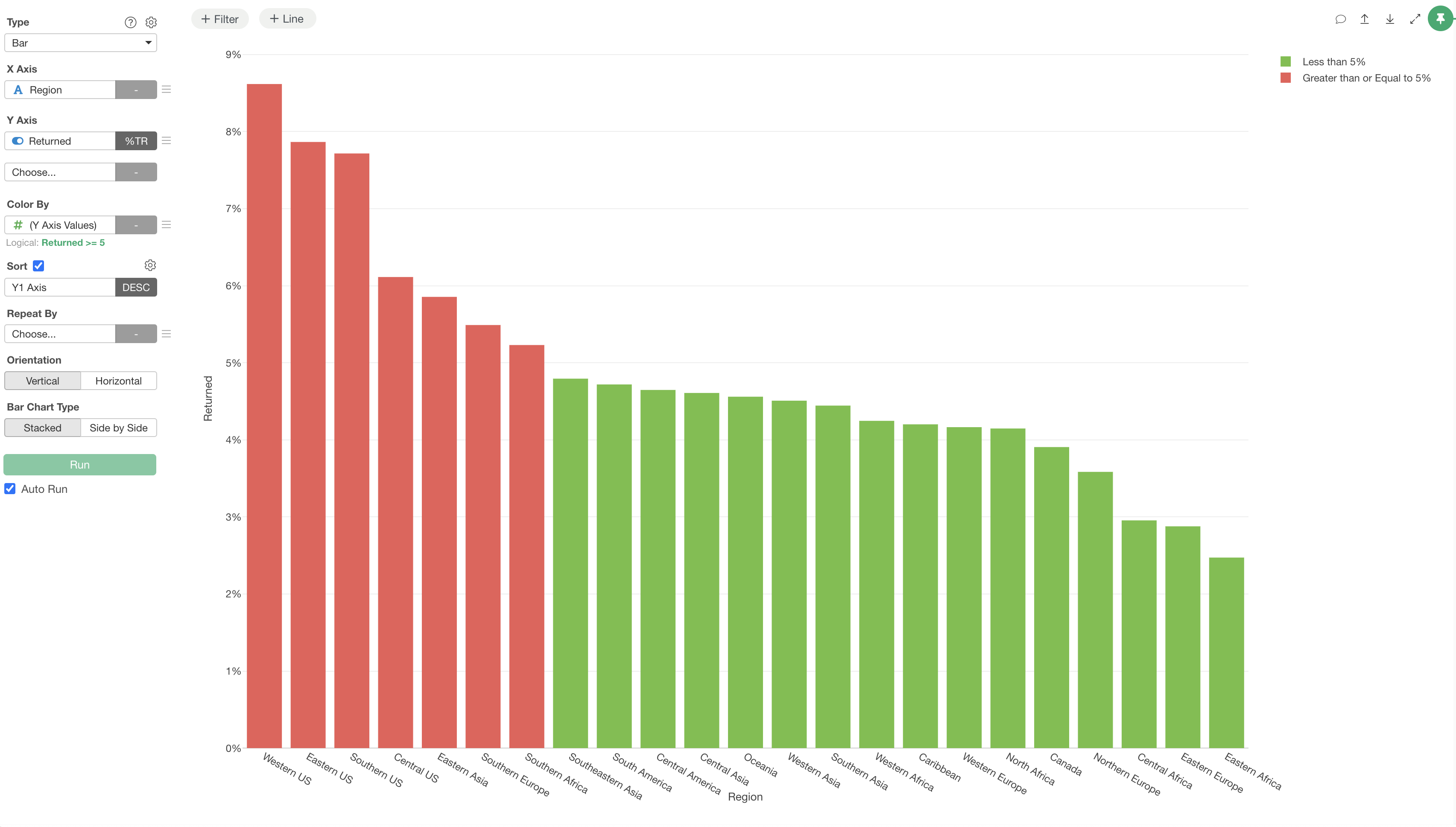
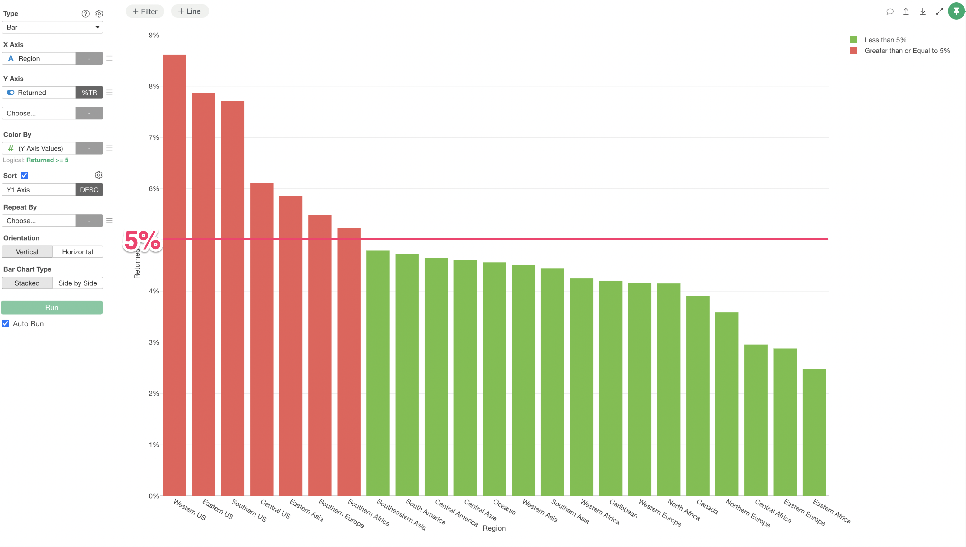
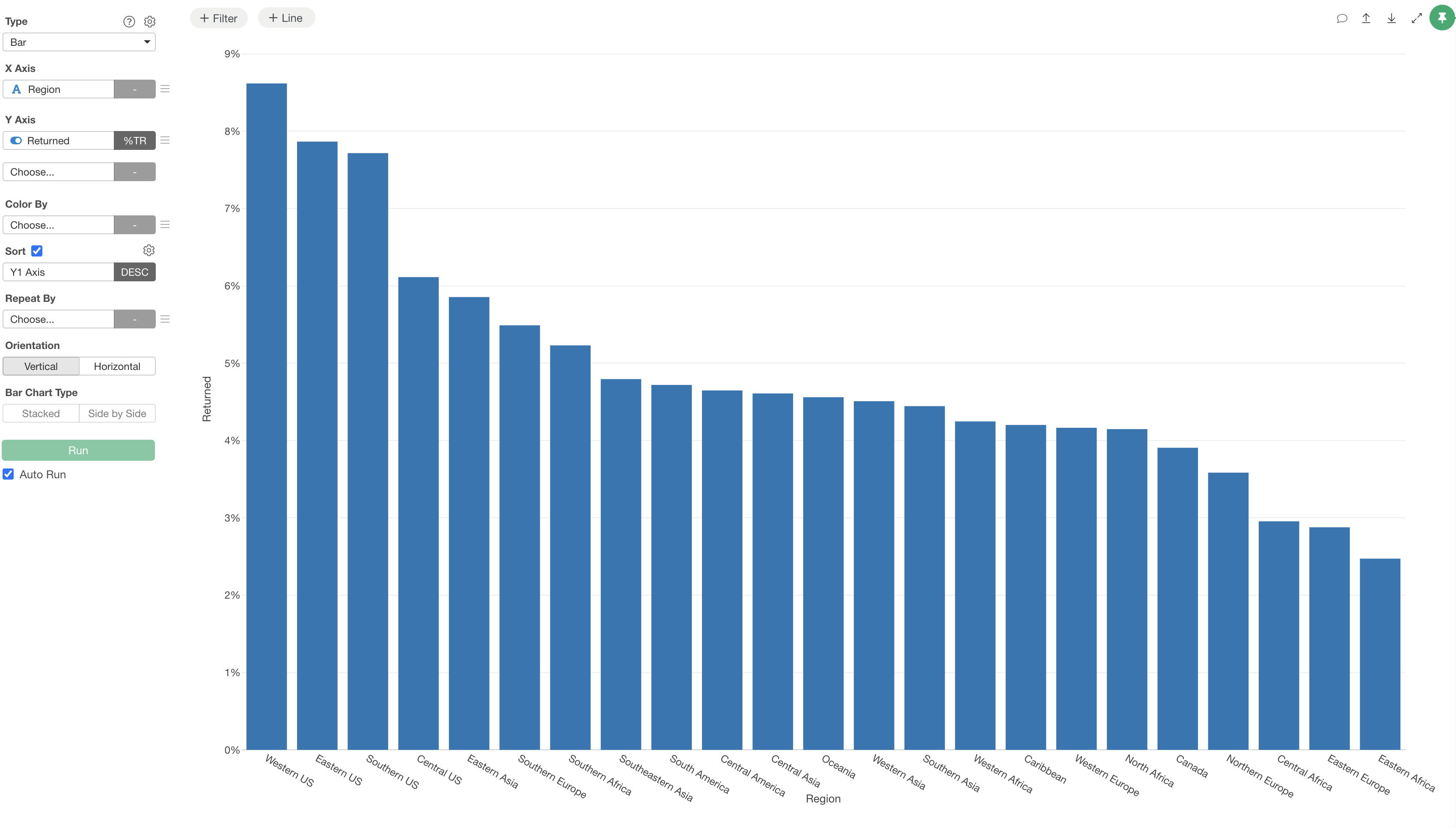
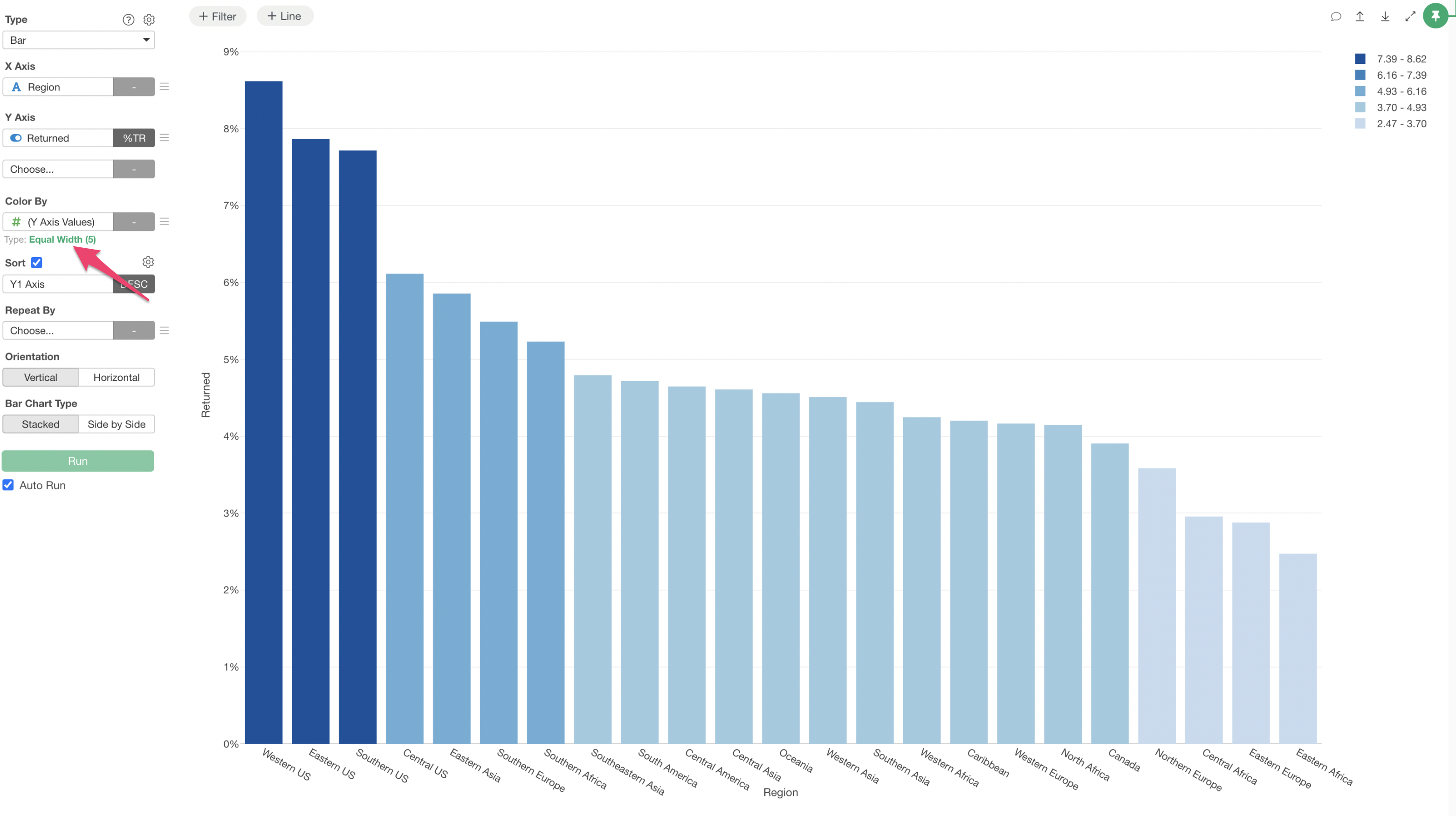
For example, the following chart displays the return rate by Region.
We want to set a condition where if the return rate is 5% or more, it’s displayed in red, and if it’s less than 5%, it’s displayed in green.

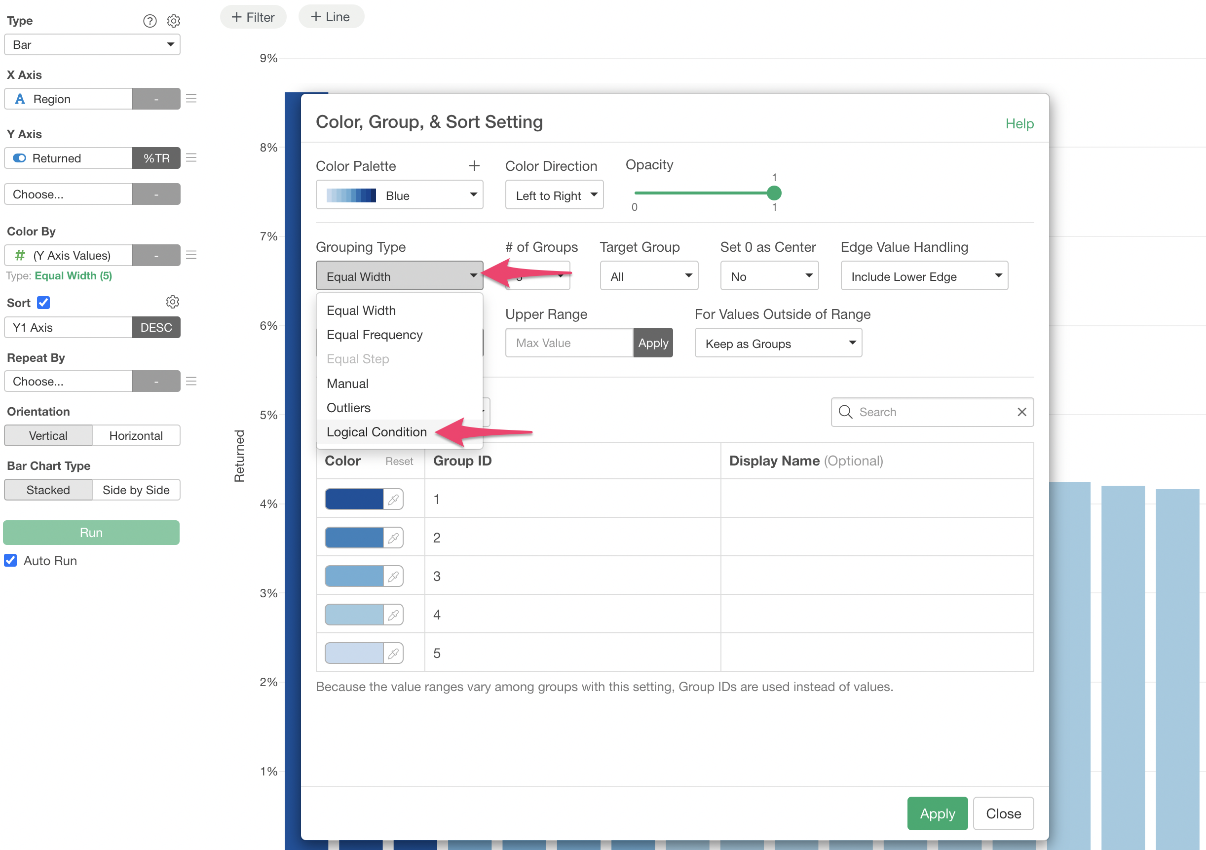
Select “(Y Axis Value)” for Color By.
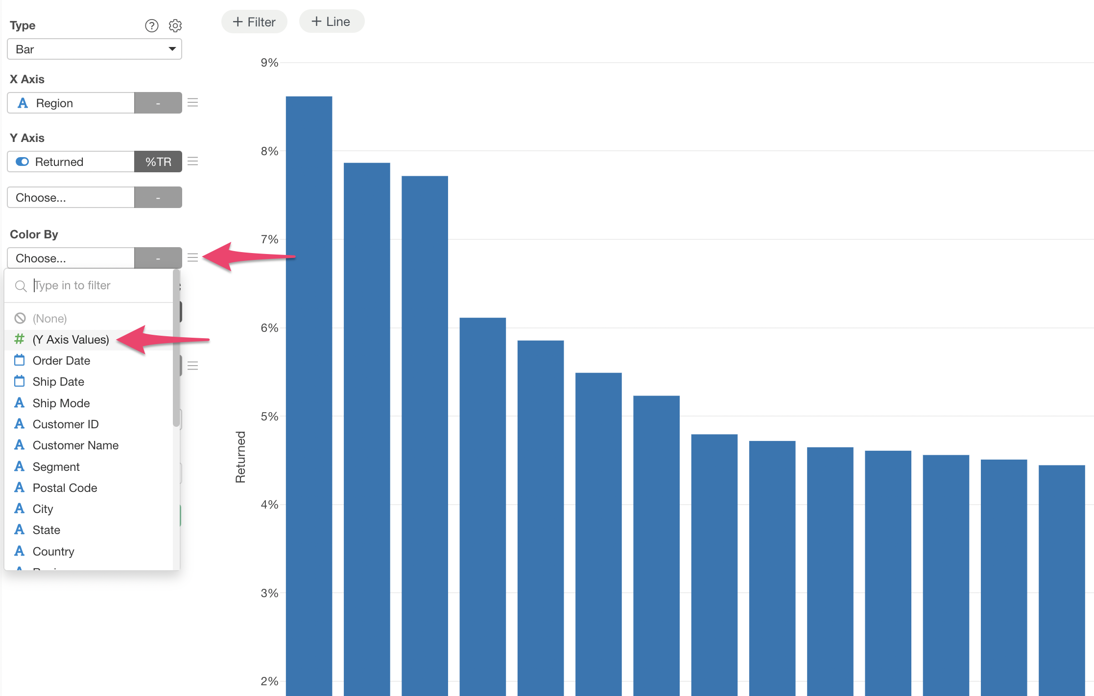
This allows you to color-code by Y-axis values. Next, click on the green text “Equal Width”.
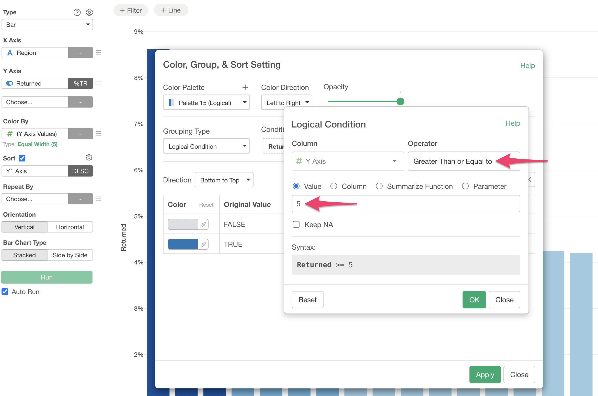
The “Color, Group, & Sort Setting” dialog will appear. Select “Logical Condition” for Grouping Type.
In the “Logical Condition” dialog, select “Greater Than or Equal to” for Operator and specify “5” for Value.
If you wish to change the colors, you can specify them individually from the Color option.
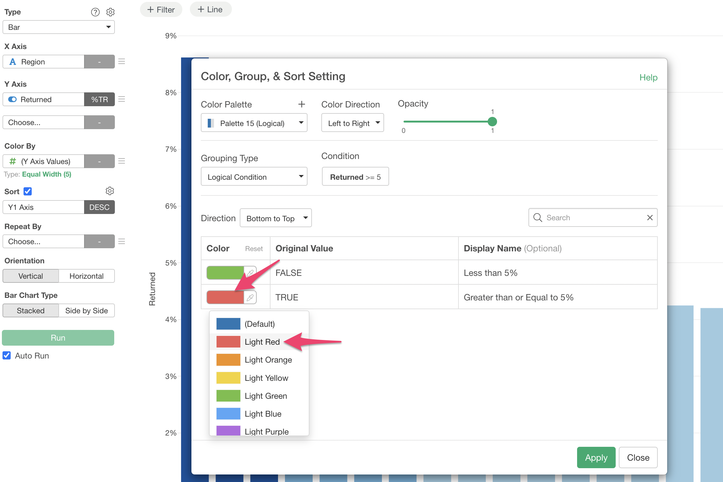
Additionally, you can change the display names for the TRUE and FALSE conditions.
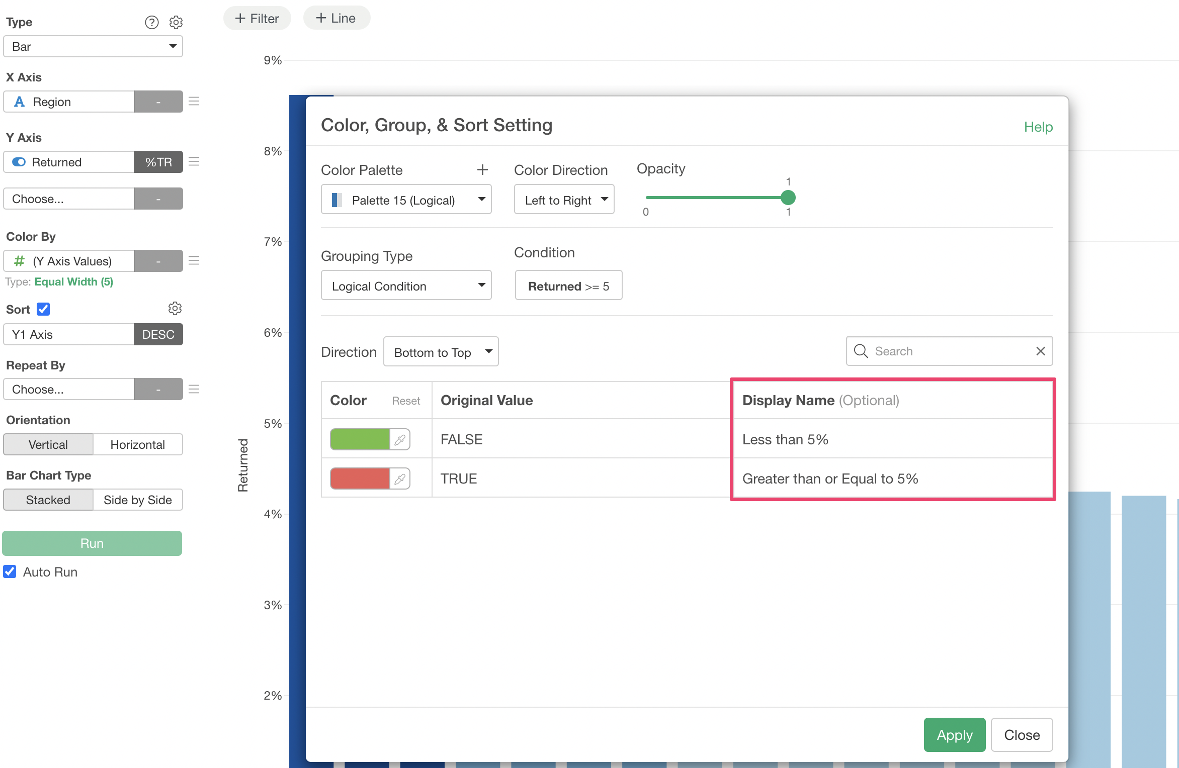
By clicking “Apply”, we can now display return rates of 5% or more in red and those less than 5% in green.