Setting Non-Existent Values as Factor Levels
When visualizing survey data, there are cases where you want to display options on the chart axis even if there are no responses for those specific values in the data.
For example, in satisfaction or usage frequency surveys, you might want to maintain a specific category (e.g., “Not used recently”) to allow for comparison with other options, even if the respondent count for that item is zero.
Typically, when converting character strings to ordered categories (Factor type) in Exploratory, the “Set Order for Values Manually” feature is used. However, this method only allows you to set levels for values that currently exist in the data.
In this note, we will introduce a method to set levels in any
arbitrary order, including values that do not exist in the data, by
using the factor function.
The Problem
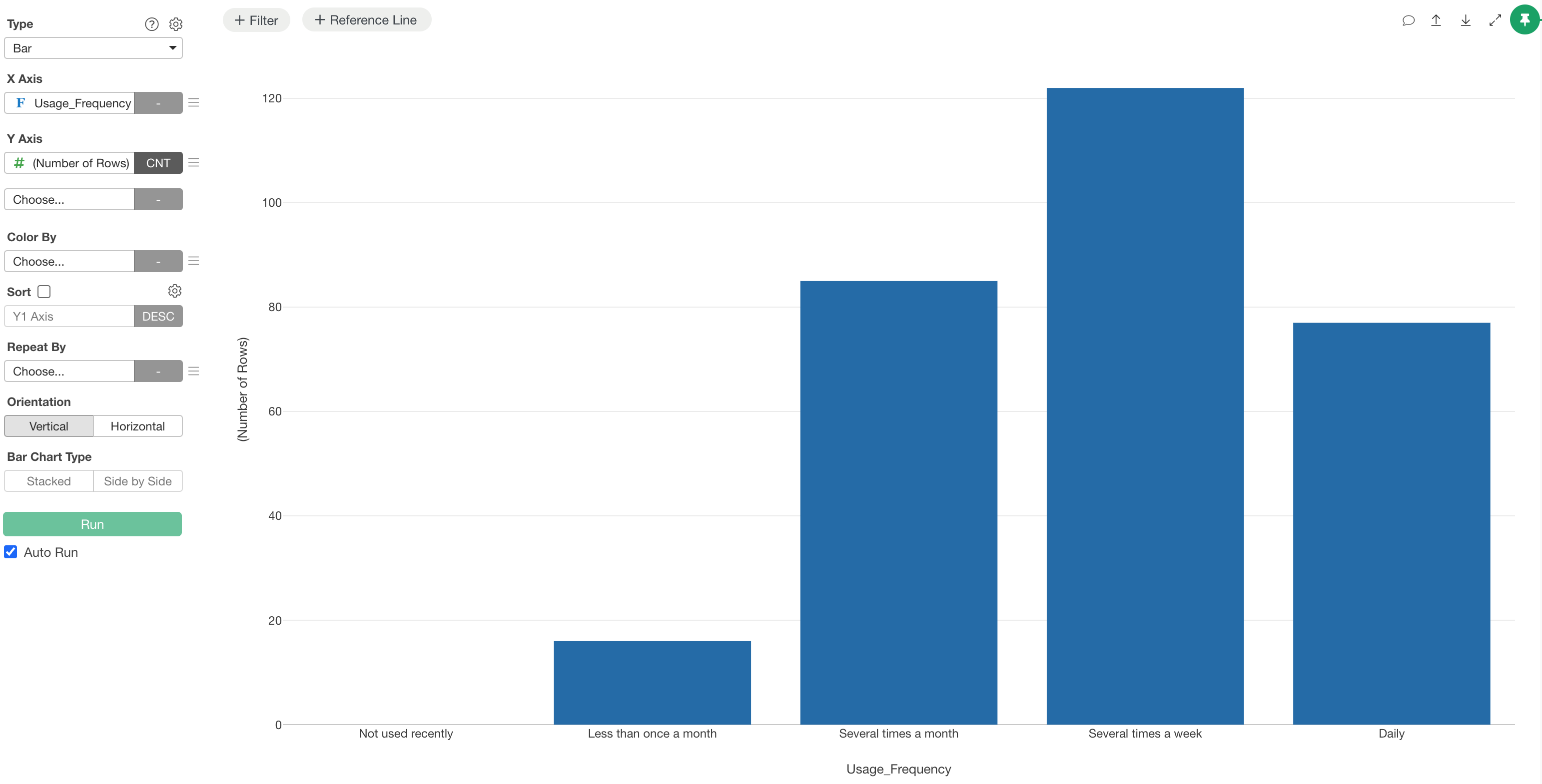
If there are values that exist as survey options but are not included in the actual response data, those items will not be displayed when you create a chart.
Furthermore, character data defaults to alphabetical or syllabary order. To visualize data in a logical sequence—such as usage frequency (Daily, Several times a week, Several times a month, etc.)—you must define the order manually.
However, functions like fct_relevel have a constraint
where they cannot add values that do not exist in the data as new
levels.
Solution
Setting Levels with the factor Function
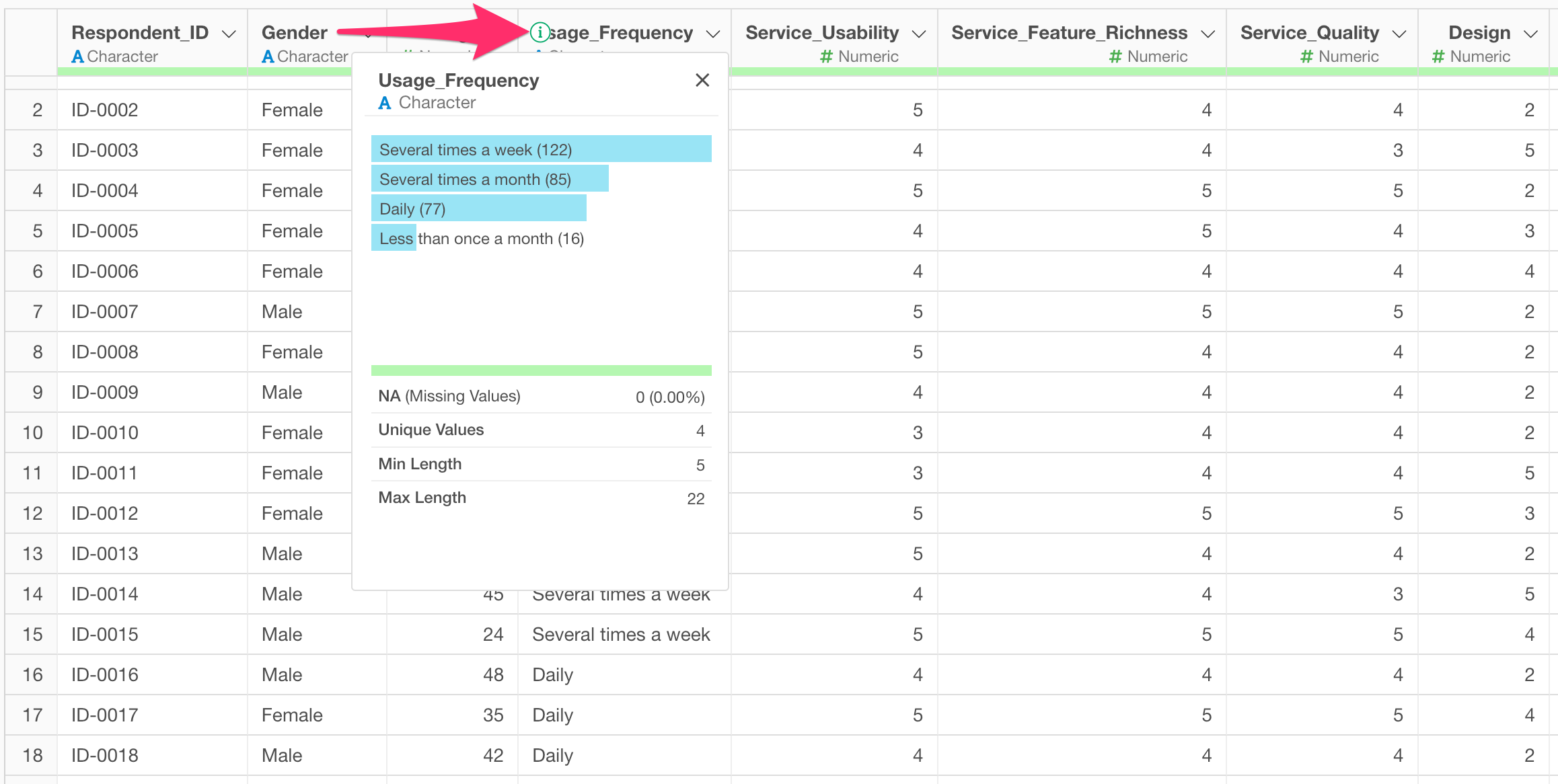
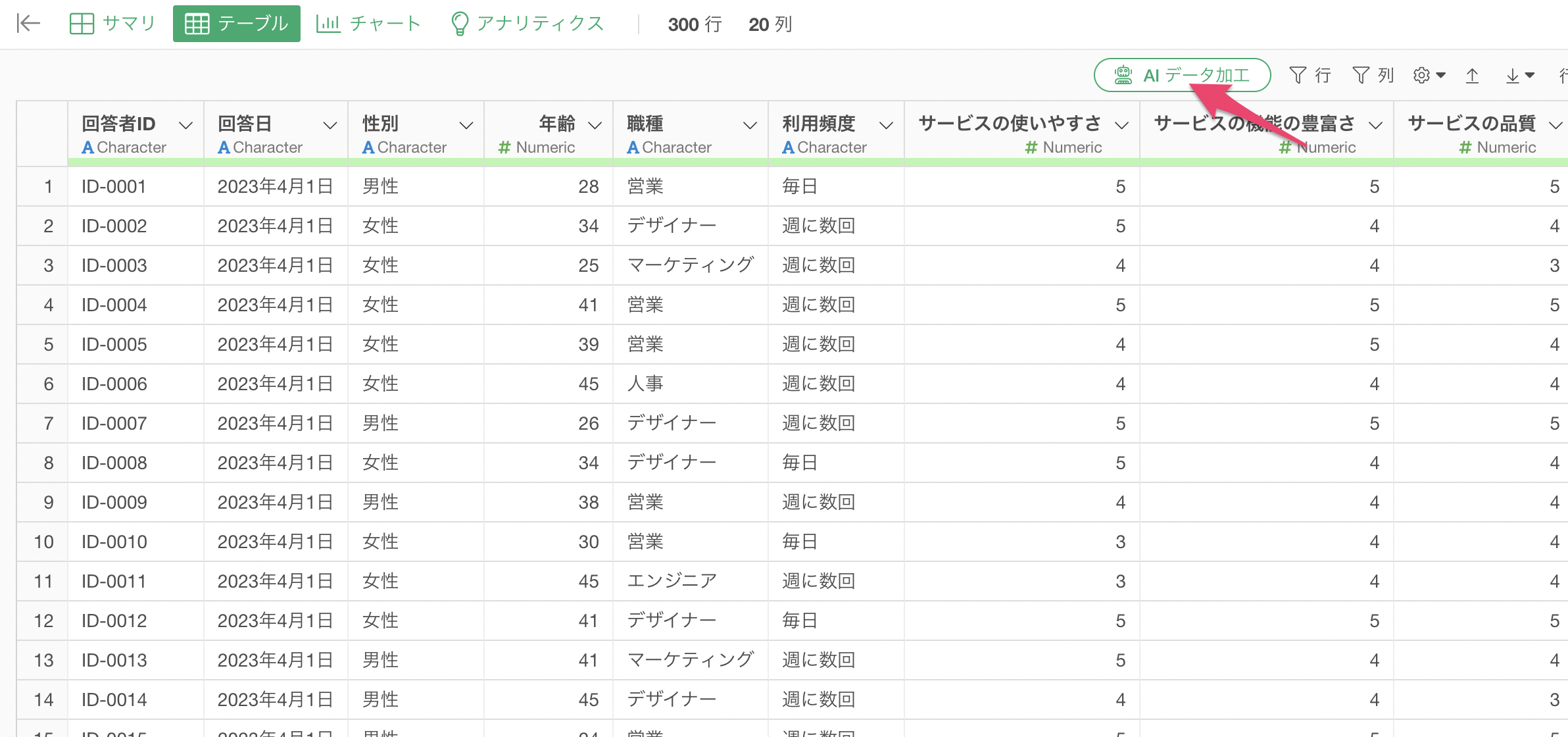
The data used for this example is a customer satisfaction survey regarding video conferencing services. Each row represents one response, and the “Usage Frequency” column contains four types of responses: “Daily,” “Several times a week,” “Several times a month,” and “Less than once a month.”
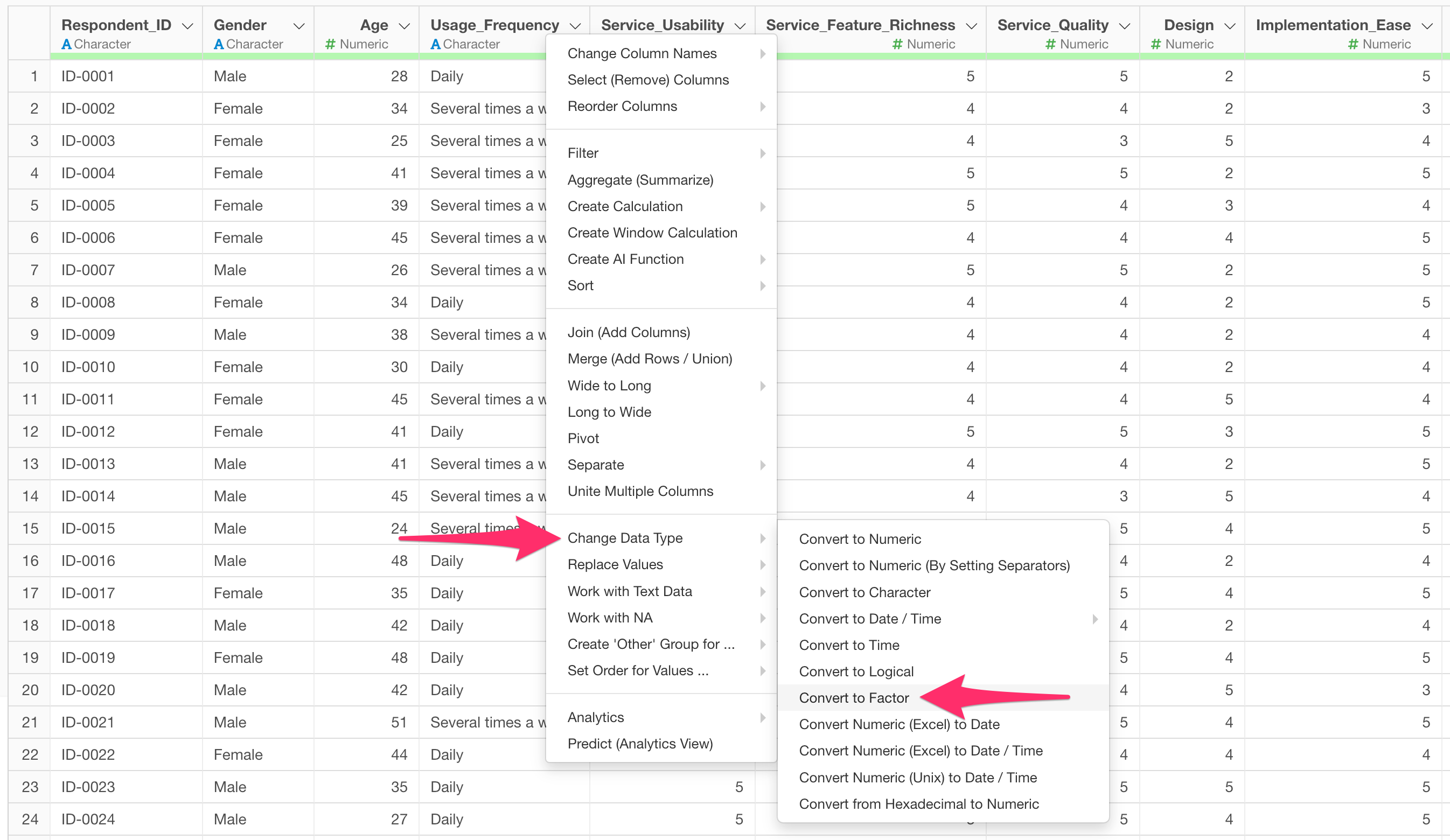
As a specific operation, select “Convert to Factor” from the “Change Data Type” menu in the column header.
The Calculation Editor will open. Write the factor
function as follows:
factor(Usage_Frequency, levels = c("Not used recently", "Less than once a month", "Several times a month", "Several times a week", "Daily"))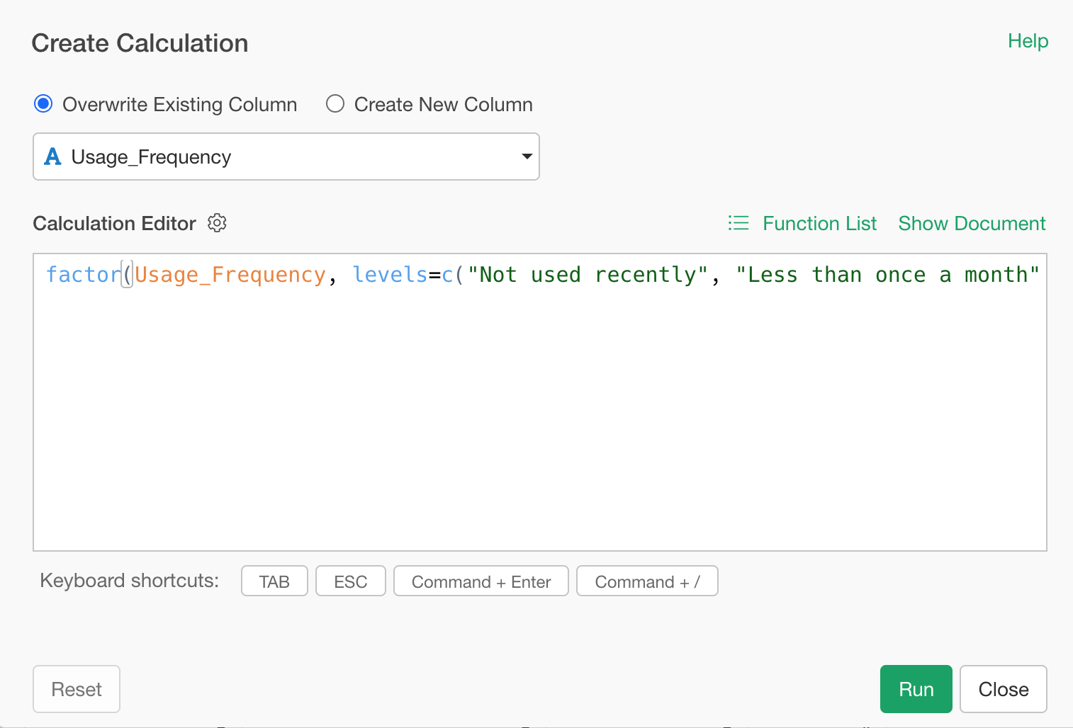
As a result of this setting, the item “Not used recently,” which has zero records in the data, will be maintained as a level in the Summary view and charts.
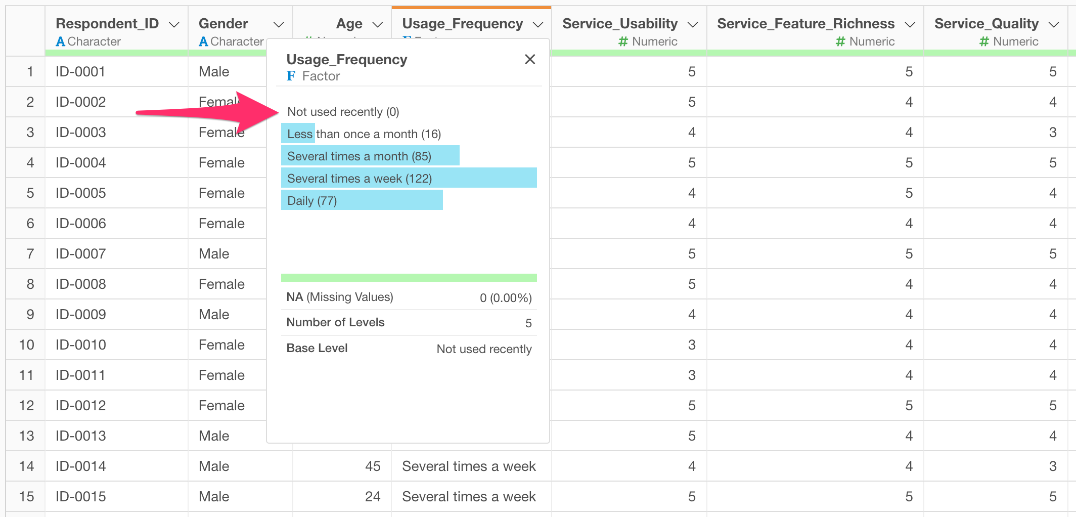
This enables visualization in the intended order on the chart’s X-axis, including items with zero responses.
Setting via AI Prompt
If you are not confident in writing functions, you can perform the same process using Exploratory’s AI Prompt.
Click the AI Data Wrangling button.
Provide the following instruction in the prompt:
Convert the usage frequency column to a factor, include values such as "Not used recently" as levels, and reorder them in an appropriate frequency order.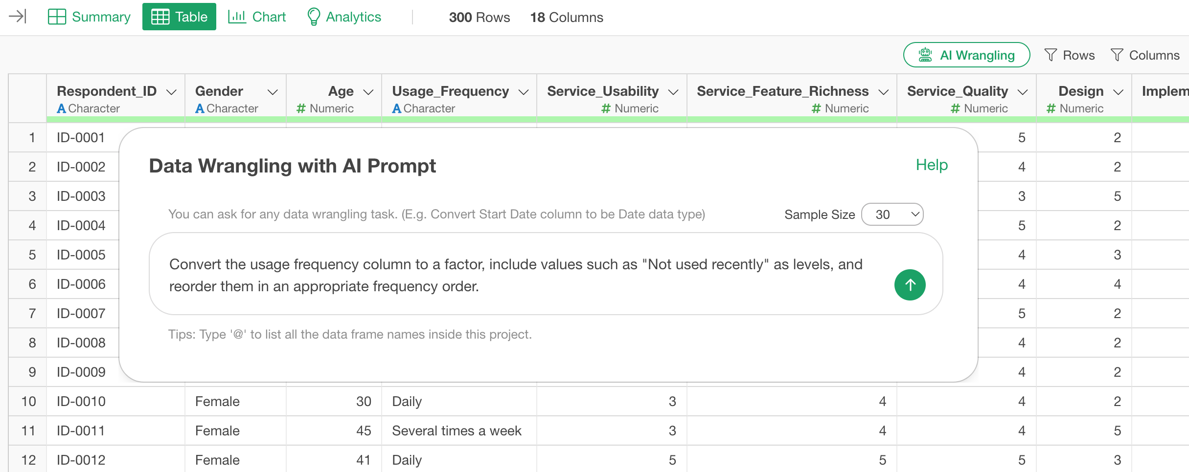
This will generate a step combining the factor function
with the levels argument. By reviewing the generated
content and clicking the “Run” button, you can complete the order
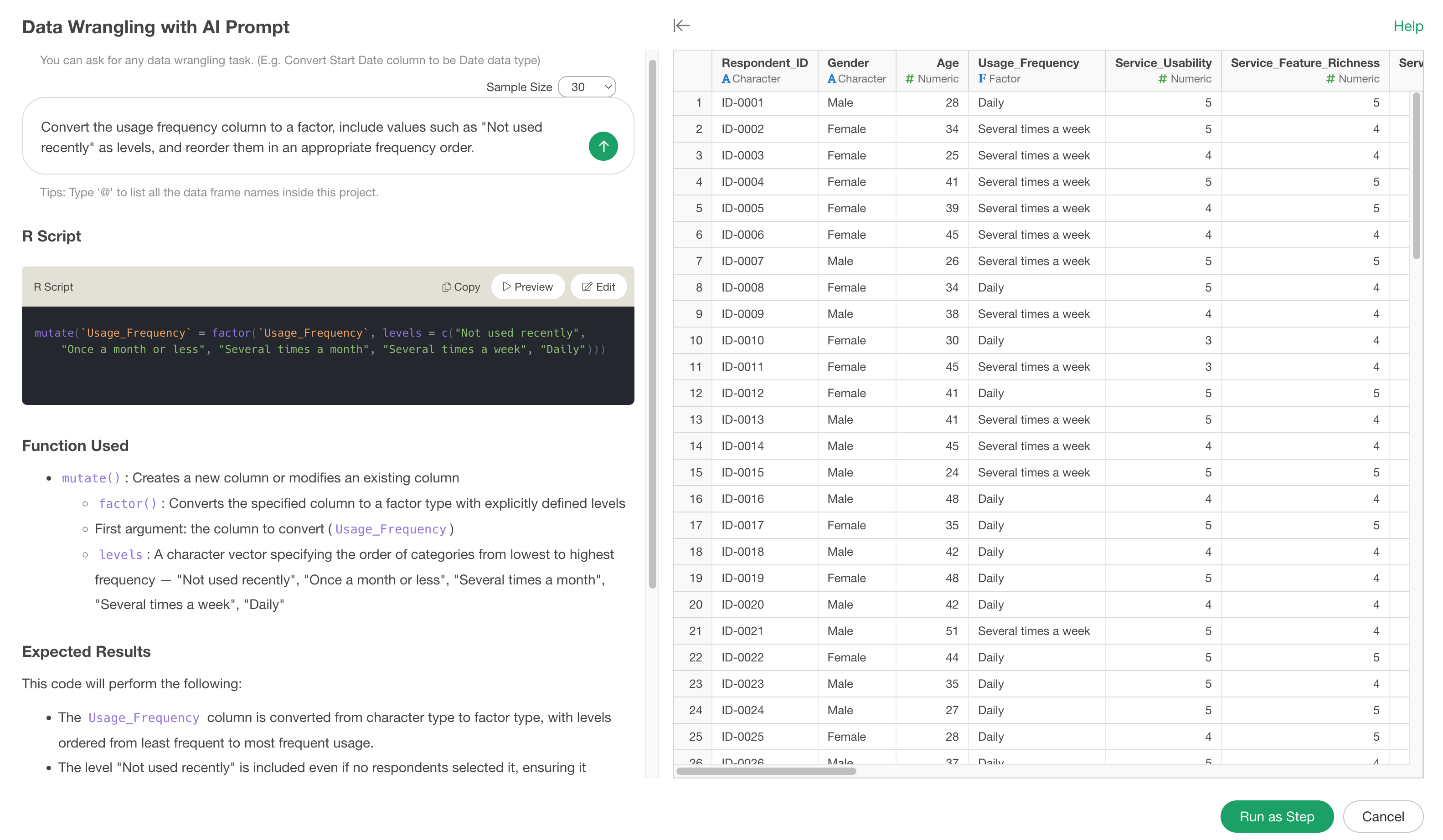
setting—including non-existent values—without manually writing code.