How to Show Multiple Measures in Multiple Charts
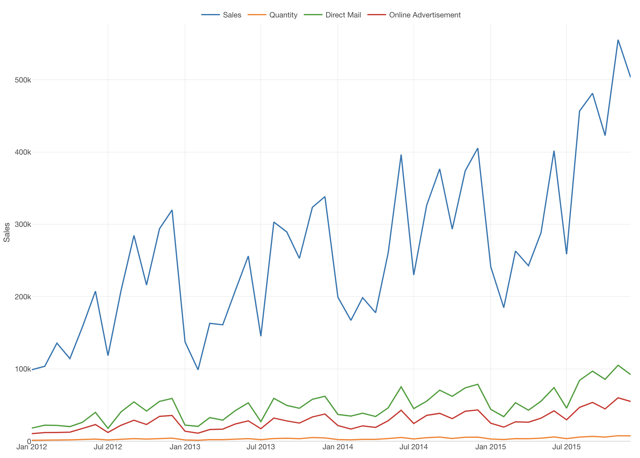
The chart below shows 4 measures (Sales, Quantity, etc.) but it doesn't work well because some measures are in difference scales from other measures, which makes it harder to compare among them.
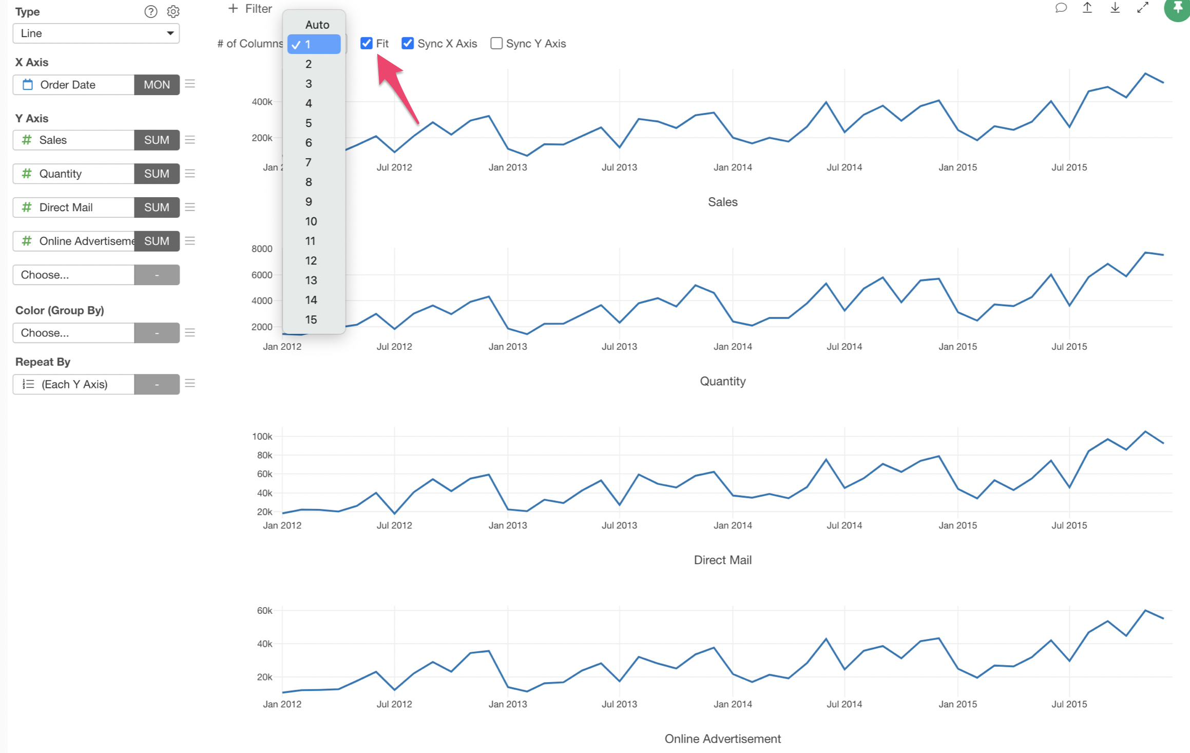
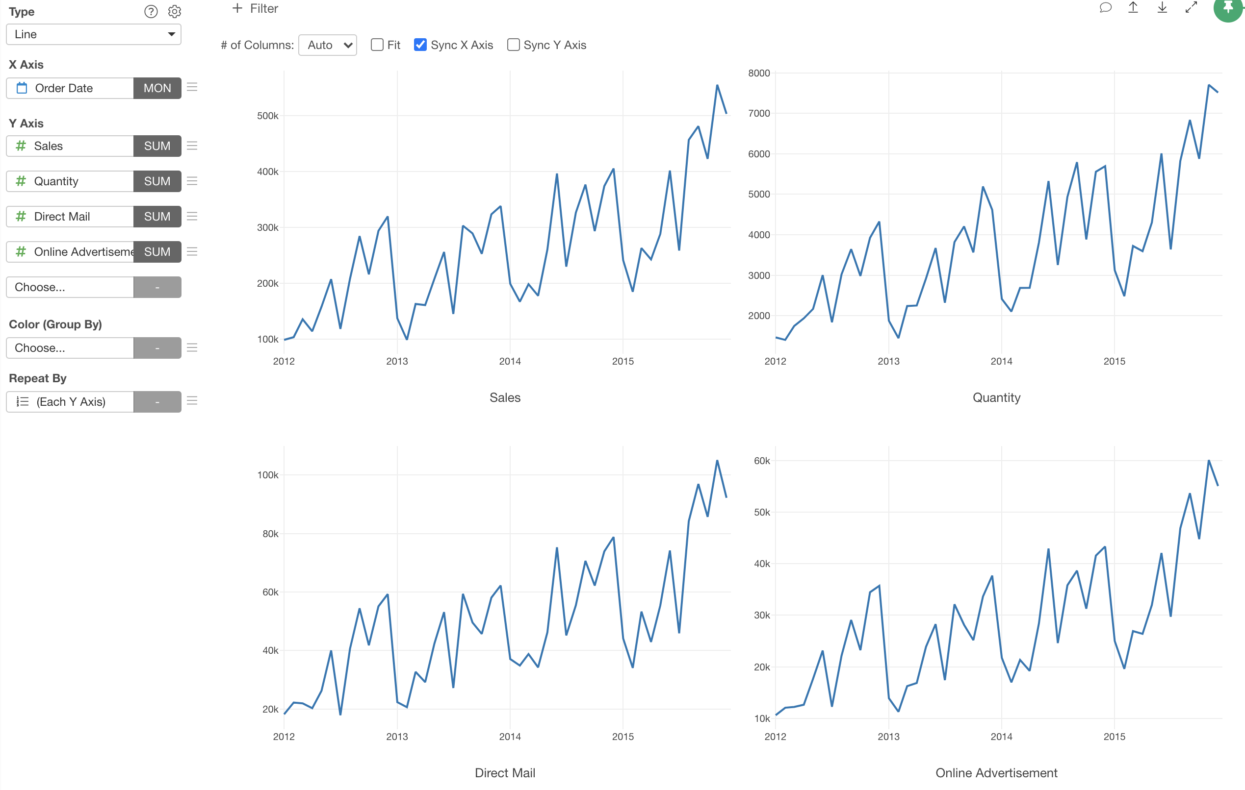
One way to address this problem is to separate the chart to multiple charts and show each measure in its own chart like below. (Another option is to use 'Y2 Axis' setting.)

You can quickly do this by using Repeat By with 'Each Y Axis' option.
Sample Data
We'll use this Sales Data. You can download it from this page.
1. Create a Line Chart
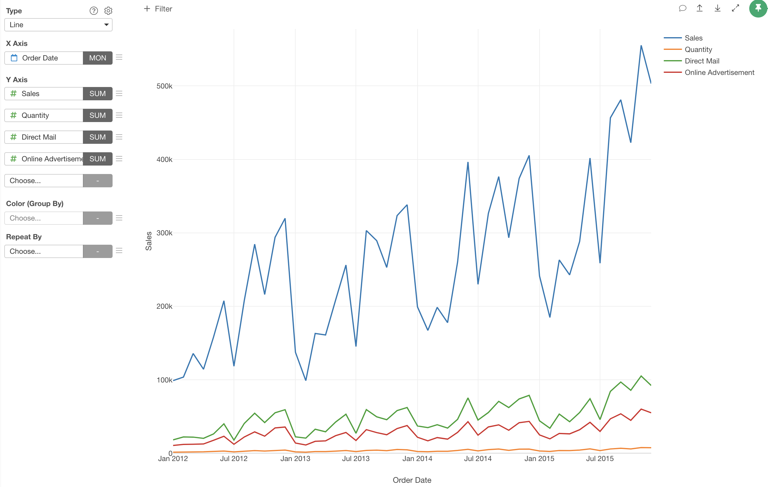
First, let's create a line chart by selecting the followings.
- X-Axis: Order Date -> Month
- Y-Axis: Sales with SUM
- Y2-Axis: Quantity with SUM
- Y3-Axis: Direct Mail with SUM
- Y4-Axis: Online Advertisement with SUM
2. Use 'Repeat By' to Separate into Multiple Charts
Now it's time to separate chart into multiple charts each of which will show each Y-Axis measure.
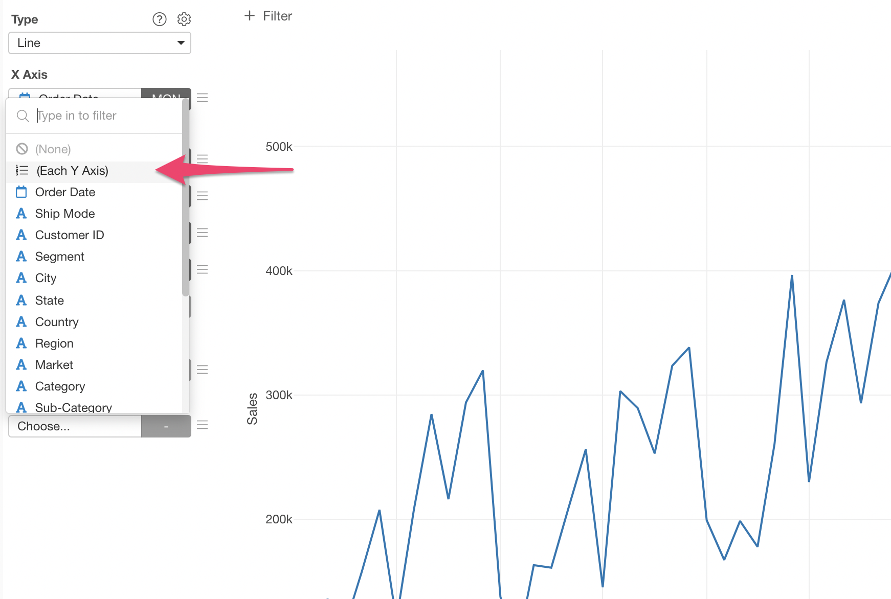
Select '(Each Y Axis)' from the Repeat By dropdown.
Now each measure is shown in its own chart.
You can adjust the layout with the setting at the top. For example, here I'm setting One column layout with 'Fit' option so that each chart is shown on top of each other, which makes it easier to compare the trend among the measures.
