Subscription Data Analysis #1: Visualizing Business KPIs
This note is the first part of the “Subscription Data Analysis” trial tour, “Visualizing Business KPIs,” which helps you efficiently learn how to create, visualize, and analyze metrics specific to subscription-based businesses.
To grow a business, it’s essential to understand the current state of the business and define metrics to recognize problems through regular monitoring.
In this note, we’ll use Exploratory to calculate and visualize the following three metrics commonly used in subscription-based businesses:
- MRR (Monthly Recurring Revenue)
- MRR growth amount from the previous month
- Retention rate / Cancellation rate
This will take about 20 minutes. Let’s get started!!
Data Overview
 The
sample data for this exercise is payment data from a subscription-based
business. You can download the data from this
page.
The
sample data for this exercise is payment data from a subscription-based
business. You can download the data from this
page.
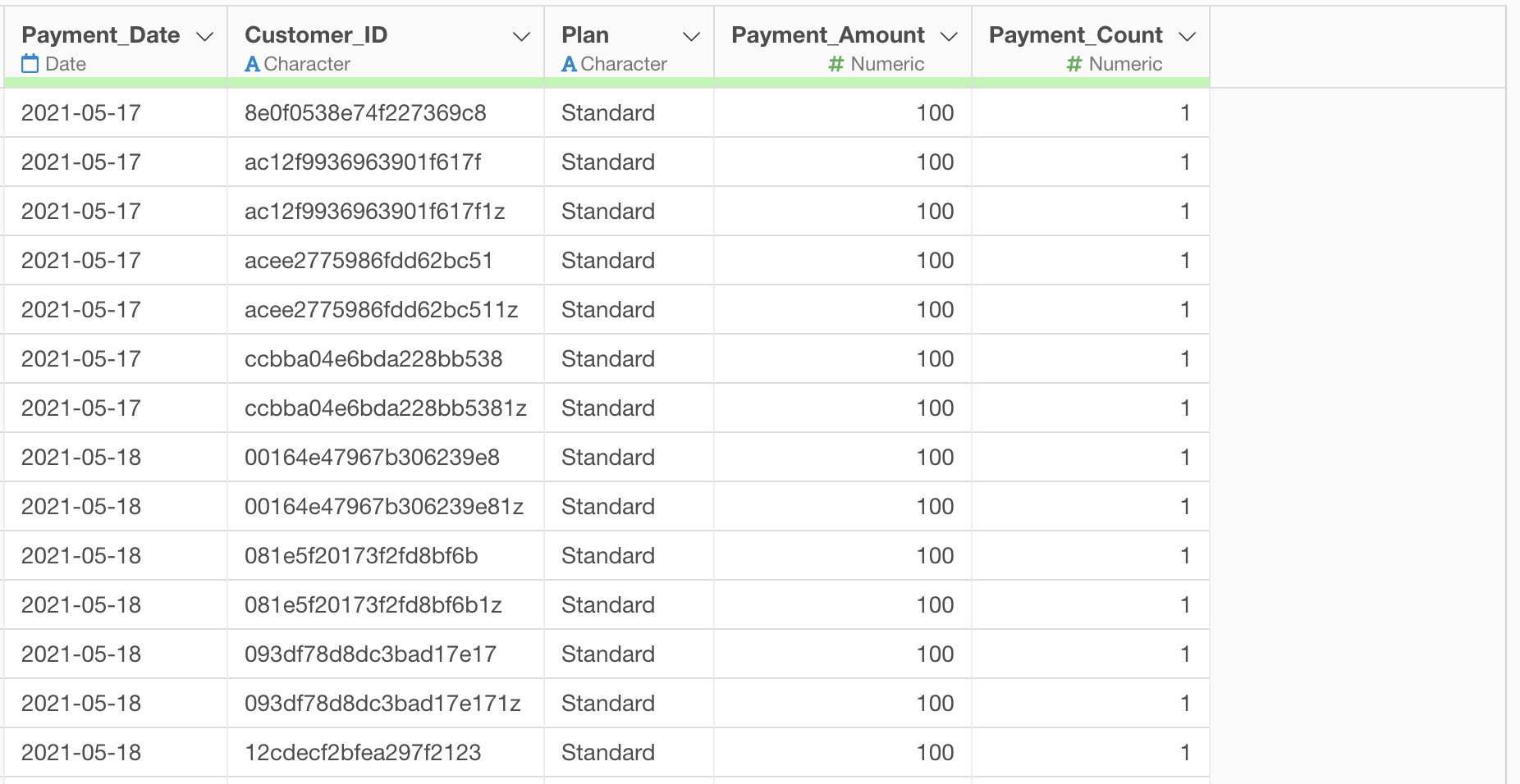
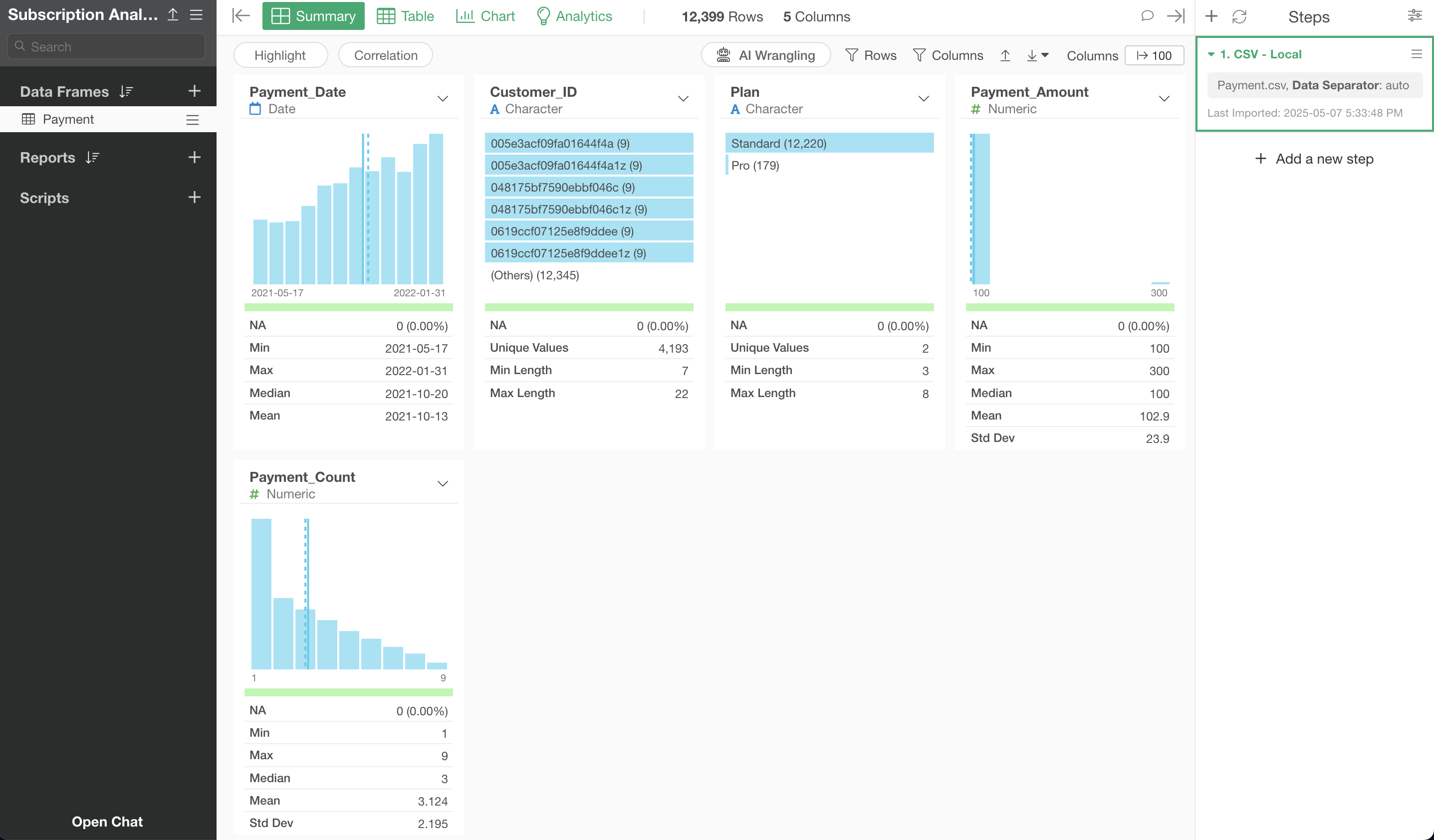
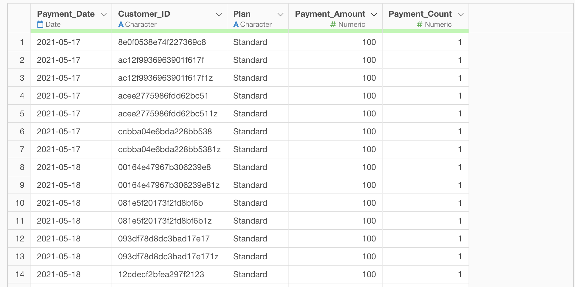
In this dataset, each row represents a monthly payment history for one customer, with columns containing the following information:
- Customer ID
- Payment date
- Payment plan
- Payment amount
- Number of payments made so far
Importing Data
After launching Exploratory, click the “Create New” project button.
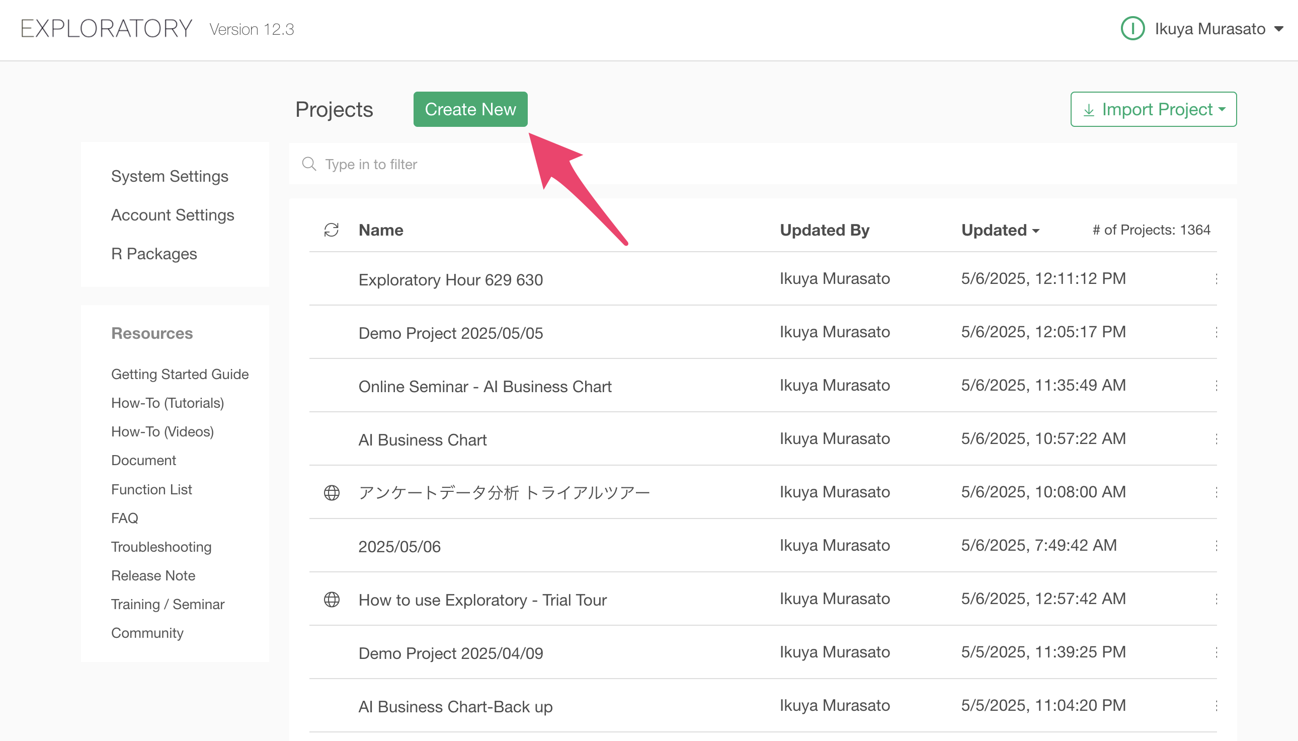
A dialog to create a project will appear. Enter a name of your choice and click the create button.
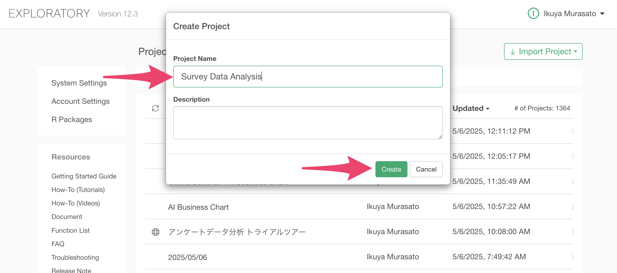
The project has been created.
Next, let’s import the data. We’ll use payment data from a SaaS service as our sample data. In this dataset, each row represents a monthly payment for one customer.
The
sample data for this exercise is payment data from a subscription-based
business. You can download the data from this
page.
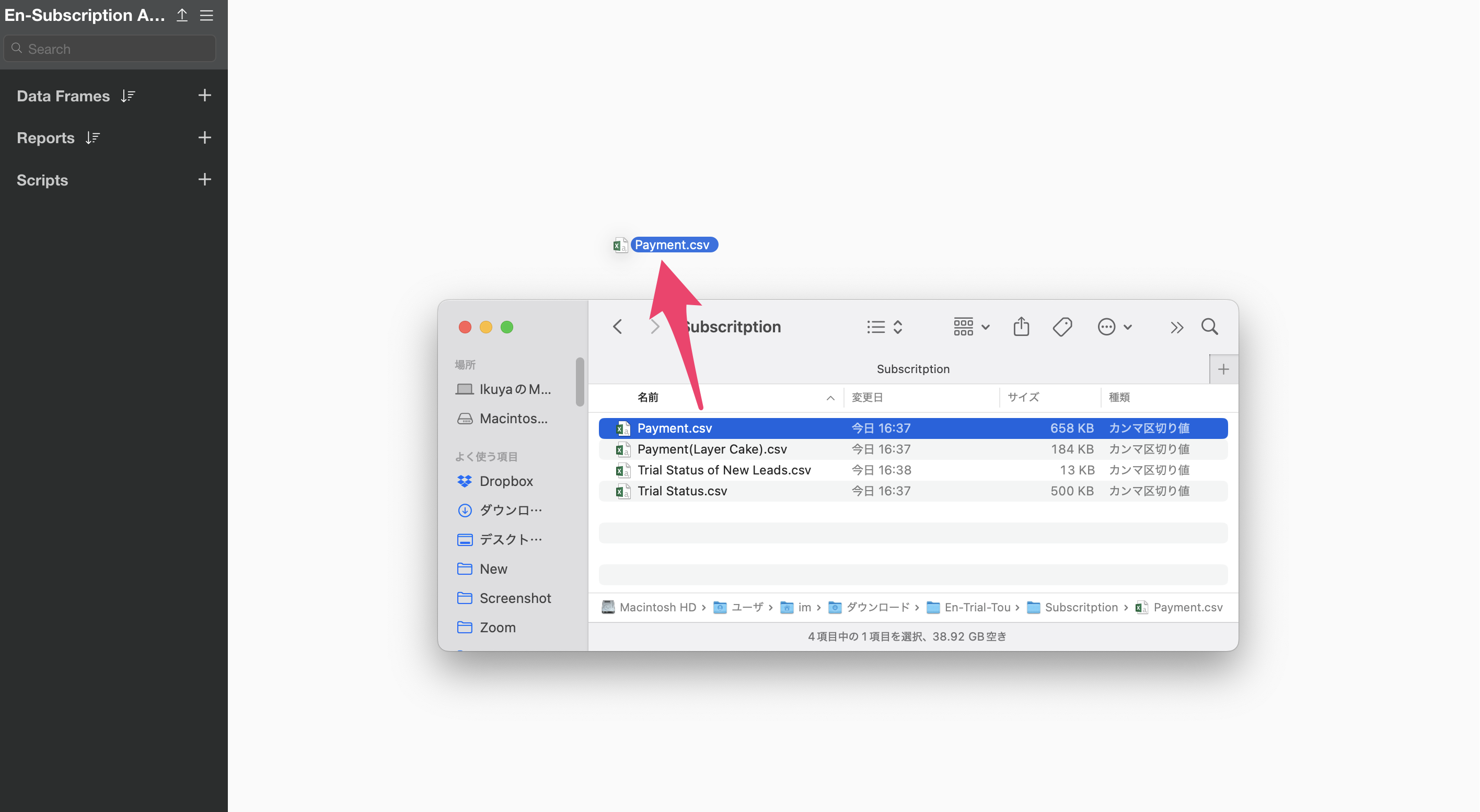
After downloading the Payment data, open the download folder and drag and drop it onto Exploratory Desktop.
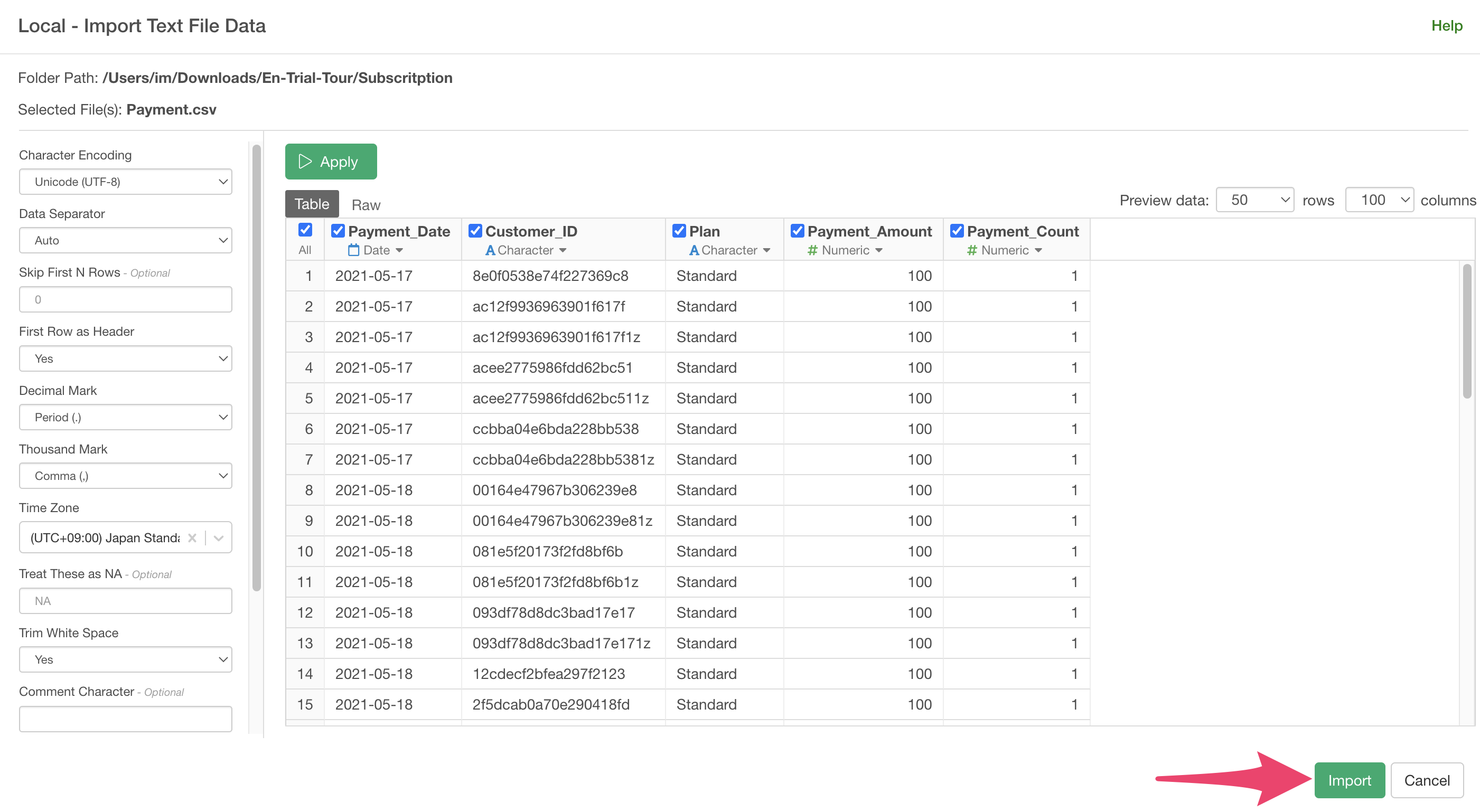
An import dialog will appear.
In the import dialog, you can specify settings for importing data from the items on the left, but since no settings are needed this time, click the “Import” button.
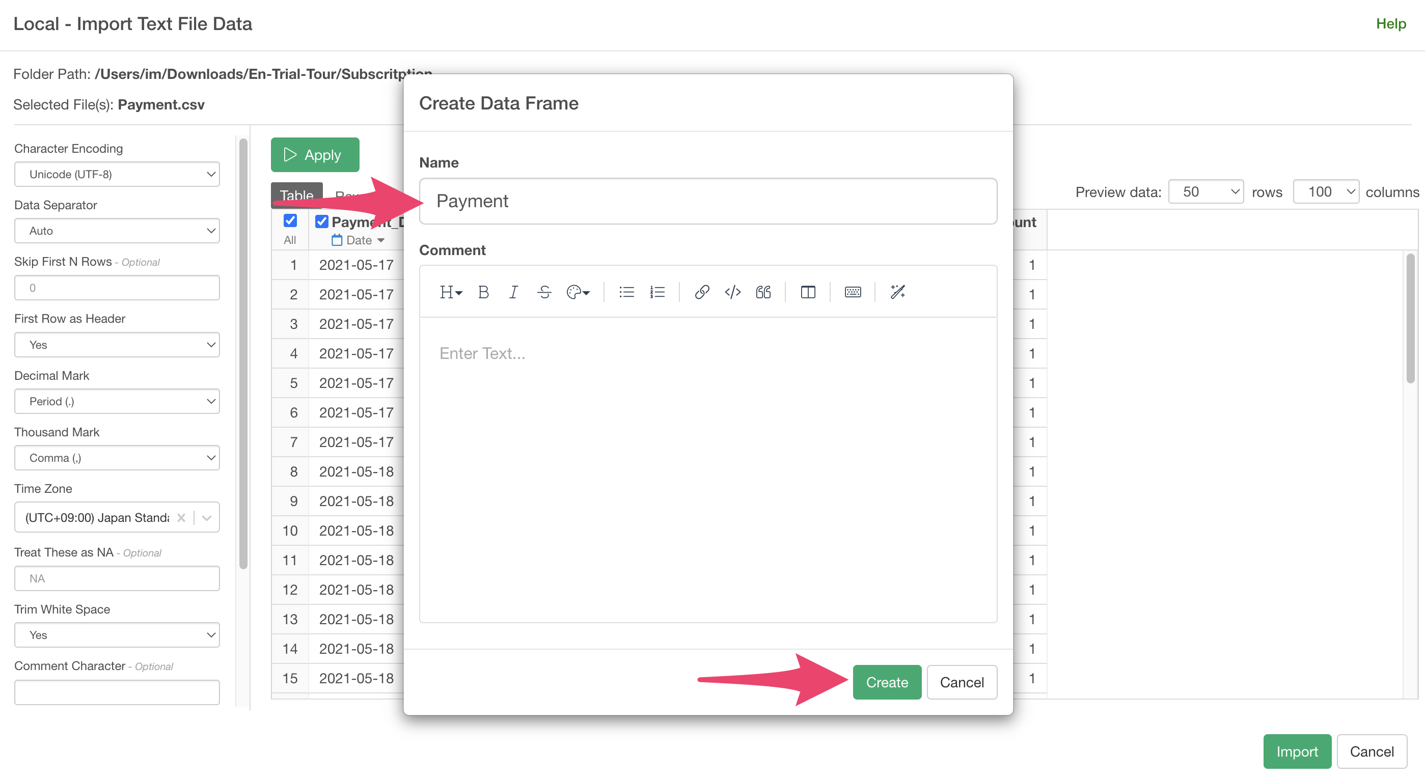
A dialog to create a data frame will appear, so click the “Create” button.
The data is imported, and the “Summary View” opens, showing a summary of the data information.
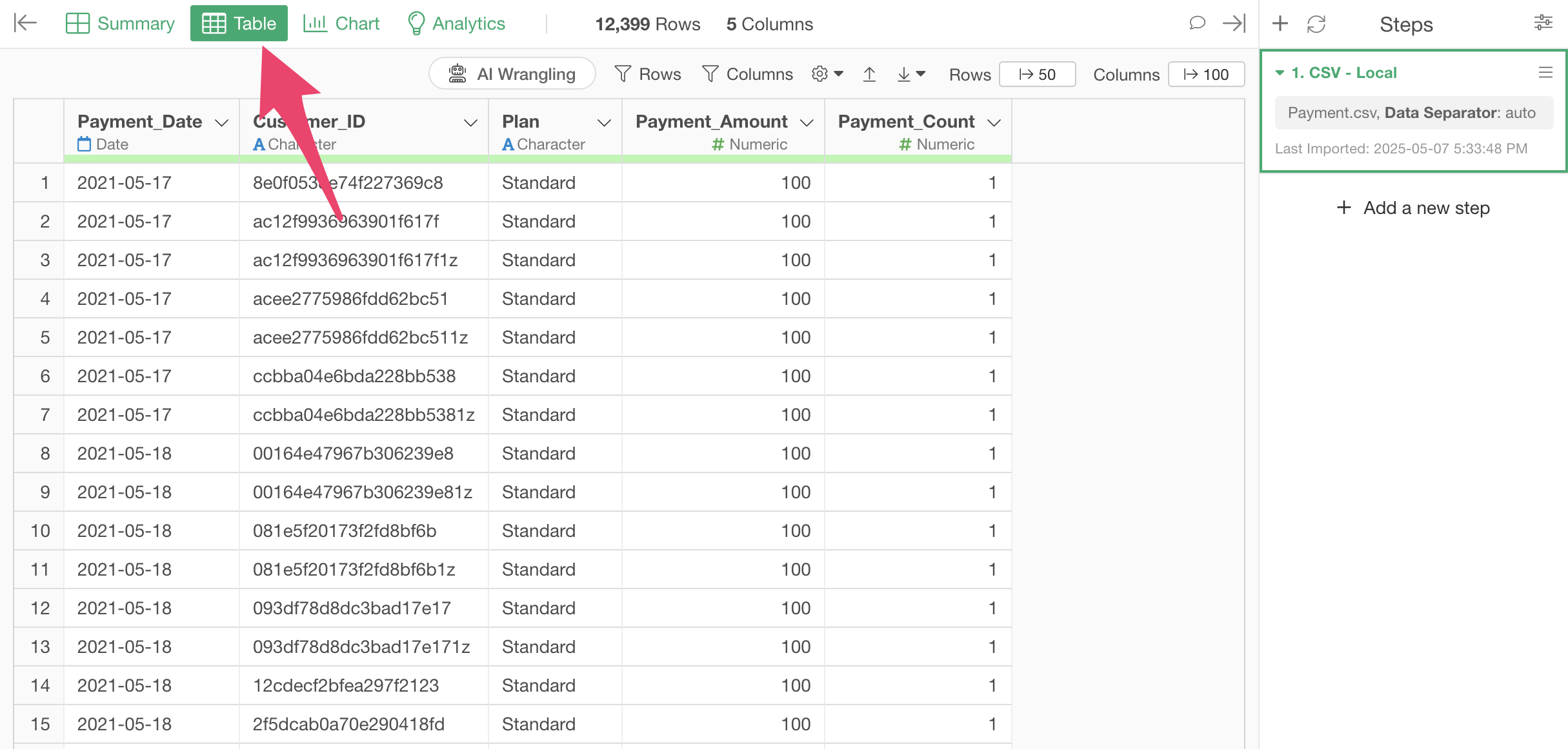
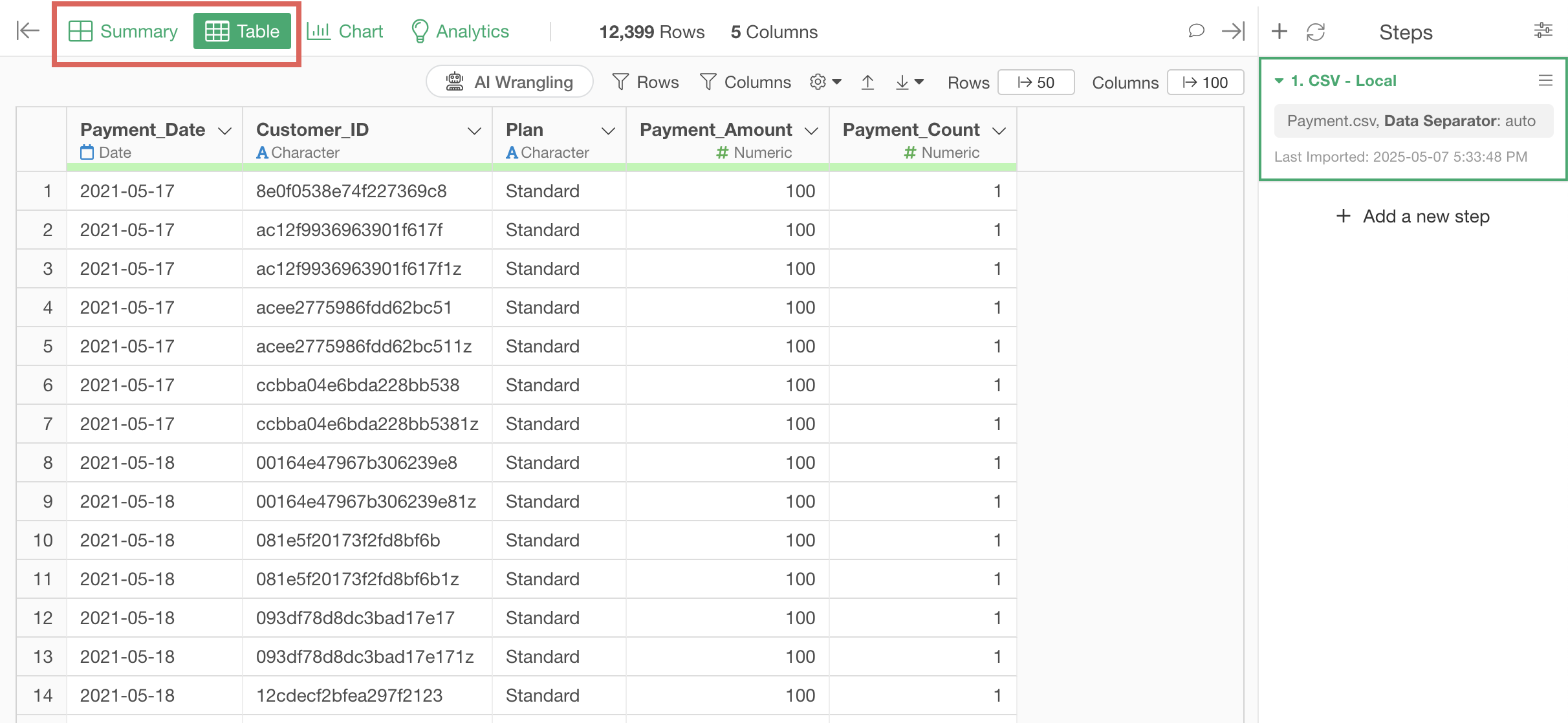
Clicking “Table” opens the “Table View” where you can check the data in table format.
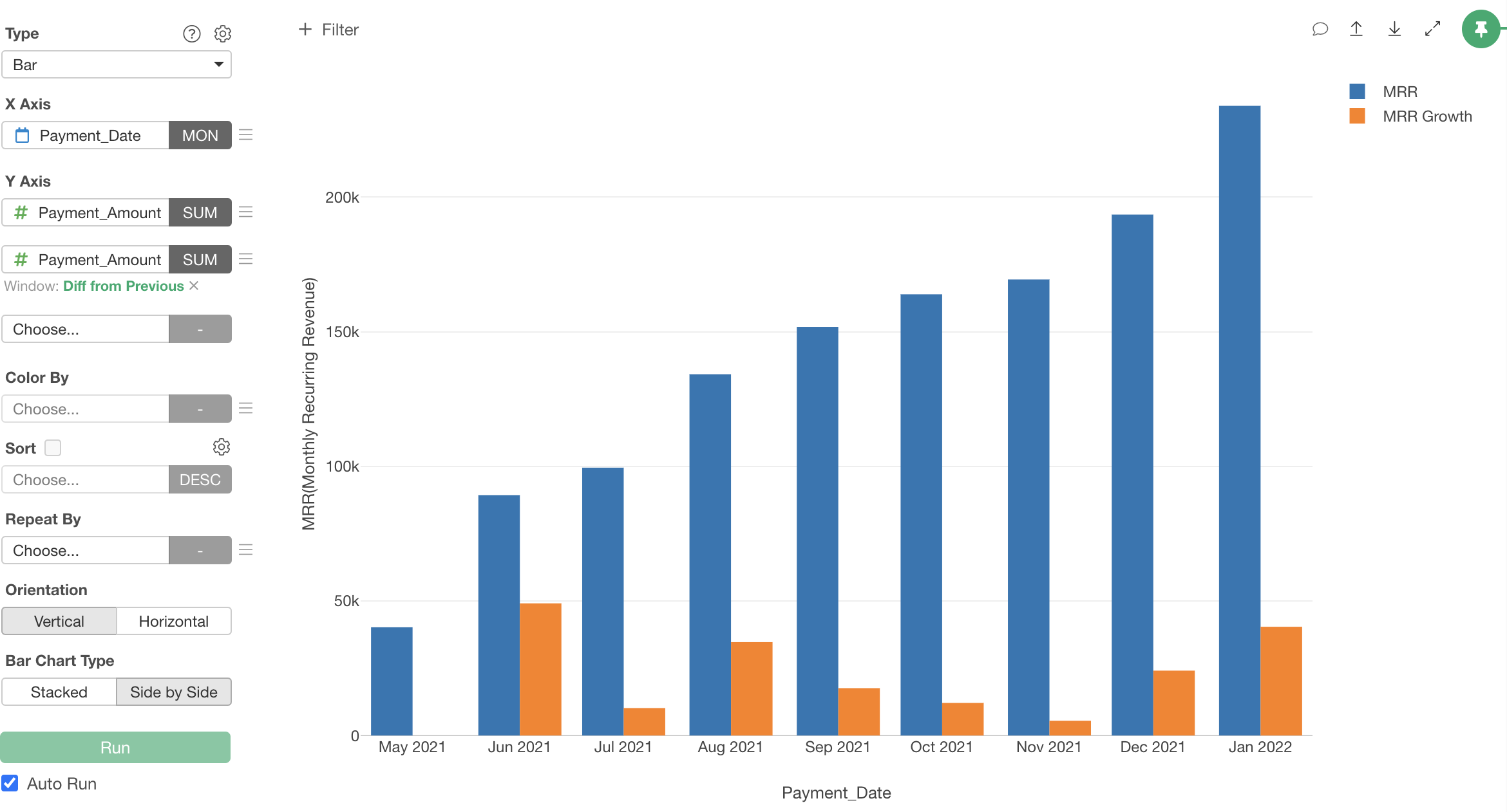
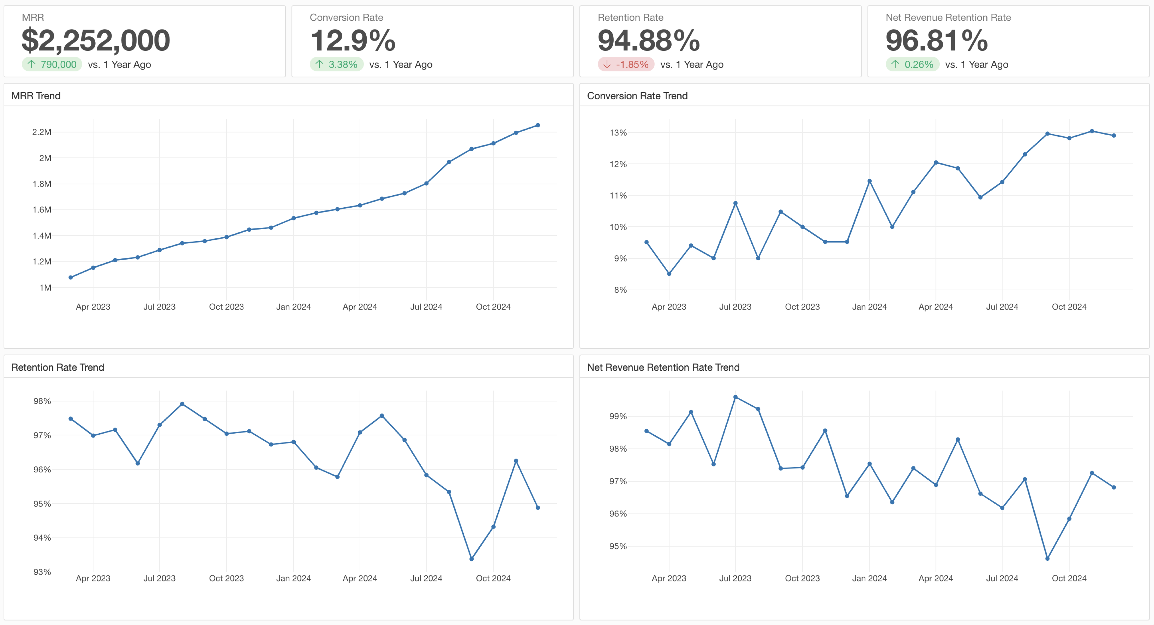
1. MRR (Monthly Recurring Revenue)
Let’s start by visualizing MRR (Monthly Recurring Revenue), which is a fundamental metric for subscription-based businesses.
This data has one row per customer’s monthly payment. We’ll use a chart to aggregate and visualize this payment data by month.
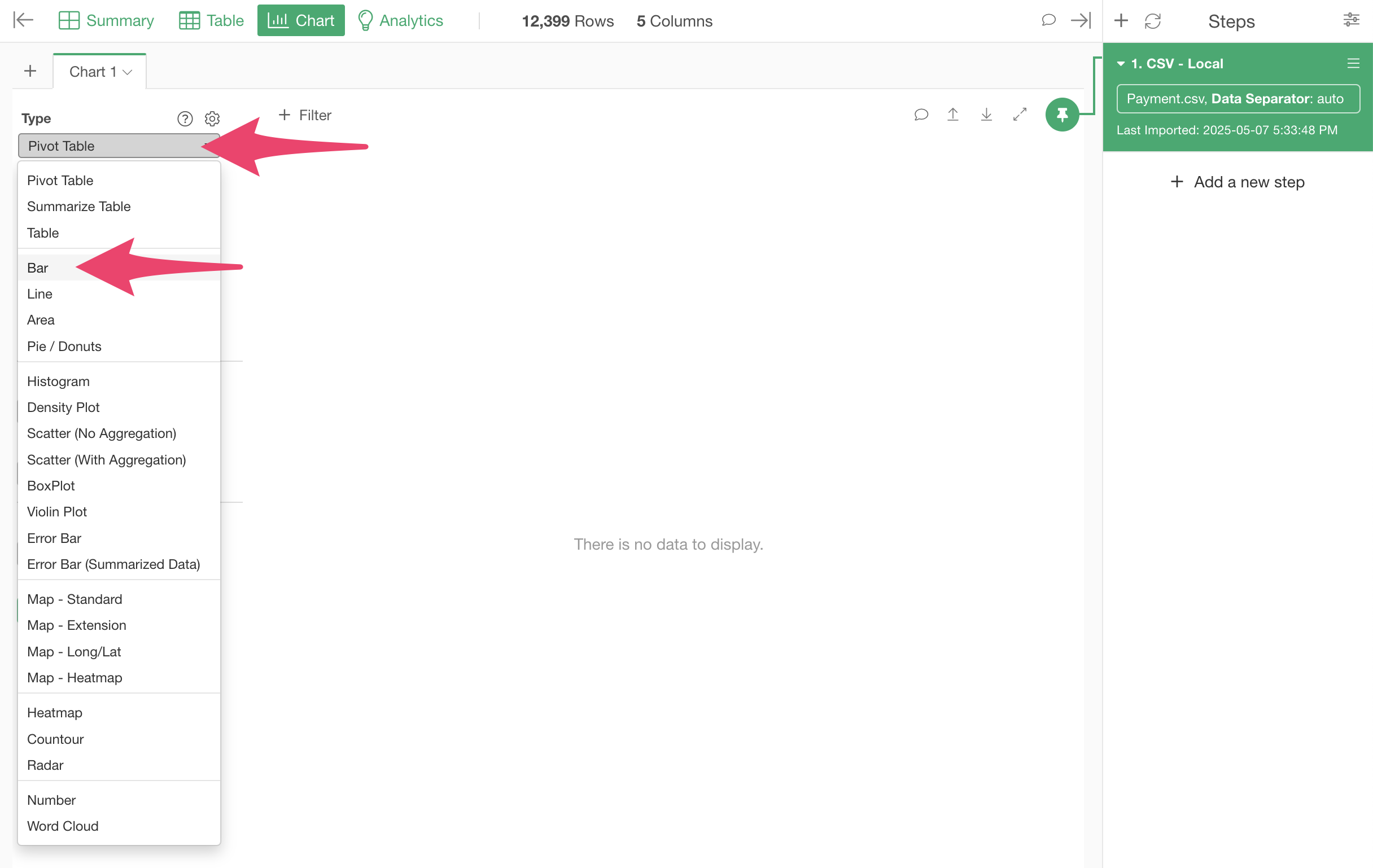
To create a chart, move to the “Chart View.”
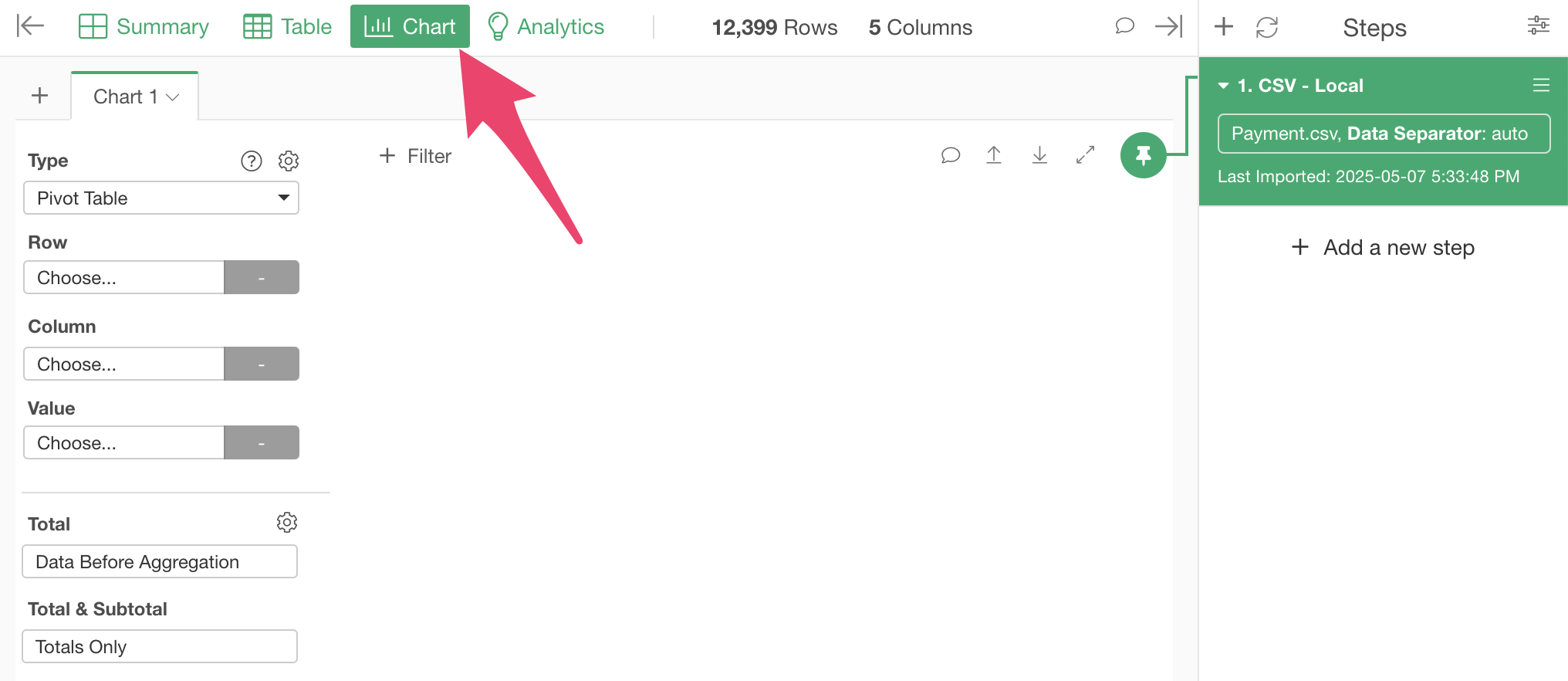
We want to visualize MRR (Monthly Recurring Revenue) using a “Bar” chart, so select “Bar” for the type.
Since we want to visualize revenue by month, select “Payment Date” for the X-axis.

When you select a date-type column for the X-axis, the date is automatically rounded to “Year.” Click on “Year” to change the date rounding unit.
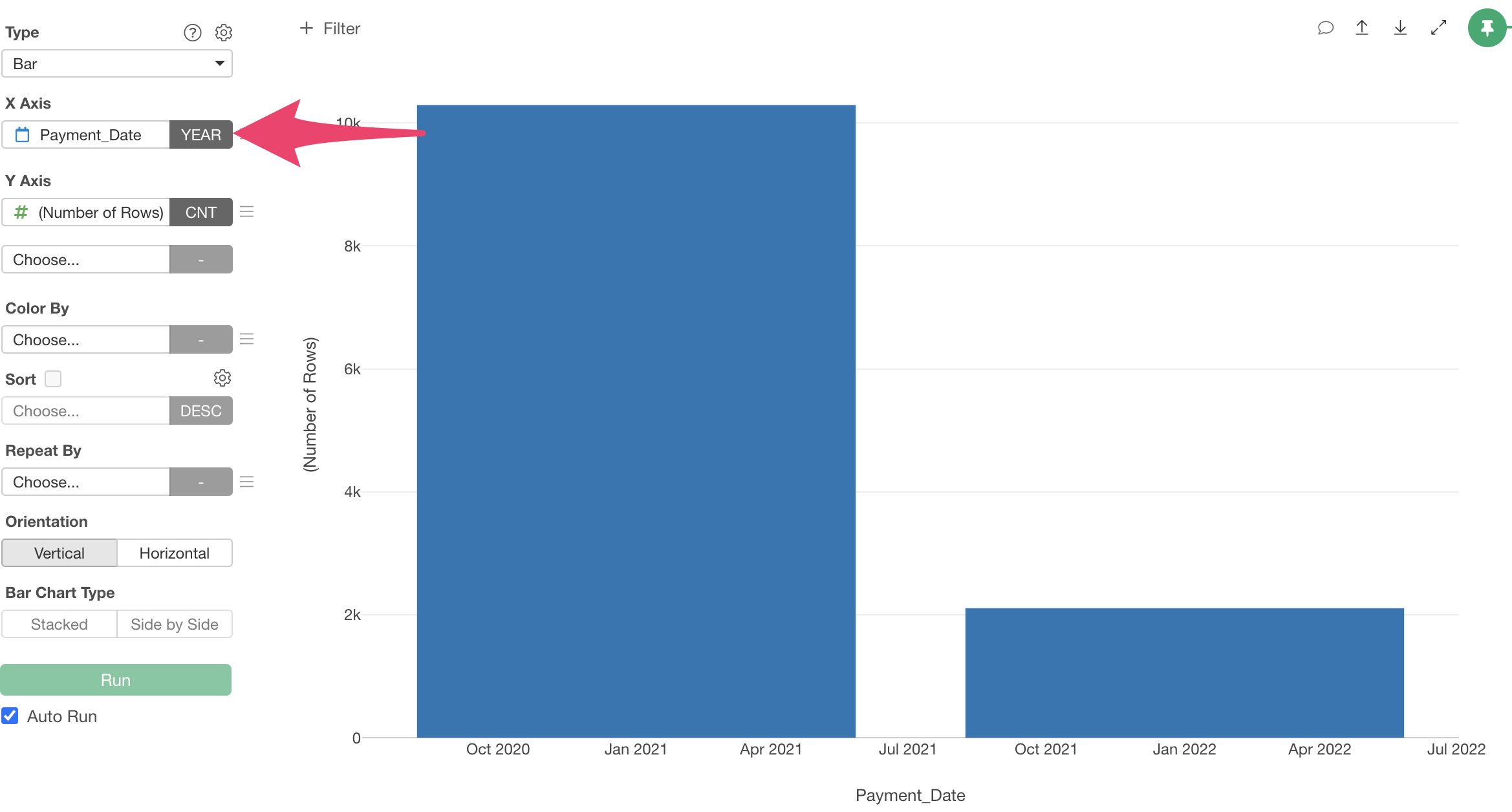
Since we want to aggregate “Payment Amount” by month, select “Month” for rounding.

Since we want to aggregate “Payment Amount,” select “Payment Amount” for the Y-axis.
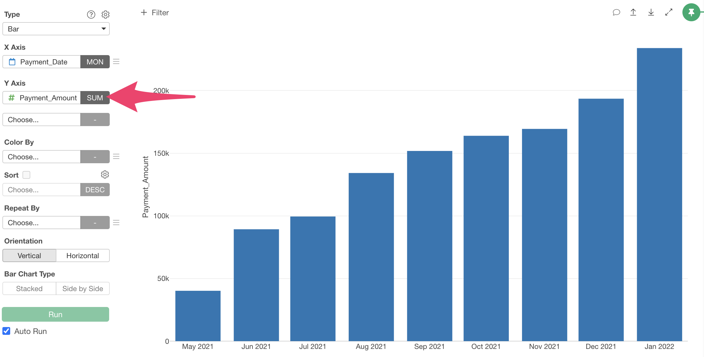
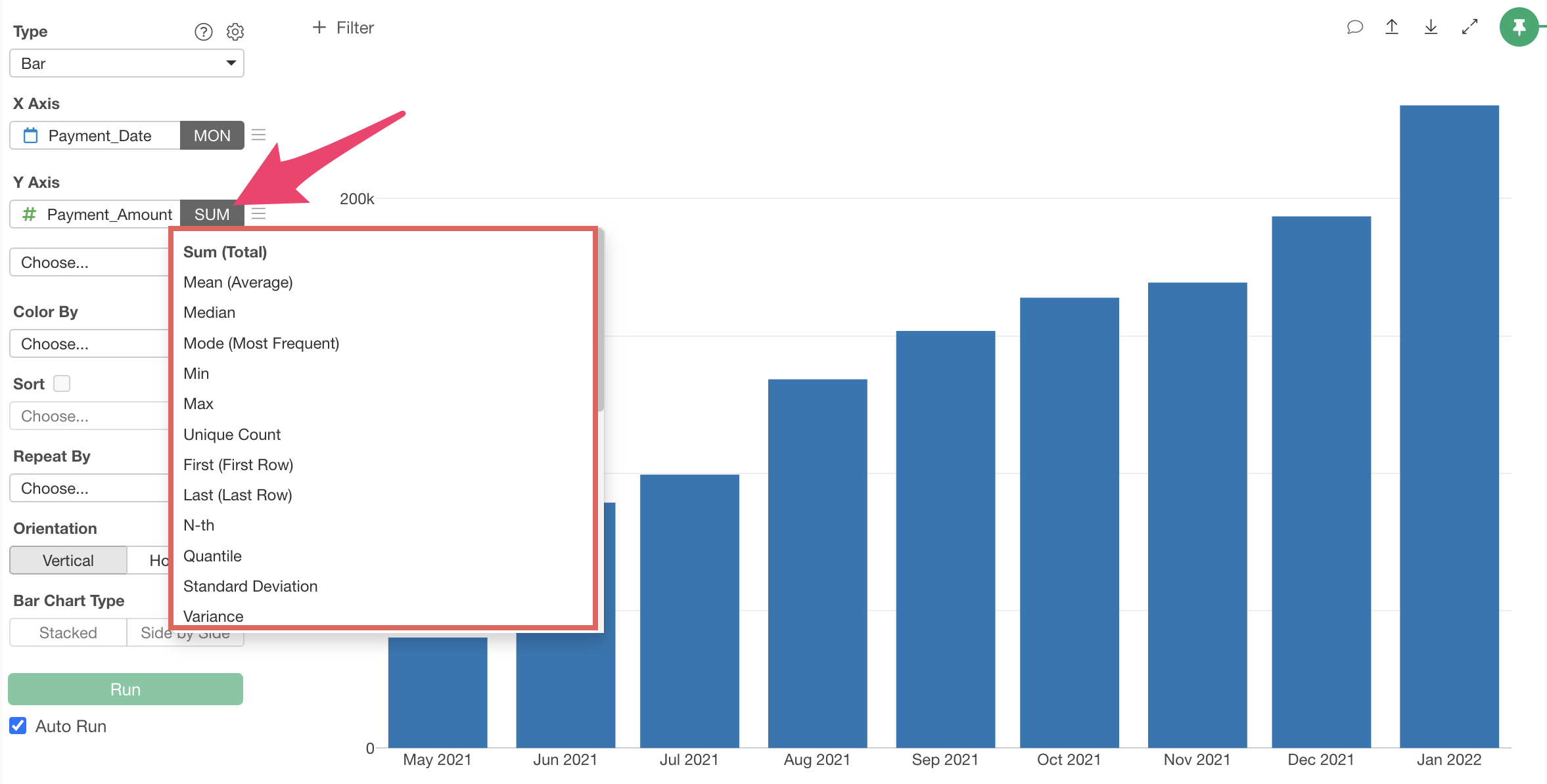
Note that you can change the aggregation function by clicking on “SUM” next to “Payment Amount.”
The default aggregation function is “SUM,” so we don’t need to change it this time.
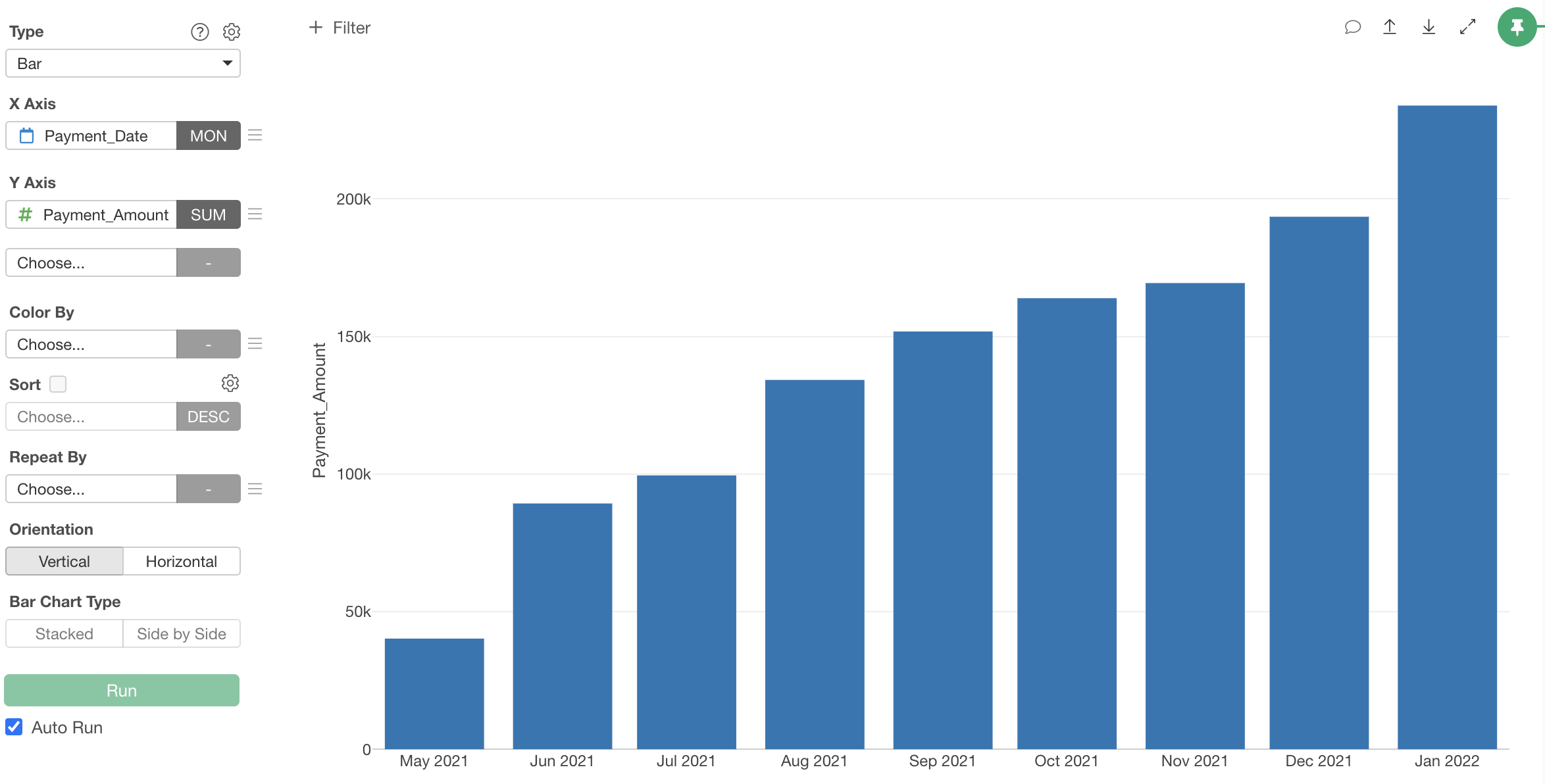
Now we’ve aggregated “Payment Amount” by month and visualized MRR (Monthly Recurring Revenue).
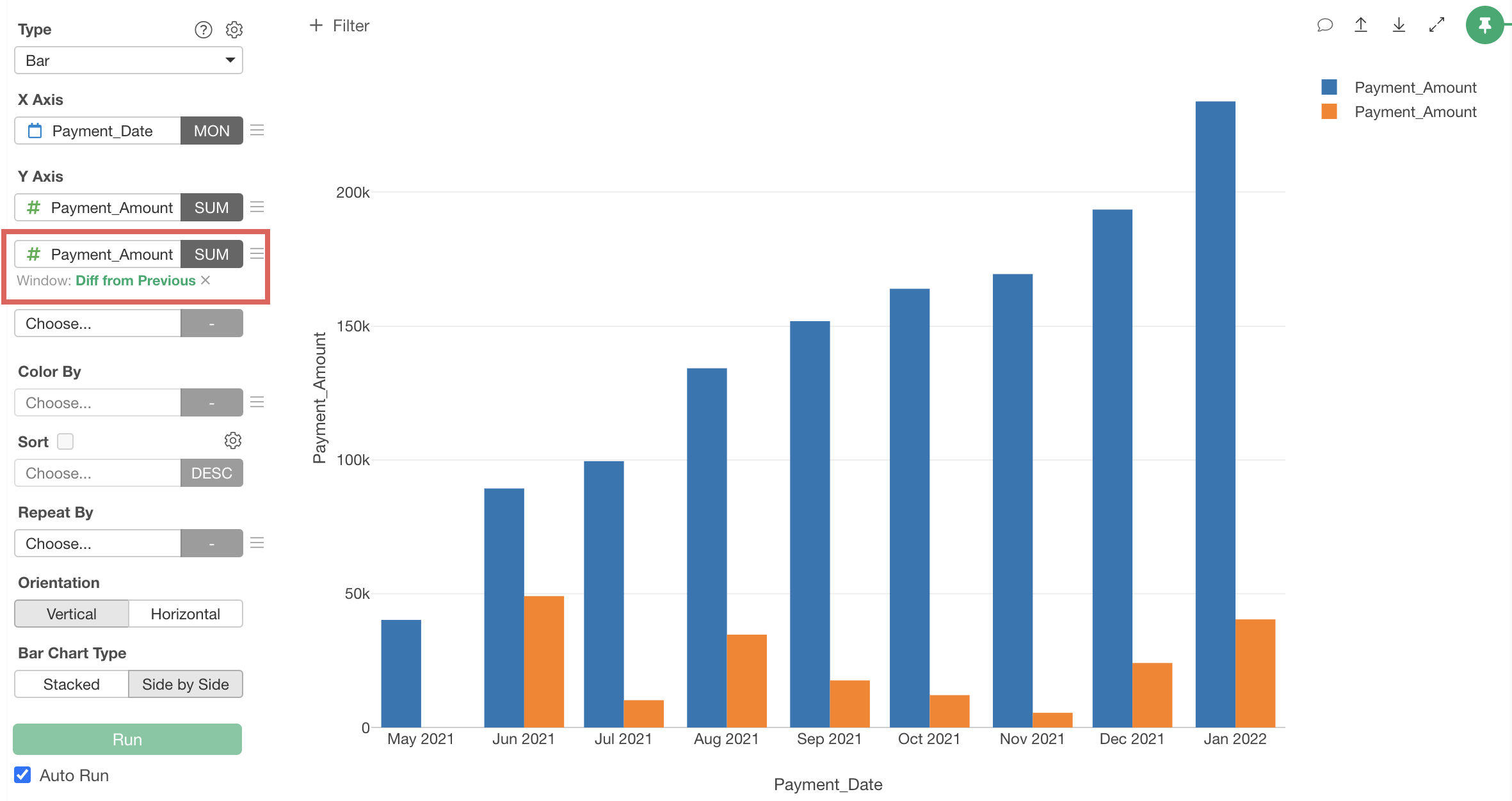
2. MRR Growth Amount from the Previous Month
Next, let’s visualize how much MRR has increased or decreased compared to the previous month.
Since we want to visualize the growth amount along with MRR, select “Payment Amount” for the second value of the Y-axis and select “SUM” as the aggregation function.
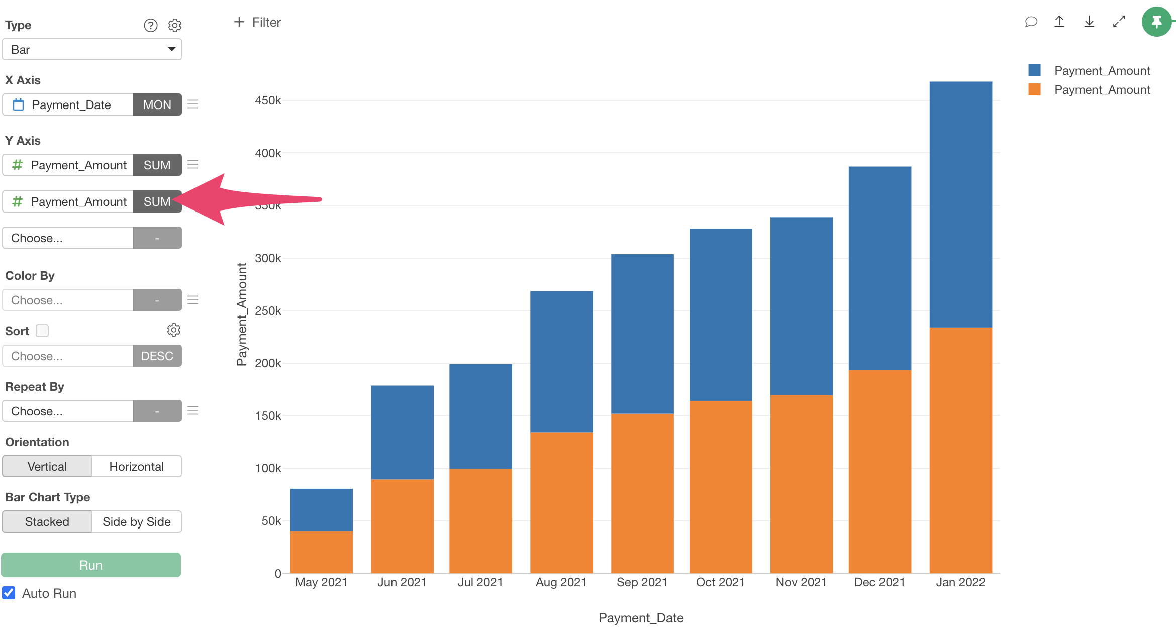
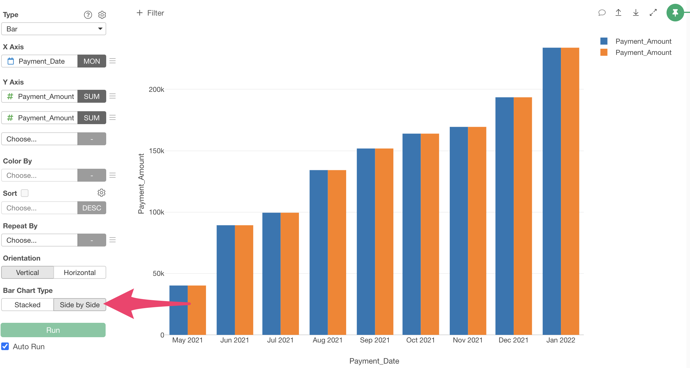
When you select a column for the second Y-axis, the “Bar Chart Type” defaults to “Stacked.”
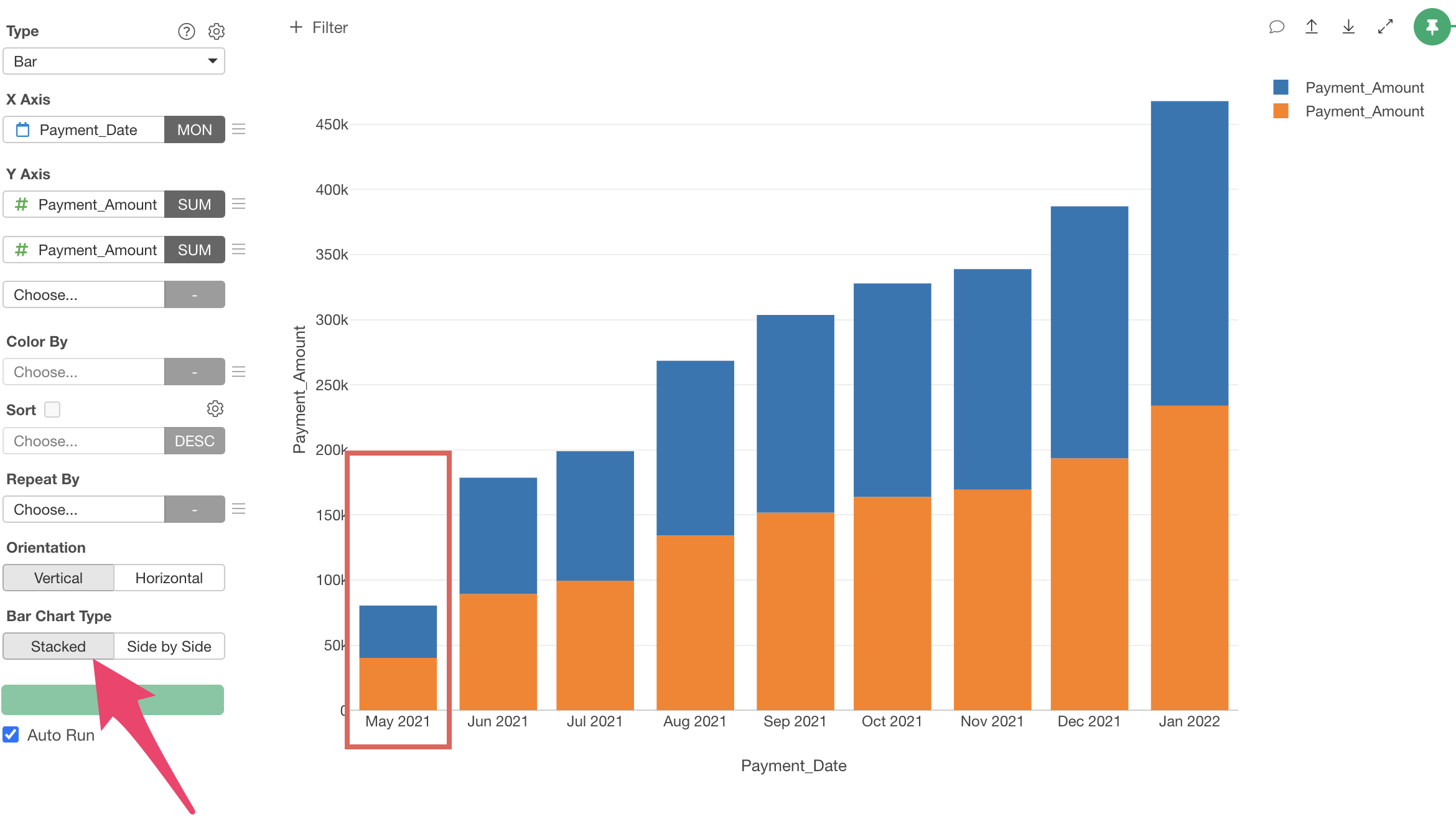
Since we want to display the first Y-axis “MRR” and the second Y-axis “Difference from Previous Month” side by side, change the “Bar Chart Type” to “Side by Side.”
Next, from the menu of the second Y-axis value, select “Window Calculation,” then “Difference from Previous.”

Now we’ve visualized the “MRR Growth Amount from Previous Month,” which is the difference from the previous value.
Finally, let’s refine the chart by changing the “Y-axis Title” and “Color (Legend)” names.
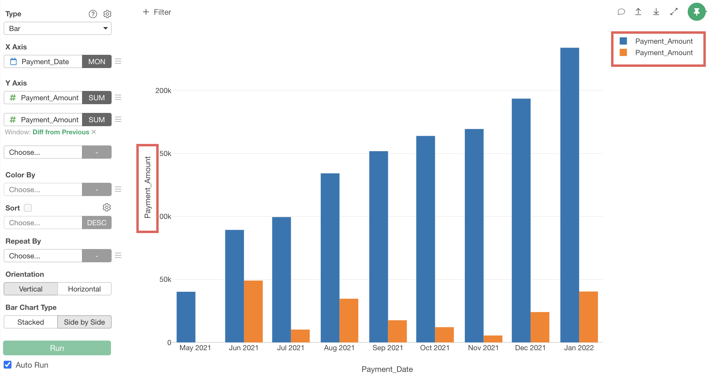
“Y-axis Title,” can be changed from the “Settings” dialog that appear when you click the gear icon next to the chart type.
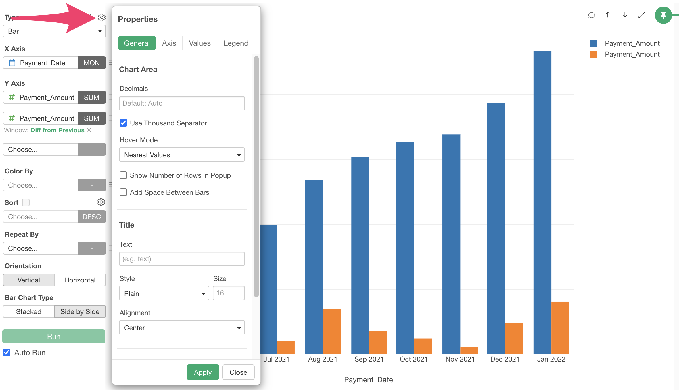
To change the “Y-axis Title,” move to the “Axis” tab and select “Y-axis.”
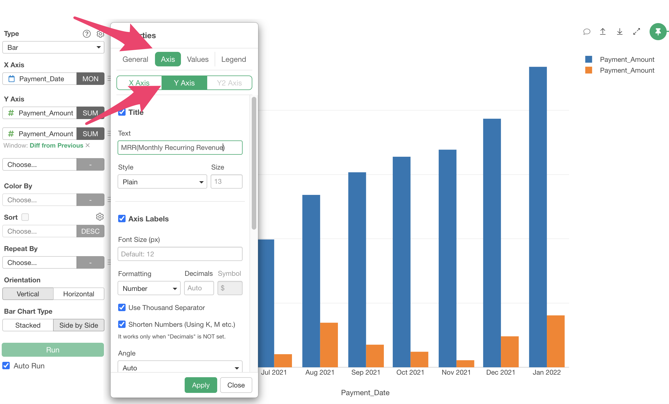
Change the title text to “MRR (Monthly Recurring Revenue)” and click the “Apply” button.
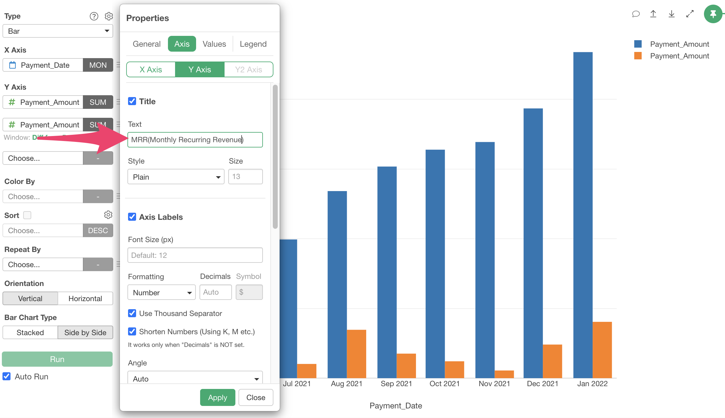
The Y-axis title has been changed.

Next, to change the “Color (Legend),” select the menu from “Color By” and select “Color, Group, Order.”

Change the “Display Name” of the legend and click the “Apply” button.
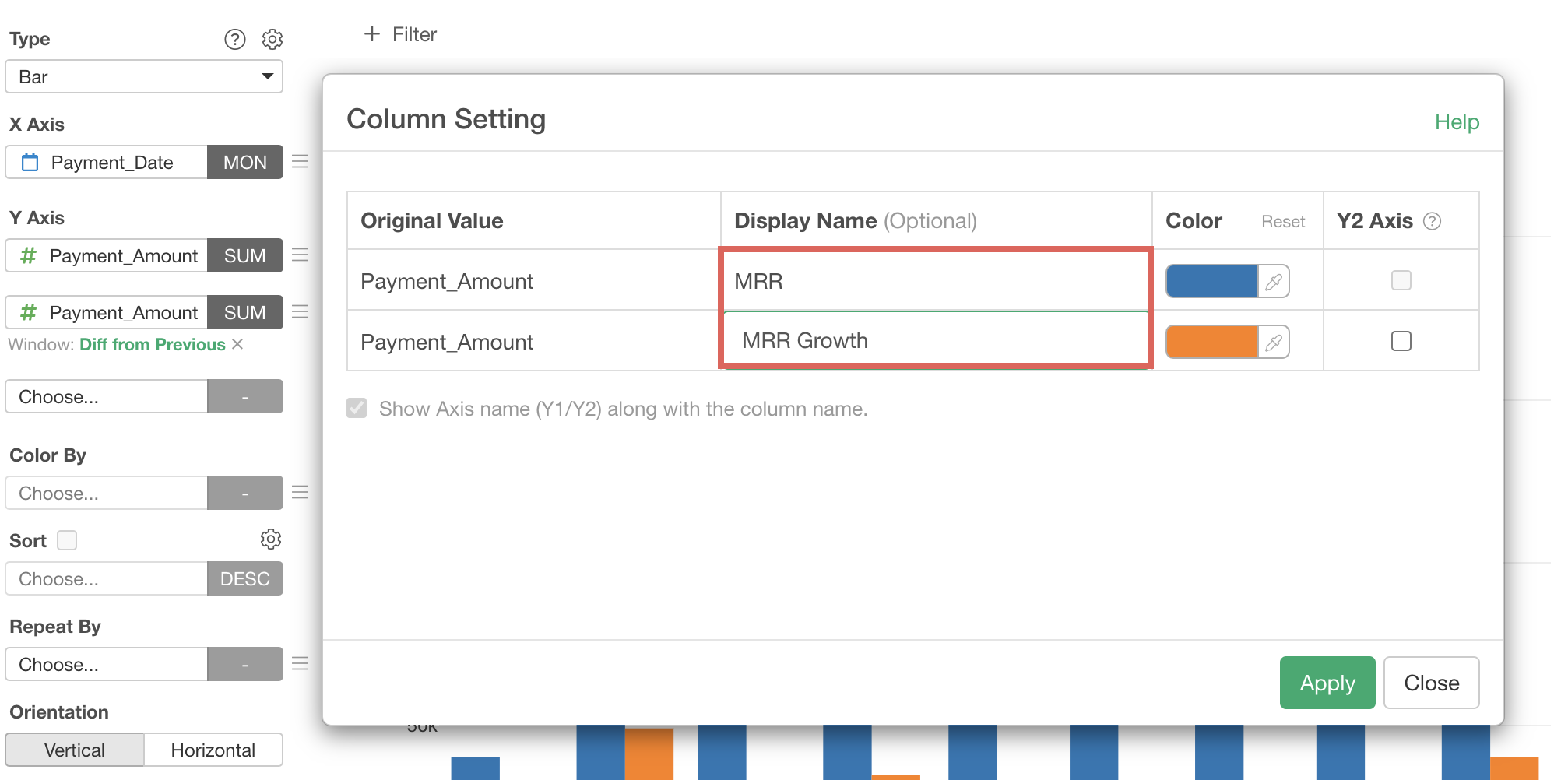
The chart has been refined.
3. Retention Rate / Cancellation Rate
Finally, let’s visualize the retention rate, which is arguably the most important metric for subscription-based businesses.
Retention rate is the percentage of existing customers who continued the service in the following month.

Since the retention rate is not included in our data, we need to calculate it based on the payment data.
The method to calculate the retention rate is simple. First, aggregate the “Number of Customers” and “Number of Continuing Customers” for each month as follows:
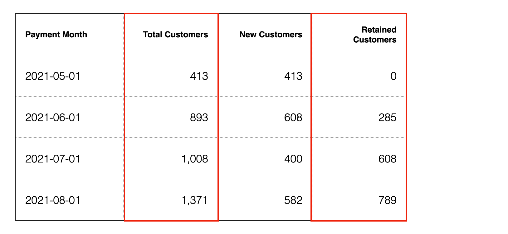
Then, calculate the ratio of “Number of Continuing Customers” to
“Number of Customers in the Previous Month.”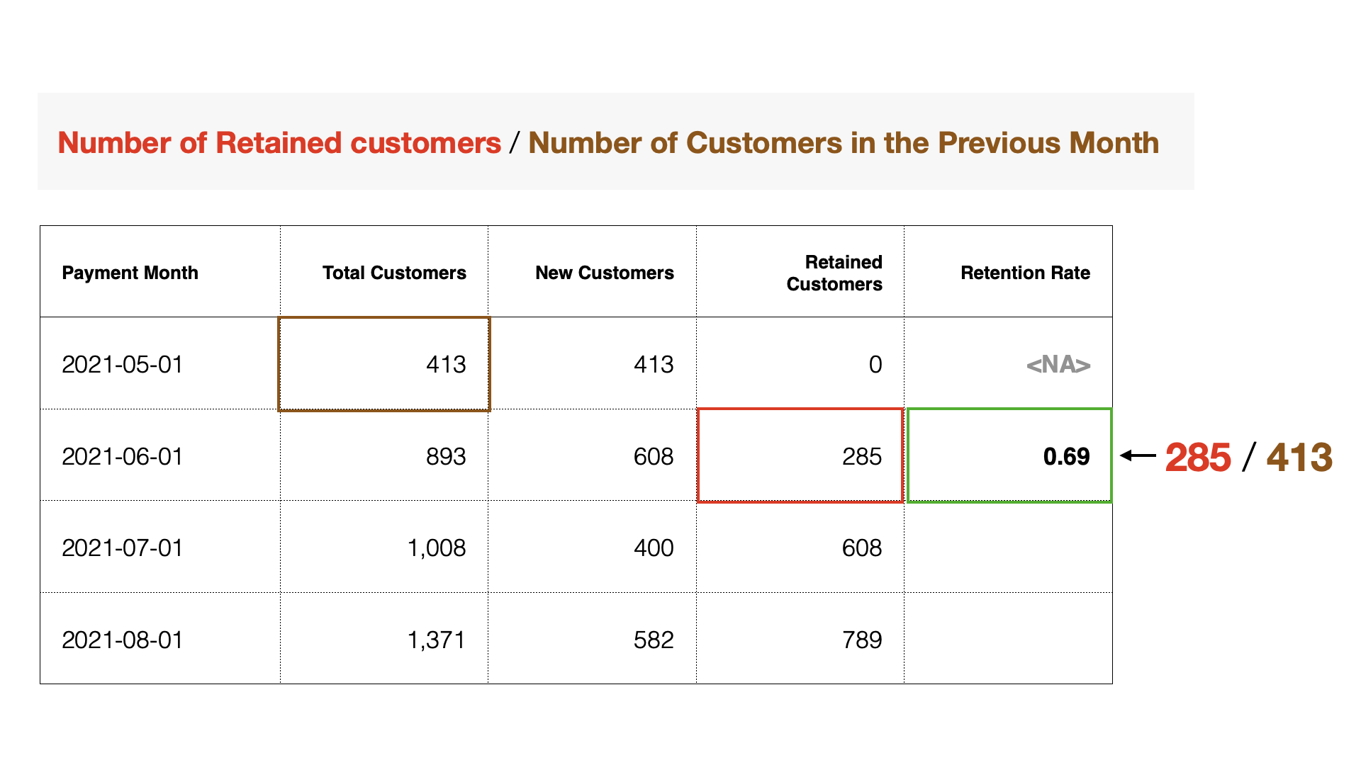 To
process data, move to the “Summary View” or “Table View.” This time,
we’ll process the data from the “Table View.”
To
process data, move to the “Summary View” or “Table View.” This time,
we’ll process the data from the “Table View.”
In this note, we’ll introduce two methods: using “AI Prompt” to process data with natural language, and using the “UI” method that anyone can use.
Calculating Retention Rate with AI Prompt
AI Prompt is a menu available only to users with paid licenses such as Business or Personal plans and their trial users. It’s also a menu that appears only when your device is connected to the internet.
Therefore, if you don’t have one of these plans or are using a device not connected to the internet, please refer to the “Calculating Retention Rate with UI” section.
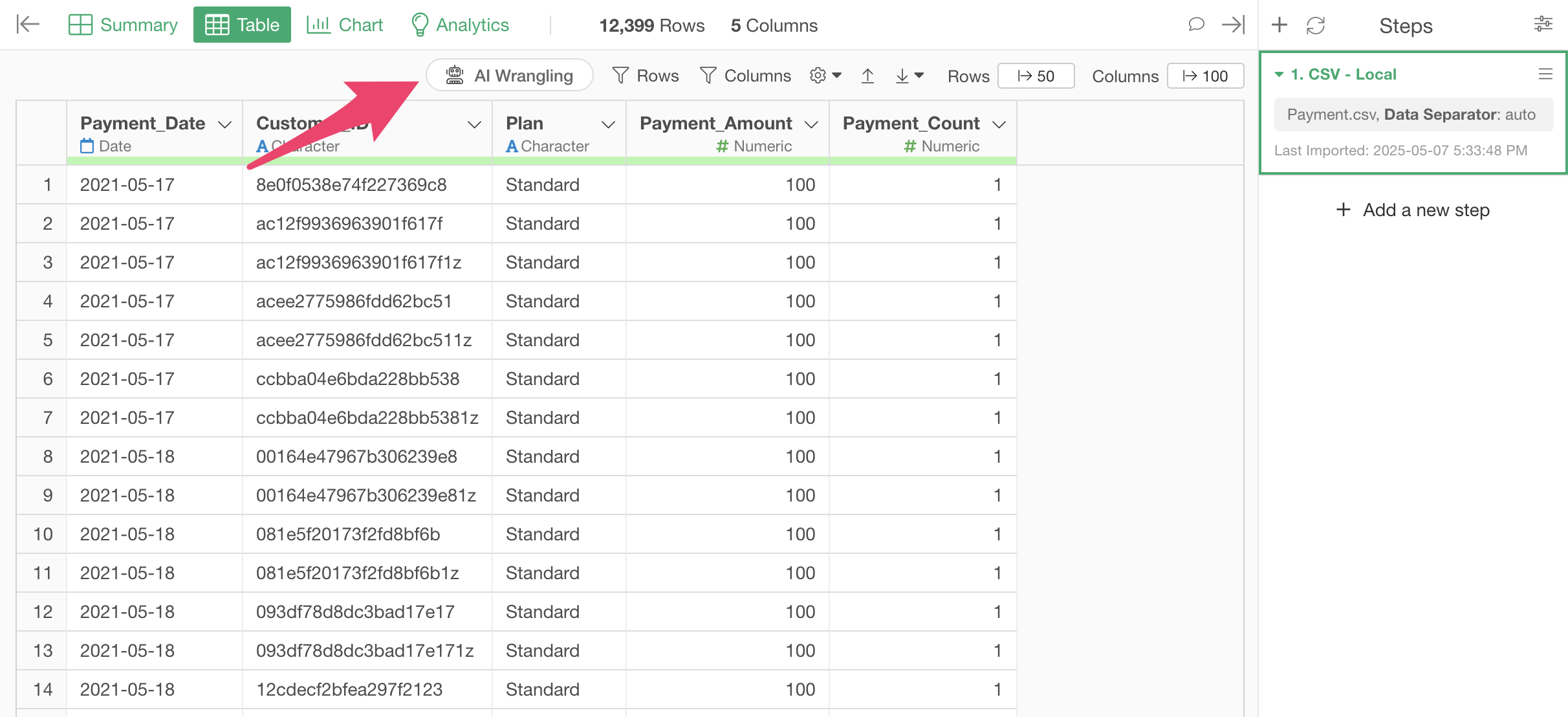
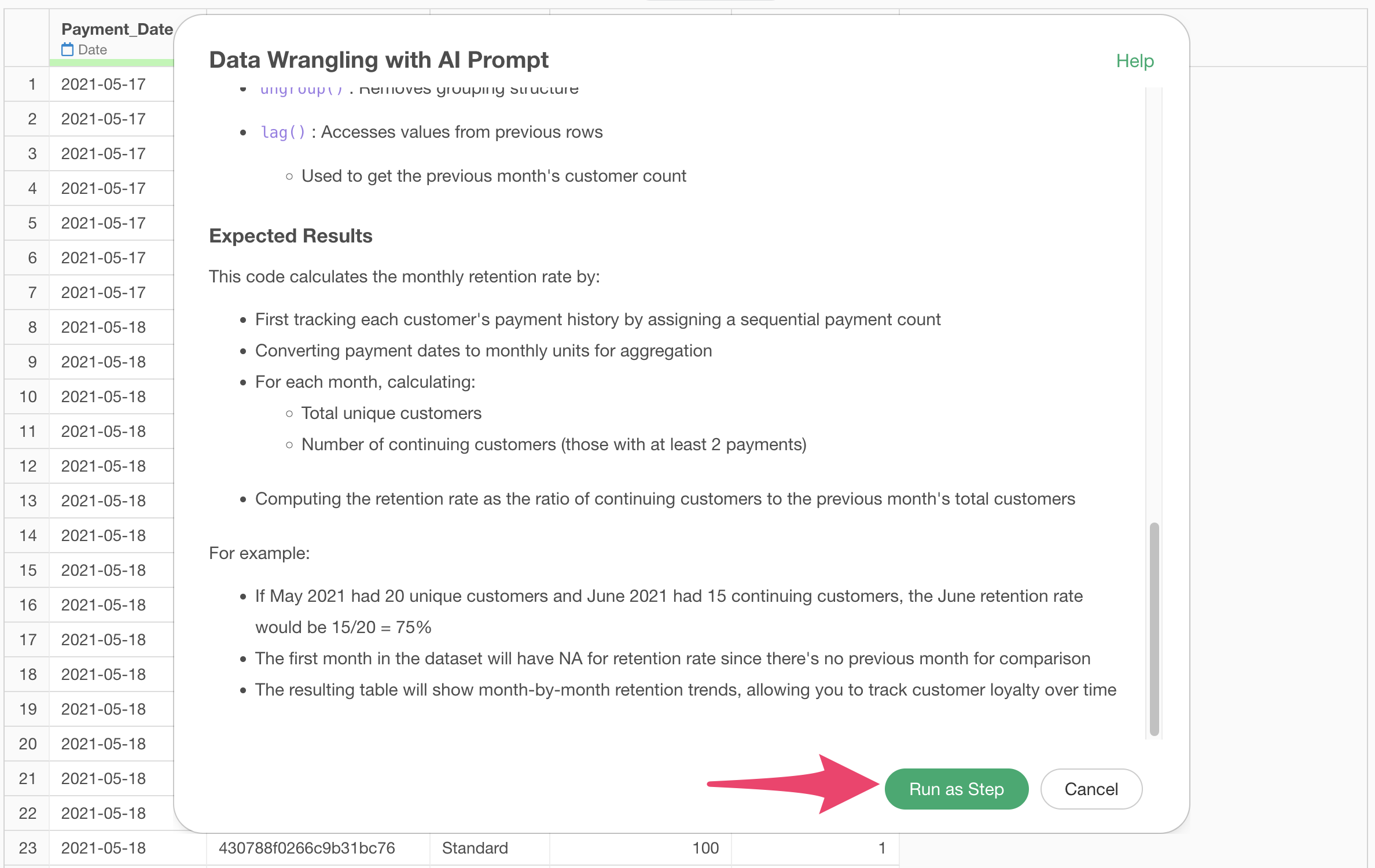
To calculate the retention rate with AI Prompt, click the “AI Wrangling” button.
When the AI Prompt dialog appears, enter text like the following and execute:
Calculate retention rate by month

Code to calculate the retention rate will be generated.
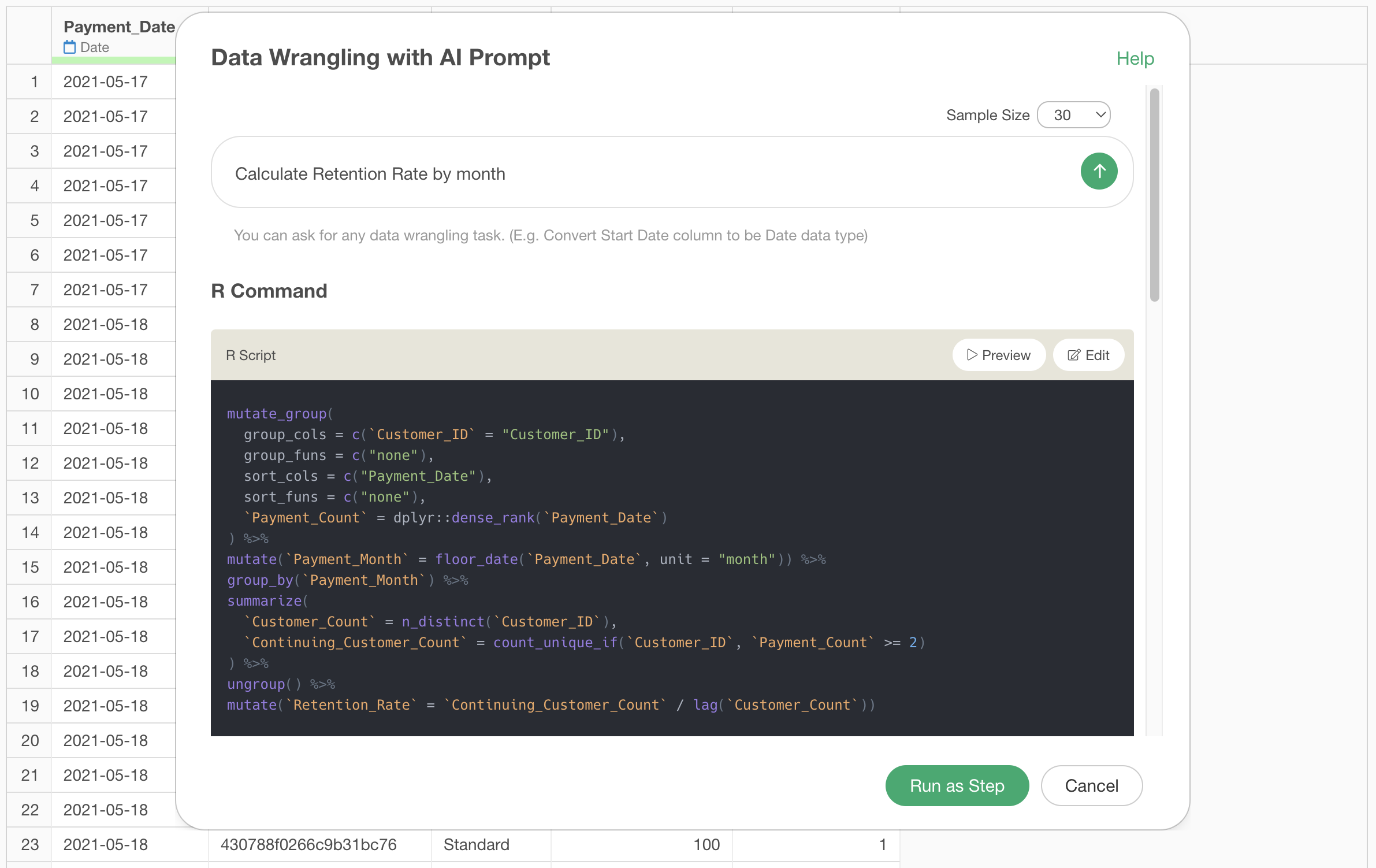
Check the explanation of the functions used and the expected results, then click the “Run as Step” button.
The step has been added, and the retention rate has been calculated.
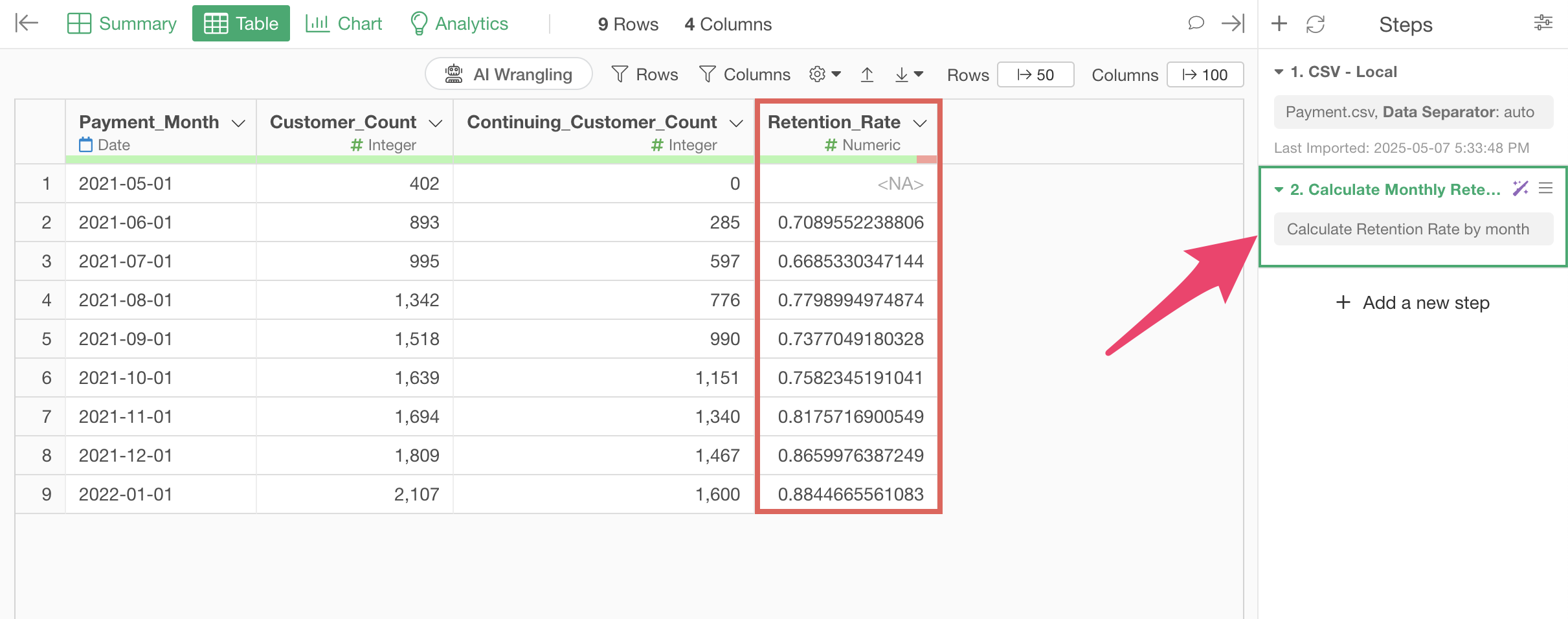
The following section will introduce how to calculate the retention rate using the “UI,” so if you’ve completed this process, please proceed to the “Visualizing Retention Rate Trends” section.
Calculating Retention Rate with UI
Clicking the “∨” icon next to the column name displays a menu for processing and aggregating data.
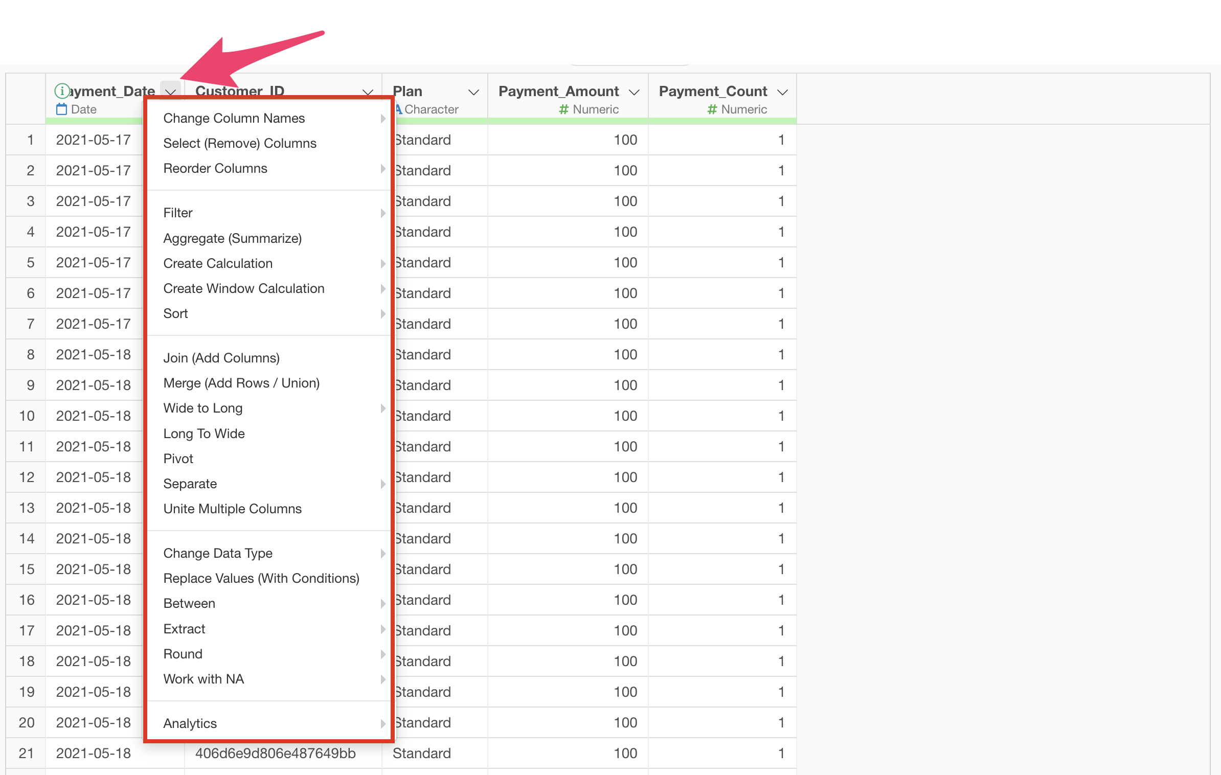
Since we want to aggregate the number of customers by “Payment Date
(Month),” select “Aggregate (Summarize)” from the column header menu of
“Payment Date.”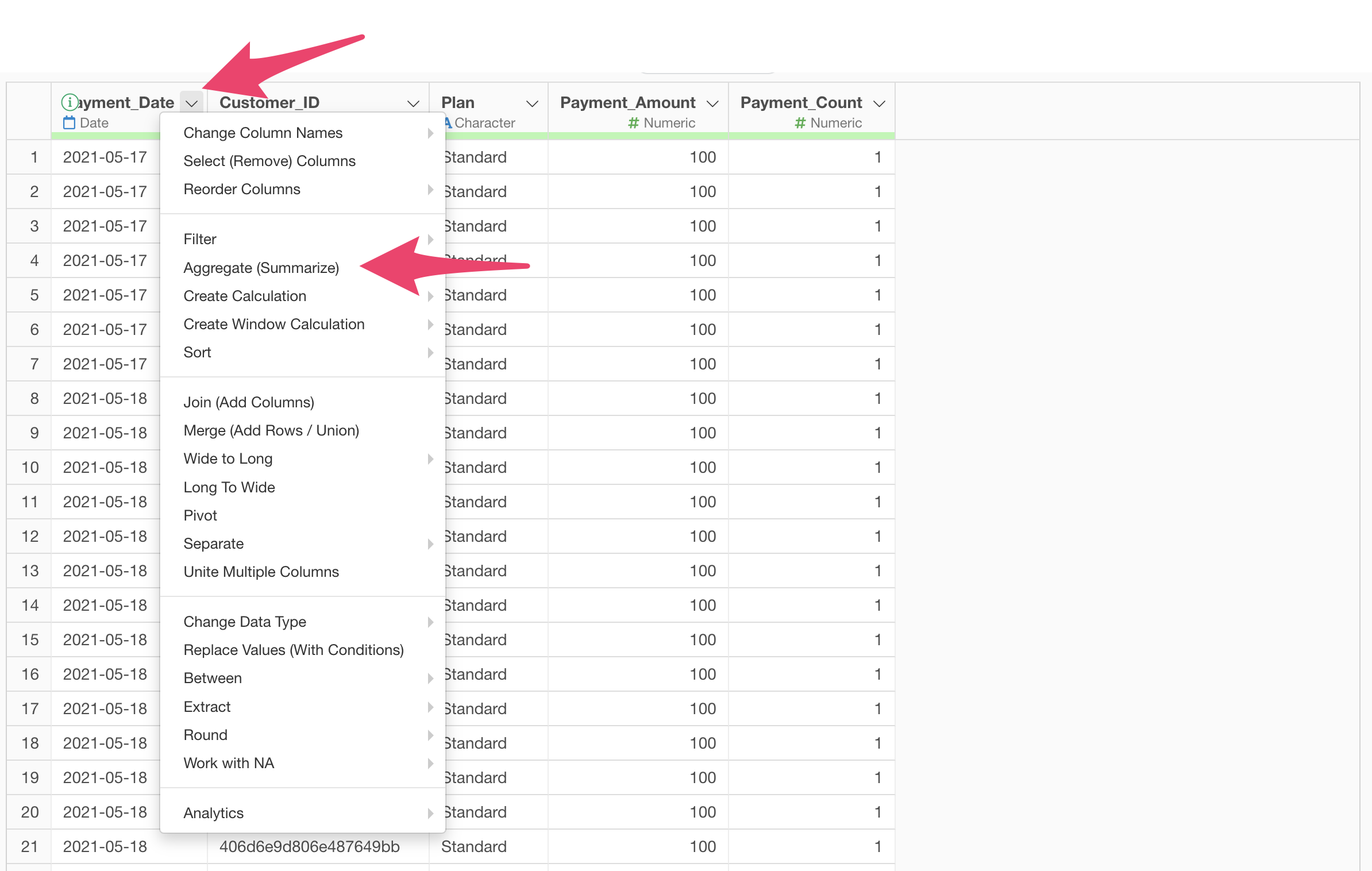
A dialog for aggregation will appear.

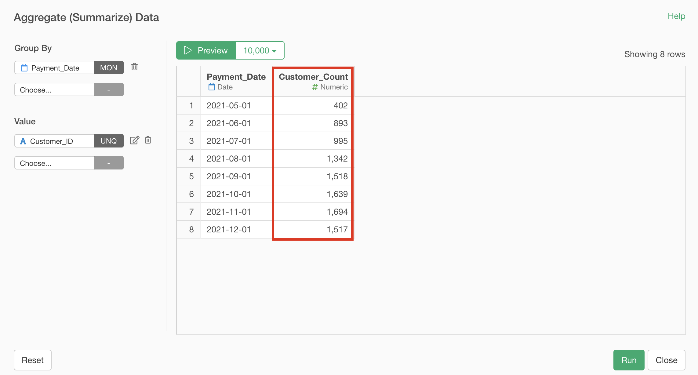
Since we want to aggregate the number of customers “by month,” select “Payment Date” for the group and “Month” for rounding.
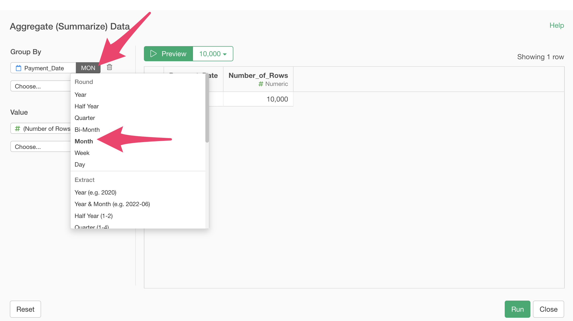
To find the number of customers, we need to count the unique number of “Customer IDs” (how many different Customer IDs there are), so select “Customer ID” for the value and “Unique Count” for the aggregation function.

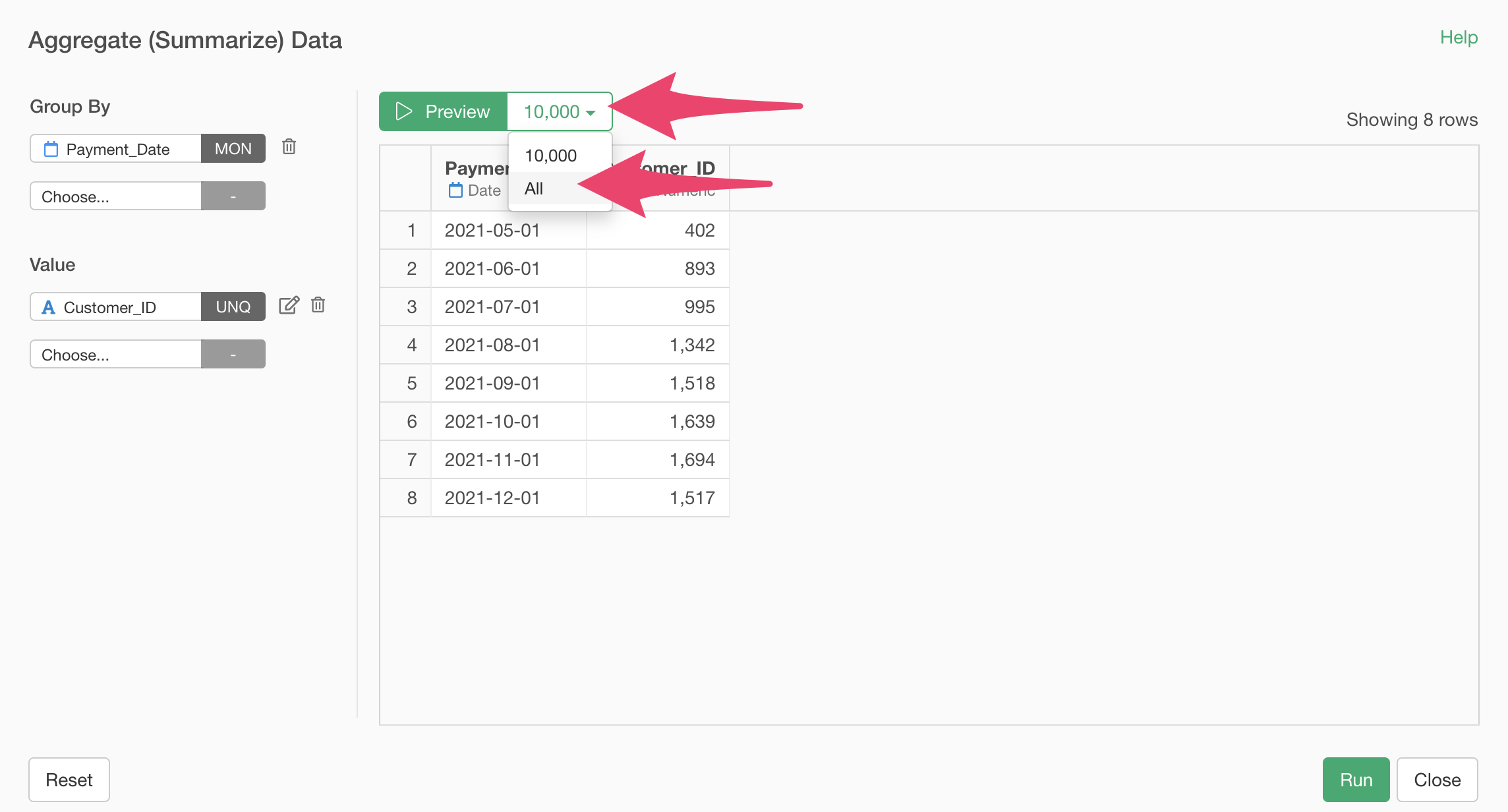
Click the “Preview” button to see a preview of the aggregation results.

If there’s a large amount of data, a sampled result will be displayed as a preview.
To display a preview using all data, select “All” and click the “Preview” button.
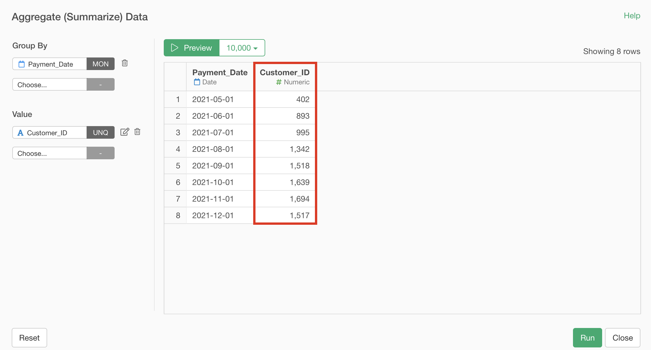
Now we’ve aggregated the number of customers, but the original column name “Customer ID” doesn’t clearly indicate that it’s a column aggregating the number of customers, so let’s change the column name to something more descriptive.
Click the value edit button and change the new column name to “Number of Customers.”
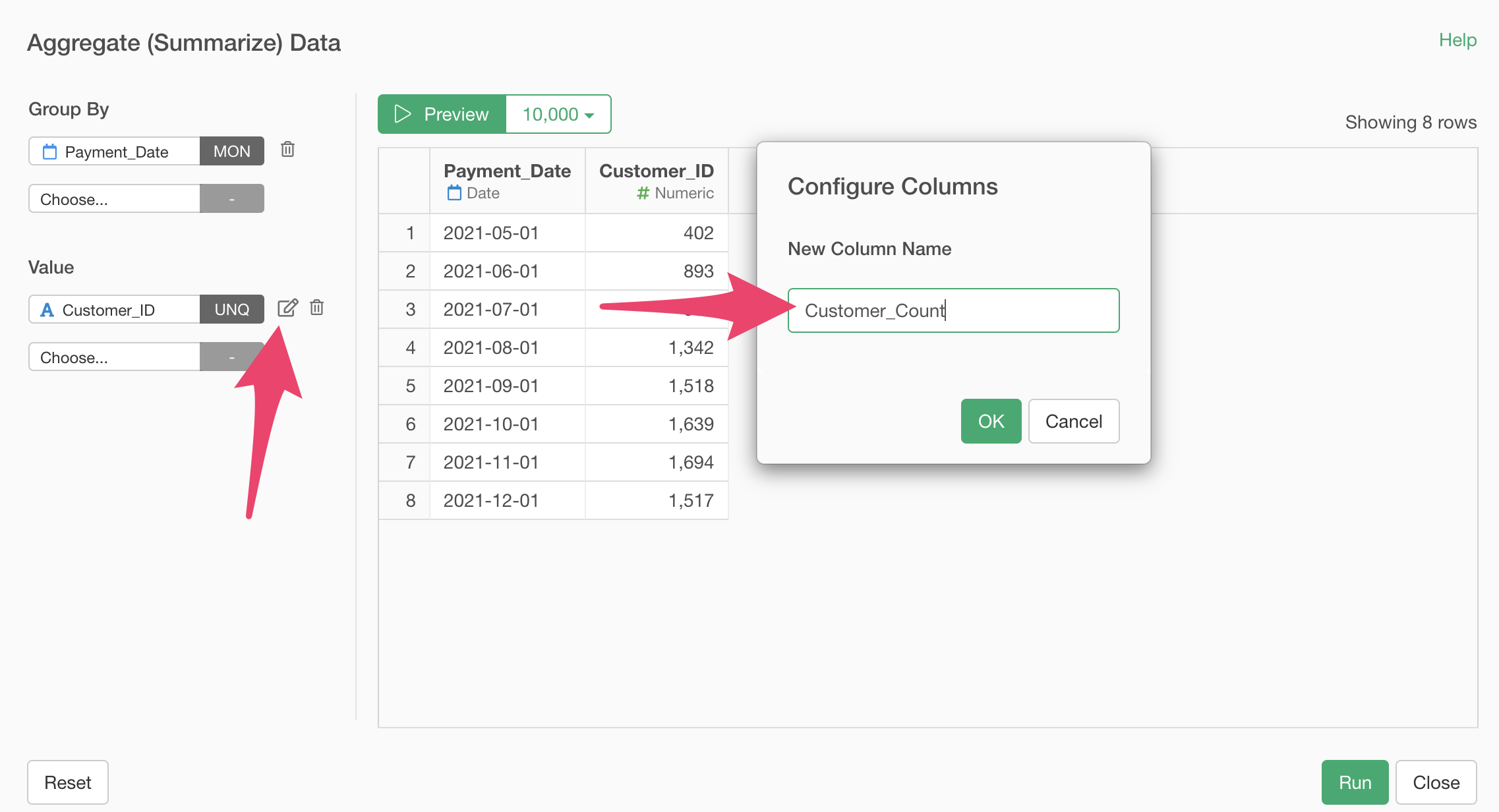
Click the “Preview” button again to confirm that the column name has been updated.
Now we’ve aggregated the number of customers.
Next, let’s calculate the “Number of Existing Customers.”
There are several ways to calculate the number of existing customers, but we can calculate it by subtracting the “Number of New Customers” from the “Total Customers.”

Since our data includes a “Number of Payments” column, we can find
the “Number of New Customers” by aggregating the number of customers
with a payment count of 1 by month. 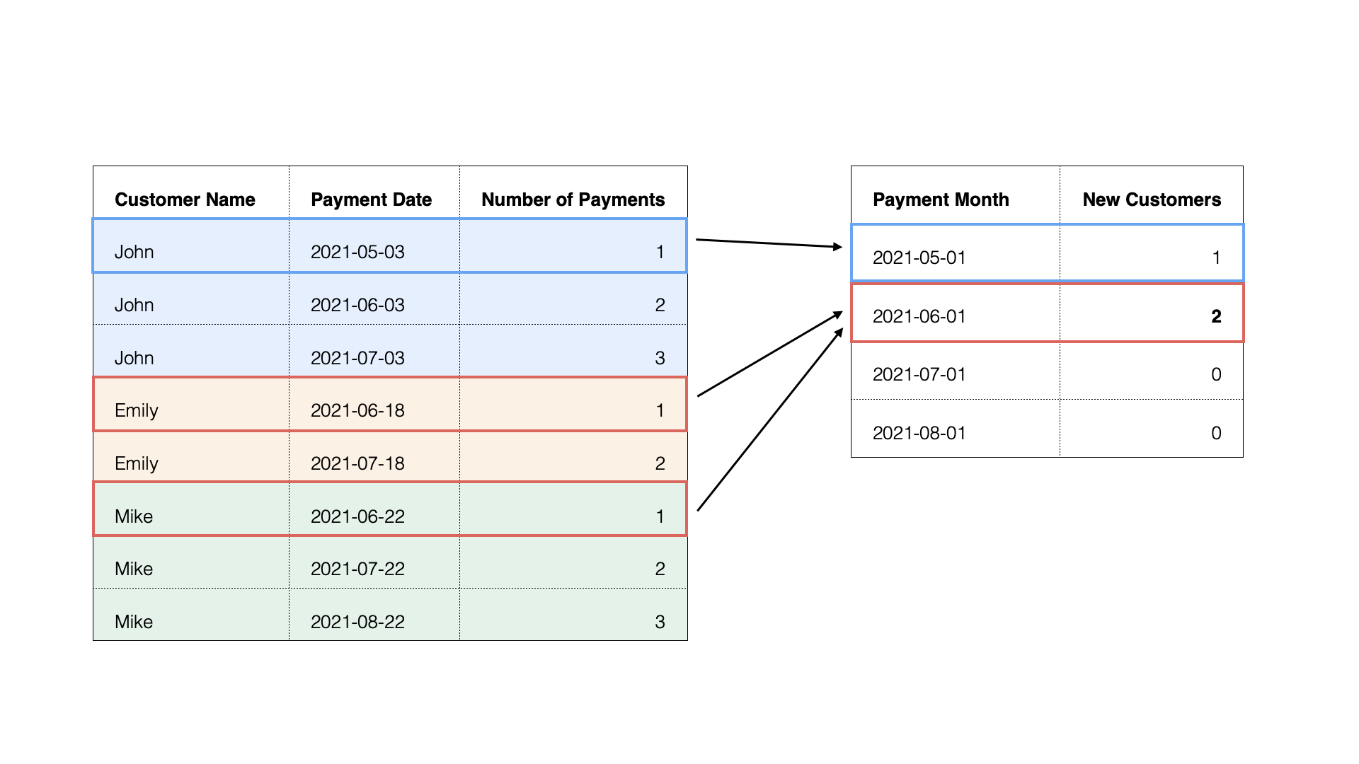 Going
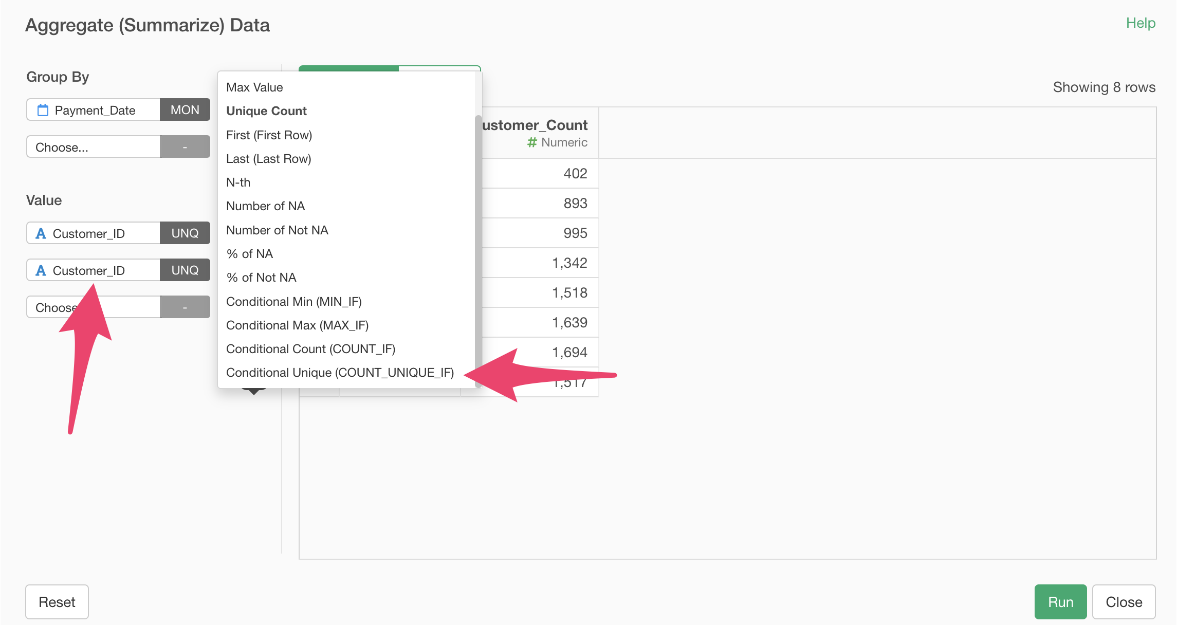
back to the aggregation dialog, add “Customer ID” to the value and
select the “COUNT_UNIQUE_IF” aggregation function, which counts unique
values that meet specific conditions.
Going
back to the aggregation dialog, add “Customer ID” to the value and
select the “COUNT_UNIQUE_IF” aggregation function, which counts unique
values that meet specific conditions.
A “Configure Column” dialog will appear to set conditions. Enter “Payment_Count” for the column, “is” for the operator, and “1” for the value.
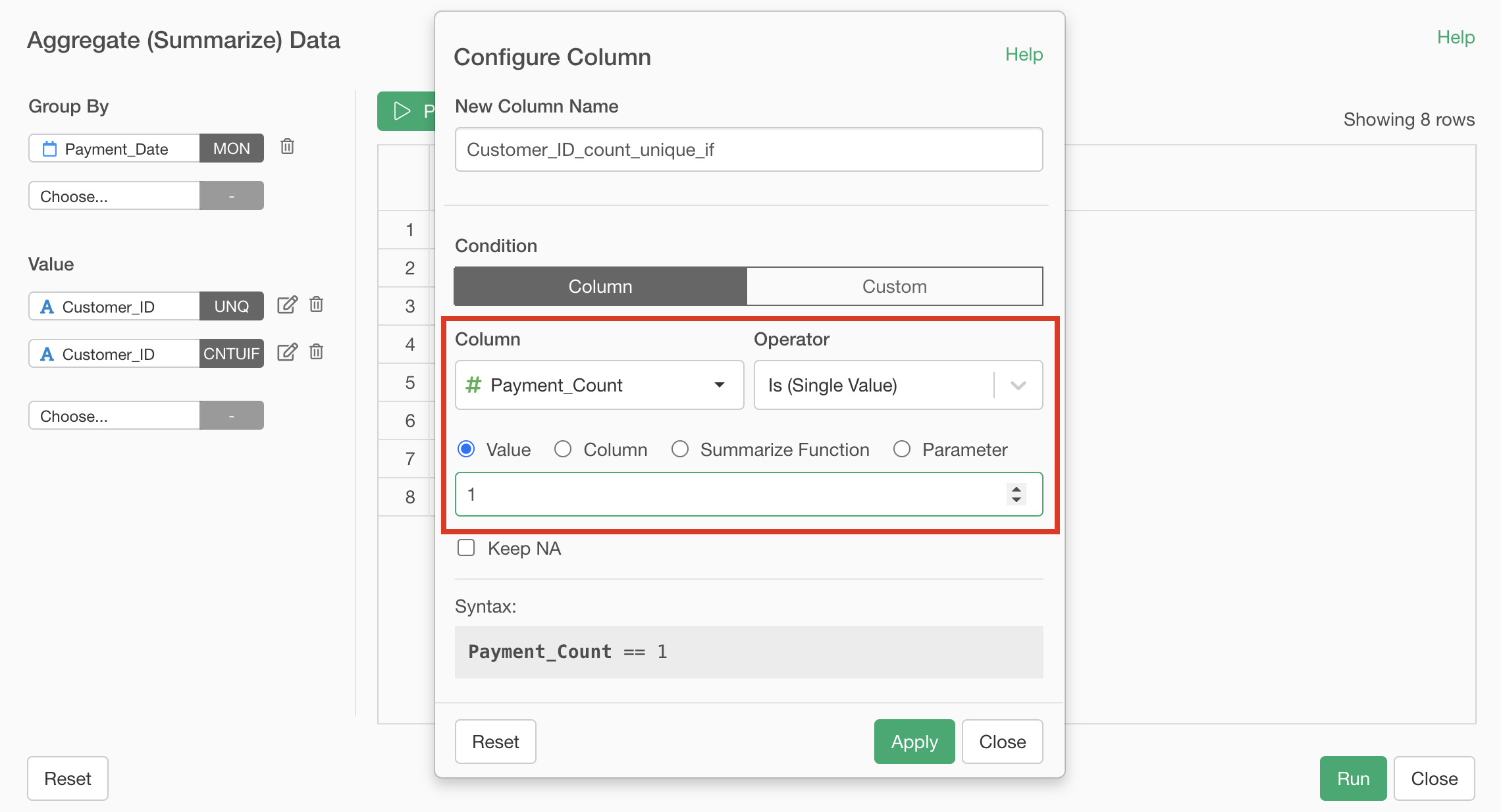
This setting allows us to count the unique number of “Customer IDs” with a “Number of Payments” of 1.
Next, enter “Number of New Customers” for the new column name and apply.
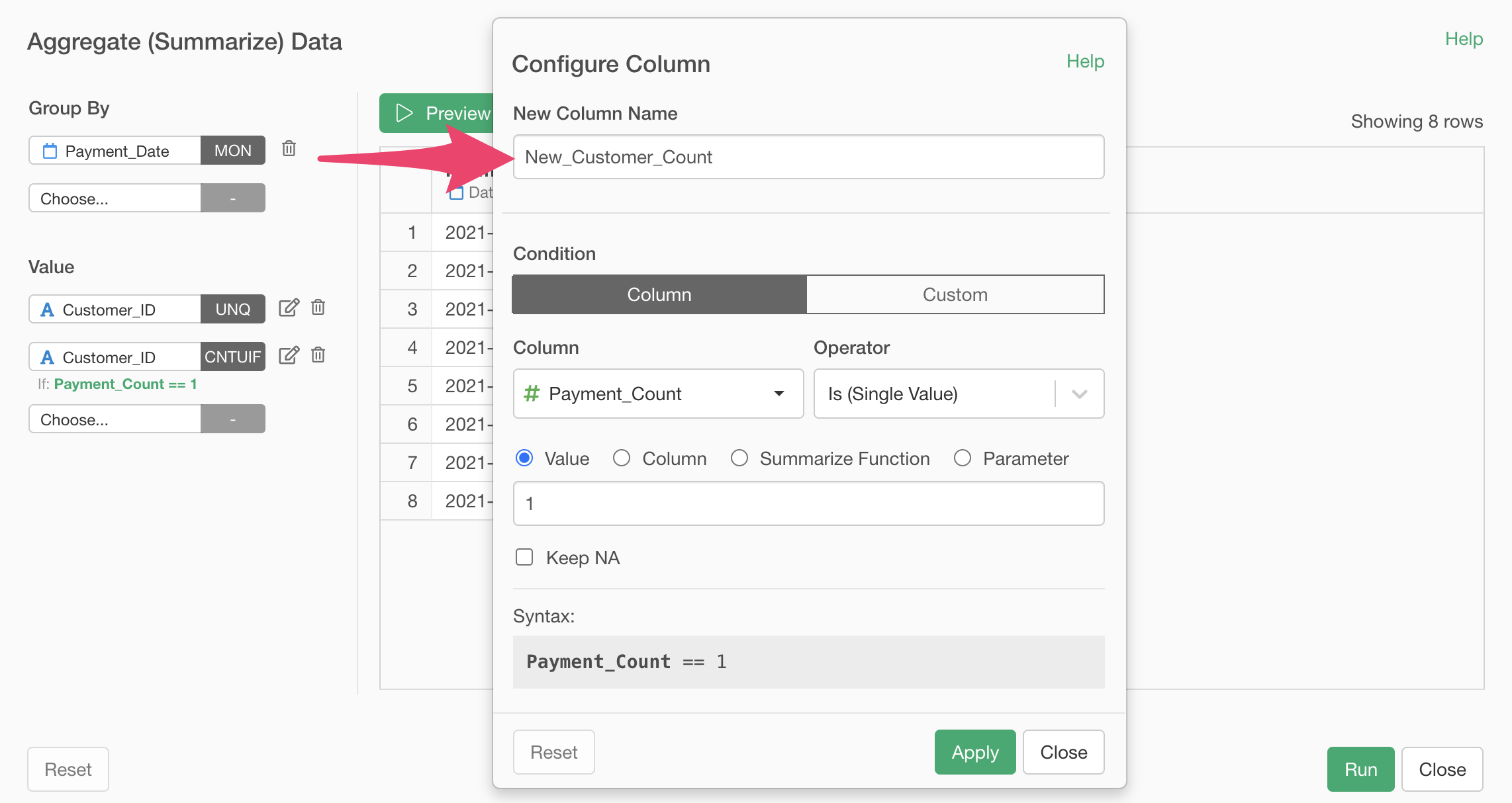
Click the preview button to confirm that the “Number of New Customers” has been aggregated, then click the execute button.
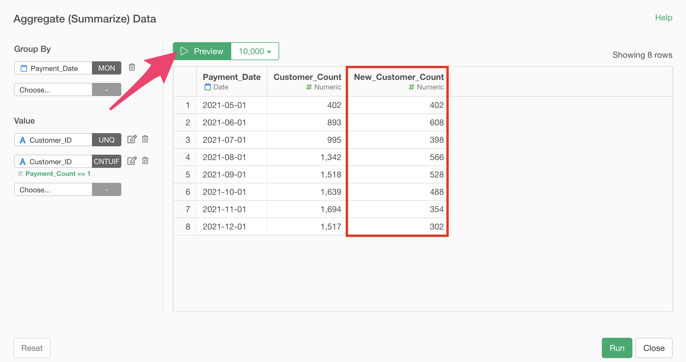
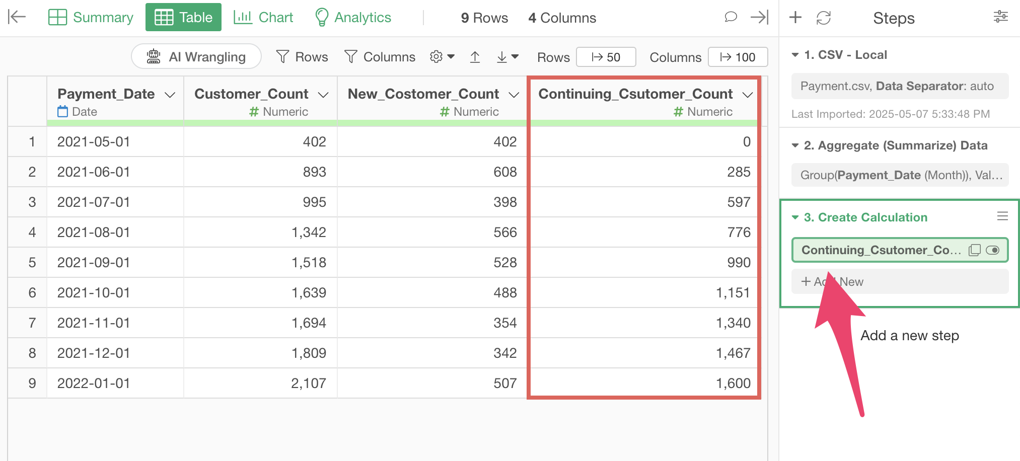
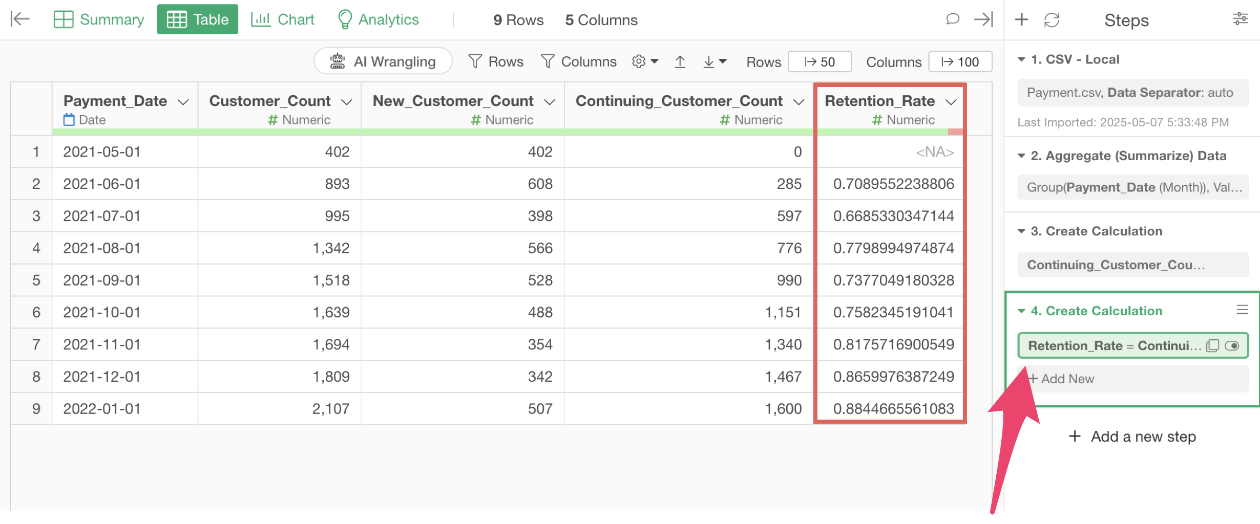
The data processing you executed is saved as a “Step,” and the data has been aggregated in the format you confirmed in the preview.
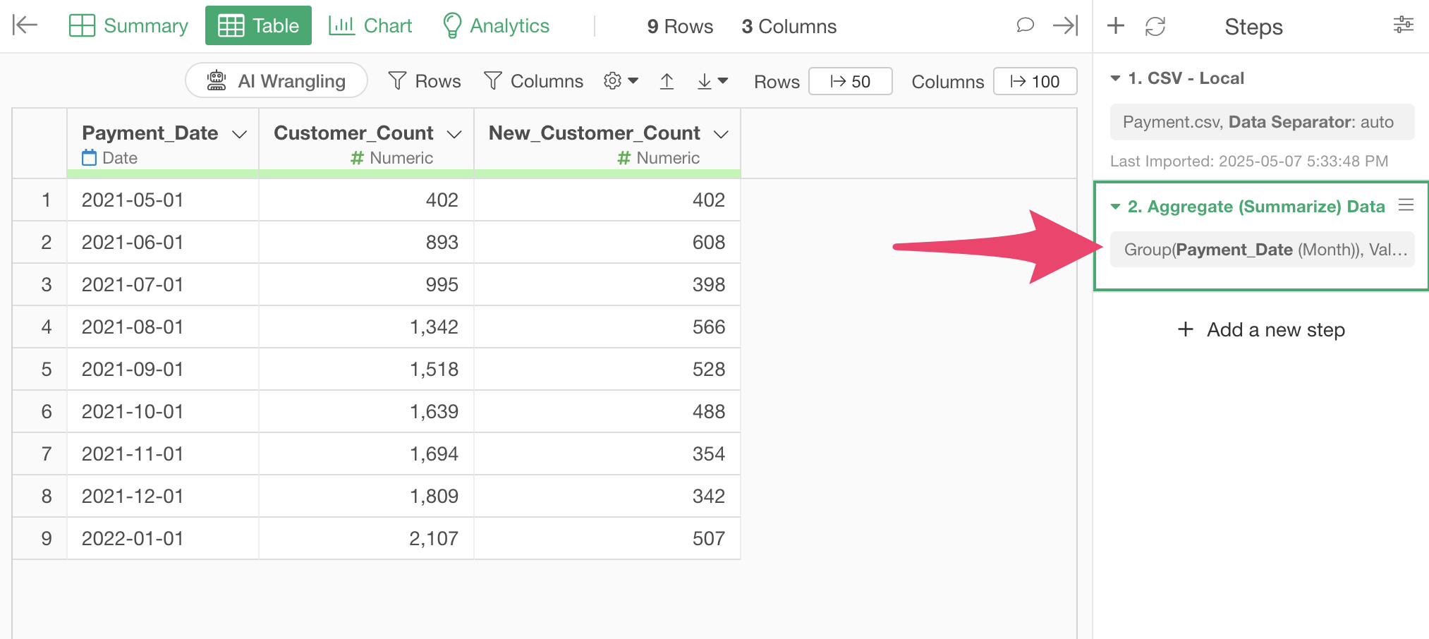
In Exploratory, all data processing and calculation processes are recorded as steps on the right side. These steps can be edited later, reordered, copied, and more.
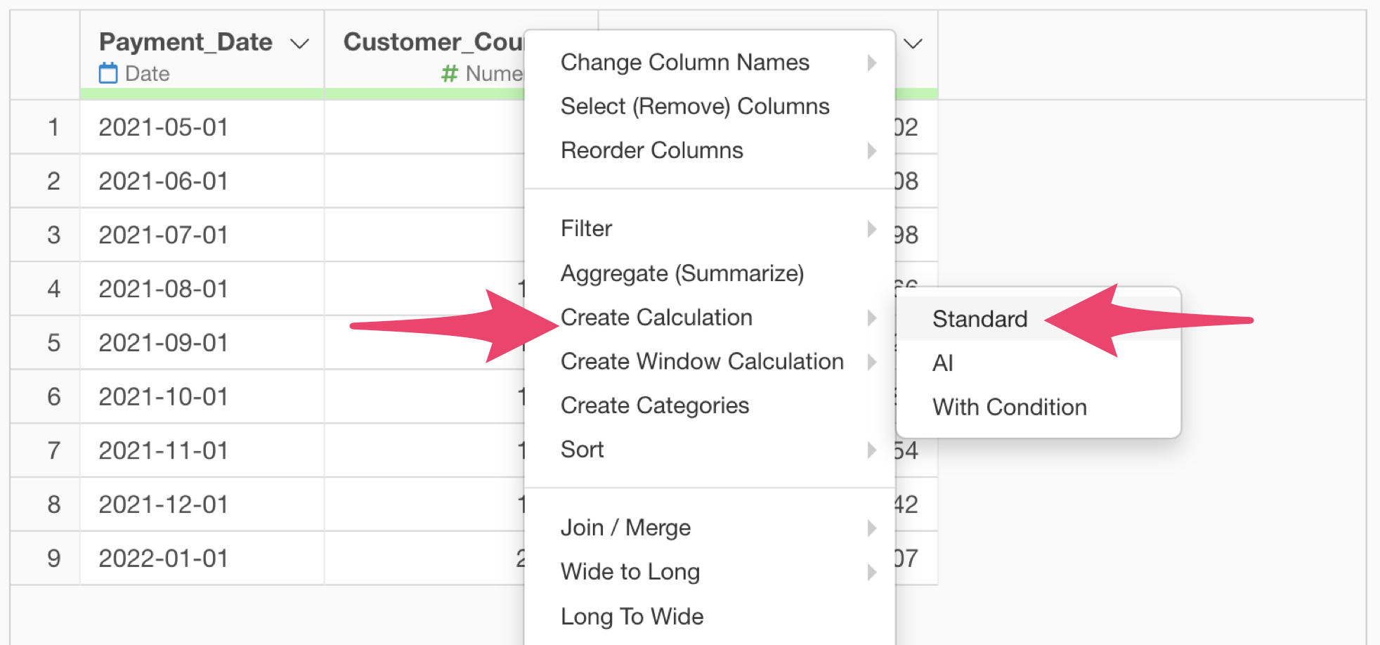
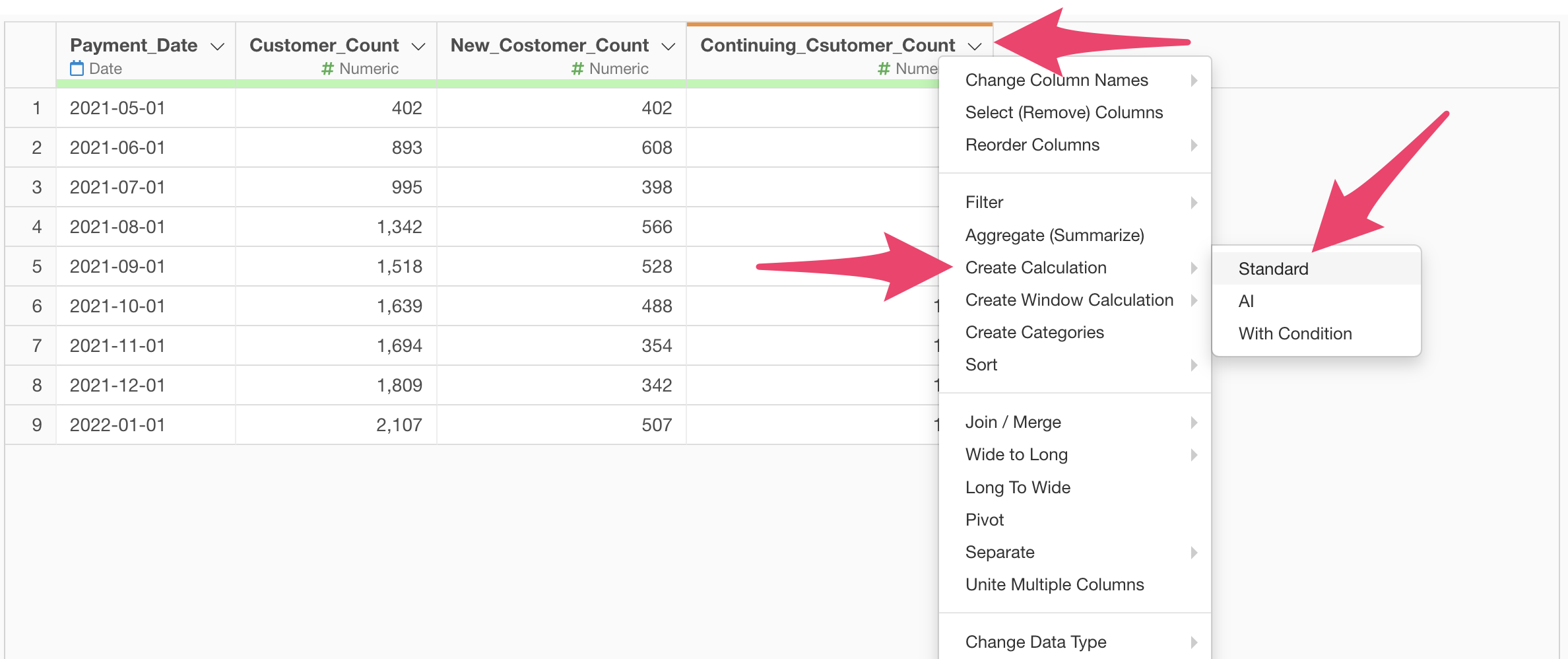
Next, let’s calculate the “Number of Continuing Customers” by subtracting the “Number of New Customers” from the “Number of Customers.” Select “Create Calculation” and “Standard” from the column header menu of “Number of Customers.”
The “Create Calculation” dialog will appear.
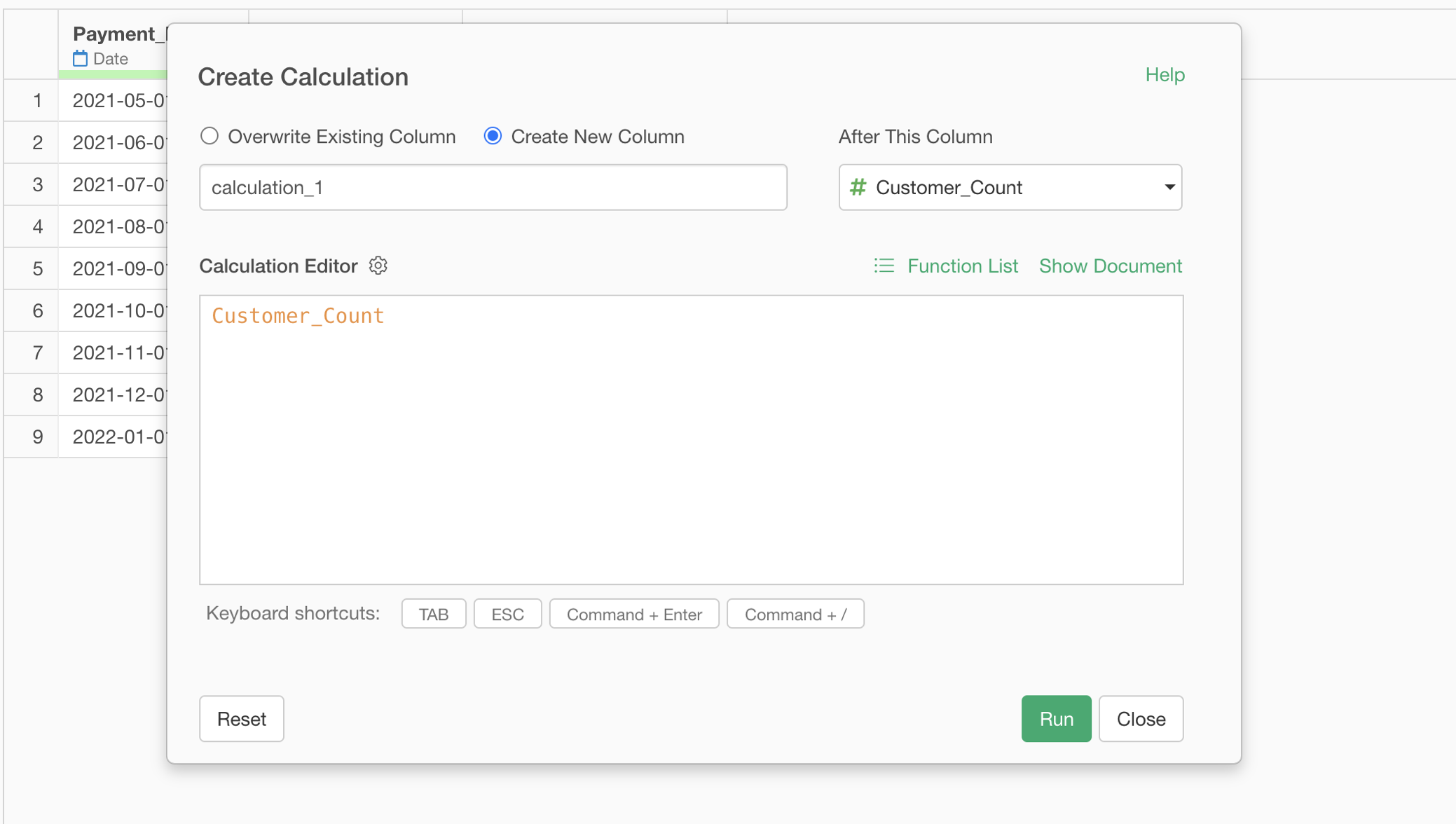
“Create Calculation” is used when you want to perform calculations “for each row.”
Since we created the calculation from the “Number of Customers” column, the “Customer_Count” column is already entered in the calculation editor. The orange color indicates that it’s a column name.
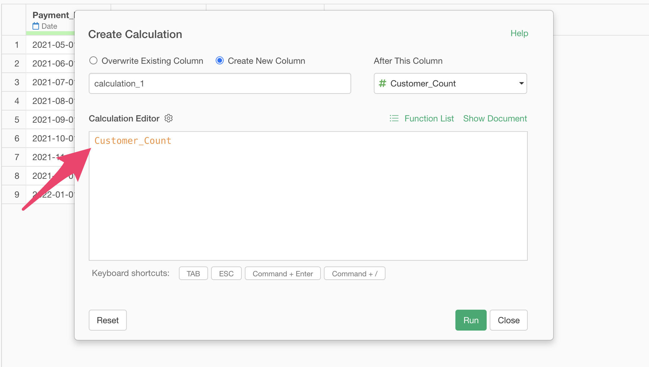
Here, we simply want to subtract the value of the “Number of New Customers” column from the value of the “Number of Customers” column, so type the following and execute:
Customer_Count - New_Customer_Count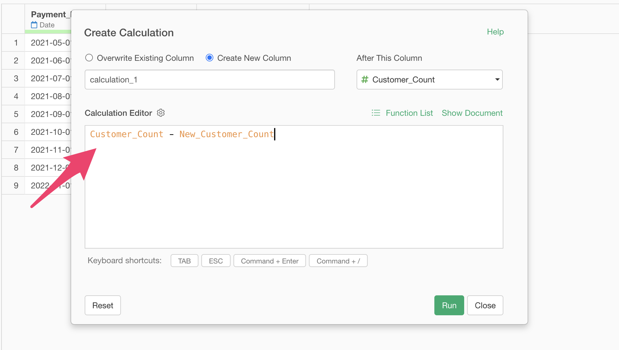
Since this calculation gives us the “Number of Continuing Customers,” select “Create a new column,” set the column name to “Continuing_Customer_Count” and click the run button.
Make sure to set “New_Customer_Count” for “After This Column” option.
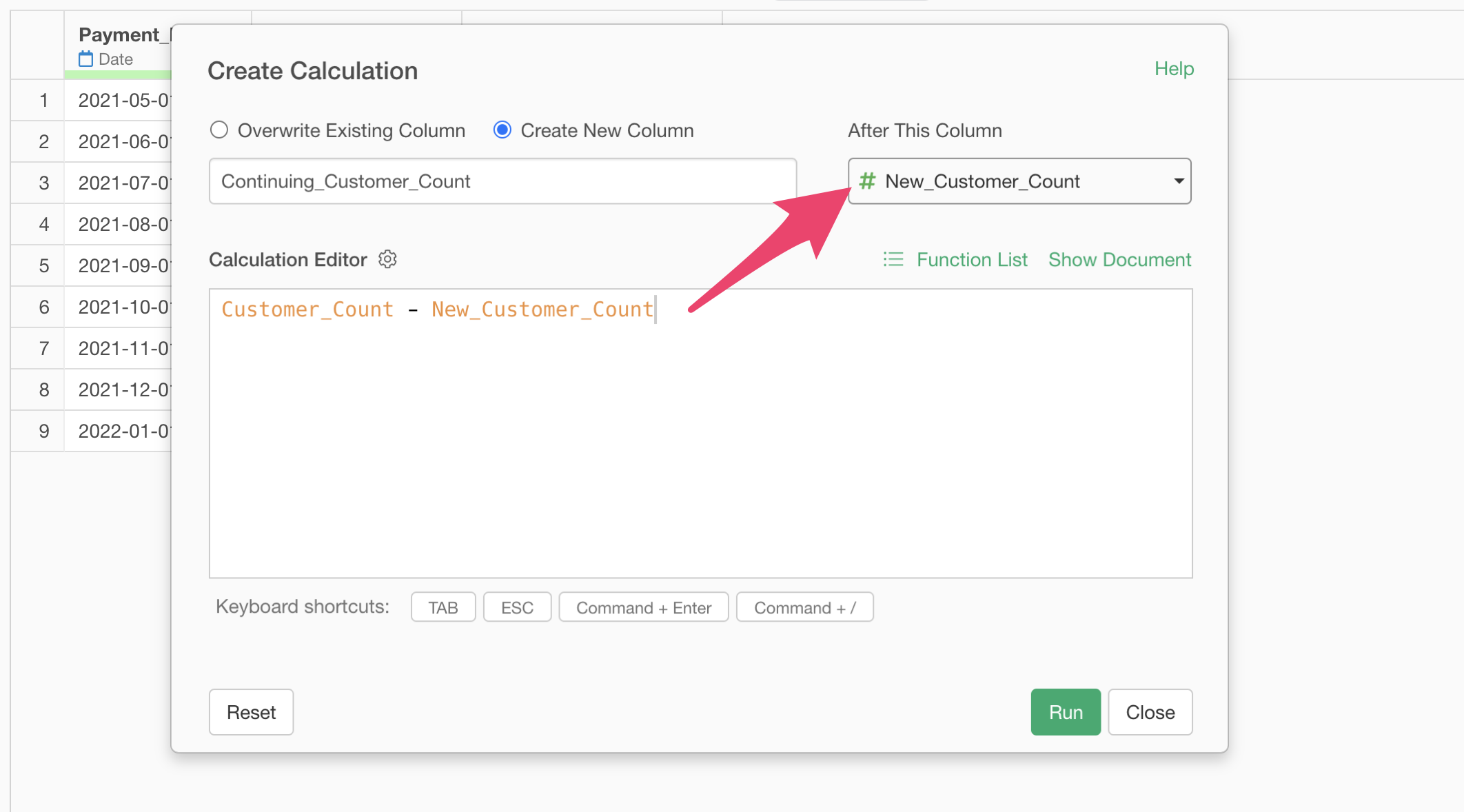
The step to calculate the number of continuing customers has been saved, and a new column “Number of Continuing Customers” has been created.
Finally, let’s calculate the retention rate.
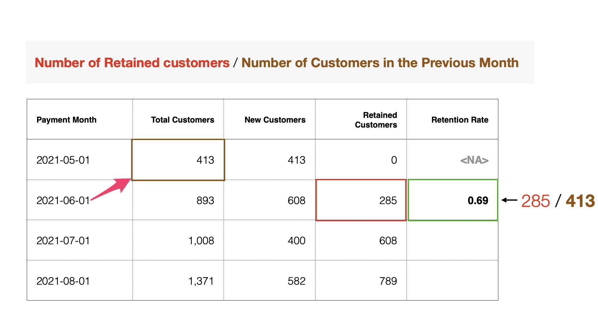 The
question is how to calculate the “Number of Customers” in the “previous
month,” but we can get the value from the previous row using the
lag function.
The
question is how to calculate the “Number of Customers” in the “previous
month,” but we can get the value from the previous row using the
lag function.

The syntax (rule for writing) of the lag function is as follows, and the lag function returns the value of the previous row for the specified column:
lag(<column name>)Now, let’s actually calculate the retention rate. Select “Create Calculation” and “Standard” from the column header menu of “Continuing_Customers_Count”
When the “Create Calculation (Mutate)” dialog appears, enter the following text in the calculation editor:
Continuing_Csutomer_Count / lag(Customer_Count)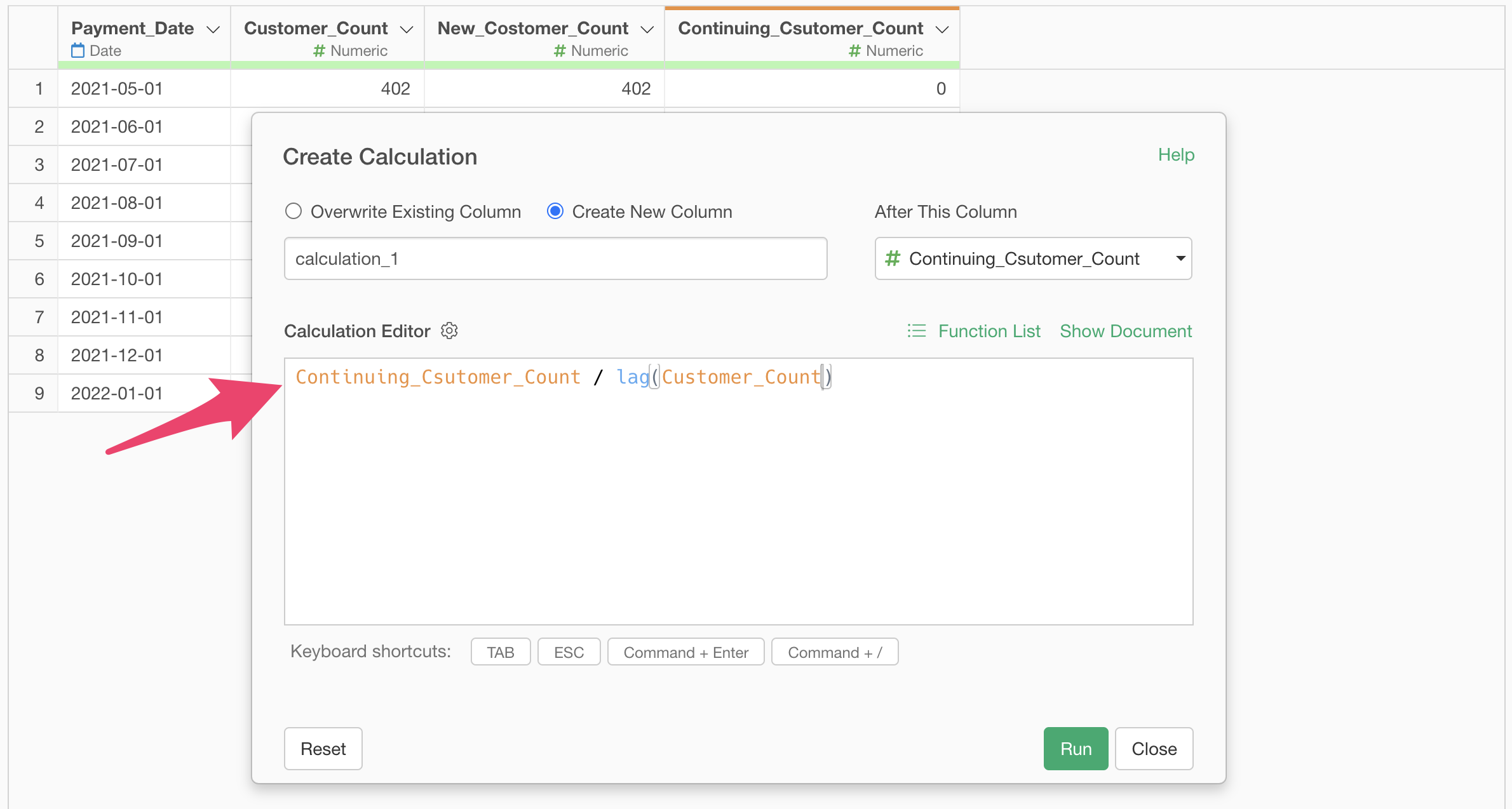
Note that in Exploratory, functions are displayed in light blue.
Since this calculation gives us the “Retention Rate,” select “Create a new column,” set the column name to “Retention Rate,” and click the execute button.
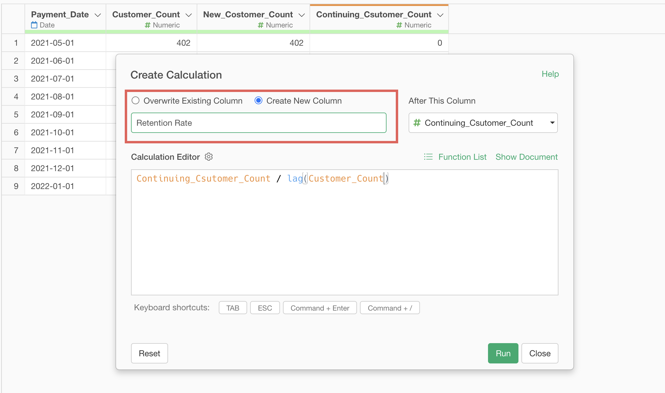
Since we want to create the “Retention Rate” column as the last column, select “(Last Column)” for “Create after this column” and execute.

The step to calculate the retention rate has been saved, and a new column “Retention Rate” has been created.
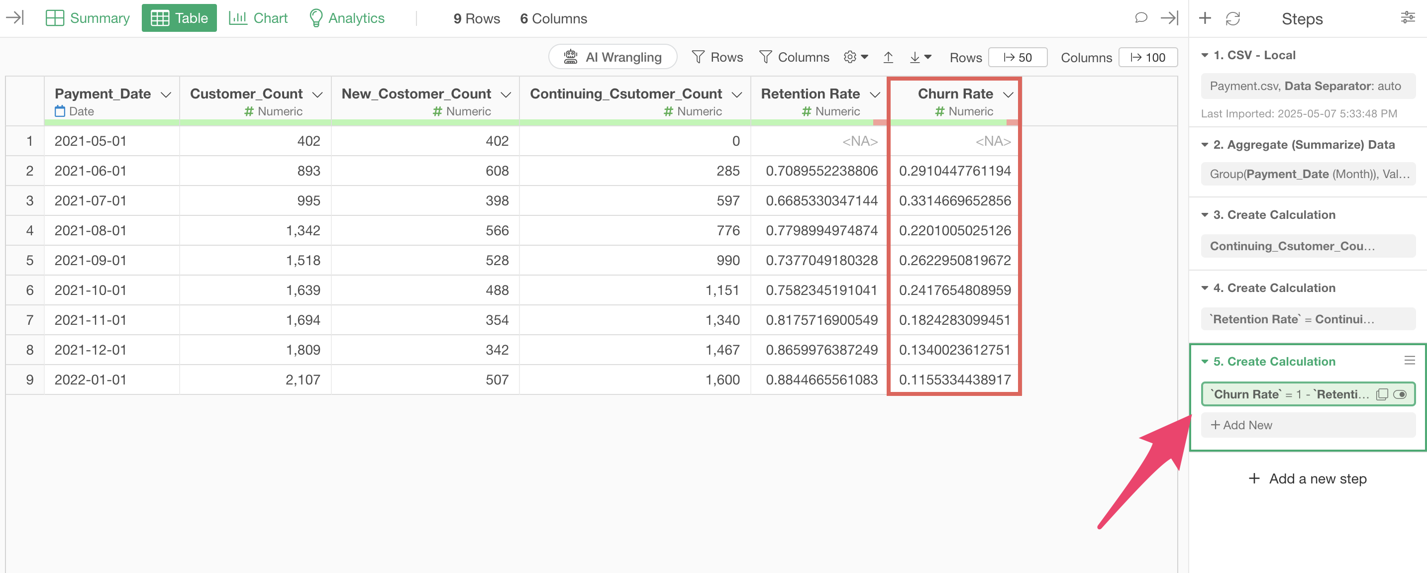
Note that the cancellation rate is the percentage of customers who were not retained, so it can be calculated as follows:
1 - Retention RateTherefore, to calculate the cancellation rate, select “Create Calculation” and “Standard” from the column header menu of the retention rate.

When the Create Calculation dialog opens, enter the calculation formula introduced earlier in the calculation editor as follows:

Make sure “Create a new column” is checked, change the column name to
“Churn Rate,” and run it.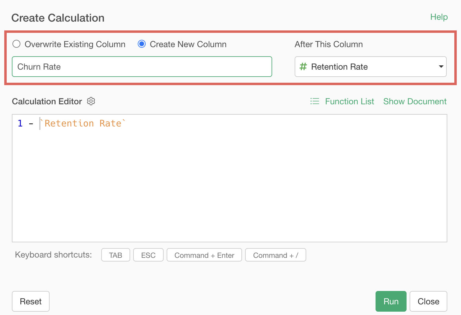
We’ve calculated the churn rate.
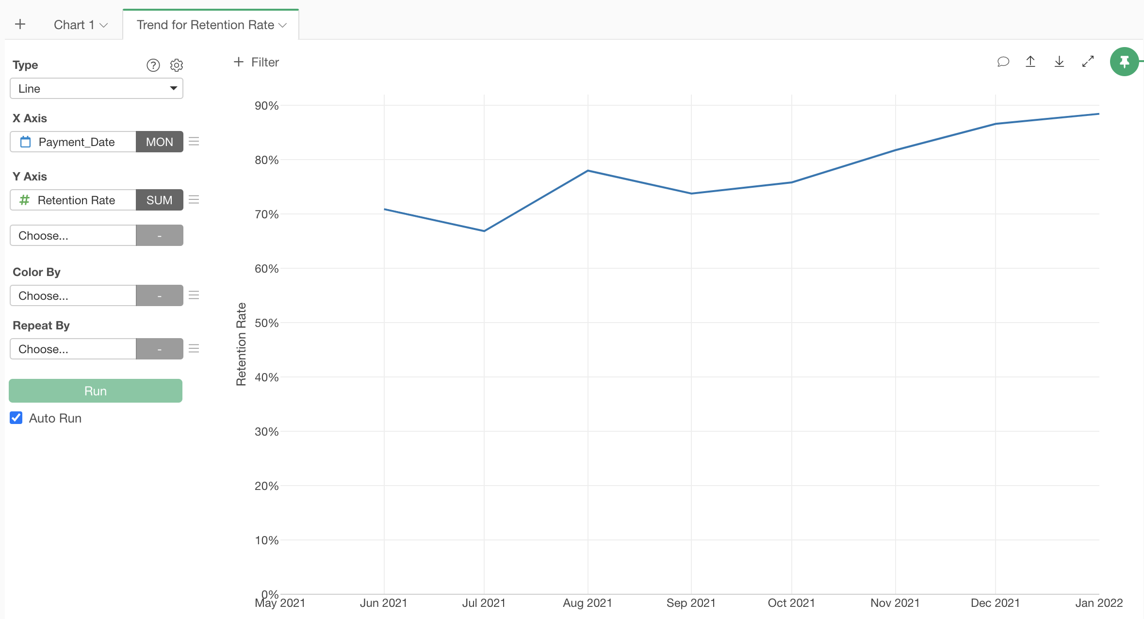
Visualizing Retention Rate Trends
Finally, let’s visualize the trend of the retention rate using the calculated retention rate.
Move to the “Chart View” and click the “+” button on the left edge of the chart tab to add a new tab to the Chart View.
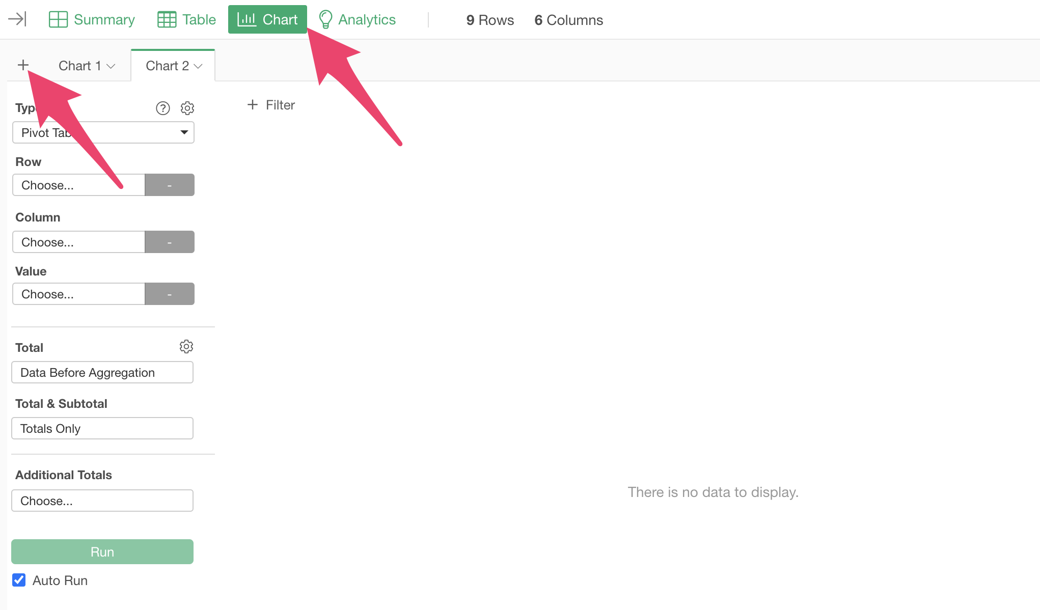
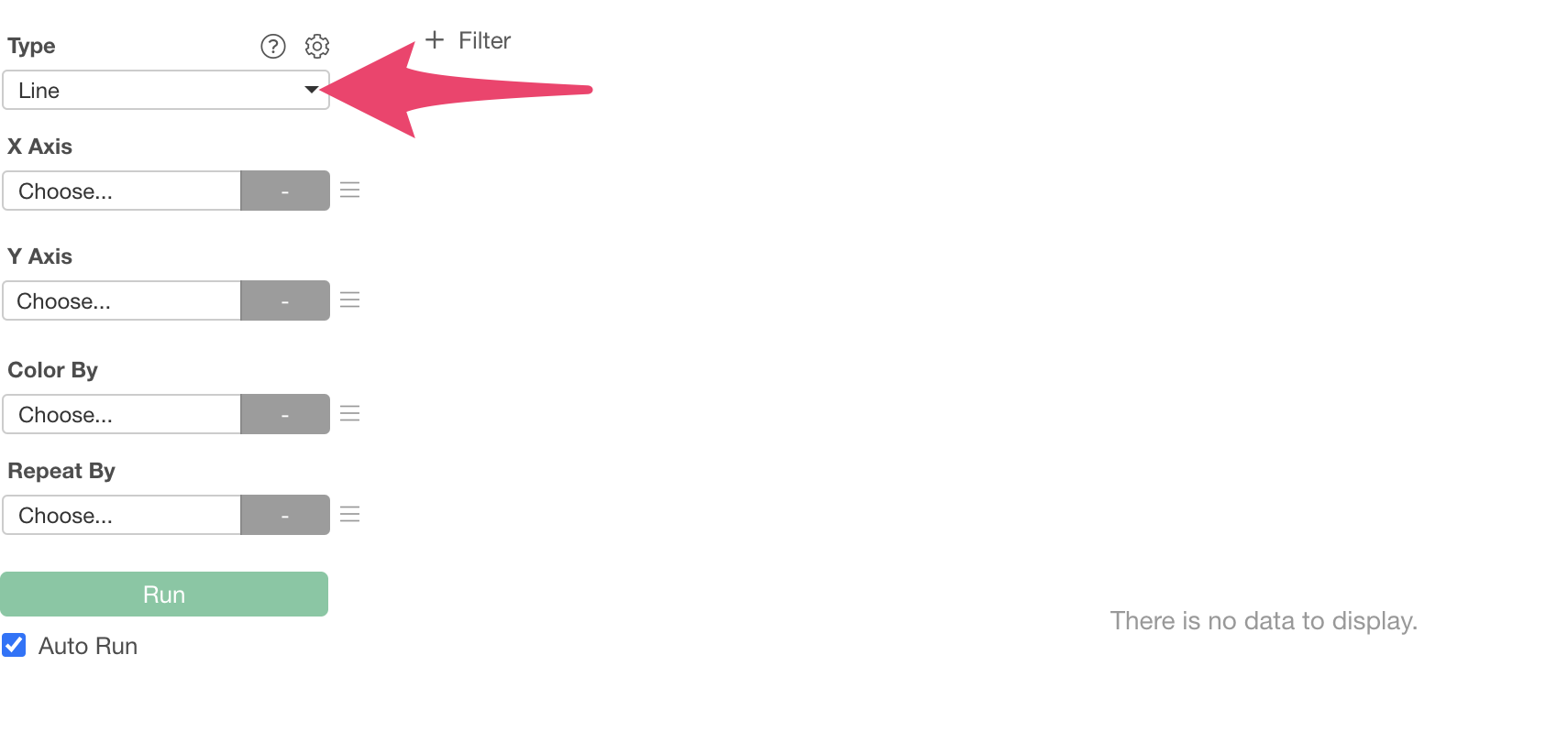
Since we want to visualize the retention rate trend using a “Line” chart, select “Line” for the chart type.
Next, select “Payment Date” for the X-axis and “Month” for rounding.
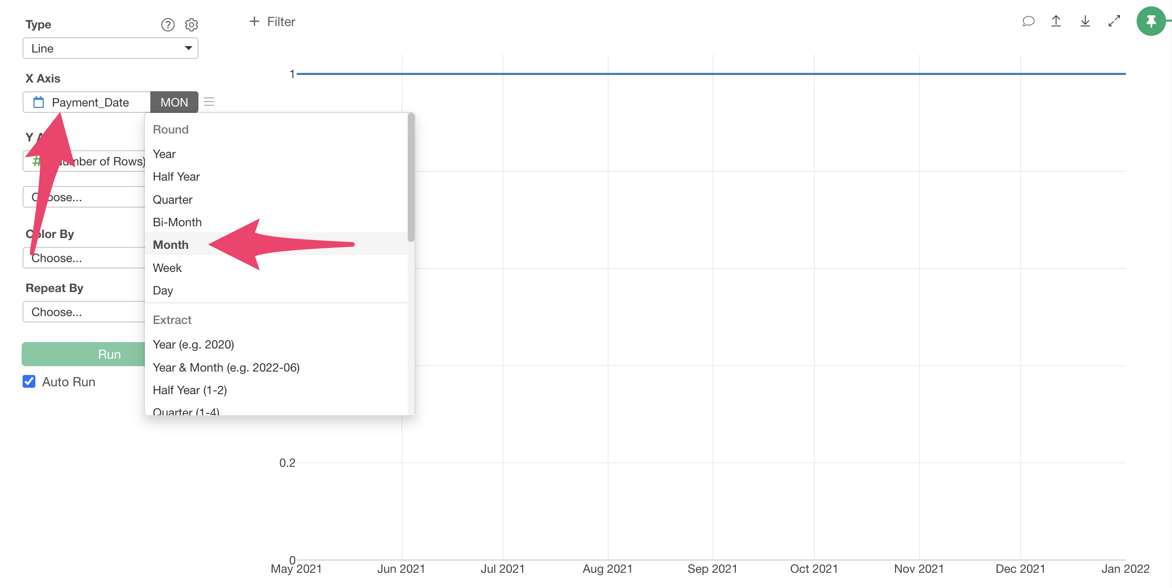
Finally, select “Retention Rate” for the Y-axis value. Since each row already represents one month of data, selecting “SUM” as the aggregation function would work.
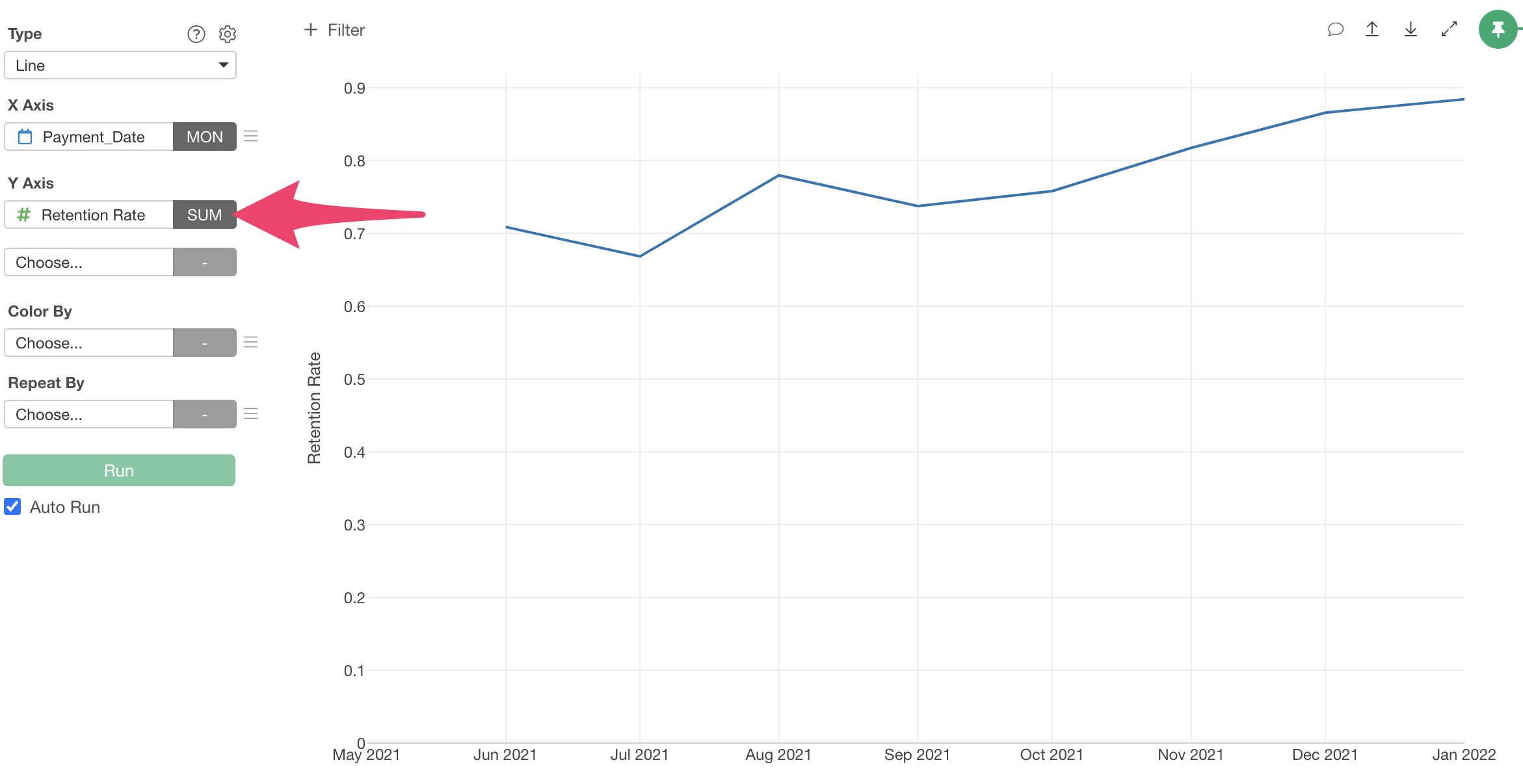
Now we’ve visualized the Retention Rate, but the Y-axis values are in decimal format, so let’s change the number format to percentage.

Click the gear icon to open settings, and from the “Axis” tab, select “Y-axis.”
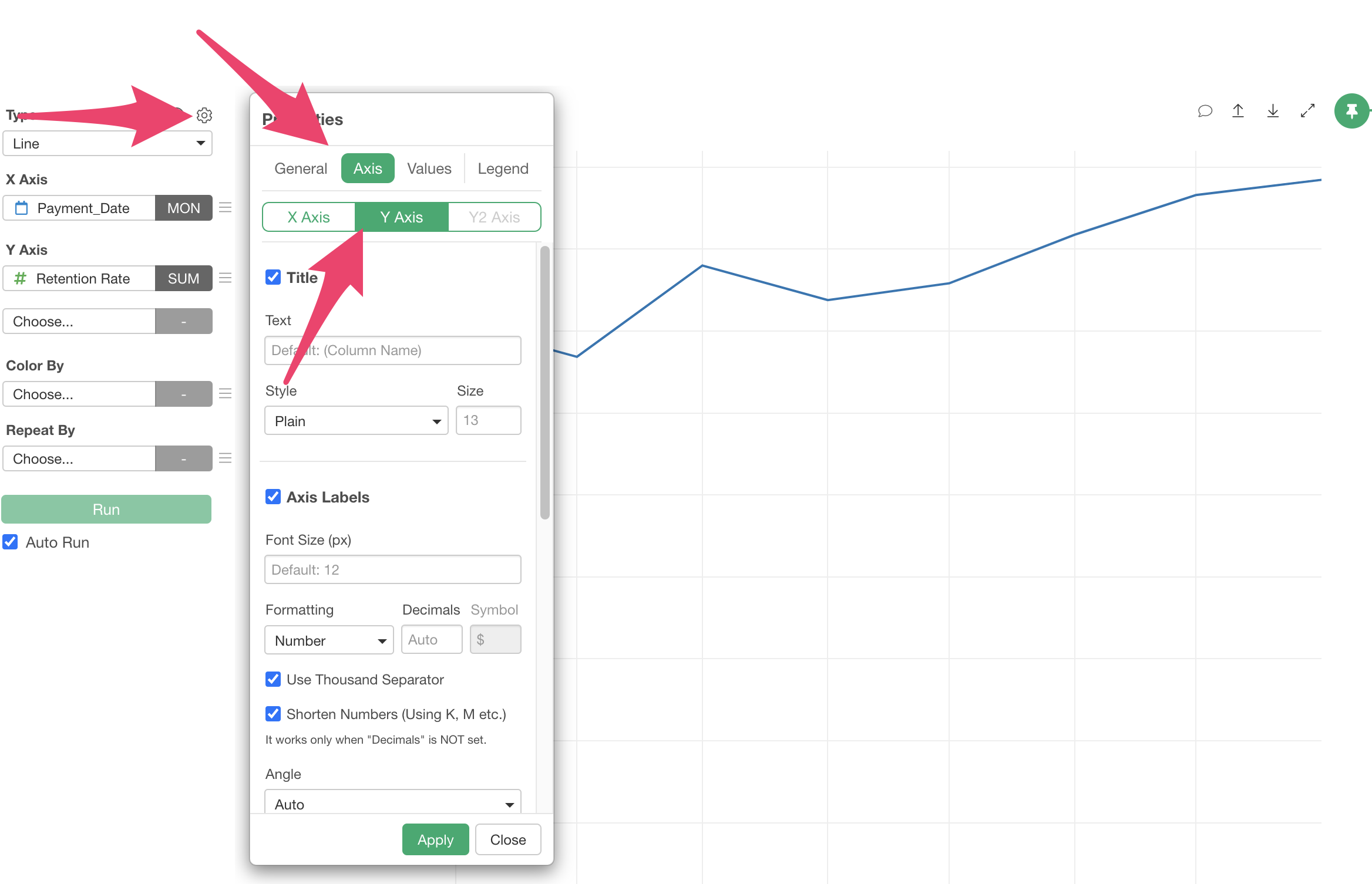
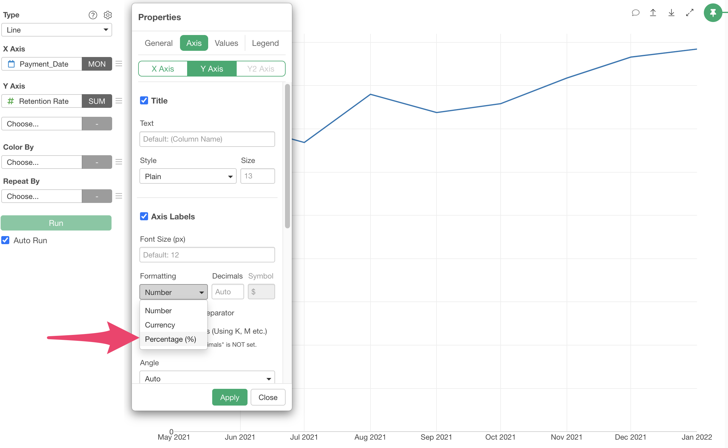
Select “Percent (%)” from “Axis Label Format” and apply.
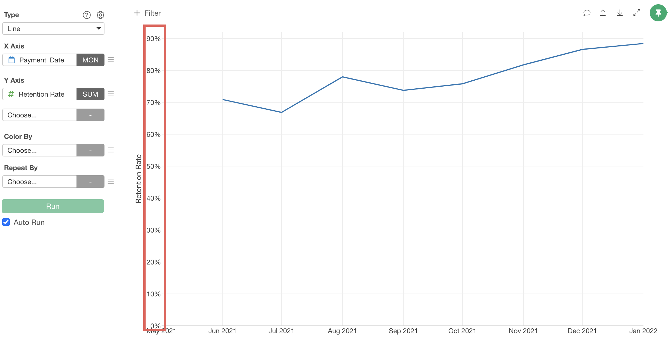
The Y-axis format has changed to percentage.
Finally, click the “∨” icon next to the chart name and select “Rename/Comment.”
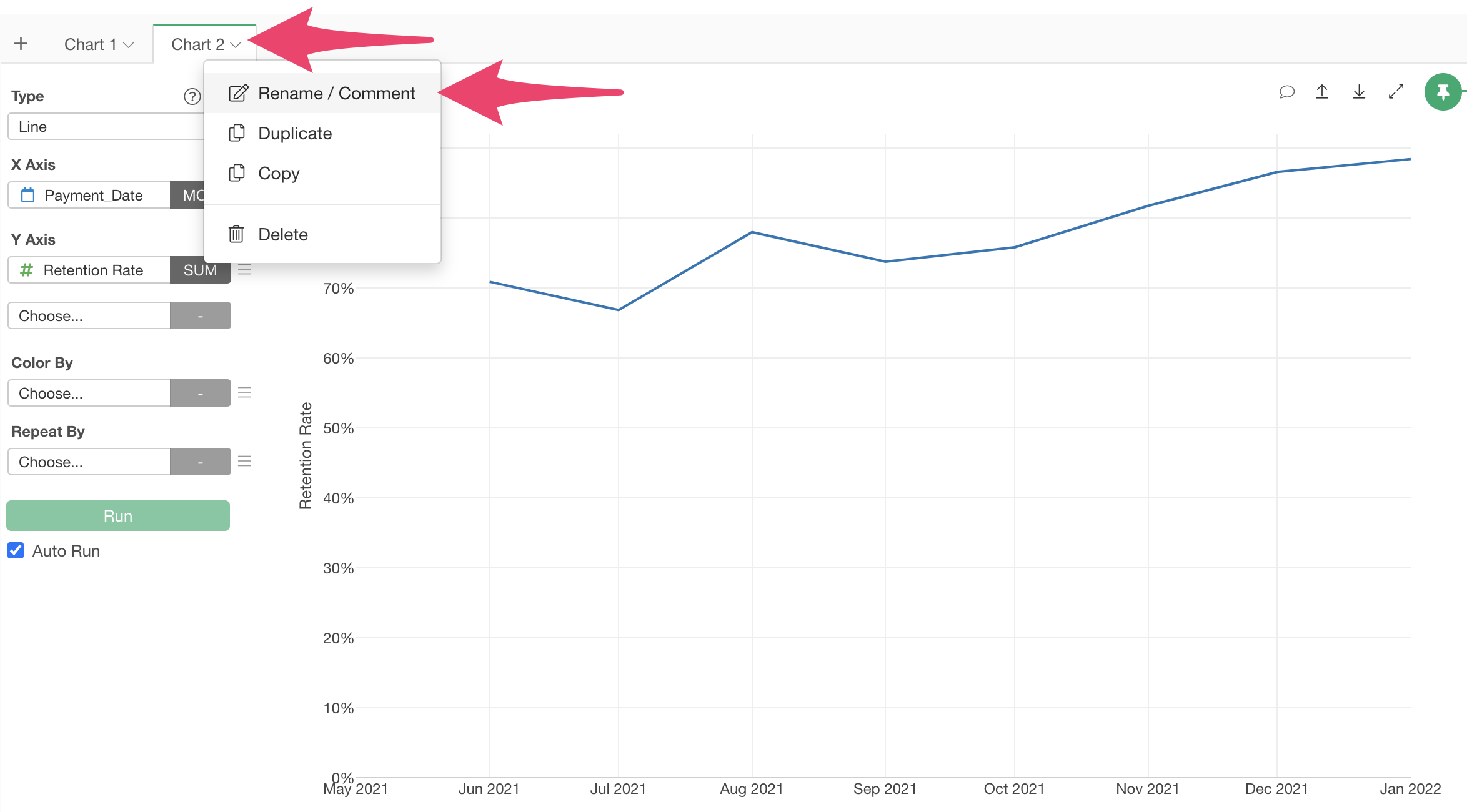
Change the chart name and click the “OK” button to change the chart name.
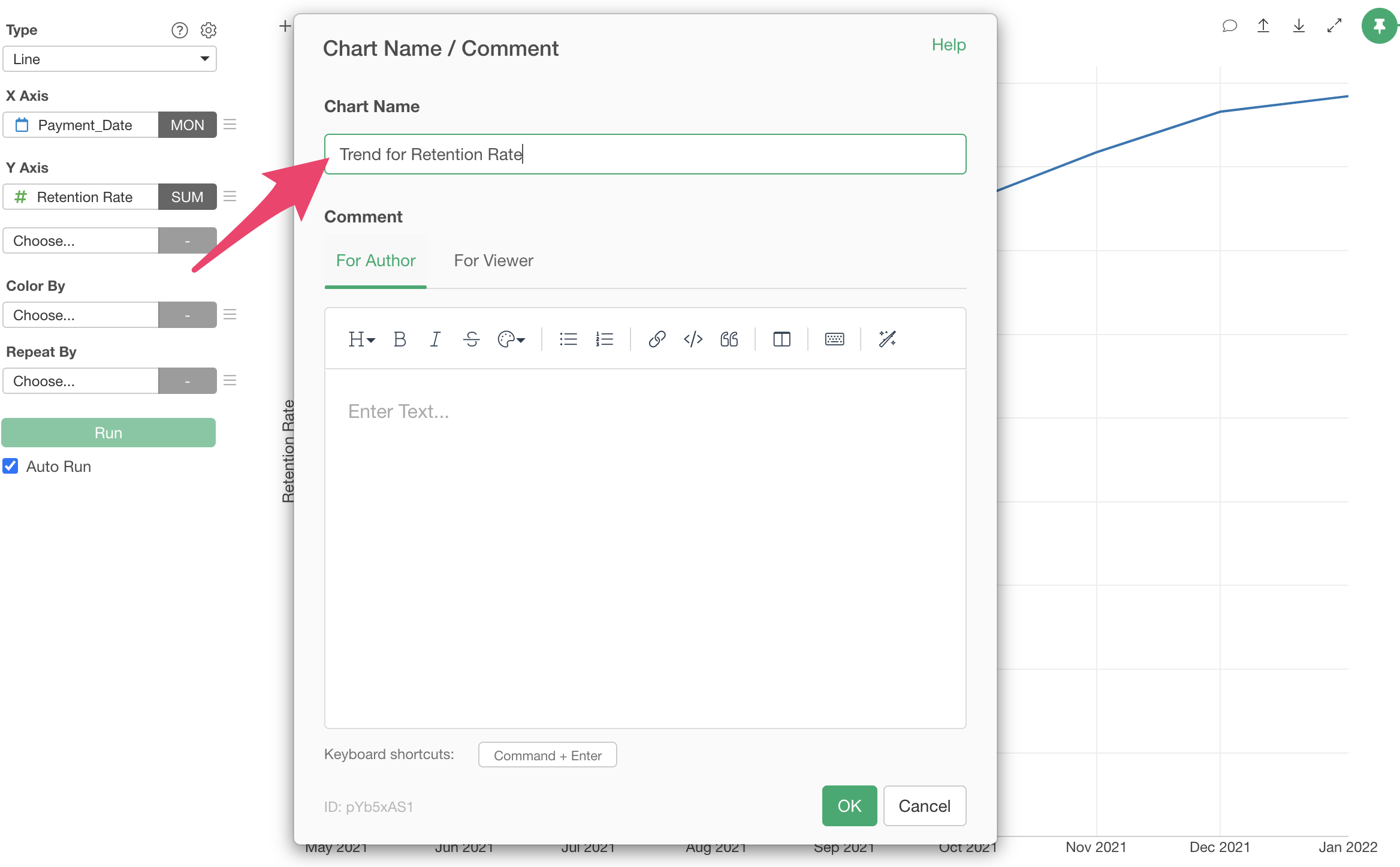
The chart name has been refined.
Now we’ve visualized the following three metrics:
- MRR (Monthly Recurring Revenue)
- MRR growth amount from the previous month
- Retention rate
Monitoring with Dashboards
In Exploratory, you can combine charts created from various data sources and steps into a single dashboard.
You can also Publish the created dashboard to a server and view it through a browser. Furthermore, you can share the published dashboard with team members and set schedules to automate updates.
If you’re interested in how to create and operate dashboards, please refer to the following links:
You can check other parts of the trial tour for subscription-based business users from the links below: