
Subscription Data Analysis #2: Creating Layer Cake Charts
This note is the second installment of the “Subscription Data Analysis” trial tour, which efficiently teaches you how to create, visualize, and analyze metrics specific to subscription-based businesses, titled “Creating Layer Cake Charts.”
In SaaS and subscription-based businesses, “Layer Cake Charts” are commonly used to visualize the “health” that demonstrates efficient business growth.
In this session, we will process customer payment data to create a “Layer Cake Chart”.
This will take about 20 minutes. Let’s get started!
What is a Layer Cake Chart?
A Layer Cake Chart is a visualization that shows the progression of MRR (Monthly Recurring Revenue) for each customer group, color-coded by their “service start period”.
It’s called a “Layer Cake” because stacking the groups from oldest to newest subscription start dates creates visible layers that resemble a cake.
For example, below is a Layer Cake Chart from Datadog, a SaaS service provider. This chart clearly shows an enviably efficient business growth at a glance.
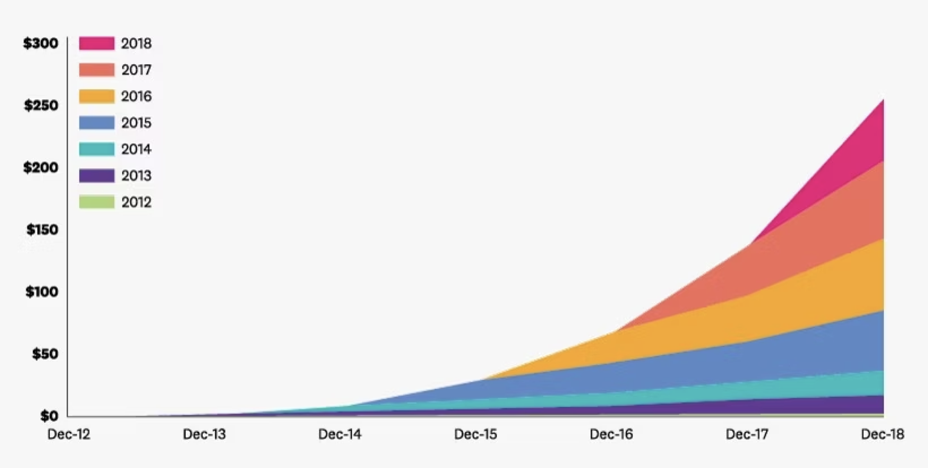
This is because the revenue from each customer group, categorized by when they started using the service, increases over time.
For example, revenue from customers who started using the service in 2016 has increased over time.

Since no business exists without any churn (cancellations), MRR from each group typically decreases over time.
However, if customers upgrade their plans or increase the number of licenses, the MRR from this group can increase, exceeding the decrease due to churn.
This is the trend demonstrated in Datadog’s Layer Cake Chart above.
Required Data
To create a Layer Cake Chart, you need data where each row represents “a monthly payment by one customer” and includes a column for that customer’s “service start date” which means their first payment date.
With such data, you can create a Layer Cake Chart by using an “Area” chart to visualize MRR and selecting “service start date” for “Color By.”

However, your available data might not include a column for each customer’s service start date.
In the next section, we will add a “service start date” column and create a Layer Cake Chart.

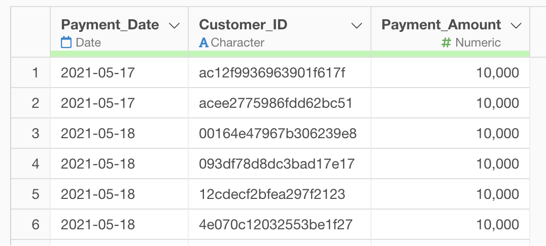
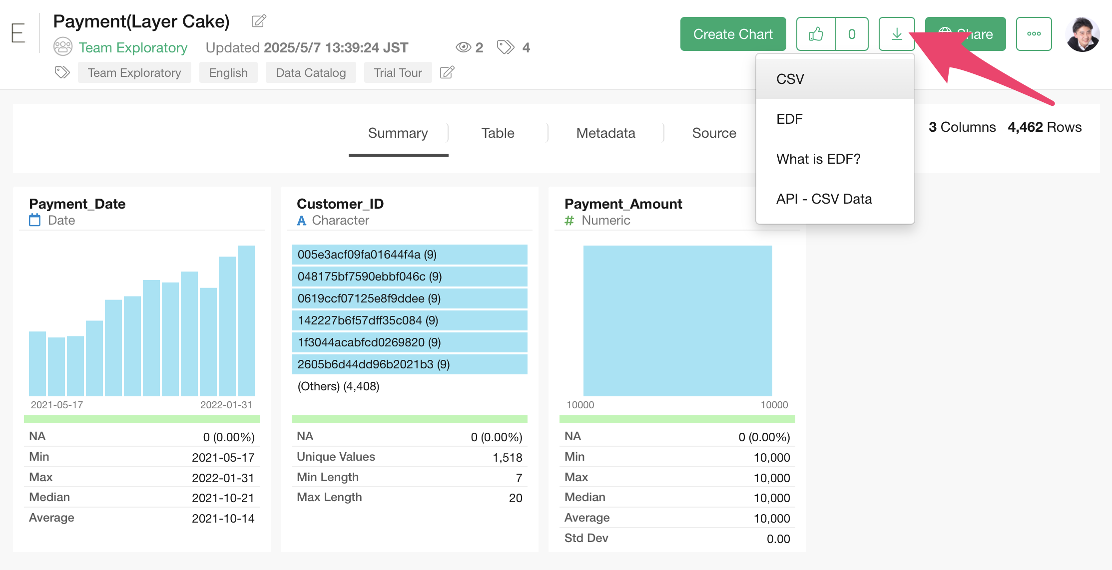
Data Overview
 The
sample data for this session is payment data from a subscription-based
business. You can download the data from this
page.
The
sample data for this session is payment data from a subscription-based
business. You can download the data from this
page.
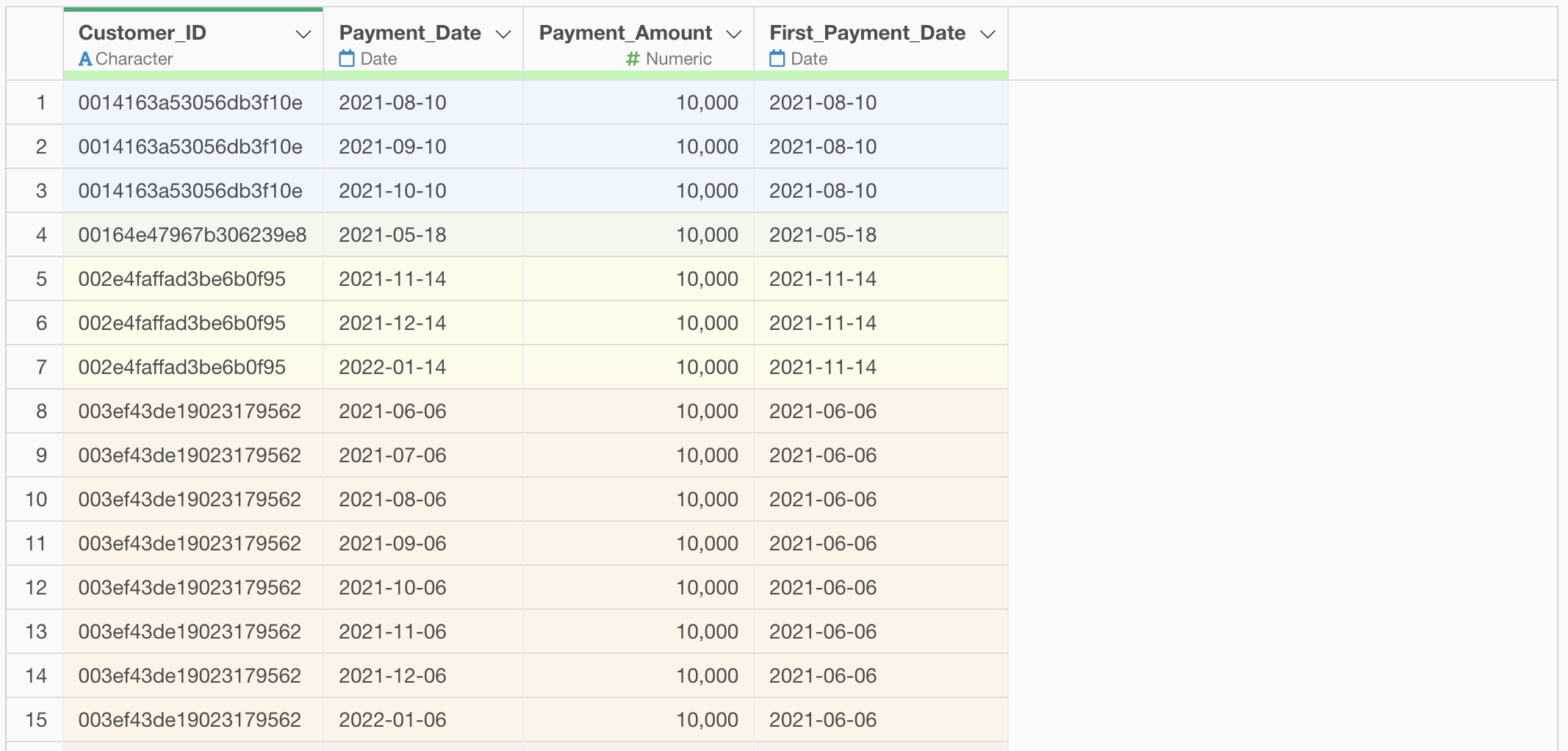
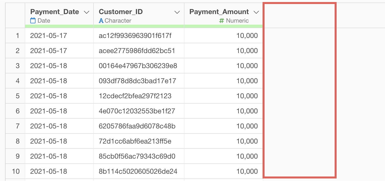
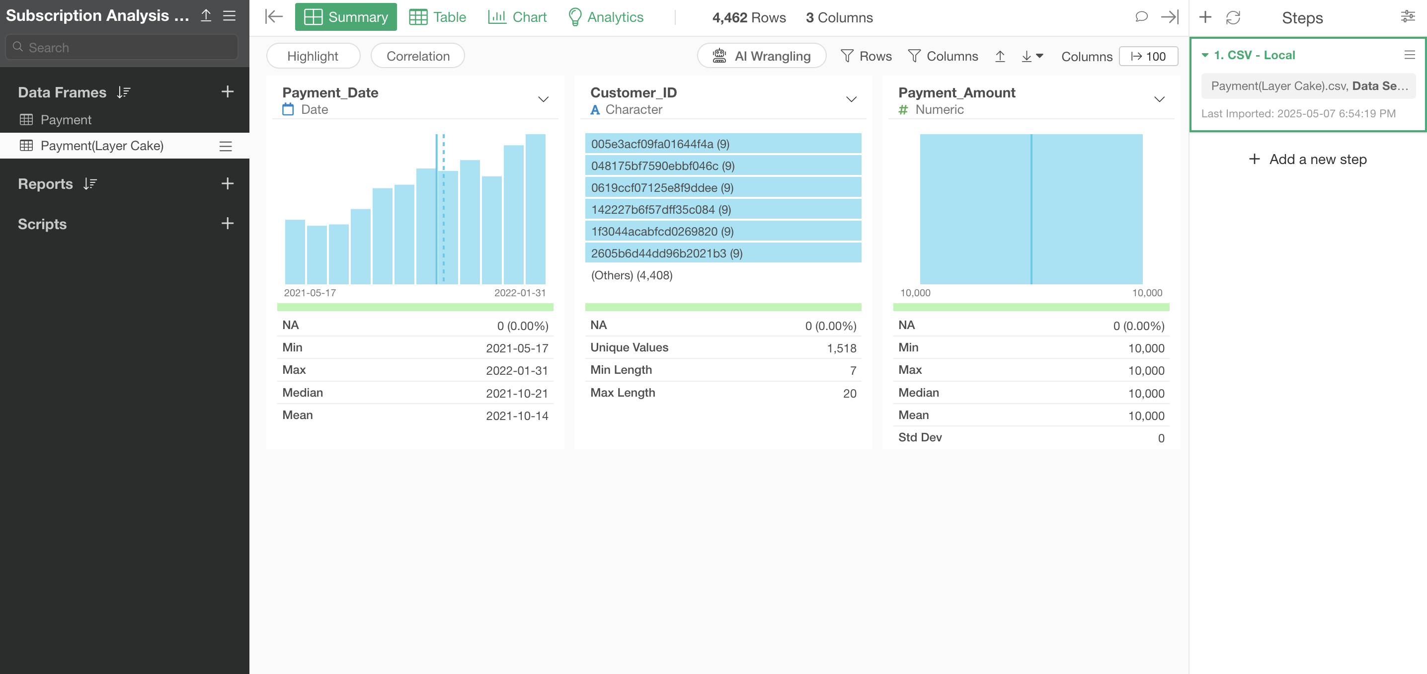
In this dataset, each row represents a monthly payment history for one customer, and the columns include the following information:
- Customer ID
- Payment date
- Payment amount
Importing Data
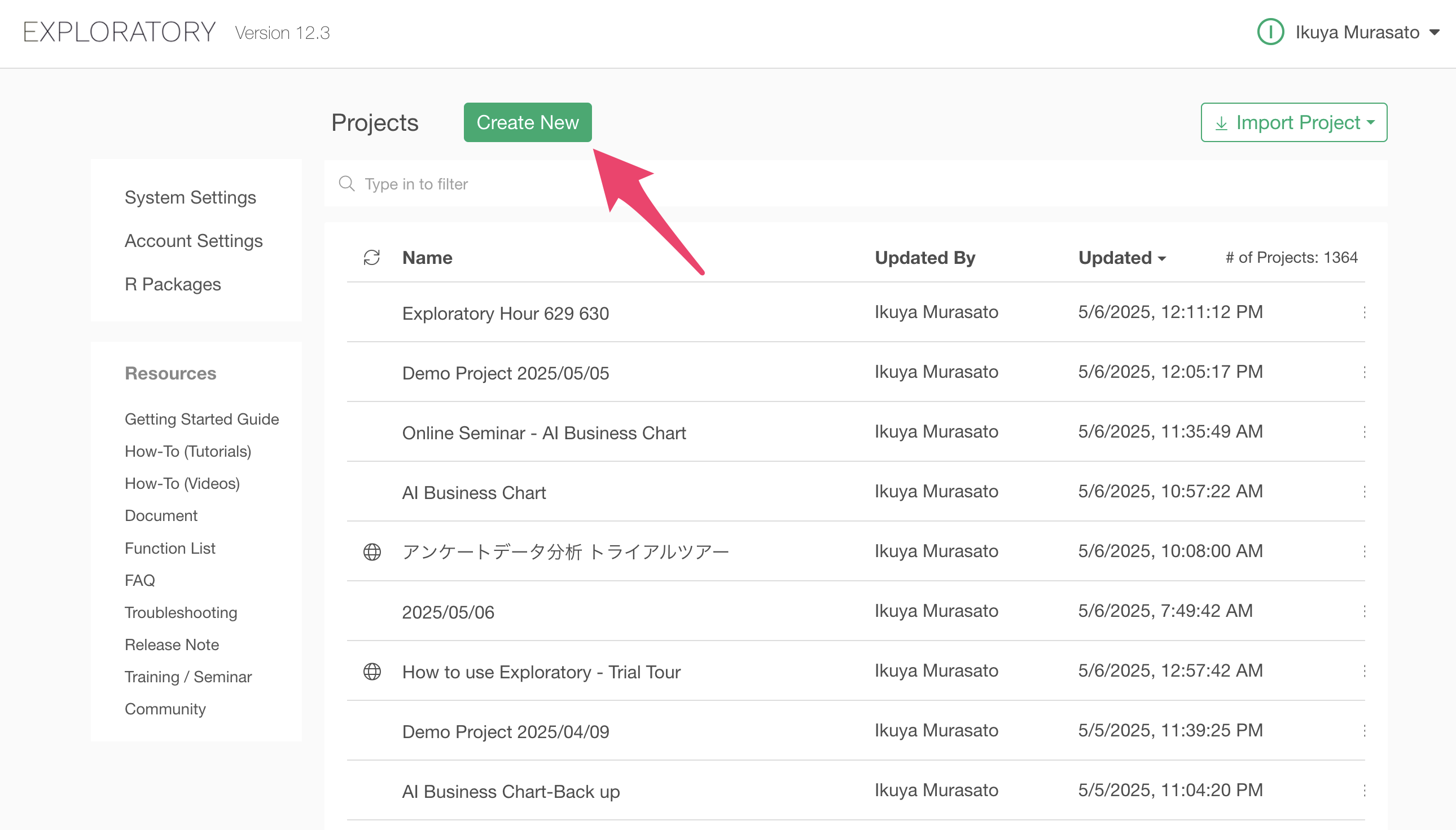
After launching Exploratory, click the “Create New” project button.
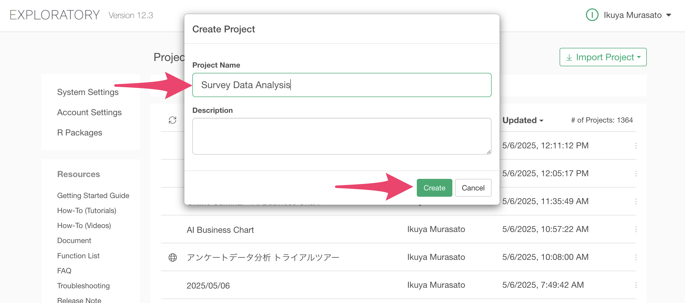
A dialog to create a project will appear. Enter a name of your choice and click the create button.
You have successfully created a project.
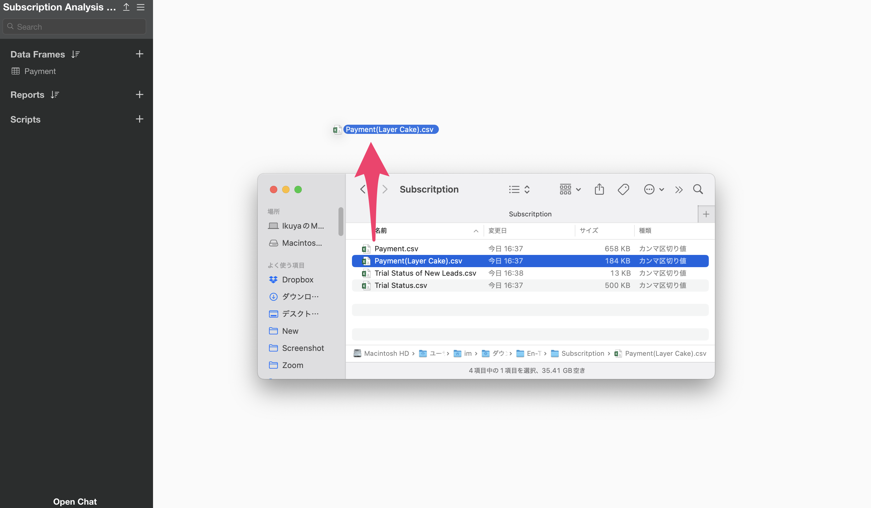
After creating the project, let’s import the data. You can download the data from this page.
Once you’ve downloaded the payment data, open the download folder and drag and drop it onto the Exploratory screen.
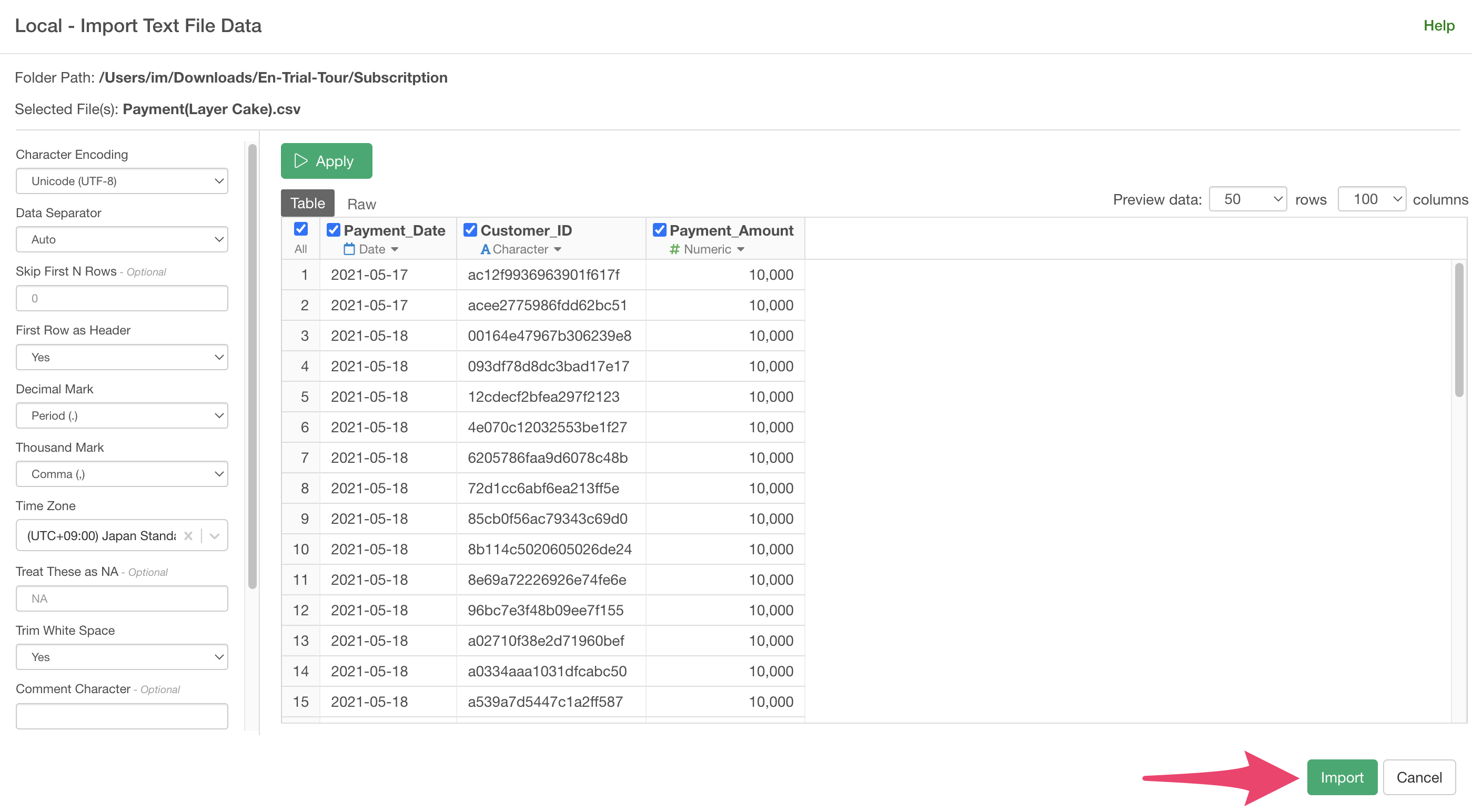
An import dialog will appear.
In the import dialog, you can specify settings for importing data from the items on the left, but no settings are required this time, so click the “Import” button.
A data frame settings dialog will appear, allowing you to set a name for the data frame.
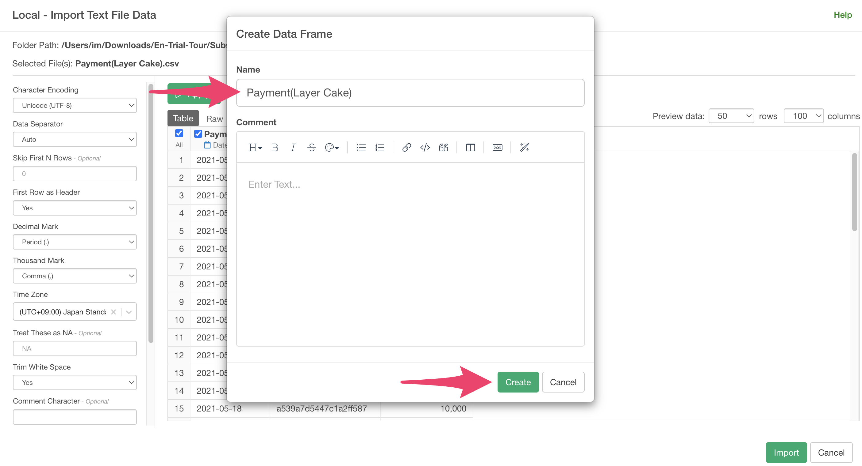
You have successfully imported the payment data.
Creating a First Payment Date Column
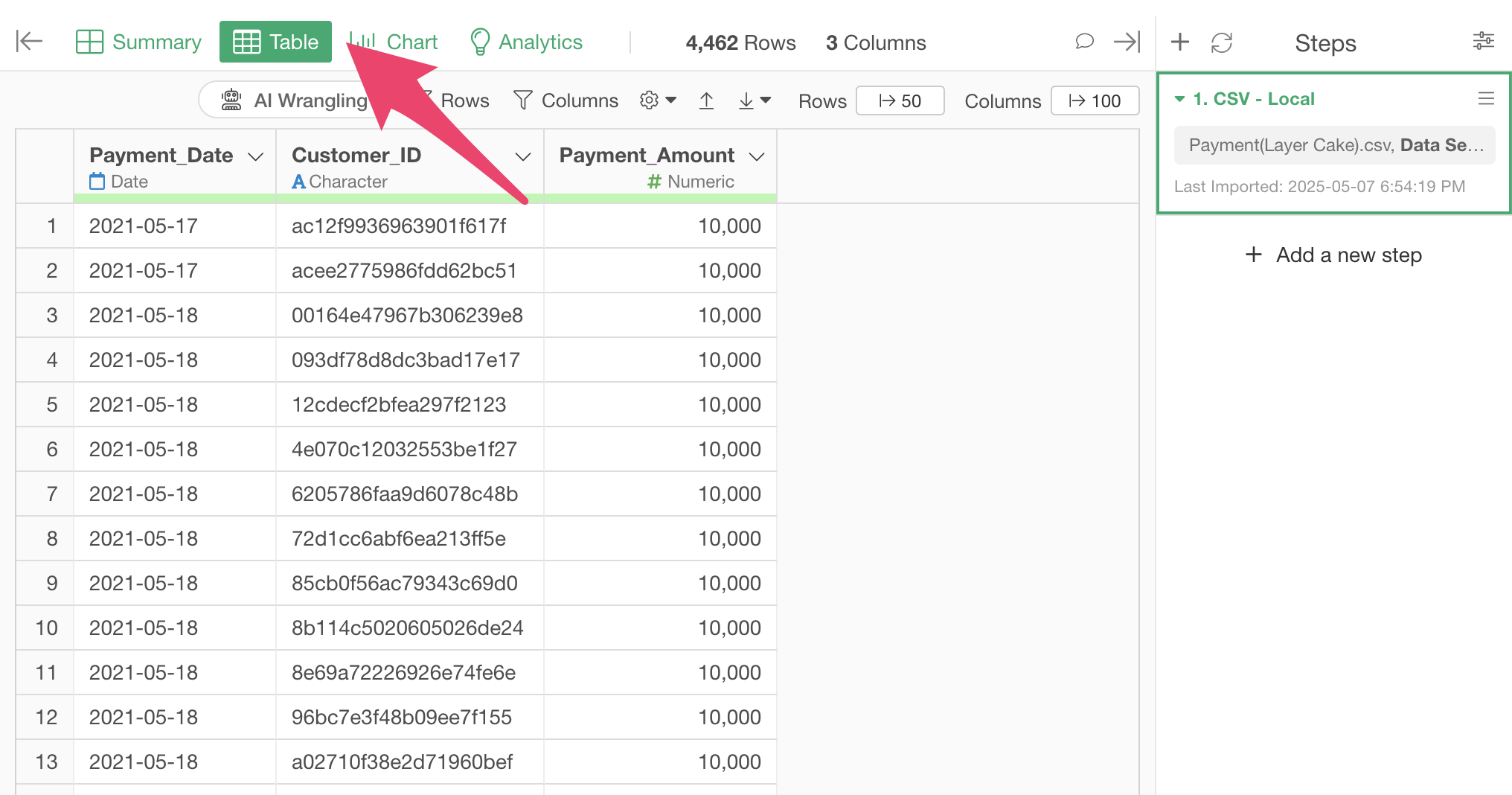
Since the original data doesn’t have “start date” information, let’s move to the table view to process the data.
In this note, we’ll introduce two methods: using “AI Prompt” which allows data processing with natural language, and using the “UI” which is available to all users.
Calculate the First Payment Date for Each Customer Using AI Prompt
AI Prompt is a menu available only to users with paid licenses such as Business or Personal plans, and trial users of those plans. It also only appears when your device is connected to the internet.
If you don’t have one of these plans or your device is not connected to the internet, please refer to the “Calculate Retention Rate Using UI” section.
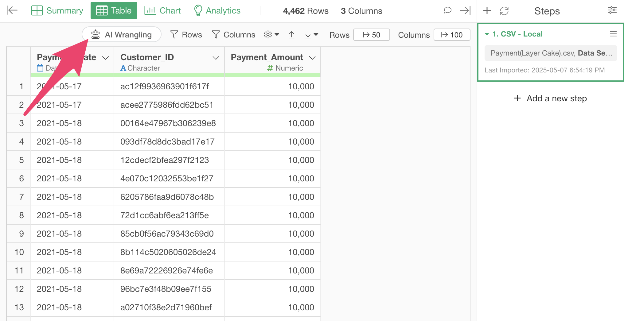
To calculate retention rates using AI Prompt, click the “AI Wrangling” button.
When the AI Prompt dialog appears, enter the following text and execute:
Add a column for each customer’s first payment date
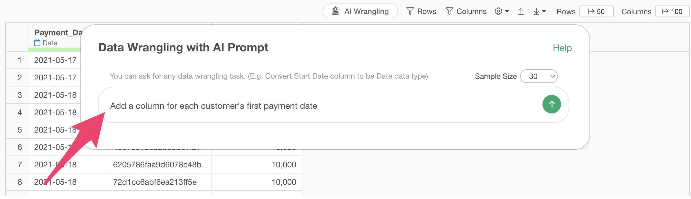
Code will be generated to add a column for the first payment date for each customer.
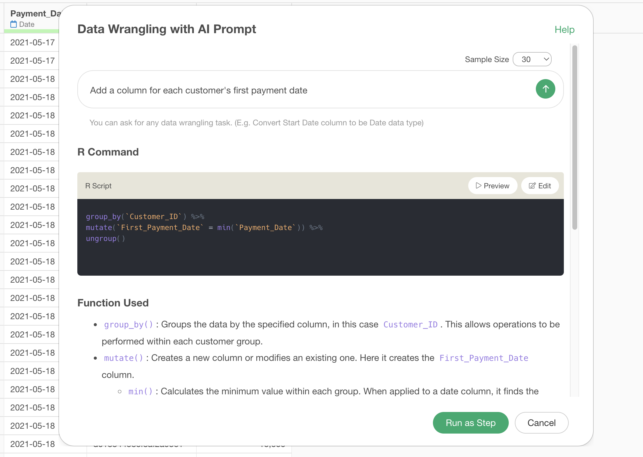
Check the explanation of the functions used and the expected results, then click the “Run as Step” button.
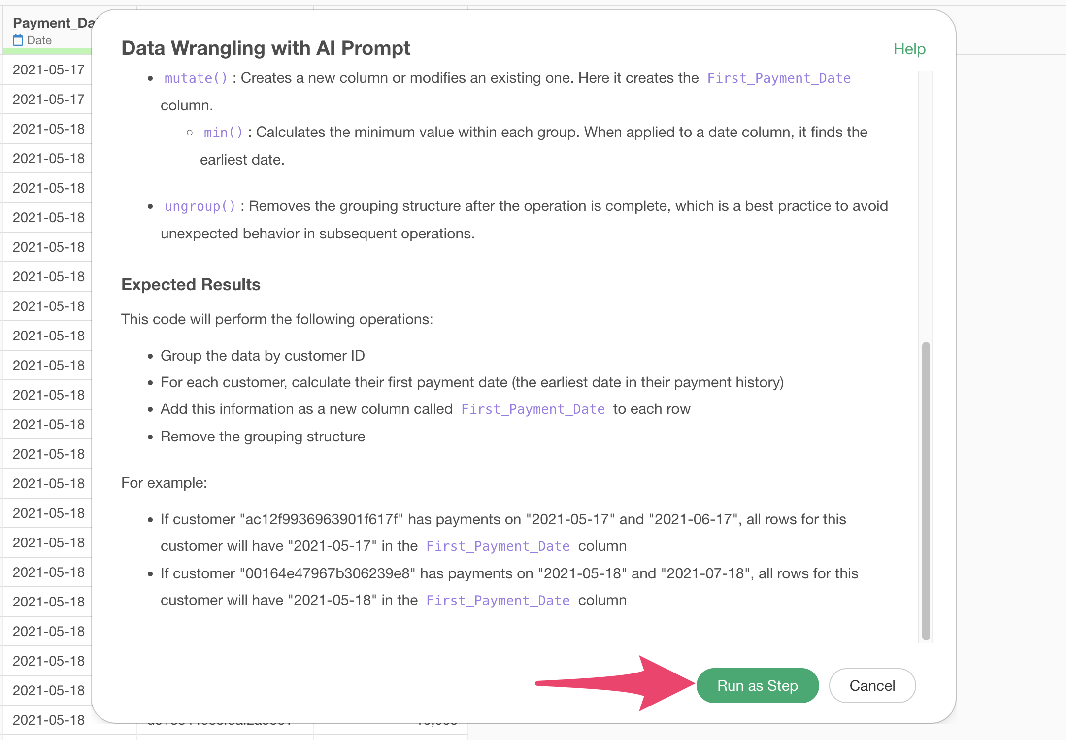
The step has been added, and you’ve successfully added a column for the first payment date for each customer.

In the following section, we’ll introduce how to add a column for the first payment date for each customer using the “UI”. If you’ve completed this process, please proceed to the “Creating a Layer Cake Chart” section.
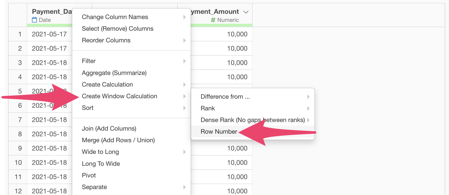
Calculate the First Payment Date for Each Customer Using UI
Here we’ll introduce how to calculate the first payment date for each customer using the UI.
Since we want to calculate the “first payment date” for each customer, select any menu (in this case, “Row Number”) from the “Create Table Calculation” in the column header menu of “Payment Date”.
When the table calculation dialog appears, select “Payment_Date” for the value and “Min(First Date )” for the calculation type.
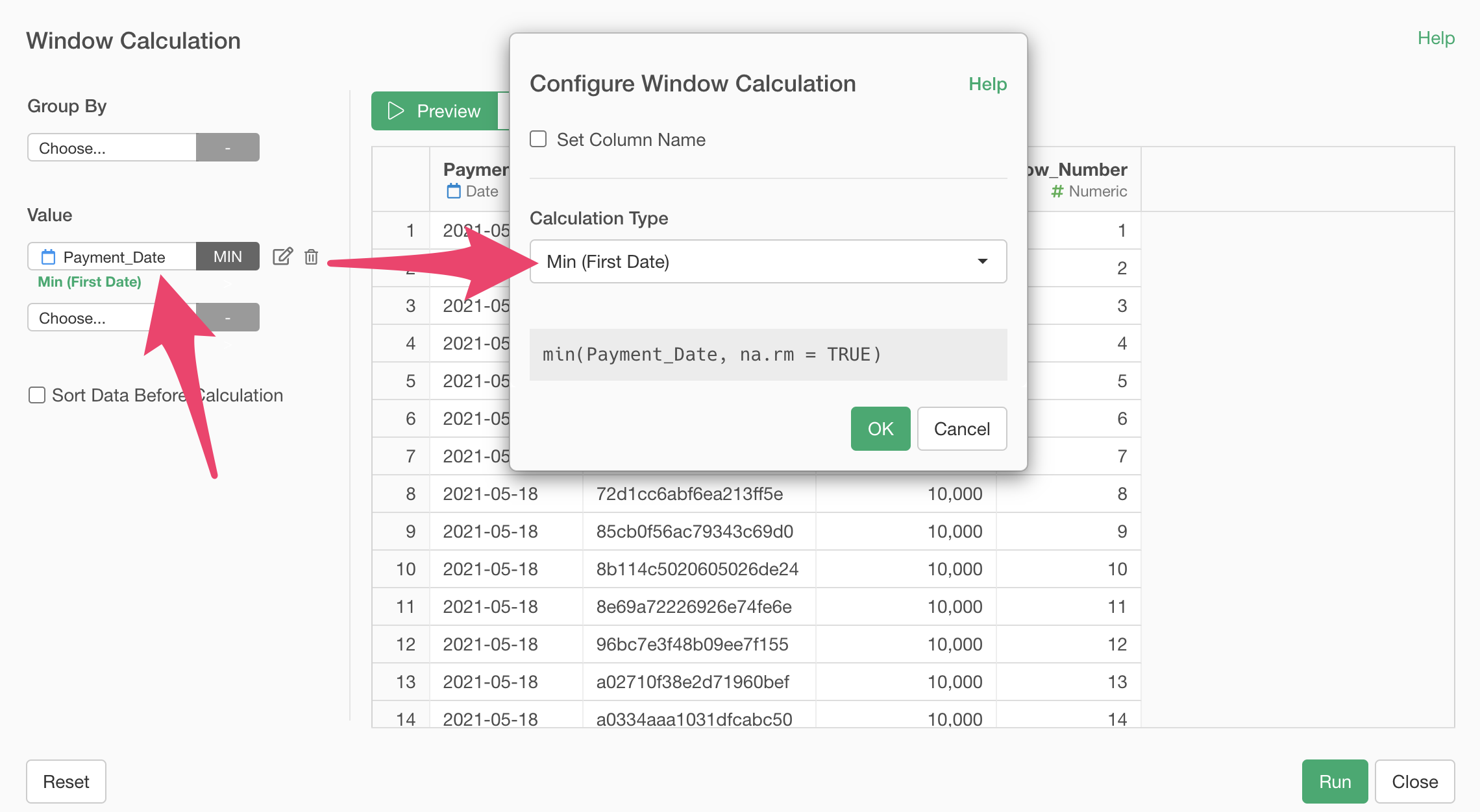
Next, check “Set Column Name” and set the column name to “First_Payment_Date”.
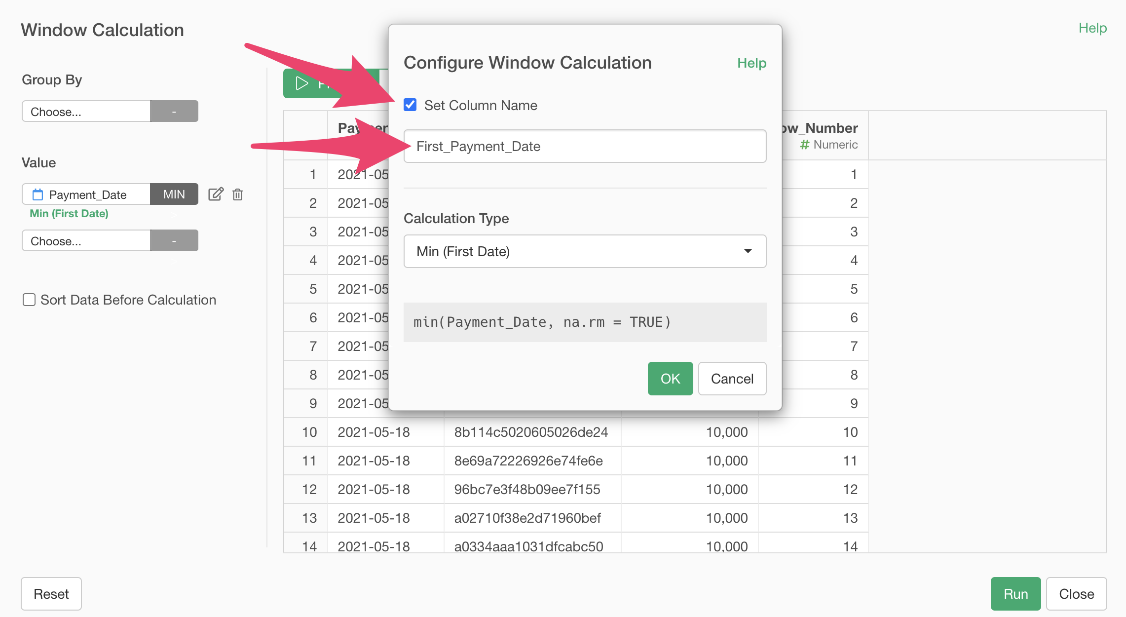
Click the preview button to confirm that all dates are the same.
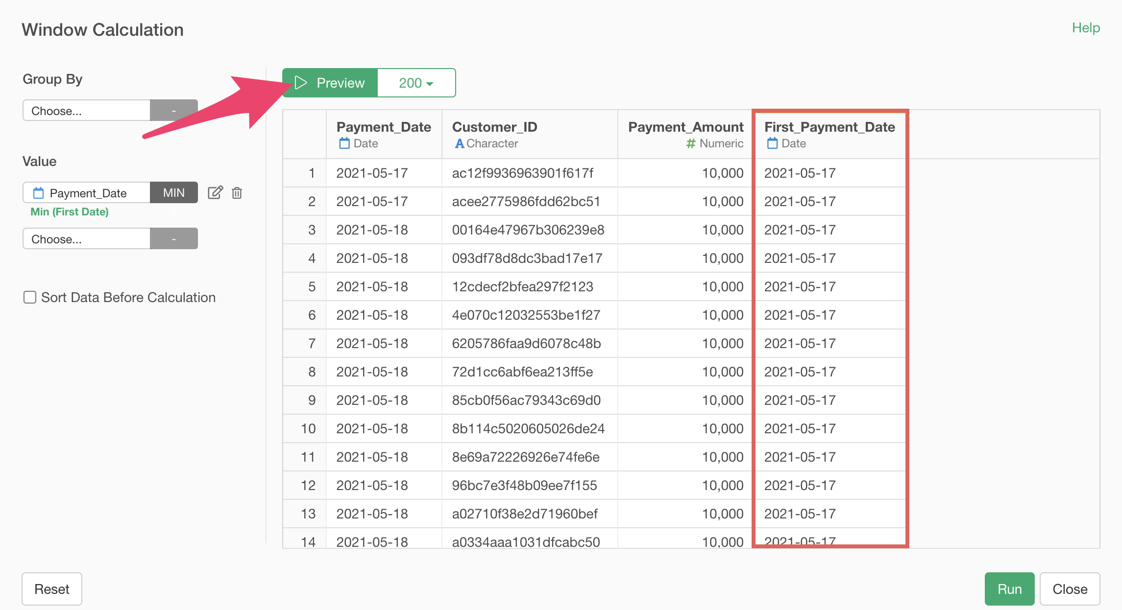
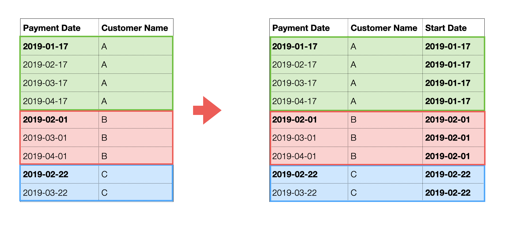
In this case, we want to calculate the first payment date “for each customer” and divide them into groups by start date (month) as shown below.
So, select “Customer ID” for the group and click the “Preview” button.
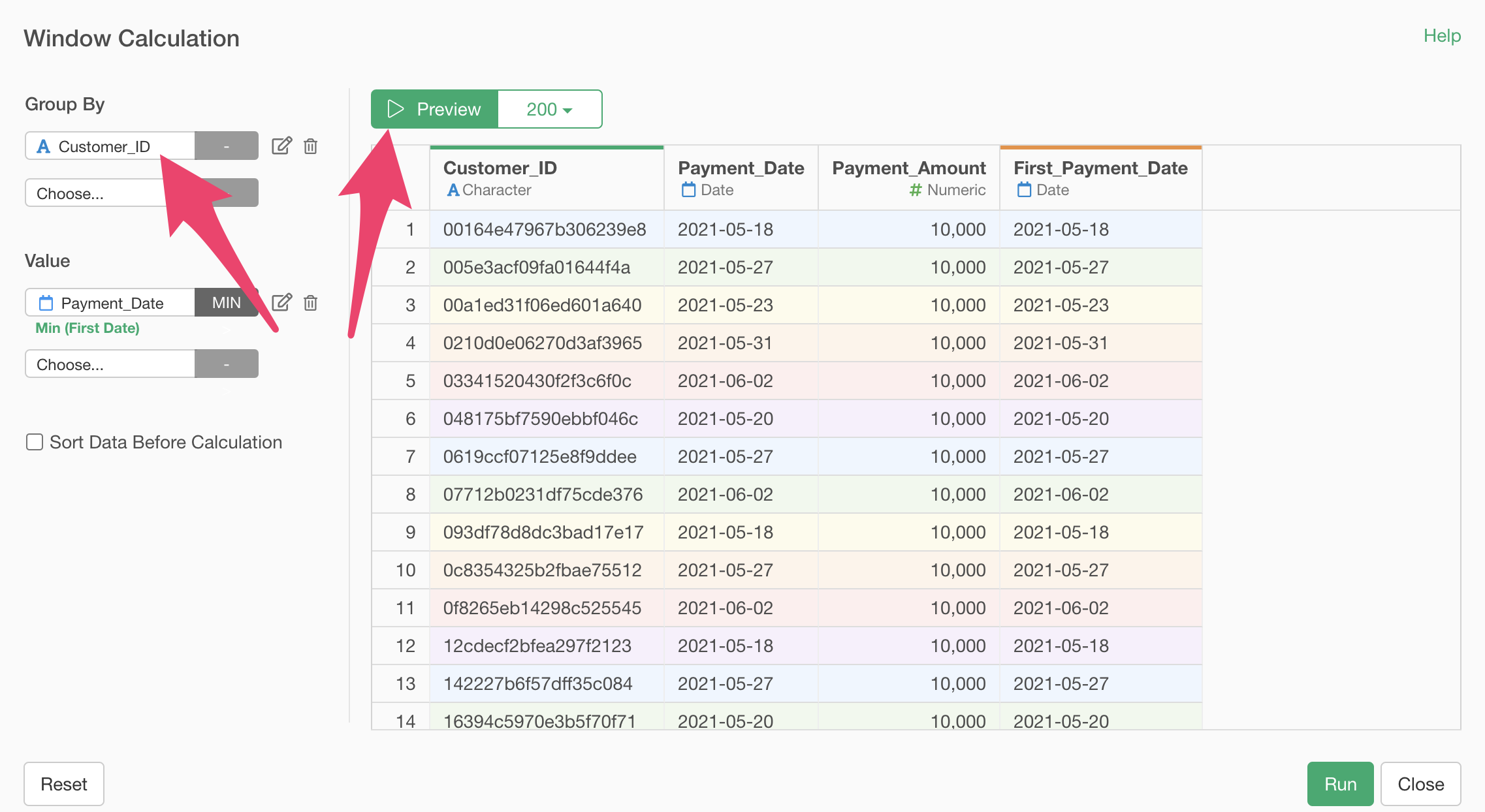 After
confirming that the “first payment date” has been calculated for each
customer, click the “Run” button.
After
confirming that the “first payment date” has been calculated for each
customer, click the “Run” button.
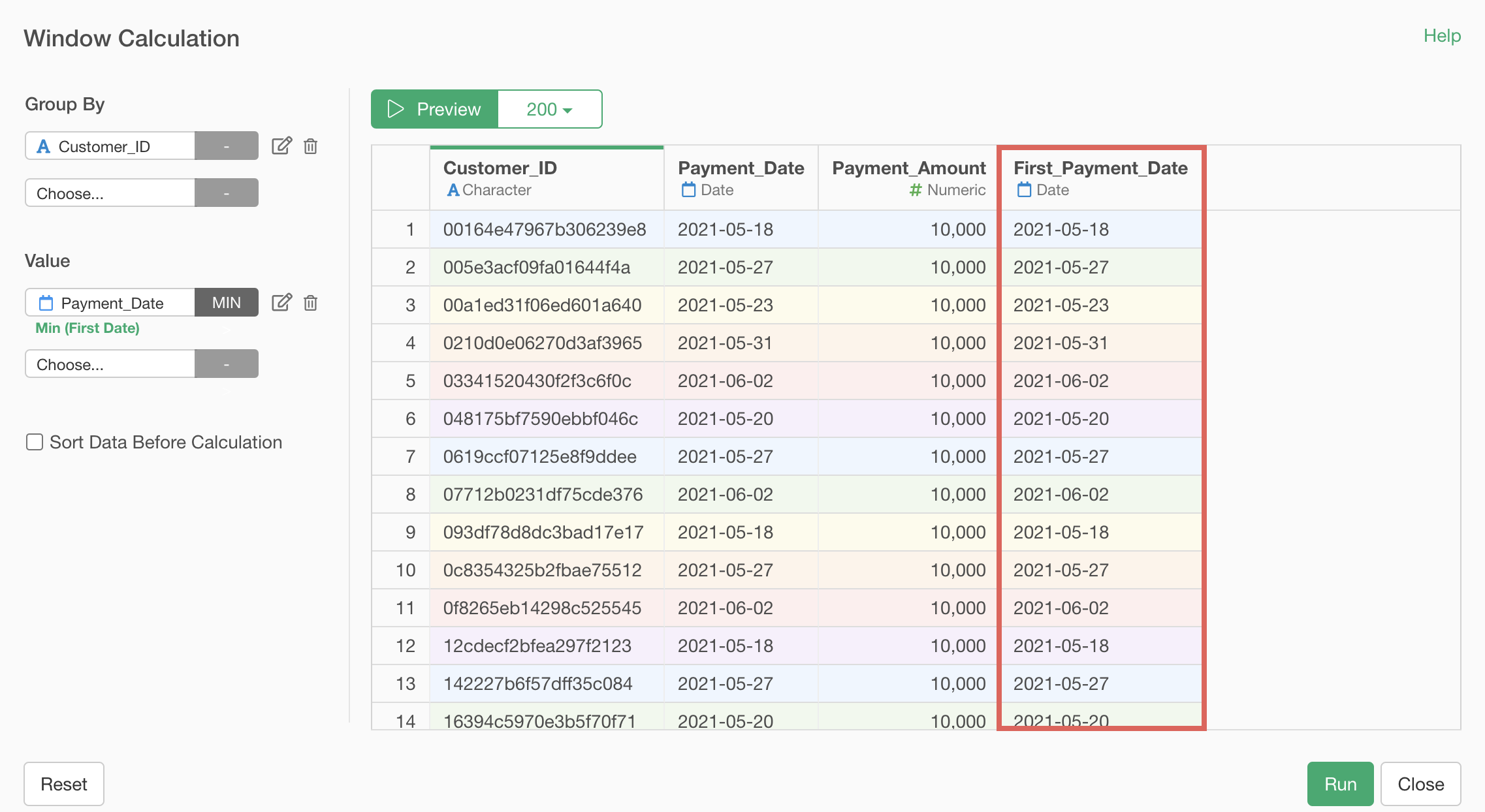
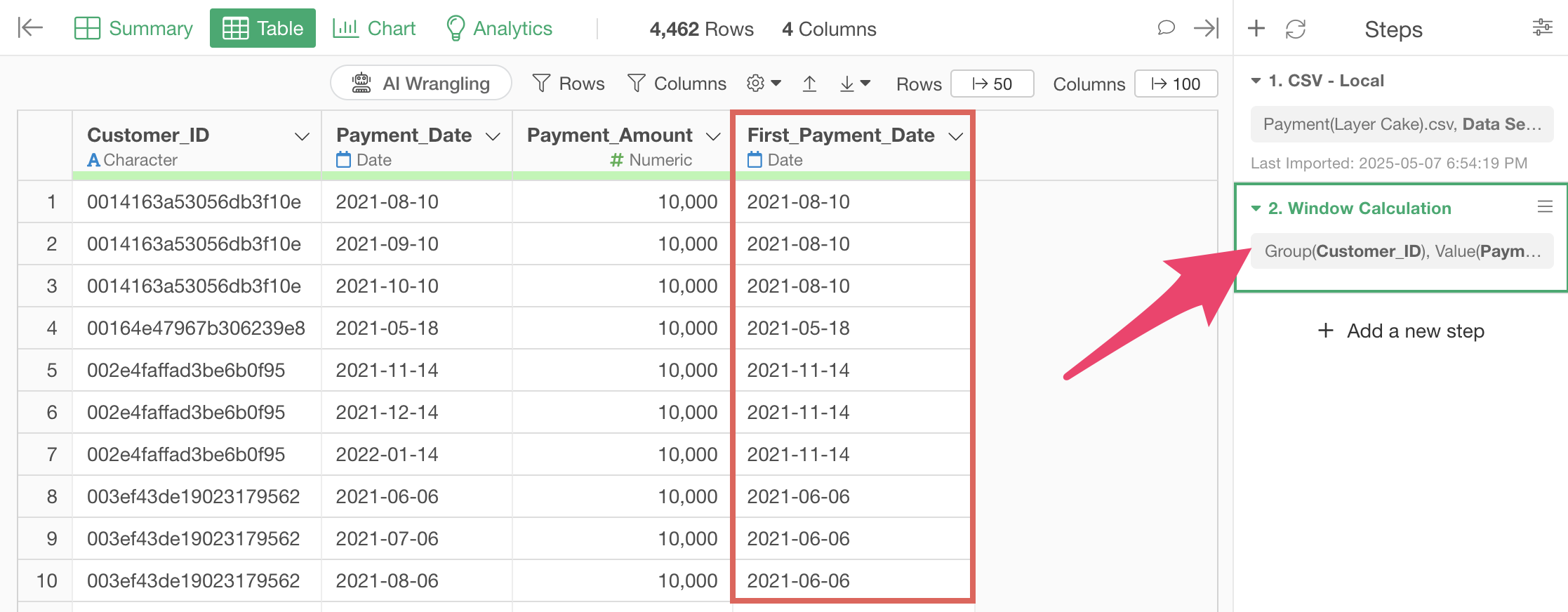
You have successfully added a “First_Payment_Date” column for each customer.
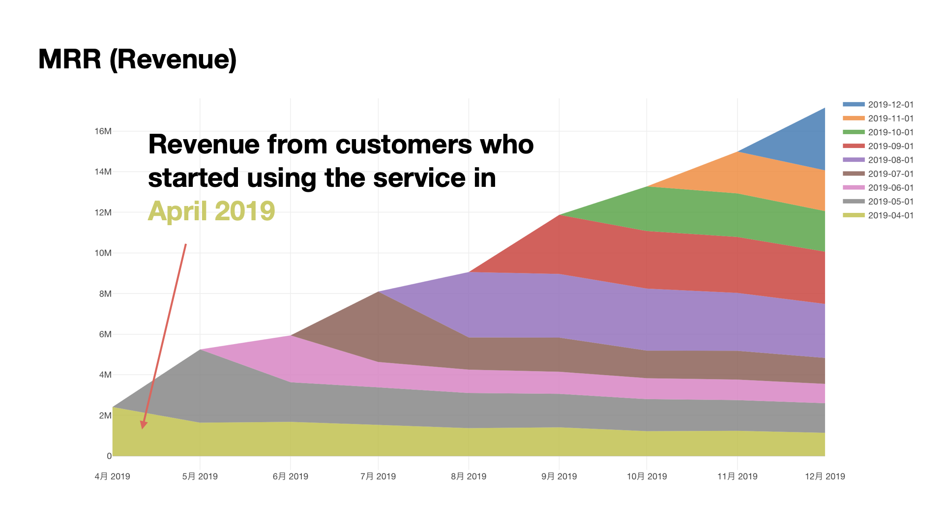
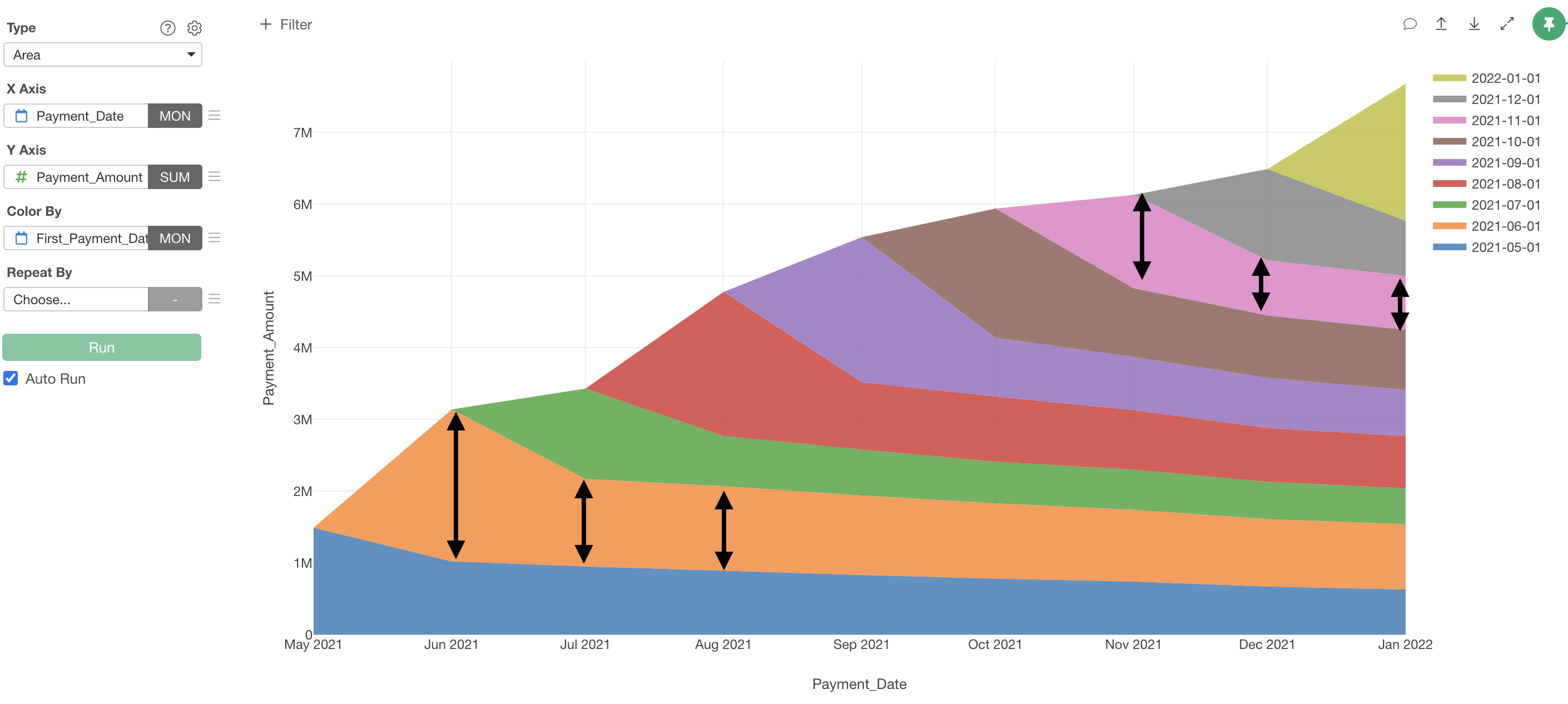
Creating a Layer Cake Chart
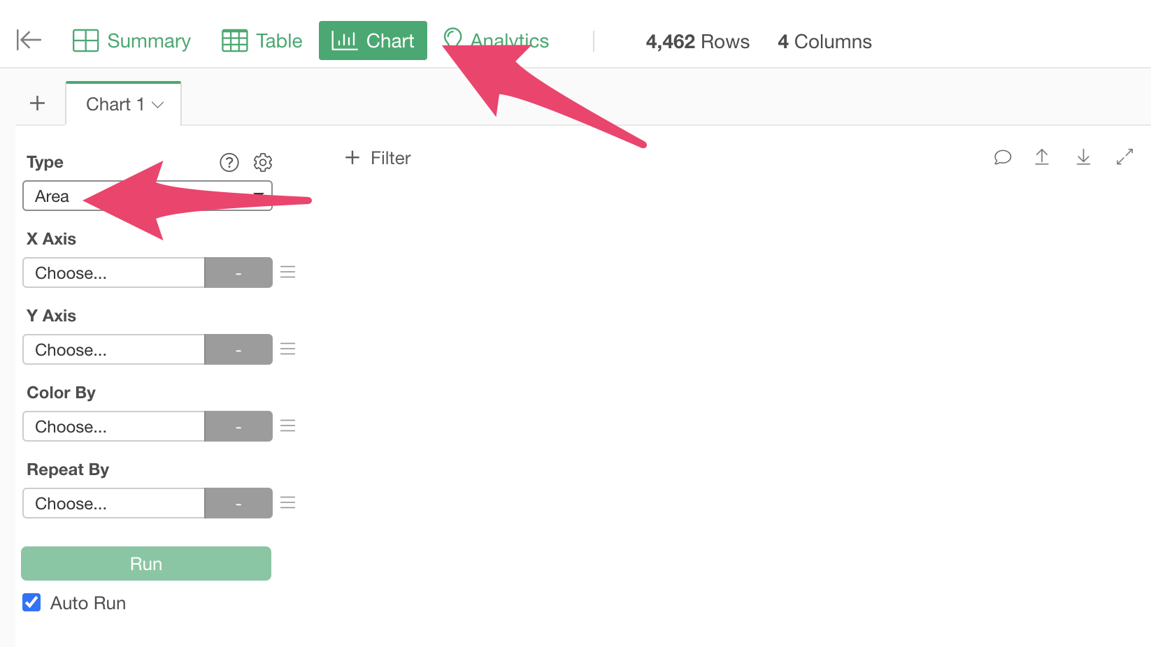
Now that the data is prepared, let’s create a Layer Cake Chart. Move to the chart view and select “Area” as the chart type.
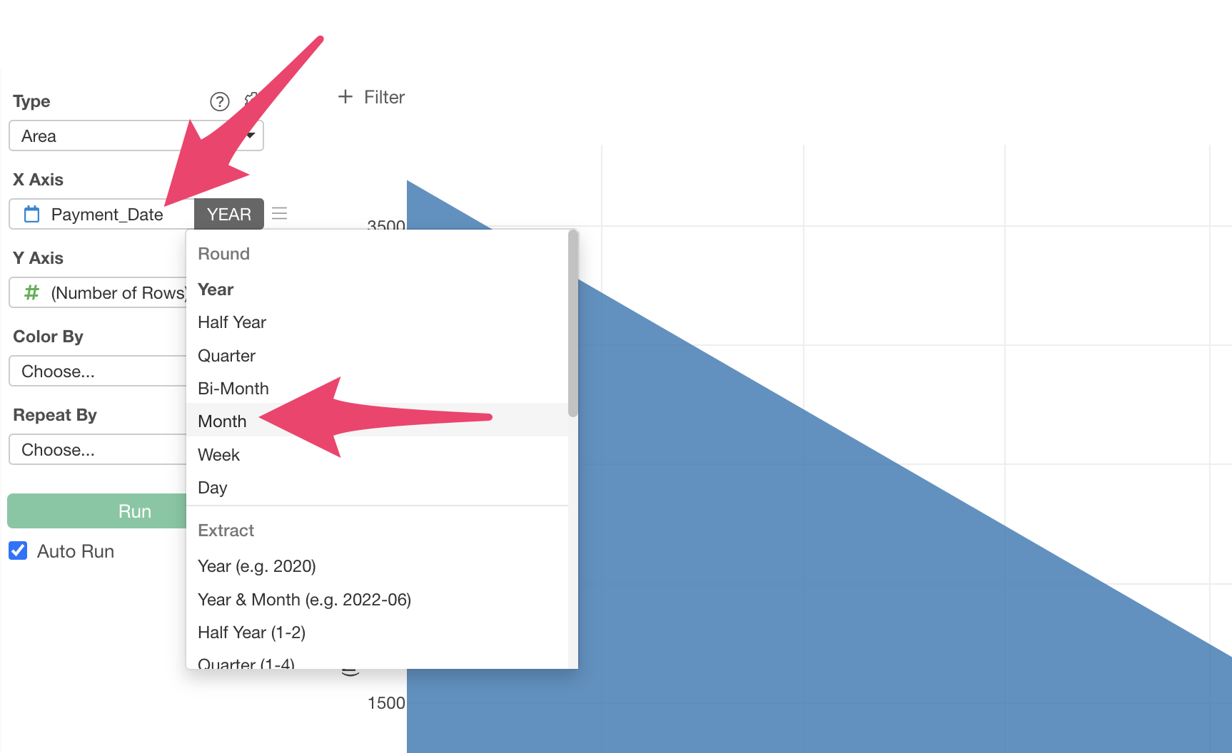
Next, select “Payment Date” for the X-axis and “Month” for the rounding process.
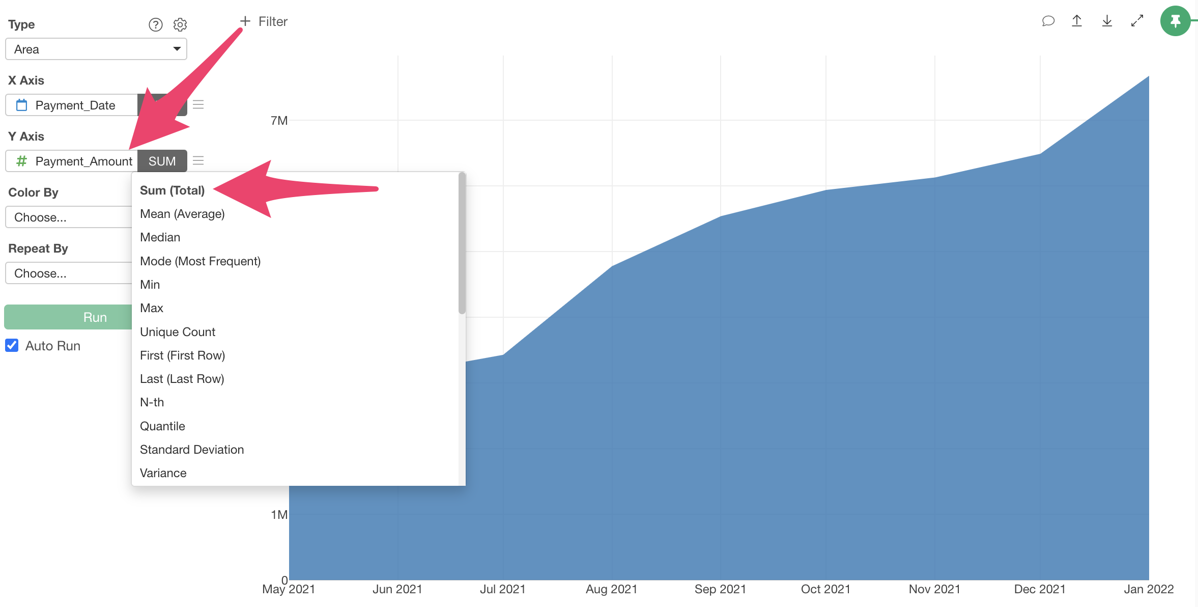
Select “Payment Amount” for the Y-axis and “Sum” for the aggregation function.
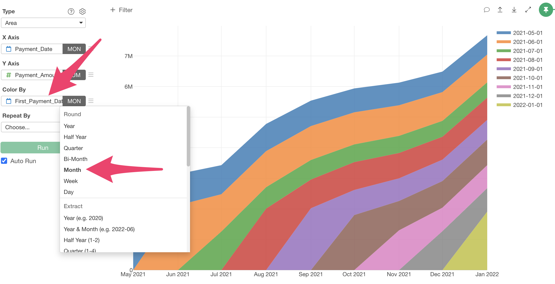
Finally, select “First_Payment_Date” for Color By and “Month” for the scale rounding.
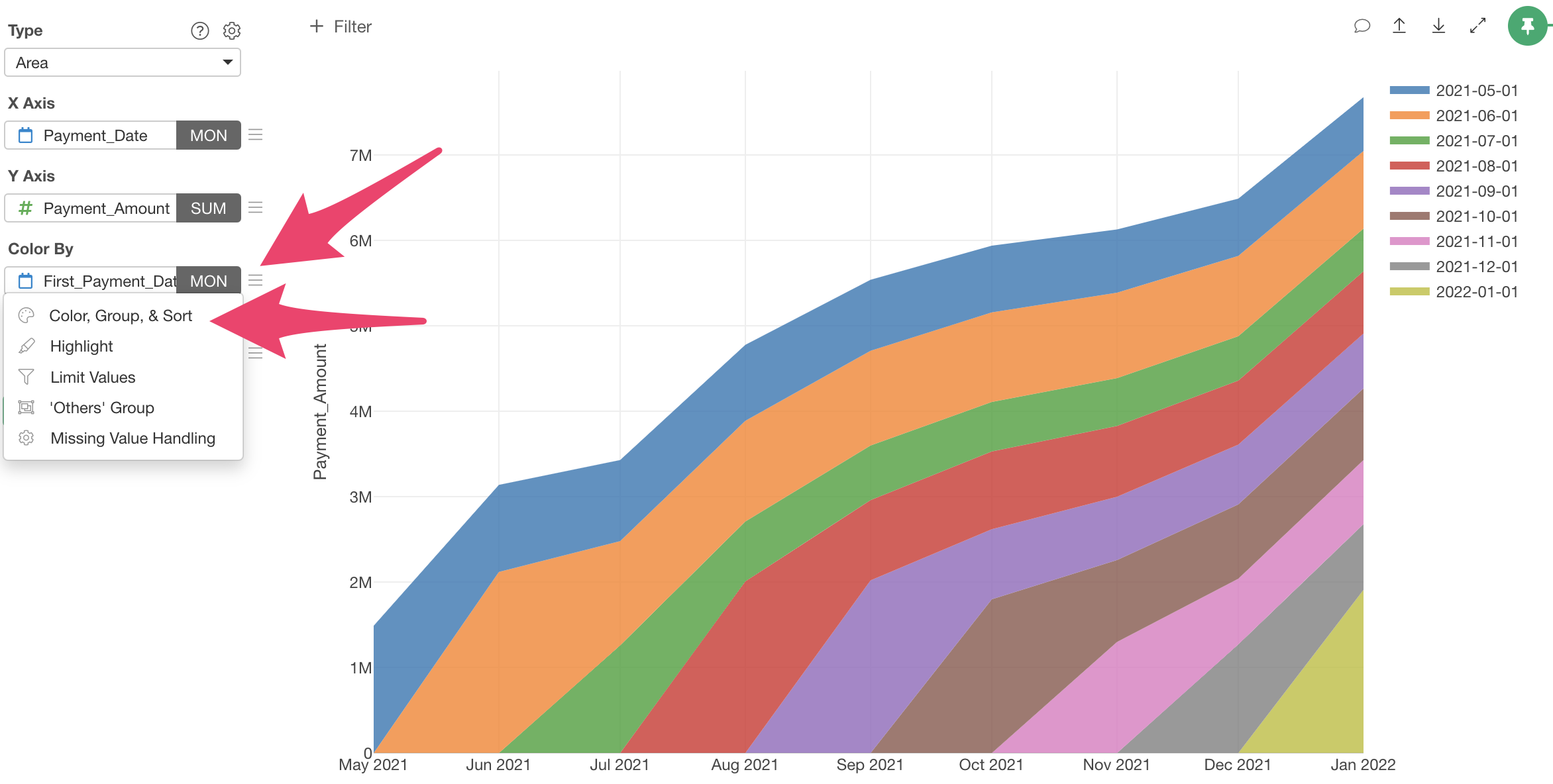
MRR has been divided into groups by service start period, but with customers with shorter continuation periods stacked from the bottom up, making it difficult to intuitively understand the progression of each cohort.

In a Layer Cake Chart, MRR is stacked starting with cohorts that have longer continuation periods.Therefore, select “Color, Group, Sort” from the “Color By” menu to change the color order.
When the “Color, Group, Sort Settings” dialog appears, change the “Direction” to “Bottom to Top” and apply.
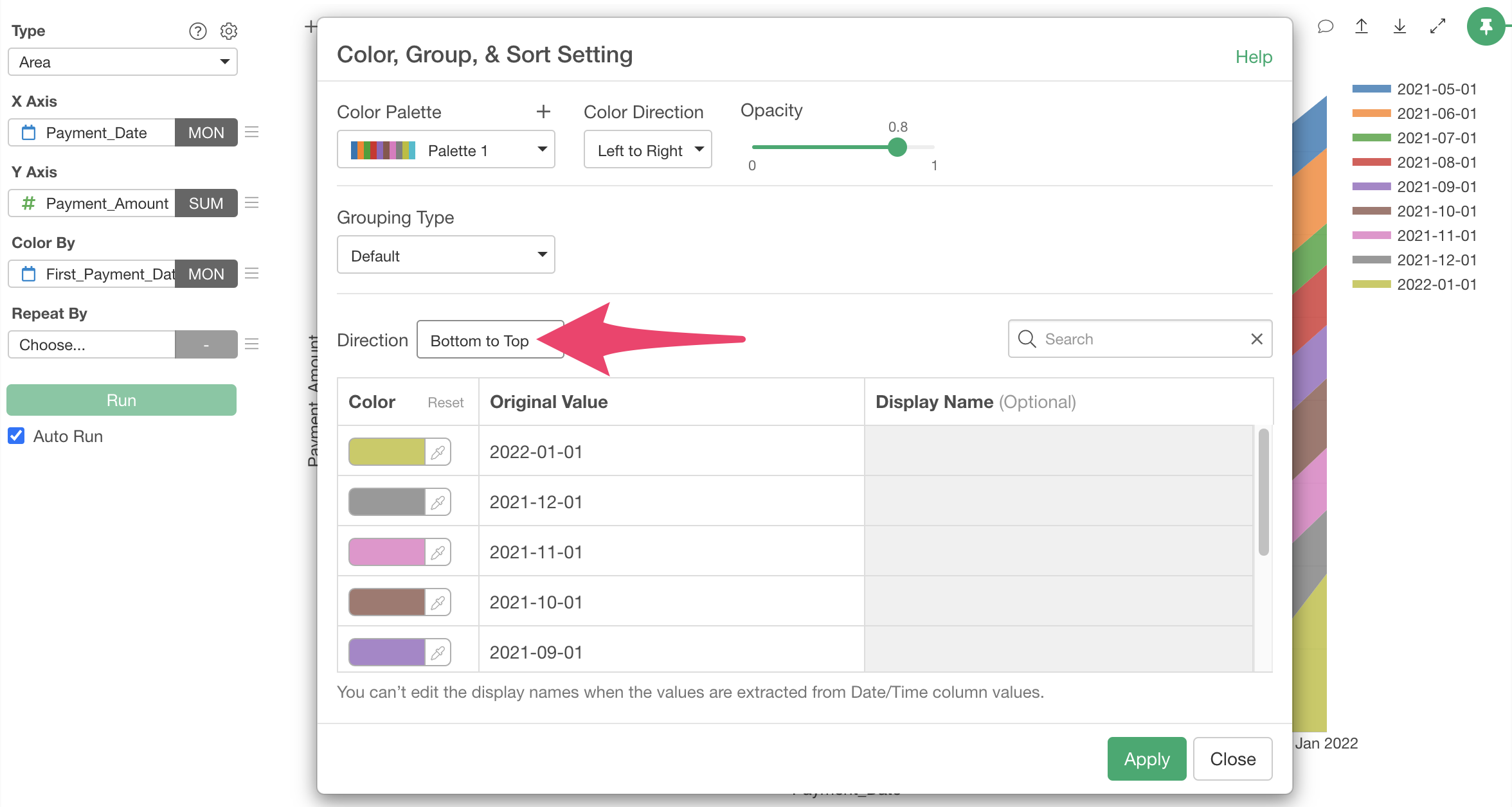
MRR has been stacked starting with groups that have longer continuation periods. This completes the Layer Cake Chart.

In this business, the retention of customers who recently started using the service doesn’t seem to differ much from that of customers who started using the service a long time ago, so it can’t be said that retention is improving.
Subscription Data Analysis
Other parts of the trial tour for subscription-based business users can be found at the links below.
- Visualizing Business KPIs - Link
- Creating Layer Cake Charts
- Conversion Factor Analysis and Prediction - Link
- Cohort Analysis - Link
Next time, we’ll analyze the factors of new customer conversion (acquisition), which is essential for business growth, and predict the probability of prospects converting.
Like this session, it’s content that can be completed in about 20 minutes, so please give it a try!