Subscription Data Analysis #4 - Cohort Analysis
This note is the fourth installment of the “Subscription Data Analysis” trial tour, which efficiently teaches you how to create, visualize, and analyze metrics specific to subscription-based businesses, focusing on “Cohort Analysis.”
In SaaS and subscription-based businesses, “cohort analysis” is performed to visualize whether customer retention (service continuation) is improving.
In this session, we will conduct a “cohort analysis” using customer contract duration data from a subscription-based business.
The estimated time required is about 20 minutes. Let’s get started!
What is Cohort Analysis?
In subscription-based businesses, growth depends on customers continuing to use products or services, making cancellation rate or its inverse, retention rate (the percentage of customers retained from the previous period), the most important metrics.
Therefore, retention rate trends are monitored as shown below.

However, when monitoring cancellation or retention rates, it’s important to consider not just whether customers canceled, but also “how long” they remained customers before canceling.
Generally, customers are more likely to cancel shortly after converting. This could be because the service didn’t match their needs or they couldn’t get accustomed to using it.
Conversely, the longer customers stay, the more likely they’ve realized the value of the service, resulting in a lower cancellation rate among these long-term customers.
Therefore, instead of calculating cancellation or retention rates by grouping all customers together regardless of their different durations, we create a “survival curve” calculated for each period as shown below.
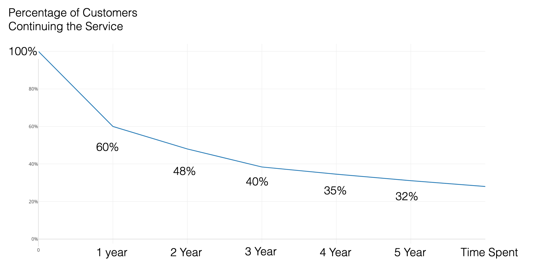
We’ll examine this in detail using a chart that visualizes what percentage of customers remain after conversion.
We then use this curve to analyze how different groups differ in terms of “retention.”
This analysis, comparing multiple customer groups using survival curves, is called “cohort analysis”. A cohort is a group.
Furthermore, in subscription-based businesses like SaaS, it’s common to divide customers into multiple cohorts based on when they converted.

This chart shows whether retention is improving or deteriorating for more recent customer cohorts. Ideally, the survival curves for more recent cohorts should rise higher, indicating improved retention. This would suggest improvements in service value or customer targeting.
Now, let’s try a simple “cohort analysis.”
Required Data
For cohort analysis, you need data where each row represents one observation subject (e.g., one customer).
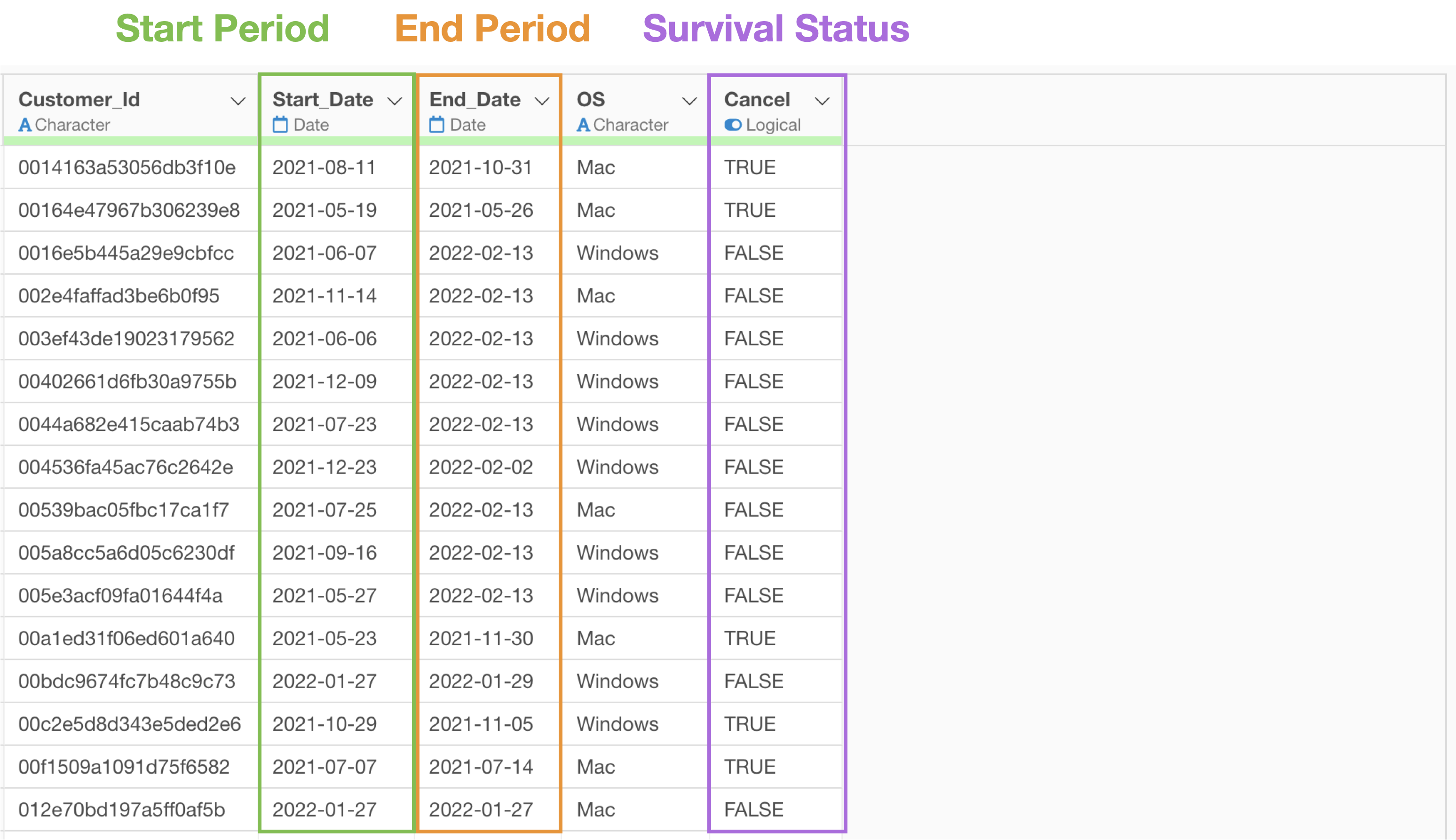
The following information is also required in columns:
- Start time: When observation of the subject began (e.g., contract date, service start date)
- End time: When observation of the subject ended (e.g., contract end date)
- Survival status: A logical column indicating the event status of the subject (e.g., cancellation, resignation)
Data Overview
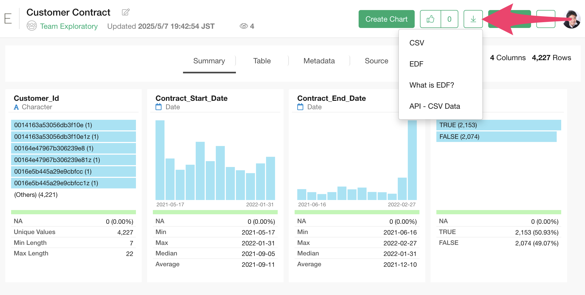
We’ll use customer contract duration data from a business providing monthly services. The data can be downloaded from this page.
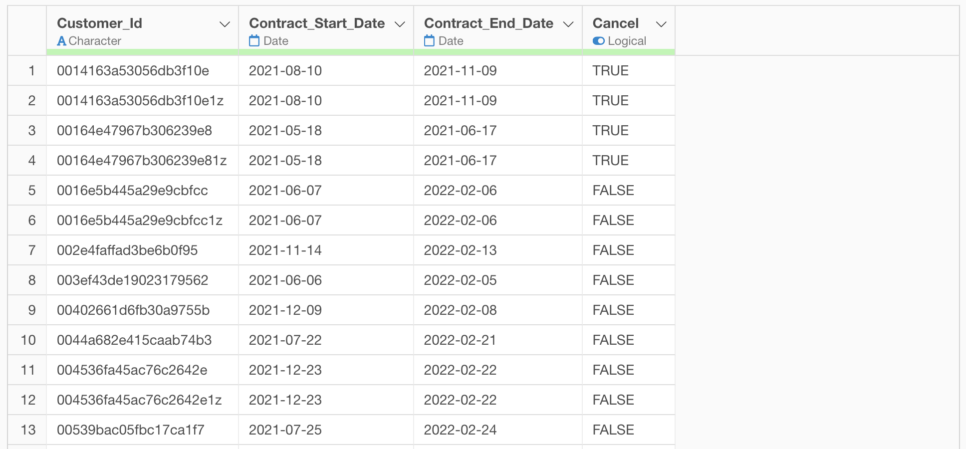
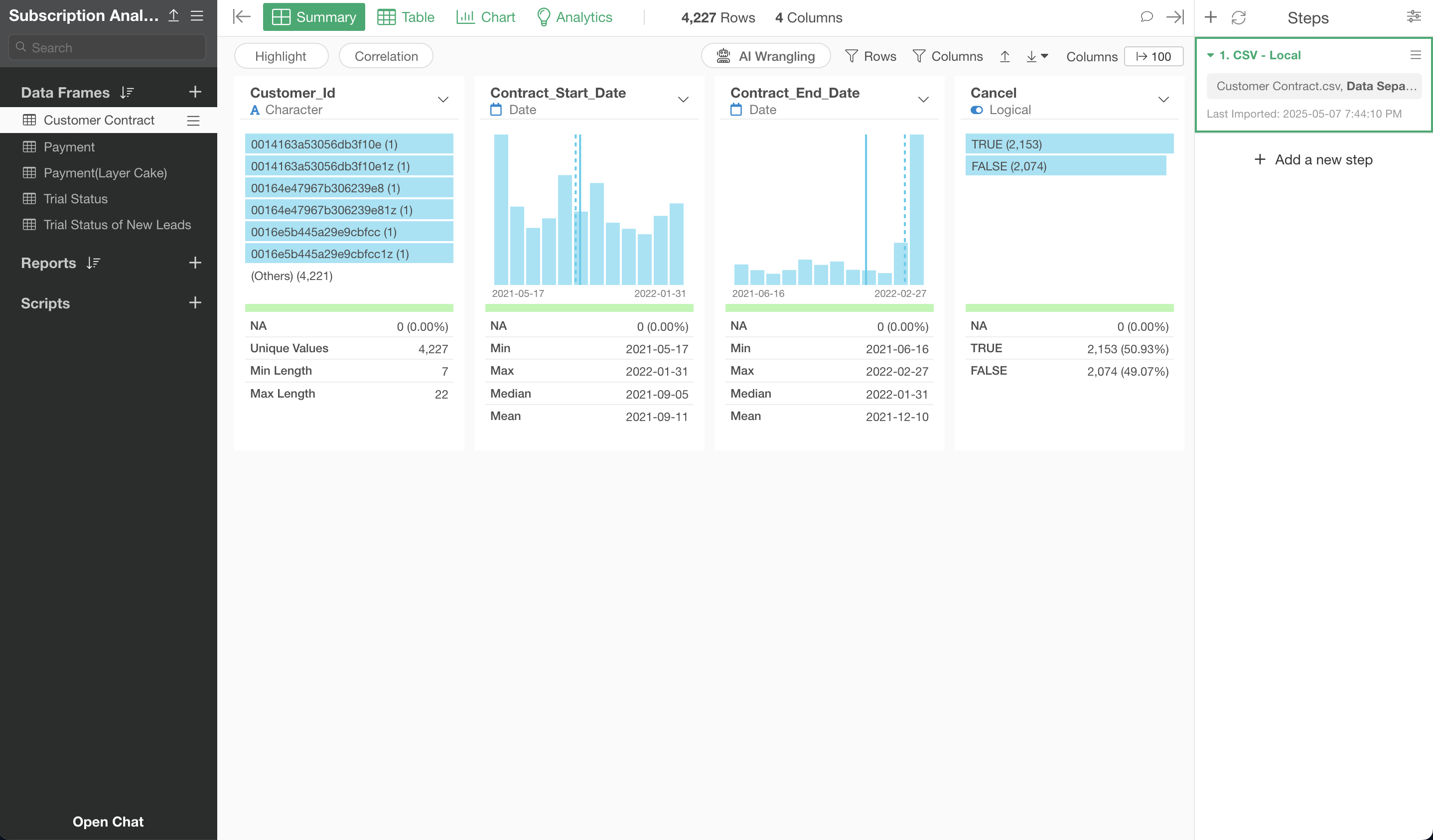
In this dataset, each row represents one paid customer, with columns containing the following information:
- Customer ID: A unique ID for each customer
- Contract Start Date: The date when customer conversion occurred
- Contract End Date: The contract end date if the customer has canceled the service, or the current date if they haven’t canceled
- Cancellation: Whether the customer has canceled the service
Importing Data
After launching Exploratory, click the “Create New” project button.
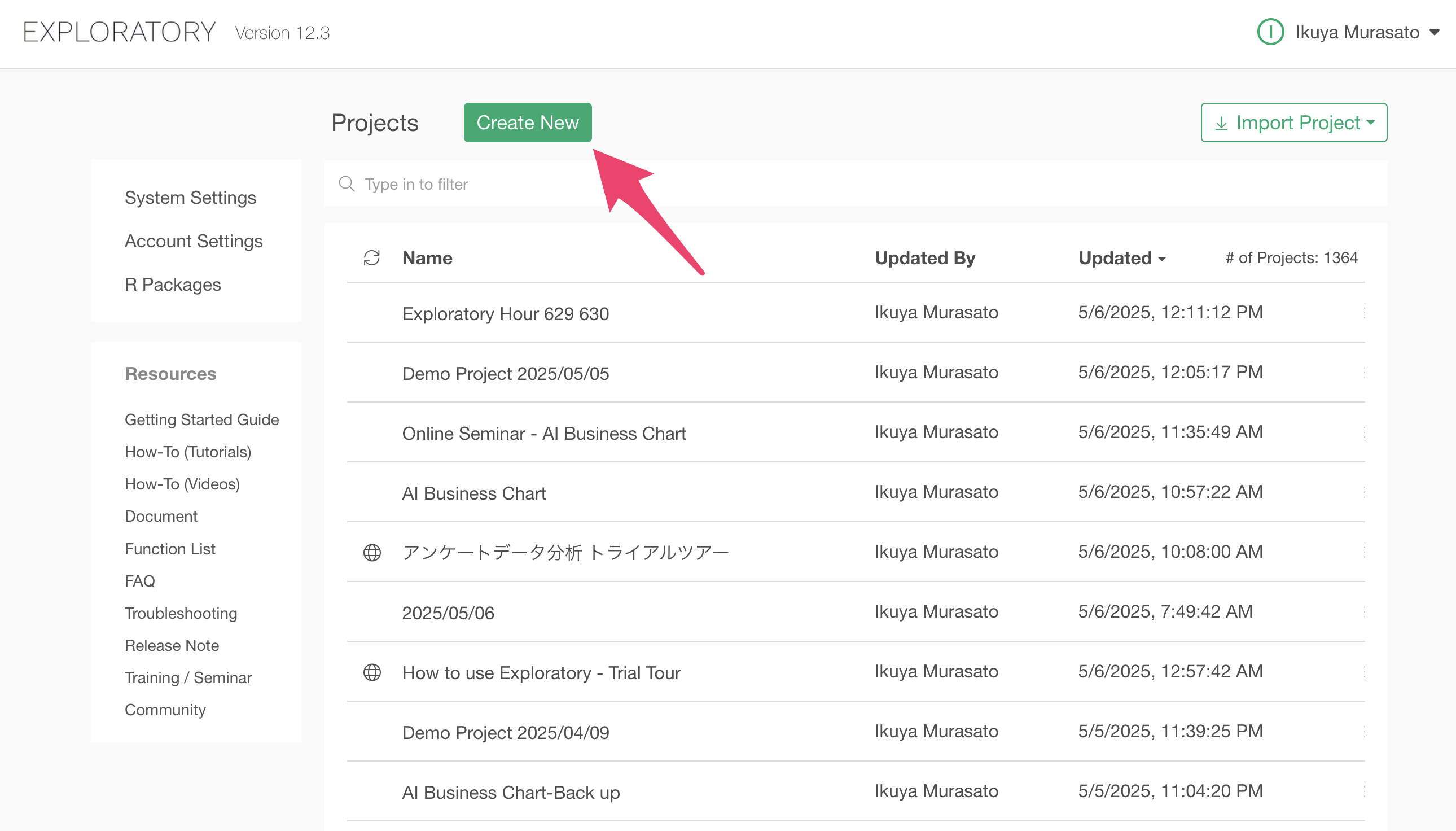
A dialog to create a project will appear. Enter a name of your choice and click the create button.
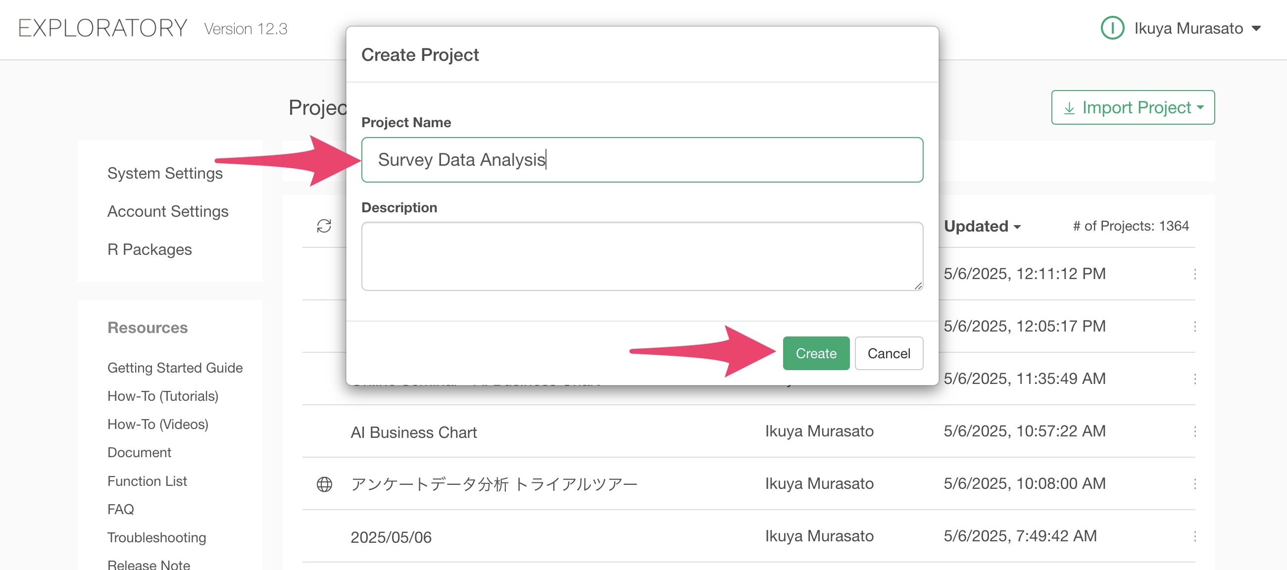
The project has been created.
After creating the project, let’s import the data. The data can be downloaded from this page.
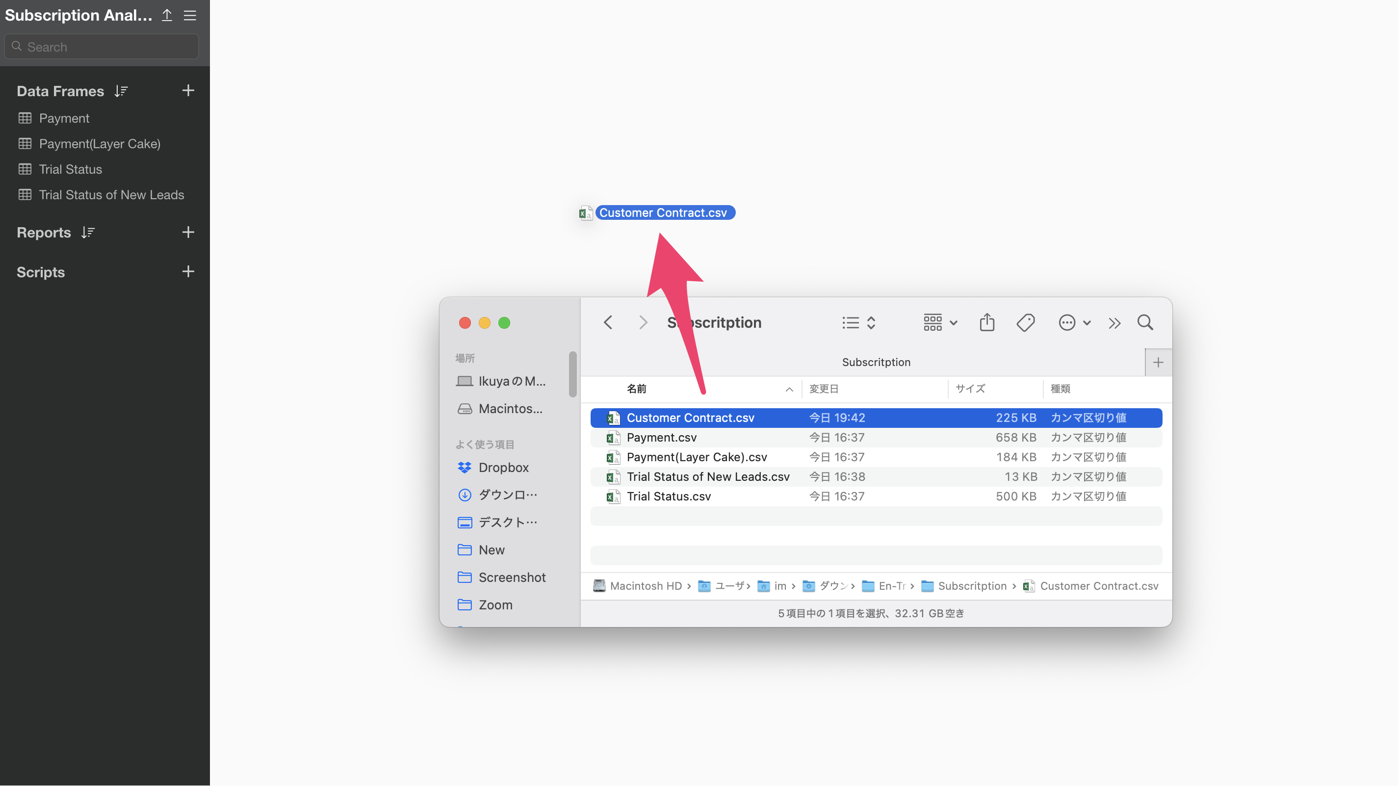
Once you’ve downloaded the customer contract data, open the download folder and drag and drop it onto the Exploratory screen.
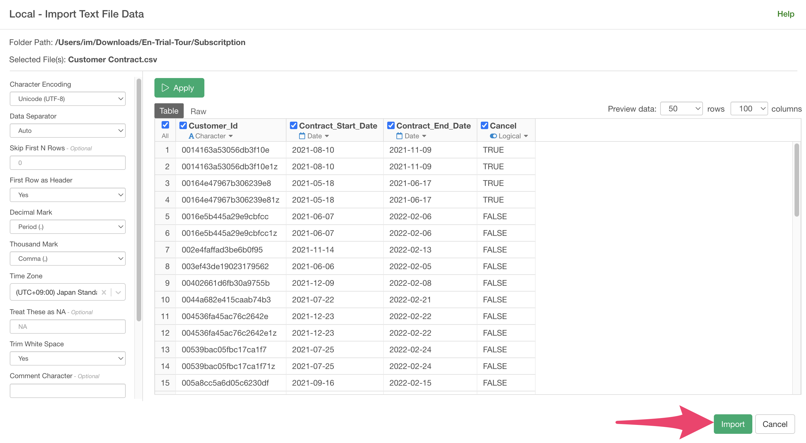
An import dialog will appear.
In the import dialog, you can specify settings for importing data from the items on the left, but since no settings are needed this time, click the “Import” button.
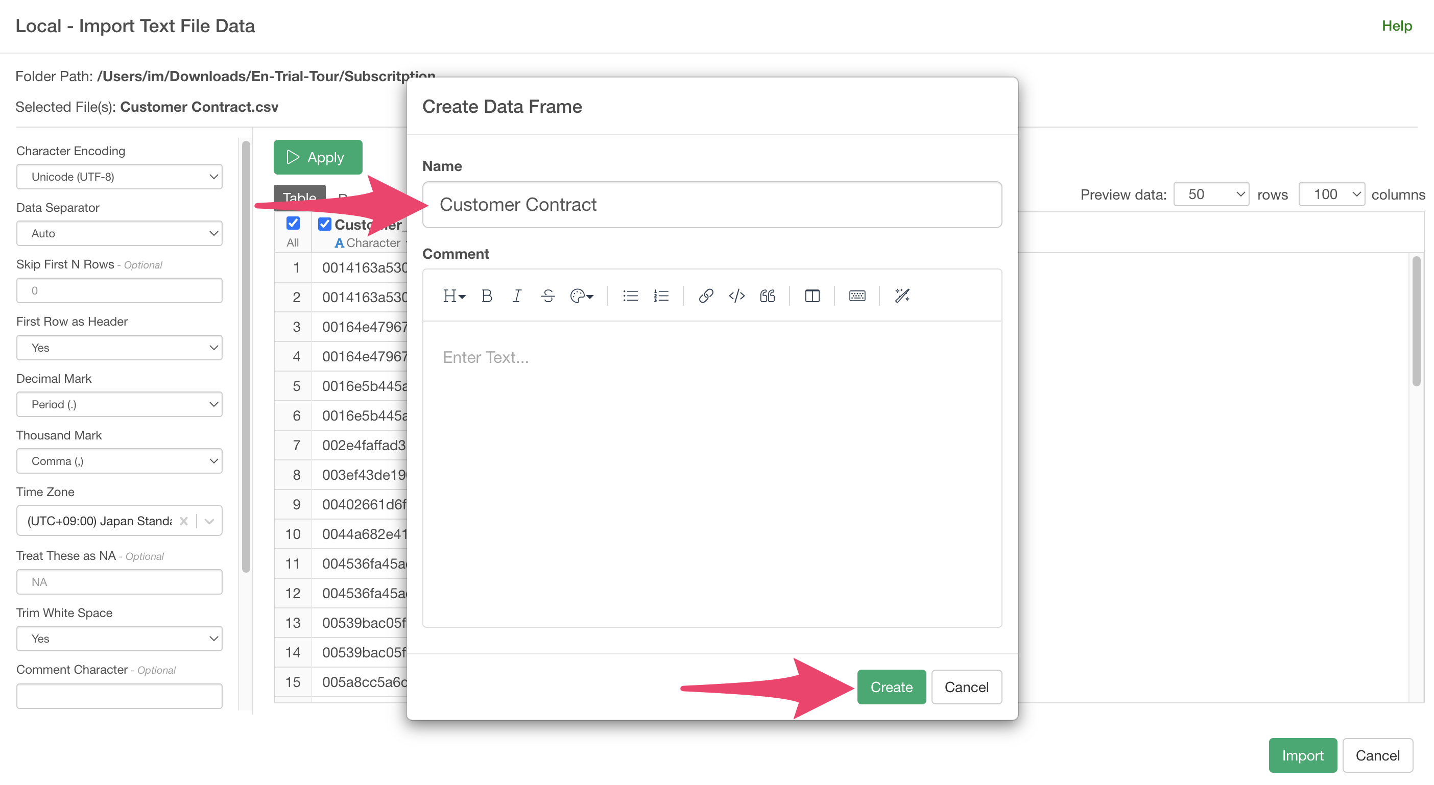
 A
data frame settings dialog will appear, so click the “Create”
button.
A
data frame settings dialog will appear, so click the “Create”
button.
The customer contract status data has been imported.
Performing Cohort Analysis
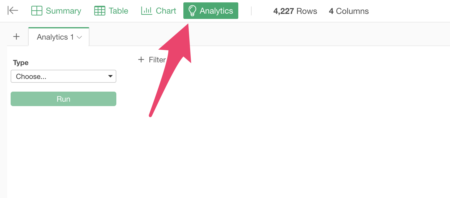
Since cohort analysis is an analytics that compares “survival curves” by group, let’s move to the analytics view.
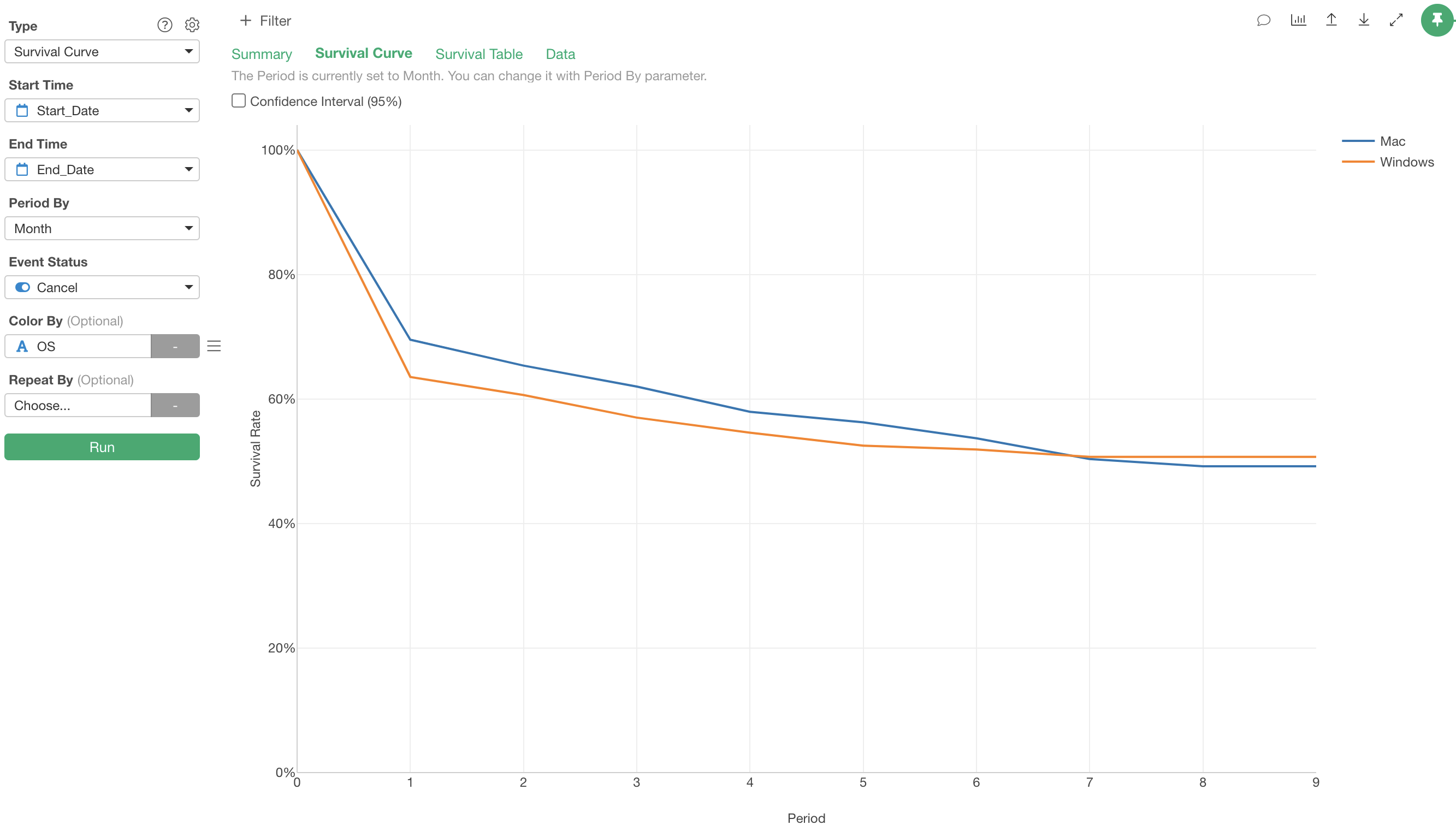
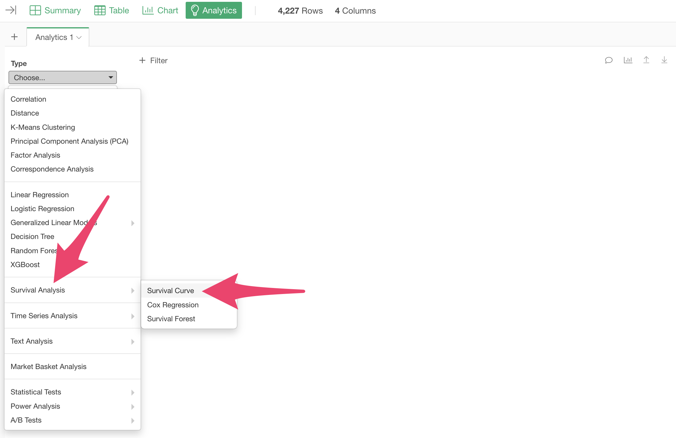
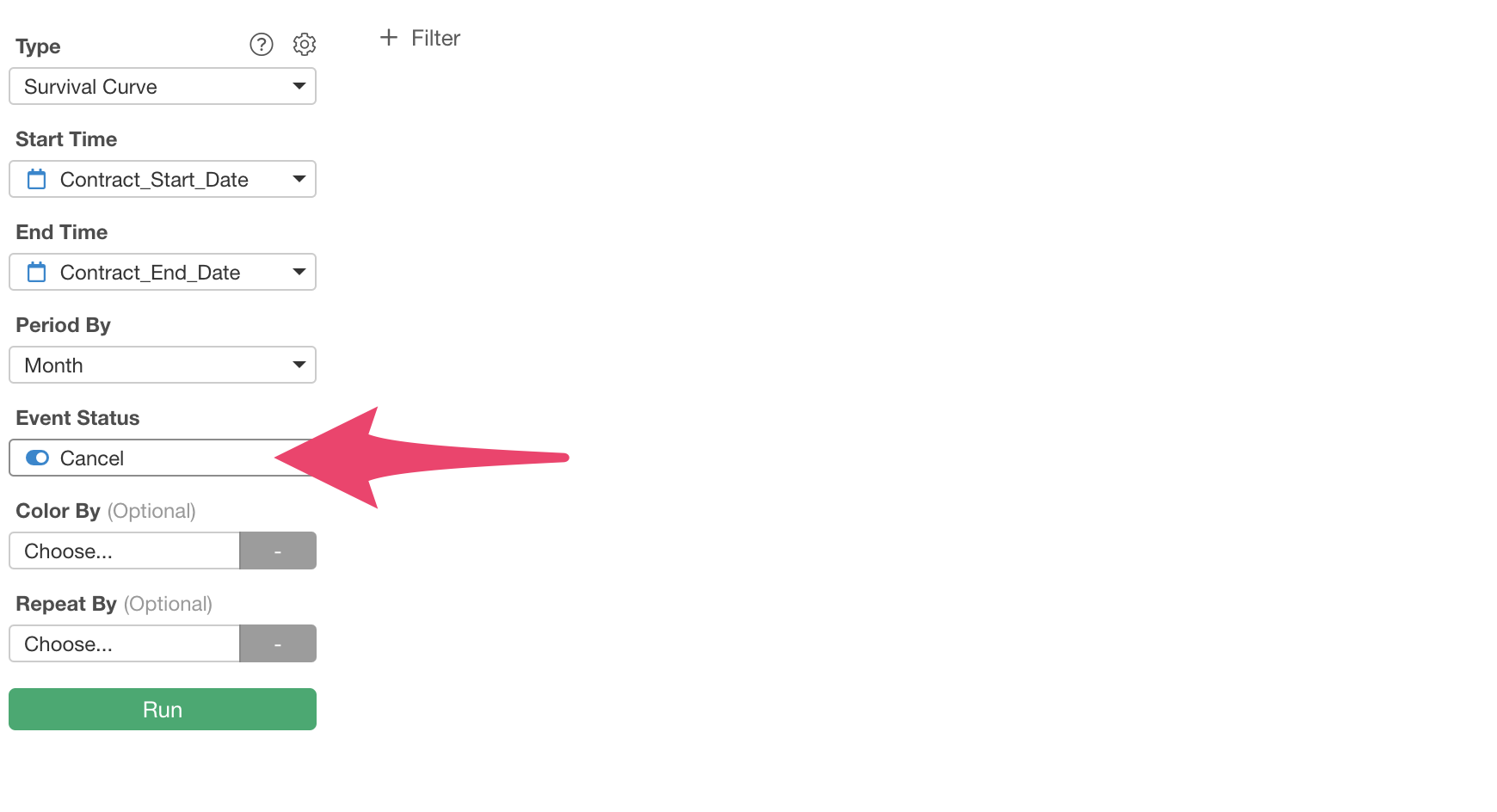
Select “Survival Curve” under “Survival Analysis” for the type.
Select “Contract Start Date” for “Start Time” and “Contract End Date” for “End Time.”
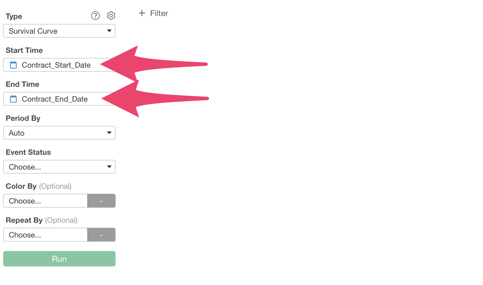
Next, set the “Time Unit” for the survival period. The default setting is “Auto,” which automatically sets the optimal “Time Unit”.
Since cancellations occur monthly in this case, let’s explicitly set the “Time Unit” for the survival period to “Month”.

Finally, select “Cancellation” for “Survival Status (Event)” and execute.
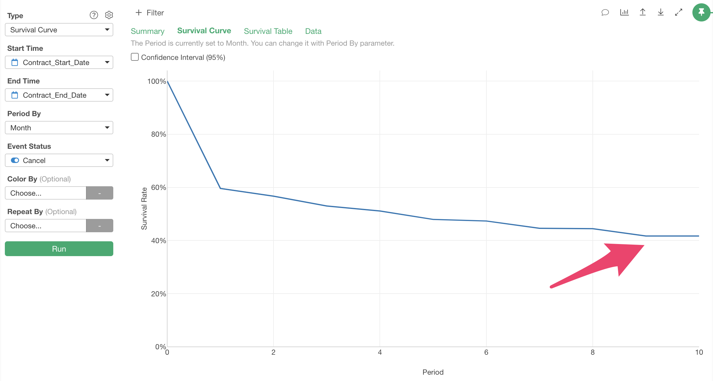
The survival curve has been drawn.
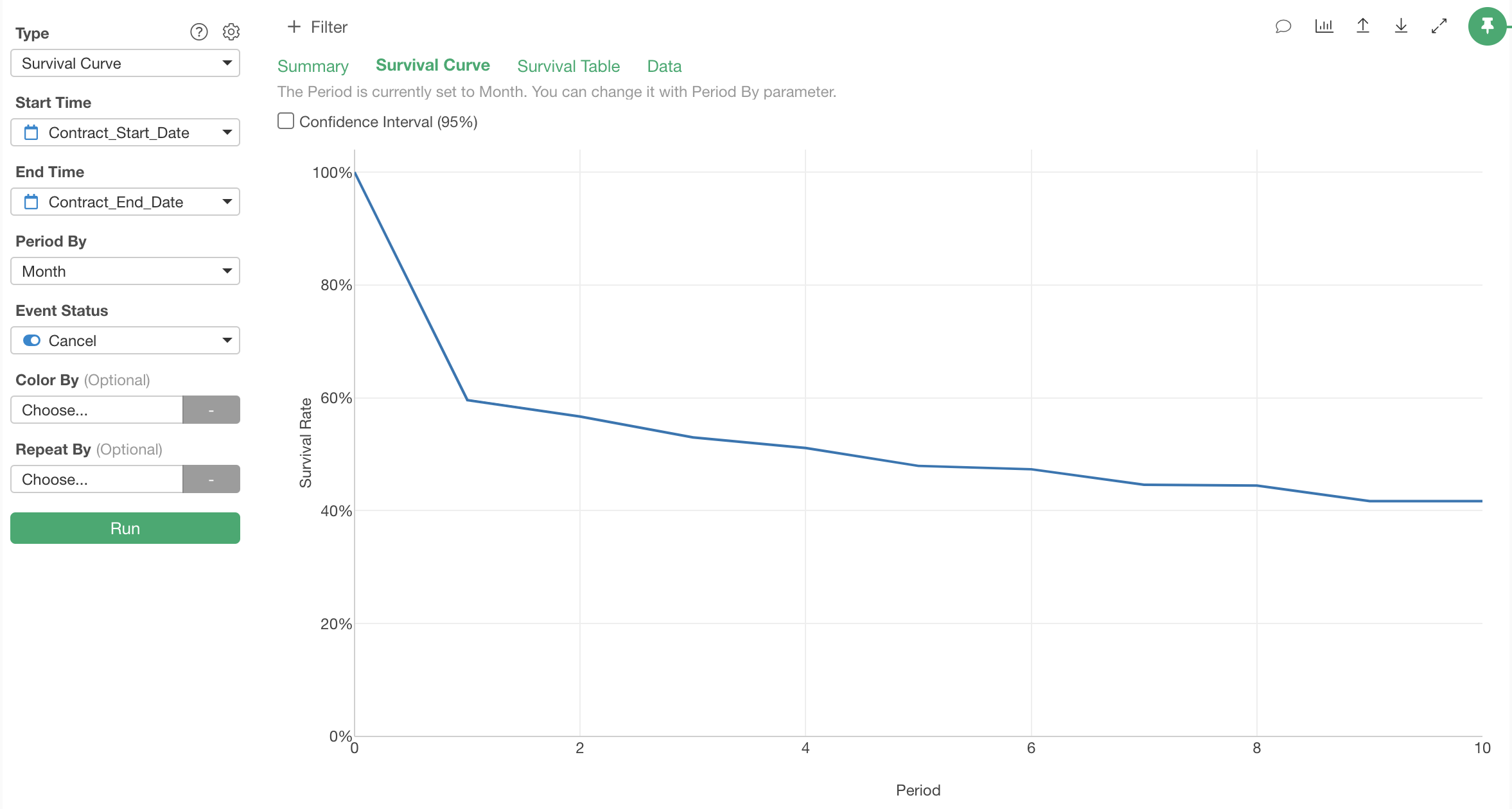
Since we specified “Month” for “Time Unit,” the unit of the survival period on the X-axis is set to “Month.”
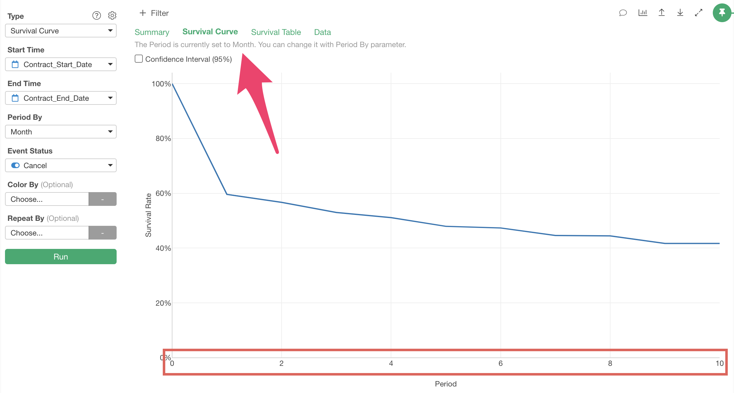
We can see that many customers cancel after one month of service use.
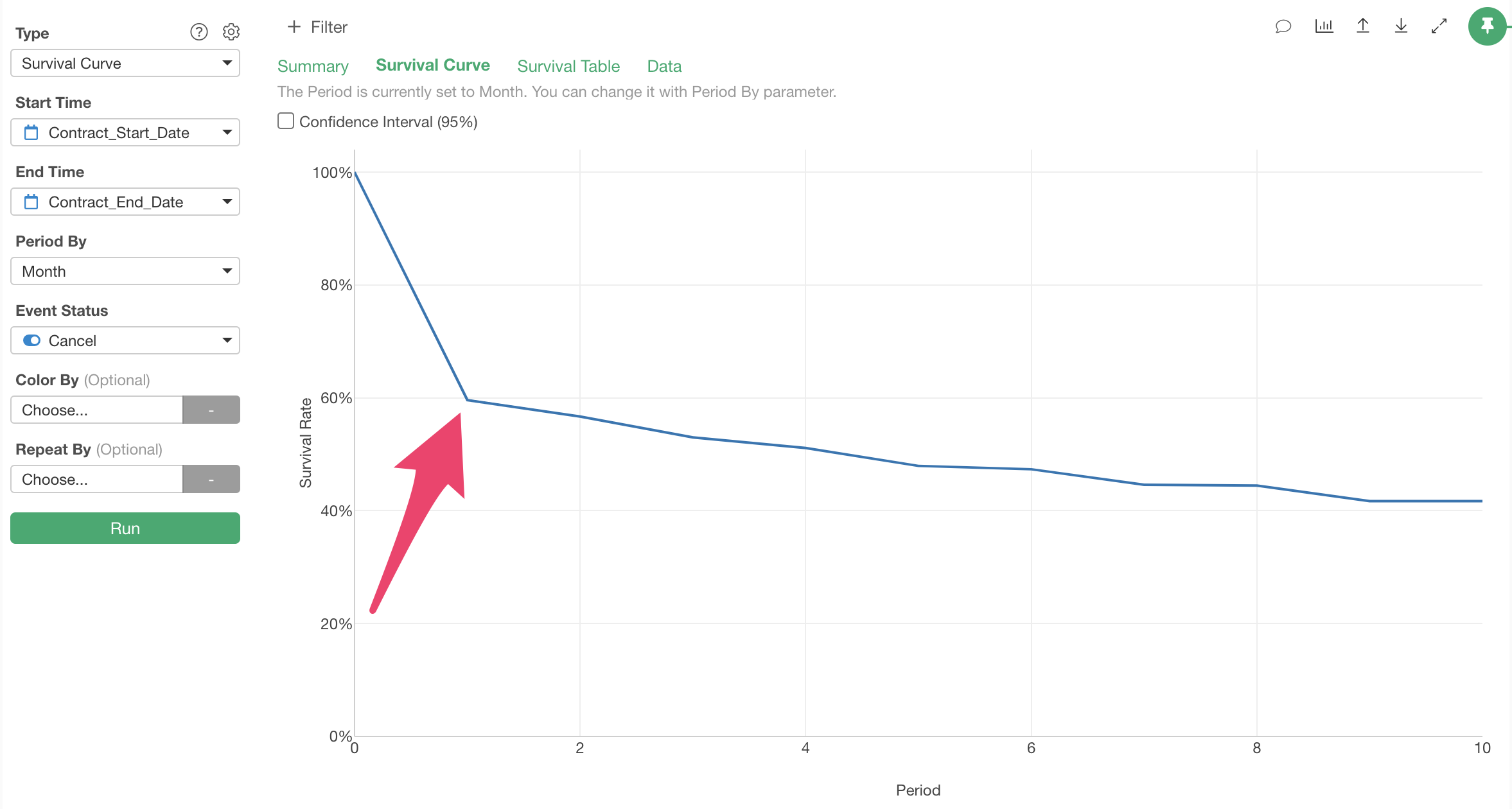
Also, when you hover over the survival rate, information about the elapsed period (survival period), the number of observation subjects surviving until that period (observation subjects), and the survival rate is displayed.
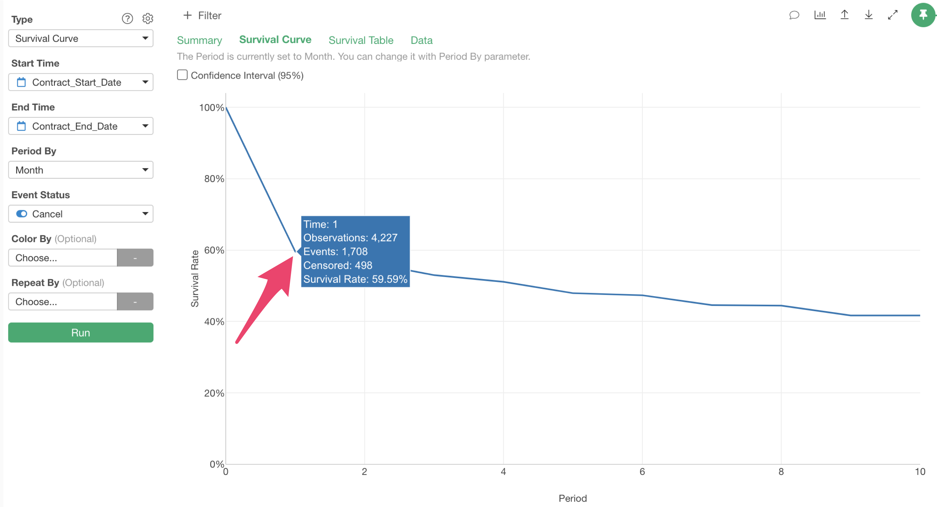
For example, the survival rate after one month is about 60%, meaning 40% of customers cancel the service within one month.
Also, customer cancellations seem to stabilize after 9 months.
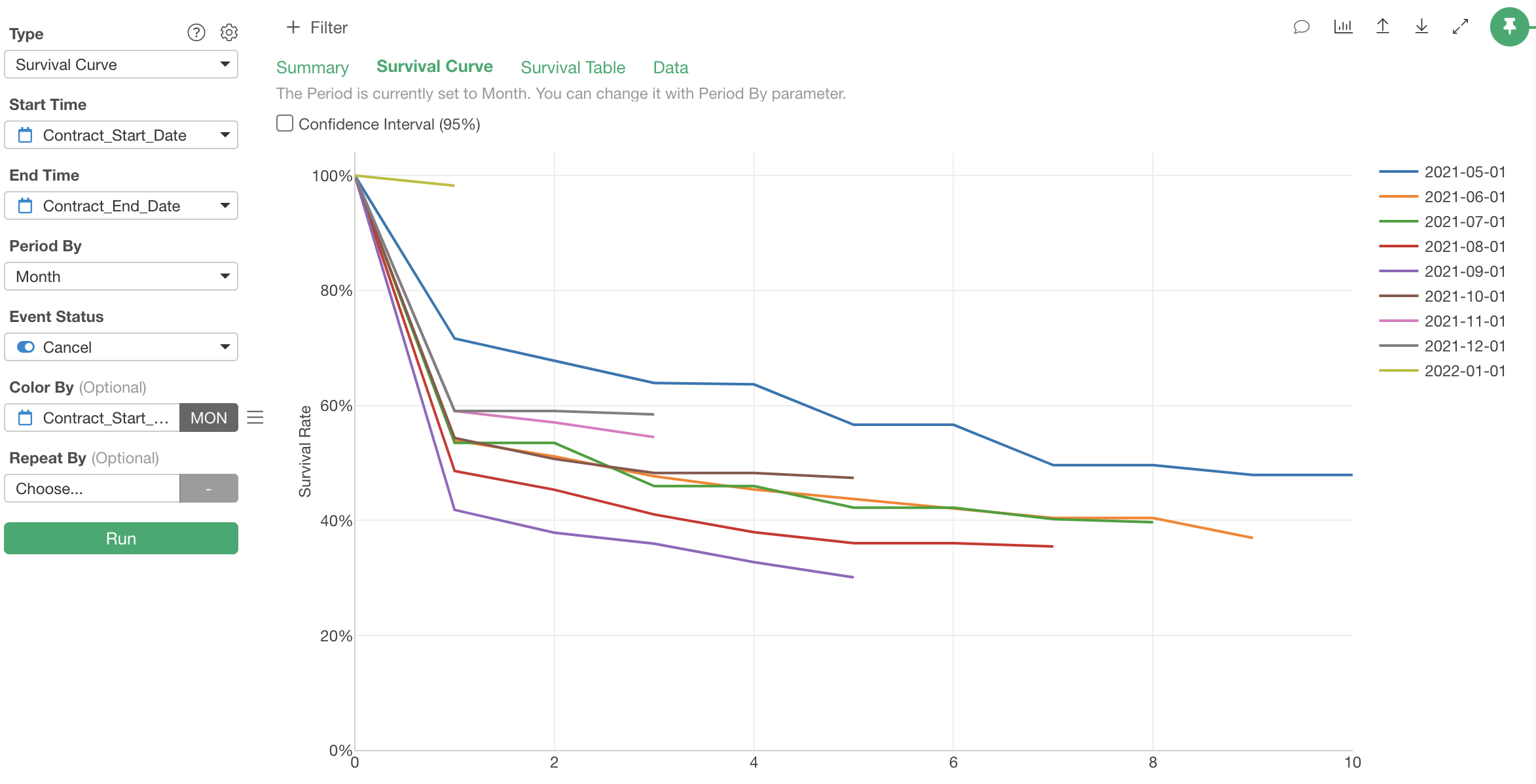
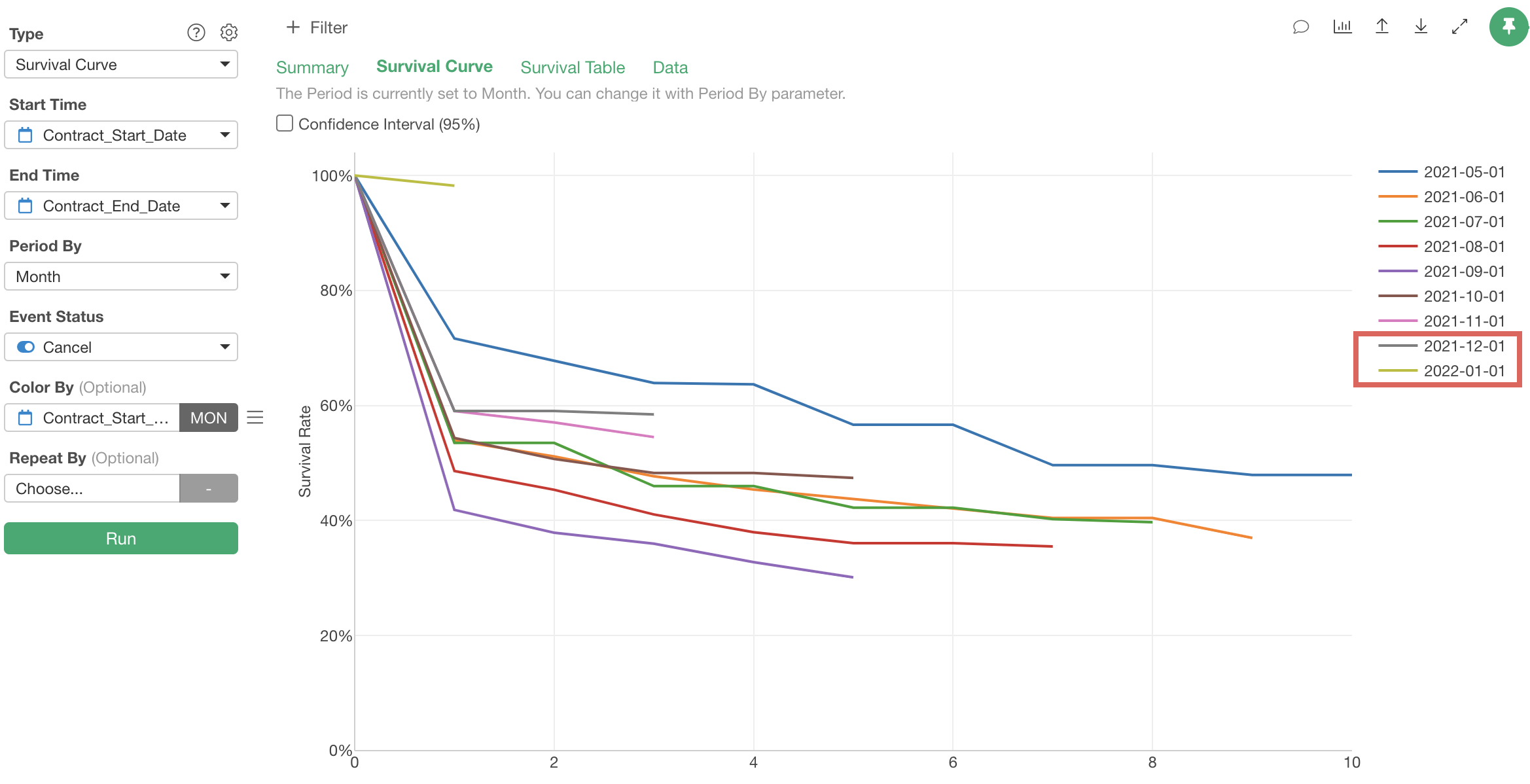
Next, let’s divide customers into cohorts based on their service start time and draw survival curves for each to see if customer retention has improved over time.
Select “Contract Start Date” for “Color By and to examine whether retention is improving monthly, select”Month” for rounding and run it.

We’ve visualized survival curves by grouping customers by their service start time.
It appears that customer retention worsened once but has since recovered.
We can see that retention for groups that started using the service after October 2021 has continued to recover, suggesting successful ongoing improvements in service, customer success, and support.
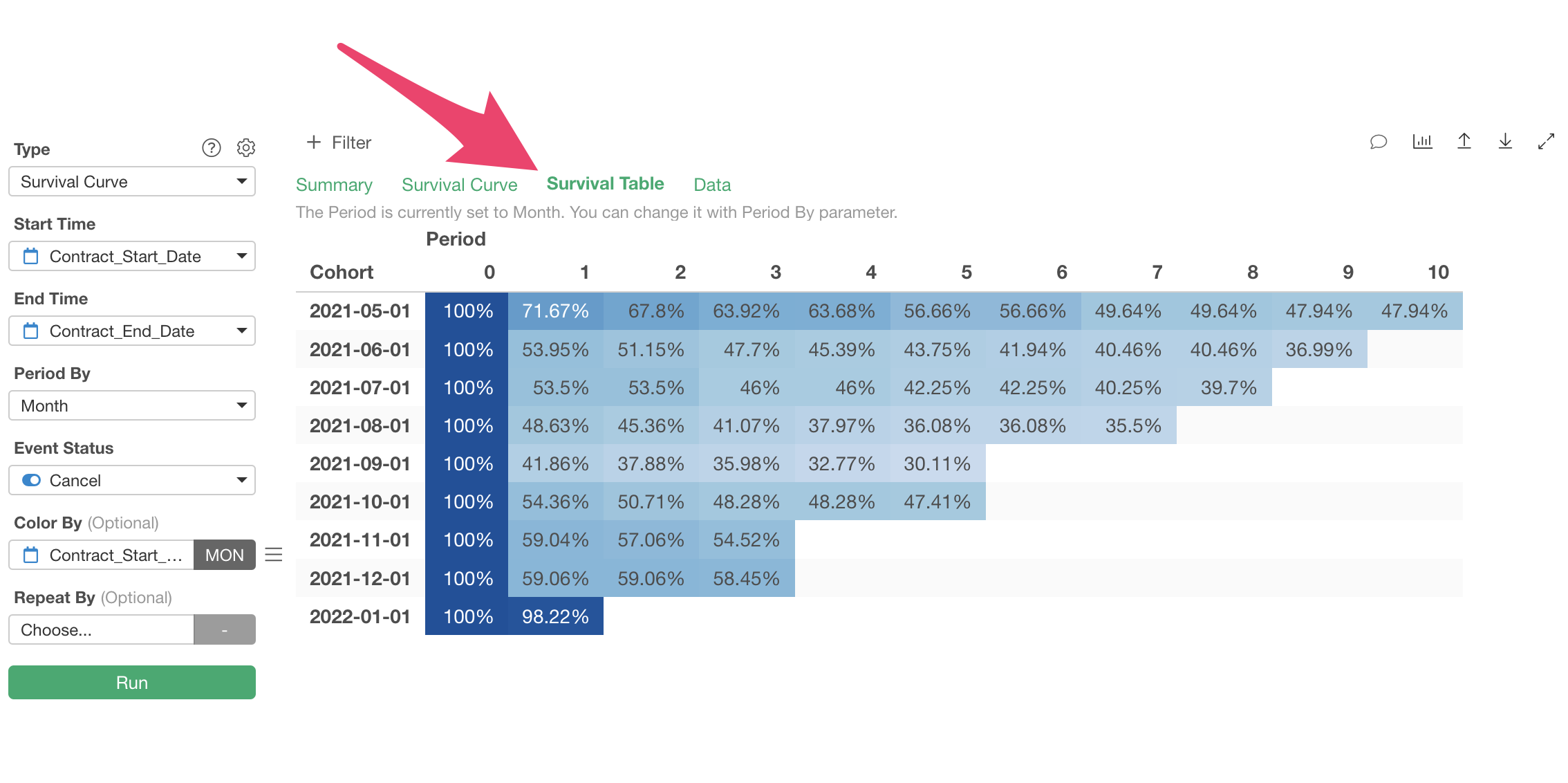
Note that the “Survival Table” tab allows you to check the information visualized in the “Survival Curve” tab in table format.
In this session, we performed cohort analysis by selecting “Survival Curve” under “Survival Analysis” as the type, but you can also use “predictive models” of survival analysis such as “Cox Regression” or “Survival Forest” to predict survival probabilities for each customer survival period.