Survey Data Analysis Part 1 - Correlation
This note is the first part of the “Survey Data Analysis” trial tour, focusing on “Correlation.” It is designed to help you efficiently learn how to effectively utilize survey data to improve your business or services. The complete tour is available at Survey Data Analysis.
We hope you’ll experience the convenient features in Exploratory that allow you to quickly check survey response trends and discover correlations between responses.
The estimated time required is about 20 minutes.
Let’s get started!
1. Create a Project
In Exploratory, all data analysis, including data import, is conducted within projects.
Therefore, you first need to create a base project.
Click the “Create New” button from the project management screen.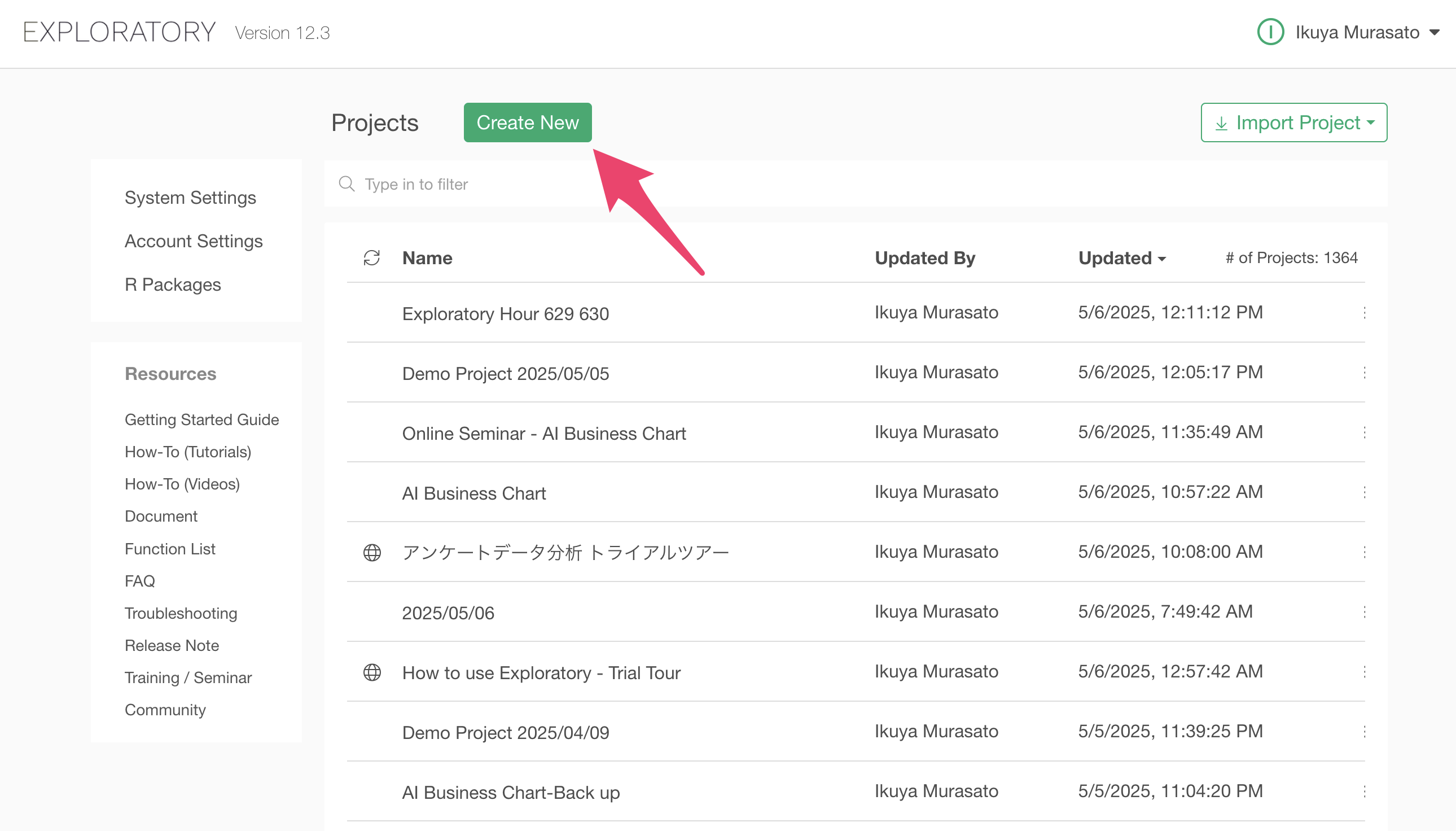
Enter any project name and click the create button.
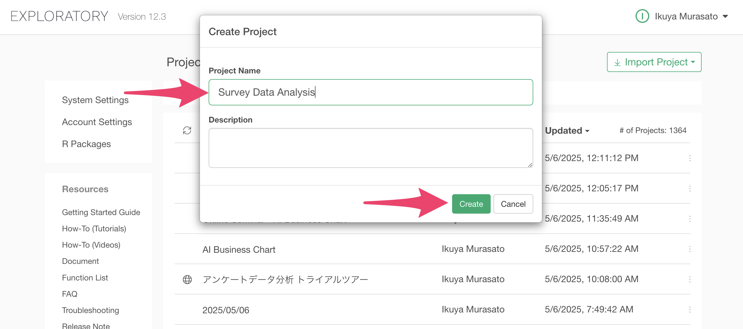
You have successfully created a project.
2. Import Data
After creating a project, let’s import data.
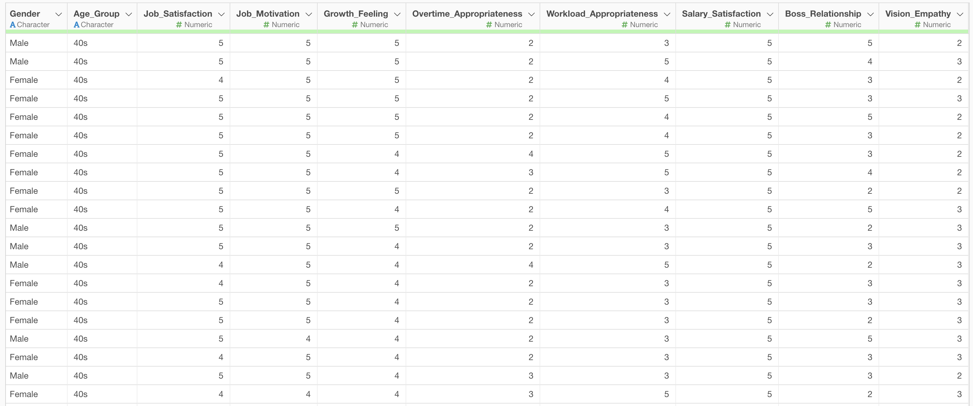
For this exercise, we’ll use “Employee_Survey” sample data. In this dataset, each row represents one employee’s response, and columns include information about the employee’s gender, age group, and survey responses.
You can download the data from this page.
After downloading the employee survey data, open the download folder and drag and drop the csv file onto the Exploratory screen.
The import dialog will appear. You can configure import settings from the items on the left side of the import dialog, but since no settings are required this time, click the “Import” button.
Specify any Data Frame name and click the “Create” button.
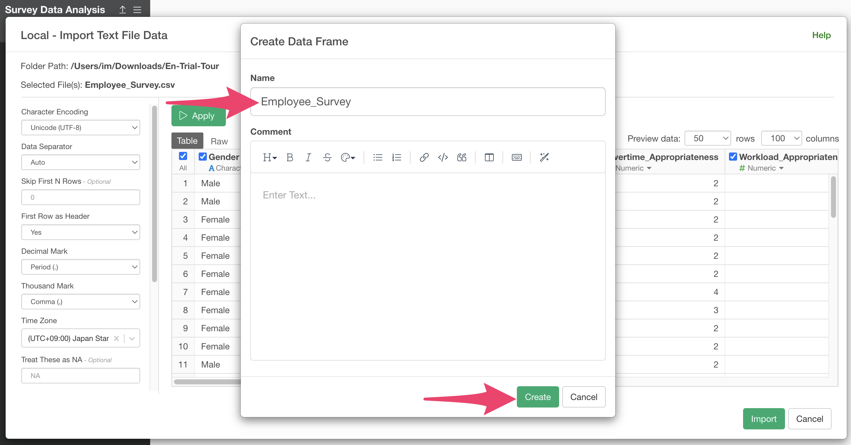
You have successfully imported the employee survey data.
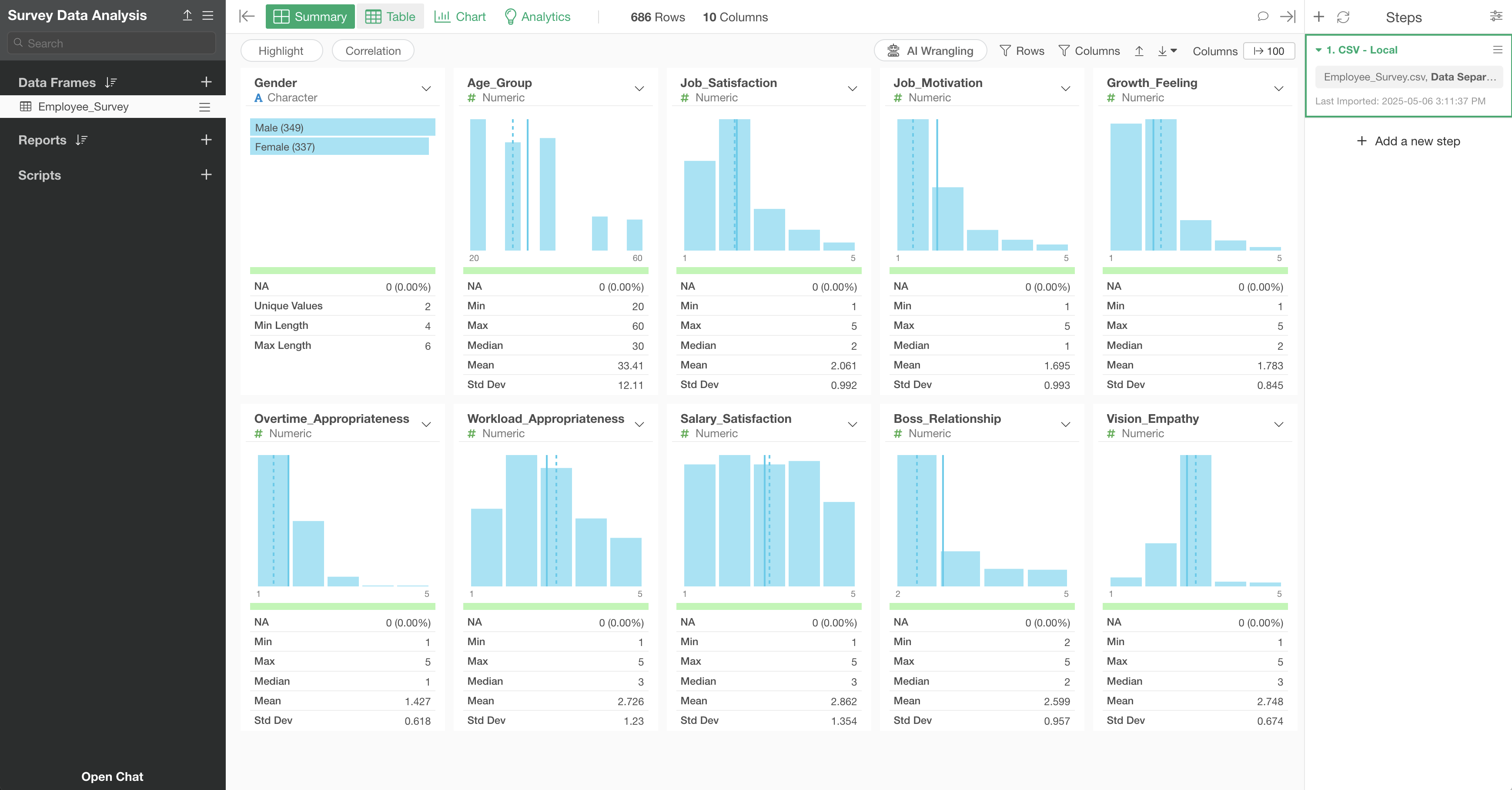
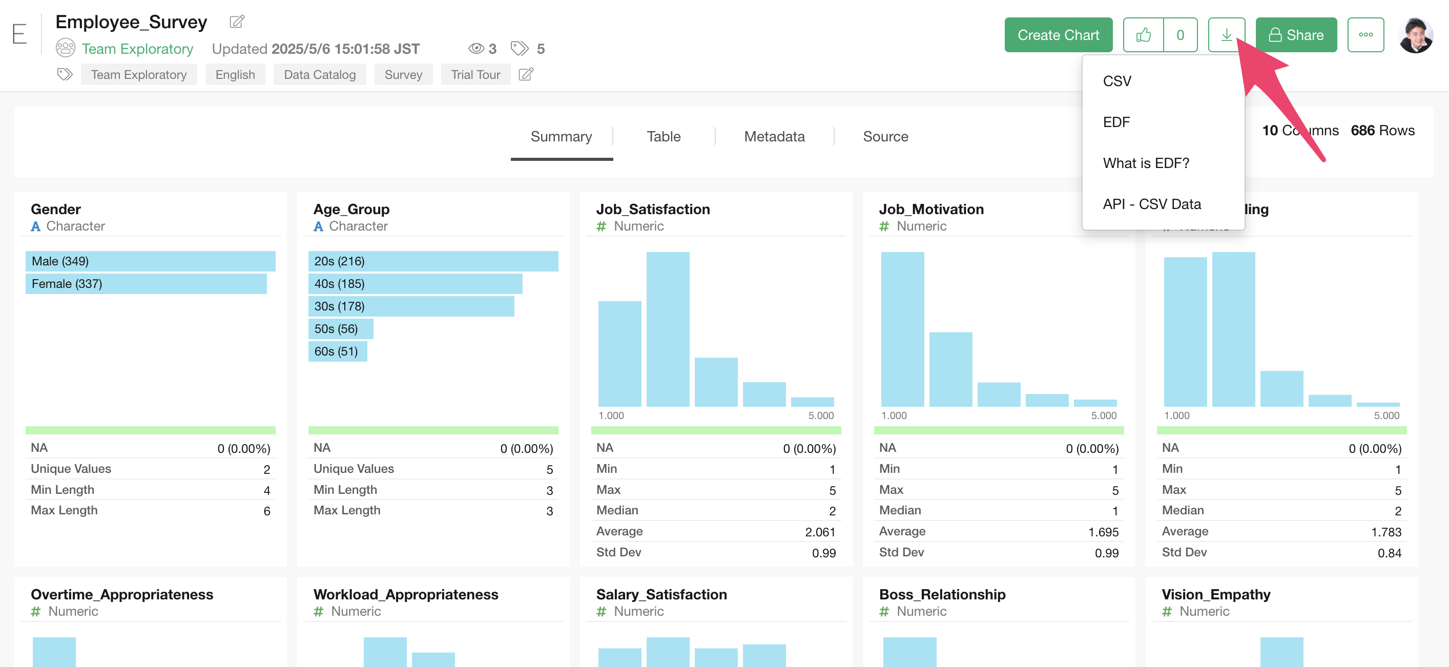
3. Checking Response Distribution Using Summary View
In Exploratory, when you import data, a “Summary View” is displayed that allows you to quickly check the statistical values and distribution (charts) of each column.
The statistical values and charts displayed in the Summary View vary depending on the “data type” of each column.
For example, since the “Gender”column is a category (character) type, a horizontal bar chart showing the frequency (number of rows) of each response is displayed, ordered from the most frequent response.
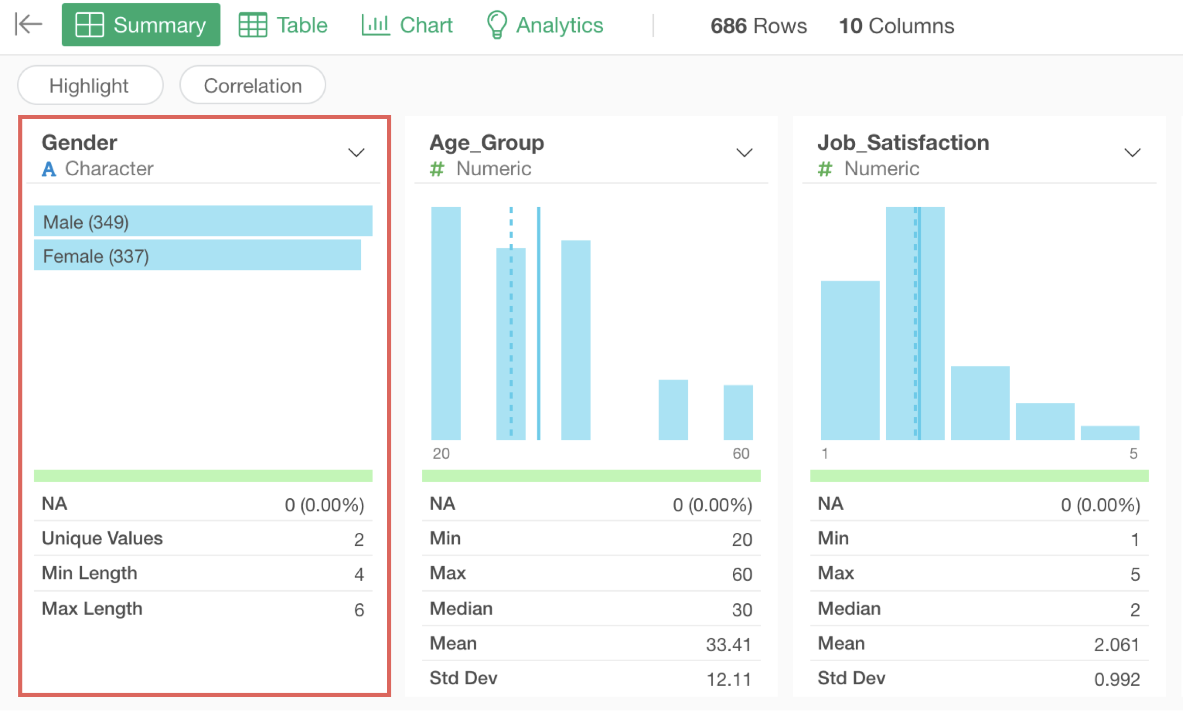
From this, we can see that in this survey, there are more men than women.
Next, in surveys, it’s common to set up 5-point (or 10-point) scale responses, and the distribution and average values of these responses are important information to know.
For example, since columns like “Job_Satisfaction” are numeric type, a bar chart showing the frequency (number of rows) of each response and statistical values such as the mean of the responses are displayed.
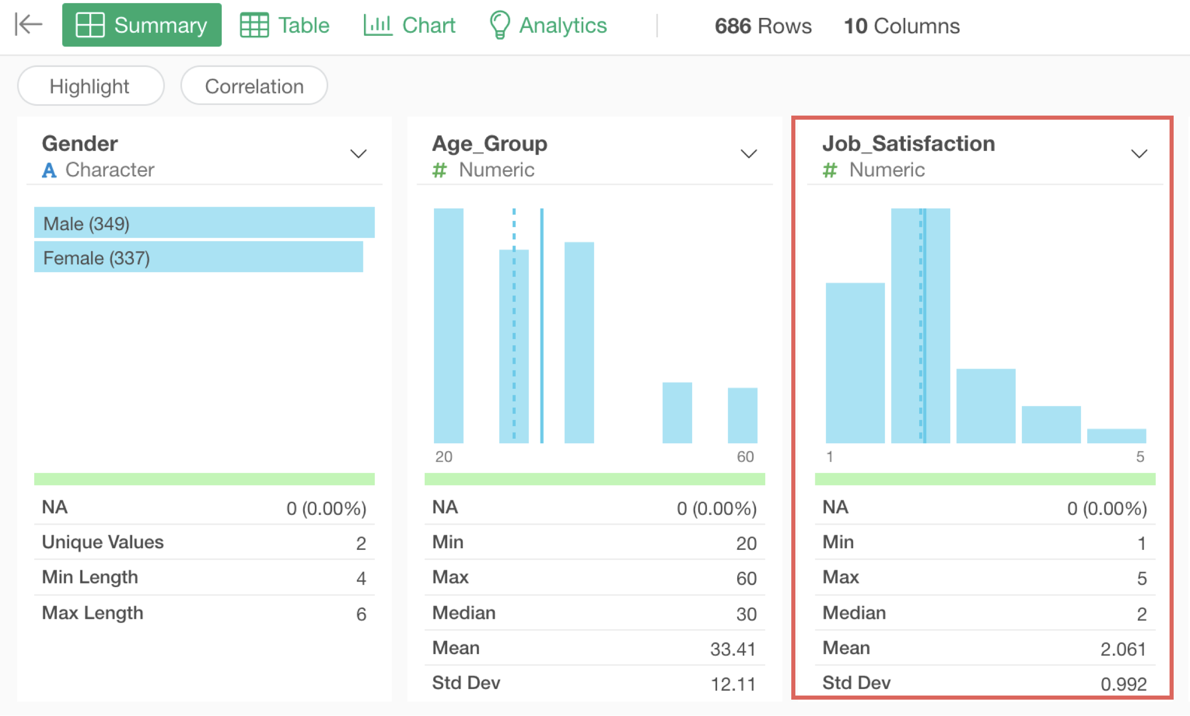
Looking at the Job_Satisfaction chart, we can see that responses are concentrated at “1” and “2,” indicating that many people have low job satisfaction scores. Furthermore, we can confirm that the average value for responses to this question is low at “2.06.”
4. Examining Correlations
When analyzing survey data, it’s important to determine whether there is a “correlation” between two columns.
A correlation is a relationship where when the value of one of two variables changes, the value of the other variable also changes together with a certain rule.
In this case, we want to investigate which variables correlate with employees’ “Job_Satisfaction” and what kind of relationships they have.
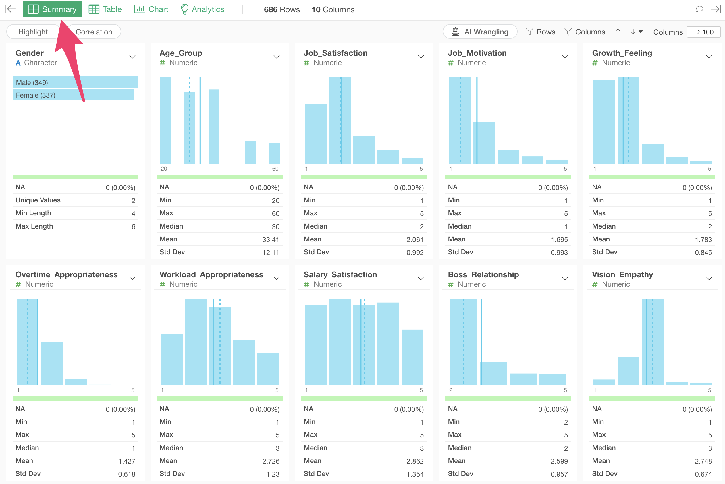
To do this, we’ll use the “Correlation Mode” feature in Exploratory’s Summary View to examine the relationship between salary and all other variables at once.
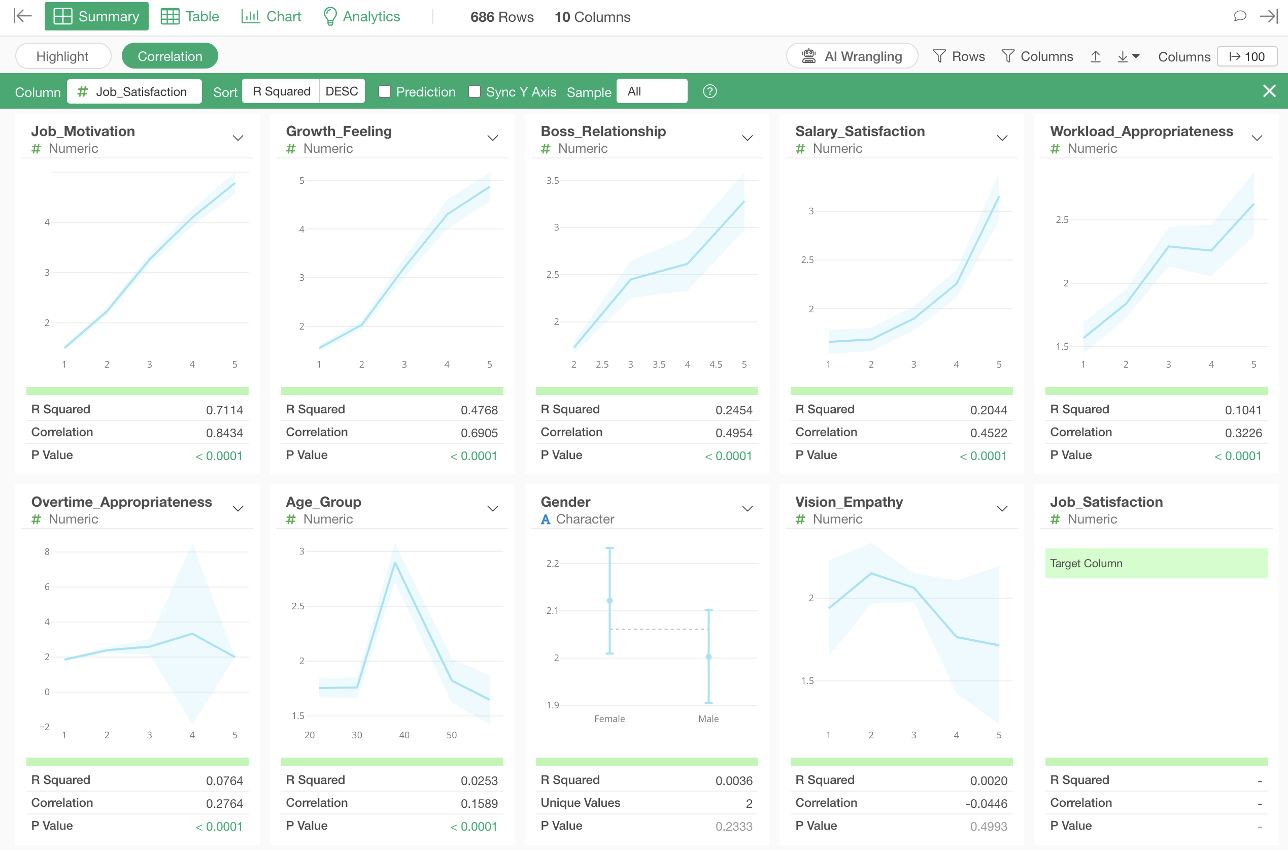
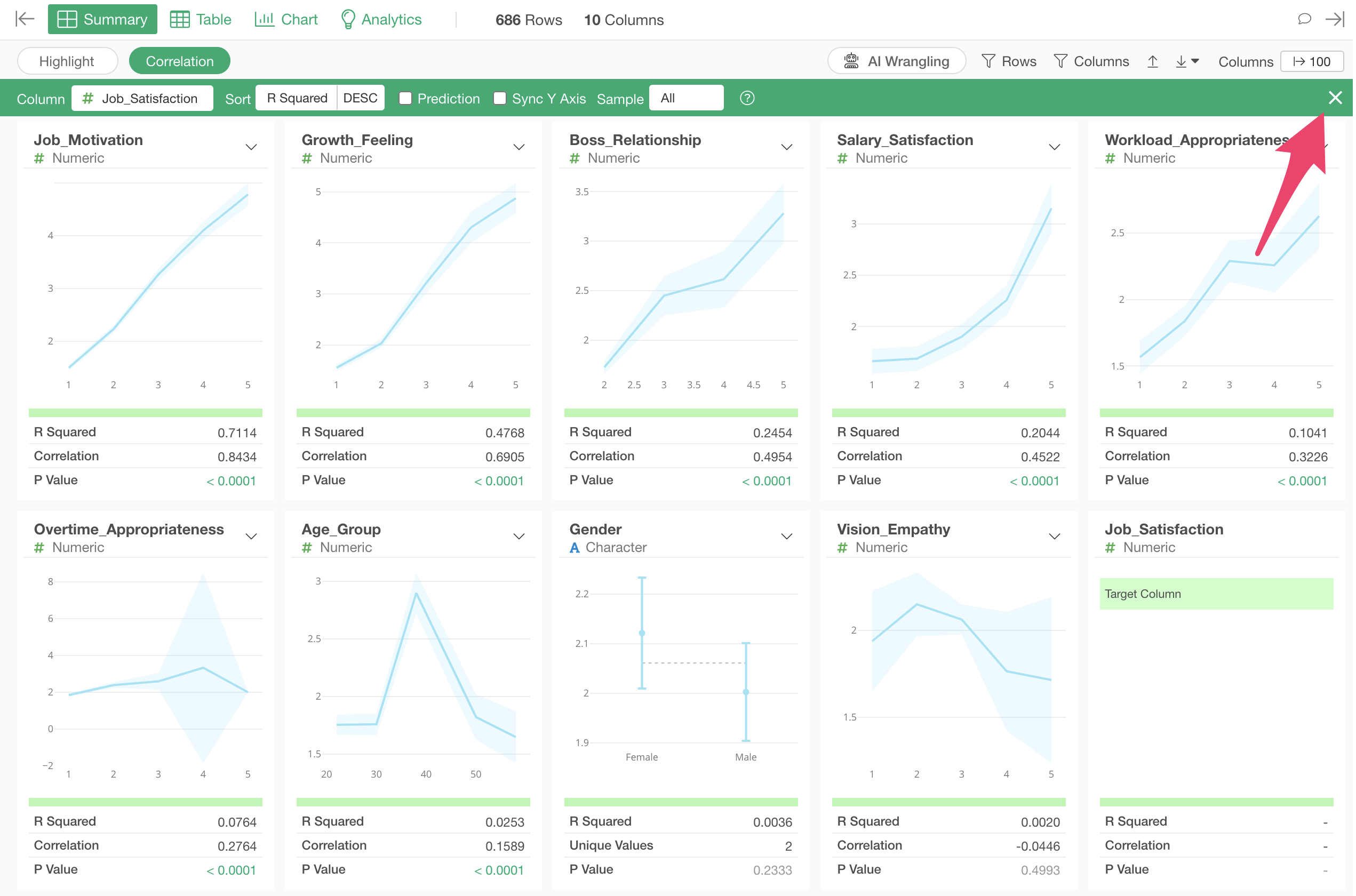
Open the Summary View and click the “Correlation” button.
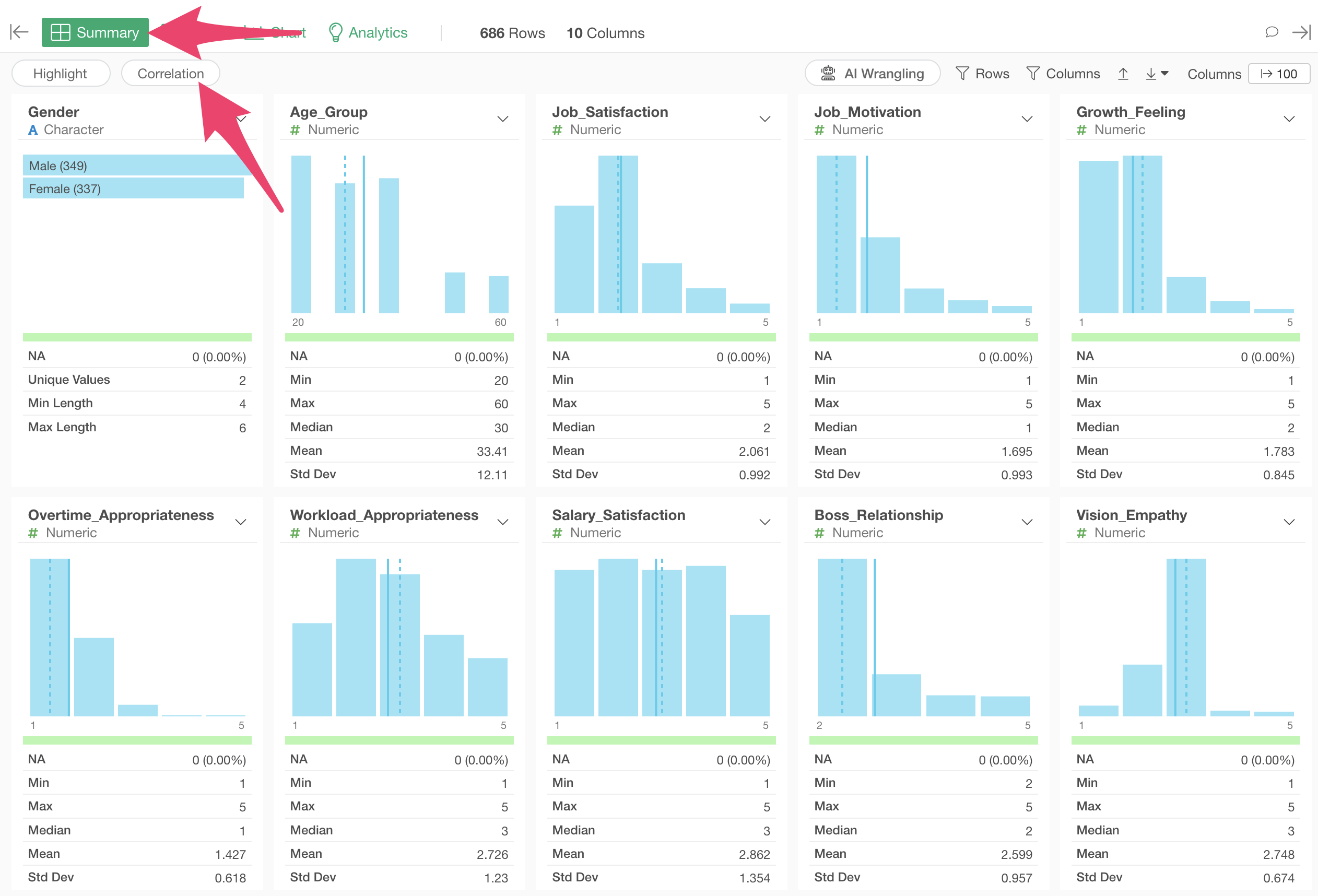
Select “Job_Satisfaction” as the column for which you want to see correlations.
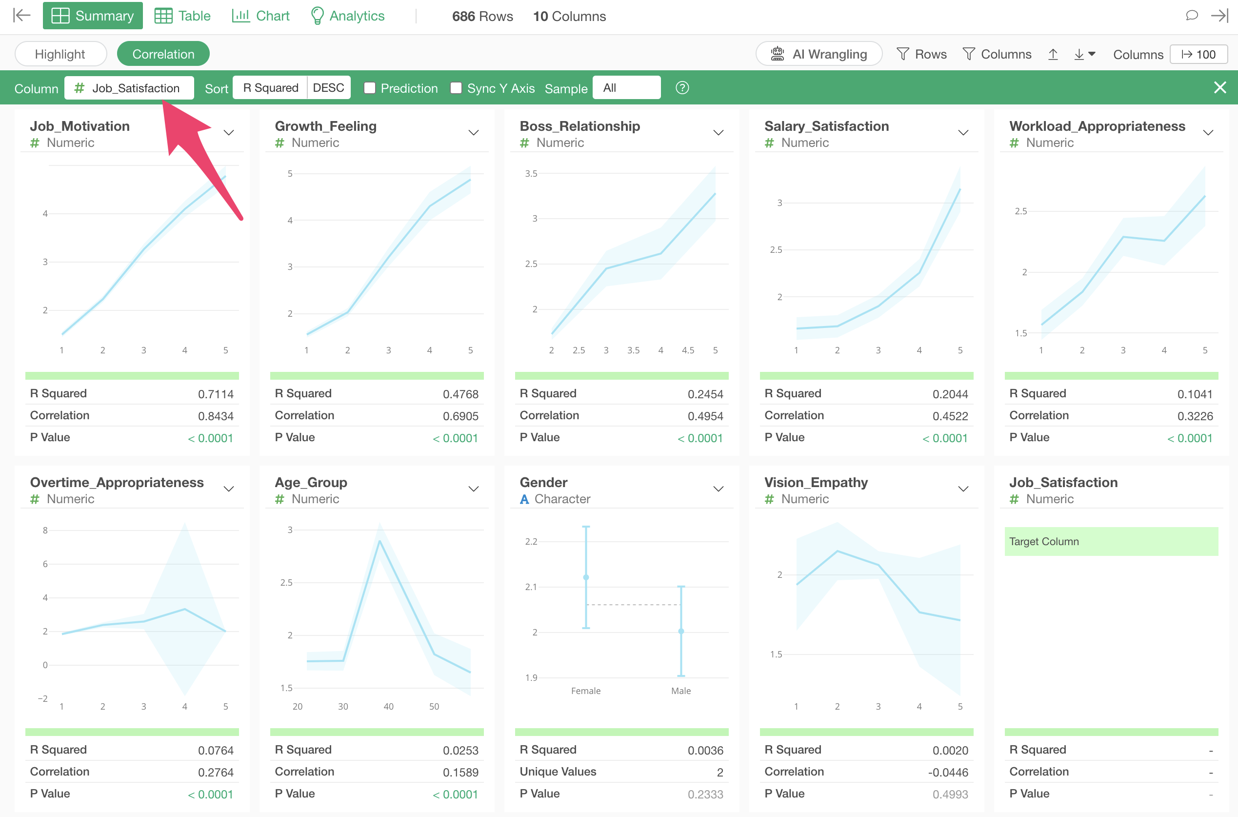
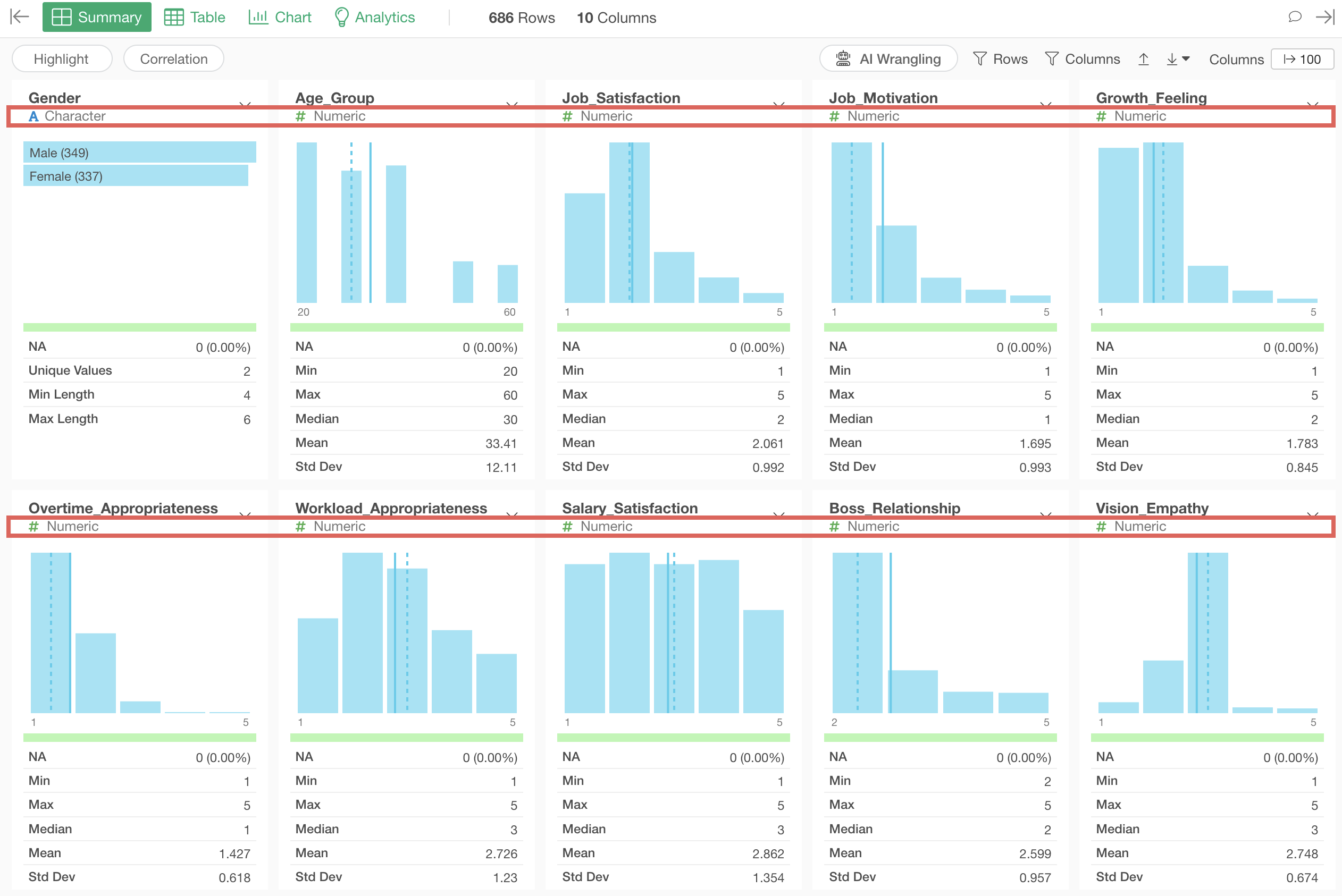
In correlation mode, when you select a column to view correlations, charts visualizing the relationship with each variable and indicators showing the strength of the correlation are automatically generated based on the data type.
Additionally, columns are sorted by the strength of their correlation.
Interpreting Charts
Numeric
For numeric types with a small range of values (e.g., 1-5) like 5-point scales, the average values at each value are visualized as a line chart. The light blue interval represents the 95% confidence interval.
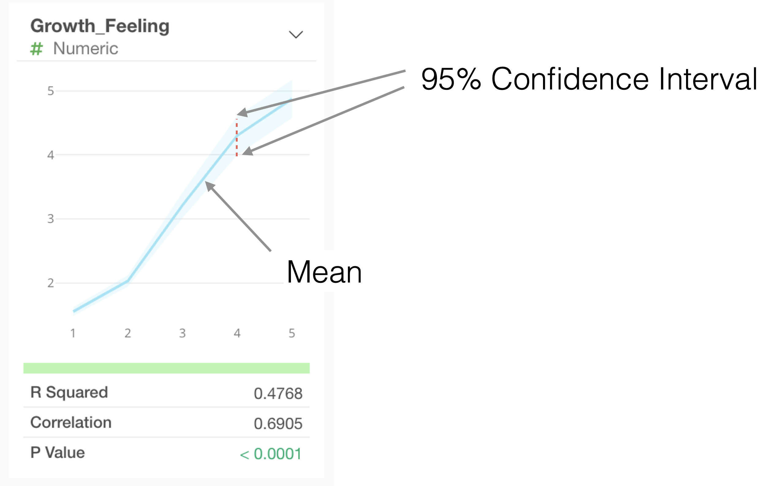
If the range of values is large (e.g., 18-60) like age, the values will be divided into 10 equal-width segments.
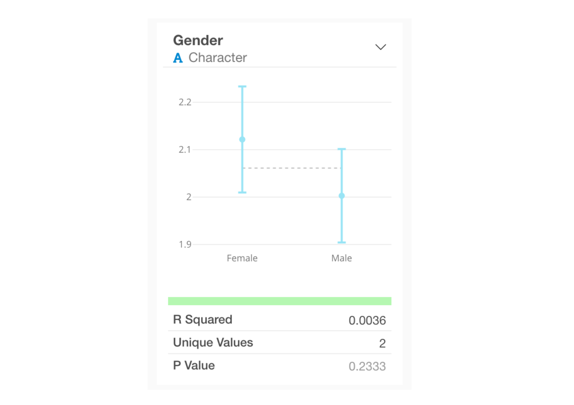
Category
For category types, the average value for each category and its 95% confidence interval are visualized as error bars.
Interpreting Indicators
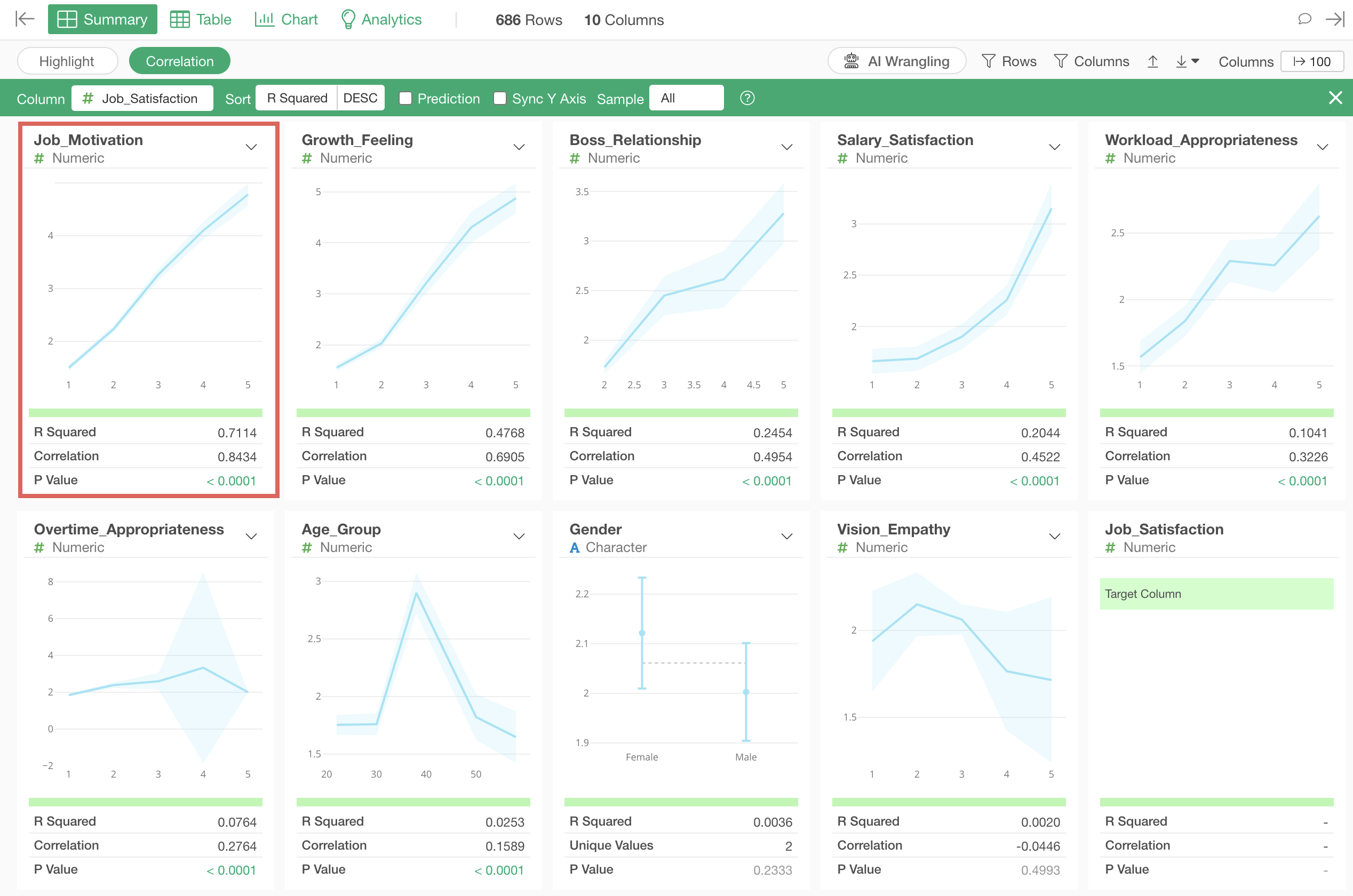
When a numeric column is selected as the correlation target, the
following indicators are displayed for each column: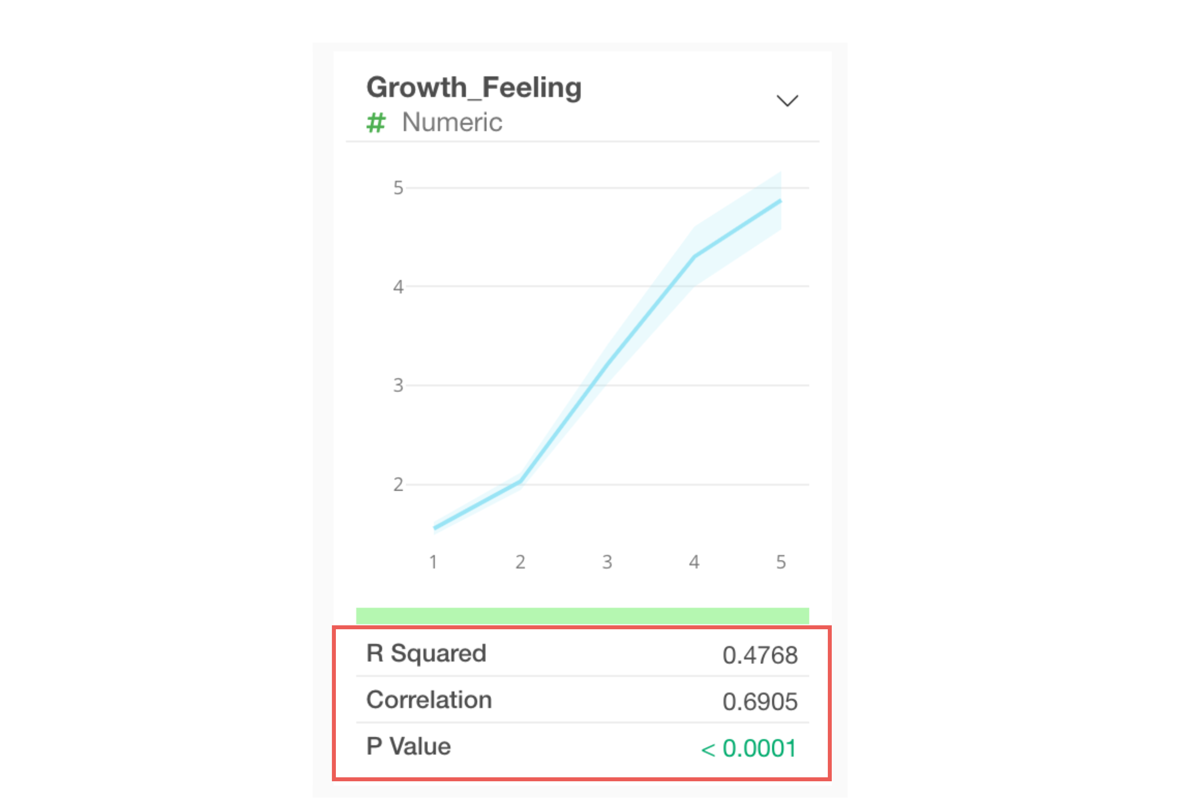
- R-squared
- Correlation coefficient
- P-value
You can check the meaning of each indicator by clicking either the information icon for each “indicator name” or
by clicking the “value” of each indicator.
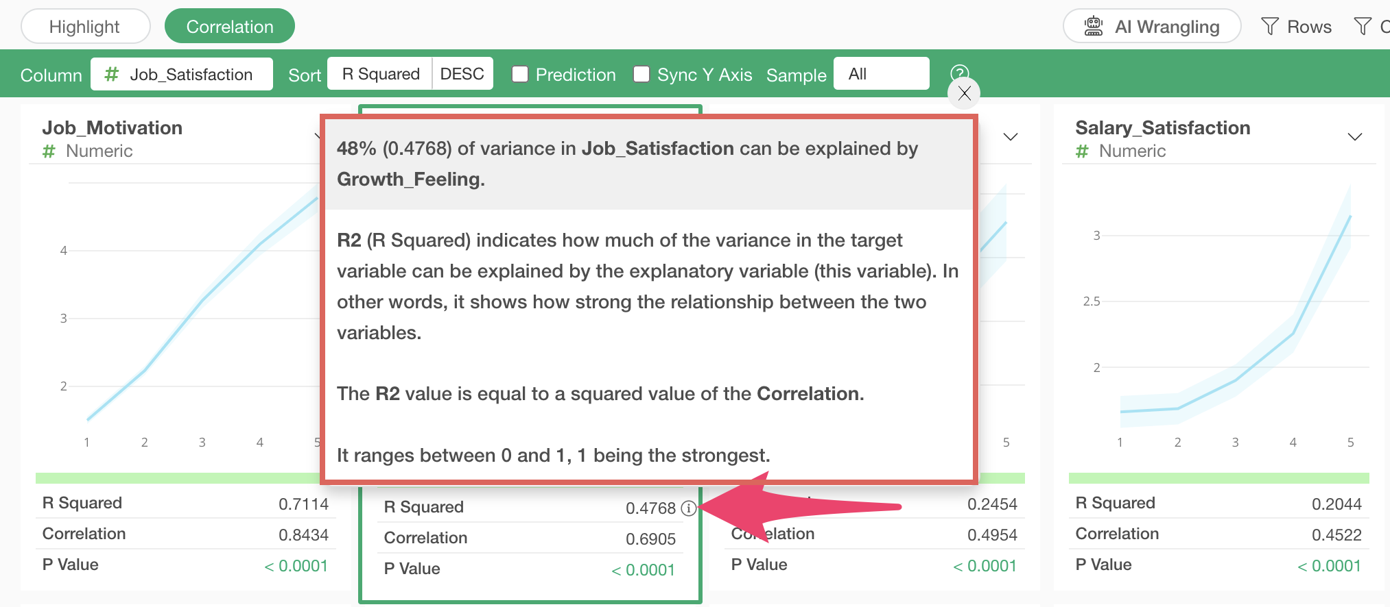
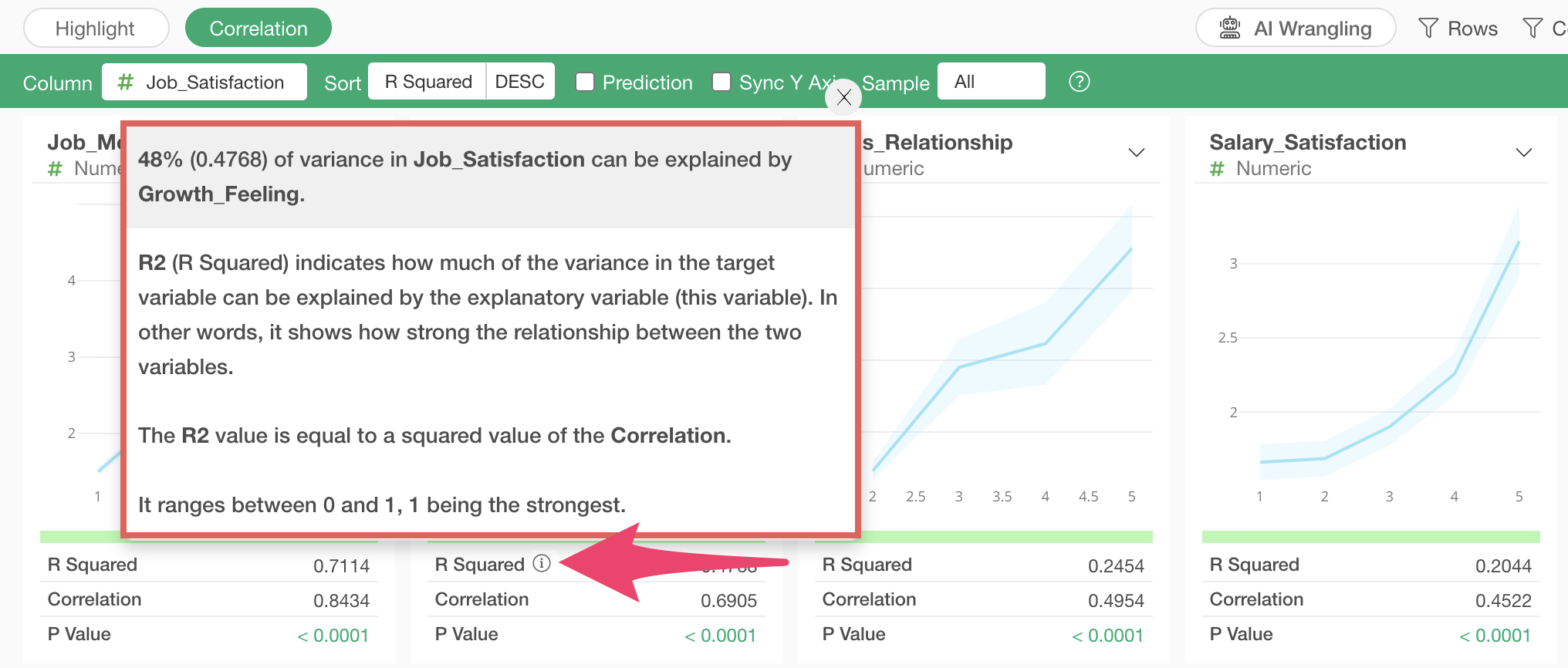
R-squared
When
you click the information icon for R-squared or R-squared value, the top
of the popup shows what percentage of the variation in the values of the
column selected for correlation (Job Satisfaction) can be explained by
the selected variable.
Correlation Coefficient
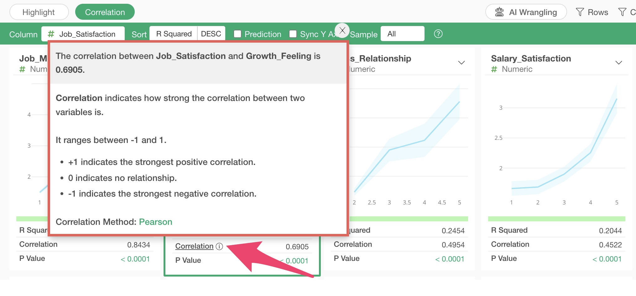 When
you click the information icon for the correlation coefficient or its
value, the top of the popup displays the correlation coefficient between
the selected variable and job satisfaction.
When
you click the information icon for the correlation coefficient or its
value, the top of the popup displays the correlation coefficient between
the selected variable and job satisfaction.
P-value
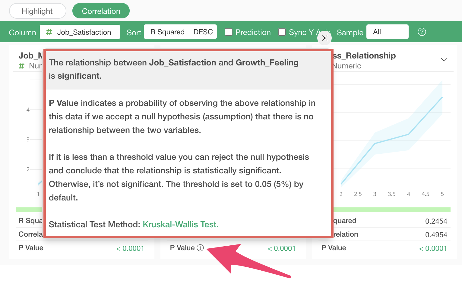 When
you click the information icon for P-value or its value, the top of the
popup displays information about whether the relationship between the
selected variable and job satisfaction is statistically significant.
When
you click the information icon for P-value or its value, the top of the
popup displays information about whether the relationship between the
selected variable and job satisfaction is statistically significant.
Sorting by Correlation Strength
When you run correlation mode, columns are sorted based on their R-squared values, in other words, in order of decreasing correlation.
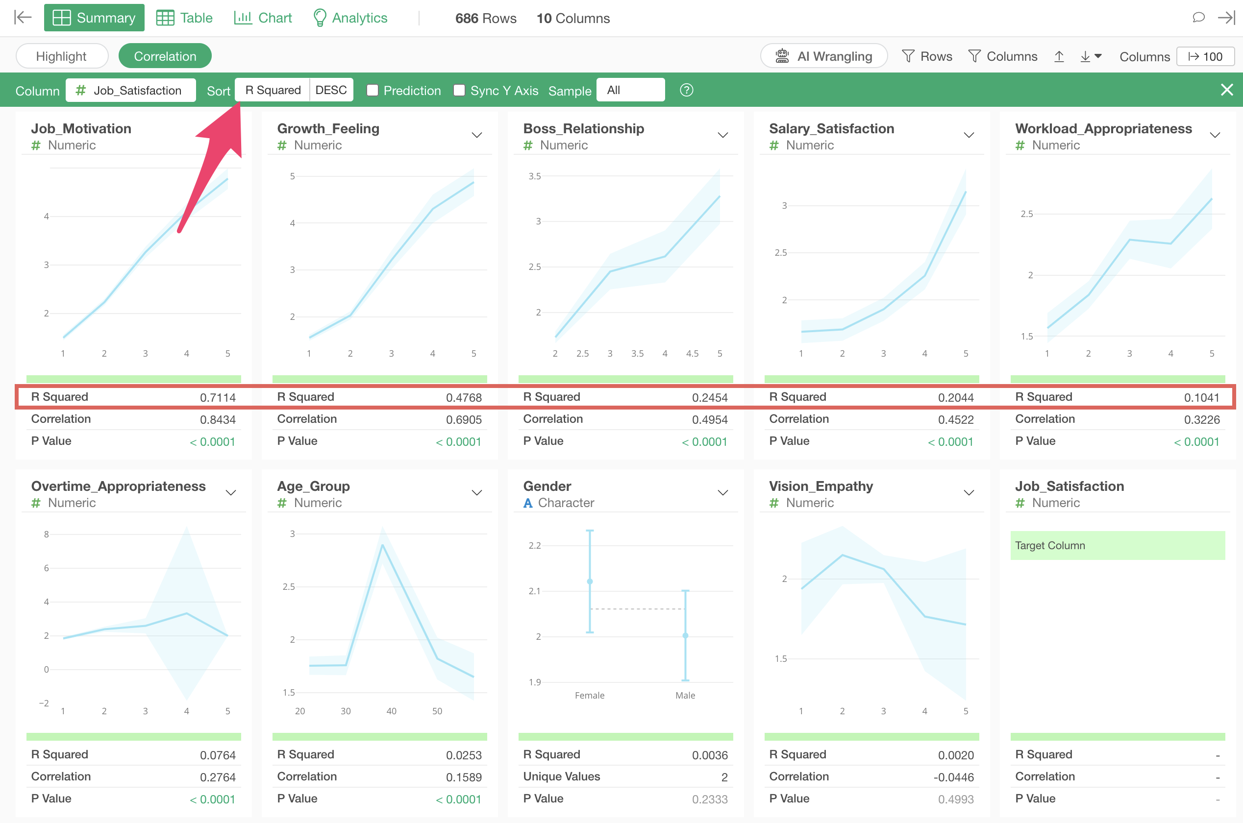
The variable most strongly correlated with job satisfaction is “Job_Motivation”, and looking at the chart, we can see that as the “Job_Motivation” score increases, the average value of “Job_Satisfaction” also increases.
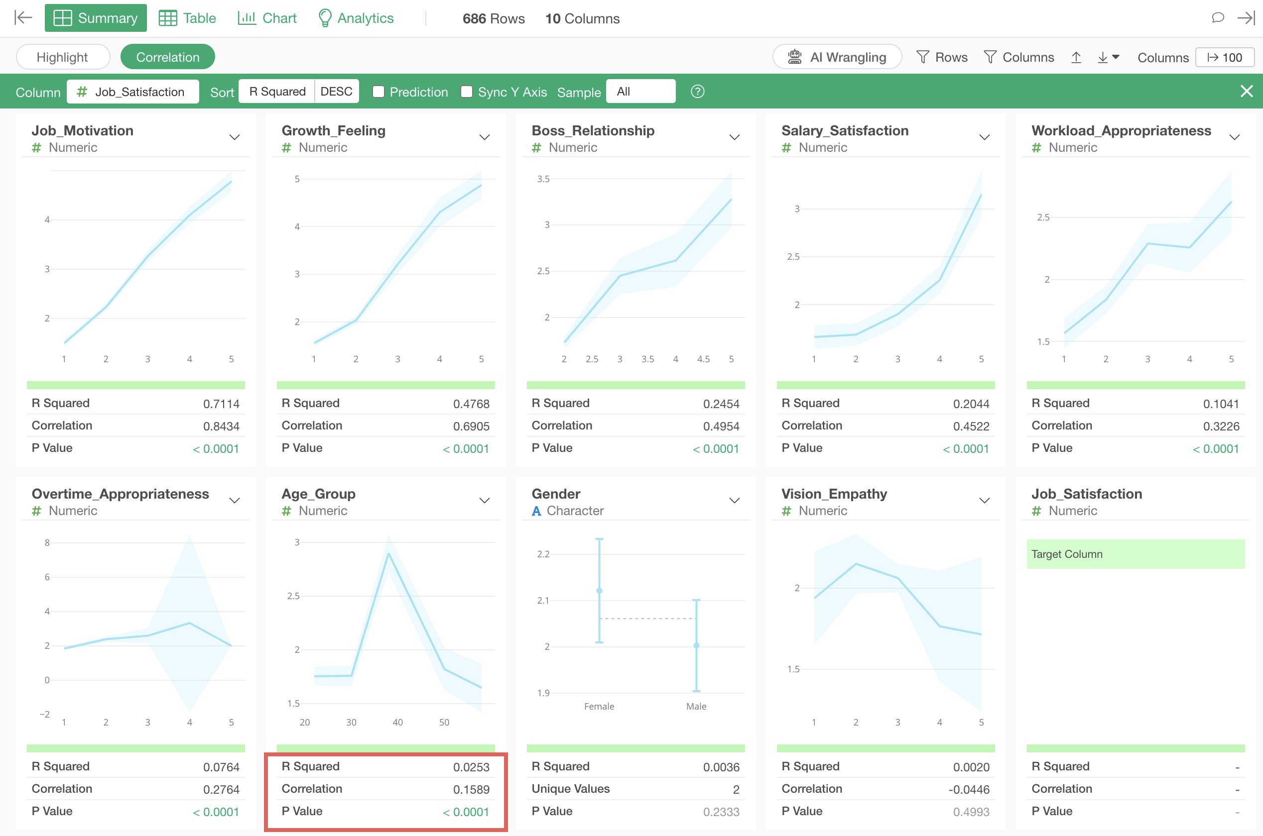
The third strongest correlation is with “Age_Group”, and looking at the chart, we can see that people in their 40s have higher job satisfaction compared to other age groups.
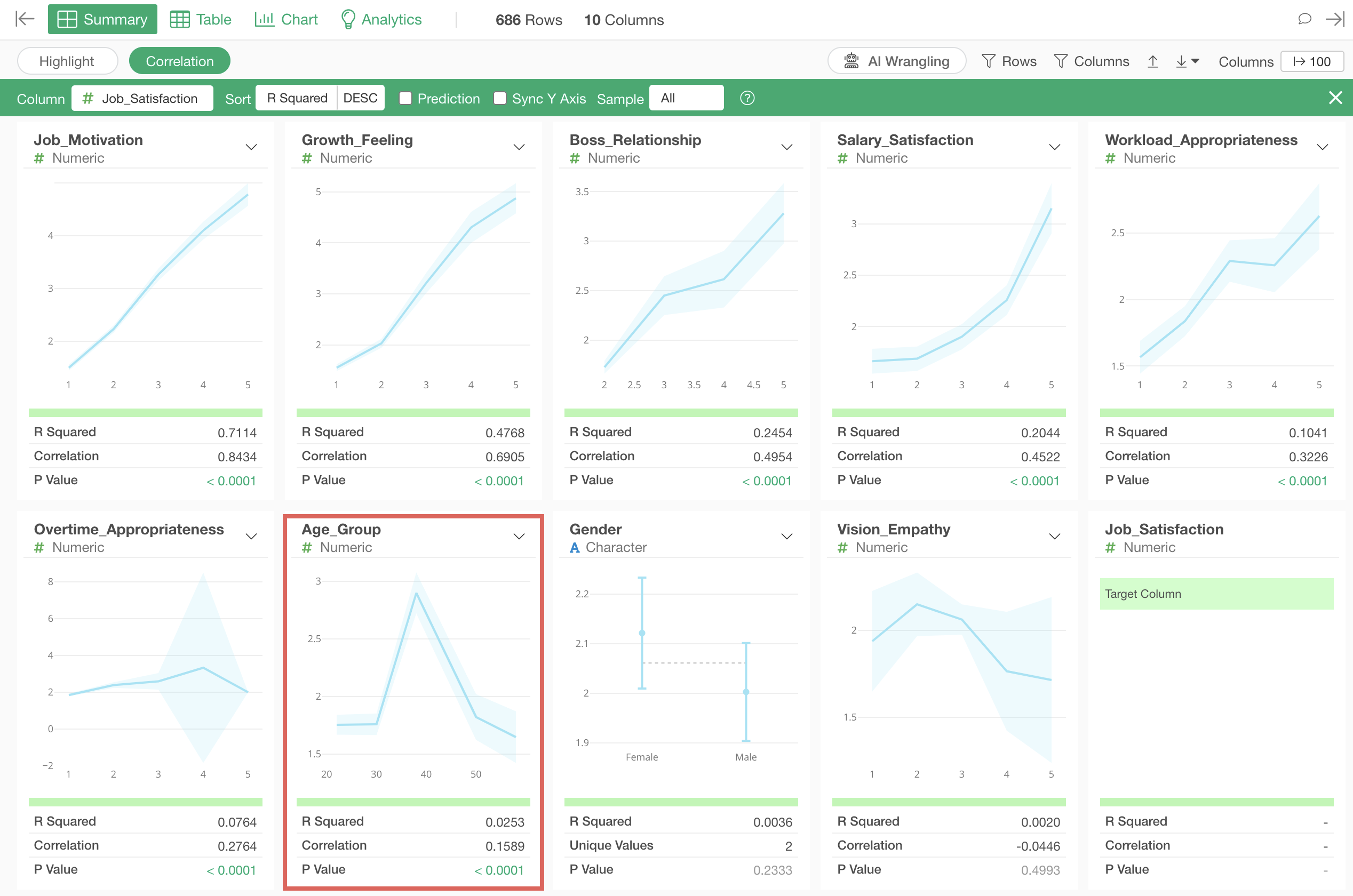
Looking at the indicators, the R-squared is 0.02, which shows very small correlation.
If you want to close correlation mode, click the “Close” button in the upper right.
In this way, you can efficiently examine the relationships between your objective and all other columns at once using “Correlation Mode.”
5. Examining Correlations Between All Responses
Earlier, we explored which variables correlate with “Job_Satisfaction,” but now let’s examine whether there are correlations between all response columns.
Open the Analytics View and select “Correlation” as the type.
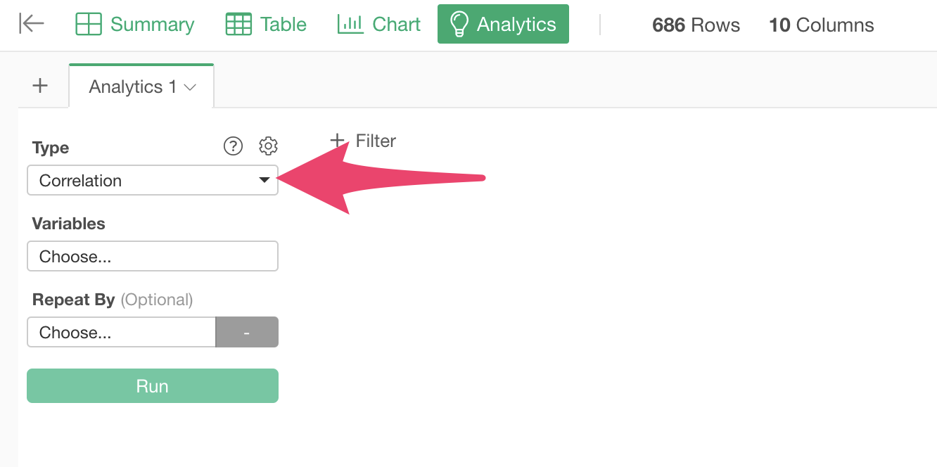
Clicking on variables displays a dialog for column selection and settings, where you can select the response columns for which you want to see correlations. By the way, you can select multiple columns at once by holding down the Shift key.
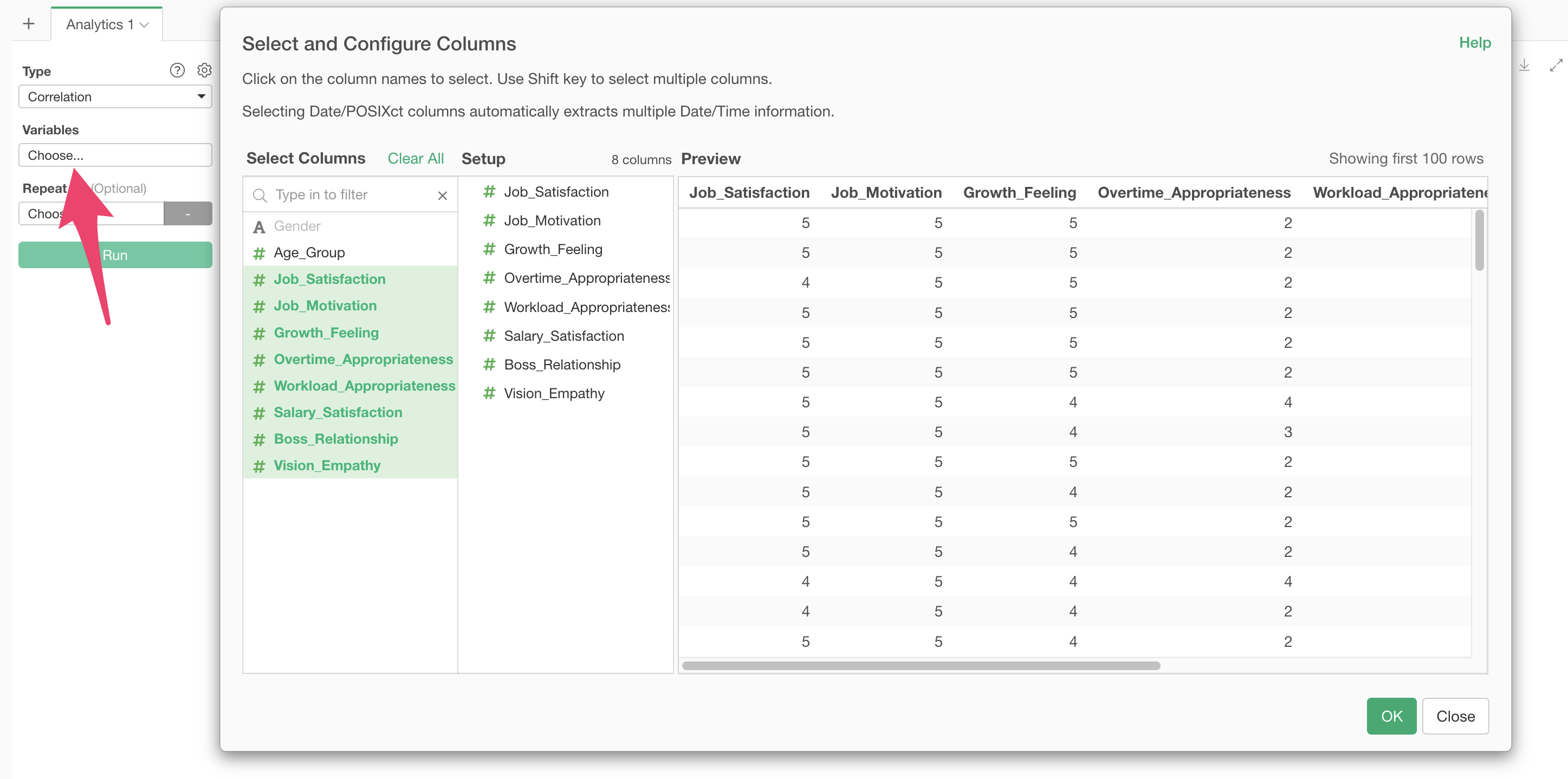
Note that only numeric or logical type columns can be used to calculate correlations.
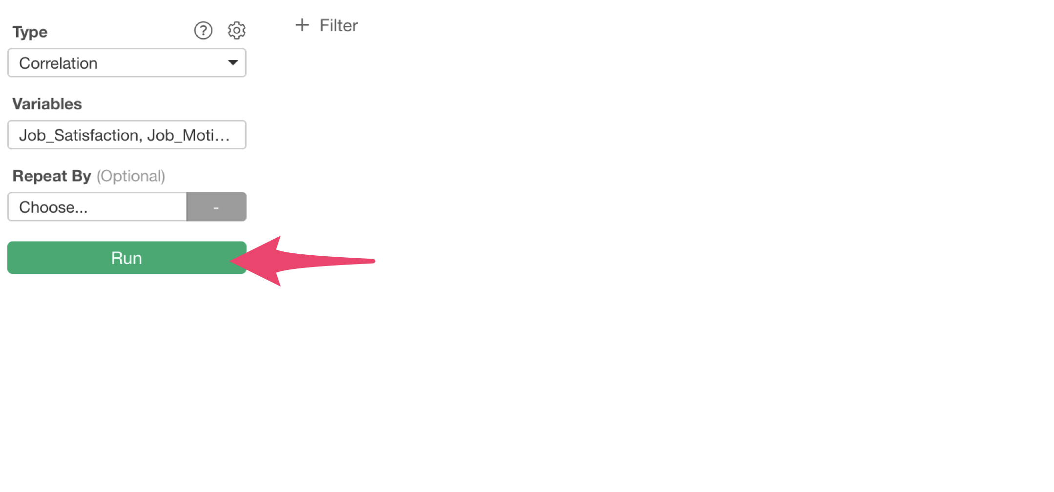
After selecting the columns, click the execute button.
This allows you to calculate correlations between all response columns at once.
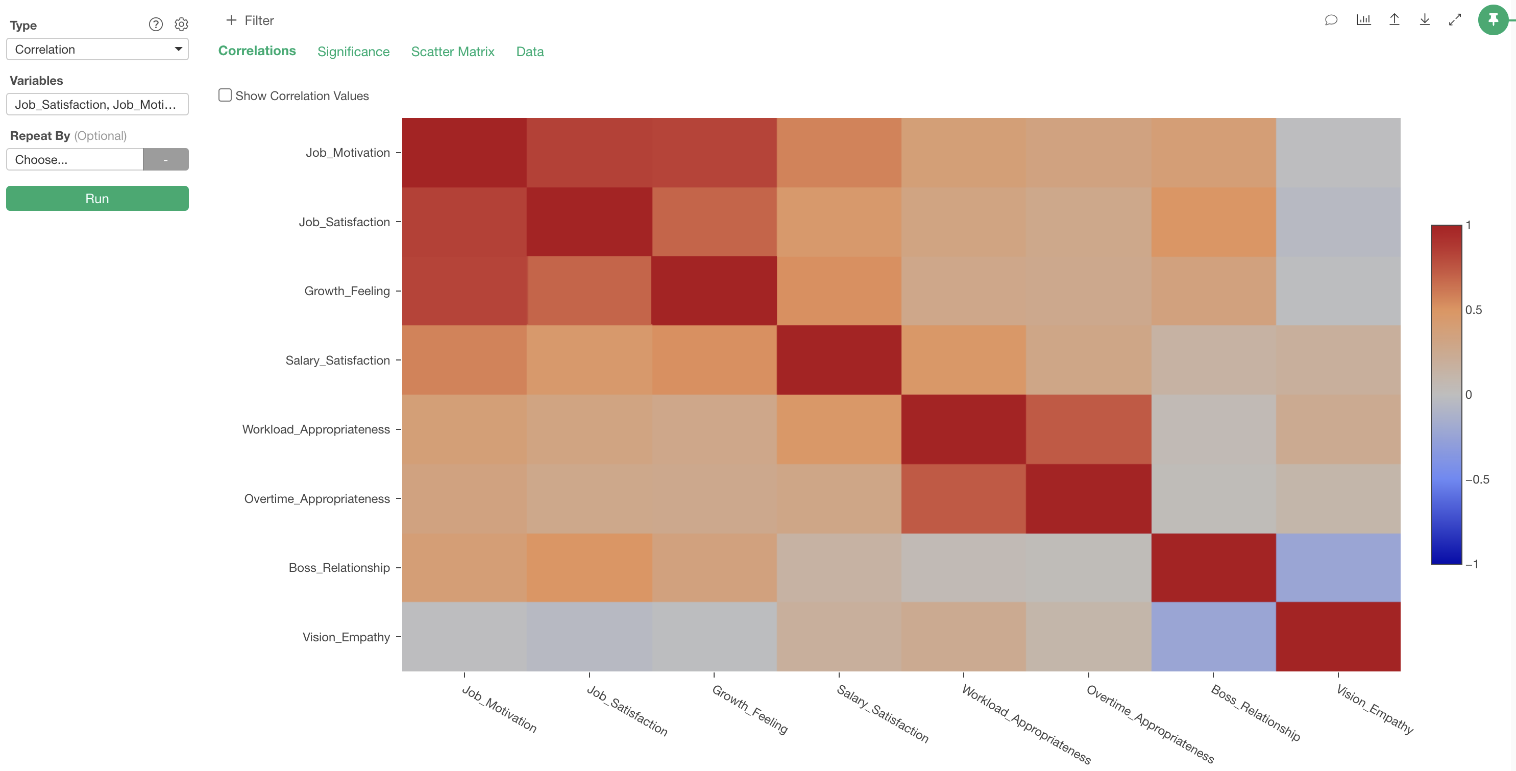
In the “Correlation” tab, correlation coefficients between columns are visualized as a heatmap.
The interpretation of this chart is that the more positive the
correlation (closer to 1), the deeper the red color, and the more
negative the correlation (closer to -1), the deeper the blue color.
Also, if there is no correlation (close to 0), the color becomes
gray.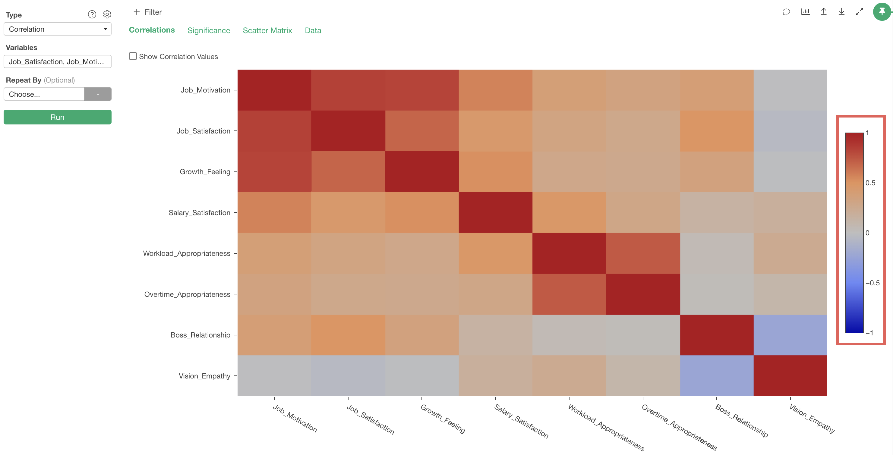
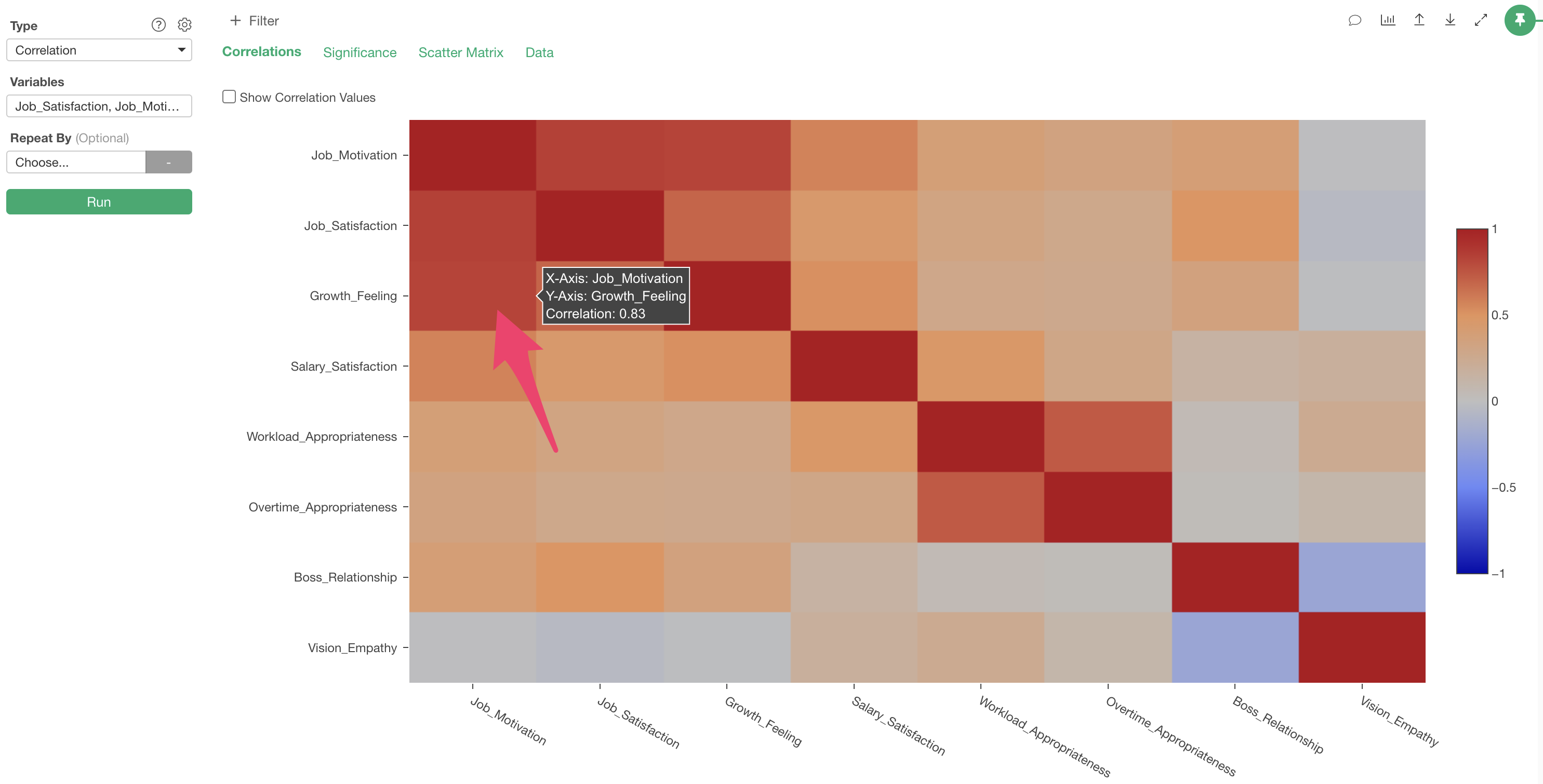
The correlation coefficient between “Job_Motivation” and “Growth_Feeling” is 0.83, indicating a “strong positive correlation.”
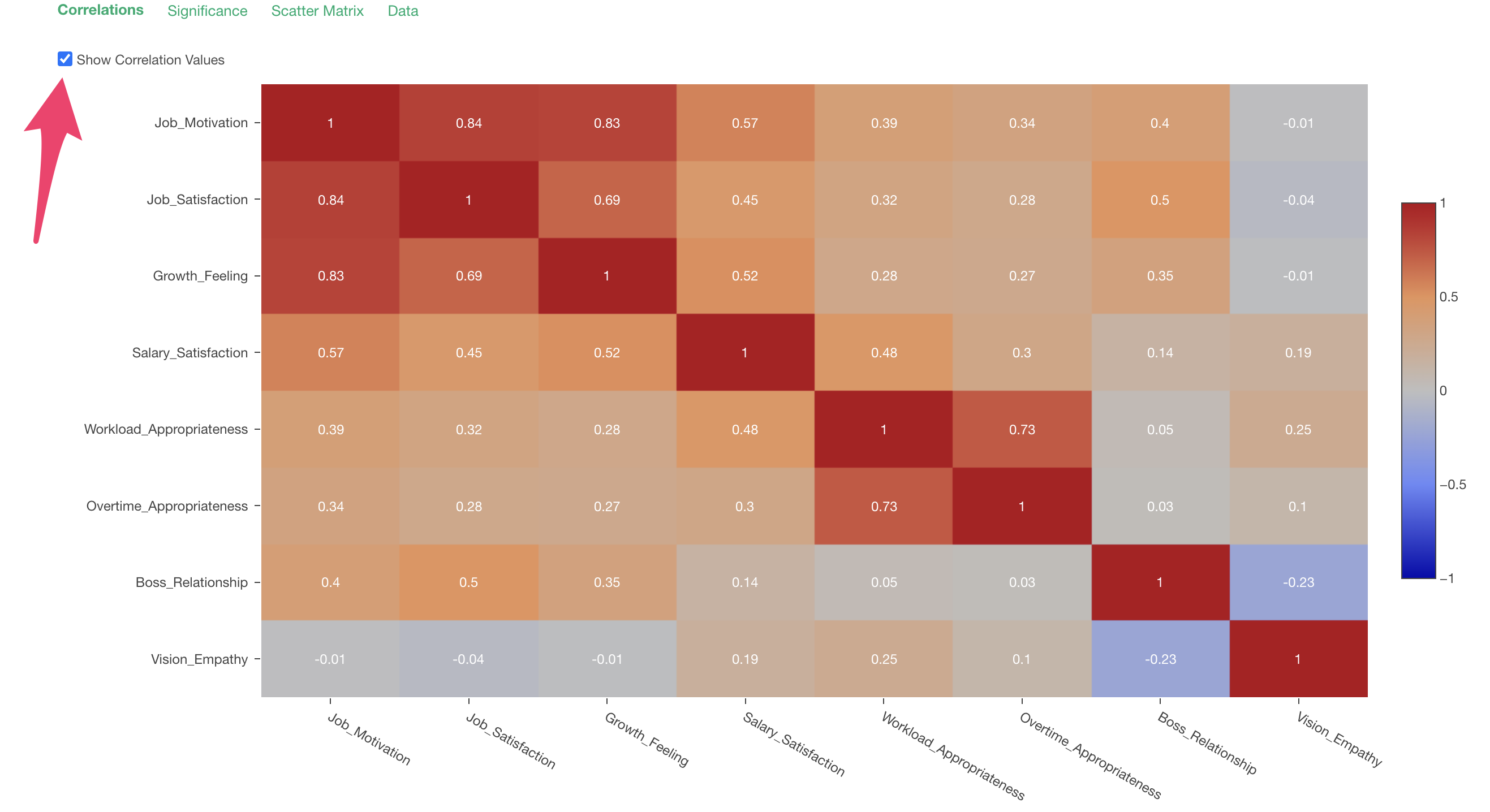
 By
the way, you can display each correlation coefficient on the chart by
checking “Display correlation coefficients” in the upper left of the
chart.
By
the way, you can display each correlation coefficient on the chart by
checking “Display correlation coefficients” in the upper left of the
chart.
This concludes the correlation version of the Survey Data Analysis!