Visualizing the Number of Responses per Value in Multiple-Choice Survey Questions
The data used in this analysis is from a customer satisfaction survey.
In this dataset, each row represents a single respondent, and the “Service Improvement Points” column contains multiple responses separated by commas.
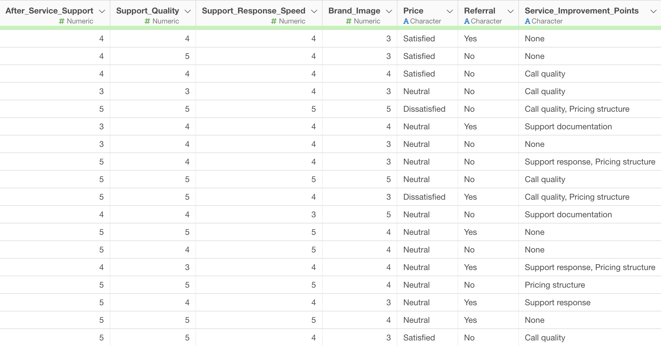
For instance, some responses might be a single item like “Call Quality,” while others might include multiple items such as “Call Quality, Pricing Structure.”
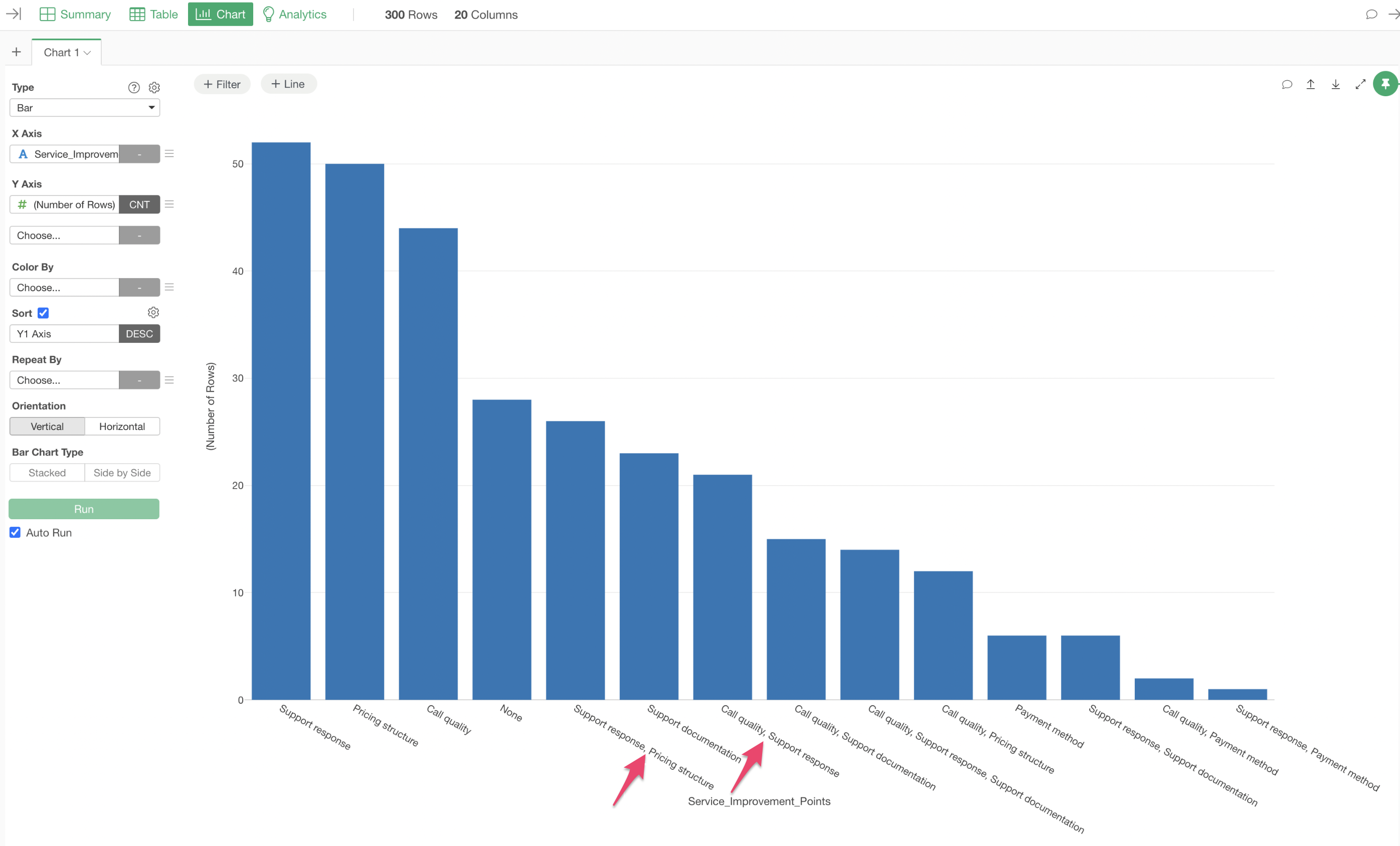
If the data in the “Service Improvement Points” column is aggregated directly, combinations like “Support, Pricing Structure” would be treated as a single response.
Splitting Multiple Responses into Rows
To enable aggregation of individual response items, it is necessary to split the multiple response values contained within a single cell into separate, independent rows.
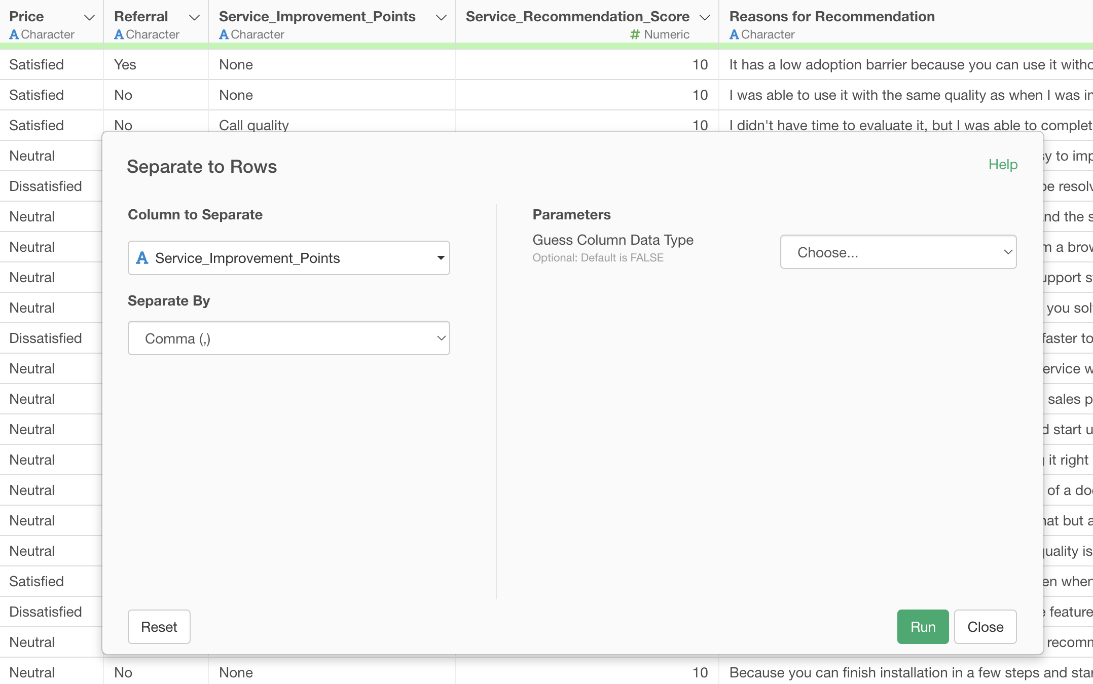
From the column header menu of “Service Improvement Points,” select “Separate,” then “Separate to Rows by,” and specify “Comma” as the delimiter.
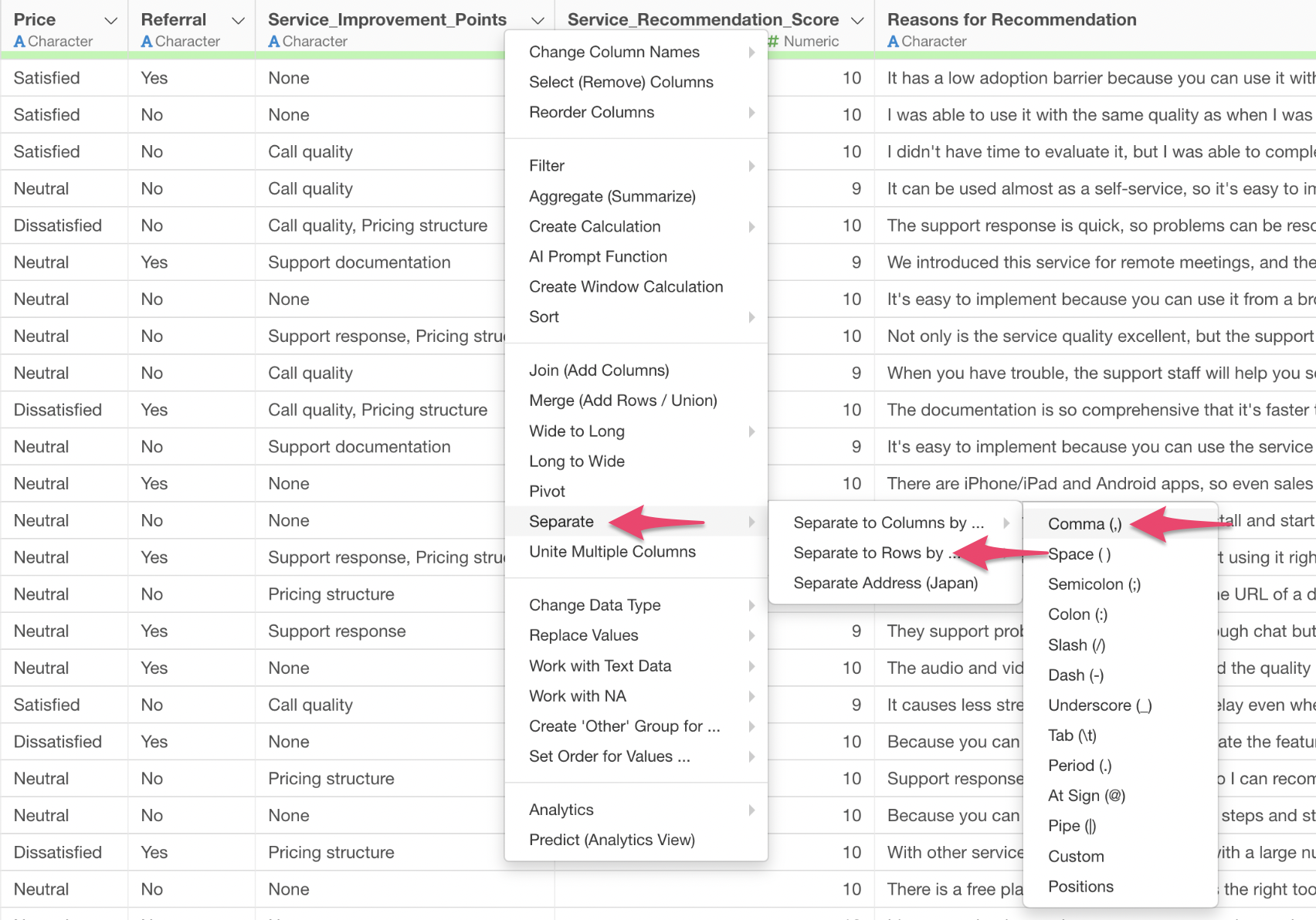
The “Separate to Rows” dialog will appear; proceed by executing it as is.
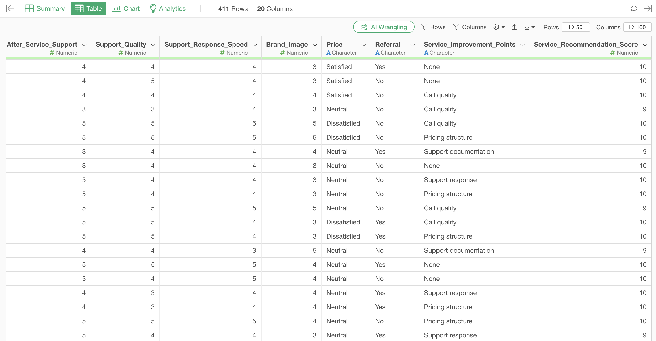
Executing this setting will increase the number of rows from an original 300 to 411. This increase in row count occurs because if a respondent selected two items, such as “Call Quality, Pricing Structure,” the original single row is split into two distinct rows: one for “Call Quality” and another for “Pricing Structure.”
Visualizing the Count and Ratio of Each Response
Once the data is split into rows, each individual response item exists as an independent row, making it easy to aggregate and visualize how many times each item was selected.
For example, by creating a bar chart and assigning the “Service Improvement Points” column to the X-axis and “Number of Rows” to the Y-axis, it becomes possible to visualize the response count for each improvement point.
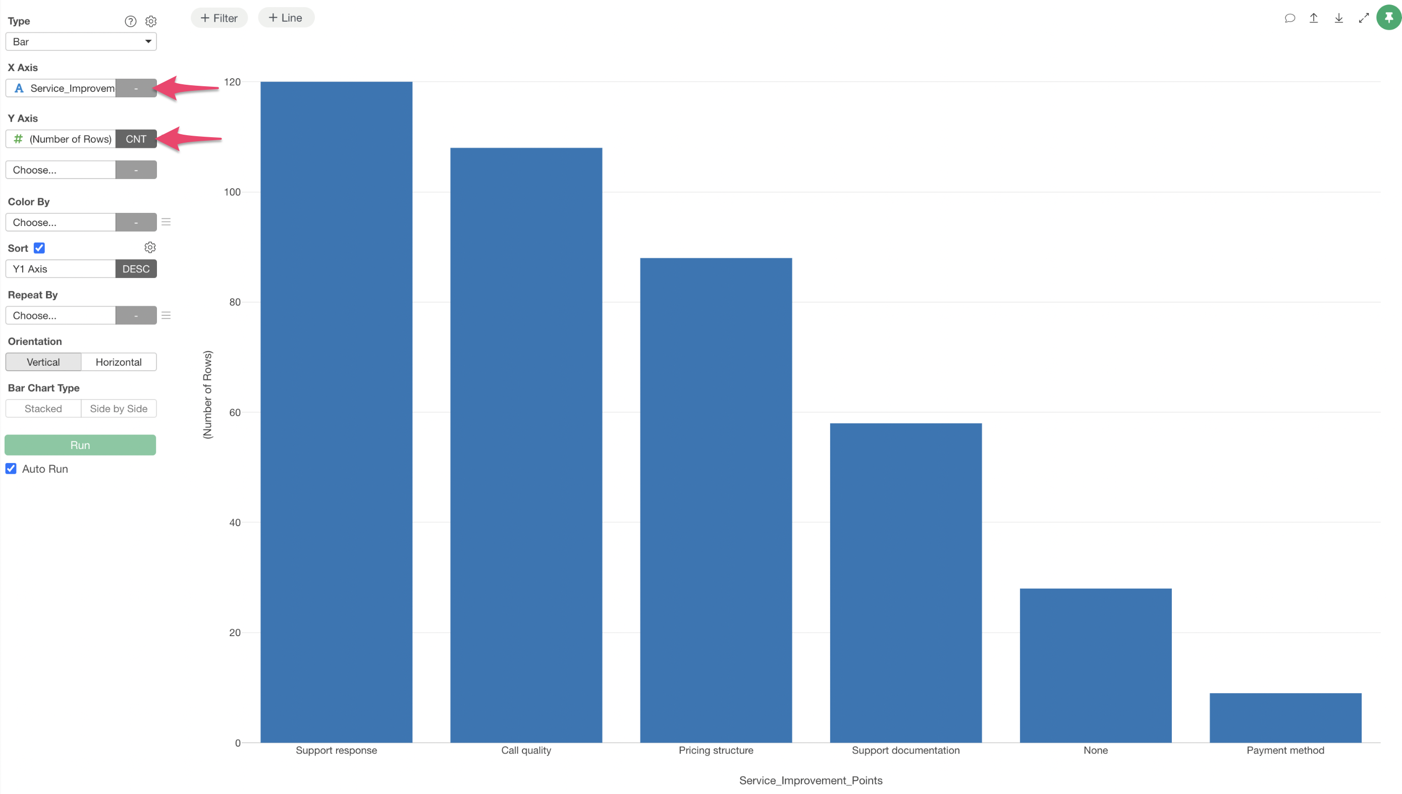
This clearly displays the specific breakdown, such as how many responses were for “Support” and how many for “Call Quality.”
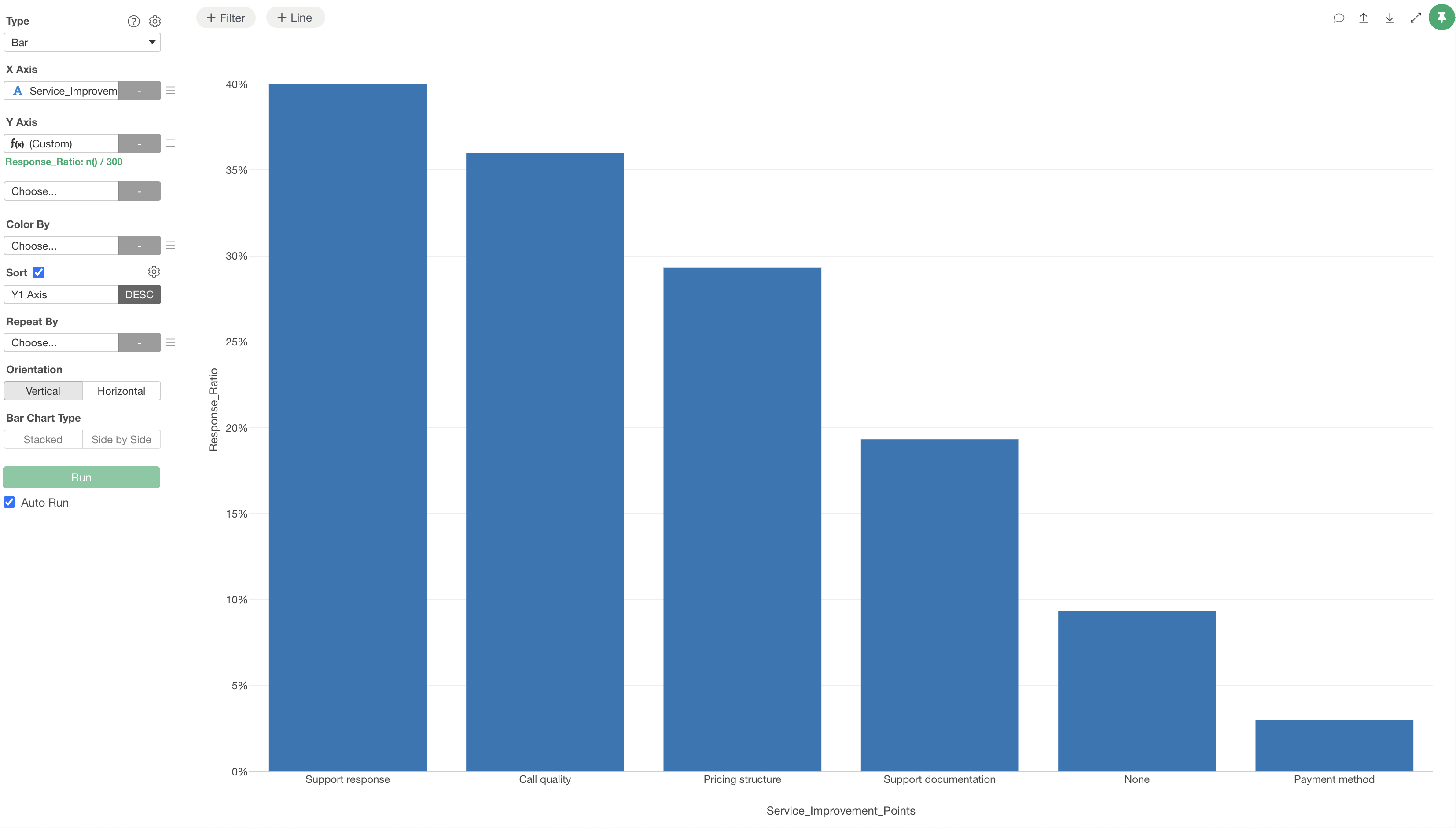
If you wish to visualize the response ratio of each answer relative to the total number of respondents, select “Custom” for the Y-axis.

The calculation formula should be specified as follows:
n() / 300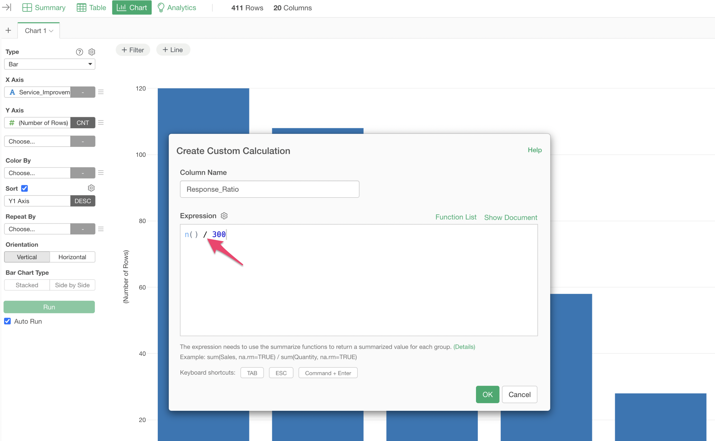
In this formula, n() represents the number of rows, and
300 is the directly substituted original number of
respondents.
Finally, to display the values as percentages, select “Percent” from the “Format” option under the Y-axis settings.

This allows for the visualization of the response ratio for each answer.
