
Hi there!
It’s Kan from Exploratory. Hope this email finds you well.
First, as to our January’s Data Science Booster Training, we have added a student discount plan (50% off) so if you happen to be currently a student or know students who would be interested in learning Data Science, please directly reply to me, I’ll send you a follow up instruction to enroll.
Second, the early bird discount for the training will end in this week so make sure you won’t miss it!
Now, here’s our weekly update for this week.
What We Are Reading
Stakeholder-Driven Data Science at Warby Parker - Link
A head of data science, Max Shron, at Warby Parker shared how they run their Data Science projects at a recent event called Data Science Popup hosted by Domino. The most interesting thing among many in the presentation (I’d highly recommend you watch the recorded presentation) is that they spend almost a half of the project time for listening to the business folks, understanding the business goals and requirements, and making sure the insights they will be delivering at the end of the project will influence the way the business making decisions before starting any data wrangling or exploratory data analysis.
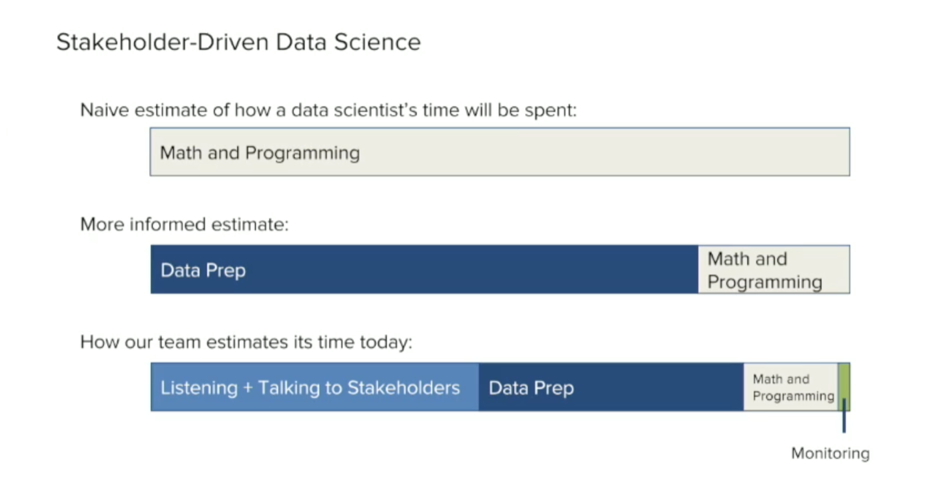
I think this should be a template for most of the Data Science projects because I have seen many of such projects ended up producing just ‘interesting’ insights that didn’t have any impact on their businesses. Data Science projects that don’t deliver values are hurting not just the people who are involved in the project, but also the businesses that could have made a significant difference.
Fueling growth through data monetization - McKinsey & Company - Link
The progress and impacts Data and Analytics are making varies among both industries and business functions.
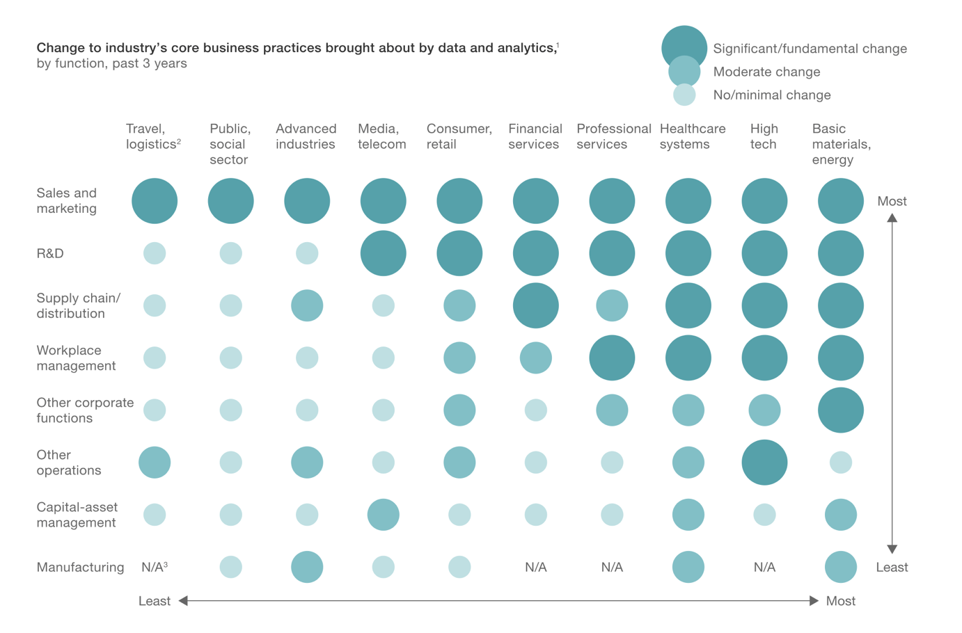
I’m surprised to find that Basic Materials and Energy and Healthcare industries are seeing big changes by Data and Analytics in many business functions (not just Sales & Marketing, which is now a table stake) as much as High Tech.
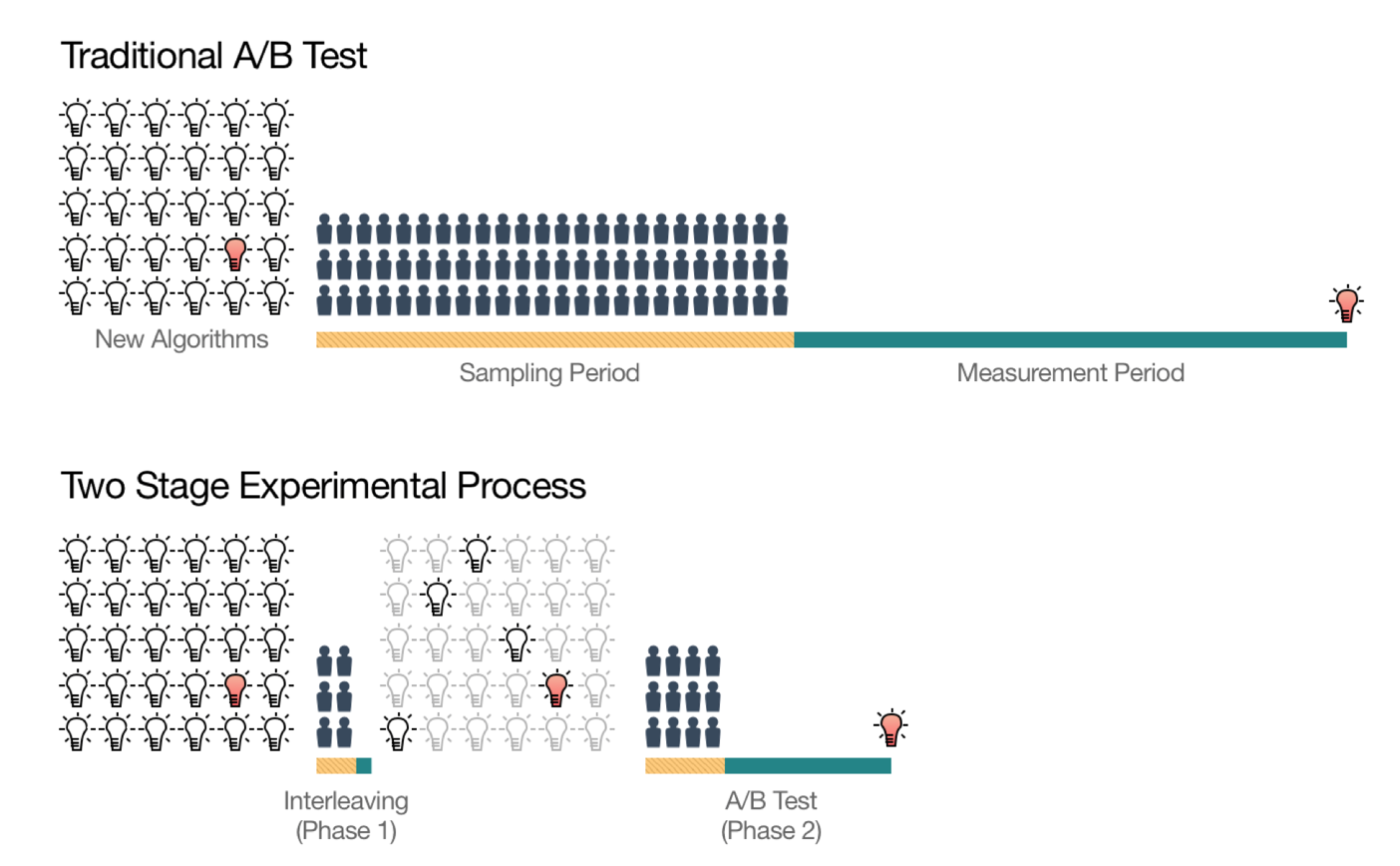
Innovating Faster on Personalization Algorithms at Netflix Using Interleaving - Link
Netflix continues to improve the quality of the recommendation engines by running hundreds, if not thousands, of A/B testing every day. Assigning users for A/B Testing can be challenging due to the bias with some users with extreme activities. They solve this problem by showing the recommended items by two recommendation algorithms (A and B) in an ‘intertwined’ way to the same user and measuring the user’s preference based on how long they watch the recommended shows.
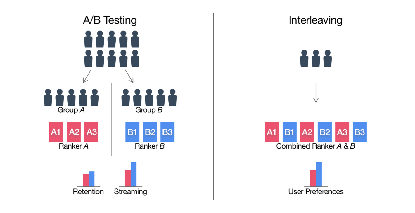
This approach also helps Netflix to reduce the overall A/B Testing time, hence they can run more experiments and deliver better recommendations faster.
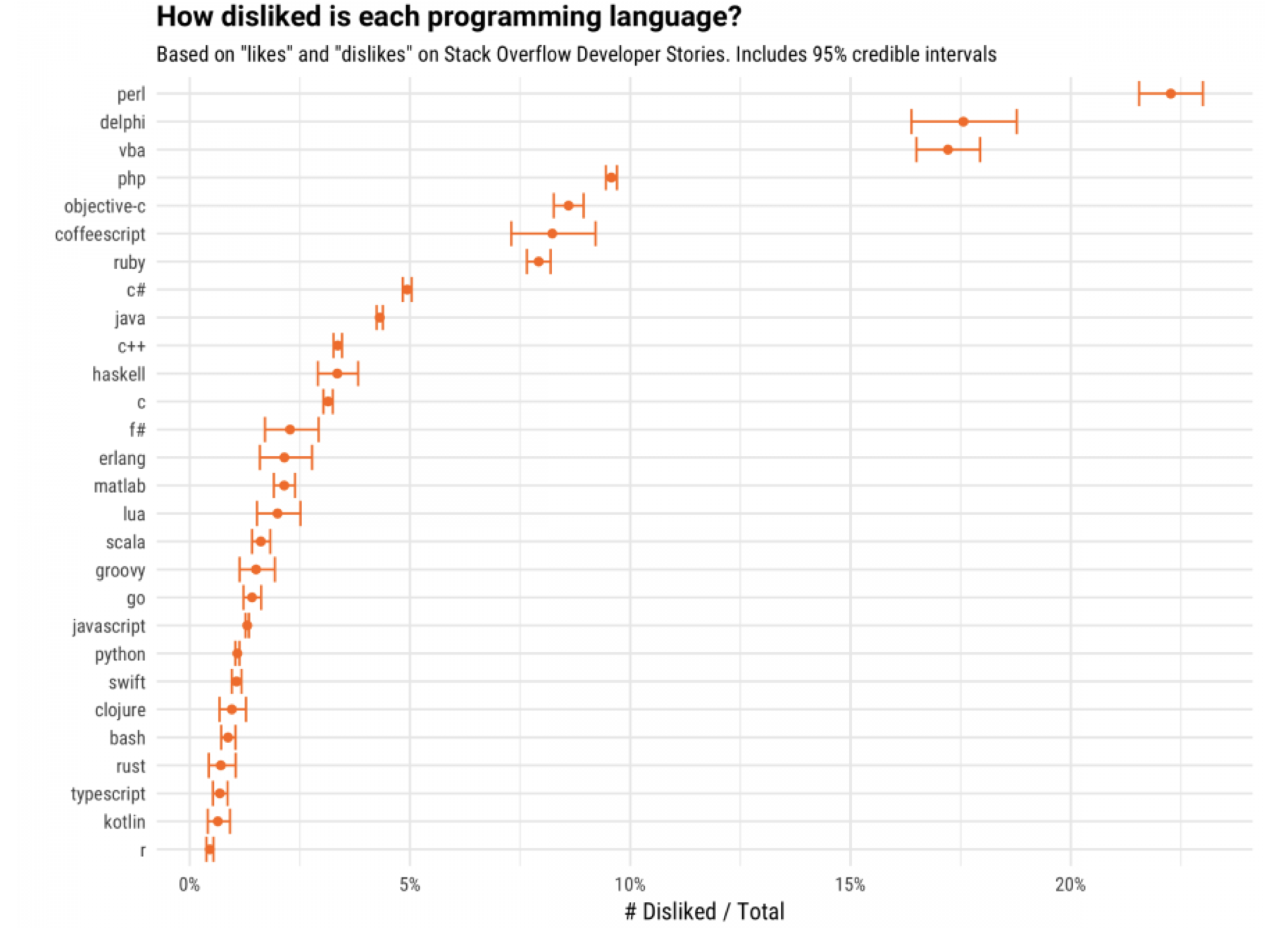
How R Doing? - Link
David Robinson, a data scientist at Stack Overflow, has done another great and fun analysis based on Stack Overflow data. This time, his analysis has revealed that R is the least disliked programming language! ;)
Others
- New algorithm can help predict patients’ end-of-life care - Link
- An artificial intelligence algorithm developed by Stanford researchers can determine a neighborhood’s political leanings by its cars - Link
- Progress in AI isn’t as Impressive as You Might Think - link
- The U.S. Leads in Artificial Intelligence, but for How Long? - Link
- Using Artificial Intelligence to Augment Human Intelligence https://distill.pub/2017/aia/
Interesting Data
Sexual harassment complaints data - Link
It’s hardly a day goes by without discovering another well know people getting accused of sexual harassment or abuse. But we all know that we are just sitting on a tip of the iceberg. There are a lot more of such behaviors in various industries in the world but most of them don’t make them to the news because they’re not famous. In U.S. the U.S. Equal Employment Opportunity Commission collects workplace sexual harassment complaints and folks at Buzzfeed obtained the data that contains complainant’s the gender, birth date, race, national origin, employer’s industry, etc. for anonymized list of the 170,000+ sexual harassment claims. This data was originally introduced by Jeremy Singer-Vine via his Data is Plural news letter.
15 years of opioid overdose deaths - Link
The opioids drug overdose deaths have increased dramatically and becoming ‘epidemic’ in many regions in the U.S. Data World’s Health team has compiled this US opioid overdose deaths data from Centers for Disease Control’s WONDER database.
Blog Posts from Team Exploratory
Last week, I have published another two new blog posts related to Bitcoin.
- Using Anomaly Detection Algorithms to Discover Strong Forces behind Bitcoin Price Movements - Link
- Using Forecasting Algorithm ‘Prophet’ to Visualize Insane Bitcoin Price Trend - Link

Hope that’s it for Bitcoin! ;)
What Are We Working On?
We are continuously and aggressively working on a development of exciting new features for v4.2.
One of them is a new addition to Analytics view, Principal Component Analysis (PCA). It is a popular and commonly used algorithm among many data scientists. It is often used to reduce the dimensionality of the data, but also it can be used to give you useful insights about variables in your data. You can find relationships among the variables and cluster the data based on how each observation (or row) is scored on those variables.
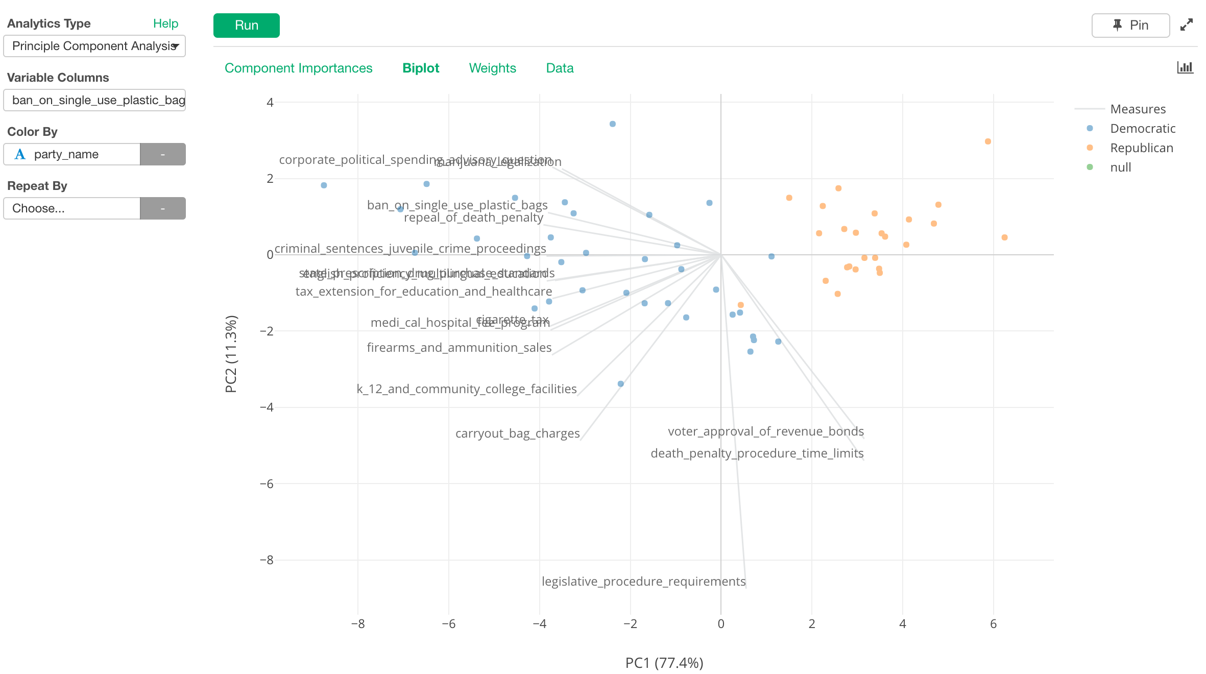
The chart above shows the relationship among the ballot measures of the last year’s California election based on how they were voted by each county. Each dot is a county and the color shows whether a given county voted for the Republican candidate (Donald Trump) or the Democrats candidate (Hillary Clinton) for the President.
Data Science Booster Training
As mentioned at the beginning, we will have our 10 hours online live training (Link) in January to equip you with the powerful Data Science methods ranging from Machine Learning, Data Visualization, and Data Wrangling. Visit our Booster Training home page for more details.
Have a wonderful week!
Kan, Exploratory/CEO