Exploratory Getting Started Tutorial
Duration (Time to finish) : About 60 minutes
This is a getting started guide for Exploratory.
If you prefer watching, here is a video tutorial.
If you prefer reading, please continue to read on.
You will learn the 5 functional areas of Exploratory. They are Data Access, Data Wrangling, Data Visualization, Analytics, and Communication with Dashboard.
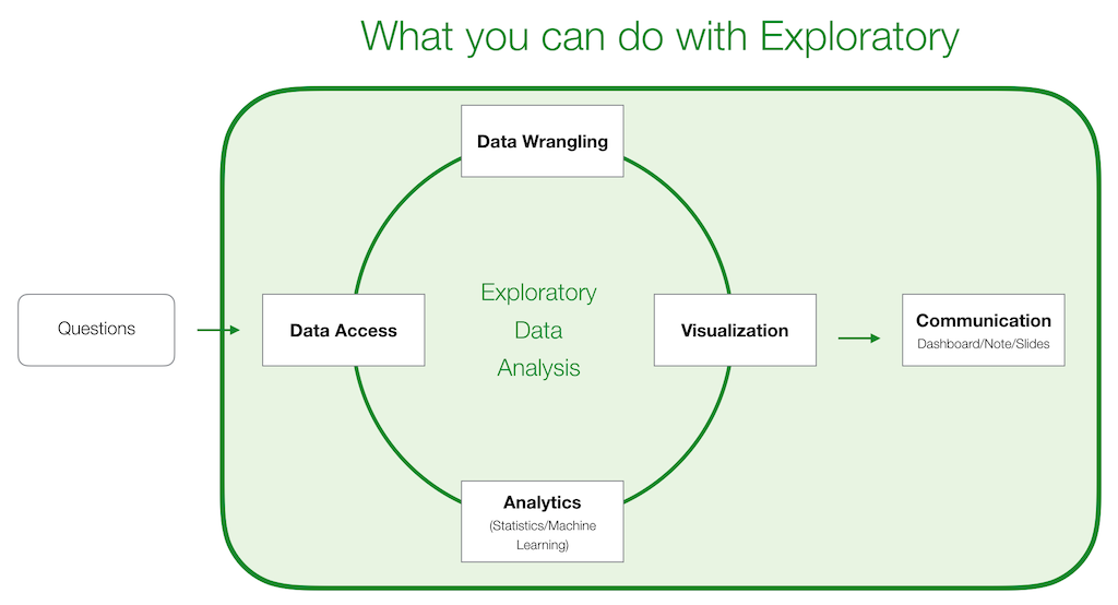
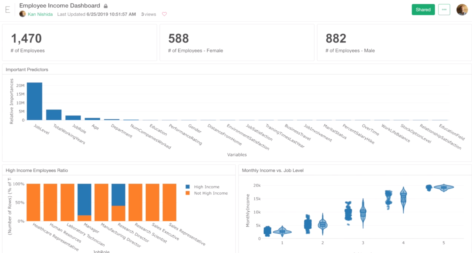
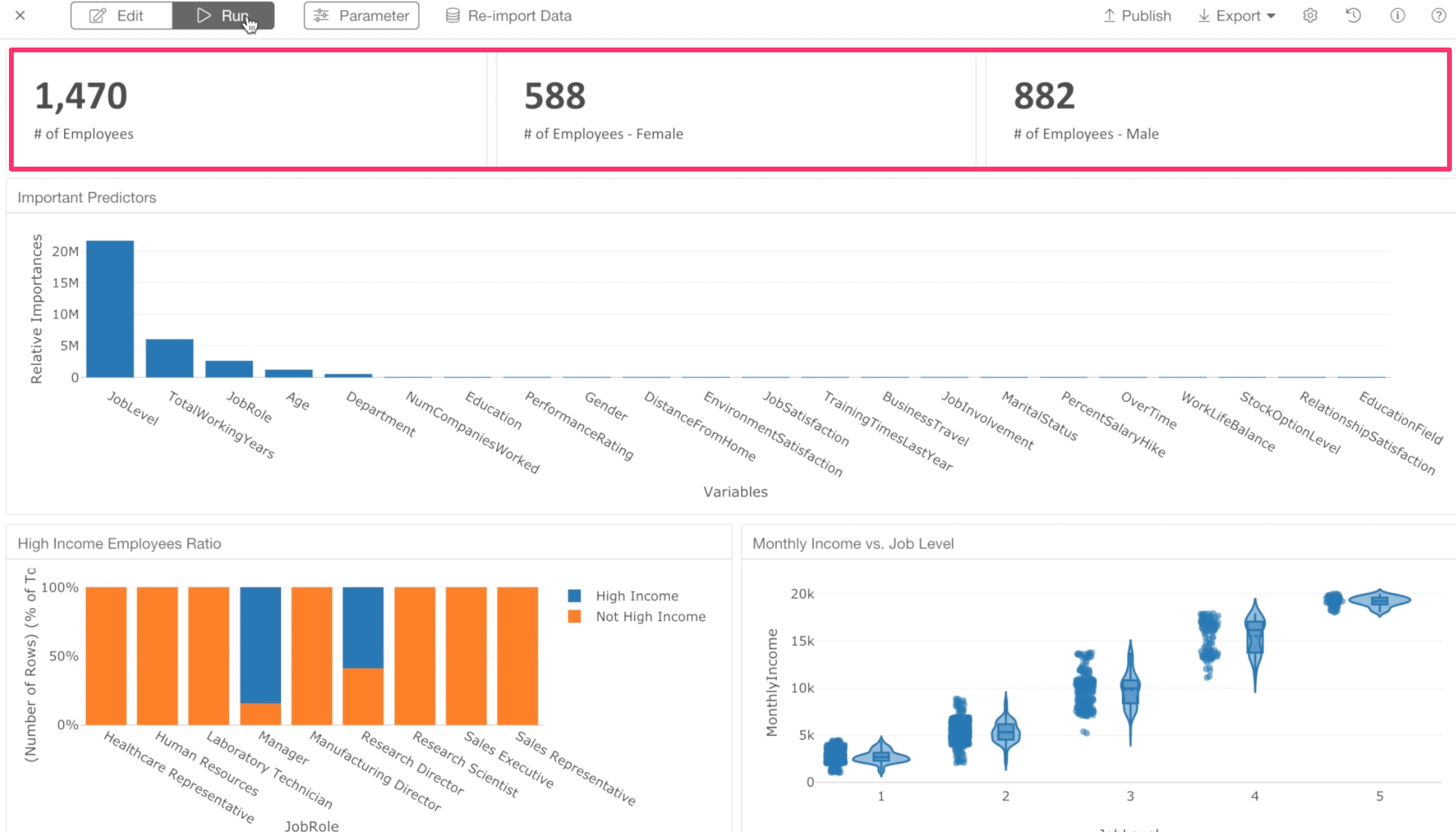
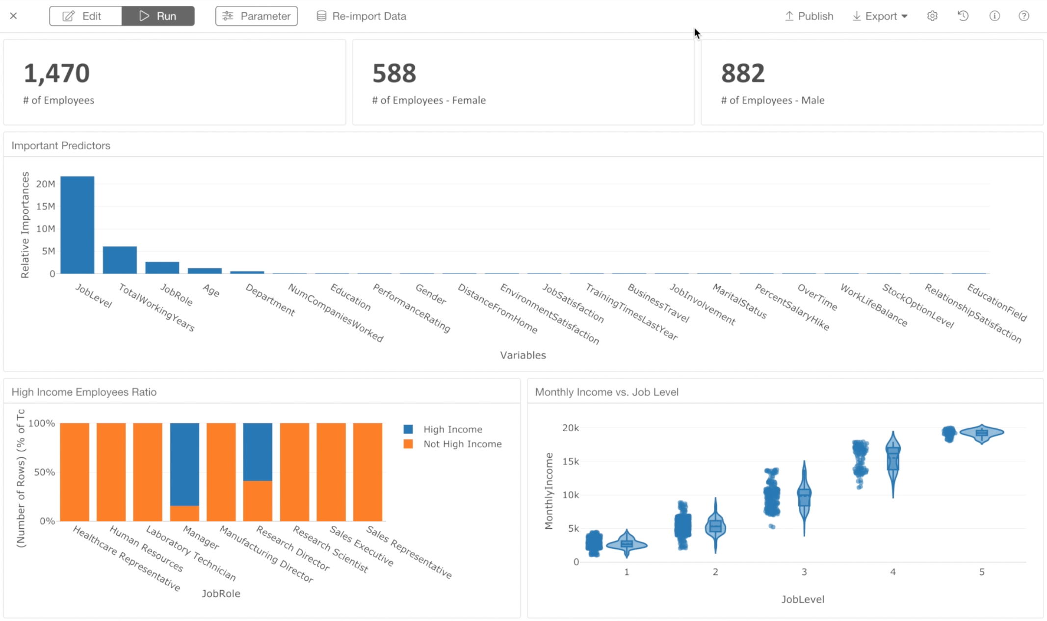
We have designed this tutorial to be something that you can learn while you perform Exploratory Data Analysis (EDA). And towards the end, you will end up creating a dashboard like this by putting all the charts you will have created together.
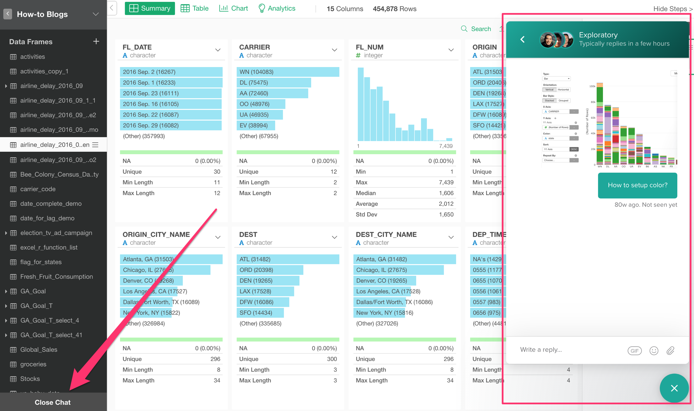
If you have any questions while you go through the steps, feel free to ask through the Chat window,
or, send your questions to support@exploratory.io by email.
Hope you are going to find it fun as well as useful.
Let’s start.
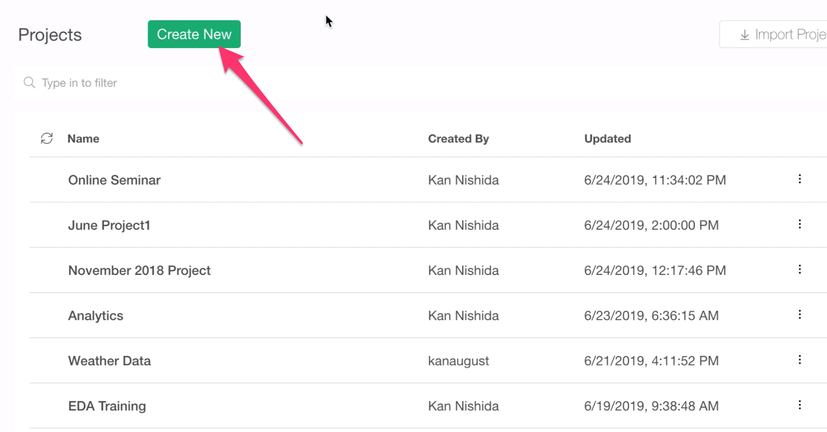
Create a new Project
When you launch Exploratory Desktop and finish the initial installation step, you will see this Project List page.
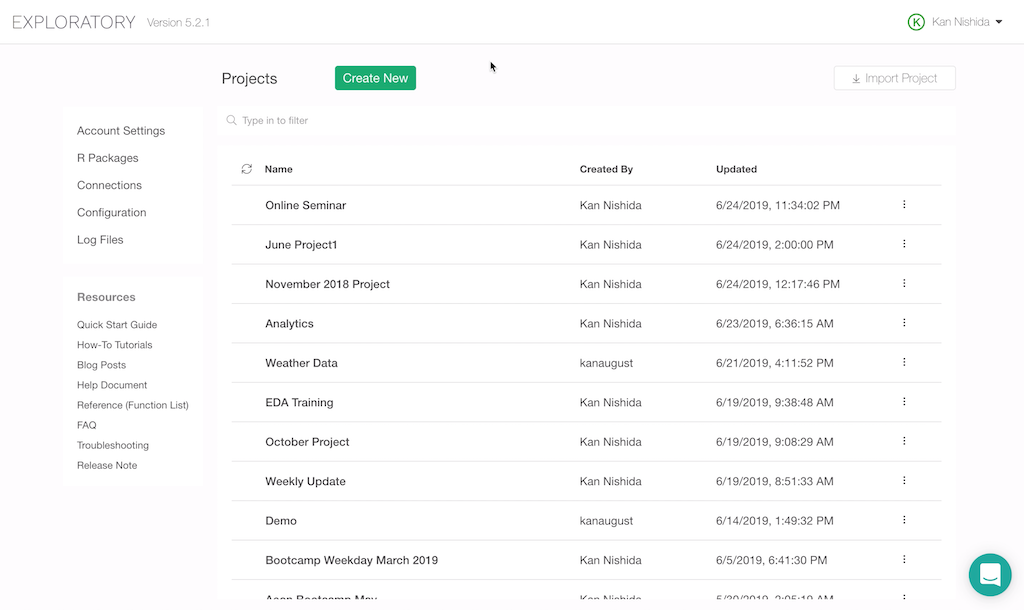
In order to start importing data or perform data analysis, you want to create a project first.
Data
The data we are going to use in this tutorial is called HR Employee data.
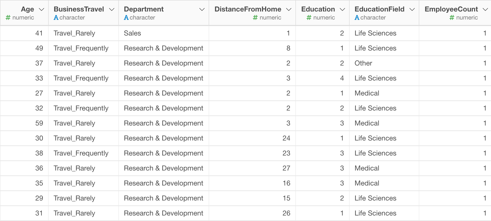
Each row represents each employee. There are about 30 attributes information about each employee, such as Monthly Income, Department they work for, Job Role, Gender, etc.
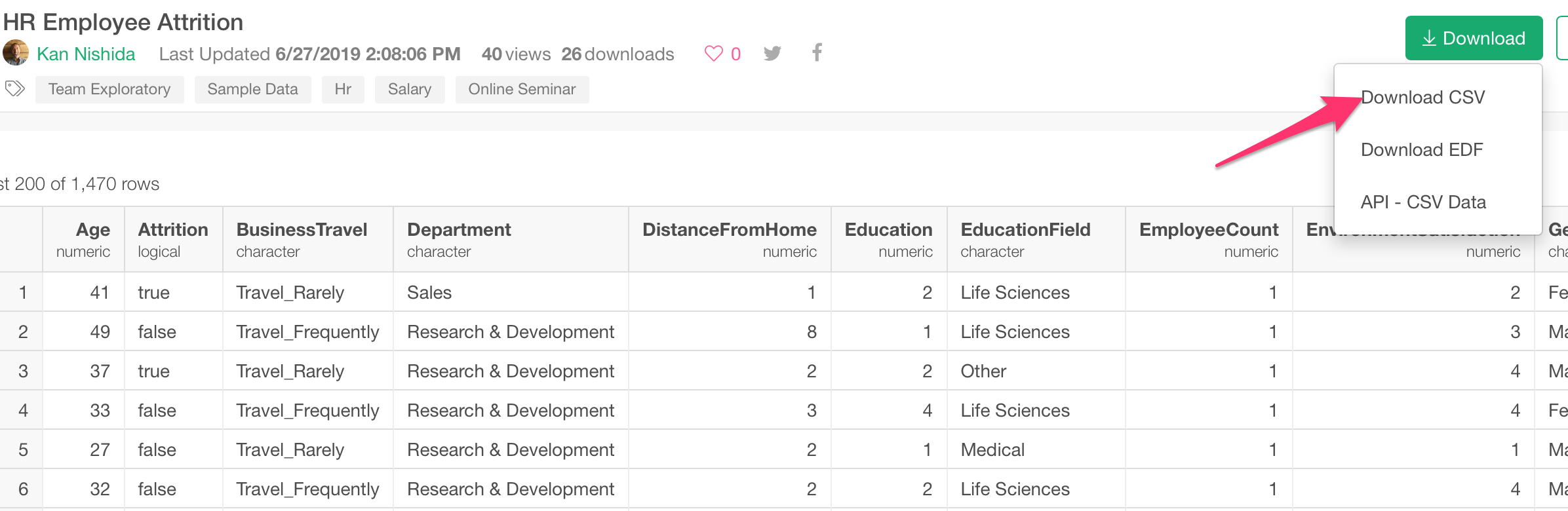
Download Data
You can download the data from the link below.
- HR Employee Data - Link
And select ‘Download CSV’ under ‘Download’ button.
Import Data
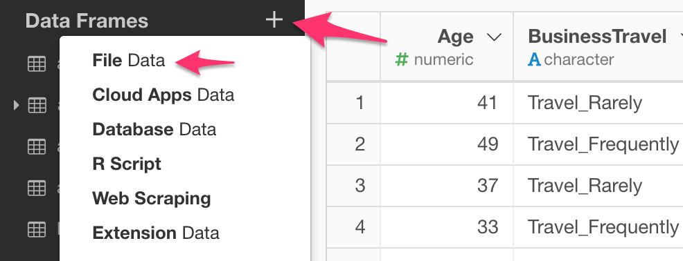
Inside the project, you can start importing data.
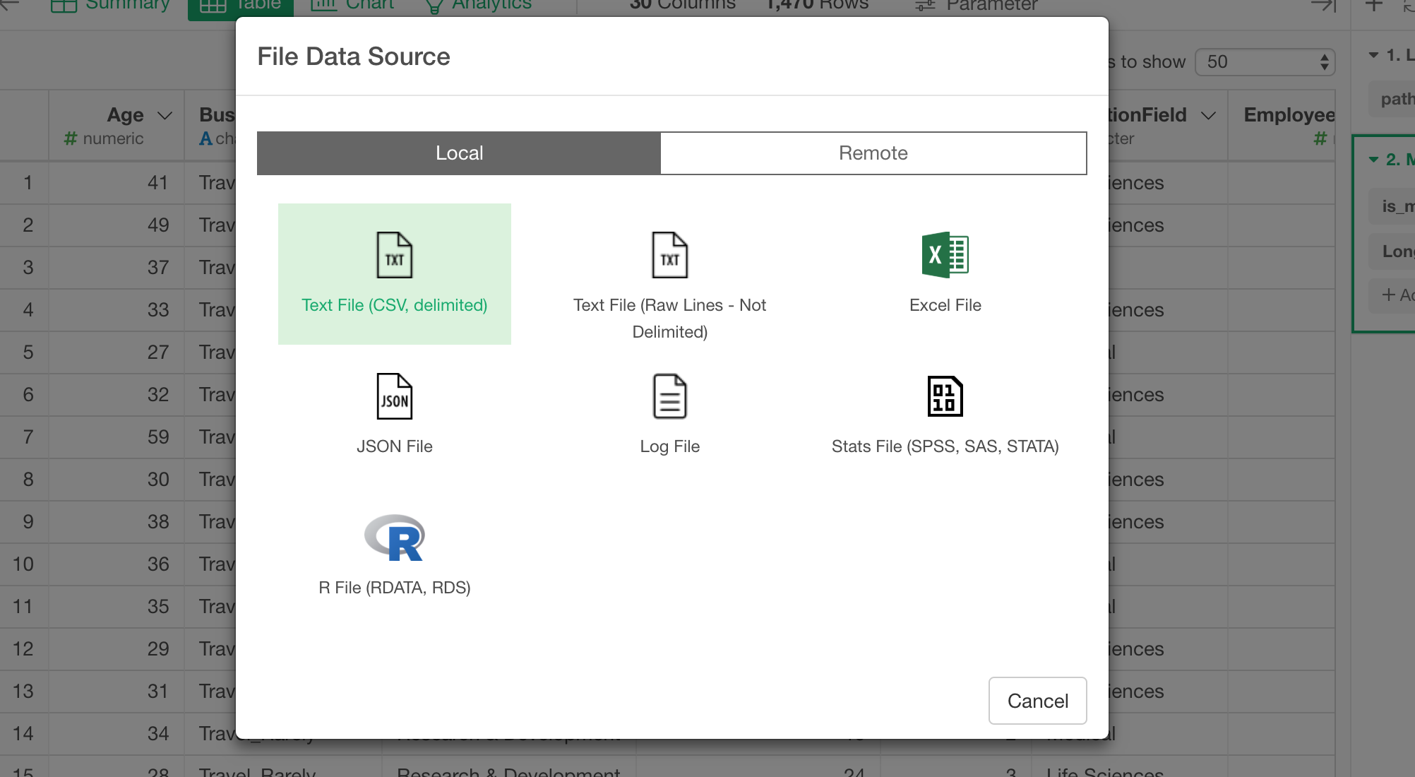
Select File Data from the data frame dropdown menu.
Then, select ’Text File (CSV, Delimited).
Once you select the downloaded csv file, you will see the data in the preview table.
At the left hand side, you can see a set of parameters that you can adjust to import the file properly.
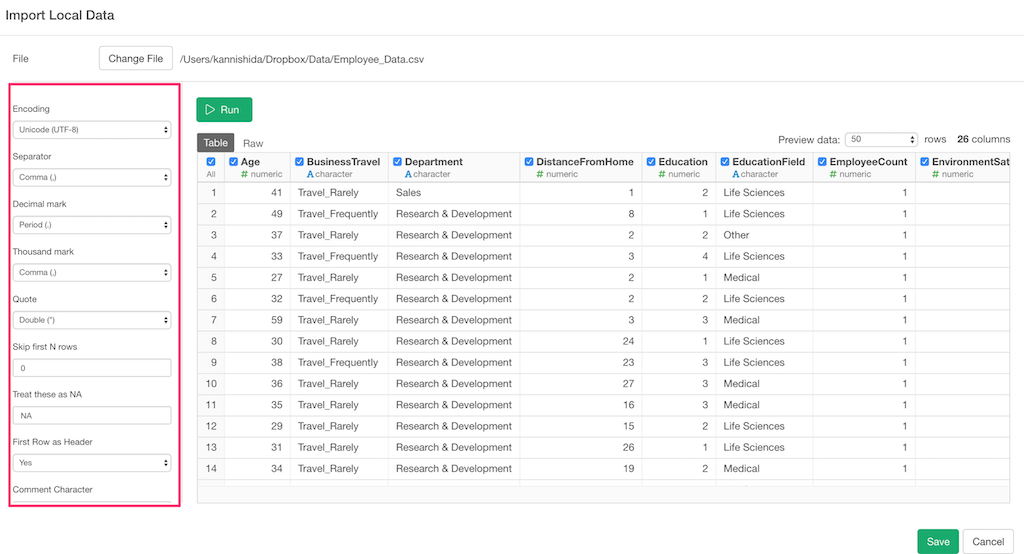
This time though, the data looks good in the preview so we can leave all the parameters as they are, and click the ‘Save’ button to import as a data frame.
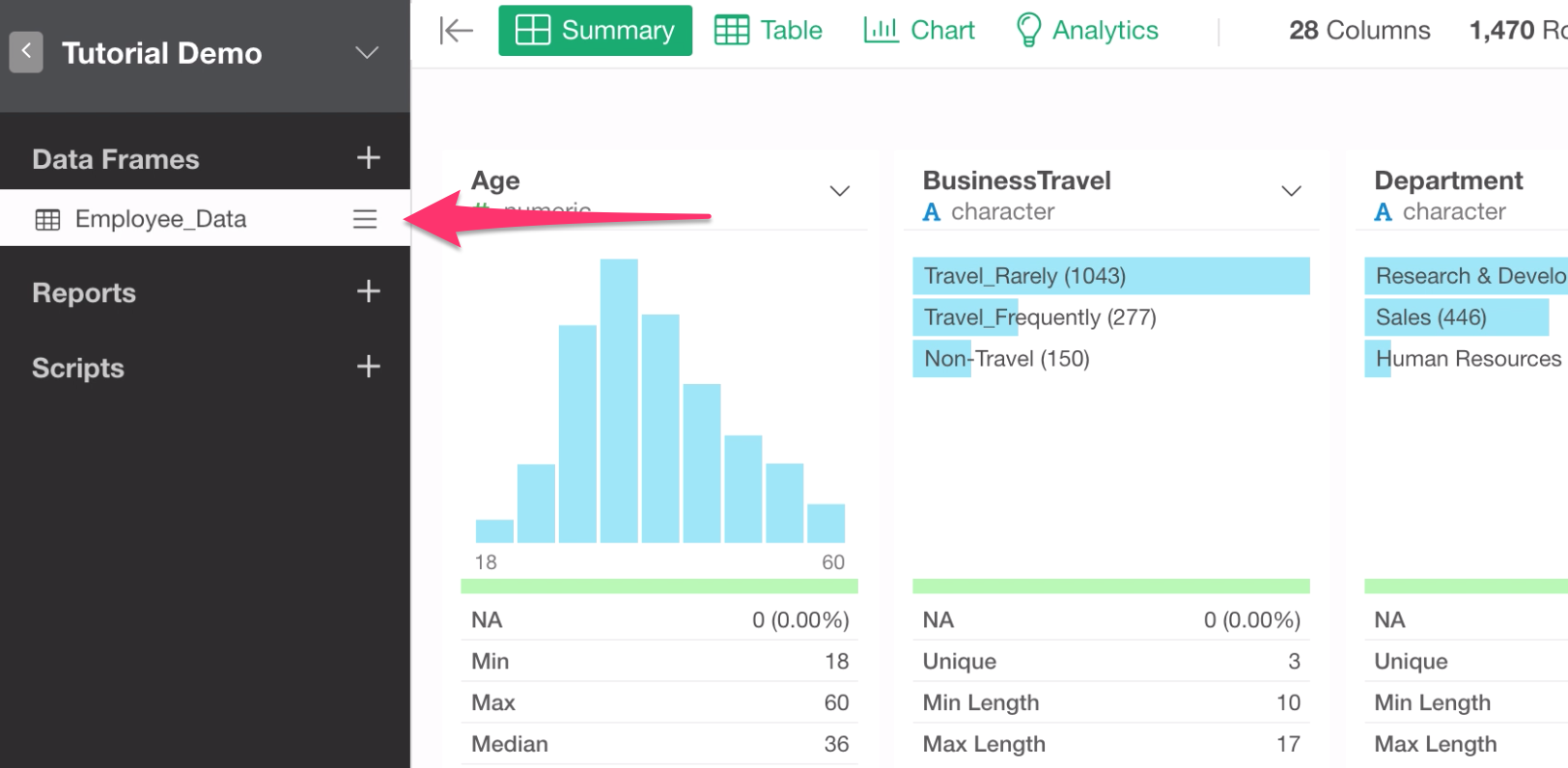
Inside Exploratory, each data is registered as something called Data Frame. A Data Frame is like a table in databases or a worksheet of Excel.
You can create multiple data frames by importing more data or duplicating the existing ones.
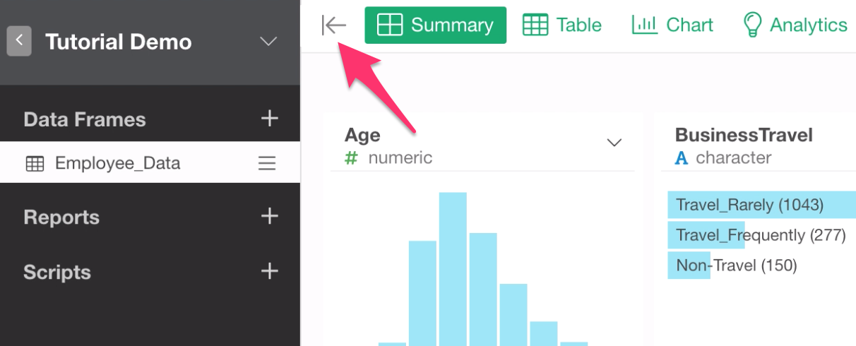
Hide Sidebar
You can click ‘Hide Sidebar’ button to hide the data frame list pane.
4 Views
Each data frame has 4 views.
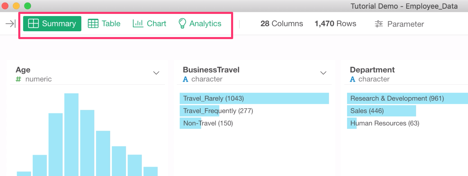
We’ll cover all of them, but first, let’s start with the Summary view.
Summary Statistics
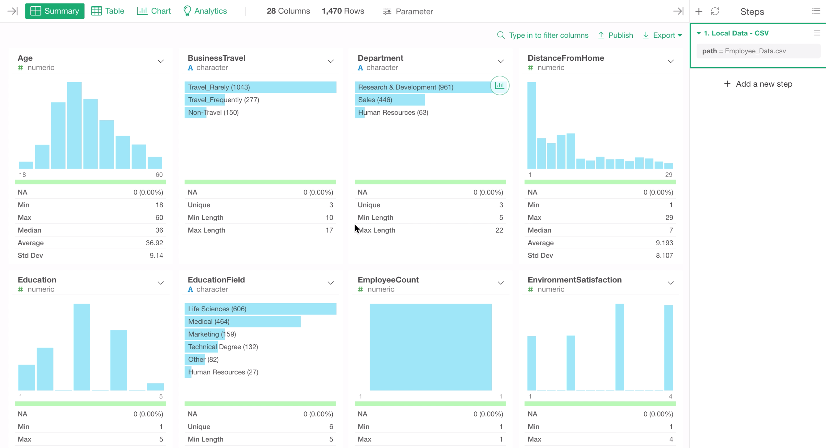
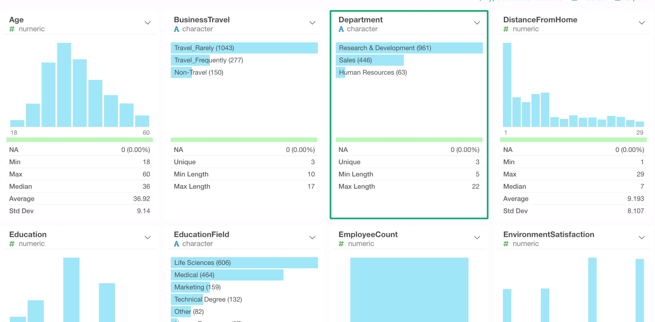
We can see each column’s summary statistics such as median, mean, etc. along with the automatically generated histogram.
The summary statistics and the chart are generated depending on each column’s data type, which can be found underneath each column name.
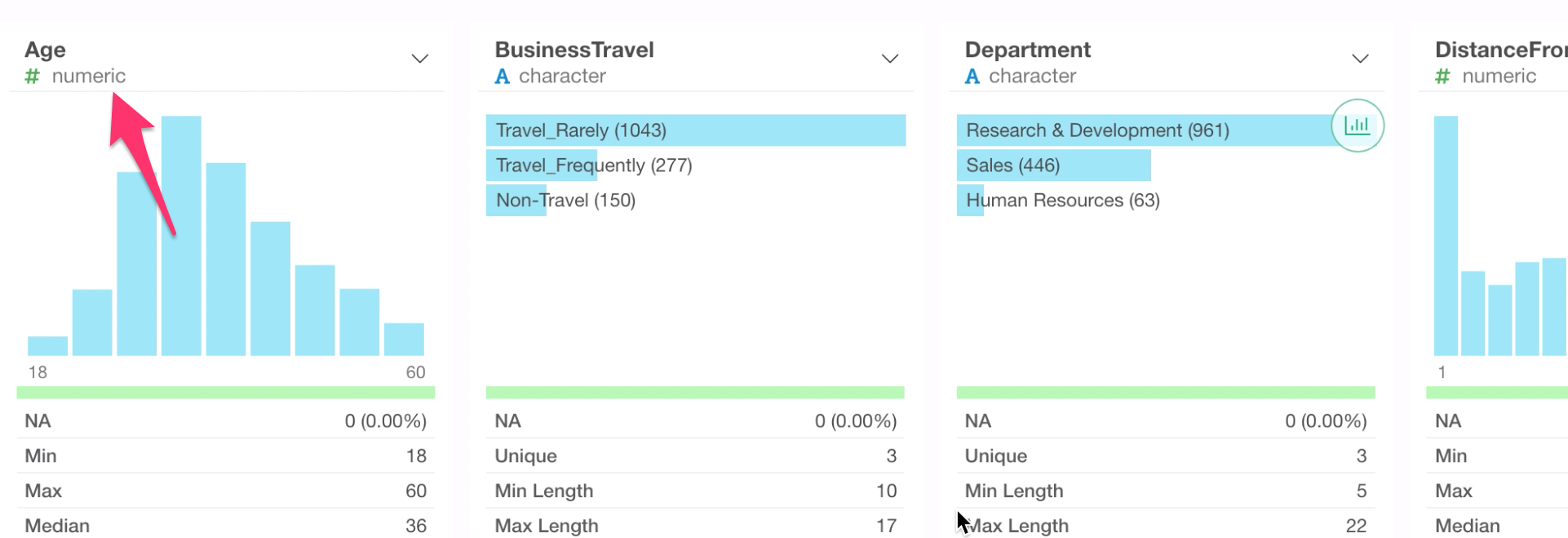
Numeric Columns
For example, this Age column is Numeric data type, therefore it has a histogram that shows how many rows are in each bucket of a numerical range.
By moving the mouse on top of each bar, we can see how many rows are in that particular bucket. For example, there are 343 rows in the range of 30 and 35 years old.
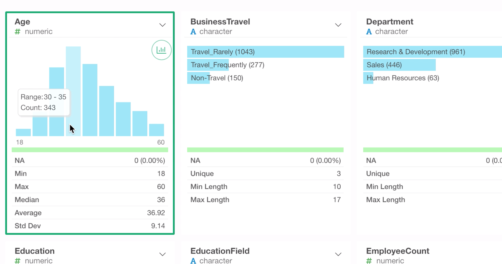
Given that each row of this data represents each employee, we can say that 343 employees are in 30 to 35 years old range.
By looking at the summary statistics section, we can see that the average age of this company is 36 or 37 years old.
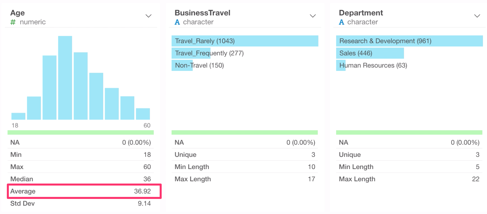
Categorical Columns
Let’s take a look at another column called Department.
This is Character data type, therefore it has a horizontal bar chart that shows the top most frequent values. We can see that ‘Research & Development’ has the most employees.
Monthly Income as our target column
When you do Exploratory Data Analysis, typically you have a subject of your interest to start with.
This time, let’s say we are interested in Monthly Income and have questions like,
- How does the income vary among the employees?
- What makes the income high or low?
You can quick ‘Search Column’ at the top,
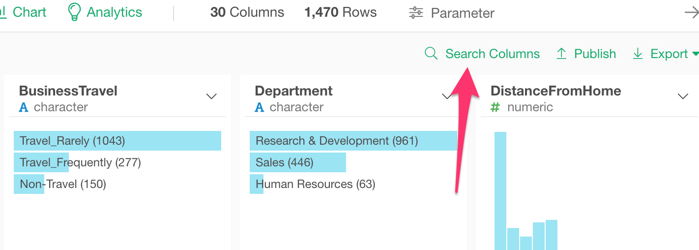
and type in a part of the column name find the Monthly Income column quickly.
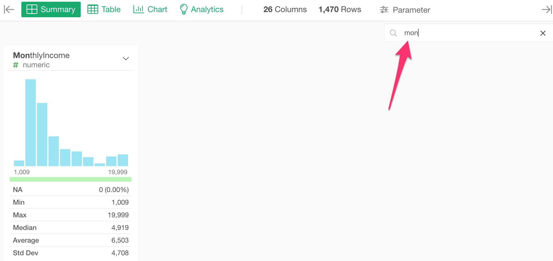
By looking at the histogram, Monthly Income values range from $1,000 to $20,000. That’s a lot of difference!
Anyway, notice that the number of employees tends to go down as the monthly income goes up, but around 16,000 the trend bounces back and start going up!
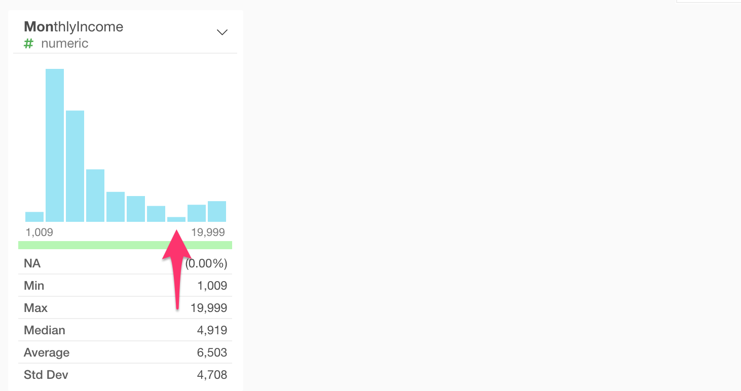
What’s going on?
Visualization & Data Wrangling
Create a Chart from Summary View
Let’s see more details by clicking on the chart icon on top of the histogram.
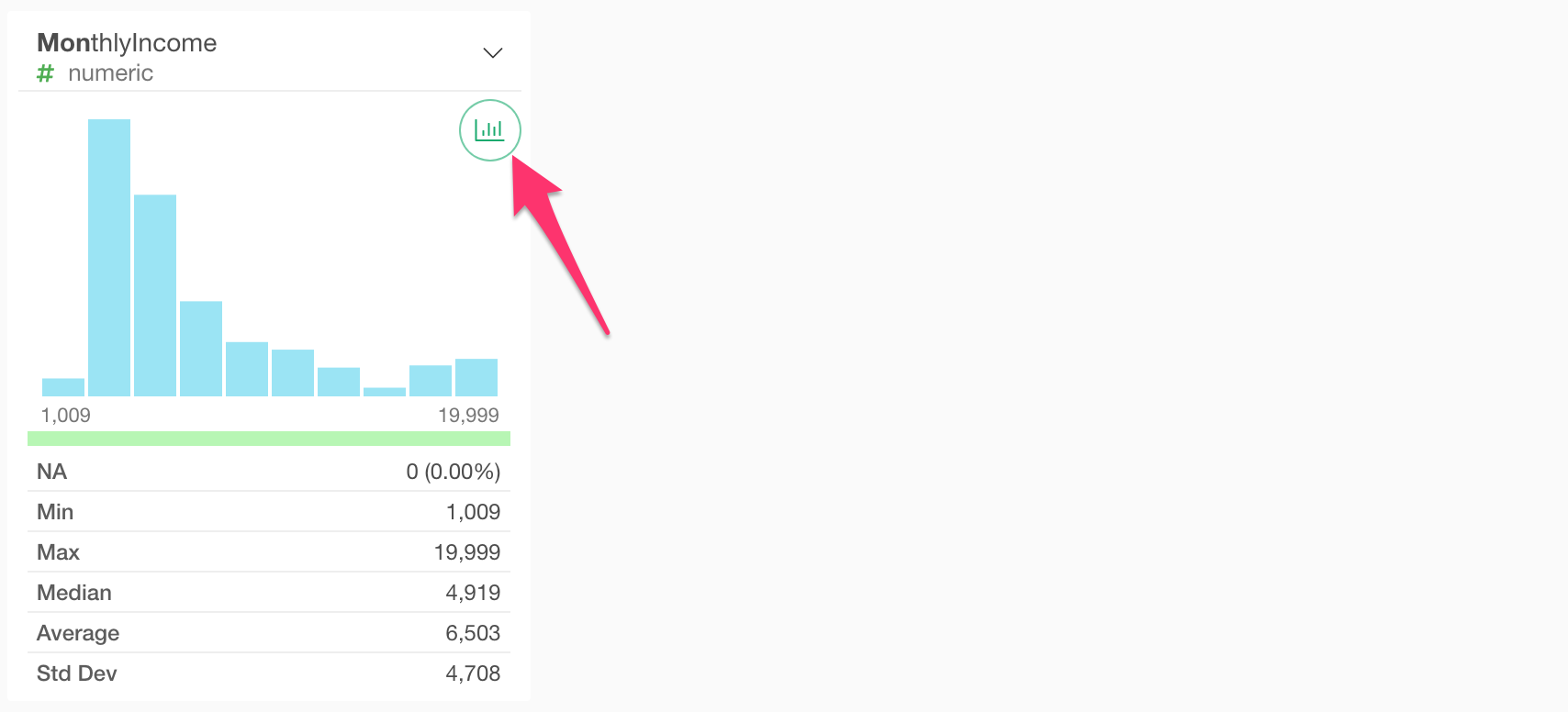
This creates a new chart under the Chart view.
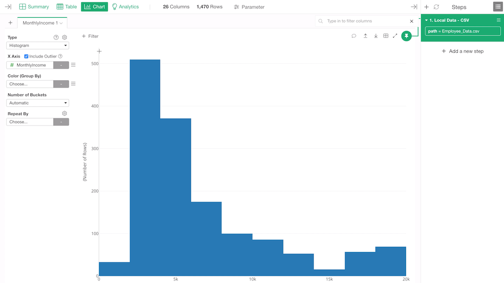
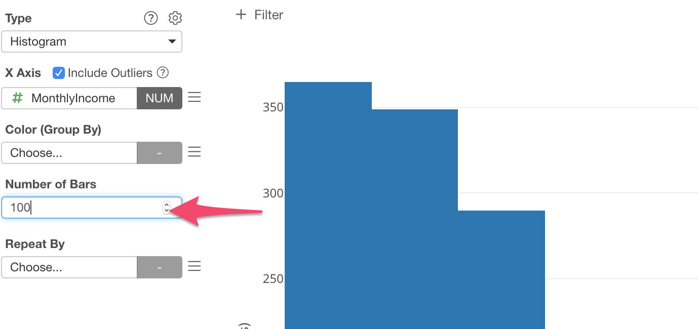
This histogram chart is basically the same one we saw in the Summary view. But under this Chart view, you can change the number of the bars.
Let’s change it to 100 by typing 100 and hit Enter (Return) key.
This makes the Monthly Income to be divided into 100 ranges each of which is presented as a bar.
Now we can see that the divide we noticed in the Summary view is around 15,000.
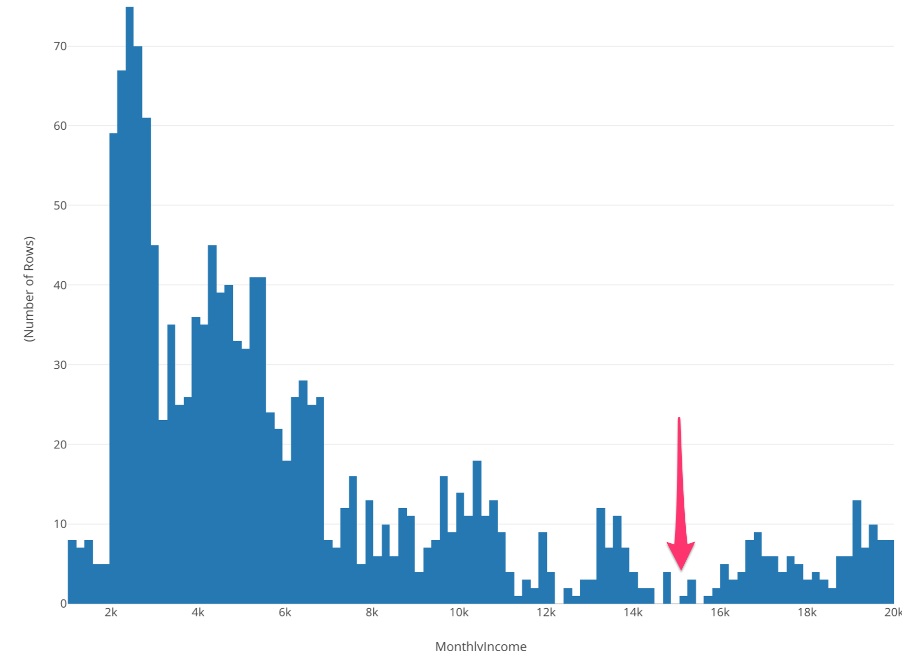
It seems that there are two different groups. One is the employees whose monthly incomes are less than $15,000 and another is the employees whose incomes are greater than $15,000.
What makes them different?
To answer this question, we can label each employee to show if he or she makes more than $15,000.
This is where Data Wrangling comes in.
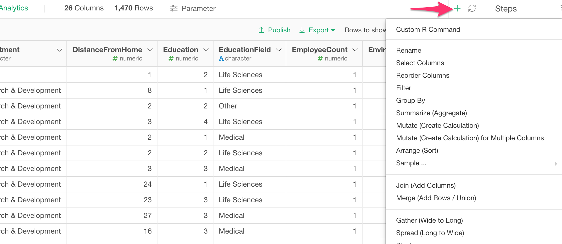
Accessing Data Wrangling Commands
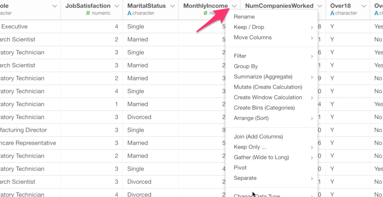
In Exploratory, most of the data wrangling operations can be started from this column header menu under Summary view or Table view.
Summary view:
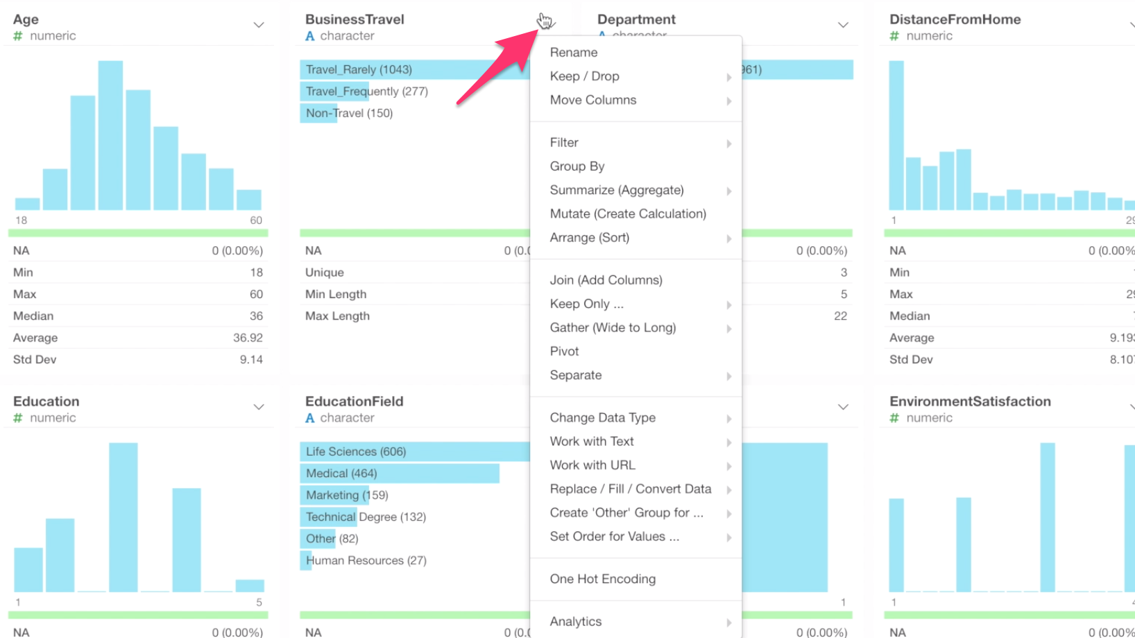
Table view:
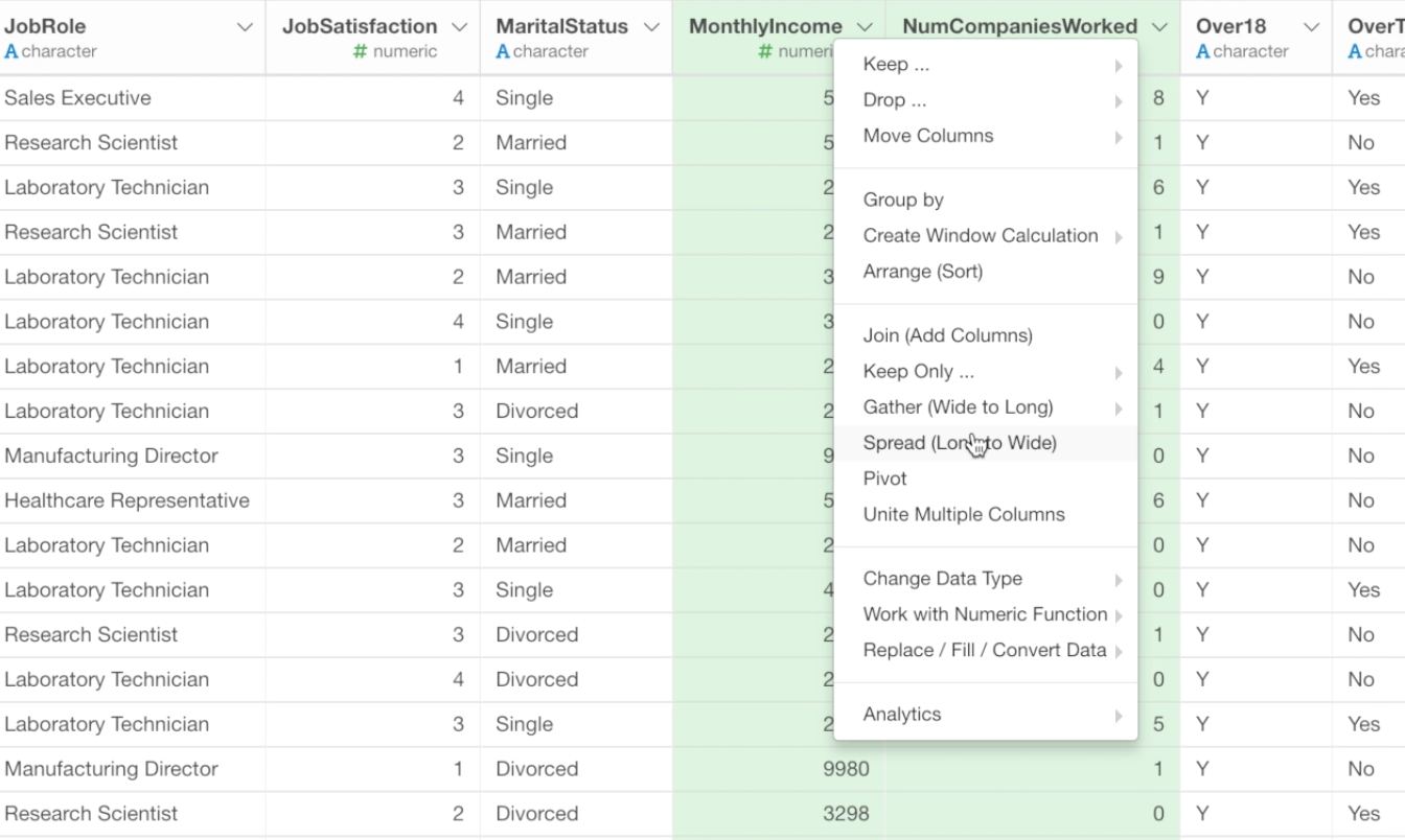
Some wrangling operations can be found only by selecting multiple columns.
Multiple Columns Menu
And some data wrangling operations that are against the whole data frame and not depending on the column selection such as Sampling the data, cleaning up the column names, etc. can be found only by clicking on the Plus button at the header of the Step pane.
Create Calculation with Mutate Command
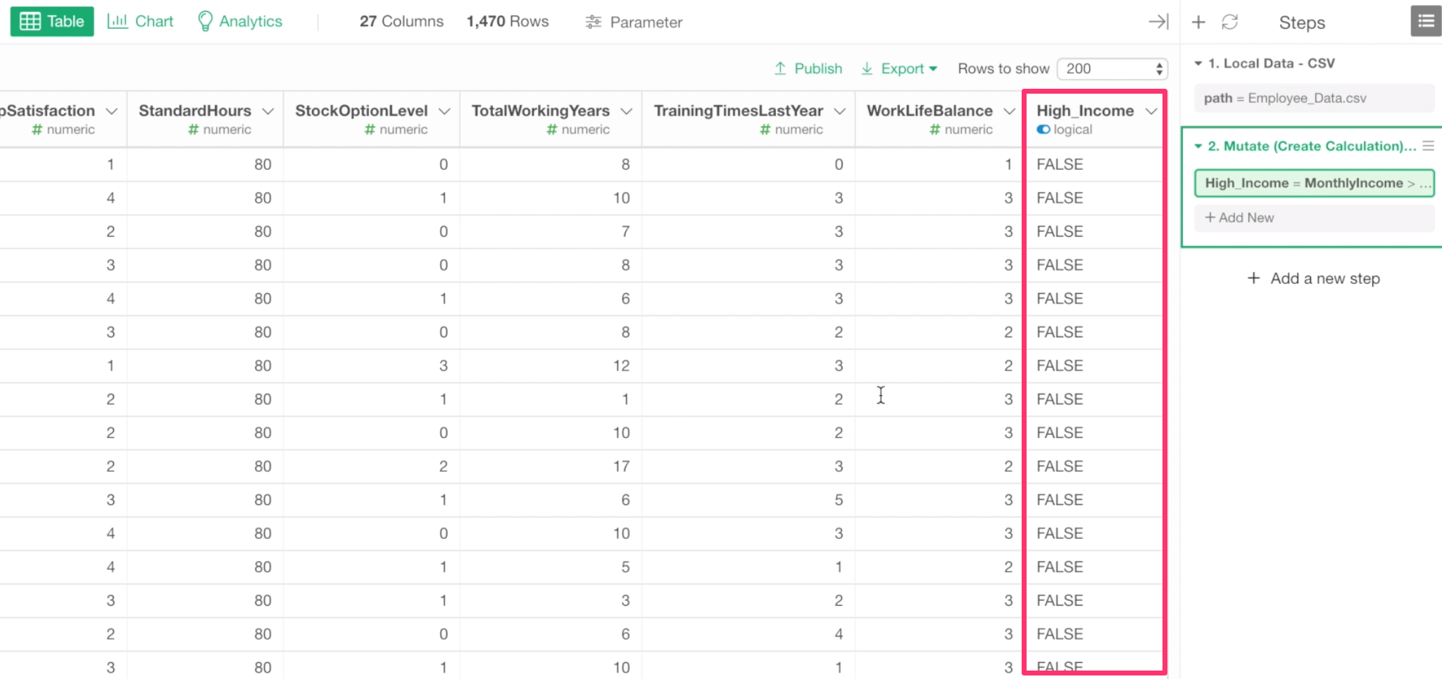
Now let’s create a calculation to label if each employee is making greater than $15,000 or not.
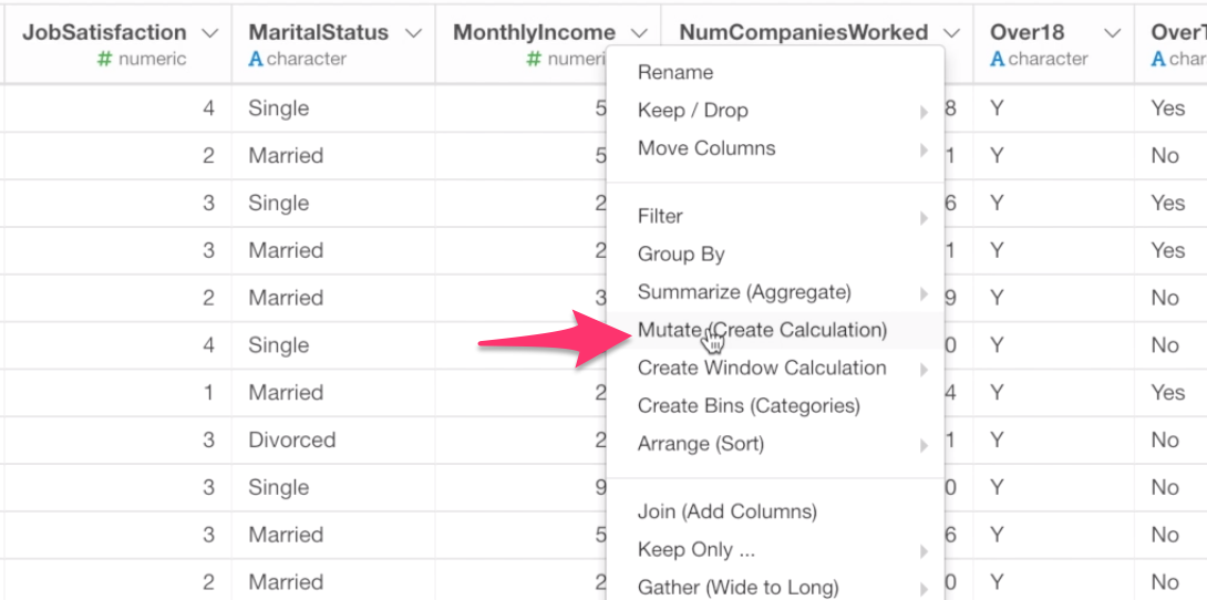
Find the Monthly Income column, and select Mutate (Create Calculation) from the column header menu.
The column name is already there in the Calculation editor. So all we need to do is to add ‘greater than 15,000’ expression.
MonthlyIncome > 15000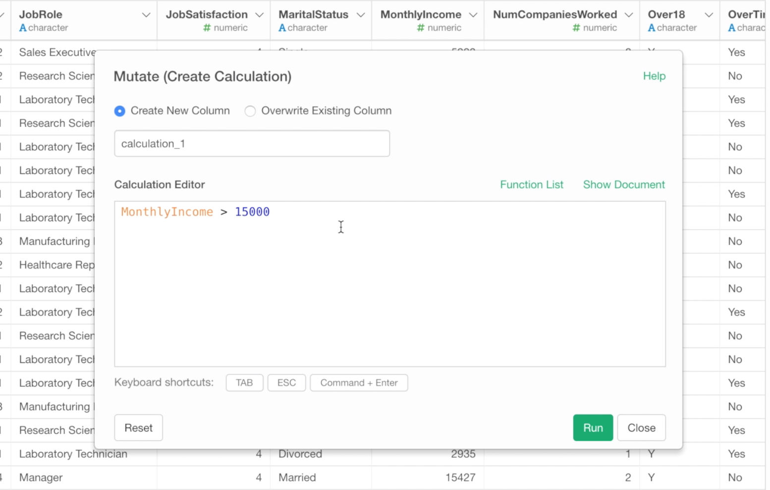
This will evaluate if the monthly income value is greater than 15,000 or not and return the result as either TRUE or FALSE.
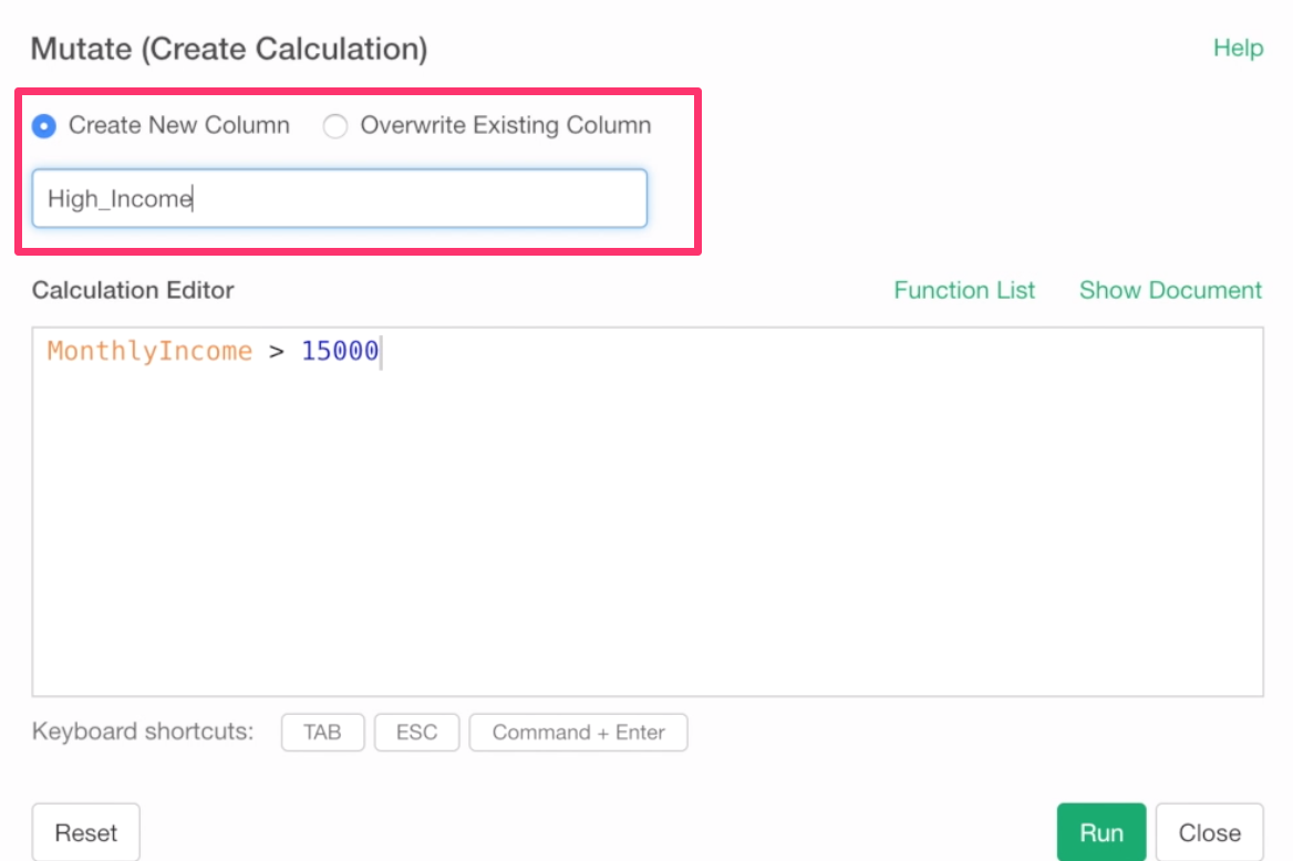
Type a ‘High Income’ as the column name and click the Run button to create a new column.
The newly calculated column is added at the end.
How many employees are labeled as TRUE (High Income)?
We can go to the Summary view to quickly answer this question.
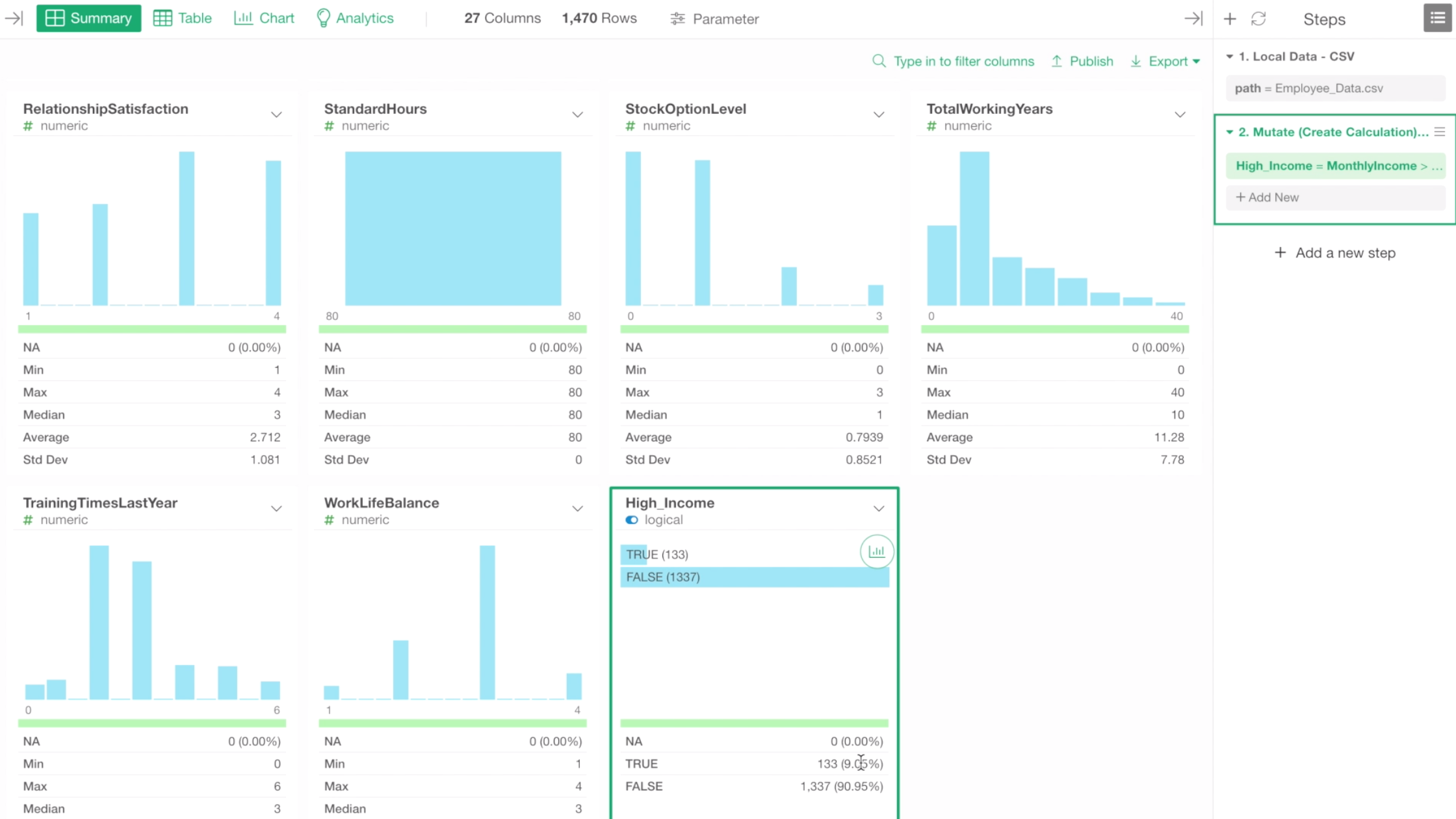
There are 133 employees, and that is about 9% of all the employees.
Let’s go back to the histogram chart and try to assign this newly created column ‘High Income’ to Color By.
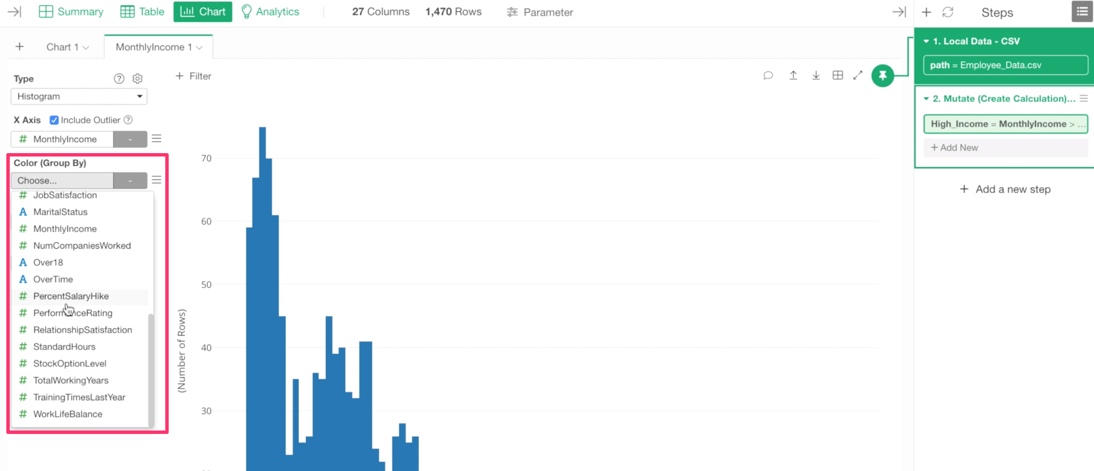
But, here is a problem. We can’t find the newly created column in the column dropdown list.
Chart Pinning
This is because this chart is ‘Pinned’ to the 1st step of the data wrangling steps at the right-hand side.
This means that the data for this chart is coming from this 1st step, not from the 2nd step. Think of it as each step having its own data, similar to the worksheet inside Excel workbook.
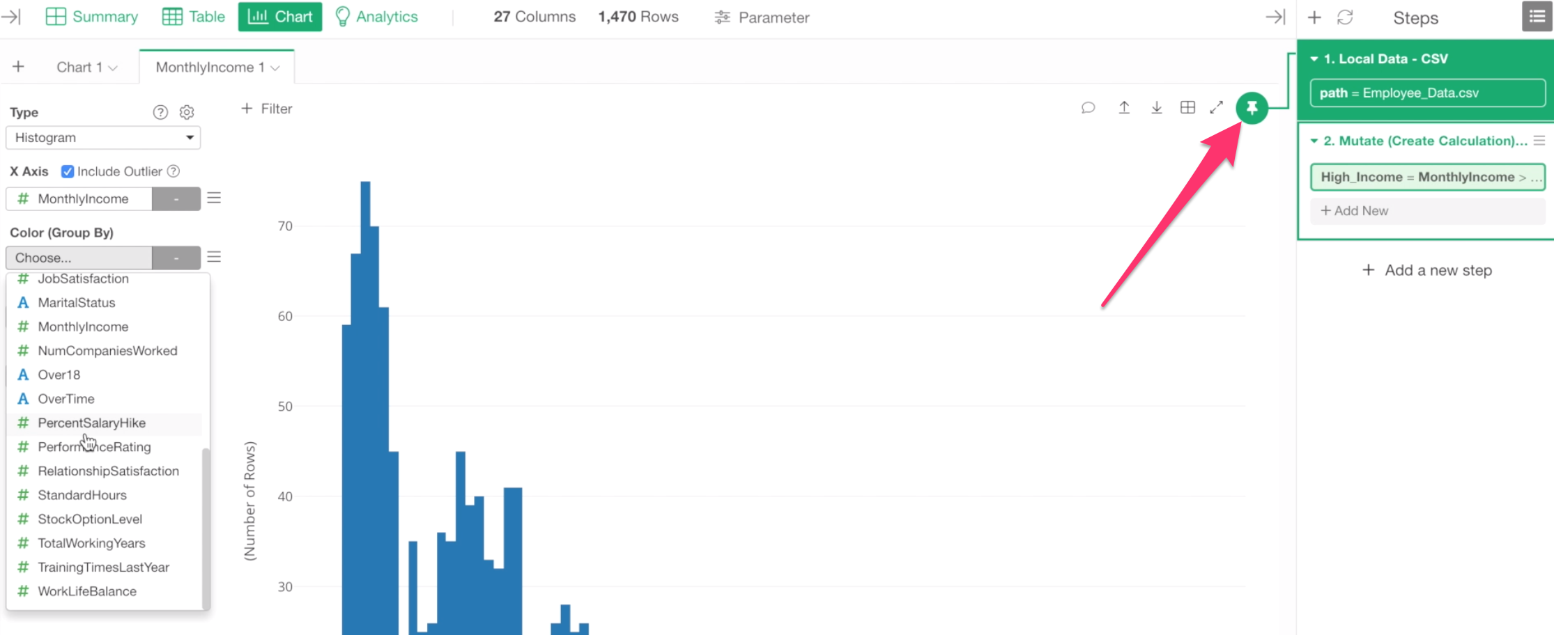
Now, if we want this chart to use data from the 2nd step where we created the ‘High Income’ column, then we can move the Pinned step to the 2nd step by drag-and-drop the Pin icon to the 2nd step.
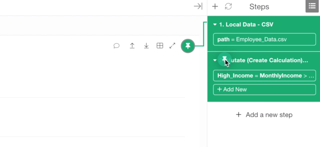
Make sure that the chart is now ‘Pinned’ to the 2nd step.
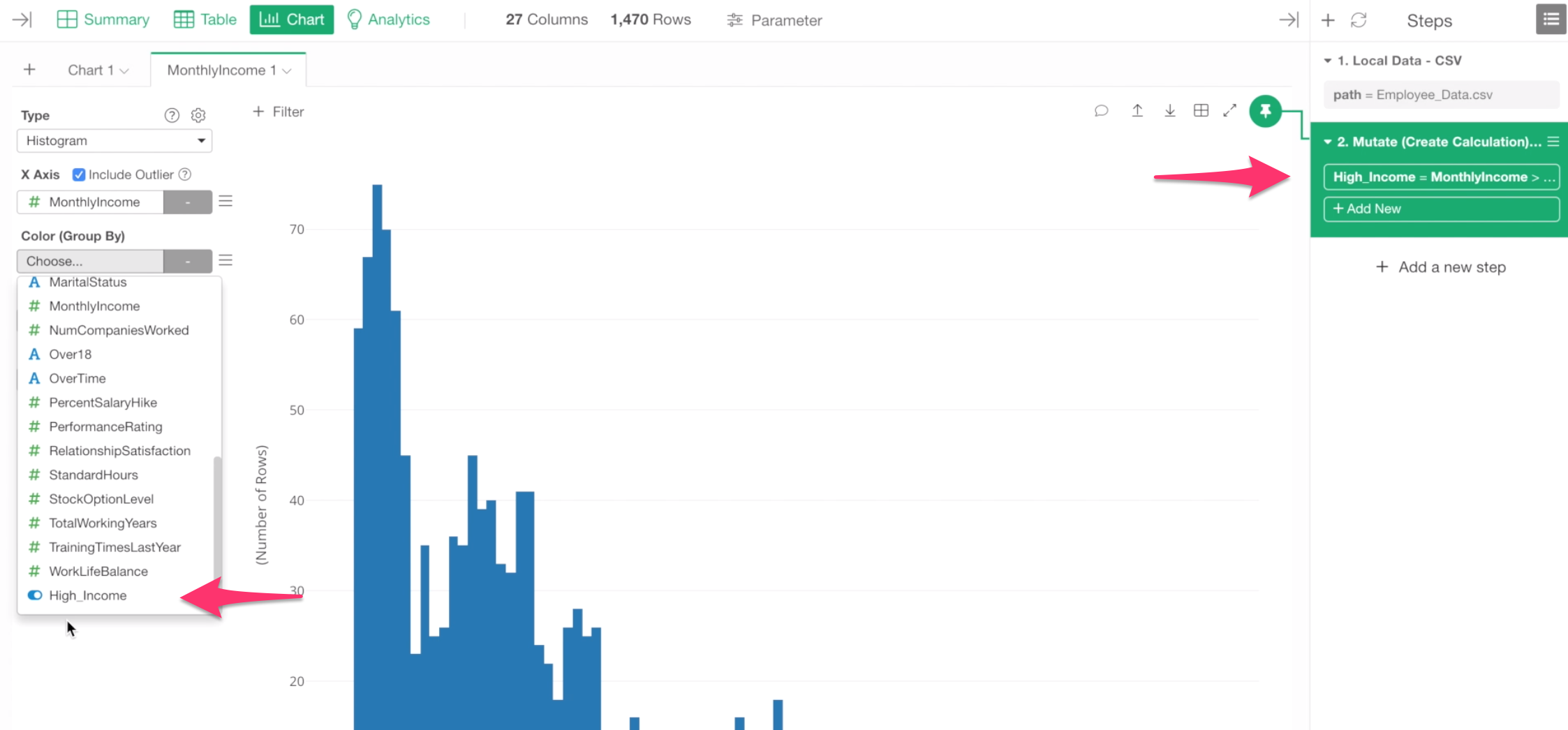
Now the ‘High Income’ column should be showing up in the dropdown of Color By.
This Chart Pinning feature becomes more useful when you add a new step to filter the data or transform it into a different form of data. In such cases, you don’t want the chart to show an unexpected result, rather you want your chart to always stay at a particular step.
Anyway, by selecting the ‘High Income’ column we can see that ‘High Income’ employees are Blue and ‘Not High Income’ employees are Orange.

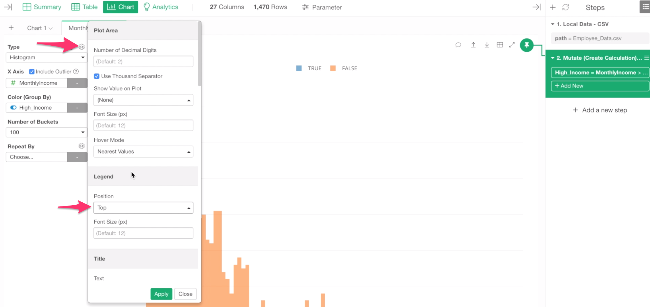
We can move the legend that is currently shown at the right hand side of the chart, to the top by using Chart property.
Click on the Gear icon at the top of the Chart Type dropdown, then change the Position to Top.
We can make it even better.
Conditional Labeling with ‘ifelse’ function
This TRUE or FALSE thing is actually not so intuitive.
Let’s label them as either ‘High Income’ or ‘Not High Income.’
To do, you can click on the token where we created the ‘High Income’ column at the right-hand side.
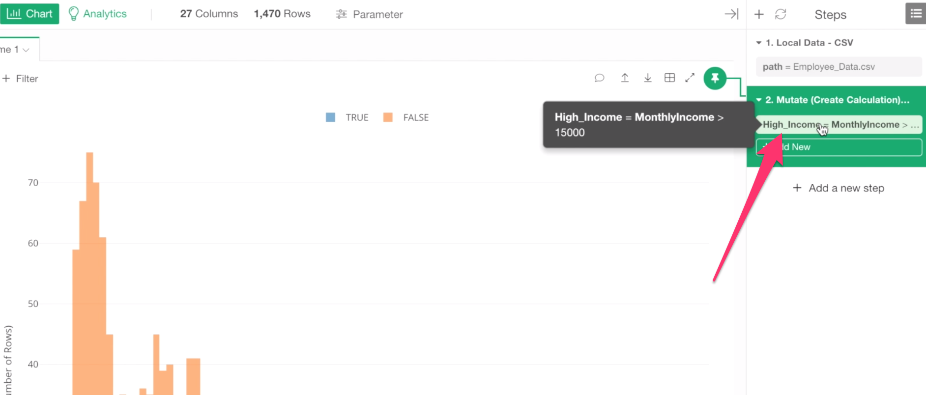
This will open the same dialog we saw before.
Let’s update the existing calculation by using ifelse function like below.
ifelse(MonthlyIncome > 15000, "High Income", "Not High Income")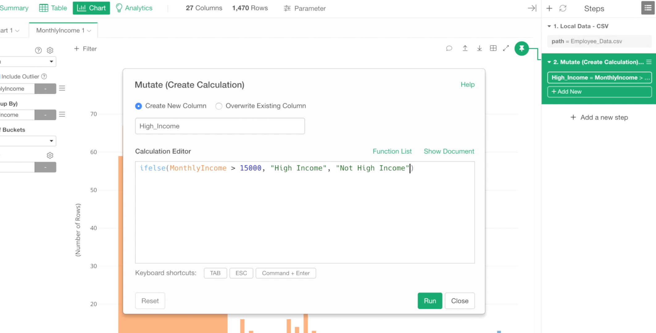
ifelse function evaluates whether a provided condition, in this case, that is ‘Monthly Income > 15000’, is TRUE or FALSE for each row, and returns a value presented in the 2nd argument if it is TRUE. If it is FALSE, then it returns a value presented in the 3rd argument.
Click on Run button.
Once the calculation is done, you would see the updated legend with the new labels.
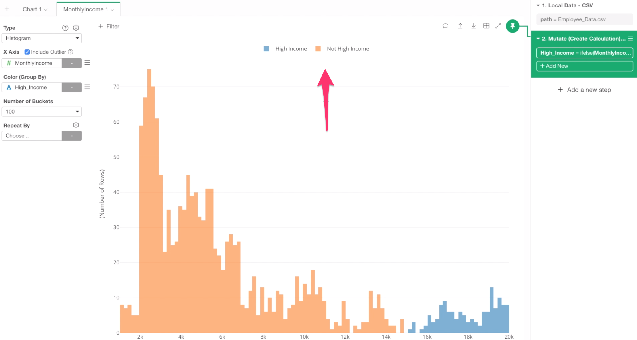
This looks much better!
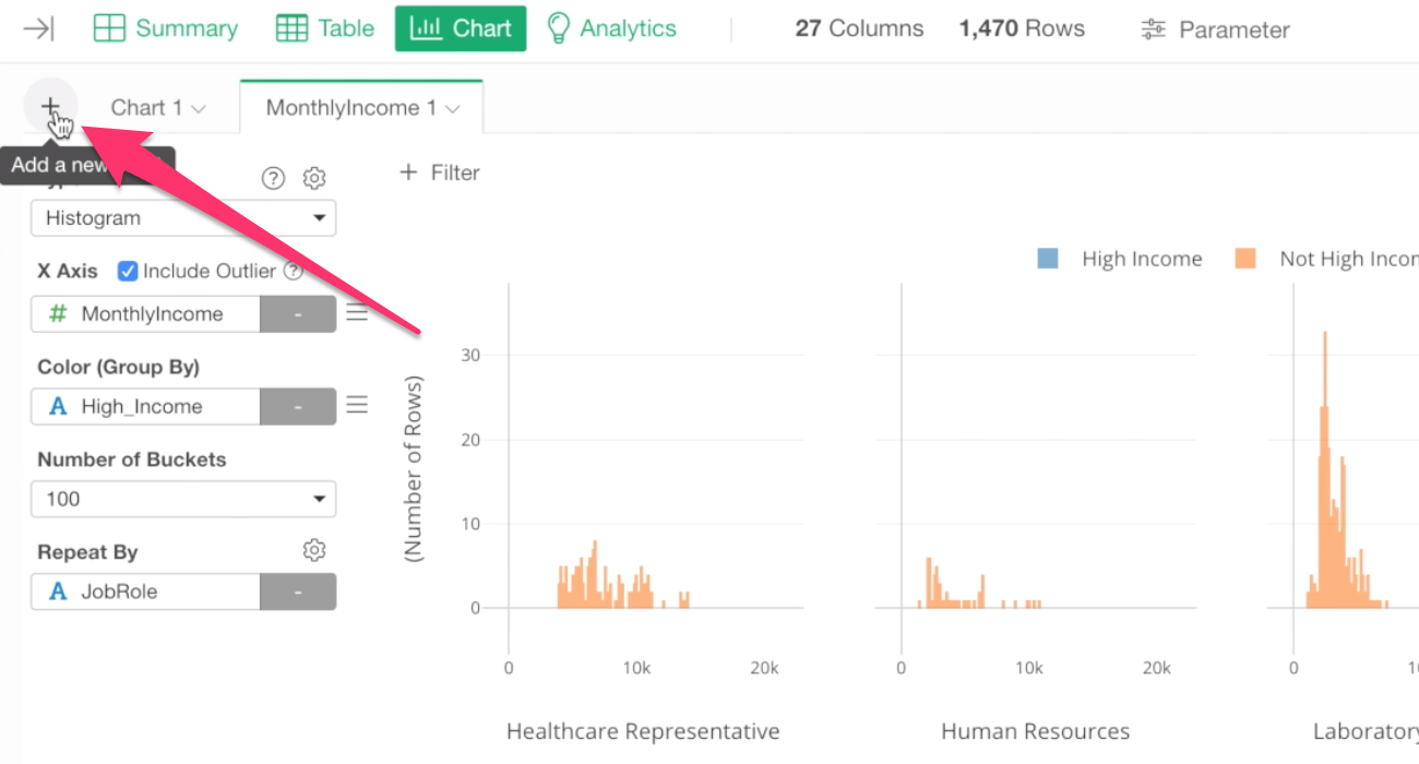
Histogram with Repeat By
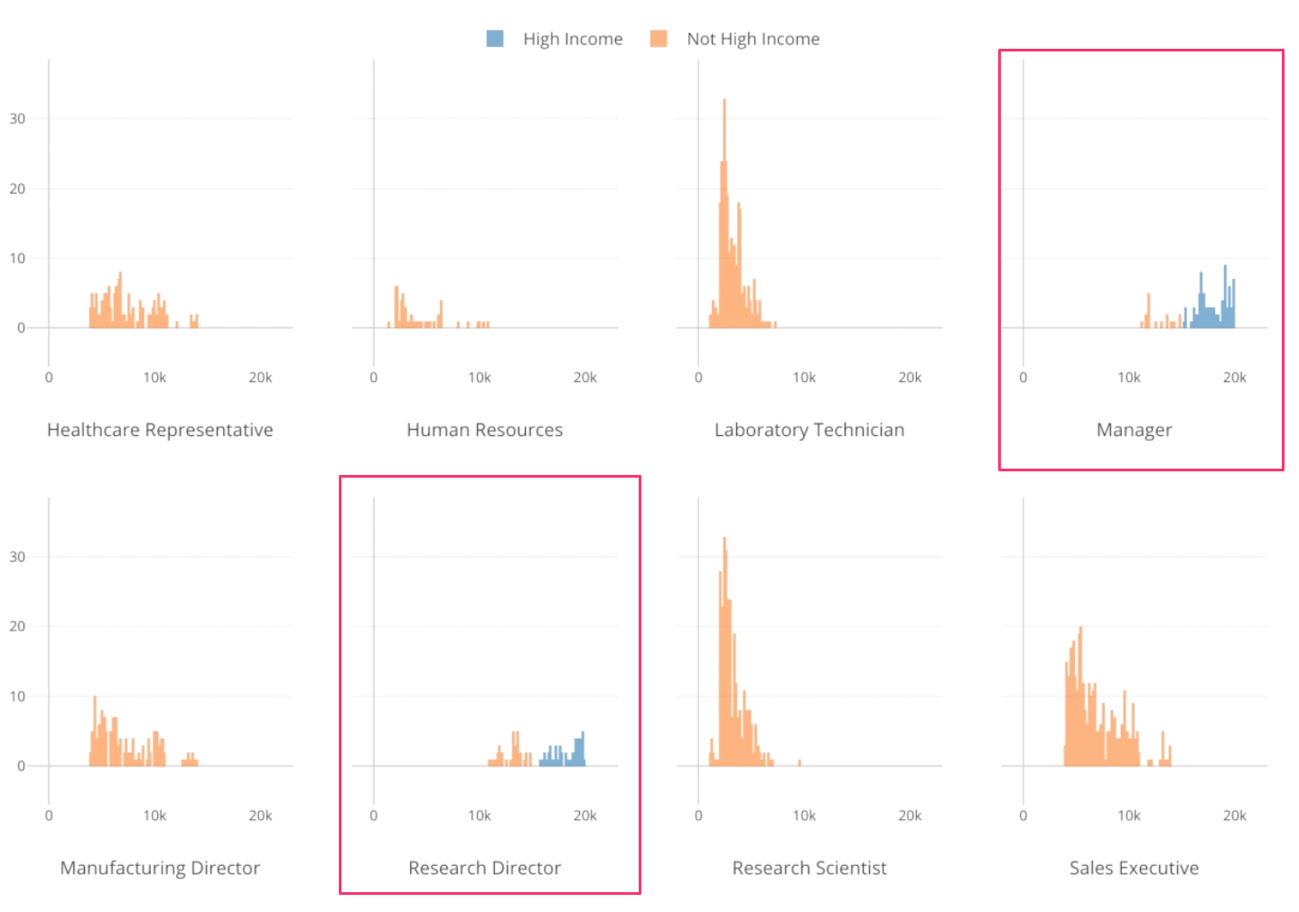
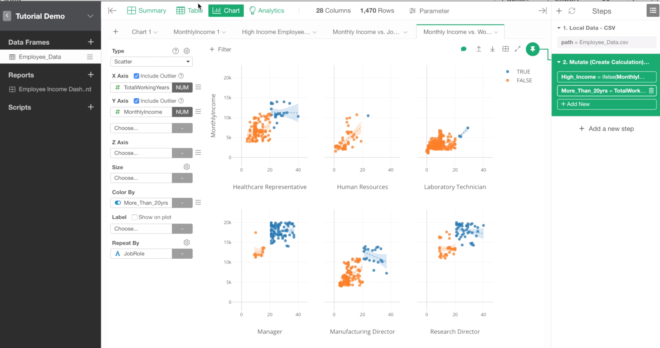
Now, let’s see if these monthly income data distributions are the same among different job roles.
To do, we can use Repeat By to break down this histogram chart into as many job roles as there are.
Select Job Role for Repeat By.
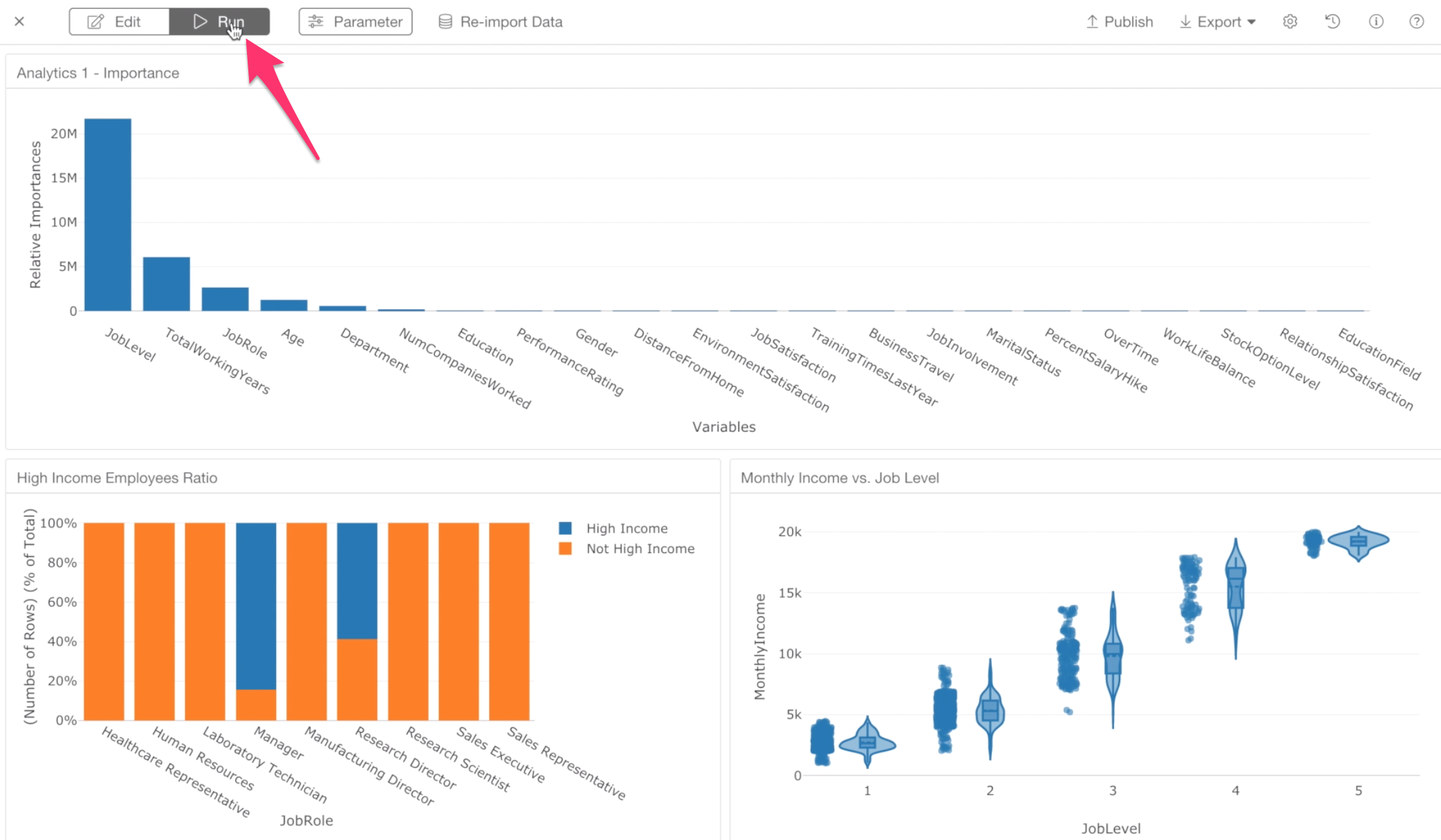
We can see different distributions of monthly income among job roles.
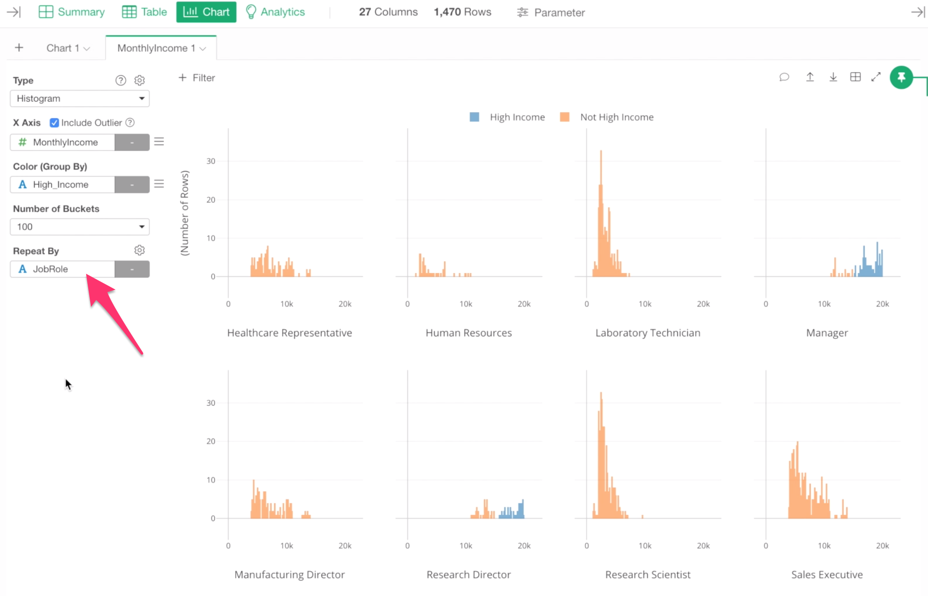
For example, for job roles like Laboratory Technician and Research Scientist, most of the employees’ monthly incomes are less than $5,000, while most of the Sales Executives are between $4,000 and $10,000.
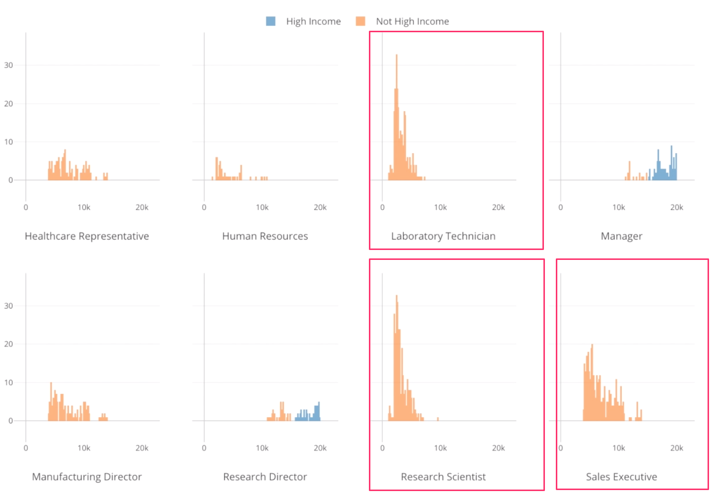
Also, we can see that the high income employees are found either in Manager and Research Director roles.
Show ‘% of Total’ with Window Calculation
Now, what are the percentage of the High Income employees for each job role?
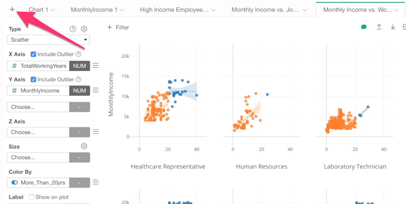
Let’s create a new chart to answer this question.
Click on the Plus button that is at the most left side of the chart tabs to create a new chart tab.
Select a bar chart, and assign ‘Job Role’ column to X-Axis, keep ‘Number of Rows’ for Y-Axis, which means Y-Axis is showing the number of employees. And assign the ‘High Income’ column to Color By.
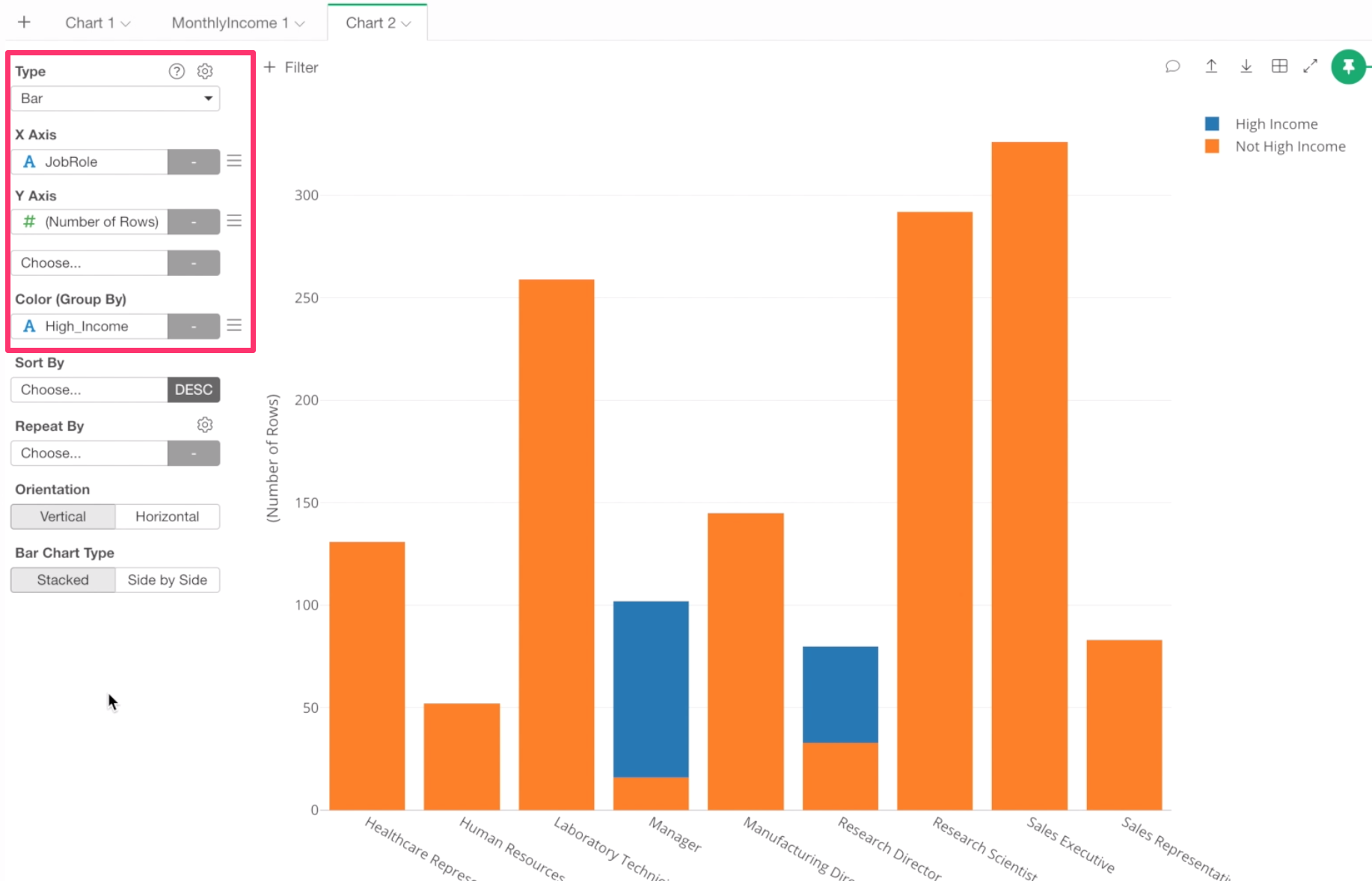
We can see the high income employees, which is Blue colored, are either Managers or Research Directors.
Now, what are the percentage of the high income employees in each job role?
To answer this, we can quickly change the Y-Axis scale by using Window Calculation.
From the Y-Axis menu, select ‘Window Calculation’.
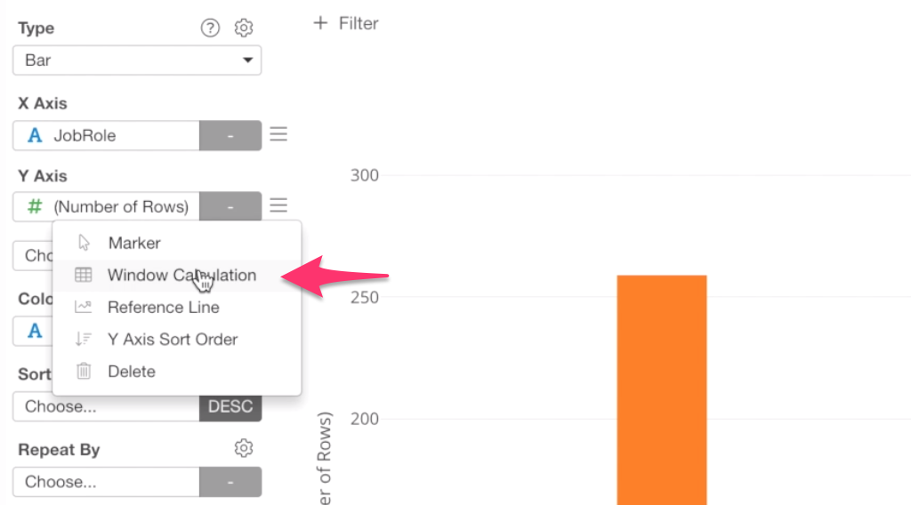
Then, select ‘% of’ for the Calculation Type.
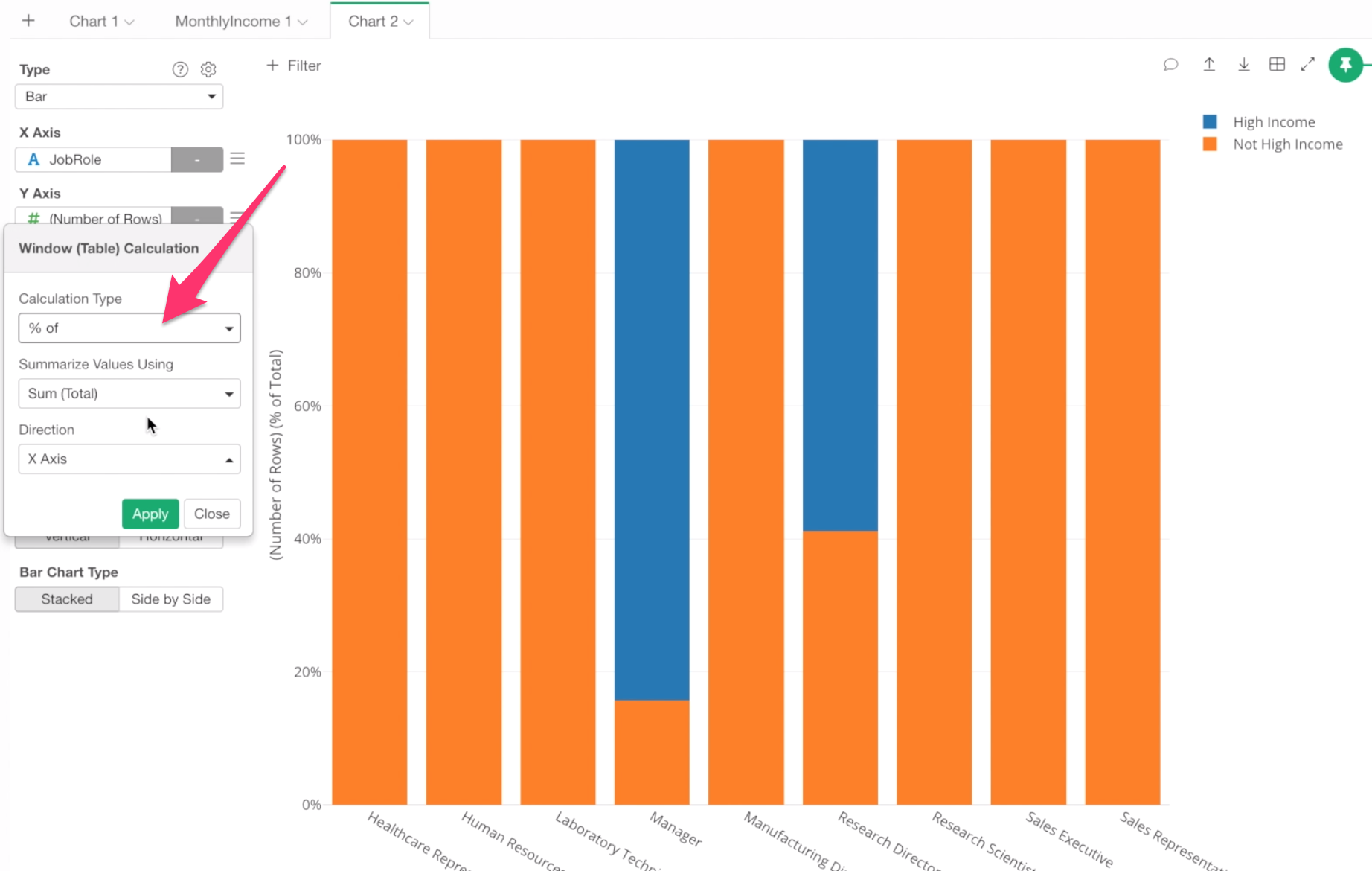
This re-calculates the Y-Axis values based on the calculation type you have selected here.
We can see that 84% of Manager are in the high income group.
Show Detail
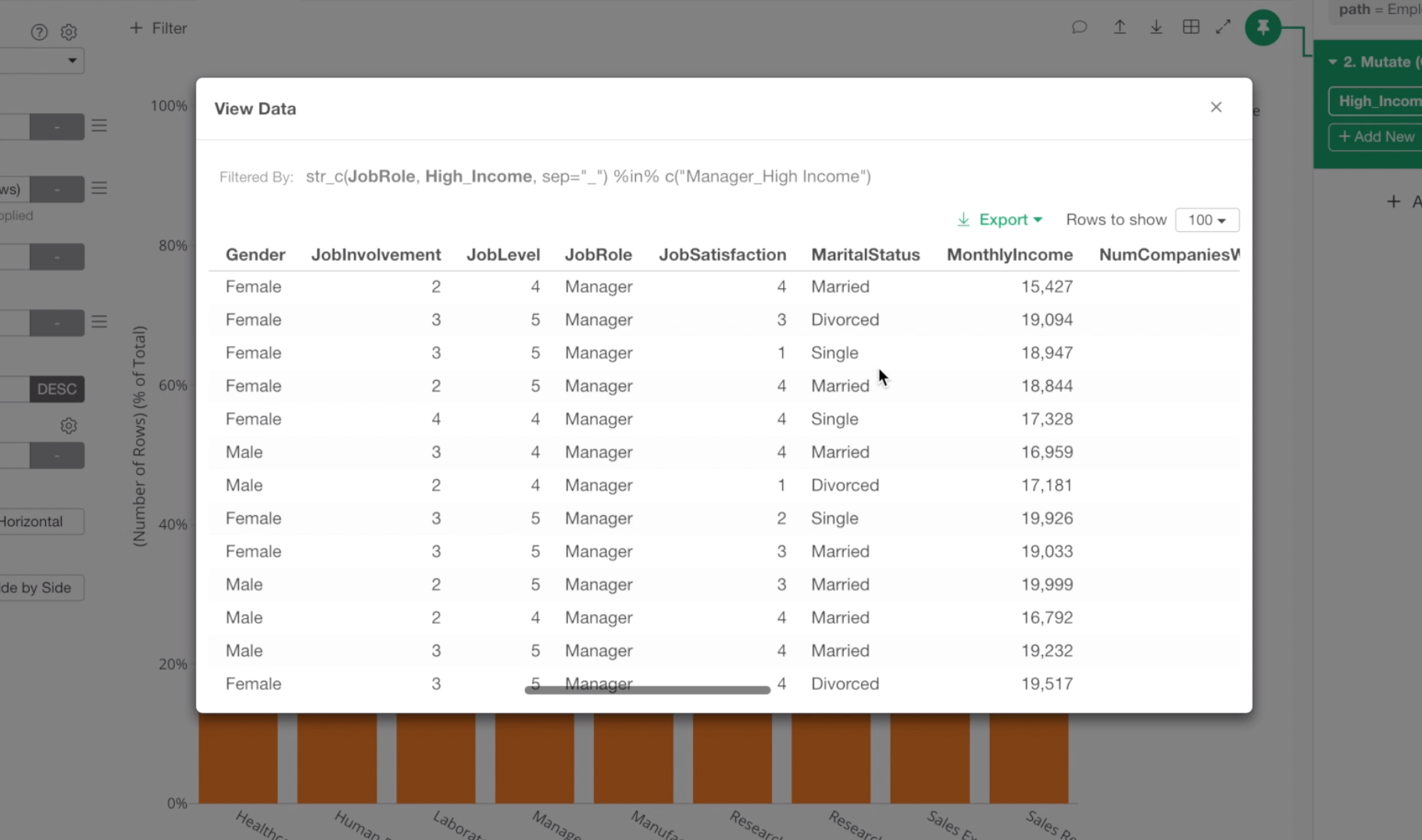
We can click the blue area of Manager, which will show an information box.
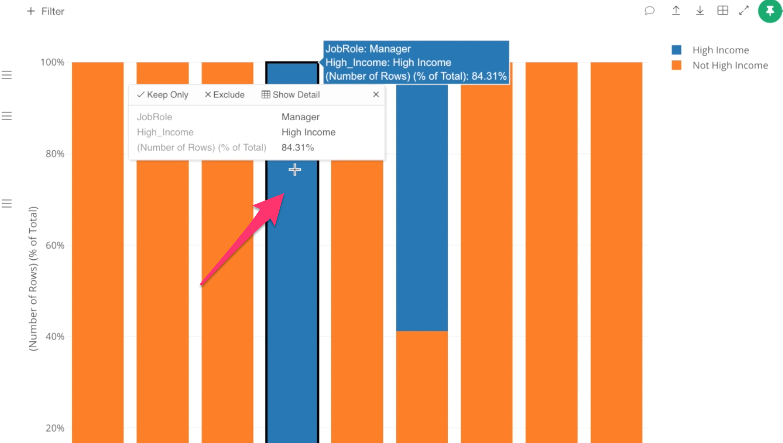
Inside the box, you can click ‘Show Detail’ menu to show the raw data for these employees.
Rename Chart Name
Now, let’s give a name for this chart.
Select ‘Rename’ from the chart tab menu.
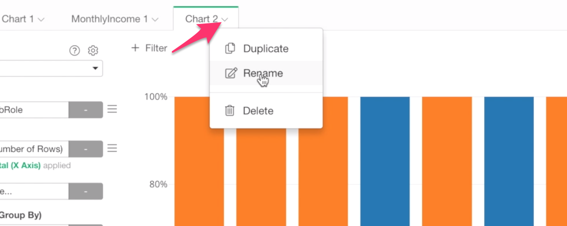
And type ‘High Income Employees Ratio’ as the chart name.
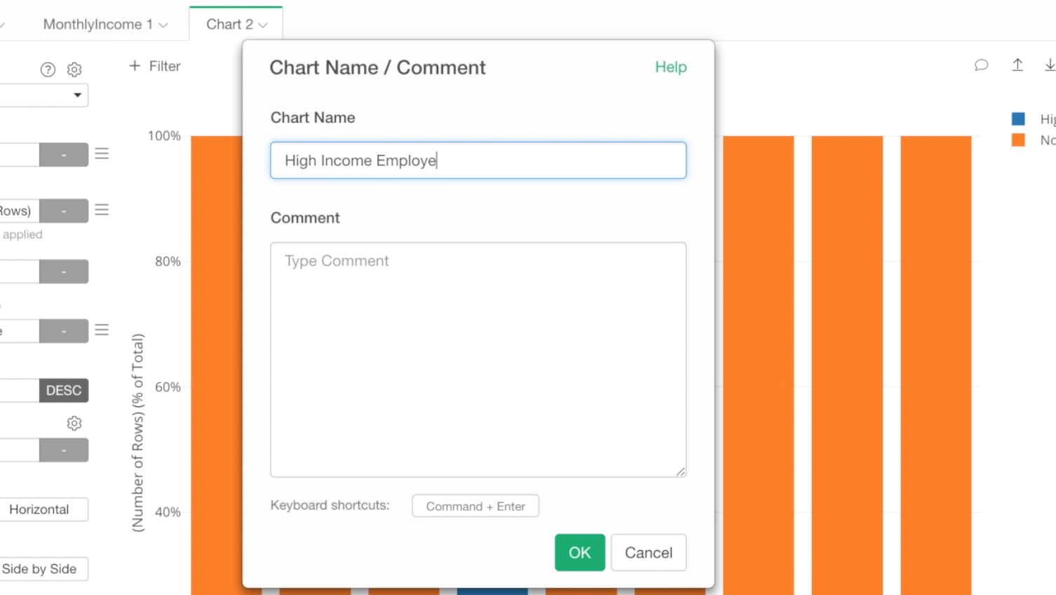
This will make it easier to find this chart later when we will be creating a dashboard.
Correlation between Monthly Income and Other Variables
Looks that there is a unique relationship between Monthly Income and Job Roles.
That means that if we know the job role for a given employee we can guess his or her monthly income range better.
But, how about others?
Are there any other variables that might have some kind of relationships with Monthly Income? This type of information would help us understand how the monthly income is decided.
We have about 30 columns in this data, and if we try to understand the relationship between Monthly Income and all the other columns by visualizing it, it will take a long time.
This is where Analytics comes in rescue.
By using Machine Learning or Statistical algorithms we can find correlations and patterns in data much more effectively.
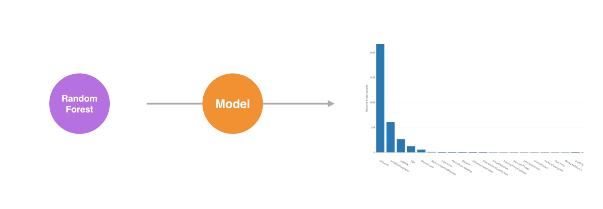
Analytics with Machine Learning Algorithm
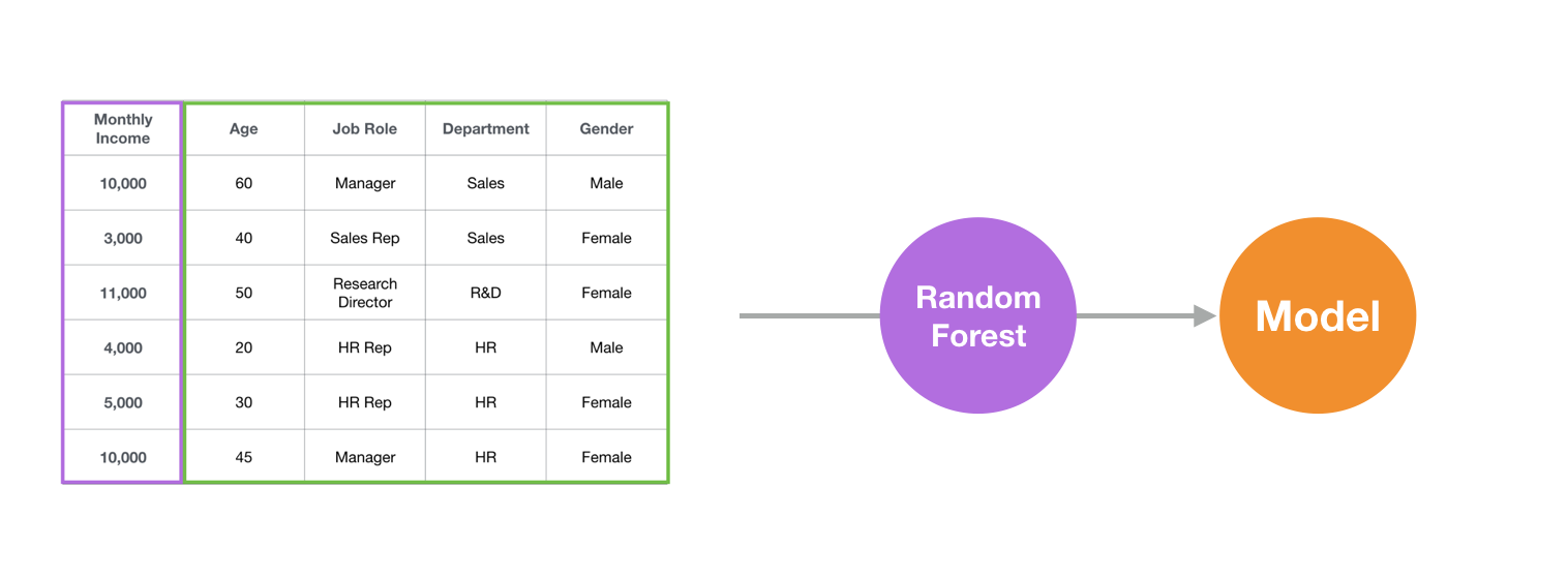
We are going to use one of the most popular machine learning algorithms called Random Forest here.
What can we use Random Forest for Exploratory Data Analysis?
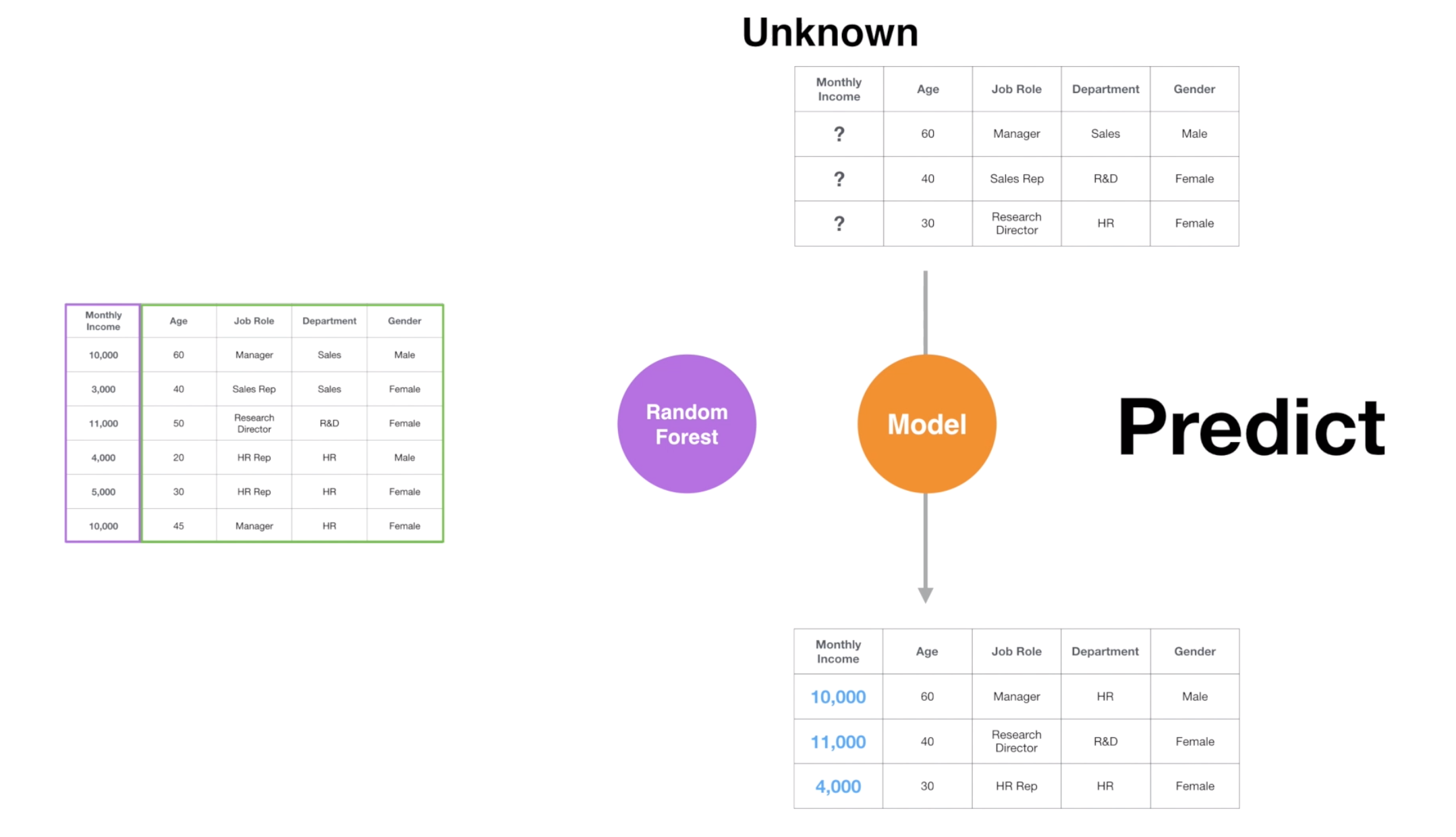
This algorithm finds patterns embedded inside the data and builds a set of rules called ‘model’ to predict the unknown.
, for example, predict the monthly income for the employees that we don’t know their monthly income yet.
Build Model: Random Forest algorithm will analyze the HR employee data, find out the patterns, and build a model.
Predict with Model: The created model will predict the Monthly Income against the data that don’t have the Monthly Income values by applying the rules found at building the model.
But predicting the unknown itself is not our interest in this Exploratory Data Analysis here. Instead, we want to know which variables are strongly associated with the monthly income.
The good news is that, since the Random Forest algorithm builds a prediction model based on the pattern it detects inside the data, the model knows a lot about the data.
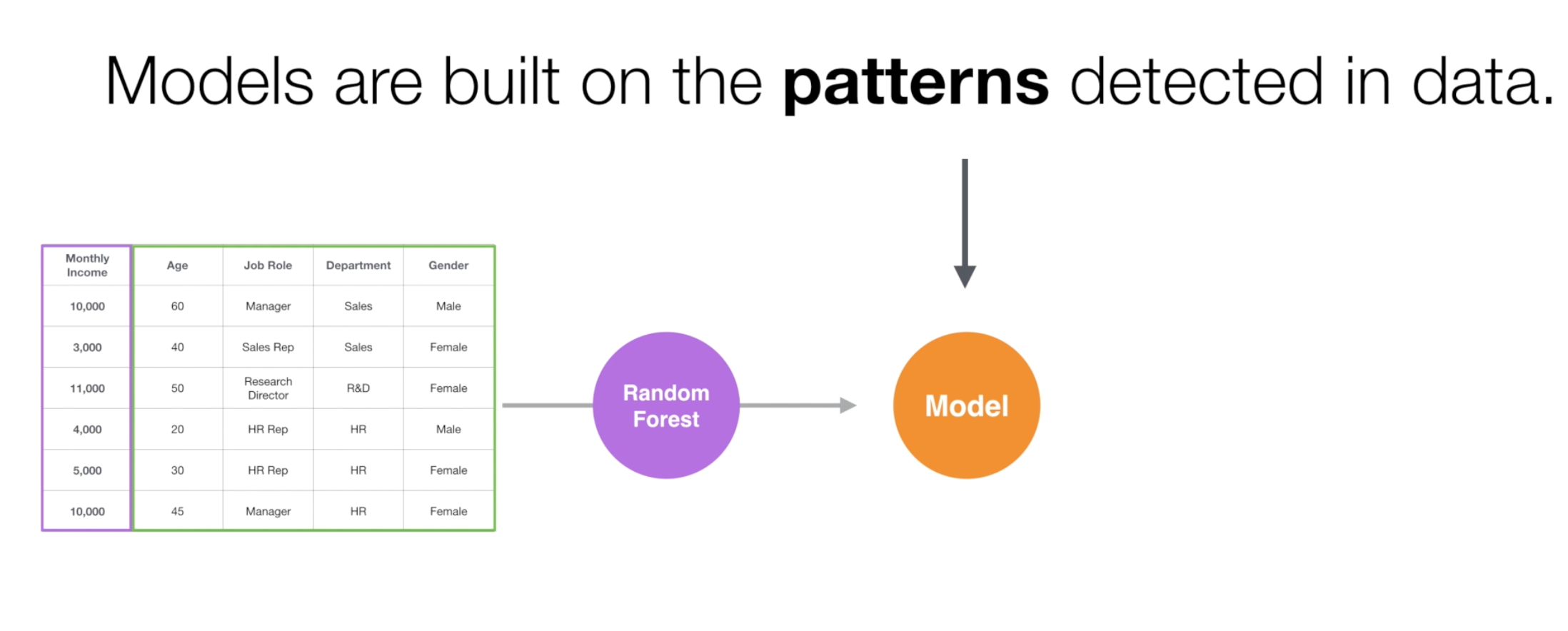
This means that it can give us information about which variables are more associated with the Monthly Income.
Once we gain such insights from the model, then we’ll use charts to visualize them to understand such relationships intuitively.
Let’s do it!
Use Random Forest
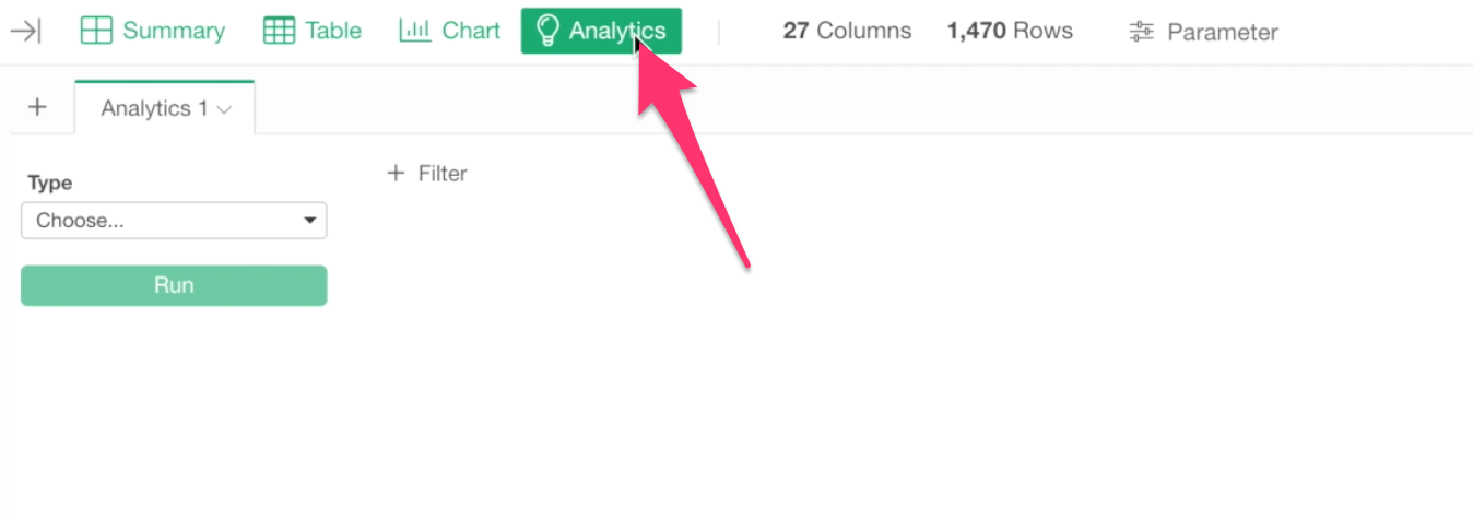
First, Go to Analytics view.
And select Random Forest for Analytics Type.
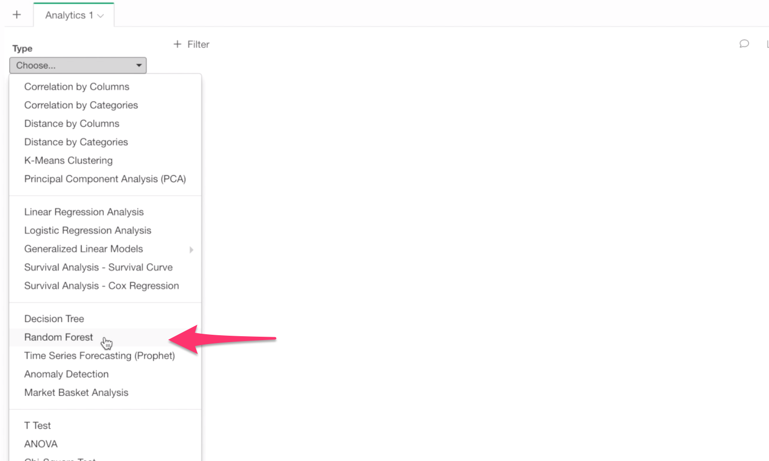
Select Monthly Income for Target Variable because this is the variable of our interest in this analysis.
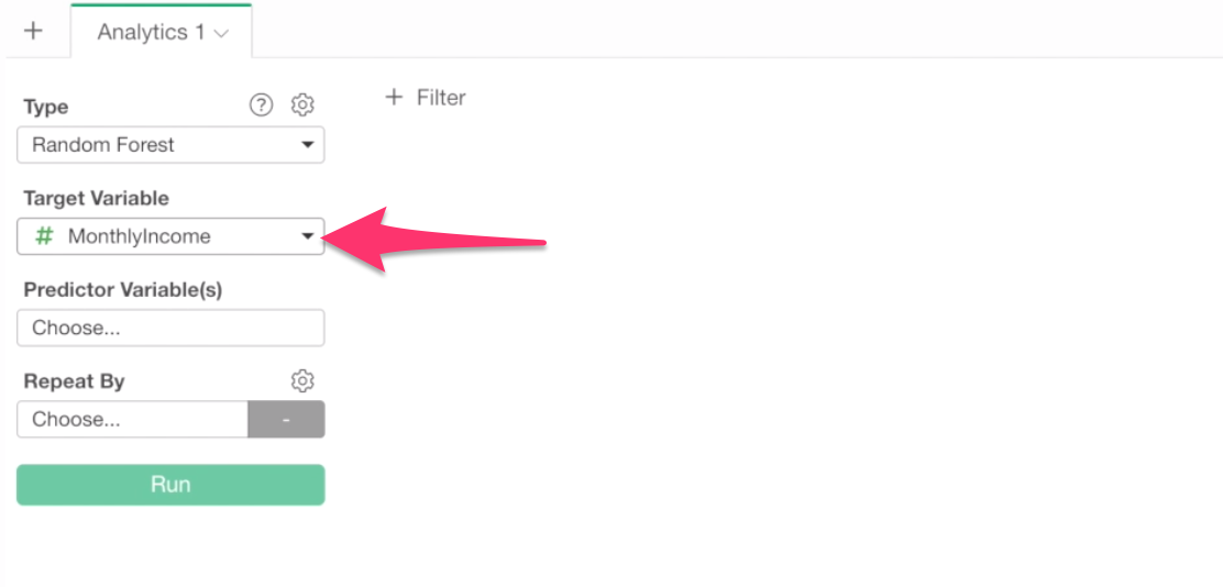
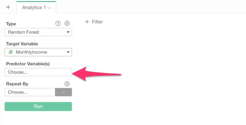
And, Click on Predictor Variable box to select columns (or variables).
Inside the column selection dialog, select all the columns except ‘high_income’ columns as predictor variables by using Shift or Control key.
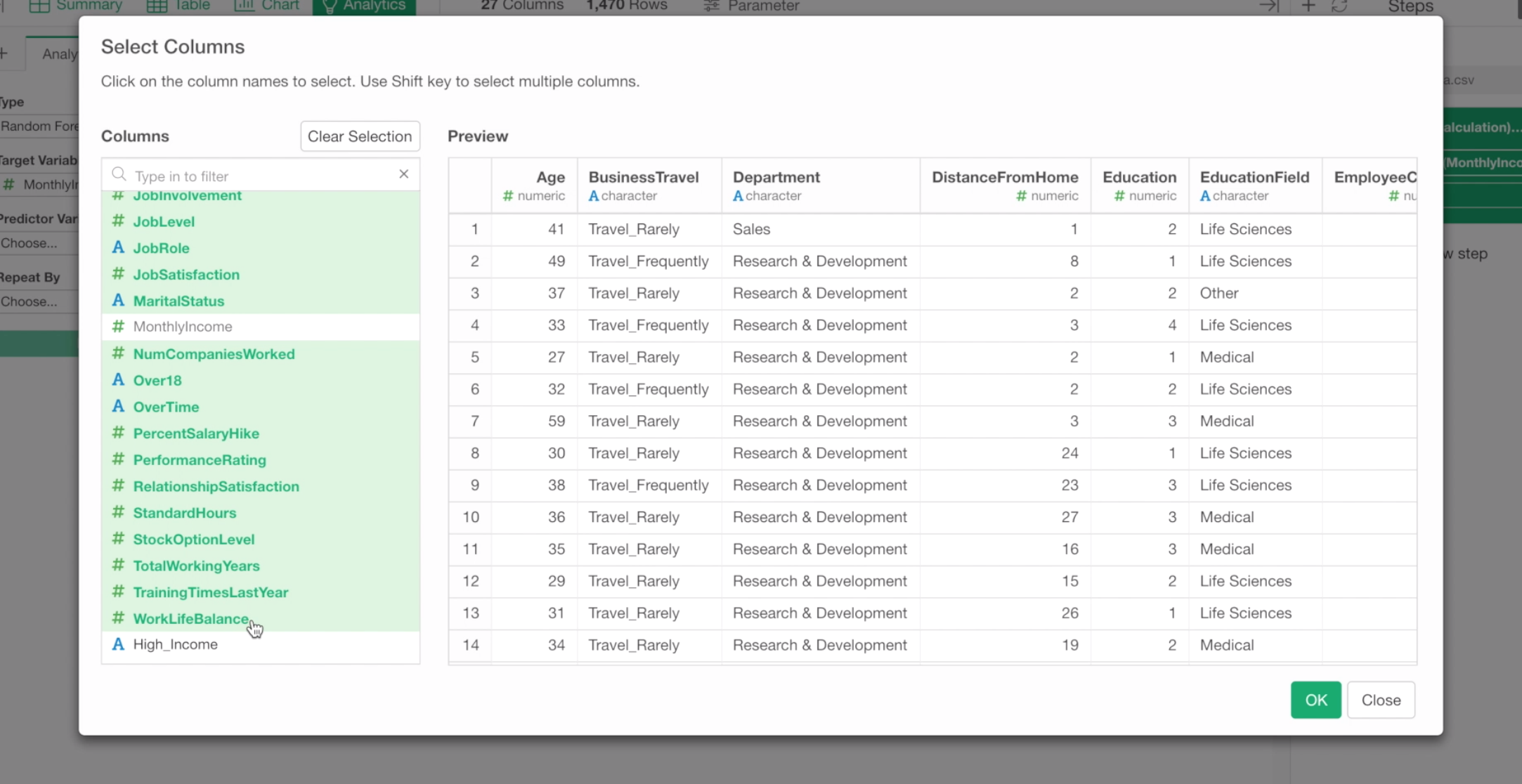
We don’t want to include ‘high_income’ column because we created this column based on Monthly Income. Predicting Monthly Income based on High Income column is kind of knowing the answer before taking a test.
Anyway, once the columns are selected, click OK.
And click the Run button.
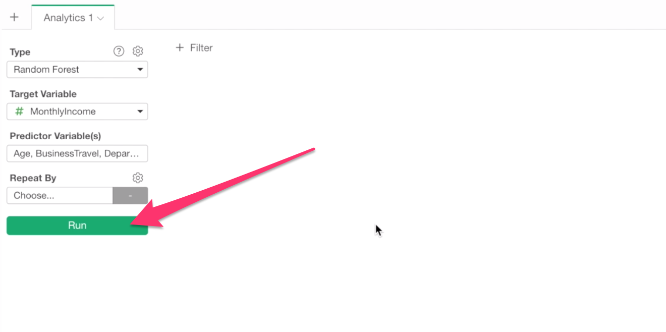
This will create a Random Forest prediction model.
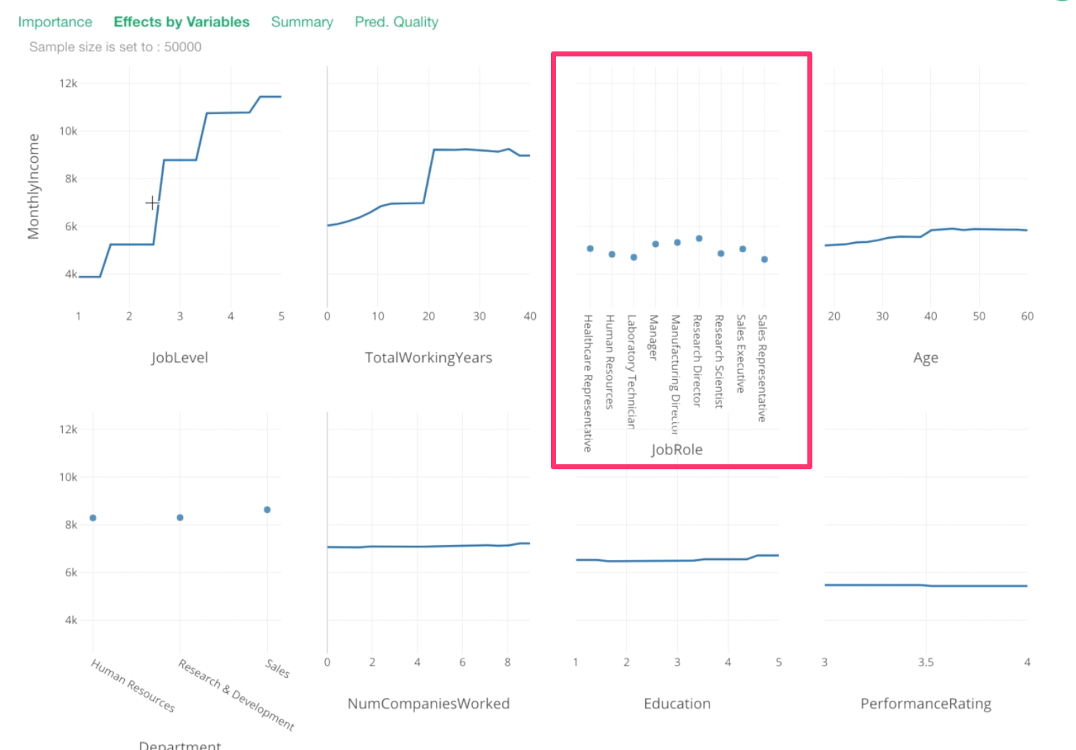
Which variables are more important?
Once it’s done, under the Importance tab we can see which variables are more important or less important to predict the monthly income.
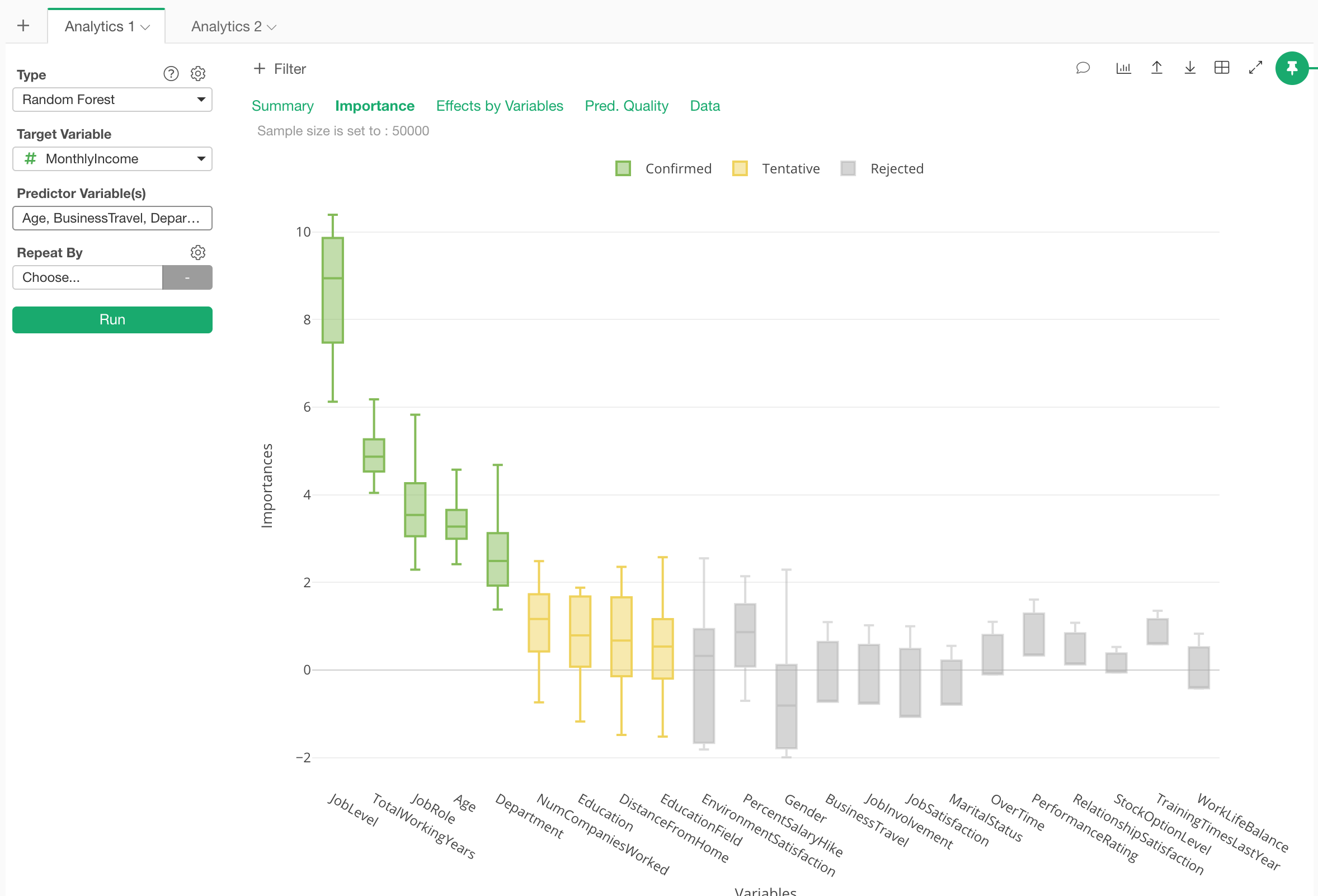
We can see that Job Level, Total Working Years, Job Role, and Age are the most important variables.
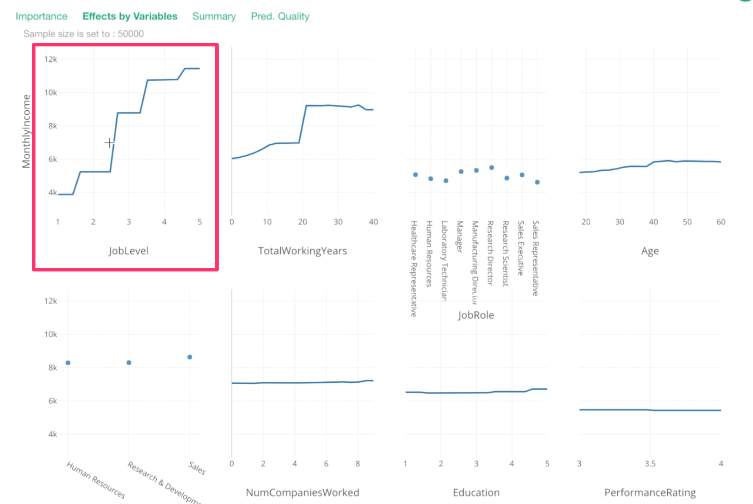
How the variables are associated with Monthly Income?
Now, how are they related to Monthly Income? For example, does the increase in Job Level increase the Monthly Income?
To answer this question, we can go to Effects by Variables tab.
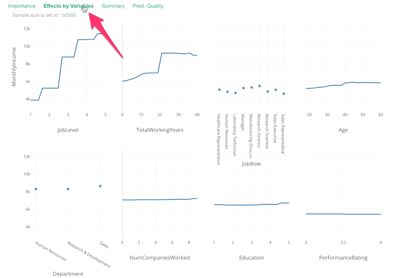
Each chart shows the relationship between Monthly Income and a given variable.
Y-Axis is the monthly income values. And all the data points are showing what the model thinks they would be based on given values on X-Axis.
For example, this Job Level chart is telling us that one job level increase would increase a significant amount of the monthly income.
Let’s take a look at Total Working Years.
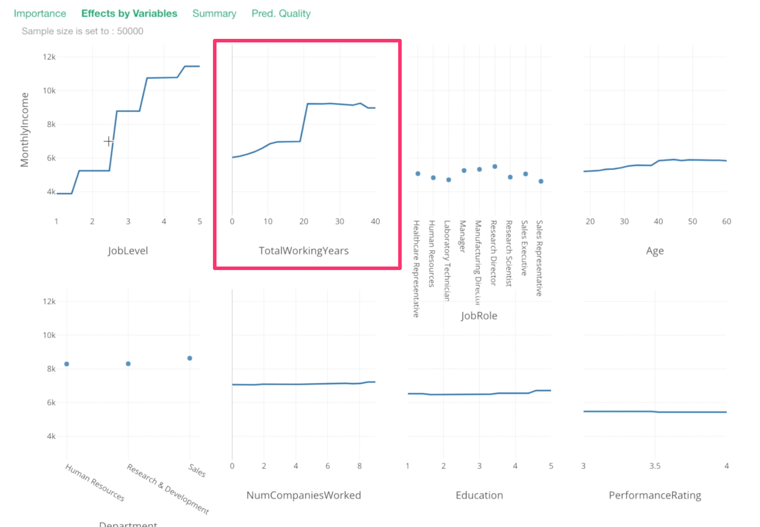
From 0 to 20th year, there seem to be incremental increases in Monthly Income, then around 20th year, there is a huge spike!
Then, after that, it stays the same or, if anything, it decreases a bit.
For Job Role, this is something we have already known. Manager and Research Director tend to have higher Monthly Income.
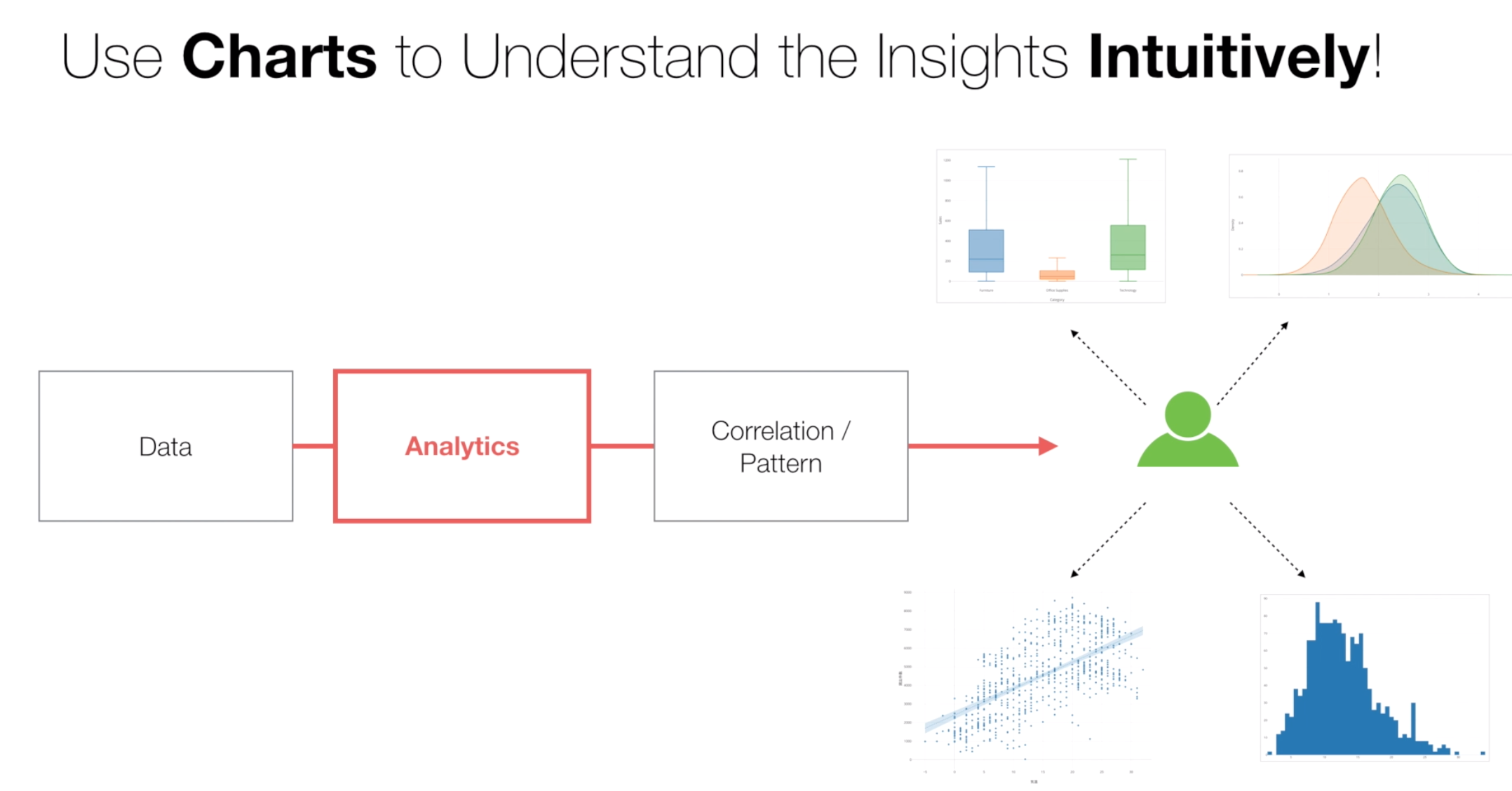
Use Charts to Visualize the Relationship
Now, building machine learning or statistical models is one thing, but it’s not really clear on exactly why and how we are getting this predicted information. This might make you uncomfortable if you are not used to using prediction models.
This is why it’s always better to confirm this information with our eyes by visualizing the data with Charts as long as possible.
Let’s take a look at the relationship between Monthly Income and Job Level.
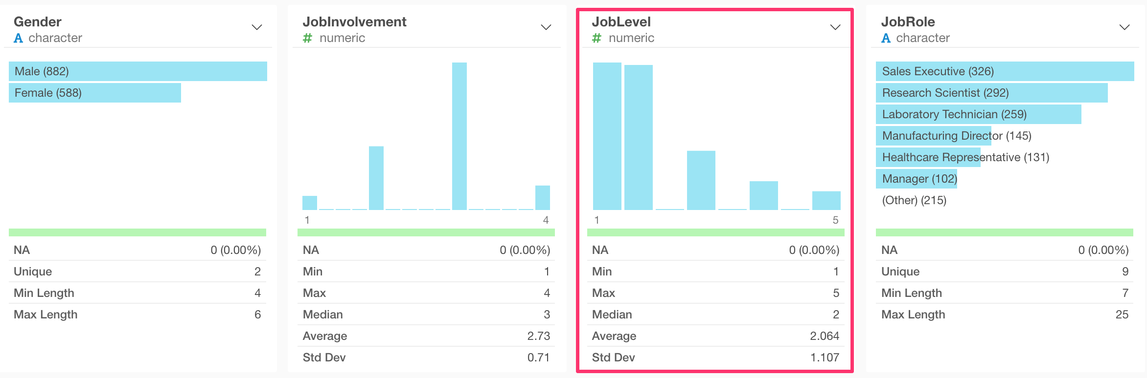
When you look at Job Level column in the Summary view, it looks more like a Categorical variable than a Numerical continuous variable.
Click the chart icon on top of the histogram.
This will create a histogram.
Now, change the chart type to Bar chart.
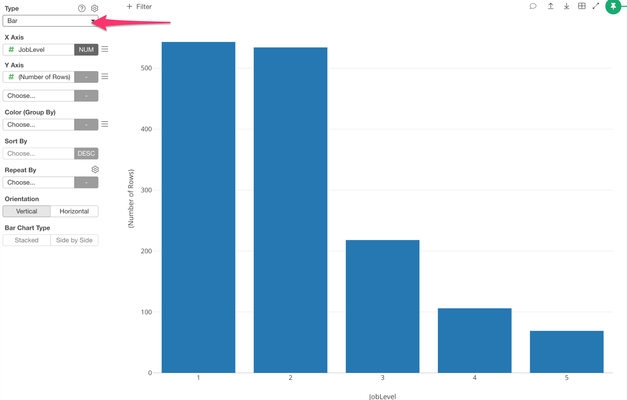
We can see that there are just 5 values of Job Levels. So this is more like a categorical variable.
If you want to understand the relationship between Numeric variable and Categorical variable, typically, Boxplot or Violin plot helps.
Let’s try the Violin plot.
Use Vionlin Plot for Categorical vs. Numerical variables
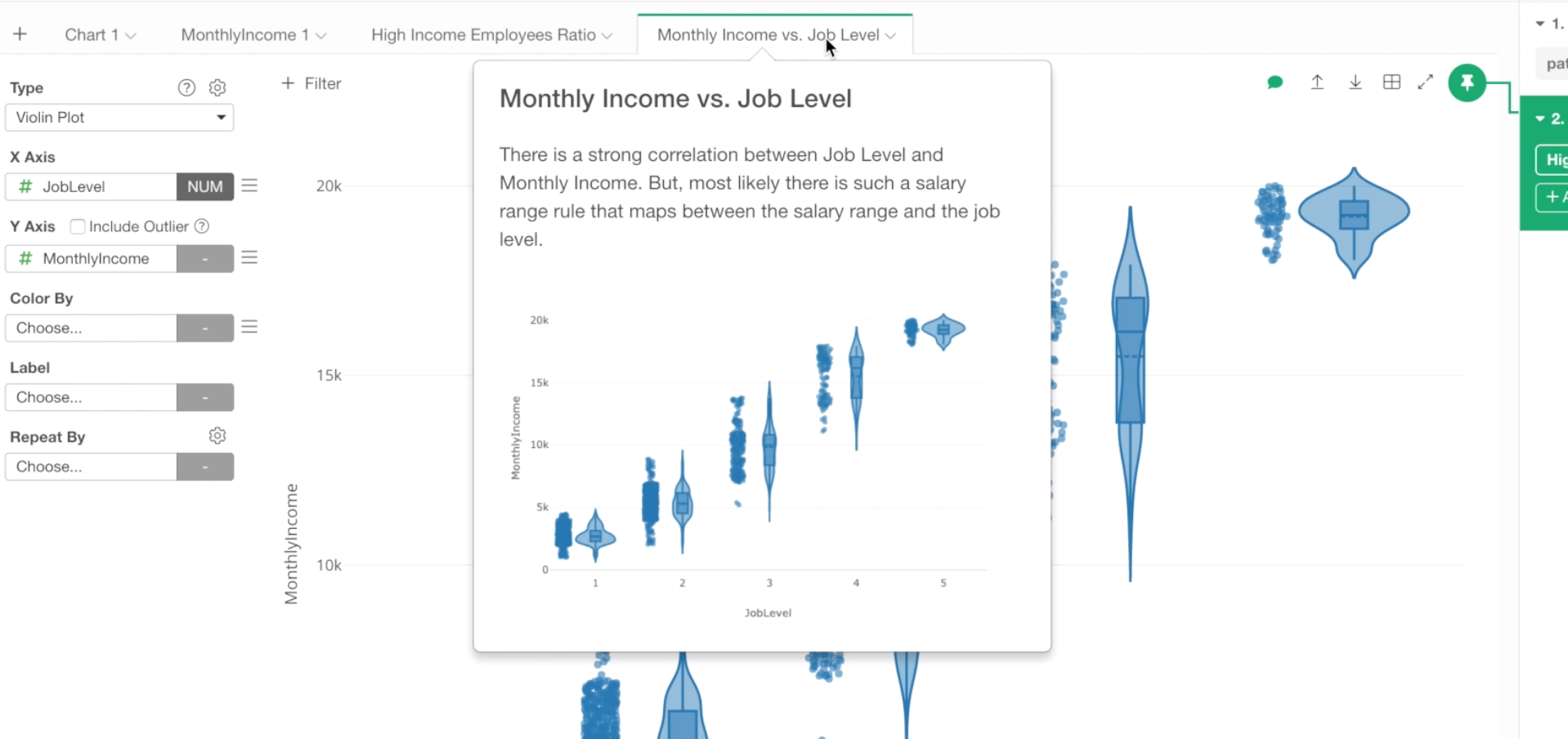
Change the chart type to Violin, and assign Monthly Income to Y-Axis.
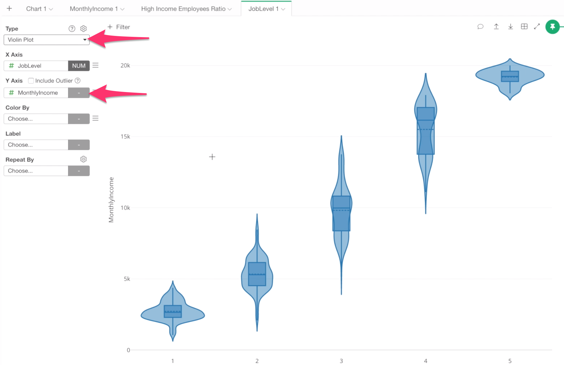
There are three things happening with this chart.
First, we can see the average monthly income with the dotted line.
Second, there is a Boxplot inside of each Violin. The box shows the range of 50% of the data around the Median value. The vertical line shows the minimum value at the bottom end and the max value at the top end of the line.
If you want to know more about Boxplot chart, take a look this note.
Lastly, the violin shapes (the wavy symmetric curves) are the density plots that show how the data are distributed.
The widest point of the curves is where most employees are in each category of Job Level.
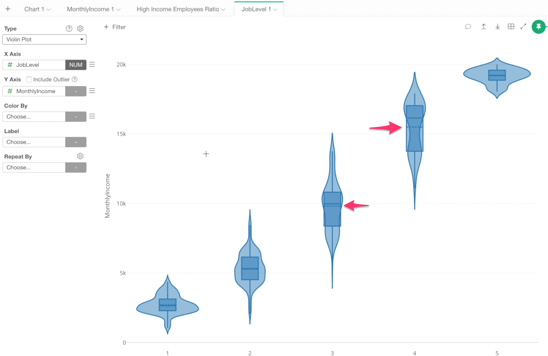
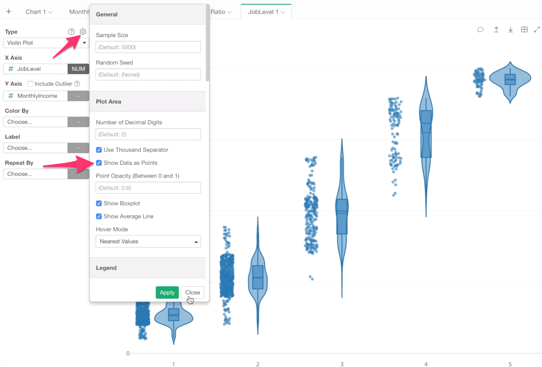
If you are not used to Boxplot or Density Plot, this information might confuse you a lot. If that’s the case, you can show each data point right next to each violin plot.
Open the chart property and check ‘Show Data as Points’.
Now each employee is shown as a dot based on his or her monthly income.
And the Violin plot is just trying to visualize the distribution of this data.
Anyway, let’s leave a comment for this chart before we forget.
You can click on this Comment icon at the right hand side top of the chart.
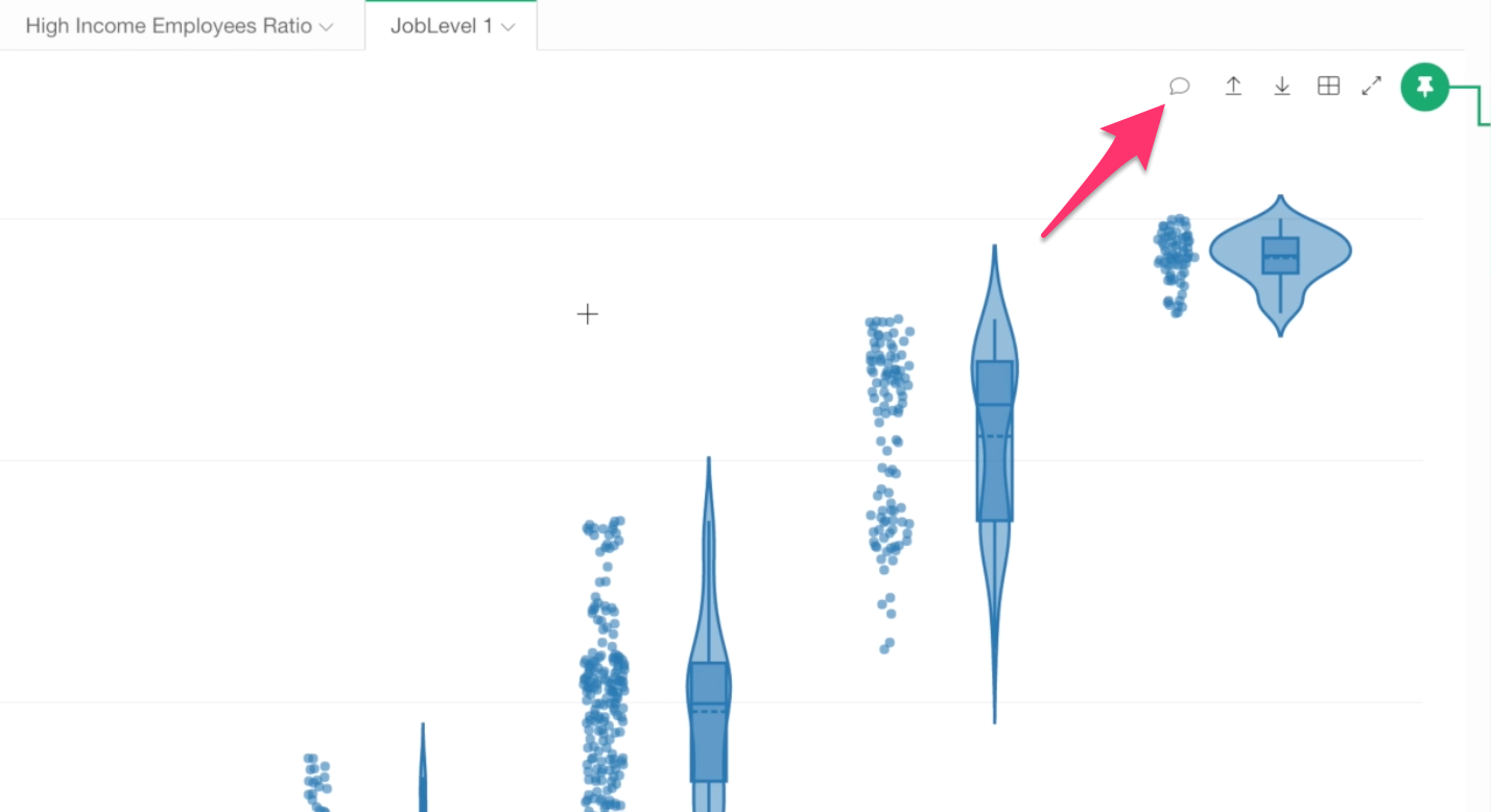
And type your finding.
Sample:
There is a strong correlation between Job Level and Monthly Income. But, most likely there is such a salary range rule that maps between the salary range and the job level.
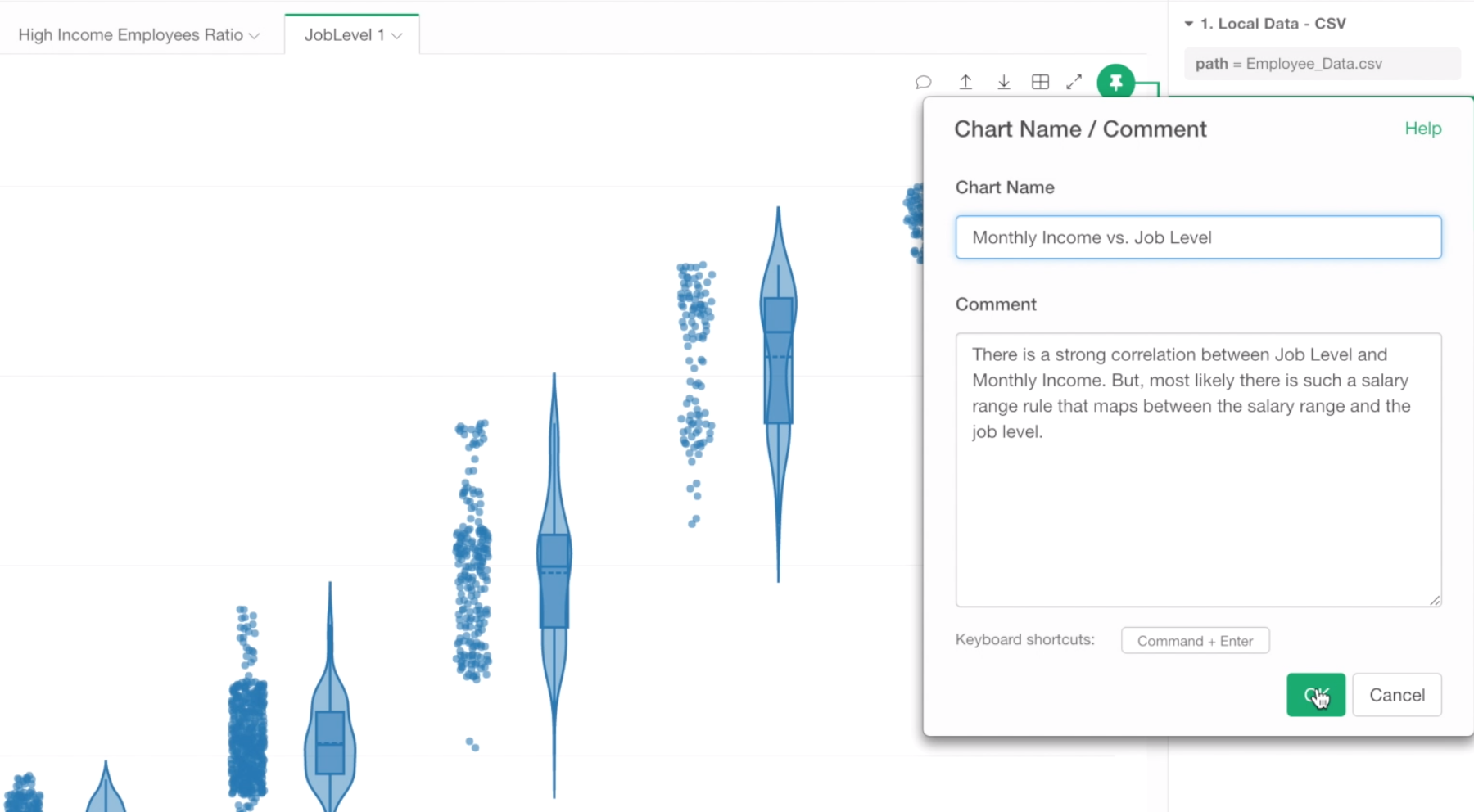
Also, let’s give a name to this chart by typing ‘Monthly Income vs. Job Level’ for the chart name, and click OK button.
When you move the mouse over on the chart tab you will see the comment along with the chart thumbnail image.
We can keep working on our analysis, but we are running out of our time. So let’s stop here, and move on to create a Dashboard to put together all the charts we have created so far.
Create Dashboard
Creating Dashboards in Exploratory is pretty straight forward.
And here is what we are going to cover.
- Create a dashboard, add three charts we have created so far.
- Create new charts called Numbers, which can be used to show important metrics, and add them to the dashboard.
- Publish the dashboard to Exploratory.io server to share with others.
Let’s start.
1. Create a Dashboard with 3 Charts
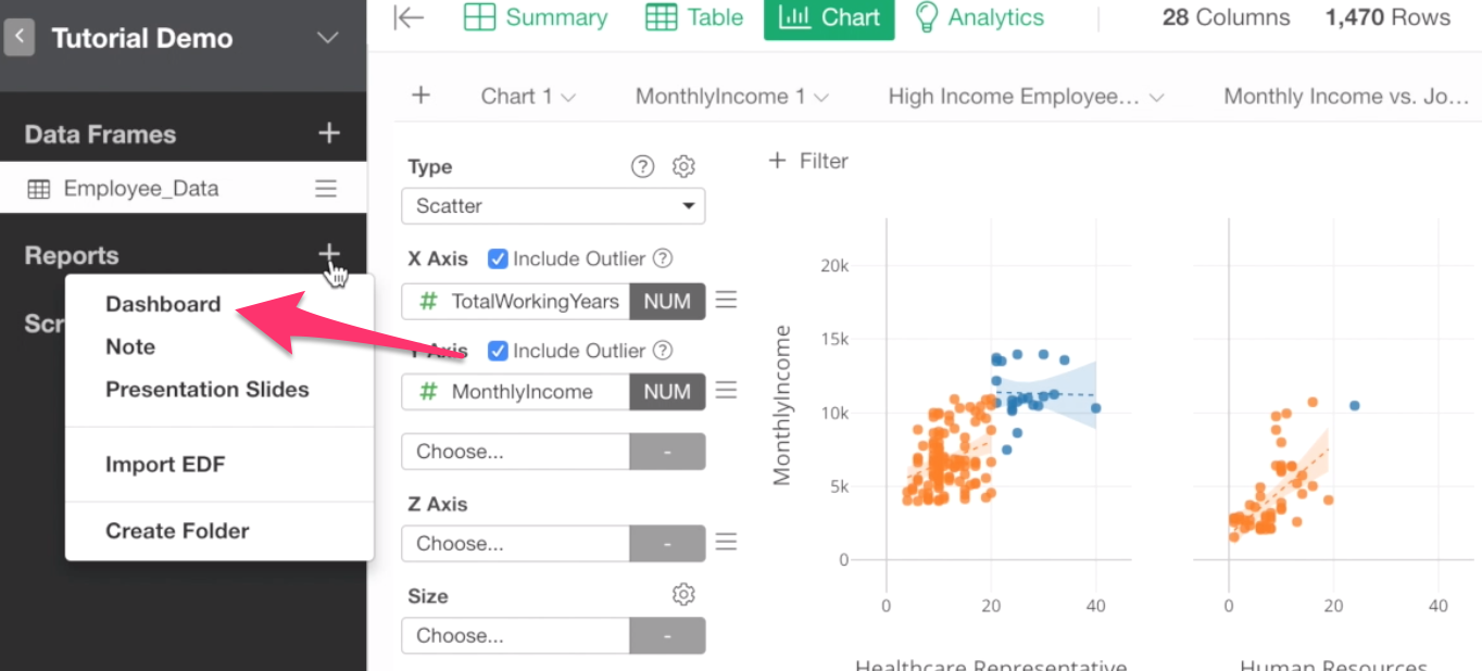
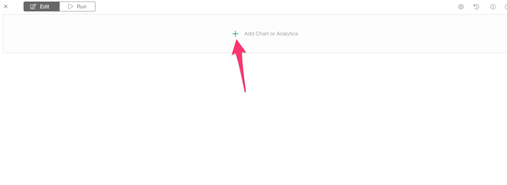
You can start creating a dashboard by clicking on this Plus button next to Reports at the left-hand side pane, and select Dashboard from the dropdown menu.
This will open a separate window for editing and running the Dashboard.
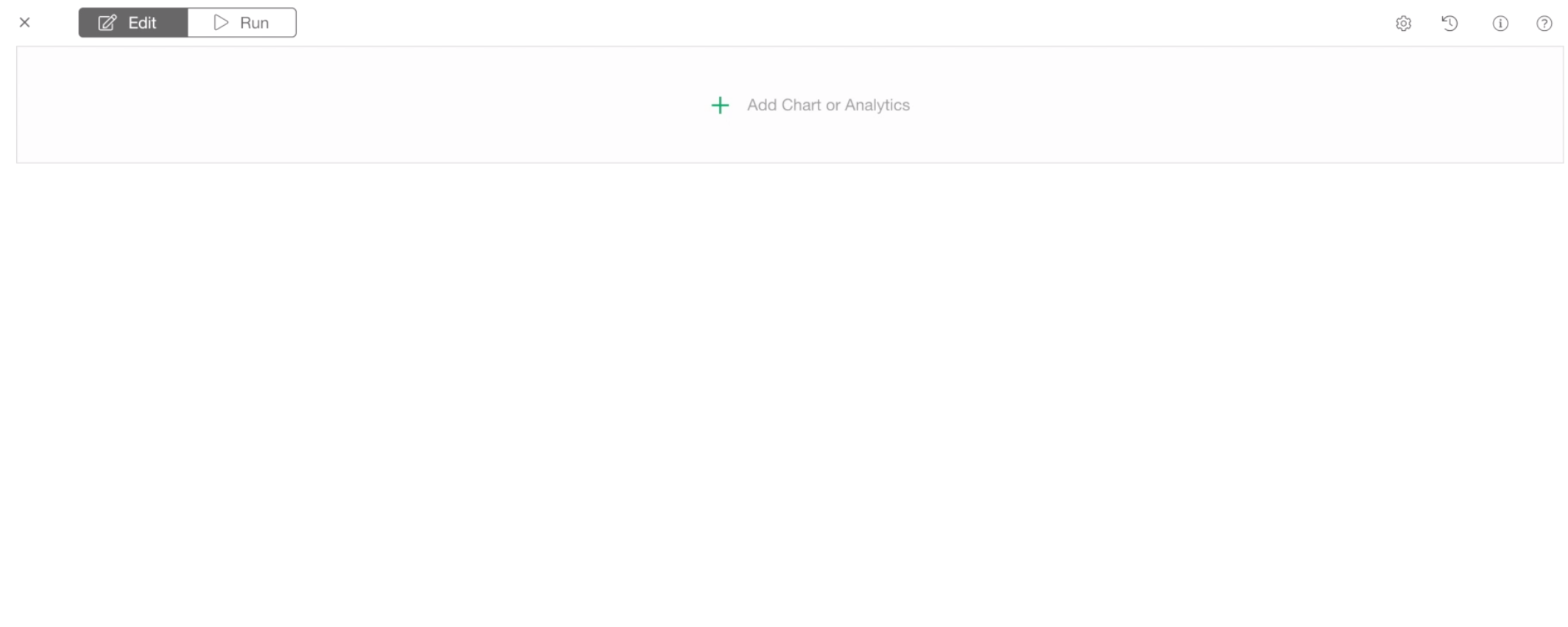
There are two tabs at the top.
‘Edit’ is for Editing the dashboard. This is where you can add the charts and analytics and adjust the layout of the charts.
‘Run’ is for Running the dashboard. This is where you can see the output of the dashboard and publish to share.
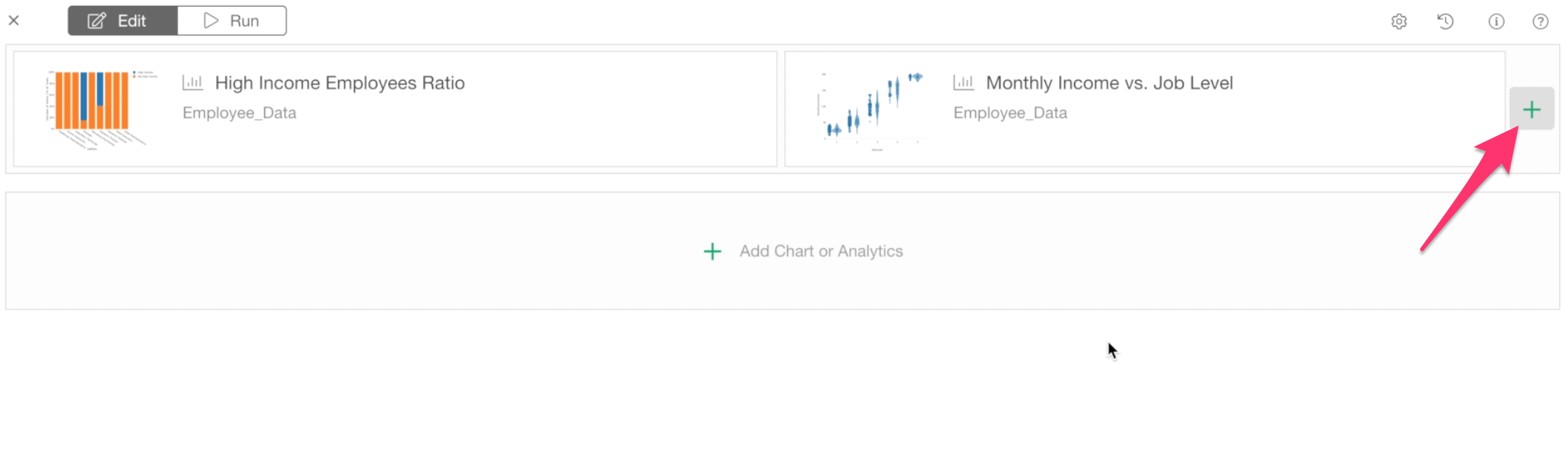
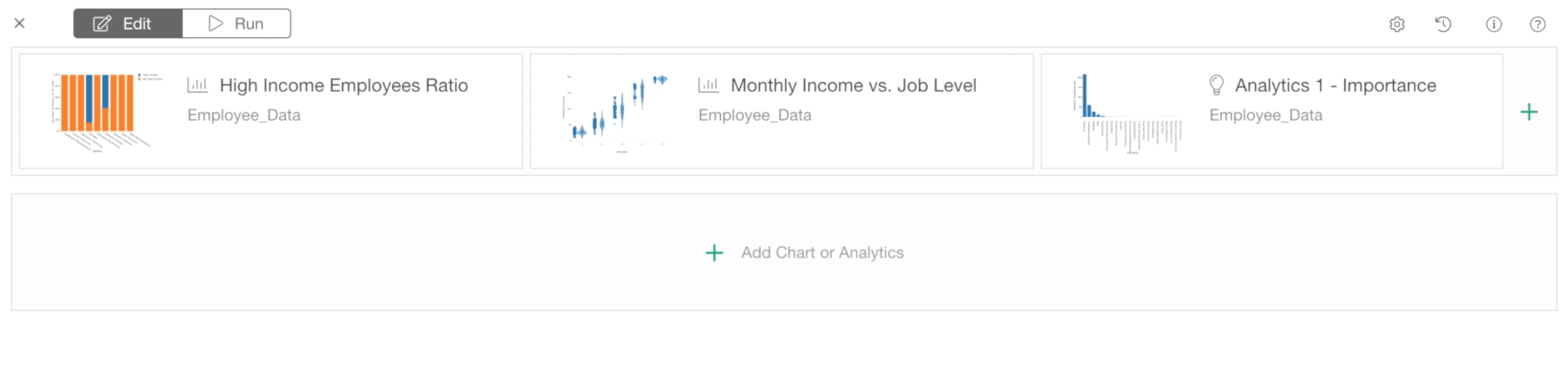
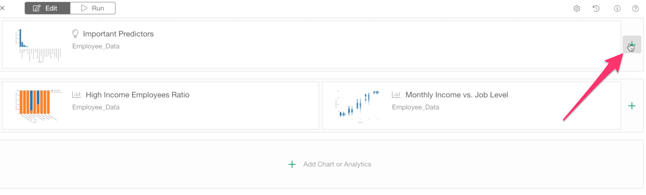
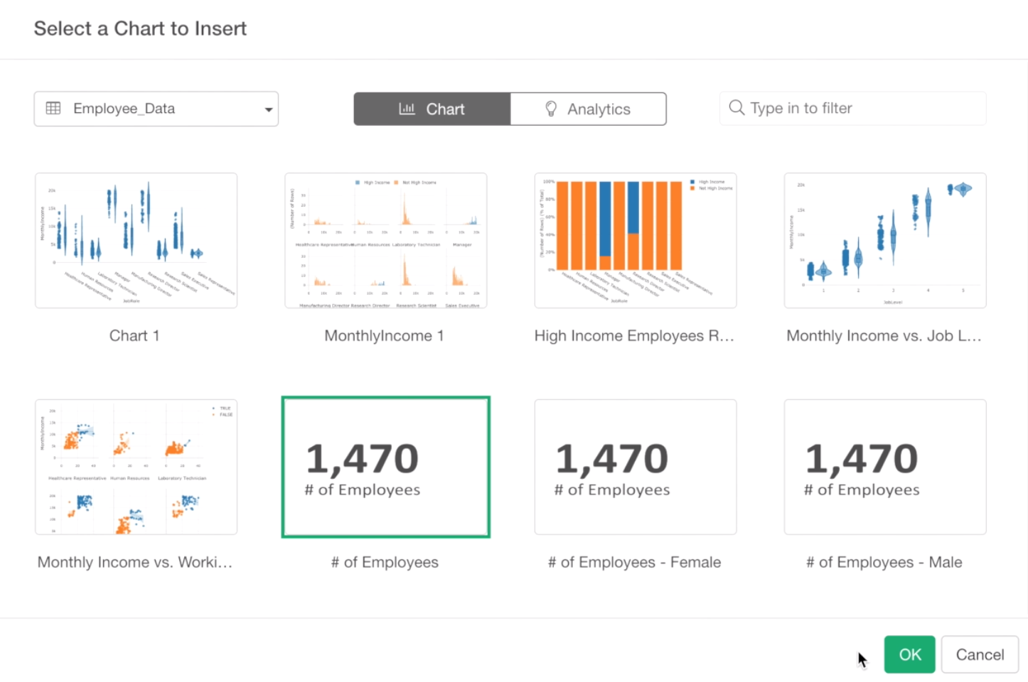
First, let’s add the charts we have created so far by clicking the green plus button at the center.
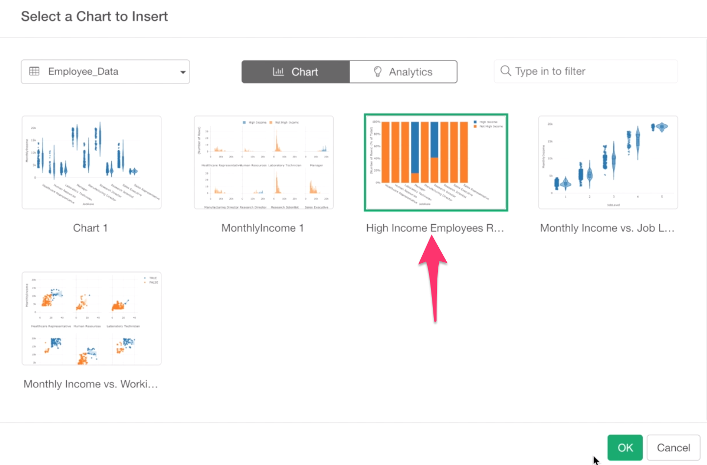
Make sure that Employee Data data frame is selected at the data frame dropdown.
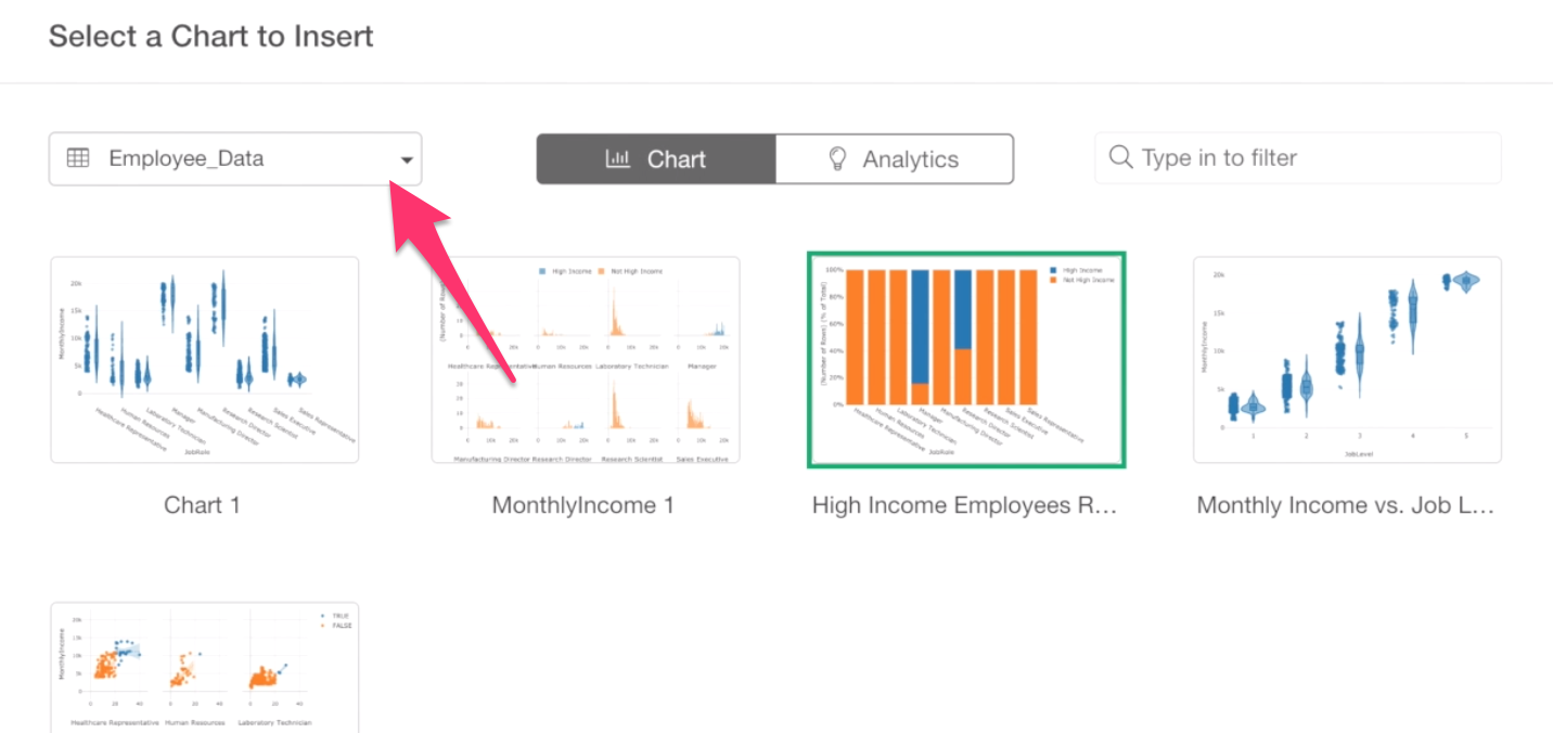
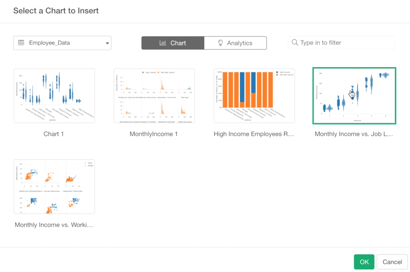
Under the chart tab, we can see all the charts you have created so far.
Let’s select the High Income Employees Ratio chart and click OK button at the bottom.
And, let’s add another chart.
Click the green plus button next to the previously inserted chart.
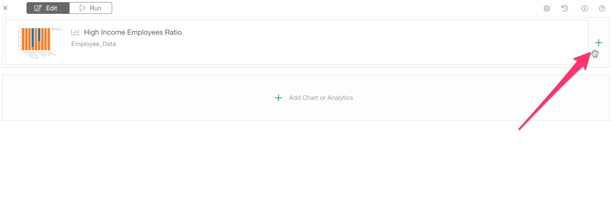
Select Monthly Income vs. Job Level chart.
Now, we want to add one more chart. This time, we want to select a chart from the Analytics view.
Click the green plus button at the right.
Click the ‘Analytics’ tab at the top.
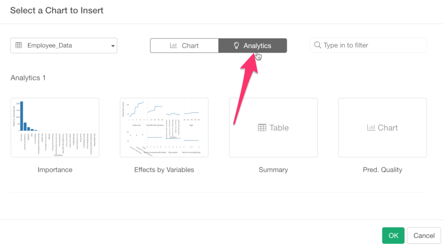
Now, all the pre-built charts under the analytics are listed here. Note that, some of the thumbnails might not be there because thumbnail images are generated only for the ones you opened.
Anyway, select the Importance chart that was built with Random Forest.
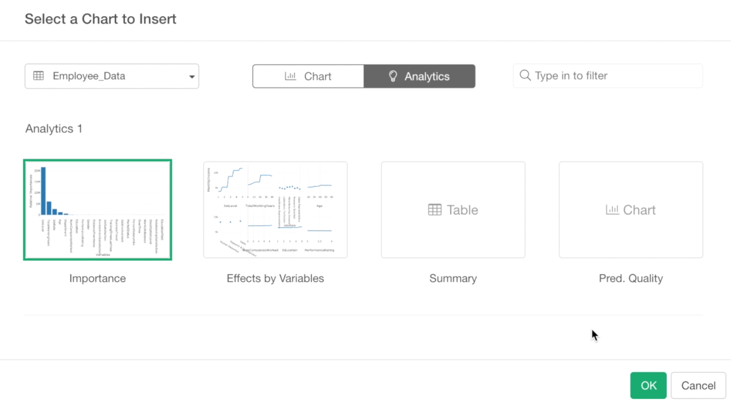
Click OK button to add.
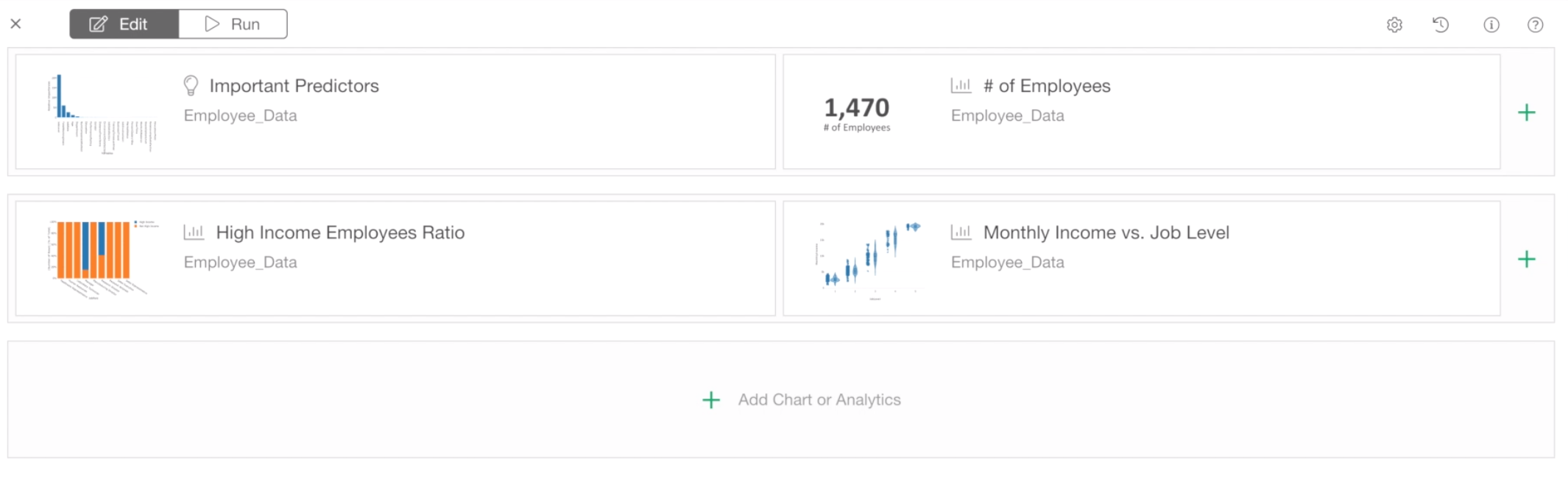
Now, we want to change the positions of these charts. We want to move the Importance chart at the top and other two charts at the bottom.
We can do this by drag-and-drop.
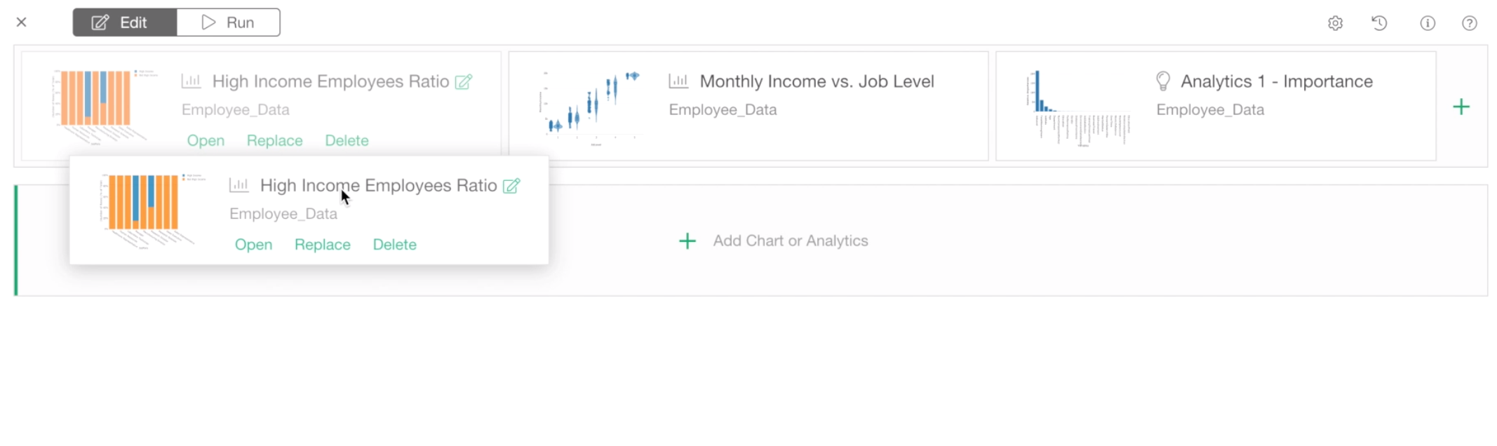
And make sure the charts are positioned like the below.
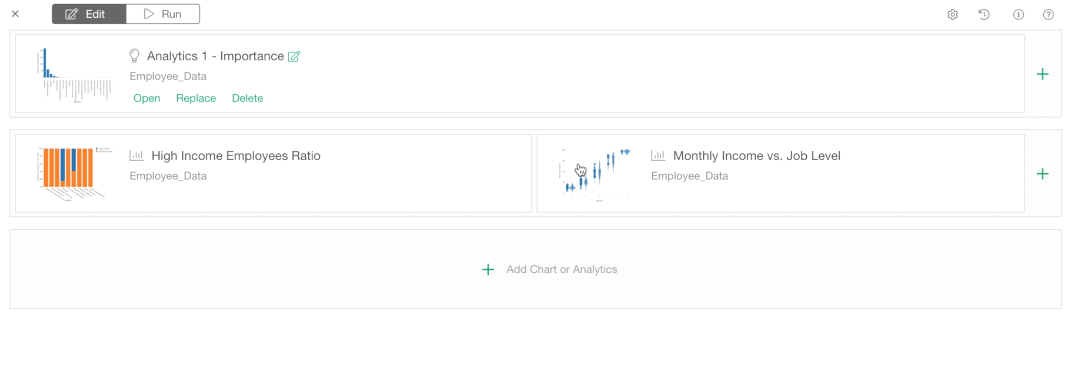
Now, let’s click the Run button at the top to check how it looks.
2. Show Metrics by using Numbers
Now, we want to show a couple of metrics at the top.
They are:
- Number of All employees
- Number of Male employees
- Number of Female employees.
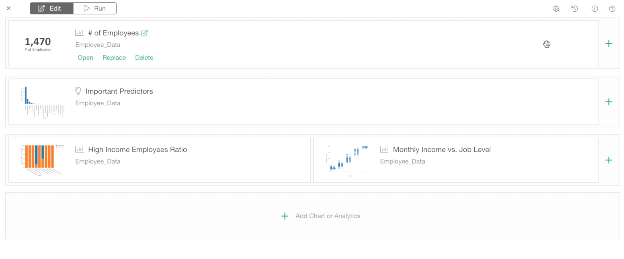
To do this, first, we need to create something called Number under the Chart tab.
Keep this Dashboard window opened, and go back to the Employee Data data frame’s Chart view.
Click the Plus button to create a new chart tab.
And select Number from the chart type list.
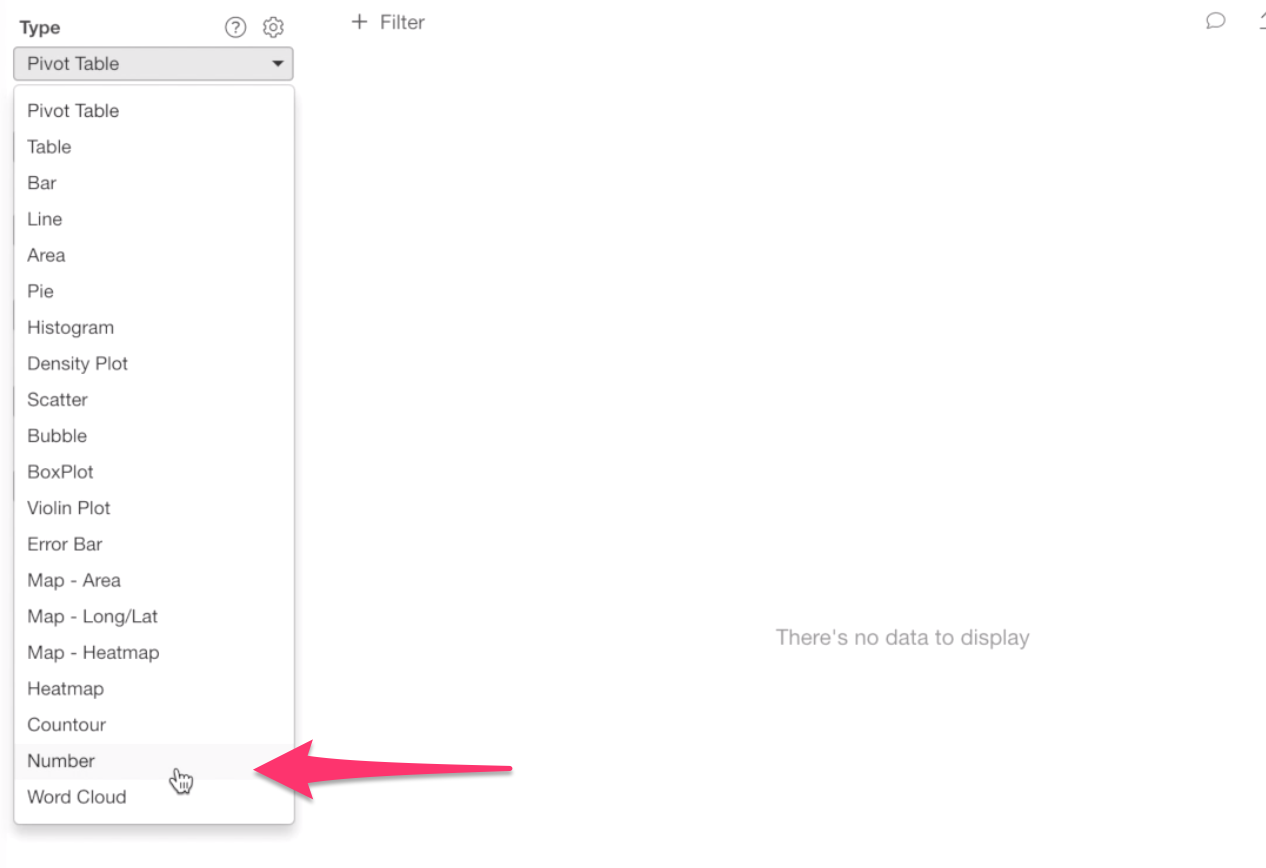
By default, it shows the number of rows as Number. In this case, this is perfect because we wanted to show the number of employees!
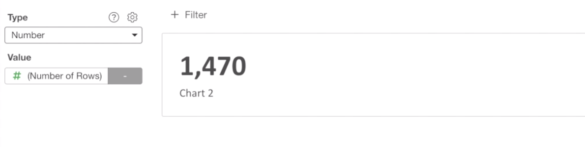
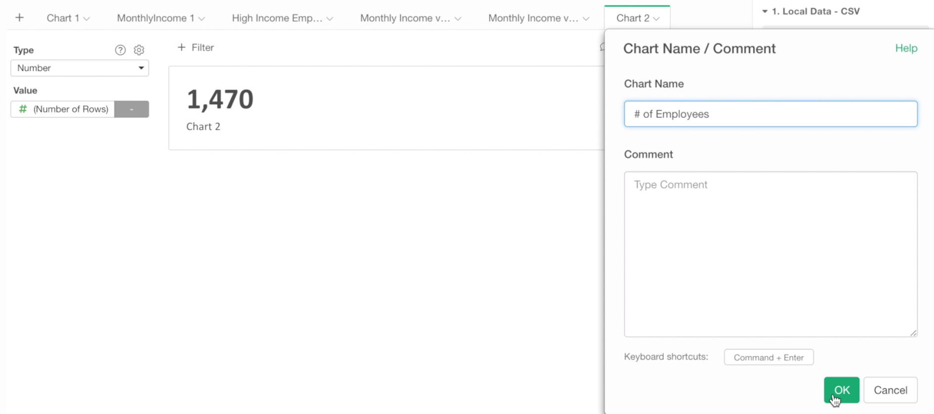
We can change the name of this chart to ‘Number of Employees’.
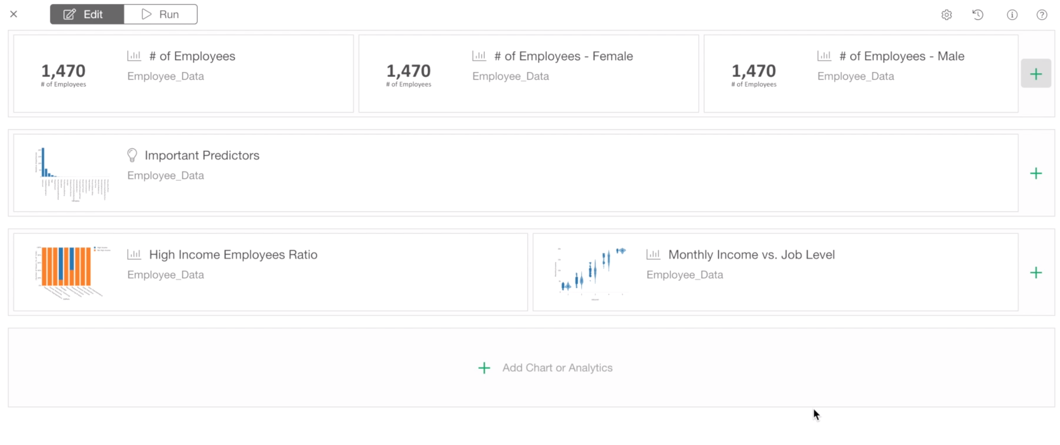
Use Chart Filter
Now, we want to create two new numbers, one is for Male employees and another is for Female employees.
For this, we can use Chart level filter.
First, let’s copy this Number by selecting ‘Duplicate’ from the chart tab dropdown menu.
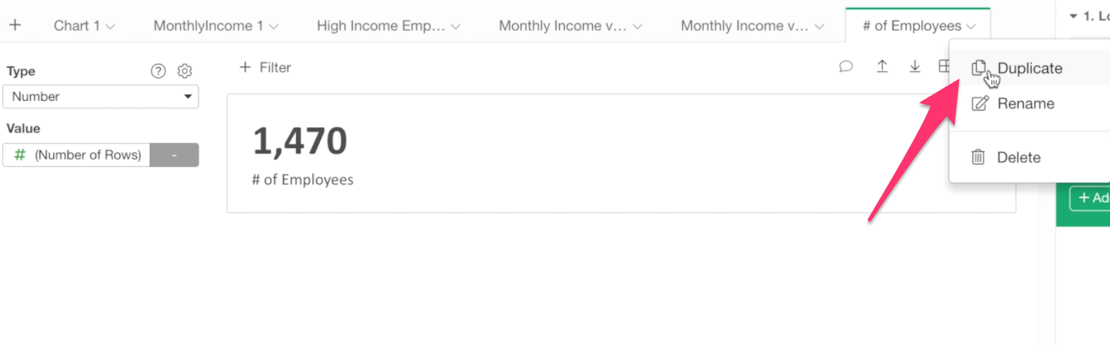
Once it’s duplicated, let’s create a chart filter to show only Female employees.
Click the Filter button at the top.
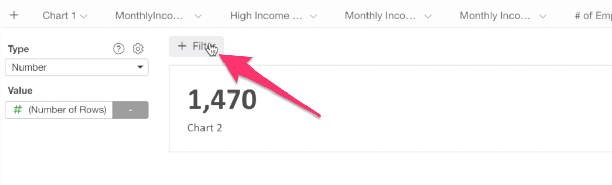
Select Gender column, and select Female from the dropdown, and click ‘Run’ button.
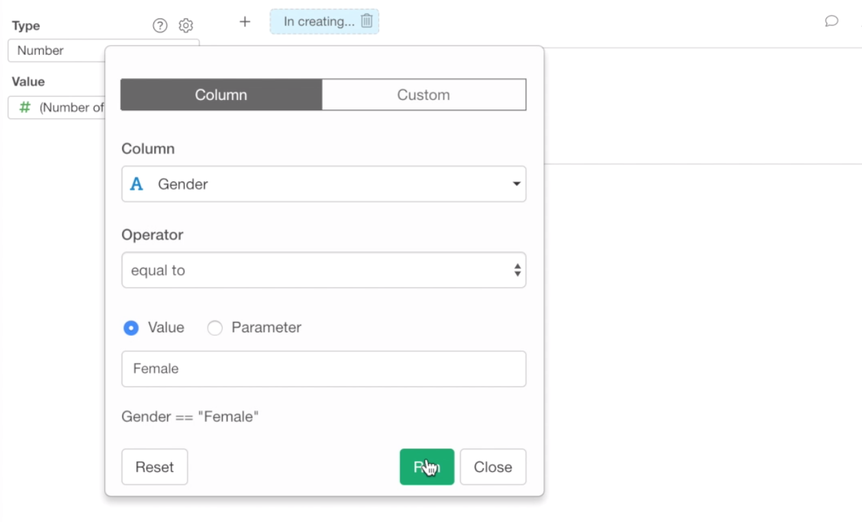
You should see 588, which indicates the number of female employees.
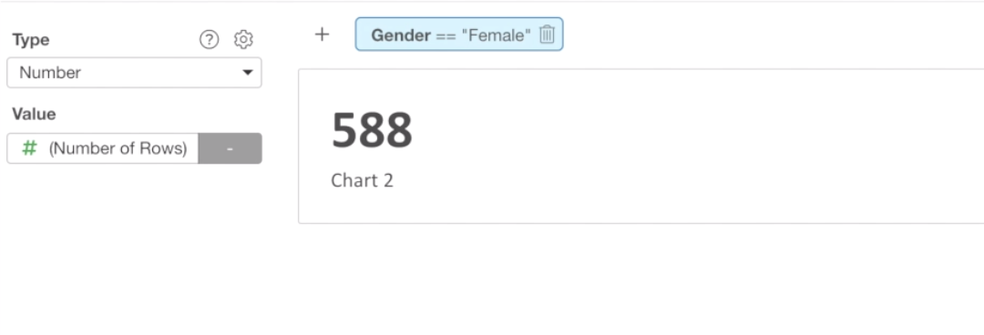
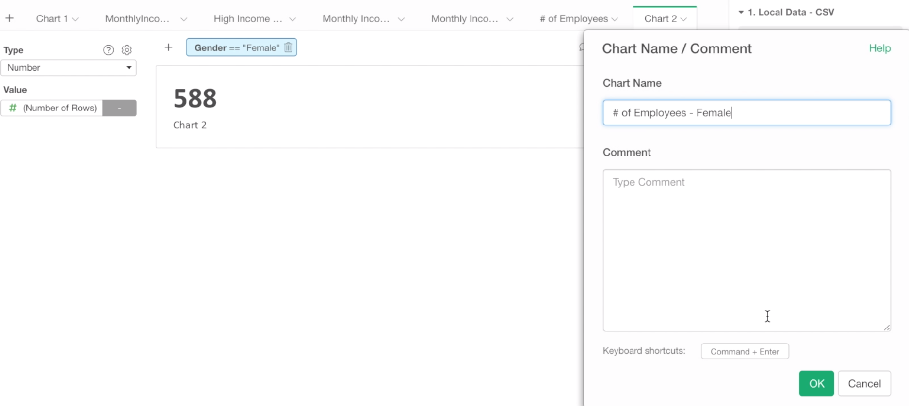
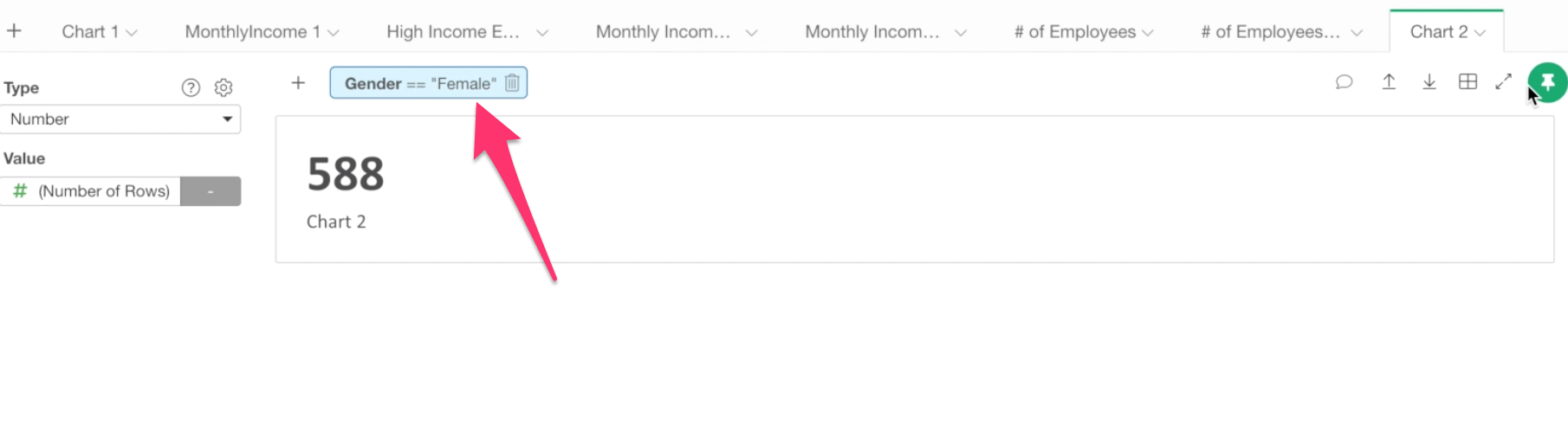
Let’s change the name of the chart to ‘# of Employees - Female’.
Now, let’s create one for the Male employees.
First, duplicate this Number.
Notice that the chart level filter has been also copied.
Click the filter token (light blue box), and change the filtering value to Male.
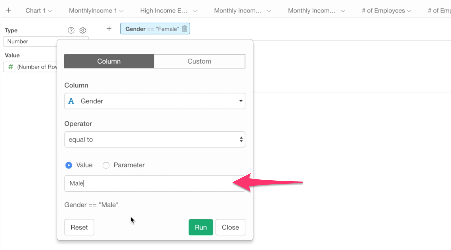
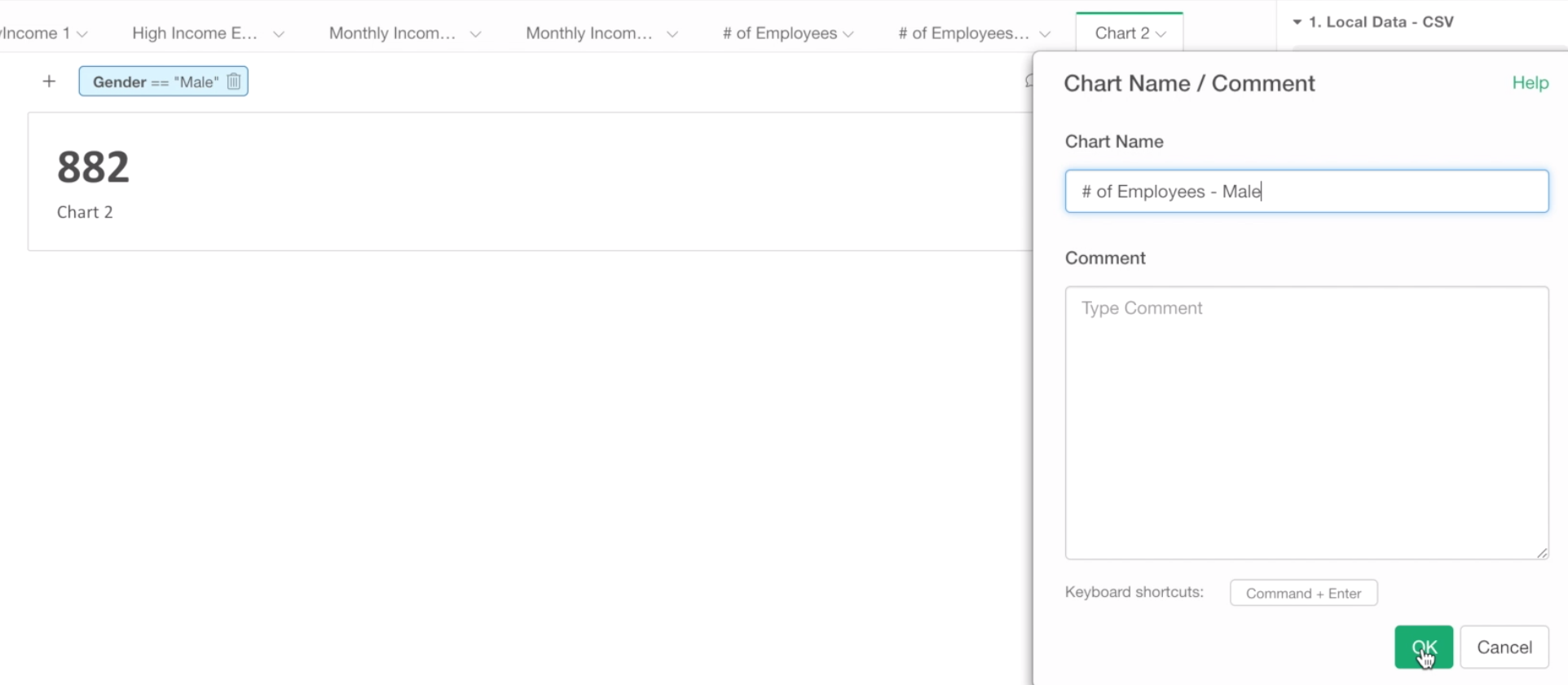
Now you should see 882, this is the number of male employees.
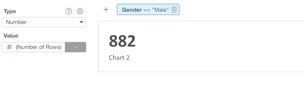
Let’s change the name of the chart to # of Employees - Male.
We have created 3 numbers, now it’s time to add them to the dashboard.
Switch the window to the dashboard window.
Click the plus button next to the ‘Importance’ chart.
You should see the 3 Numbers we have just created under Chart tab.
We’ll select the ‘# of Employees’ first.
Click OK button to add it to the dashboard.
Now, we want to have the numbers at the top, and have the other charts in the 2nd and the 3rd rows.
Let’s move them around by drag-and-drop.
And you can repeat the steps to add other two Numbers to the dashboard.
And click Run button to see the output.
It looks good, and now it’s time to share with others by publishing it.
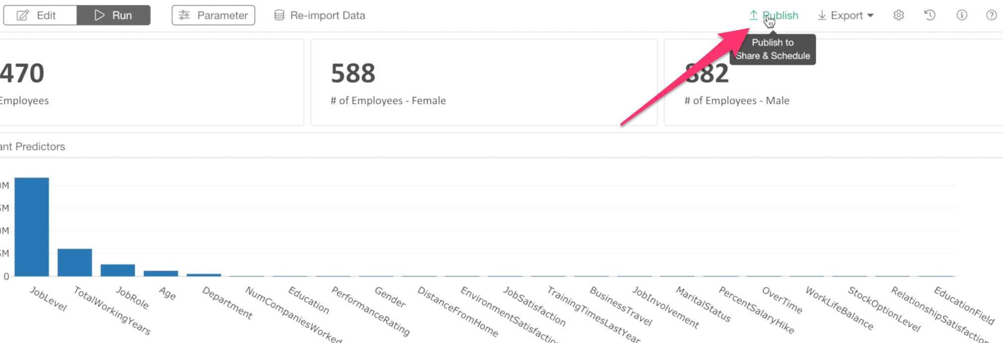
3. Publish Dashboard to Share
You can publish the dashboard to the exploratory.io server or Exploratory Collaboration Server. In this example, we’ll use the exploratory.io server, which is the default.
Click ‘Publish’ button at the top.
You can choose either Private or Public mode for your dashboard. With Private mode, you can setup who can see your dashboard.
For this exercise, we’ll go ahead with the default setting, which is the Private mode.
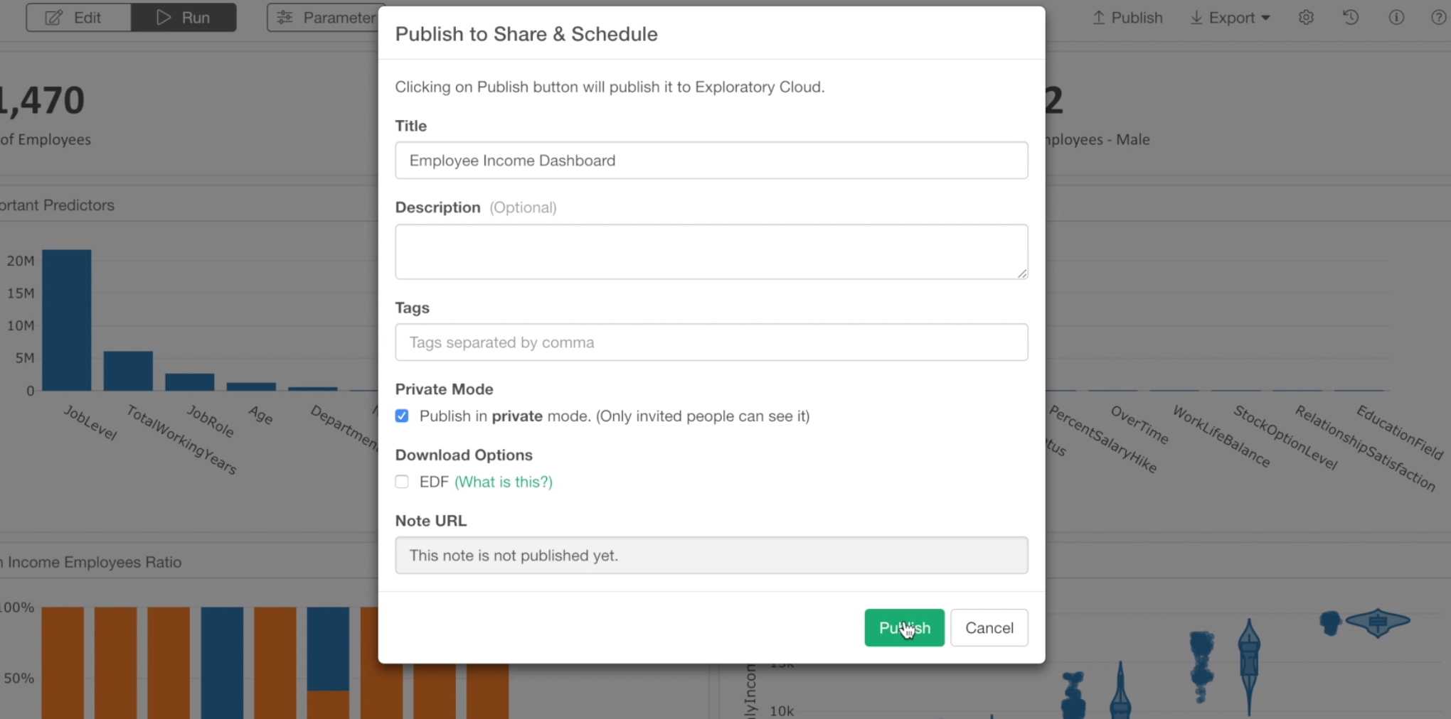
Click ‘Publish’ button to publish.
Once it’s published, you can click ‘Open in Browser’ link to open the published dashboard in your web browser.
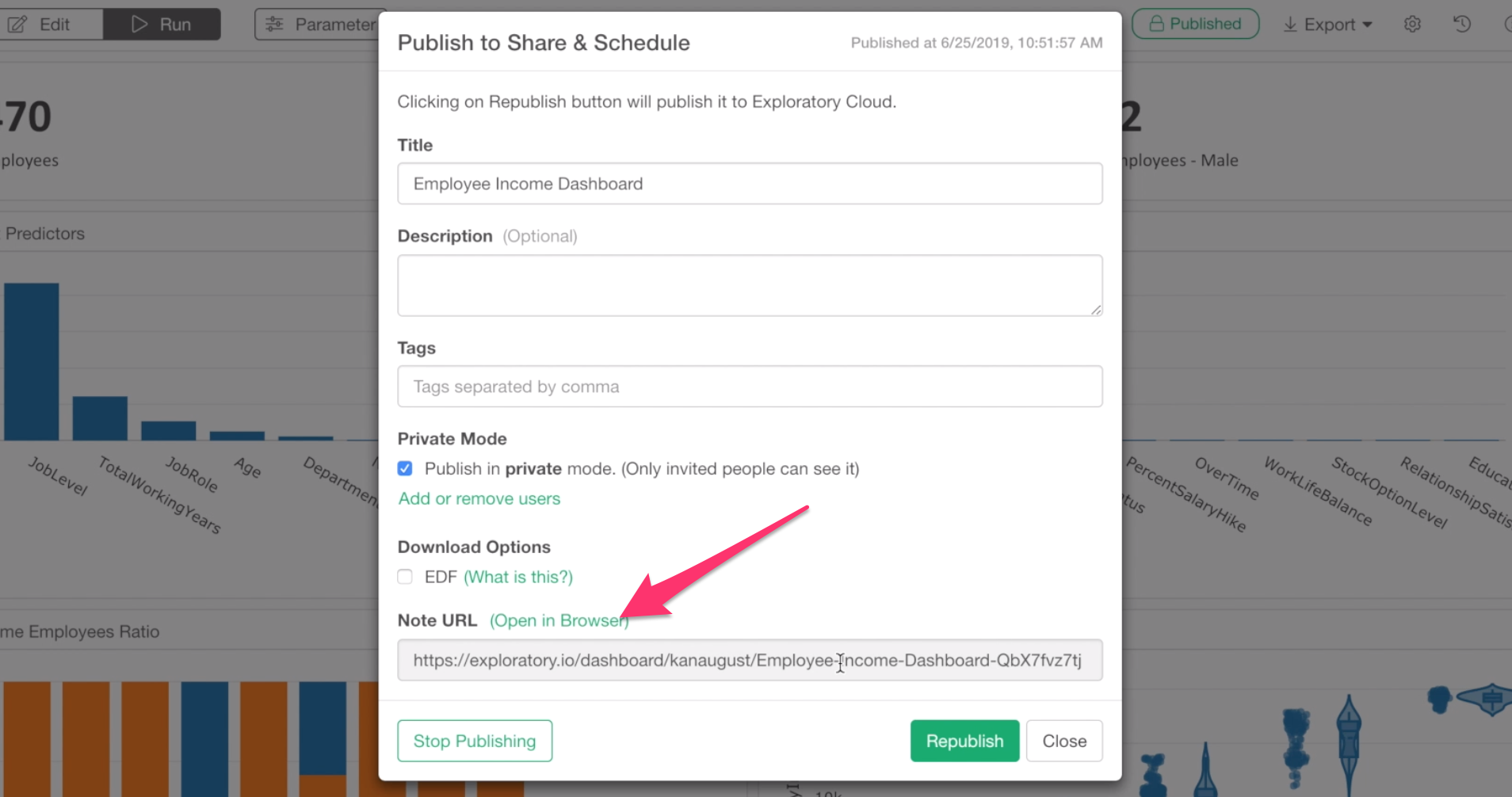
To share your dashboard with others, you want to click the Share button at the published page.
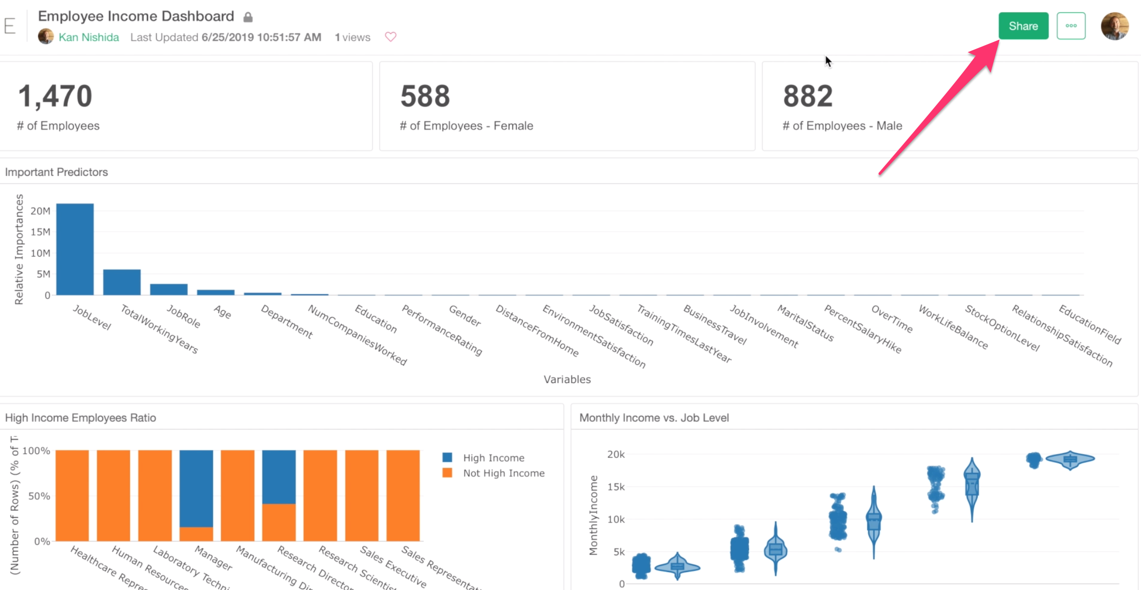
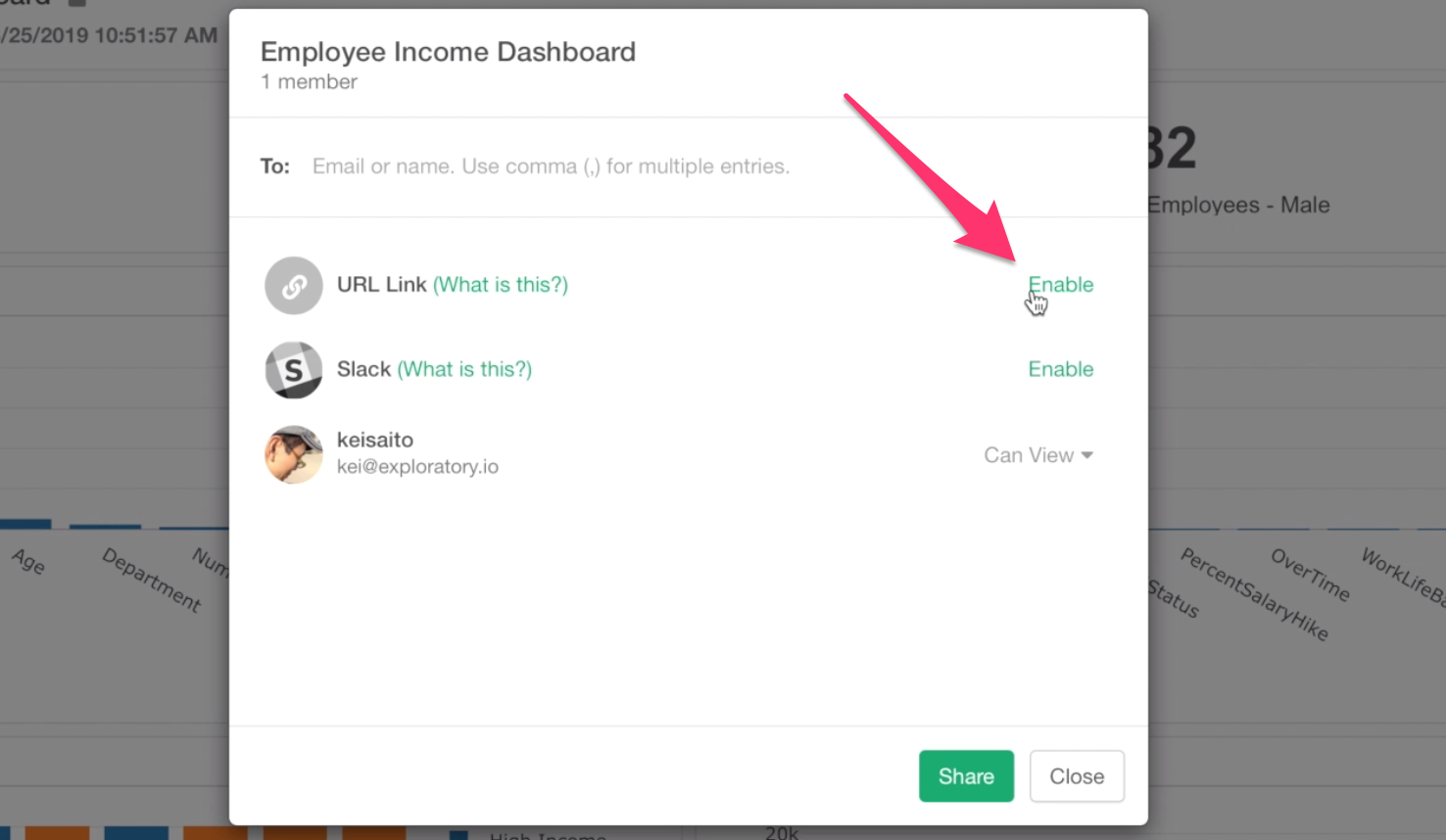
And type their email addresses in the dialog.
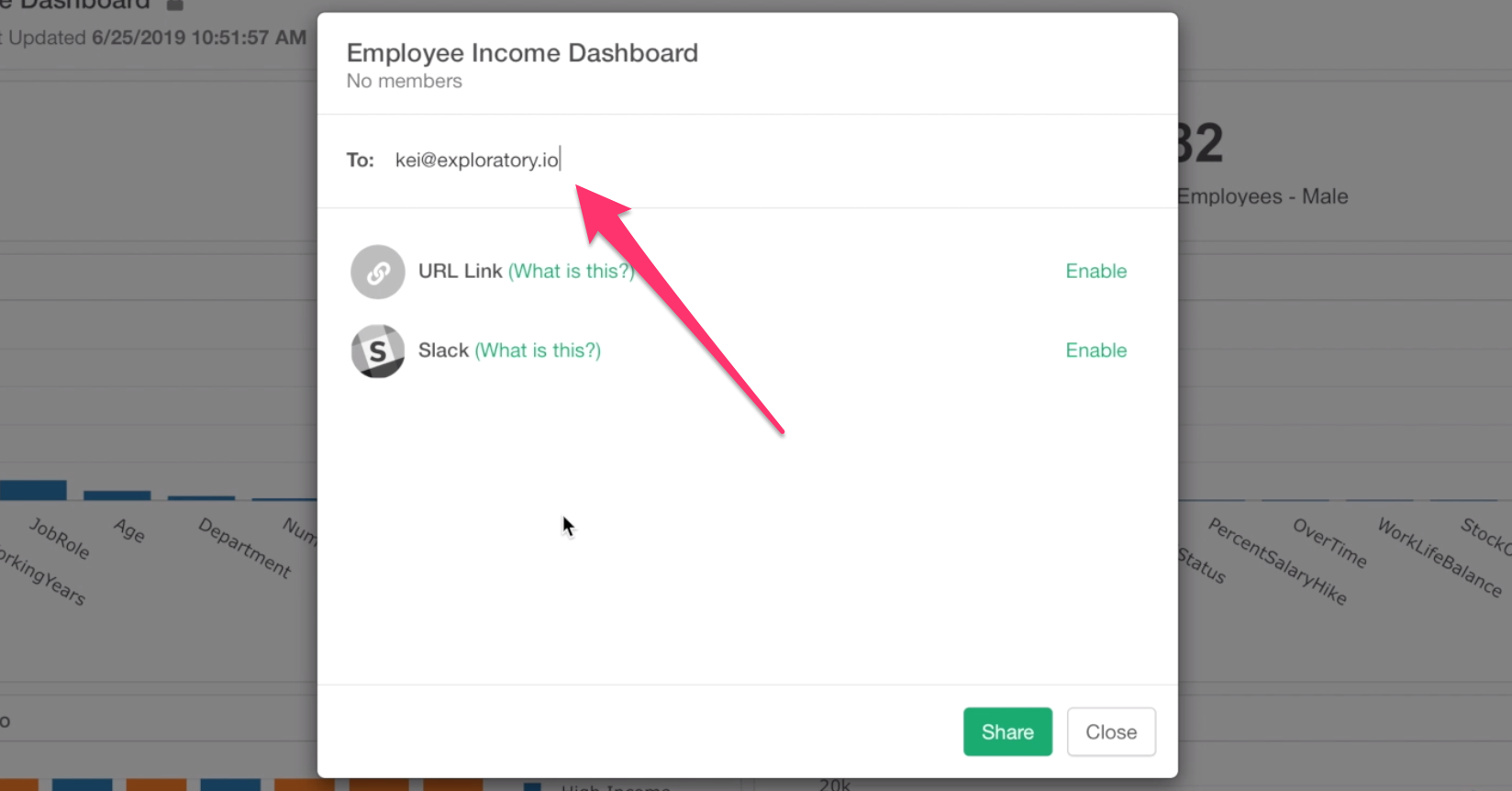
By clicking on Share button at the bottom, an invitation email will be sent to the person you specify.
If they already have Exploratory accounts then they can login to exploratory.io and open your Dashboard.
If they don’t have the accounts, then they will be asked to create new accounts. But this is a free Viewer account, which can be used only to view or interact with the published contents including Dashboard, Notes, and Slides. Yes, they don’t need to enter credit card or any payment information! It’s free!
While this way of sharing makes your dashboard more secured, but sometimes you might want to make it easier to access. In such case, you can enable URL sharing option, which makes your dashboard accessible as long as you know the URL.
Lastly, you can schedule your dashboard as long as your data is accessible. In such case, you can click on the Schedule button, then set up the schedule to refresh the data inside the dashboard.
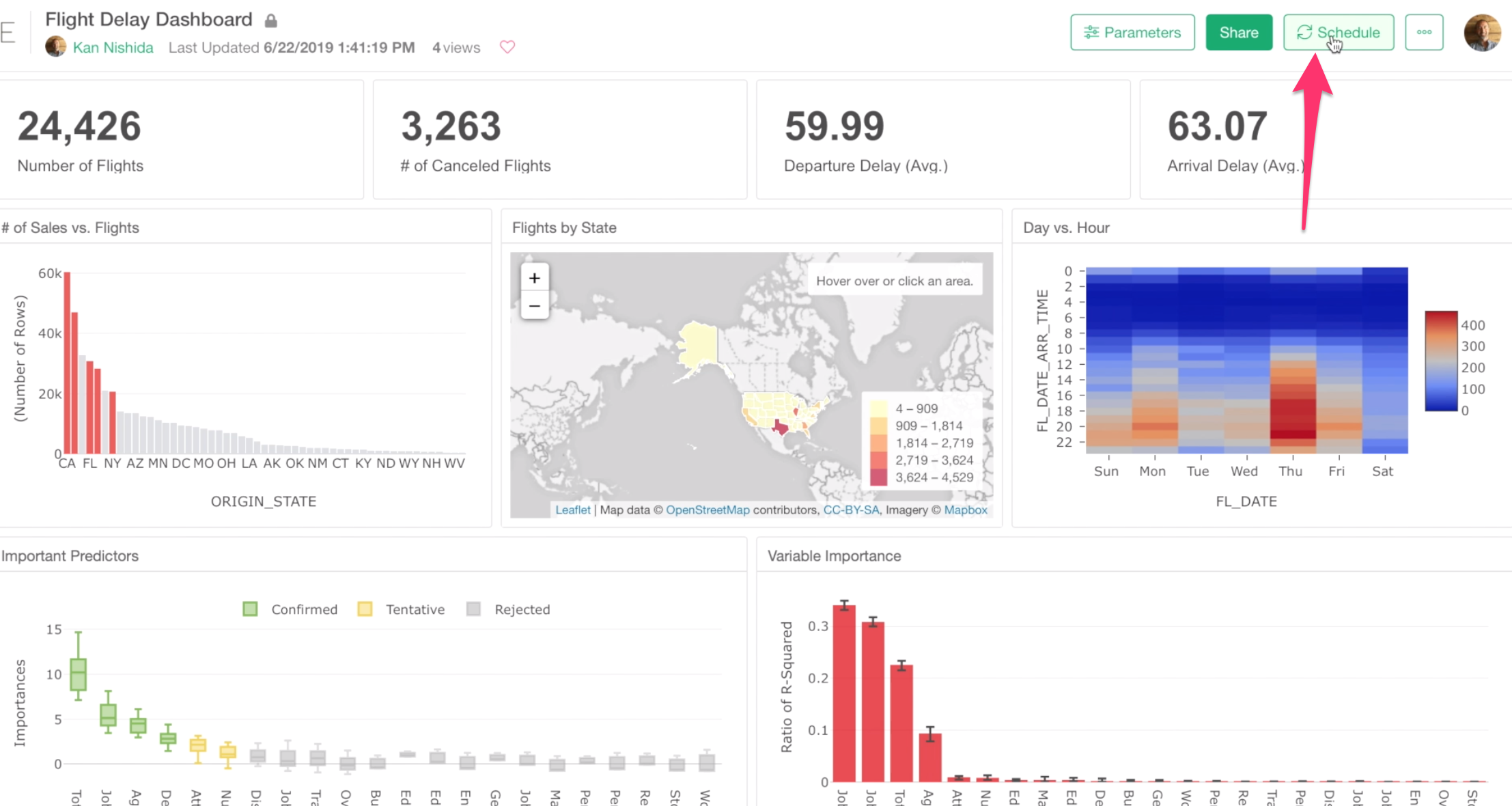
Note that the dashboard we have created in this tutorial uses CSV file data that is stored on your PC so Exploratory.io server can’t access it, hence there is no Schedule button.
By the way, If you have created parameters for your Dashboard you will see the Parameter button at the top.
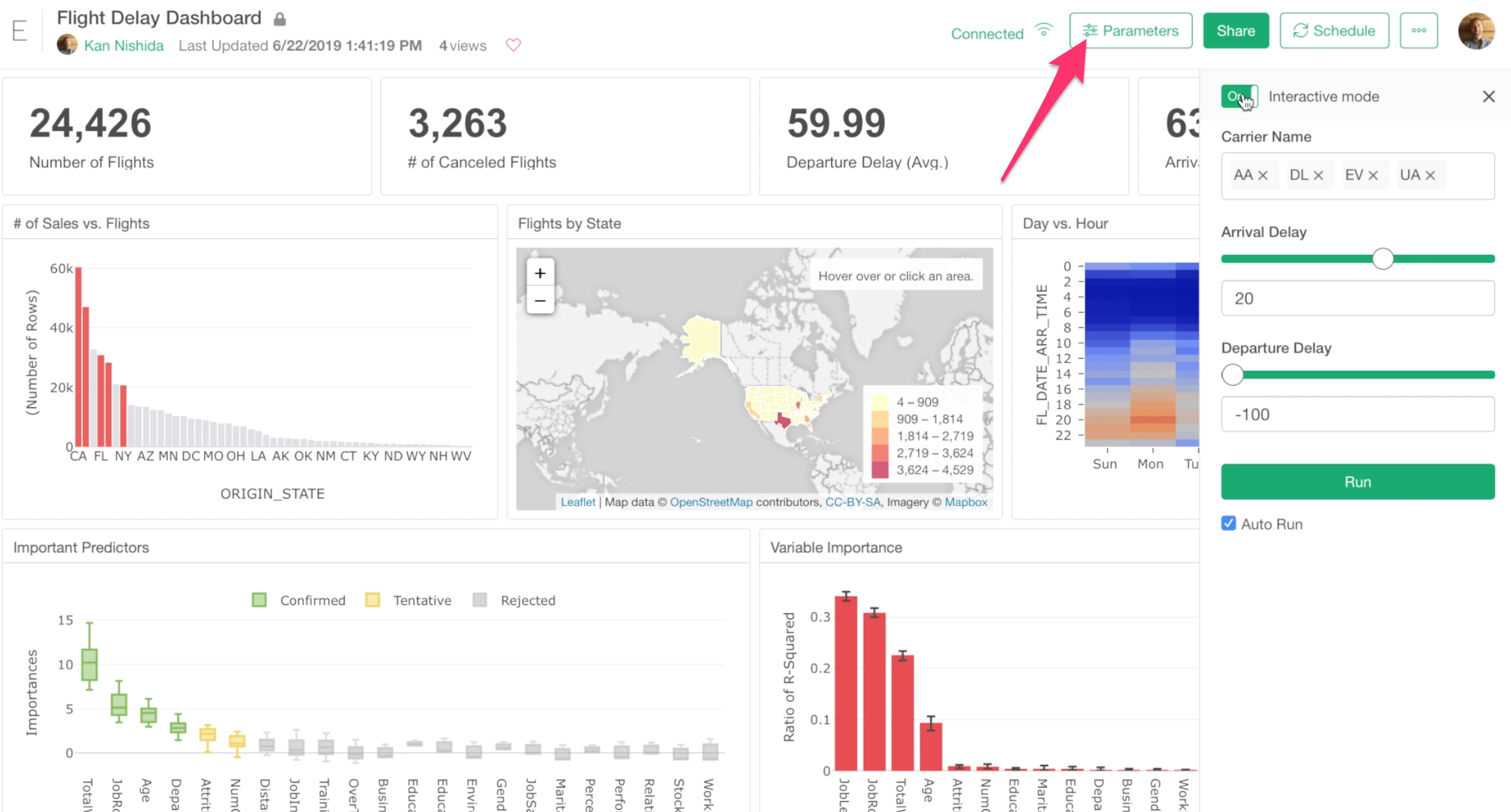
You can click the button to open the Parameter pane and interact with your dashboard by changing the parameters and refresh the data inside the dashboard.
If you are interested in parameterizing your dashboard, check out the ‘An introduction to Parameter’ note.
Ok, that’s it for this tutorial. Congrats on finishing!
There are many many other things you can do with Exploratory, and I’d recommend you take a look at our How-To page.
If you have questions, just open a chat window and send us your questions!
Cheers! Team Exploratory