I just saw this tweet from the President Trump yesterday.
3000 people did not die in the two hurricanes that hit Puerto Rico. When I left the Island, AFTER the storm had hit, they had anywhere from 6 to 18 deaths. As time went by it did not go up by much. Then, a long time later, they started to report really large numbers, like 3000…
— Donald J. Trump (@realDonaldTrump) September 13, 2018
Sure enough, this made a lot of people mad. Many took it as another false claim.
Among many criticizing comments, here’s what Nate Silver from FiveThirtyEight had to say.
I know there's a lot of competition but this is the worst thing he's ever tweeted. https://t.co/szjPKKxzhK
— Nate Silver (@NateSilver538) September 13, 2018
Well, there is a huge difference between 6 (or 18) and 3,000.
Is he wrong that it is not 6 it is actually 3,000 people who died because of the hurricane Maria? Or, is he right that it is actually 6 or 18 and the Puerto Rico government is inflating the number?
It’s easy to jump to the conclusion in either way based on how you support the President. But then we are not critically thinking.
Let’s face it. The governments or any public offices have an innate motivation for inflating this type of numbers. The bigger the number of victims the easier they can get bigger size budgets.
And, Puerto Rico needs money. It “has struggled to repair its infrastructure and power grid since the storm, and is asking US Congress for $139bn in recovery funds,” according to BBC.
A territory like Puerto Rico, which doesn’t have a right to vote for the President and doesn’t a right to send their representatives to the congress, it’s really hard to get enough support and budgets from the federal government in the first place.
So is Puerto Rico government inflating the number?
Why is the President making a big deal now?
Now, here is the thing. The Puerto Rico government used to claim the people who died of the hurricane was 64, though this is based on counting “those killed directly by the hurricane, crushed by collapsing buildings, drowned or hit by flying debris,” according to BBC.
But, there should be people who died not by the direct cause, but by the indirect cause. For example, if you don’t have electricity because of the hurricane damage for a period of time, what happened to those who are plugged into medical devices at hospitals? What happened to those who didn’t have access to clean water?
According to BBC, “Repeated power cuts also led to an increased number of deaths from diabetes and sepsis.”
So when we talk about the deaths caused by the hurricane we should consider both direct and indirect impacts, that’s what Puerto Rico government is saying.
So, the governor of Puerto Rico commissioned a study to a group of researchers at George Washington University. And what did they find?
They estimated 2,975 died because of the hurricane Maria.
And this is the number that the President doesn’t want to accept.
How Did They Come Up with 3,000?
The researchers at George Washington University employed a statistical method to develop a series of generalized linear models to predict the population after the event (September 2017) based on the pre-hurricane period (July 2010 to August 2017) data including demographic, seasonality, etc.
And the difference between the predicted numbers of the population and the actual numbers are estimated as the number of the death.
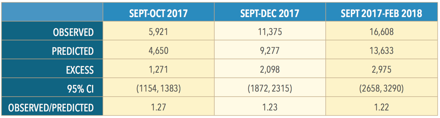
Here is the table that shows the predicted values based on the model they built and the actual values.
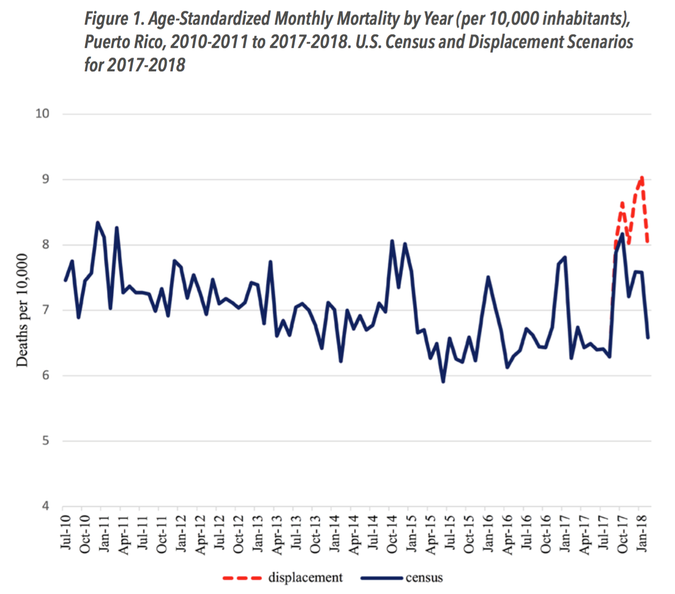
Here is a line chart that shows the trend of the both the predicted population and the actual.
Here is the summary of the method they employed.
We developed a series of generalized linear models (GLMs) with monthly data for the pre-hurricane period of July 2010-August 2017, accounting for trends in population size and distribution over this period in terms of age, sex, seasonality and residence by municipal level of socioeconomic development. Our estimates also considered Puerto Rico’s consistently high emigration during the prior decade and dramatic population displacement after the hurricane. We used the model results to project forward mortality that would have been expected if the hurricane had not occurred for two scenarios—if the population had not changed (census scenario), and explicitly accounting for massive post-hurricane population displacement from the island (displacement scenario).
You can see more details in their report here.
This is a very typical way to approach for this type of analysis. There is nothing magical about it. It is a good old statistics that have been used for many many years.
But still, there is always something mystery about this type of analysis. I haven’t found a Github repository or something like that, which means we can’t reproduce the analysis. But even they published it, many of us don’t feel like we understand it, especially when you don’t have statistics or data science backgrounds.
So I’m going to try to see if we can see such trend by just visualizing the data in an intuitive way.
Visualizing Trend of Death Numbers
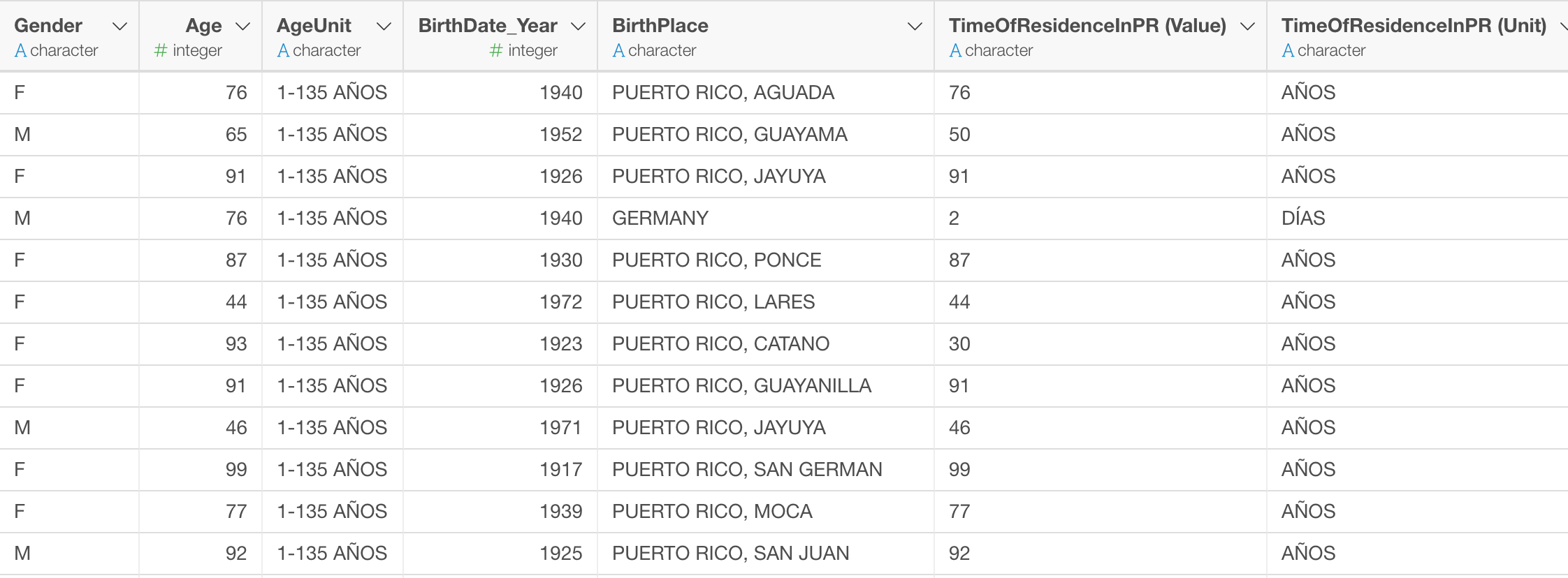
Puerto Rico government recently started releasing data of all the deaths registered in Puerto Rico. (Thanks to Jeremy Singer-Vine. If you haven’t subscribe his news letter “Data is Plural”, you should.) Maybe this data sharing is part of the effort for the government to increase awareness of the high number of the death. And that’s a good thing. Transparency helps getting support from many people if you don’t have anything to hide.
The data is only from 2017 to today, but they update every month moving forward. The data includes the year and month of the death, the place of the death, the causes of death, age, sex, marital status, occupation, etc.
Summary View:
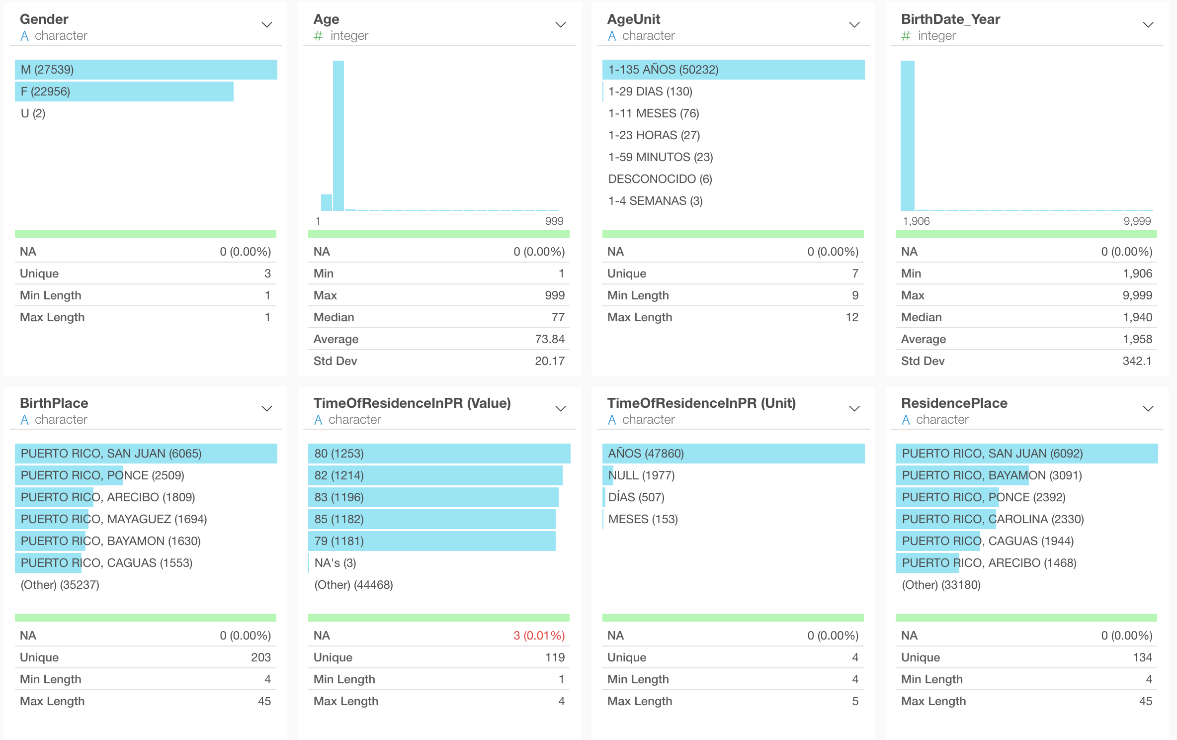
Table View:
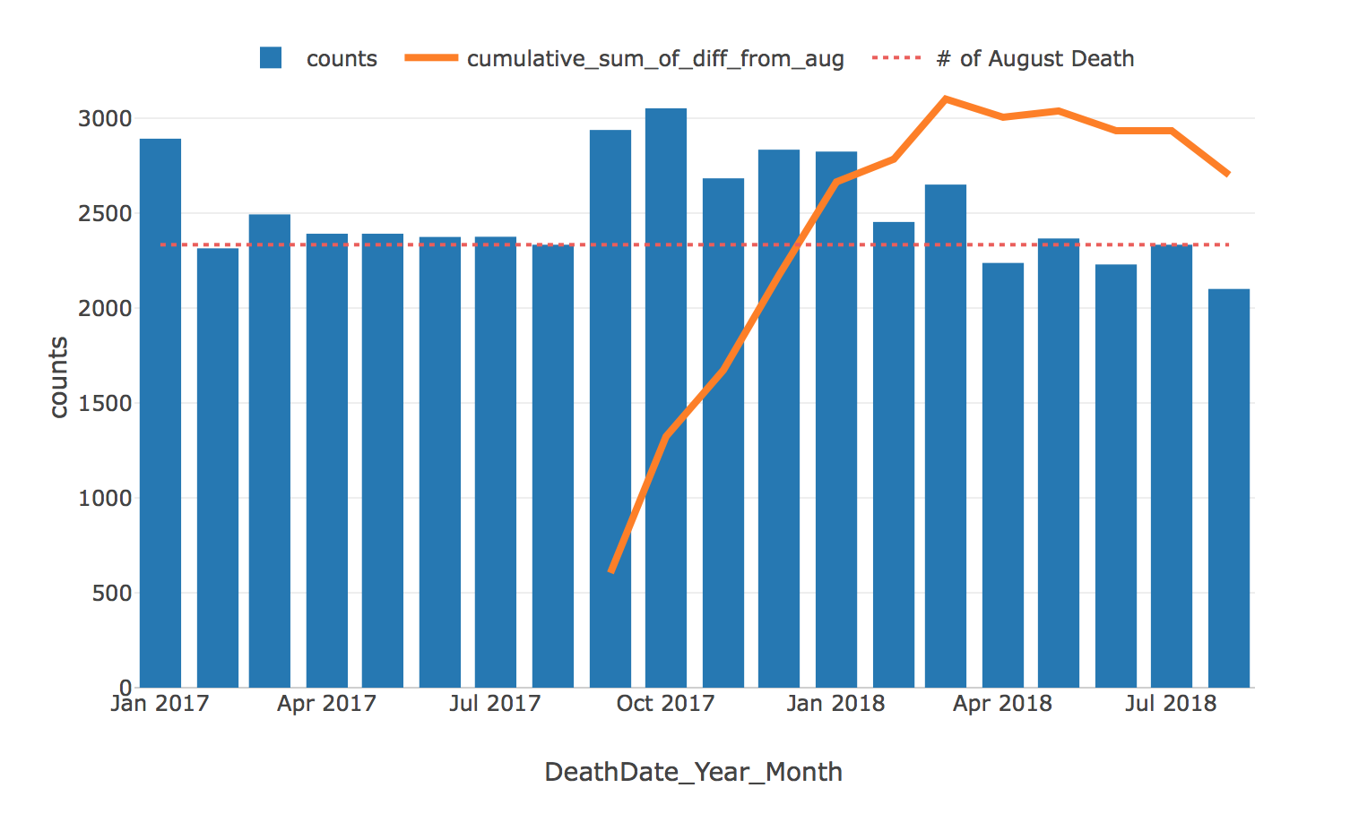
And here is a chart that shows the number of the death by month.
Each blue bar represents the number of deaths in Puerto Rico. The orange circle indicates the month the hurricane Maria hit Puerto Rico. The red dotted line is the overall average.
We can clearly see the jumps from September 2017 through March 2018.
To make the difference between each month’s death number and the overall average more clear, I’ve created this chart that shows just the difference.
Those jumps from September through January (or March) seem to be unnatural without some particular events.
But, when you look at the bar at the most left hand side, which is January 2017, that’s high, too.
So one can wonder maybe January is a month where many people die in Puerto Rico.
Unfortunately, I don’t have data for September, October, November, and December in 2016 or in 2018 so I don’t know if these high numbers have something to do with the seasonal changes or not. The government is updating the data every month, so we will know something better over the next few months.
Now, calculating the difference between each month’s death number and the average might not make sense. Because the average number itself is heavily influenced by the high numbers of those jumps. We don’t really want to analyze how big the jumps are by comparing to the average that are increased by those jumps. ;)
Calculating against the month before the event
How about calculating the difference between each month’s death number and the death number in August 2017?
This is a same chart that showed the death counts but this time the reference line (green color) is showing the August number, which is 2,335.
And here is a chart that shows only the difference between each month’s death number and the August number.
We can see the same trend, but this time, those jumps from September 2017 to March 2018 are even bigger.
What I’m trying to do here is to see if the death numbers after the hurricane Maria hitting Puerto Rico are something abnormal. And there are other ways to evaluate. We can take an average of the all months before the event.
Or, instead of using the average, you can build a prediction model based on all the variables to predict the numbers for those months after the hurricane and calculate the difference between the actual death numbers and the predicted numbers. In fact, that’s exactly what the study above did.
Unfortunately, I don’t have enough historical data to build such model. All I had was the data starting from January 2017. The researchers had the data from 2010.
Nonetheless, we are not shooting for the perfectly accurate numbers here. Our goal here is to see if there is a general trend about the death numbers caused by the hurricane in a way we can intuitively see.
How many deaths are impacted by Hurricane Maria?
After all this, we still haven’t answered the core question of this post.
Is 3,000, the number brought by the Puerto Rican government inflated?
Again, we all know by now that the number was estimated by the researchers at George Washington University with a standard and rigorous statistical method.
But, can we observer something similar by just visualizing the data we have here?
To answer this question, let’s bring the chart that we saw before again.
Each blue bar shows the difference between each month’s death number and the August number after the hurricane Maria.
And to count the total number of people who died because of the hurricane Maria, we want to cumulate these numbers from September onward.
Here is a chart that does just that.
The blue bars are showing the counts of all the deaths regardless if it’s impacted by the hurricane or not. The orange line is showing the cumulative counts of the death that could be impacted by the hurricane.
And the orange line keeps going upward until March 2018 when it reaches to 3,103.
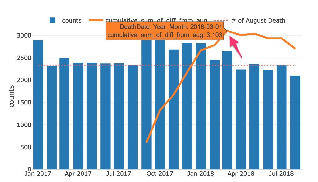
This is very close to the estimated number.
Of course, we have to be very careful to jump onto the conclusion like this.
First, this is a time series data, which means we need to take account of the seasonality. We can’t simply compare August and September. If you’re a toy store manager you know December and January are very different months, for example. So what we typically want to do is to compare the numbers against ones from the previous years, at least.
And we always have to suspect that there might be other reasons that caused the jumps for September 2017 through March 2018. As I mentioned, we can see a high number even for January 2017 which is before the hurricane, so there might have something to do with the winter in Puerto Rico, I don’t know.
At the end of the day, correlation is not causation, and analyzing the causal relationship is hard. This is why we want to use more rigorous statistical approaches to analyze this deeper with more data.
But, at least though, this is something to start with.
We get a sense that the death numbers seem to be increased after the hurricane, and it’s hard to believe that it is in a range of 10 or 100. It seems to me that it’s more in the range of thousands.
I’ll try to run this analysis for the next few months as the government releases more data, and let’s see our hypothesis will hold true. Who knows, we might see huge jumps in this month and next month and we might end up concluding that September and October are happen to be the times many people die in Puerto Rico in general. I don’t think so, but you never know.
Closing…
Again, Puerto Rico needs money. It needs it to repair its infrastructure and power grid, their lifelines. They are begging the US government and Congress for $139bn.
This is a territory, which doesn’t have a right to vote for the President and doesn’t have a right to send their representatives to Congress. I can only imagine how hard for them to get such big size of the budget from Congress when the congressmen are all busy for the upcoming election, which Puerto Rico is not a part of.
Criticizing the President’s tweet is one thing, but this is not about the President. It’s about the people in Puerto Rico. Their lives. Hope more people become aware of the horrible situations currently happening somewhere that is a part of the United States.
How to Reproduce:
I have used Exploratory do clean and transform the data and generate those charts above. If you use Exploratory, then download this Note as EDF file, which you can import and reproduce everything including the data wrangling, charts, and this note.
If you are not, then you can reproduce the data wrangling part in R. The below is an R script that was generated by Exploratory. It does the data cleaning and all the calculations that were required to generate the data displayed with the charts above.
# Load required packages.
library(lubridate)
library(tidyr)
library(stringr)
library(readr)
library(dplyr)
library(exploratory)

read_delim("/Users/kannishida/Dropbox/Data/regdem-defunciones-01-enero-2017-hasta-7-septiembre-2018.csv" , ",", quote = "\"", skip = 0 , col_names = TRUE , na = c('','NA') , locale=readr::locale(encoding = "ISO-8859-1", decimal_mark = "."), trim_ws = TRUE , progress = FALSE) %>%
  mutate(DeathDate_Month = na_if(DeathDate_Month, 99)) %>%
  unite(DeathDate_Year_Month, DeathDate_Year, DeathDate_Month, sep = "_", remove = FALSE) %>%
  separate(MunicipalityDeathPlace, into = c("Death_Place_country", "Death_Place_municipality"), sep = "\\s*\\,\\s*", convert = TRUE) %>%
  mutate(DeathDate_Year_Month = ymd(str_c(DeathDate_Year_Month, "_01")), Death_Place_municipality = str_to_title(Death_Place_municipality)) %>%
  group_by(DeathDate_Year_Month) %>%
  summarize(counts = n()) %>%
  filter(DeathDate_Year_Month <= today() - months(1)) %>%
  mutate(average = mean(counts), diff_from_average = counts - average, greater_or_less = diff_from_average > 0, pre_maria = DeathDate_Year_Month < ymd("2017-09-01"), counts_of_august = ifelse(DeathDate_Year_Month == "2017-08-01", counts, NA), Day_of_Maria = ifelse(DeathDate_Year_Month  == "2017-09-01", 0, NA)) %>%
  fill(counts_of_august, .direction = "down") %>%
  fill(counts_of_august, .direction = "up") %>%
  mutate(diff_from_august = ifelse(DeathDate_Year_Month  < "2017-09-01", 0, counts - counts_of_august), diff_from_august_cumsum = cumsum(diff_from_august), diff_from_august_cumsum = na_if(diff_from_august_cumsum, 0))