I’m super excited to announce Exploratory v5.0! Finally!
The biggest thing for this release is the new UI design and experience. We started working on it about 6 months ago while we were still working on other developments for v4.x series at the same time. What we wanted to do is to make the data analysis and data wrangling much easier and more fun.
We have learned a lot from our users over the last 2 years and a half since the beginning of Exploratory. And the data science training programs we have been providing is one such venue where we learned a lot about what are the hard things when people start their journey into data science and what are the most important things when they try to understand data.
And of course, we have been continuously learning a lot from our great existing users of Exploratory who kindly have been constantly giving us a lot of great feedback!
With such learnings and our relentless works towards our vision of democratizing data science, we think we have got a great release here for you. Now you are the judge, we can’t wait to hear what you think.
Here is a list of the new features and enhancements for Exploratory v5.0.
New UI Design & Experience
The biggest change for v5.0 is the new UI design and experience. It’s all about ‘Simplicity and Focus’. We wanted to make it so that you can focus on what is more important when you work with data.
In typical data analysis, our users spend their majority of time on Data Wrangling so it is definitely a critical element of the data analysis. But also at the same time, what they really want to do is to visualize the data and analyze it with algorithms so that they can find useful insights that help them make better decisions.
So we wanted to make the data wrangling experience as simple yet powerful as possible, yet at the same time, we want it to not disturb other tasks like data visualization and analytics. when they are not needed.
So we have spent a lot of times in redesigning the whole experience around this area, and what we have finally come up with is v5.0. The clean UI that provides a simple yet powerful experience for building and managing the data pipelines.
Enough talking, let’s take a look one by one.
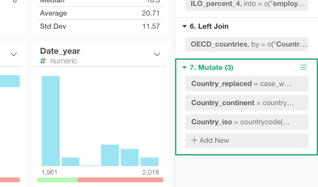
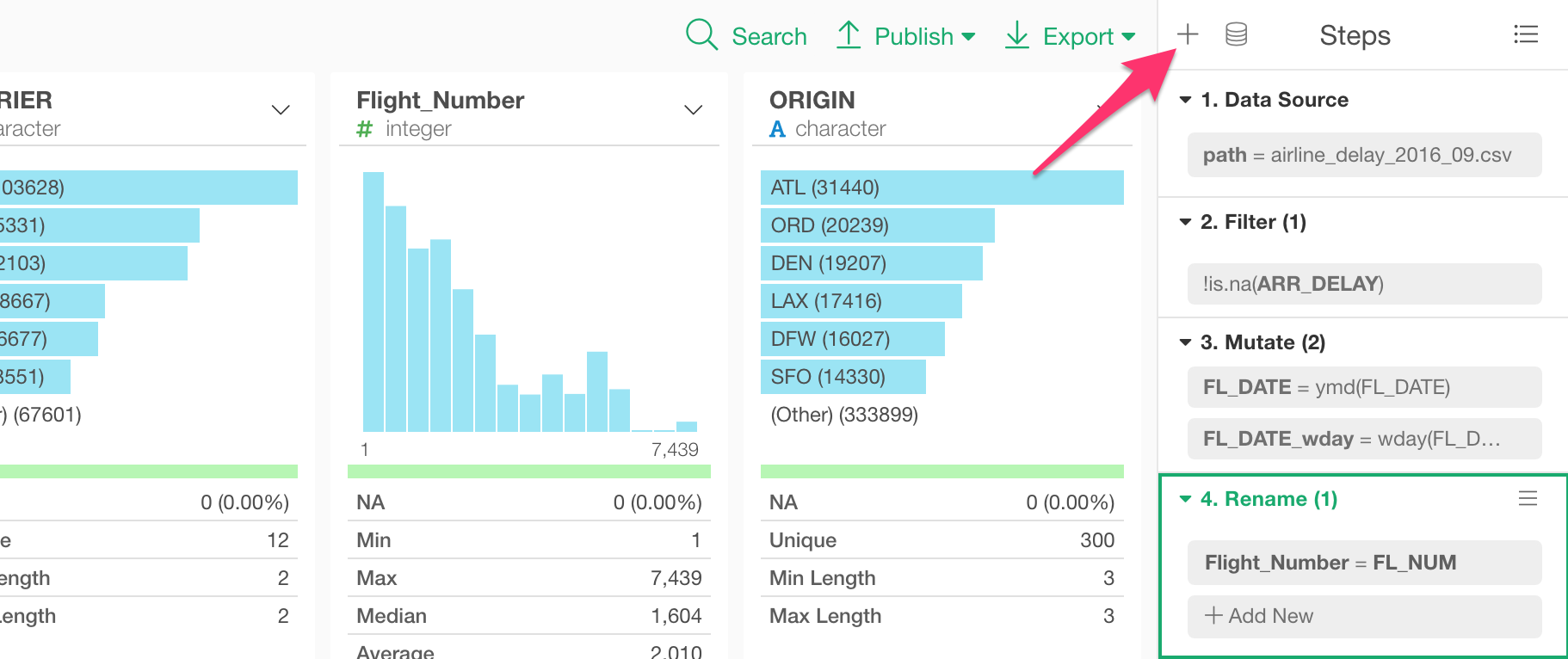
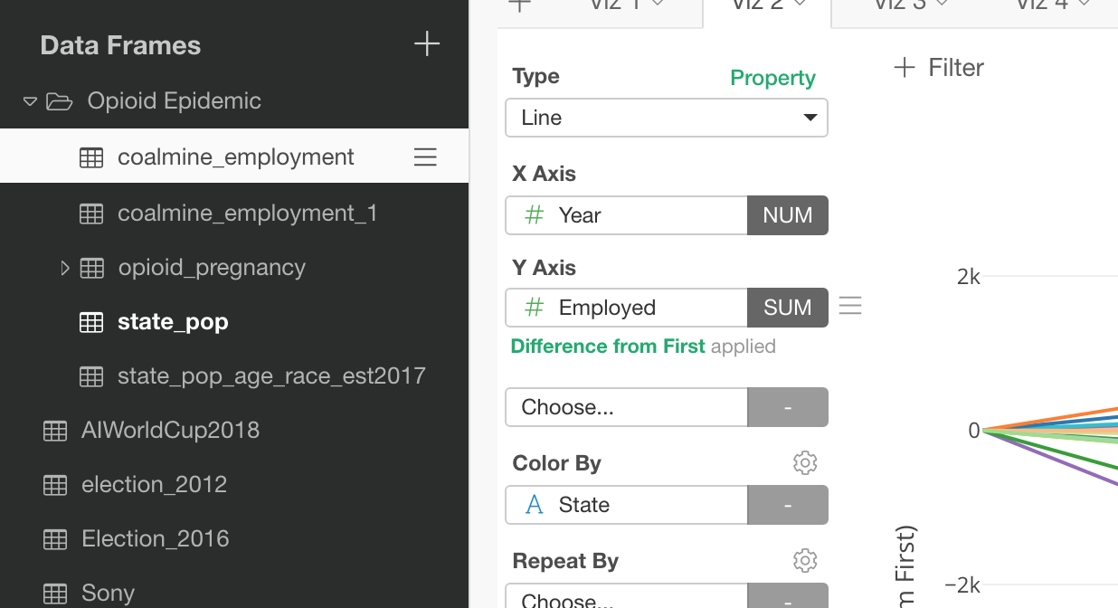
Managing Data Wrangling Steps at Right Hand Side, not at Top
In the previous releases, we used to have the command token area at the top where you manage the data wrangling operations like Mutate, Filter, etc. And we had the right hand side ‘Step’ area where you see a list of the data wrangling steps each of which shows a corresponding R command.
In v5.0, we have removed the top command token area completely and enhanced the ‘Step’ area at the right hand side to centralize all the operations around the data wrangling.
The first thing you would notice at the Step area is that you no longer see the R commands at glance. Instead, you see the title and tokens (light gray background button) for each step.
And, you can click any of the tokens to open the corresponding dialogs (or UIs) directly to edit.
Understanding and Investigate the Steps
One of the important things for Data Wrangling is the ability to debug or understand what is going on in the steps. This becomes even more important when you have an error somewhere in the steps. So, we have done a few things to improve the experience in this area.
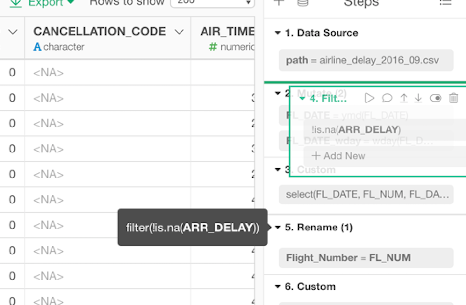
Instant Mouse Over Pop-up to Show the Commands
You can move your mouse pointer on top of each token to see what is inside the token.
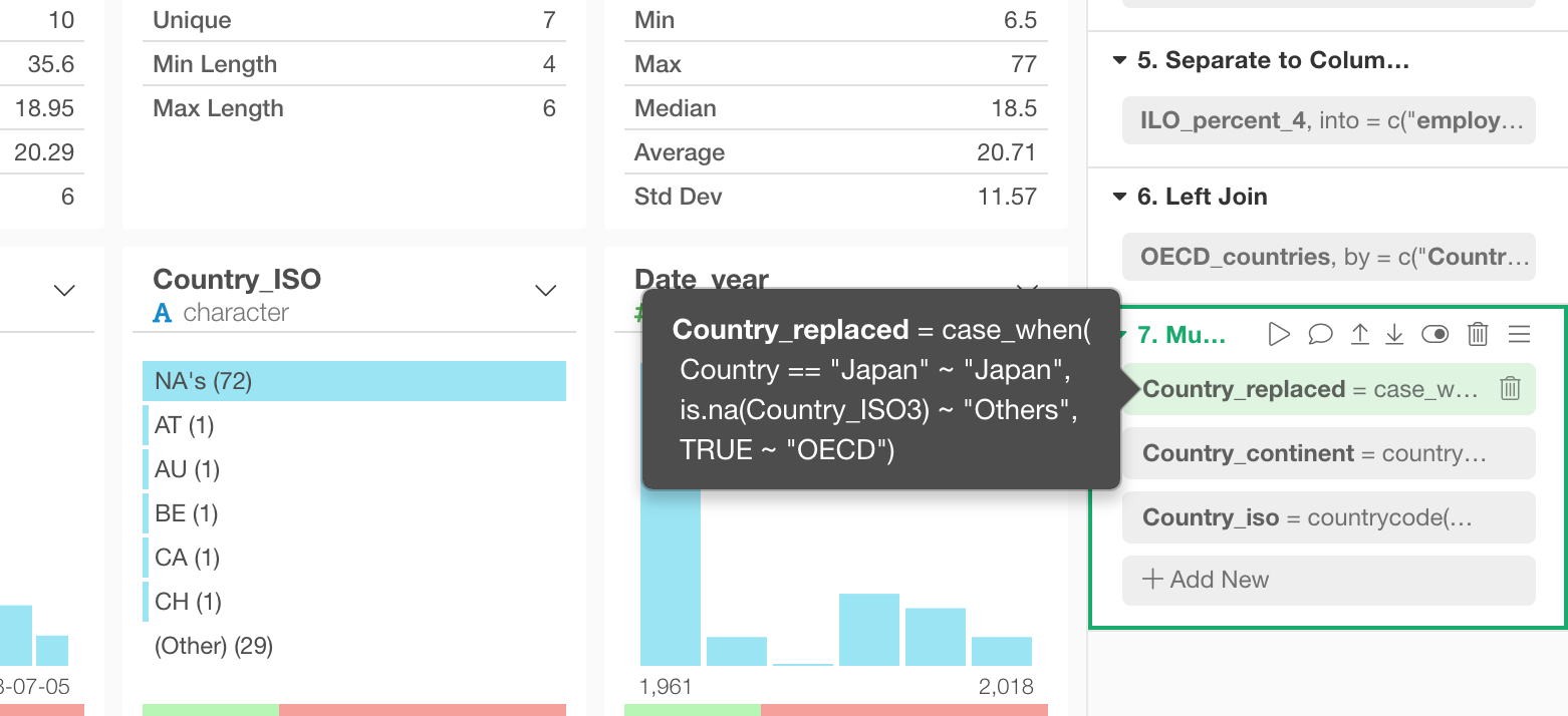
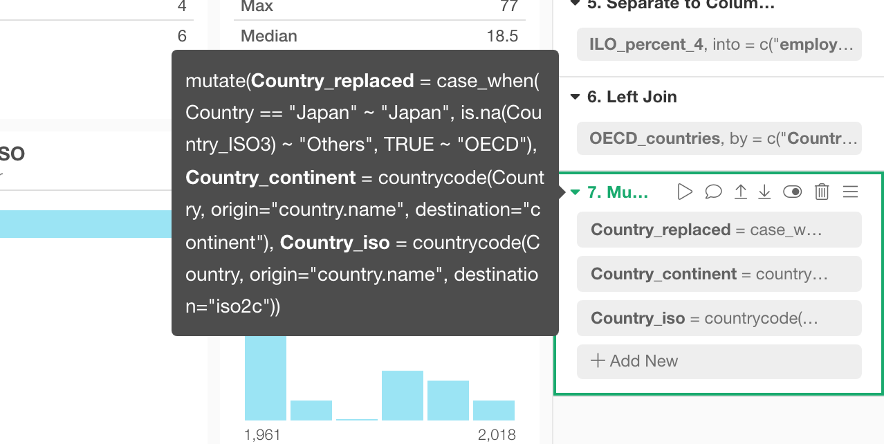
You can also move the pointer on top of the step title to see the entire R command for each step.
Highlight Related Tokens by Clicking on a Column in Table / Summary Views
Clicking on a column in Table or Summary view will highlight the tokens that use the column. This is useful especially when you want to know how the column has been created and how the change you are going to make to the column will impact the downstream.
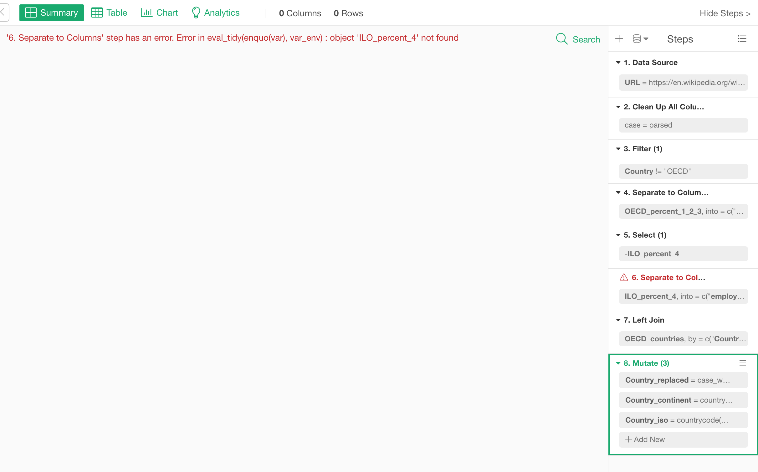
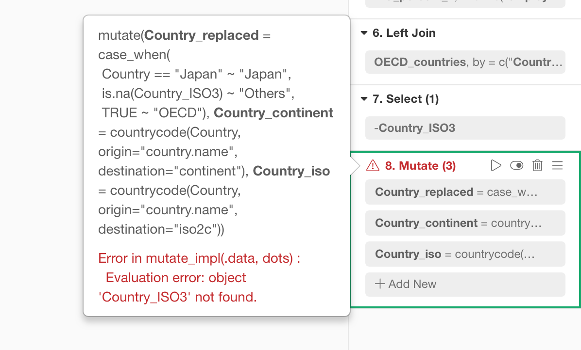
When you got an error
When you got an error somewhere in the data wrangling step, it now shows which step is producing the error in the error message at the top. Also, the invalid step is indicated by its title shown as Red color.
Here is an example when you have an error at the Step 6.
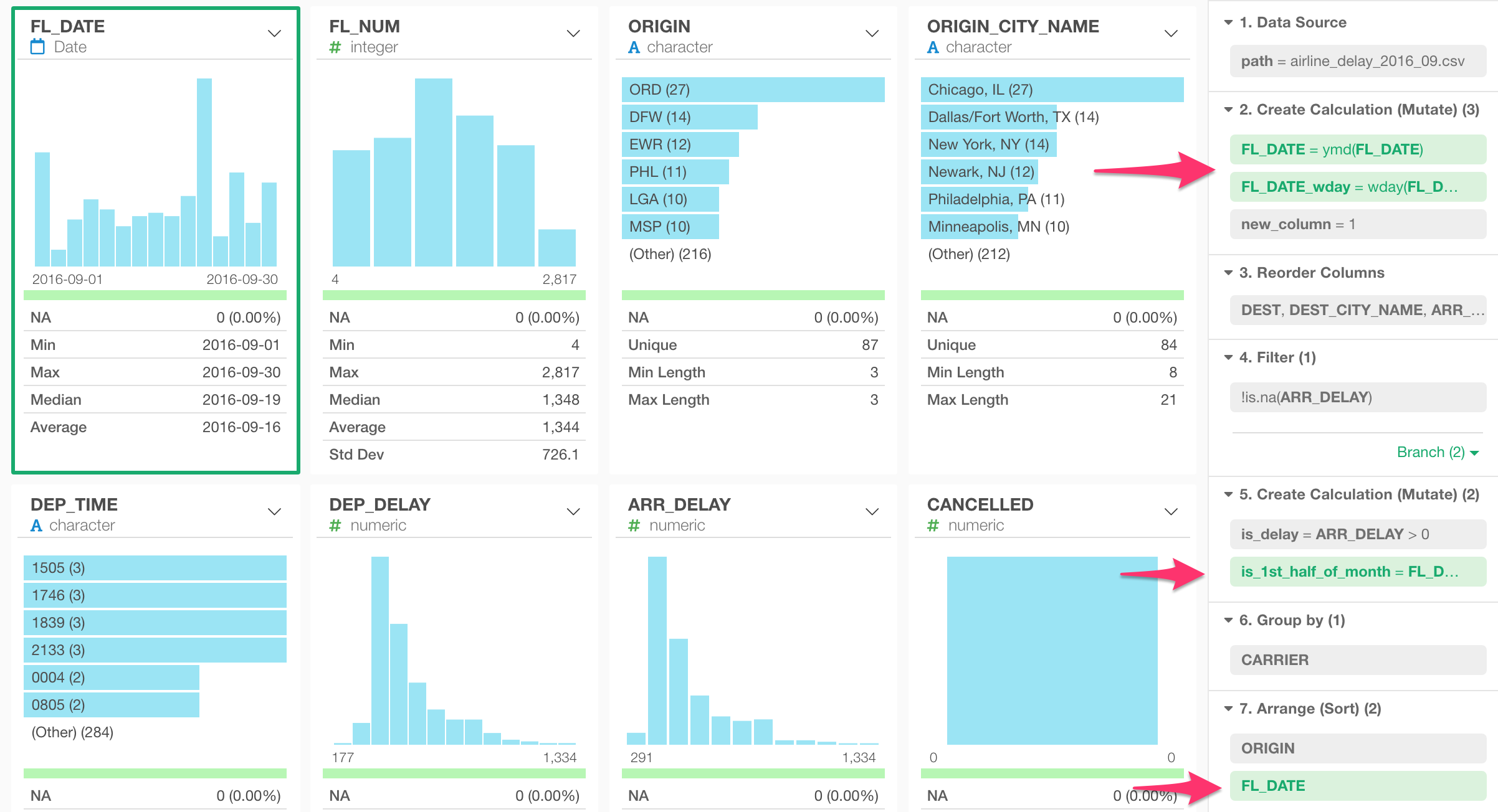
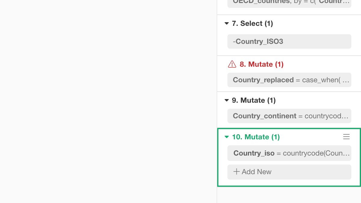
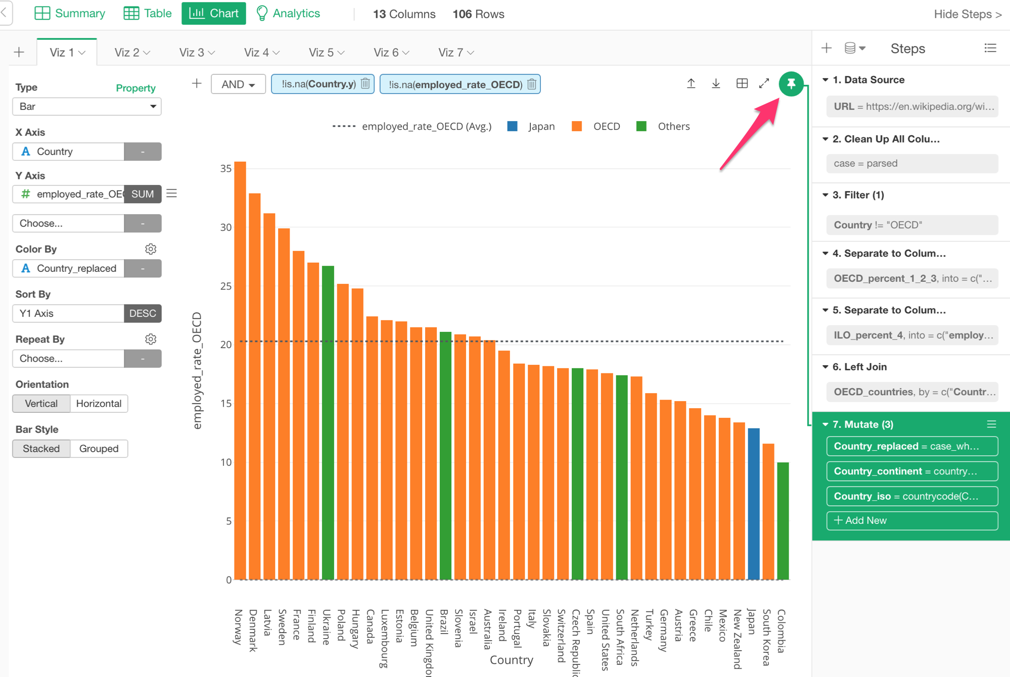
Split a Step into Multiple Steps
For the steps that can have multiple tokens like Mutate, Filter, etc. it might get harder to debug. Which token is producing the error?
For this, you can ‘ungroup’ the step into multiple steps.
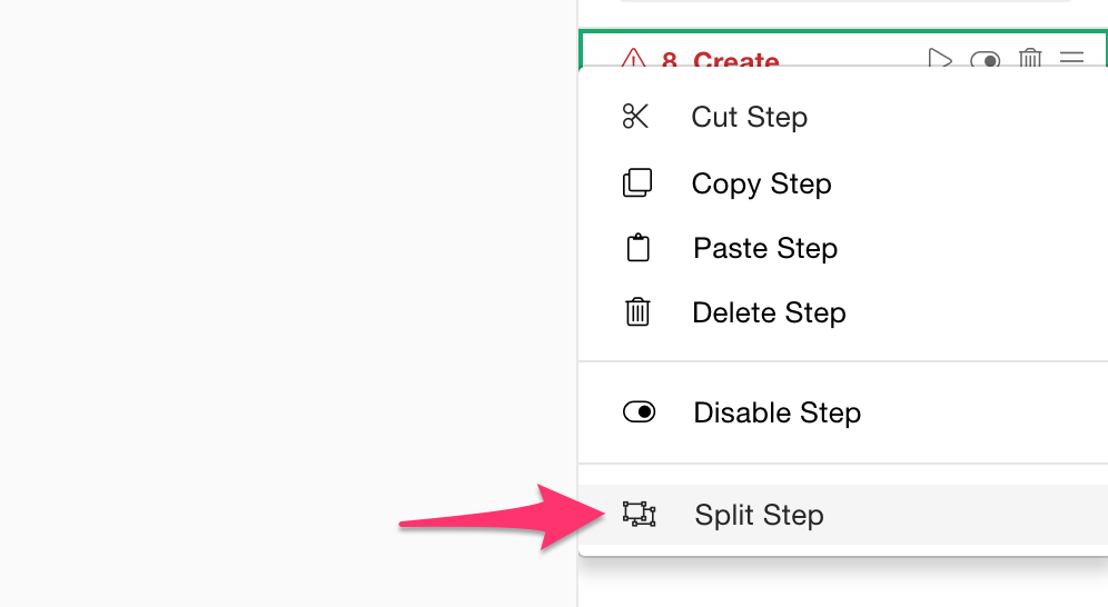
This will help you identify which operation is having the problem easier. In this case, you can see the first Mutate (Step 8) is having a problem.
Combine Multiple Steps into a Single Step
Can we get those tokens back together as a single step again?
Yes, you can!
Select multiple steps with Command / Control Key or Shift key, then click ‘Combine Multiple Steps’ icon.
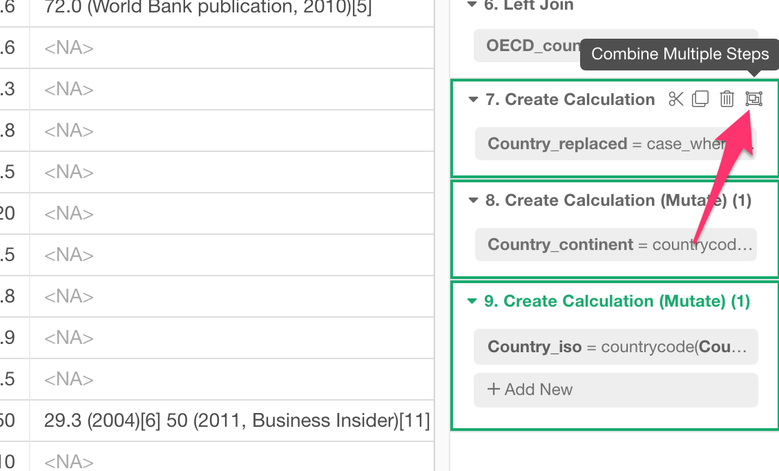
You will see a single step created which contains the three mutate operations as tokens.
Move Step
As you could do before, you can drag and drop the step to move them around even with this new UI. Just grab the title area of each step and move it to where you want to.
Also, it goes without saying that you can Copy, Cut, and Delete the steps just like before!
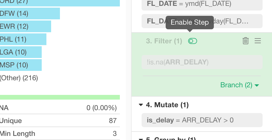
Disable Steps
You can quickly disable any step. This is useful when you want to quickly try running the steps with or without a particular step.
Just click ‘Disable Step’ icon to disable the step.
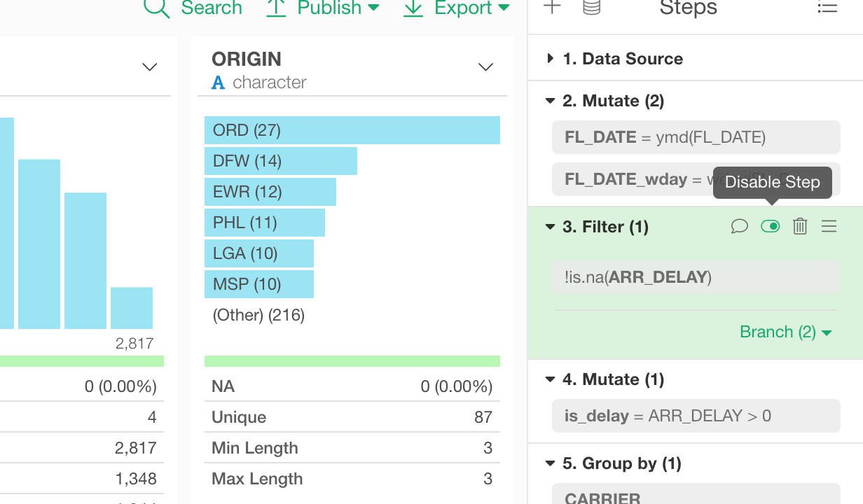
This will make the step grayed out and make the data wrangling steps to ignore the step when it runs.
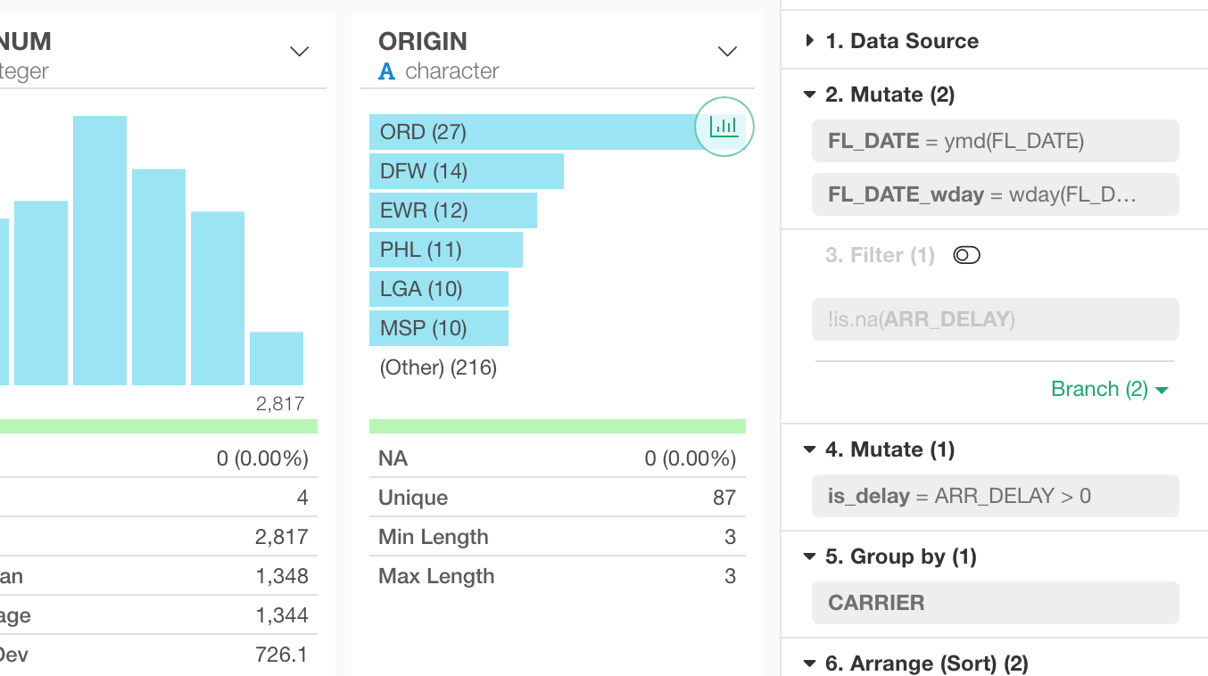
You can click ‘Enable Step’ icon to bring the step back quickly.
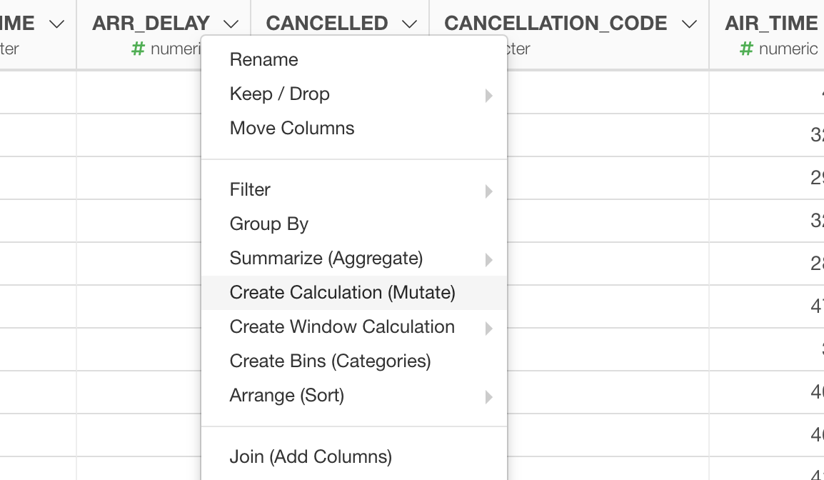
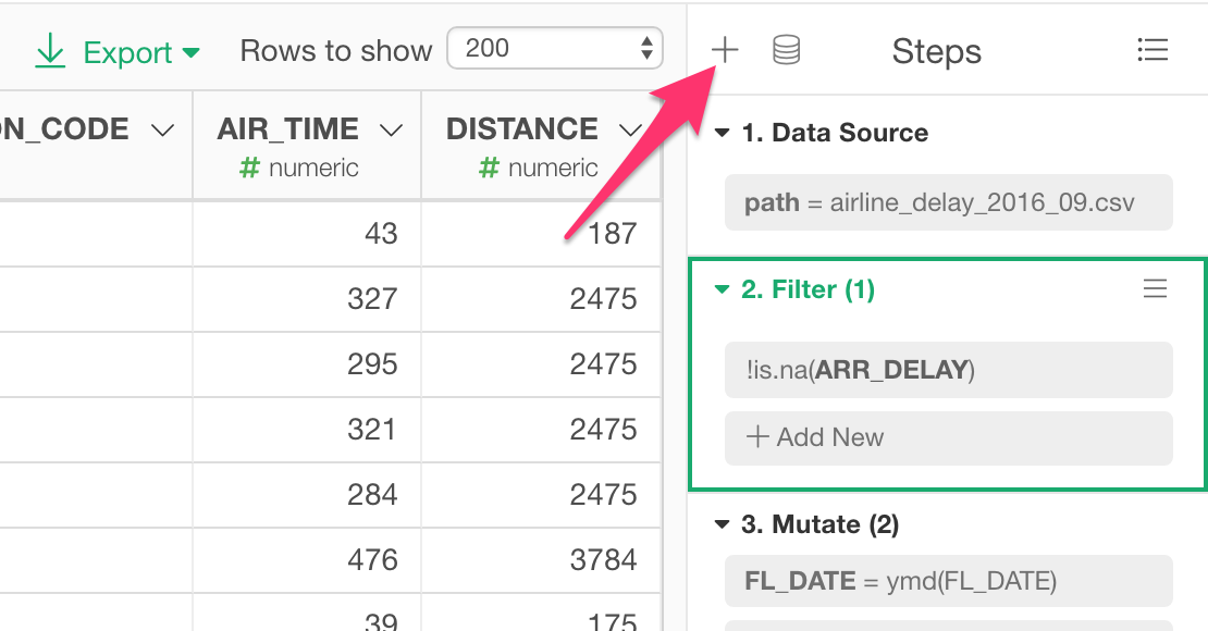
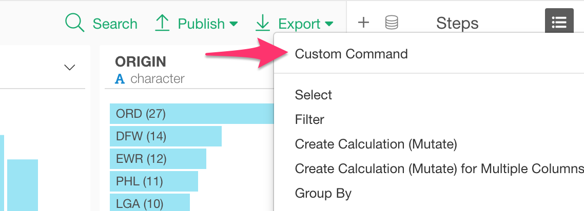
Add Steps
You can add the data wrangling steps either selecting a menu from the column header menu or selecting a command from the Plus button at the top of Step area.
Column Header Menu
Plus button at the top of Step
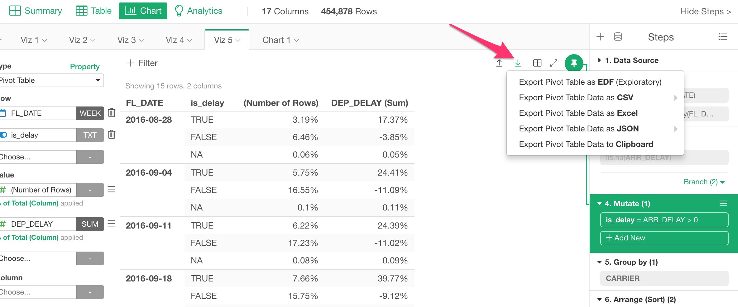
Data Export
There are two types of data you can export.
Step Data
This is to export the data that is generated at the selected step of the data wrangling pipeline.
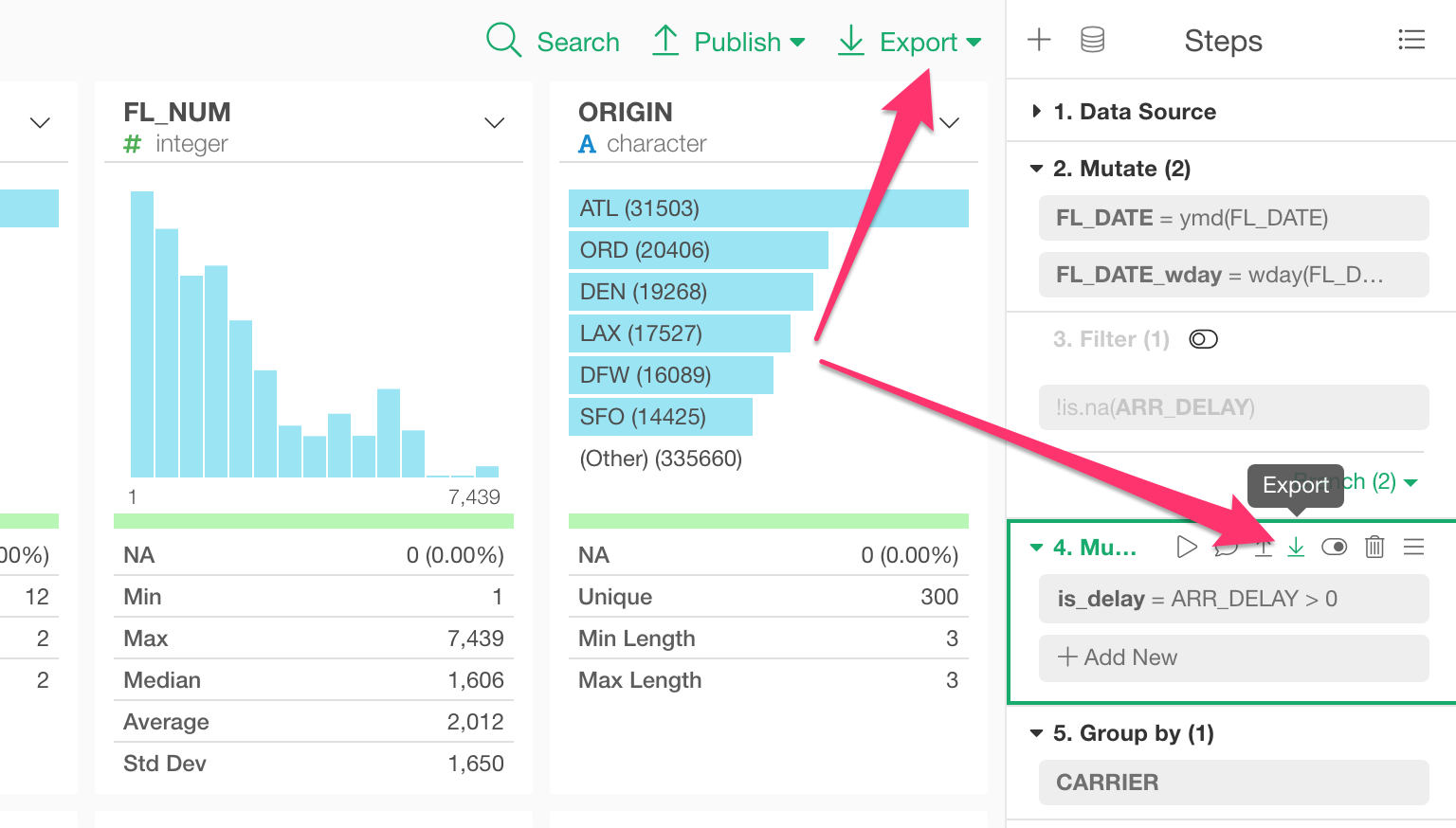
Chart / Analytics Data
This is to export the data that is produced by the chart or analytics.
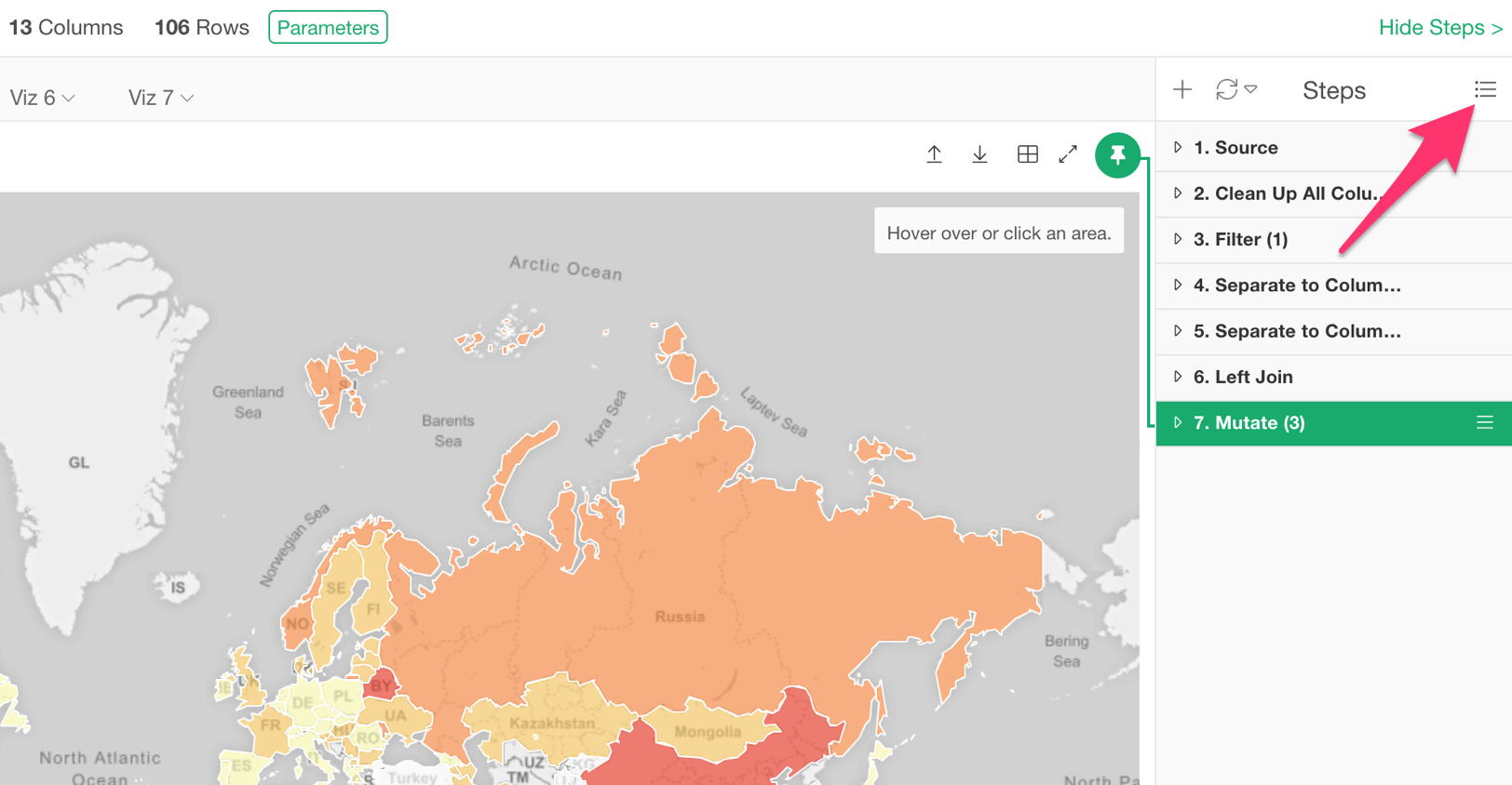
Expand and Collapse
One thing about data wrangling is that you can easily end up with a lot of steps, which makes it harder to see what is going on at a high level.
You can now click ‘Collapse’ button at the right hand side top to show only the titles of the steps.
Hide Step Area
The Data Wrangling Steps is a critical part of data analysis, but it’s not like you need to see them all the times. If so, you can hide it when you don’t need it.
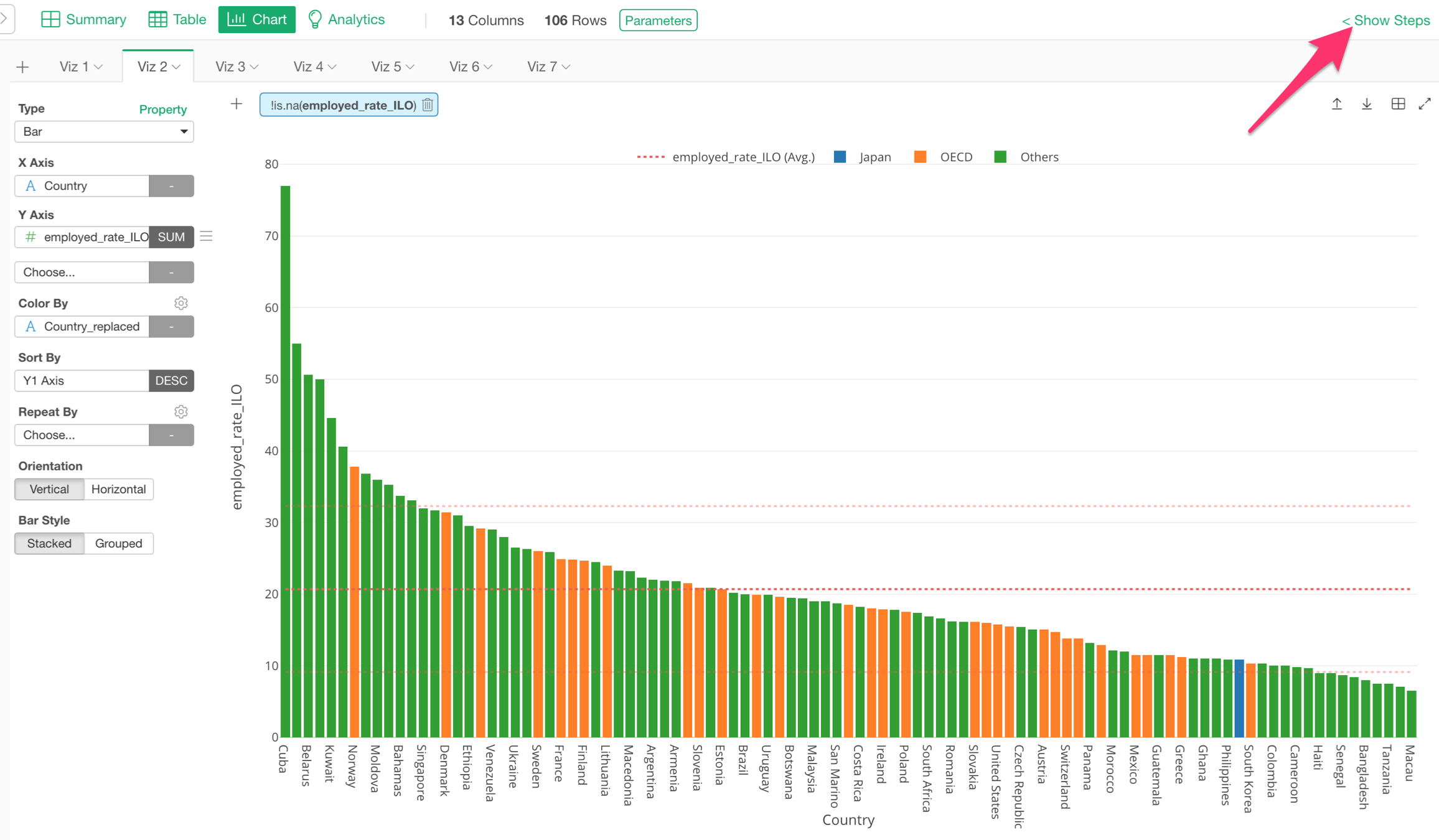
This will give more space for the chart and the analytics.
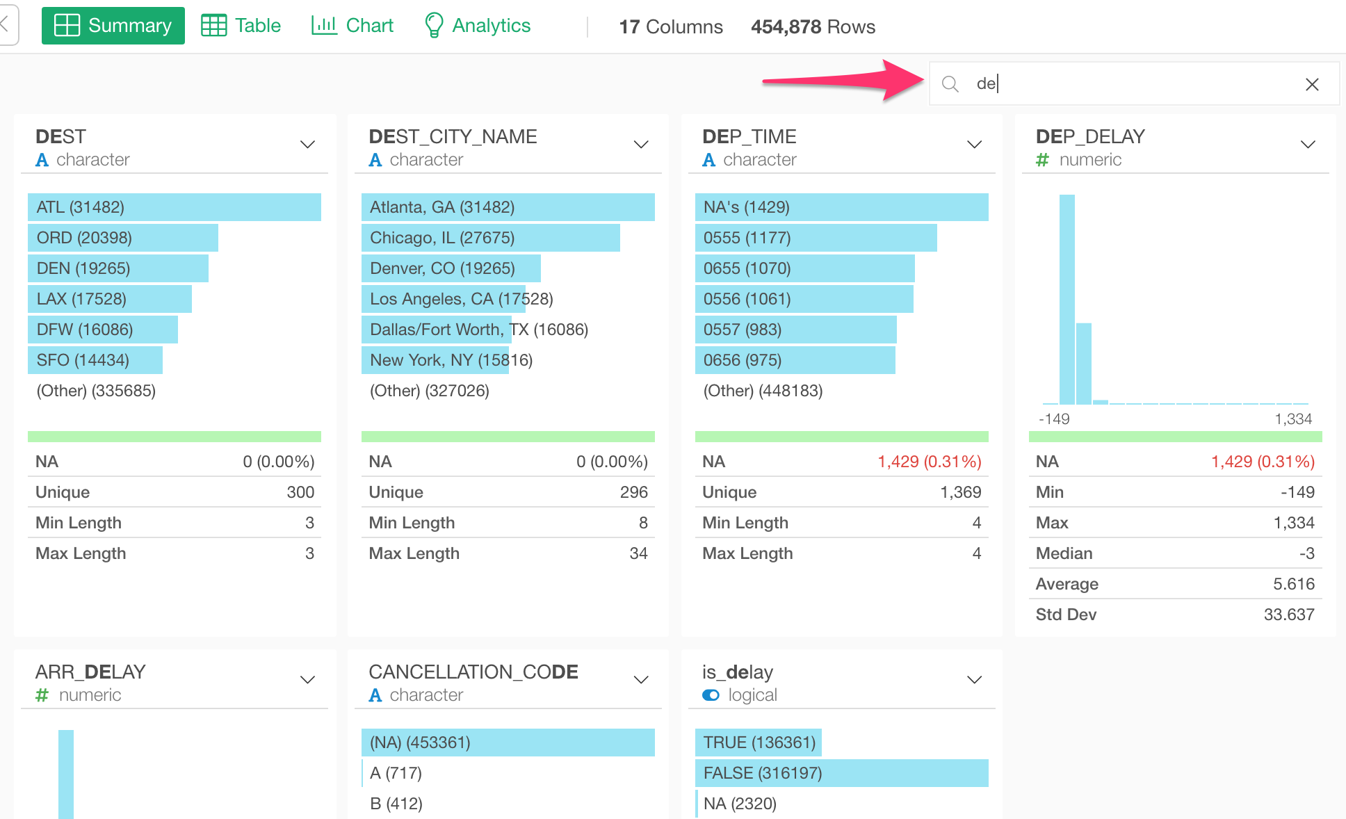
Summary
You can now search the columns under Summary view! This is useful when you have many columns.
Data Wrangling Command UIs
We want to keep making Data Wrangling easier and more fun by providing a great UI experience for each Data Wrangling command step.
In this release, we are introducing two new UIs for the data wrangling commands, Select and Reorder.
Select
In the new Select dialog, you can select the columns by clicking on them one by one or select multiple columns together by using Shift key quickly.
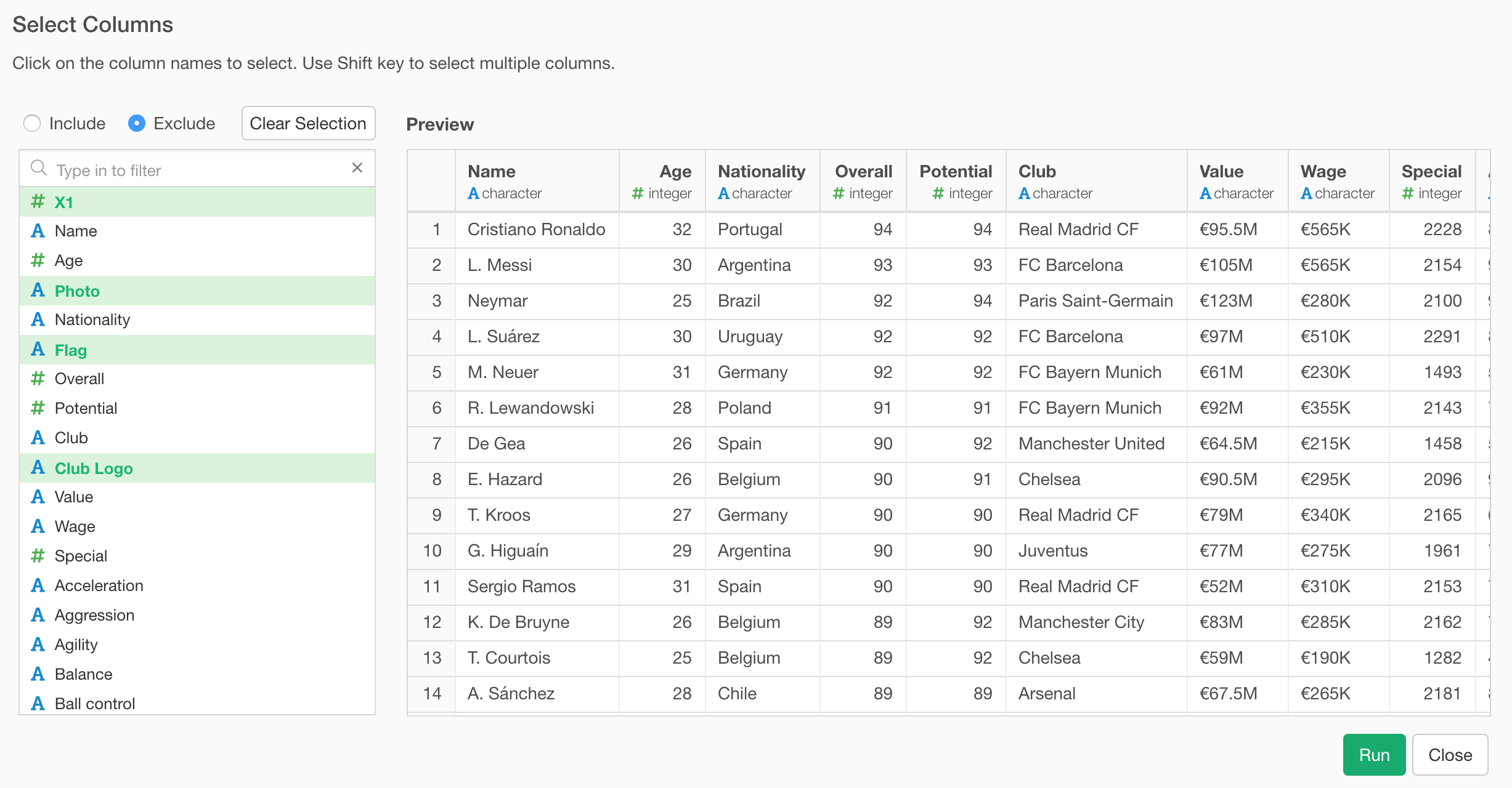
You can also search the columns by typing the name. This is useful when you have a large number of columns.
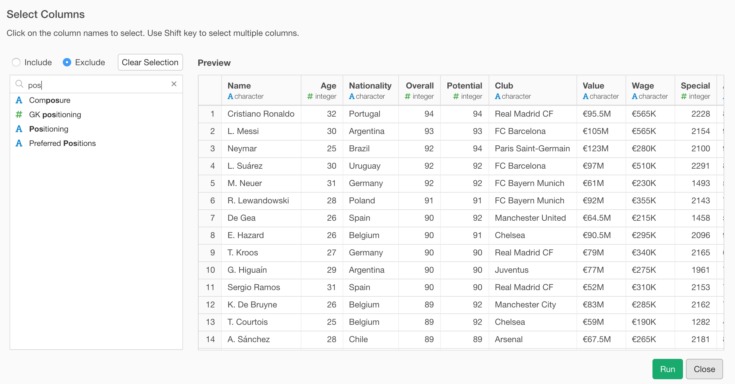
It supports two modes, one is to include the selected columns and another is to exclude the columns.
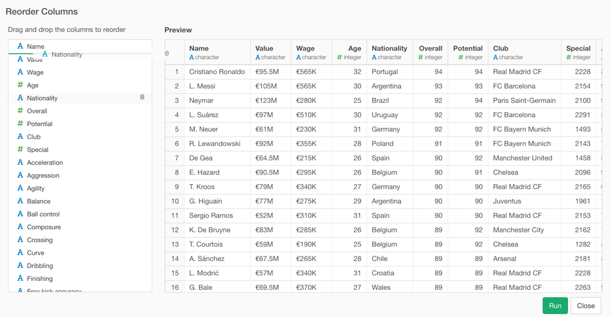
Reorder Columns
We have created a dedicated UI dialog where you can reorder the columns.
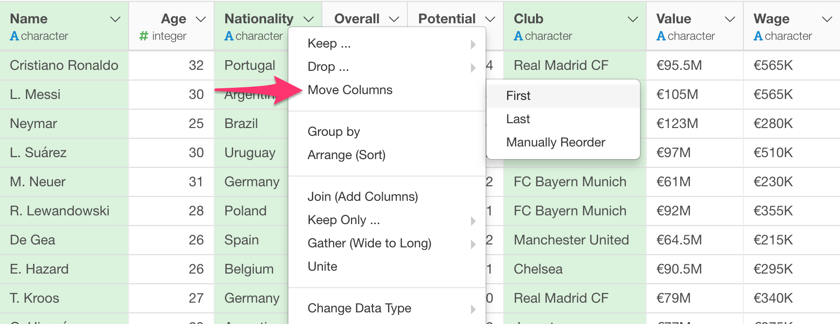
You can simply drag and drop the columns to reorder them.
Custom Command Step
One of my favorite capabilities of Exploratory is its extendability. And Data Wrangling is one big area where the extendability shines.
You can run any R command as a step as long as it takes a data frame as the input and returns a data frame as the output.
You can add Custom R Command step by selecting ‘Custom Command’.
And you can type the command in the new ‘Custom Command’ dialog.
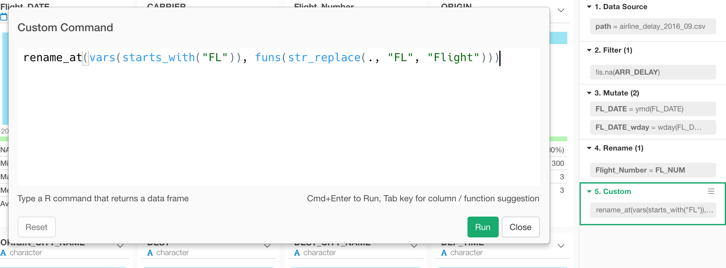
And, you can type the command in multiple lines now! ;)
Working with Timezone
Timezone in Table view
Working with the time sensitive data can get easily complicated because of the timezone.
When you import the data with time information but not with the timezone information, it will be recognized as UTC timezone. But of course, this can be wrong unless you live in the UTC timezone.
The timezone that is wrongly set is not the worst part of the problem. The worst part is that it’s hard to know how your time data is registered. Is that UTC? PT (US Pacific Time)? JT (Japan Time)?
So in v5.0, we have started to display the timezone along with the time information for all POSIXct data type columns.
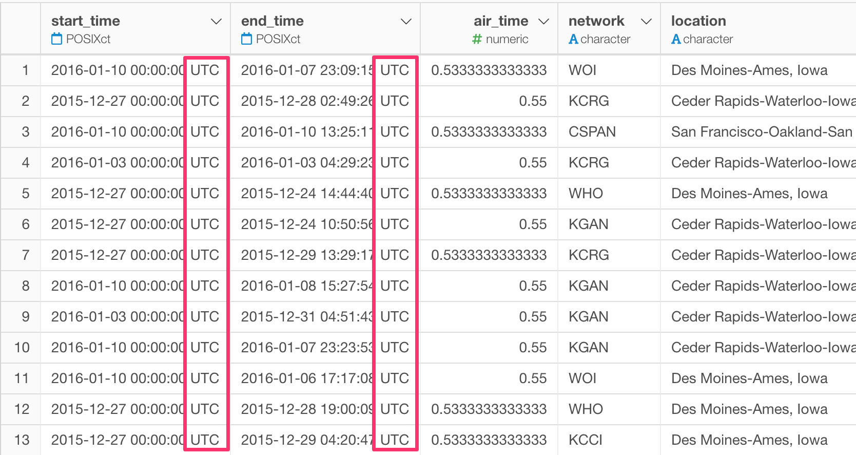
Once you know how the data is set for the timezone then it’s relatively easy to fix.
Check out the following note if you want to know how to convert or fix the time zone.
Folder Support in Catalog UI
When you have a lot of data frames in the same project, it becomes harder to organize them. So we are adding Folder support in v5.0. You can create folders and simply drag-and-drop data frames into them.
You can organize your Dashboard, Note, Slides by using ‘Folder’ as well, though they need to be still under Document section and not be together with Data Frames.
Visualization / Chart
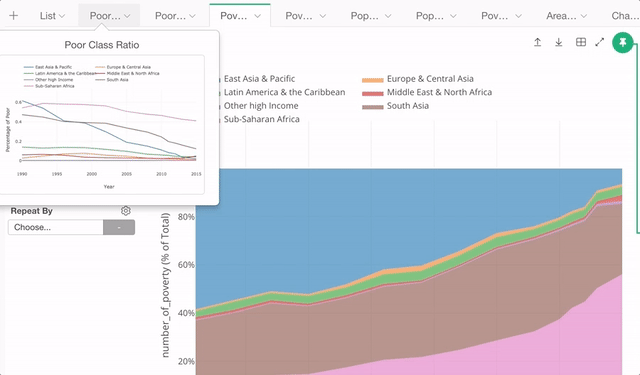
Chart Pinning
Chart “Pinning” is actually a super useful feature that is unique to Exploratory experience, if you know how it works.
The thing about this though, if you don’t know it, then you would get easily frustrated when you see your charts broken because some of the columns used in the charts don’t exist in the currently selected step.
So we have made a few changes in this area.
First, the chart “pinning” is the default behavior now. This means any new chart you will create will be ’Pinned" to the currently selected step.
The step that is ‘Pinned’ shows the green background to indicate that it’s ‘Pinned’.
But this also means that you will want to switch the “Pinned” step when you add a new data wrangling step because the chart is still ‘Pinned’ to the previous step. You can click the ‘Pin’ button to pin or un-pin just like you used to do previously to change the ‘Pinned’ step. But we didn’t stop here.
We wanted to make this ‘Pinning’ experience easier and more fun. So we have added a Drag and Drop support. In order to move the ‘Pinned’ step, you can simply drag the ‘Pin’ button and drop it to the step you want to ‘Pin’!
Chart Tab Scroll, No More Menu!
Here is another enhancement in Chart area. You will be able to just scroll the chart tabs when you have many charts and see the thumbnail images to see what those tabs are.
No more ‘More’ tab, if you know what I mean. ;)
Analytics
Decision Tree
Even when you have Random Forest, XGBoost, etc. at your fingertip, when it comes to communicating with others, Decision Tree still does a great job.
After getting many requests from our users, we’re finally adding it to Analytics view.
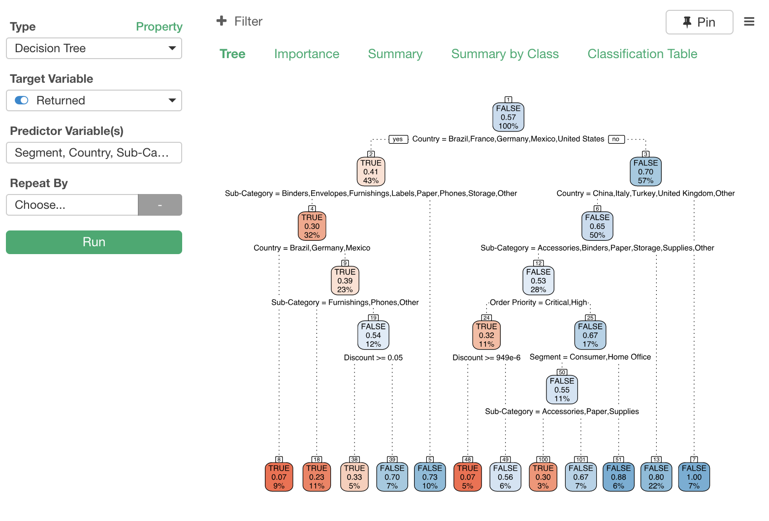
It has the following tabs for different types of information. They are very similar to what you would see with ‘Variable Importance with Random Forest’.
- Tree - this is a visualization of the tree that is built to predict the target variable.
- Importance - You can see which variables are more important to predict the target variable.
- Summary - You can see the prediction performance of the model.
- Summary by Class - You can see the performance for each class. For example, if you are building a model to predict a logical output (TRUE or FALSE) then you will have the prediction performance for TRUE and FALSE separately.
- Classification Table - This is what is known as Confusion Matrix. You can quickly compare the predicted result against the actual result and see which area this model is good at predicting for.
We are using ‘rpart.plot’ R package for this tree visualization.
Market Basket Analysis / Association Rules
Association Rules algorithm helps you understand what are the items that show up together. The common use case is to predict what customer would buy based on the other items they are buying already. Someone who bought diapers tend to buy a six-pack beer, for example.
There is a well known R package called ‘arules’, which implements the association algorithm, and Exploratory users have been using it via the command step. Now, with v5.0, you can access it under Analytics view!
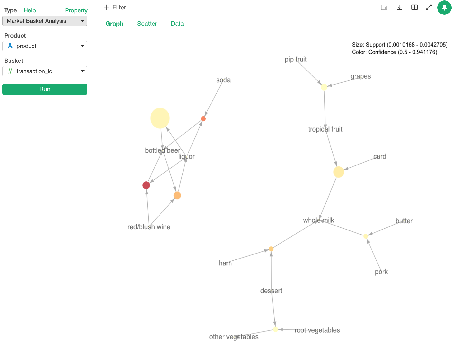
We wrote this blog post a while back to explain what the Association Rule algorithm does. The post was written based on the command step experience, but you can see what it is and how to interpret the output. We are planning to update it with this new Analytics view experience soon.
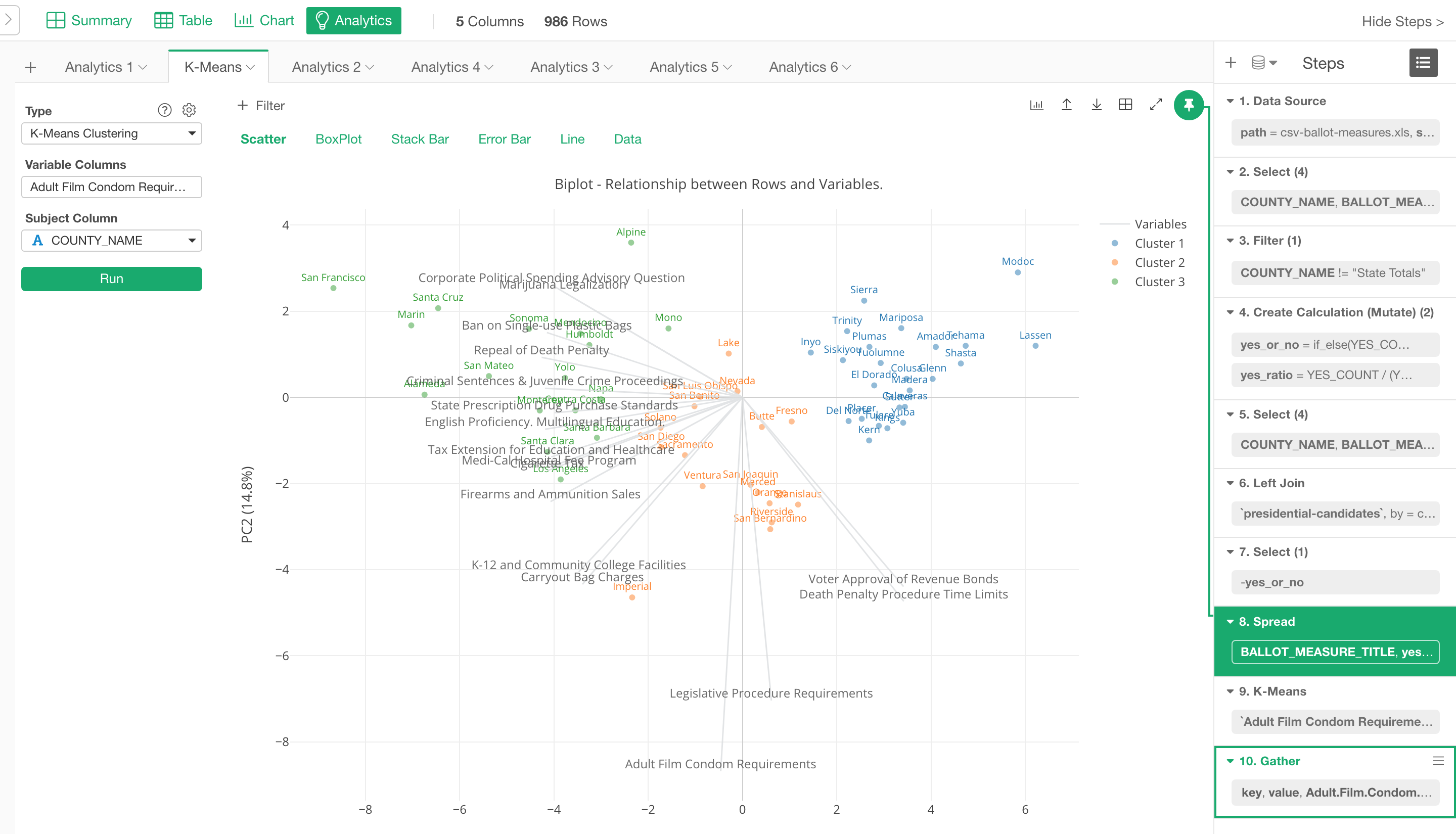
K-Means Clustering
We have added K-means Clustering to Analytics view!
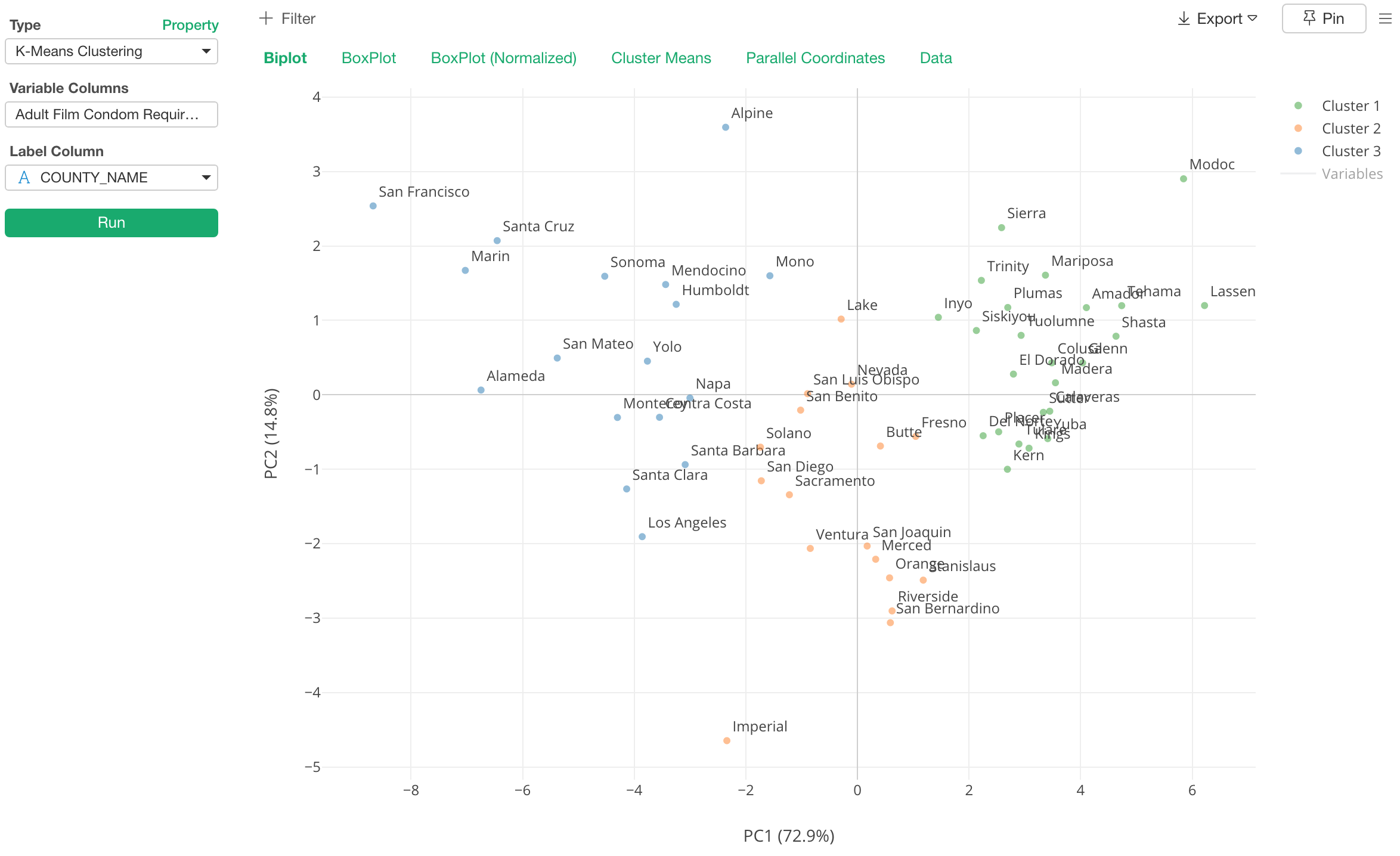
Even before v5.0, you could already run the K-means as the data wrangling step, which gives you the clustering score for each row. Then, you can visualize the result the way you want.
But there are two challenges for using K-means algorithm. One is, how to set ‘K’ as the number of the clusters you are going to build. Is that 5 or 10?
Another is, let’s say you got 5 clusters that your customers are grouped into, then what each cluster mean or how those clusters are different from one another?
So we are introducing K-means Clustering to Analytics view to address these two challenges. There are quite a lot to talk about this exciting new addition, so I’ve written a separate note dedicated to this feature. Take a look at the following note if you’re interested in.
- Introduction to K-Means Clustering under Analytics View - Link
Time Series Forecasting
We have added the following properties to ‘Time Series Forecasting (Prophet)’ to support some of the parameters of Prophet algorithm.
- Support for Holiday in Analytics View
- Lower Limit for Trend
Also, we are adding ‘Daily Seasonality View’ when the data contains the hourly level information.
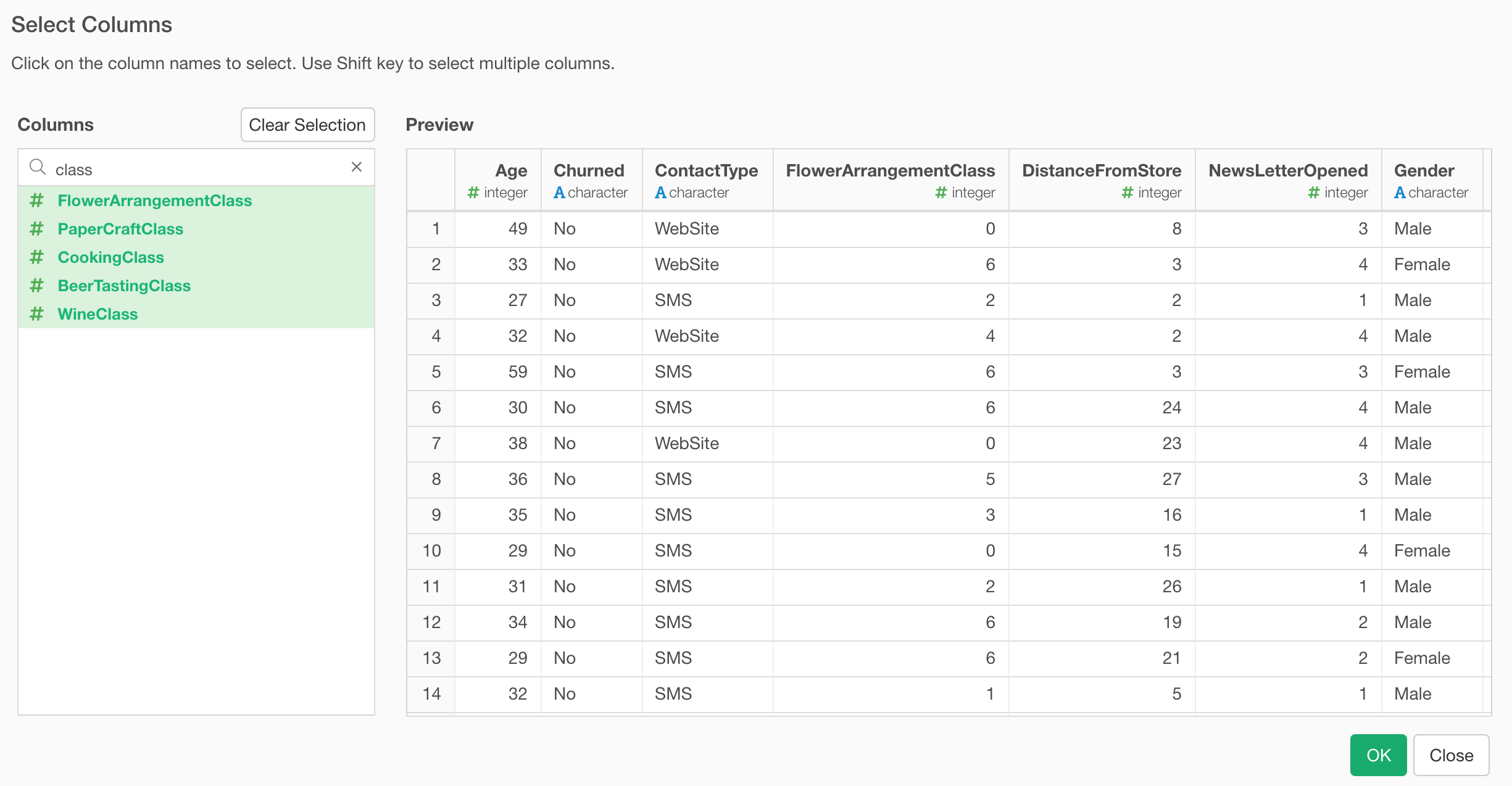
Column Selection
Selecting multiple variables under Analytics is now much easier thanks to the new Column Selection dialog.
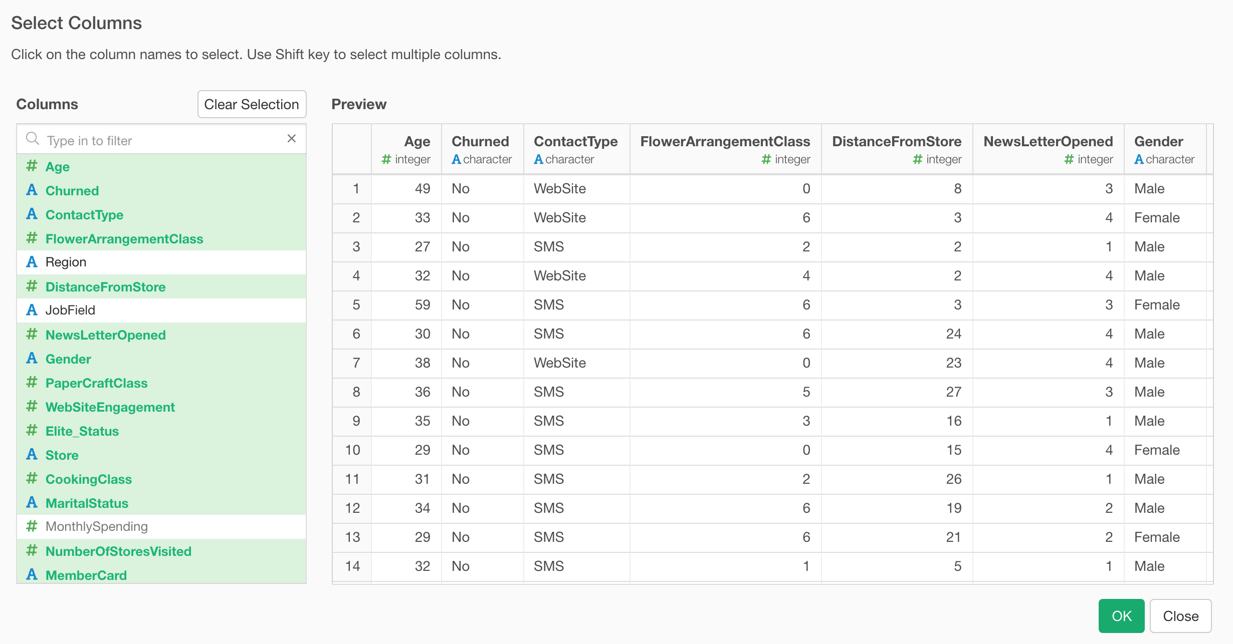
You can use the Shift key to select multiple columns quickly.
Also, you can search the columns that you are looking for.
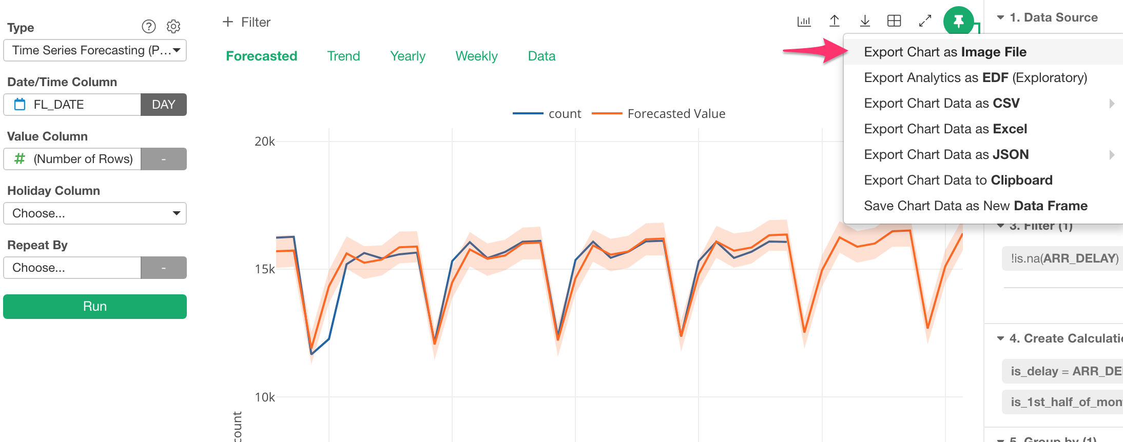
Export Chart as Image
We have received this request a lot in the past. And now you can do it! ;)
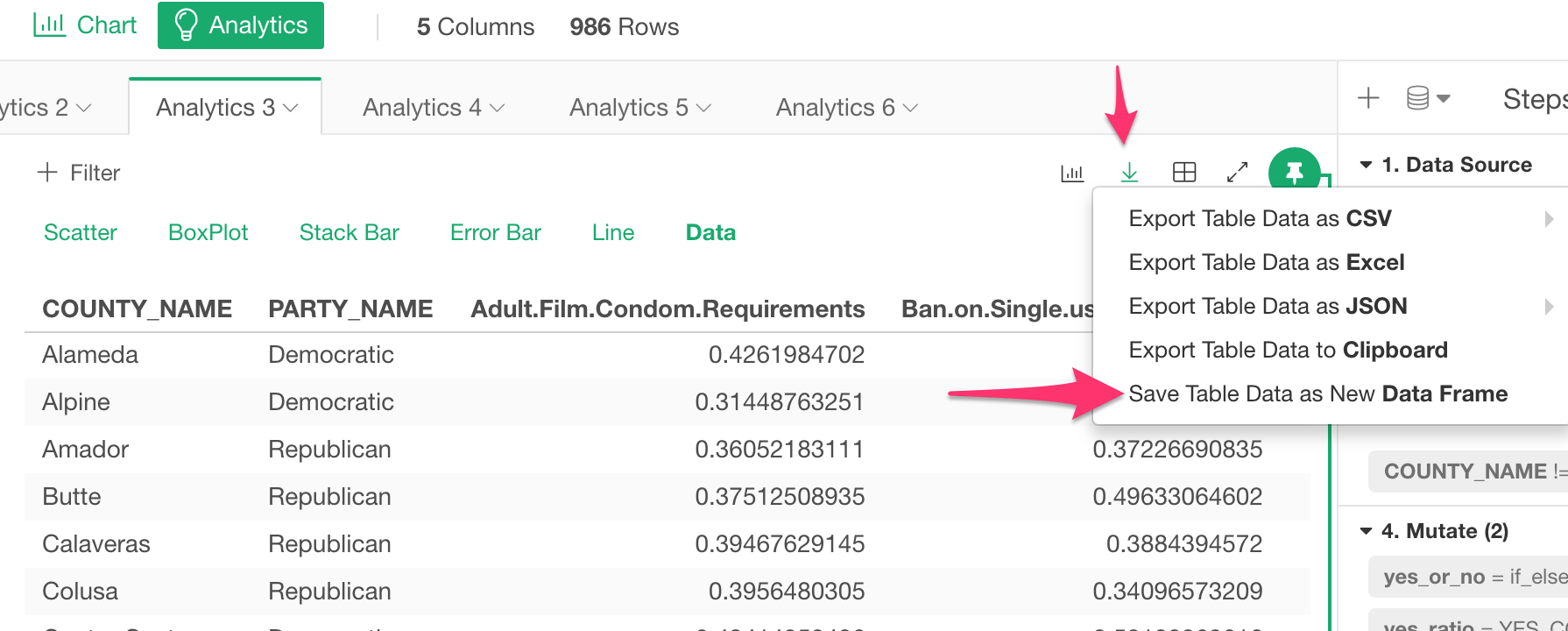
Create Data Frame with the Result
Running the analytics under Analytics view can produce valuable data. And sometimes you might want to use the data to visualize or for other data wrangling pipelines.
Now you can save the result as a new data frame by simply selecting ‘Save as New Data Frame.’
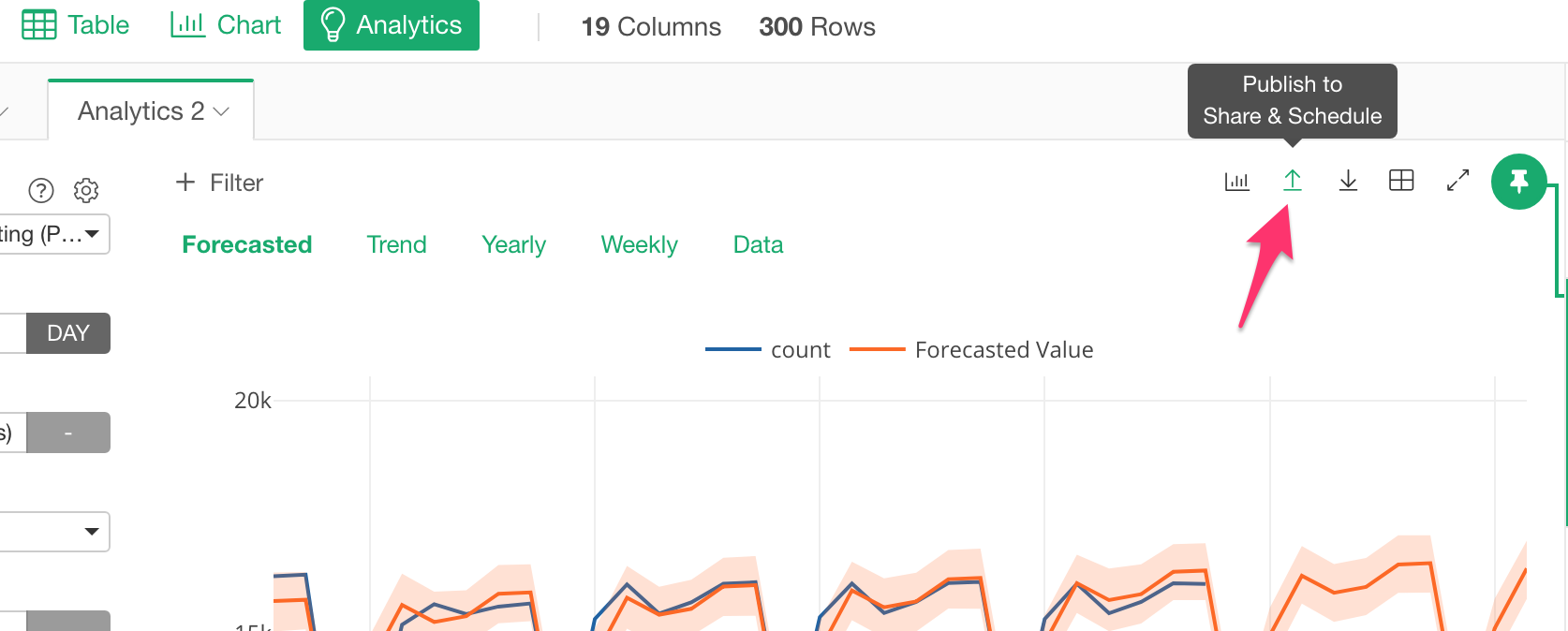
Publish Analytics
Now you can publish your Analytics to Exploratory Cloud or Exploratory Collaboration Server. This will make it easier to share your analytics with others, also you can embed the charts into your websites and schedule the analytics periodically.
Dashboard / Notes / Slides
Side-by-Side Mode vs. Single Mode
The ‘Side-by-Side’ view makes it much easier to write a Note while you see the outputs especially when there are charts and images inside the Note.
So, we have made Side-by-Side as the default mode. When you create a new Note or open the existing Notes it will open in Side-by-Side mode.
But sometimes, you might prefer the ‘Single View’ mode for a bigger space for writing. Then, you can simply click on ‘Single View Mode’ button to switch to ‘Single View’ mode.
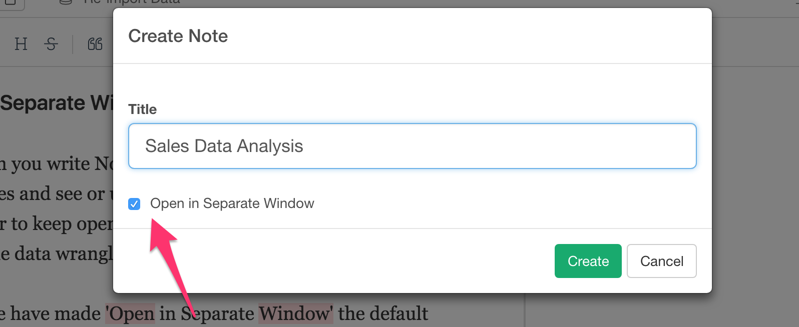
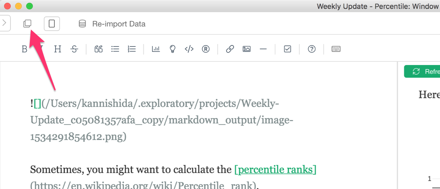
Open Note in a Separate Window
When you write Notes, often you want to go open the data frames and see or update the charts and analytics. So it’s much easier to keep opening Notes while you edit the charts or work on the data wrangling.
So we have made ‘Open in Separate Window’ the default behavior when you create a new note.
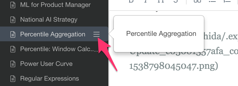
Also, now you can directly open existing Notes, Slides, and Dashboard in a separate window from the action menu, without closing the data frames that you are viewing.
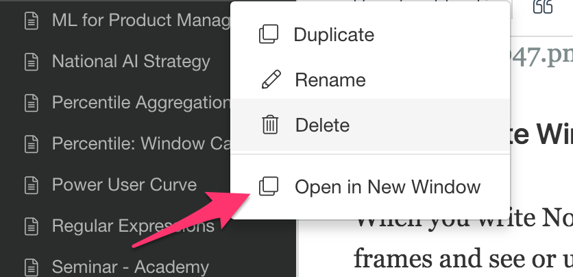
Even when you open Notes, Slides, and Dashboard in the main window, you can still open it in a separate window by clicking on this button.
Export Menu
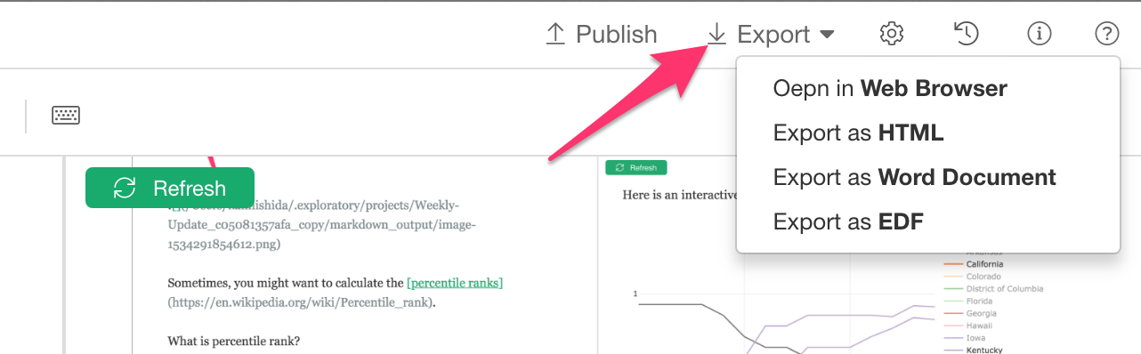
Now we support ‘Export to EDF’ for Notes, Slides, and Dashboard. It exports your Notes, Slides, and Dashboard in a reproducible format. This means that if your Notes, Slides, and Dashboard includes charts or analytics, their corresponding data frames are also going to be exported along. This makes it possible to share your Notes, Slides, and Dashboard with others who can later import the EDF into their Exploratory and reproduce all the data wrangling steps for the data to produce the final output of Notes, Slides, and Dashboard.
That’s it for the new features!
We still have many other enhancements and bug fixes. Take a look at the release note for the full list.
Make sure to download v5.0 from our download page to start exploring it today!
If you don’t have an Exploratory account yet, sign up from our website for 30 days free trial without a credit card! If your trial period has expired in the past but want to try this new version feel free to contact us at support@exploratory.io !
Lastly, if you happen to be a current student or teacher at schools, it’s free!
Happy Exploratory v5.0! 🍾
Cheers,
Kan