America’s Rural Areas Defined by Internet Access
Have you ever wondered where America’s rural lives?
U.S. Census Bureau and USDA define it as:
rural areas comprise open country and settlements with fewer than 2,500 residents; areas designated as rural can have population densities as high as 999 per square mile or as low as 1 person per square mile.
And based on the definition it would look like this.
I have visualized the population densities by US county on the map. The color shows the densities, the darker red means the higher densities and the lighter yellow means the lower densities.
From this picture, it looks that America’s rural areas are the areas between the central vertical line, if we can imaginary draw, and the western coastal areas of California, Oregon, Washington.
But this can be too simple because the word ‘rural’ sounds like the area where there is not much development or it’s behind in the modern development that we see in the urban areas. For example, in this day and age, we can have a huge territory where things are operated with modern high technology like robots or automated systems without a dense population and we can still produce an optimal output and have a modern lifestyle just like we do here in Silicon Valley.
So, what if we define the ‘rural’ based on the today’s modern technology point of view? For example, we can evaluate the areas based on how much of the population has the broadband or high speed Internet access.
And FCC (Federal Communication Commission) actually collects such data. For example, there is data about how many Internet access connections over 200 kbps by both US county level and US Census Tract level. You can download the county level data from here, and US Census Tract level data from here.
I have downloaded the county level data and quickly visualized it to see which areas have more accesses or less accesses.
Ratio of Internet Access Connections per Population
First, I have calculated the Internet access connections ratio by county, which is defined as below.
Number of Household Internet Accesses / Total Number of Households And here is the map showing the ratio.
The darker the red means the higher the ratio is.
We can already see that this view is not really correlated to the population densities we saw above. Though we can see many yellow areas, which means the lower Internet access counties, we can also notice that many of the counties in the Southern states are also less than 50% ratio, which is pretty low from today’s world standard.
High or Low by County
To make it even easier to see the trend among the counties, I have created a new measure which has two values of High and Low. High means that the counties have greater than 75% for the Internet access connections ratio, which means that more than 3 out of 4 households have Internet accesses. And Low means that they have less than 75% for the Internet access connections ratio.
high_or_low = if_else(house_ratio > 0.75, "High", "Low")Here’s the map showing the High and Low counties based on the above definition.
The red areas are the ones that have the high ratio of the Internet access. You can see there are some areas that comprise of counties with the high ratio. I have marked those areas below.
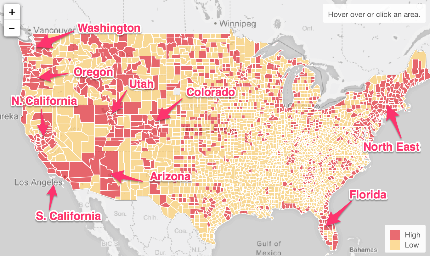
This is probably what most of us would have expected. These areas tended to be considered as ‘modern’ areas and there are many of the modern high tech startups especially in Software in these areas, though I didn’t expect Arizona would be one of them. (Sorry, nothing personal here!) Also, these areas are often considered as ‘liberal’ and tend to support the Democratic party, though there are a few exceptions like Utah and Arizona.
On the other hand, we can see that the vast areas in the South and Mid West have lower Internet accesses
Now, we can summarize this data at the State level so that we can see which states are more urban or more rural than the others. I wanted to see which states have more ‘High’ counties or ‘Low’ counties than the others. From the above picture alone, we can guess that the North Eastern states like Connecticut, Vermont, Massachusetts, etc. would be considered as ‘Modern’ states because it looks like most of the counties in those states have ‘High’ Internet access ratio. On the other hand, some of the Southern states like Ohio, Alabama, etc. would be considered as ‘Rural’ states because there are many ‘Low’ Internet access ratio counties in those states.
To find this out, we can simply summarize this county level data by State and calculate the ratio of the ‘High’ counties within each State like below.
   group_by(statename) %>%
   summarize(high_ratio = sum(house_ratio_replaced == "High") / n())
Basically, I’m counting the number of ‘High’ counties and dividing it by the number of the counties for each state.
We can visualize this result with Map like below.
The darker the red means the higher ratio of the ‘high’ Internet access counties. And the lighter the yellow means the opposite. As I have expected, some of the states like California, Utah, and North Eastern states have the high ratio of the ‘high’ counties. On the other hand, some of the states like Alabama, Oklahoma, Mississippi, Arkansas, Louisiana, Tennessee, Kentucky, Missouri, Virginia, West Virginia, etc. which are located at the east side of the South and are colored as light yellow have many areas that have lower ratio of the Internet accesses.
Conclusion
In this day and age, the Internet access to me is a basic human right. It gives us not only a gateway to all the information the world is accumulating, but also a gateway to new opportunities for building carriers, personal growth, better education, starting new businesses, etc. Therefore, not having enough Internet access to me is the ‘rural’ areas where especially many young people want to leave from.
With the recent US Presidential Election turmoil with ‘fake news’, it’s actually ironic that the people that are considered to have been made to believe such ‘fake news’ are the ones who are living in ‘low’ Internet access areas. Maybe we are overestimating the influence of ‘fake news’ on the last election or maybe that the way the ‘fake news’ spreads among people in these areas is different from what we know.
This analysis is done by Exploratory, the modern data science tool for non-programmers. If you are interested in, sign up from here for a free trial. If you are a student or teacher it’s free!
R Code to Prepare the Data for this Analysis
For the County level map data.
# Set libPaths.
.libPaths("/Users/---/.exploratory/R/3.4")

# Load required packages.
library(readxl)
library(forcats)
library(dplyr)
library(exploratory)

# Steps to produce the output
exploratory::read_excel_file( "/Users/kannishida/Dropbox/Data/County Connections Jun 2016.xlsx", sheet = "County Connections Jun 2016", na="NA, -9999", skip=0, col_names=TRUE, trim_ws=FALSE) %>% exploratory::clean_data_frame() %>%
  mutate_if(is.numeric, funs(na_if(., -9999))) %>%
  mutate(ratio = na_if(ratio, -9999), ratio = if_else(ratio > 1, 1, ratio), house_ratio = coalesce(round(consumer/hhs, 2), 0), house_ratio = if_else(house_ratio>1, 1, house_ratio), house_ratio_replaced = case_when(house_ratio > 0.75 ~ "High",
house_ratio > 0.5 ~ "Mid High",
house_ratio > 0.25 ~ "Mid Low",
TRUE ~ "Low"), house_ratio_replaced = fct_relevel(house_ratio_replaced, "High", "Mid High", "Mid Low","Low")) %>%
  mutate(high_low = case_when(house_ratio > 0.75 ~ "High",
TRUE ~ "Low"))
For the State level map data.
# Set libPaths.
.libPaths("/Users/kannishida/.exploratory/R/3.4")

# Load required packages.
library(readxl)
library(forcats)
library(dplyr)
library(exploratory)

# Steps to produce the output
exploratory::read_excel_file( "/Users/kannishida/Dropbox/Data/County Connections Jun 2016.xlsx", sheet = "County Connections Jun 2016", na="NA, -9999", skip=0, col_names=TRUE, trim_ws=FALSE) %>% exploratory::clean_data_frame() %>%
  mutate_if(is.numeric, funs(na_if(., -9999))) %>%
  mutate(ratio = na_if(ratio, -9999), ratio = if_else(ratio > 1, 1, ratio), house_ratio = coalesce(round(consumer/hhs, 2), 0), house_ratio = if_else(house_ratio>1, 1, house_ratio), house_ratio_replaced = case_when(house_ratio > 0.75 ~ "High",
house_ratio > 0.5 ~ "Mid High",
house_ratio > 0.25 ~ "Mid Low",
TRUE ~ "Low"), house_ratio_replaced = fct_relevel(house_ratio_replaced, "High", "Mid High", "Mid Low","Low")) %>%
  group_by(statename) %>%
  summarize(high_ratio = sum(house_ratio_replaced == "High") / n())