Show Animated Chart
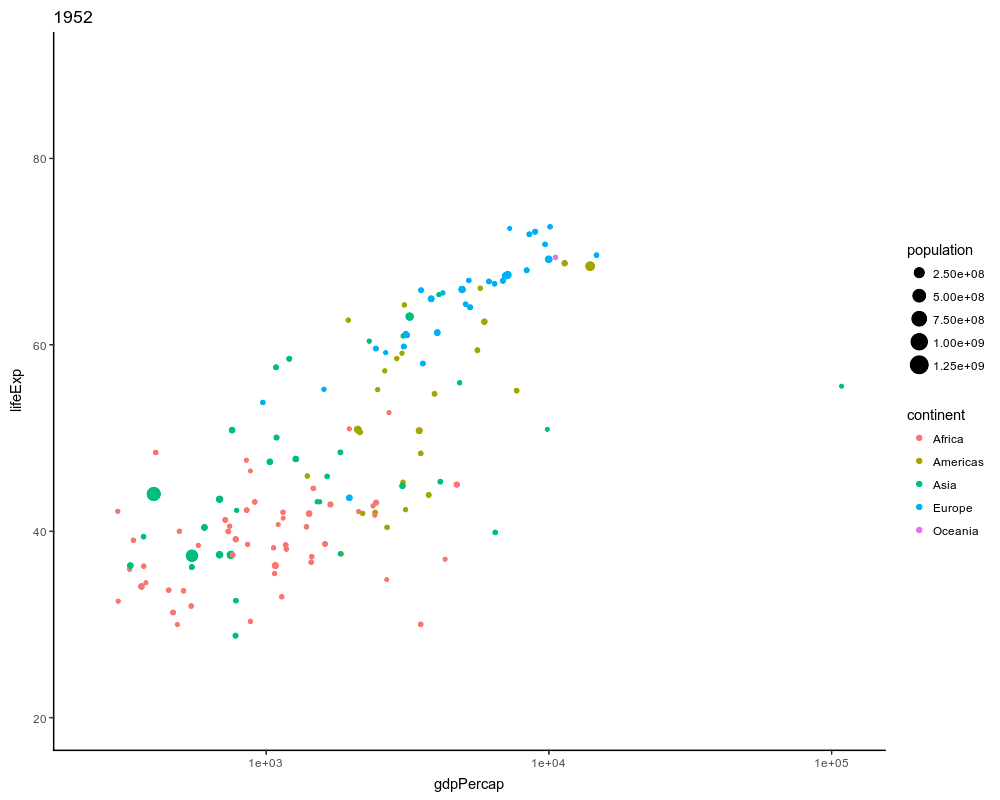
You can use ‘magick’ package to make your chart animated. Here’s an example of using the ggplot2 package to generate a series of the charts, each of which represent each year of the data, and using the magick package to make them animate. The data is from ‘gapminder’ and it investigates the relationship between the life expectancy and GDP for each country.