Are San Francisco Bay Water Temperatures Rising?
I’ve found this San Francisco Bay’s water quality data collected from 1969 to 2015 by the U.S. Geological Survey agency, thanks to Jeremy Singer-Vine’s weekly news letter ‘Data is Plural’ last week. They are collected at about 40 stations in the Bay as shown below for metrics such as temperature, salinity, chlorophyll, oxygen, nitrate, ammonium, etc.
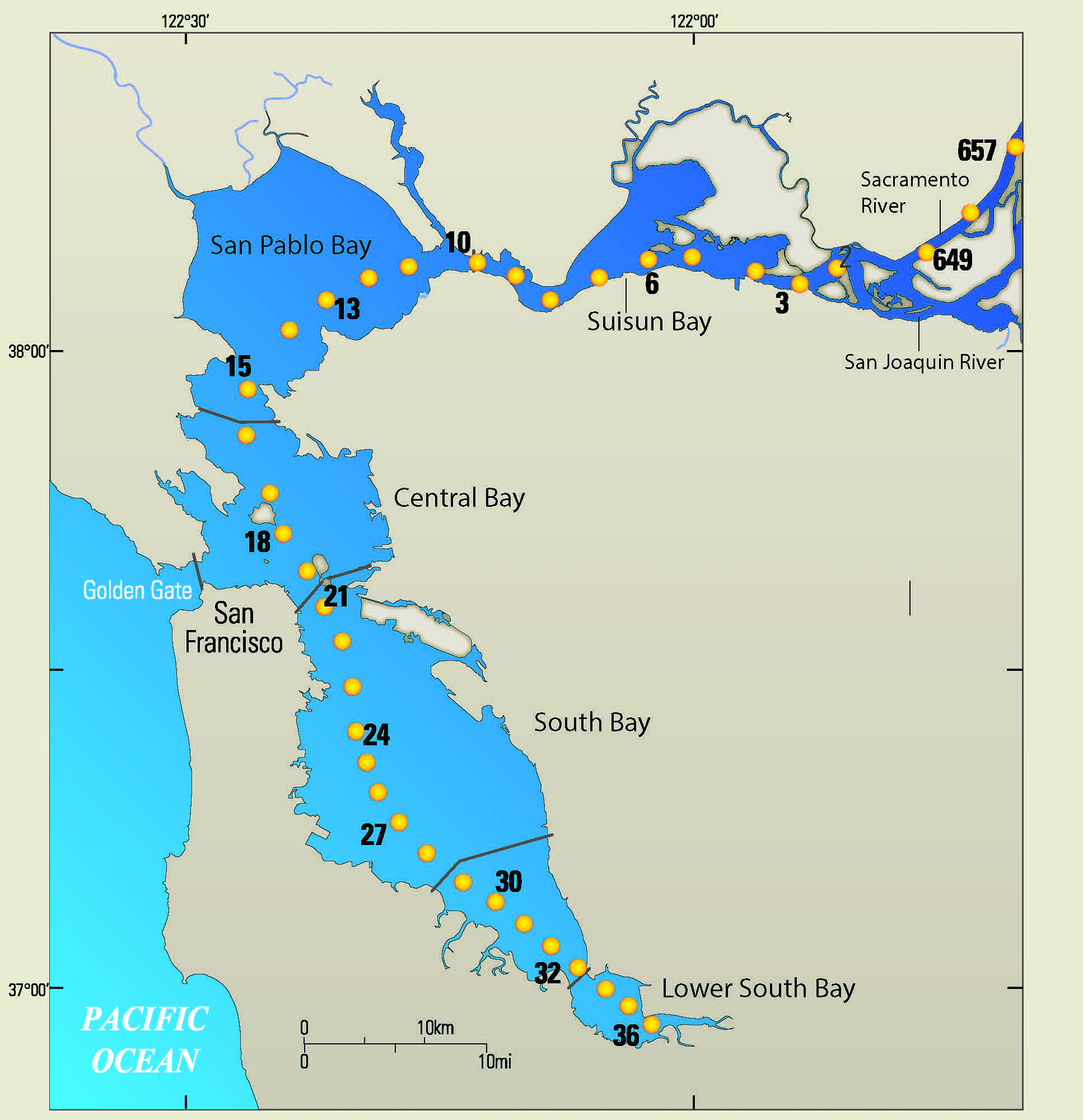
Map of Sampling Stations
The South end of the bay is where the cities like San Jose, Cupertino (Apple), Mountain View (Google) are located. The North end of the bay is where cities like Napa, Vallejo, are located. And at the middle around the station 18 to 21, there are cities like San Francisco, Oakland, Berkeley.
When I found this data, I had only one question I wanted to answer. That is, Are water temperatures of San Francisco Bay rising? We know that the temperatures have been rising around the globe, but is that true for the water in the Bay, too?
Let’s start exploring this data.
Trend of Average Water Temperatures Over the Years
First, let’s see a trend of the monthly average water temperatures for the last 60 years.
As you would guess, the temperatures have a yearly seasonal trend, which means that they tend to be higher in summer time and tend to be lower in winter time. This is why we are seeing those ups and downs. We can change the measure from monthly average to yearly average.
Looks like the last few years of the data are showing the upward trend, but when we compare it to the entire period, it’s hard to say the temperatures are really rising.
Distribution of Temperatures
The thing we need to be careful with the average is that it can be distorted when there are extreme values, in this case, the temperatures. For example, if we happen to have very high temperatures in summer period in a particular year the average can be skewed towards to the high. To address this concern, we can see the distribution of the temperatures for each year.
Distribution by Month
Here is a boxplot chart to show the distribution of the temperatures for each year.
We can see that some years like 2013 have very wide spread between the lowest and highest degrees.
Distribution by Location
Another thing is that these temperatures are collected at 40 different locations in the Bay. And given that the air temperatures are very different among those locations, probably the water temperatures are also different. For example, San Francisco is known for the coldest weather in the whole Bay area.
We can use the same boxplot chart but this time we assign the stations at X-Axis so that we can see the distribution of the water temperatures by the locations.
The one with the most narrowest distribution at the center is the station closest to San Francisco. As contrary to my guess though, while the median water temperature of the station 19, which is shown as the center line in the box, is indeed the coldest are not the coldest, it doesn’t get too cold compared to other locations.
Distribution by Month and Location
We can switch to a scatter chart and use color to represent the month names, and see how those temperatures are distributed in more detail.
We can see that those higher part of the distribution are the summer months like June, July, August, September, etc., while the lower part of them are the winter months like December, January, February, etc. Also, we can see that January is the coldest month among all the locations.
Trend over Years by Month
Now that we know there are good degrees of differences within each year, let’s take a look at the temperatures trend for each month.
We can see some months like March, April, September, etc. shows a bit of rising after year 2010, though not intuitively significant by looking at all these months.
We also know by this time that there are good degrees of differences among the locations, we can create the same chart for each location.
Since there are too many locations shown here, I have grouped them to a third of the locations, for example, the stations of 0, 1, and 2 become 0, the stations of 3, 4, and 5 become 3, and so on. And, calculated the average temperatures for each group.
We can kind of see some degrees of upper trends towards to the end of each line for most locations. But, when we look at the trend of all the years it’s hard to conclude that the temperatures are rising in a linear fashion.
Using Time Series Data Forecasting Algorithm ‘Prophet’
Finally, I’ve used the state of art algorithms for forecasting time series data called ‘Prophet’ from Facebook’s data science team. This algorithm would detect the trend from the data automatically and return the future data by forecasting. Here, we are not interested in forecasting the data, but we are interested in the trend itself that is detected by the algorithm in order to see if there is any upward or downward trends in this historical temperatures data.
And here is the result.
The blue lines represent the temperatures while the green lines are the trend.
We can see some areas are showing the rise of the water temperatures especially after year 2000.
To make it easier to see the trend, I’ve setup the chart below to not start from zero at Y-Axis, and to not sync the Y-Axis scales among all the charts. (I’m usually against this practice by the way, but there are always exceptions as many things in life. 😎)
Now we can see the trend much better. For most of the locations, there is a somewhat upward trend throughout the years, but the trends accelerate after around 2010.
To conclude, the water temperatures in the Bay seem to be rising, especially in the last decade.
I’m not sure if this is a general trend in other areas like Pacific Ocean, Caribbean Ocean, Atlantic Ocean, etc. If so, then this might explain those crazy hurricanes in the recent years, which seems to be only growing larger and worse. But that is just a question at this point, and I will need to find other data sets to do similar analysis for those regions.