15 Cool Things You Can Do with Charts in Exploratory
You can do many things with Chart in Exploratory. I’ve compiled 15 cool (and of course useful!) things as a quick introduction.
- Date / Time Aggregation
- Aggregation Functions
- Multiple Lines by Color
- Multiple Lines by Multiple Columns
- Dual Y-Axis (Y1 and Y2)
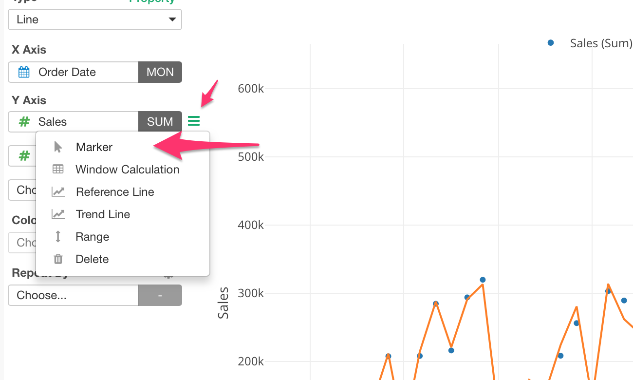
- Marker (Line, Bar, Circle)
- Multiple Charts by Category (Subplot)
- Trend Line
- Reference Line
- Window Calculations
- Highlight
- Binning (Categorize Numbers)
- Limit Values
- Missing Values Handling
- Time Series Range Slider
I’m going to use Line chart to demonstrate for most of the features, but most of them are not specific to Line chart. You can do pretty much the same things with other chart types like Bar, Area, Scatter, Bubble, etc. as well.
Date / Time Aggregation
Round Date / Time
The default is to aggregate the data points by the rounded Year. Actually, it is floor, so any day of 2018 will be considered as 2018, for example.
You can change this to other levels like Month, Week, Day. etc.
Extract Date / Time Components
You can extract each component of Date and Time information. For example, here I’m extracting Month Name component of Date information.
This extracts only the month names (Jan, Feb, etc.) and strips out all others such as Year, Day. So essentially, you are focusing on the monthly trend.
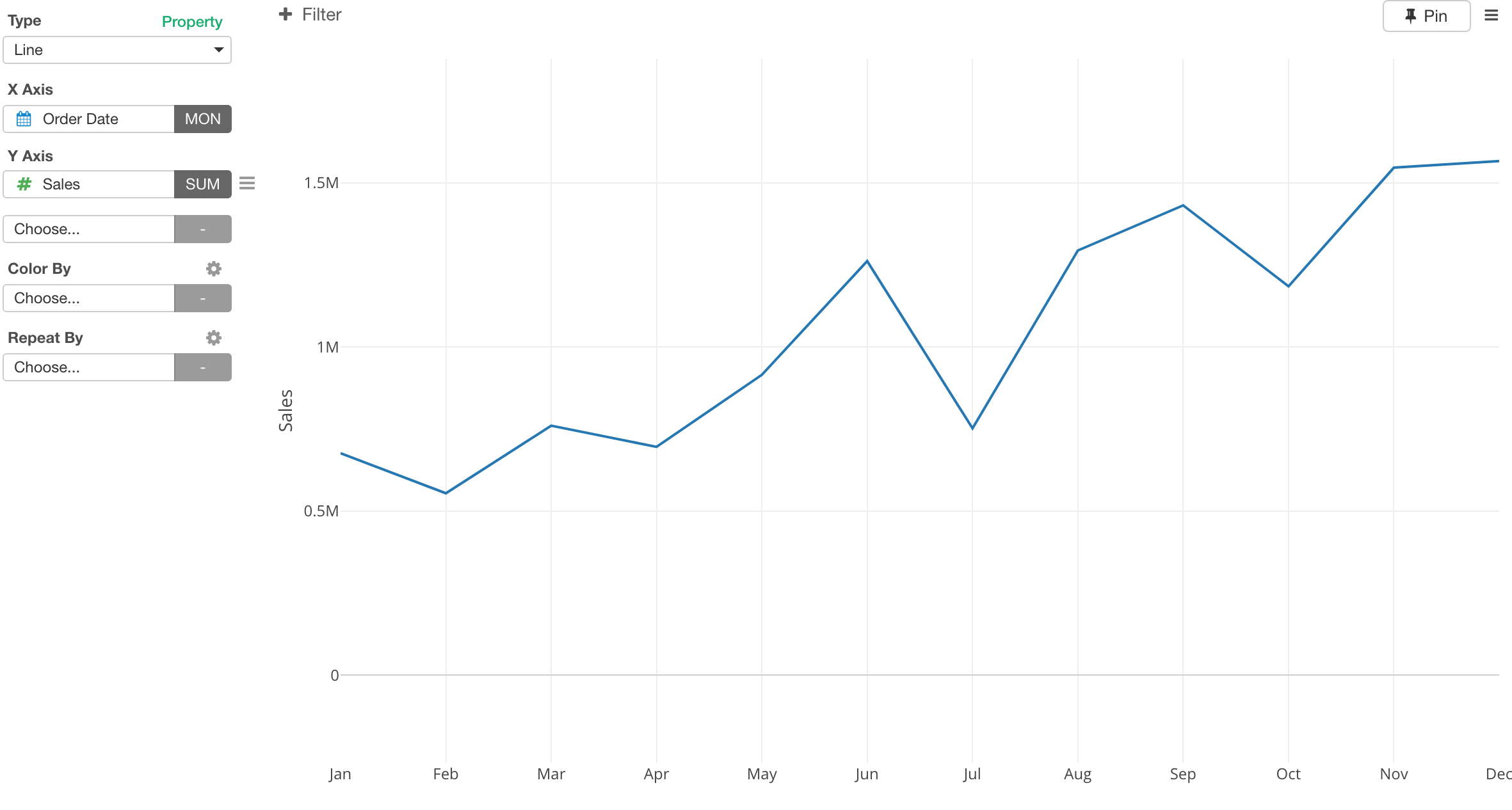
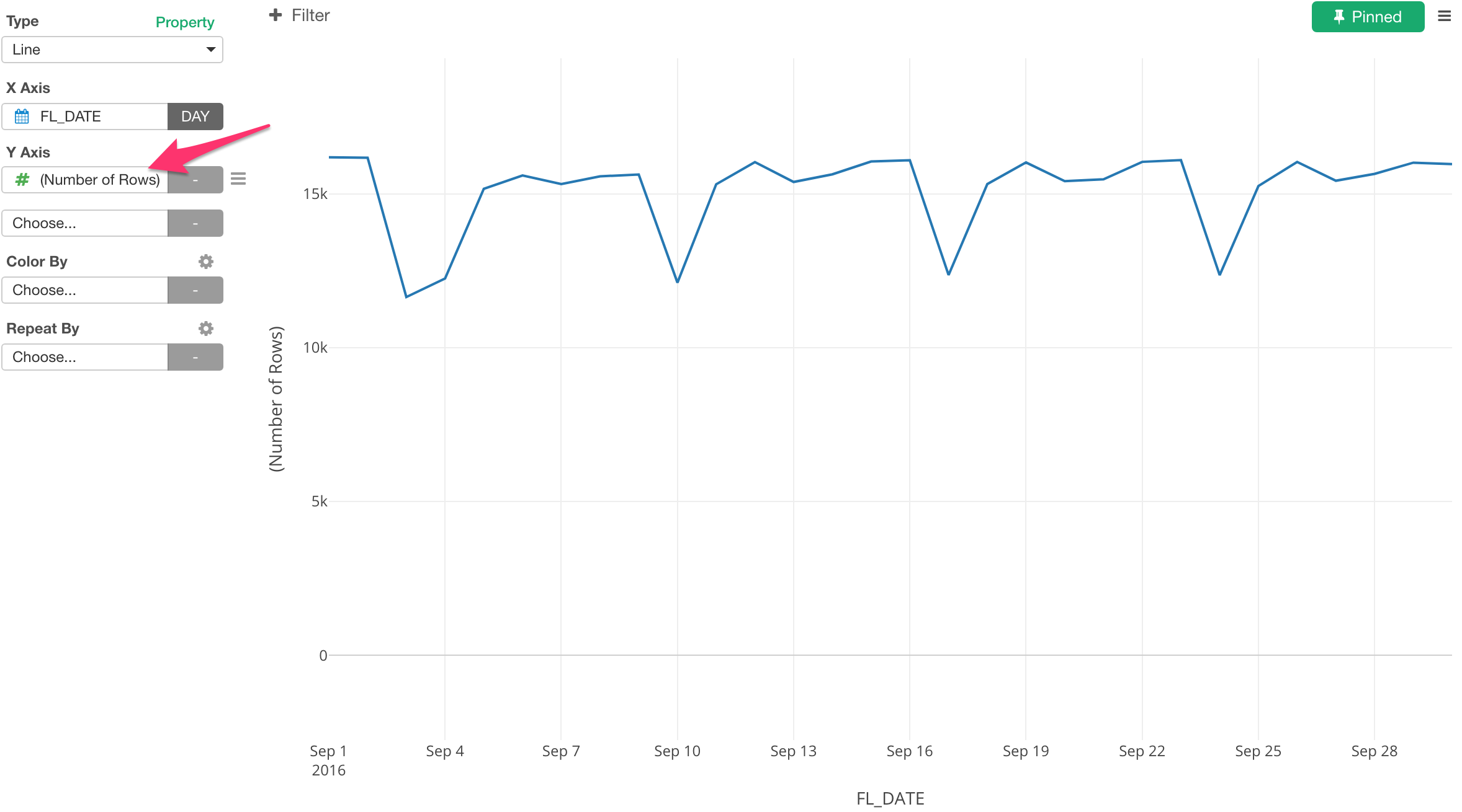
Aggregation Function for Y-Axis
The default is to calculate the number of the rows for each data point of X-Axis.
You can assign a column and select one of the aggregation functions listed for Y-Axis.
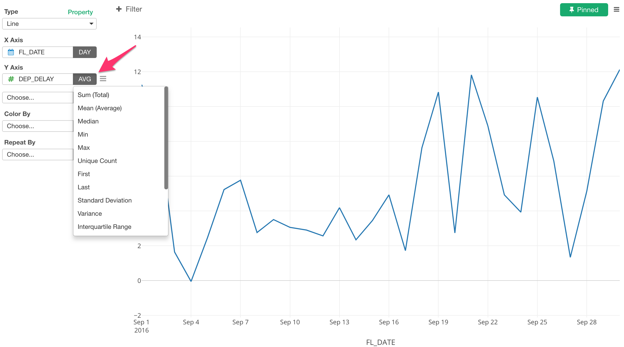
Different Calculation Methods for Different Data Types
This list is differnt based on the data type.
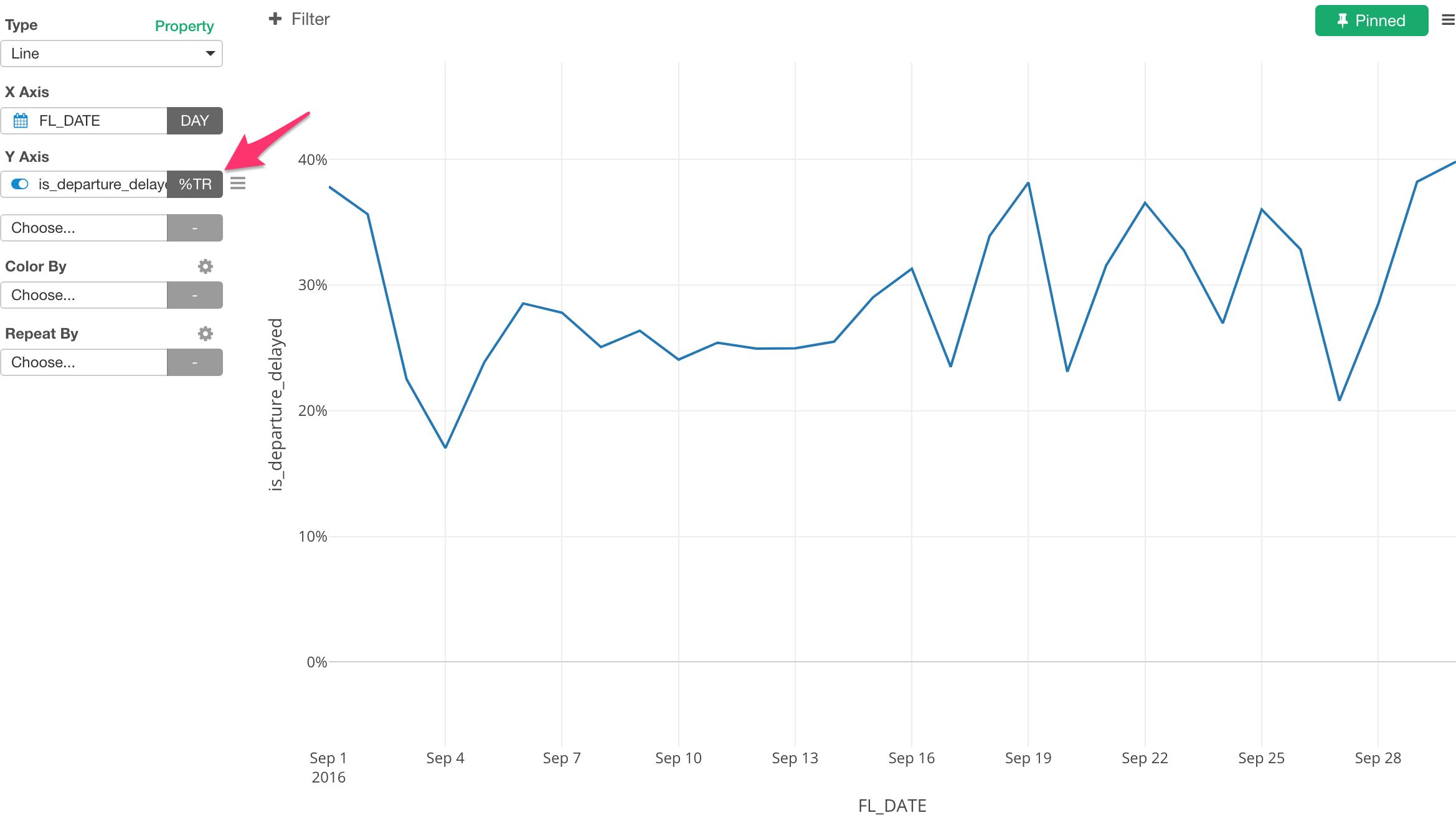
Here is a list of the aggregate functions for Logical data type column. I’m assigning a column that indicates whether a given flight was delayed or not and selecting ‘Number of TRUEs’ function. We can see how many flights were delayed on each day.
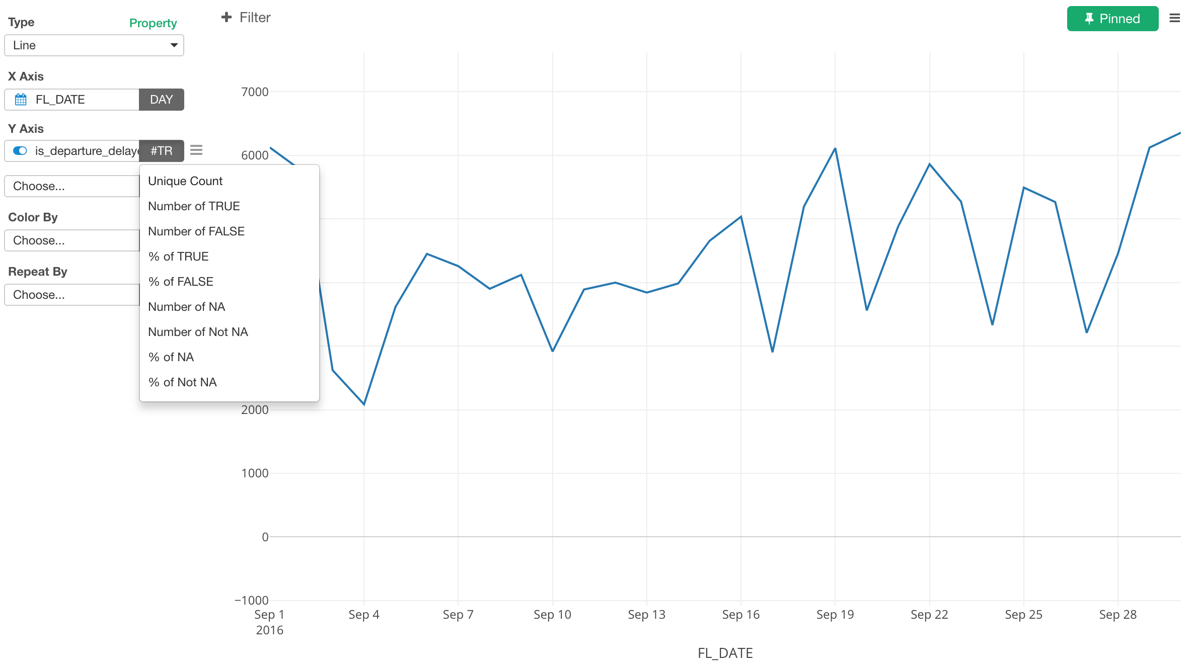
We can swtich to ‘% of TRUEs’ instead to see what is the percentage of the flights that were delayed on each day.
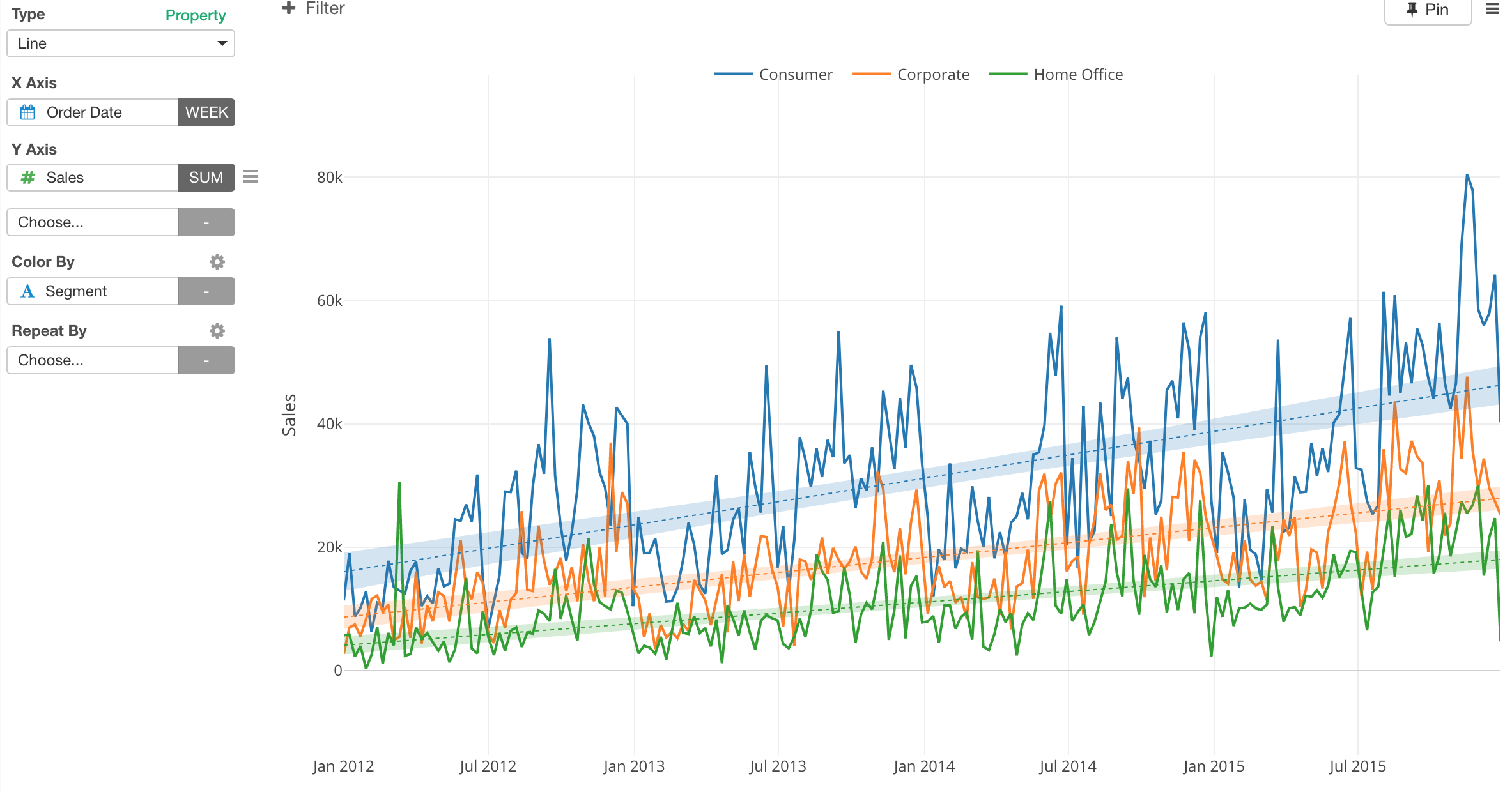
Multiple Lines by Color
You can assign a categorical column to Color to break down the data. Here, I’m breaking it down to multiple lines.
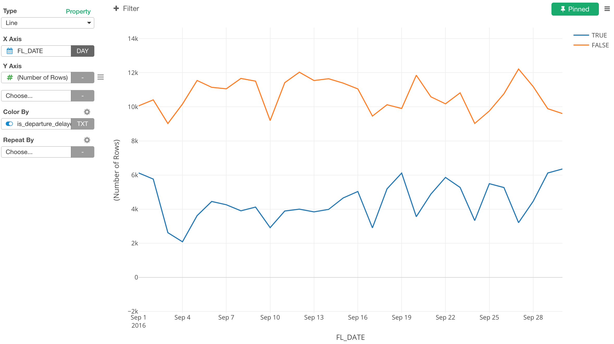
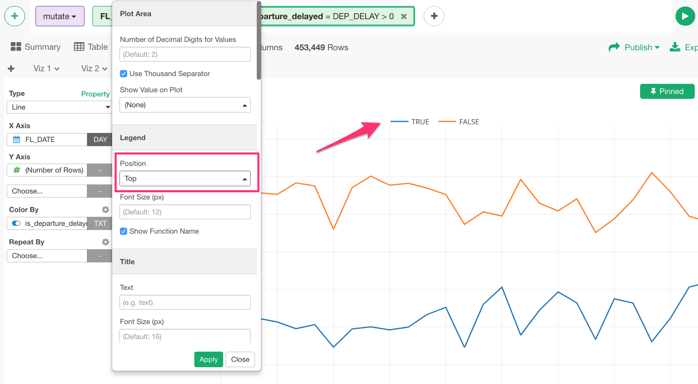
You can see the legend showing up at the right hand side that indicates what each color means. You can change the position of the legend.
Multiple Y-Axis Columns
You can assign multiple columns to Y-Axis.
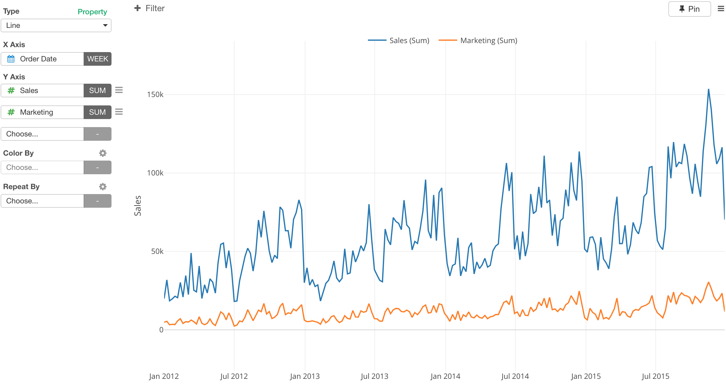
You can assign up to 5 columns. When you assign multiple columns to Y Axis you can’t use Color By since the multiple columns use Color to differentiate the multile lines.
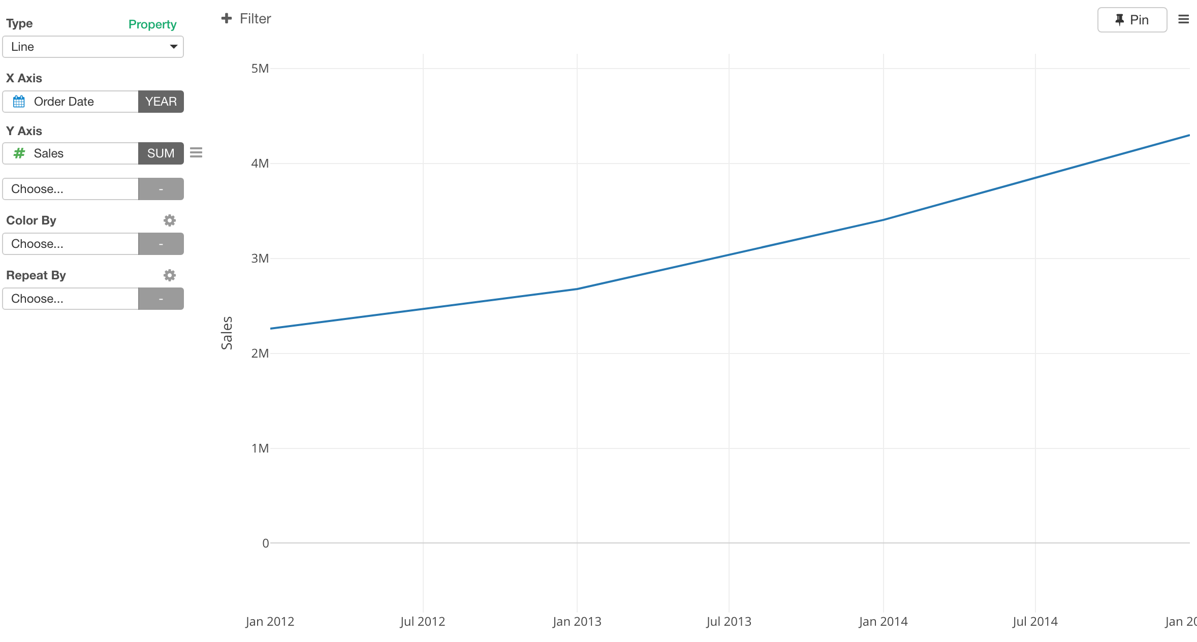
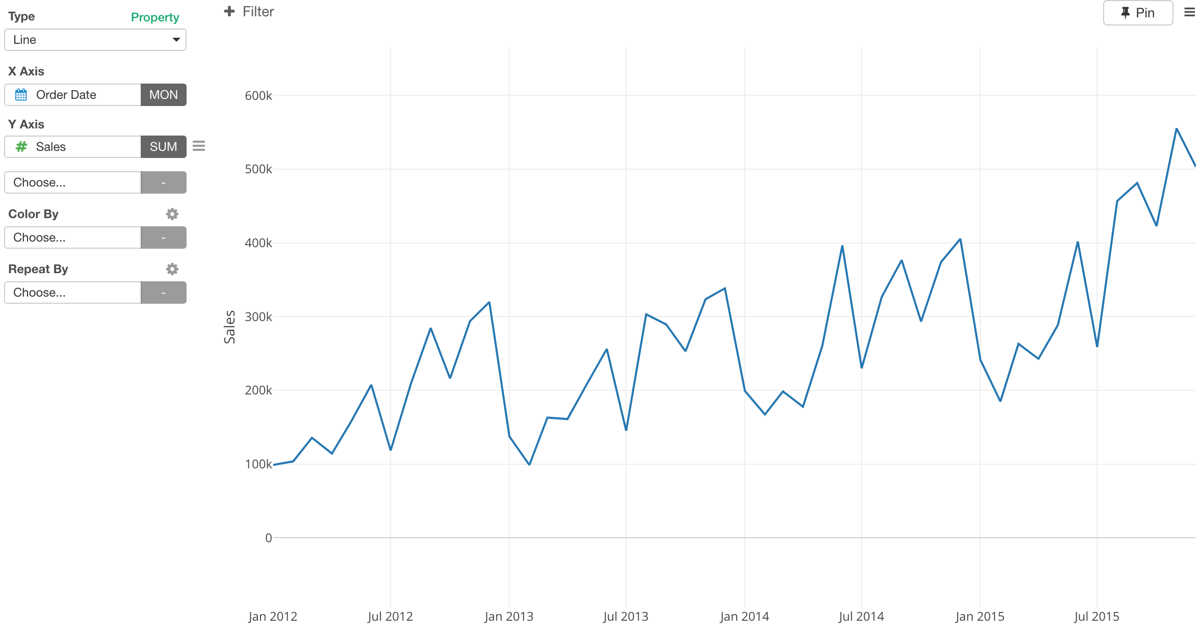
Dual Y-Axis: Y1 and Y2 Axis
Sometimes the scales can be very different between two columns if you assigned both of them to Y1.
You can assign one of them to Y2, which will allow the two columns values to be displayed with different scales.
Select ‘Y1/Y2 Assignment’ from the Y Axis menu. of the column you want to assign to Y2 Axis.
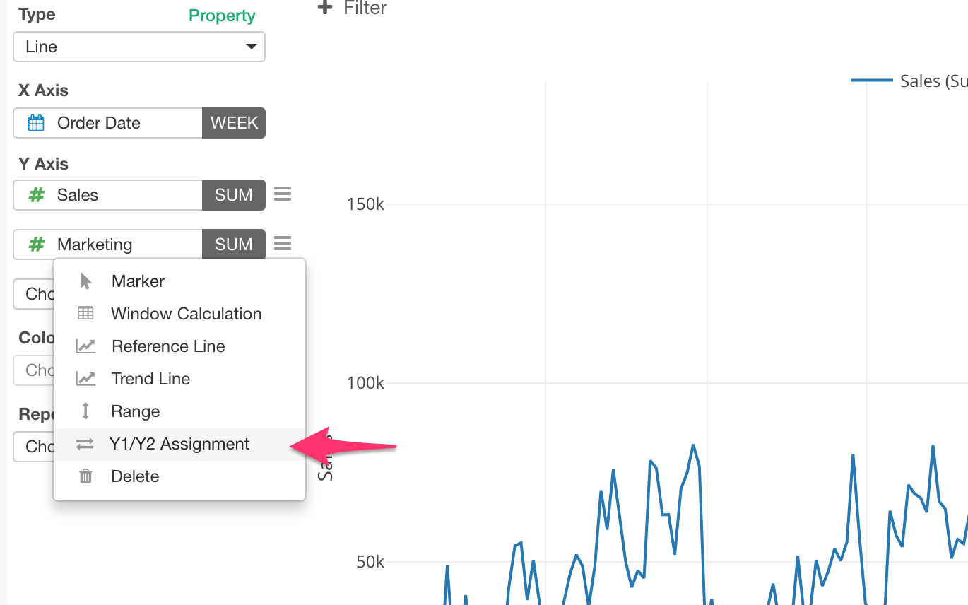
Check ‘Assign to Y2’.
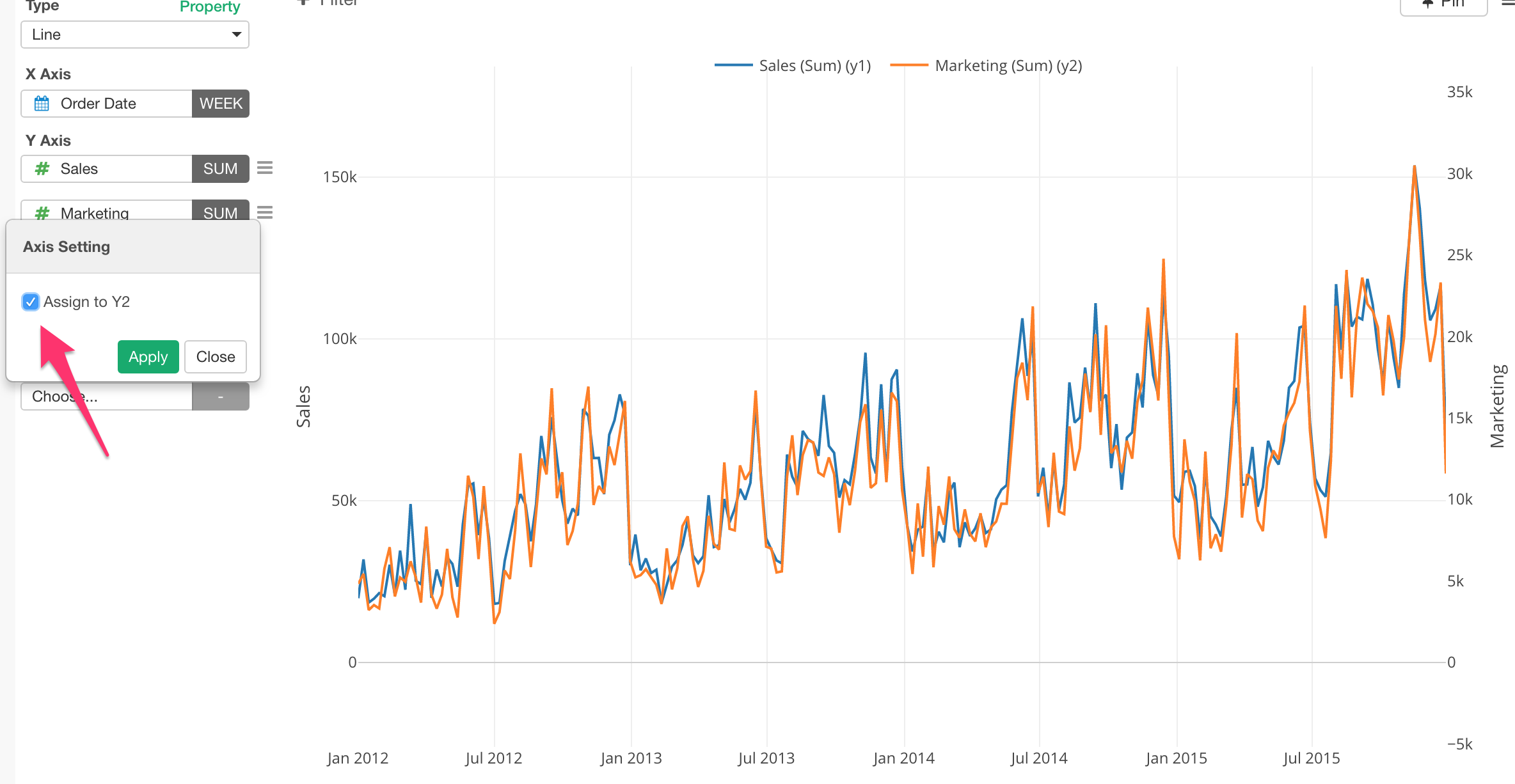
This will assign the column to Y2 Axis with a different scale from the Y1 scale.
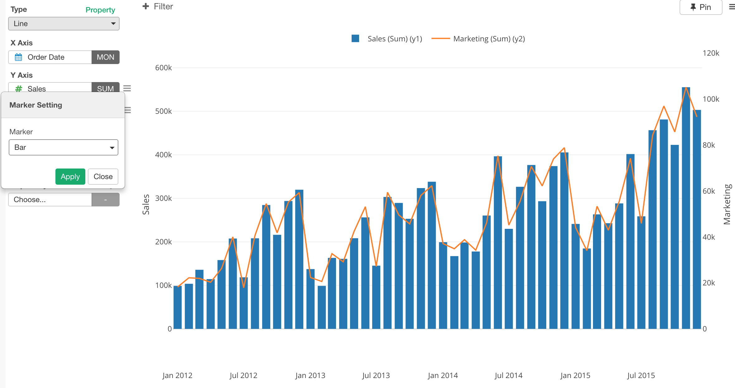
Marker - Line to Bar / Circle
You can change the marker for each Y Axis Column. For example, here I’m setting the first Y Axis column to use Bar marker.
And here, I’m setting it to Circle.
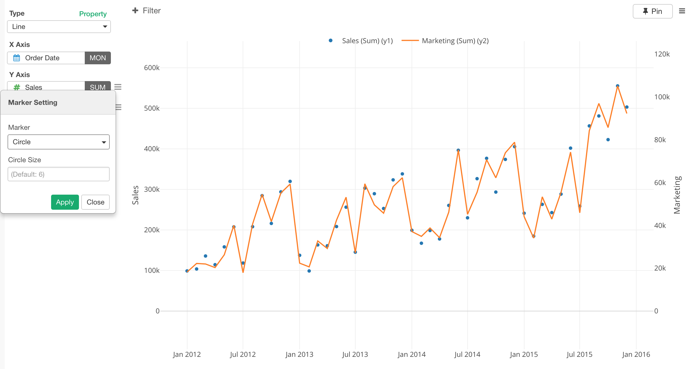
You can access Marker Setting from the Y Axis menu.
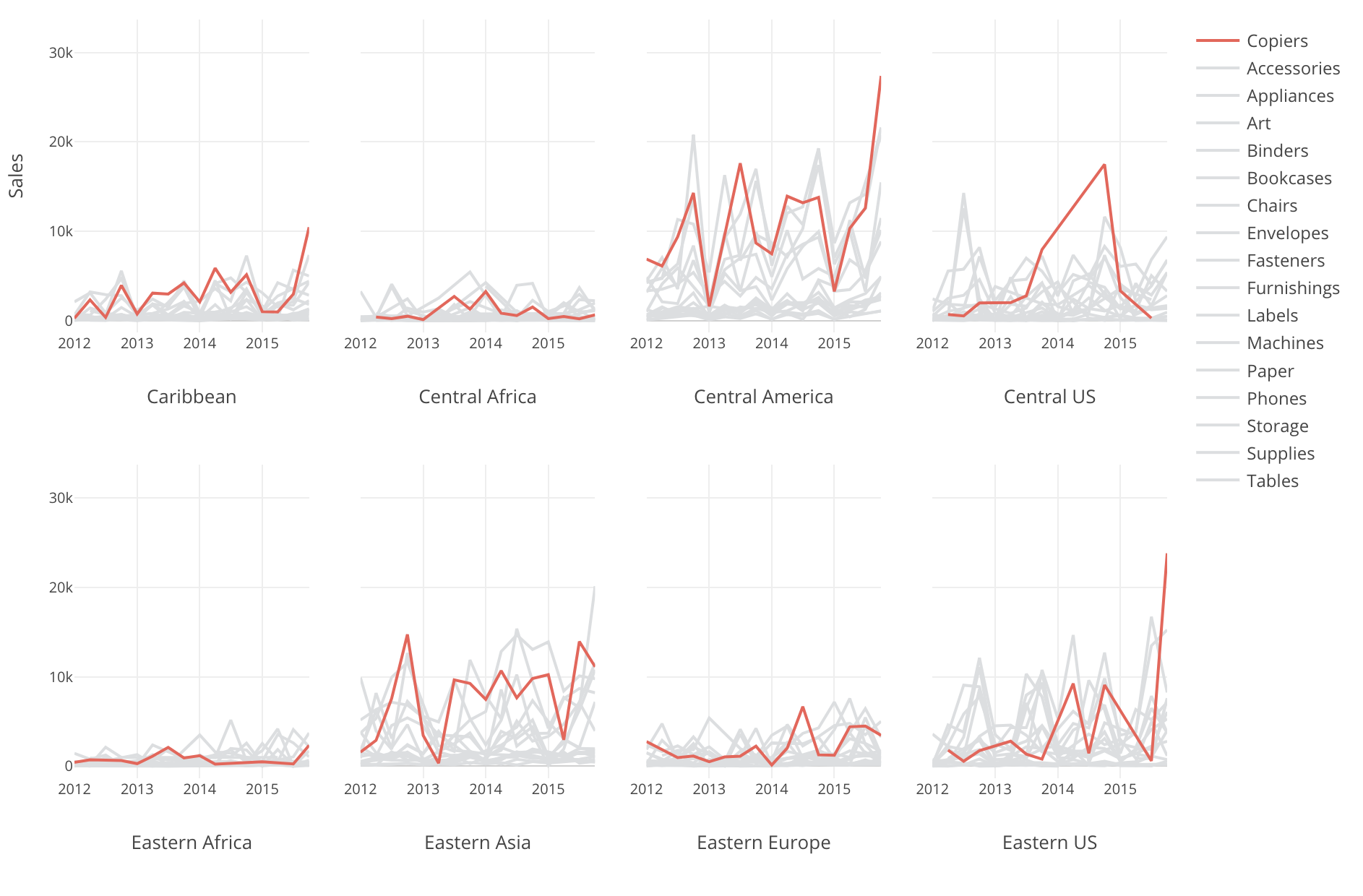
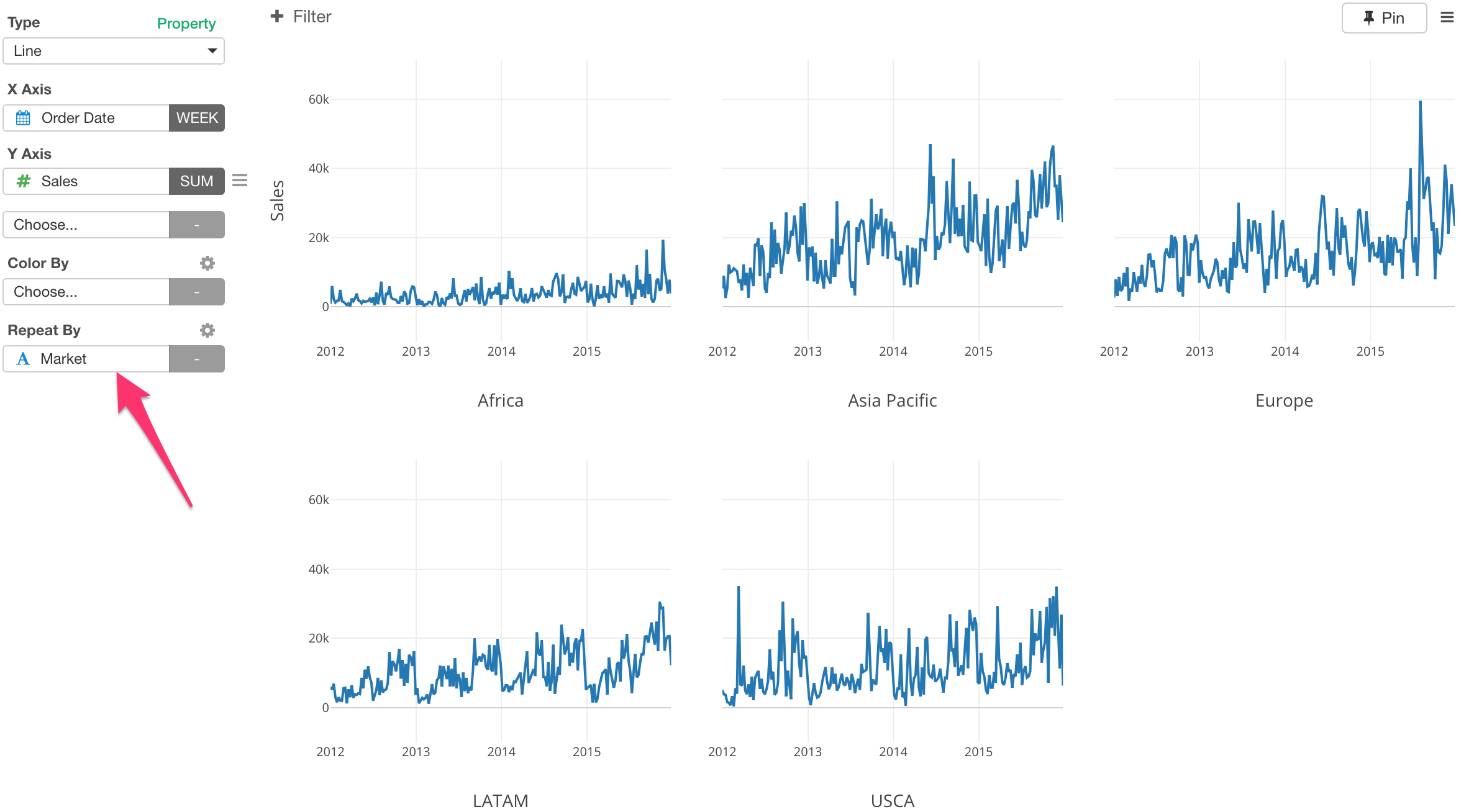
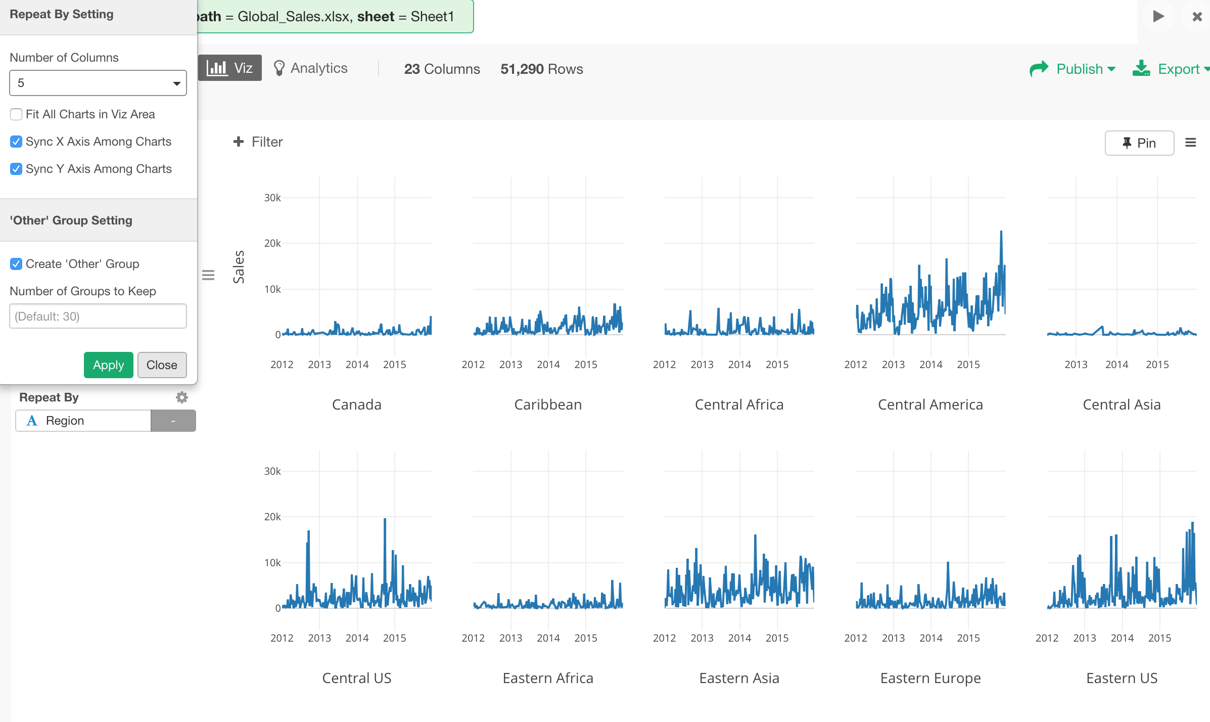
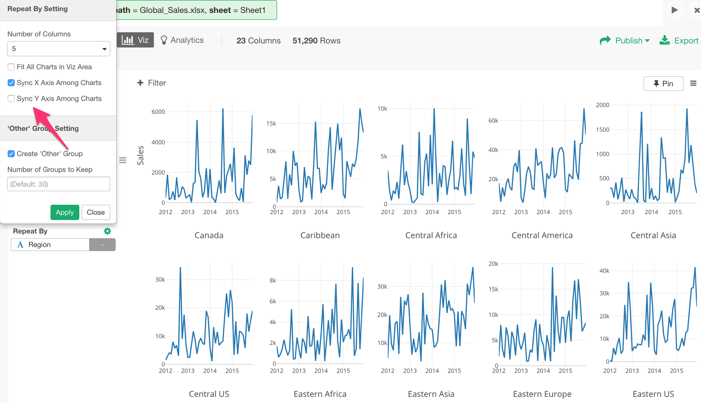
Multiple Line Charts (Subplot)
You can use Repeat By to show the chart divided into multile categories and line them up to compare among them.
Layout
Sometimes, the charts layout might not be the way you want to see.
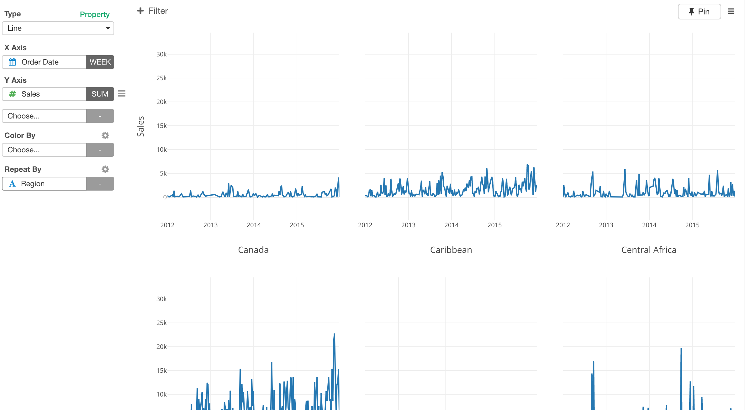
You can adjust the layout.
First, you can set how many columns you want to use for the layout. For example, I’m setting it to use 5 columns layout.
Scale
When you are trying to compare the trend you might not care about the absolute scales. In such cases, you can uncheck ‘Sync Y Axis Among Charts’ to re-adjust each Y Axis scale to match with the data for each chart.
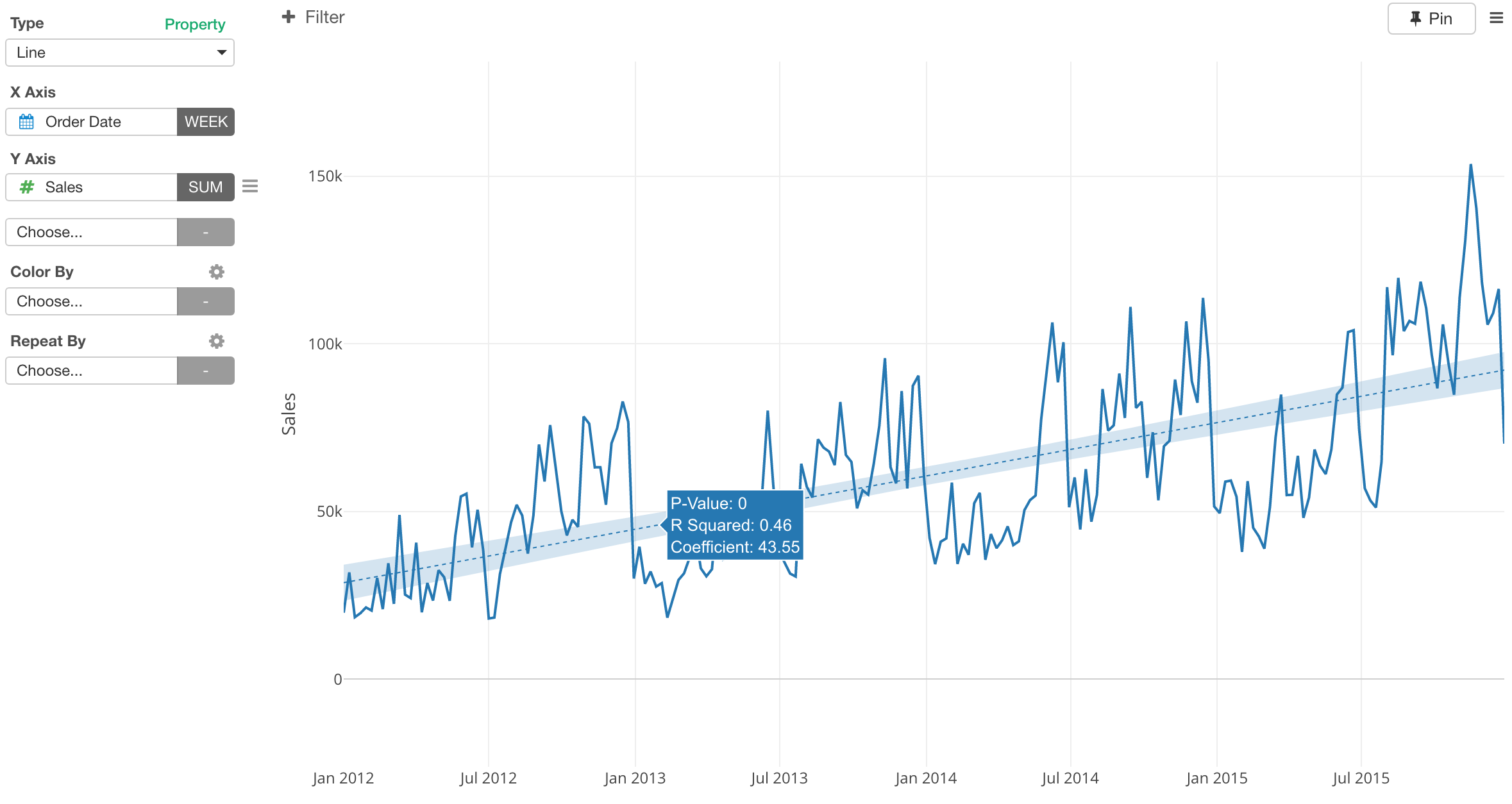
Trend Line
You can show a trend line for each line.
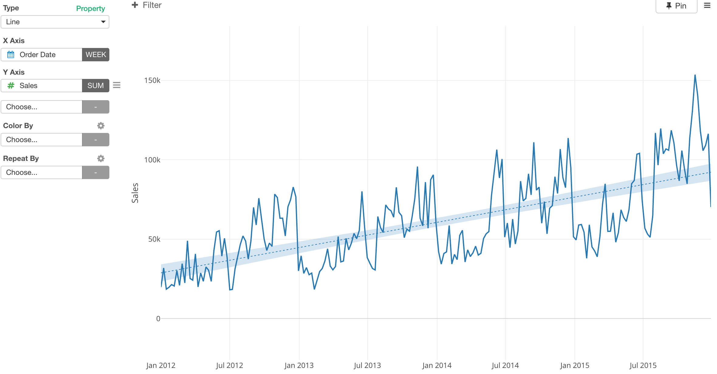
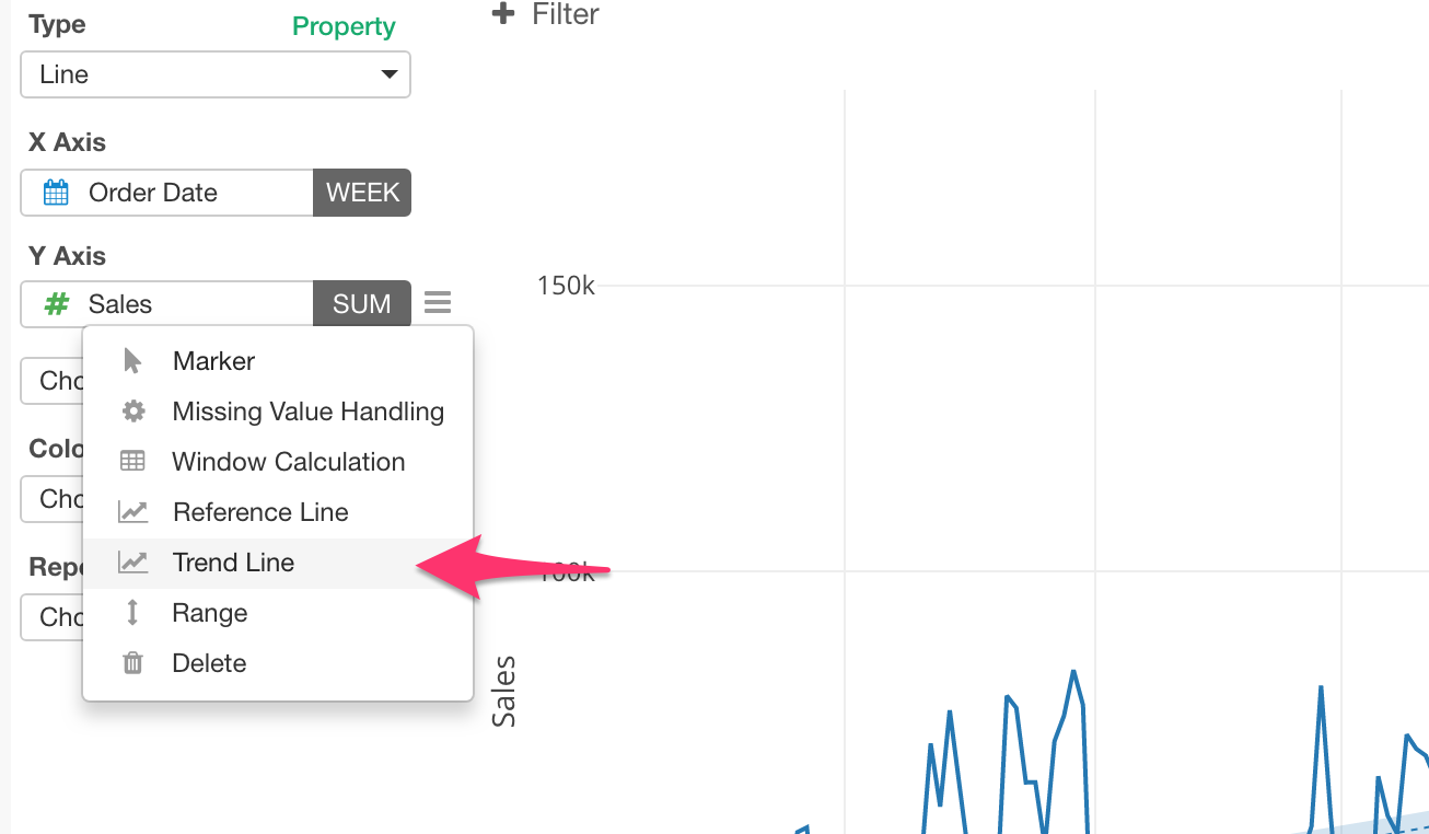
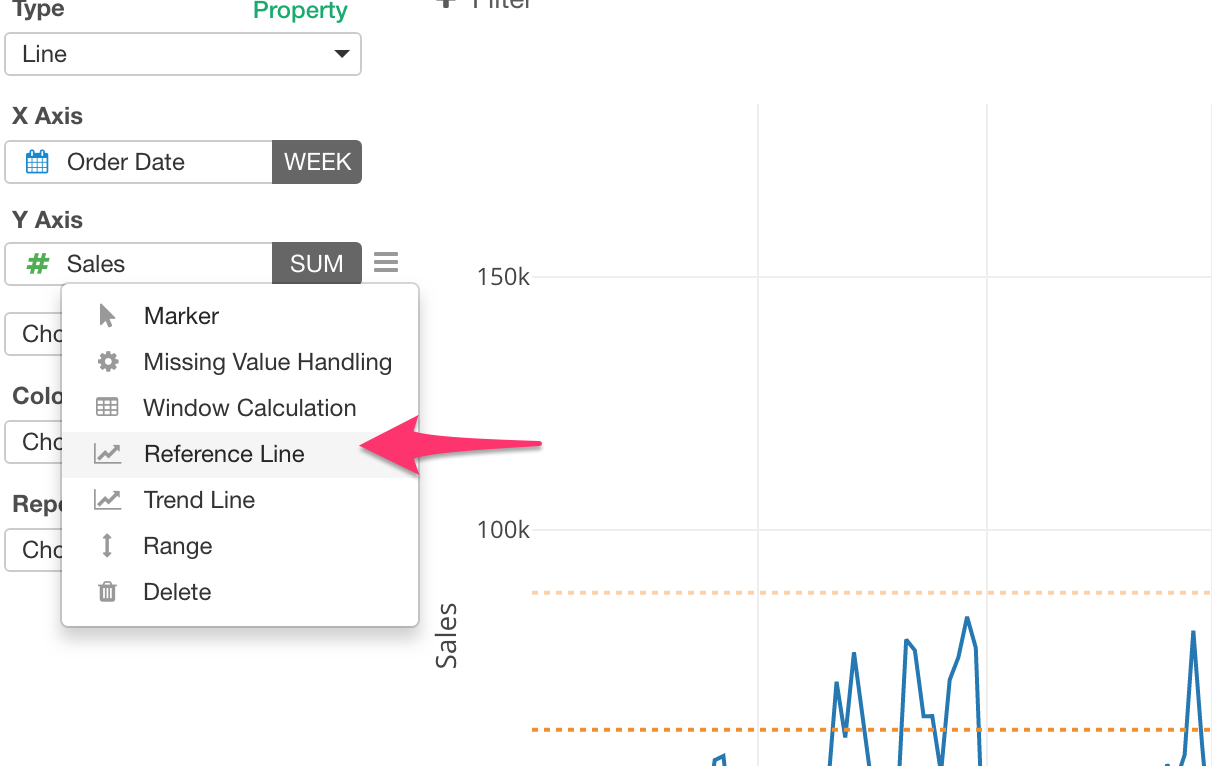
You can access to Trend Line Setting dialog from Y Axis menu.
There are different methods to calculate the trend line. Exploratory supports the following three.
- Linear Regression
- GAM
- Polynomial
GAM and Polynomial tend to make the line more smooth along the base line while Linear Regression always draw a straight line.
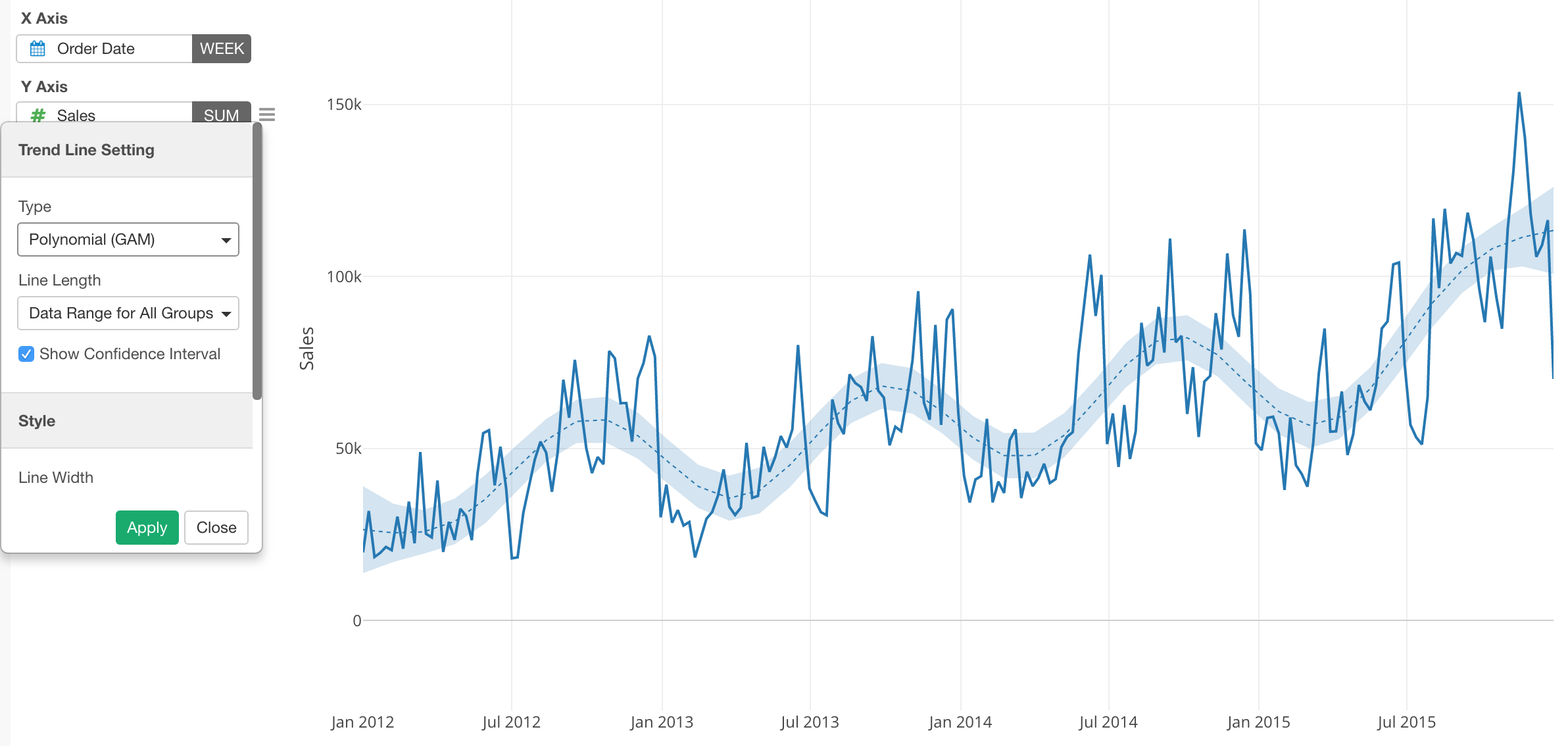
Regardless of the methods, it builds a predication model behind the scene to draw the trend line. This means that you can see some of the model quality metrics in the pop-up when you move the mouse over on the line.
Trend Line with Color By
You can show the trend line for each color line.
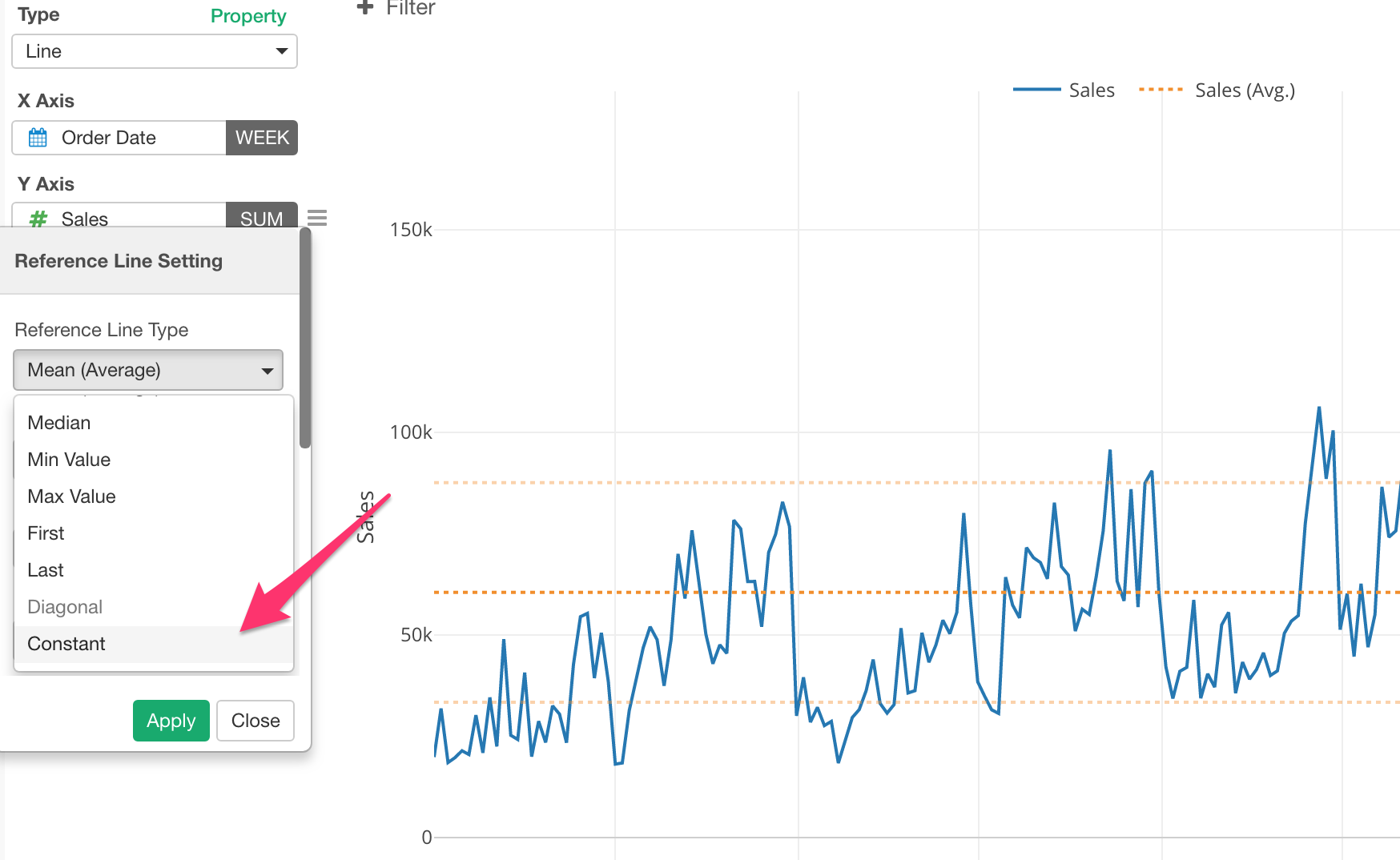
Reference Line
You can show a reference line
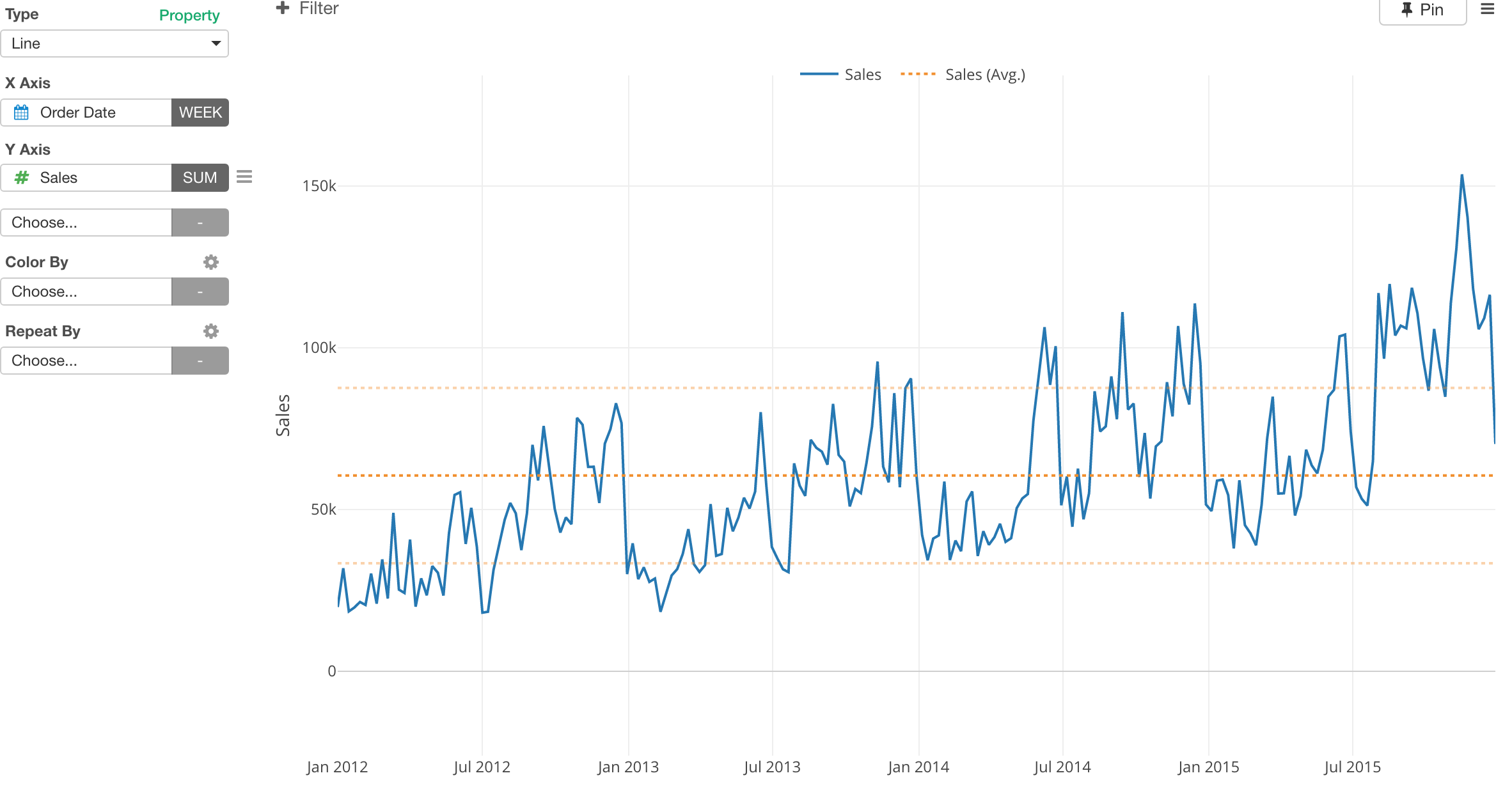
You can access to Reference Line Setting dialog from Y Axis menu.
Select one of the methods to calculate the reference line.
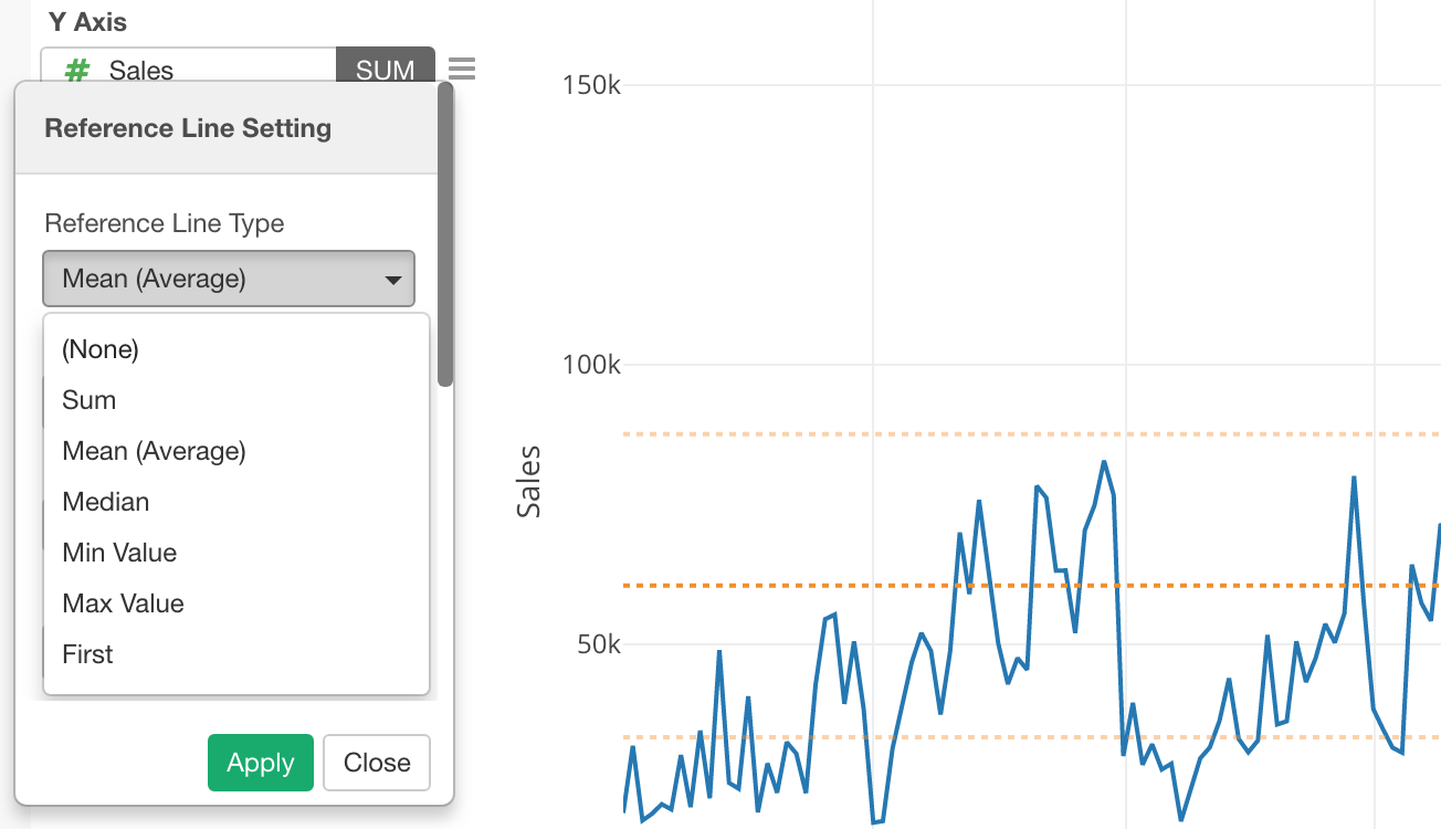
You can use ‘Constant’ by scrolling down when you want to set a static value.
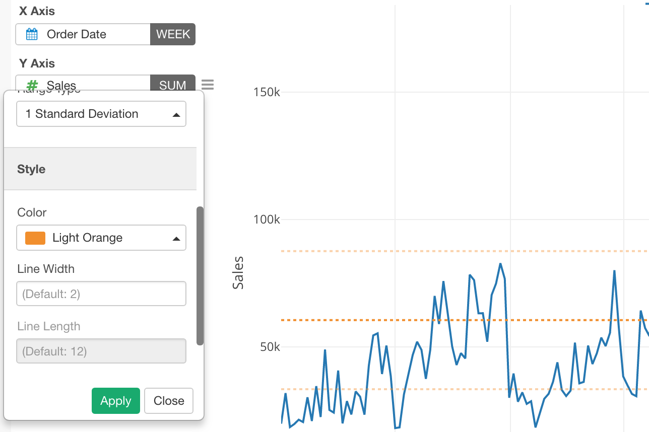
You can adjust the style (Color, Line width, Line style) by scrolling down in the dialog.
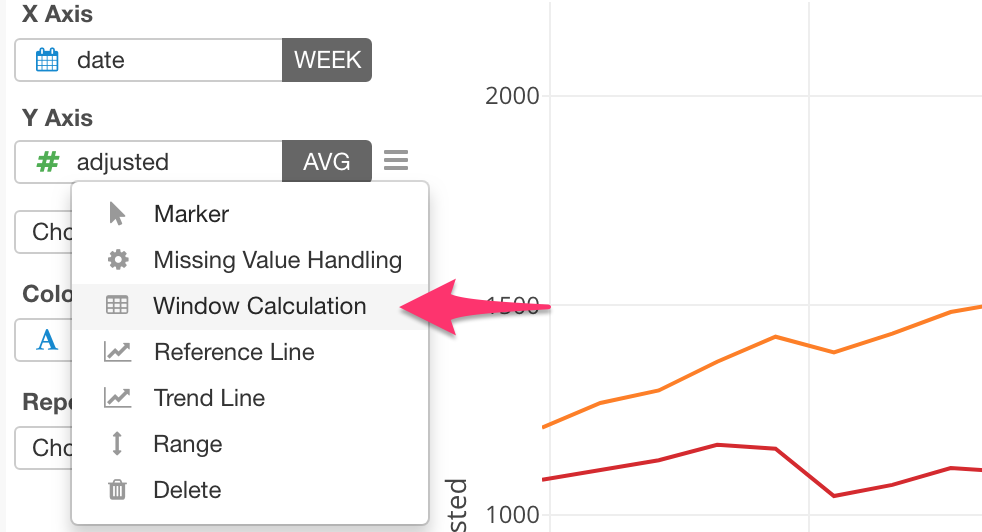
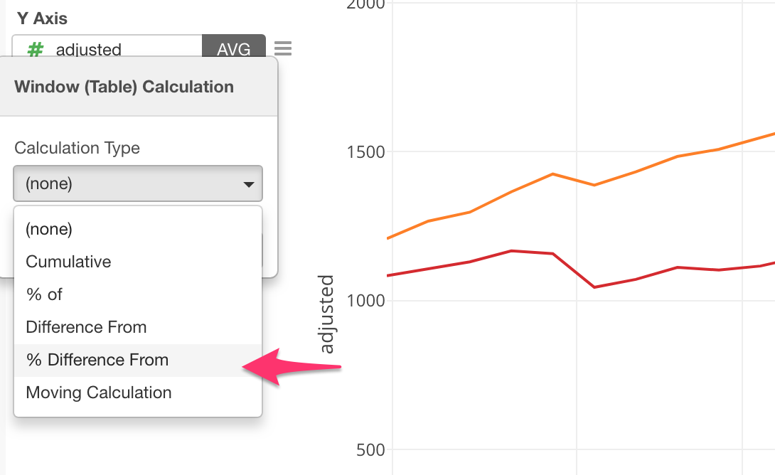
Window Calculation
There are various window calculation methods you can use to calculate the values for the lines on the fly.
- Cumulative
- % of
- Difference From
- % Difference From
- Moving Average
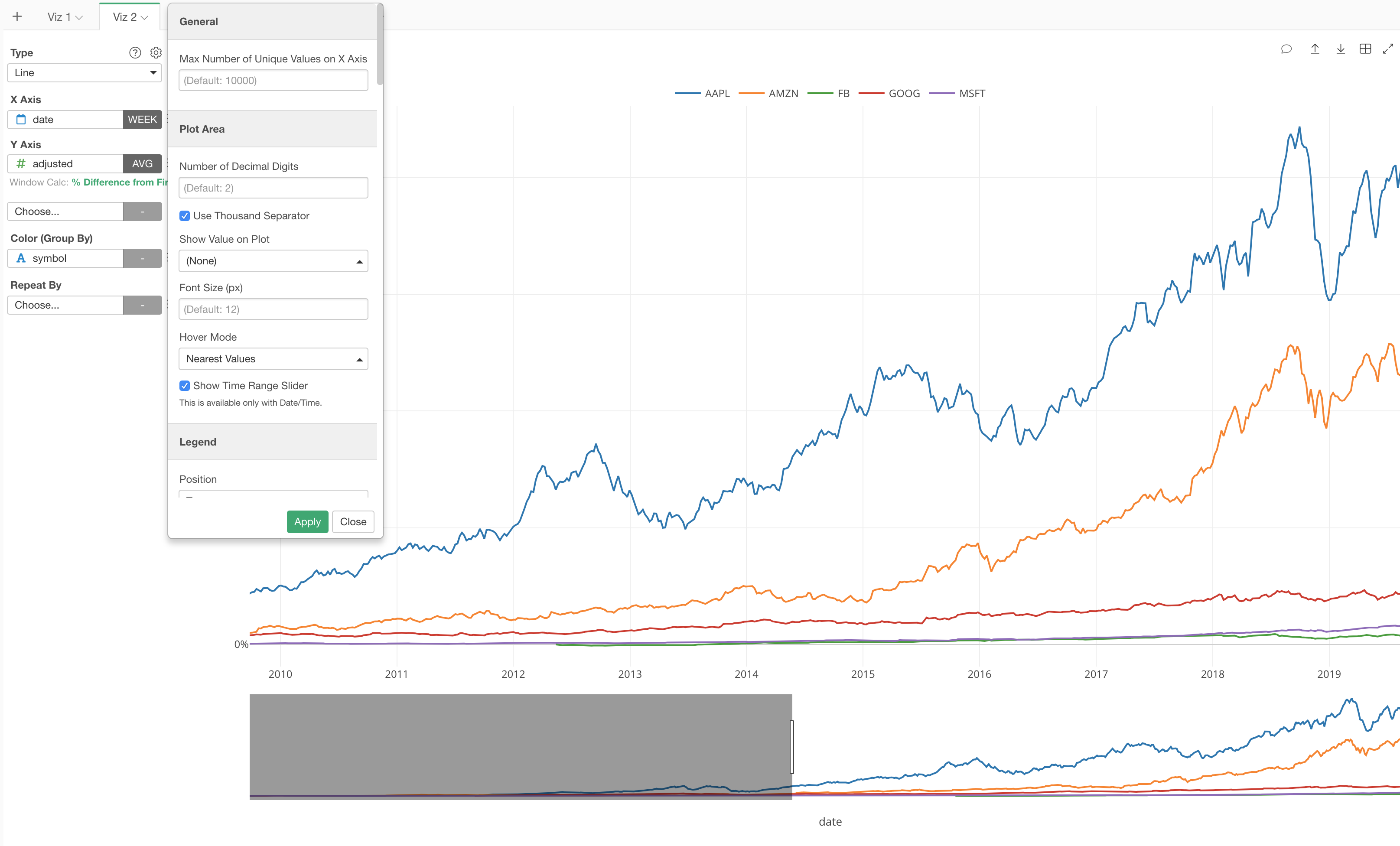
For example, here is a stock price data and I’m showing each company’s adjusted stock price trend using different colored lines.
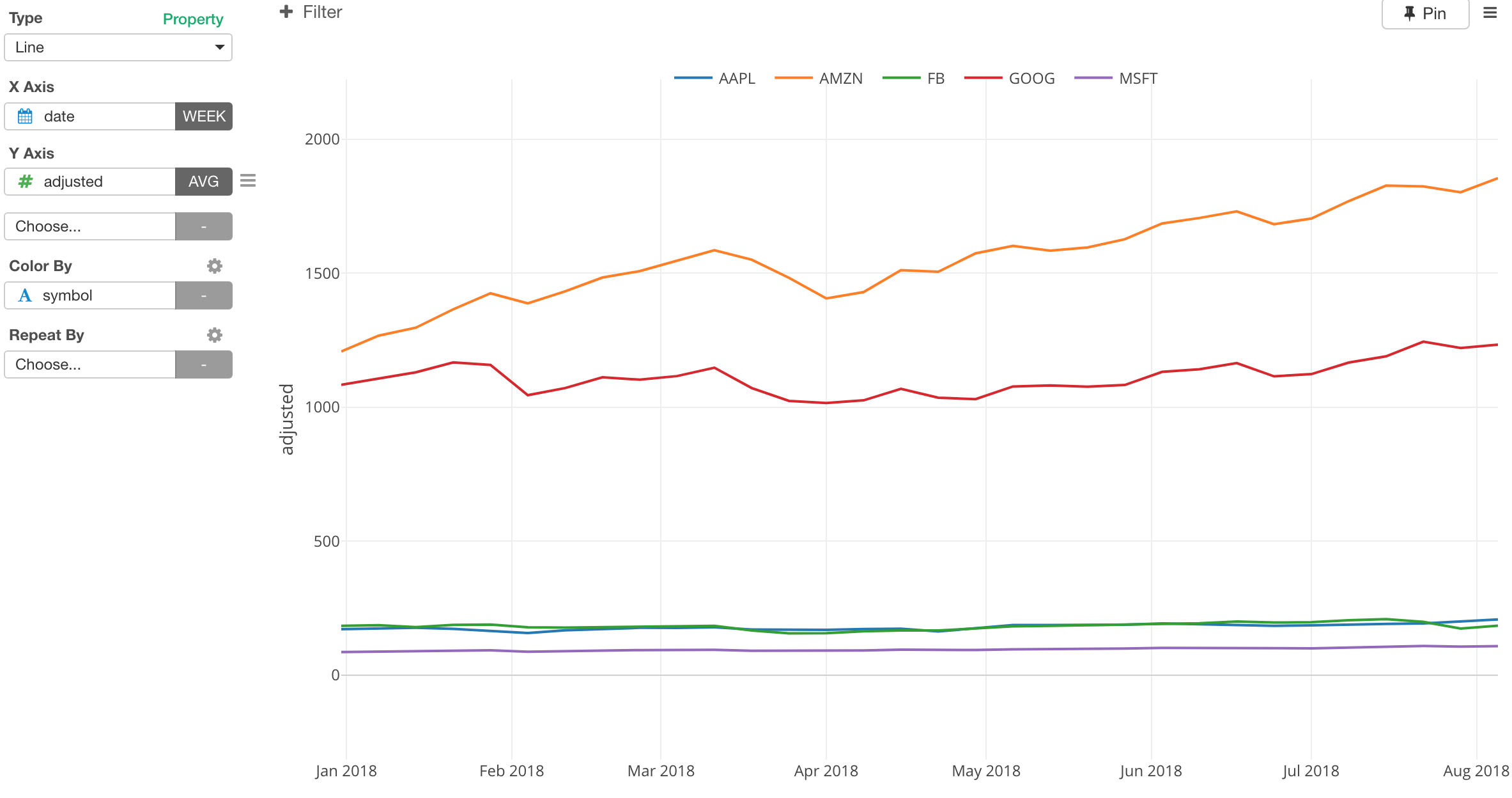
Since the price ranges between two groups - one group (AMZN/Amazon and GOOG/Google) and another group (AAPL/Apple, FB/Facebook, and MSFT/Microsoft) - are very different, it is hard to compare which stocks are performing better or worse.
Instead, we can show how much they grow in a percentage term.
Select Window Calculation from Y Axis menu.
Select % Difference From
By selecting ‘First Value’, which is the default by the way, we can now see how much each stock price has performed easier.
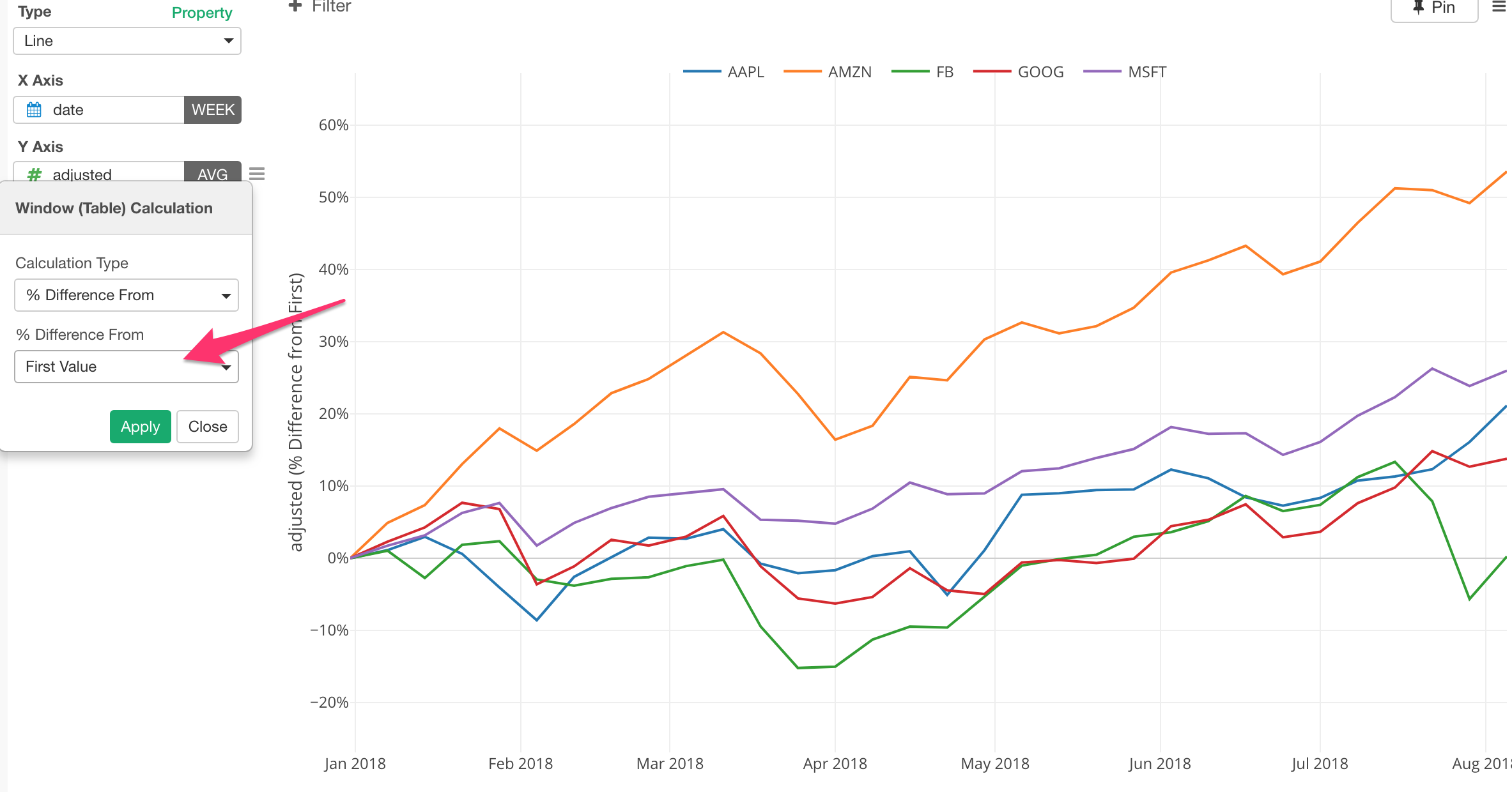
This ‘% Difference From - First Value’ method is to calculate the difference between a value at any given point and the first value for a series of the values for each color line, in this case that is the stock.
So the calculation is something like the below.
(adjusted - first(adjusted)) / first(adjusted) * 100There are other methods I’d recommend you try out. Take a look at this introduction of Windows Calculation post for more details.
Highlight a Part of Data
You can highlight a part of data that you want to see it compared against others.
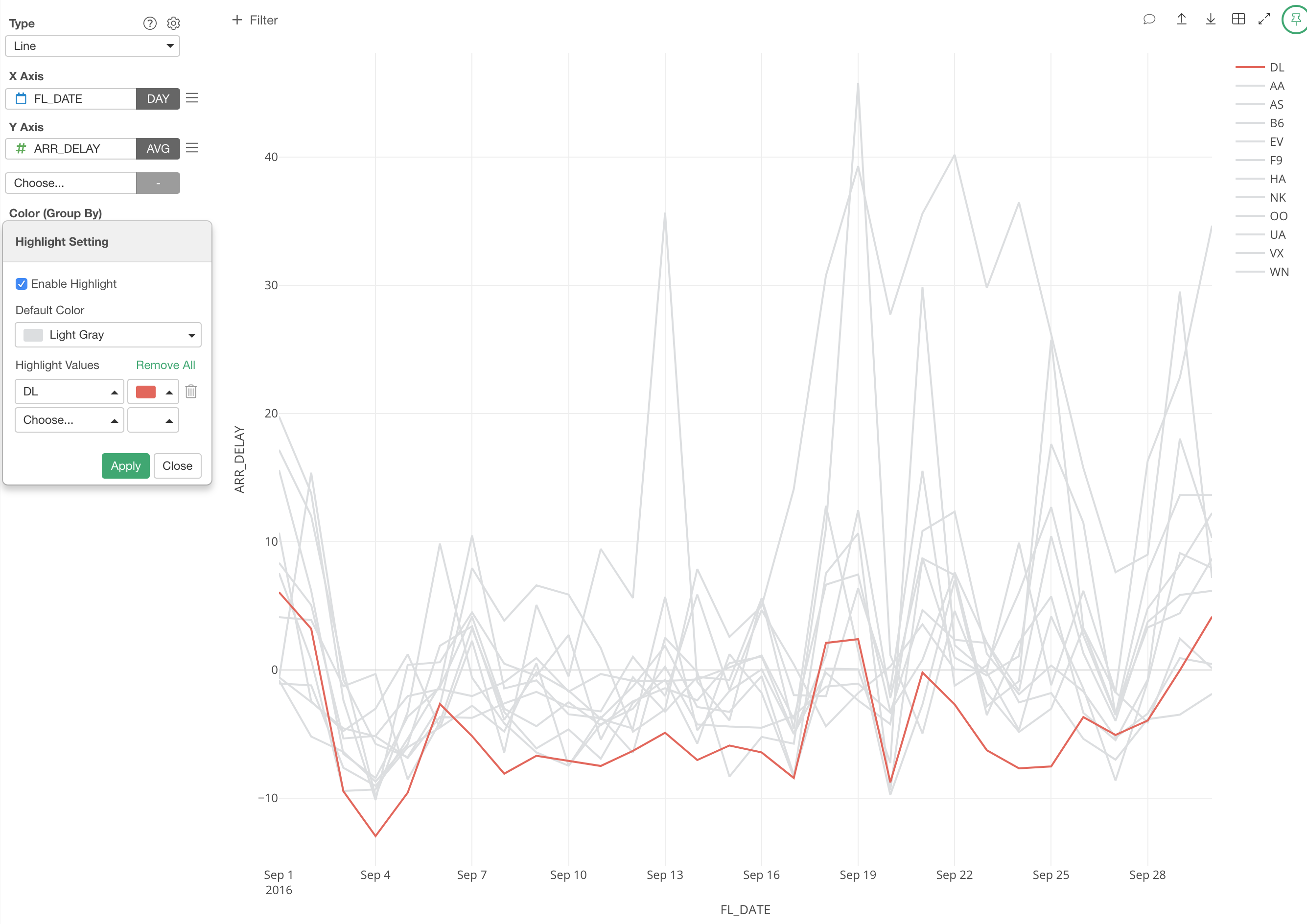
You want to assign a column to Color and select ‘Highlight’ from the menu.
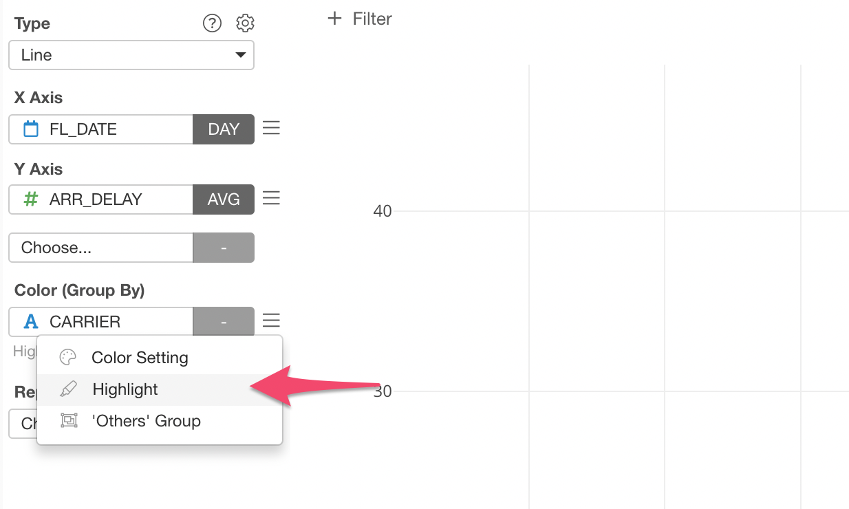
Then, you can select a value (or multiple values!) that you want to highlight by using a different color.
Binning (Categorize Numbers)
Sometimes it’s better to categorize numeric values (or binning) rather than using the original values to visualize the correlation or the trend in data.
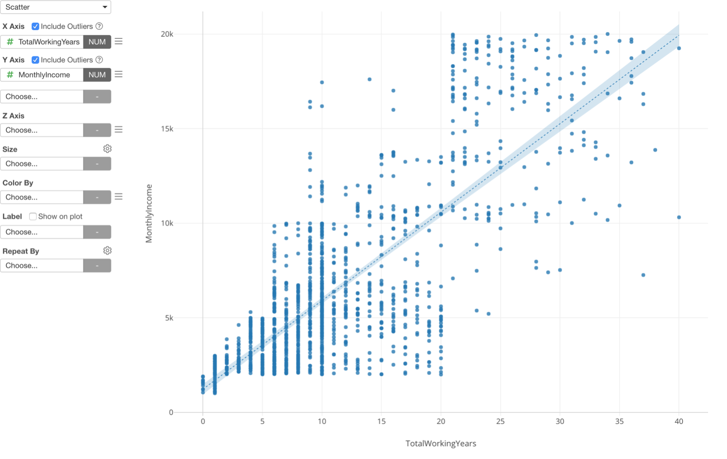
This is one way to look at the relationship between the two, but there is another way, which is to categorize the numeric variables.
Here is a boxplot chart showing Working Years at X-Axis and Monthly Income at Y-Axis, but this time the Working Years is divided into 5 groups based on the numeric value range and each group is showing the distribution of Monthly Income at Y-Axis.
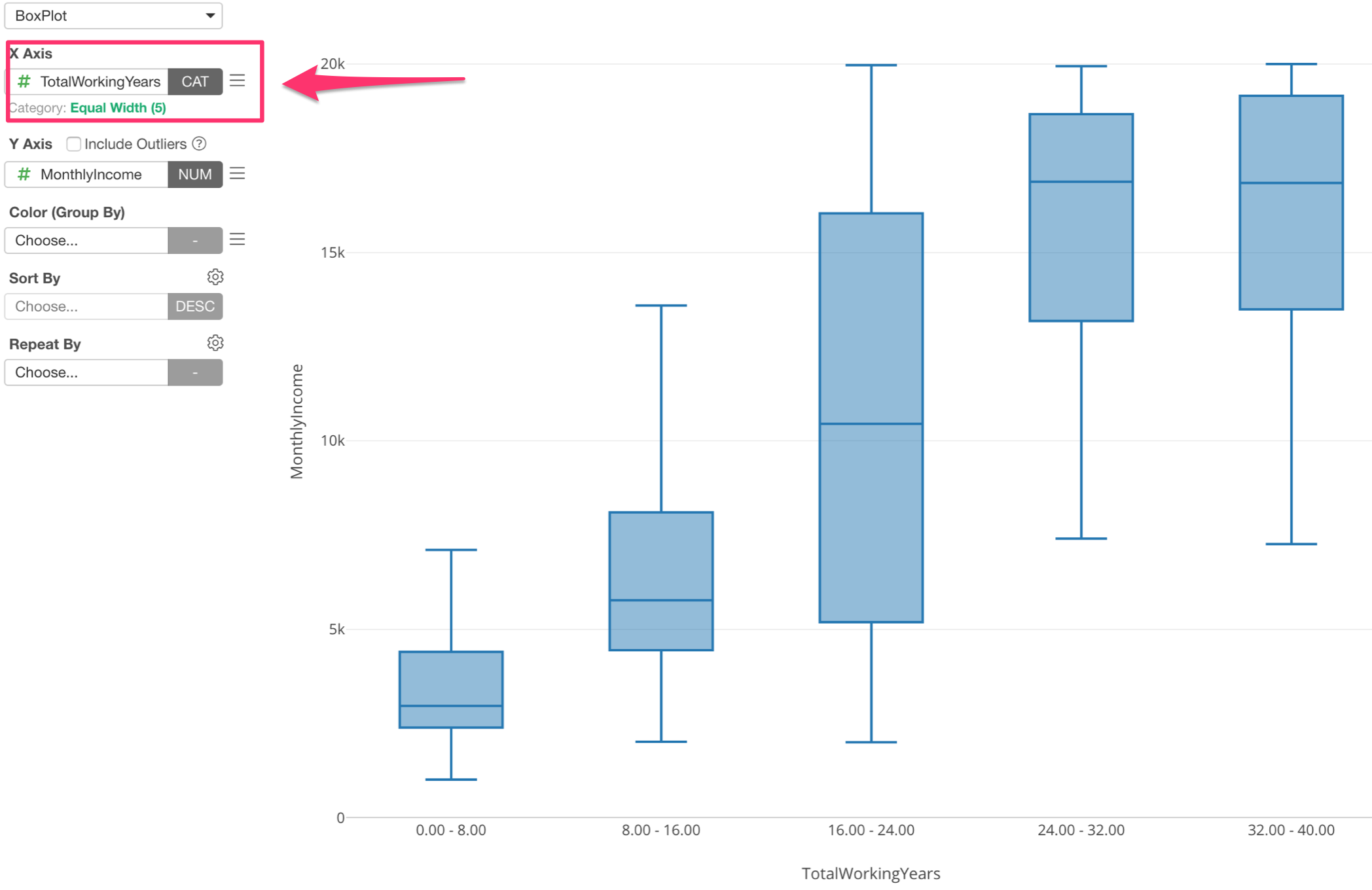
Assigning Numeric variable (or column) to X-Axis automatically changes the option to ‘Category’ and divide into 5 groups.
Categorize Numeric Values for Color and Repeat By.
You can use the ‘Categorize Numeric’ for other parts like Color and Repeat By as well.
Here I’ve assigned Monthly Income column to Color, which automatically divides into 5 categories.
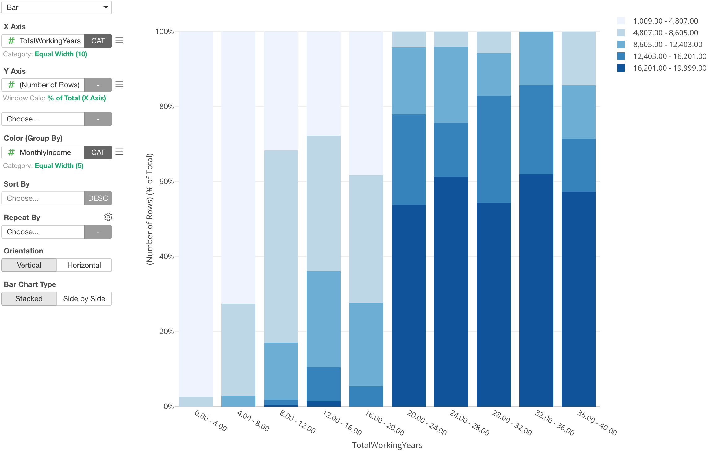
This chart is showing the percentage of each Monthly Income groups for each Working Years group.
Take a look at the following post for more details.
- Categorizing (Binning) Numeric Values inside Chart - Link
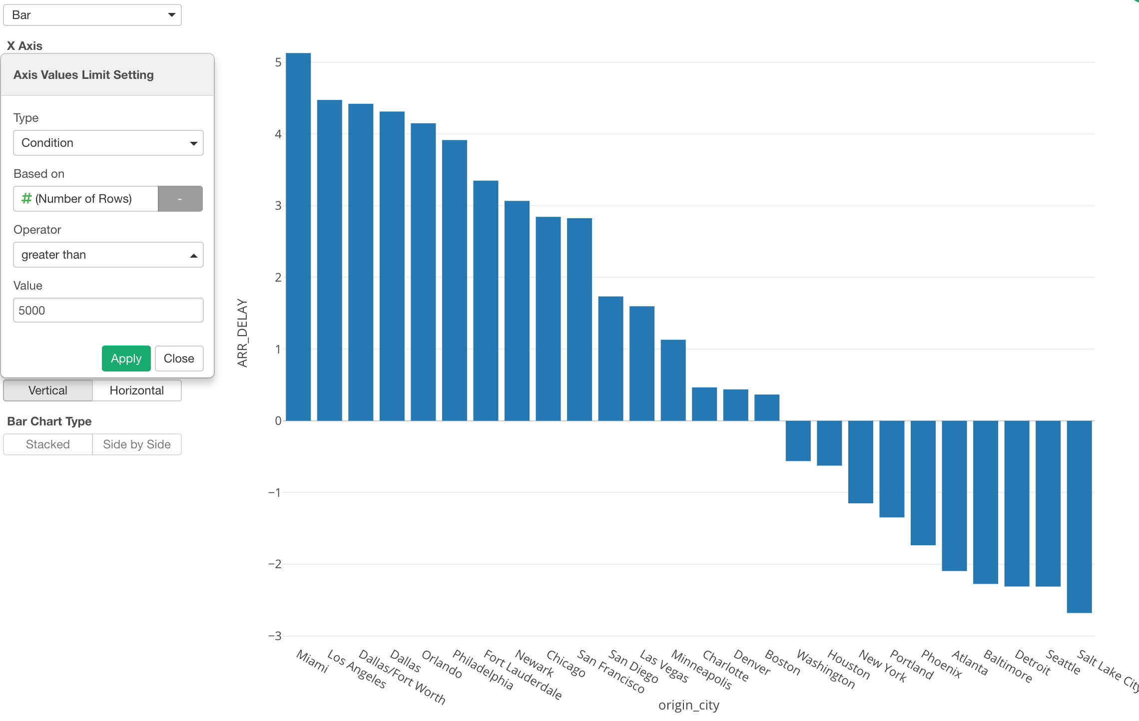
Limit Categorical Values at X-Axis
Sometimes, there are too many values for a chart and you want to limit them. This chart shows the average flight delay time for each departure city.
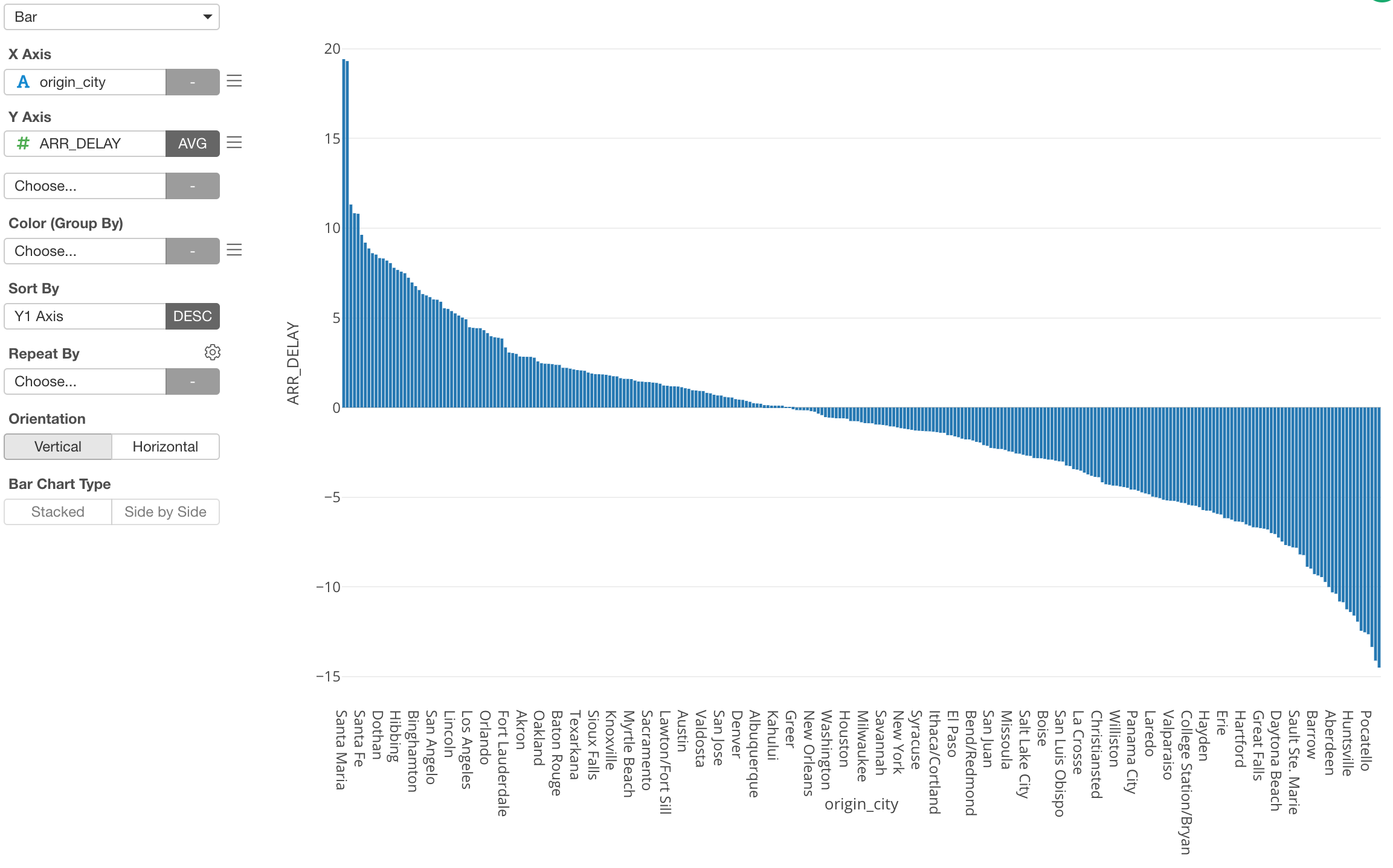
But there are too many cities for the chart.
You can limit them by using ‘Limit Values’ feature.
You can use ‘Limit Axis Values’ feature to limit the values.
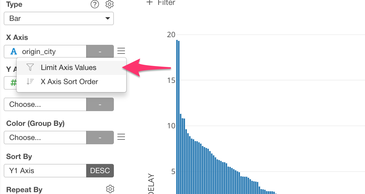
There are 3 options to limit the values.
- Top N
- Bottom N
- Condition
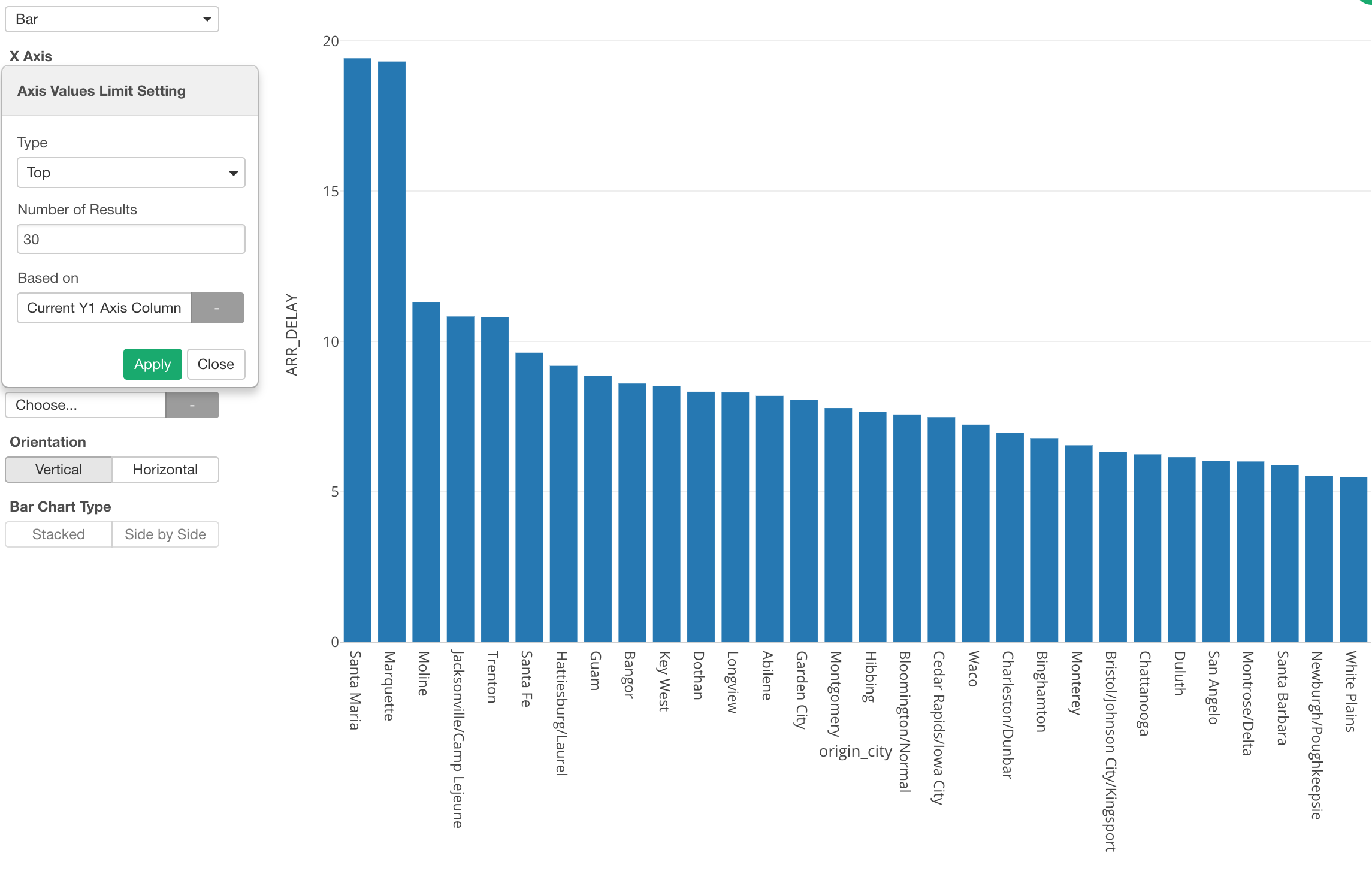
Here’s an example of showing the top 30 cities based on the Y-Axis setting, which is the average of Arrival Delay time.
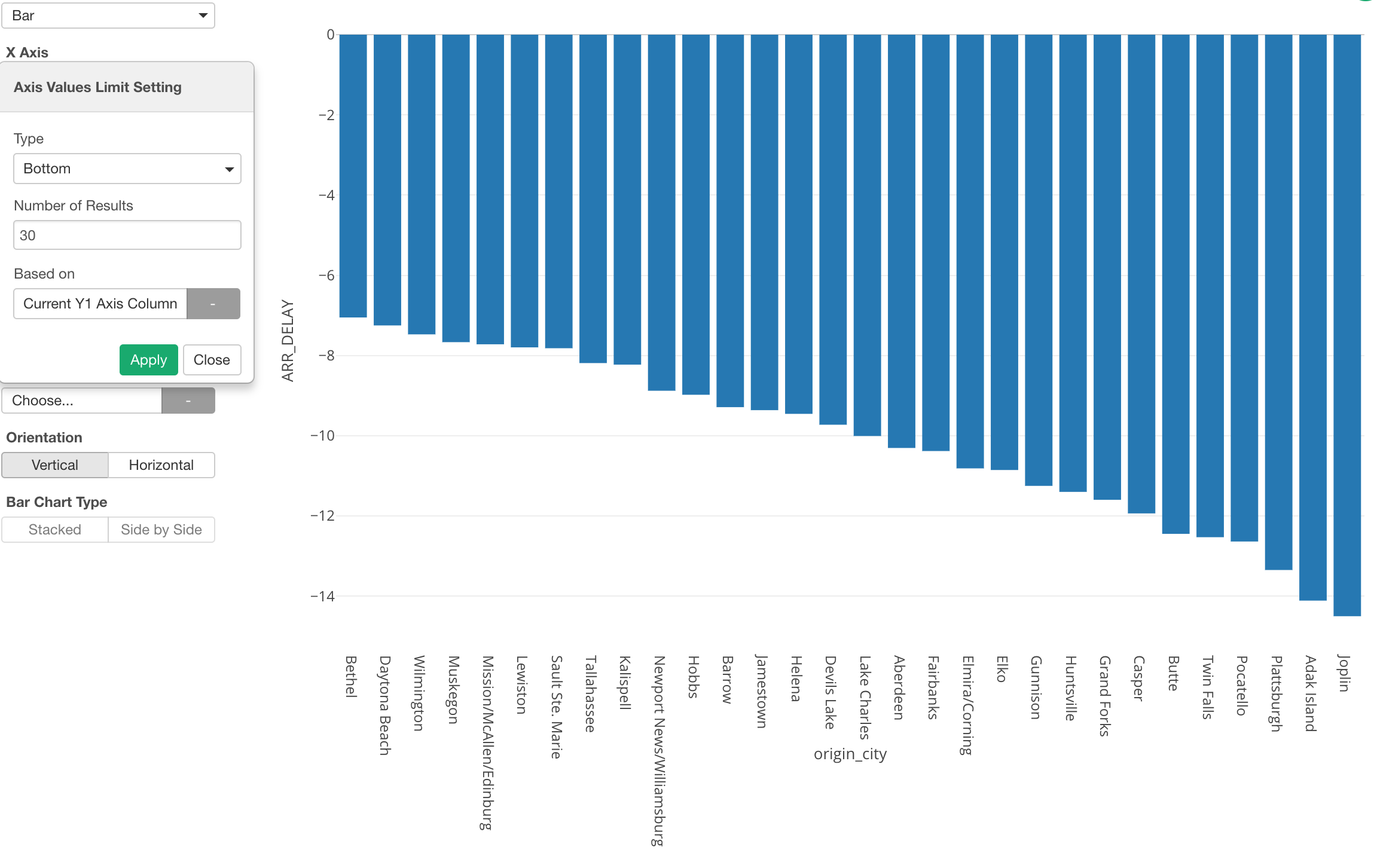
You can do the opposite, which is to show the bottom 30 cities based on the delay time.
Limit Values with Condition
You can also use Condition as the limiting option.
For example, you might want to have a condition like “the cities with more than 5,000 flights.”
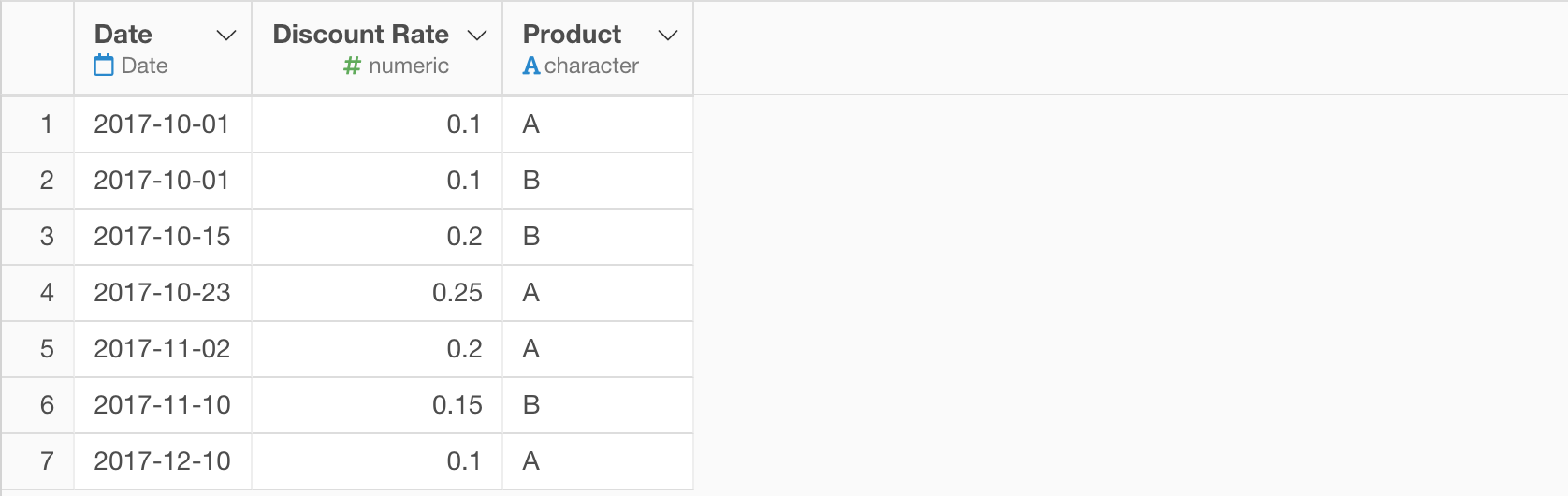
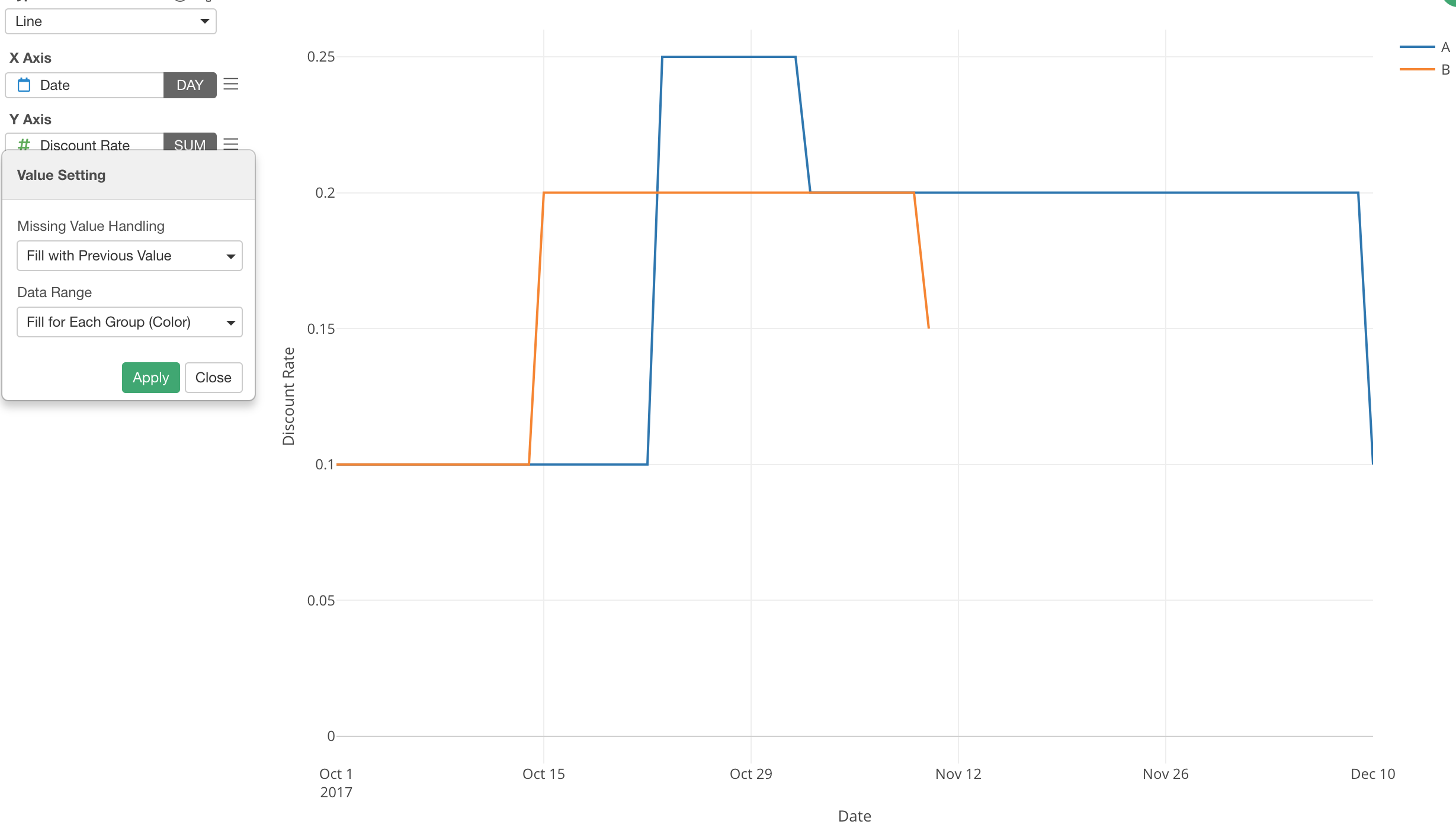
Missing Values Handling
Let’s say we have a discount rate changes data that have only the dates when the discount rates were changed.
If we visualize this with Line chart you’ll get something like this.
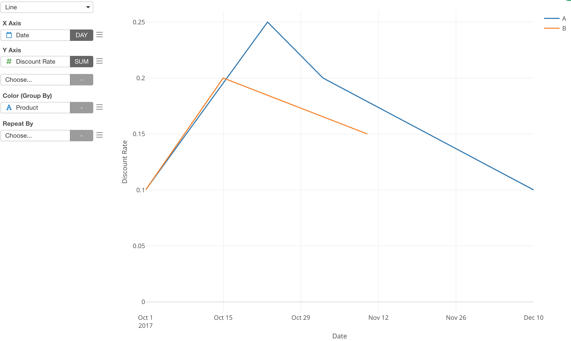
This is misleading because we know the discount rates were not changing gradually between the change dates.
You can use ‘Missing Values Handling’ to address these type of problems.
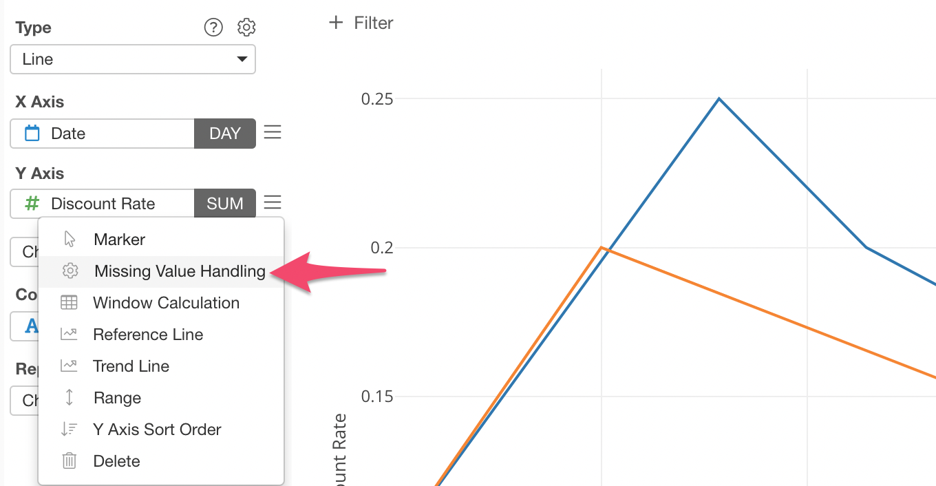
For example, I’m selecting ‘Fill with Previous Value’ option so that the same values get repeated until there is a new value on the time horizon.
Time Series Range Slider
If you are working with Time Series data (Date/Time column is assigned to X-Axis) then you can show the range slider by checking ’Show Time Range Slider in the property.