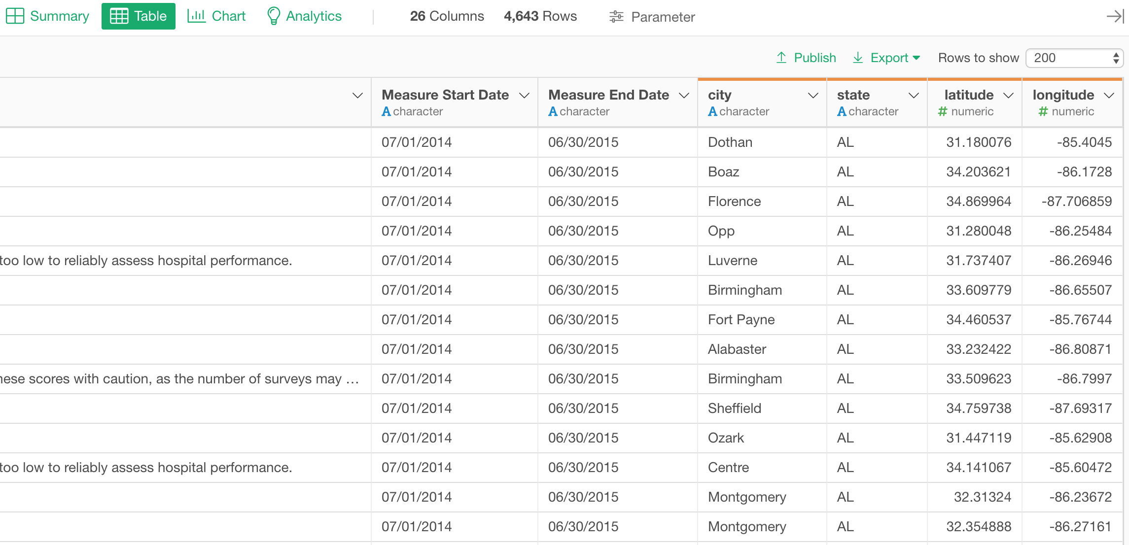
I’m super excited to announce Exploratory v5.1!
I mean, finally!
We have been working on this release for the last 5 months! We were originally planning to release it in January, but we canceled it, though we had many users already using the beta version of v5.1.
So, what happened?
Well, we had realized we had two major problems.
One was about Parameter. This was the biggest new feature of v5.1 and one of the most requested features from our users. But it was not as high quality as we wanted. So we wanted to spend more time to make Parameter to be easier to use, faster to perform, and more stable to function.
Another problem was that we were not addressing some of the critical problems our users and students (yes, we teach data science!) were facing when they wanted to use Statistics and Machine Learning tools to understand their data deeper. So we wanted to provide great solutions to address them by improving Chart and Analytics.
Having said that, I think we’ve got something really great here.
Themes of v5.1
There are two main themes.
One is to make it possible for you to make your Dashboard, Note, Slide, and Chart interactive so that your team members can interact with them and dynamically update the data. We call it Parameter.
Another is to make EDA (Exploratory Data Analysis) experience of Exploratory easier and more powerful with new chart types such as Violin plot, Scatter matrix, Density Plot, and Word Cloud, and new analytics capabilities such as Boruta for Random Forest, Relative Importance for Linear Regression, Marginal Effect for Logistic Regression, etc.
And of course, there are many other new features and enhancements in other areas such as Data Source, Data Wrangling, etc. as well.
As always, there are tons of cool new features.
Let’s take a look at some of them worth noting.
Parameter
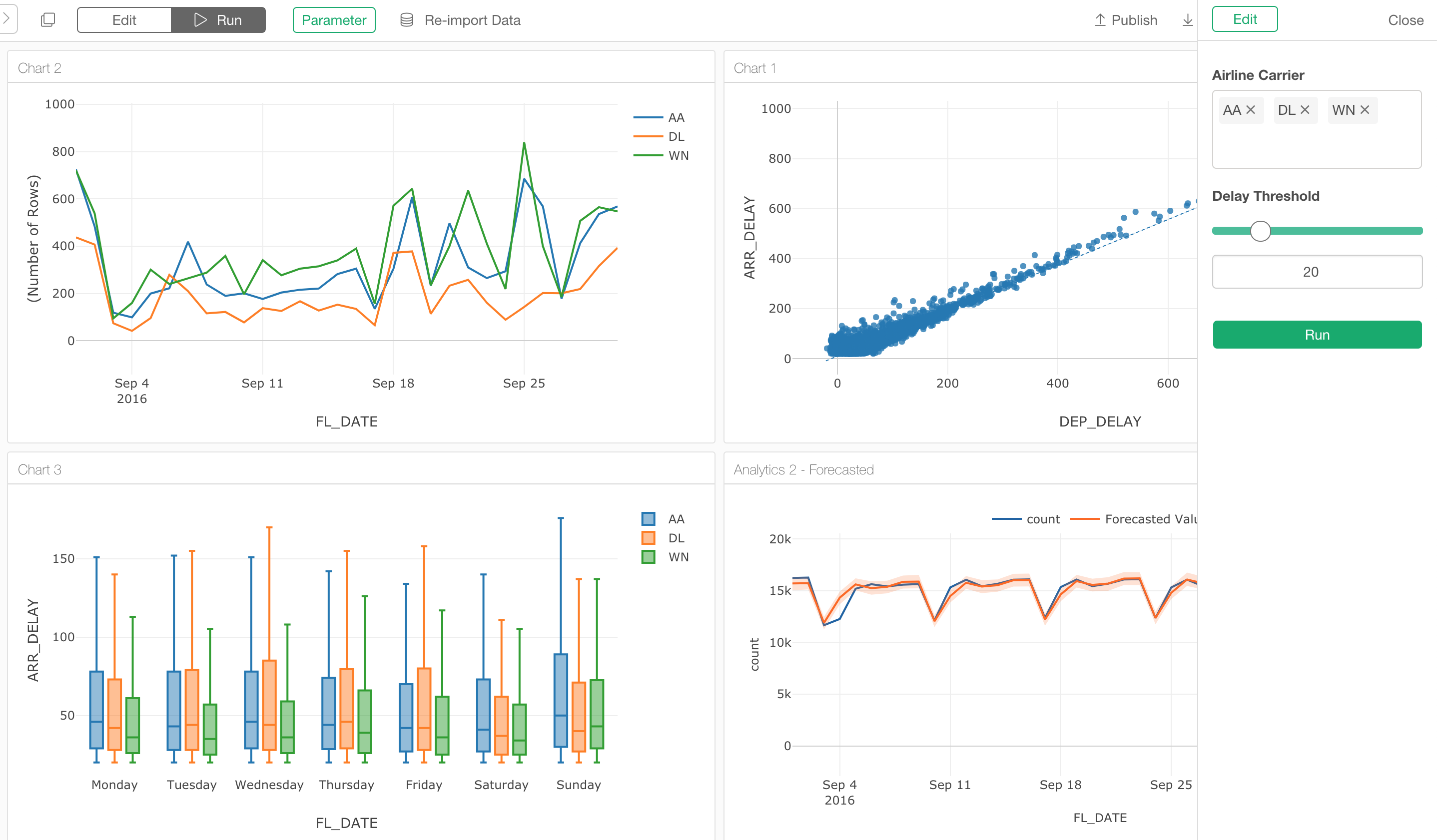
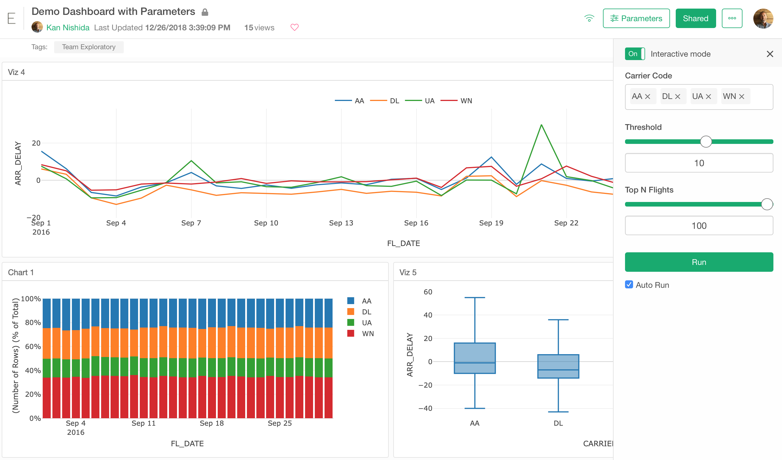
Parameter makes your Dashboard, Note, Slides, Chart, and Data interactive so that other people can interact with them to update the data.
By using Parameter, you can update the data wrangling steps and data queries (SQL, MongoDB, Custom R Script) dynamically based on the user inputs.
Not only you can interact with Dashboard and others inside your Exploratory Desktop, but also you can interact with them at the server (exploratory.io or Exploratory Collaboration Server) once you publish them.
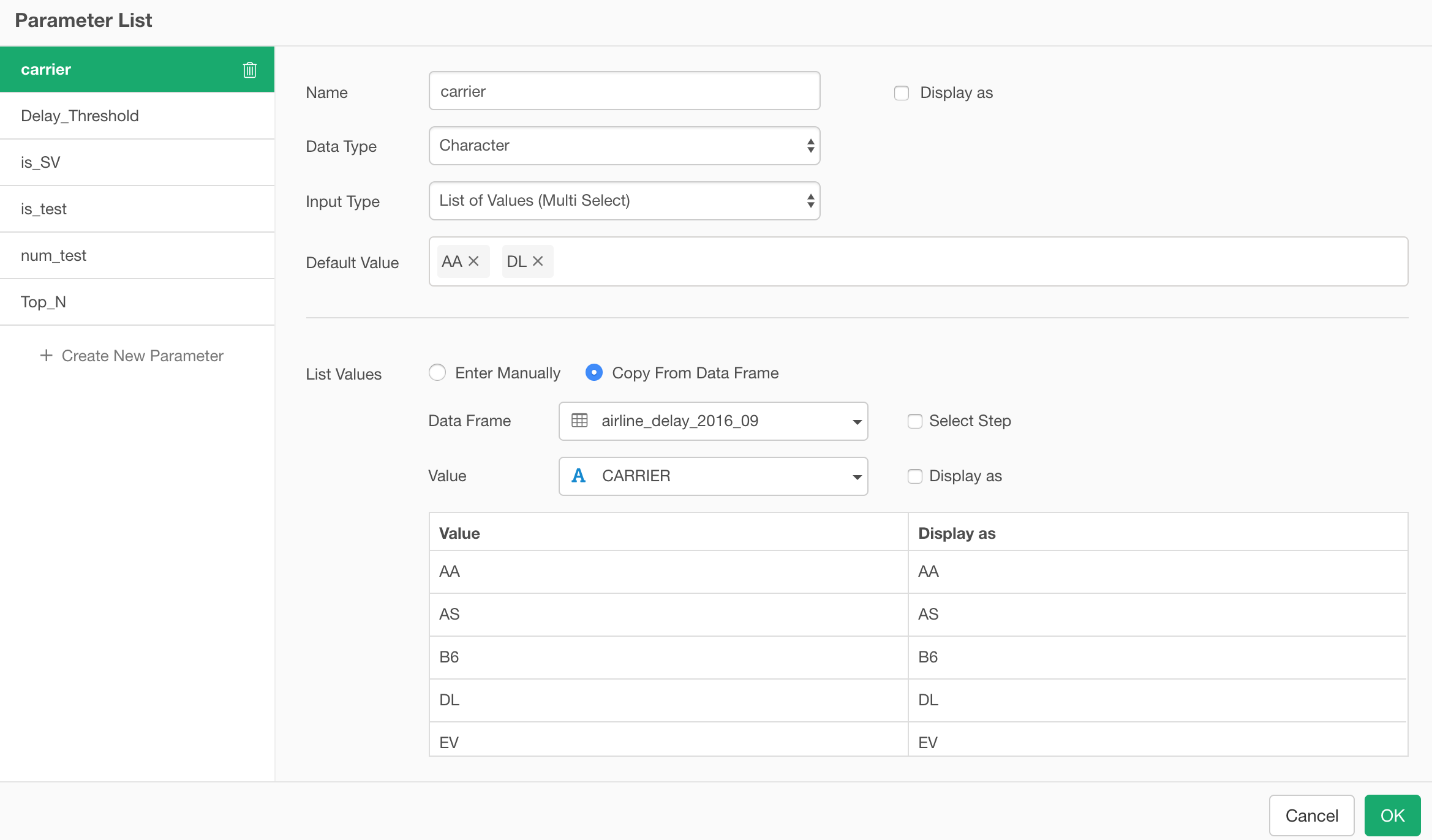
To use the Parameter, you want to create it first. 😉
We have created a new UI to configure the parameters.
Configure Parameters
There are various types of parameters you can create. For example, you might want to show a list of values from which you or your audience can pick from. Or, you might want to show a slider with which you or your audience can use to set a numeric value. We have a separate note if you are interested in more details.
Once you have created your parameters you want to parameterize your Data Source or Data Wrangling steps.
Here are a few examples of what you can parameterize.
Parameterized SQL Queries
You can make your SQL query to be dynamically generated based on the user inputs.
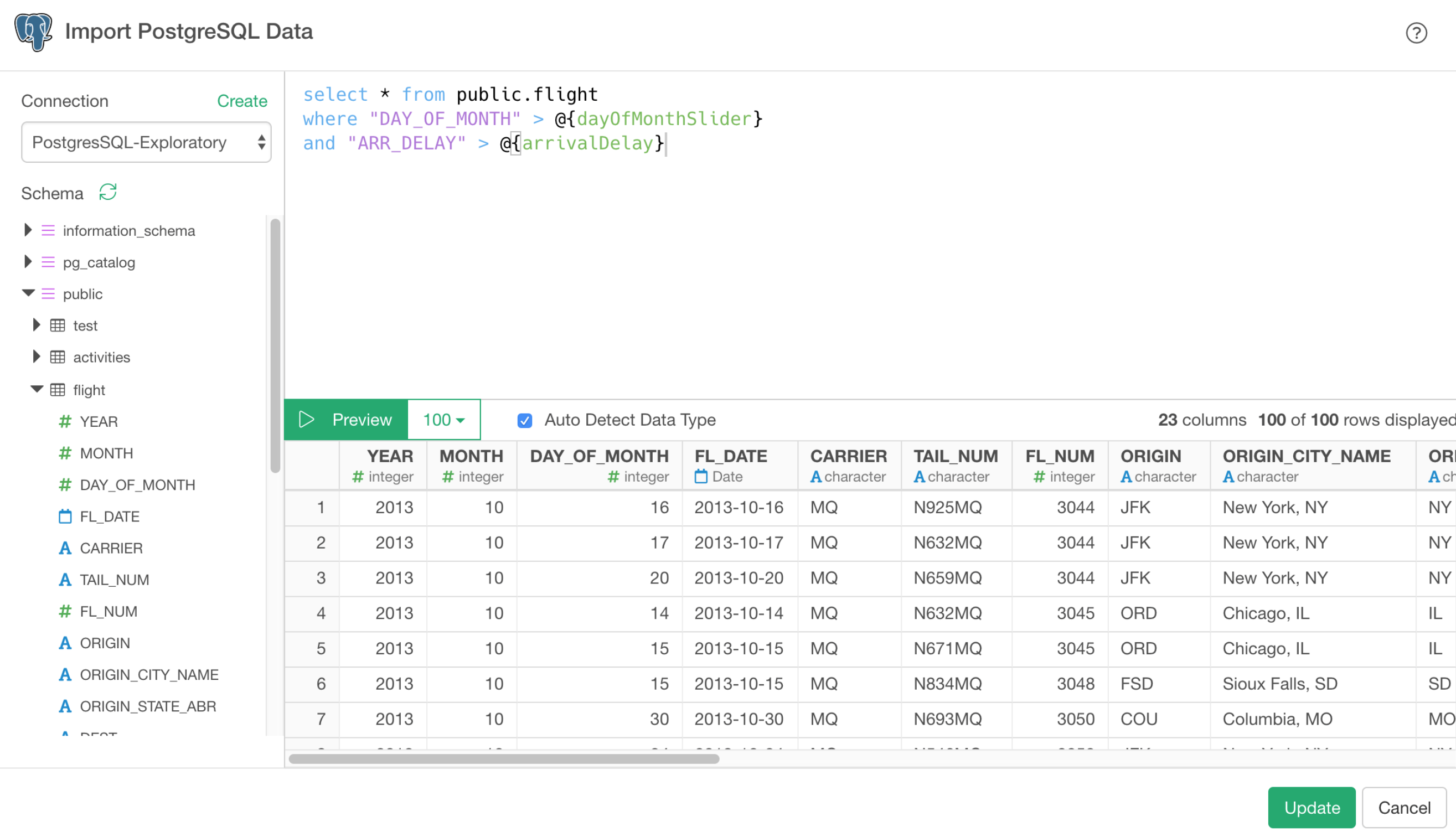
Once you set up your SQL queries with the parameters, you can simply update the parameter values from Parameter UI Pane to update the queries and expect to see the updated data in the chart, for example.
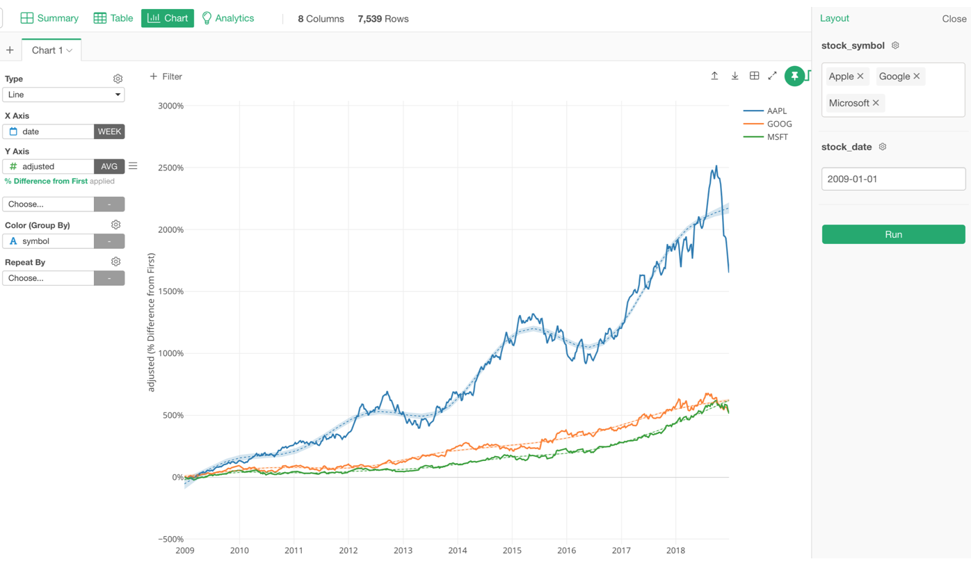
Parameterized R Script Data Source
You can make your R Script dynamically generated based on the user inputs.
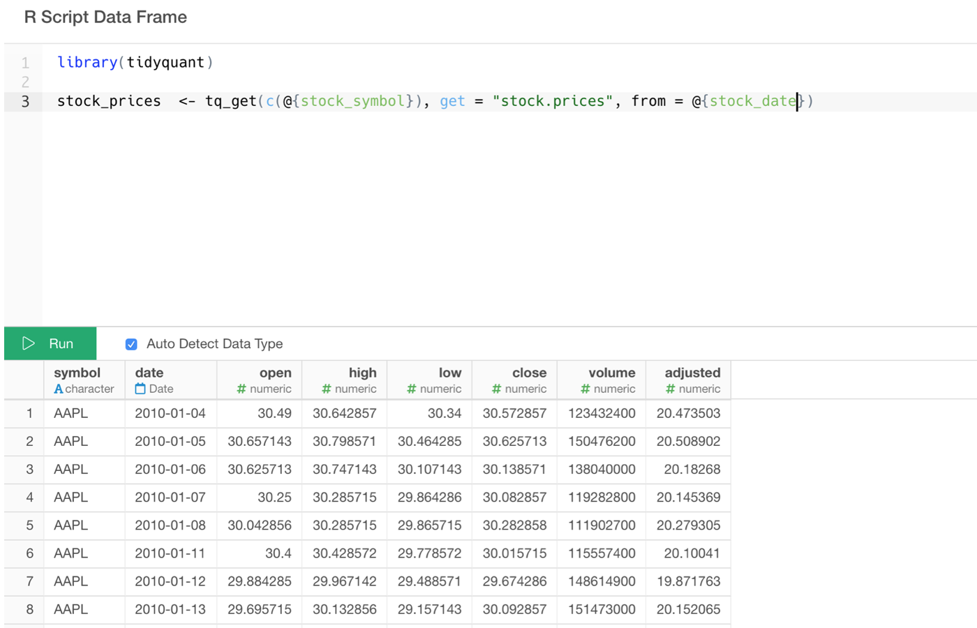
This R Script is using ‘tidyquant’ R package to retrieve the stock price data. I’m making the stock symbol and the date range to be parameterized so that I can change those values from the Parameter UI Pane while looking at the chart.
Parameterized MongoDB Query
You can make your MongoDB query to be parameterized.
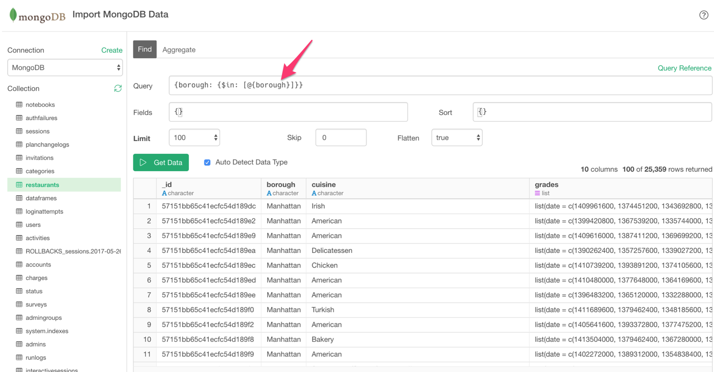
Same thing. you can now interact with MongoDB just by updating the parameter values while looking at the chart or the dashboard.
Parameterized Data Wrangling Steps
Of course, you can make your data wrangling steps to be parameterized, too!
Here are a few examples.
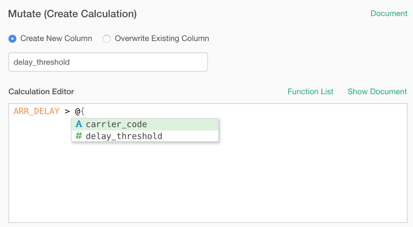
Parameterize Calculations (Mutate)
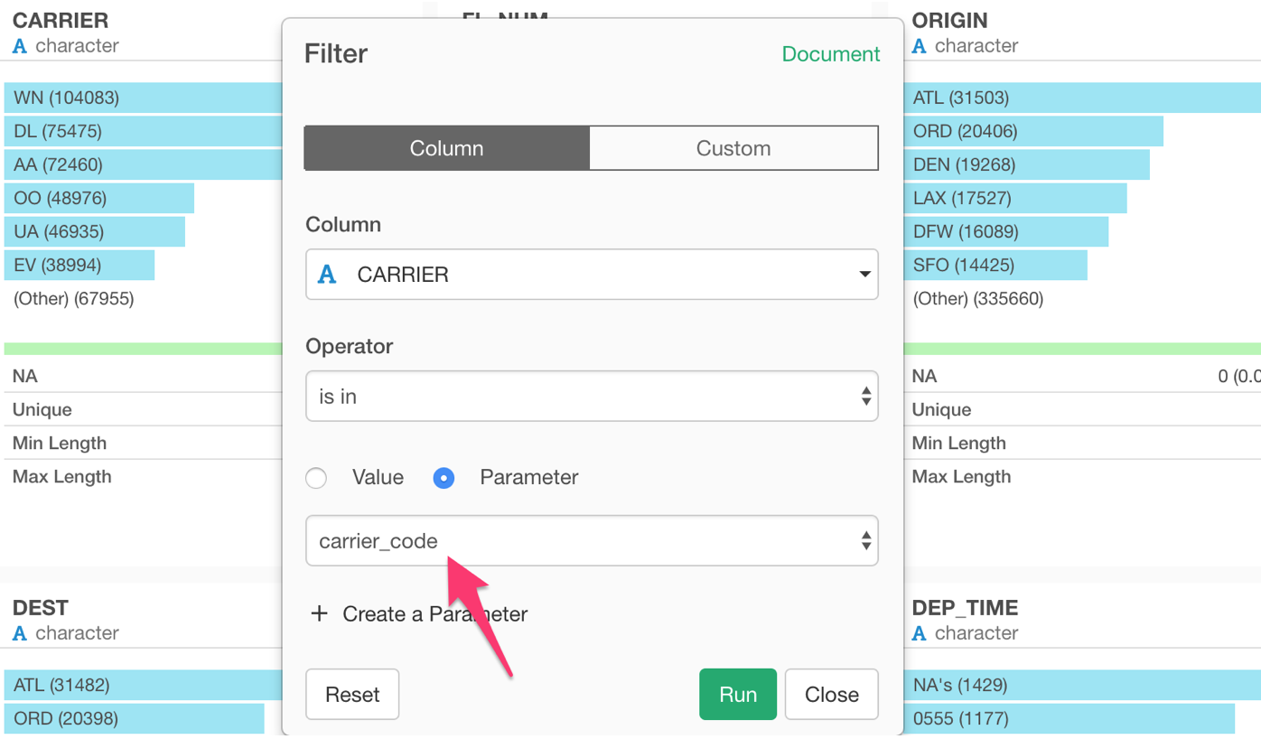
Parameterize Filter
This is probably the most common scenario. You can simply click the Parameter radio button and select the parameter you want to use.
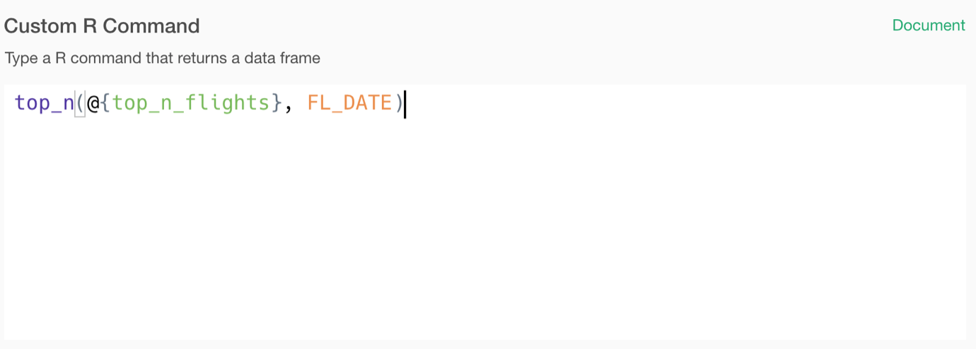
Parameterize R Command
The cool thing about Exploratory is, you can directly type R commands as long as they take a data frame as the input and return a data frame as the output.
And you can parameterize the R commands as well!
Once you parameterize your data source or data wrangling steps, it’s time to interact with them!
Make Dashboard Interactive with Parameters
The cool thing is, you don’t need to do anything to use the parameters in the Dashboard. Any parameters that are used in the underlying data for your Dashboard will automatically show up in the parameter UI pane of Dashboard.
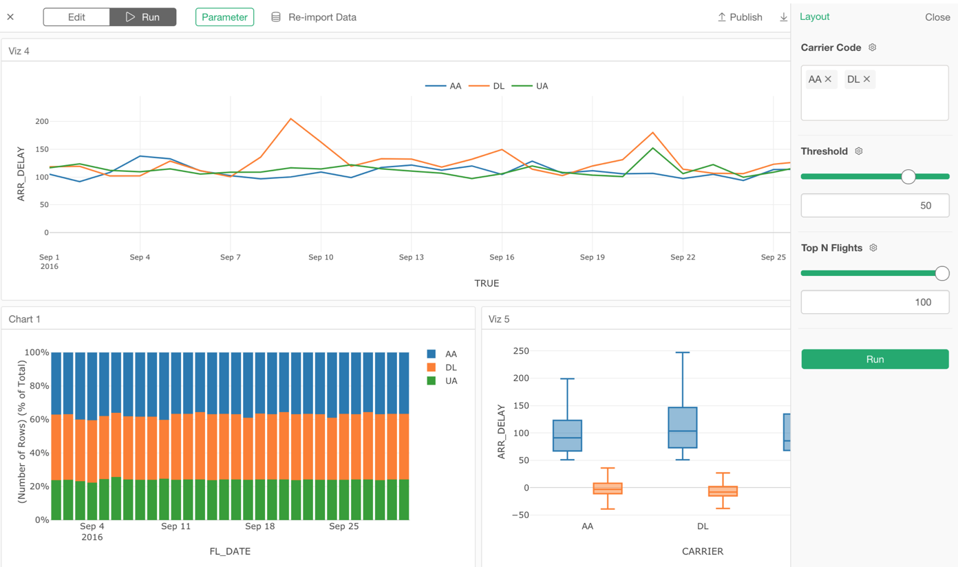
Our data processing engine automatically detects which parameters to be used in order to generate the dashboard data. Just works!
And of course, you can make your Notes and Slides to be interactive with Parameter as well!
Now, you can create only one version of a dashboard, for example, then share it with others who might want to see different parts of data. They can simply change the parameter values to re-run the dashboard!
I have written a separate note to cover more details on how to create and use Parameter in Exploratory, take a look!
- An Introduction to Parameter in Exploratory - Link
Now, let’s take a look at other new features under Chart, Analytics, Data Wrangling, and Data Source.
Chart
We have introduced 4 new chart types and a few exciting enhancements to the existing charts for v5.1.
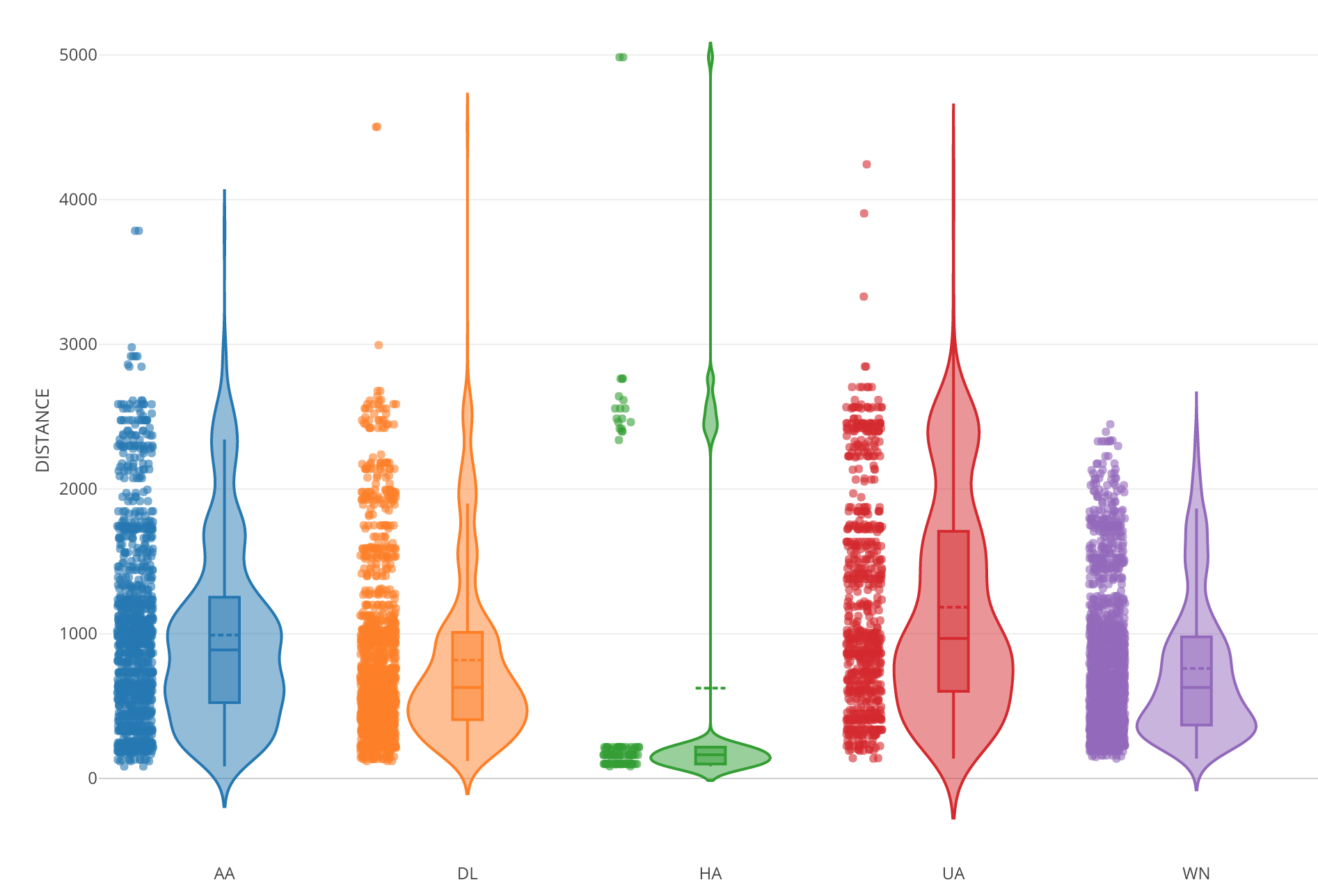
Violin Plot
Violin Plot is basically combining Density plot and Boxplot. It visualizes how the data is distributed and help you compare the distribution among categories better.
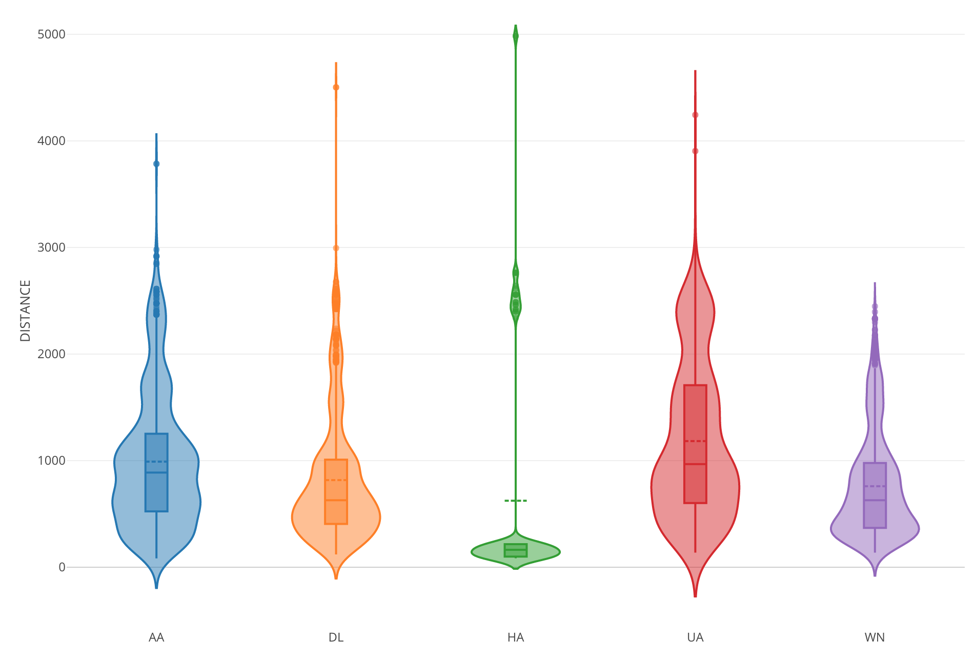
You have an option of showing the boxplot inside the violin shape and showing the dots (original data points) next to the Violin.
Scatter Matrix
Finally, Scatter Matrix is in the house!
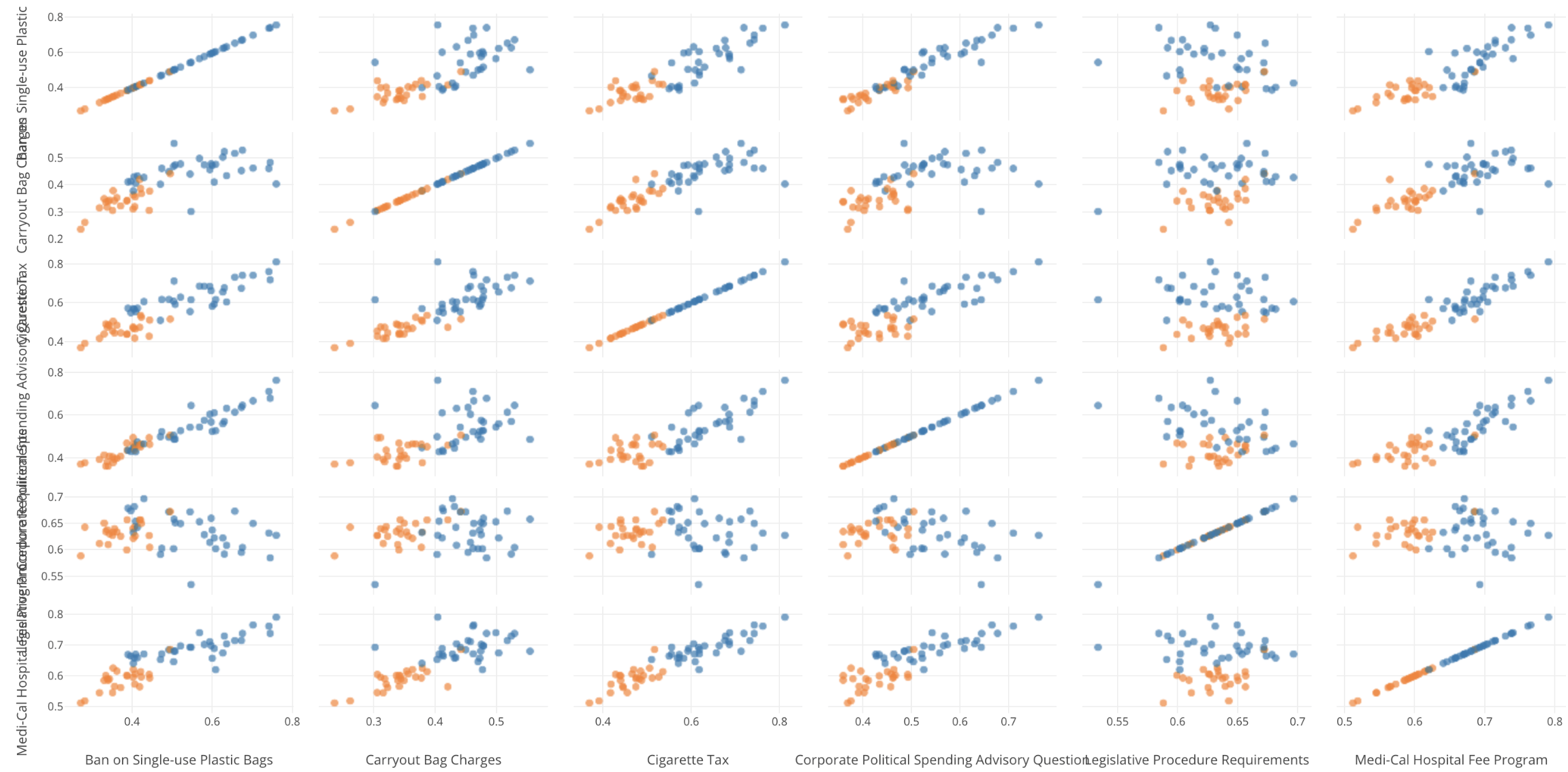
This chart is available under Analytics view’s Correlation Analysis. It will make it more intuitive to understand the correlation between any given pair of numerical variables.
Density Plot
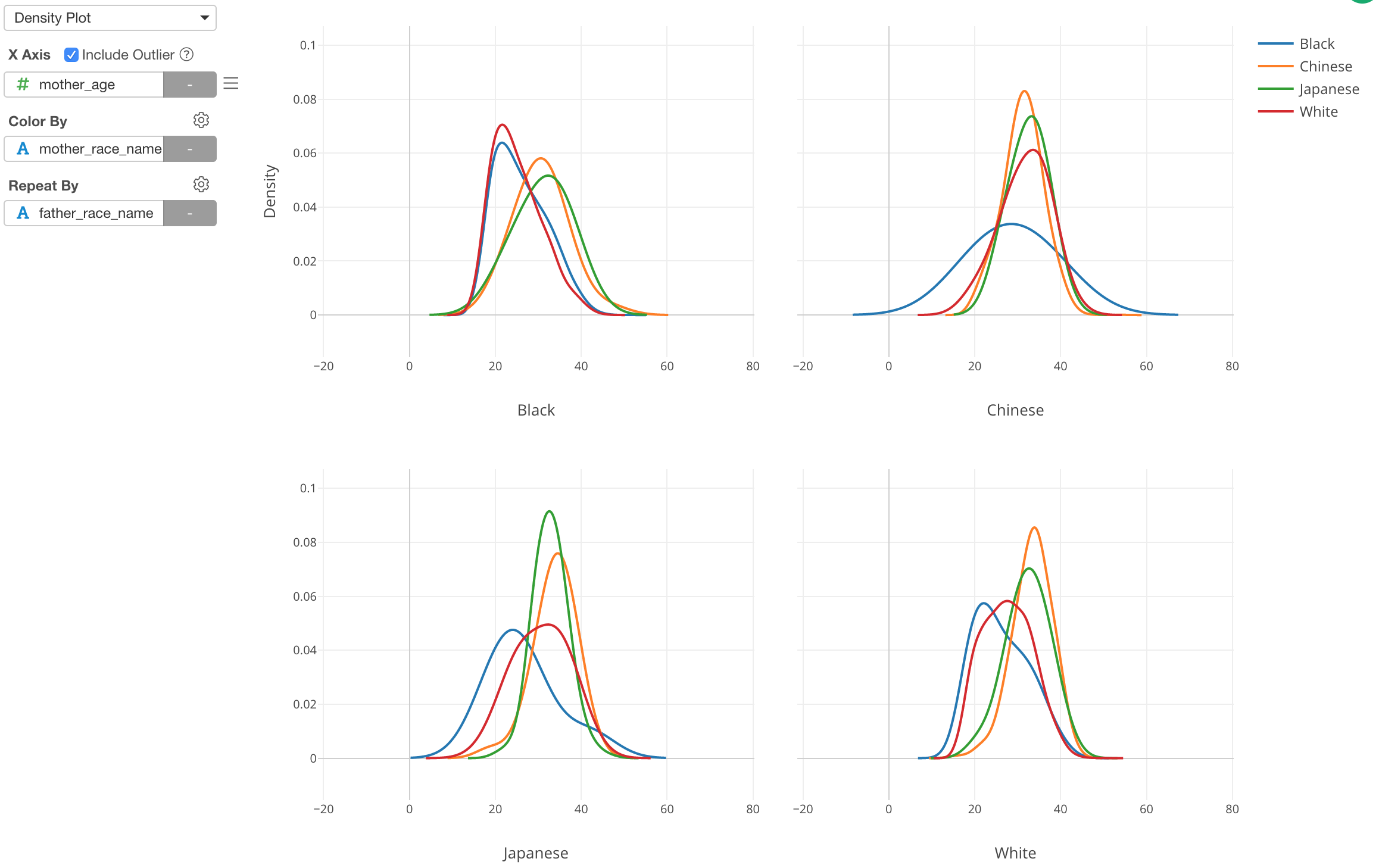
We often use Histogram to visualize the distribution of numerical variables, but sometimes it’s not helpful.
For example, in order to compare the data distribution among multiple categories, we can use Color. But this often ends up placing multiple histograms on top of each other, which makes it harder to understand the difference, like the below.
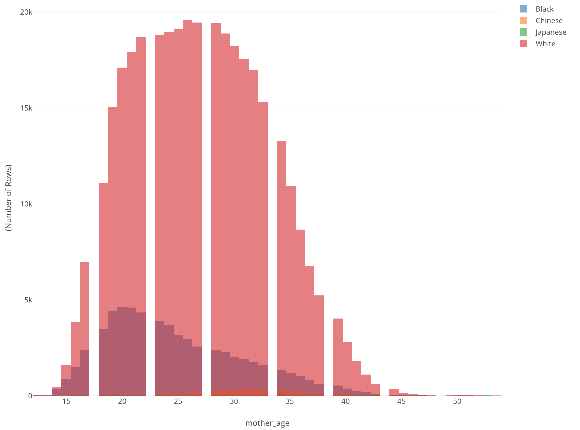
This is showing the age distribution of mothers who gave birth by mother’s race. All we can see is a histogram of White (Red). There is another histogram inside it, but we don’t know what exactly is and we can’t really see others.
There are two problems. One is that different colors are on top of each other. Another is that there are some groups (categories) that have very small values compared to others.
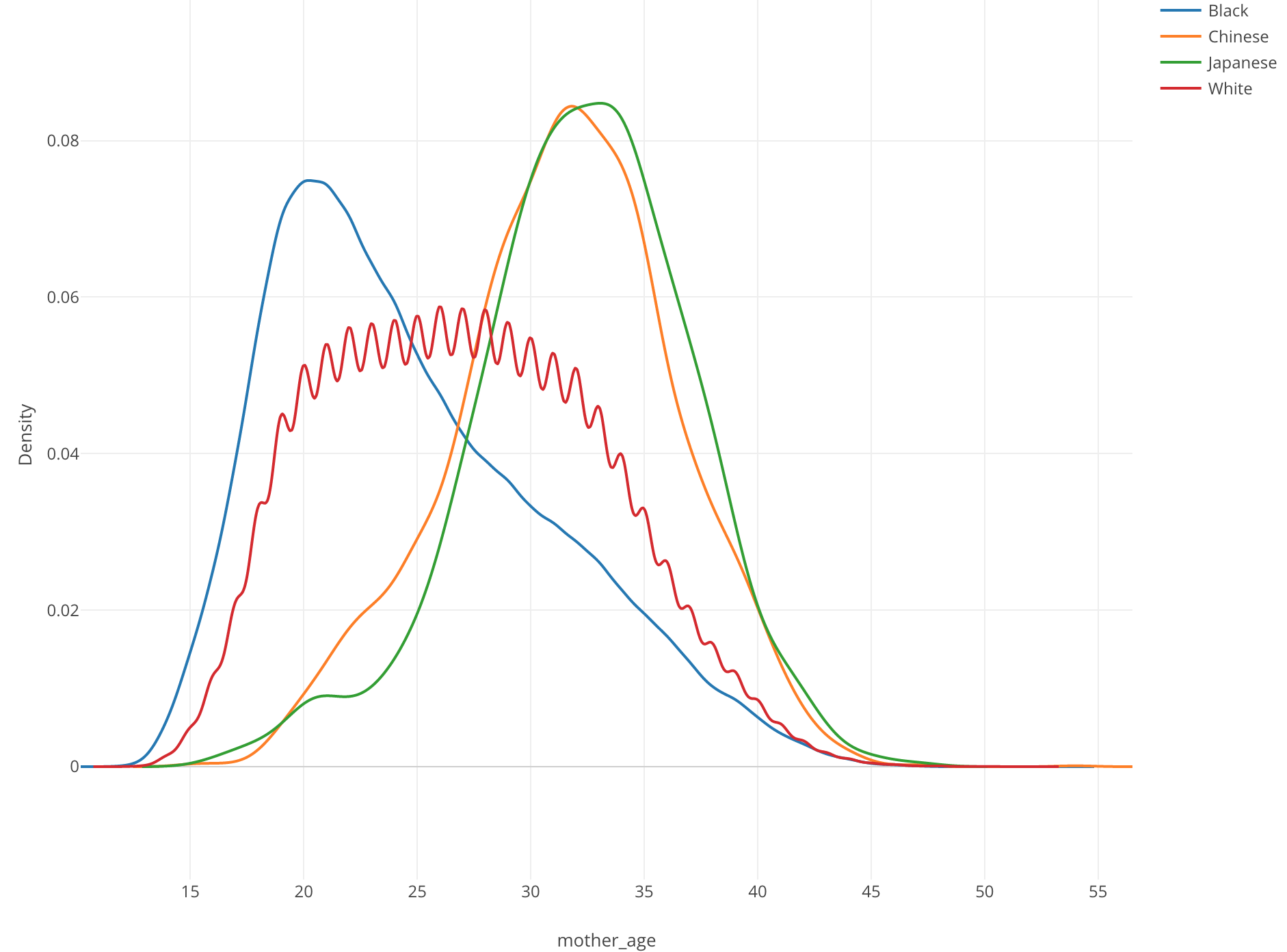
This is when Density plot comes in handy. Here, I’ve just changed it from Histogram to Density Plot. Now we can see that Chinese (Orange) and Japanese (Green) mothers tend to be older than other groups while Black (Blue) mothers tend to be younger.
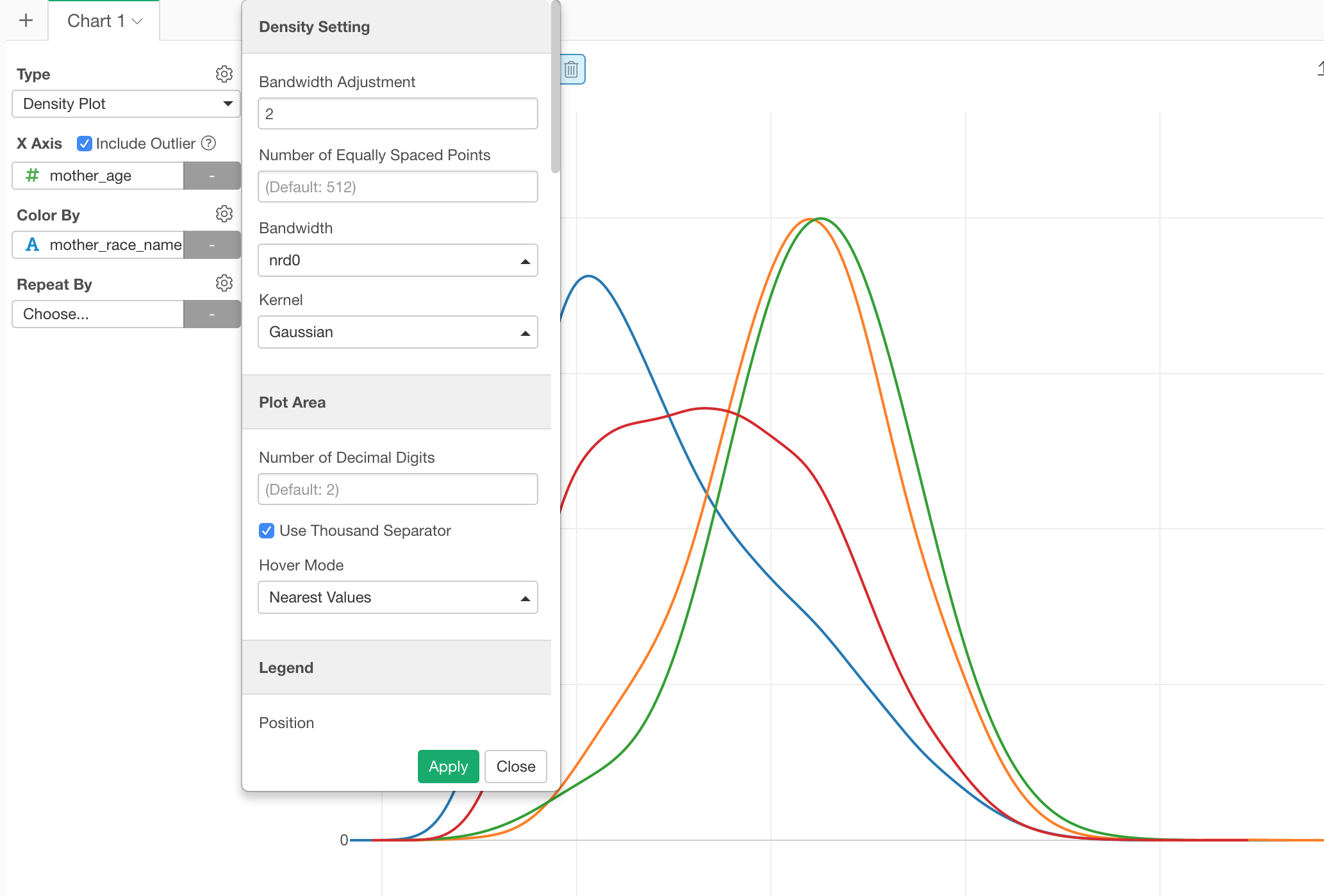
From the property, you can configure the algorithm behind the plot called ‘kernel smoothing’, which estimates the density of the data distribution.
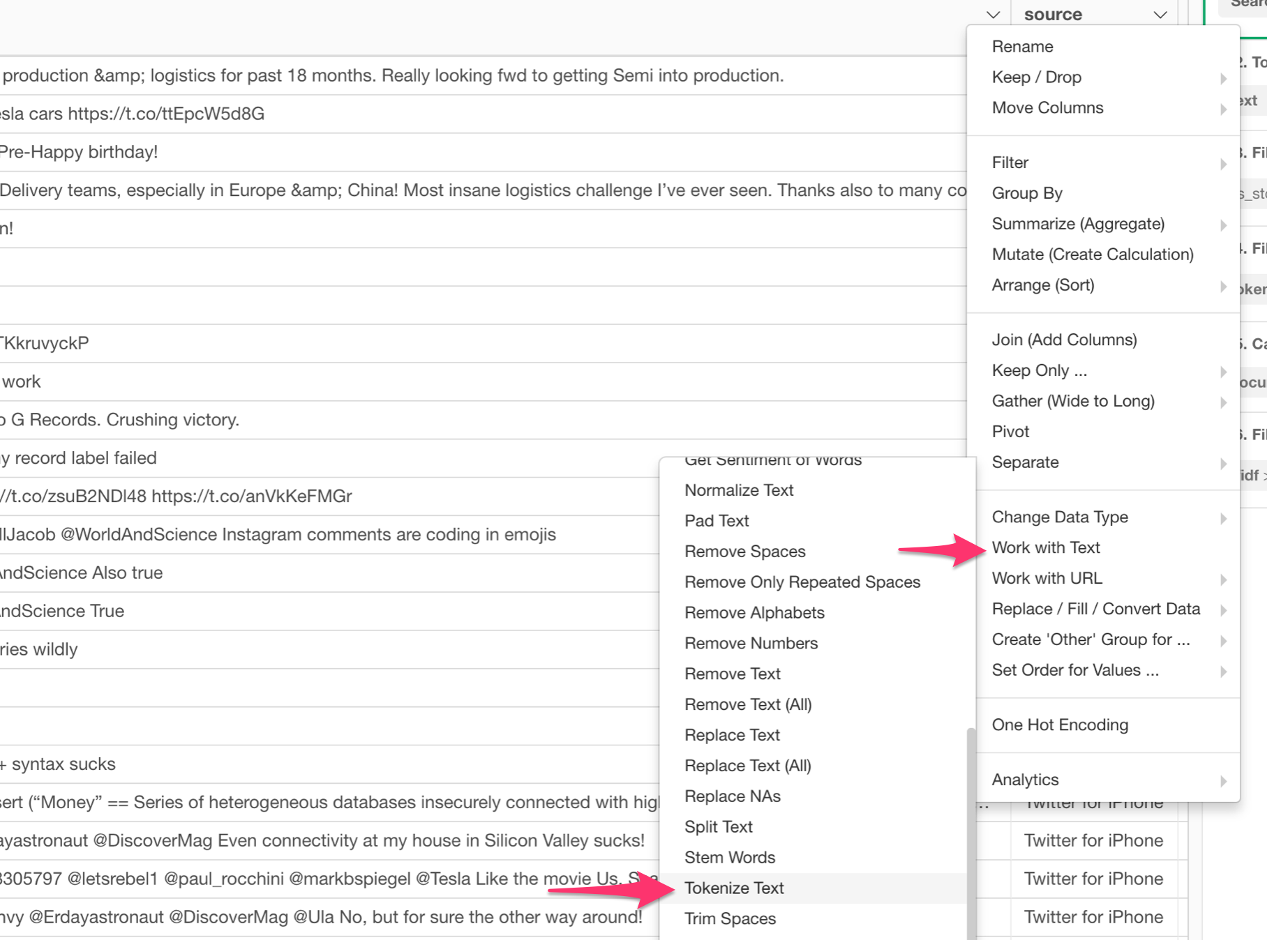
Word Cloud
We have added Word Cloud chart under Chart view.
It helps to visualize your text analysis result in a more engaging way.
Here is how I have visualized Elon Musk’s tweet text based on the number of appearances after removing the stop-words (common words).
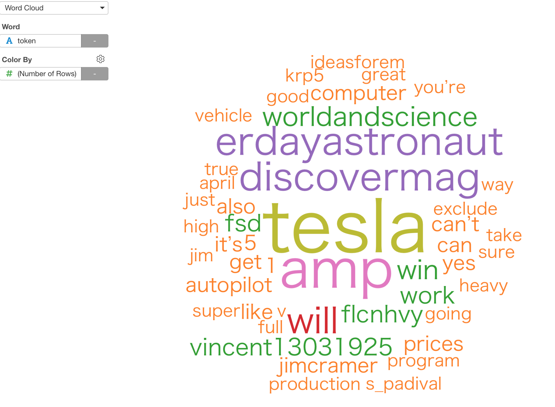
The bigger the size is the more frequent they appear in his tweets.
To use it, you want to tokenize the tweets first. You can do this by selecting,
Work with Text -> Tokenize Text
from the column header menu.
If you want to know more about Text Analysis in Exploratory, I have written a series of blog posts before, take a look if you’re interested.
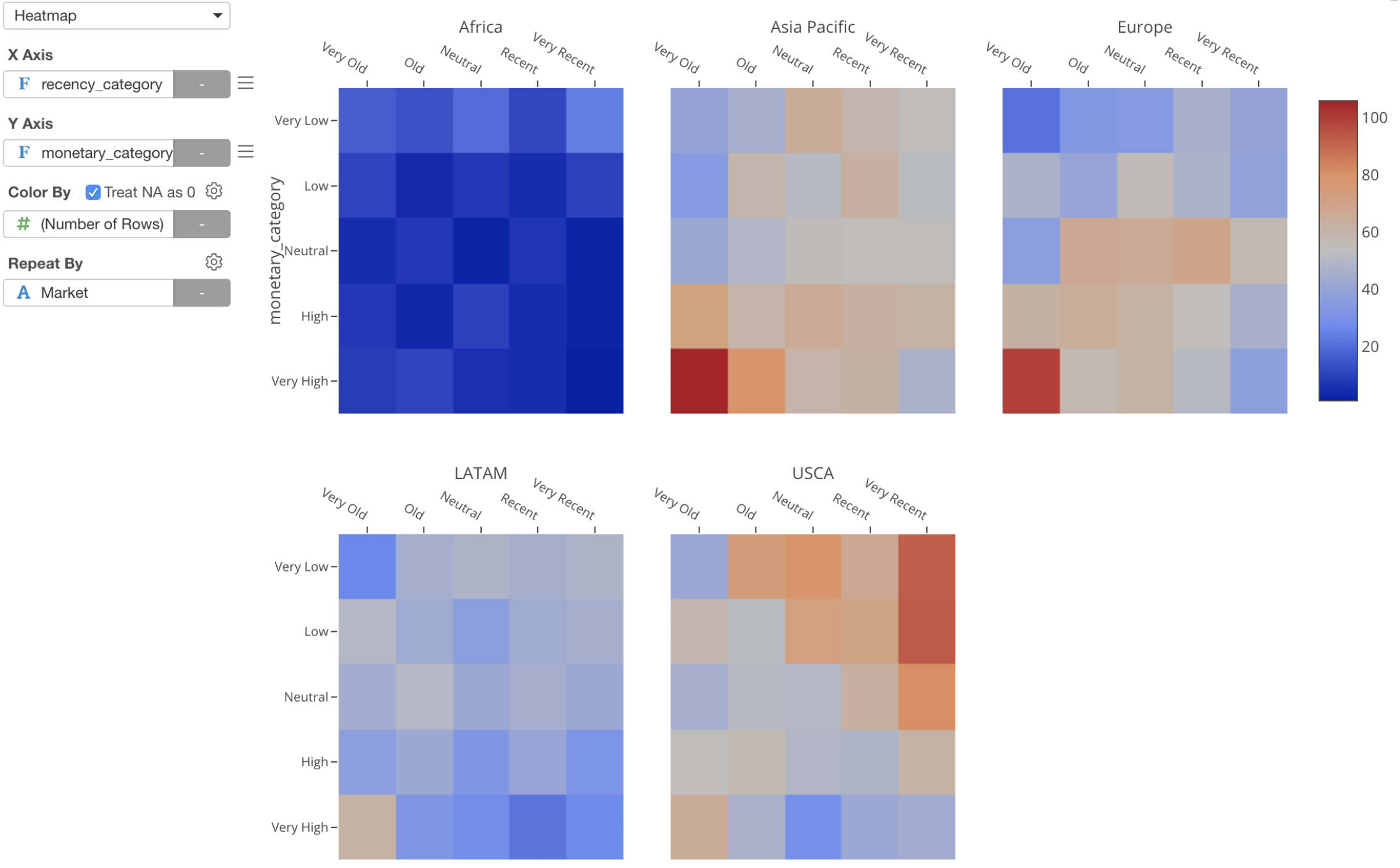
Heatmap with Repeat By
We have added ‘Repeat by’ support for Heatmap chart! You will be able to see multiple heatmap charts for multiple categories.
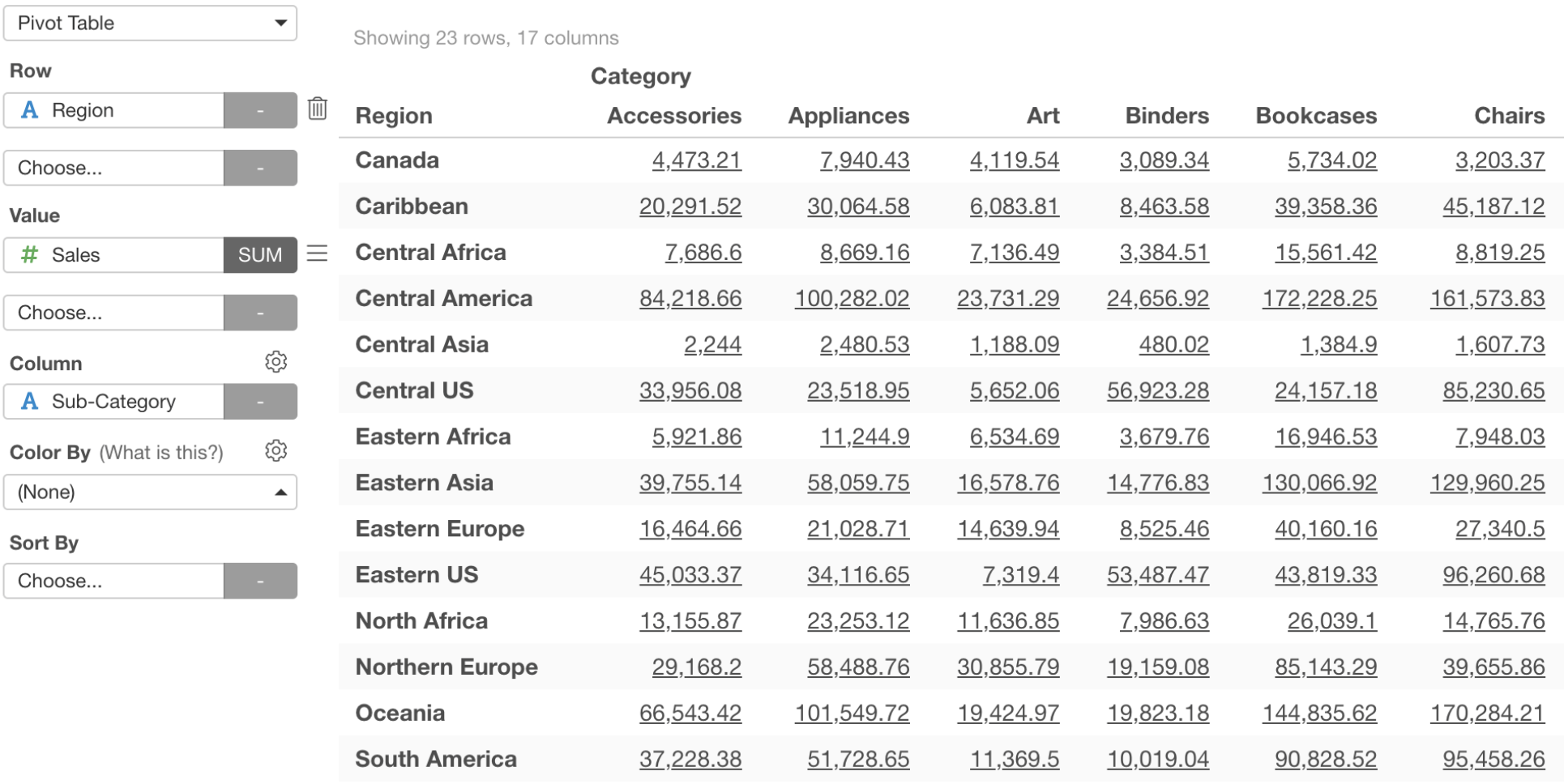
URL Link Support for Pivot / Table
You can now set URL link for the text inside Pivot Table and Table. This would be useful when you want to share your Dashboard with Pivot Table or Table and have your audience click on a particular data point to open an associated web page.
Pivot Table
Table
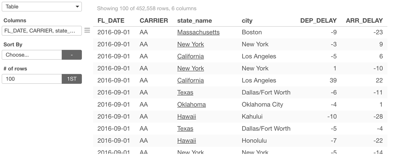
Those URL links can be dynamic by using the column values.
I have written a separate post to cover more details on this feature.
- How to Add URL Link to Values in Pivot / Table? - Link
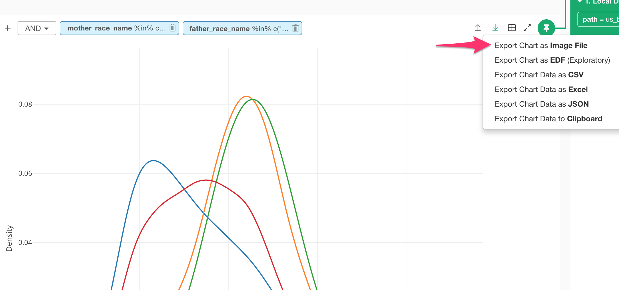
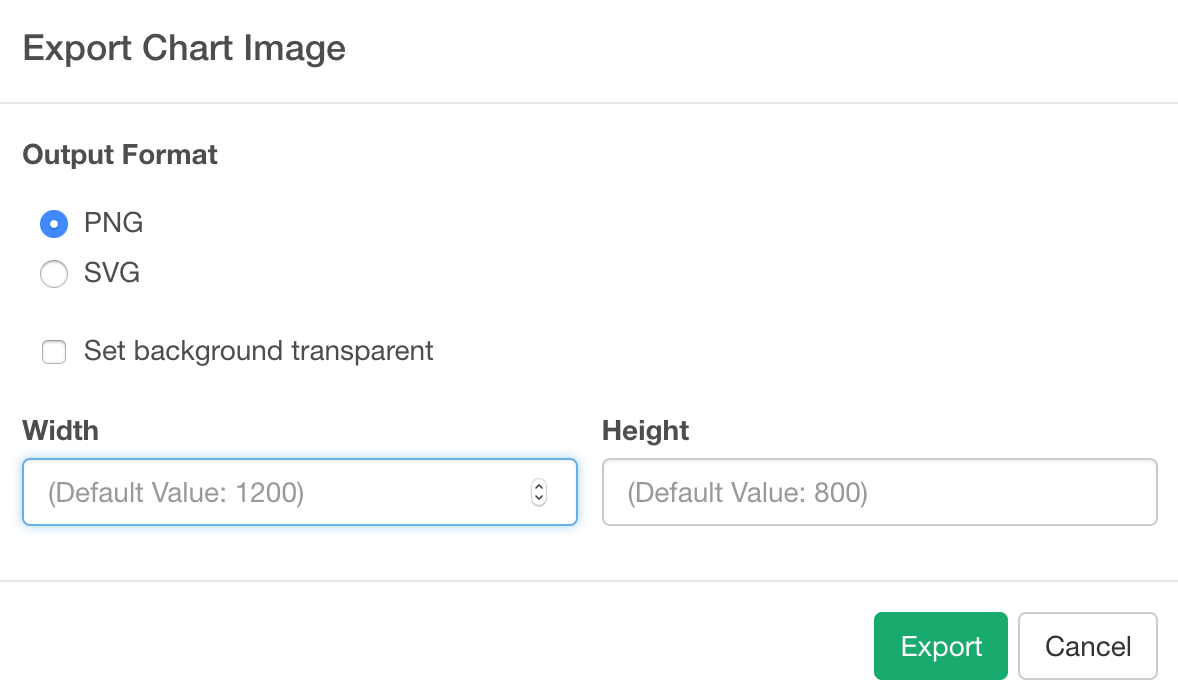
Image export with Color background
Now you can export your charts with a non-transparent background. Also, you can set the size (height and width) of the exported images.
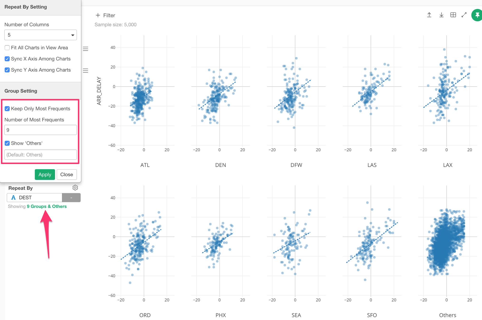
‘Other’ group support
When you assign a variable (column) with many unique values to Color or Repeat By, the chart becomes hard to read. This is why there is ‘Other’ group support, which makes less frequent values to be grouped under ‘Other’.
This setting has been available only in a few charts before, but now we are extending the support for other charts types like Map, Scatter, Bubble, etc.
Analytics
There are a few but very exciting and useful new features under Analytics view.
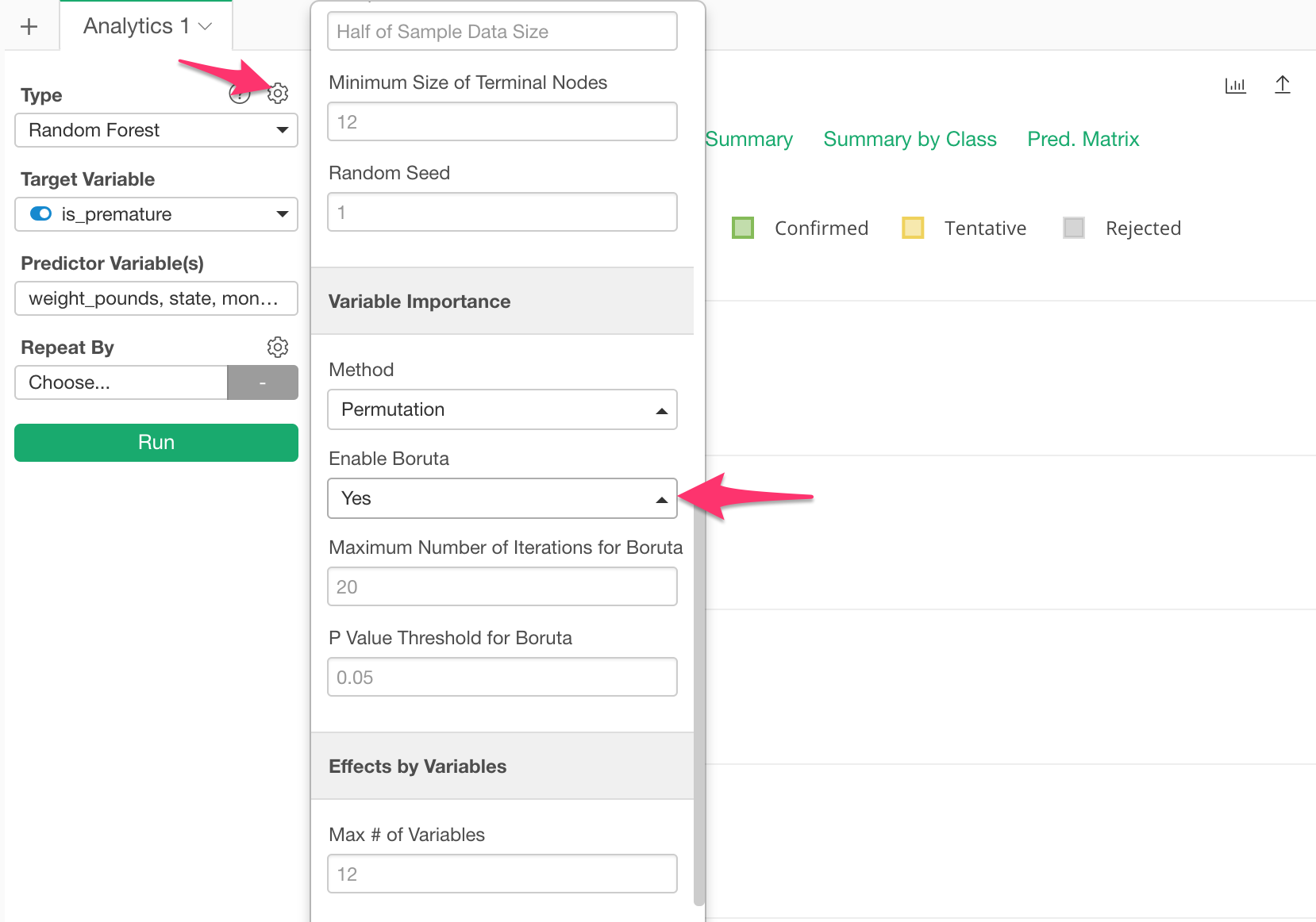
Random Forest with Boruta
There are two problems in order to interpret the result of Random Forest’s ‘Variable Importance’.
First, the result can vary every time you run it due to the ‘randomness’ of sample data used to build the model.
Second, you don’t know which variables are actually meaningful and which are not for predicting the outcome.
There is a method called Boruta, which helps to address these two problems.
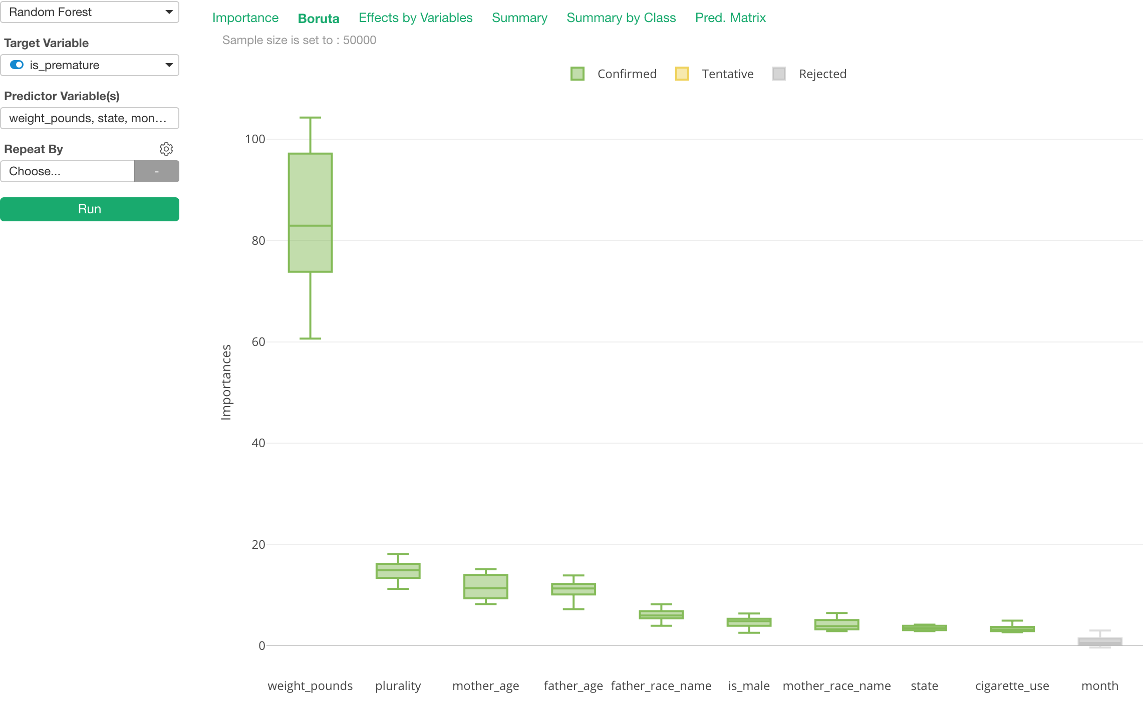
With Boruta, you can see the variable importance scores as distribution, Boxplot, not Bar, and also see the variables in different colors based on how significant they are to predict the target variable.
It is off by default because it makes the model building slower, but you can easily turn it on from the property.
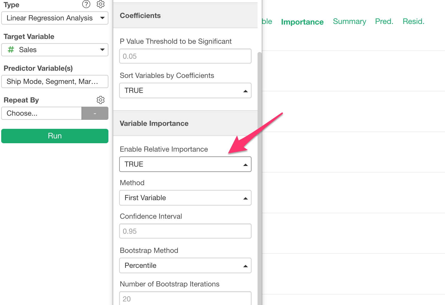
Variable Importance for Linear Regression
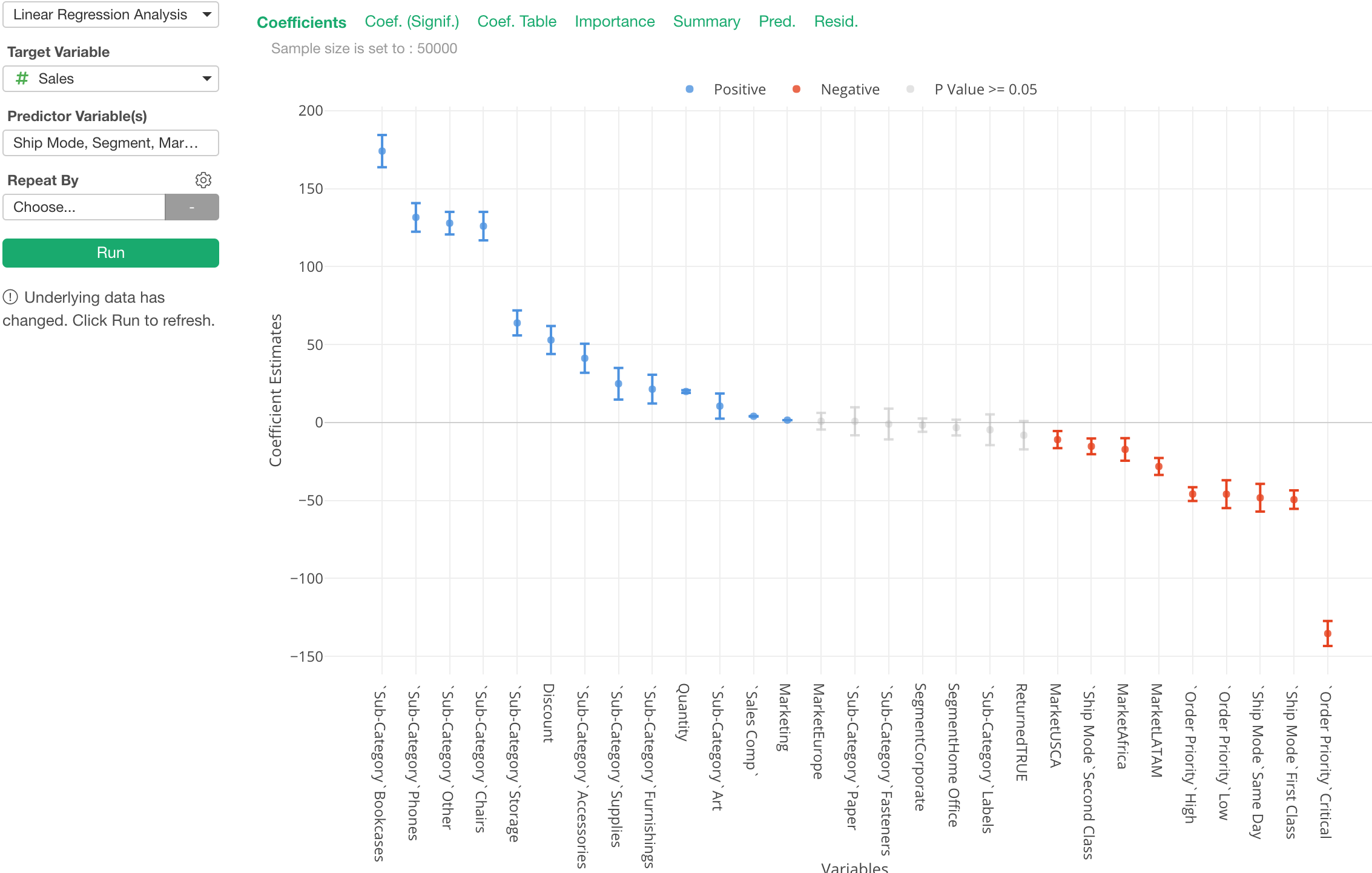
When we build Linear Regression models and look at the coefficients once thing you are not supposed to do is to compare the coefficients among the variables. That is because the units of each variable are different. For example, Order Quantity, Age, Weight, and Job Type are completely in different units and scales.
But, we can’t stop trying to do it because essentially that’s what we really want to know! ;)
Well, there is a method called ‘Relative Importance’, which can help you answer a question of which variables are more influential to the target variable. And we have added support to show this metric under Analytics view’s Linear Regression.
Basically, it gives a score to each variable based on how much it contributes to the overall R-Square.
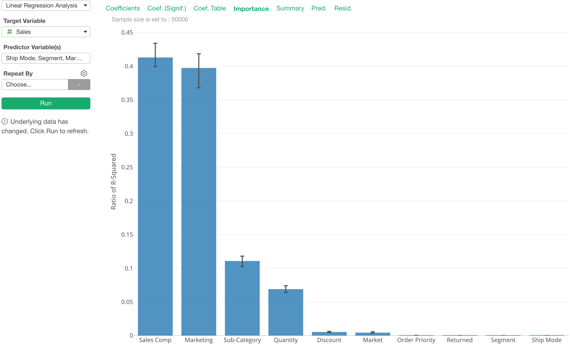
You can turn this on from the property.
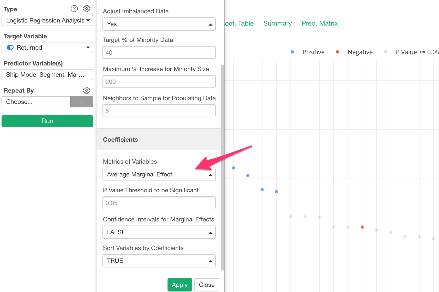
Marginal Effect
Interpreting the result of Logistic Model is hard because the coefficient of the logistic curve or Odds Ratio is an intuitive metric to understand.
There is something called Marginal Effect (or Average Marginal Effect), which has been used to address this challenge in the world of Economics and Political Science.
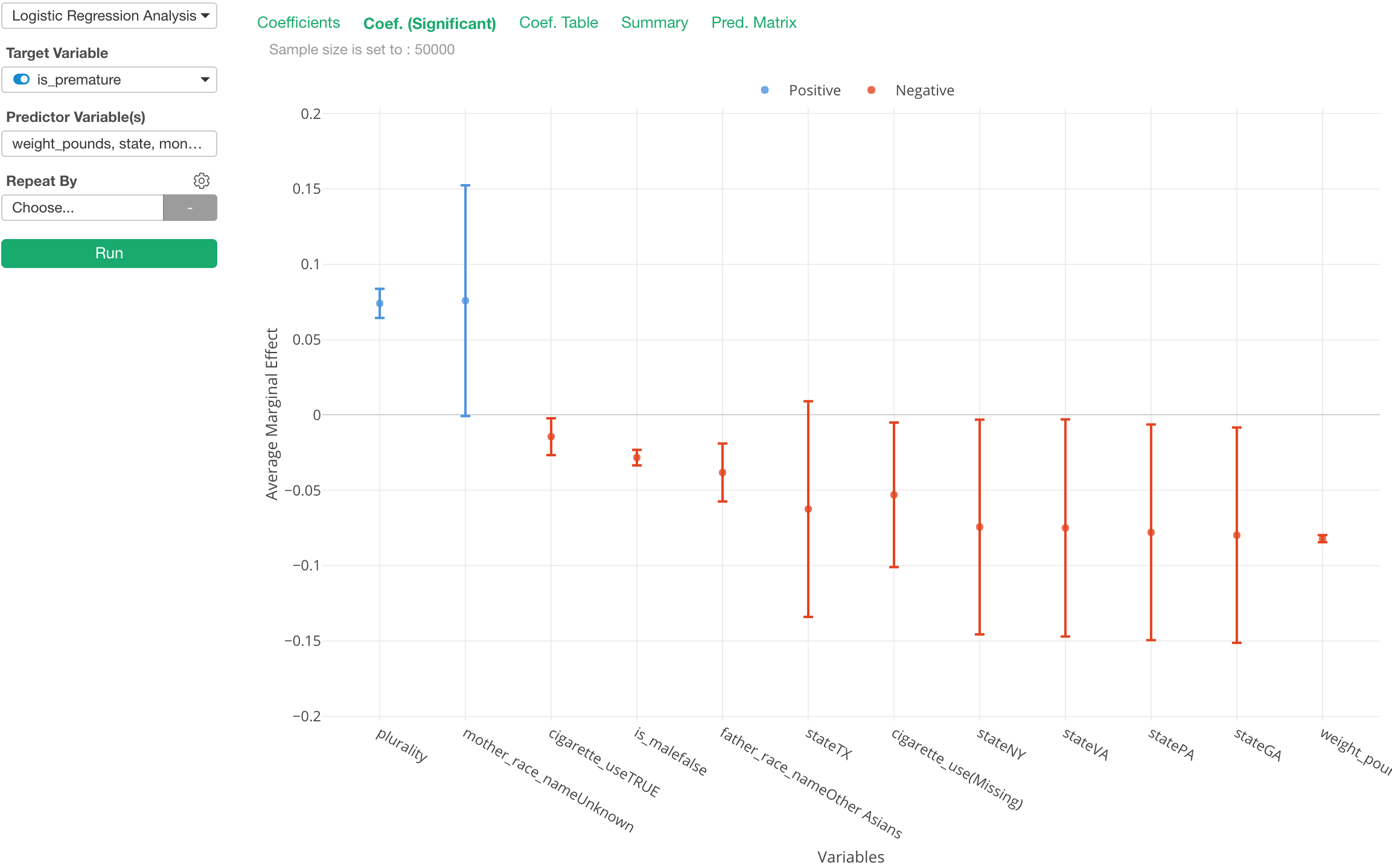
The chart above is showing the Average Marginal Effect for each of the predictor variables. We can interpret as “if we see one point increase in a given predictor the chance of the target variable becoming TRUE increases N percent.”
Yes, it’s much more intuitive!
The default is still set to use Odds Ratio, but you can switch to use the Average Marginal Effect from the property.
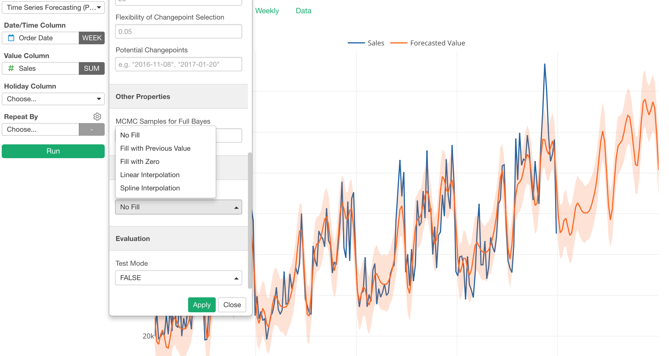
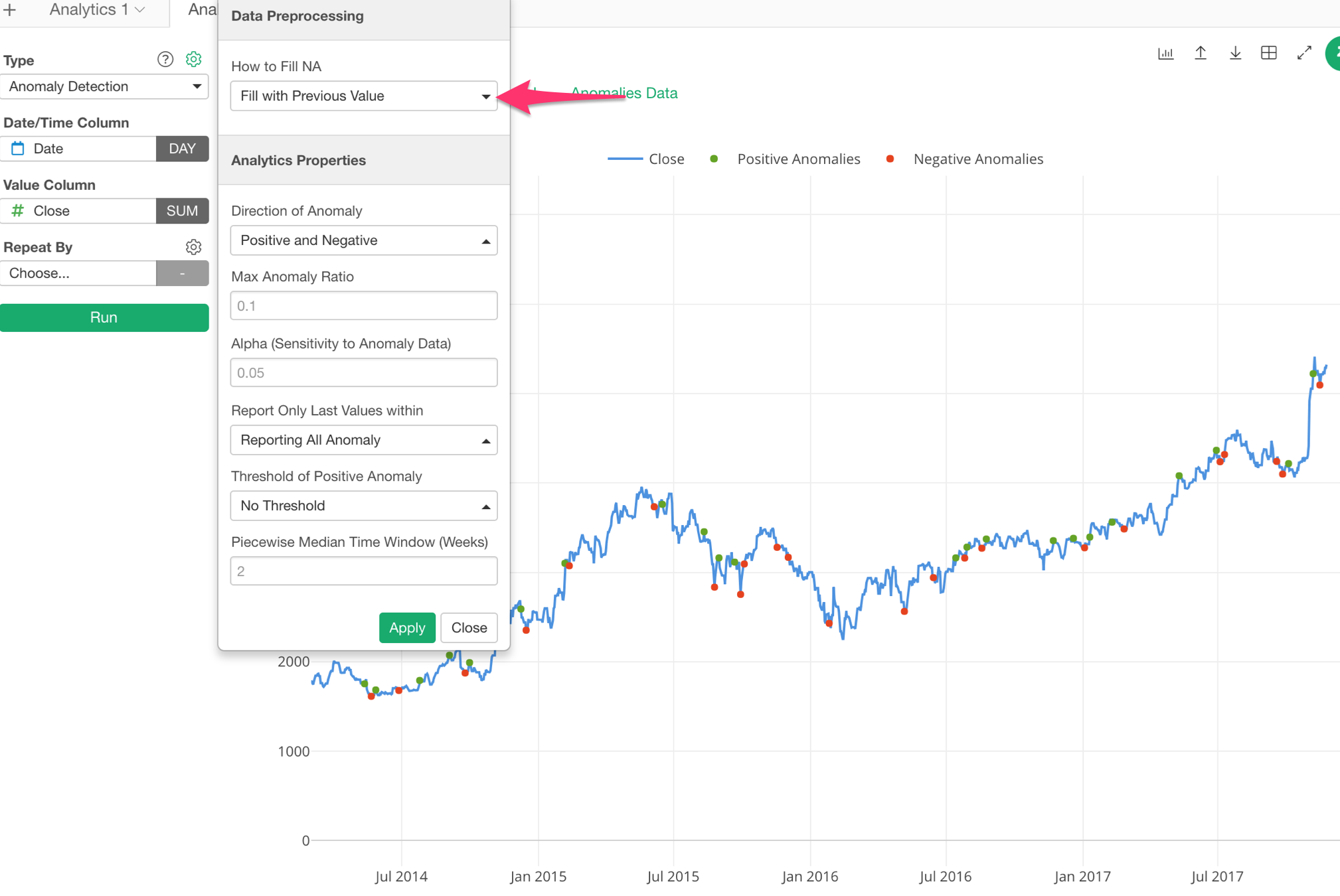
NA Values Handling for Time Series Forecasting and Anomaly Detection
Time Series Forecasting with Prophet and Anomaly Detection got a better NA (Missing Value) handling support. There are a few options such as:
- Fill with Previous Value
- Fill with 0
- Linear Interpolation
- Spline Interpolation
Time Series Forecasting with Prophet
Anomaly Detection
Data Wrangling
Branch (Data Frame) Root Switch
Branch Data Frame is a unique and strong feature in Exploratory, with which you can keep common data wrangling steps in the main data frame then create multiple ‘branch’ data frames for various data wrangling steps and analysis.
The problem was though, sometimes you might want to change the branch root step after creating one.
Well, you will be able to do it in v5.1!
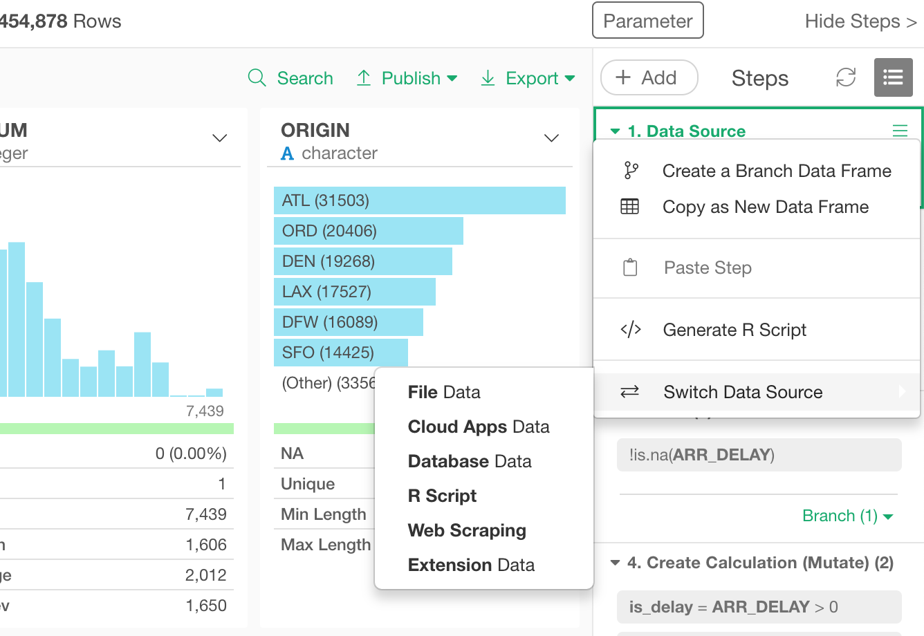
Data Source Switch
Let’s say you started your data analysis with CSV data and added a bunch of data wrangling steps and a bunch of charts.
Then later, you realize that you want to switch the data source to, say, PostgreSQL database while keeping all the data wrangling steps and the charts as they are.
You can do this now by selecting ‘Switch Data Source’ from the step menu of Data Source step!
Join Dialog
We have updated the Join dialog UI and the way to show the result.
One thing you will notice in the new Join dialog UI is that now there are two color bars at the top of the ‘Current Data Frame’ and ‘Target Data Frame’.
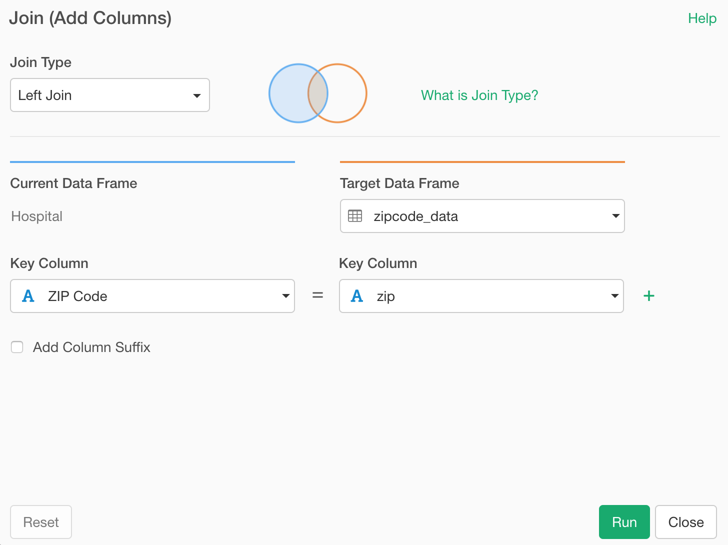
Once you run the Join command, the new columns that are brought from the target data frame will have the orange color bars at the top of the column headers.
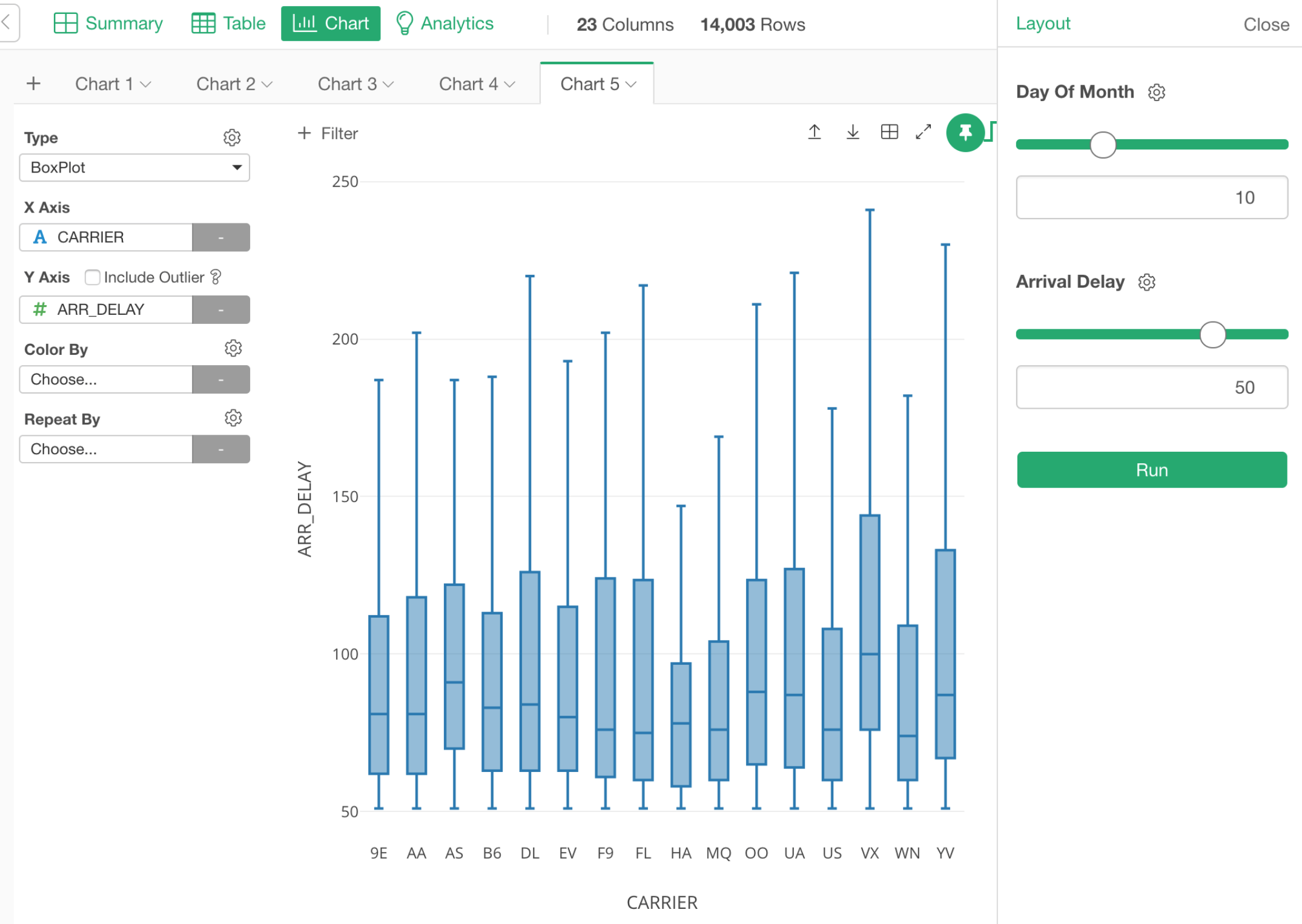
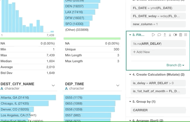
Filter with Summarize (Aggregate) Functions
Sometimes, you might want to filter the data by using a result of the summarizing functions like mean, median, min, max, etc.
For example, here is a flight delay data and you want to keep only the flights whose departure delay times are later than the average of all the flights.
Now, you can click ‘Summarize’ radio button and select ‘mean (average)’ function fro the dropdown list, then select a column name, in this case, that is ‘DEP_DELAY’.
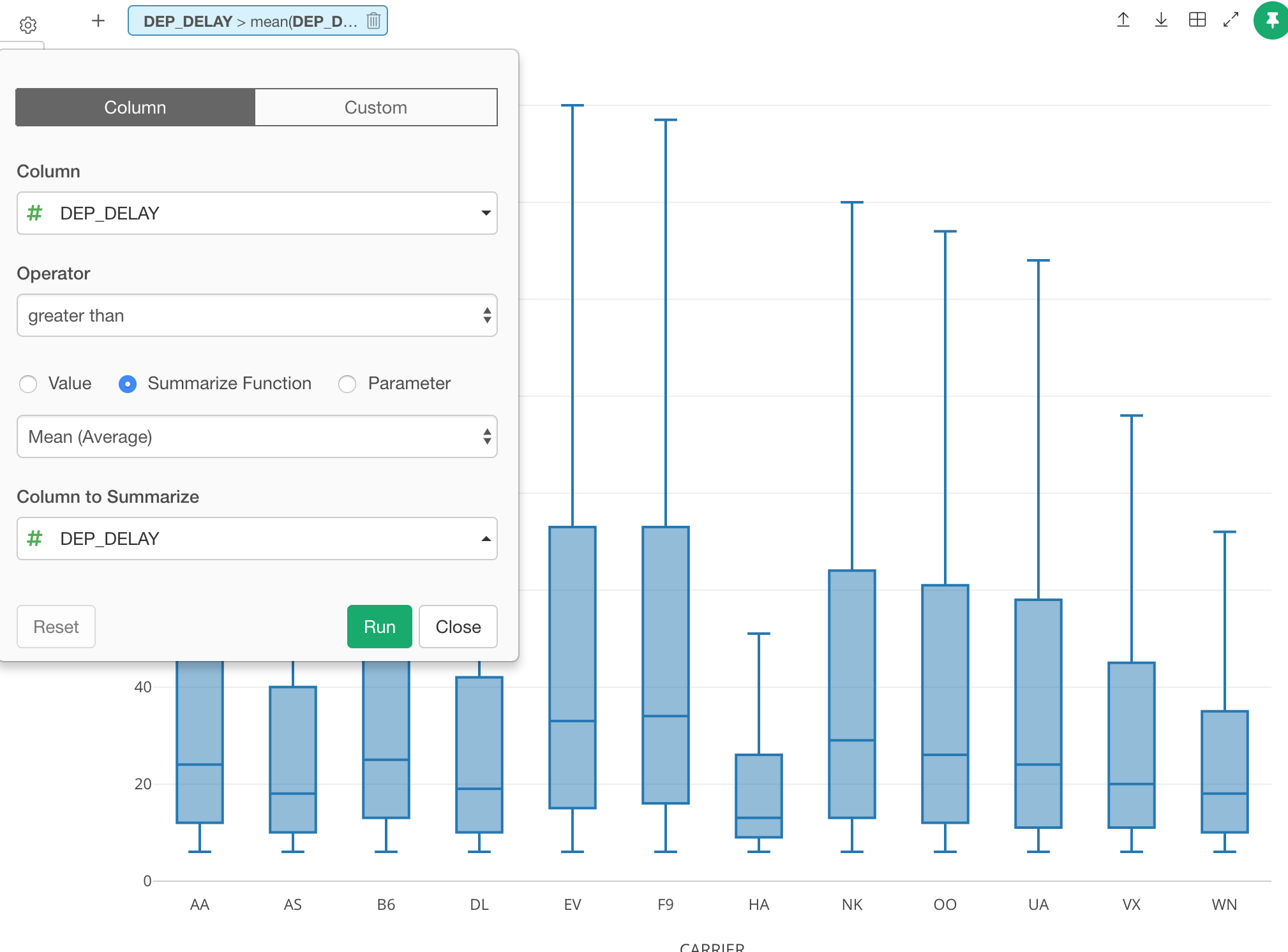
This will show you only the flights that meet this condition.
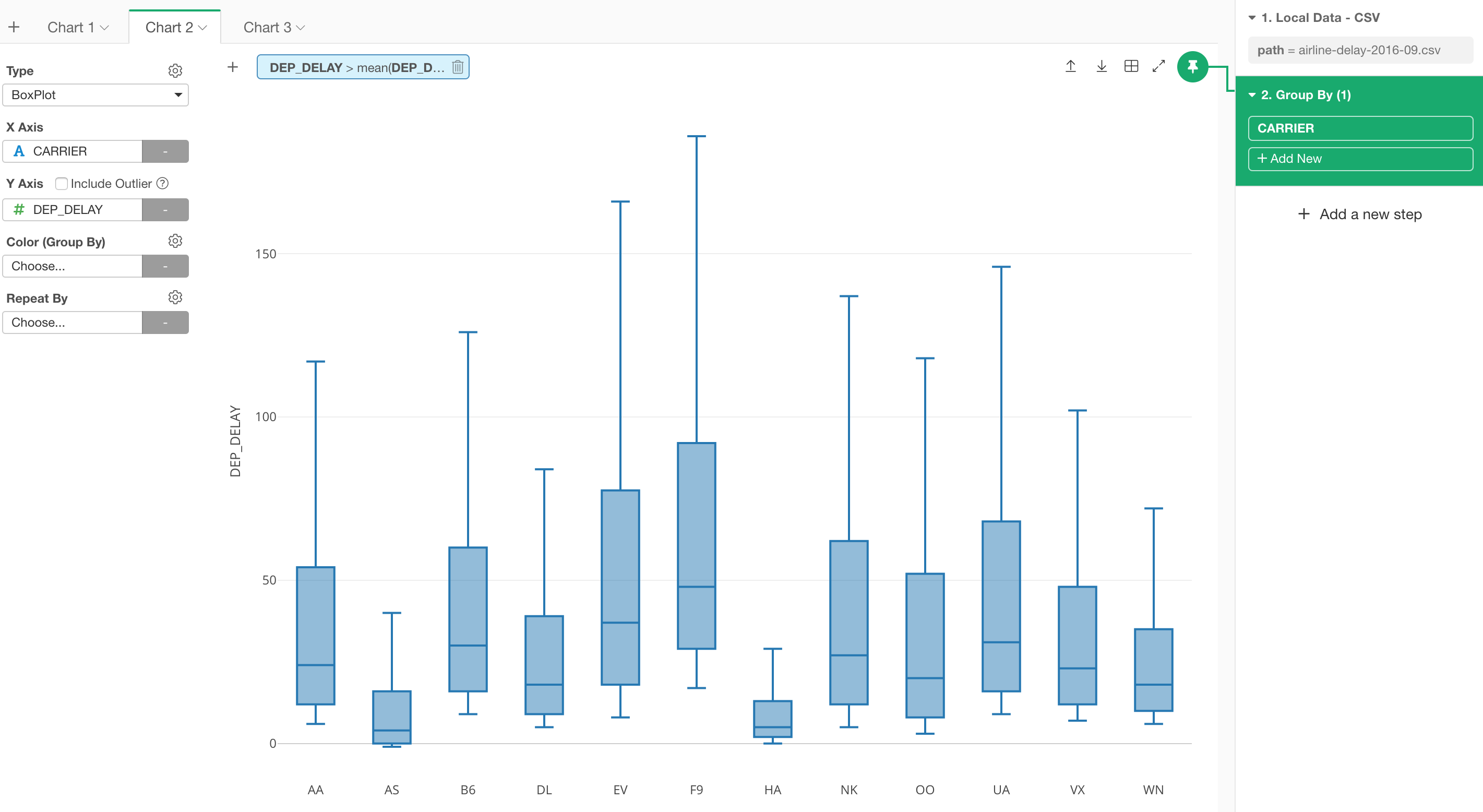
With Group By
If you want to make this ‘mean (average)’ calculation being done for each Carrier (airline company) then you can run a Group By step first. This will make the data frame to be grouped by Carrier and the following ‘Summarize’ operation will be done for each group.
With a boxplot chart below, you can see that each box’s leg starts at a different value, which is the average of the departure delay for each Carrier.
Function List - Better Search
There are tons of R functions that are available to use out-of-the-box in Exploratory. You can find a list of such functions in Function List window, which can be opened by clicking ‘Function List’ text inside Mutate, Filter (under Custom option), and Summarize (under Custom tab) dialogs.
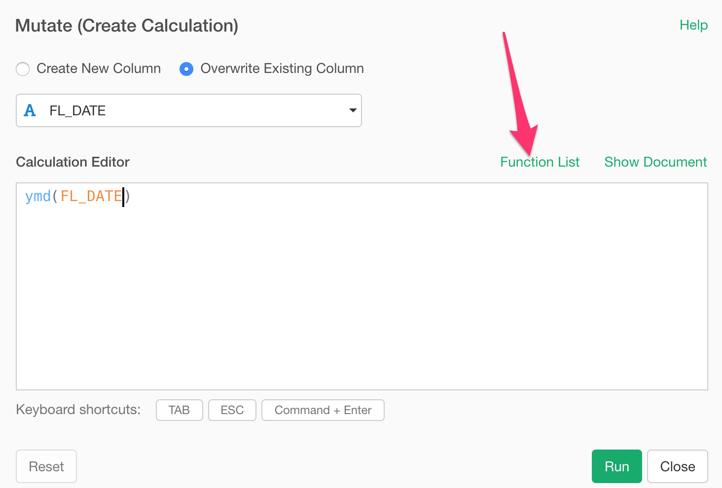
There is a search box at the top of the function list, but this used to simply filter the functions based on a function name matching.
Now, it searches the entire help document and lists up the functions whose help documents that matches the input text.
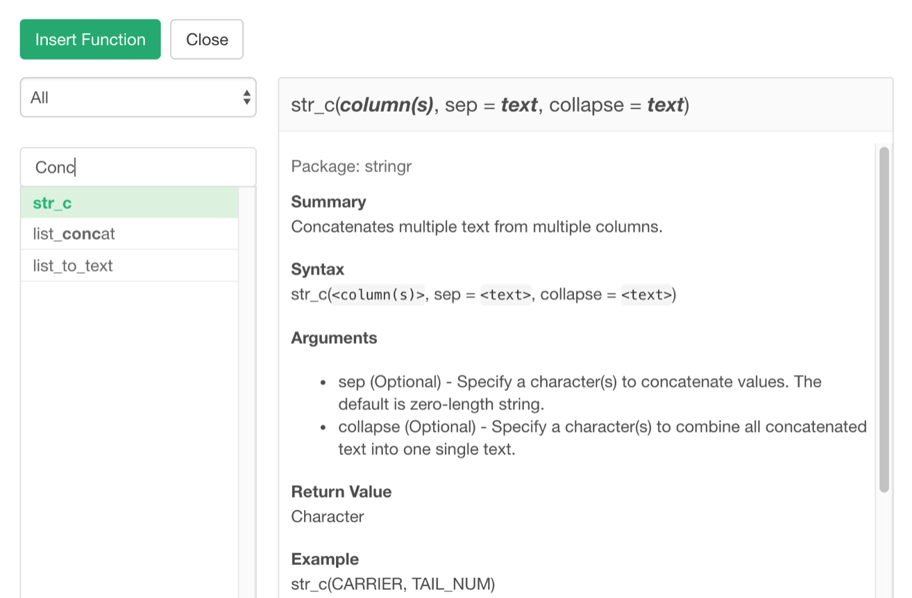
The above example is showing that when I try to find a function to concatenate multiple texts by typing ‘Conc’ it returns functions like ‘str_c’, ‘list_to_text’.
Data Source
AWS S3 Athena Support
With Athena, you can write SQL queries to retrieve data from the files stored at S3.
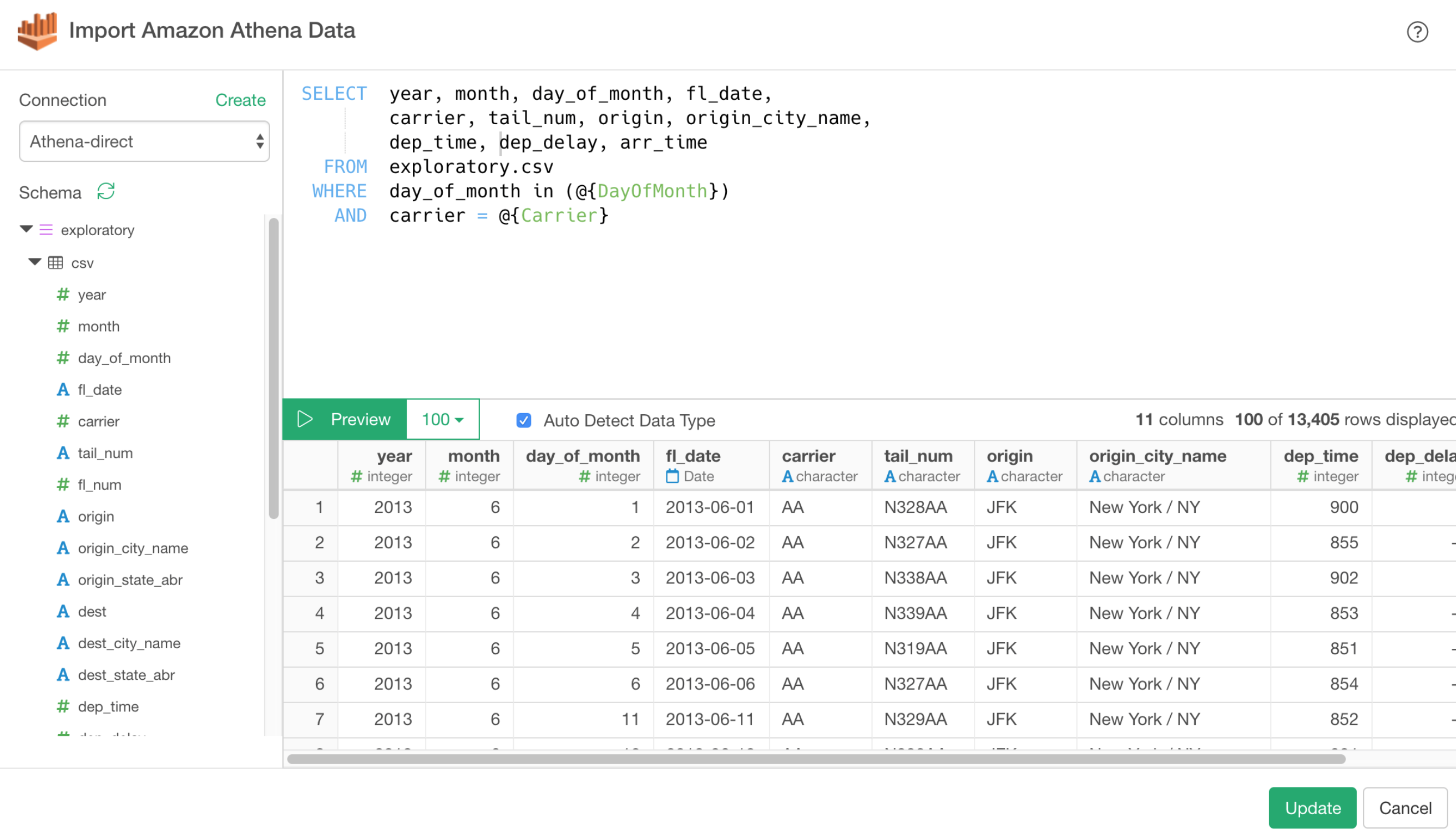
Of course, you can use Parameter as part of SQL queries as well!
Teradata Support
We have also added Teradata built-in support as well!
That’s it for the new features of v5.1!
We still have many other enhancements and bug fixes. Take a look at the release note for the full list.
Make sure to download v5.1 from our download page to start exploring it today!
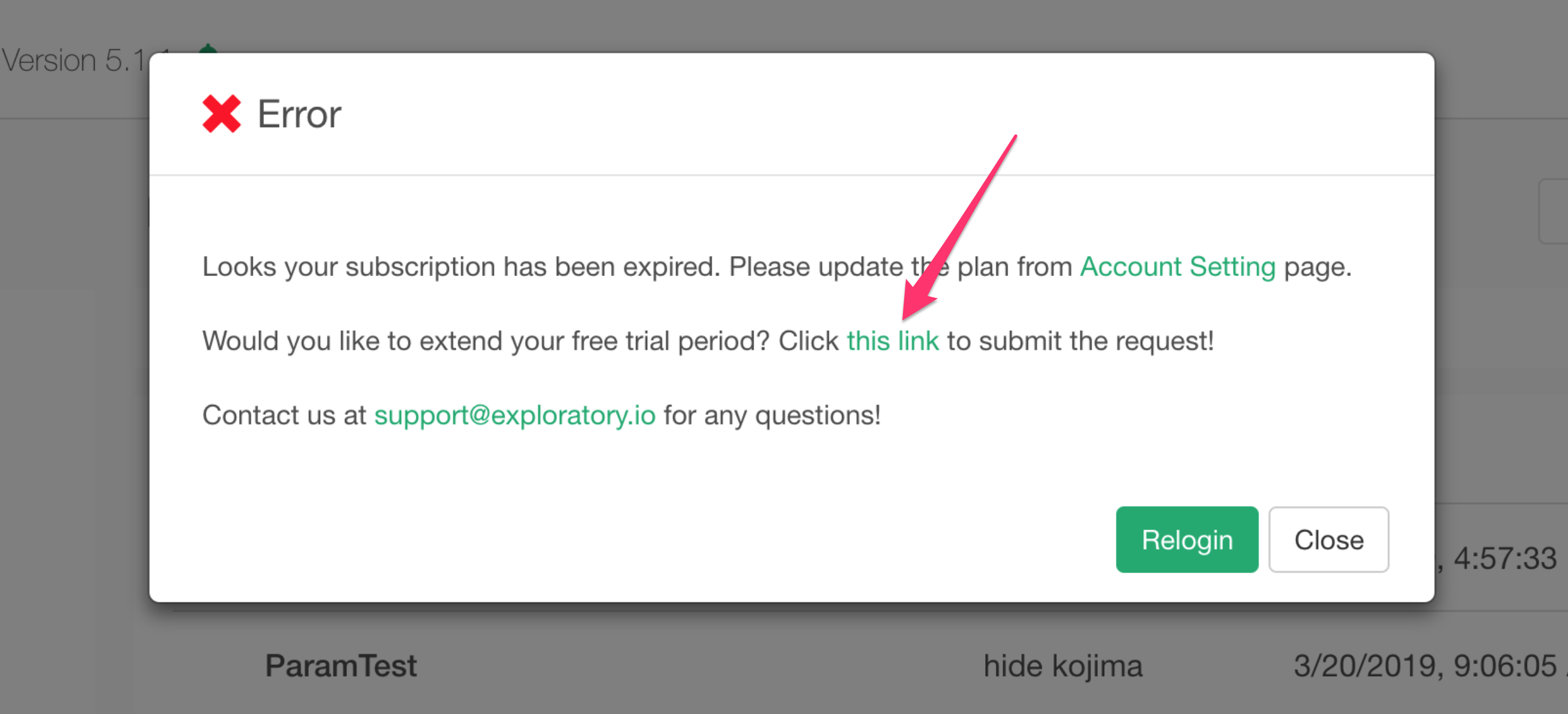
If you don’t have an Exploratory account yet, sign up from our website for 30 days free trial without a credit card!
If you happen to be a current student or teacher at schools, it’s free!
If your trial period has expired in the past but you’d like to try this new version, you can simply click a link inside Exploratory Desktop v5.1 like the below or feel free to contact us at support@exploratory.io !
Happy Exploratory v5.1! 🍾
Cheers,
Kan