Exploratory v5.3
I’m super excited to announce Exploratory v5.3!
As always, we have many new features, enhancements, and bug fixes.
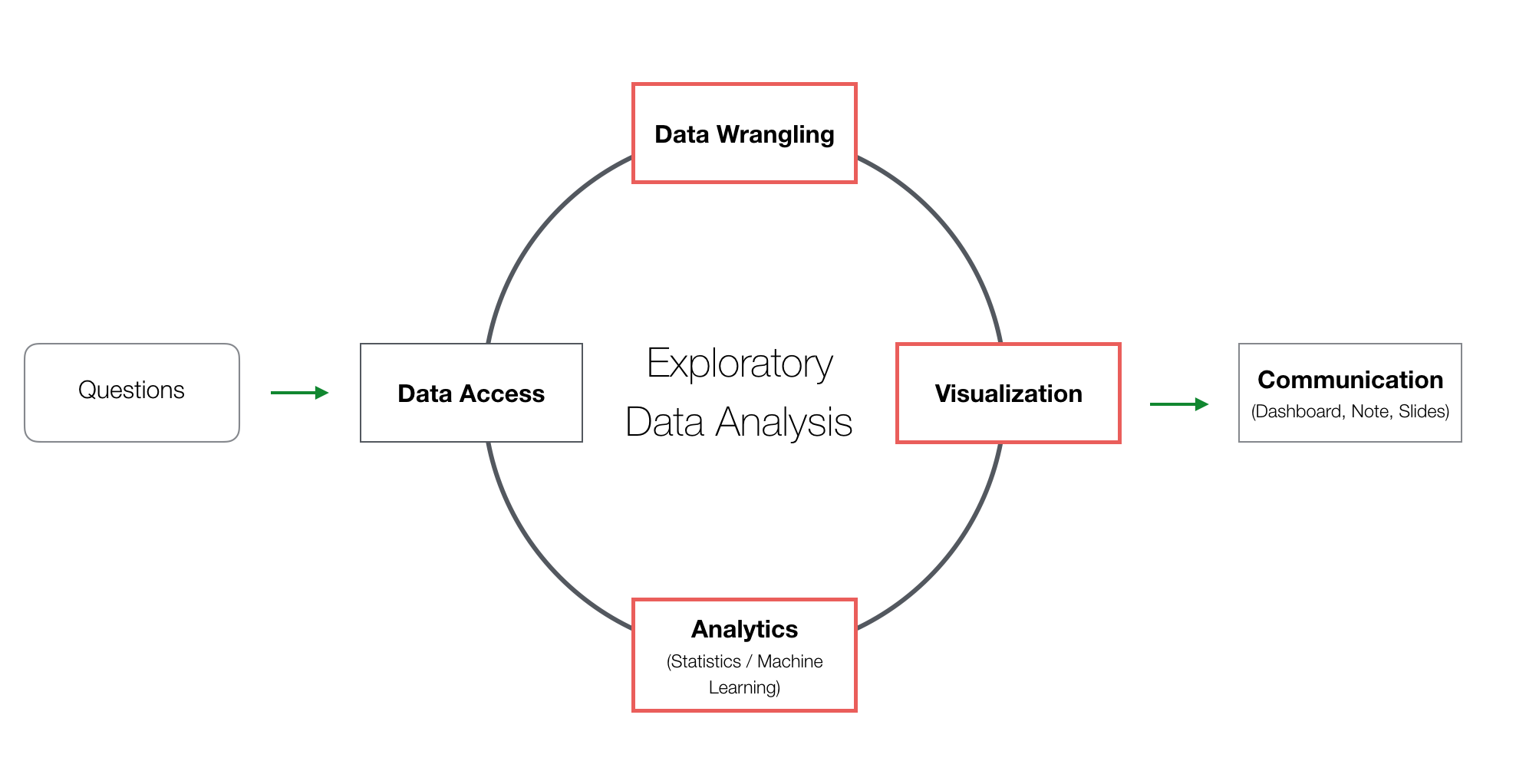
With this release, the main areas for the new features are Data Wrangling, Data Visualization (Chart), and Analytics (Statistics / Machine Learning), the 3 key tasks of data analysis.
Let’s take a look at some of the key new features.
Alternatively, you can watch a video of my presentation introducing Exploratory v5.3 at our online seminar.
Data Wrangling
Summarize Step UI
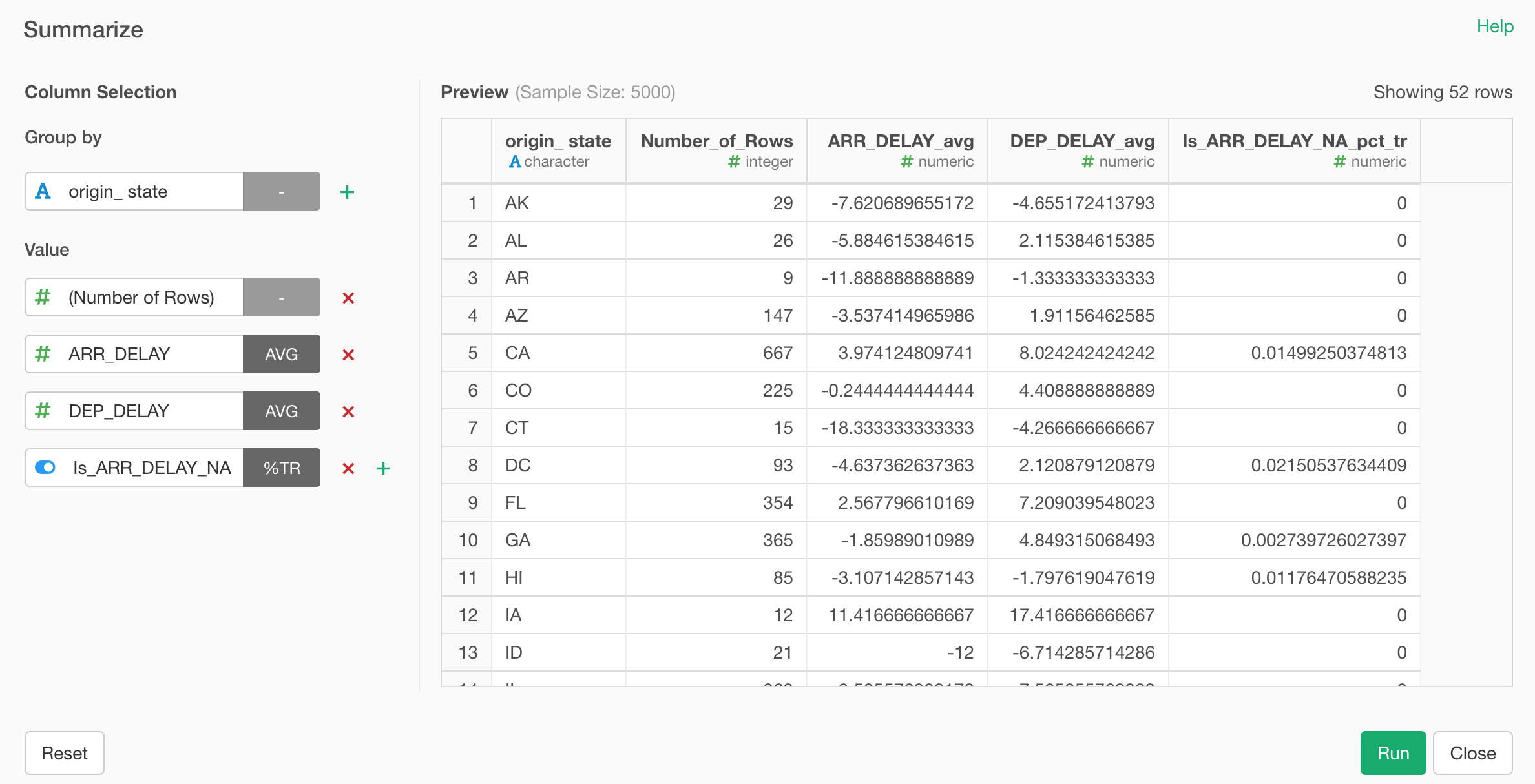
We have re-designed the whole experience around Summarize (or aggregate) step.
We used to have to create a Group By step first, then create a Summarize step to aggregate the data.
With v5.3, we have combined these two steps into one single UI. This means that you can simply start with Summarize and get all the aggregating calculations done in a single step.
Select ‘Summarize (Aggregate)’ and one of the aggregation function from the column header menu.
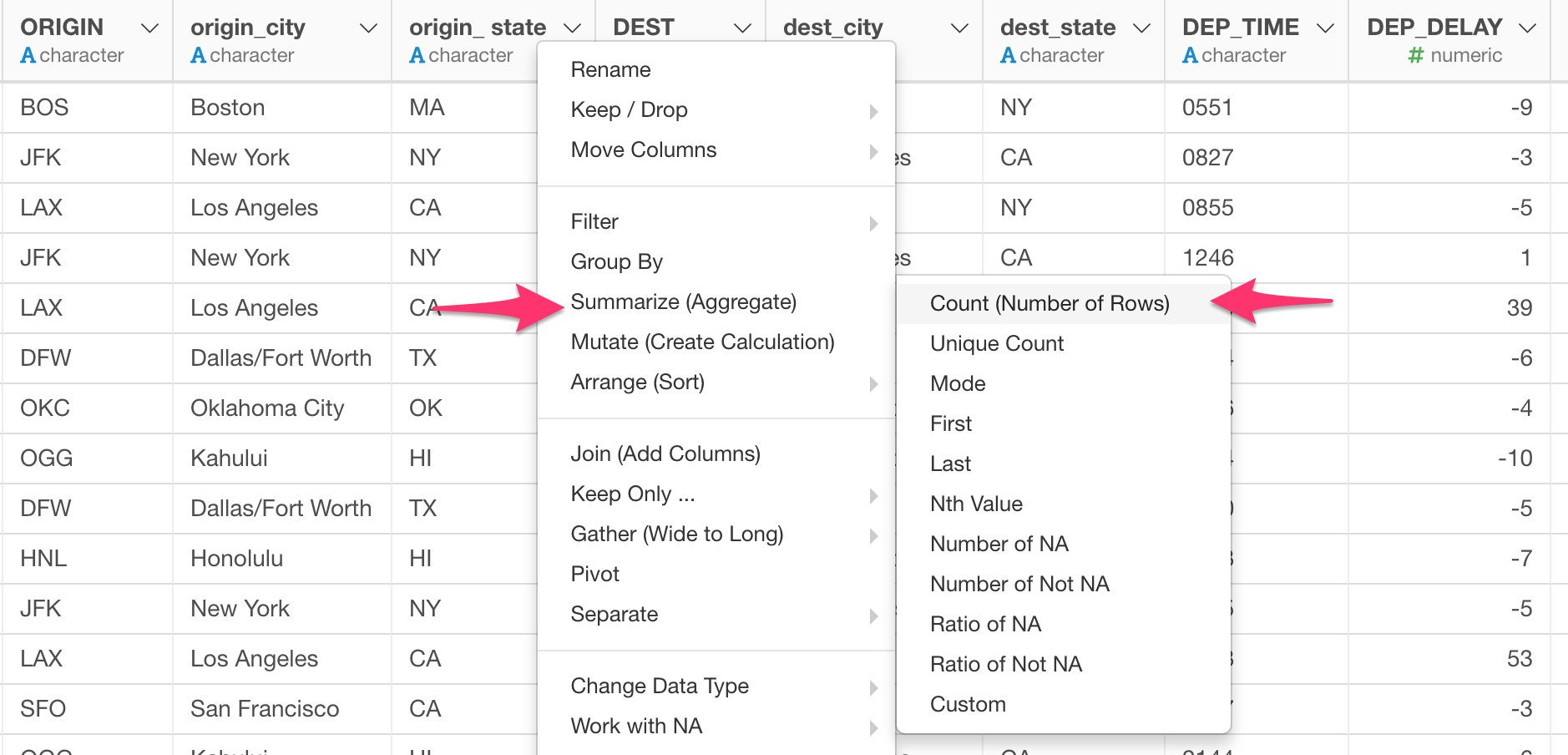
This will open a new Summarize dialog.
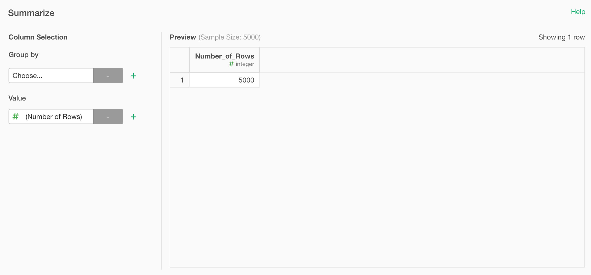
By default, it would show the summarized value without Group By in the right hand side Preview table.
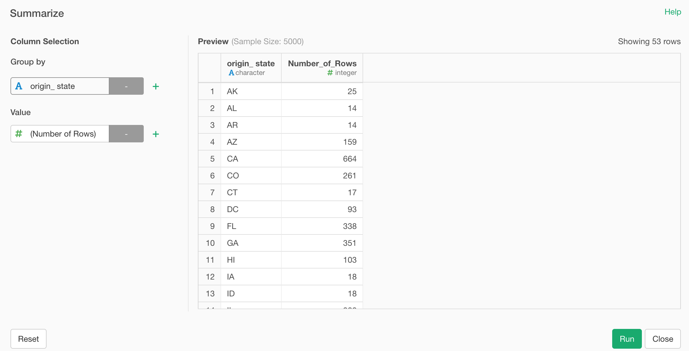
You can add a grouping column under Group By at the left hand side to show the summarized values for each group.
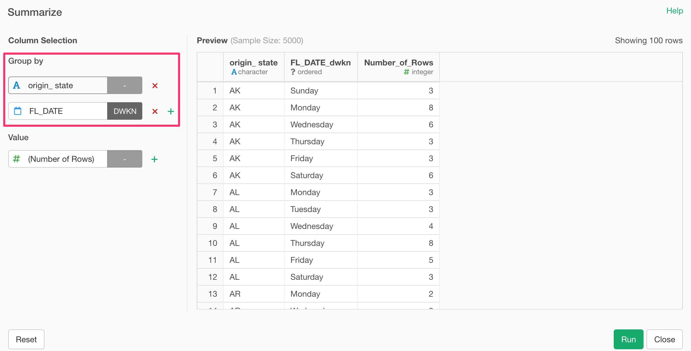
You can add multiple columns for Group By.
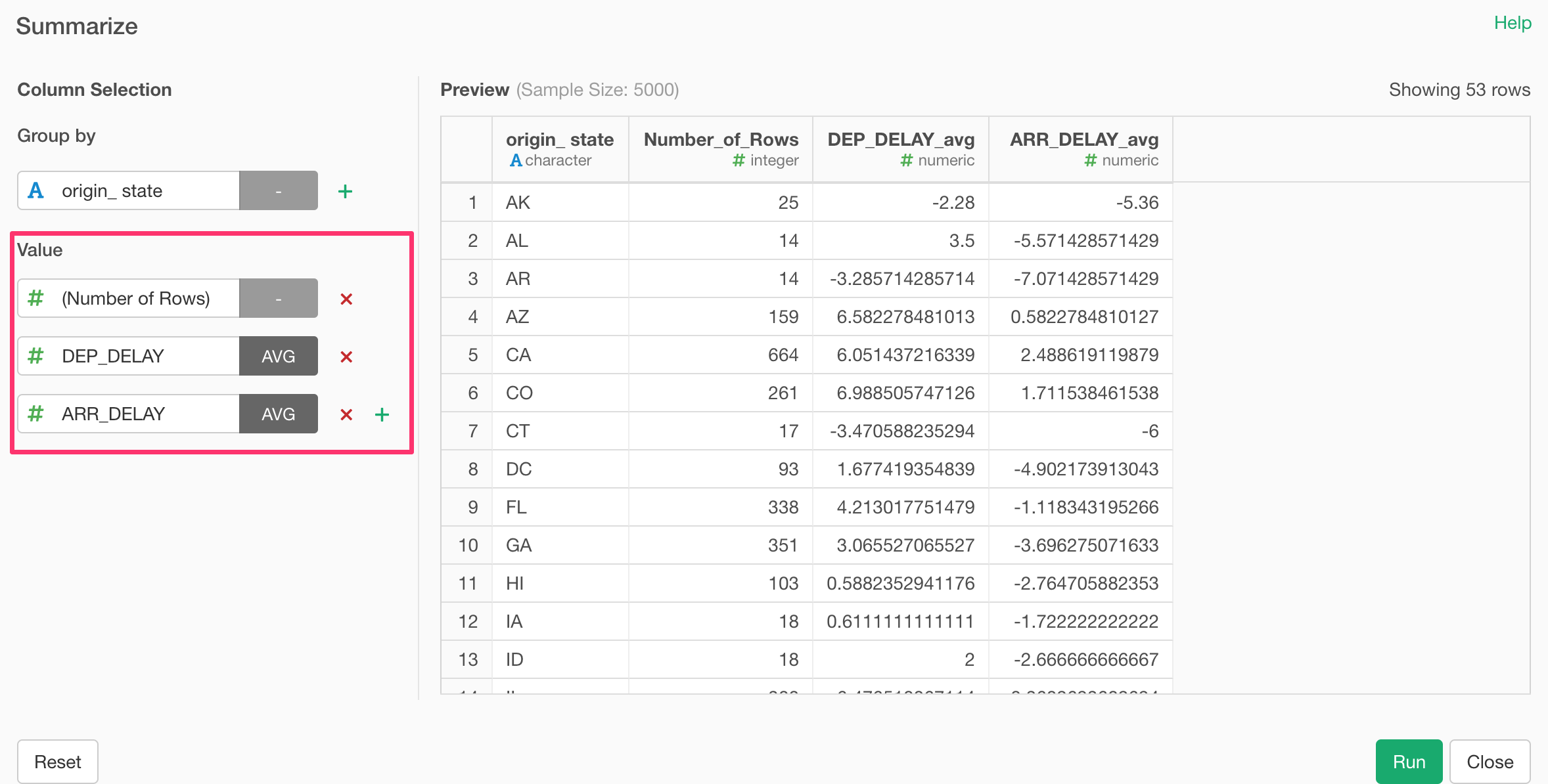
And you can add multiple summarizing calculations under Value section.
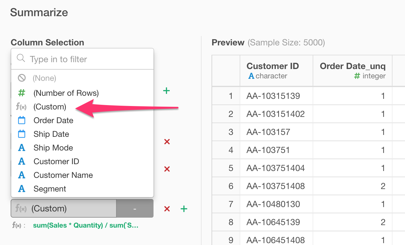
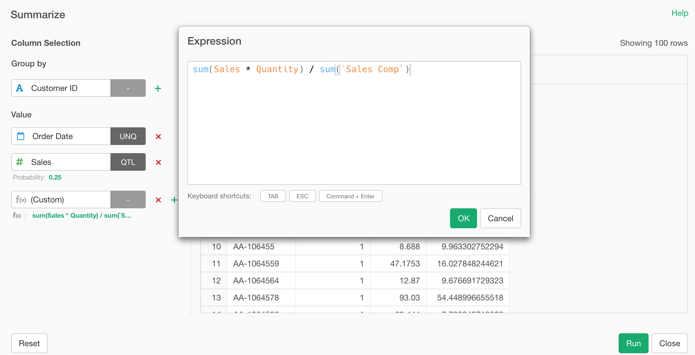
We also support Custom Calculation for the Summarize step. You can select ‘Custom’ from the column list.
And type the calculation expression.
Pivot Step UI
Pivot step’s UI dialog has also been redesigned!
Pivot is a command to produce the data in the same format you would expect with Pivot Table under Chart view.
Pivot Table under Chart view:
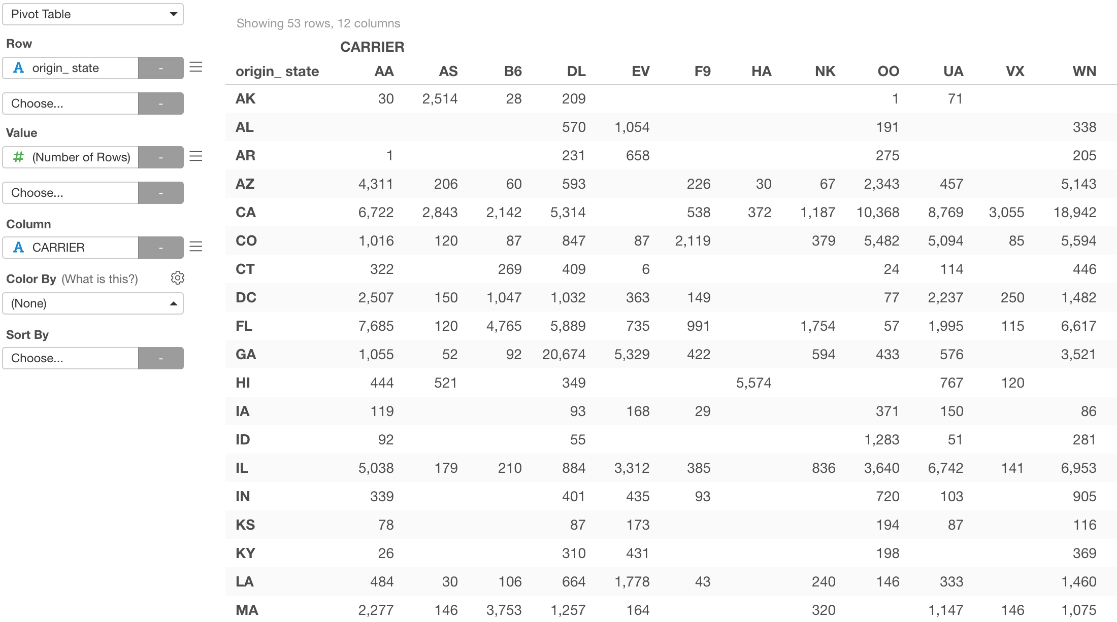
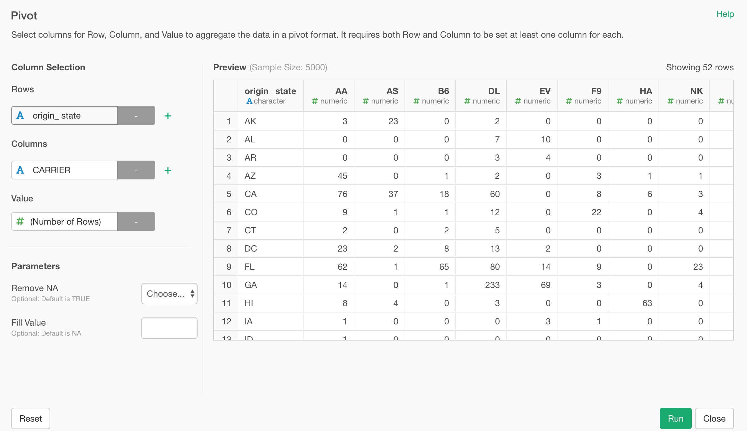
It is similar to Summarize step, but this is about Rows, Columns, and Values.
Select ‘Pivot’ from the column header menu.
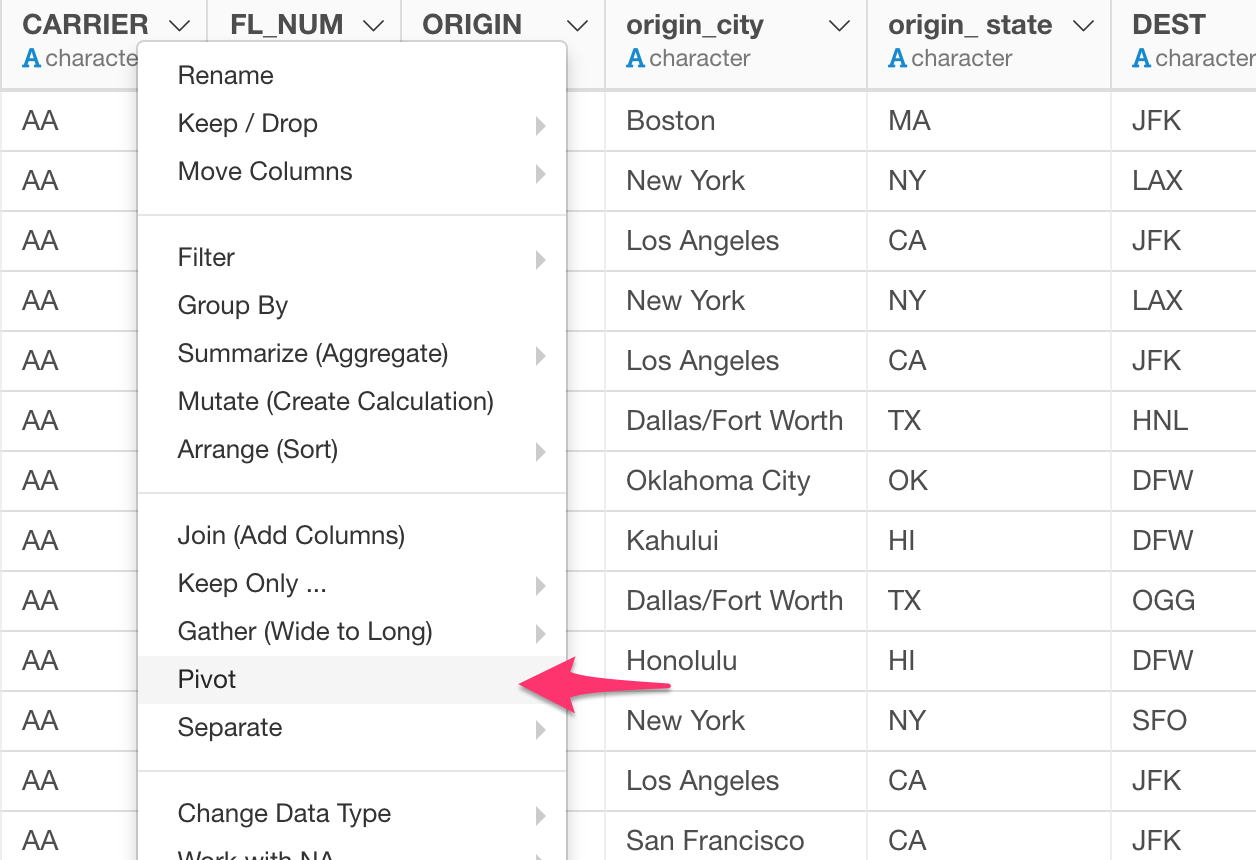
And assign columns to Rows, Columns, and Value.
Rename Step UI - Support Multiple Columns
We have redesigned the Rename step, too!
This might sound like a minor change, but to me, this is one of the best things we have gotten in this release. How often had I have to rename many columns when I imported Excel files or scraped from web sites such as Wikipedia, etc. !?
Now we can rename multiple columns in a single dialog at once, by using tab key to move between the fields!
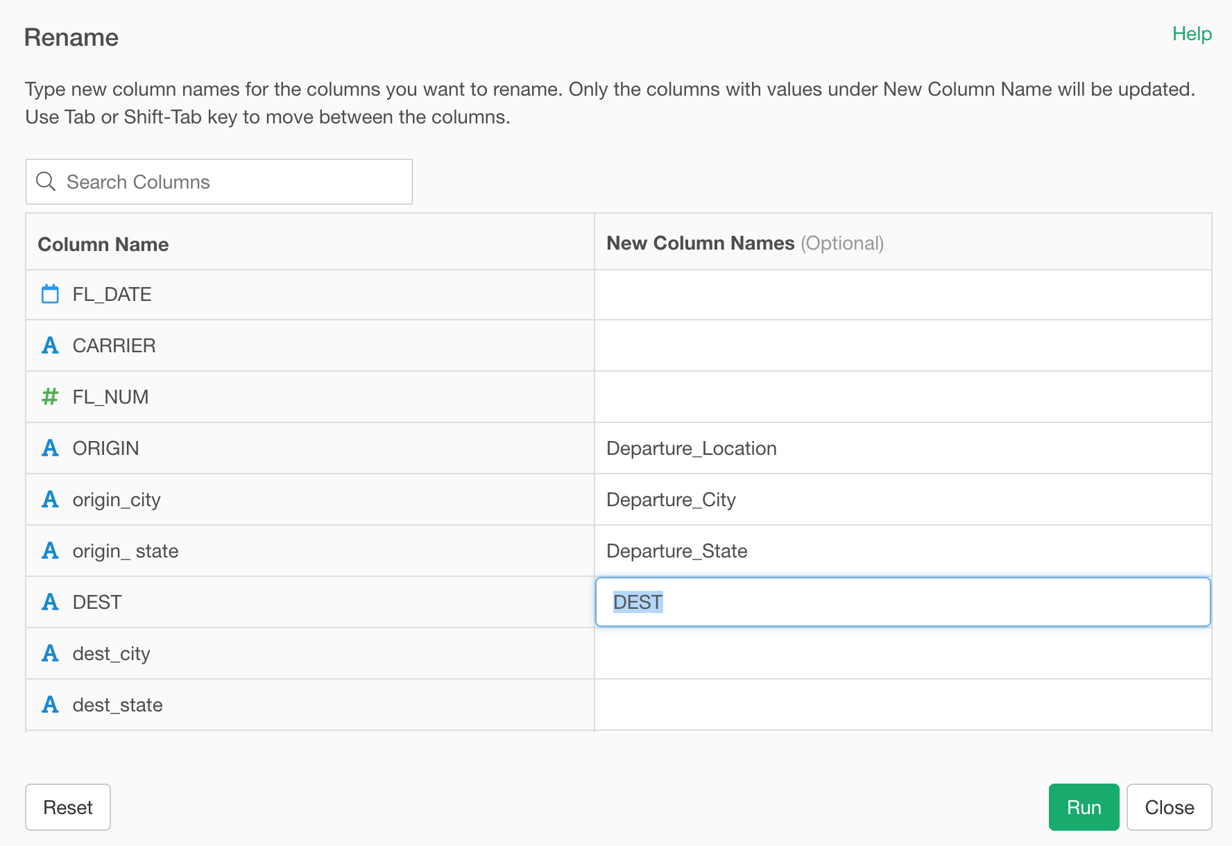
This makes renaming the column names much easier and faster! 🔥
Merge (Bind Rows) Step
When you want to combine rows from multiple data frames you want to use Merge step.
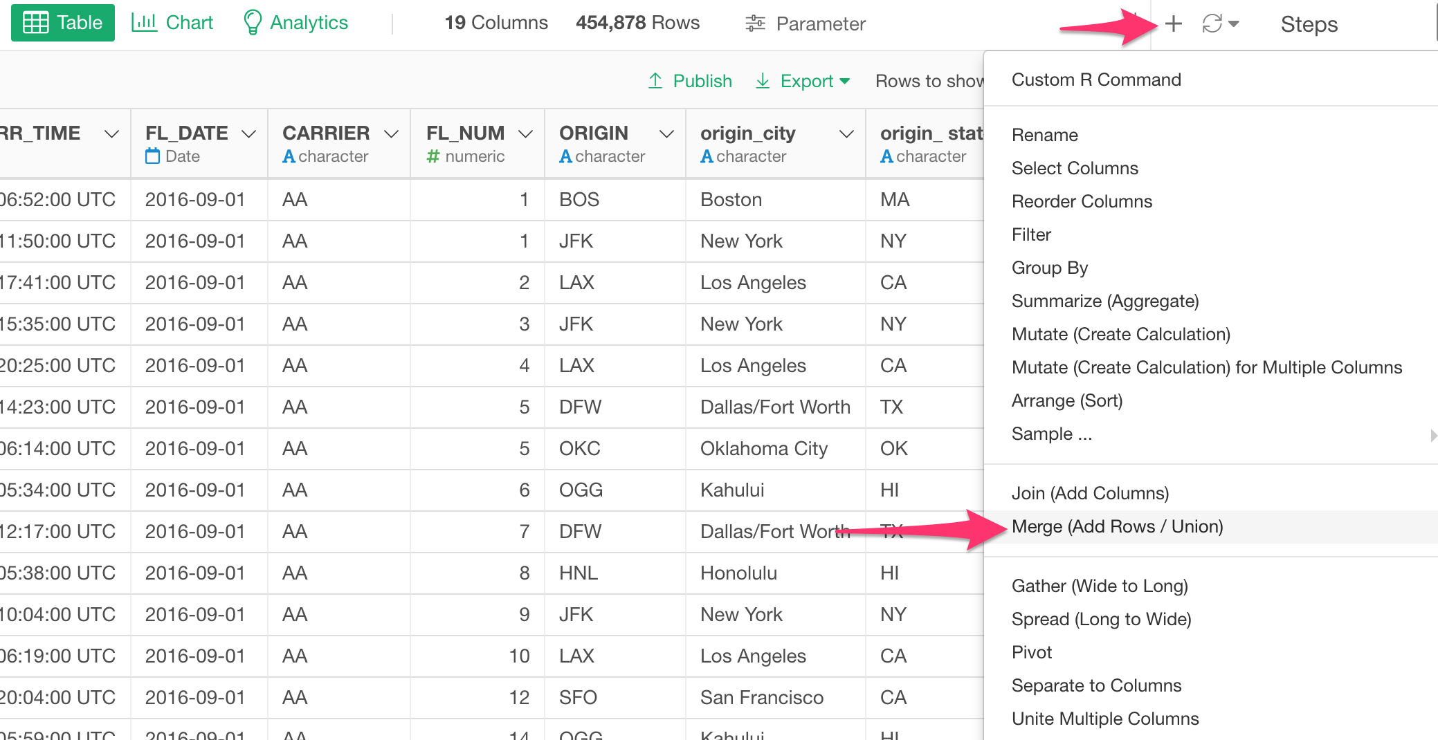
If you have used this before, you might have encountered these two problems.
- First, you don’t know which rows are coming from which data frames after the merge operation.
- Second, you got an error because some of the columns are different data types between the two (or more) data frames.
We have addressed these two problems in v5.3.
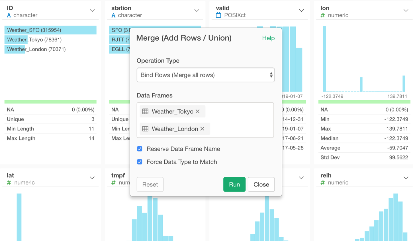
There are 2 new menus.
- ‘Reserve Data Frame Name’ will create an ID column to keep the original data frame names.
- ‘Force Data Type to Match’ will make all the columns to be Character data type once, merge all the data frames, then guess appropriate data type for each column heuristically by looking at the actual data in the first 1,000 rows.
These are the main new features/enhancements for Data Wrangling area. Now, let’s take a look at some exciting new features around Chart.
Data Visualization - Chart
Binning - Categorizing Numerical Values
You can now categorize the numeric values inside the charts.
Here is a scatter chart showing Working Years at X-Axis and Monthly Income at Y-Axis, and I’m trying to visualize the relationship between the two variables.
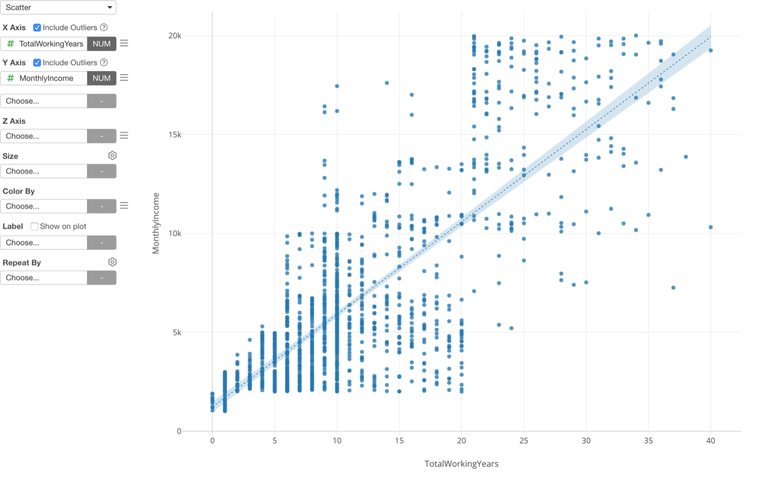
This is one way to look at the relationship between the two, but there is another way, which is to categorize the numeric variables.
Here is a boxplot chart showing Working Years at X-Axis and Monthly Income at Y-Axis, but this time the Working Years is divided into 5 groups based on the numeric value range and each group is showing the distribution of Monthly Income at Y-Axis.
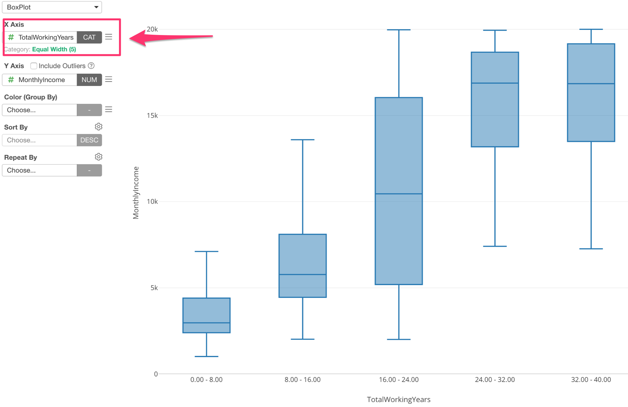
Assigning Numeric variable (or column) to X-Axis automatically changes the option to ‘Category’ and divide into 5 groups.
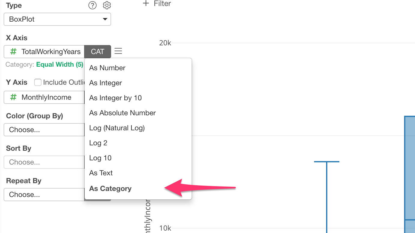
You can change this setting by clicking on the green text.
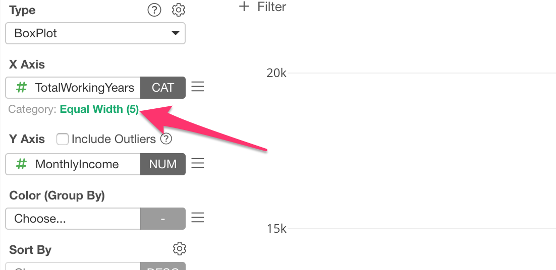
You can change the number of categories, say 10.
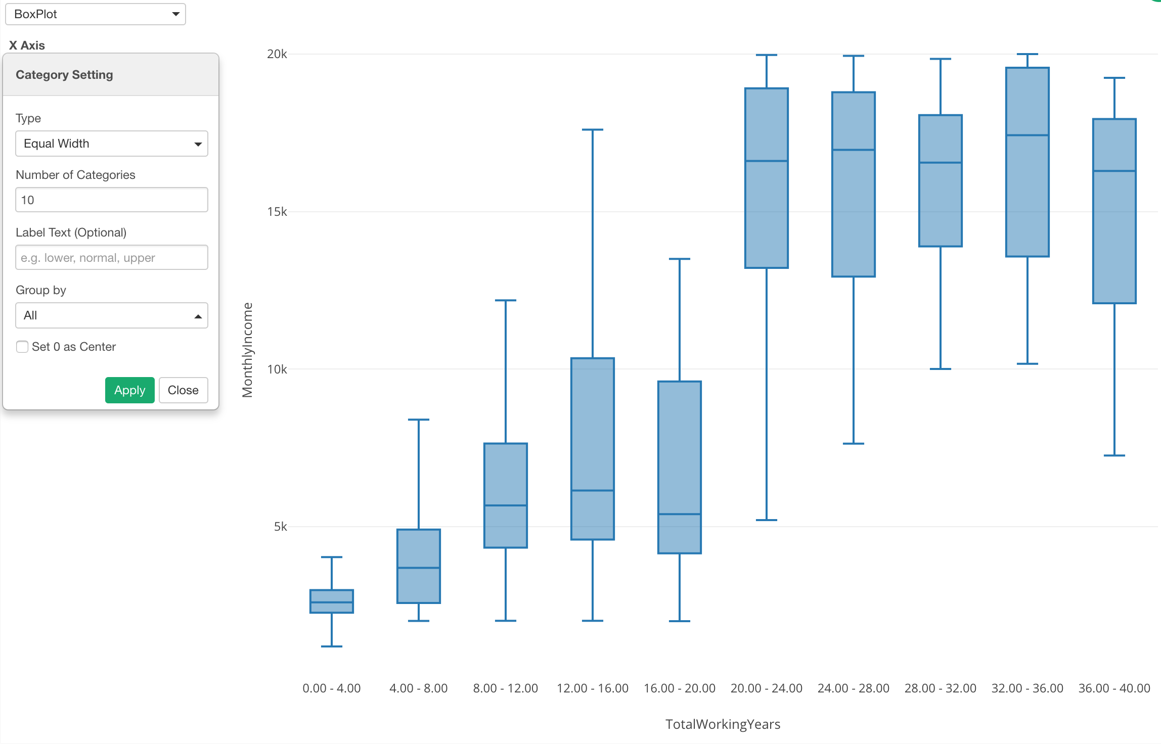
This gives me an idea that there is a huge divide around the 20th year of the working years when it comes to the monthly income.
Binning for Other Charts
Of course, this is not just for Boxplot, but also for other chart types as well. For example, here is a Bar chart showing the average monthly income (Y-Axis) for each category of the working years.
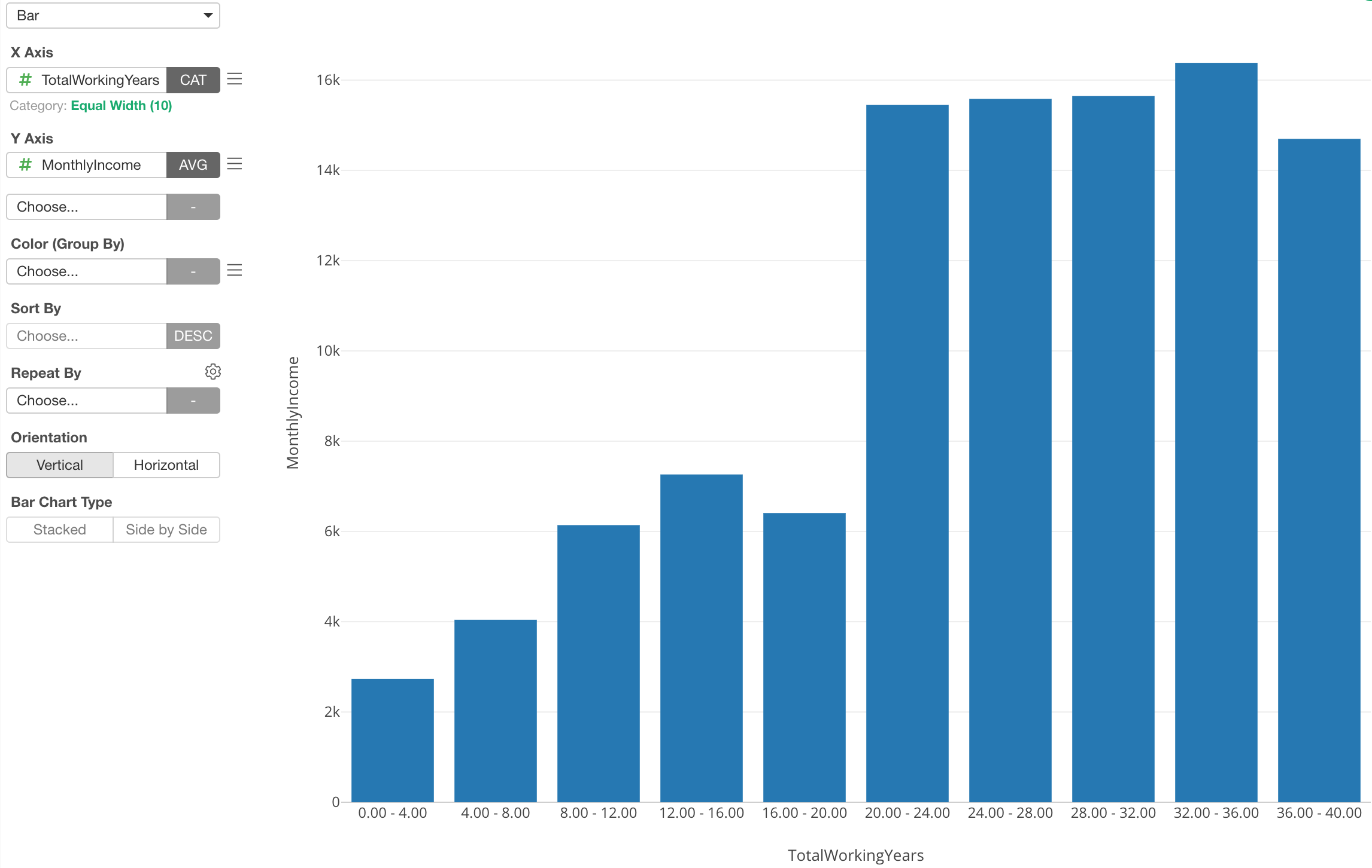
Binning for X-Axis
And this is not just for X-Axis, but also for Color and Repeat By (and Y-Axis for Bubble chart).
Here I’ve assigned Monthly Income column to Color, which automatically divides into 5 categories.
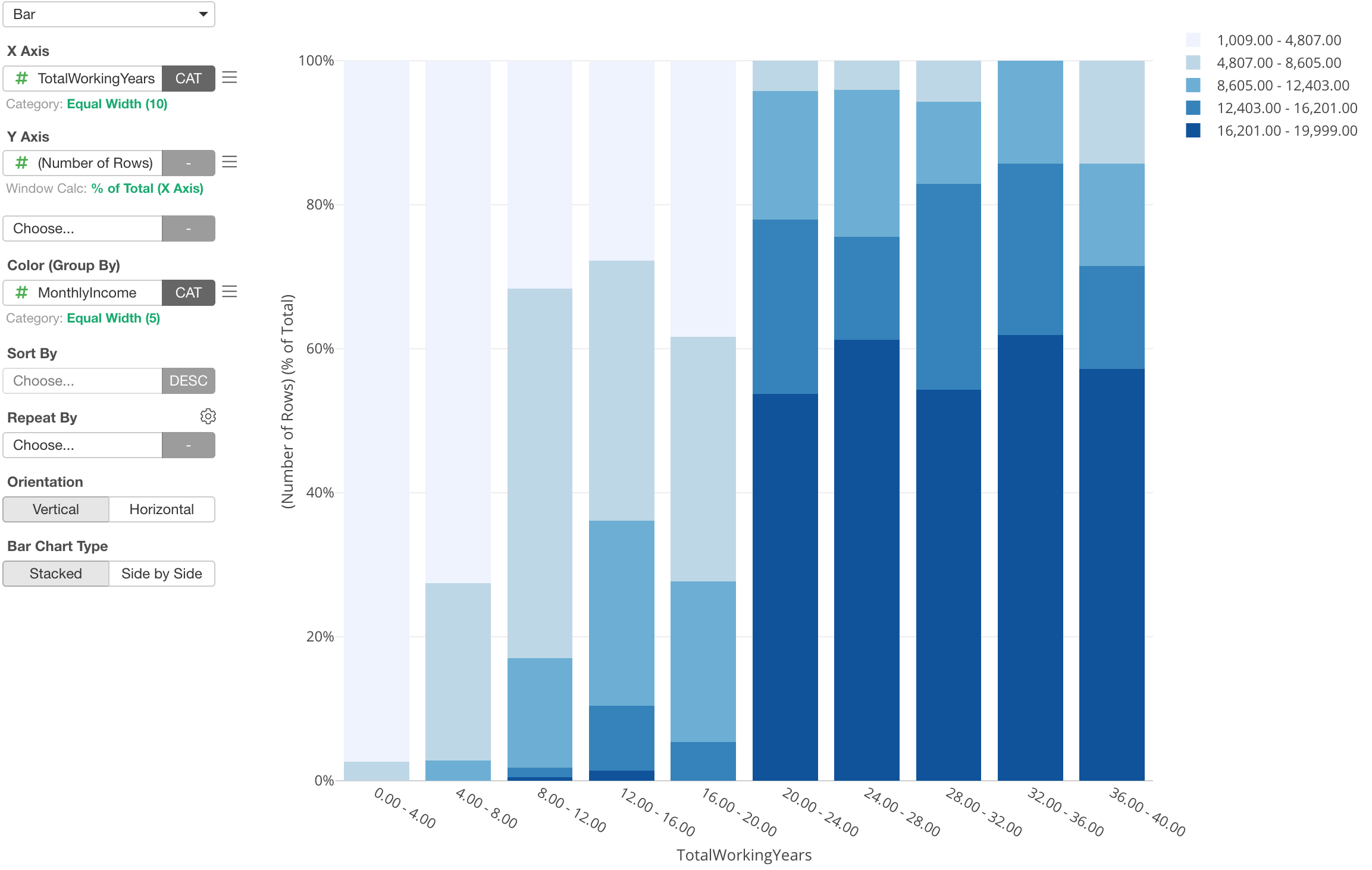
With this, I can show the percentage of each Monthly Income groups for each Working Years group. It’s very clear that the majority of employees whose working years are greater than 20 years are making a high income, but looks it doesn’t really matter how many years you work once you pass the 20th years.
We have seen the categorization of numeric columns with ‘Equal Width’ option so far, but there are other options as well.
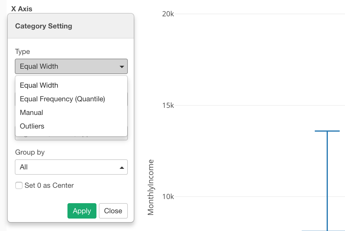
Binning with ‘Equal Frequency’ Option
Let’s say you get data like this.
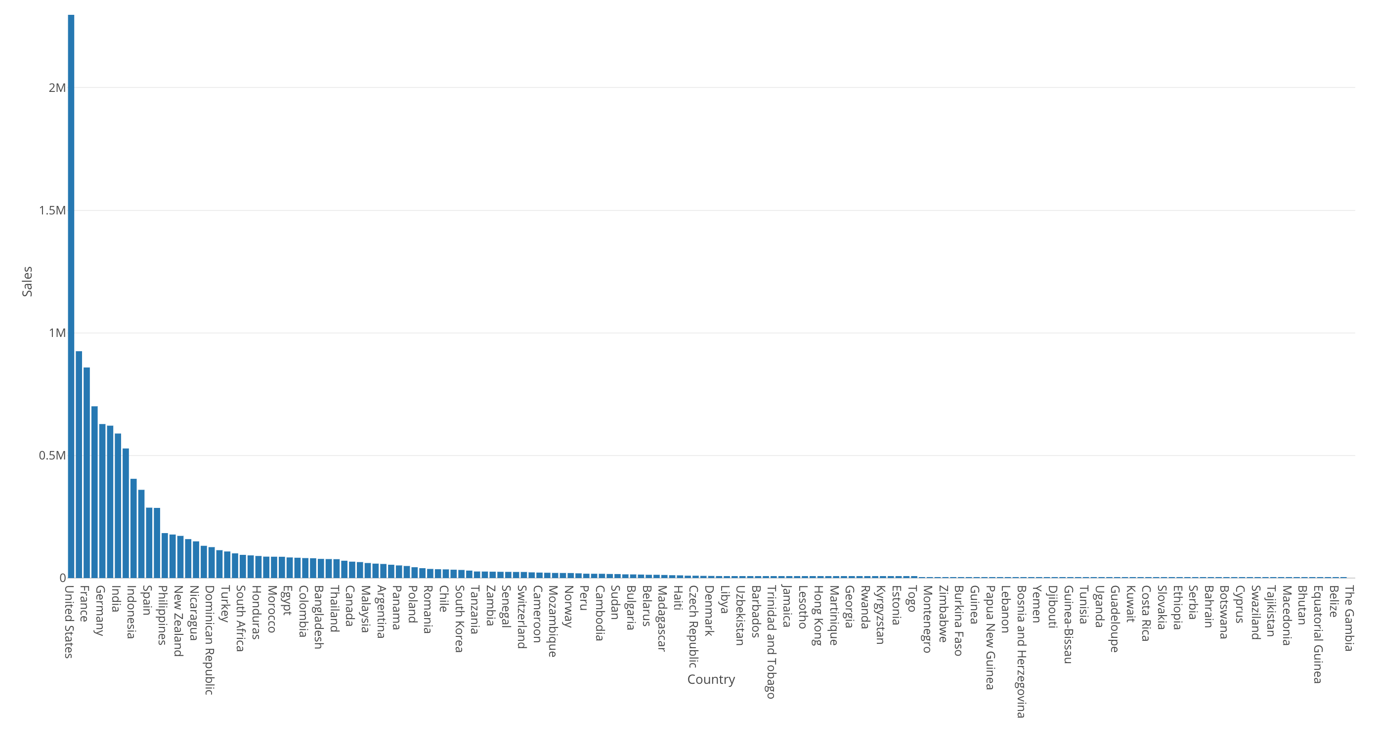
This bar chart is showing the sales by country.
The United States is the highest (the most left hand side) and most of the countries’ sales are very small compared to the United States.
Now, we can visualize this data by using Map and assign Sales to Color. This would categorize the Sales’ numeric values into 5 categories by default, and I have set the number of the categories to 10.
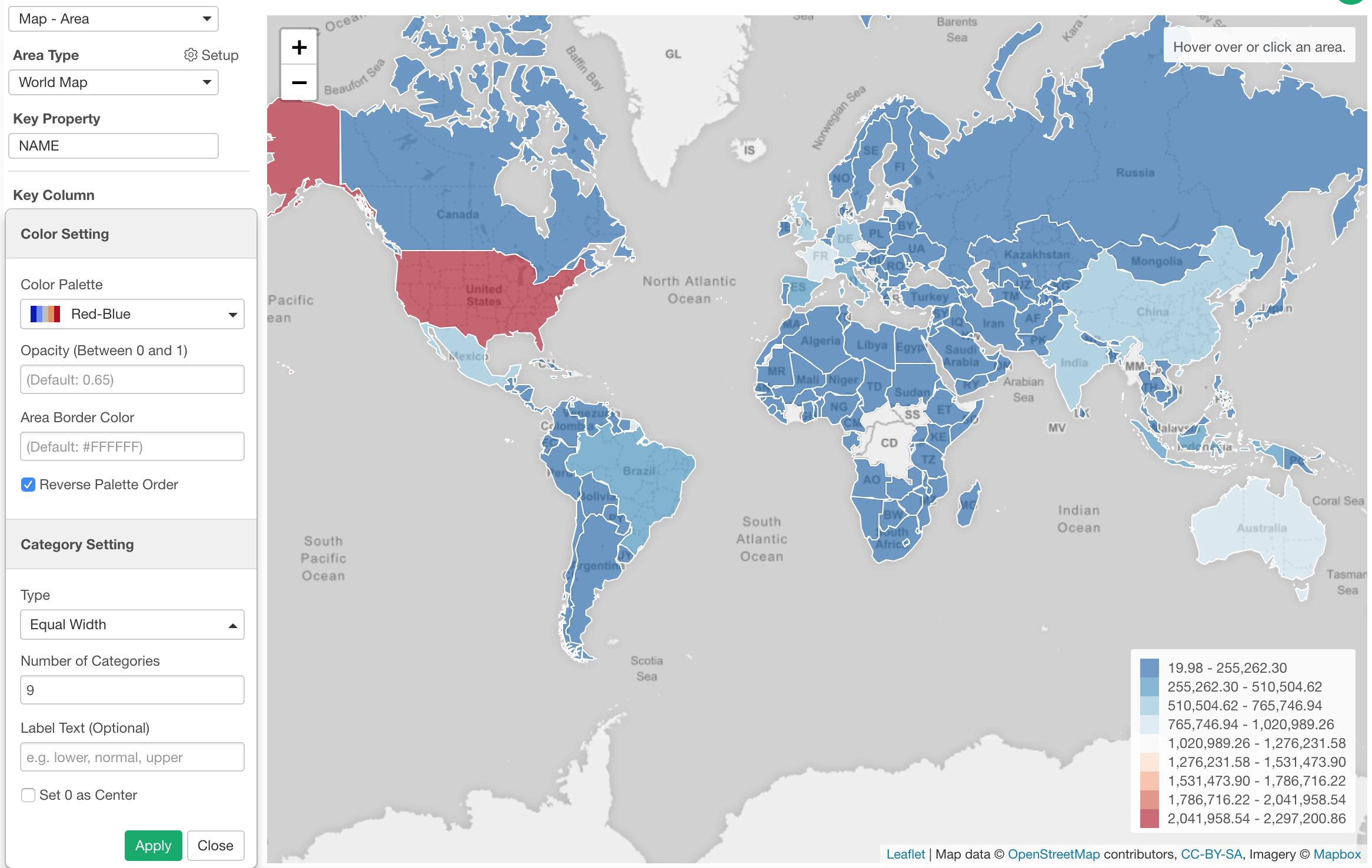
The problem is that only the United States (Red color) look different and everything else looks the similar blue color. This makes it harder to see any differences between the countries other than the United States.
We can try using the ‘Equal Frequency’ option for the binning, which will divide the numeric values into 10 groups (in this case) so that each group will have same number of countries. In this data, there are 165 countries, so each group will have about 16 countries.
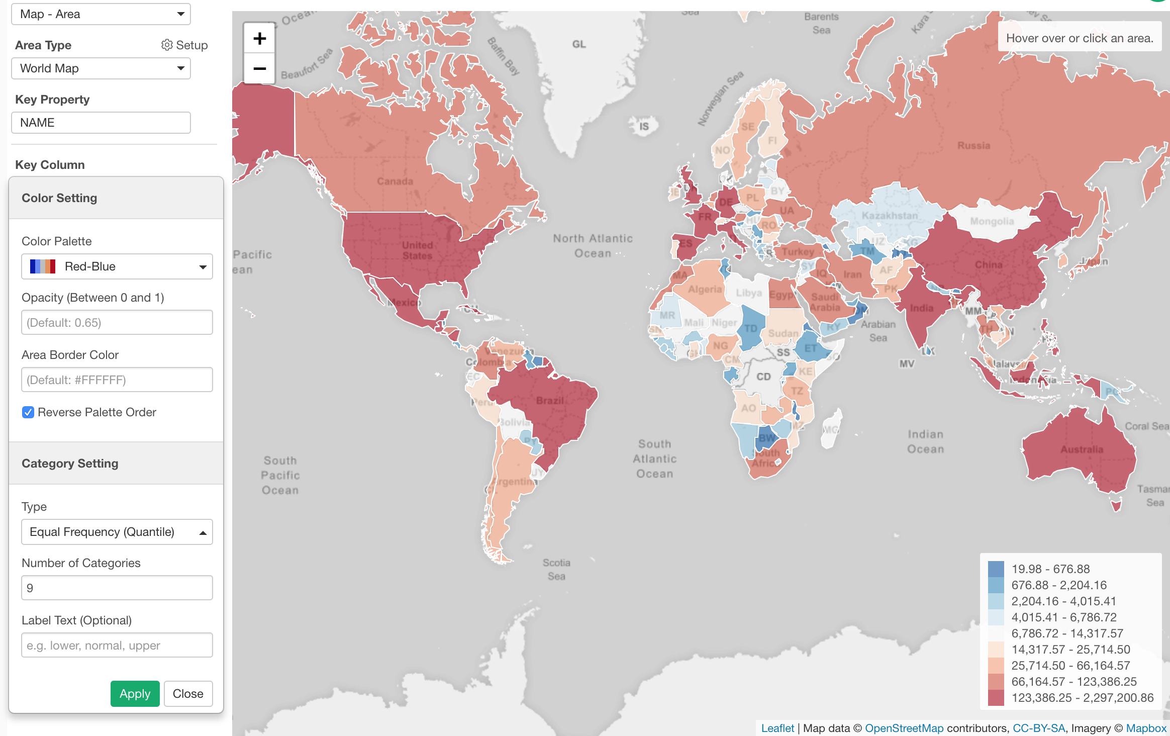
Binning with ‘Manual’ Option
You can divide the numeric values by setting specific threshold values.
Here, I’ve assigned the ‘Age’ column to X-Axis and showing the percentage of employees by ‘Job Role’ for each Age group.
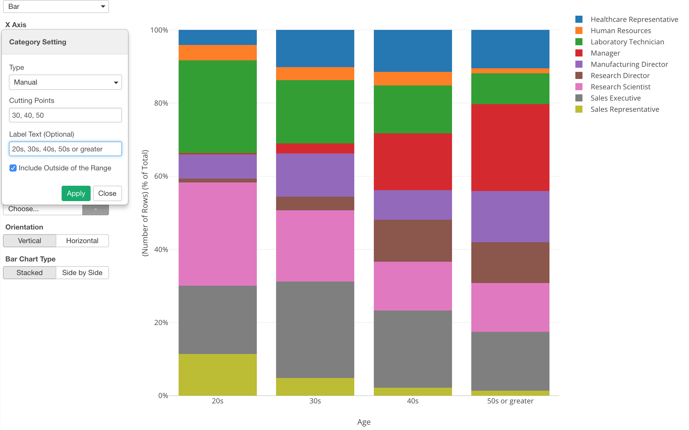
In the property, I set specific dividing values (30, 40, 50) and added a label text for each group.
Binning with ‘Outlier’ Option
Another cool option for categorizing numeric values is ‘Outlier’.
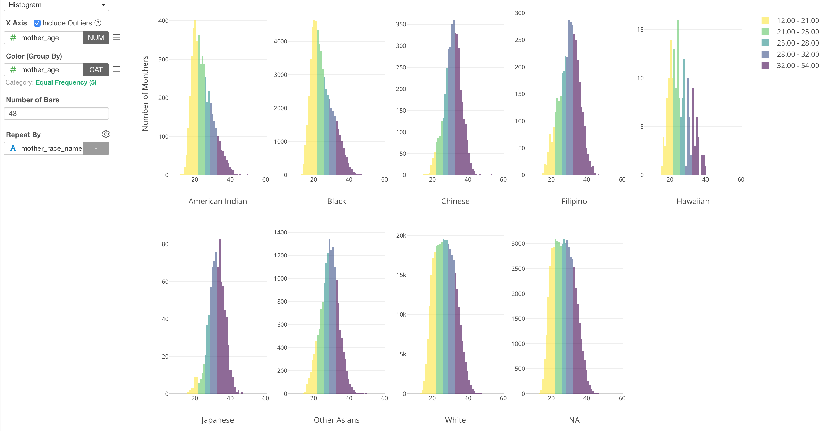
Here, I’ve used a histogram to visualize the distribution of Mother Age from the US baby data. By using Repeat By, I’m showing the histogram for each Mother Race type (e.g. White, Black, etc.)
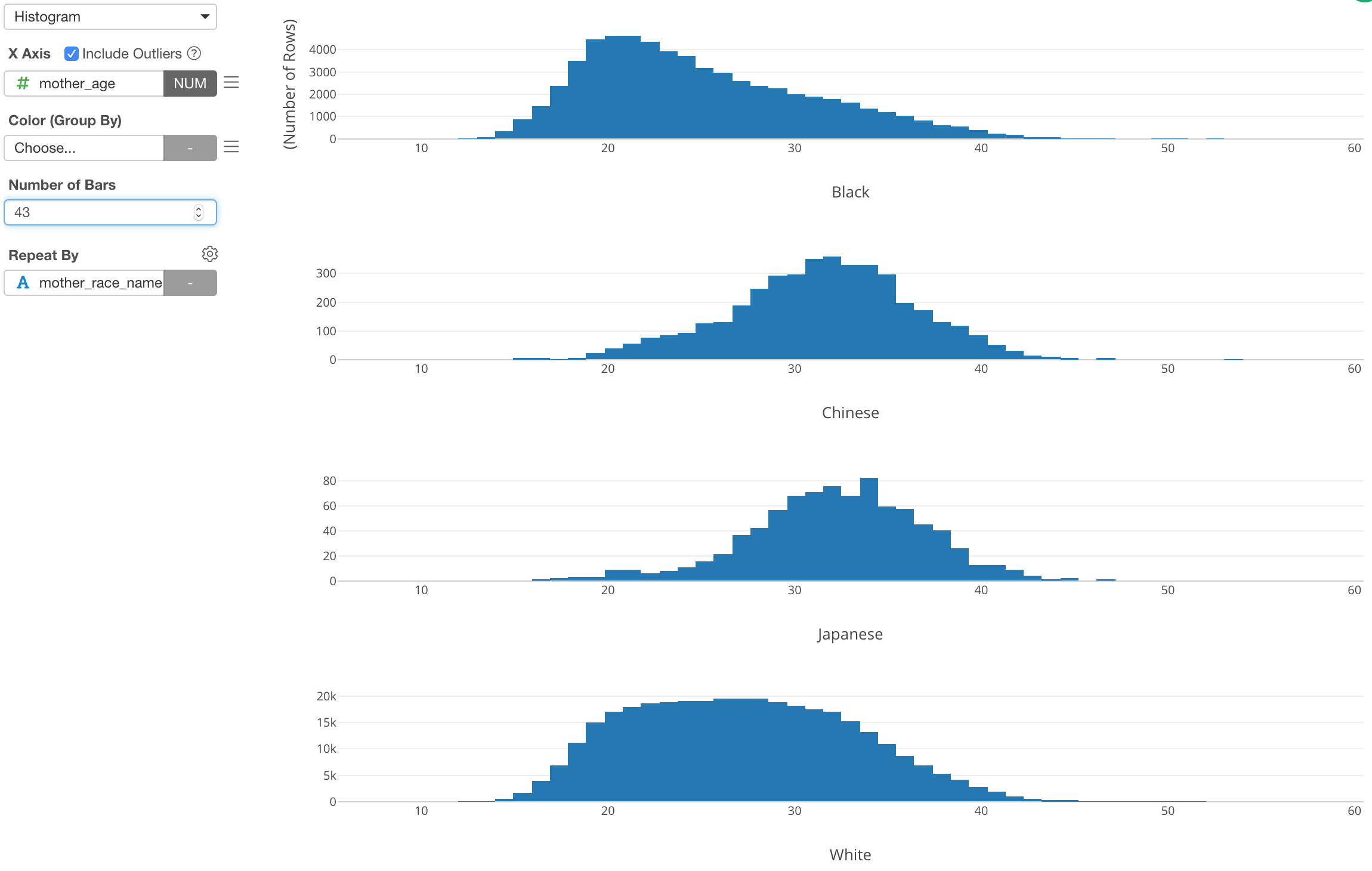
Now, if we want to show the outliers, which means that the mothers who gave birth at very early ages or very late ages, I can assign Mother Age column to Color and setup the categorization.
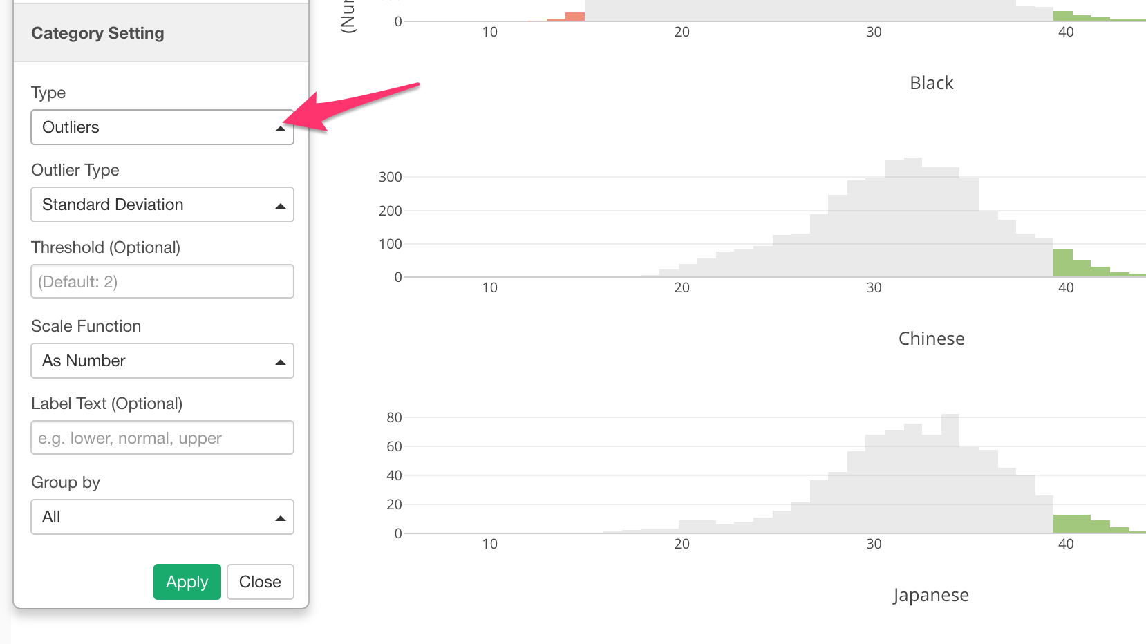
We can see the outliers are in either green (higher side of the outliers) or red (lower side of the outliers).
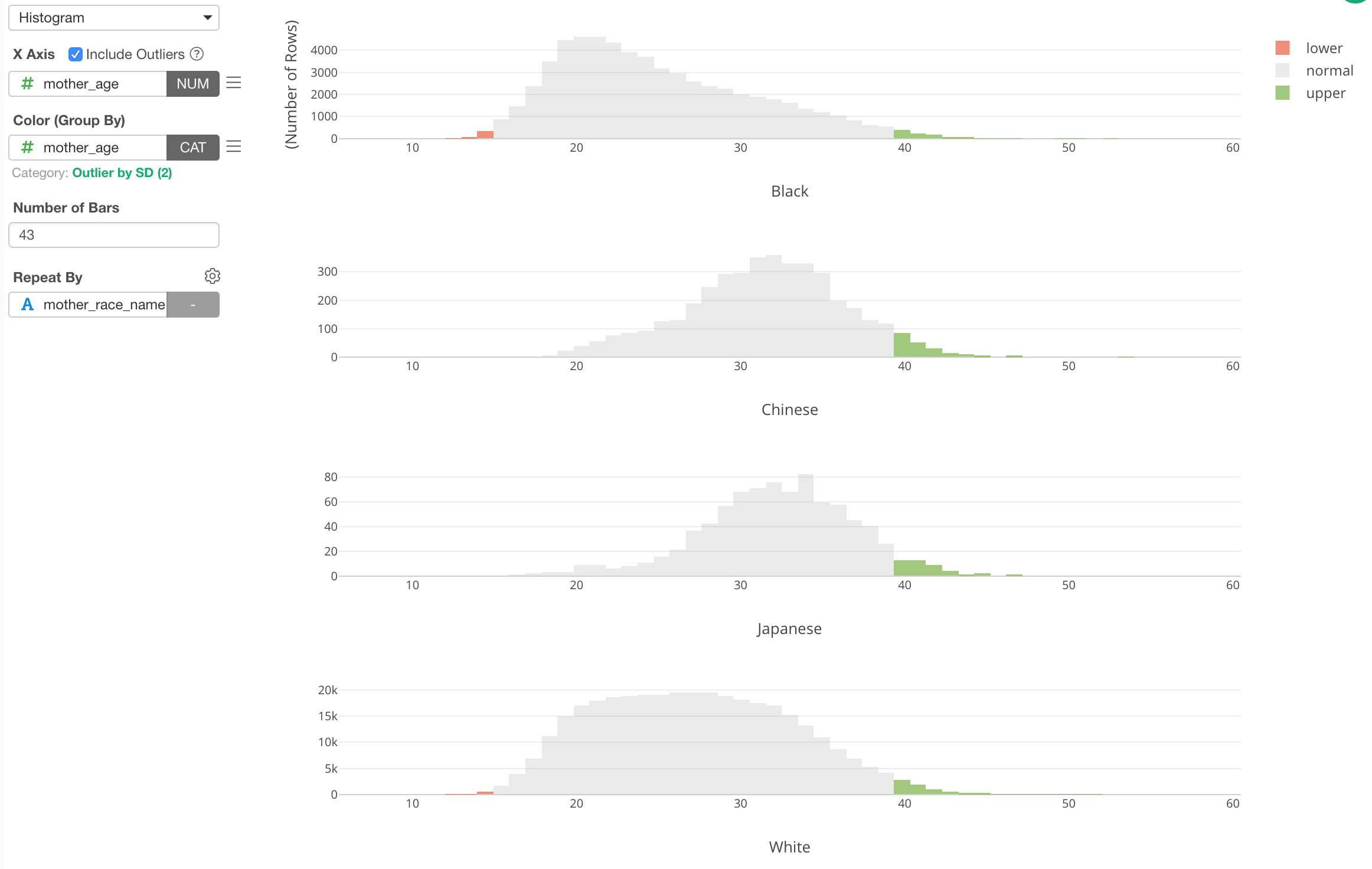
This ‘Outlier’ categorization is done against the whole data. But if we want to do it for each Mother Race group, we can set ‘Group By’ setting to use ‘Repeat By’.
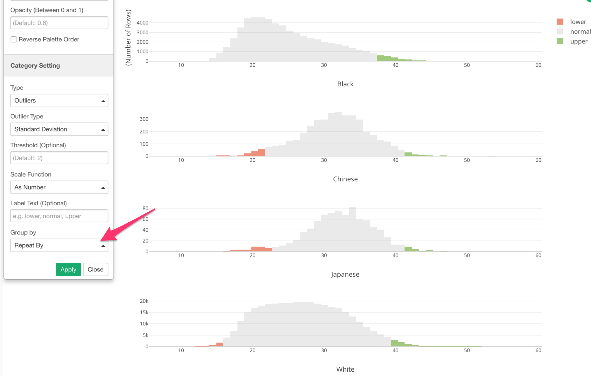
Now we can see that outlier ranges are different for each Mother Race group.
Limit Values - Top/Bottom N & Condition
This ‘Limit Values’ feature is quite convenient. It literally limits the categorical values that are shown in the charts.
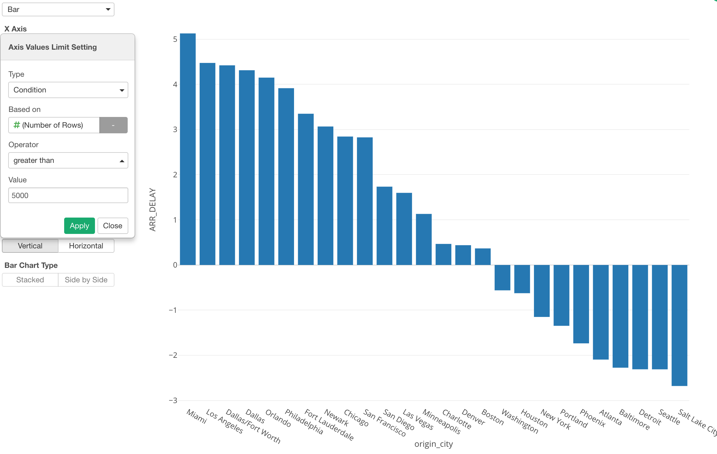
Here, I have US flight data and am using a bar chart to show the average flight delay time for each departure city.
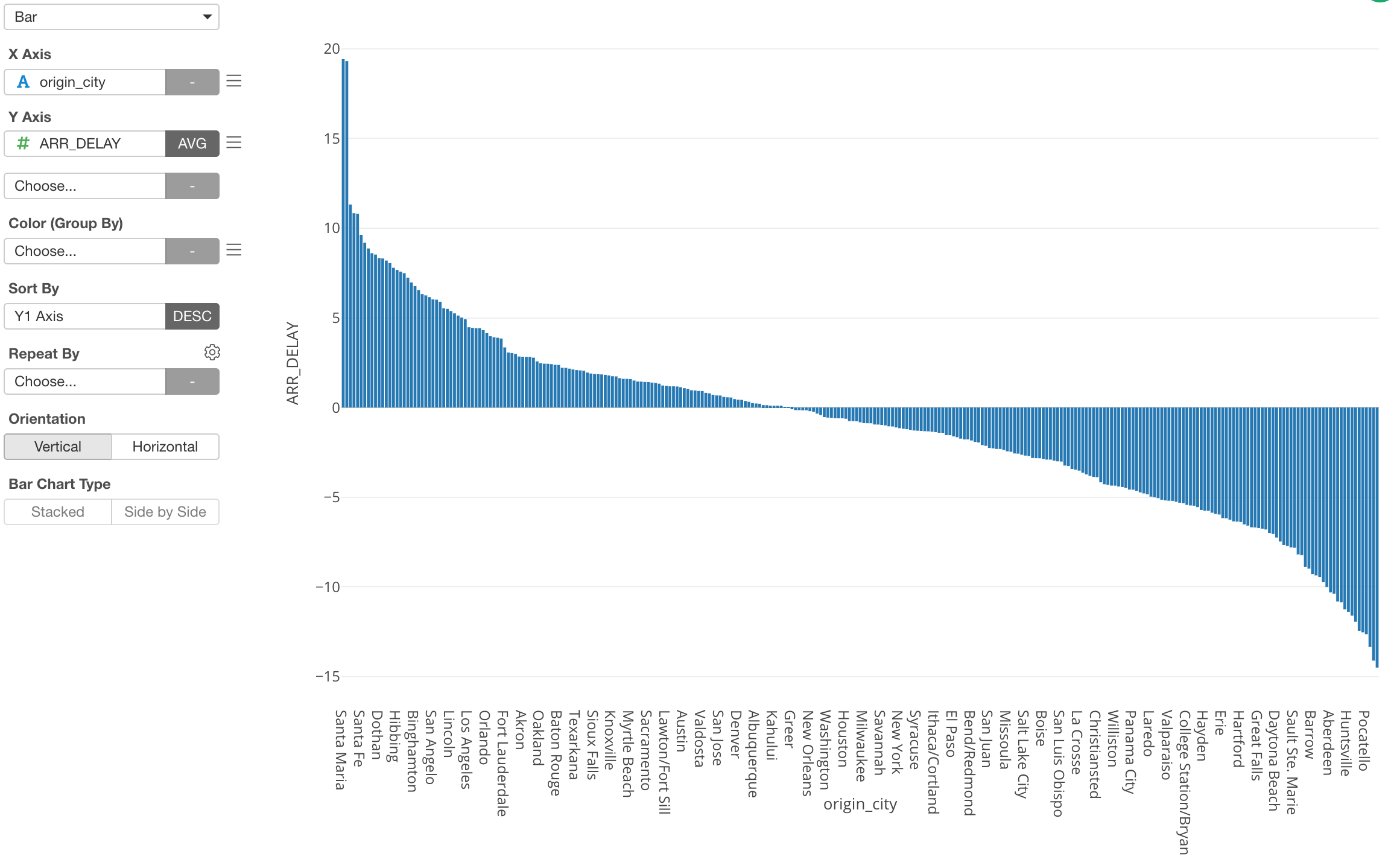
However, as you can see there are tons of cities and it’s hard to see what cities are even in the chart.
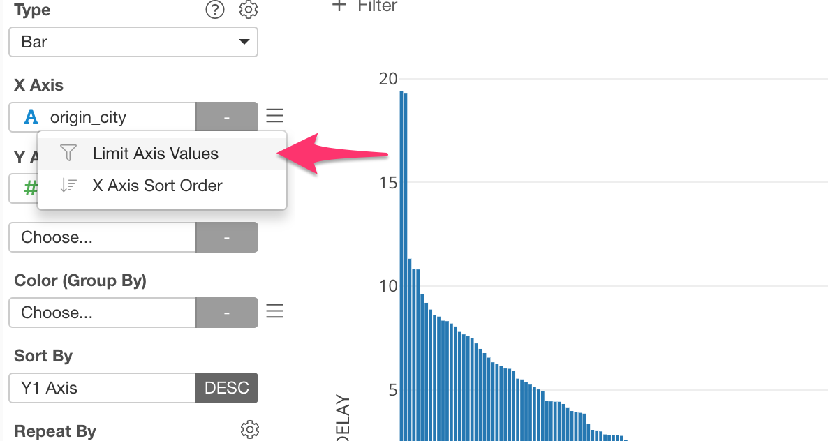
This is when you want to use the ‘Limit Values’ feature.
We can select ‘Limit Axis Values’ from the X-Axis menu.
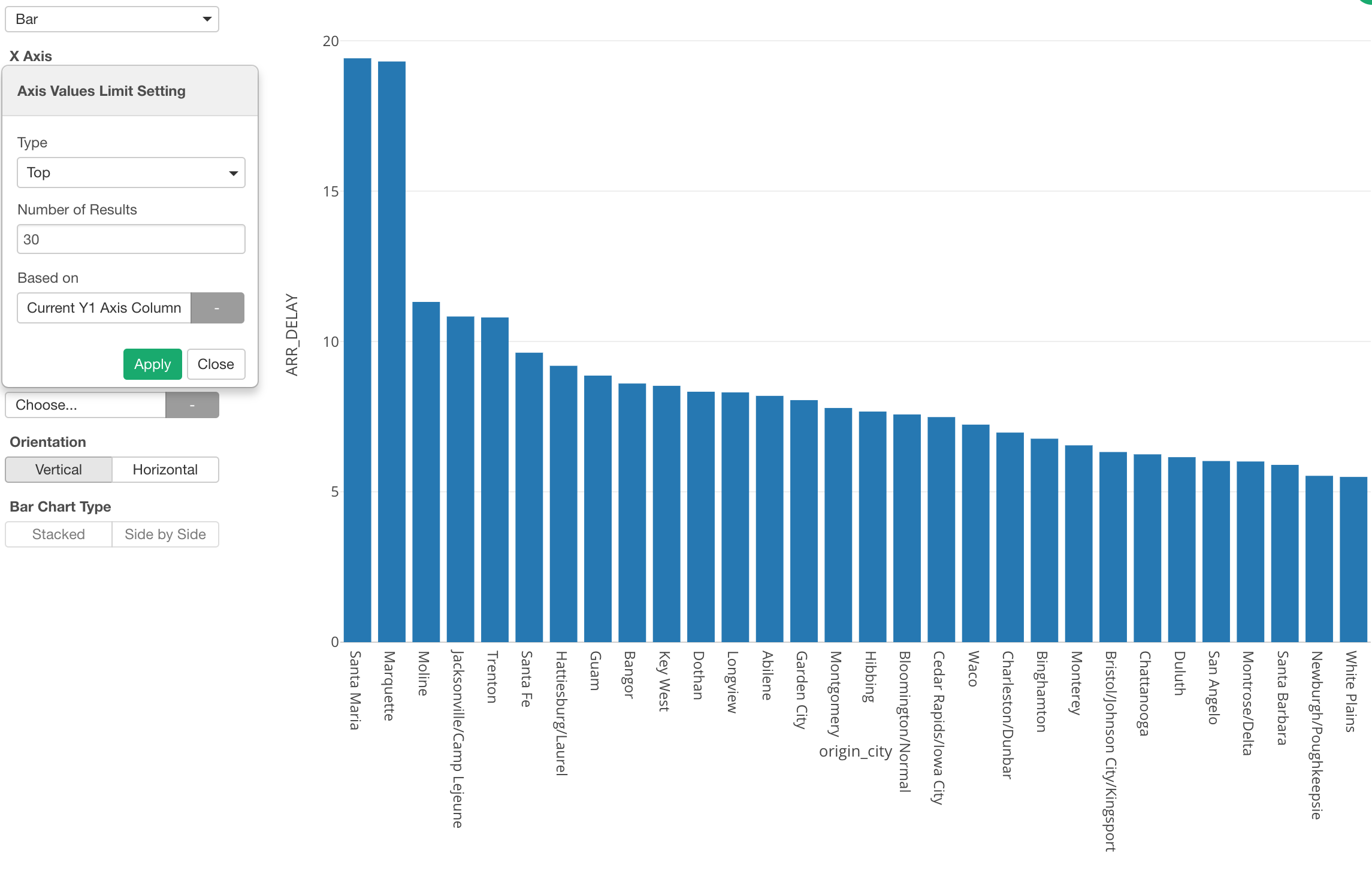
And we can select ‘Top’ as Type and 30 for Number of Results to show the top 30 cities based on the delay time.
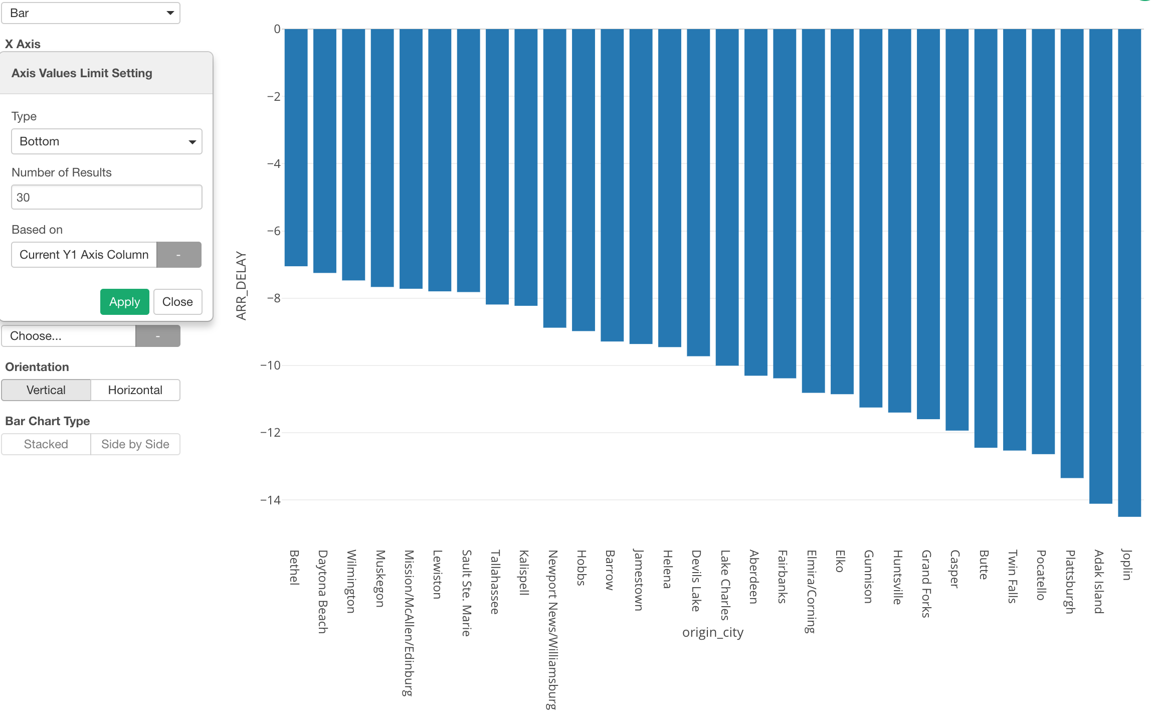
Bottom N
We can do the opposite, which is to show the bottom 30 cities based on the delay time.
Condition
Also, we can use Condition as the limiting option.
Here, I’m using the ‘Condition’ to show the cities that have departed greater than 5000 flights.
New Functions
We have added the following three functions inside the chart.
- Log
- ABS
- Weekend
These are the functions that you can use inside ‘Mutate (Create Calculation)’ as Data Wrangling step, but being able to use these inside the chart makes your exploratory data analysis much faster and easier.
Log
The log function is useful when you are dealing with data whose distribution is skewed towards the small numbers.
Here is a sales data that is visualized by a histogram.
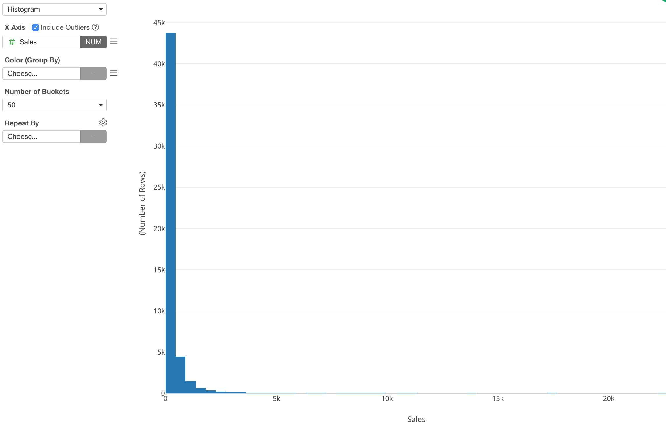
This is a typical sales data distribution with a long tail.
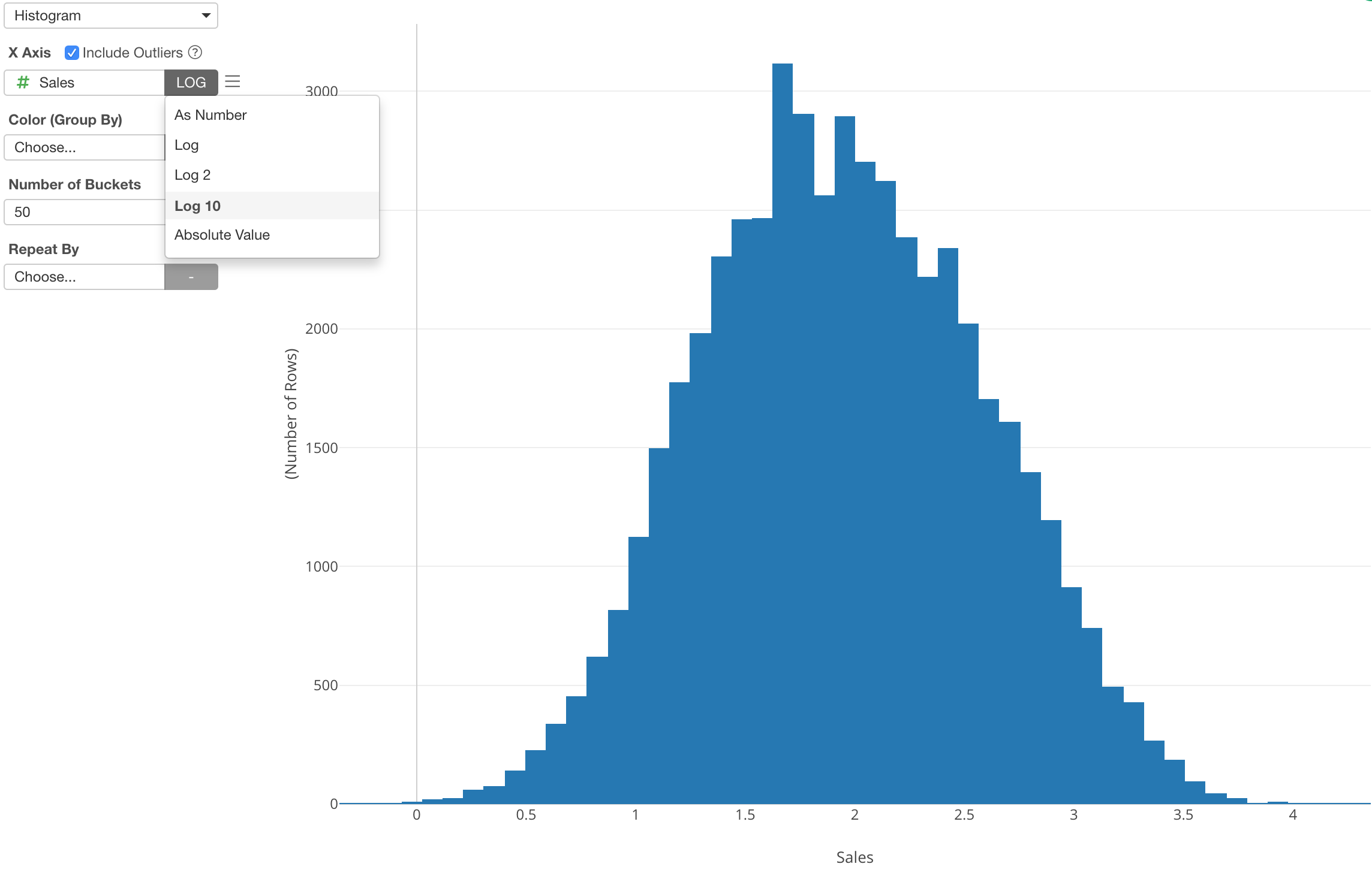
You can select one of the Log functions from the function list and transform the numeric values and see if the data will be normally distributed (or closer to it).
Scatter
These functions are available for other charts as well. For example, I’m using a Scatter chart to show the relationship between Sales and Sales Compensation of the store sales data.
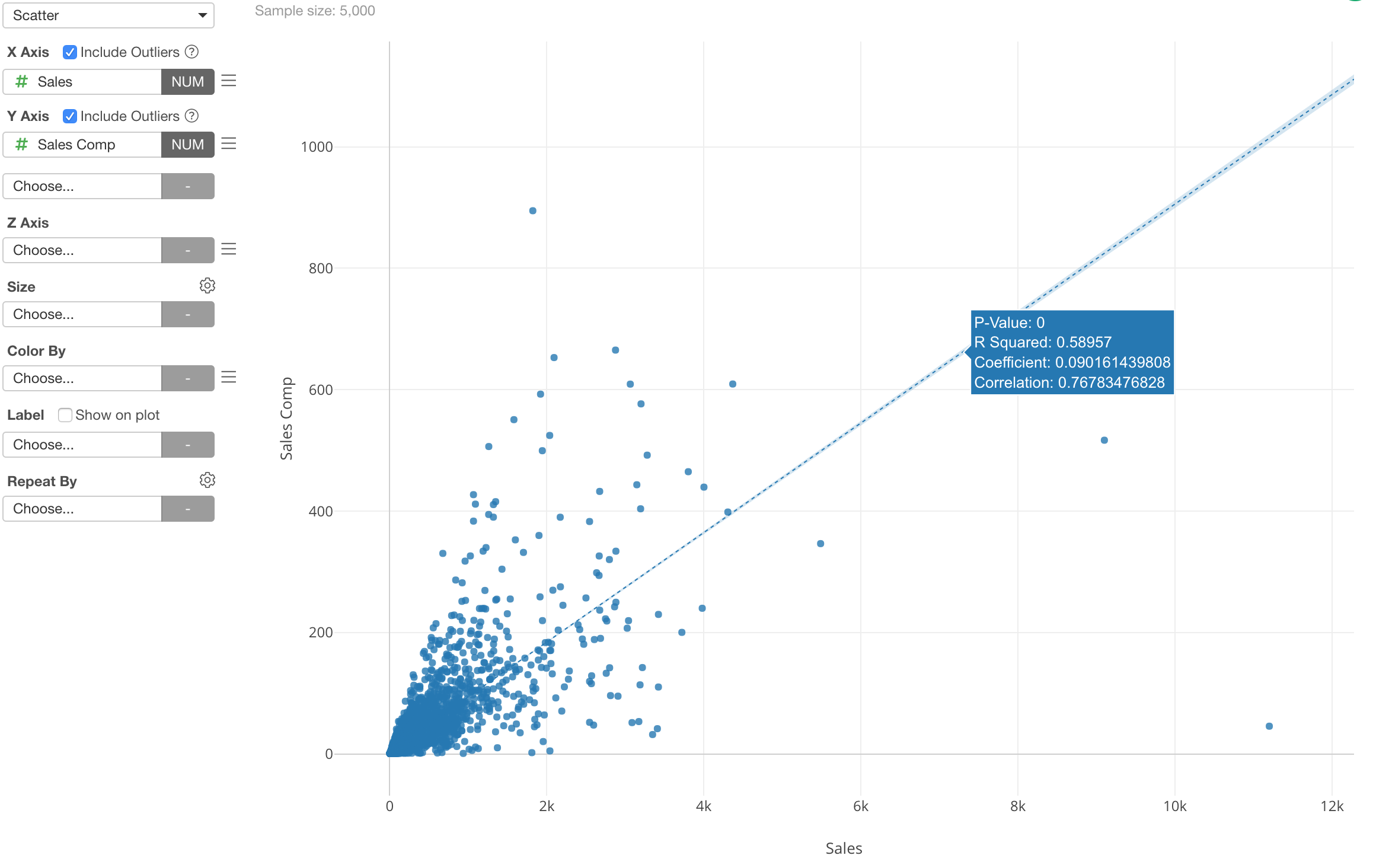
Again, both Sales and Sales Compensation are skewed towards to small numbers, and this makes it harder to see the relationship in the area where most of the data is.
We can apply the log function to both X-Axis and Y-Axis.
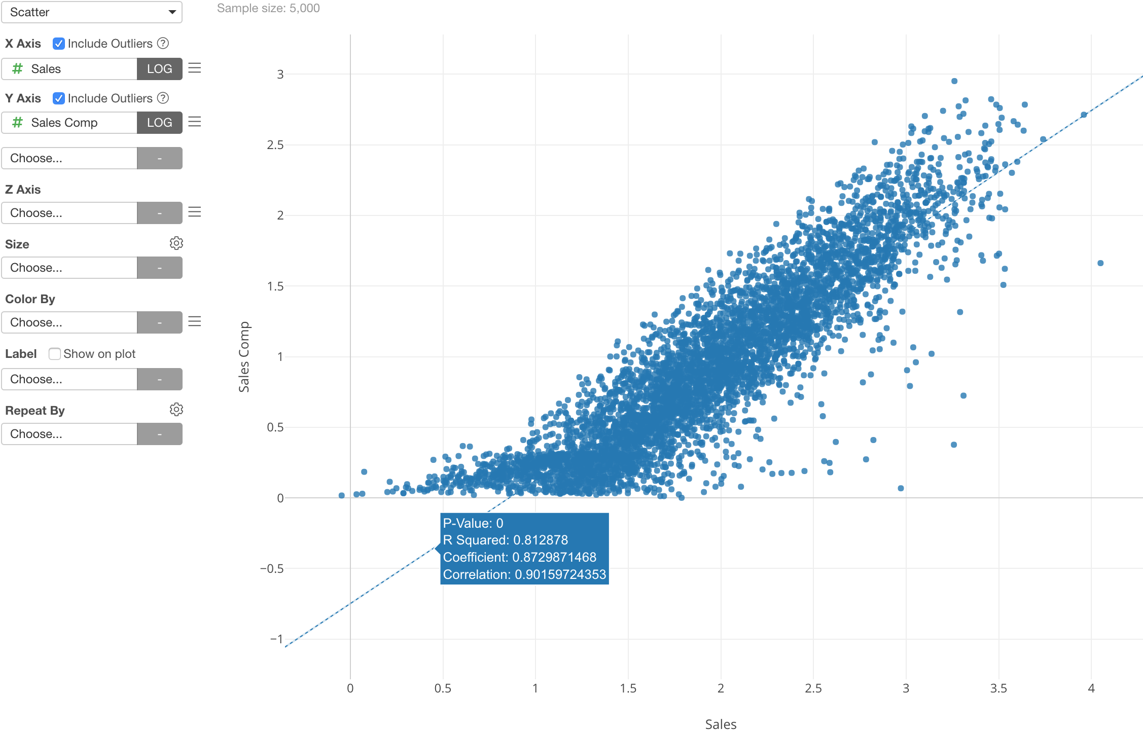
And we can see that the two variables (or columns) are highly correlated (0.90) after they are transformed by the log function.
Weekday vs. Weekend Function
We have added a Weekend function to the date/time related function list.
Here, I’m showing the bike rental counts distributions for Weekday and Weekend.
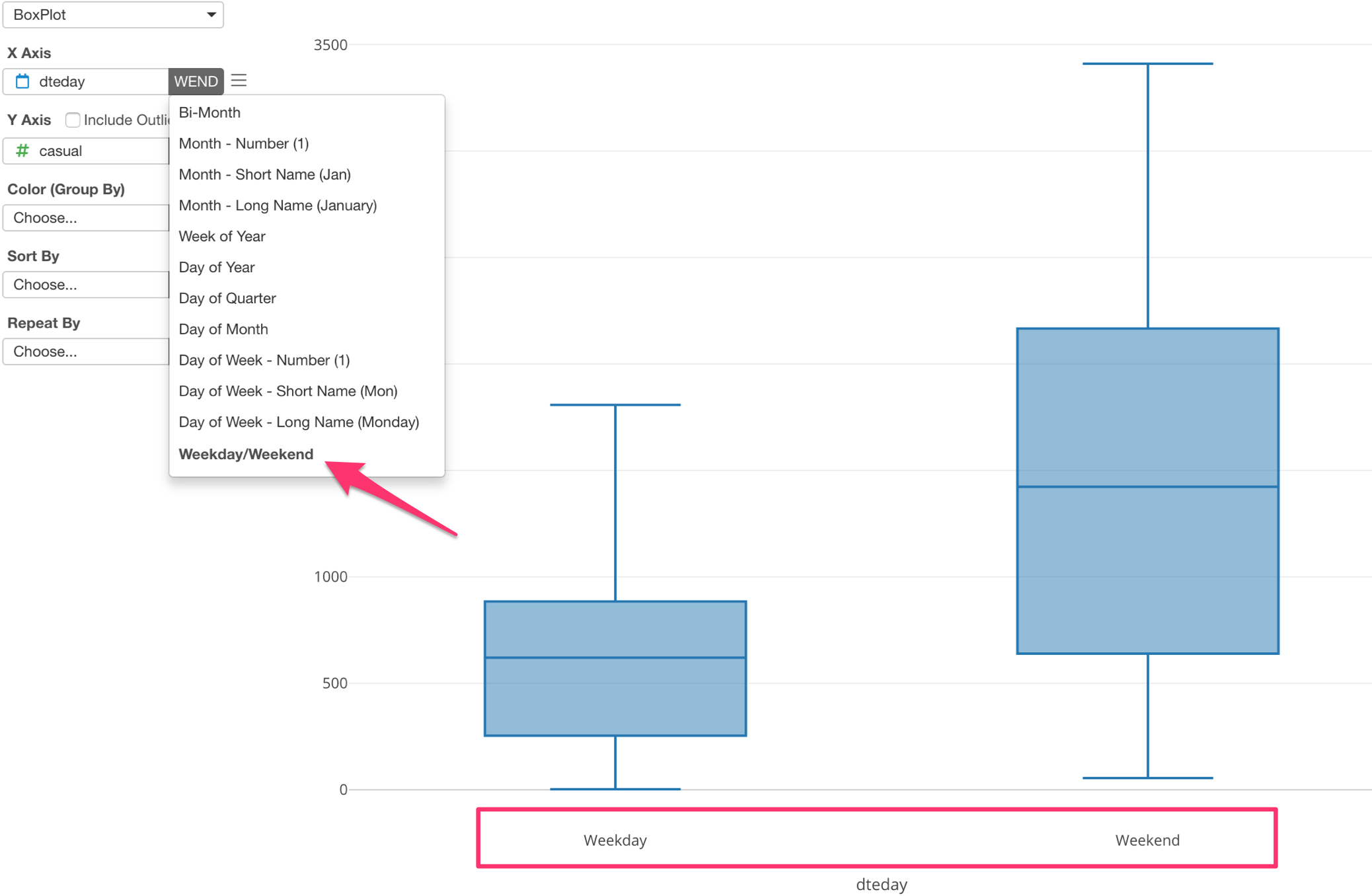
All you need to do is to select ‘Weekday/Weekend’ menu from the date/time function list.
Scatter
And this is supported for other charts and other places like Color and Repeat By as well.
For example, here is a scatter chart showing the relationship between the temperature and the bike rental counts.
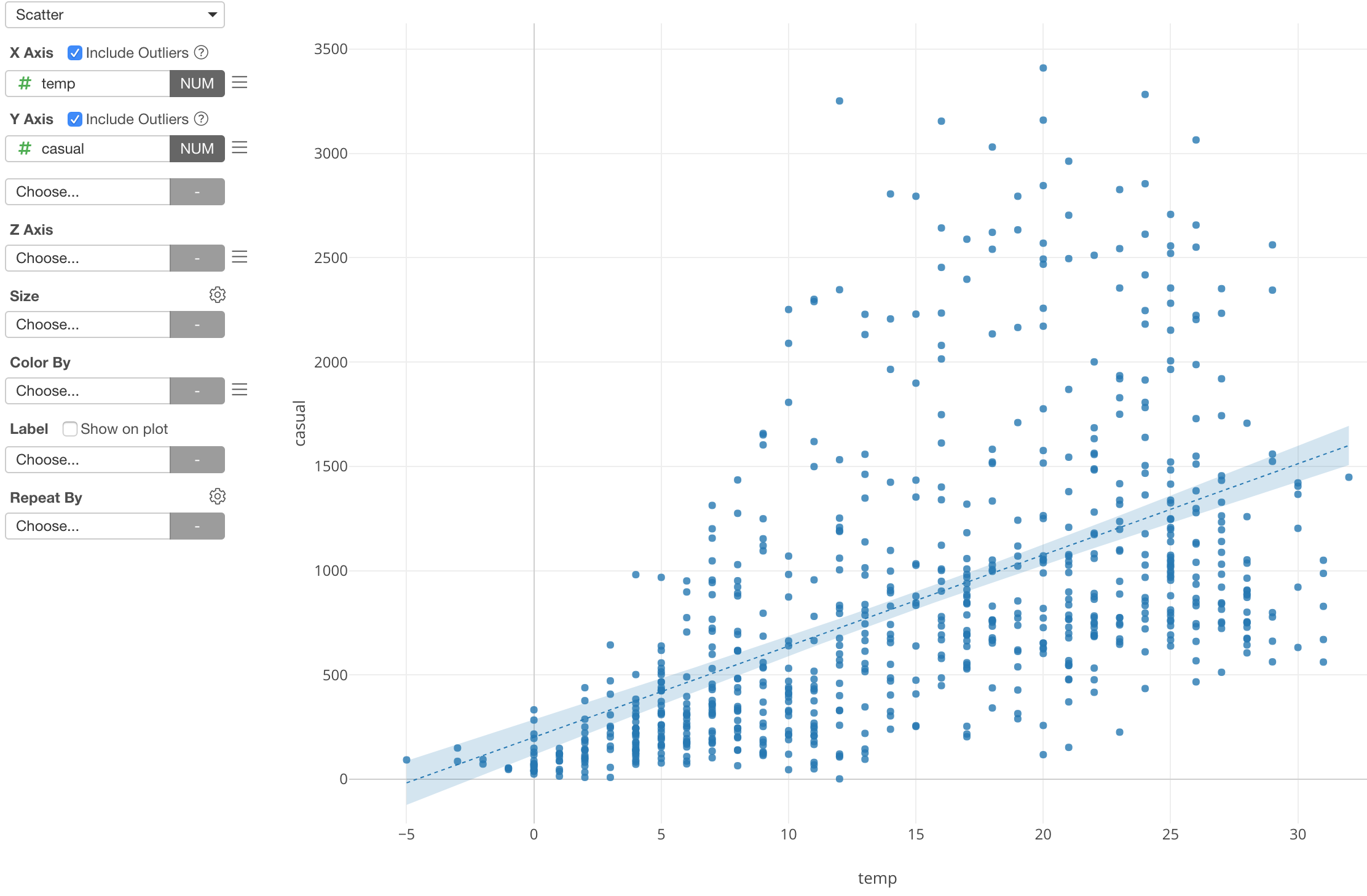
By separating this data into Weekday and Weekend with Color, we can see different patterns between the two.
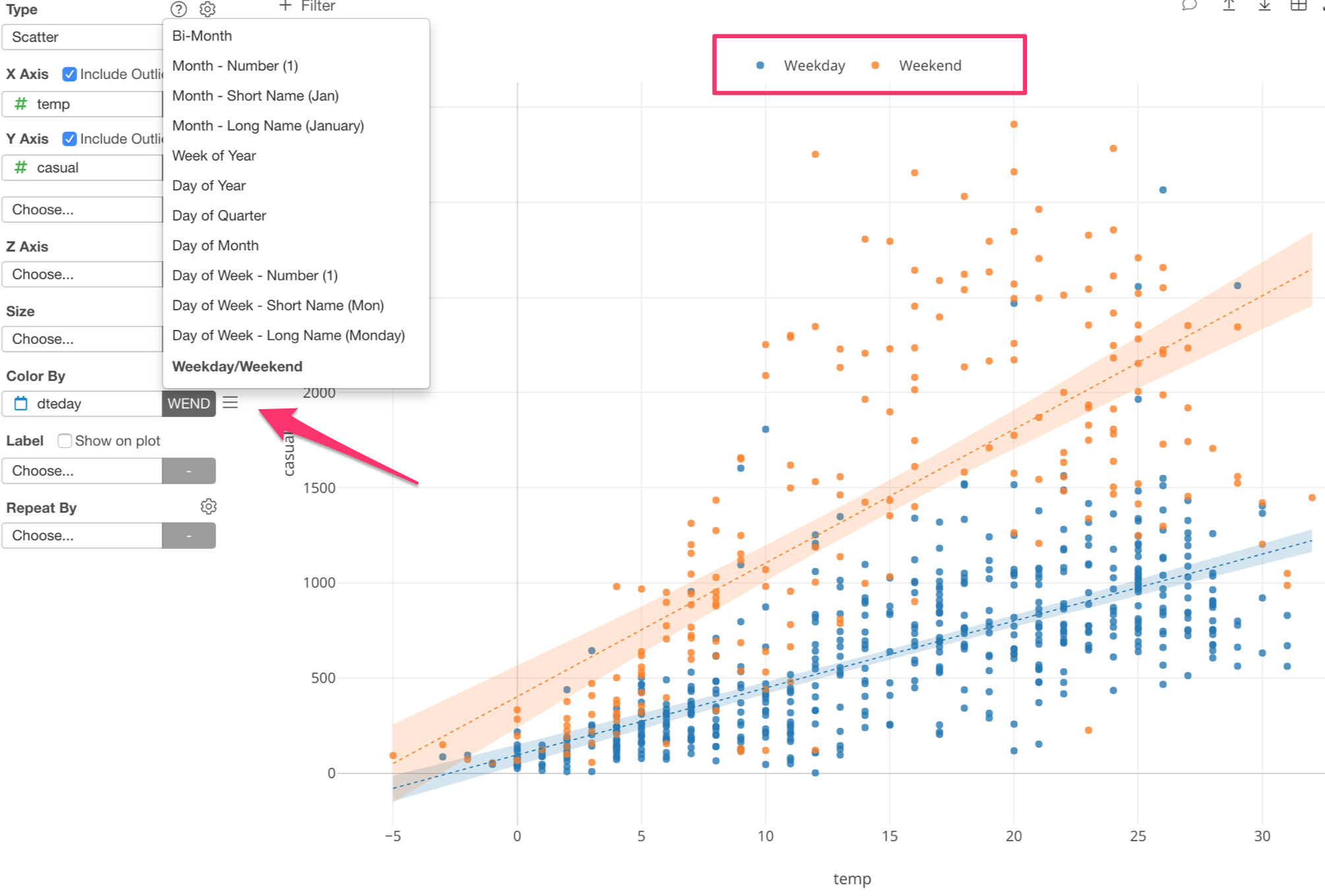
The number of bike rentals in weekends seem to be much more influenced by the temperature than the ones in weekday.
Pivot Table Enhancements
Maybe not so surprising to many, but still surprising to me, people love Pivot table.
I totally understand, it’s basic but easier to report numbers, and more often than not we need these numbers for running businesses.
Anyway, so we have been constantly enhancing the Pivot table under Chart view, and we have delivered a few with v5.3 as well.
Here are two main things.
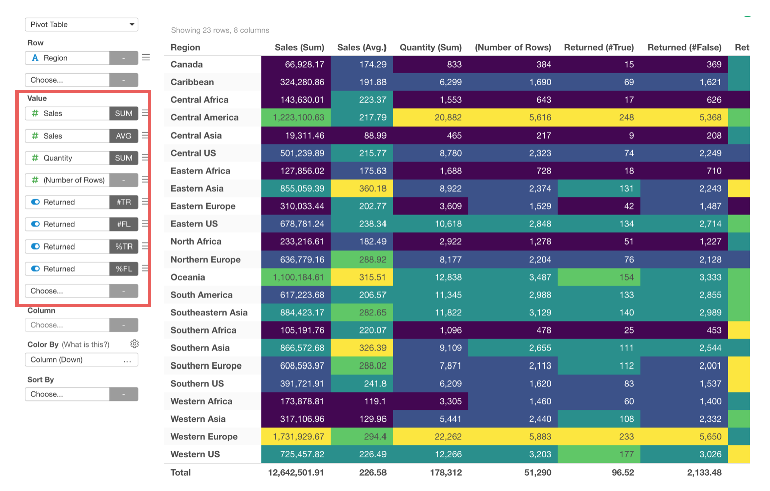
Many Value Columns!
We have gotten this request a lot, our users want to show more than just 5 value columns!
So we have extended the number of the columns to 30!
Grand Total Calculation
This is not a new feature, but we have changed the way to calculate this grand total.
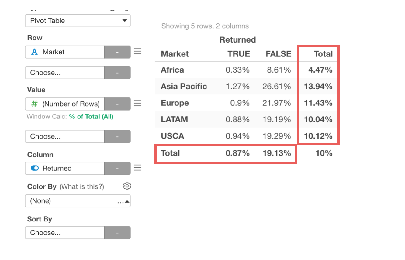
It used to be calculating the grand total numbers before aggregating the data for Pivot, which could be technically correct, but could be different from what users would expect, especially when you want to calculate average, % ratio, etc.
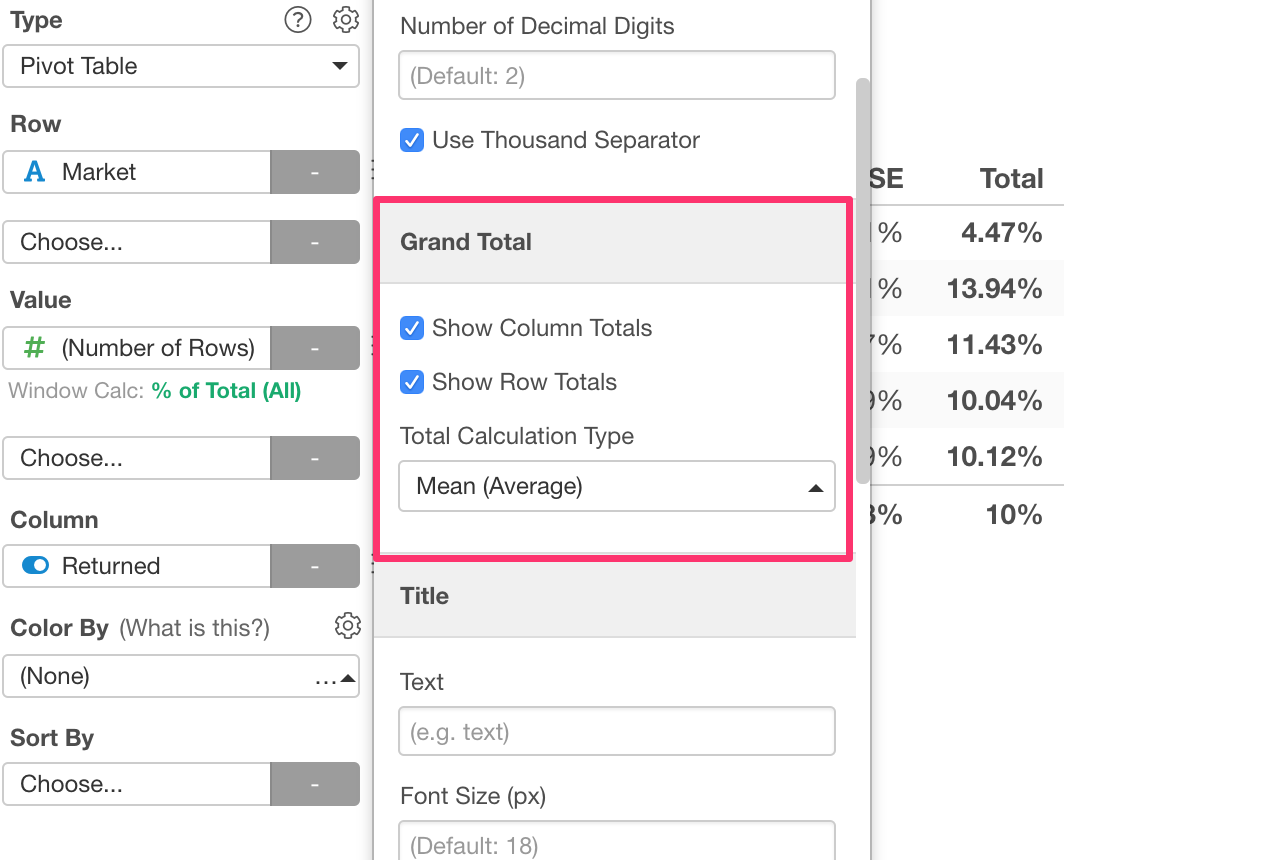
So we changed it so that the grand total calculations are done on top of the data aggregated in the Pivot table.
You can choose which aggregation function to use from the property.
Reverse Orders for Color Values
Sometimes you might want to change the order of the values for Color.
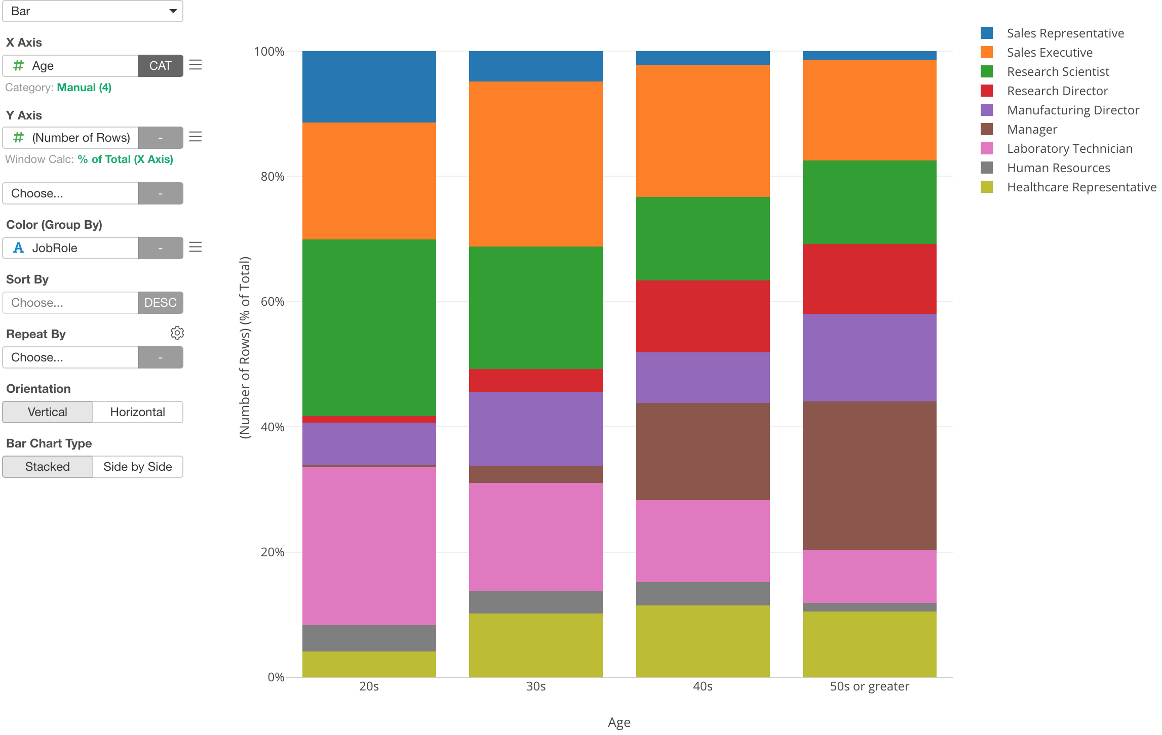
Here is a chart that shows the percentage of employees by Job Role for each Age categories.
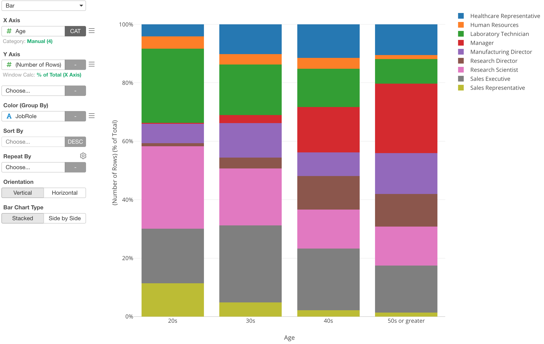
Now, let’s say you want to change the order of the Job Role values to be opposite.
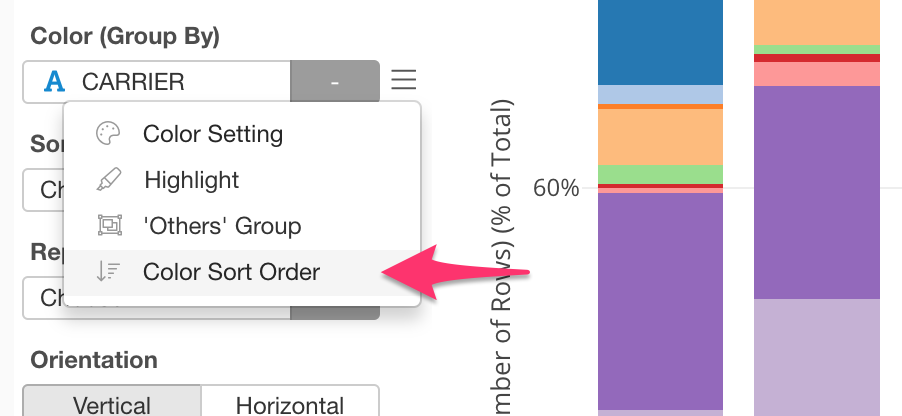
You can select ‘Color Sort Order’ from the color’s menu.
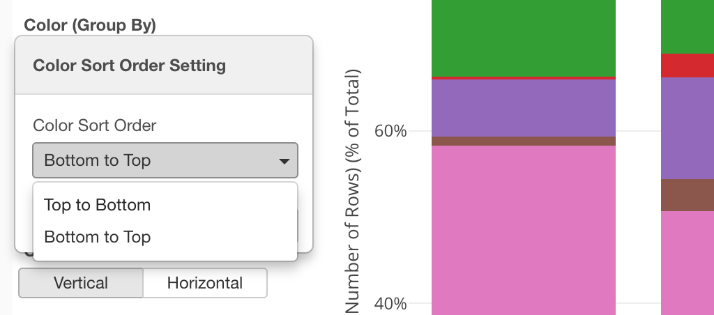
And select ‘Bottom to Top’ from the dropdown.
Now the order has flipped.
Analytics
Training vs. Test Data
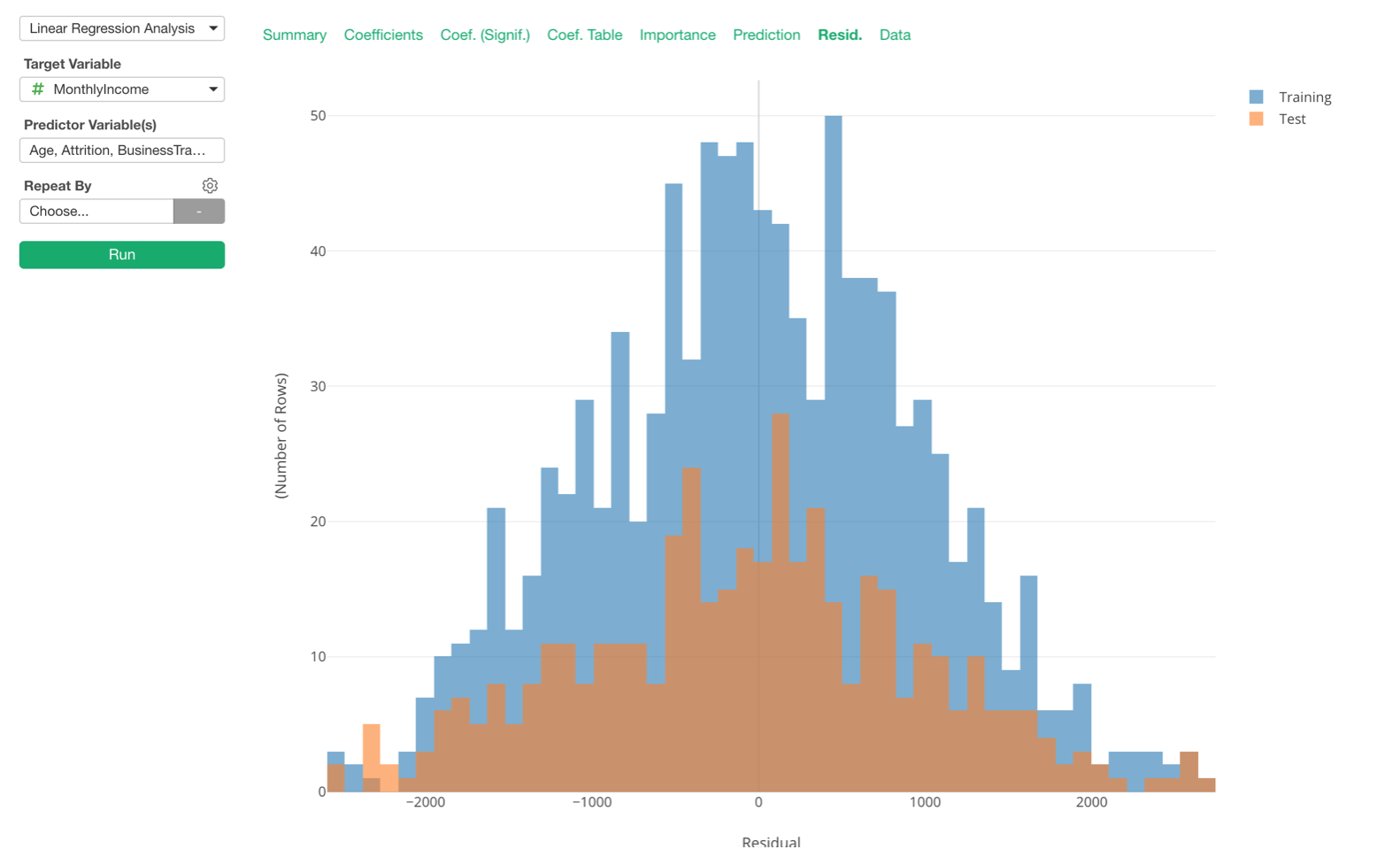
We have added ‘Test Mode’ for all the Statistical and Machine Learning model options including Linear Regression, Logistic, GLM, Decision Tree, Random Forest, etc. under Analytics view.
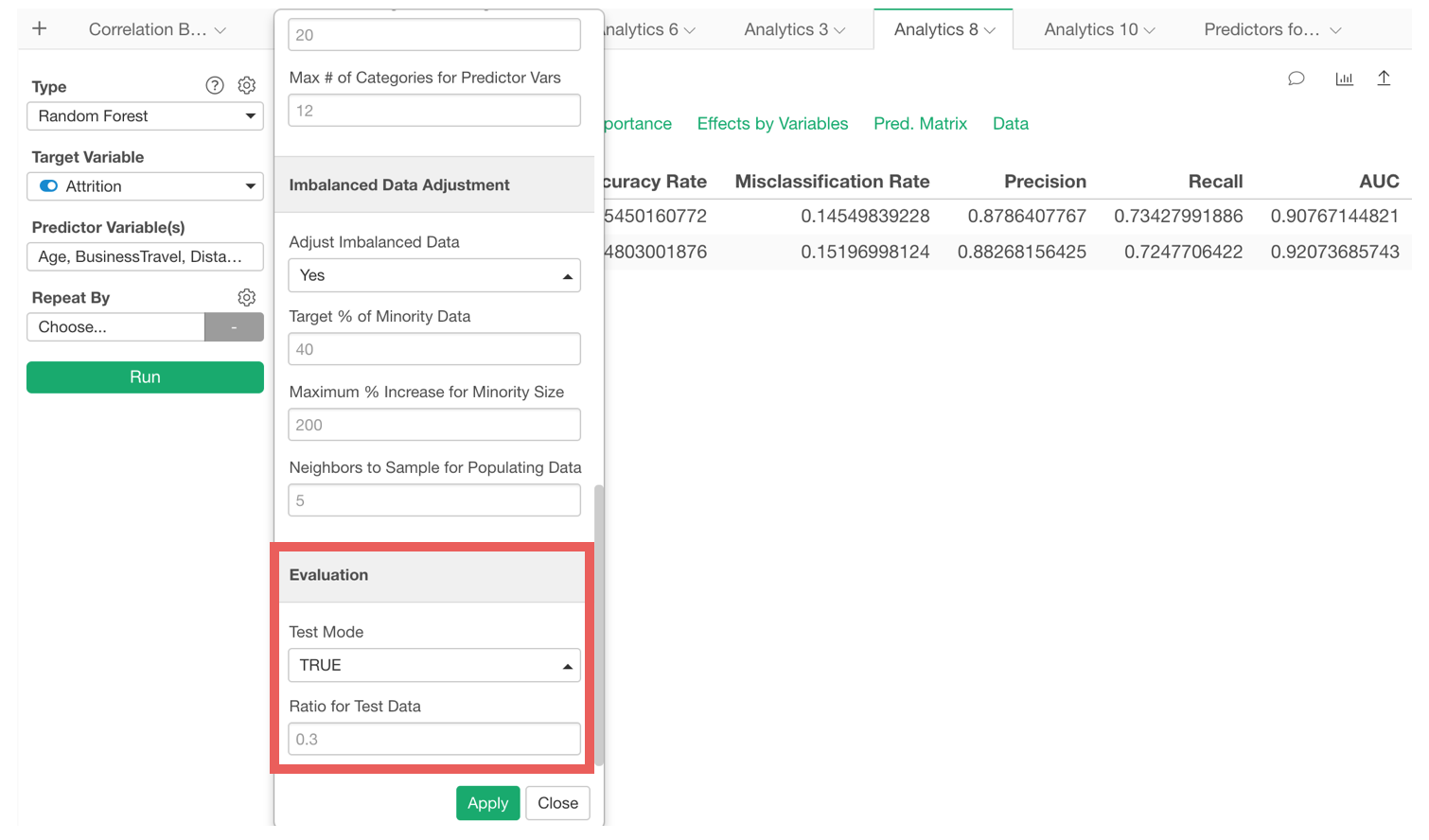
Enabling the Test Mode will split the data by the ratio that is set in the property and build a model based on the training data, then evaluate the model against the test data.
You can see the summary metrics of the model against both Training and Test data.

All the charts under Analytics view show the training and the test data as separate colors.
Cut Point for Binary Classification (TRUE/FALSE)
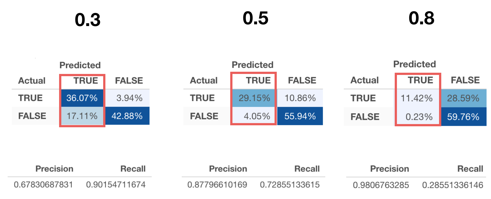
Binary Classification models use a cut point (or threshold) to separate TRUE or FALSE. It used to be 0.5 hard-coded internally, but now you can set it manually.
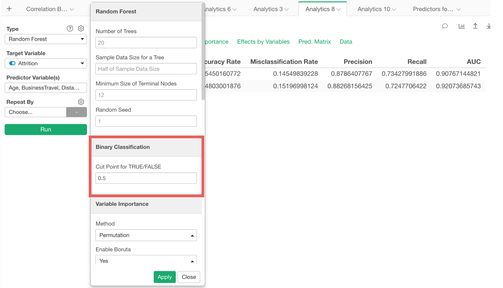
By changing the cut point to, say, 0.3, 0.5, or 0.8, you’ll see different prediction results.
Updated Default Setting - Random Forest, Linear Regression, Logistic Regression
We have changed the default setting for the following algorithms.
Random Forest with Boruta
Now Boruta is the default. This means it will always build 20 Random Forest models (you can change this setting) and show the variable importance scores as distribution and perform a statistical test to evaluate which variables importance are statistically significant.
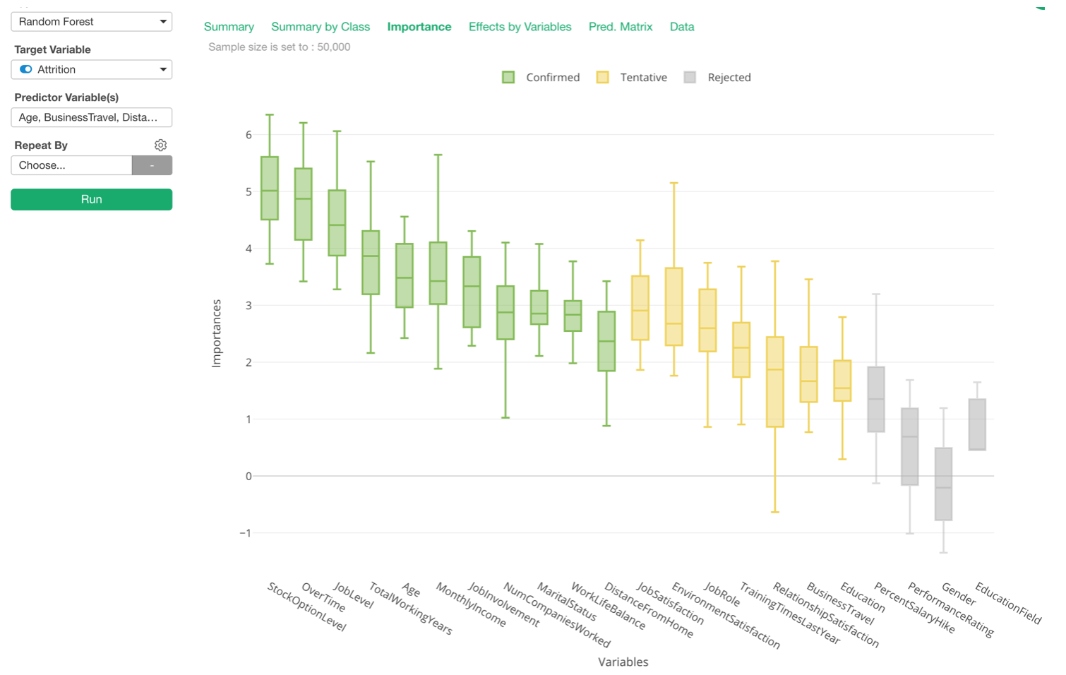
You can change this setting back to a single run with a bar chart for the variable importance view from the property.

Linear Regression with Variable Importance
When you are building the Linear Regression model, more often than not, what you really want to know is which variables have more effects on the target variable.
For this, you can go to Importance tab and compare the variables’ effects on a relative scale.
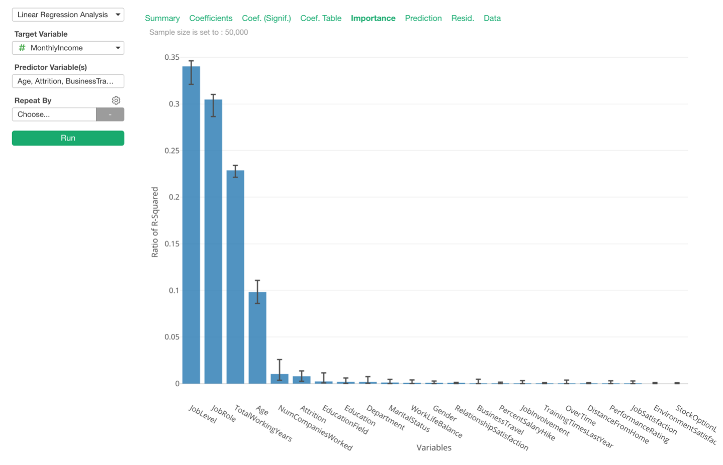
We have made this view available by default, but you can disable it from the property.
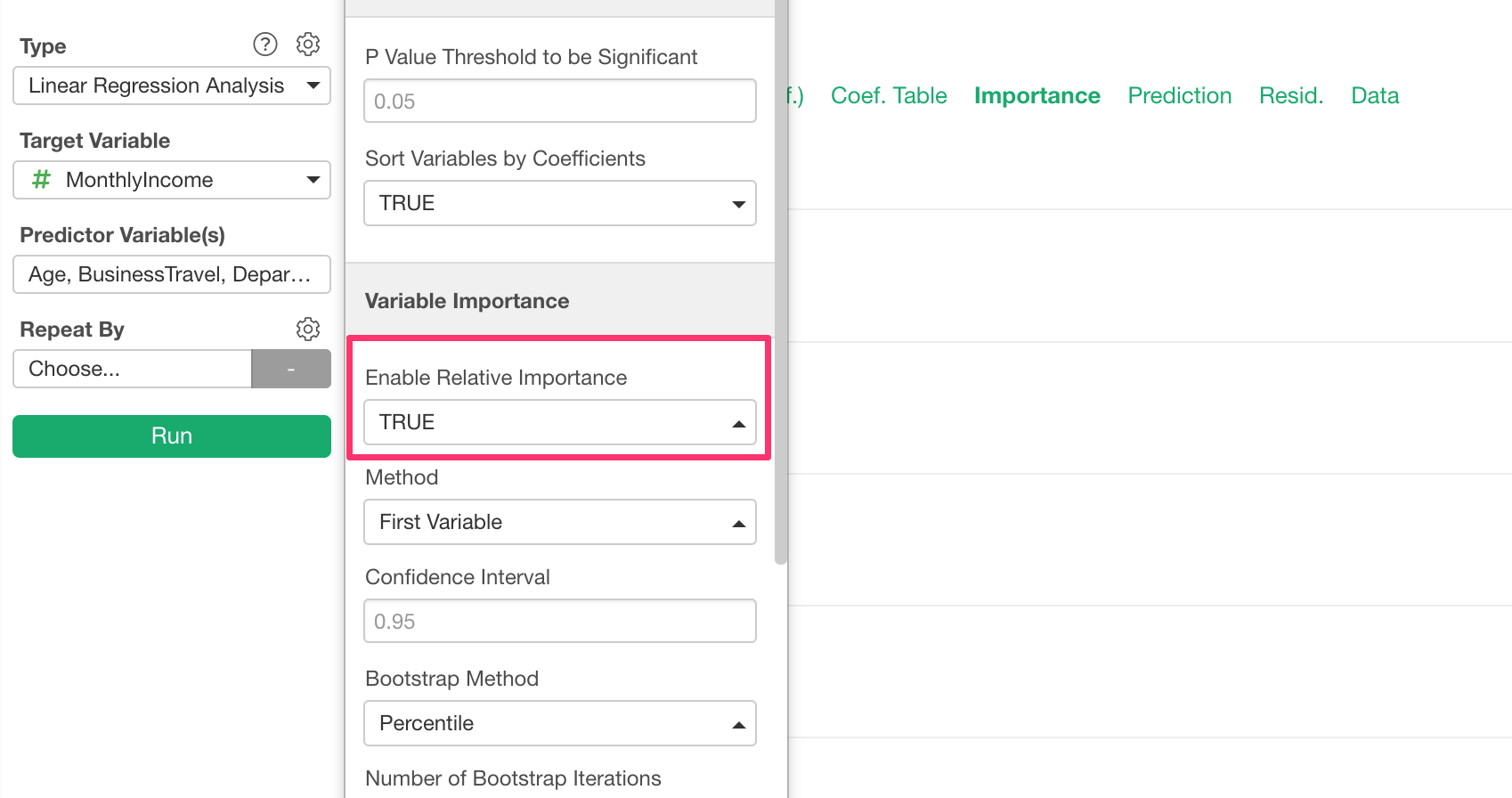
This feature builds a lot of models behind the scene to estimate the effects of the variables, so you might want to disable if you are concerned with the performance.
Logistic Regression with Marginal Effect
Trying to understand the coefficients or the odds ratios for your Logistic Regression models is always a bit tricky. This is why we have introduced the Marginal Effect in v5.2.
It turned out that this has benefited many of our users due to its explainability. One value increase in X would increase the probability of getting TRUE for ‘Marginal Effect’ value percentage at average.
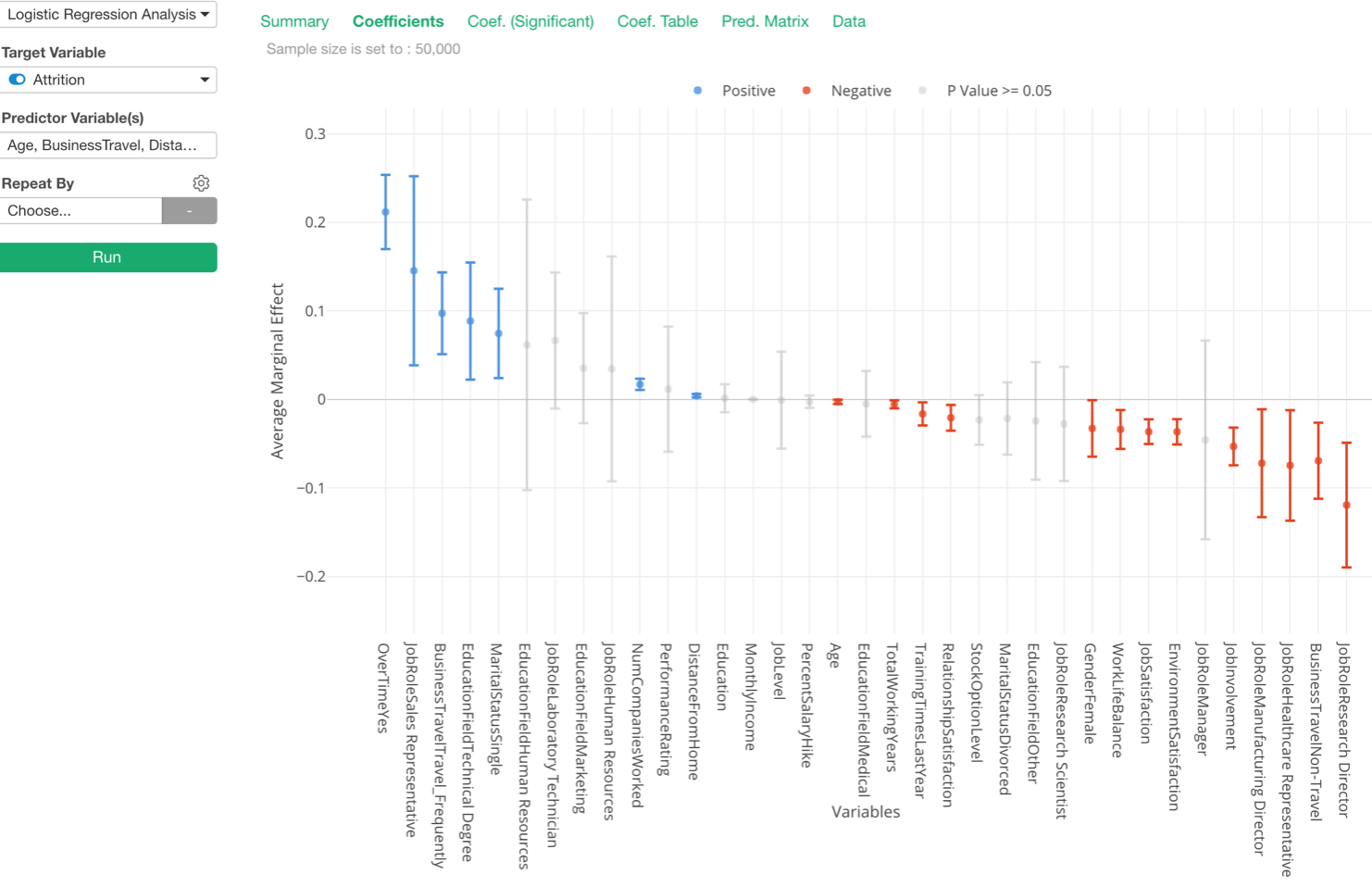
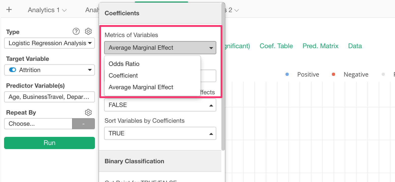
So we have made the metric as the default one, but you can change it from the property.
Enhancements for Time Series Forecasting with Prophet
We have added support for a few great features of Prophet!
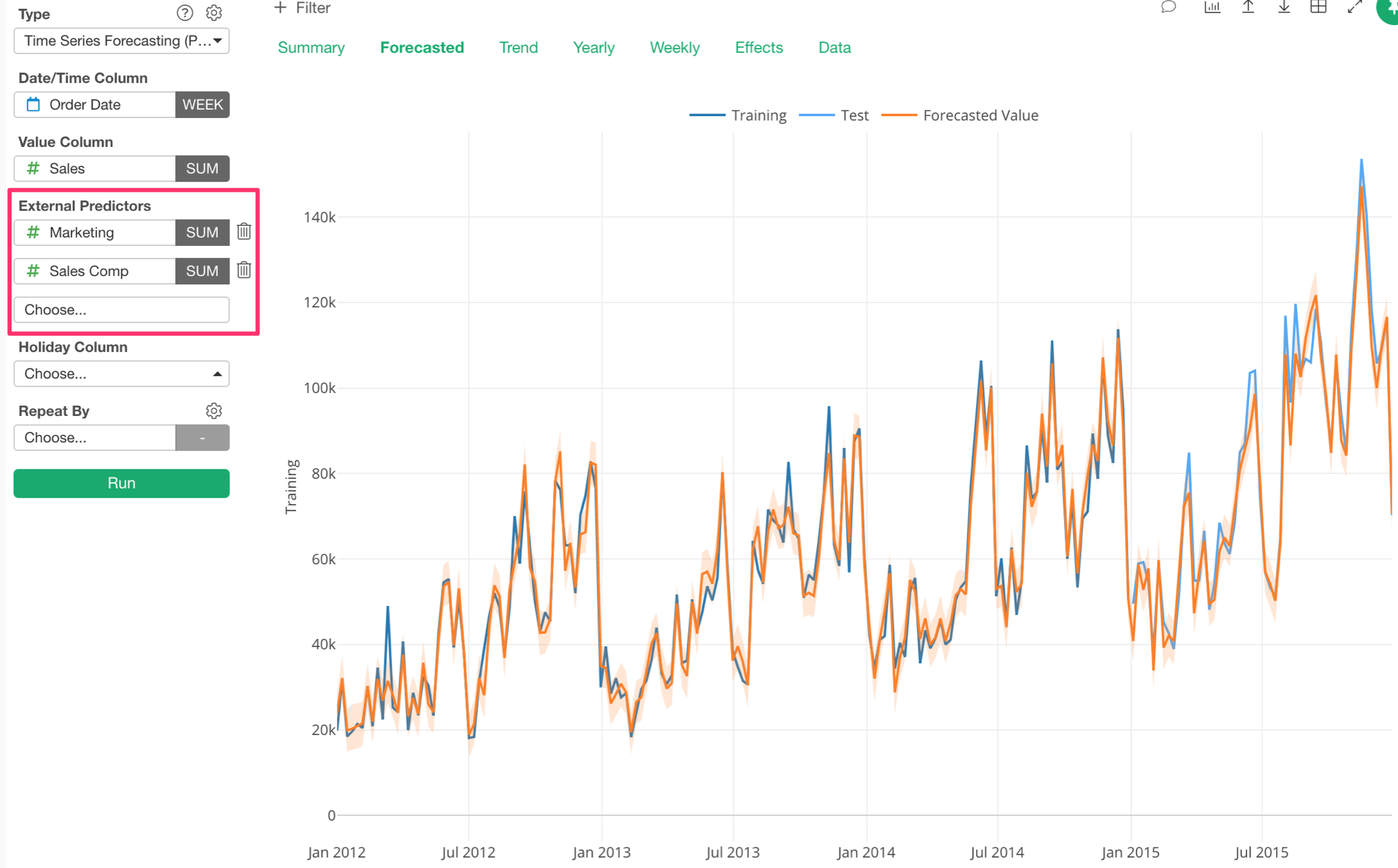
External Regressor
Now you can add ‘External Predictors’ (or Extra Regressors), which can be used as one of the components to forecast the outcome.
For example, let’s say we want to forecast Sales values.
We can simply forecast the Sales based on the past Sales data.
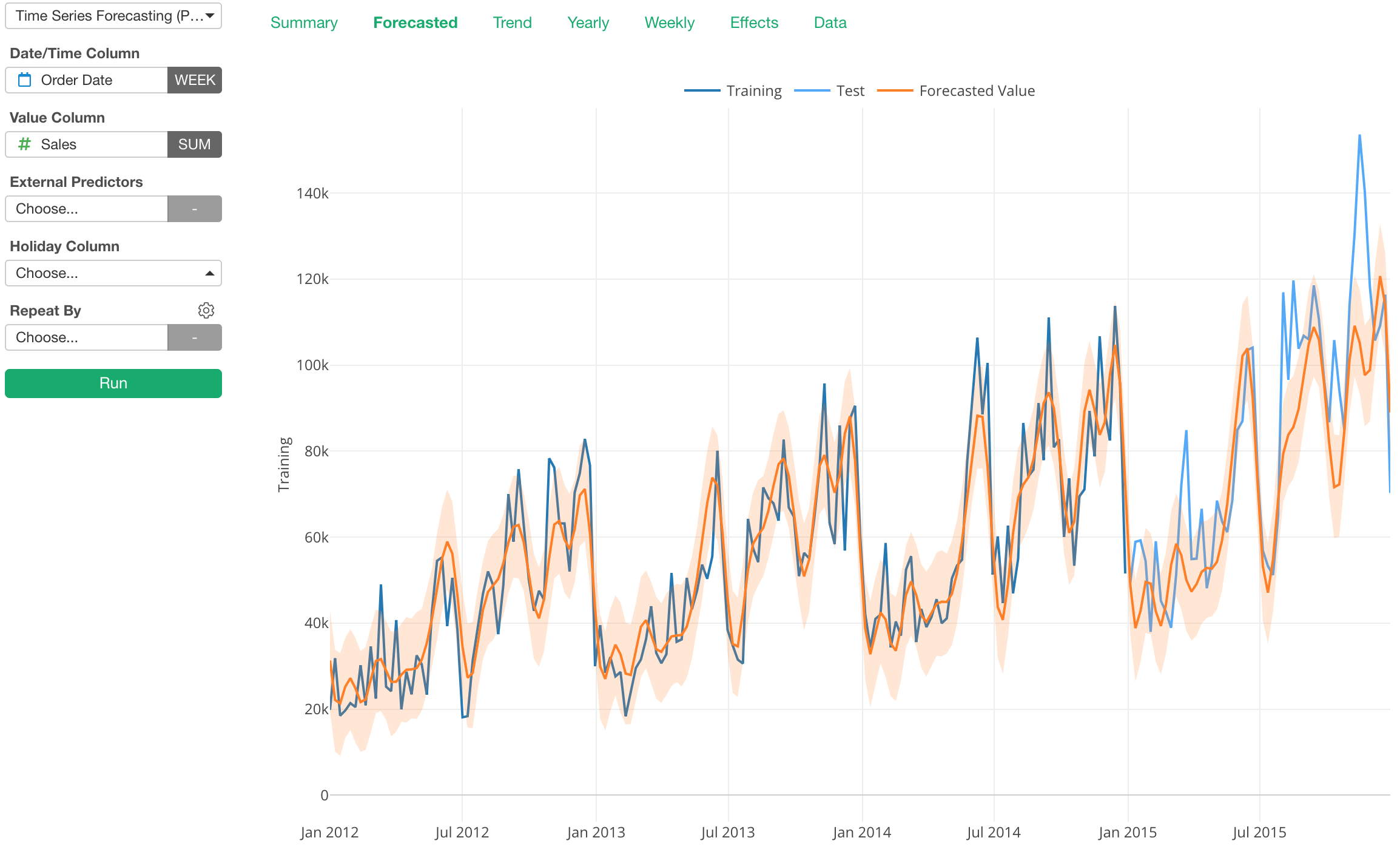
And RMSE is $16,726, which is considered to be as an ‘average’ difference between the forecasted values and the actual values.

Now, we can add another variable (or column) called ‘Marketing’, which I know it has some degree of correlation with Sales, as the External Predictor.
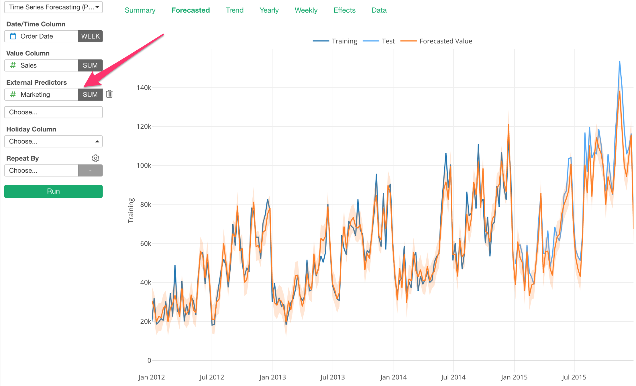
Notice that the difference between the actual values (blue) and the forecasted values (orange) got smaller.
And the RMSE got smaller, too, as you would expect.

We can add multiple External Predictors.
Here, I’m adding a Sales Compensation variable as one of the External Predictors. And the result looks even better than before.
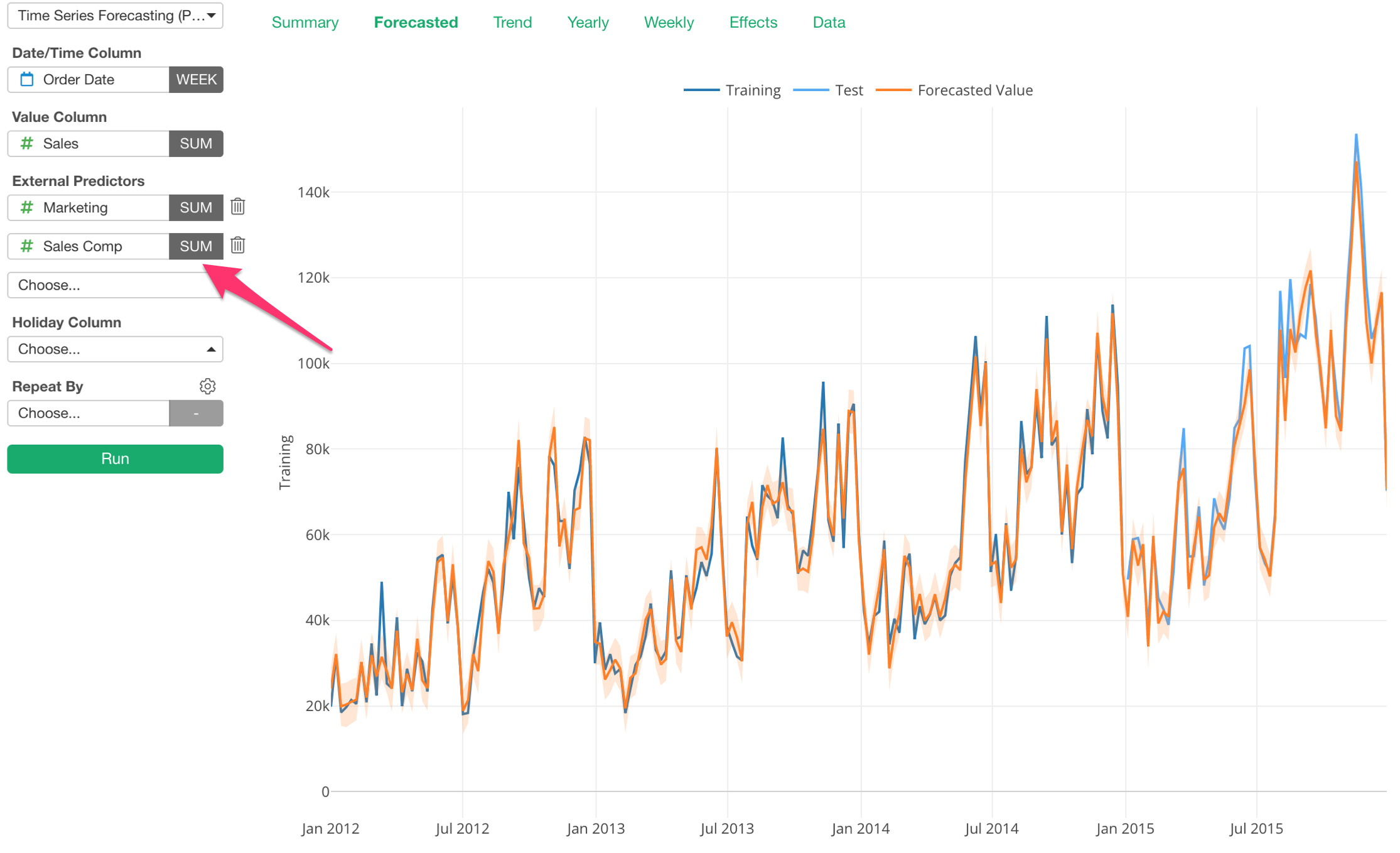
And the RMSE got even smaller, it’s 5,405 now.

Daily Seasonality
We supported Yearly and Weekly seasonalities before, but with this release, we have added Daily seasonality as well.
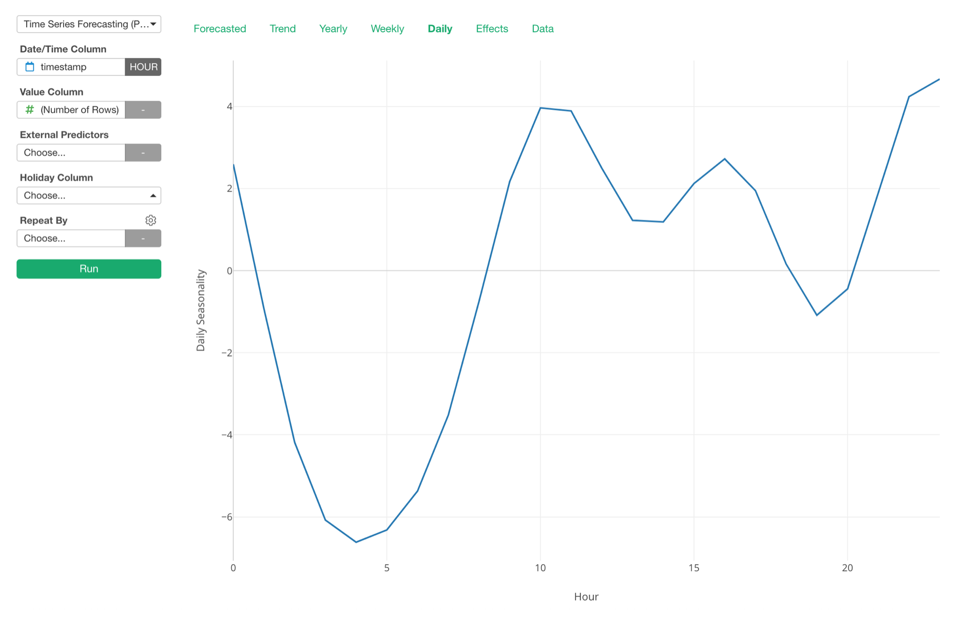
With this, you can see what hours of the day have more sales, for example.
Additive vs. Multiplicative
There are two types of data. One is additive, which can be considered as the result of adding numbers. This type of data tends to show a linear trend.
Another is multiplicative, which can be considered as the result of the compounding effect with percentage growth. This type of data tends to show an exponential trend.
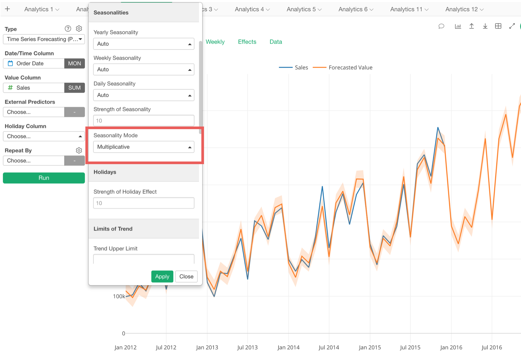
And if you’ve got a growing business your sales data tends to look more like the latter. And if you want to forecast such data, now you can select ‘Multiplicative’ for the seasonality effect.
Additive:
Here’s how it looks if we build a forecasting model with the ‘Additive’ option for the seasonality effect.
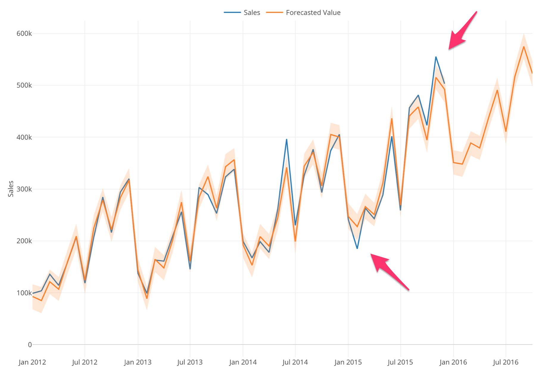
Notice that the difference between the actual values (blue) and the forecasted values (orange) are becoming wider as the time goes by. And this is a good sign that you want to try the ‘Multiplicative’ option.
Multiplicative:
And here’s how it looks if we switch to ‘Multiplicative’ option.
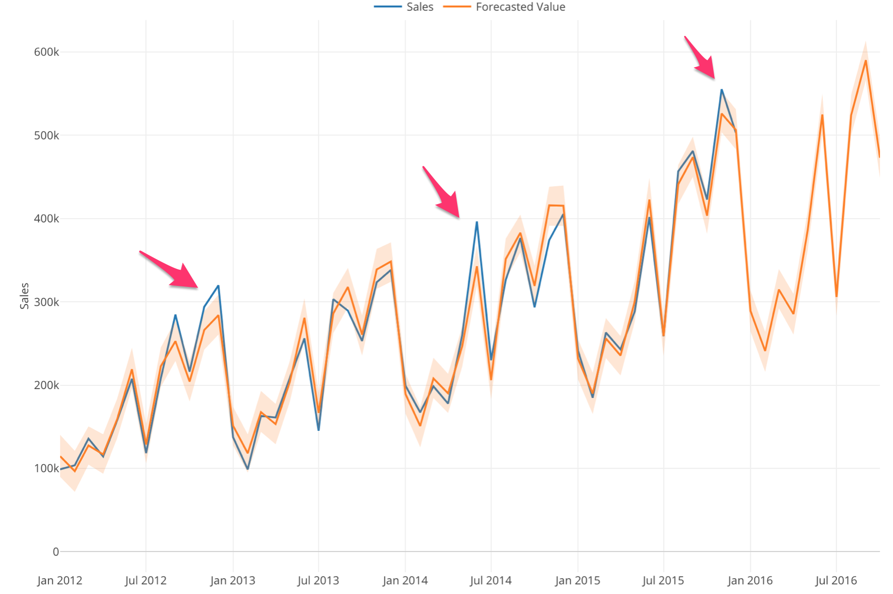
Notice that the difference between the actual values (blue) and the forecasted values (orange) are equally spread across the years.
And this makes the forecasting model quality better. We can compare the evaluation metrics between the additive and the multiplicative options.
Additive:

Multiplicative:

All the metrics for the multiplicative model are better than the ones for the additive model.
Hypothesis Test with Power Analysis
Now the statistical tests are reporting Effect Size and Power, along with P-Value, which is very important because reporting these values will provide more context about the test and make it less cheatable.

When we do the Hypothesis Test one of the questions that often come up is, how much data we need to collect in order to be confident about the test result.
Now, the above result is showing P-value is 22% (0.22) and we are not sure if that means ‘statistically significant’ or not. And when we look at Power, it is 23% (0.23), which means that there is 77% of chance that we might be making the type 2 error.
We can increase the power, but that means we need more data. The question is, how much data?
This is when you want to enable Power Analysis from the property. You can set up the Type 1 and/or Type 2 error thresholds and other parameters.
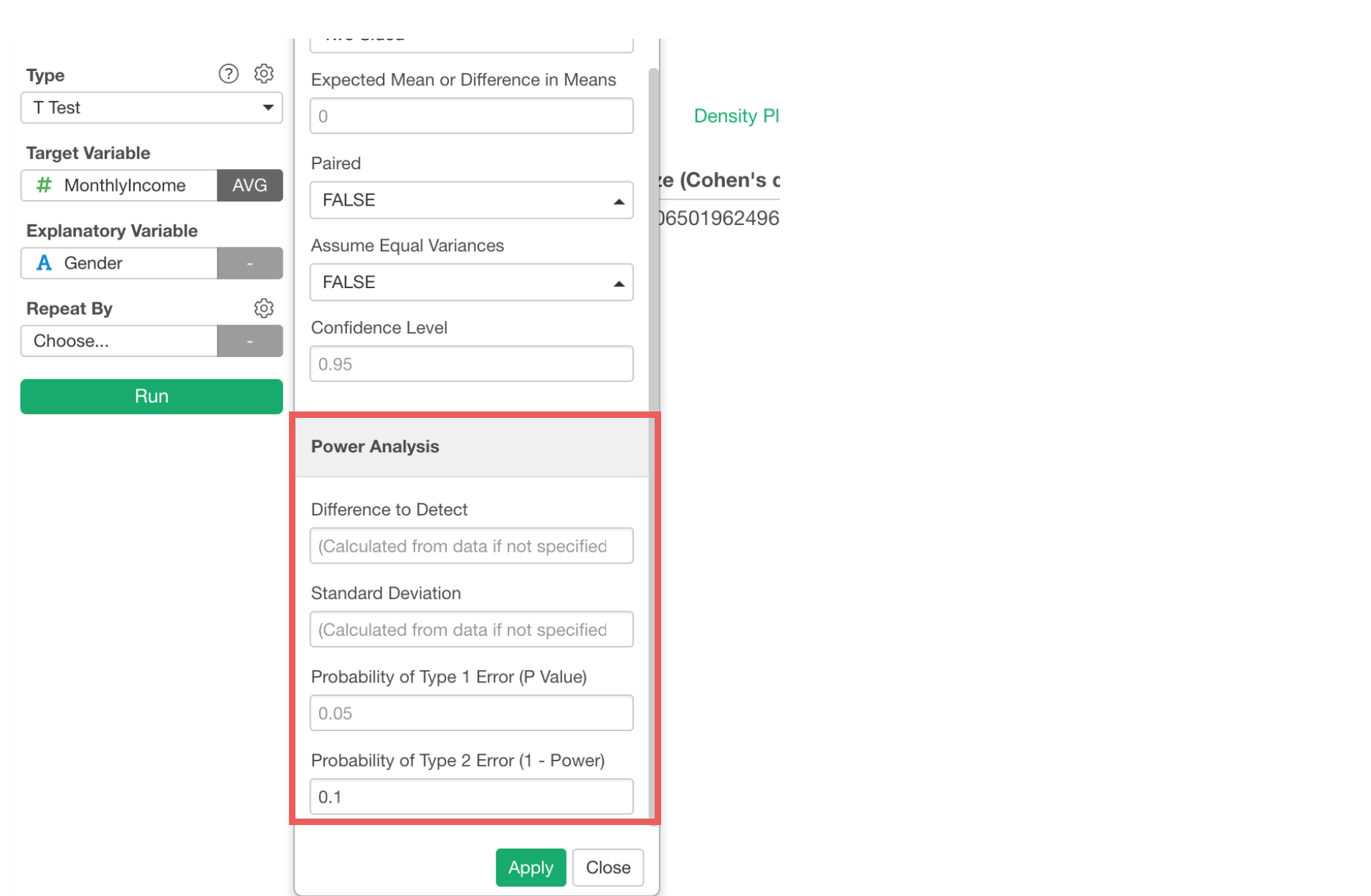
And it will give you the required data size in order to be more confident about the test result.

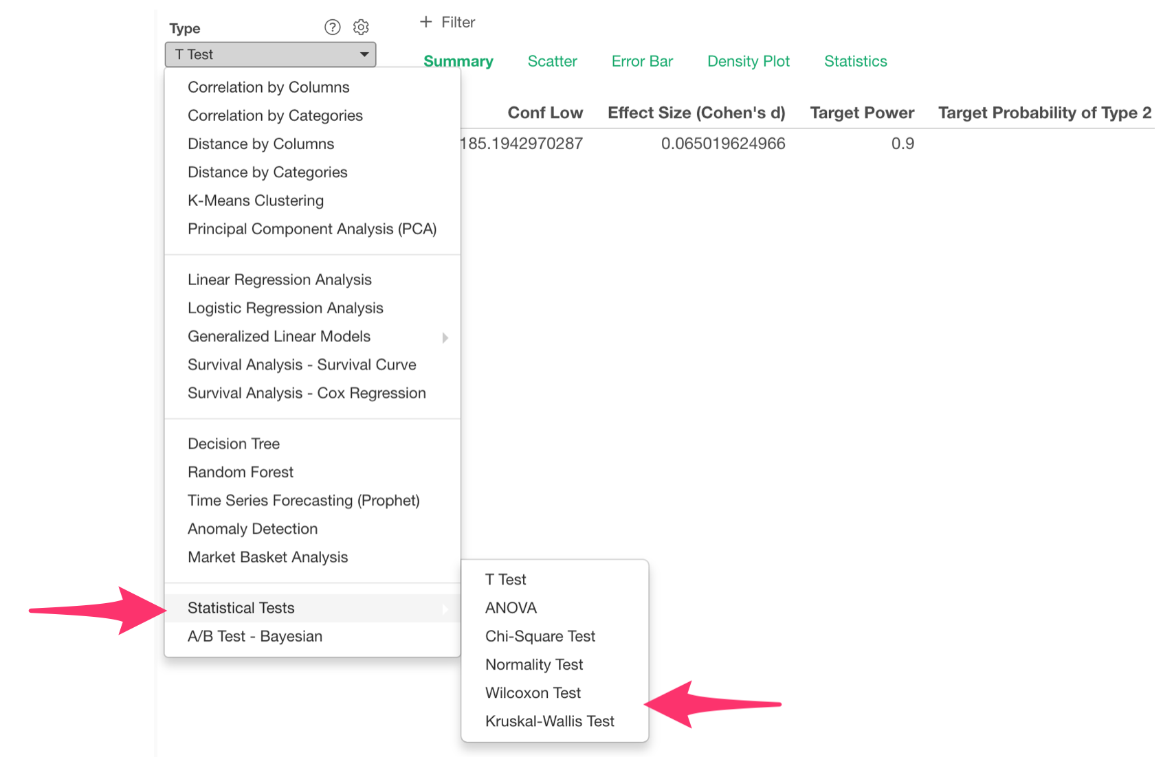
Stats Test - Wilcoxon Test & Kruskal-Wallis
We have added the following non-parametric statistical tests.
- Wilcoxon Test
- Kruskal-Wallis Test
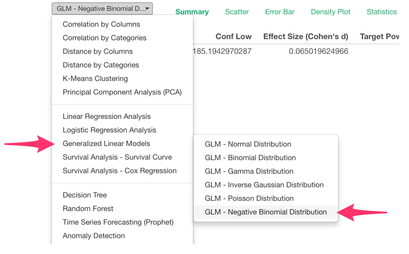
GLM - Negative Binomial Regression
When you build models to predict or explain the count data, you might use Poisson distribution. But it has an assumption that the mean and the variance of the data are the same.
But more often than not, your data’s variance can be bigger than the mean. This is when you want to consider using Negative Binomial distribution, which is more flexible and robust.
We have now added the Negative Binomial distribution support under GML under Analytics view.
That’s it!
I know there is a lot to digest.
But also note that we have other enhancements and bug fixes in this release, make sure to check out the release note for the details.
Happy Exploratory v5.3! 🍾
Cheers,
Kan
Try Exploratory v5.3!
Make sure to download v5.3 from our download page to start exploring it today!
If you don’t have an Exploratory account yet, sign up from our website for 30 days free trial without a credit card!
If you happen to be a current student or teacher at schools, it’s free!