An Introduction to Cohort and Survival Analysis
Understanding Your Retention and Churn Trends Better
Improving your product or service’s retention rate (or decrease churn rates) is one of the most important tasks for any size of SaaS businesses. Without a healthy retention or churn rates, all your growth hack or marketing is just a waste of your time and money.
And one of the best ways to monitor the retention and churn rates is to use a technique called ‘Cohort Analysis’. It helps you understand how your retention or churn rates are improving or decreasing by groups such as Joined Month, Country, Subscription Plan Type, etc. better.
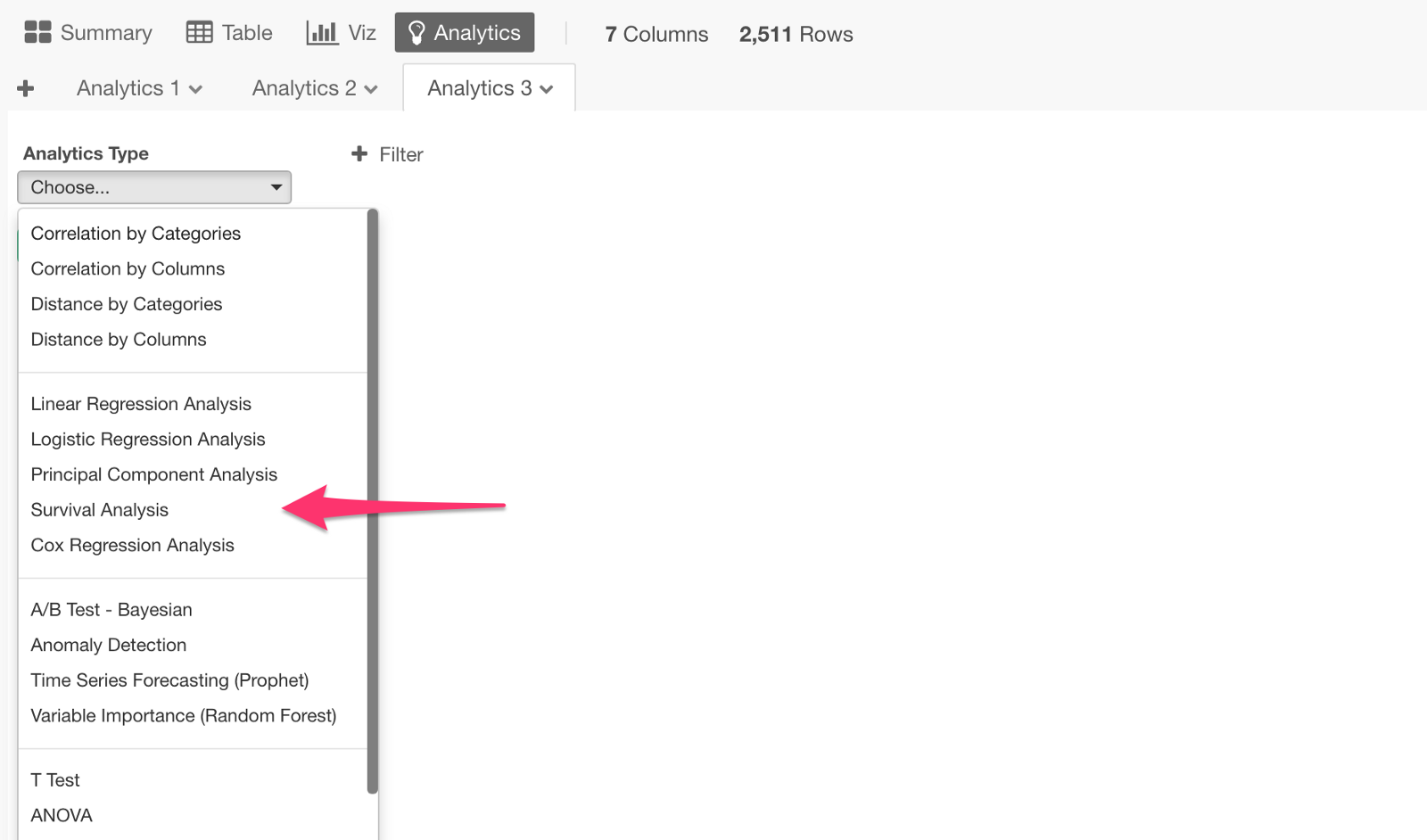
In Exploratory, you can quickly run ‘Survival Analysis’ under Analytics view to do ‘Cohort Analysis’.
Let’s take a look.
Survival Analysis
Survival Analysis uses Kaplan-Meier algorithm, which is a rigorous statistical algorithm for estimating the survival (or retention) rates through time periods. The algorithm takes care of even the users who didn’t use the product for all the presented periods by estimating them appropriately.
To demonstrate, let’s prepare the data.
Data Import
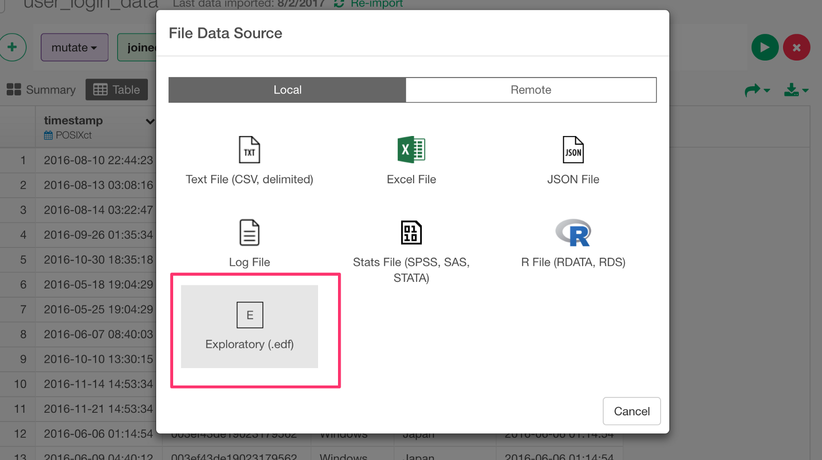
The sample data can be downloaded from here. This is EDF file so you can import it from File Data Source dialog.
Here, we have user activity data imported.
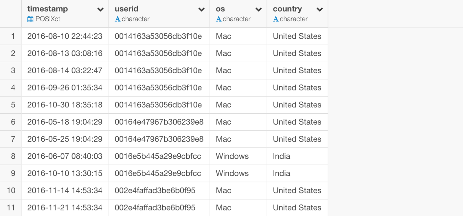
‘timestamp’ column is the time when the users used the service. ‘userid’ is each user’s unique identifier.
Data Wrangling
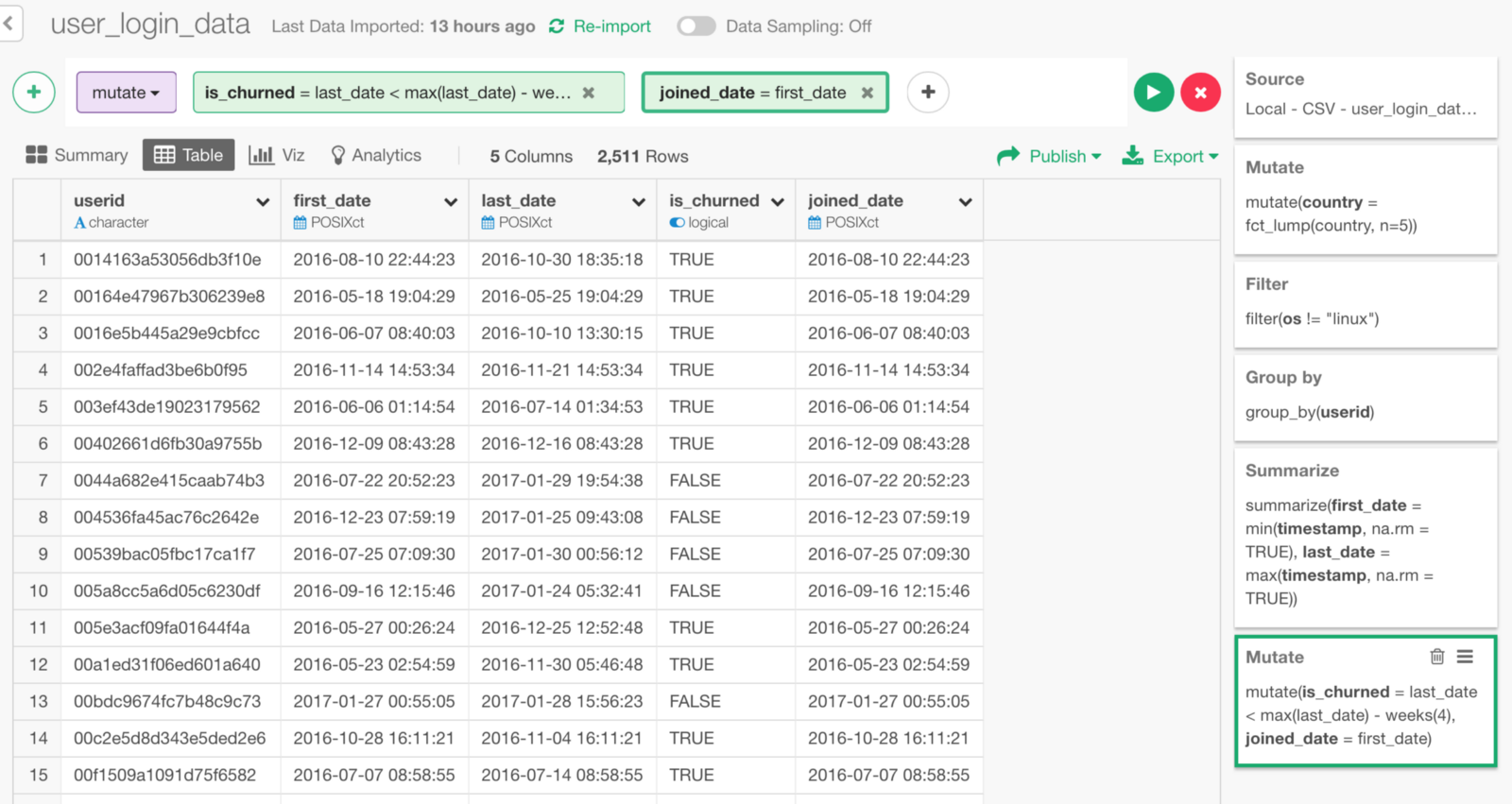
To perform Survival Analysis under Analytics view, you want to prepare the following three attributes that are currently not present.
- Start Date/Time
- End Date/Time
- Event Status
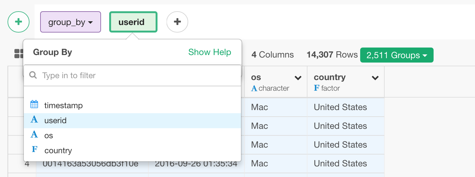
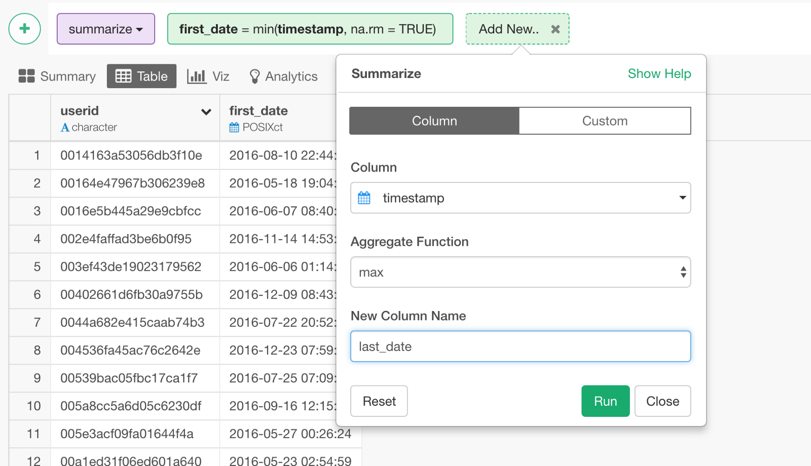
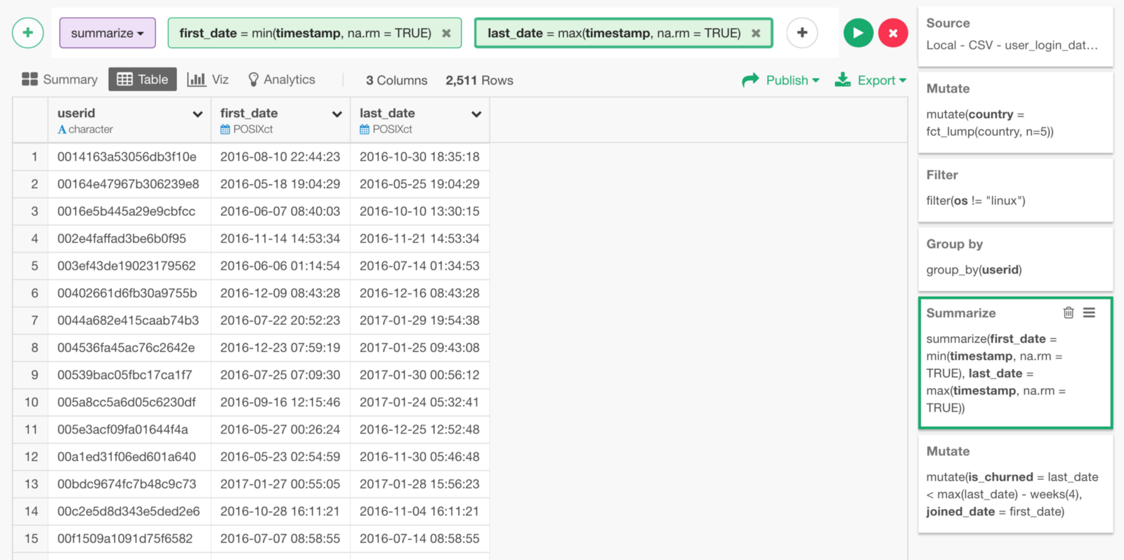
Start Date and End Date will be used internally to calculate the user’s lifetime period during which each user used your product or service. To get these, you want to group the data by each user, then you can use min() and max() functions inside ‘summarize’ step to extract the first and the last dates each user accessed.
Group By
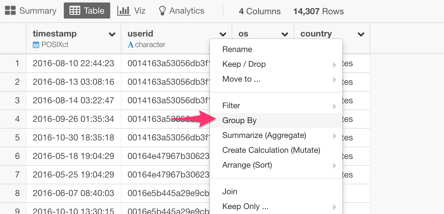
Select ‘userid’ column.
Summarize
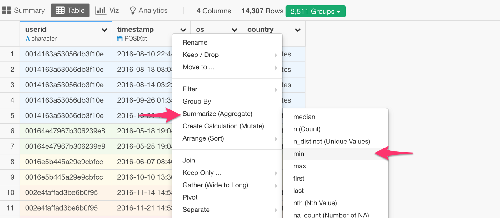
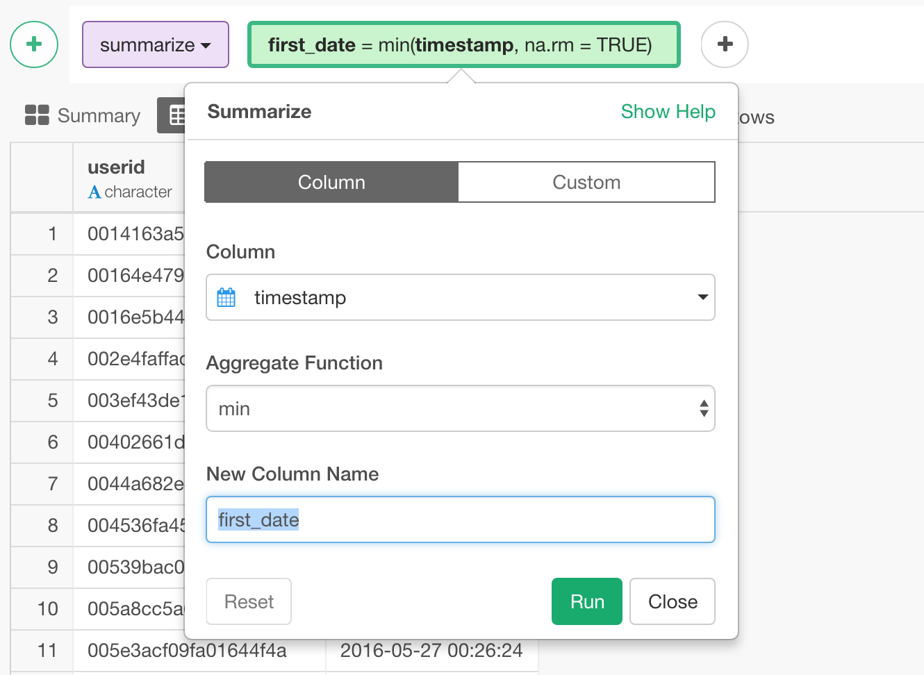
First, let’s get First Date.
You want to use ‘min’ function for this. You can start by selecting ‘min’ from the column header menu.
Next, let’s get Last Date.
You want to add another calculation in the same Summarize step for this.
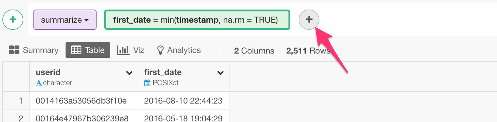
Select ‘timestamp’ column, but this time, you want to use ‘max’ function so that you can get the last access date for each user.
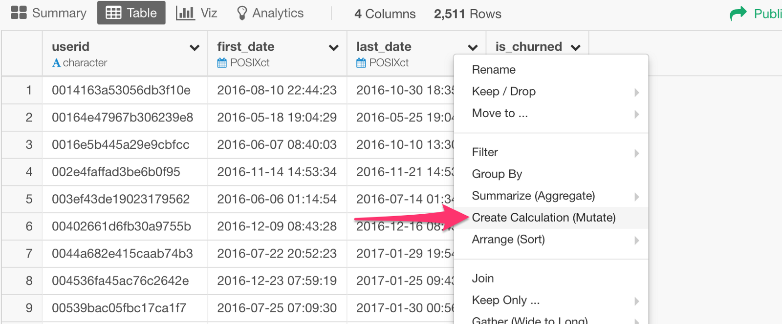
Event Status
Lastly, we want to create a column that indicates whether a given user has churned or not. This depends on how you want to define ‘churned users’.
For example, if your users are all paid customers then you should be able to find this status information somewhere in the payment systems. But if your service is free then it’s a bit tricky because you never be 100% sure if the users are really ‘churned’ or still using your service.
This sample data is about a fictional company’s free web service access data. And we don’t have the event status data. But we can define and create such attribute.
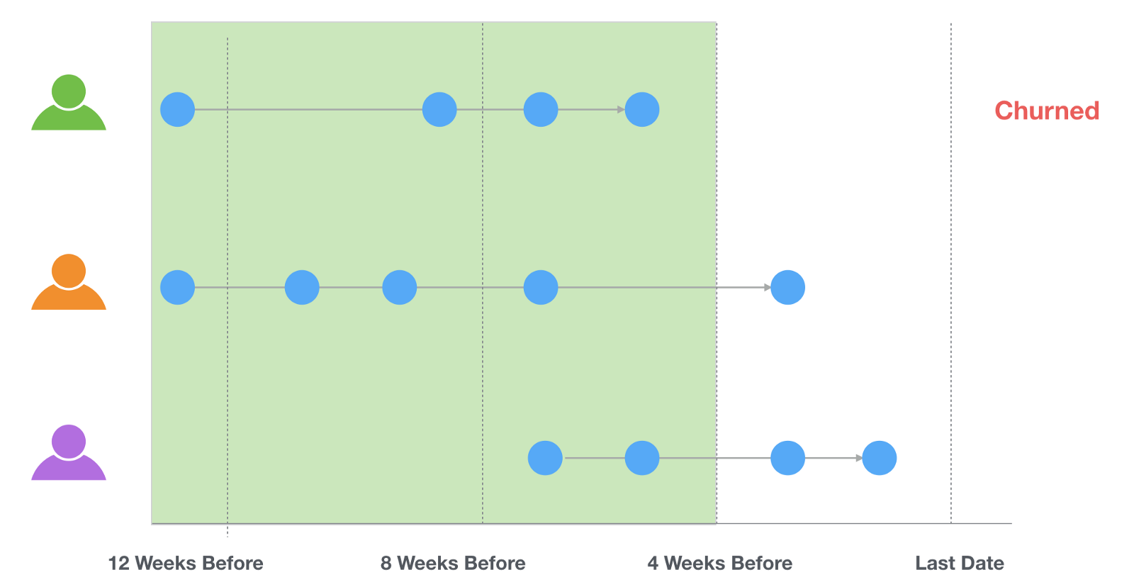
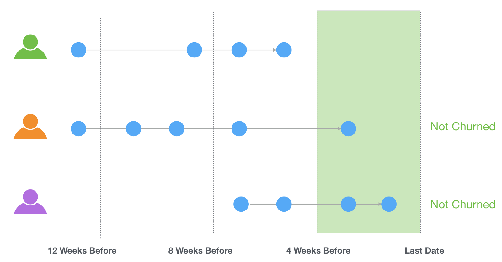
In this example, we are going to assume that the users who haven’t used the service in the last 4 weeks of the data period are considered ‘churned’, just to make it simple.
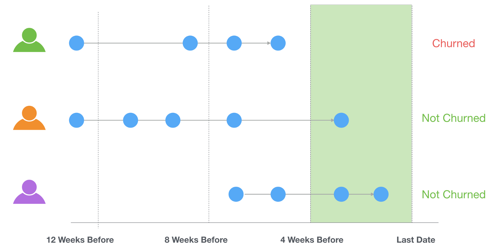
The blue circles above indicate the times each user logged into the system.
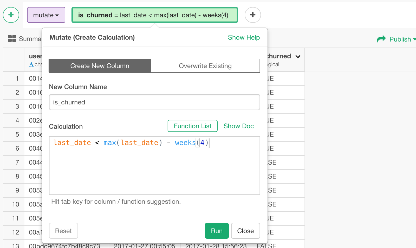
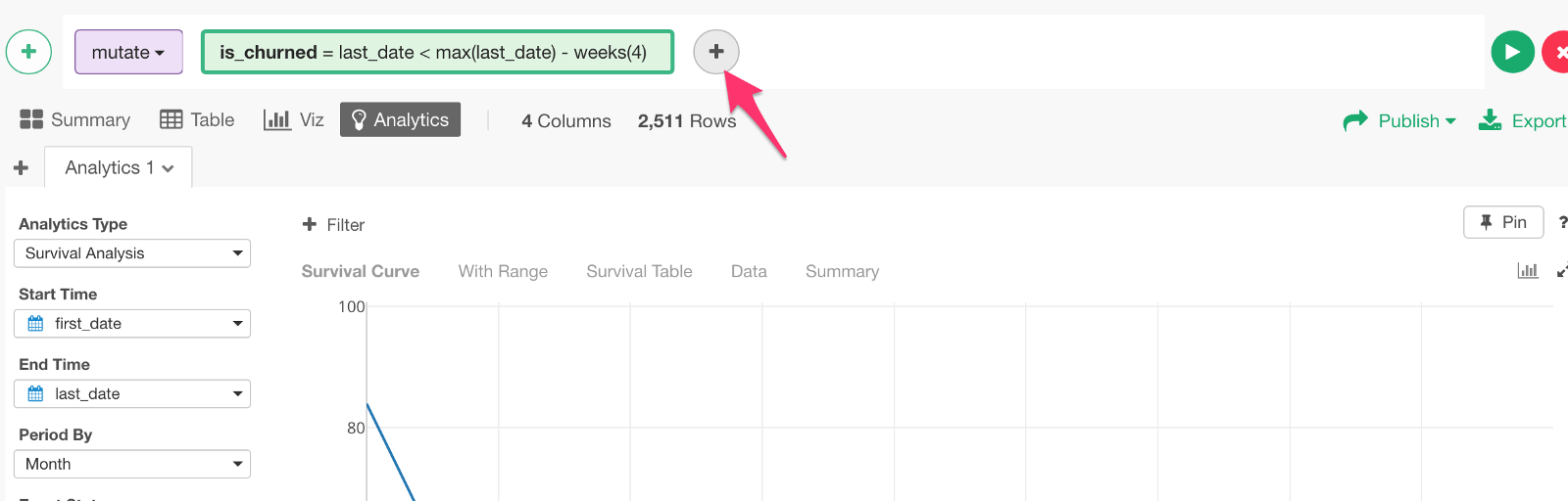
The calculation to get such churn status (TRUE or FALSE) can look something like below.
last_date < max(last_date) - weeks(4)‘max(last_date)’ returns the last date of the data. ‘weeks(4)’ returns 4 weeks.
So,
max(last_date) - weeks(4)this part of the calculation is subtracting 4 weeks from the last date, which means the 4 weeks before the last date of the data.
And finally, putting them all together,
last_date < max(last_date) - weeks(4)it evaluates if each user’s ‘last_date’ is within the last 4 weeks period or not.
If it is earlier than the last 4 weeks period that means the user didn’t use the service in the last 4 weeks hence we assume she/he had churned.
If it is within the last 4 weeks period that means the user was still using the service hence we assume she/he had not churned yet.
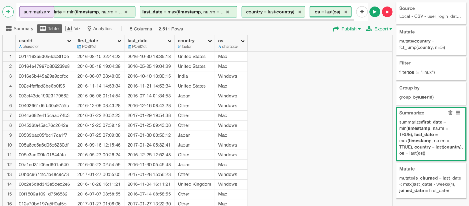
We can create this calculation with Mutate.
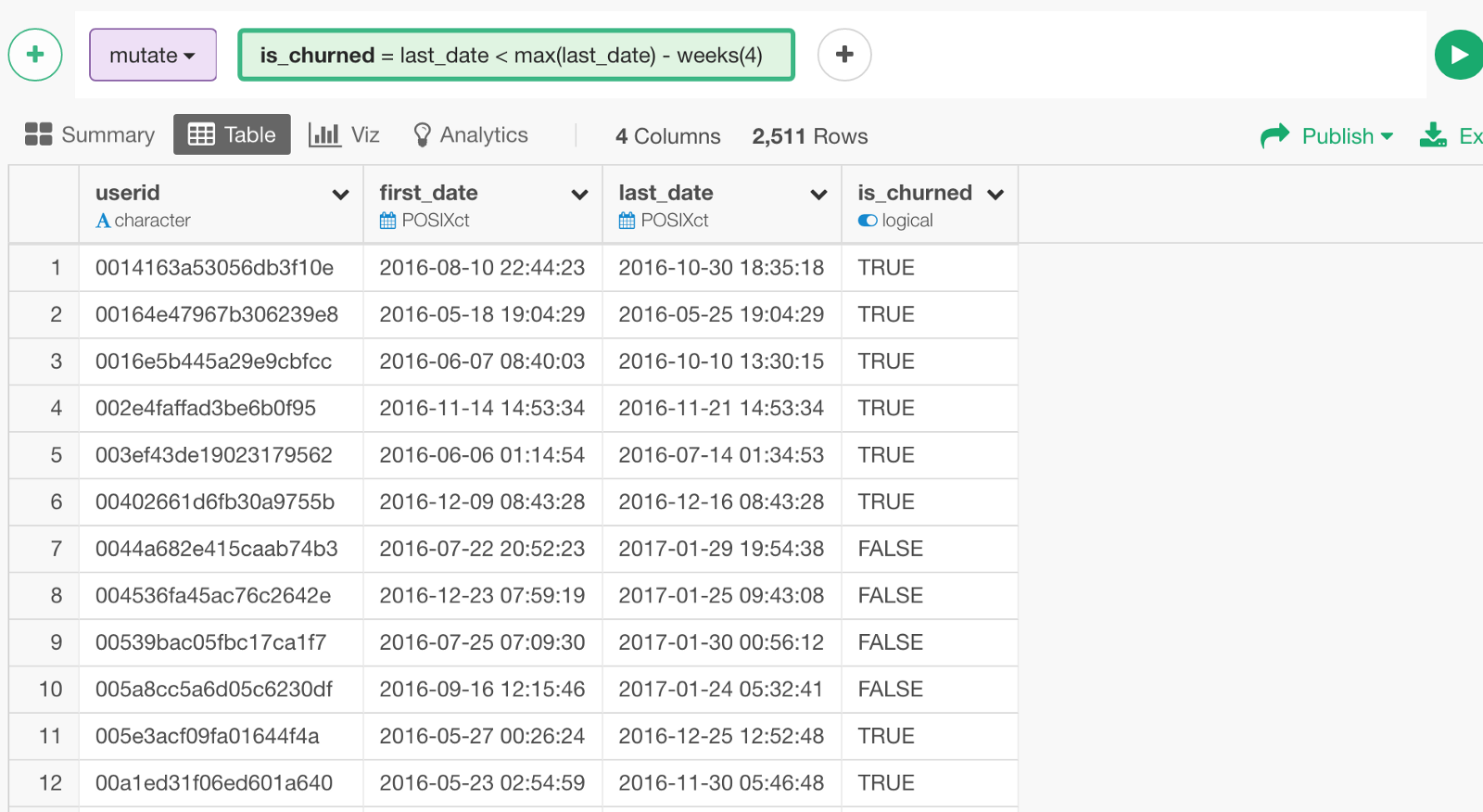
Now we have either TRUE or FALSE for is_churned column for each user based on when was the last time she/he logged in.
Now that we have prepared the data for Survival Analysis, let’s run it!
Run Survival Analysis
Under Analytics view, select ‘Survival Analysis’ under Analytics Type.
We can assign ‘first_date’ column to Start Time, ‘last_date’ to End Time, and ‘is_churned’ column to Event Status. Also, we can select ‘Month’ for Period By for now.
And click ‘Run’ button at the bottom.
Here is our first survival curve generated.
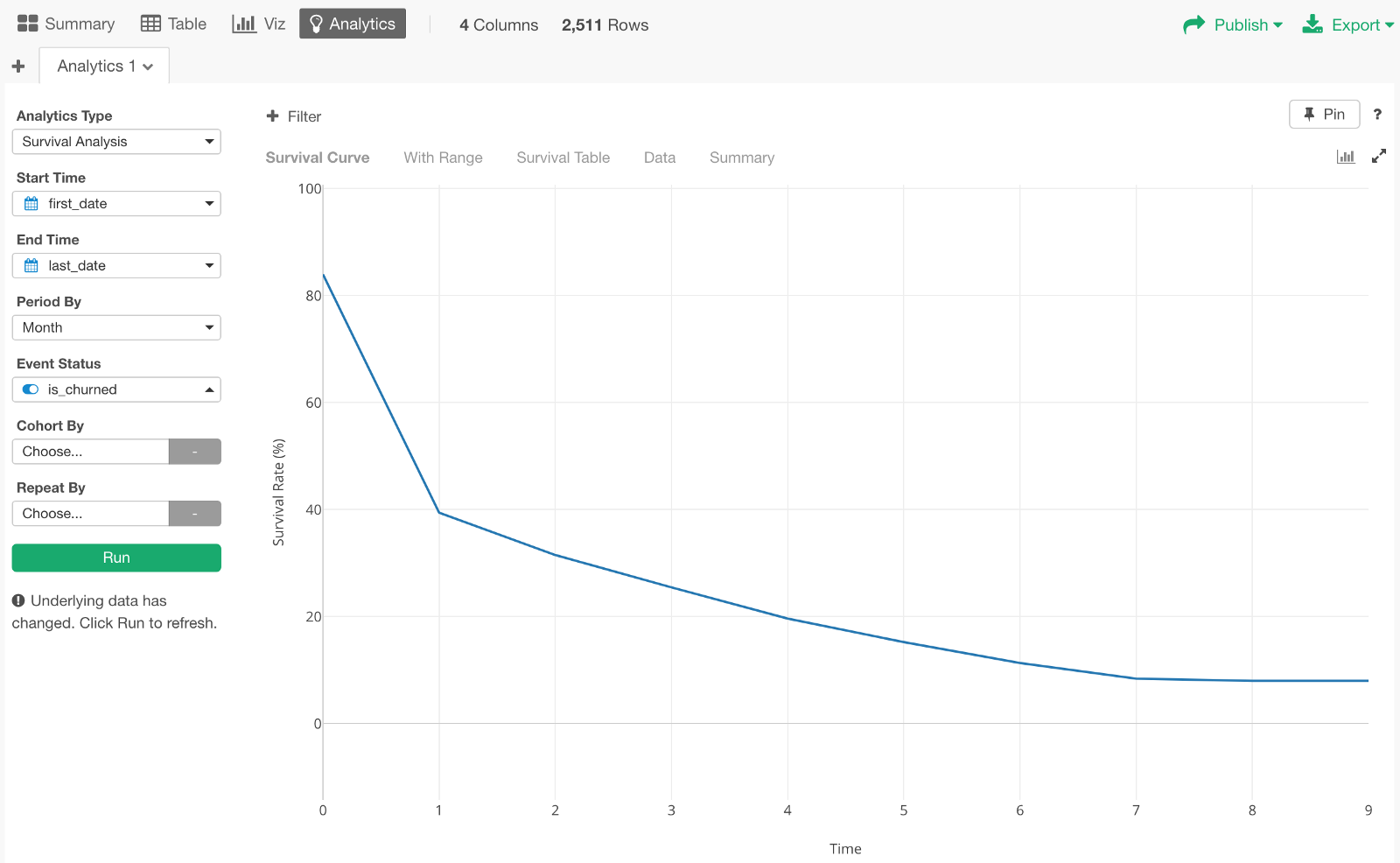
The X-Axis shows how many months passed from the beginning. And Y-Axis shows the survival rate or retention rate. For example, we can see that the survival rate for the 1st month is 40%.
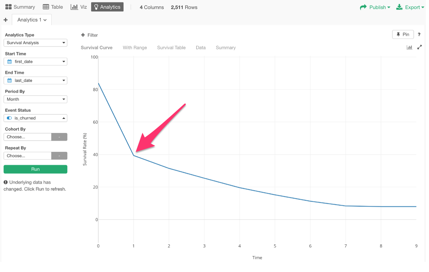
By the way, usually, the 0th period should start with 100%. But in this data, there are some users whose Start Date and End Date are same because they logged in only once. So those are considered immediately churned, hence the 84% survival rate at the very beginning.
Cohort Analysis
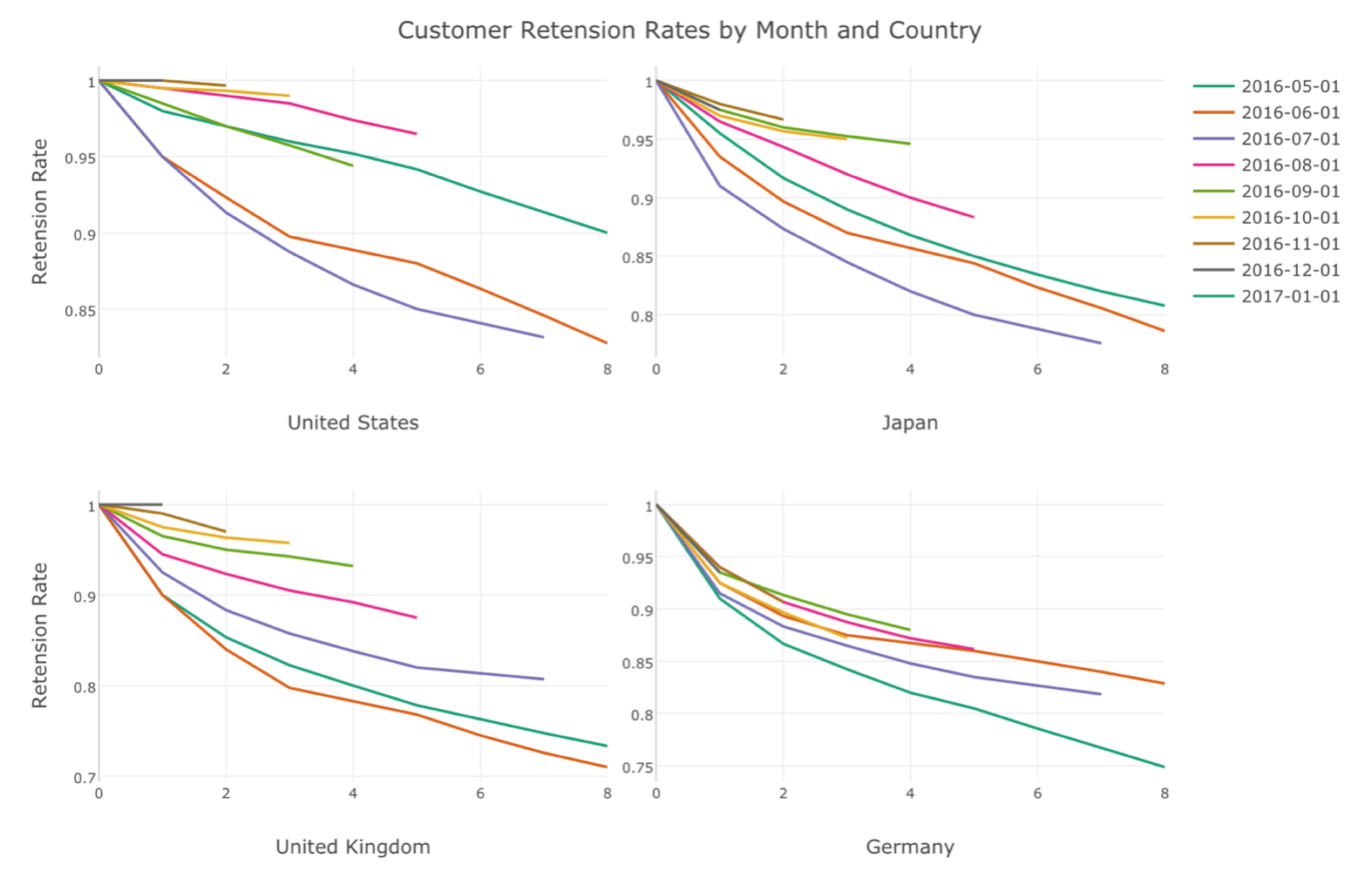
Now, we want to split this survival curve into multiple groups. These groups can be Country, OS Type, etc. And these groups are called Cohort in the world of survival analysis.
Let’s see the survival curve by the cohort of which month they started using this service. Let’s call this ‘Joined Month’.
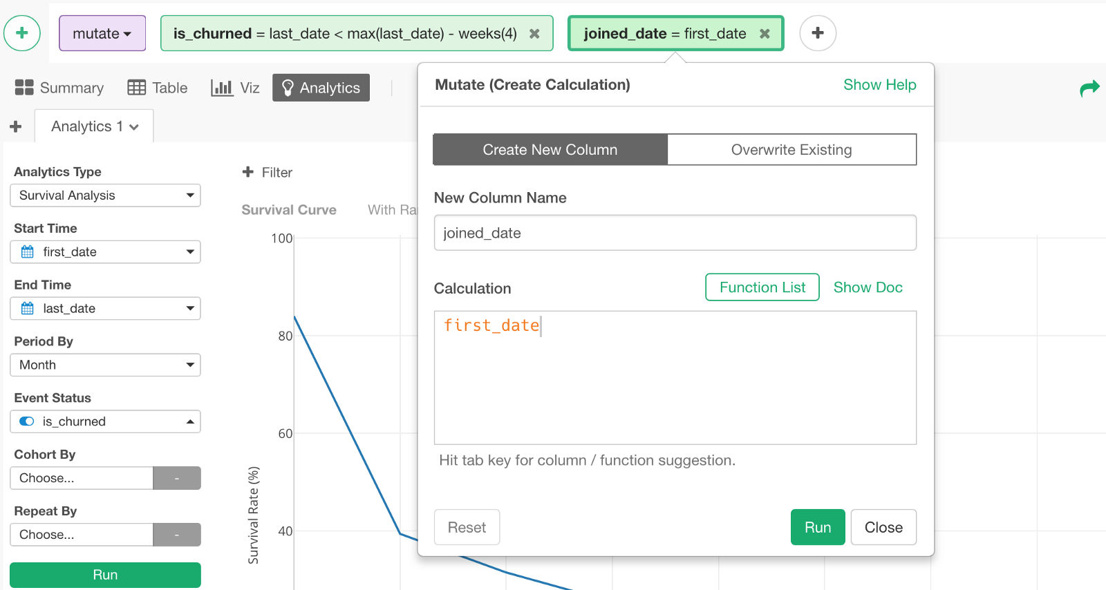
For this, we want to use the ‘first_date’ column, but it is already assigned to ‘Start Time’, so we want to create a new column called ‘joined_date’ by copying the ‘first_date’ column like below.
Then, we can assign ‘joined_date’ to Cohort By and select ‘Floor to Month’ for the aggregation level.
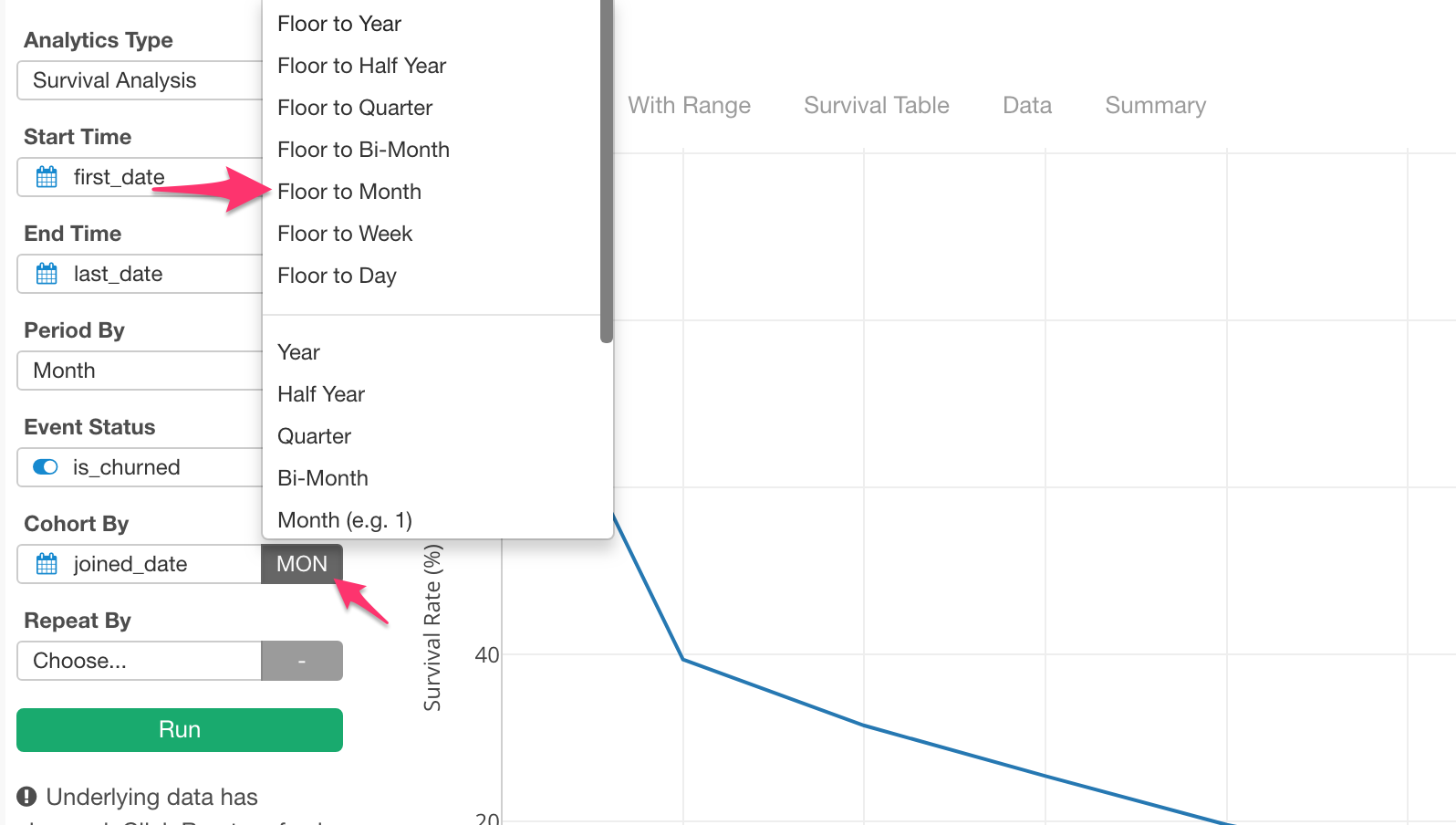
And click Run button.
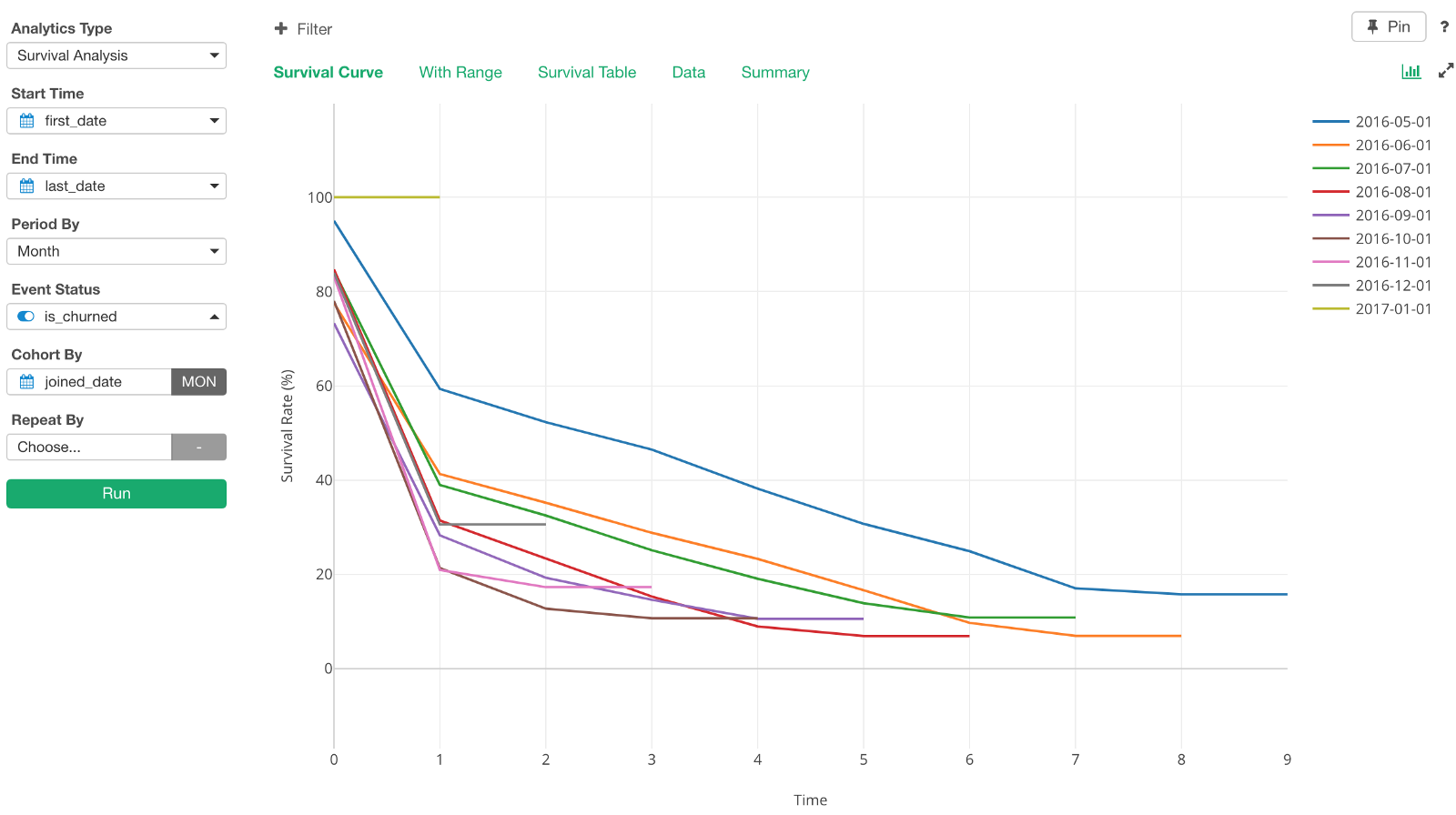
Now we can check the survival rate (or retention rate) trend by Joined Month cohort. Looks that the oldest Joined Month cohort’s survival curve (2016–05–01) is the best, the rate of going down is the most modest.
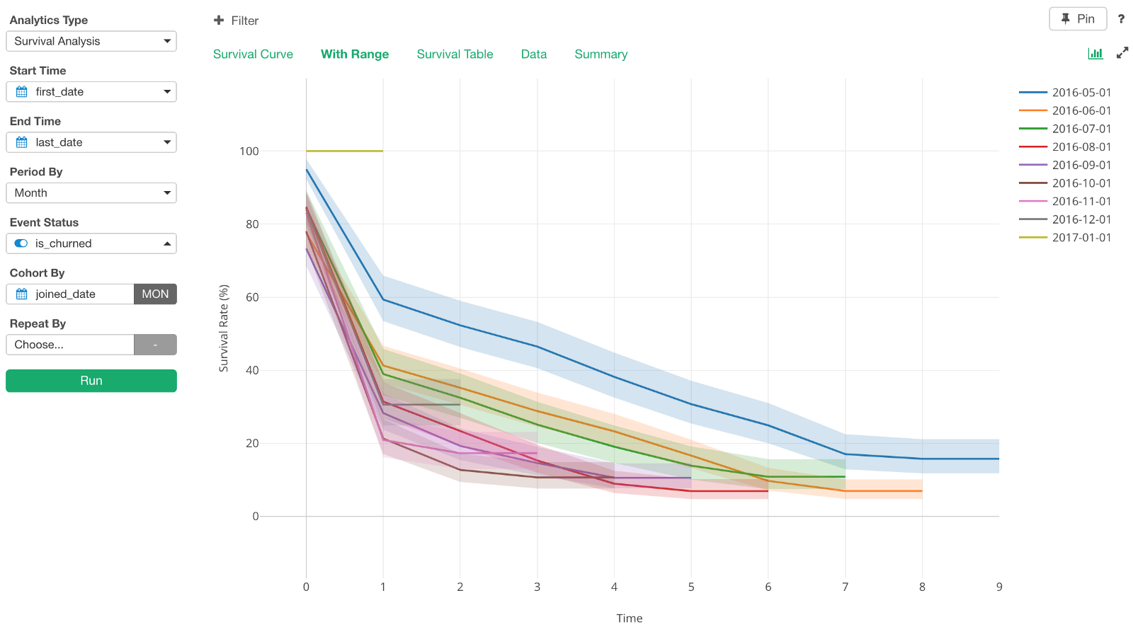
We can go to ‘With Range’ tab and see the curves with the confidence intervals.
Also, we can go to Summary tab to find out if the differences among the cohorts are statistically significant. It runs ‘Log-Rank’ Test as the hypothesis testing internally.
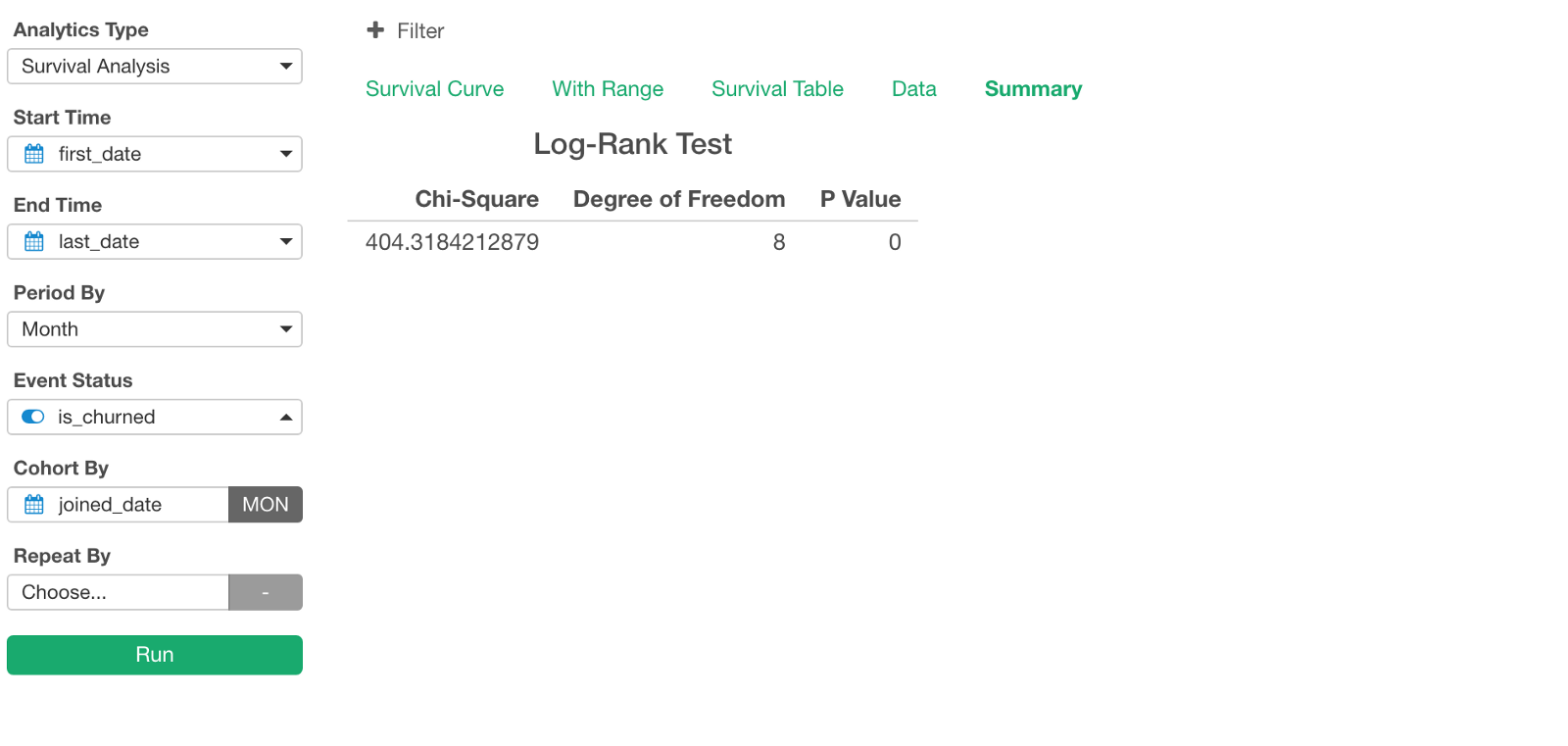
Given that P-Value is 0, we can reject the null hypothesis of “there is no difference among the cohorts”. This means that we can conclude that the differences among the survival curves by Joined Month are statistically significant.
How about Cohort of Country and OS?
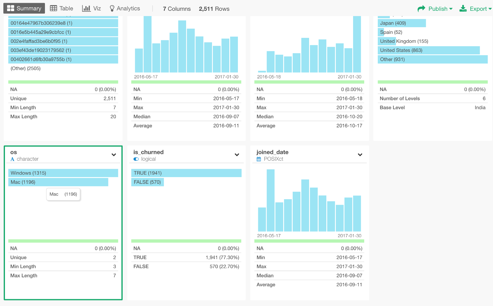
The cohort doesn’t need to be always Joined Month. It can be other attributes like Country or OS with this data.
Now, there is one problem. We don’t have those Country and OS columns right now.
But, we used to have it!
Let’s move up to Group By step.
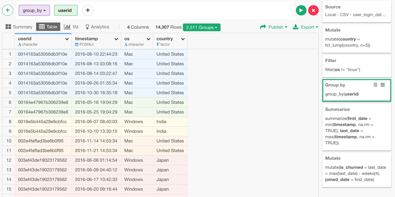
Here, we have both Country and OS data.
But, we lost them after Summarize step.
This is because Summarize command aggregates the original data by specified group. In this case, the group is user_id. And we have multiple rows for each user, so we need to tell Summarize how we want it to aggregate Country and OS column values explicitly.
Get Country and OS Data
To get the Country column with Summarize step, we can simply use ‘last’ function. This will get whatever the last value in each group (user_id).
Click ‘Plus’ button in Summarize step.
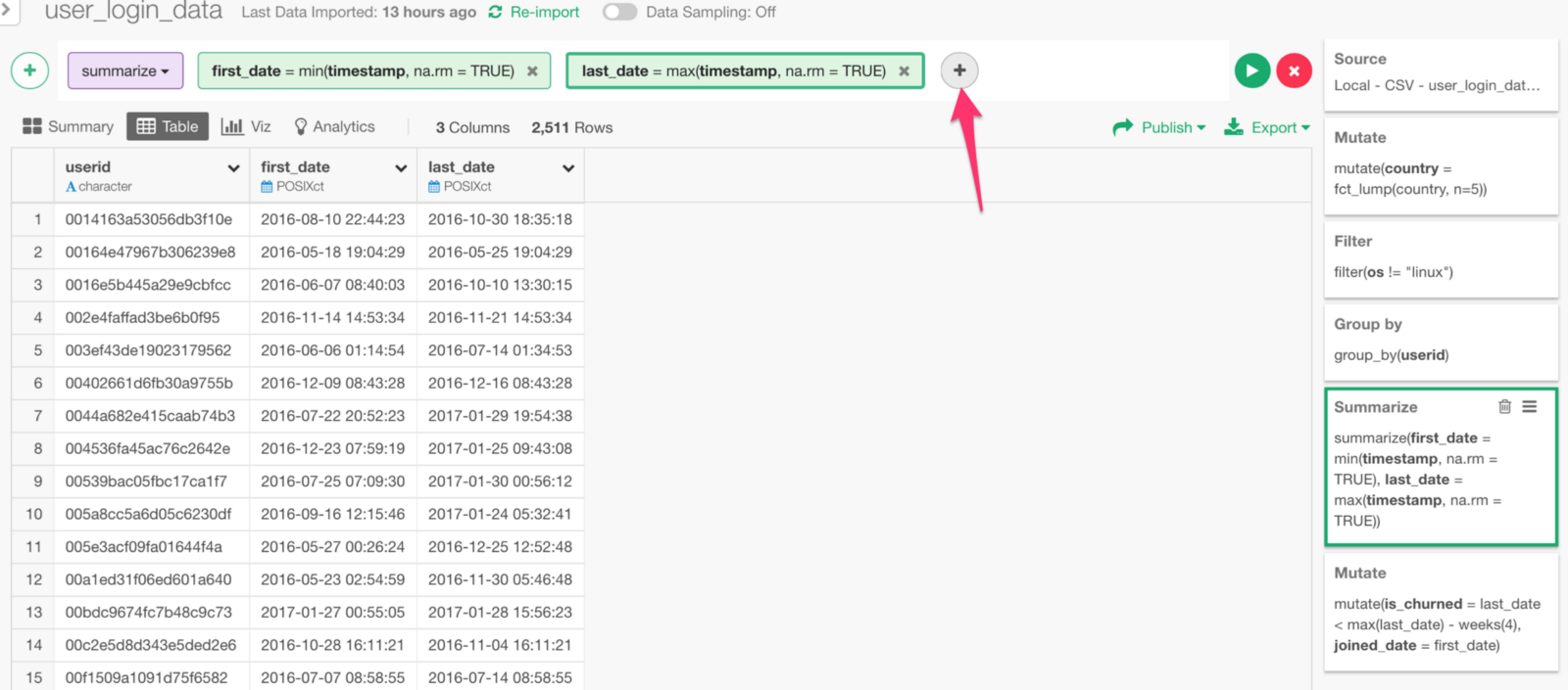
Select ‘country’ column, select ‘last’ function, and type ‘country’ as the new column name.
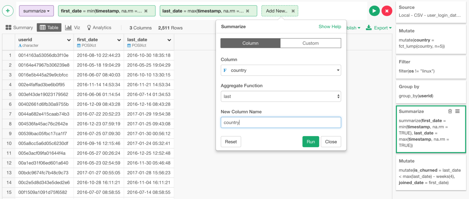
Now, we have ‘country’ column with country names!
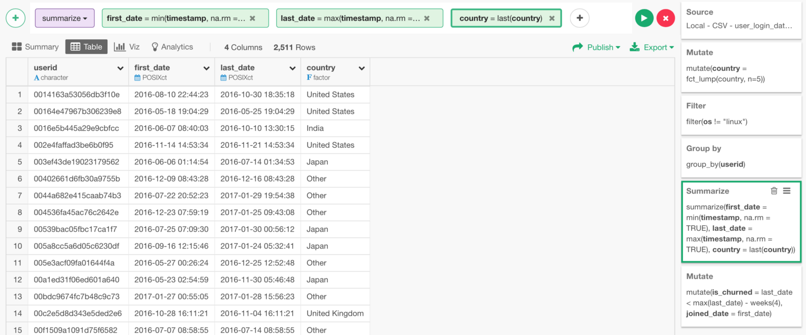
We can do the same thing for OS to get the OS names for all the users.
Survival Curve by Country
Now, we can go back to Analytics view and assign Country column to Cohort By.
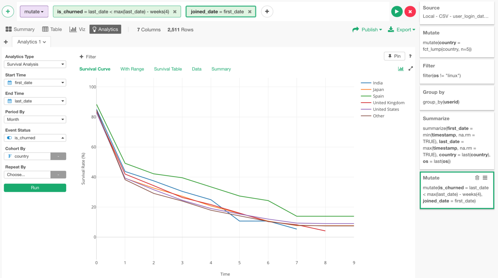
We can see that the survival (or retention) curve for Spain is better than other countries.
But looking at the wide confidential interval for Spain under ‘With Range’ tab, I’m not sure if that is statistically significant.
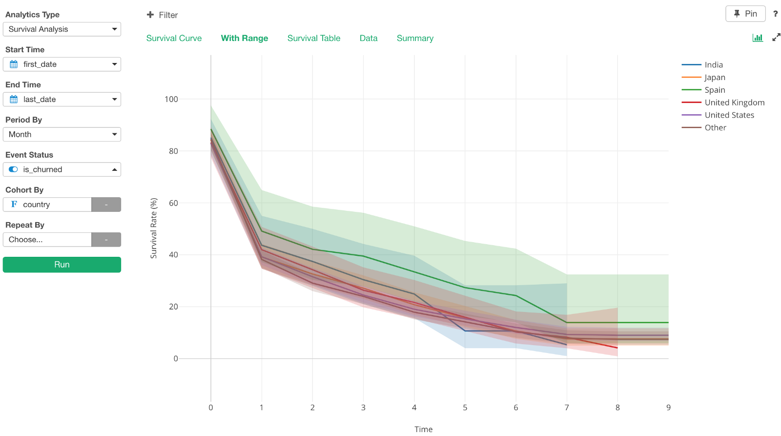
This happens when there is not enough data. So probably we don’t have enough users from Spain. We can quickly check this under Summary View.
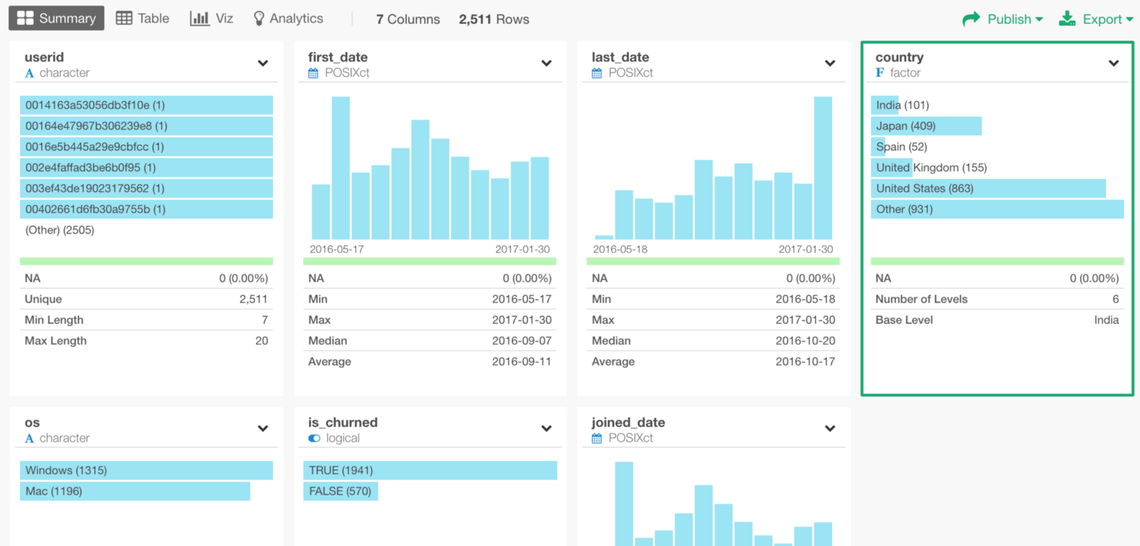
There are only 52 users from Spain!
Also, let’s check P-Value for this analysis under Summary view.
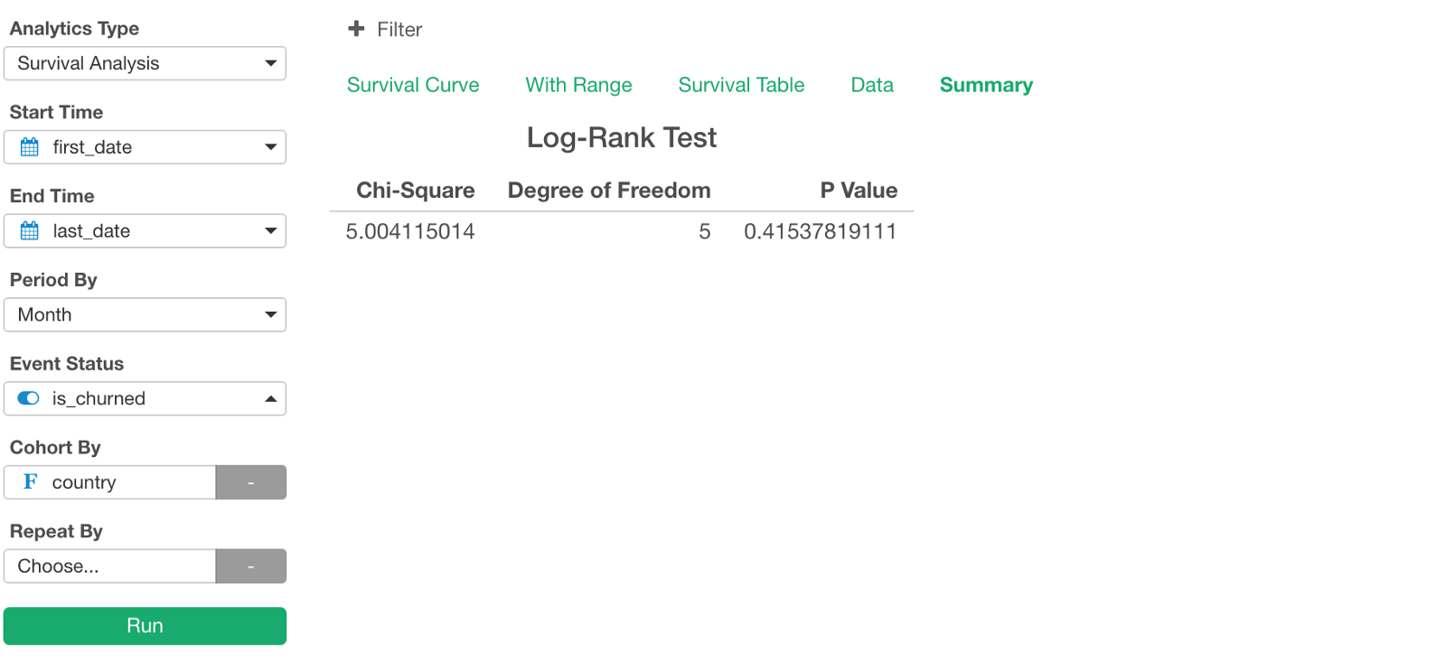
It is 0.415, which means that the probability of us getting the similar result by chance is 41.5%. So, this kind of difference we are seeing here can happen randomly, not necessarily because of the differences in the country.
So at this point, we are not sure if there is any difference among the countries in terms of the retention rate.
Survival Curve by OS
Let’s also examine if OS makes any difference in terms of the retention rate. We can assign OS column to Cohort By.
Here are the survival curves with confidence interval ranges.
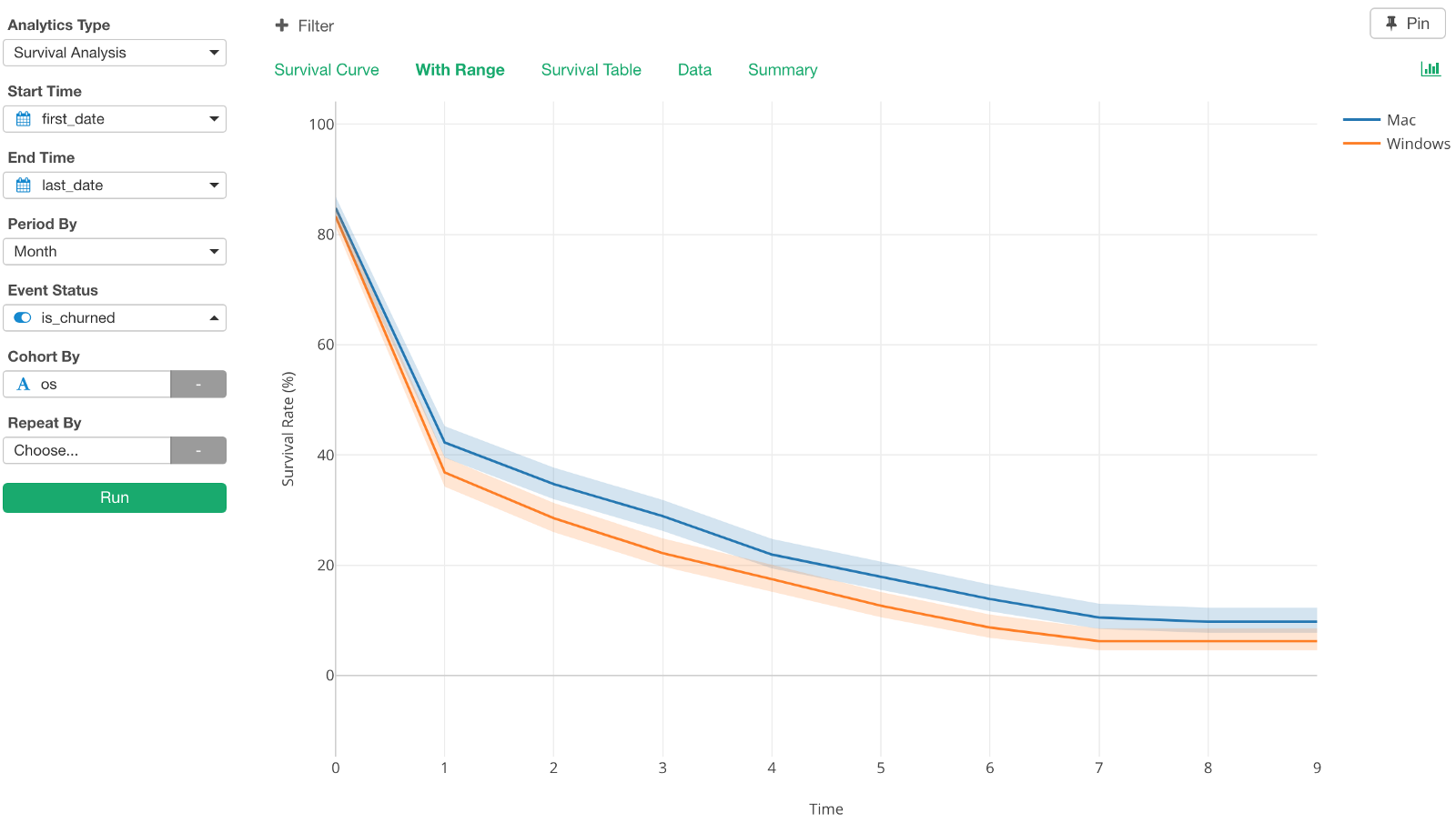
As you can see these two lines are not covering on top of each other, they are pretty separated. So we can start sensing that the difference between the two, Mac and Windows, seems to be significant.
We can see both OS types have enough users in this data as well.
And, let’s check the P-Value under Summary tab.
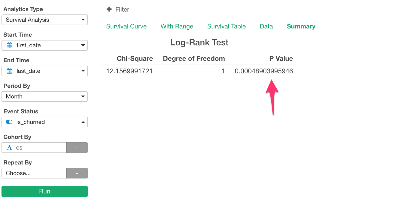
It is 0.000489, which means that the probability of getting the similar difference in the survival curve between Mac and Windows is 0.0489%, which is quite small. Therefore, we can conclude that the difference between Mac and Windows is not by chance.
And, we can conclude that the retention for Mac users is better than Windows users in a statistically significant.
Survival Curve by Country and OS
Now that we know that Mac users are better than Windows users in terms of the retention rate.
But can that be observed in all the countries?
For example, Mac users’ retention is better in Japan as well as the United States?
To investigate, we can assign ‘country’ column to Repeat By.
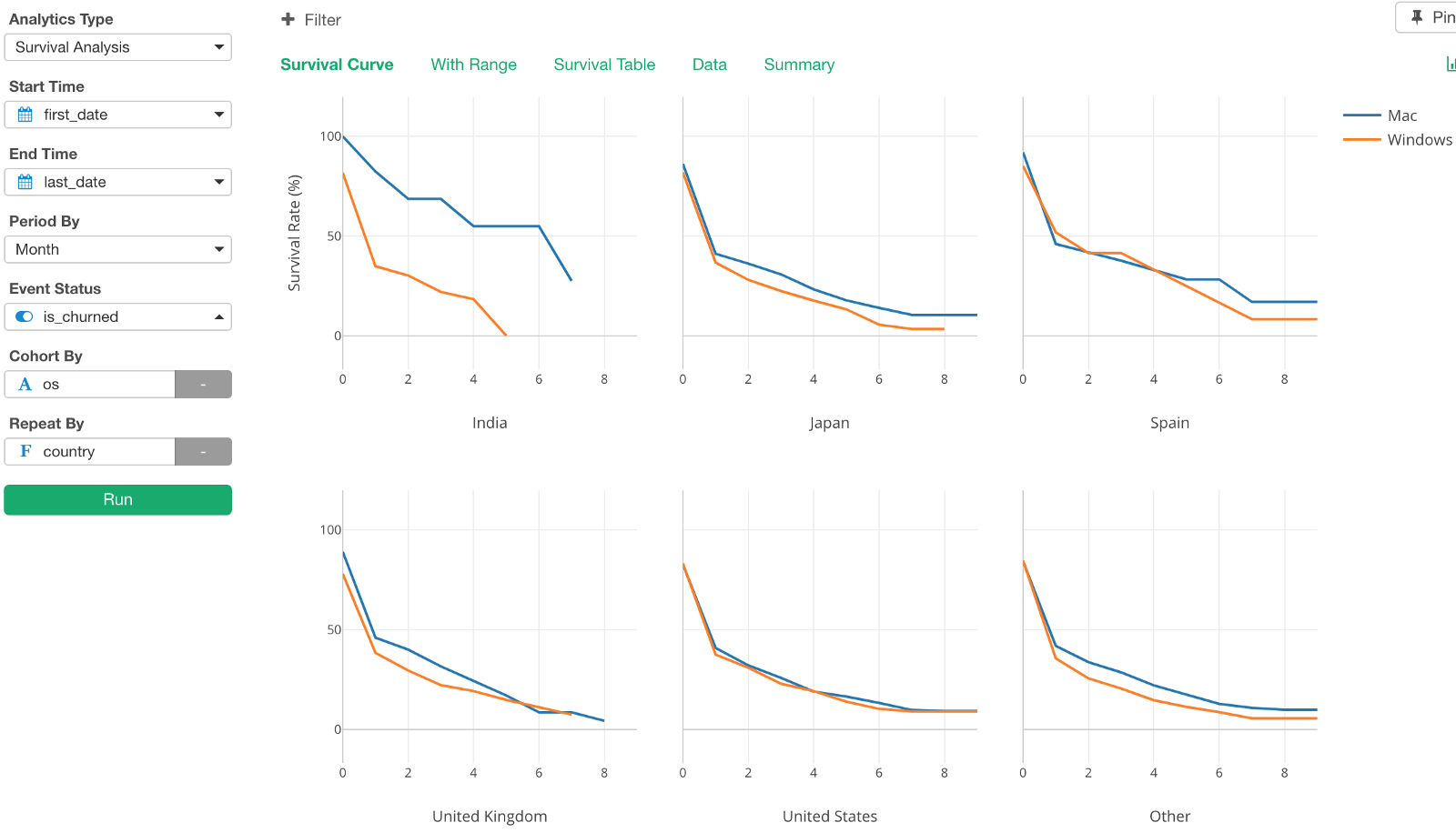
As you can see the difference between Mac and Windows are pretty obvious in countries like India and Japan, but not so much for other countries like Spain, United States.
We can go check P-Value under Summary tab.
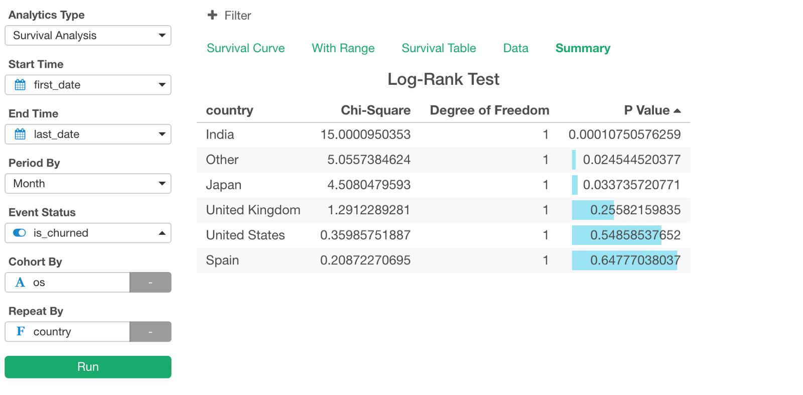
The P-Values for India, Japan, and ‘Other’ seem to be enough small. So we can say that the differences of the survival curves between Mac and Windows for these countries are not by chance, rather they are statistically significant, and Mac users are better than Windows in terms of the retention rate.
Cohort Analysis (or Retention Analysis) gives you great insights that help you understand your state of the business before you start seeing material impacts (like MRR / Monthly Recurring Revenue) on your business. And Survival Analysis is a great algorithm to estimate the retention rates and also test if the difference you see is statistically significant or not.
Hope ‘Survival Analysis’ under Analytics view would make this type of analysis much closer to many.
Happy Survival Analysis!