Categorizing Numerical Values - Binning -
You can categorize the numeric values inside the charts.
Here is a scatter chart showing Working Years at X-Axis and Monthly Income at Y-Axis, and I'm trying to visualize the relationship between the two variables.
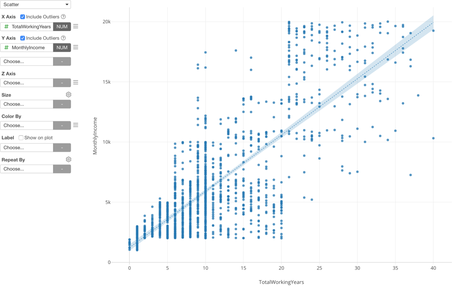
This is one way to look at the relationship between the two, but there is another way, which is to categorize the numeric variables.
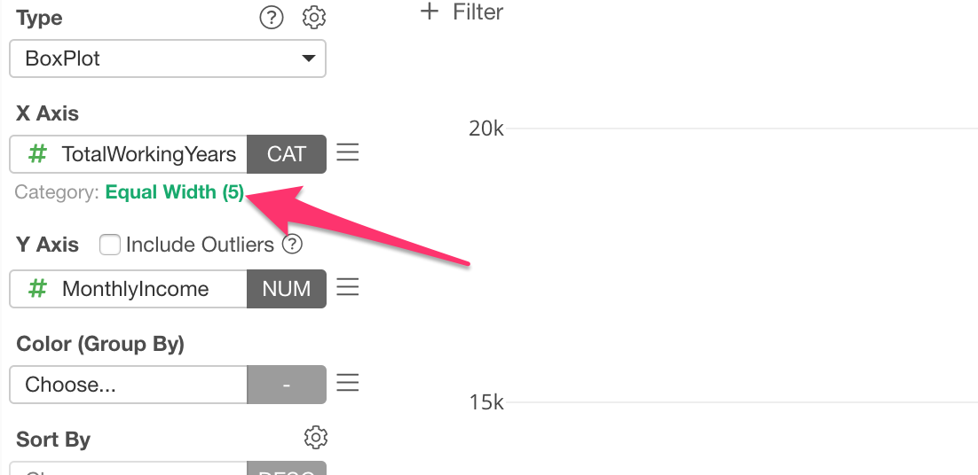
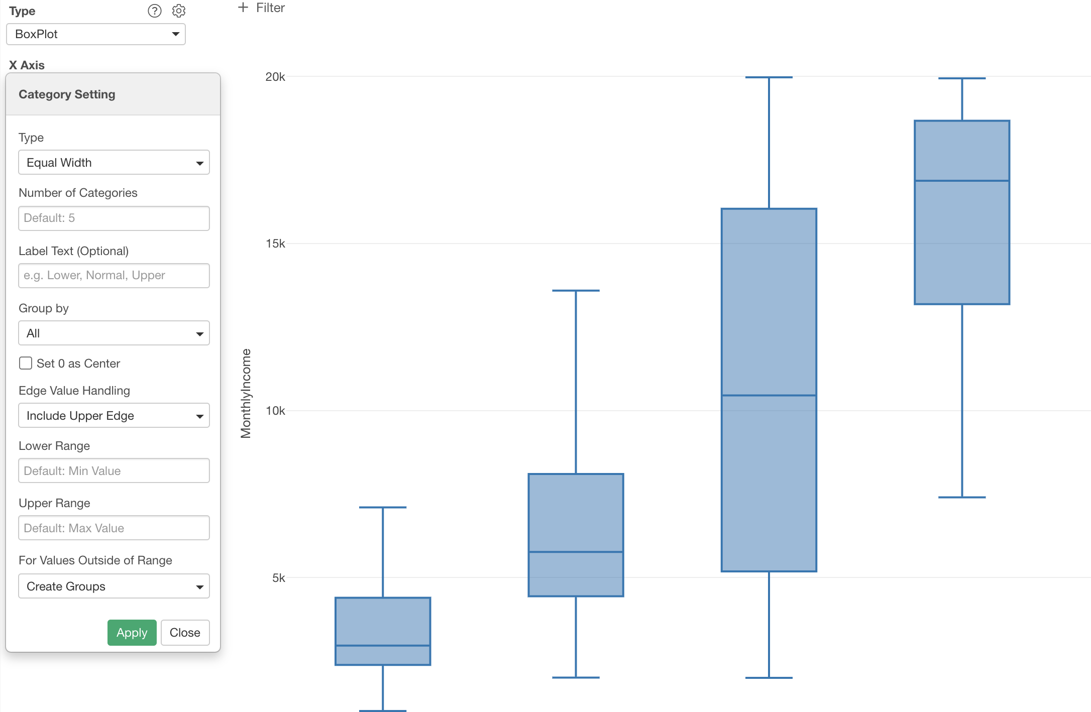
Here is a boxplot chart showing Working Years at X-Axis and Monthly Income at Y-Axis, but this time the Working Years is divided into 5 groups based on the numeric value range and each group is showing the distribution of Monthly Income at Y-Axis.
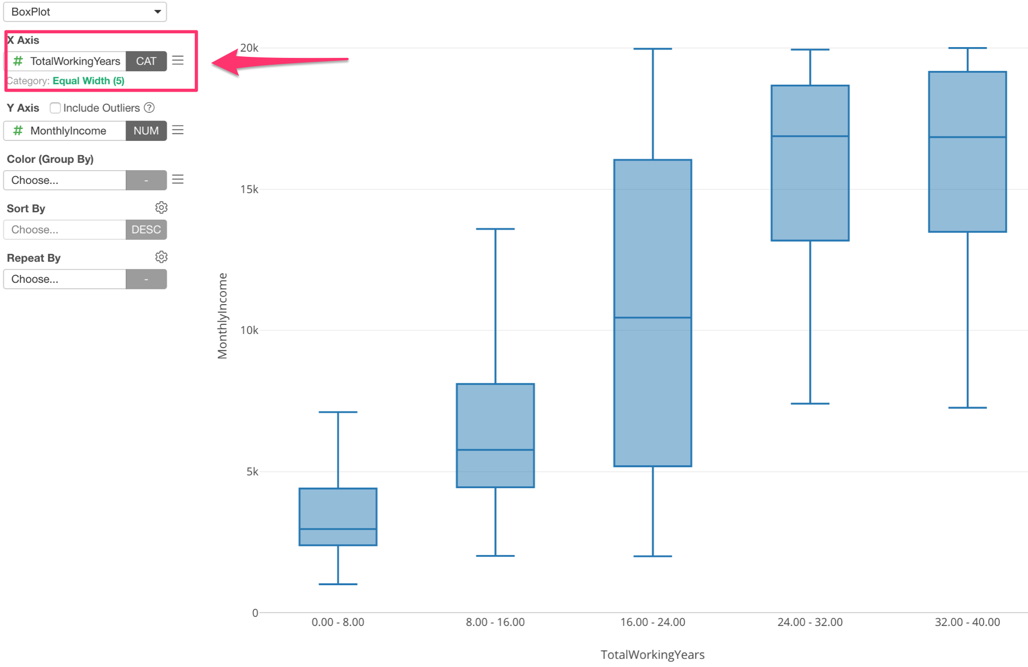
Assigning Numeric variable (or column) to X-Axis automatically changes the option to 'Category' and divide into 5 groups.
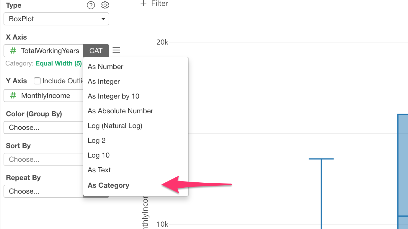
You can click on the green text to change the detail setting based on your needs.
You can change the number of groups (bins), for example.
Categorizing Numeric Values for Other Charts
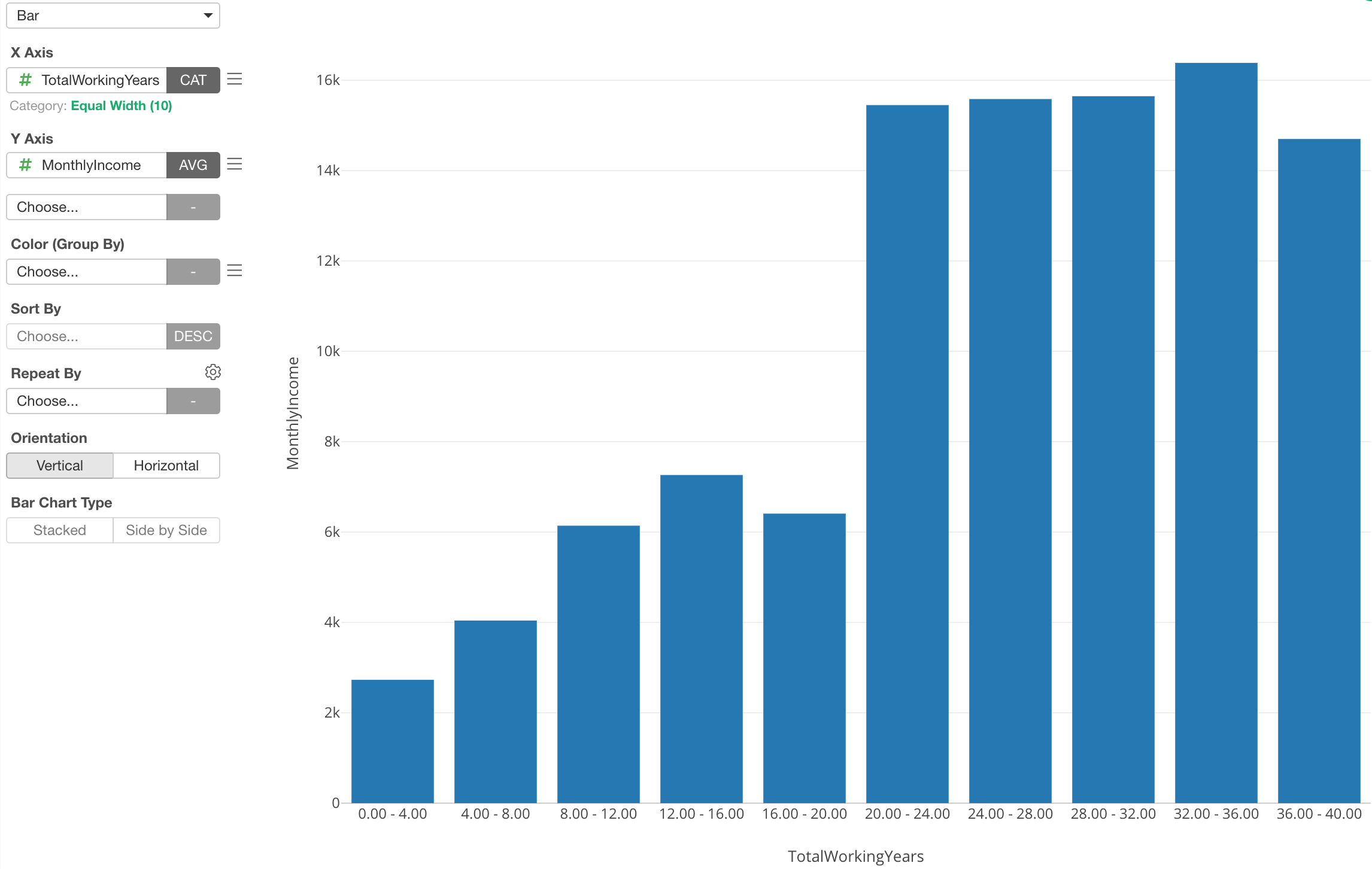
Of course, this is not just for Boxplot, but also for other chart types as well. For example, here is a Bar chart showing the average monthly income (Y-Axis) for each category of the working years.
Categorizing Numeric Values for Pivot Table
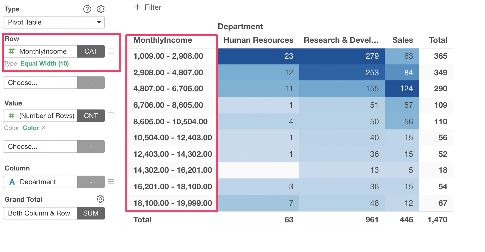
Pivot Table supports the categorization of numeri values as well.
Categorizing Numeric Values for Color
You can use the 'Categorize Numeric' feature for the Color as well.
Here I've assigned Monthly Income column to Color, which automatically divides into 5 categories.
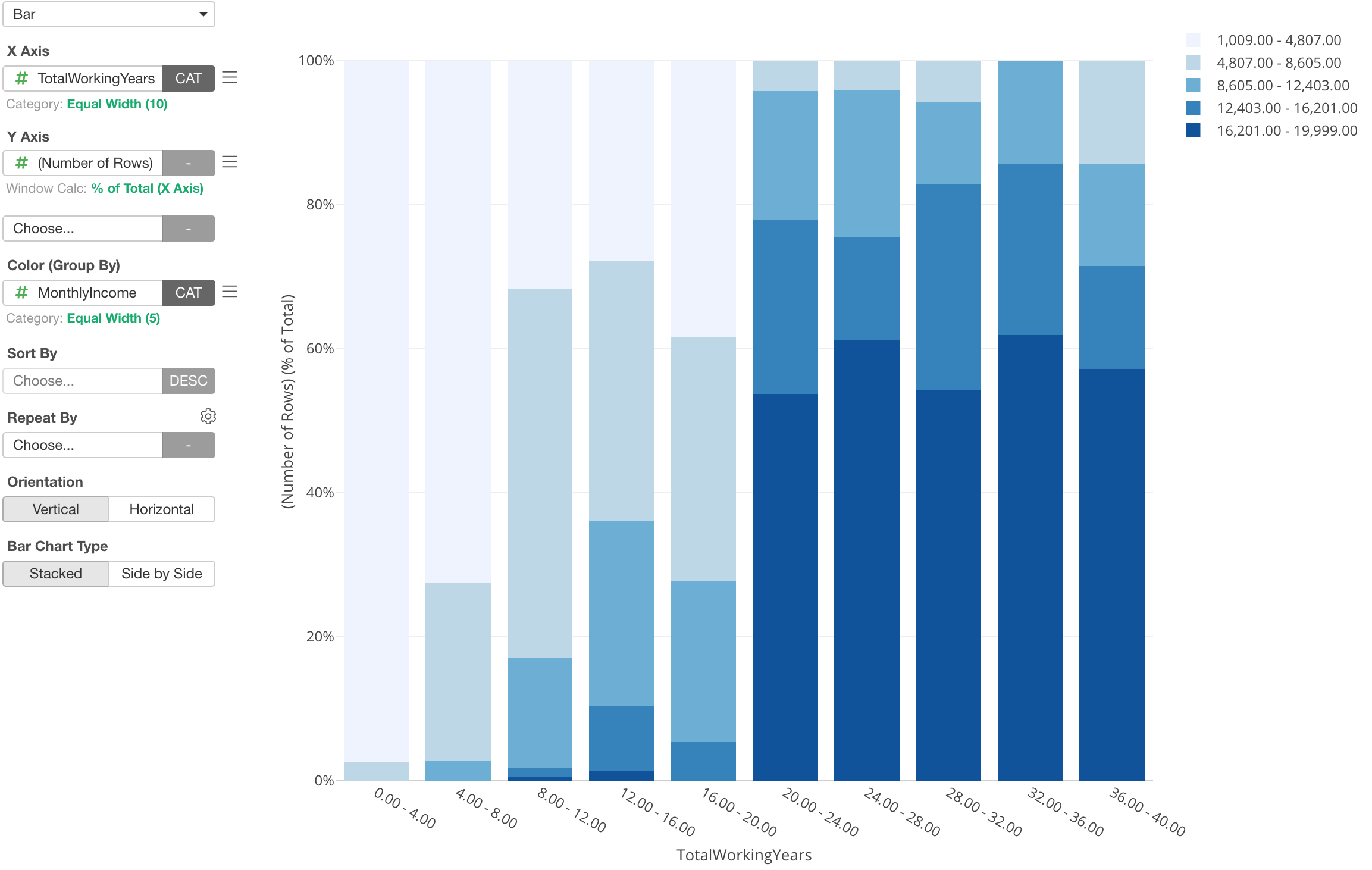
You can click on the green text to open the Color dialog where you can adjust the detail setting on how to group the numeric values and also update the label text for each group.
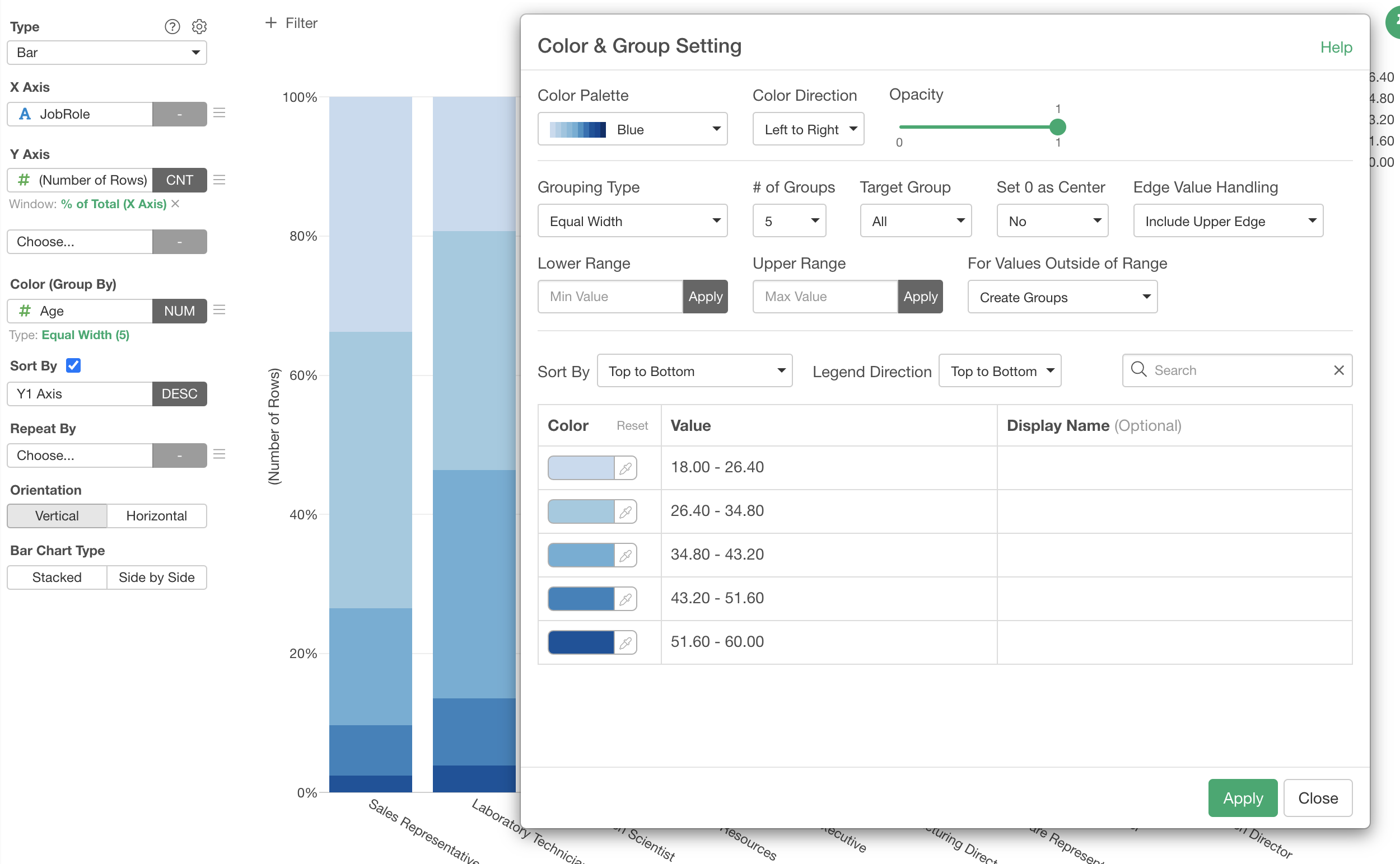
Categorizing Numeric Values for Repeat By
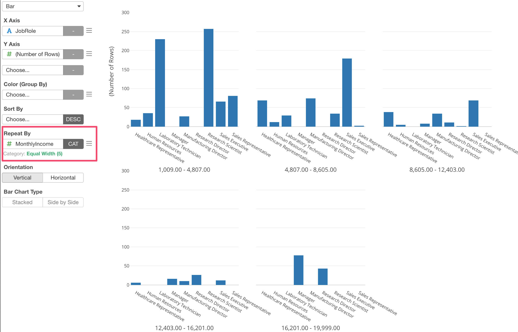
You can also use 'Categorize Numeric' for Repeat By.
Various Categorization Options
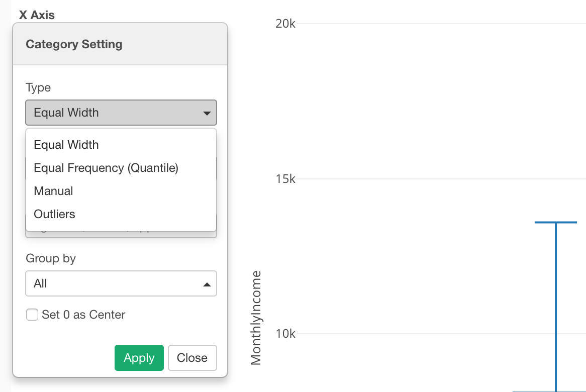
We have seen the categorization of numeric columns with 'Equal Width' option so far, but there are other options as well.
Categorization with 'Equal Frequency' Option
Let's say you get data like this.
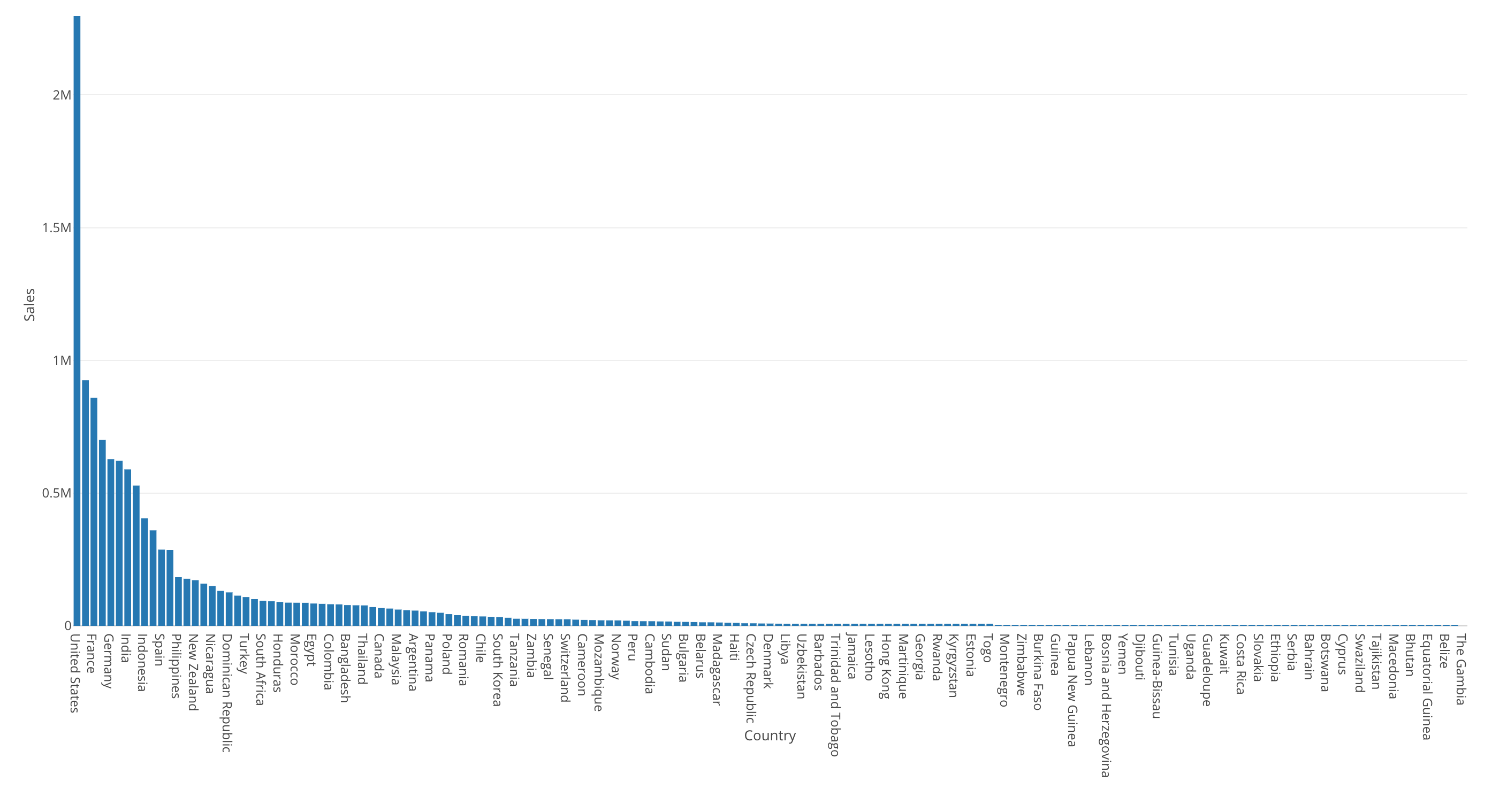
This bar chart is showing the sales by country.
The United States is the highest (the most left hand side) and most of the countries' sales are very small compared to the United States.
Now, we can visualize this data by using Map and assign Sales to Color. This would categorize the Sales' numeric values into 5 categories by default, and I have set the number of the categories to 10.
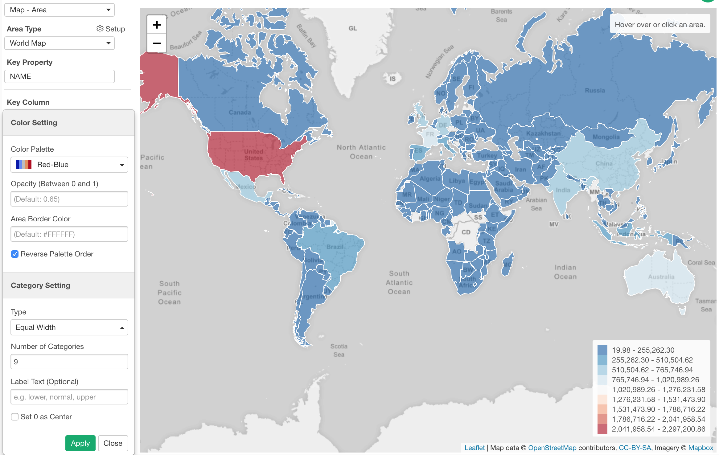
The problem is that only the United States (Red color) look different and everything else looks the similar blue color. This makes it harder to see any differences between the countries other than the United States.
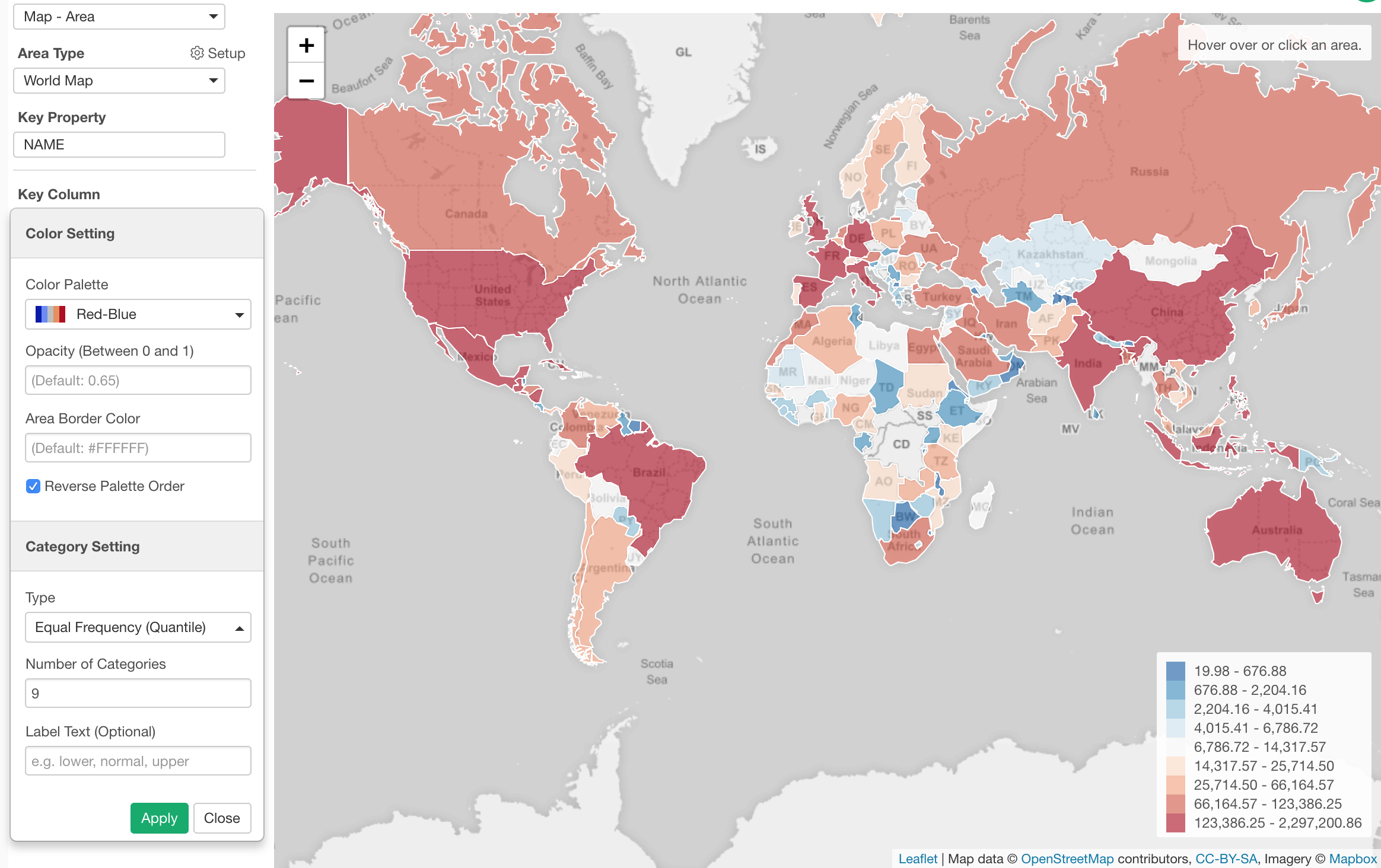
We can try using the 'Equal Frequency' option for the binning, which will divide the numeric values into 10 groups (in this case) so that each group will have same number of countries. In this data, there are 165 countries, so each group will have about 16 countries.
Categorization with 'Manual' Option
You can divide the numeric values by setting specific threshold values.
Here, I've assigned the 'Age' column to X-Axis and showing the percentage of employees by 'Job Role' for each Age group.
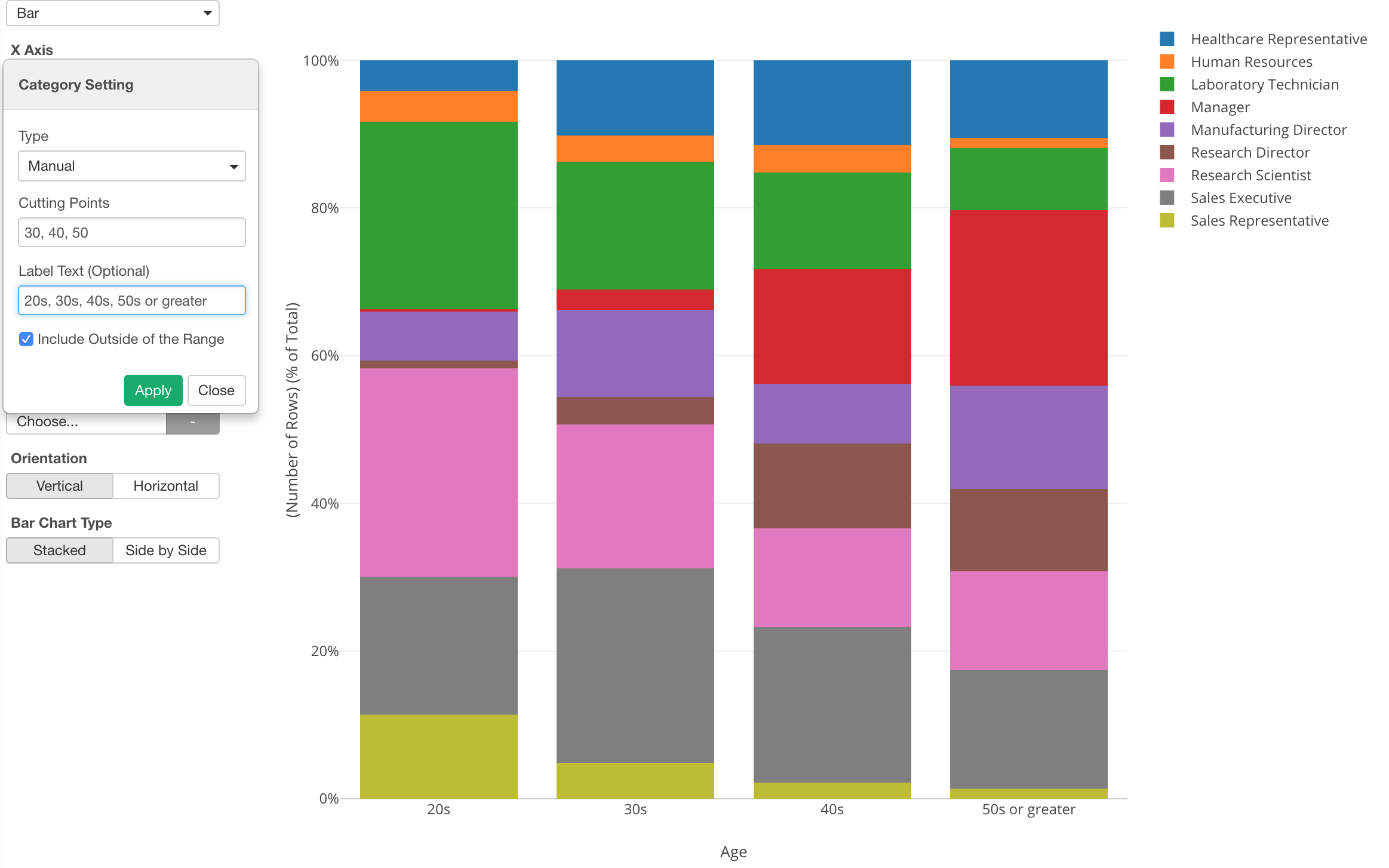
In the property, I set specific dividing values (30, 40, 50) and added a label text for each group.
Categorization with 'Outlier' Option
Another cool option for categorizing numeric values is 'Outlier'.
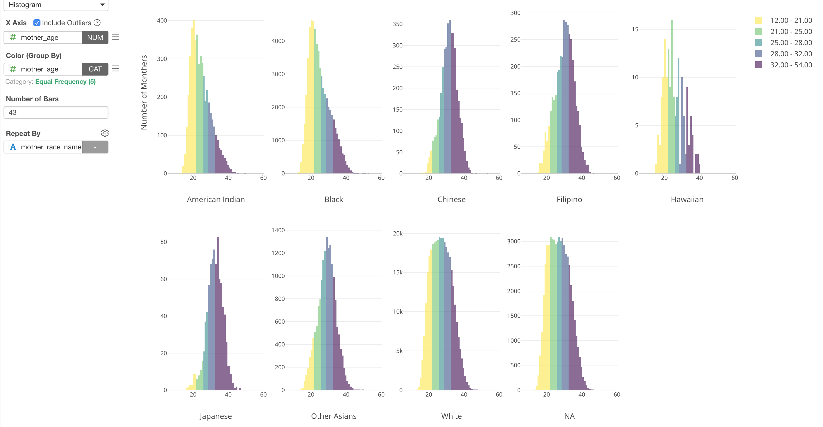
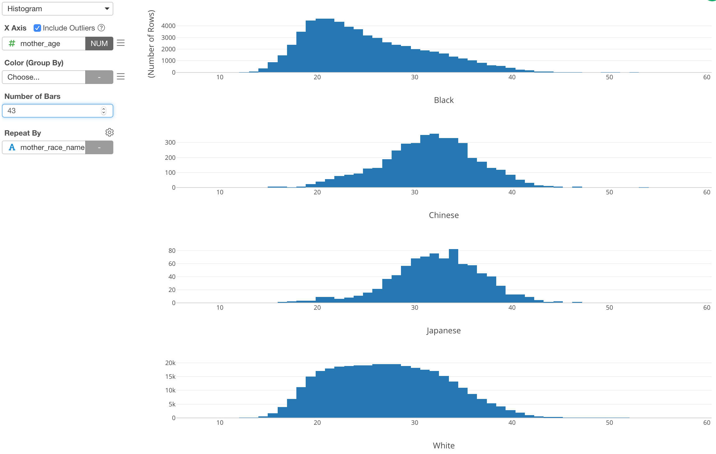
Here, I've used a histogram to visualize the distribution of Mother Age from the US baby data. By using Repeat By, I'm showing the histogram for each Mother Race type (e.g. White, Black, etc.)
Now, if we want to show the outliers, which means that the mothers who gave birth at very early ages or very late ages, I can assign Mother Age column to Color and setup the categorization.
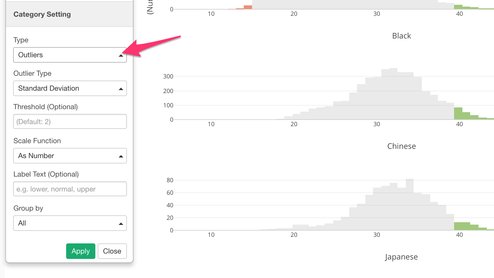
We can see the outliers are in either green (higher side of the outliers) or red (lower side of the outliers).
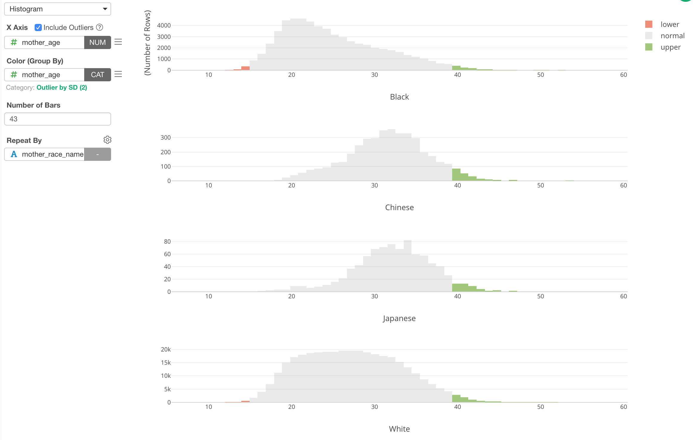
This 'Outlier' categorization is done against the whole data. But if we want to do it for each Mother Race group, we can set 'Group By' setting to use 'Repeat By'.
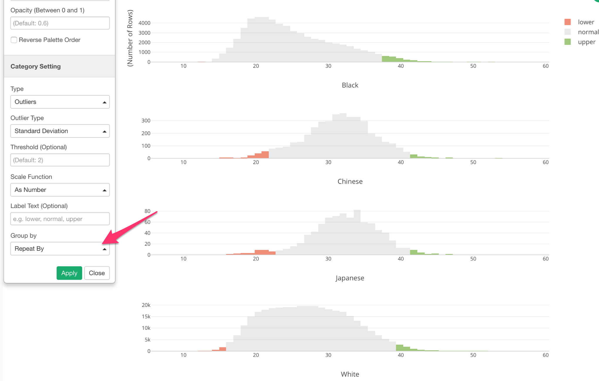
Now we can see that outlier ranges are different for each Mother Race group.