Collecting 74 Years of 38 Central Banks’ Interest Rates Data from Bank of Internation Settelments (BIS)
Wouldn’t that suck if you have saved up money in your bank only to find later that you don’t get the whole money back, let alone no interests.
Yep, that is what’s happening with some of the central banks in the world right now. Is there data about this?
There is an organization called Bank for International Settlements who hosts the historical interest rates data of all the central banks in the world among many other data sets and updates them periodically.
And conveniently enough, there is an R package literally called BIS from Eric Persson. It provides a function to download that data easily in R!
Brilliant!!🔥🔥🔥
So I’ve quickly downloaded the data, cleaned up little bit, and visualized it. Here is a chart that shows the historical interest rates of 6 major countries and area over the last 58 years.
And Japan and Switzerland are those taking money from the bank accounts with the negative interest rates in the recent years!
Now, I want to share how you can do the same.
Here are the 5 steps.
- Install BIS Package
- Write R Script with BIS Package to Download Data
- Convert Data Type - from Character to Date
- Visualize Data
1. Install BIS Package
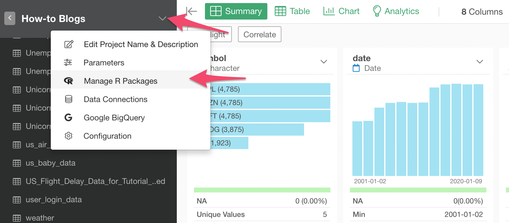
First, you need to install the BIS R package inside Exploratory before you can use it.
Select ‘Manage R Packages’ from the Project level menu.
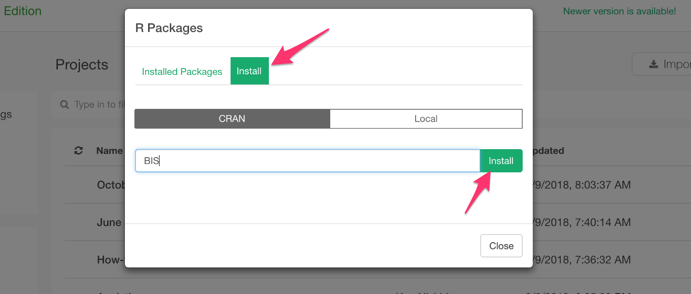
Under the Install tab, type ‘BIS’ and click ‘Install’ button.
Once it’s installed, now it’s time to use it!
2. Write R Script with BIS Package to Download Data
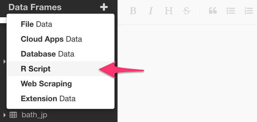
Select ‘R Script’ from Data Frame menu at the left hand side.
First, you can use ‘get_datesets’ function to list what datasets are available.
library(BIS)

datasets <- get_datasets()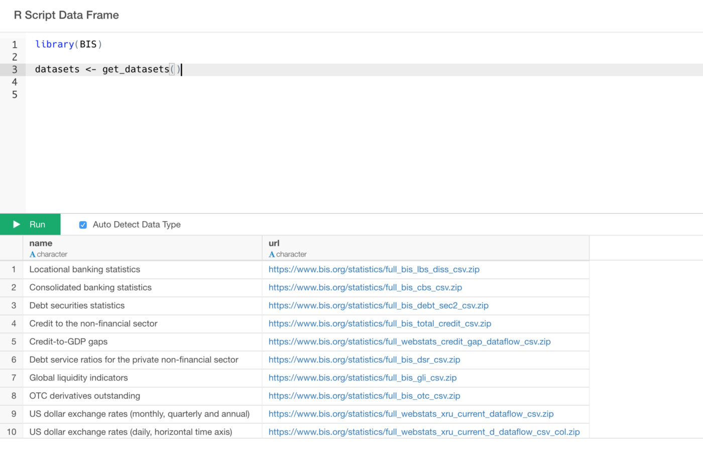
Here is a list of all the data sets.
Now, let’s say we want to get ‘Policy rates (monthly)’ data.
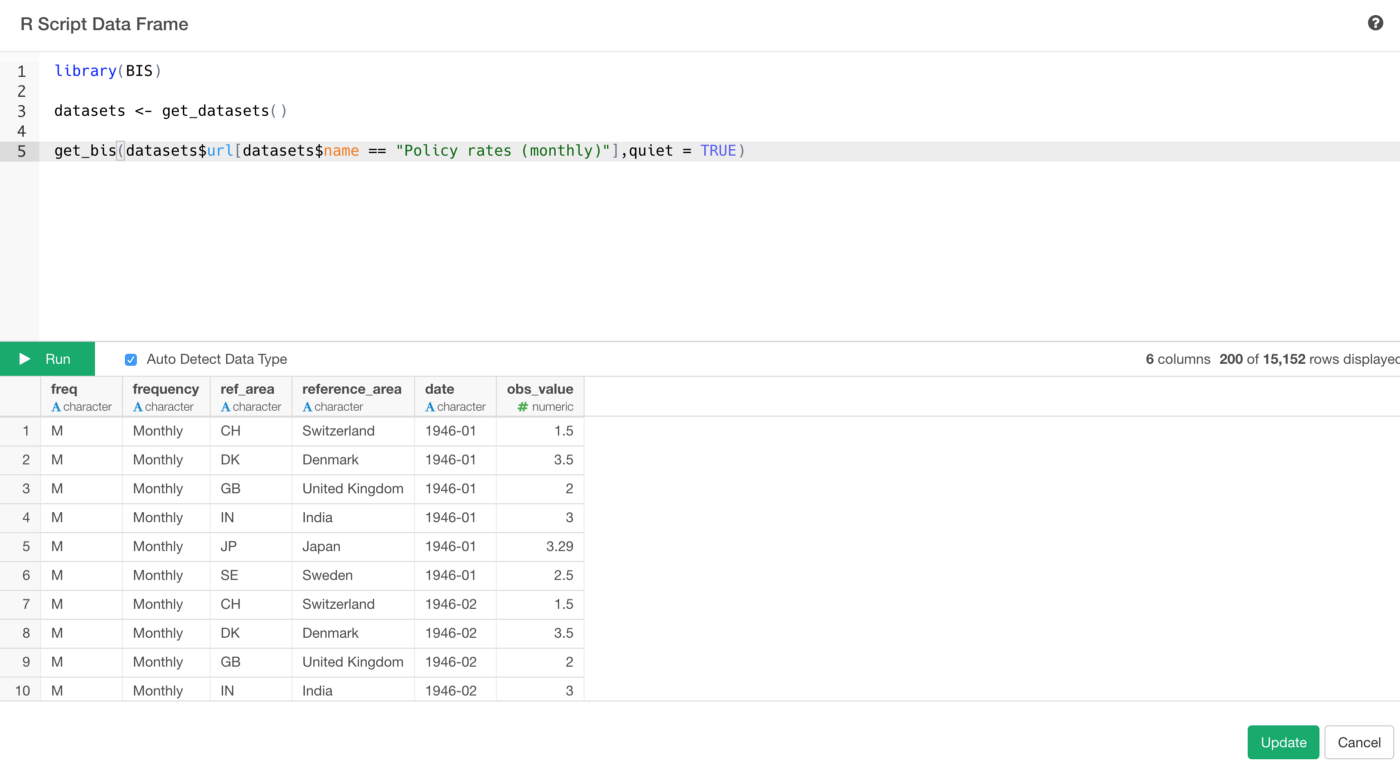
You can use ‘get_bis’ function like the below.
library(BIS)

datasets <- get_datasets()

get_bis(datasets$url[datasets$name == "Policy rates (monthly)"],quiet = TRUE)
The get_bis function takes the URL from the data returned by get_datasetsfunction. You can copy and paste the URL value of the data set you are interested in or you can use the name value to filter the URL data like the above.
Once the data looks good in the preview table, click on ‘Import’ or 'Save' button.
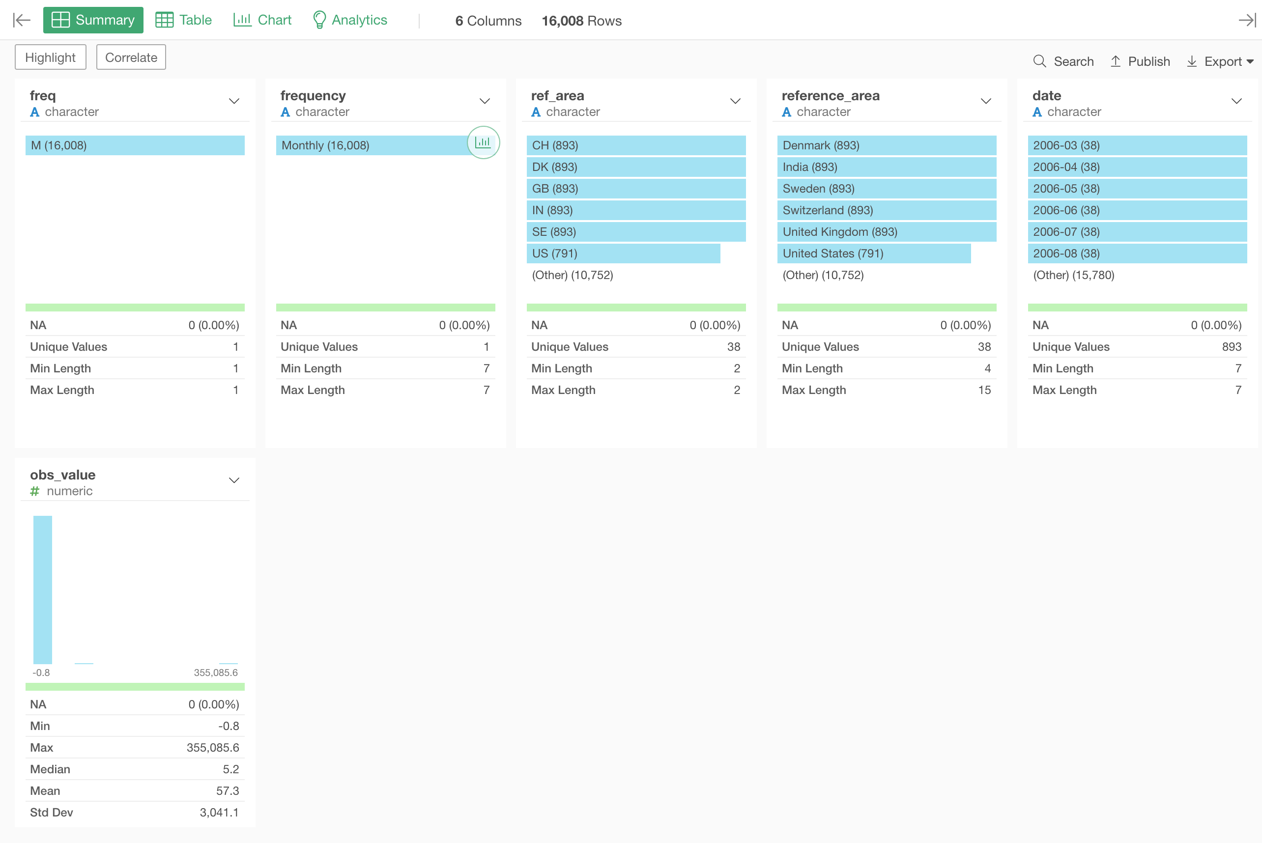
You will see the data displayed in Summary view like the below.
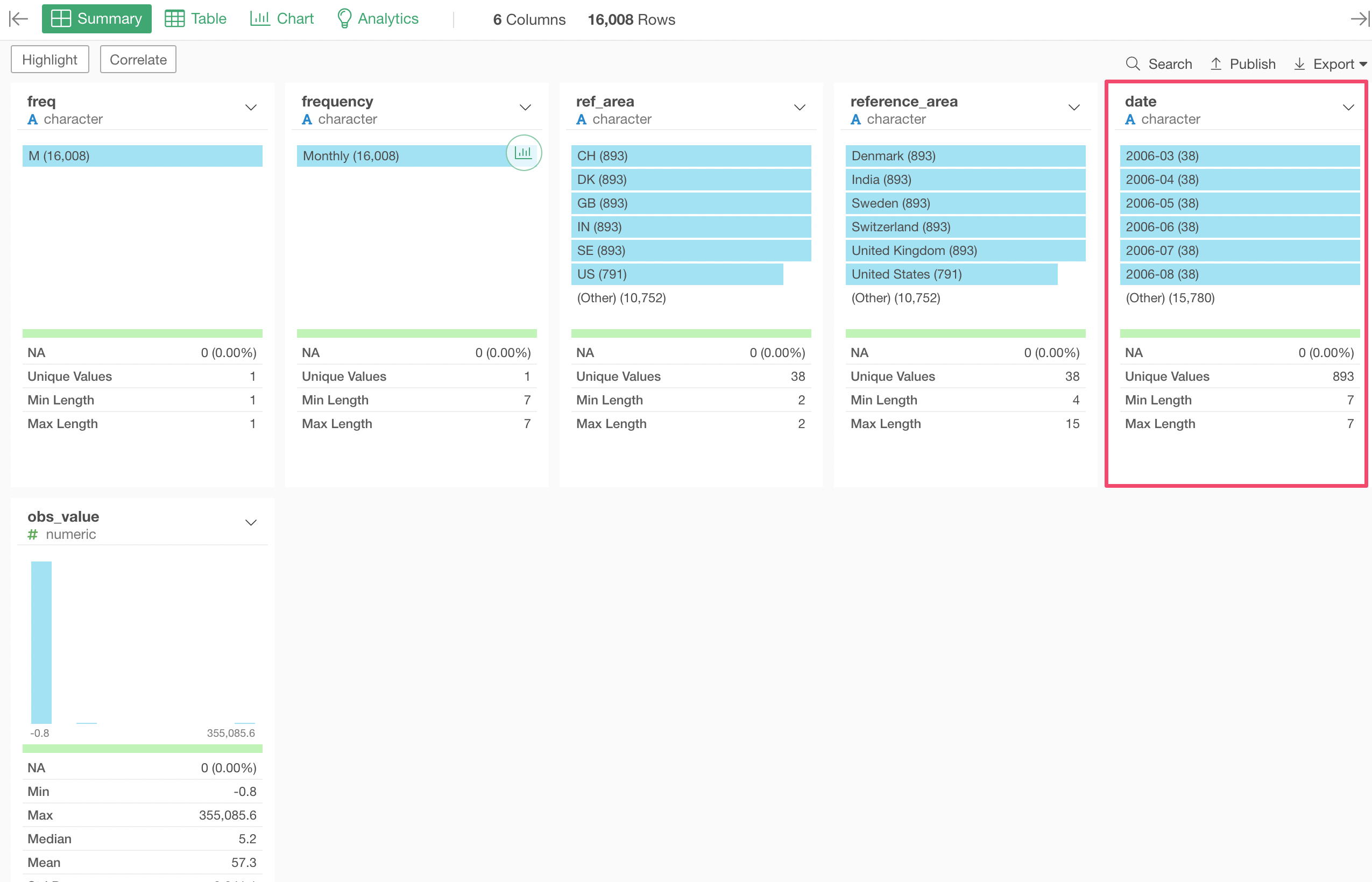
3. Convert Character to Date with ymd function
This is monthly interest rates data, which means it is a time series data. But the date column is Character data type, which makes it harder to visualize the time series data.
We can fix this quickly.
Select ‘Change Data Type’ -> ‘Convert to Date / Time’ -> ‘Year, Month’ from the column header menu of date column.
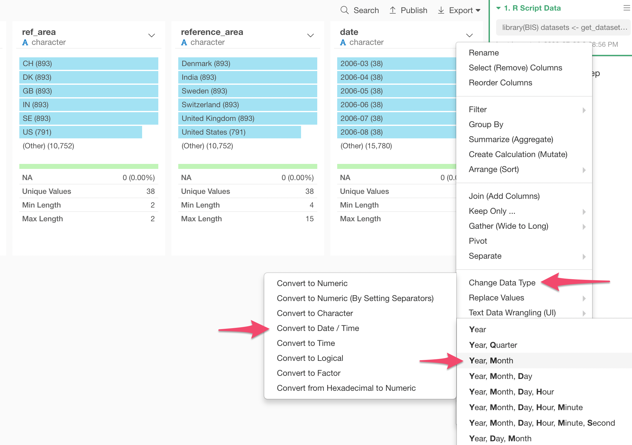
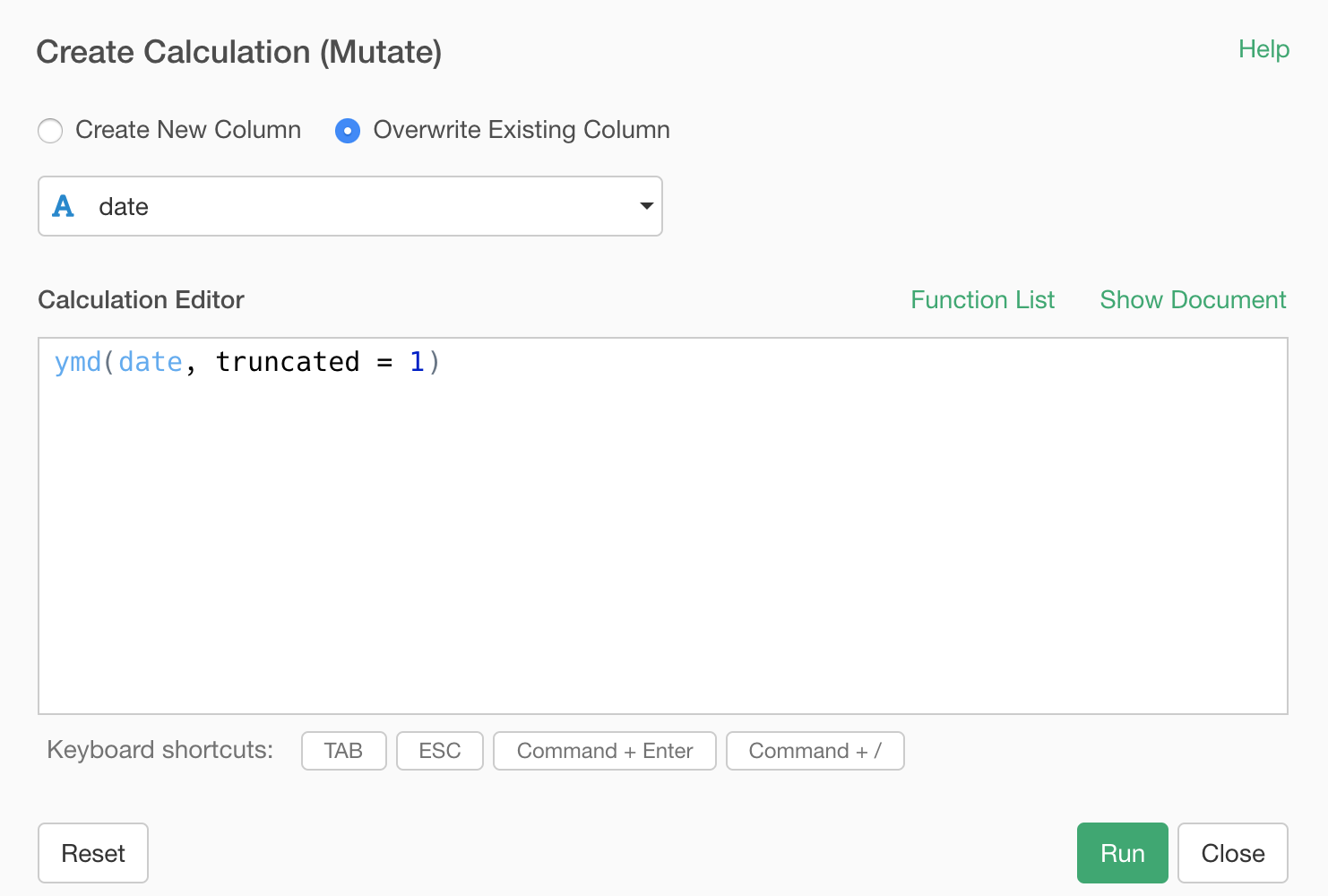
This will populate ymd function with date column.
This ymd function is from an R package called ‘lubridate’ and it is super powerful.
The cool thing about the function is that it doesn’t matter what characters are between Year, Month, and Day values. For example, it can take any of the following data and convert them to Date type appropriately.
2018-04-02

2018/04/02

2018/4/2

Reported on 2018, April 2nd.
What it matter is the order in which Year, Month, and Day are presented.
In this case though, we have only Year and Month information in the data. This is why we have the truncated = 1 argument inside the ymd function, which tells the function that the last part of the ymd (that is 'd') is missing.
What if you have your data in a different order? There are other functions like ‘mdy’, ‘dmy’, etc. Take a look at this post for more details on these functions.
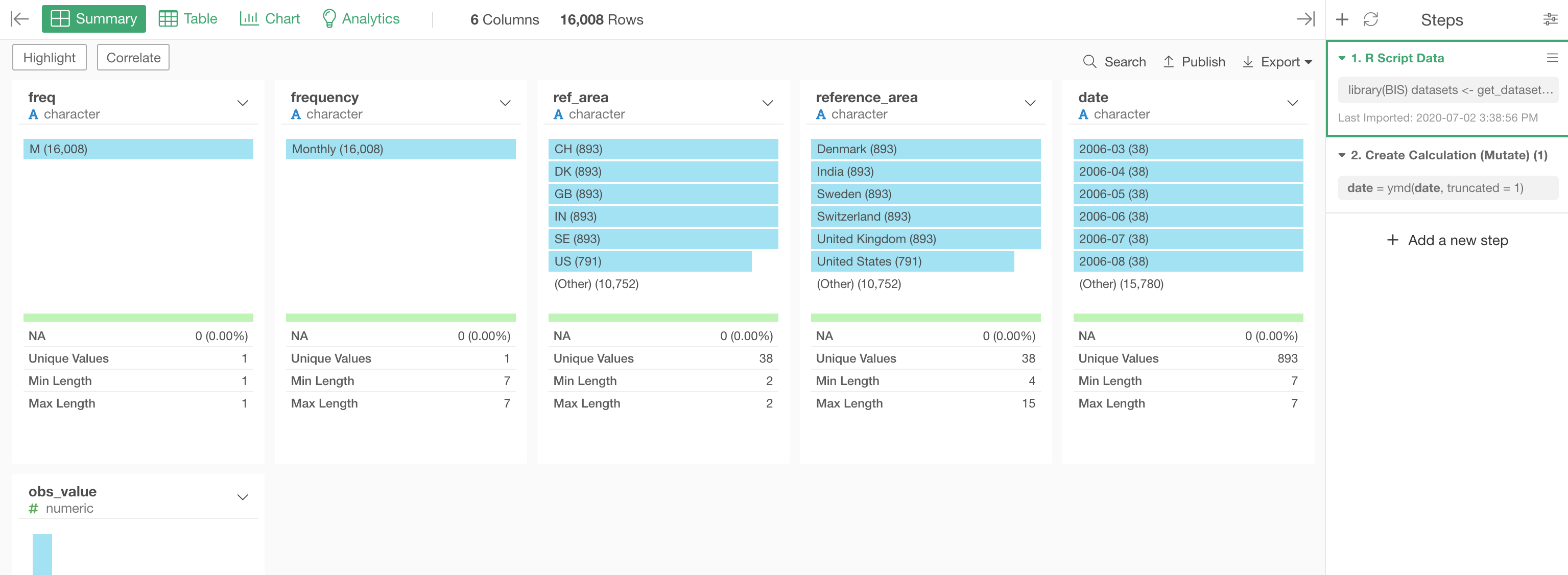
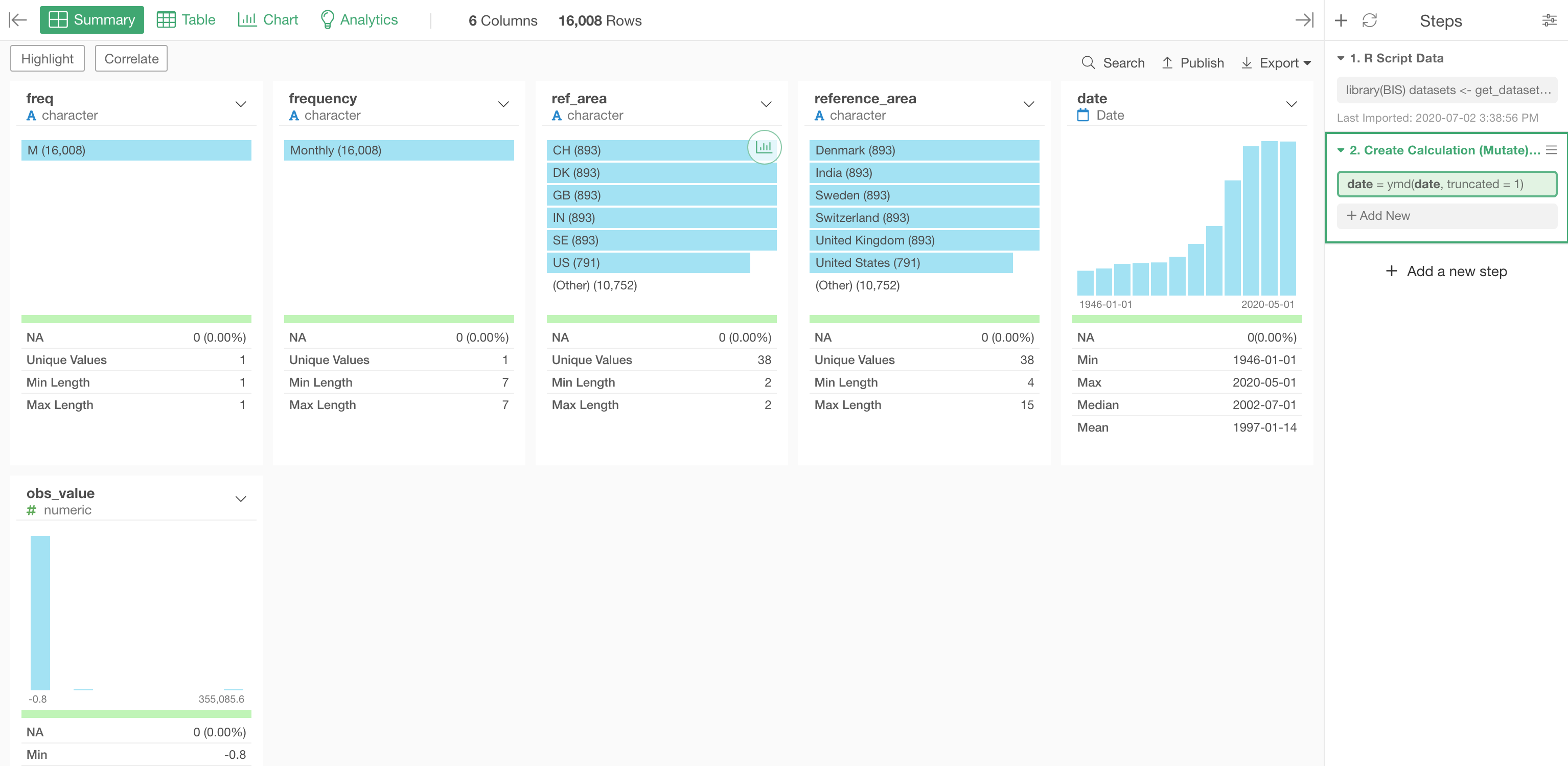
Anyway, you can see the result of the Character to Date conversion in Summary view better.
Before:
After:
4. Visualize Data
Now that we have the time series data prepared, let’s visualize it.
Under the Chart view, we can select a Bar chart and assign the columns as follows:
- X-Axis: date
- Y-Axis: obs_value with 'Mean (Average)' function
- Color: reference_area (Country Name)
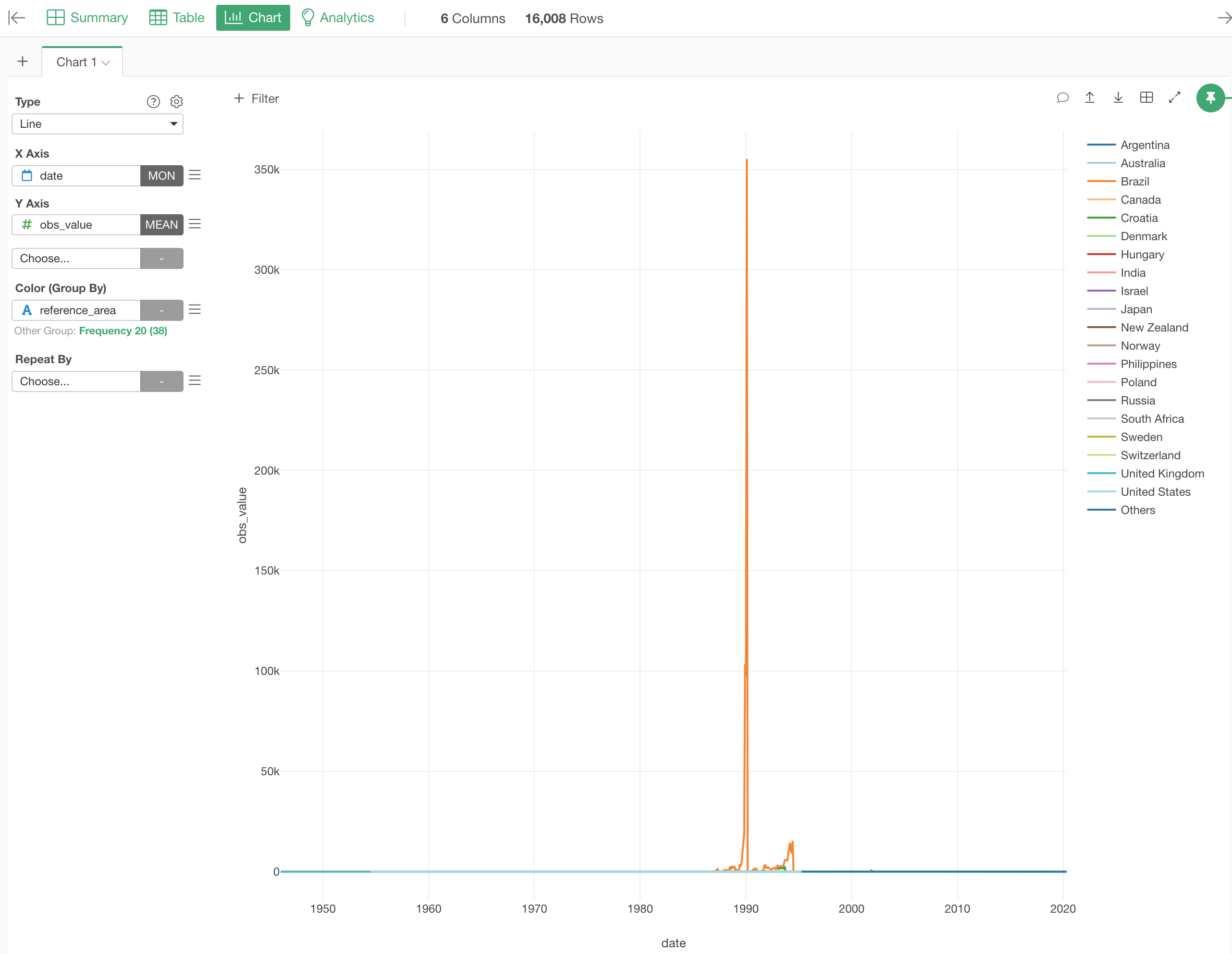
We can see crazy interest rates for Brazil around 1990.
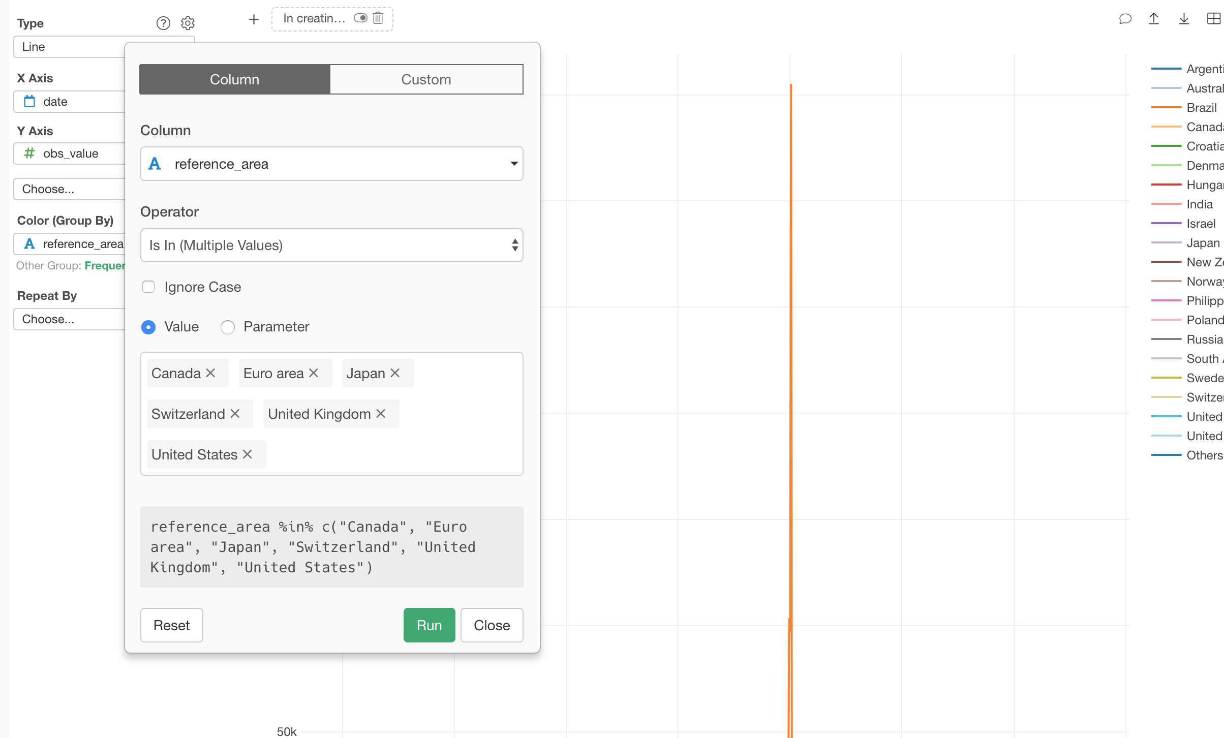
4.1 Filter Data
In this post, let’s focus on the following 5 major countries and 1 area.
- Canada
- Euro Area
- Japan
- Switzerland
- United Kingdom
- United States
Let’s use the Chart Level Filter to get this job done like the below.
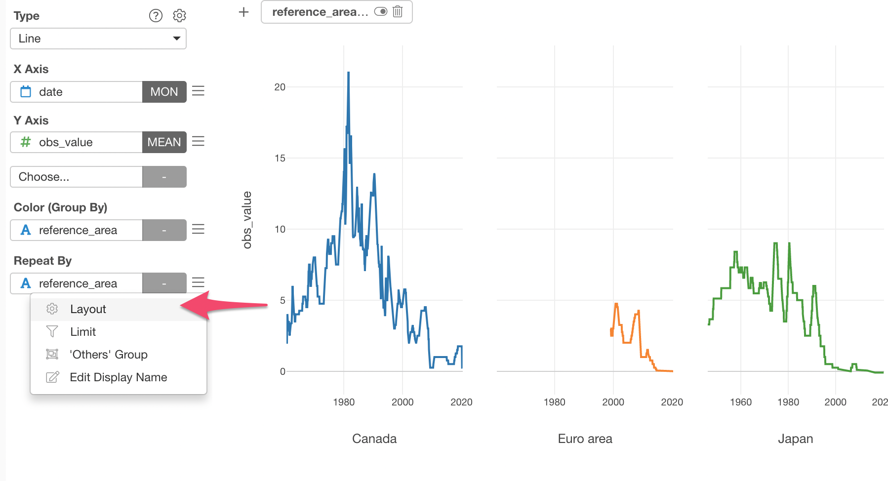
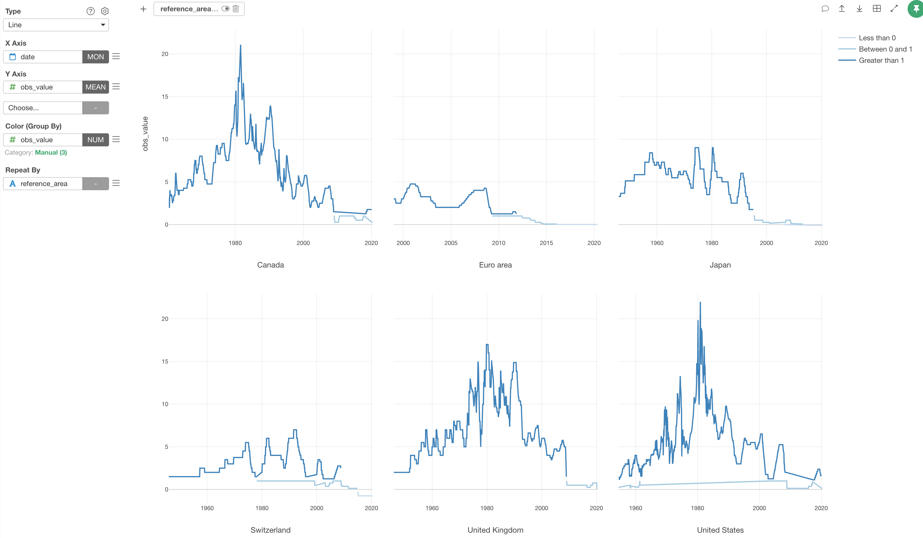
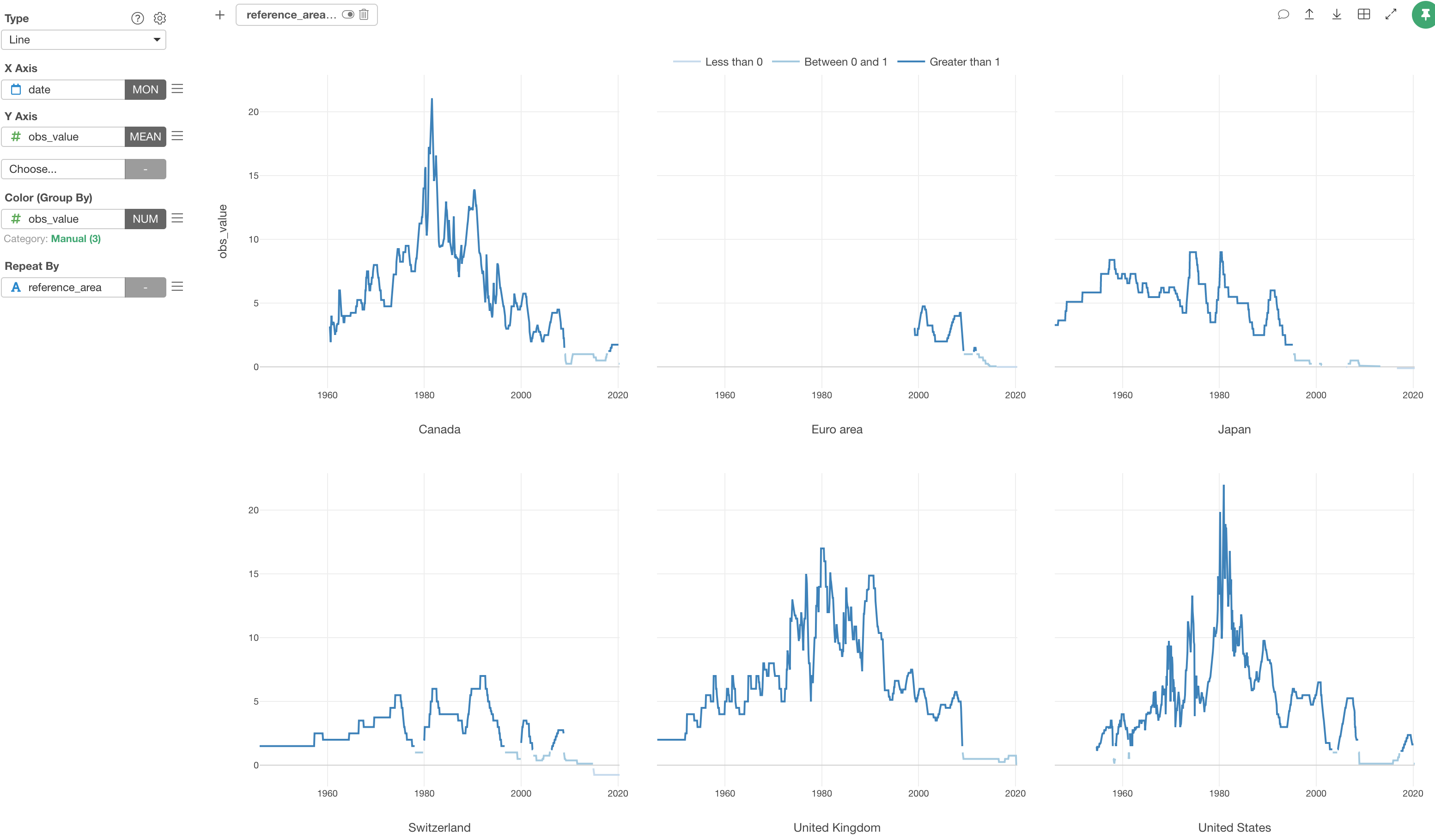
4.2 Separate Each Coutry to Its Own Chart with Repeat By
It’s a bit hard to see the 6 lines on top of each other.
We can separate it into 6 different charts, each of which represents each country or area, by using Repeat By.
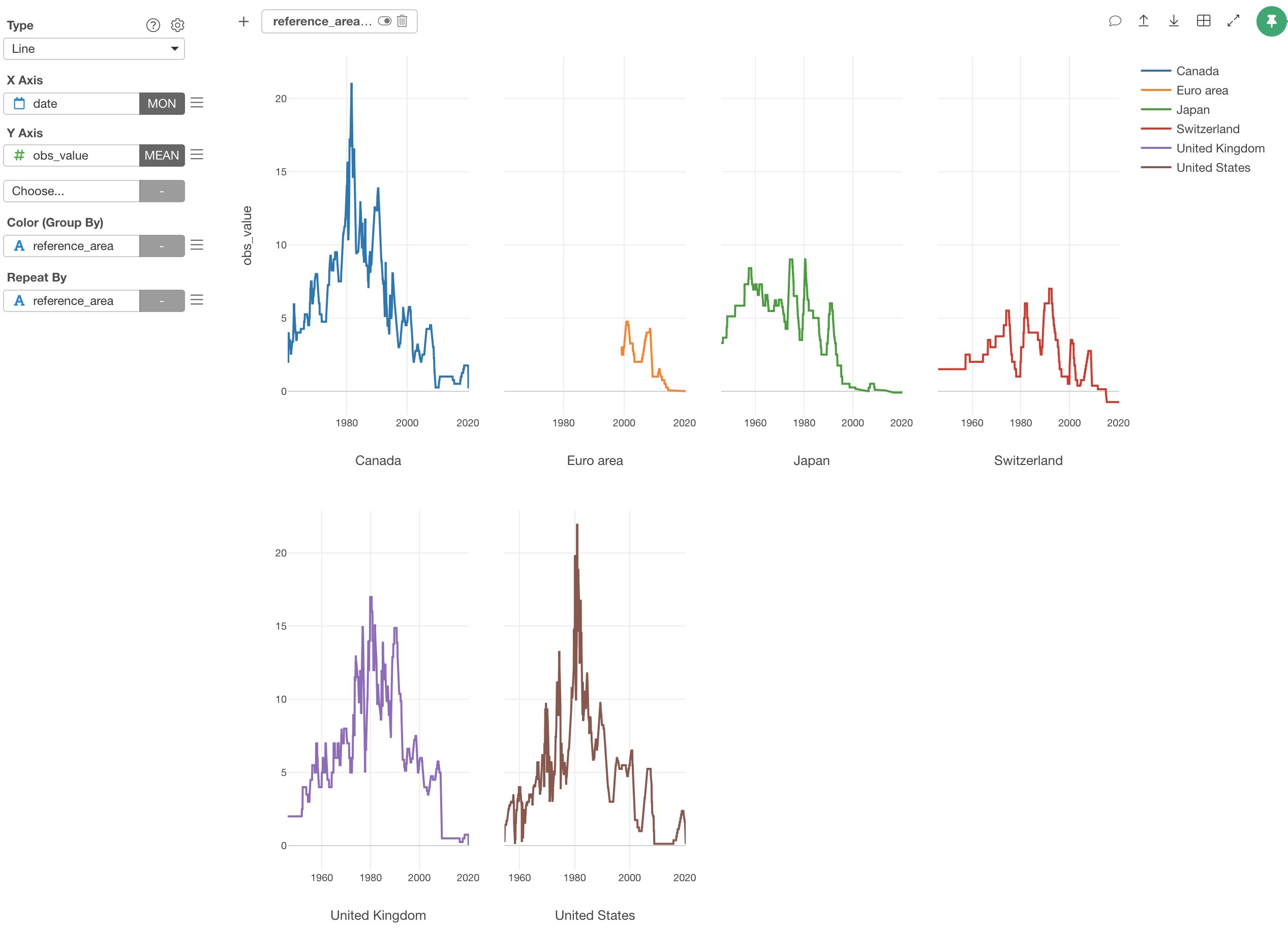
We can adjust the layout to show 3 charts in each row.
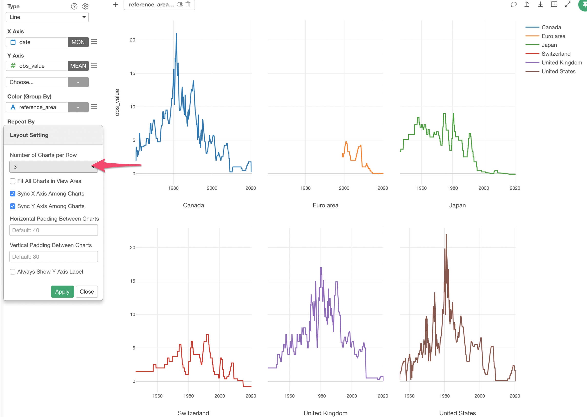
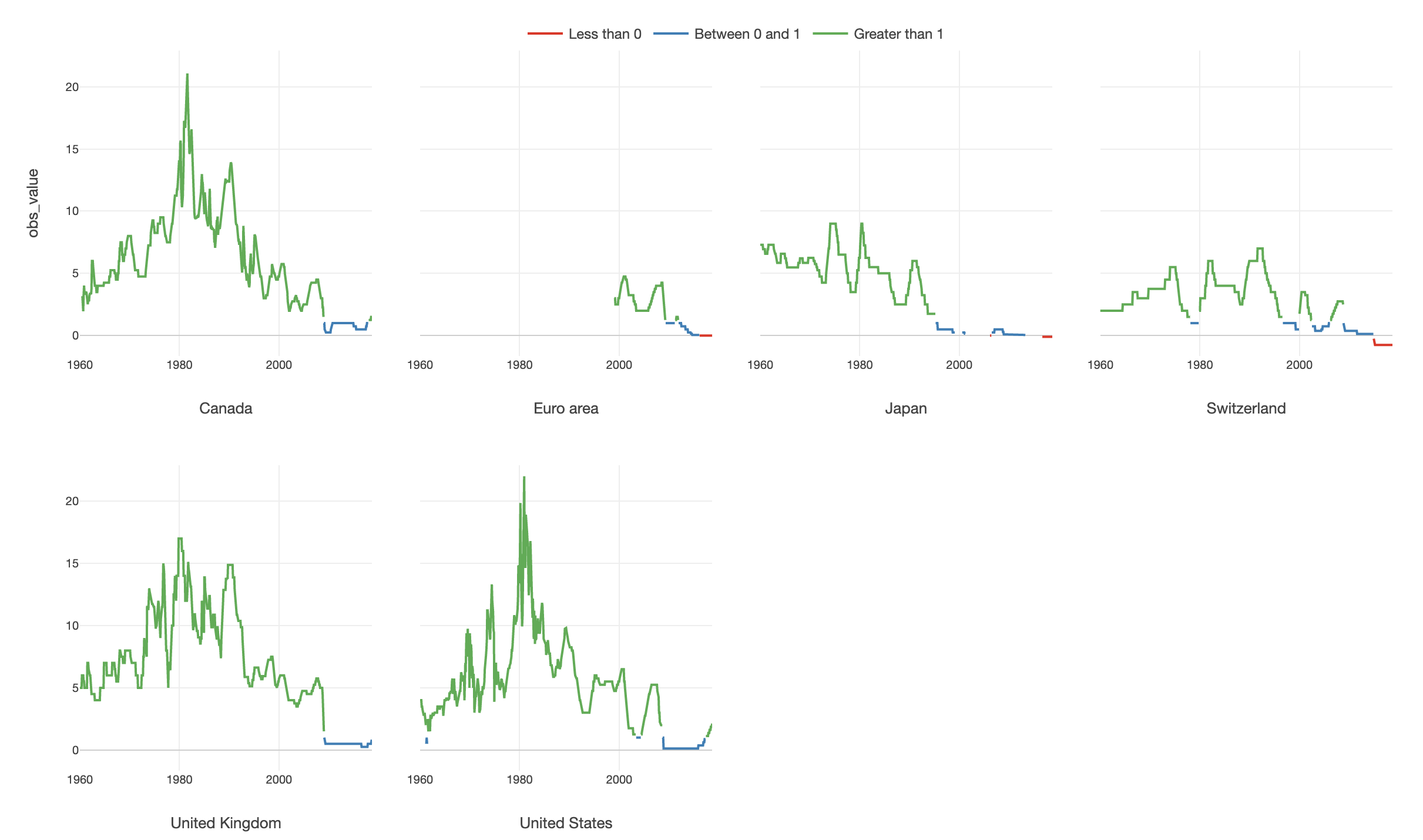
Looks Japan, and Switzerland seem to have the interest rates in negative in the recent years.
But are they really? It’s kind of hard to see it.
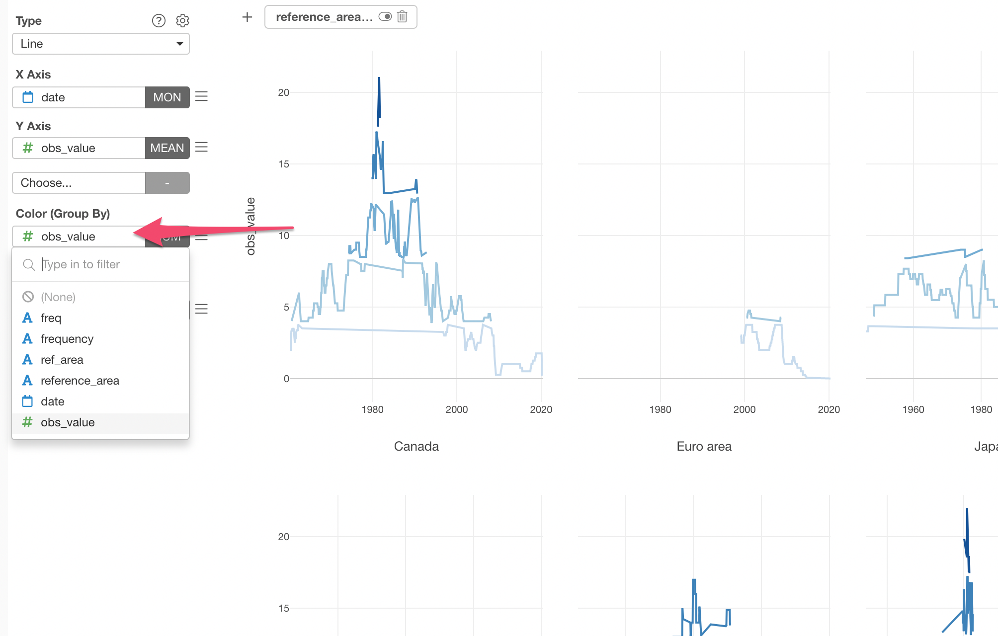
4.3 Categorize Numerical Values
We can categorize the interest rates into the following 3 categories and assign unique color to each category so that it will become visually more obvious to spot where the negative interest rates are.
- Less than 0% (Negative)
- Between 0% and 1%
- Greater than 1%
We can use the ‘Categorize’ feature to get this job done.
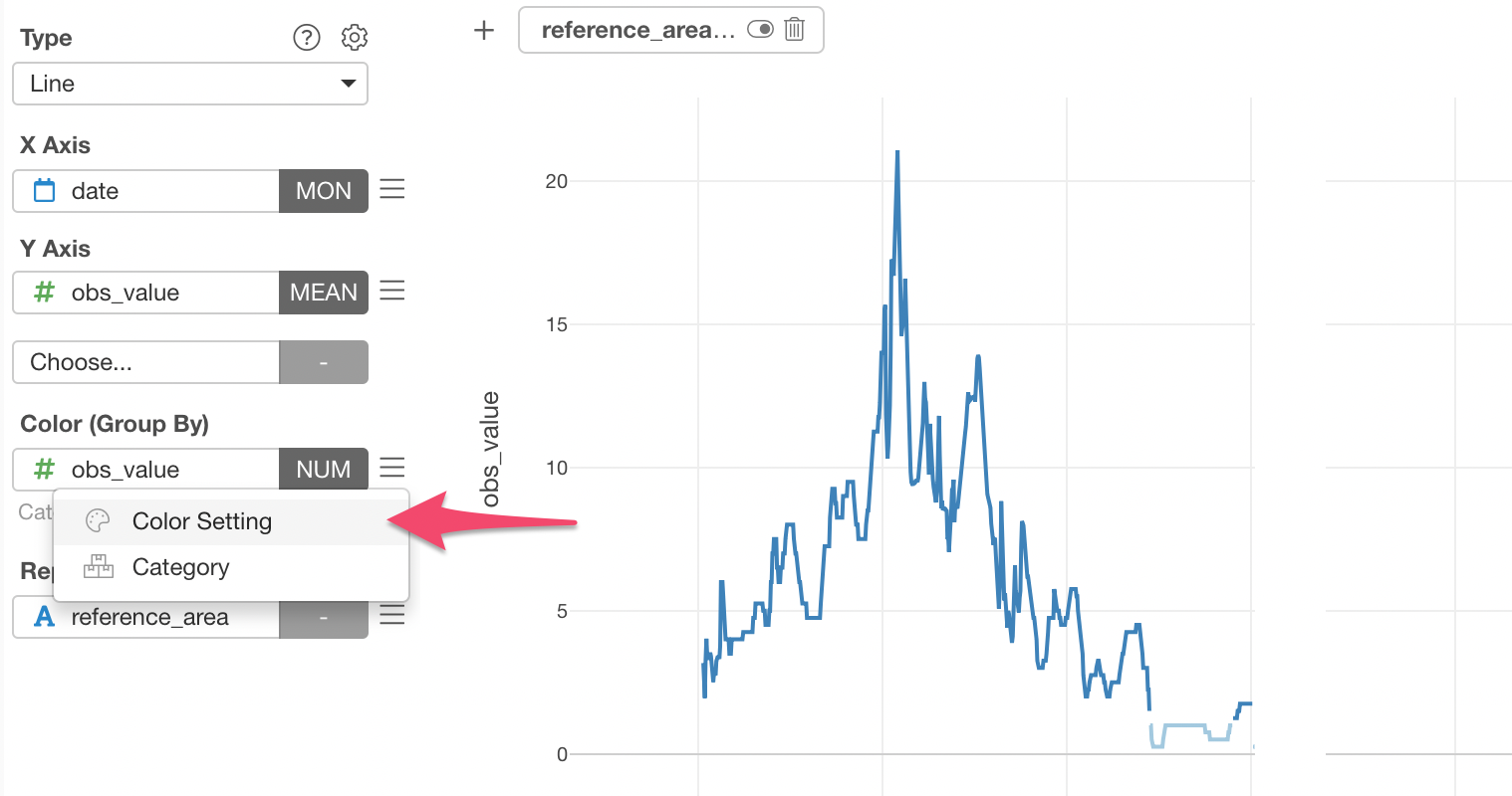
First, select the 'obs_value' column to the Color.
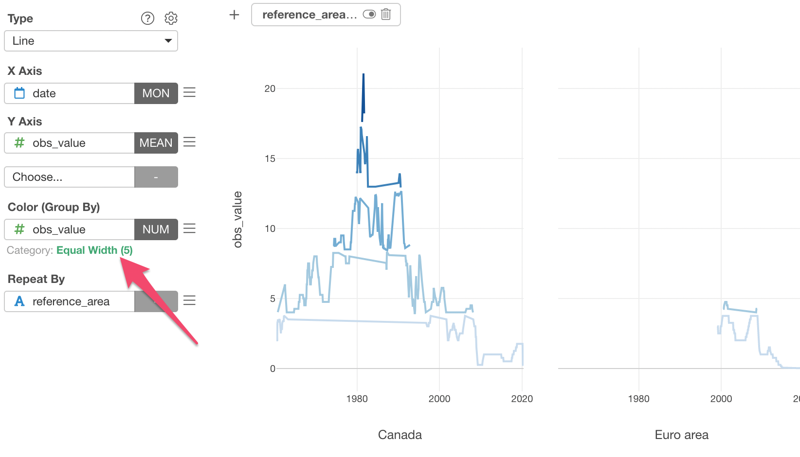
This will automatically categorize the numeric values into 5 groups (categories) with 'Equal Width' method.
But, this is not what we want. We want to categorize the interest rate values into the above 3 categories split by 0 and 1.
We can click on the green text of 'Equal Width (5)' to open the 'Category Setting dialog.
Inside the dialog, we can select 'Manual' for the Type, type 0 and 1 as the Cutting Points, then type the Label Text for those 3 groups.
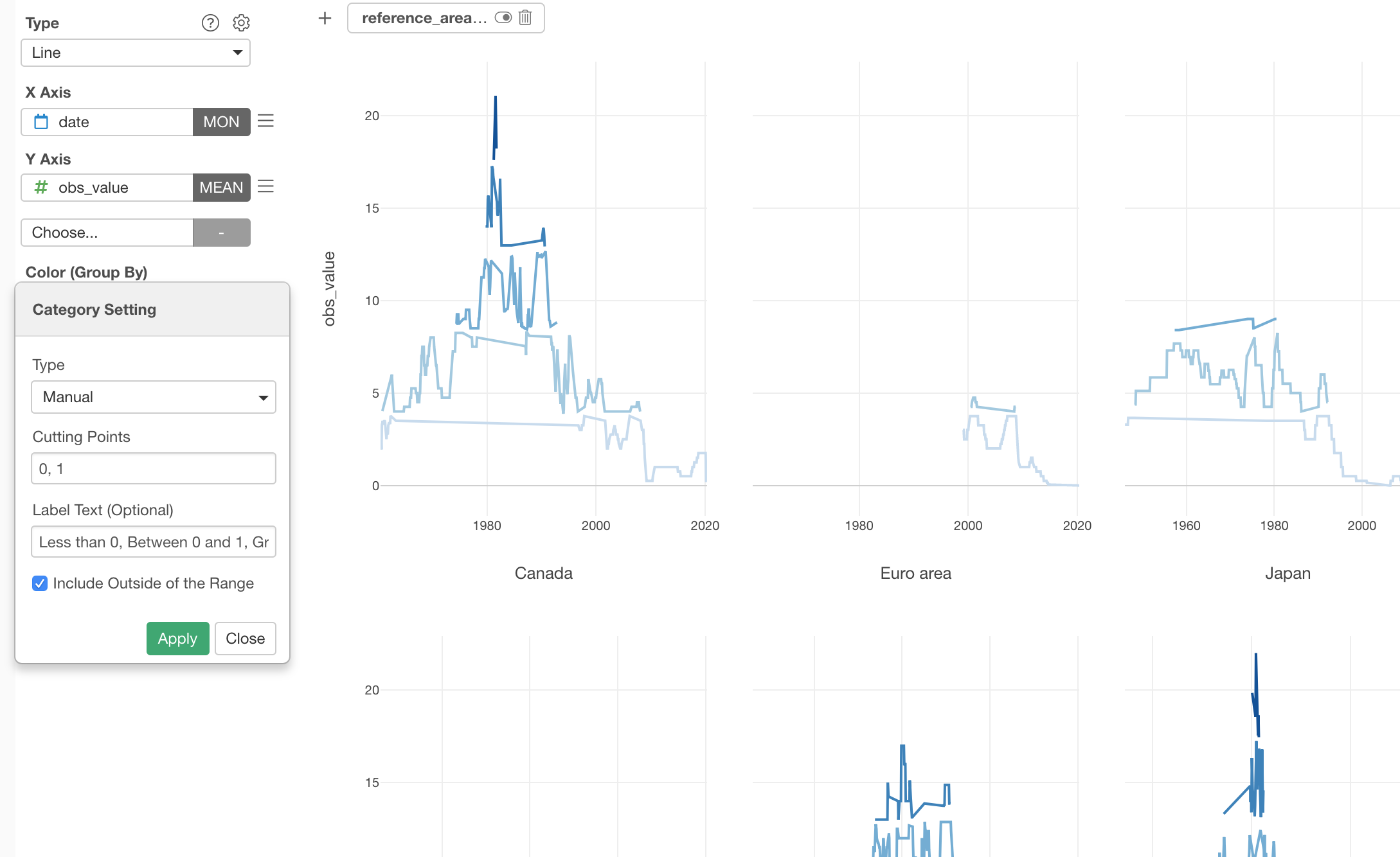
Now it uses different degree of blue colors for the each group.
Now, do you notice there is something weird going on especially with the lightest blue lines?
Let’s take a look at the United States at the right hand side bottom.
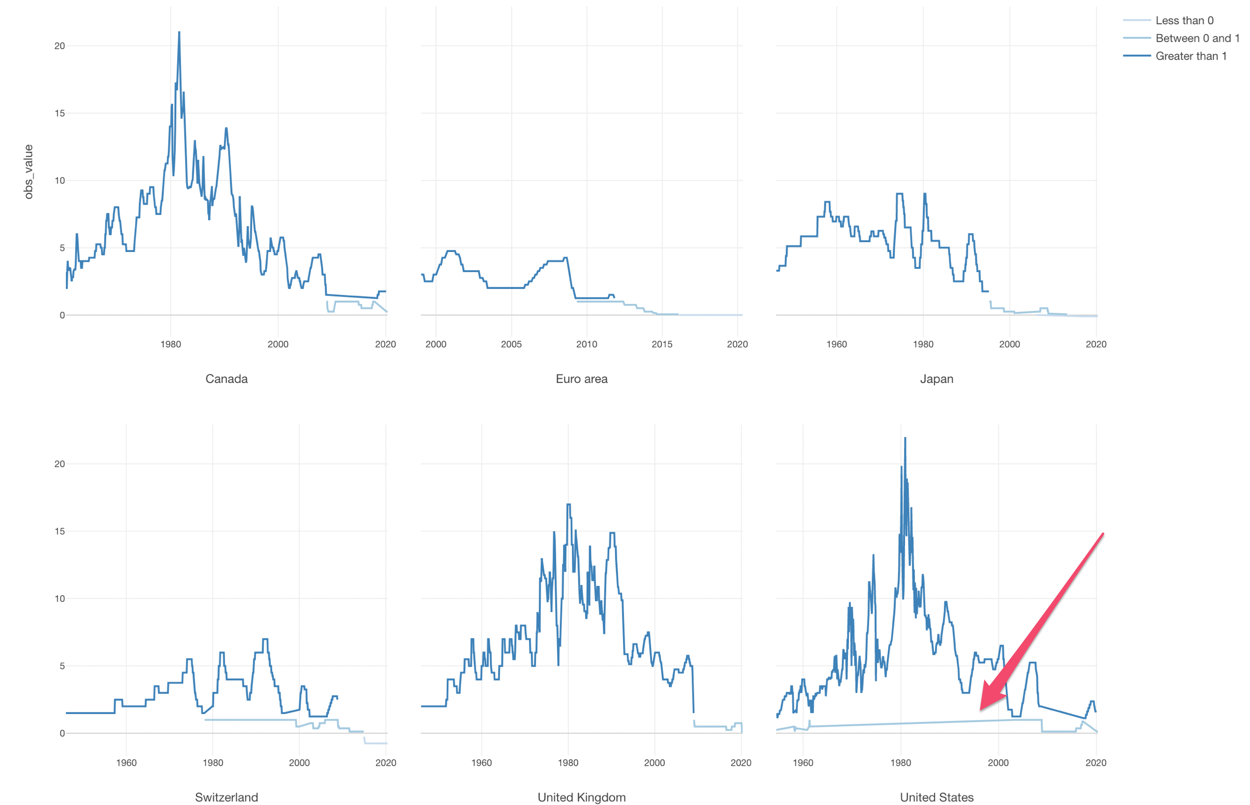
The problem here is that in most of the times the interest rates are greater than 1, but there are some brief periods around 1960 and after 2000 where the interest rates are actually between 0 and 1.
The Line chart tries to connect the available data points, so for example, when you have data only for 2000, 2017, and 2018, then you will end up having a line that connects those 3 data points ignoring the years between 2000 and 2017.
But here, that's now what we want.
We can address this problem by explicitly telling Line chart what to do with those ‘empty’ data periods.
4.4 Handle Missing Values in Chart
You can configure how to deal with Missing Values in the chart.
Select Missing Value Handling from the configuration menu for Y-Axis.
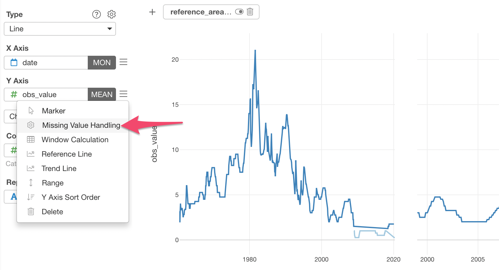
And select Fill with NA.
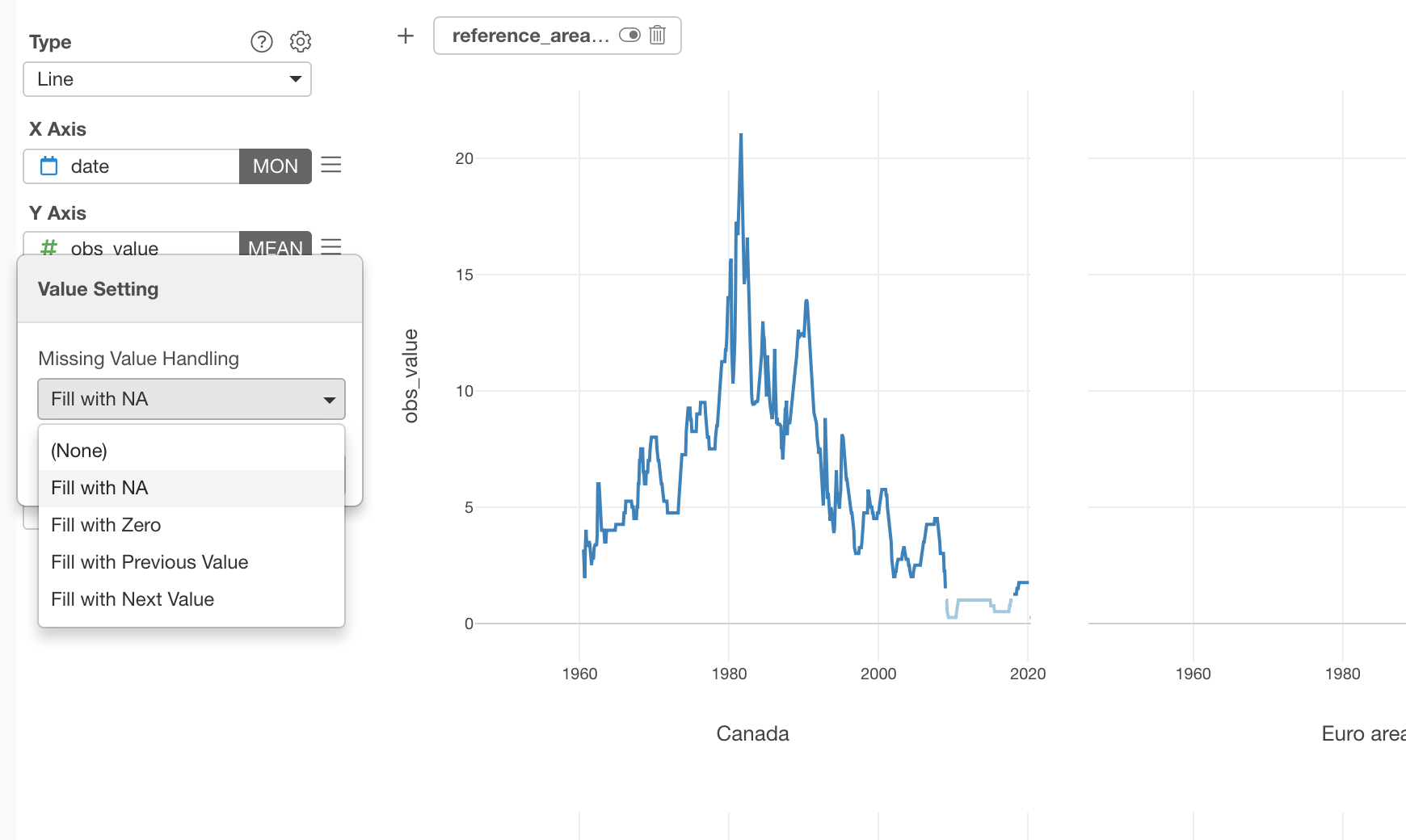
This will make the lines not connect through the ‘empty’ period.
Now the orange lines are not trying to connect with one another!
There is one last thing I want you to try.
Here, we are trying to high light the negative interest rates. Having the blue gradient colors (lighter to darker) is not really helping to highlight that.
Well, we can change the color!
4.5 Change the Color Palette
Open Color Setting dialog by selecting the Color Setting menu.
And switch to whatever the pre-registered color palette. This time, I'm selecting the Palette 1.
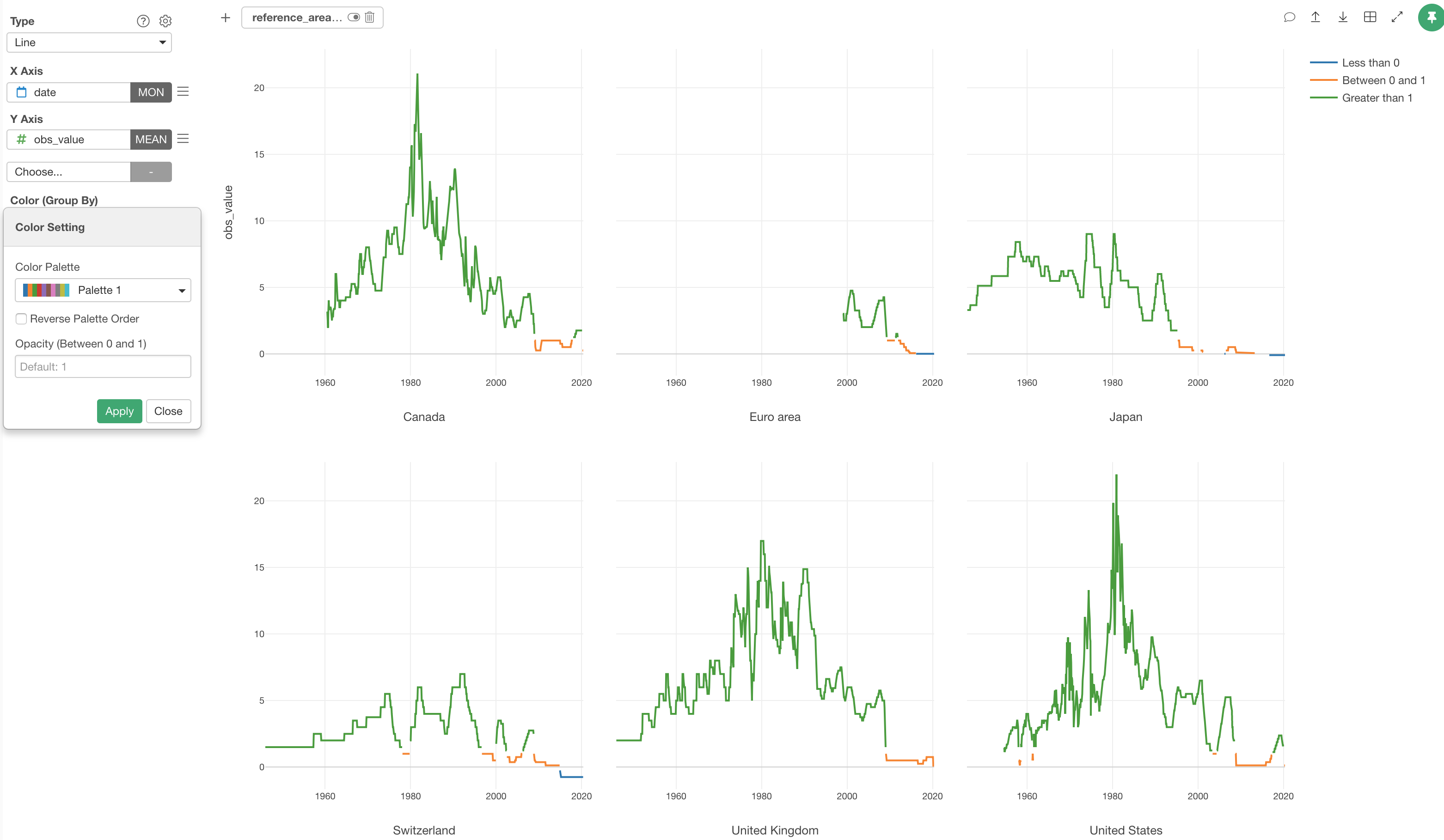
You can create your own Color Palette, if you like.
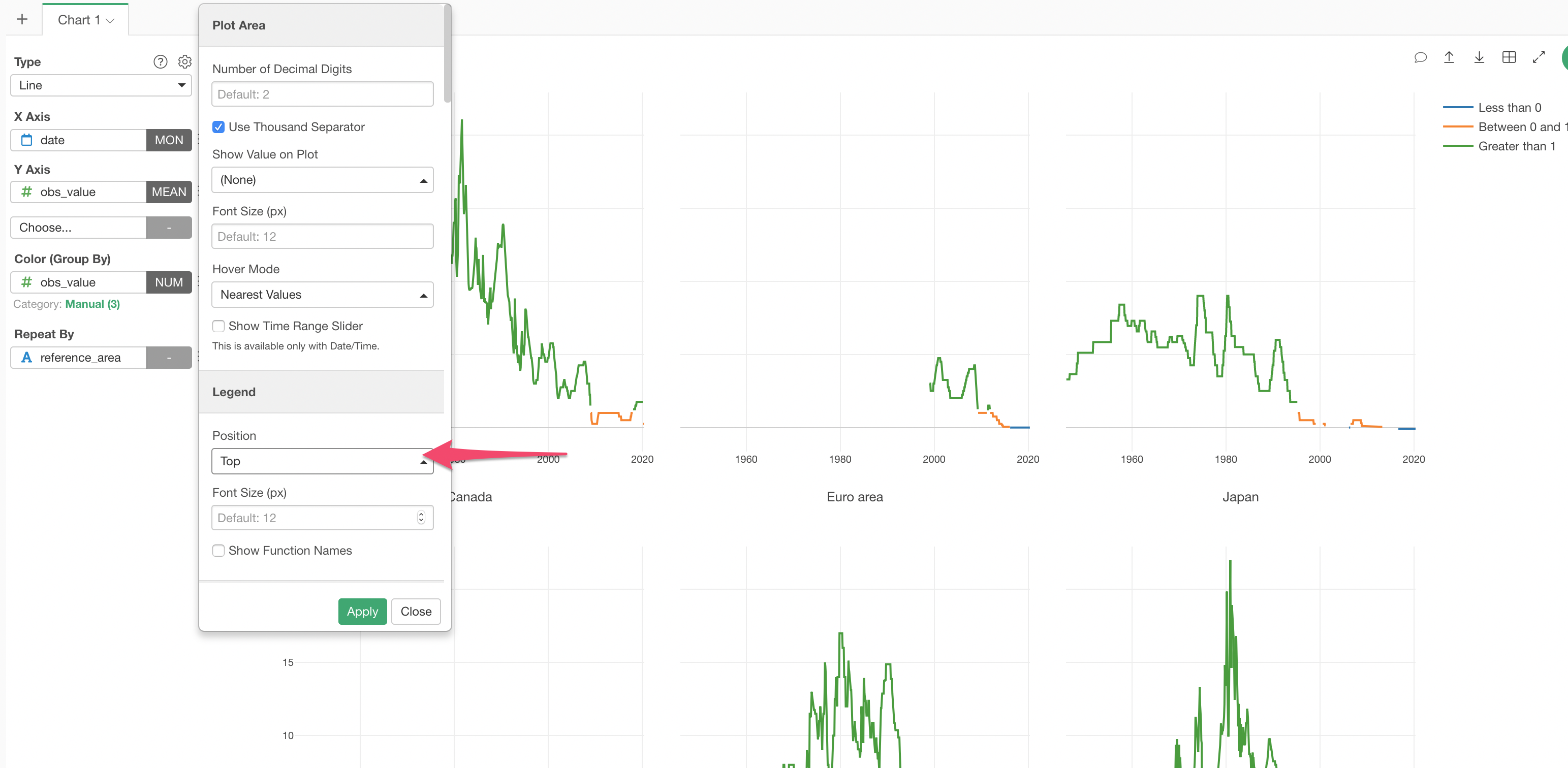
4.6 Change the Legend Position
And let’s move the Legend position to the top from the Property dialog.
And here it is. The history of the interest rates for the 6 developing countries and regions are visualized with 3 colors highlighting when they went to the negative, if any.
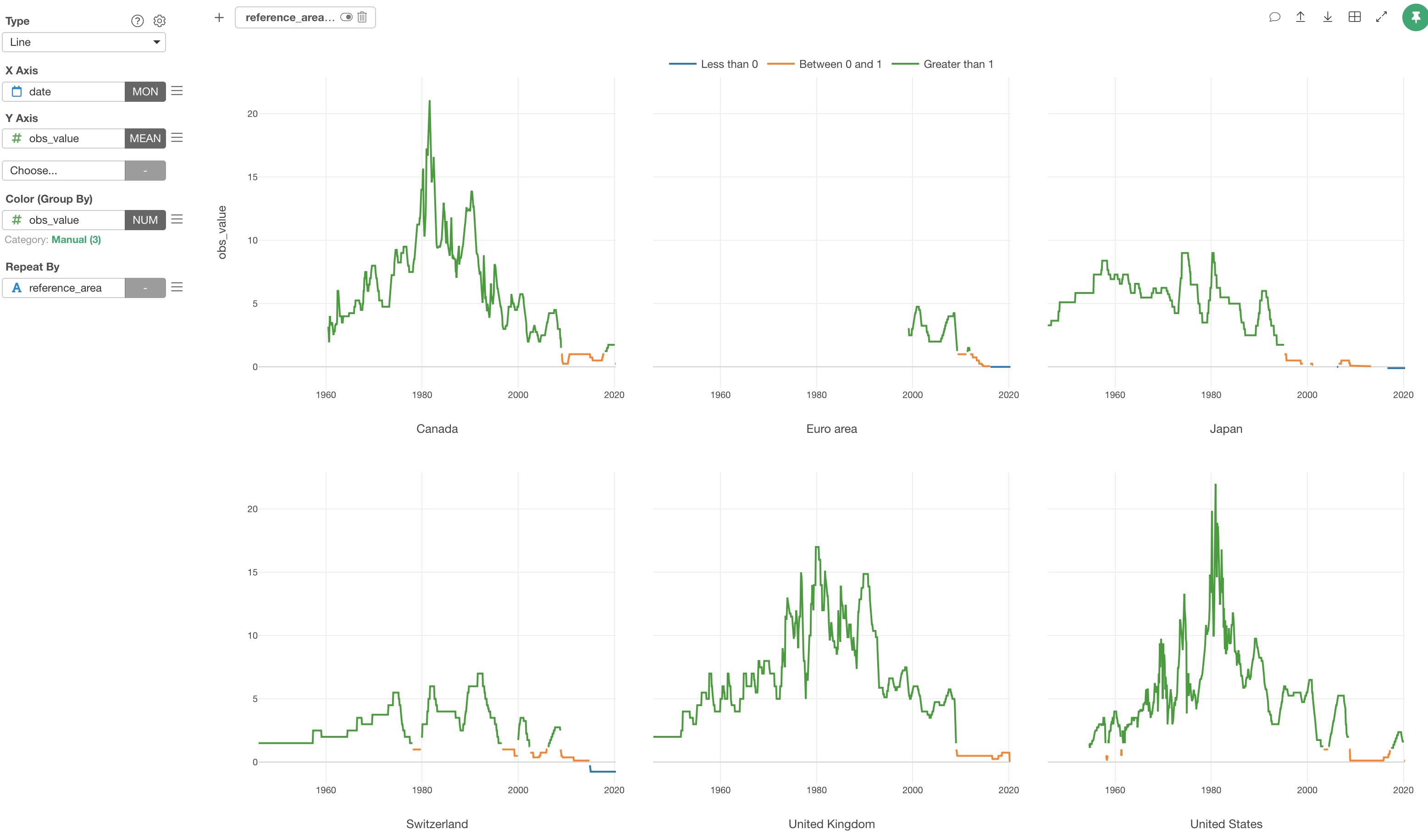
We can see the interest rates being negative in Japan and Switzerl and 0 in Euro in the recent years.
And interestingly enough, in the United States and Canada, the interest rates are relatively higher than the other countries and regions.
Now, you know where you want to keep your money. Note that this is the rate for the central banks, not the commercial banks, but they tend to influence your banks as well!