Create Weighted Histogram Manually
Histogram is to create evenly spaced bins for a given numerical variable and have them at X-Axis and show the number of the rows that fall into each bin at Y-Axis.
But sometimes, you might want to show something else other than the counts for the Y-Axis. This is called Weighted Histogram.
Here, I’ll explain how you can create Weighted Histogram in two scenario.
The first is to give another variable as weight, which means that you can show the calculated value of another variable for each bin.
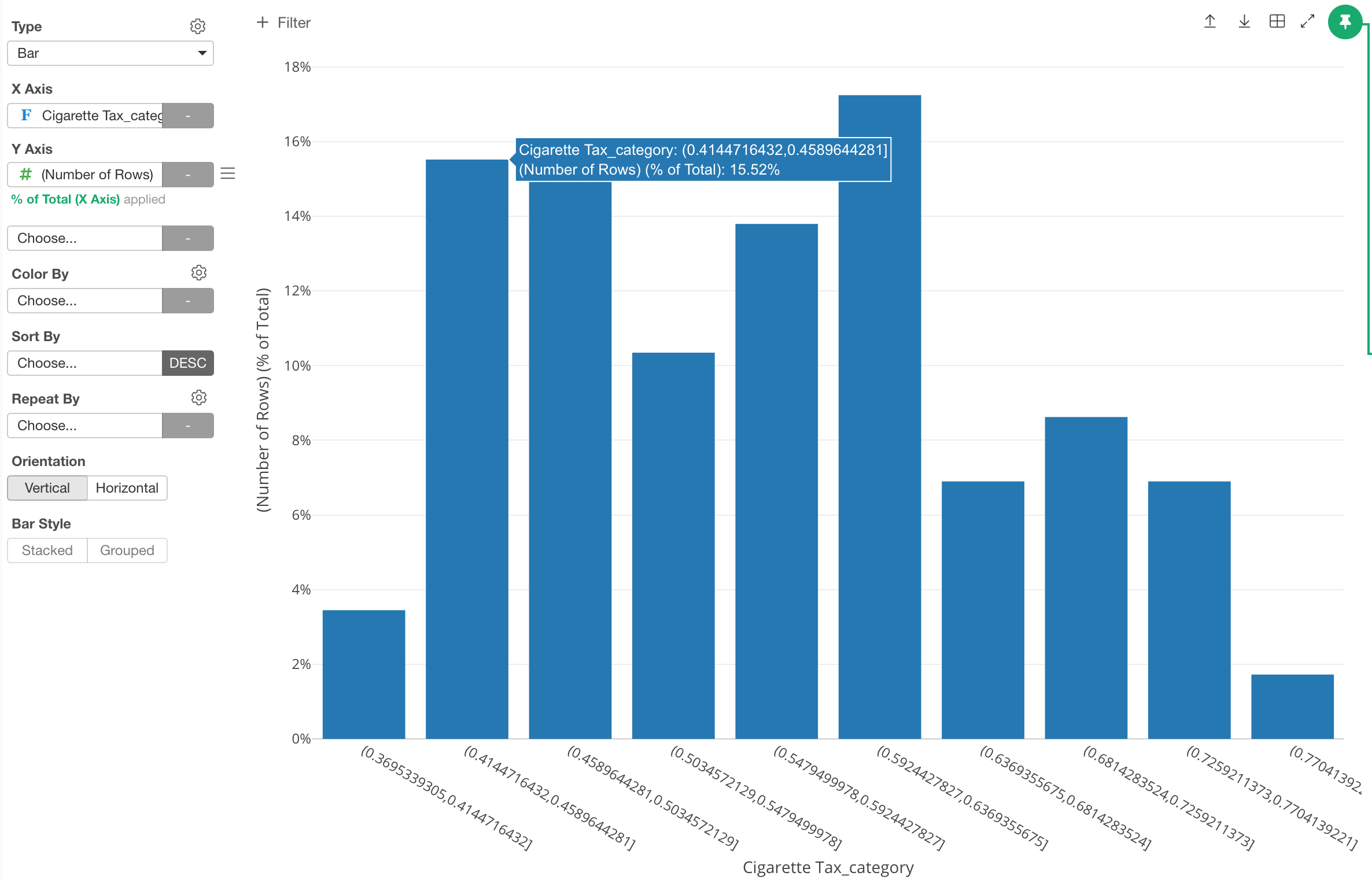
The second is to show the ratio of each bin rather than the raw count.
1. Give weight to each observation instead of counting as 1 by using another variable
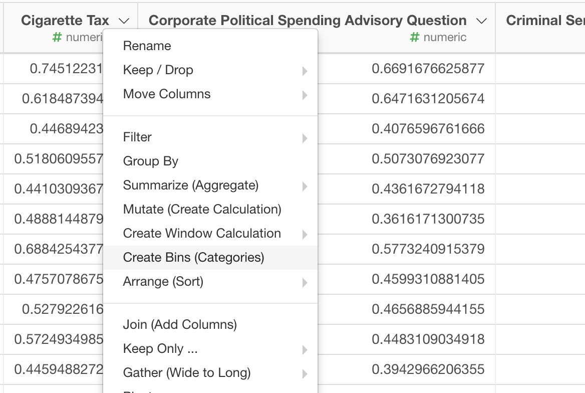
Select ‘Create Bins (Categories)’ from the column header menu of the numerical variable you want to work on.
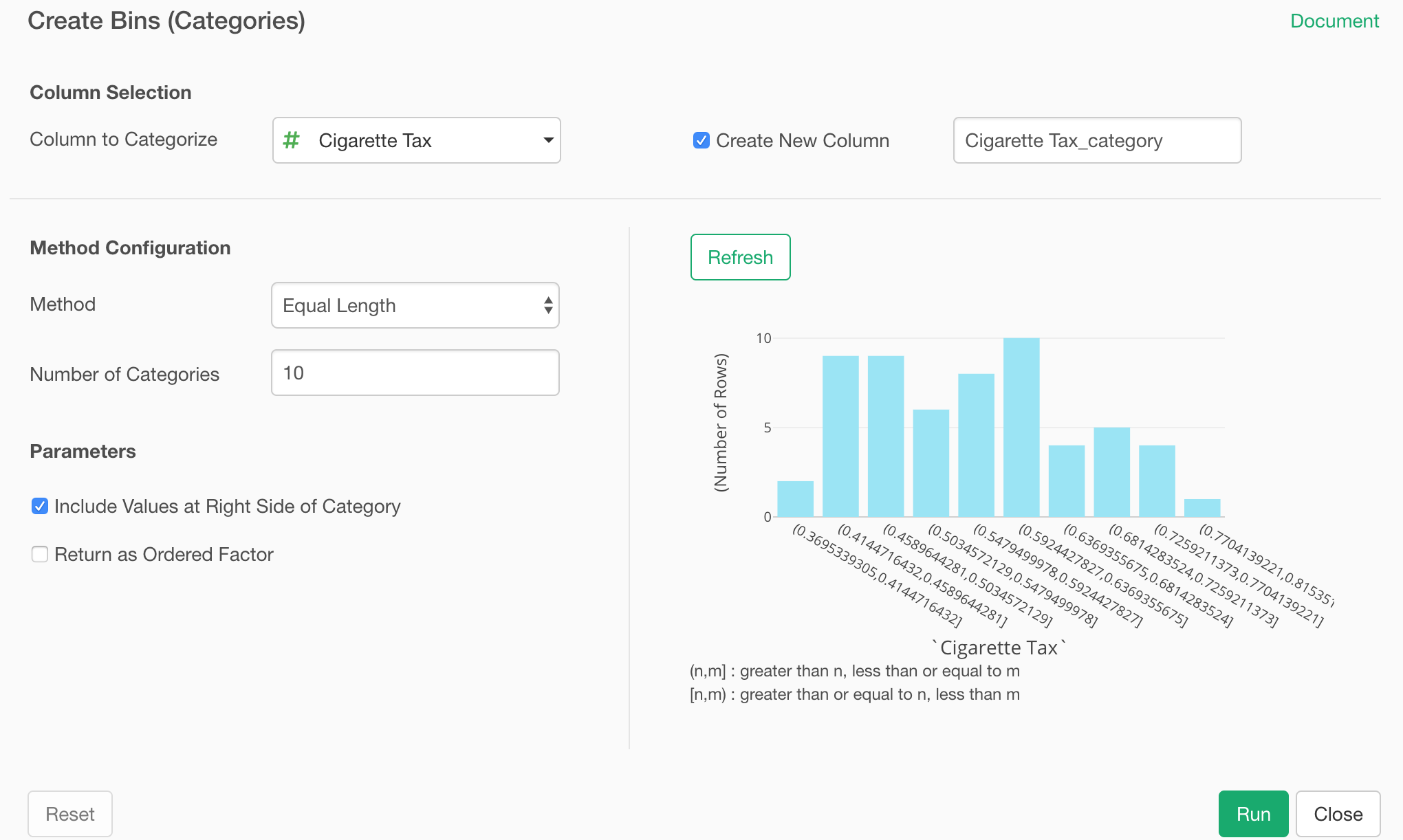
Set up how you want to categorize the numerical variable. Here, I’m setting the number of the bins (buckets) to be 10.
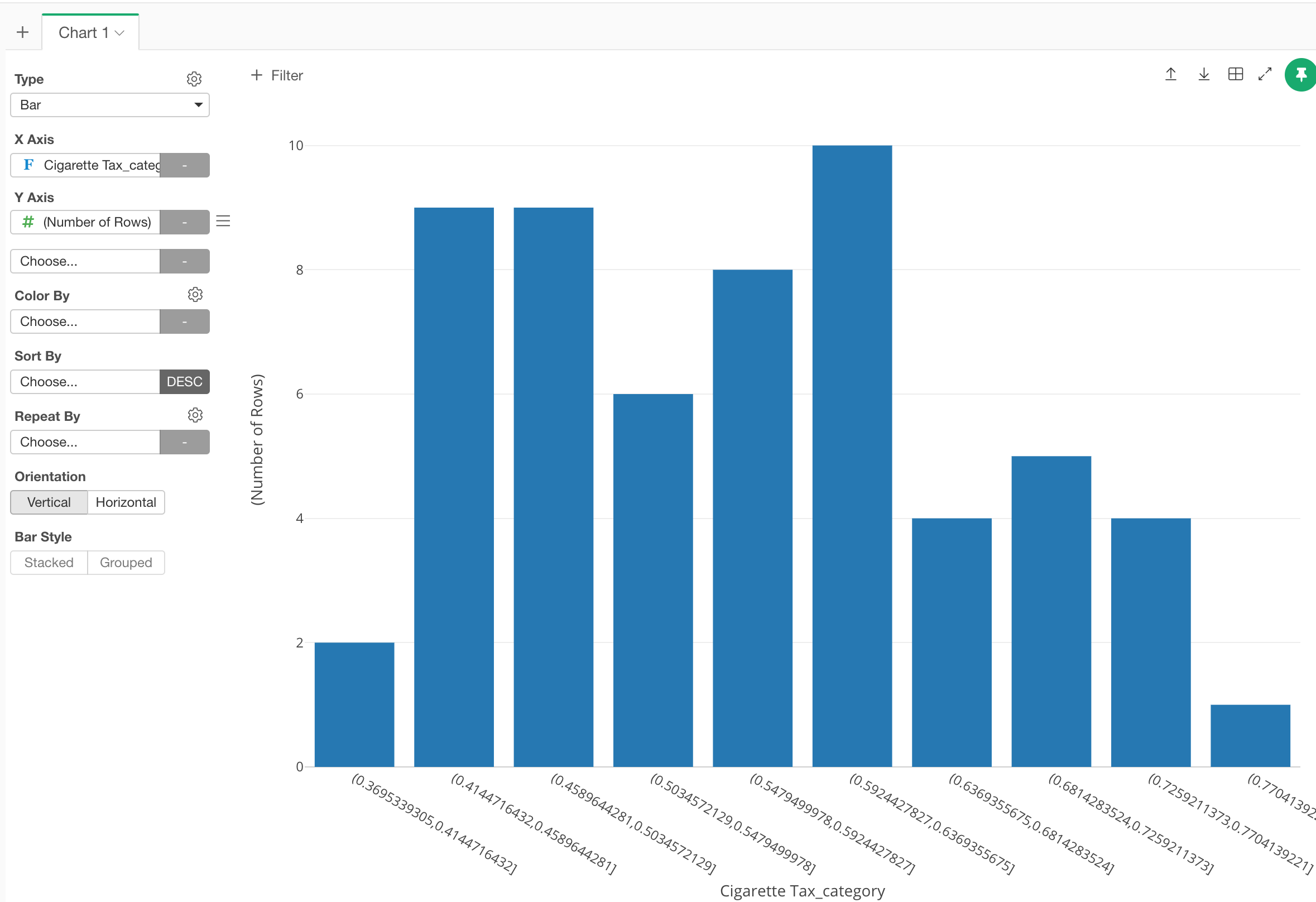
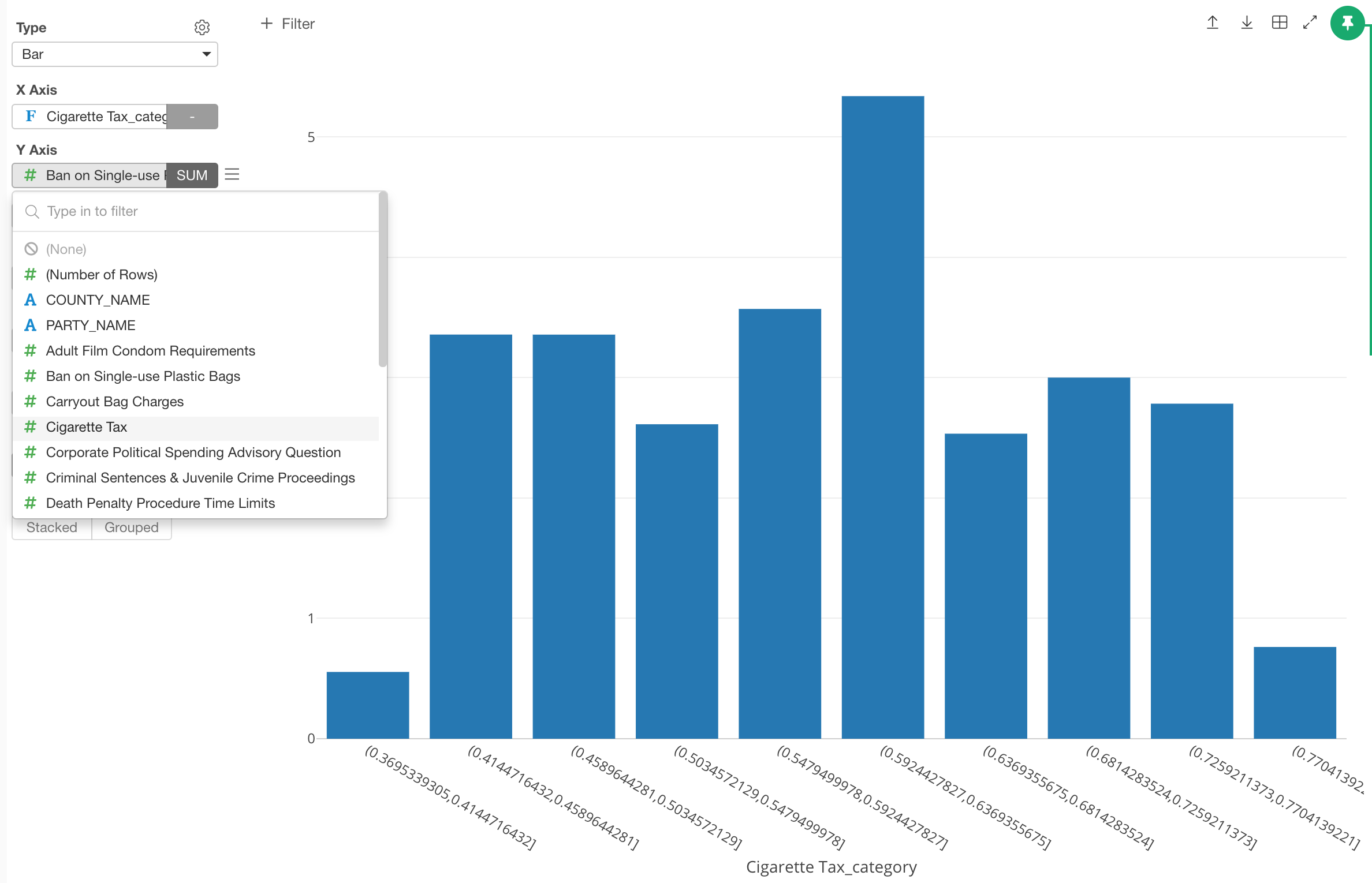
Then, you can use Bar chart, assigning the newly created categorical variable to X-Axis.
Now you can assign any column for Y-Axis and set a proper aggregation function.
2. Show the ratio of each bin
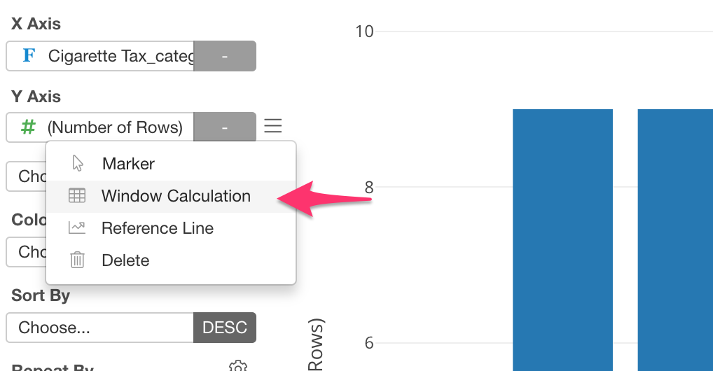
You can do this simply by using Window Calculation feature inside the chart.
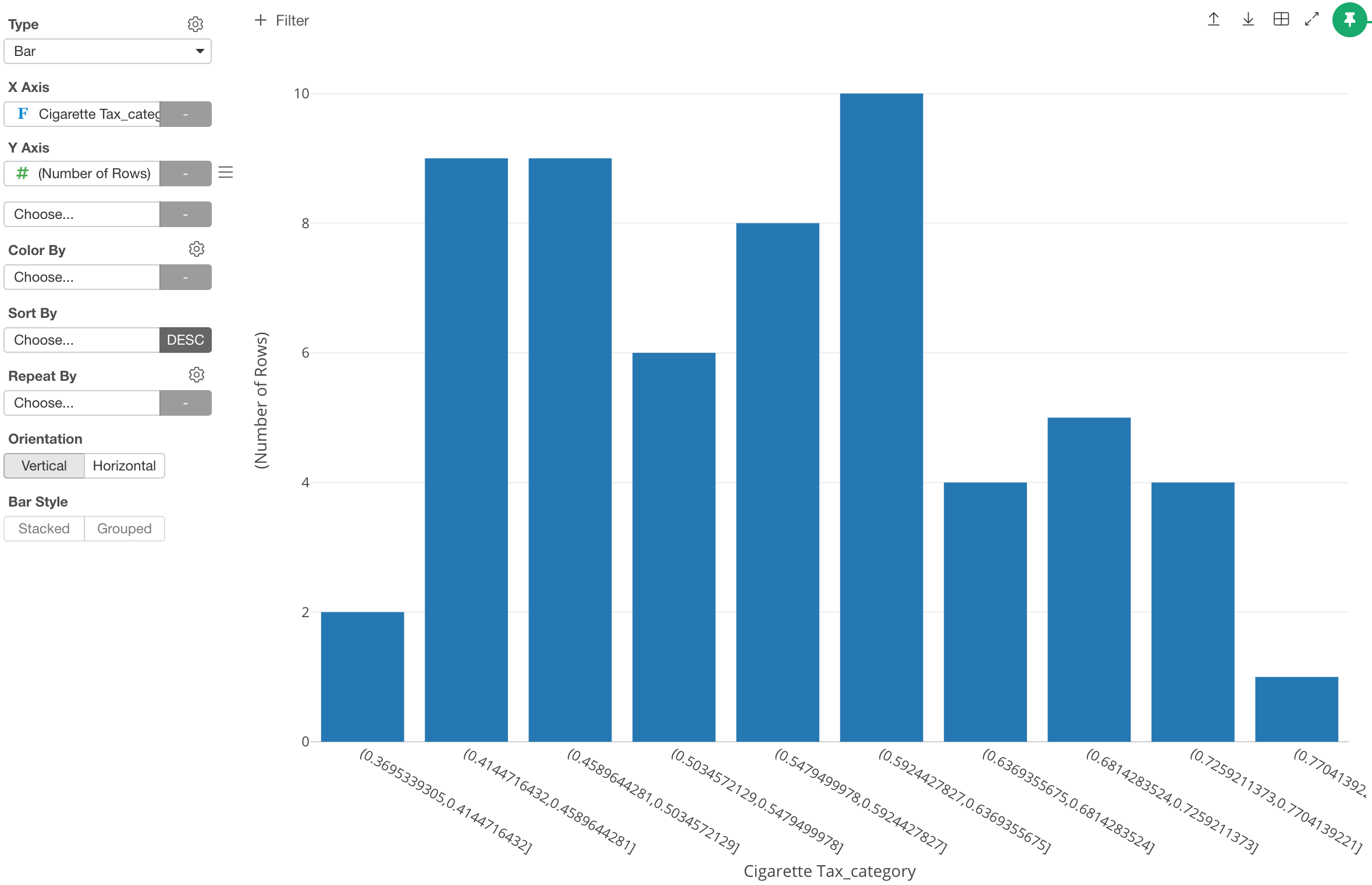
Make sure to assign the bin column to X-Axis and ‘Number of Rows’ to Y-Axis for a bar chart like below.
Then select ‘Window Calculation’ from Y-Axis’s more menu.
Select ‘% of’ as the calculation type.
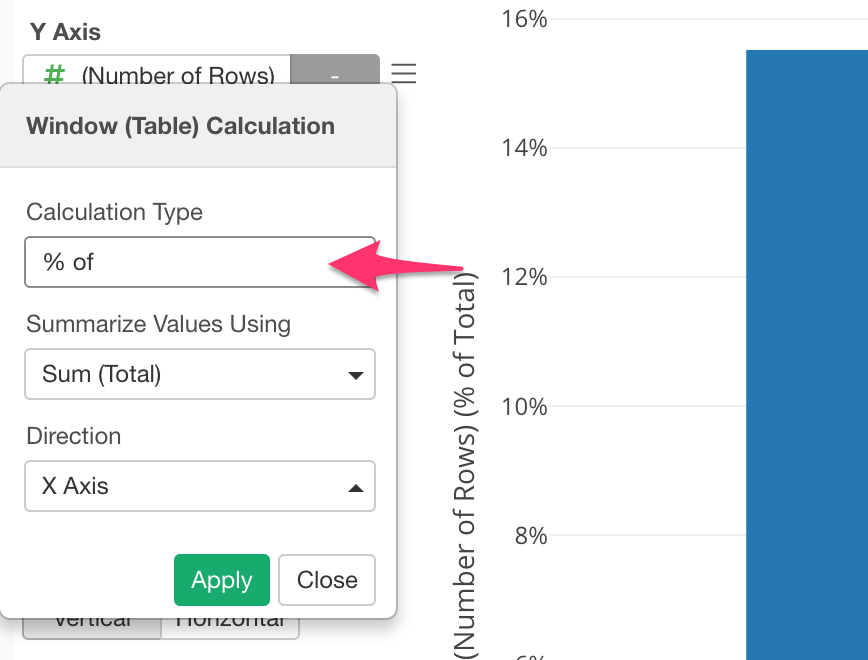
Now the Y-Axis is howing the ratio rather than the original count numbers.