Google Analytics: Visualize Sessions by Day & Hour with Heatmap
Sometimes, we want to understand when the users are accessing our websites the most and want to see if there are any patterns.
One of the most effective ways is to use Heatmap chart and visualize the number of sessions by day (day of week) and hour.
The above is a heatmap from the Google Analytics' pre-build dashboard.
Now, here is the thing.
Most often, you want to see it at deeper levels by separating it by segments such as device type, country, weekend vs. weekday, etc. This is when you want to quickly import the data into Exploratory and flexibly visualize it with the Heatmap chart.
Let's take a look at how you can do it quickly.
Here are the 3 steps:
- Get the Session Data from Google Analytics
- Visualize it with Heatmap
- Split the Heatmap by Segment
1. Get the Session Data from Google Analytics
Select 'Cloud Apps Data' from the Data Frames menu.
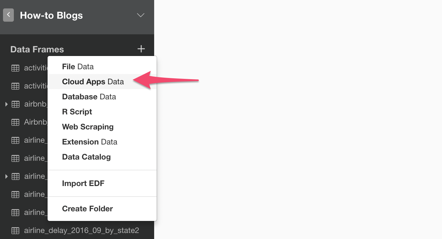
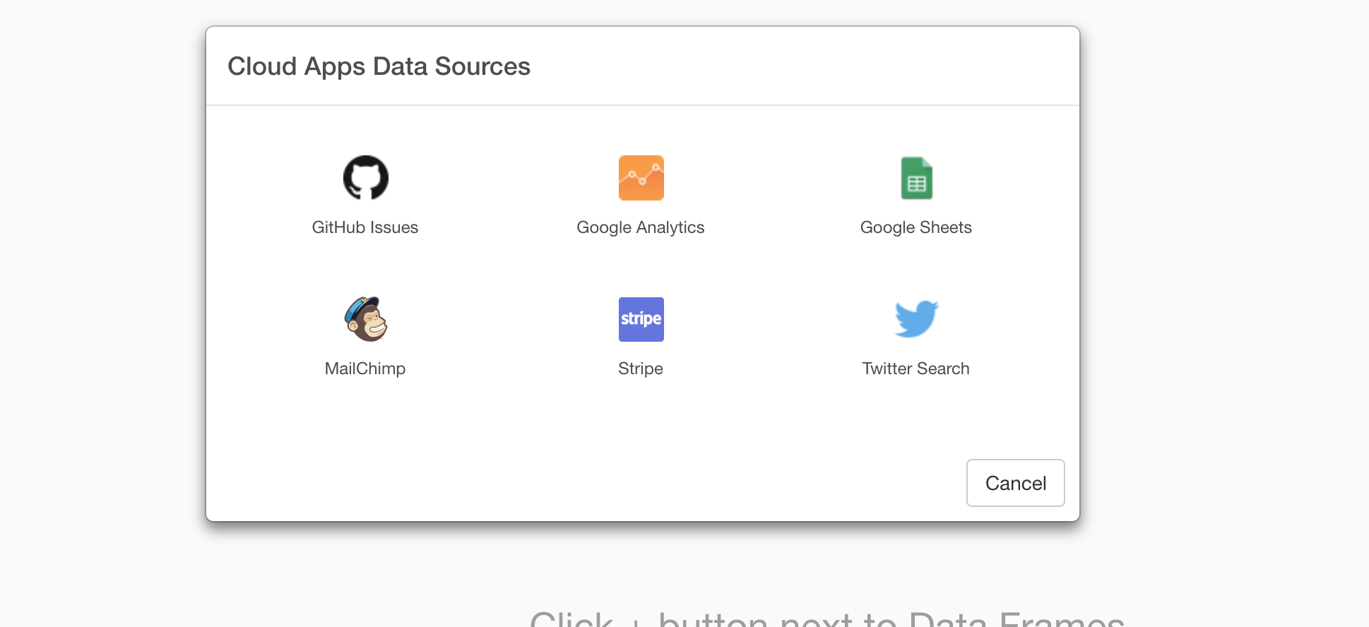
Select 'Google Analytics' data source.
Select the appropriate account, property, and view.

Select the period for data. This time, I'm selecting 'Last 1 Year'.
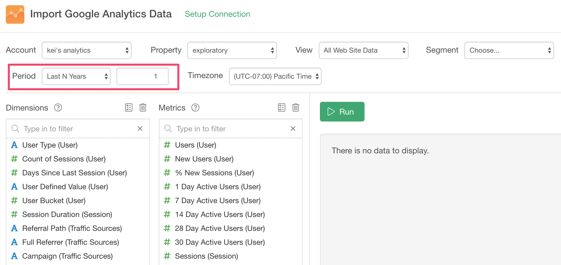
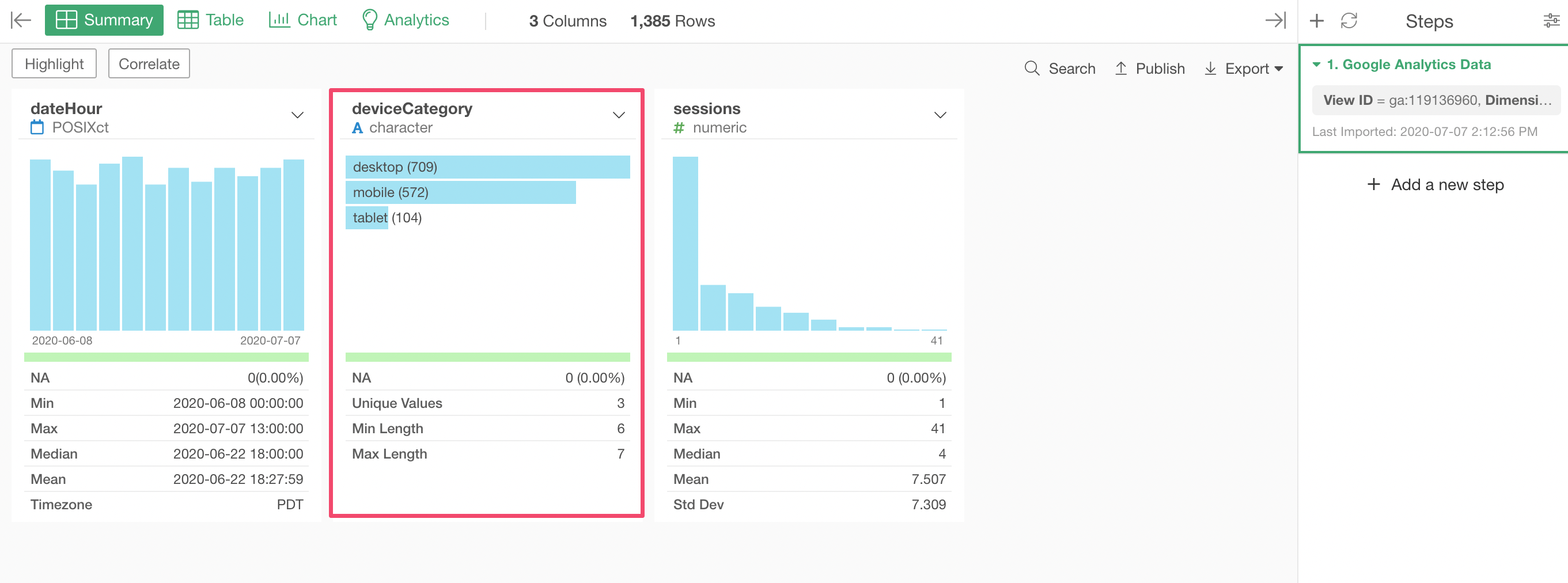
This time, we want to visualize the number of sessions by day and hour, so select 'Date/Hour (Hour)' for the Dimension and 'Sessions' for the Metric.
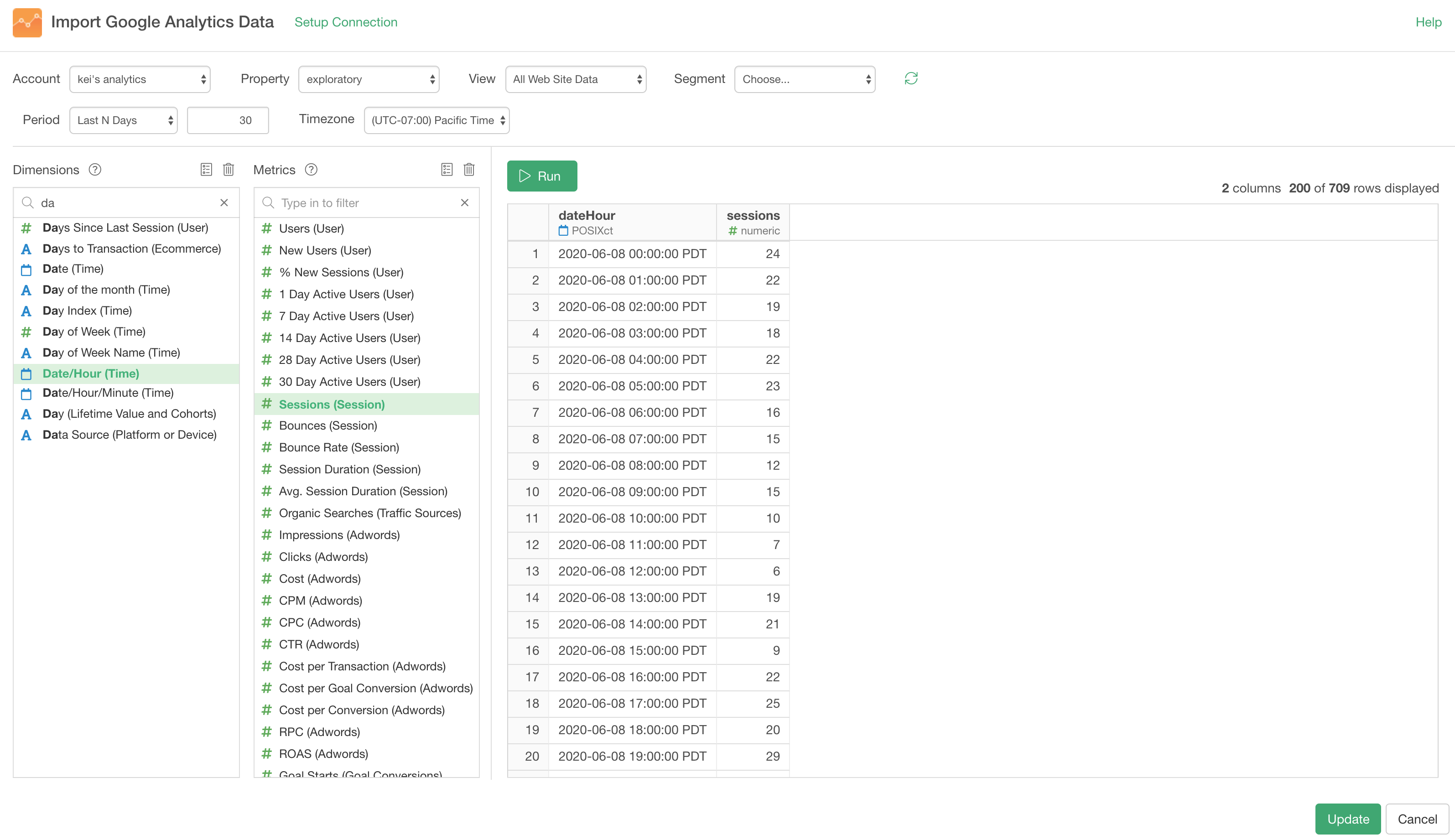
Note that you want to make sure the appropriate timezone, which you want to see the data with, is selected.
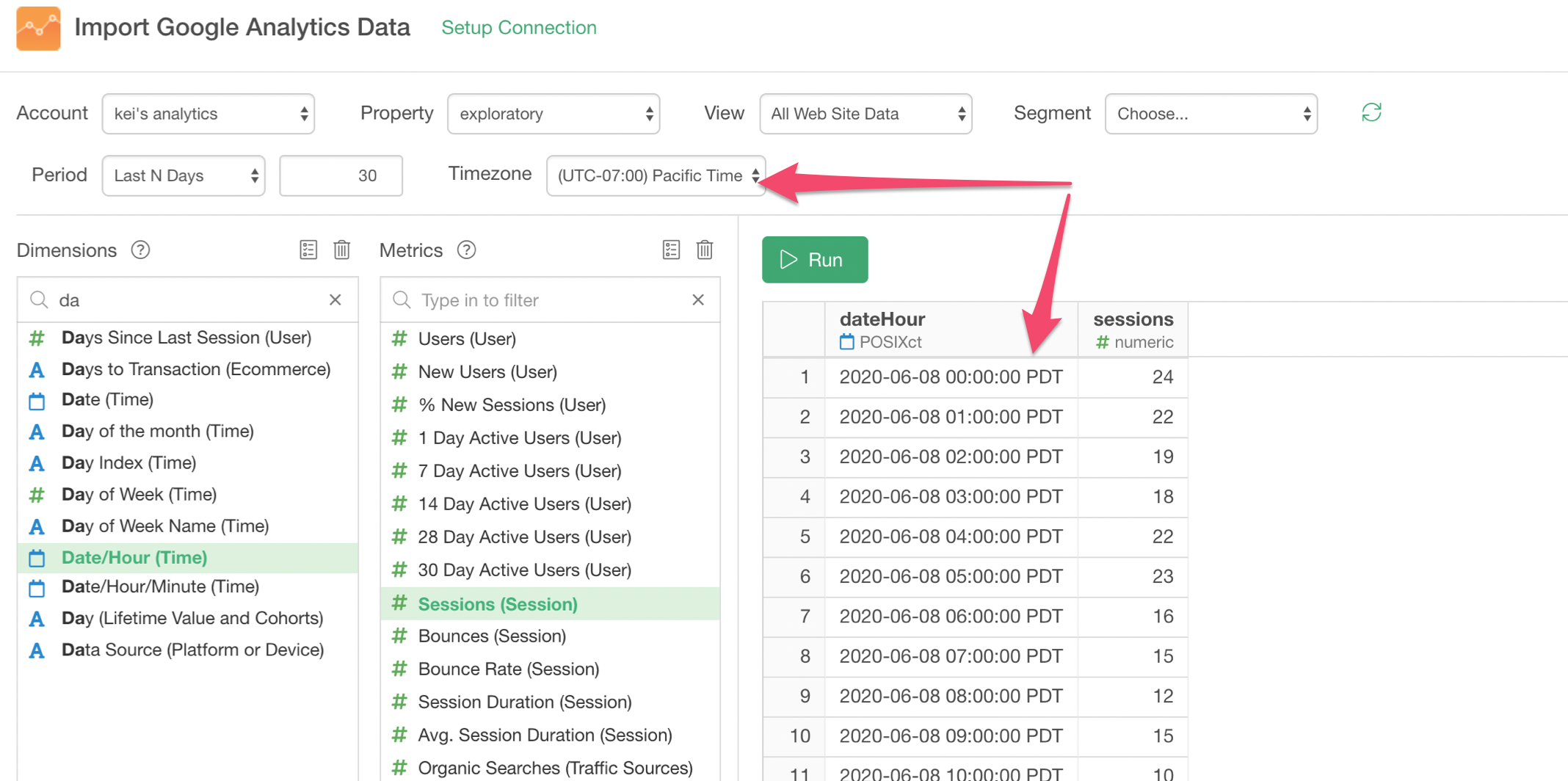
Once you click the 'Save' button the data will be imported and show up with the Summary view.
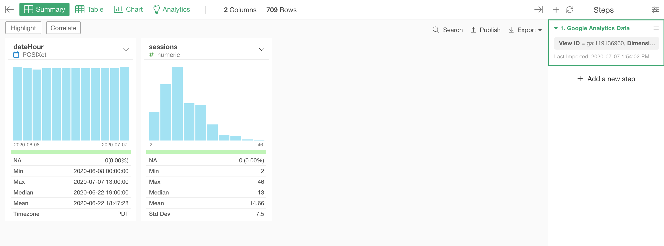
It's time to visualize!
2. Visualize it with Heatmap
Go to the Chart view and select the Heatmap chart.
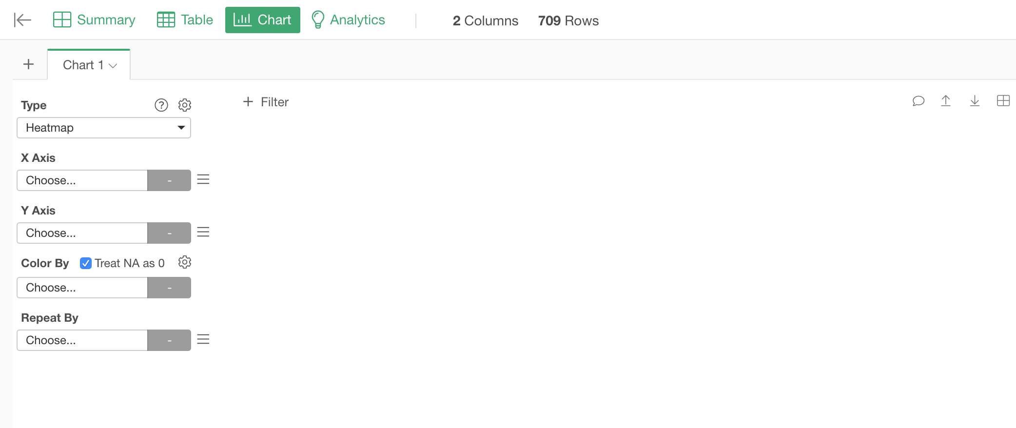
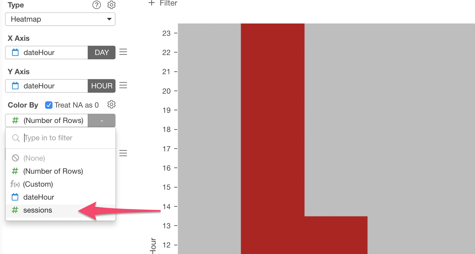
Select the 'dateHour' column for the X-Axis and select 'Day of Week' as the aggregation level.
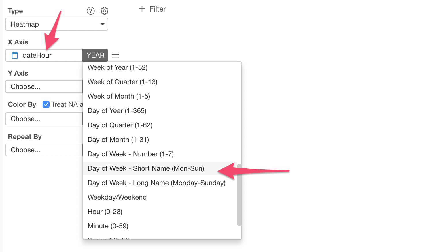
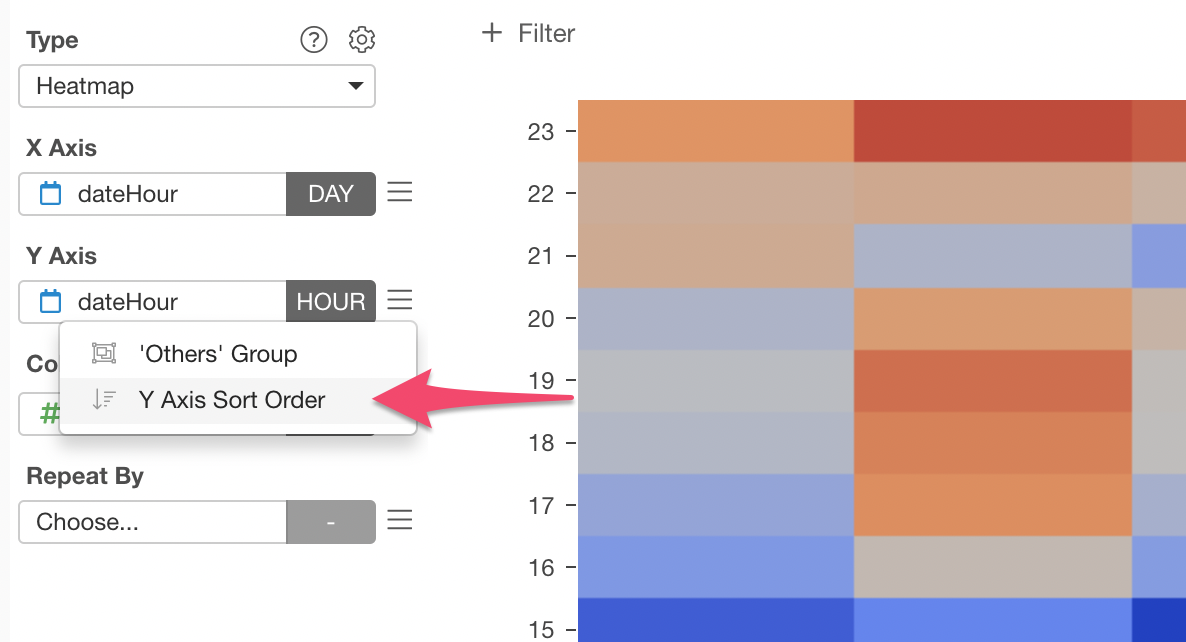
Select the 'dateHour' column for the Y-Axis and select 'Hour' as the aggregation level.

Finally, select the 'sessions' column for Color.
Here is the Heatmap.
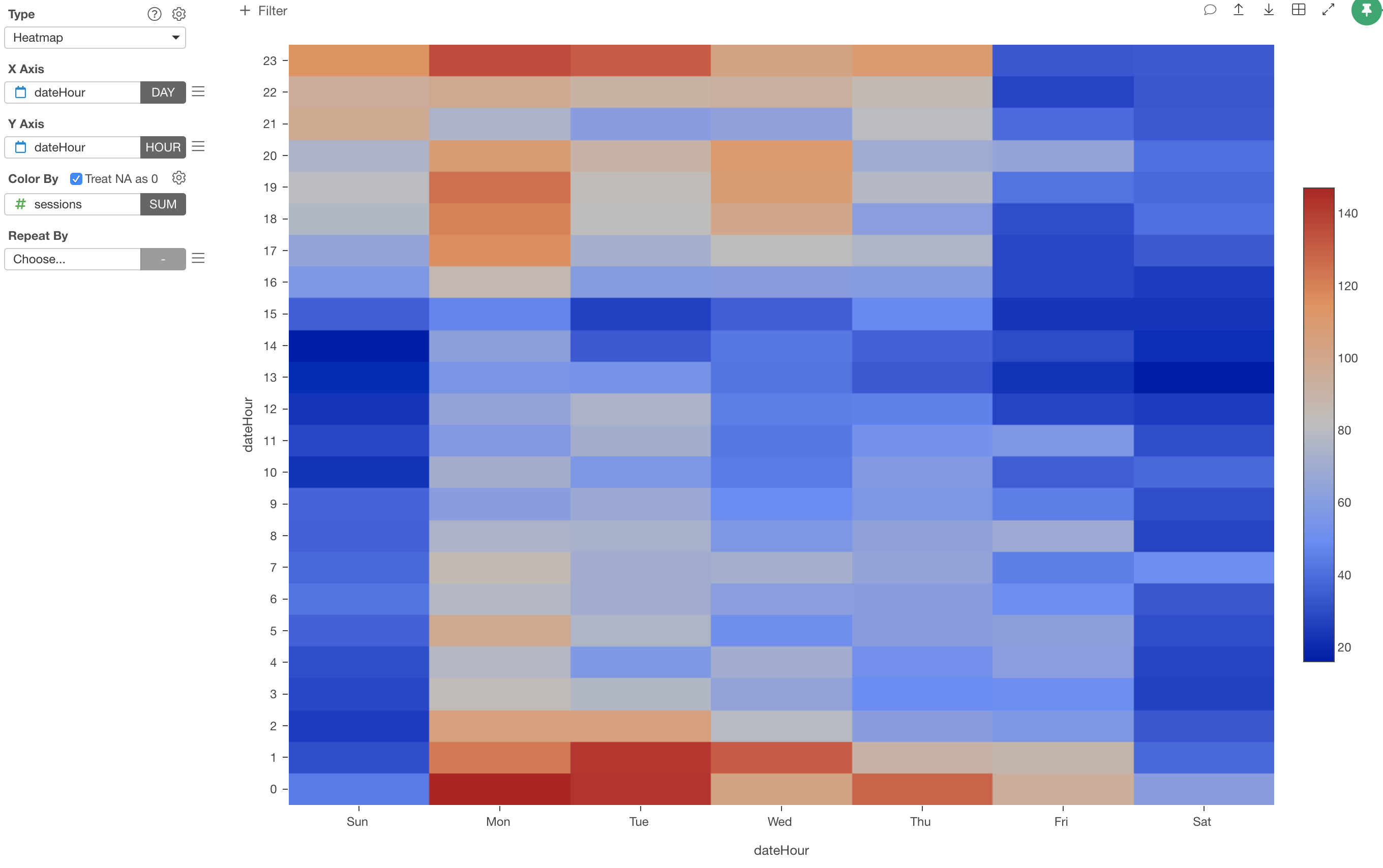
Now, here is one problem.
If you use your schedule in Calendar app, you are used to seeing the hours starting from the top to the bottom. But this Heatmap is showing that in the opposite way.
Good news. You can change it easily.
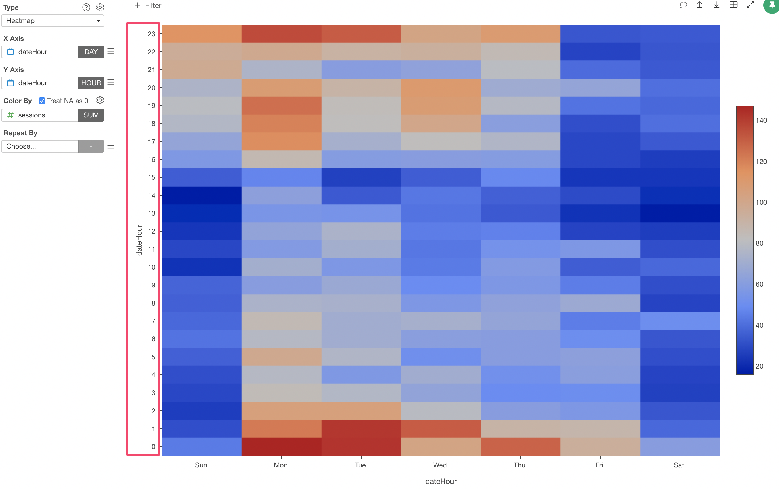
Select 'Y Axis Sort Order' from the Y-Axis menu.
Switching to 'Top to Bottom' makes the hours starting from the top to the bottom.
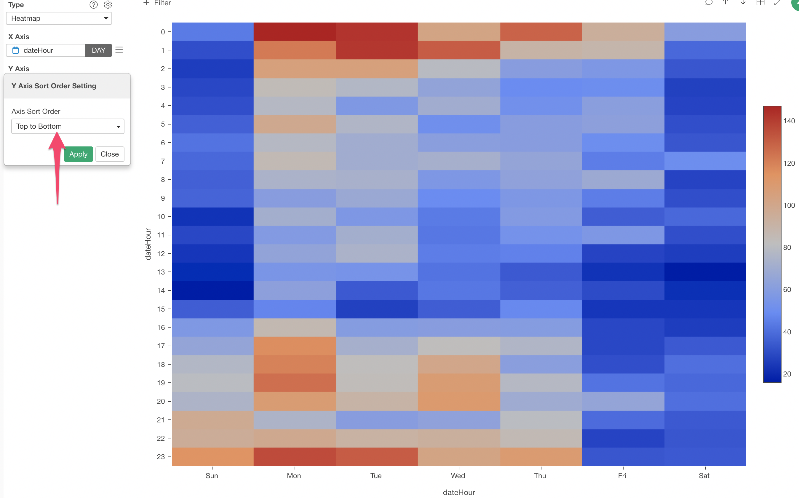
We can see that many site visitors come to this website around midnight between Sunday to Thursday.
3. Split the Heatmap by Segment
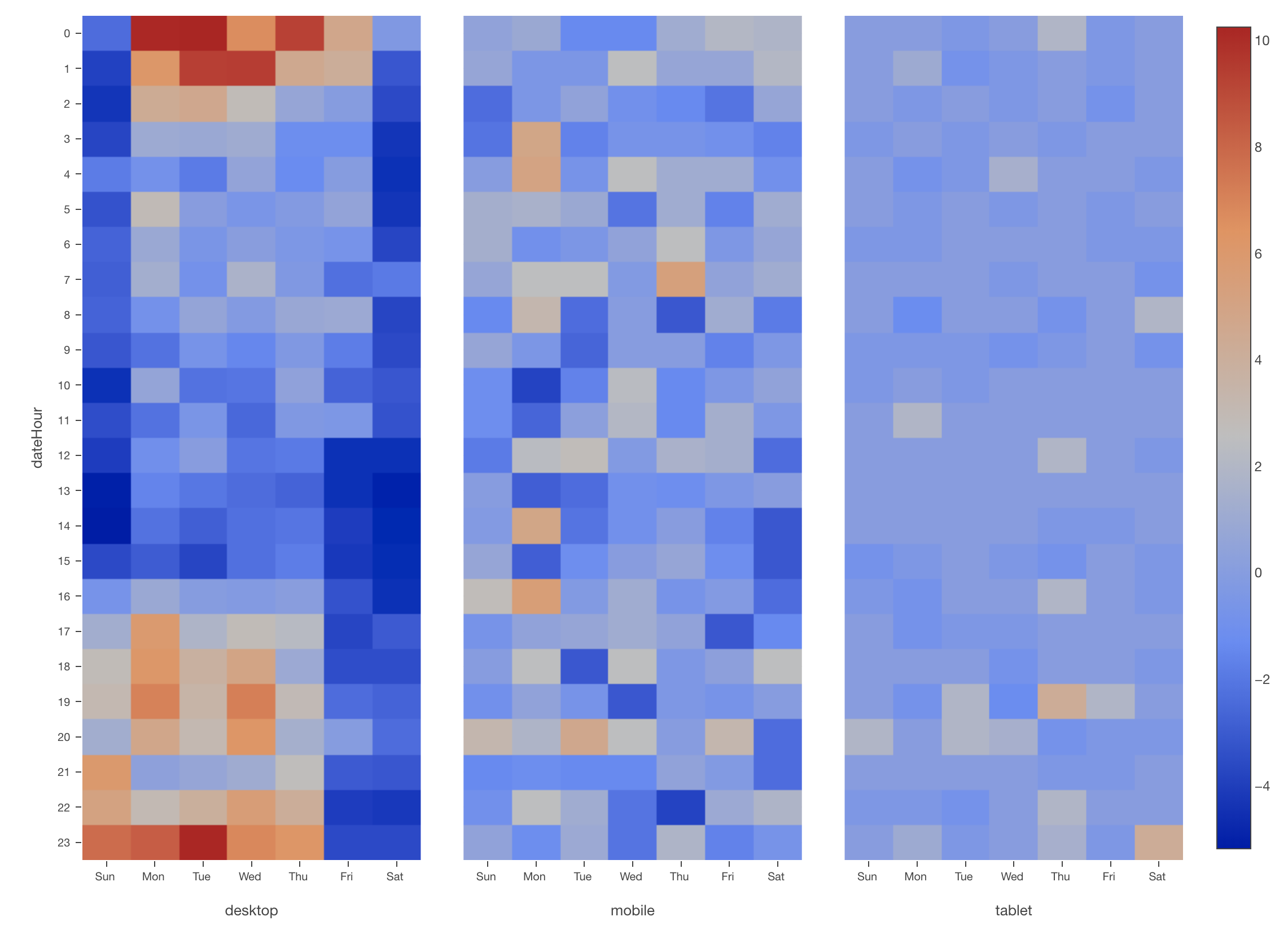
Now, we want to see this Heatmap for each segment of our interest. Let's say we are interested in seeing the user access pattern by the device type (mobile vs. PC).
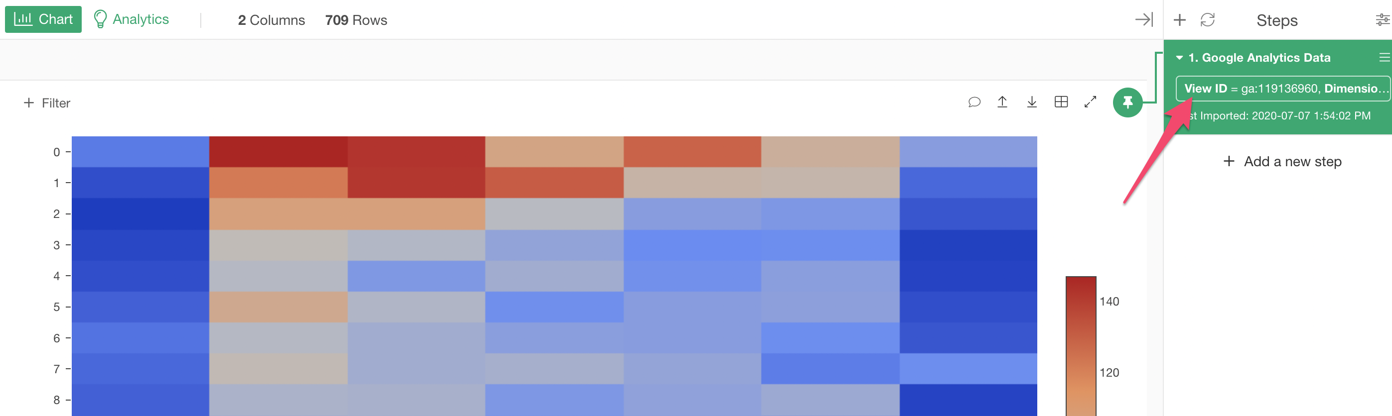
For this, we can query the device type from Google Analytics first.
Click on the token inside the data source step to open the Google Analytics data import dialog.
Select 'Device Category' under the Dimensions and click the Run button.
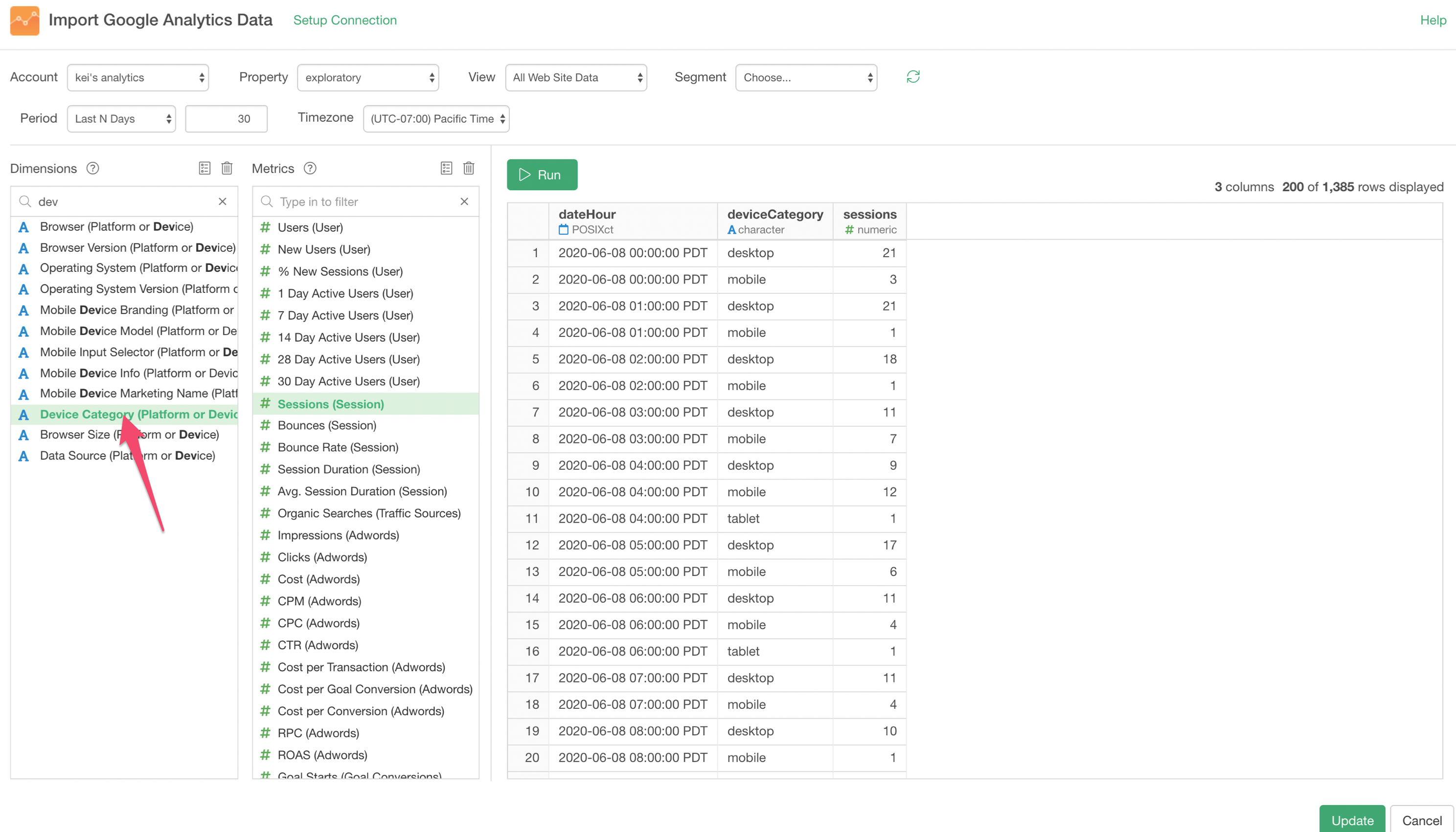
Click the 'Update' button to import this data.
When you go to the Summary view you can see that there are 3 device types.
Go back to the Chart view and assign the 'deviceCategory' column to 'Repeat By'.
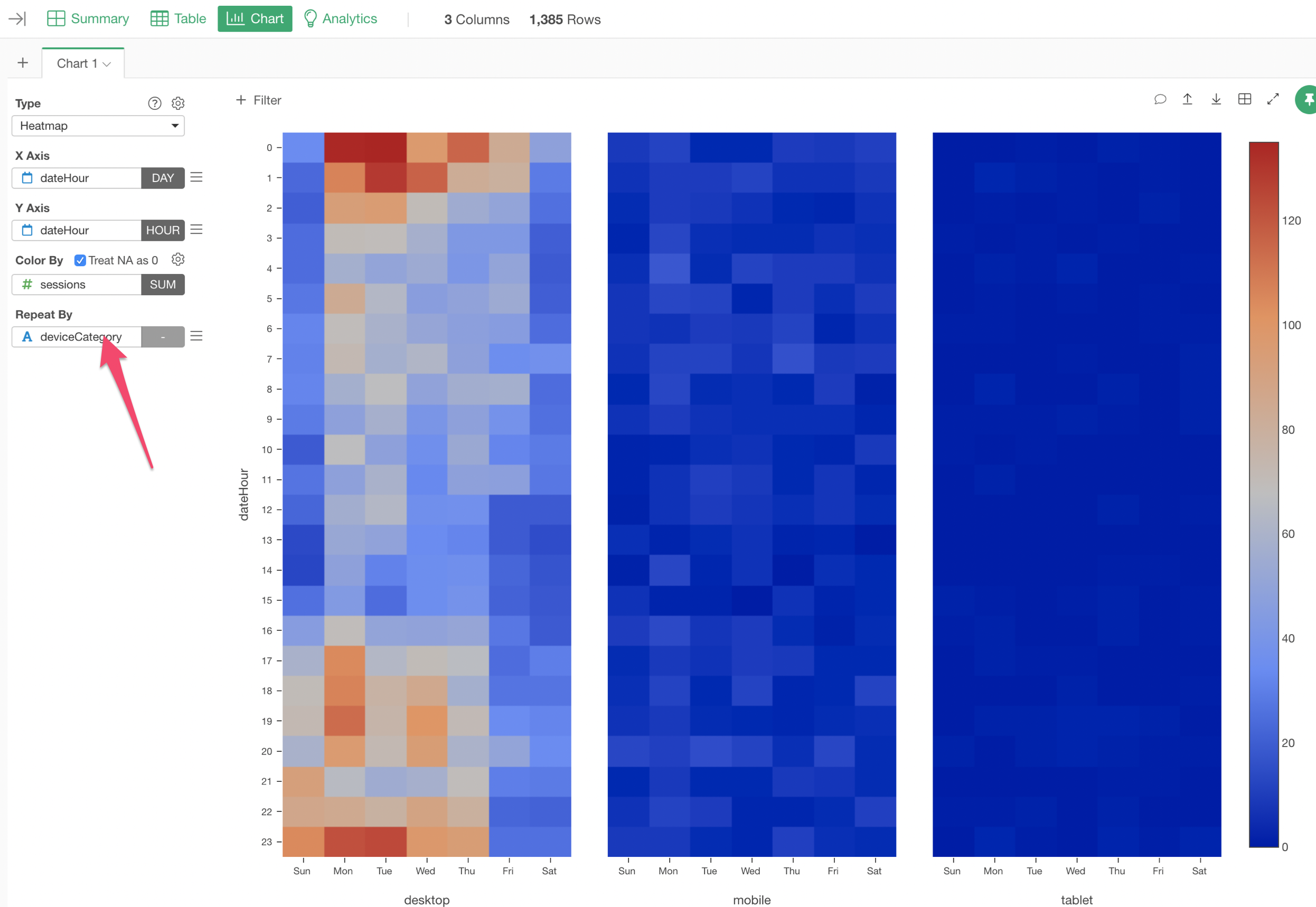
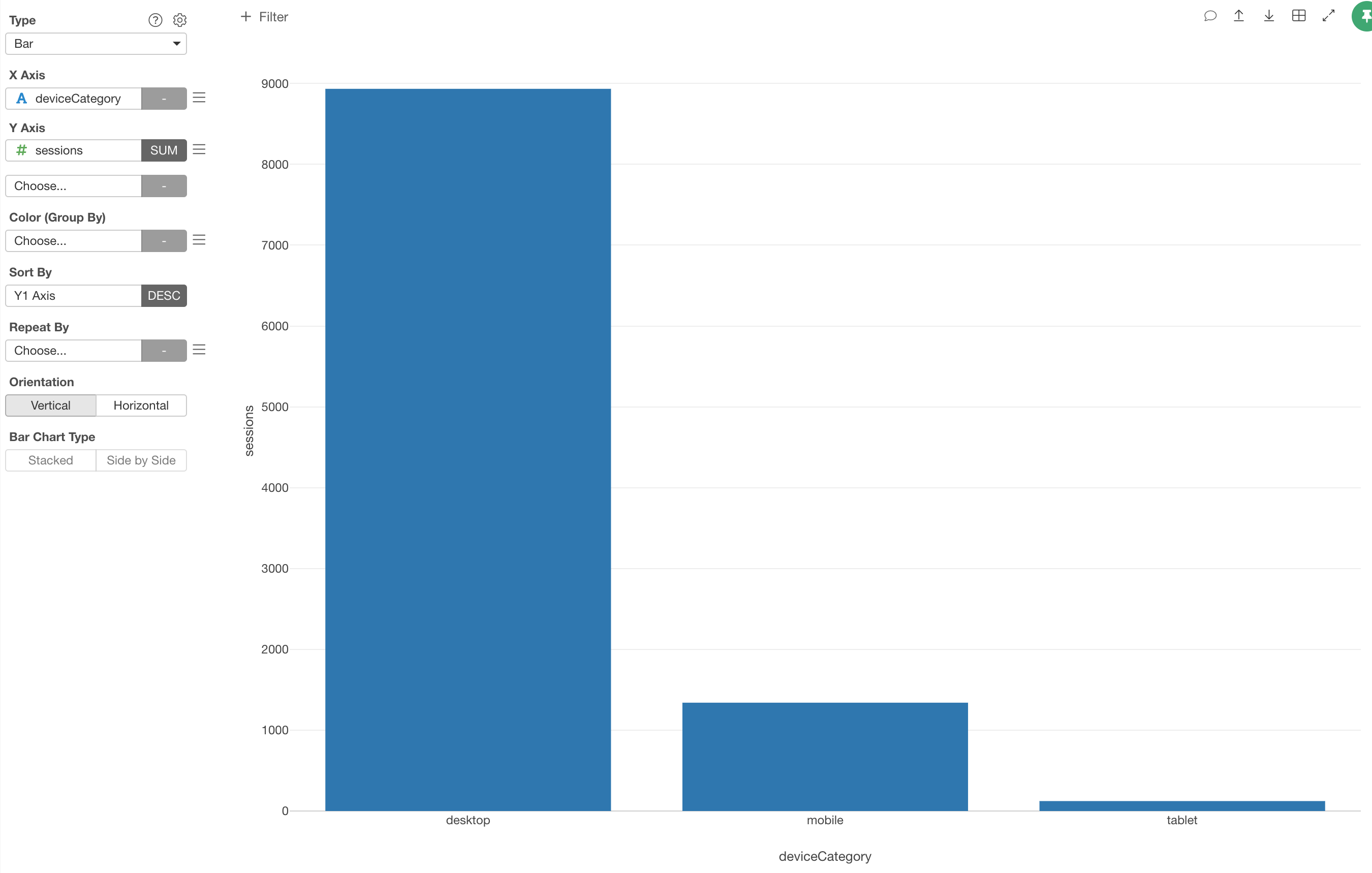
This data happens to have a much higher number of sessions for PC than other device types.
So we can't really see any patterns in the mobile and the tablet segment, but you get the idea.
Bonus: Normalize the Numbers
Well, if you really want to see the patterns in each device type you can normalize the session numbers in each device type.
For this, we can use the 'normalize' function, which calculates the difference between the original values and the average then divide it by the standard deviation.
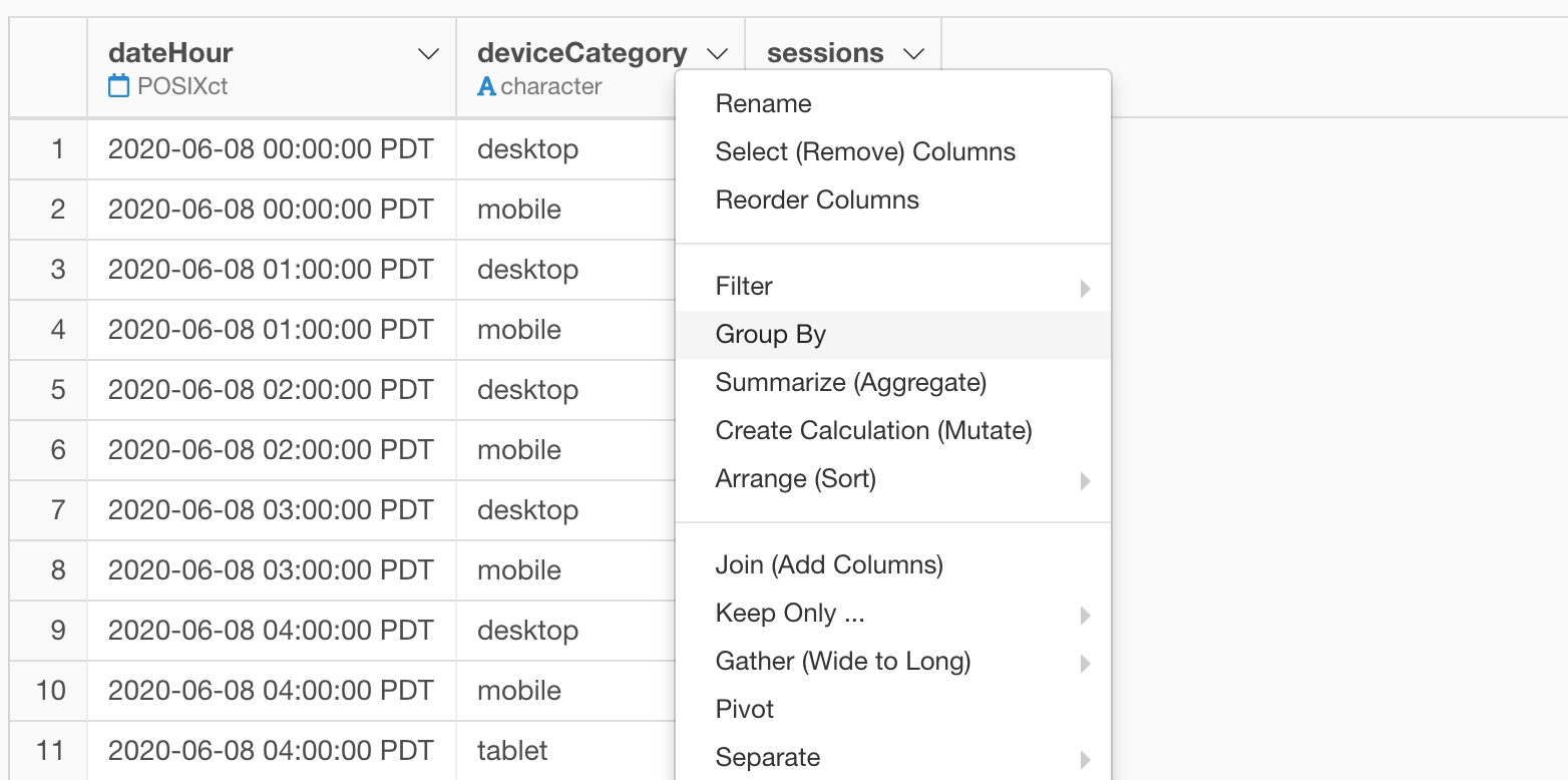
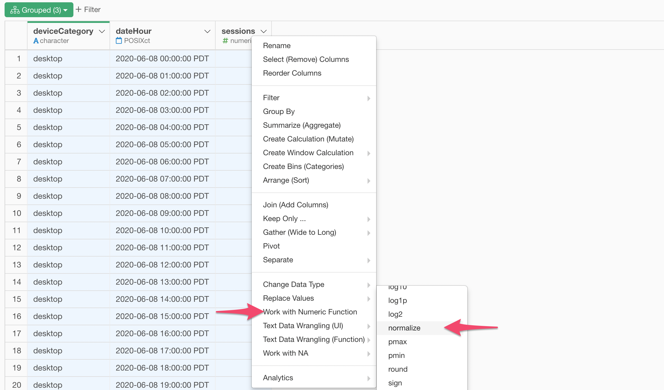
Since we want to normalize the values in each device category, first you want to group by the data frame.
Select 'Group By' from the column header menu of the 'deviceCategory' column.
Then, select 'normalize' under 'Work with Numeric Function' in the column header menu of the 'sessions' column.
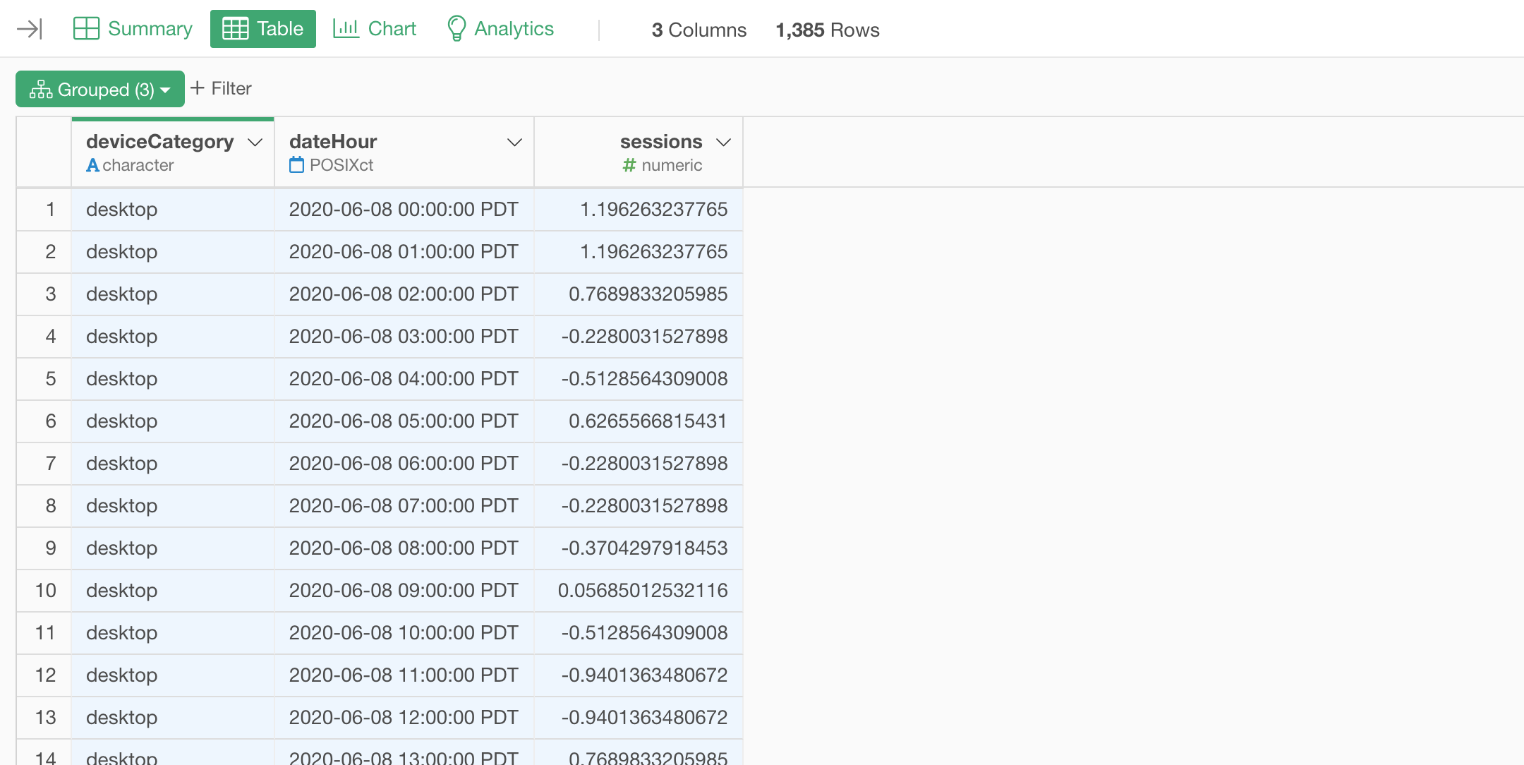
The normalizing calculation is pre-populated inside the Create Calculation dialog, click the Run button.
Now the session numbers are the normalized numbers.
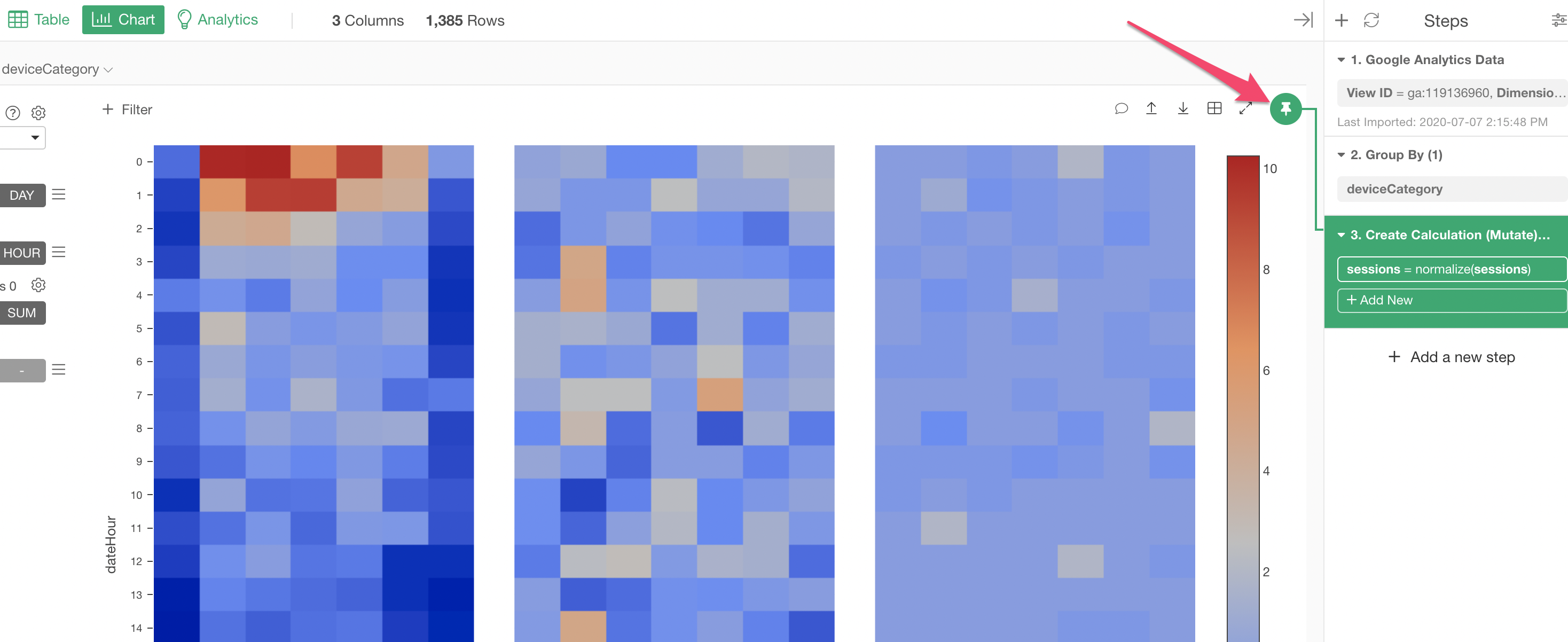
Go back to the Chart view and move the Pin button to the new step by drag and drop.
With this data, even with the normalized data, we can't really see clear patterns for the mobile and the tablet device types...
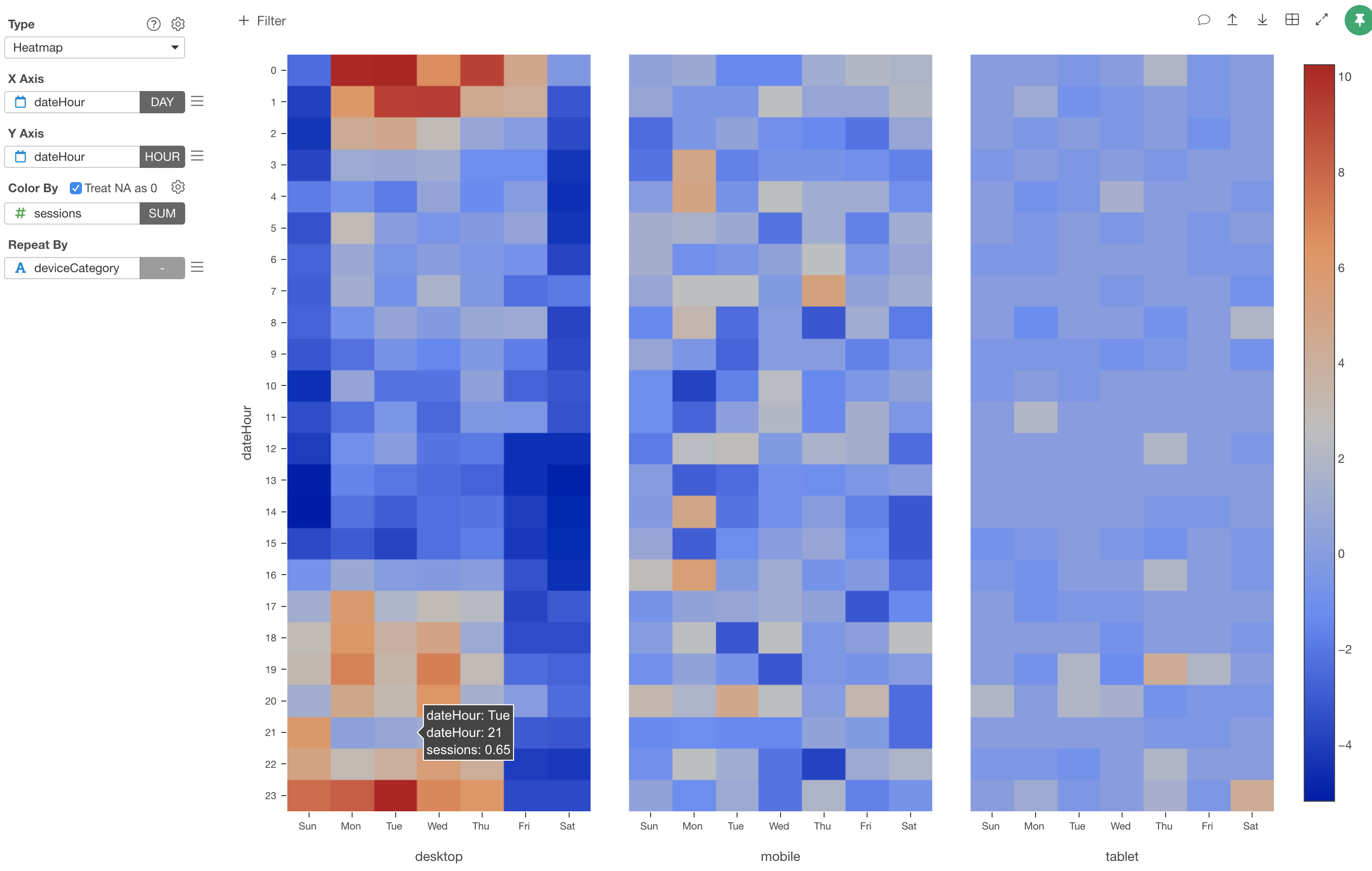
But, again, you get the idea! ;)