Highlighting a Part of Chart
Sometimes, you want to highlight a part of the chart to emphasize your point or understand your subject like above.
Here's a quick how-to video.
And, in this Note, I'll show you how you can
Here, I have a flight delay data and I’m showing the average arrival delay times (Y-Axis) by day (X-Axis) and by each airline carrier (Color).
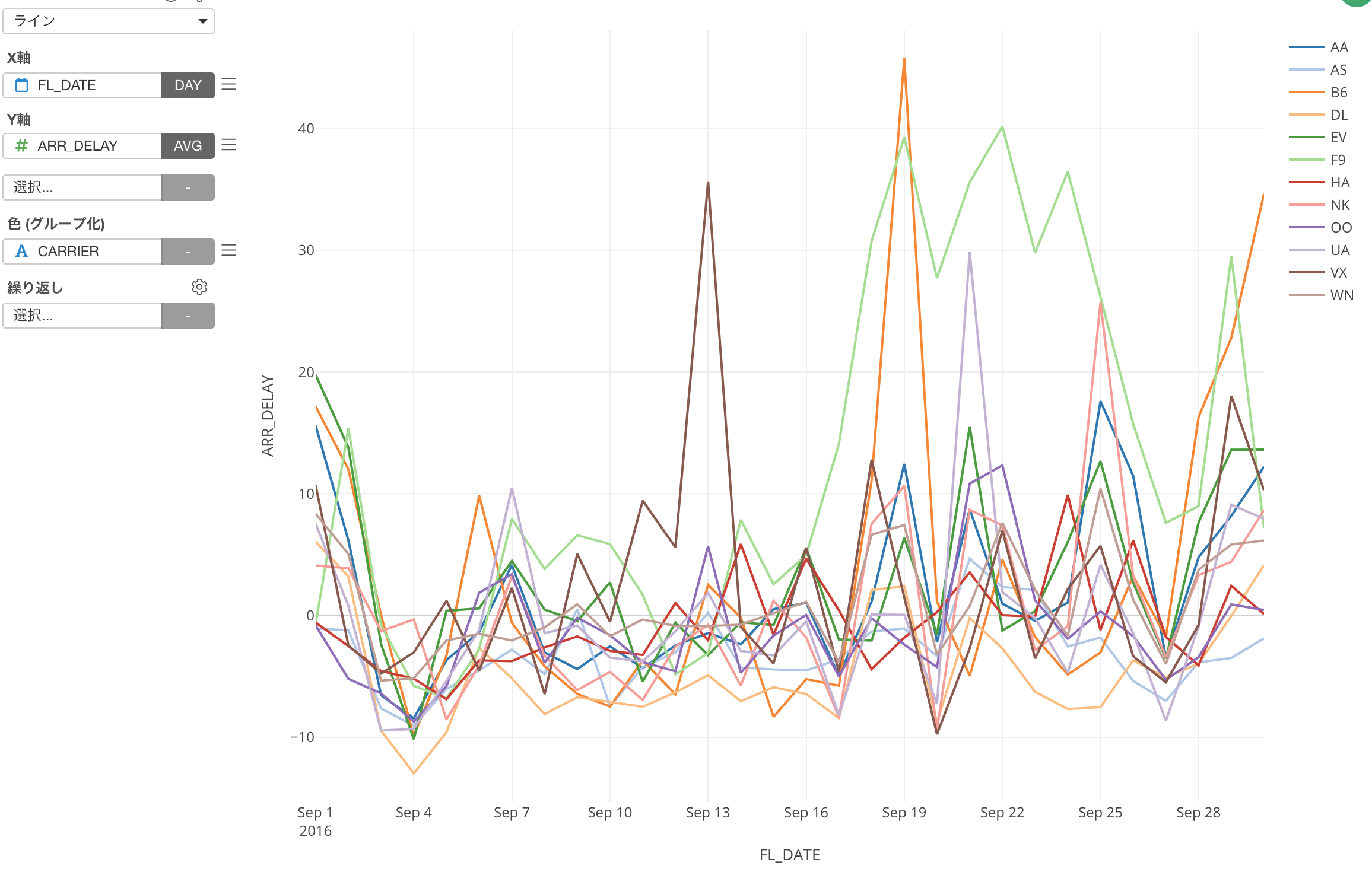
Now, among all the airline carriers, let’s say I’m interested in how Hawaiian airline has performed in comparison to the others, this chart is not helping me at all. ;)
This is where the Highlight feature can rescue!
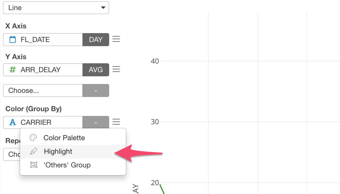
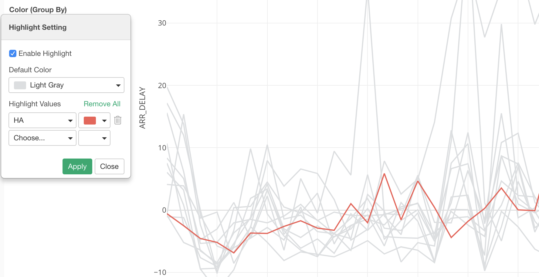
Select ‘Highlight’ from the Color menu dropdown.
Once you check ‘Enable Highlight’, all the lines are colored by the default color, which is ‘Light Gray’ by default.
And you can select a value to highlight, in this case, that is ‘HA’ (Hawaiian Airline), and select a color to use.
You can select multiple values if you like.
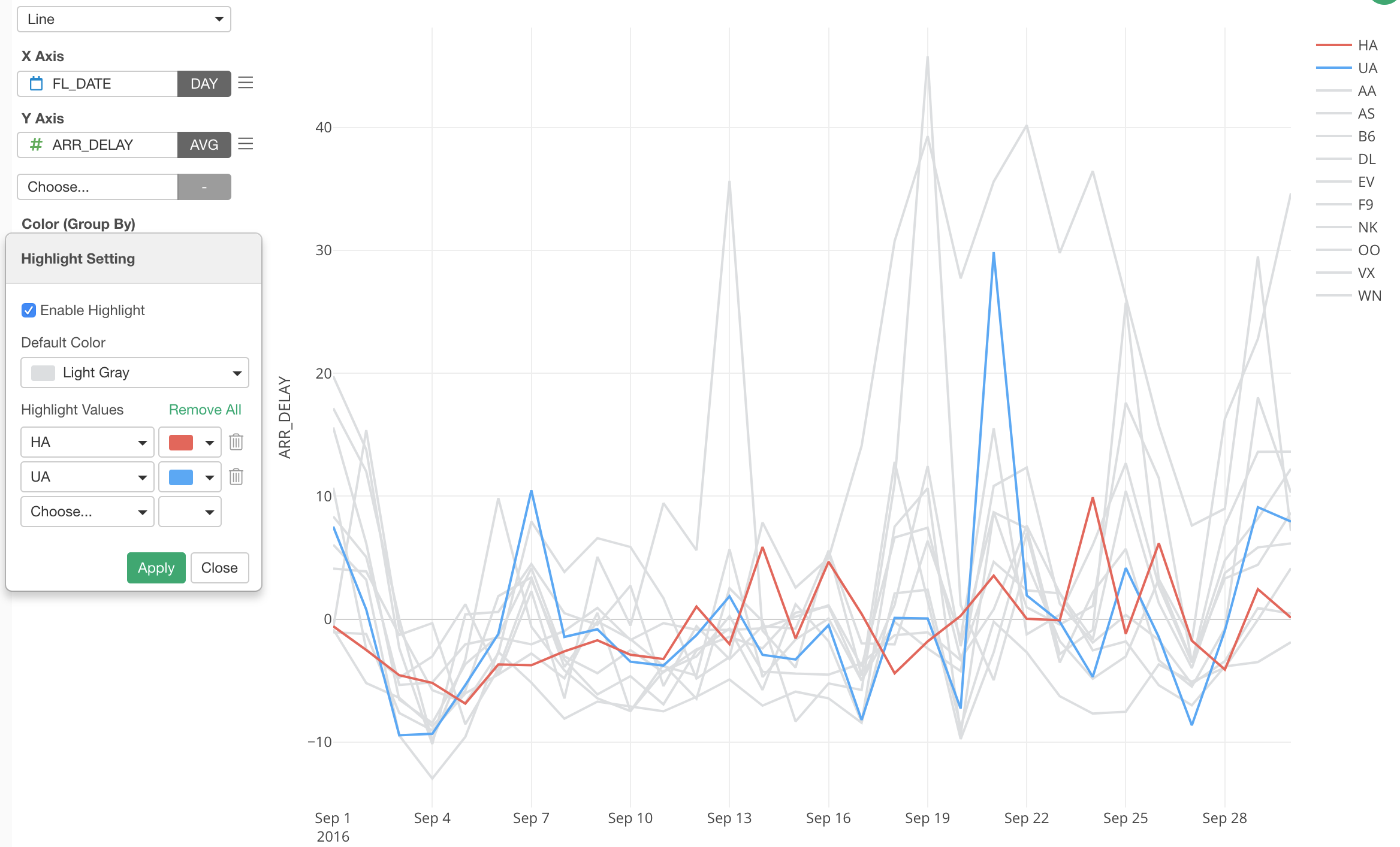
That’s it! It’s pretty simple.
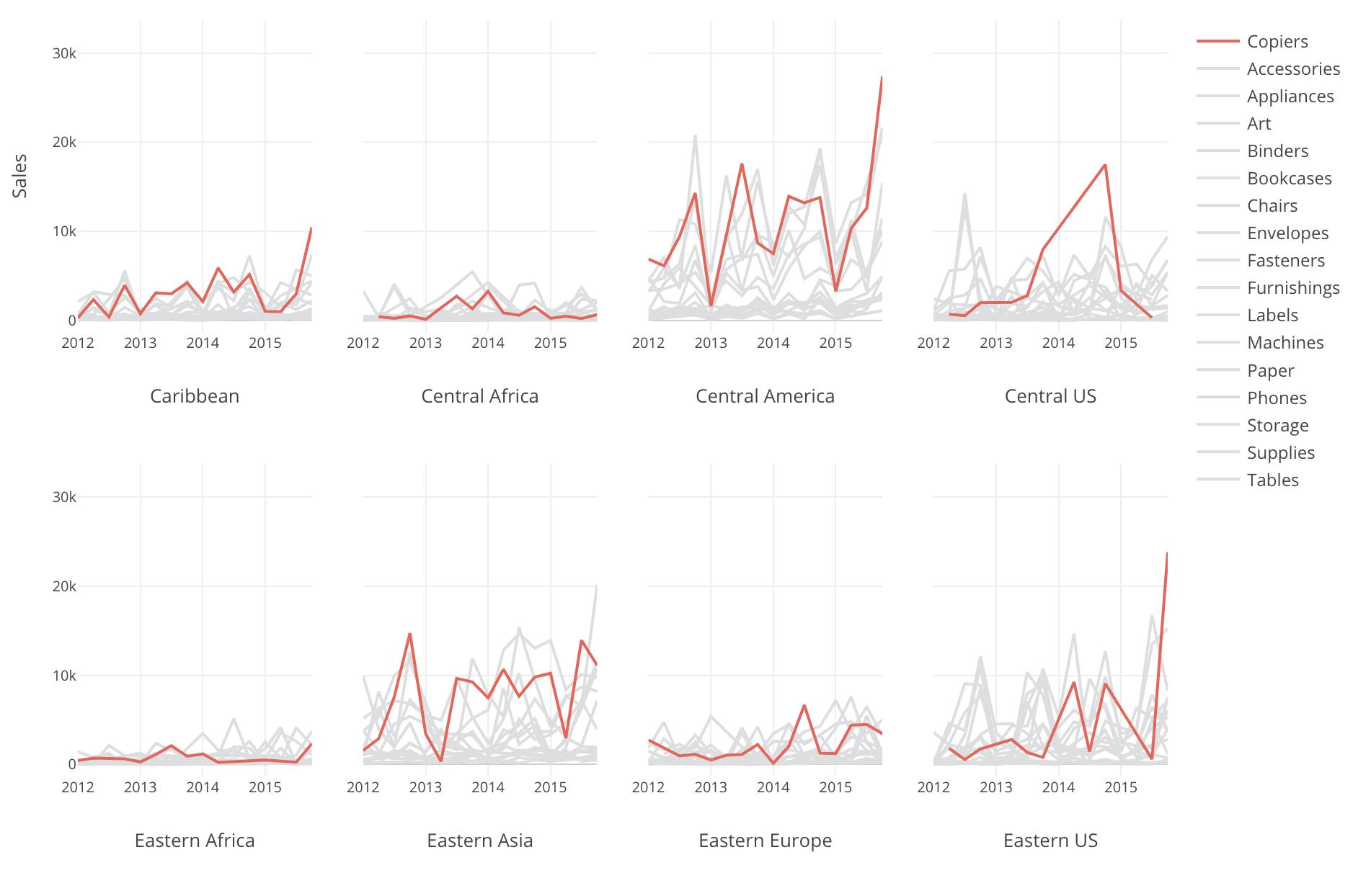
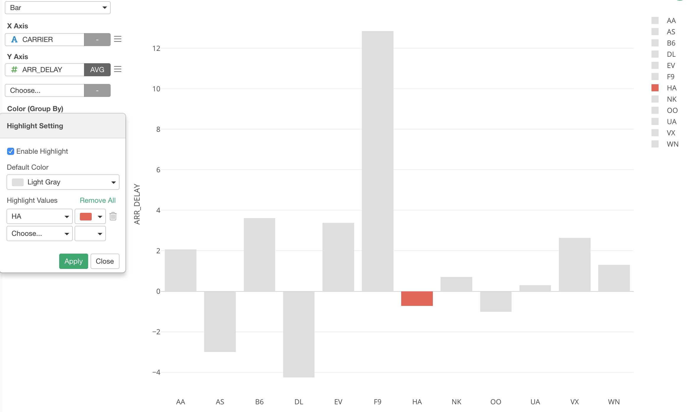
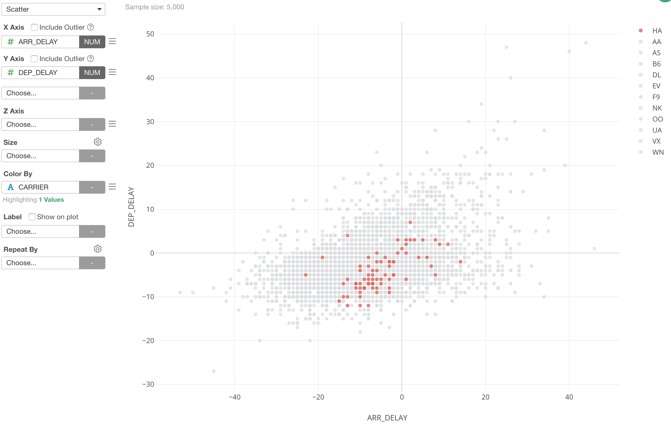
And, the Highlight feature is available for other chart types as well.
Here are a few examples:
Bar Chart
Scatter Chart
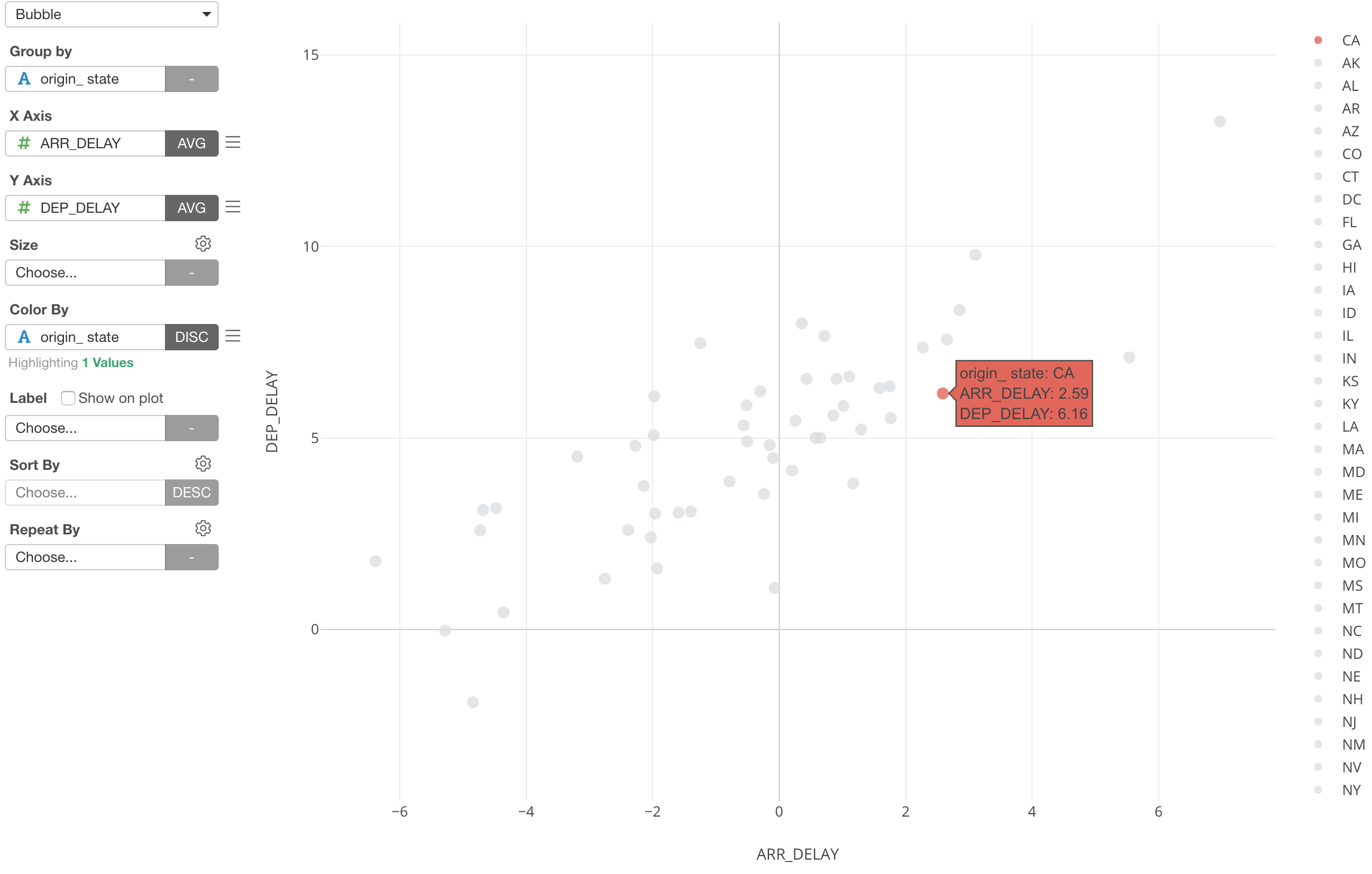
Bubble Chart
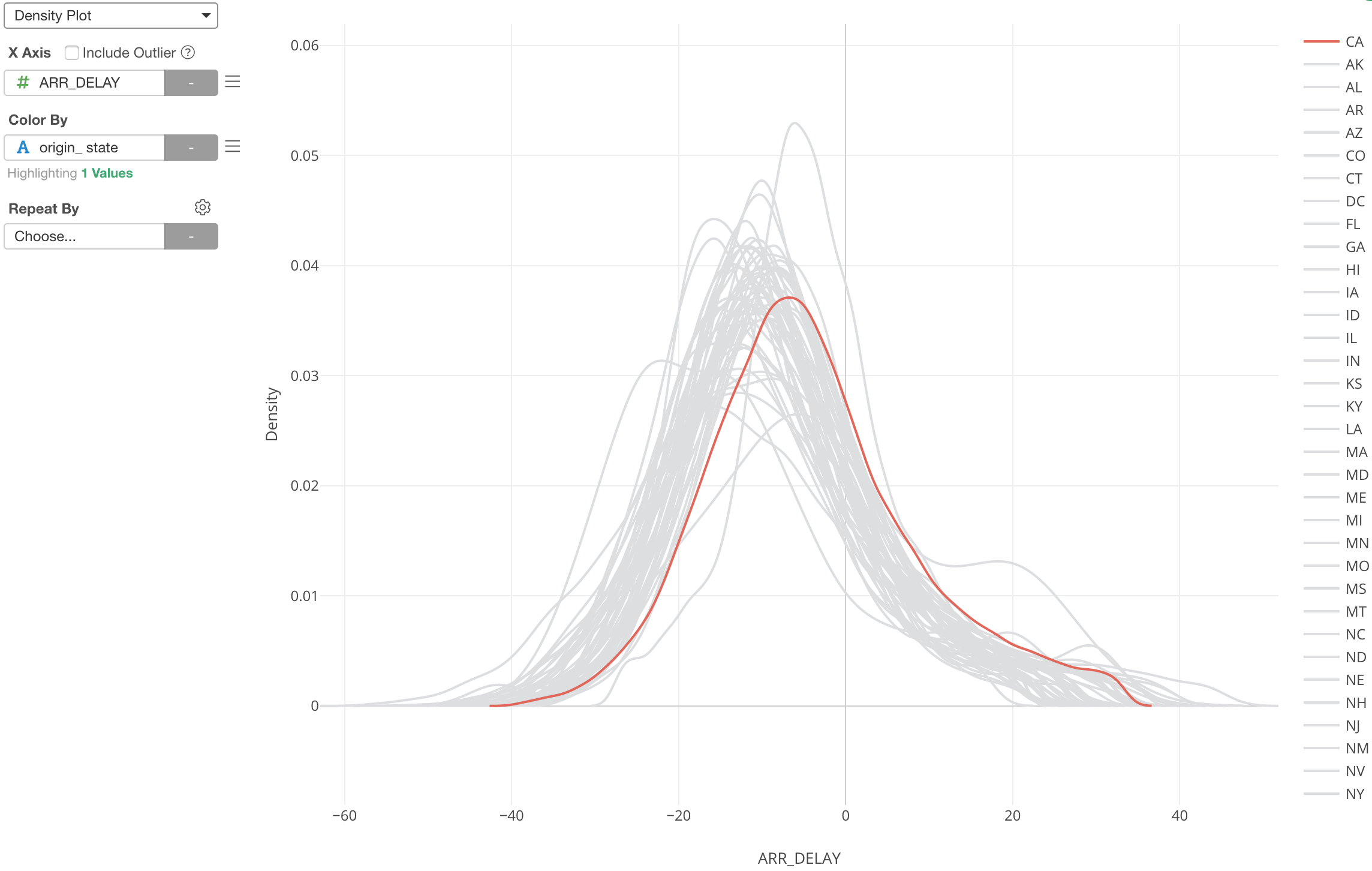
Density Plot