What are the fruits becoming more popular or less popular over the years in the U.S?
I’ve found this US fresh fruit consumption data at data.world.
- TBT Week 19 - Fresh Fruit Consumption - 1980 to 2016 - Link
The data is sourced from the USDA Fruit and Tree Nut Yearbook - Table G36, which I believe this page.
- Fruit and Tree Nut Yearbook Tables - Link
Sounds interesting data, so I just imported in Exploratory and tried to see if I could answer the above question for myself .
And here is the result.
What is this Data?
Here is the summary view.
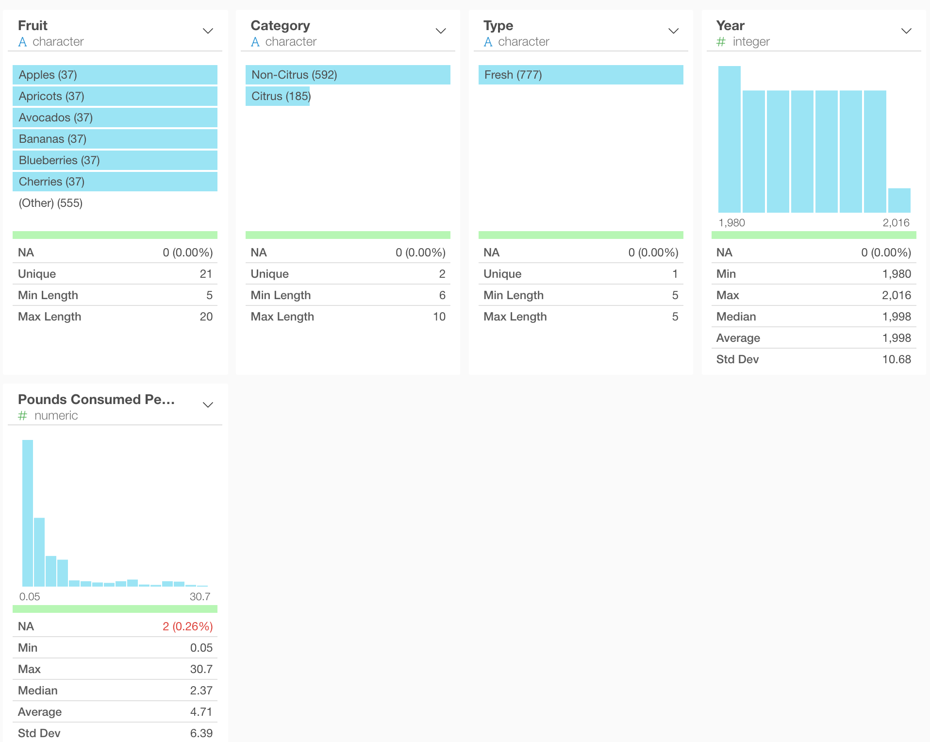
There are 21 fruits and 2 categories (either Citrus or non-Citrus). And the data is from 1980 to 2016. The consumption amount is measured in pound ranging from 0.05 to 30.7.
Let’s take a look at the consumption trend of these fruits over the years.
Fruits Consumption Trend
Here is a very simple line chart that shows the consumption of each fruit over the years.
Banana, Apple, and Orange are the top 3. Banana seems to have increased, Apple not much, Orange seems to have decreased.
The problem here though, different fruits have different ranges of the consumption amount. For example, Banana is much bigger than Blueberry.
This makes it harder to spot the trends for the fruits whose consumption amounts are smaller than other fruits. So, it would be better to separate each fruit into each line chart and compared them side by side.
This chart might blow up when you look at it in a small screen, so here is a screenshot of the same chart.
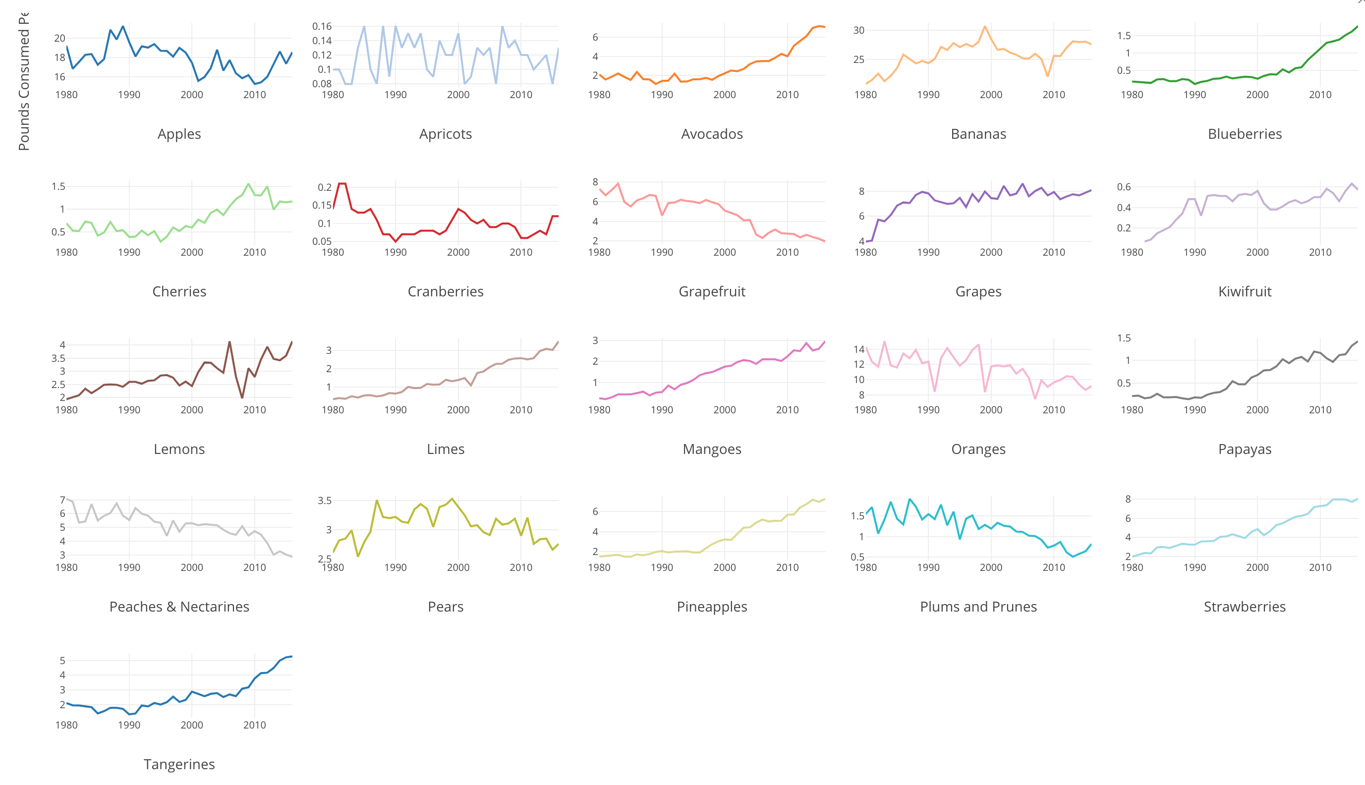
Now we can see some that some fruits like Avocados, Blueberry, Limes, etc. have increased a lot over the years. By the way, I didn’t know Avocados is a fruit! ;)
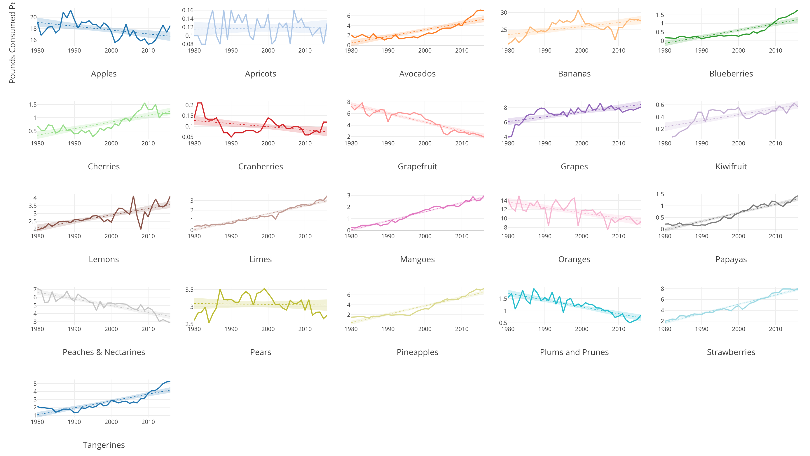
To make the trend easier to follow, I’ve turned on a trend line with ‘Linear Regression’, which would draw a straight line that makes the distance between the line and all the data points as small as possible.
Here is an image of the chart.

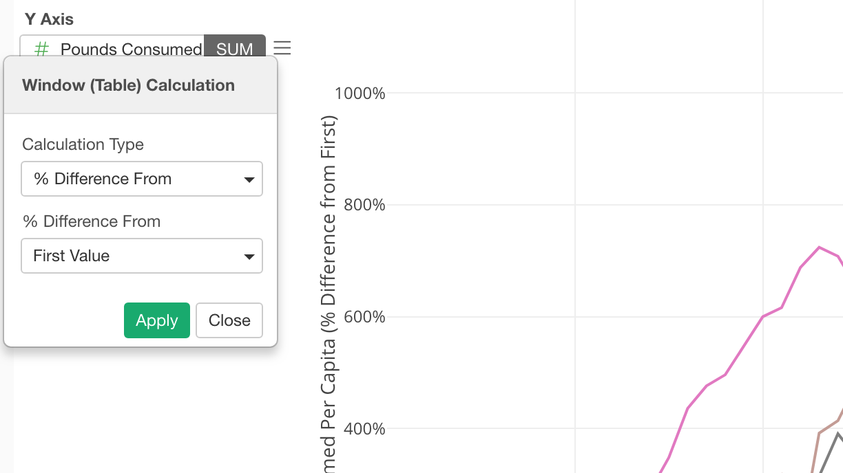
Percentage Difference from 1980
To see the difference from the first year of this data, which is 1980, I’ve applied a window calculation ‘% difference’ to the above chart.
This gives us the following chart.
We can see a different trend here.
Mango, the purple line at the top, has increased a lot. By the time of 2016, it has grown 1,084% compared to 1980!
The next two are Blueberry and Lime, and they have increased 883.33% and 866.67% respectively.
Again, we can separate this into multiple charts each of which shows each fruit data.
Here is an image of the same chart.
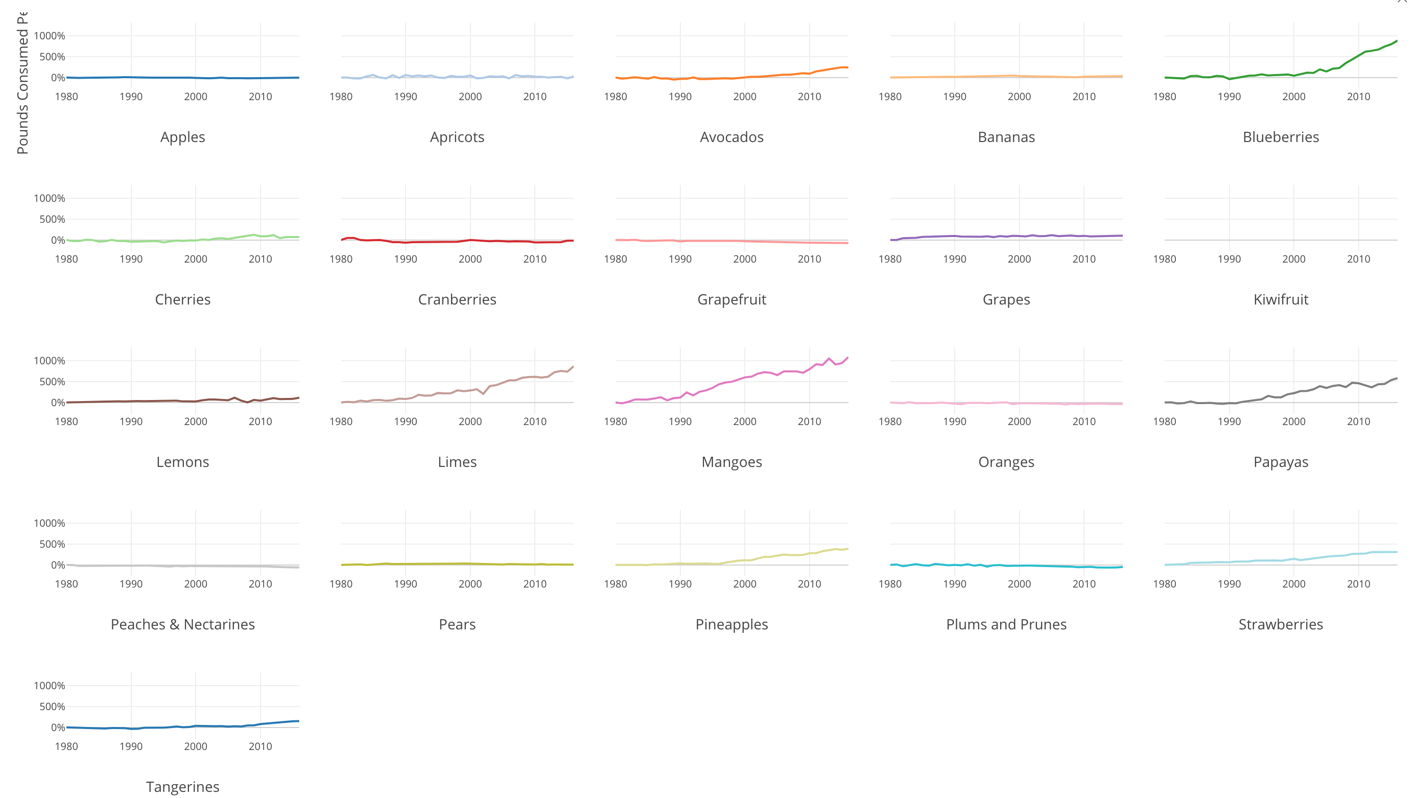
Here, we can clearly spot which fruits and see how much they have increased over the years. Avocado, Blueberry, Lime, Mangoes, Papayas, and Pinapples are the top growing frutis in the U.S.