Data
I’ve got this world wide livestock production data. It has the production data for variety of animals such as Chicken, Cattle, Pig, etc. dating back from 1960 to 2017.
Questions
My question is simple.
Who is feeding our stomach? And how has that been changed over the years?
Analysis
Here is the trend of the total number of animals for the major livestock categories. Note that only Chicken’s product has a different scale, that is showing 1 for 1,000 chickens.
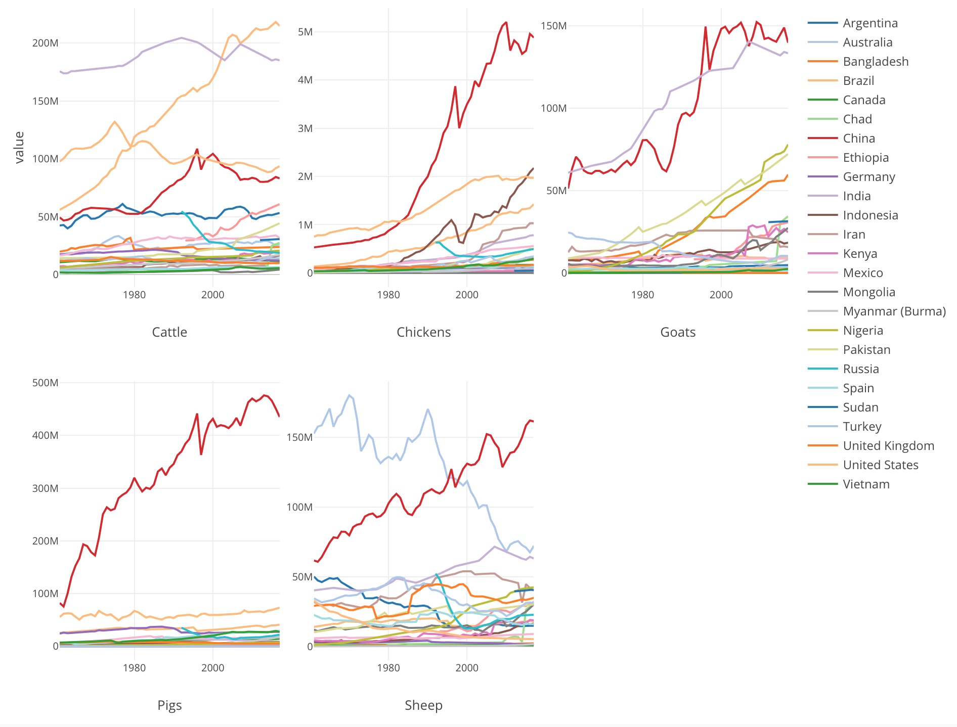
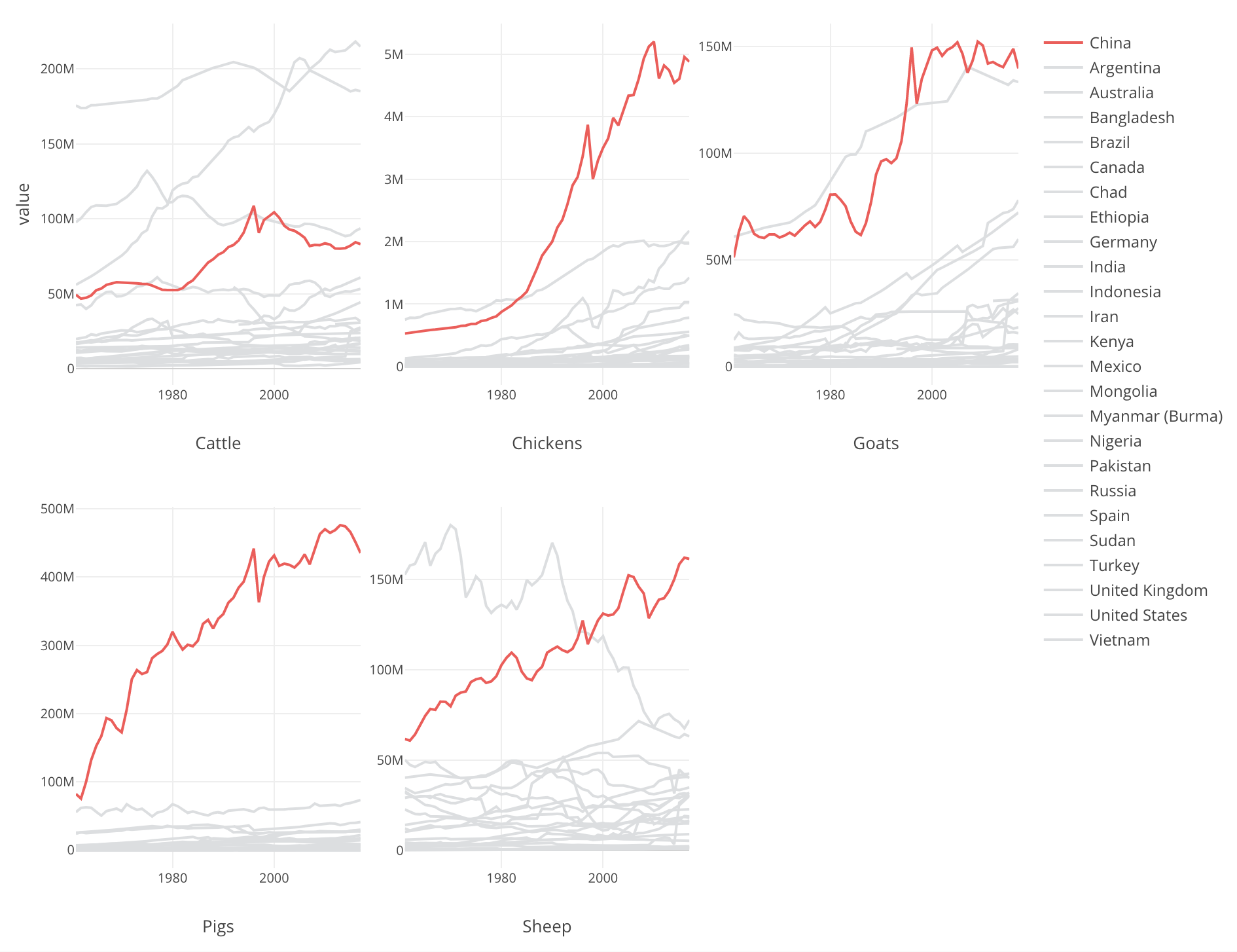
We can see that China has increased the production of all types dramatically over the years.
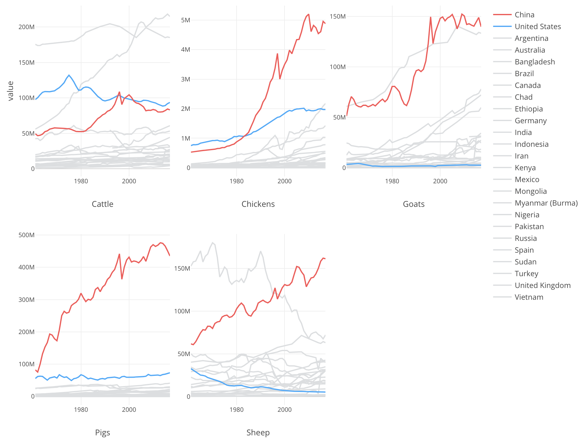
Here’s a contrast between China as Red color and United States as Blue color.
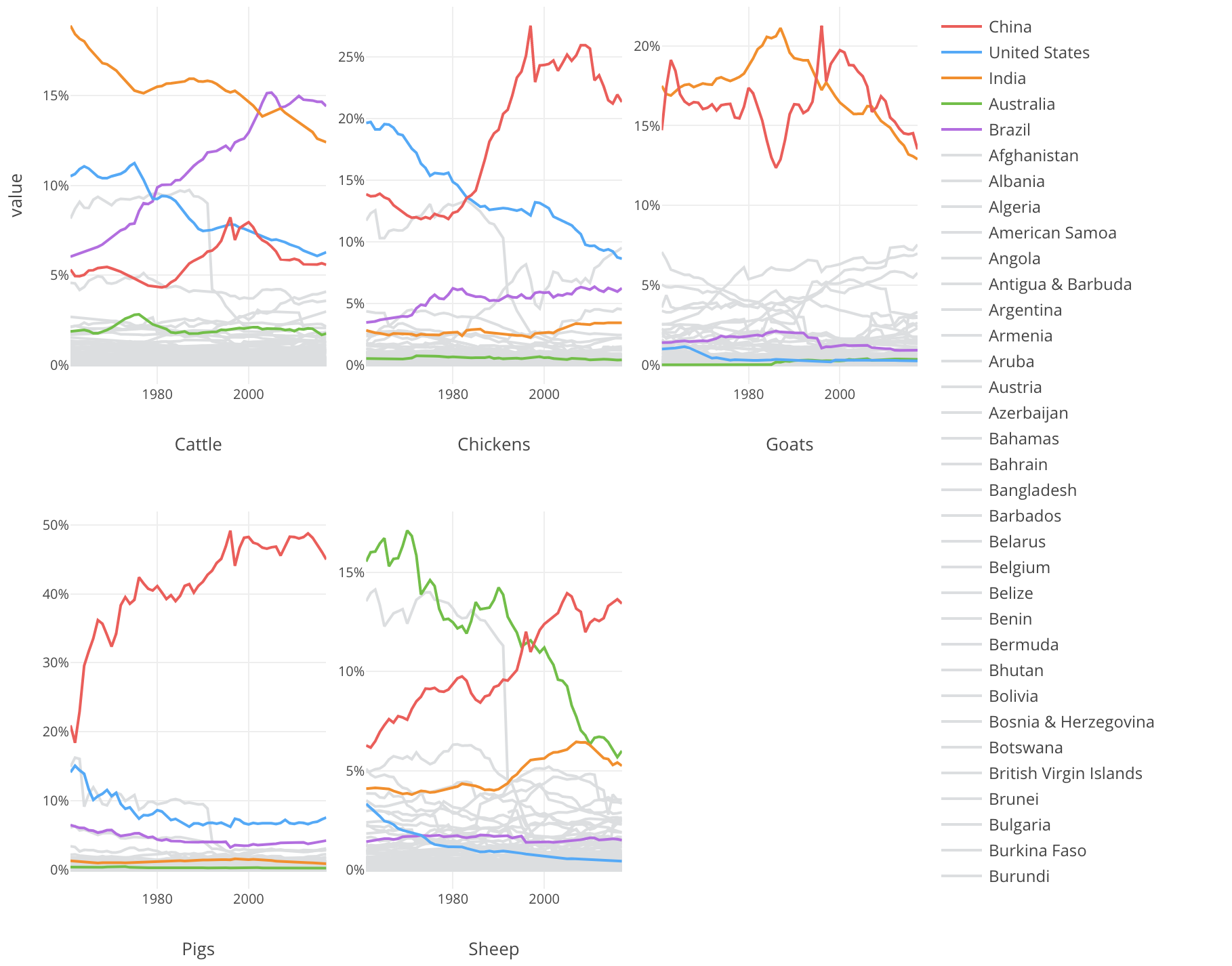
Percentage of Livestock Production
And this contrast can become stunning especially when I show the percentage of each country’s production against the whole production.
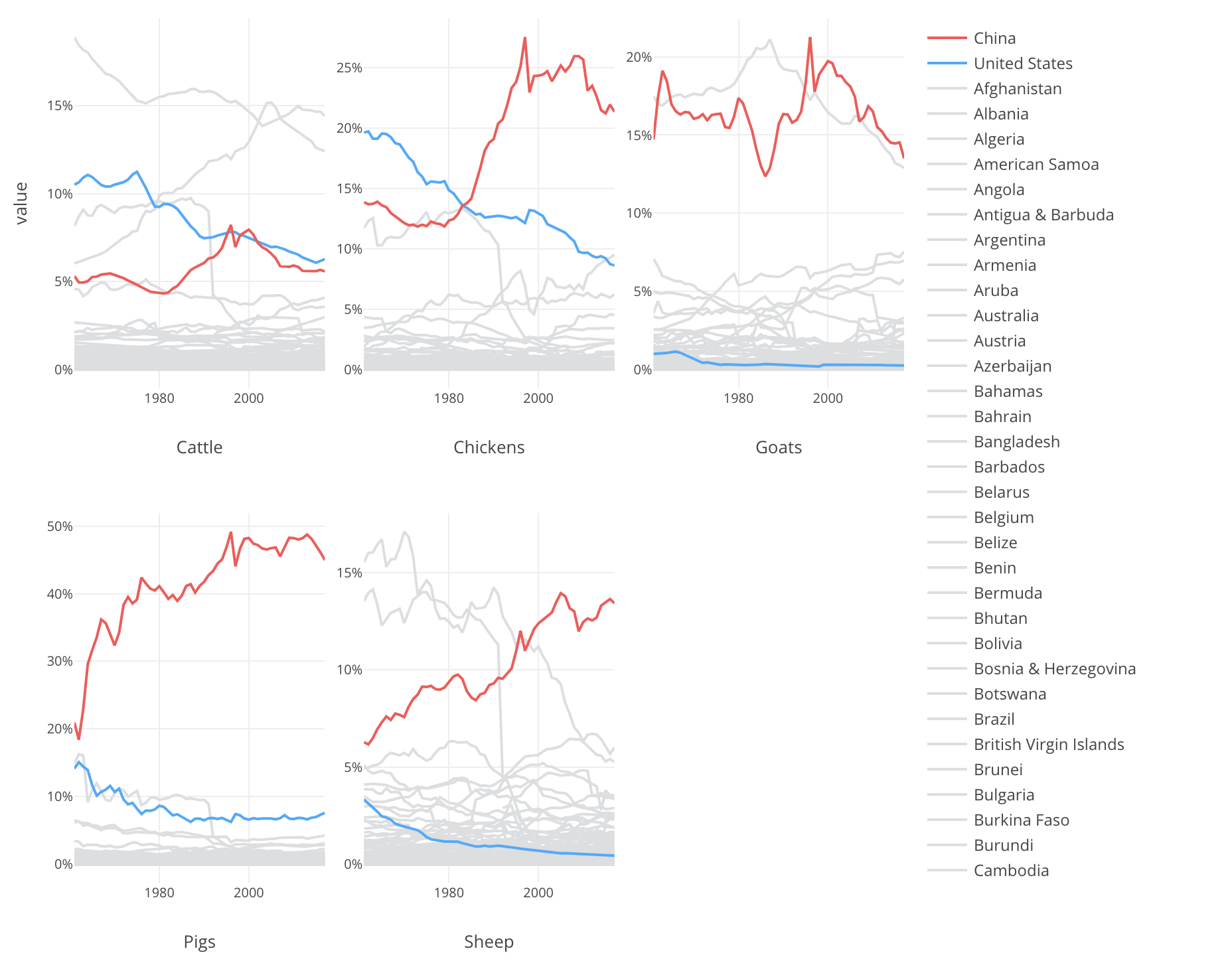
The livestocks like Chickens, Pigs, Sheep, United States used to play a significant role in producing such animals but the decrease is clear in all the types.
On the contrast, China has increaed the percentage dramatically. Especially for Pig, Now China is producing almost a half of all the pigs in the world.
Conclusion
There is one clear trend I’ve found by visualizing the trend, which is that China has increasing the production of the livestocks and feeding majority of our stomachs especially for Chicken.
And countries like United States and Australia have been decreasing the share of the production in the world market.