Sometimes, you might want to calculate the percentile ranks.
What is percentile rank?
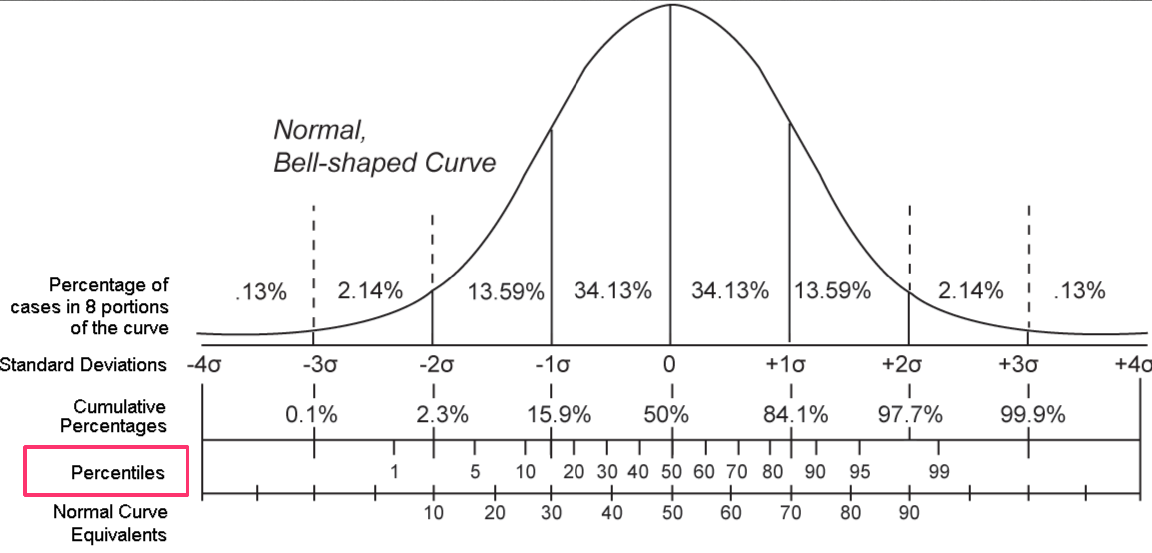
The percentile rank of a score is the percentage of scores in its frequency distribution that are equal to or lower than it. For example, a test score that is greater than 75% of the scores of people taking the test is said to be at the 75th percentile, where 75 is the percentile rank. In educational measurement, a range of percentile ranks, often appearing on a score report, shows the range within which the test taker’s “true” percentile rank probably occurs. The “true” value refers to the rank the test taker would obtain if there were no random errors involved in the testing process.
You can do this by using ‘percent_rank’ function from dplyr in Exploratory and R.
We have a data about the number of the mothers who are opioid addicted during the pregnancy in the United States.
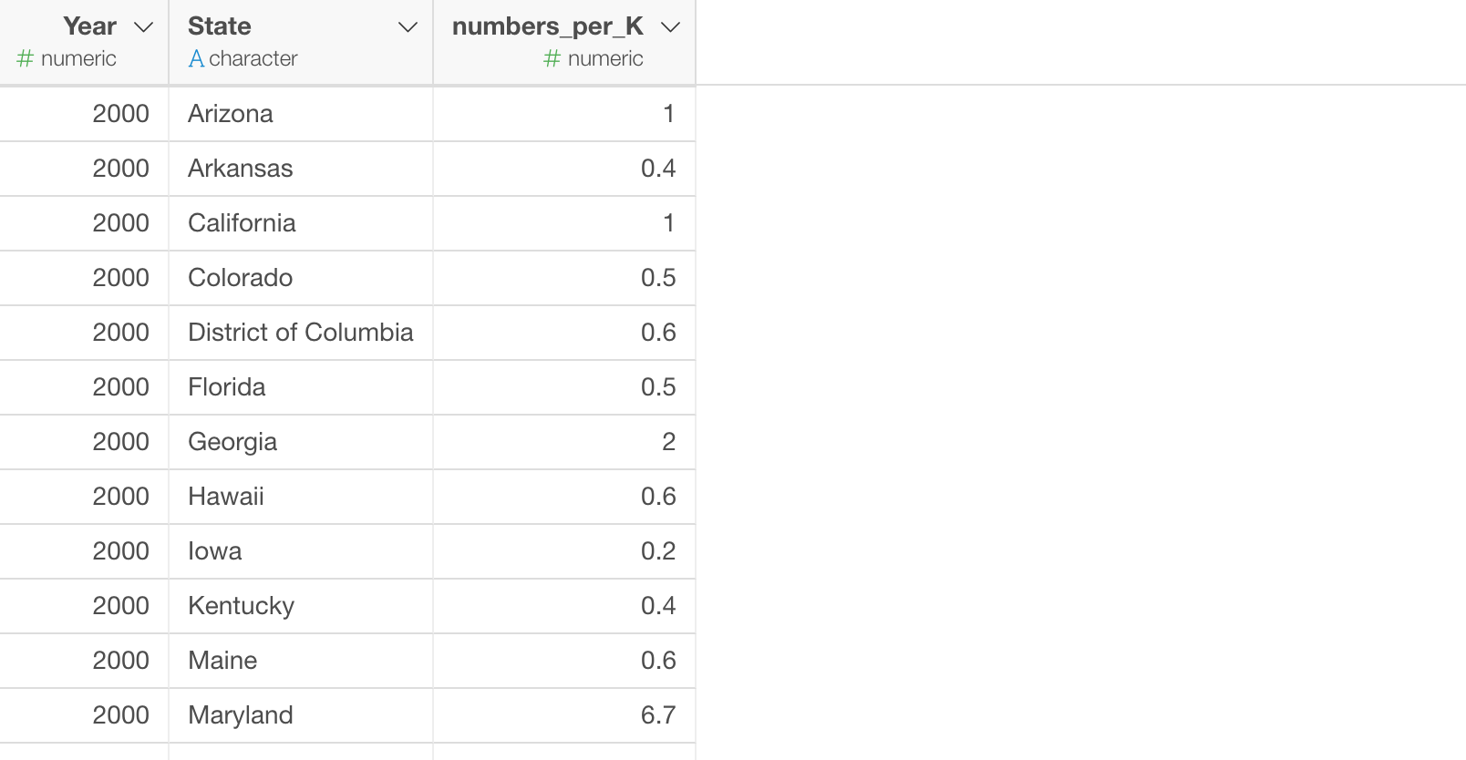
These numbers are the number of the addicted mothers in each state and each year per 1,000 all mothers.
Now, let’s say we want to know the percentile of the state in each year. For example, we want to know what is the percentile of California in each year so that we can see how it’s changed over the years. Is it increasing the rank or decreasing?
You can use Percent Rank function called percent_rank from dplyr to do this. This is one of something called Window Calculation, which does the calculation in a context of ‘Group’. In this case, we want to do the percentile calculation in each year which is the group.
Let’s take a look.
Group the Data Frame
First, we want to group the data by Year.
In Exploratory:
Select ‘Group By’ from the column header menu of ‘Year’ column.
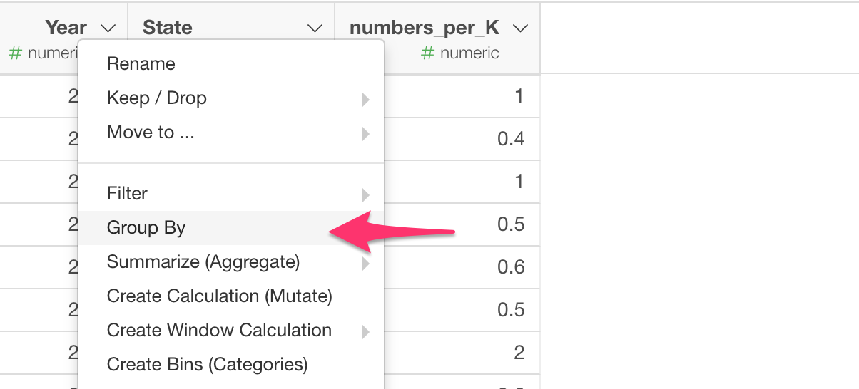
The data frame is in the Grouped Mode at this point.
In R:
df %>% group_by(Year)Use Window Calculation
You can use ‘percent_rank’ function to get the percentile calculation.
In Exploratory, you can simply select ‘Create Window Calculation’ -> ‘Rank’ -> ‘Percent Rank’ from the menu of ‘numbers_per_k’ column in this case.
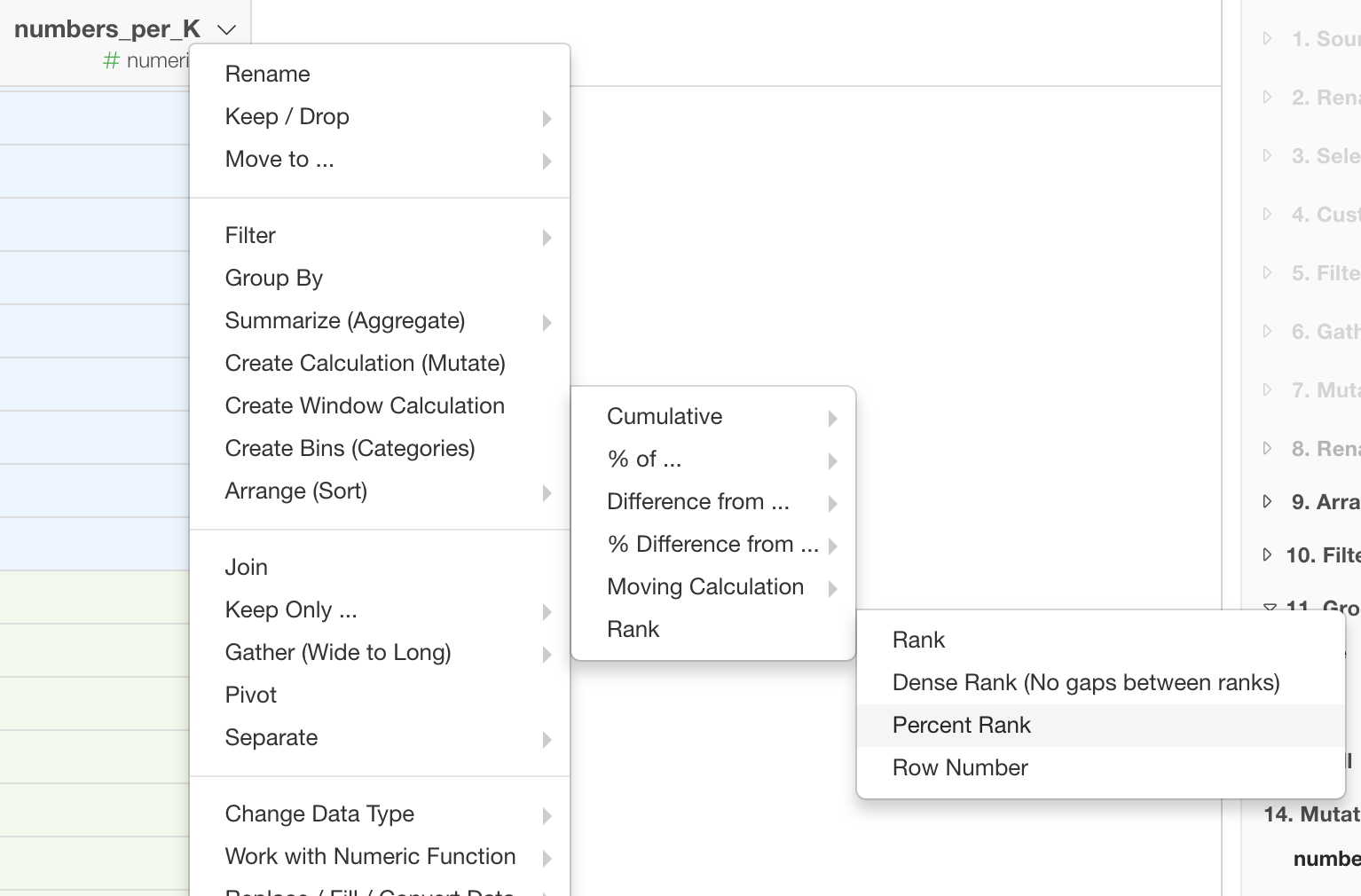
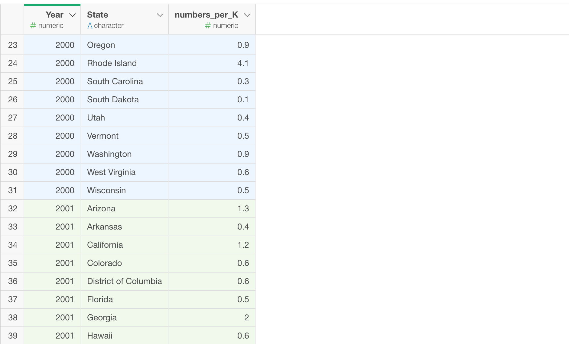
Once you run it, the calculation is done for each row.
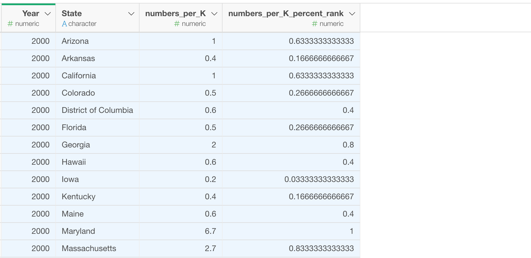
But notice that the percentile calculation is done by respecting the group setting, in this case, that is Year. So the numbers you are seeing here are the percentile values (percent ranks) in each year.
In R:
df %>%
  group_by(Year) %>%
  mutate(numbers_per_K_percent_rank = percent_rank(numbers_per_K))
Visualize it!
Nothing is better than visualizing it to understand what has just happened with the percentile calculation.
Under Viz (Chart) view, assign Year to X-Axis and the newly created percentile column to Y-Axis, then assign the state column to Color By.
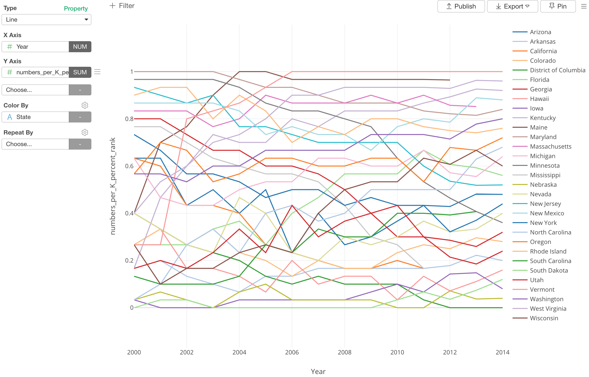
Here is an interactive version of the chart.
There are too many lines here. There about 30 lines.
You can double click on one of the states to show only the state. Then start clicking on other states to show only a few states you are interested in.
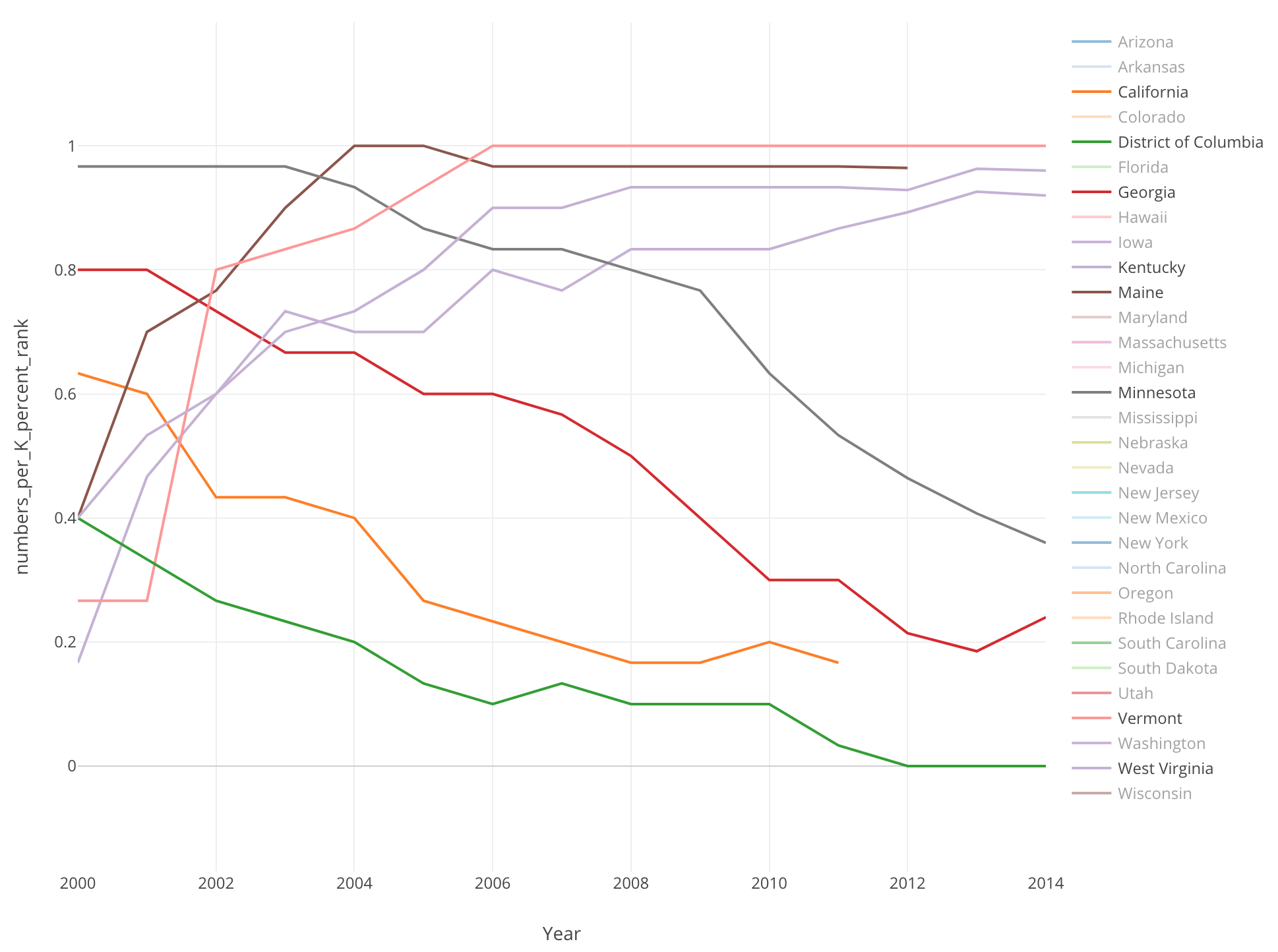
Here, I’ve selected District of Columbia, Georgia, Kentucky, Main, Vermont, West Virginia.
We can see some of the states are increasing the ranks or the percentile values and some are decreasing them.