How to Visualize New York Times COVID-19 Data - Basic
New York Times has published the US COVID-19 data that they have been collecting at US County level.
You can download the data from this page.
You can download the data from this Github repository page.
I have quickly visualized the data and published a few posts to share my findings.
- California County Level Infections & Deaths of COVID-19 Visualized - Link
- Some States Moved Quickly, But New York Didn’t - When to Call Shelter in Place? - Link
Now, I’d strongly recommend you take the data and visualize and analyze it for yourself.
Why?
Because there is too much sensational news out there that is trying to feed unnecessary fear into us. We should be concerned about the development of COVID-19 in the US and the world, and we can be worried about it. But we shouldn’t be in fear, which makes us stop thinking.
There has never been a more important time than now for us to use data and understand what is going on as objective as possible.
Now, it is easier to said than done.
If you grab the data and try to visualize it in Exploratory, you might hit some roadblocks or get confused.
So, here are a few things that I think would help you get started quickly.
- Import the Data as Remote File
- About this Data
- Visualize the Cumulative Number of Cases with Line Chart
- Filter the Data with Step Filter
- Show Only the Last Date of Data with Chart Filter
- Horizontal Chart with Values on Plot
- Show Only Top 30 States
- Change the Color
Import the Data as Remote File rather than Local
You want to use the Remote File type to directly import the data into Exploratory, rather than downloading it to your PC then import the file as Local File.
The Remote File option gives you 2 great things.
First, they (New York Times) update the data daily. This means you want to keep update the imported data to see the latest. With the ‘Remote File’ option all you need to do is to click ‘Re-import’ button.
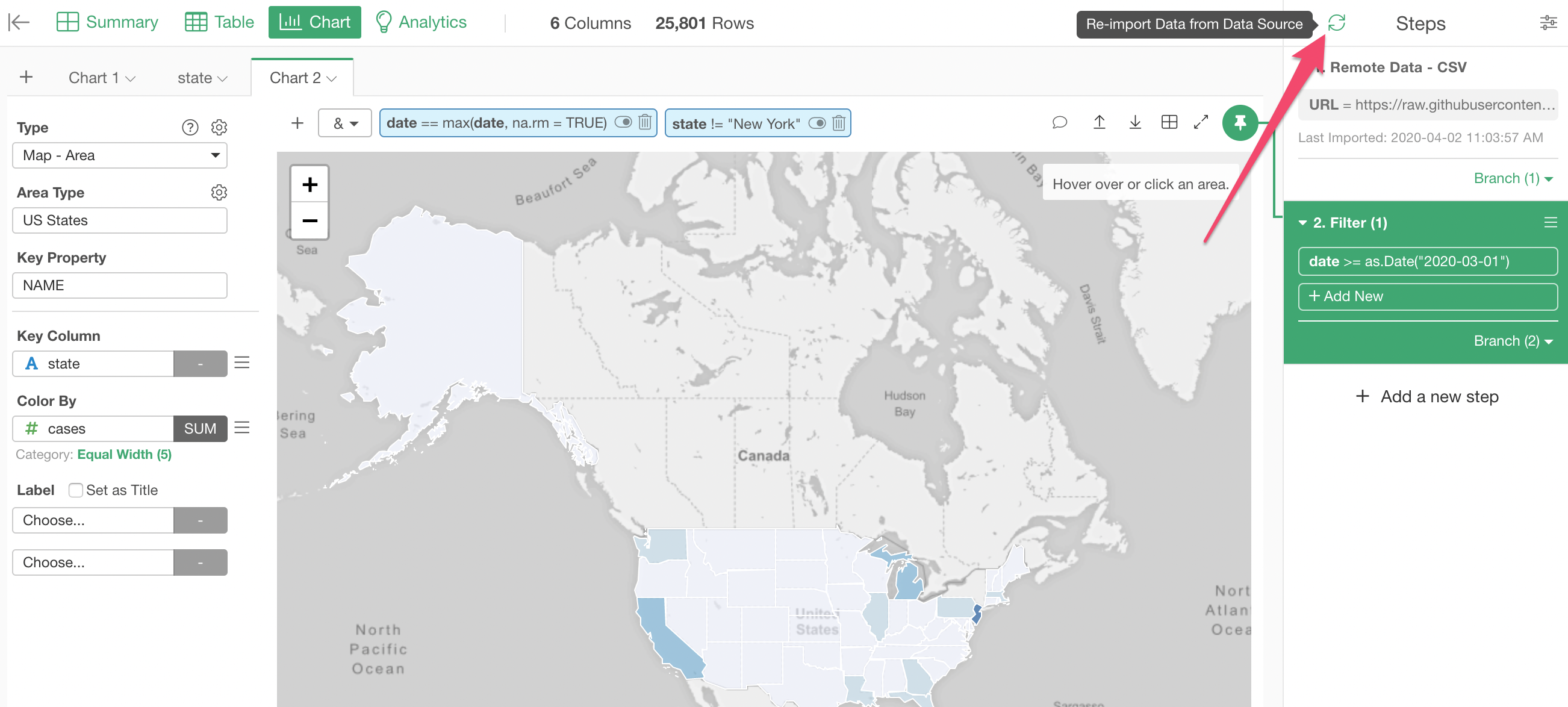
This will not only directly import the latest data from the source (Github) into Exploratory, but also run all the data wrangling steps, which I’ll talk about it later, and regenerate the charts automatically!
Second, you can schedule the update of the data by publishing your chart, Dashboard, Note, etc. to Exploratory Cloud server (exploratory.io). In order to schedule, the data needs to be accessible from the Exploratory server, and ‘Remote File’ is accessible!
Now, here is how you can import the data as the ‘Remote File’.
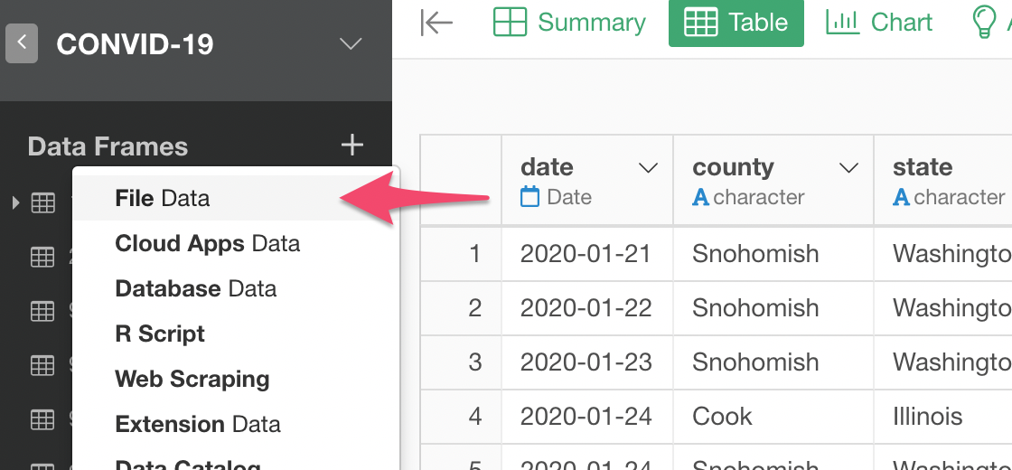
Select ‘File Data’ from the Data Frame menu.
Click ‘Remote’ tab in the dialog, then select ‘Text File (CSV, delimited)’.
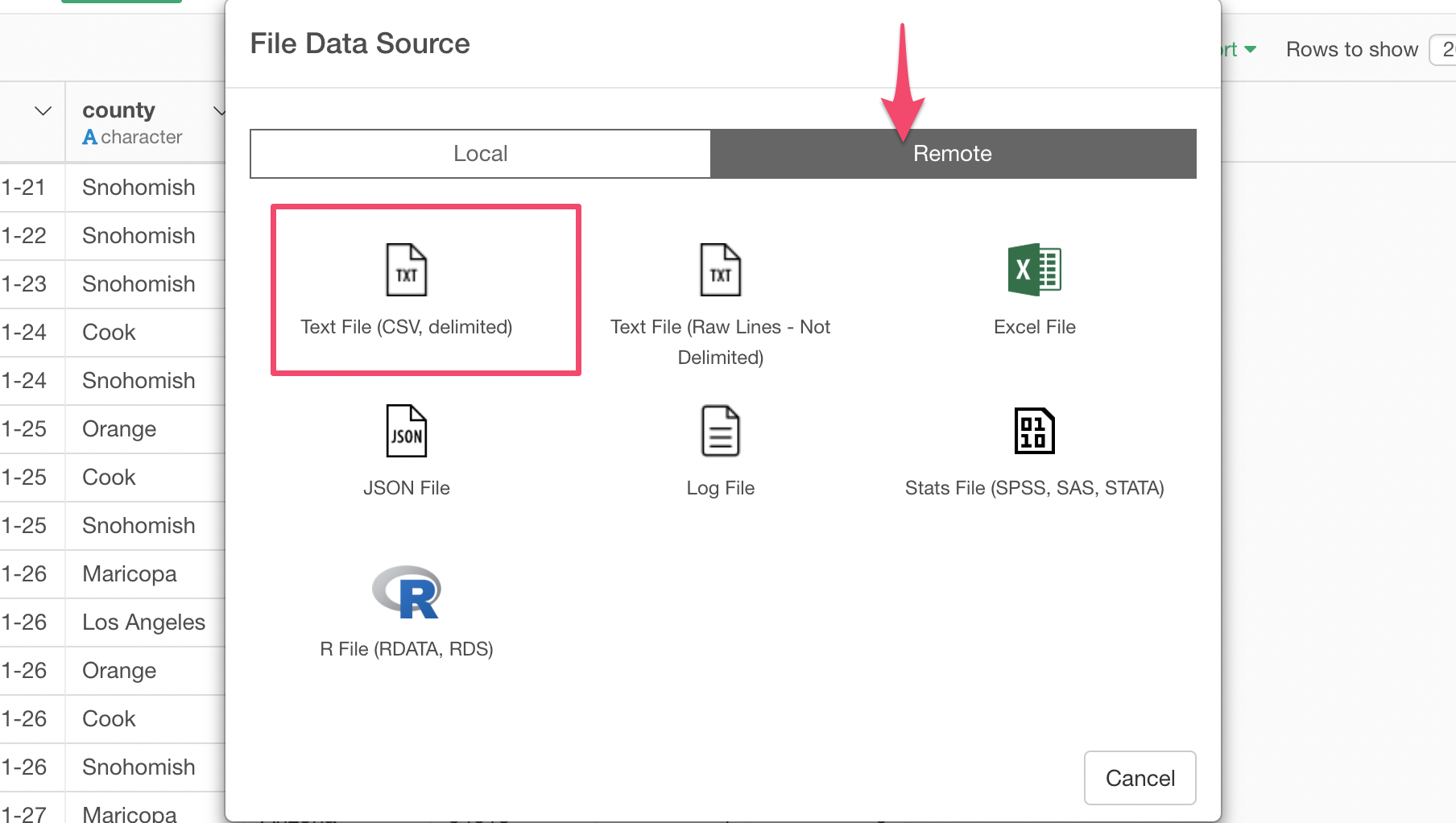
Then, copy the following URL for the data.
https://raw.githubusercontent.com/nytimes/covid-19-data/master/us-counties.csv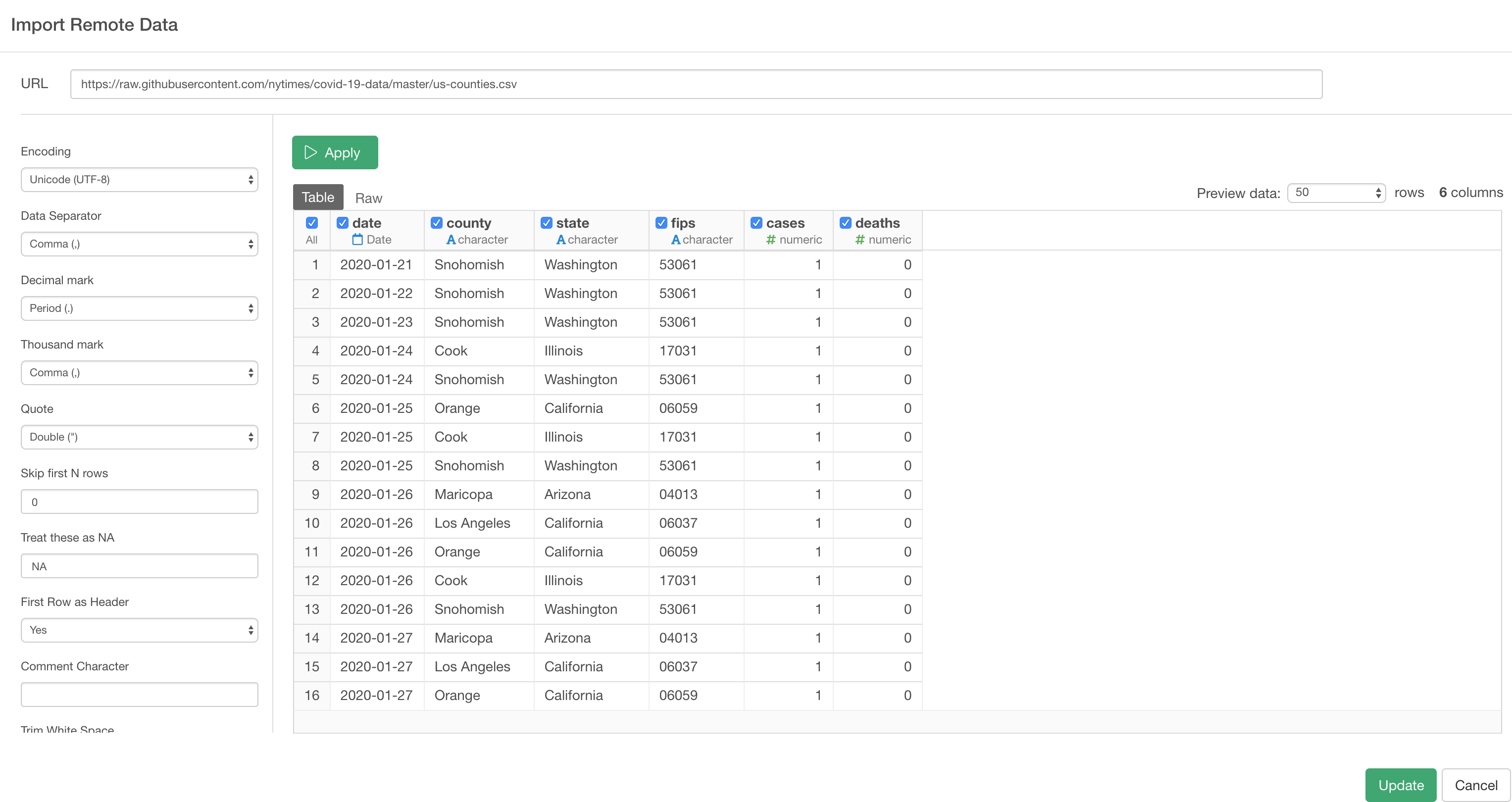
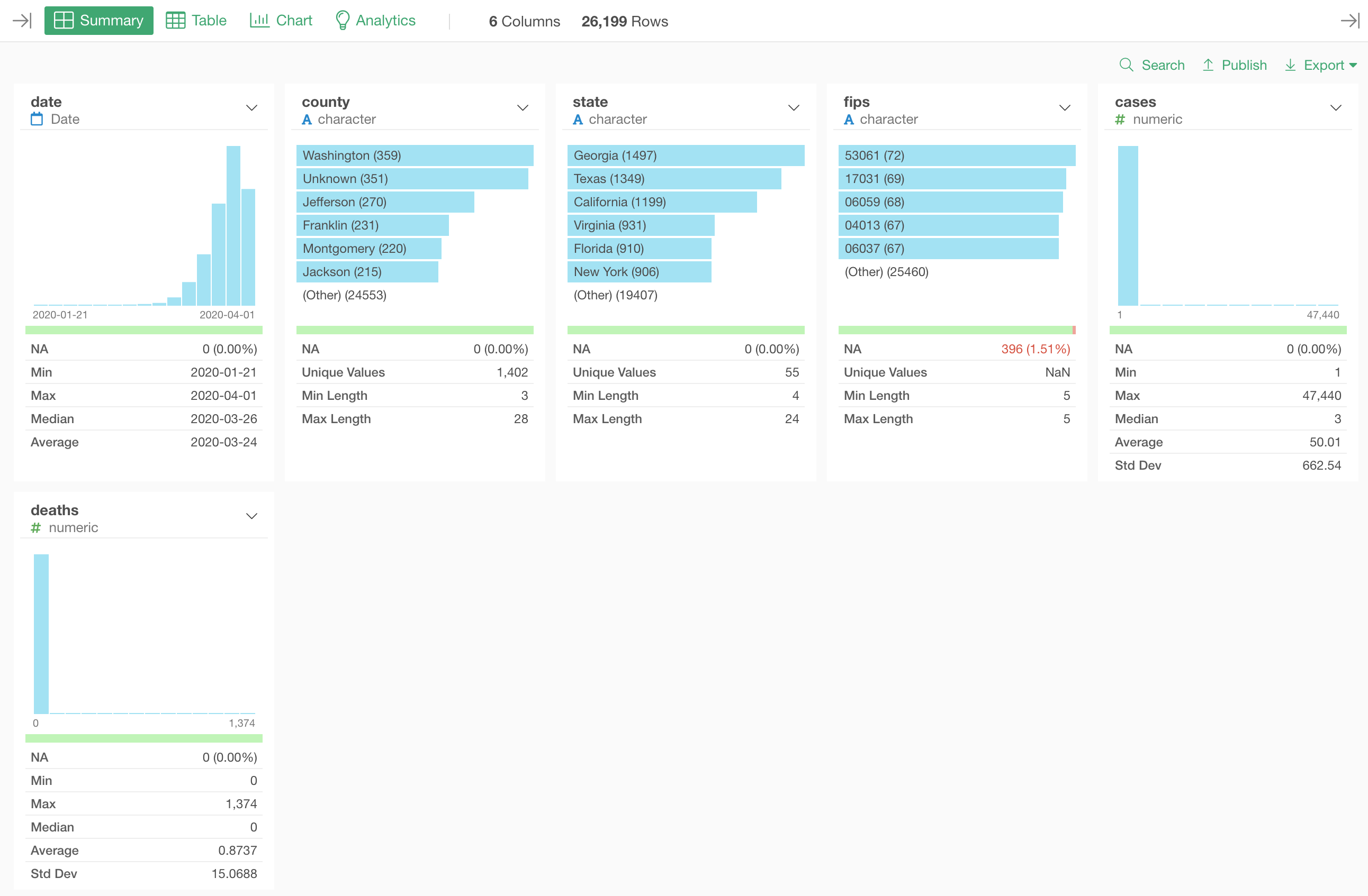
Once the data is imported, you’ll see a summary information of the data as below.
Something about this Data
It’s always important to understand what each row represents.
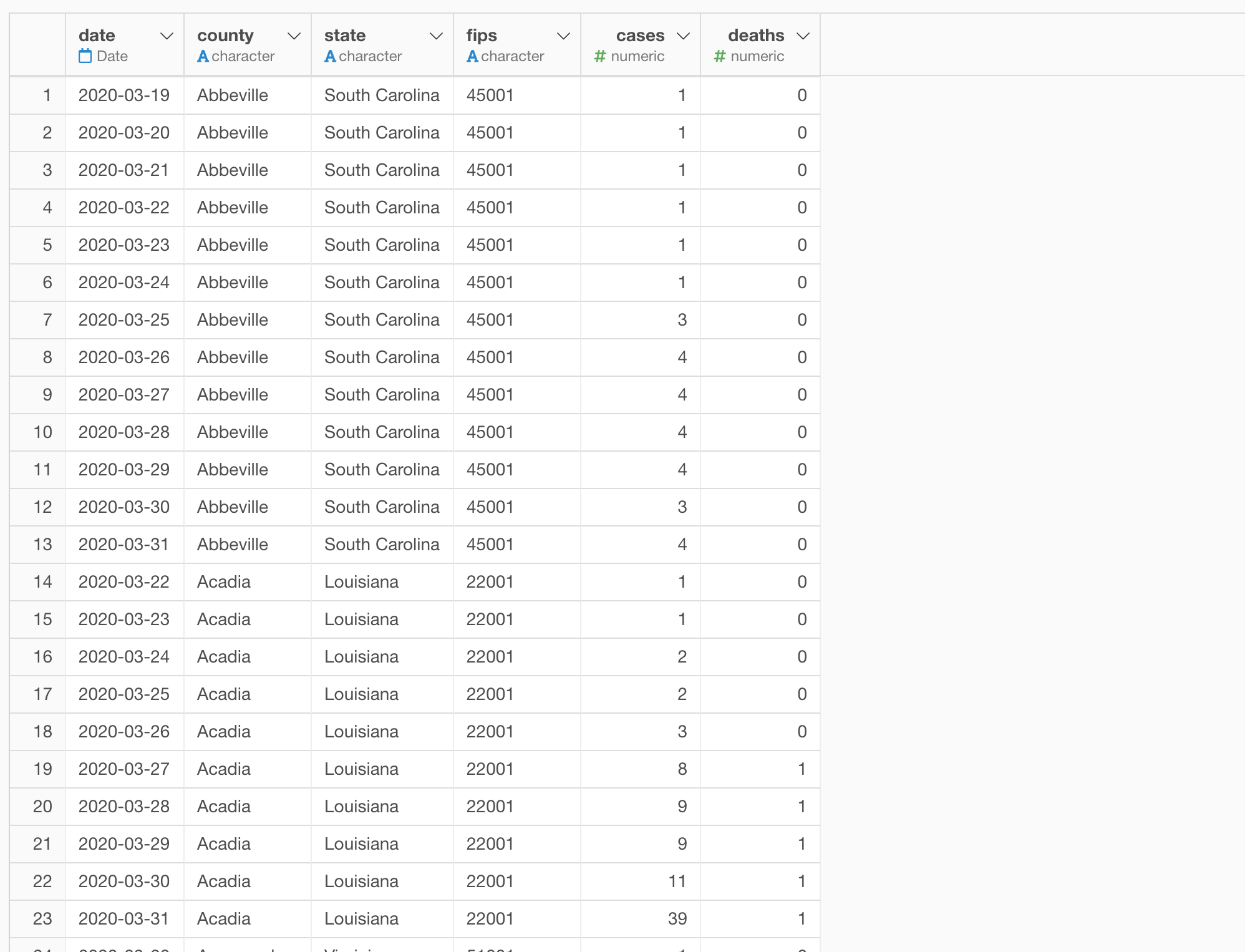
Each row represents a particular day with the number of infected cases and deaths for each US county.
And here is one thing to be careful.
These numbers are not the newly reported cases or deaths of the day. Rather, they are the accumulated numbers up to a given day, meaning that any number you see here is a sum of all the reported cases or deaths in all the previous days.
This is an important point that becomes important later.
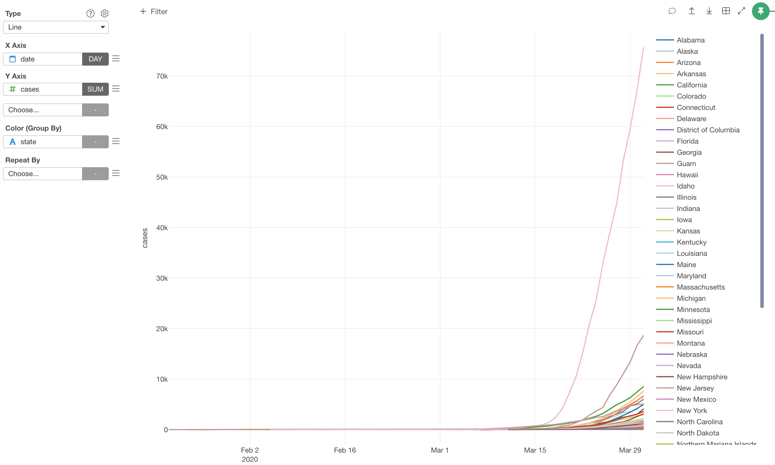
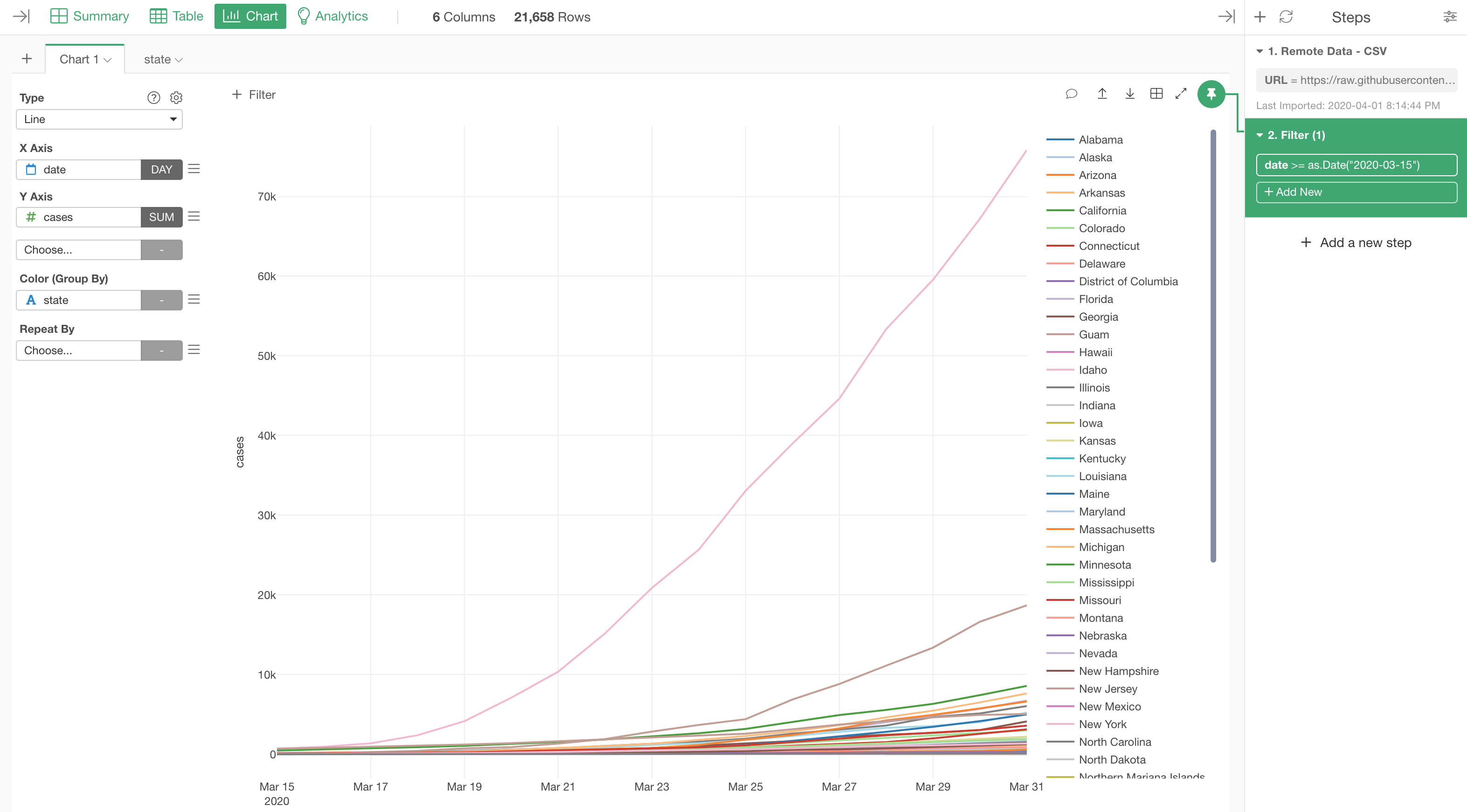
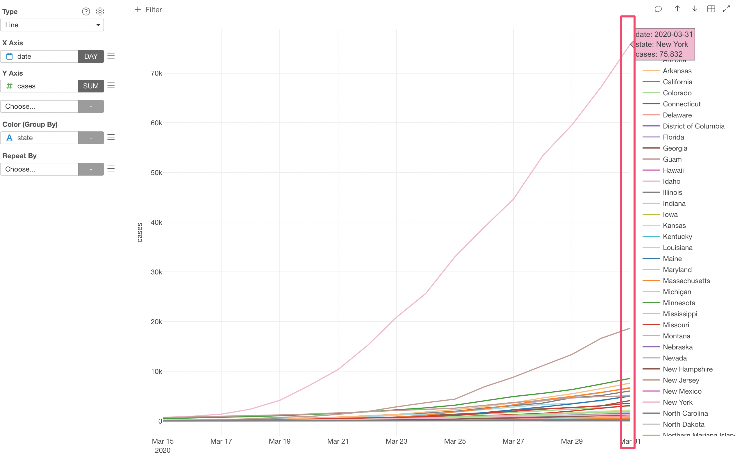
Visualize the Cumulative Number with Line Chart
Now that we have imported the data, let’s start visualizing it.
We’ll start with a line chart to visualize the cumulative number of infected cases.
As mentioned before, the data is already accumulated at a daily level, so we don’t need to do anything. We just assign the date column to X-Axis and the cases column to Y-Axis.
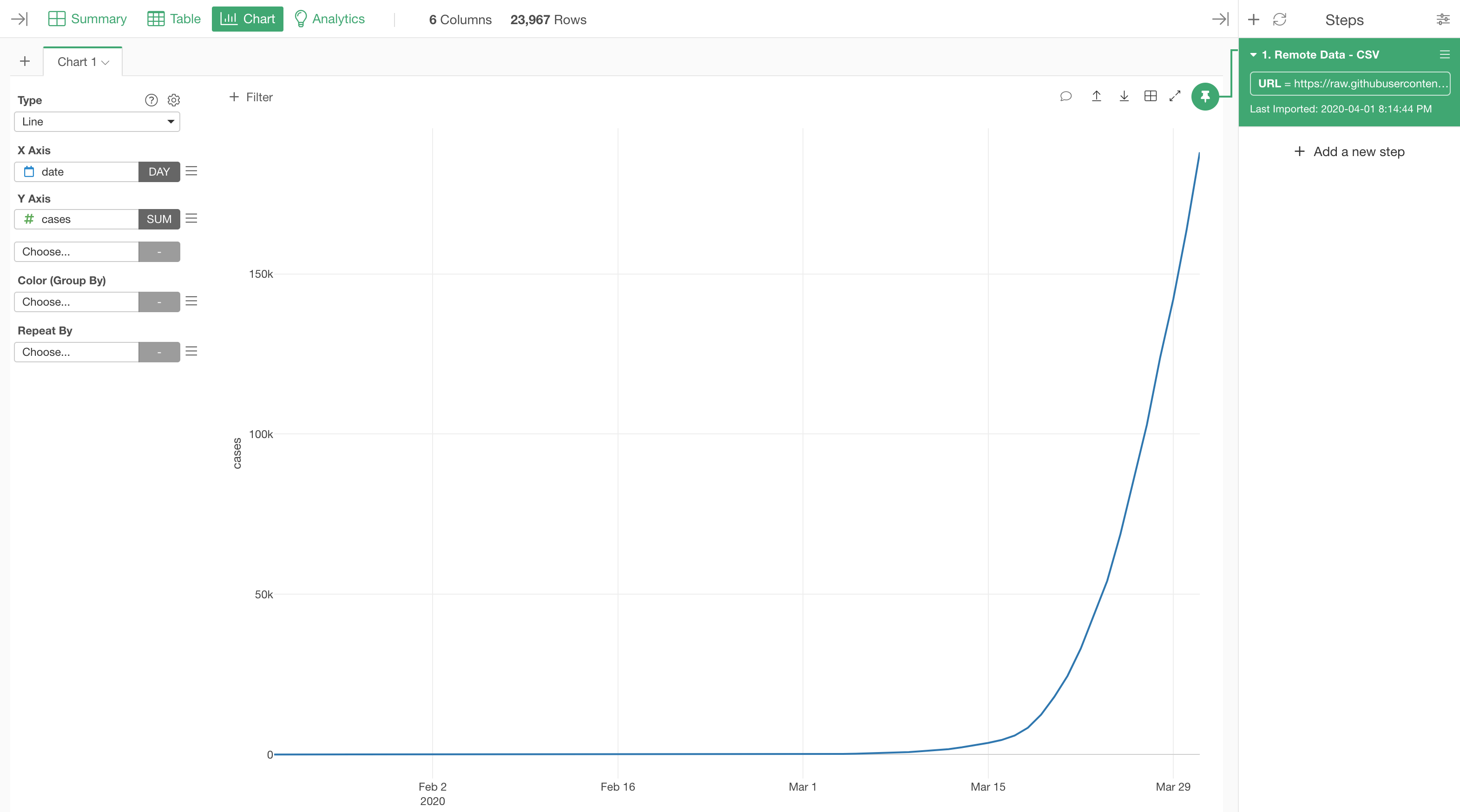
We are looking at the total number of infected cases including all the counties in the US as long as they’re reported in this data.
Group By State
Let’s say we want to see the trend by State.
We can assign the ‘state’ column to ‘Color’.
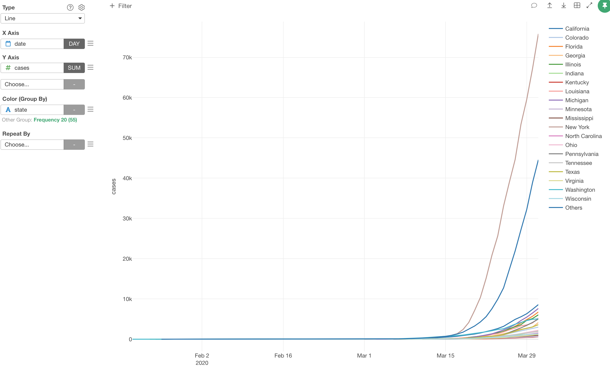
Other Group
Notice that there is ‘Other’ group with high numbers of infected cases. This ‘Other’ group is automatically created when you assign a column with more than 20 unique values to Color.
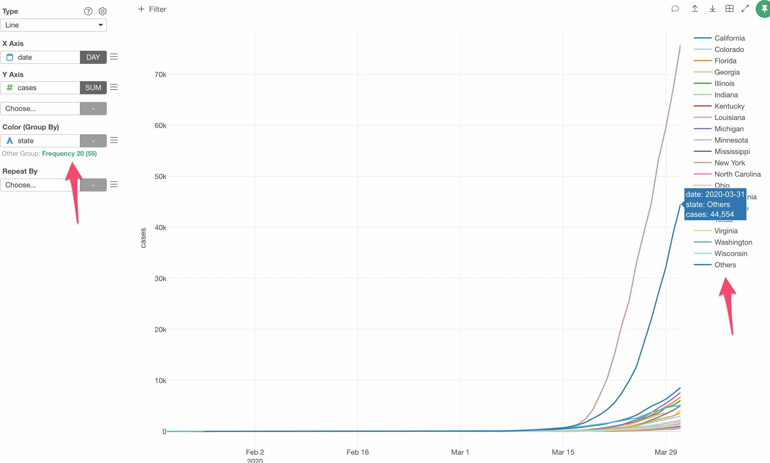
There are 55 states (and annexes), this means that the ‘Other’ group combines 35 states. This is not really meaningful when it’s presented this way.
How is the ‘Other’ group created?
The default option is to keep the most frequent values as they are, then put everything else under ‘Other’ group.
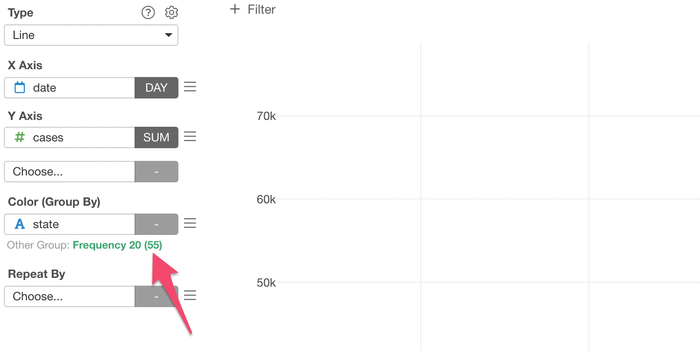
Let’s disable the ‘Other’ group, instead show all the 55 states.
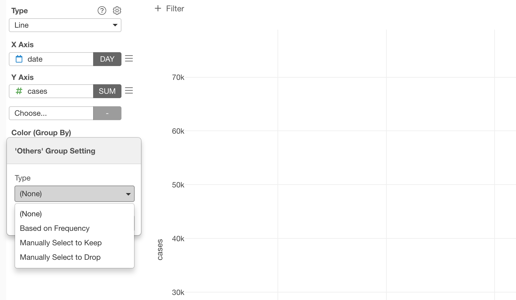
Click on the green text that says ‘Frequency 20 (55)’.
Select ‘None’ under the Type and click the ‘Apply’ button.
This will make the chart a bit noise-y with a bunch of colors.
You can keep only the states with the highest number of cases on the latest day. That requires to create something called ‘Branch’ data frame, and I’ll create a note for it soon.
Filter Data with Step Filter
Now, when you look at the trend, you notice that there is almost no activity going on before 3/15, and then dramatic increases after that.
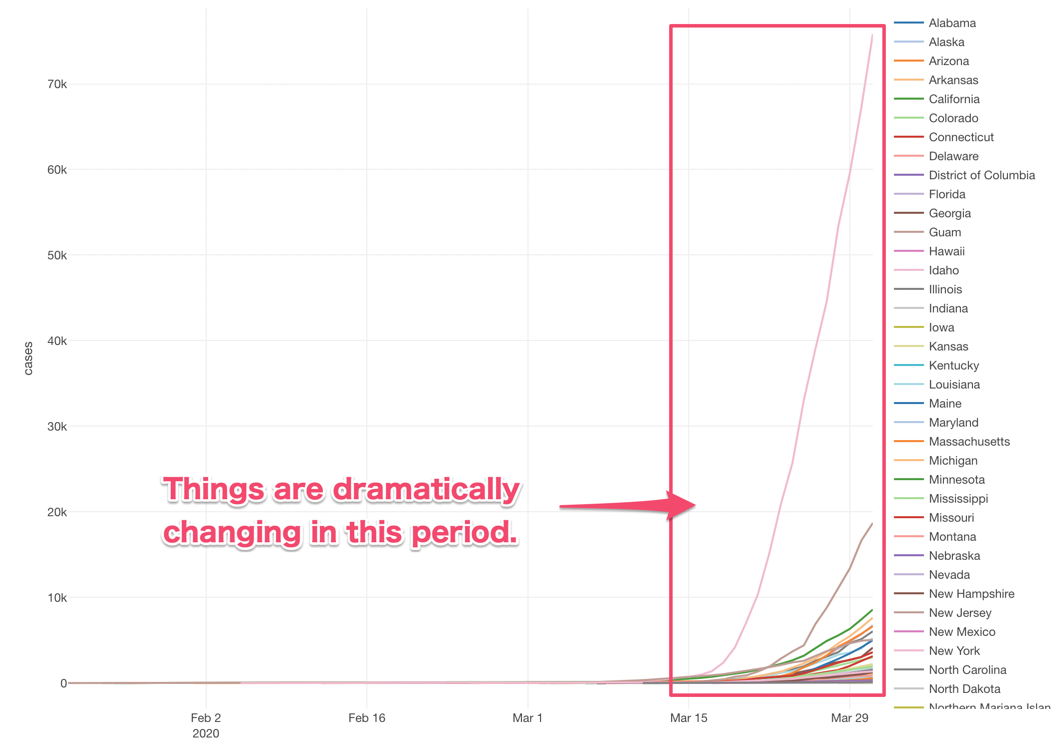
We can filter the data to keep only the data after 3/15.
There are two ways to filter the data. One is called Step Level Filter and another is called Chart Level Filter.
Chart Level Filter filters the data only for this chart. This is quick and convenient.
But if you want to create more charts and want all the charts to use the same filtered data, creating the same filter for each chart is cumbersome.
This is when you want to use the Step Level Filter, which will add a step at the right hand side and filter the data that can be referenced by multiple charts.
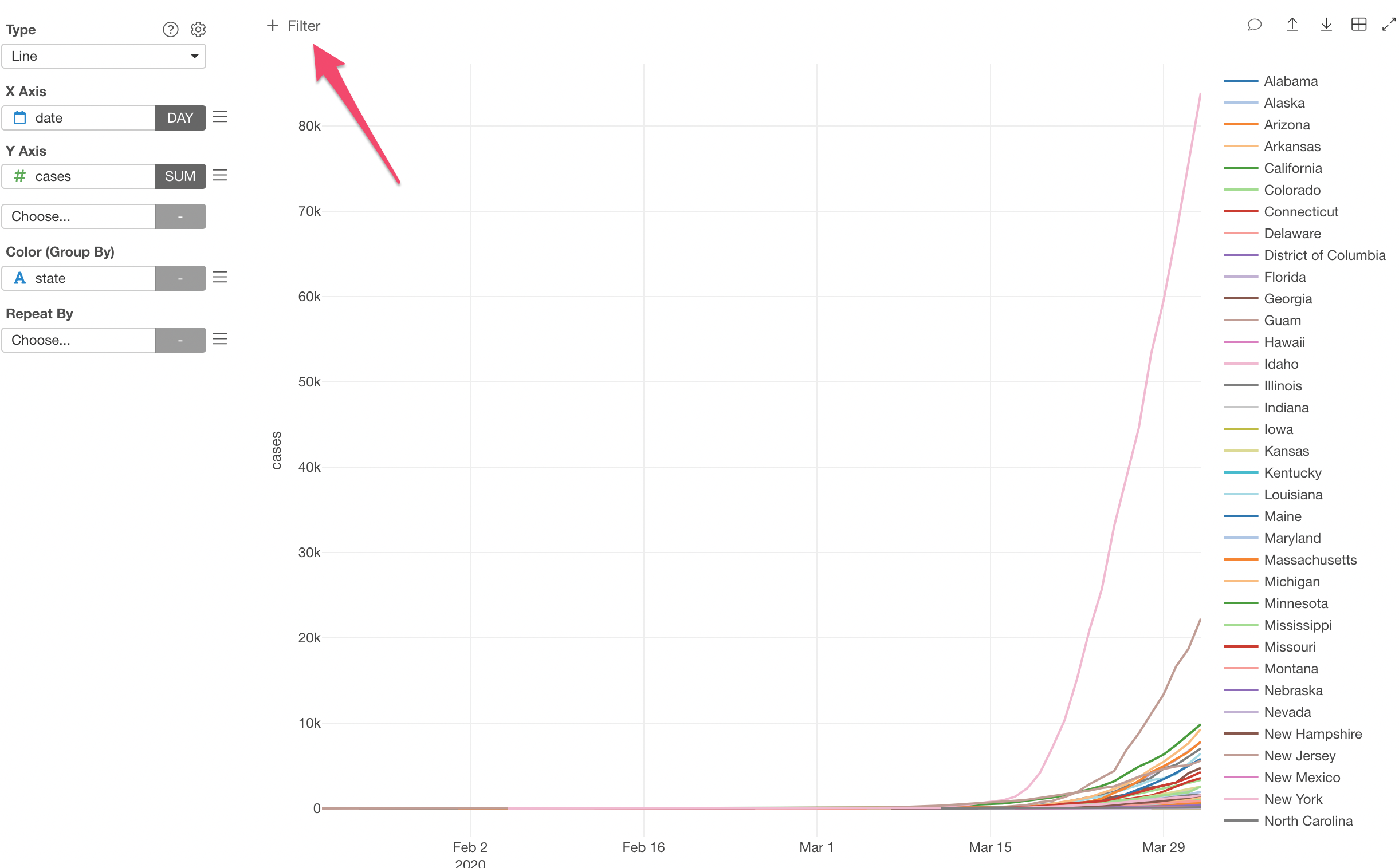
Let’s try.
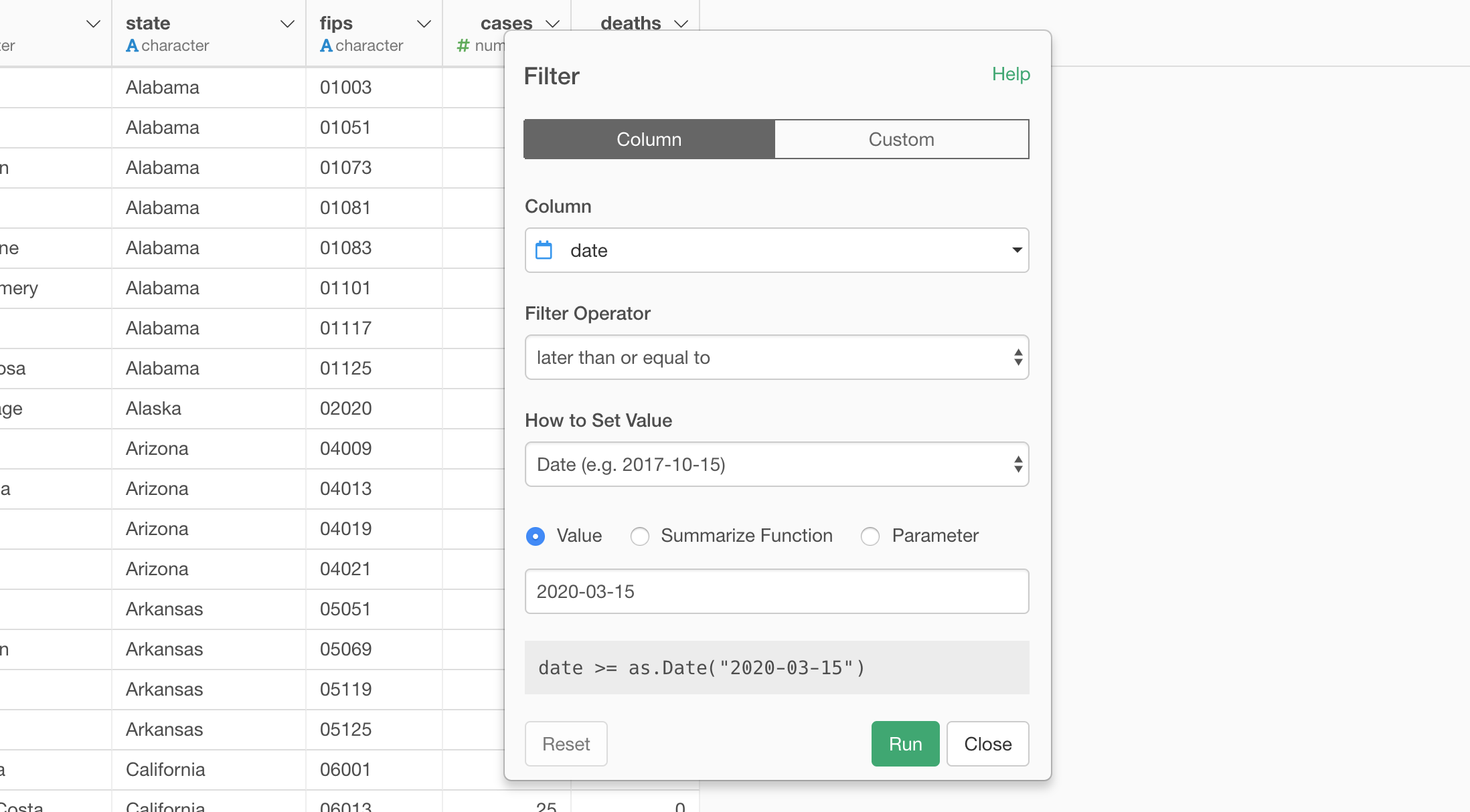
Select ‘Filter’ from the column header menu of the ‘date’ column.
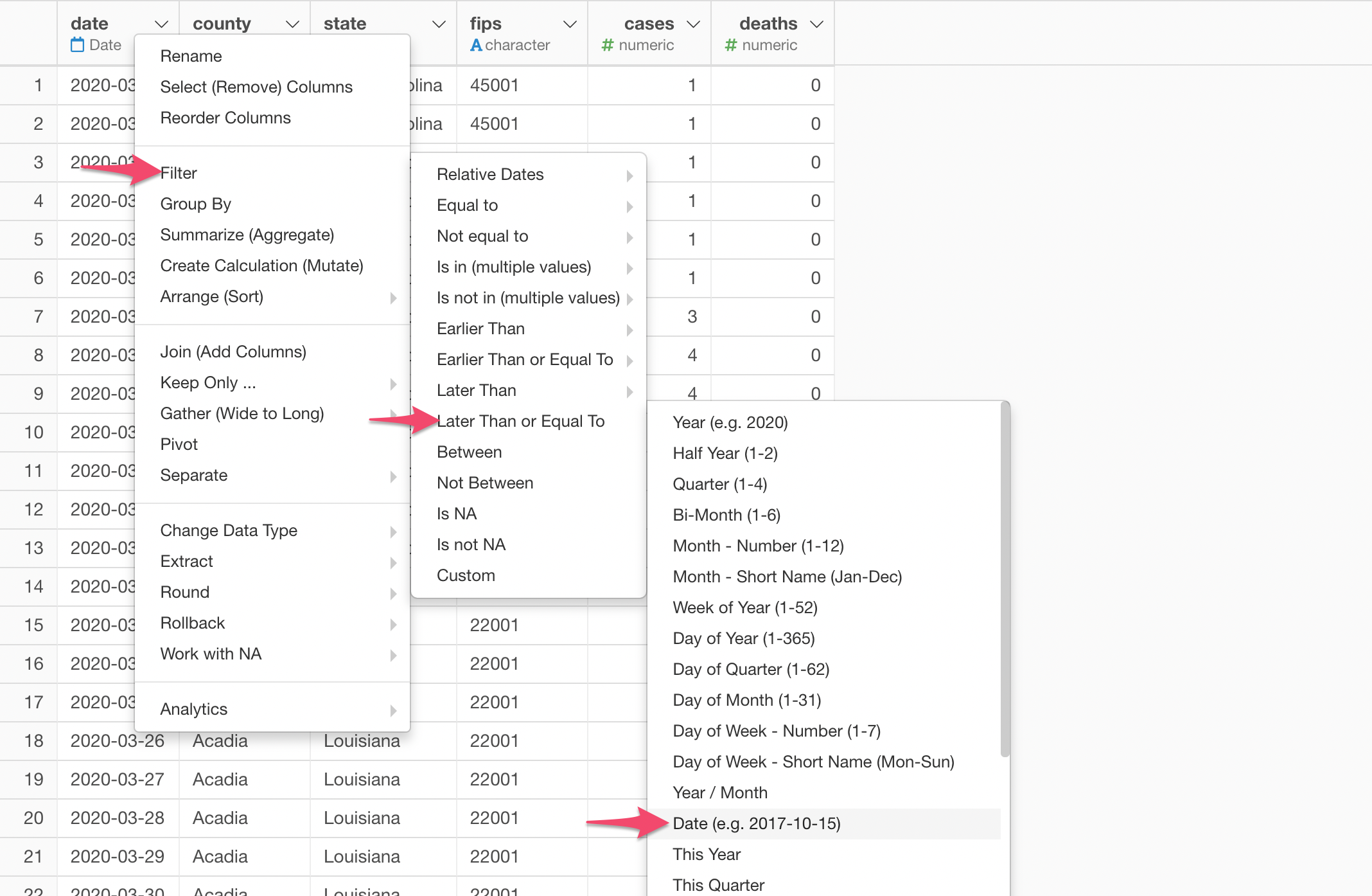
And select ‘Later Than or Equal To’ and ‘Date (e.g. 2017-10-15)’ from the sub-menu.
In the opened dialog, you want to type ‘2020-03-15’ for the Value.
Now, a new step is added to the Step area.
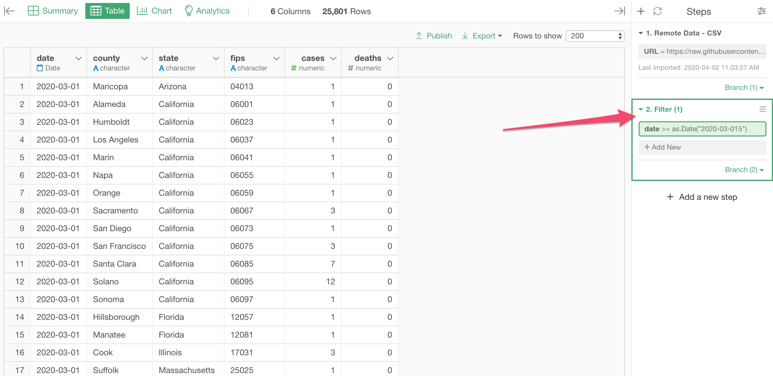
This is the Filter step to keep the data only after 3/15.
Now, when you go back to the previous chart you’d notice that it is still showing the data before 3/15. This is because the Chart is Pinned to the 1st step before the new Filter step.
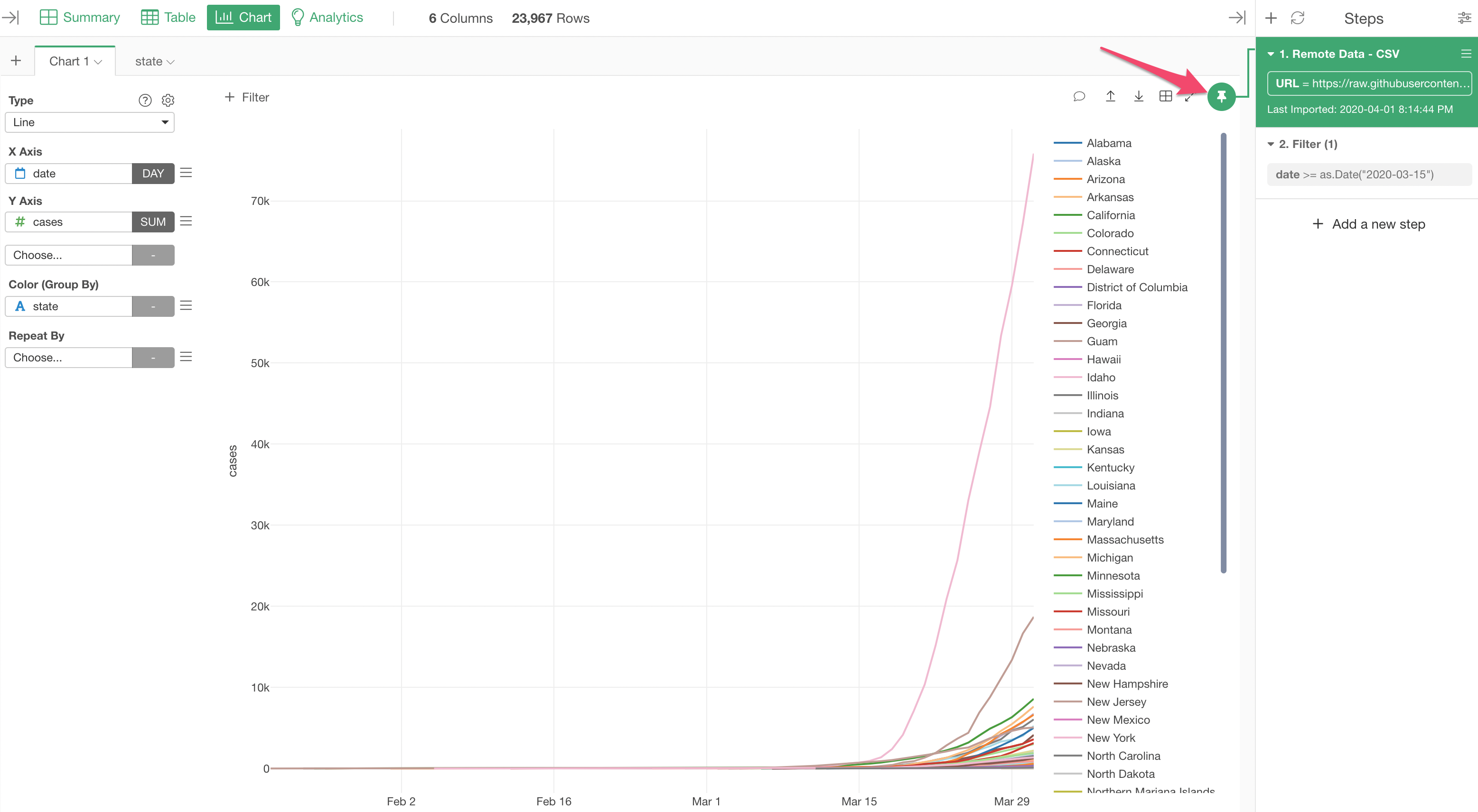
In order to show the filtered data, you want to move the Pin button to the 2nd step of ‘Filter’ by drag-and-drop.
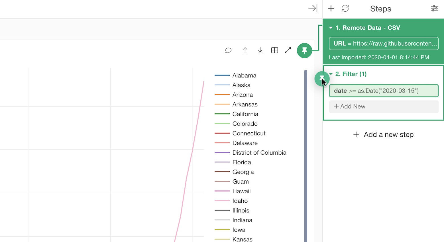
After the Pin is setup correctly, now you should see the data that is after 3/15.
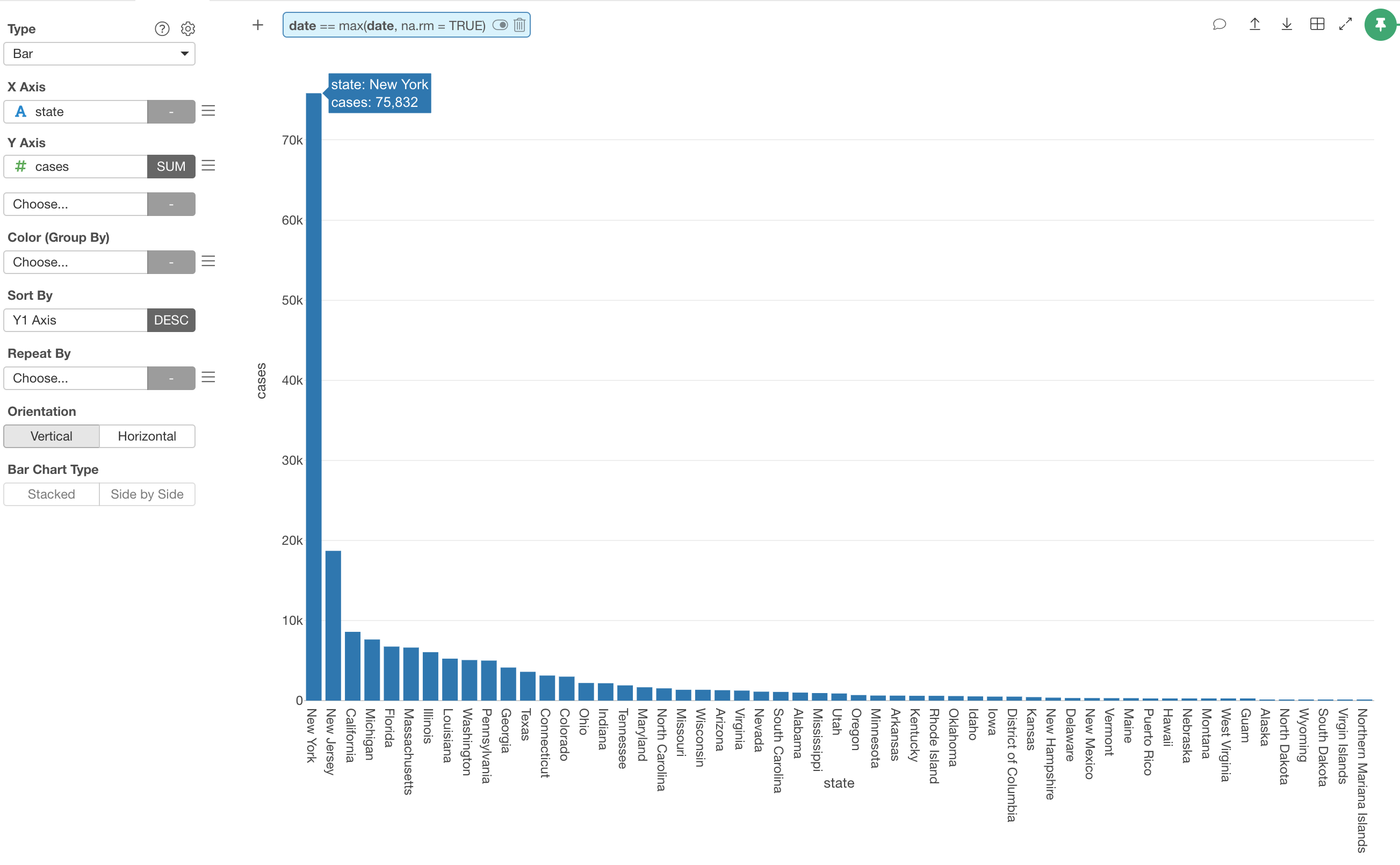
Show Only the Last Date Data, not Sum of Cumulative Data
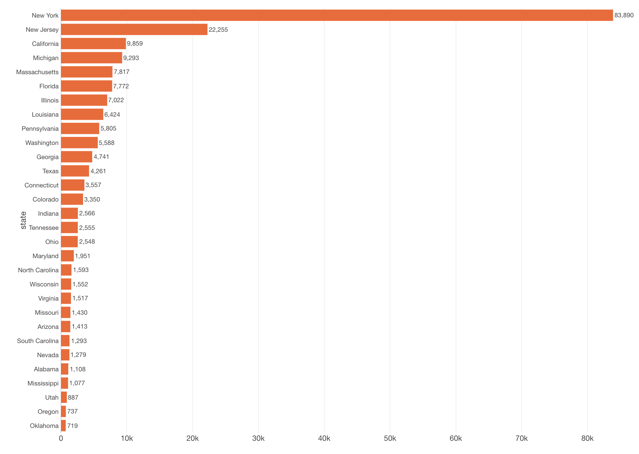
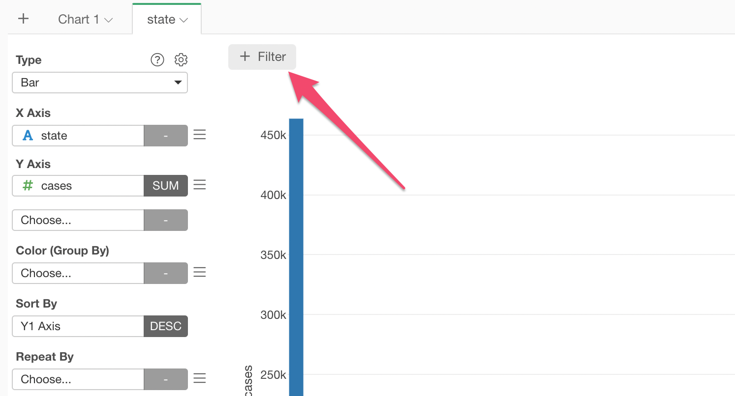
Now, let’s say we want to compare the number of infected cases among the states.
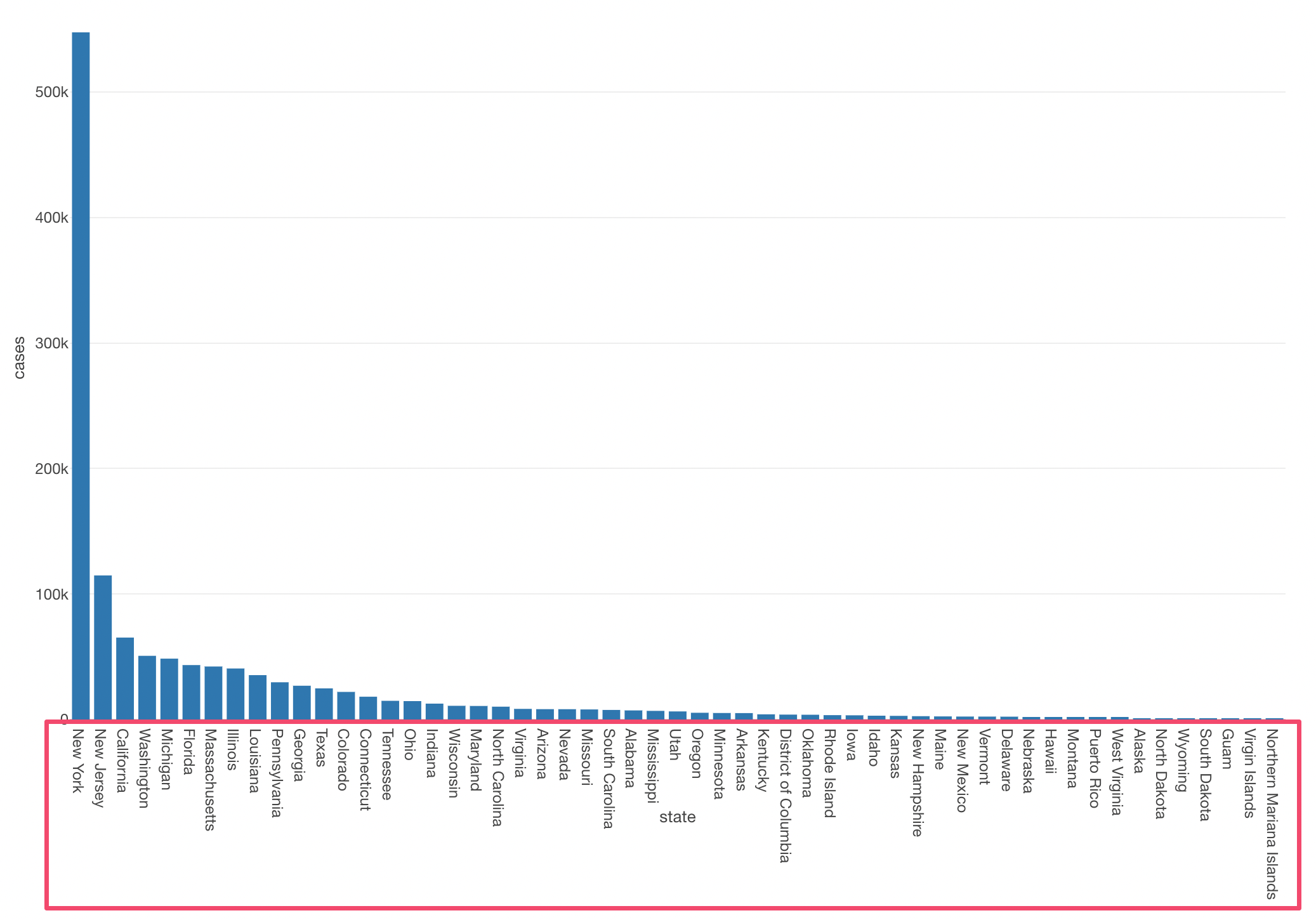
We can create a bar chart like the below by assigning the ‘state’ column to X-Axis and the ‘cases’ column to Y-Axis, then sort the states based on the number of cases by using Sort By.
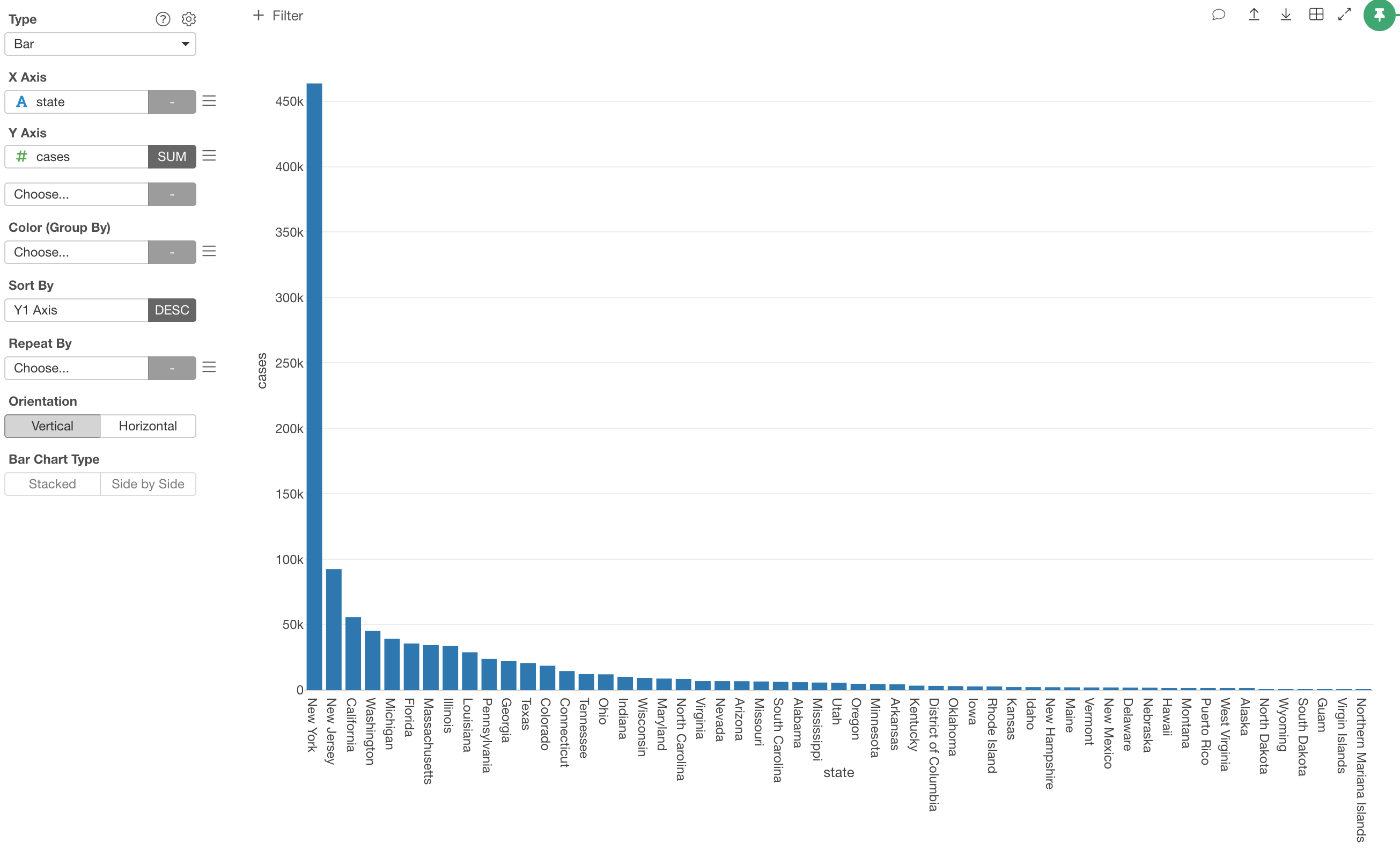
We can see that New York state has 463K people infected!! That’s a half million people!
Wait, that’s not true. Hold your breath…
As mentioned before, the ‘cases’ column has a cumulative sum (running total) of the cases, this means you can’t add up all the numbers for each state by using ‘SUM’ function.
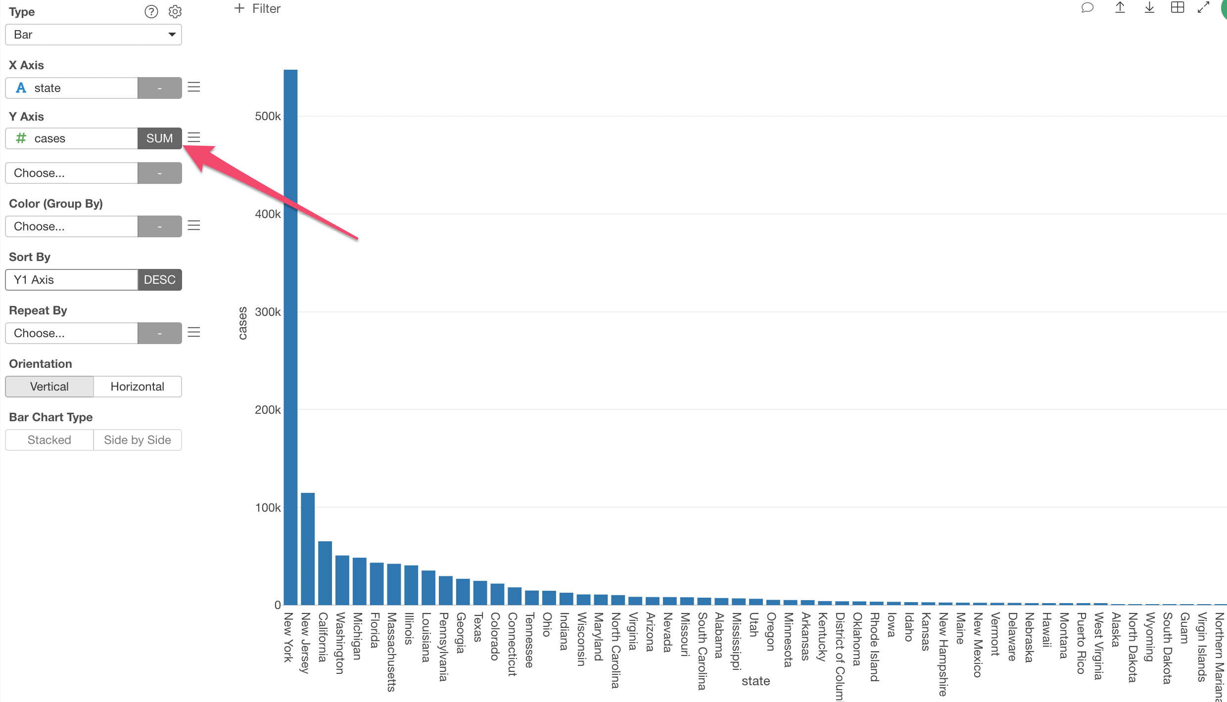
If you want to compare the numbers of infected cases among the states based on the latest numbers, you want to filter the data to keep only the latest date.
You can do this with something called ‘Summarize Function’ filter.
For this, let’s use the ‘Chart Level Filter’ this time because we want to filter the data only for this chart.
First, you want to select the ‘date’ column, select ‘equal to’ as the filter operator, then ‘Date’ for the ‘How to Set Value’.
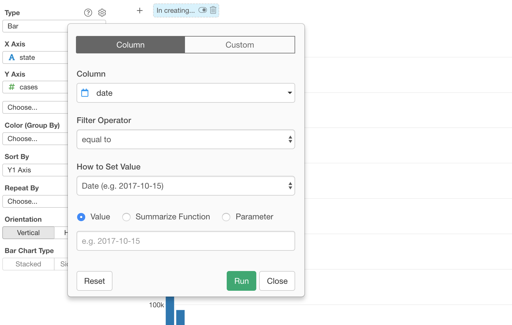
Then, you want to click the Summarize Function checkbox, and select ‘Max’ function from the list.
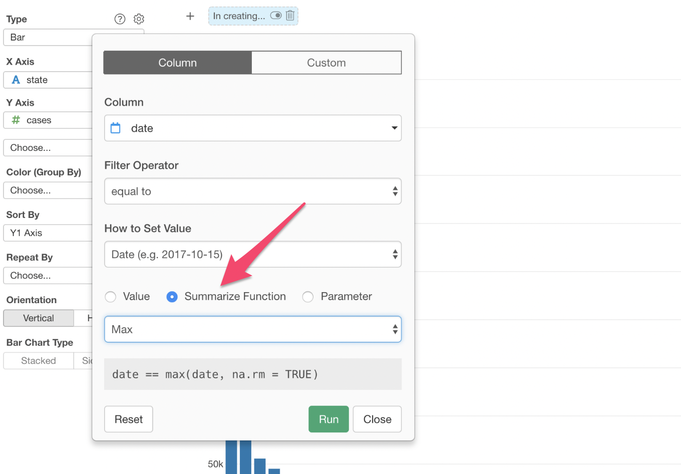
This will filter the data whose date column has the max date, which is equal to the latest date, of the data. (e.g. 2020-03-31).
Once you click ‘Run’ button, the data is showing only the cases for the latest date of the data.
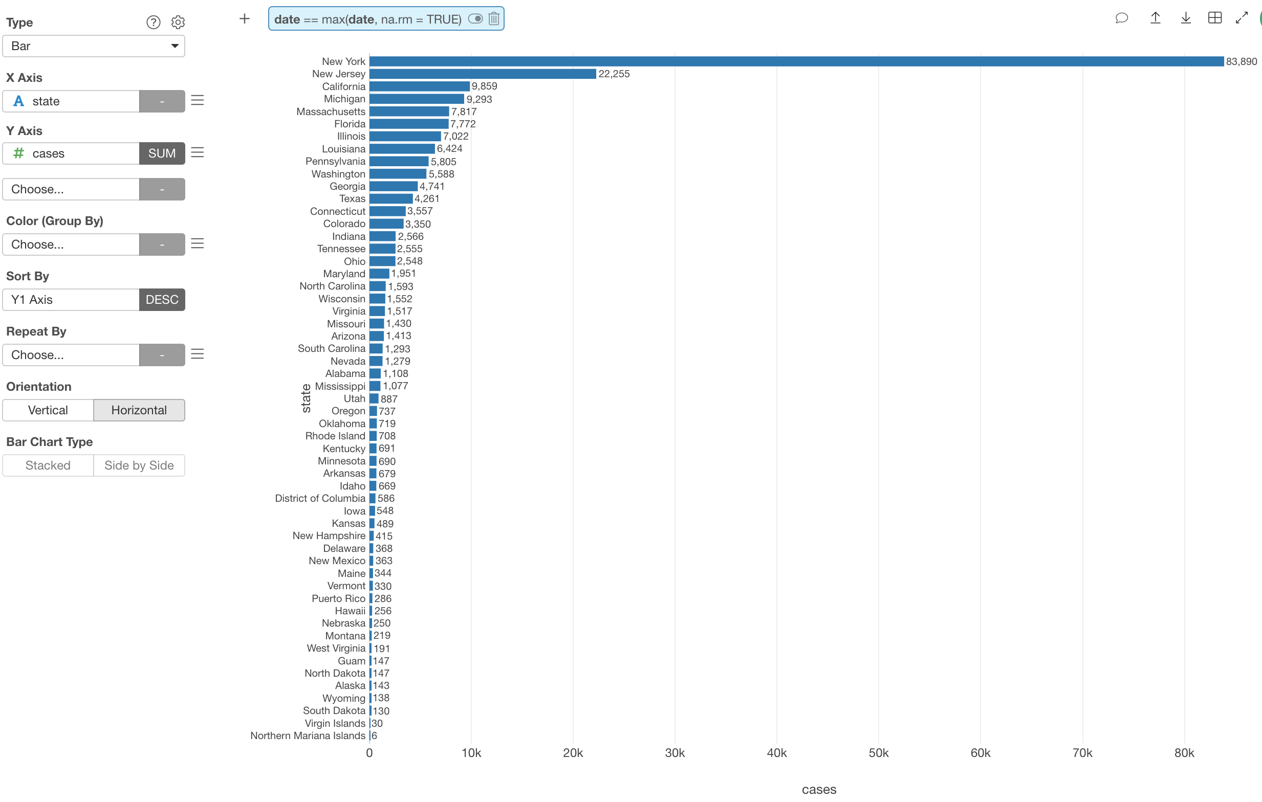
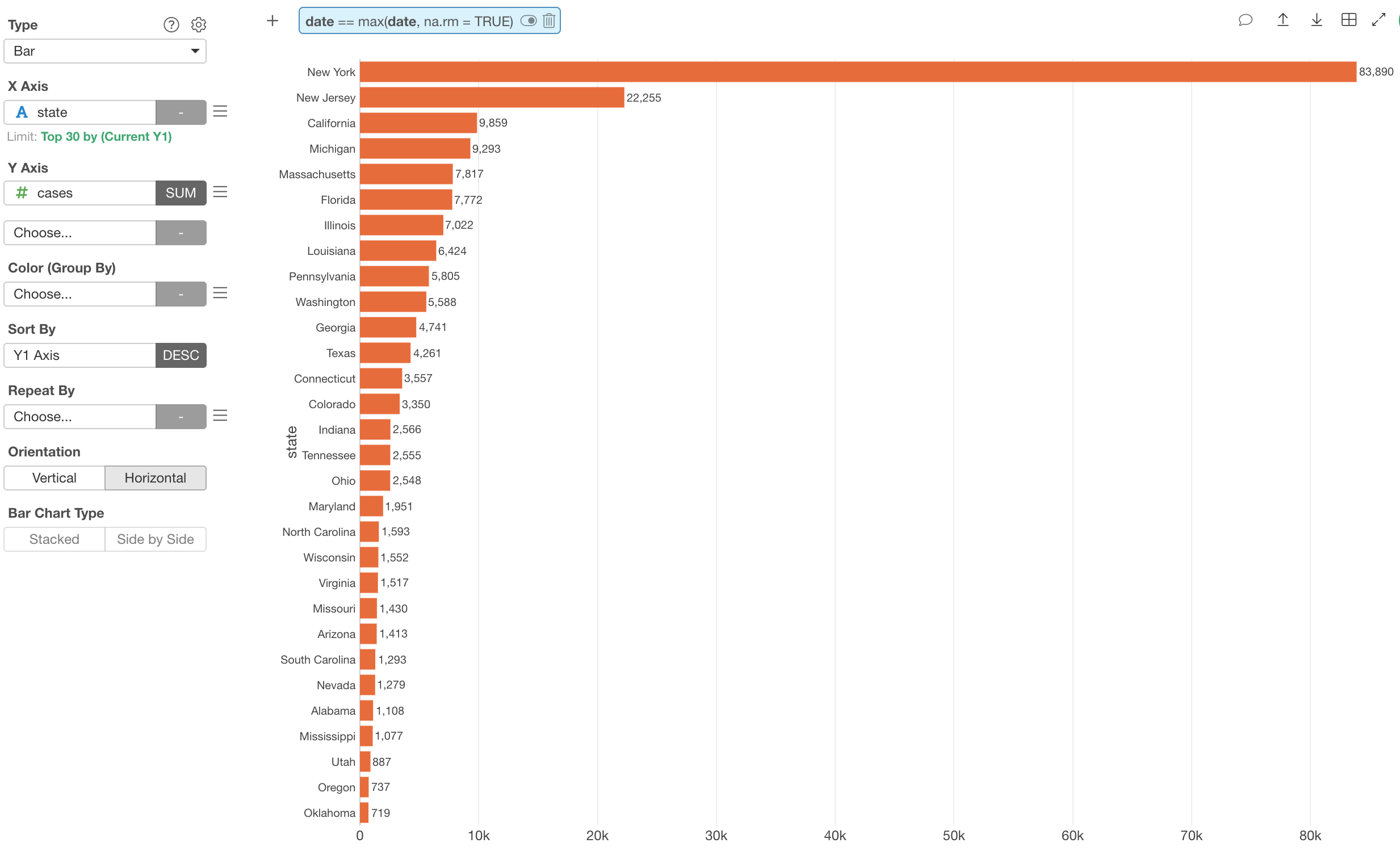
Horizontal Bar with Values on Plot
The state names can be long and showing them vertically makes it harder to read.
You can make the bar chart to a horizontal mode.
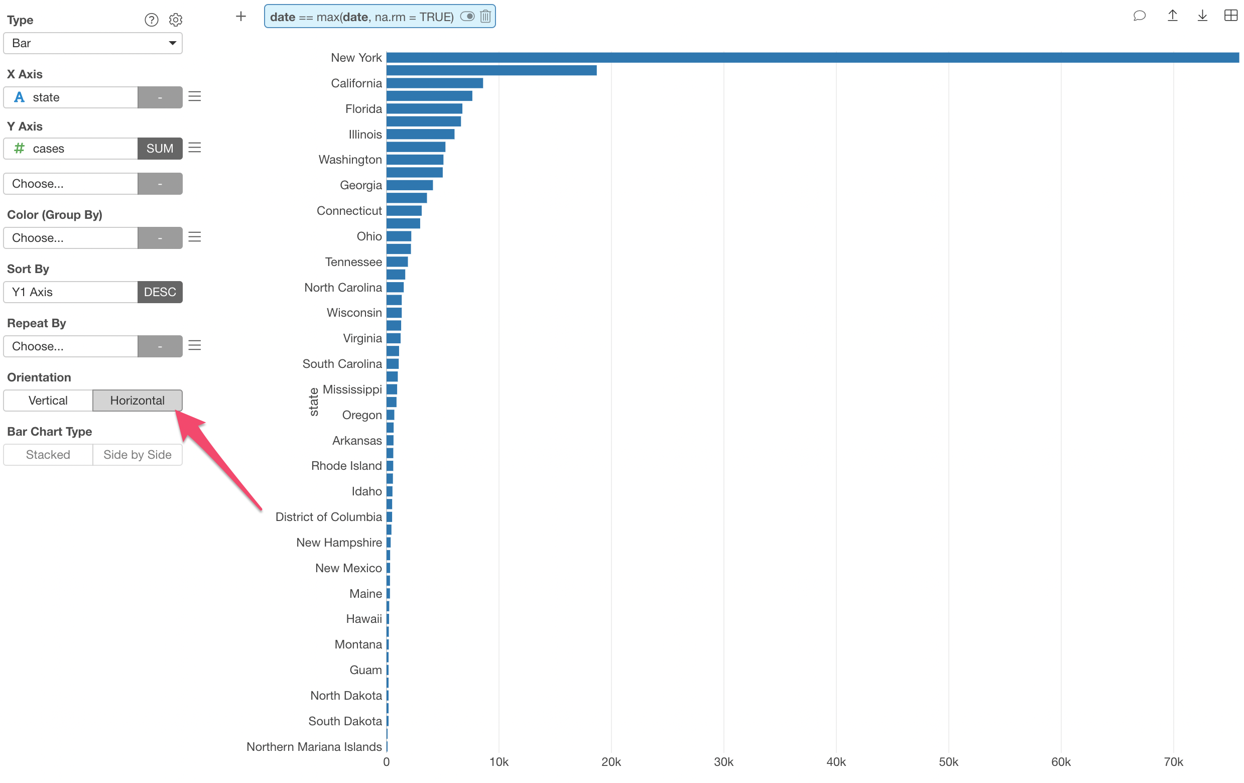
Show Values on Chart
You can move your mouse over on each chart to see the exact number of cases for each state. But sometimes, you might want to show the values next to the bars so that you (or your audience) can see the numbers right away.
You can do so inside the Chart property, and select ‘Above’ for the Show Value on Plot property.
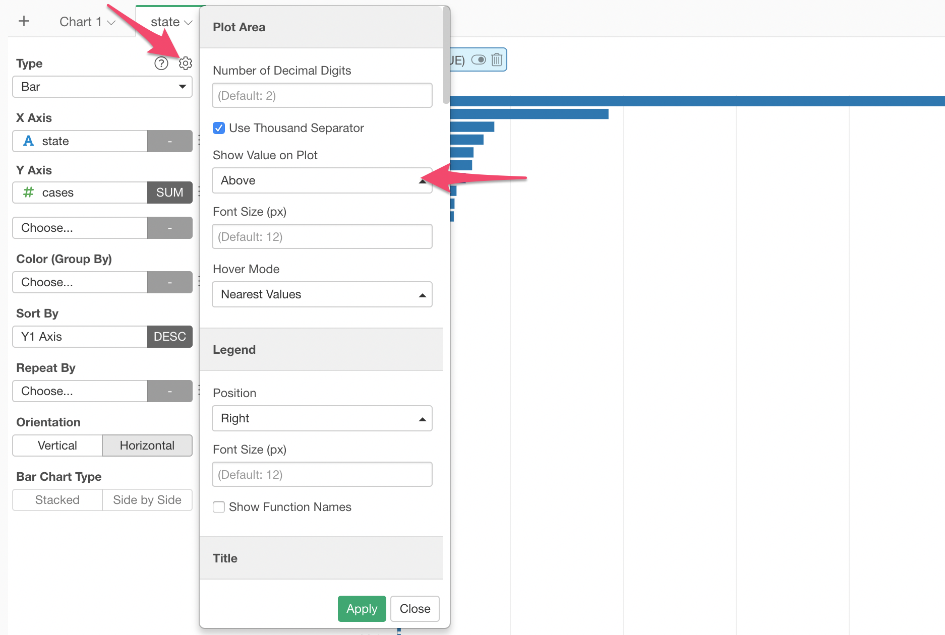
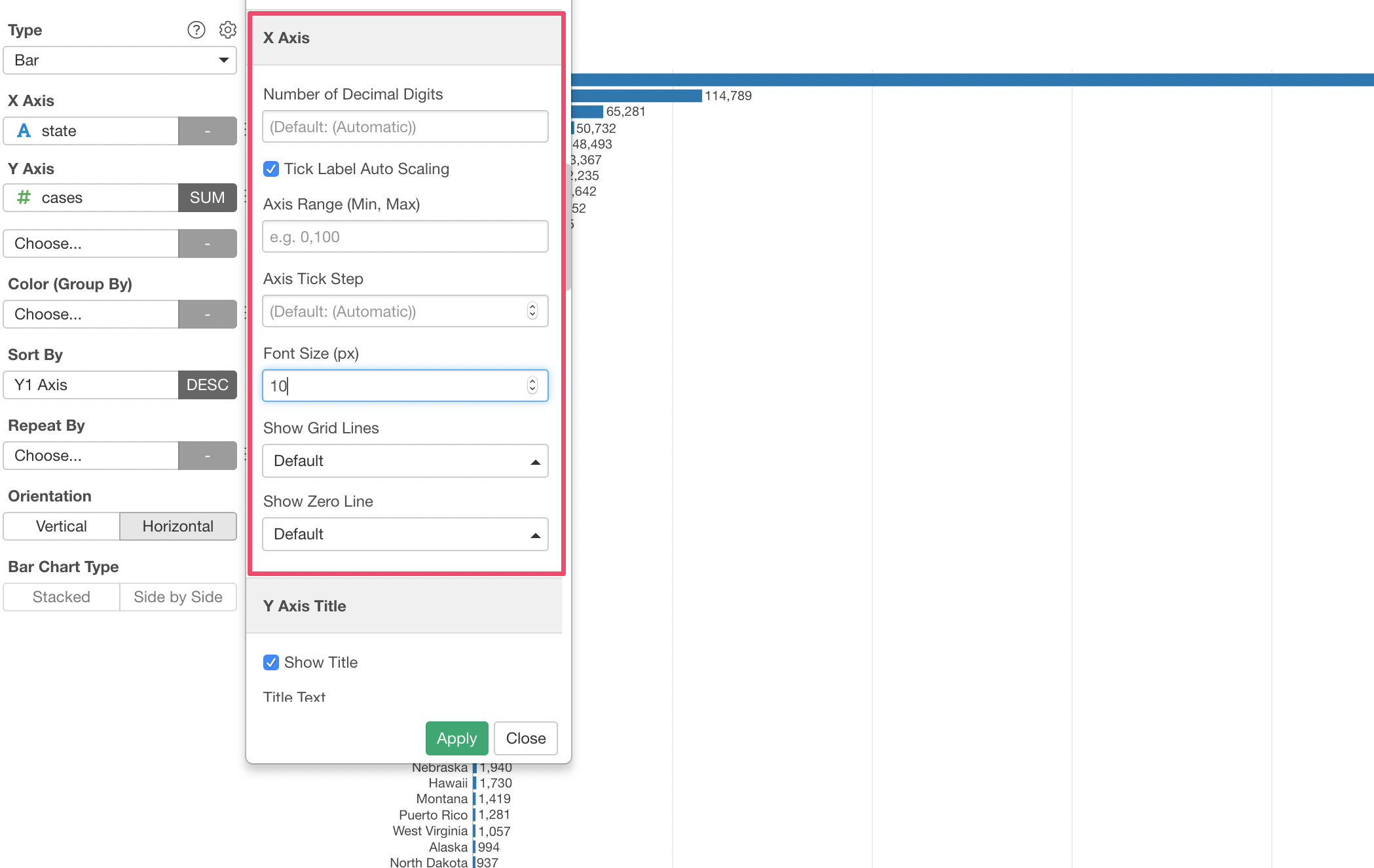
When you do I’d recommend you adjust the font size to make it easier to read.
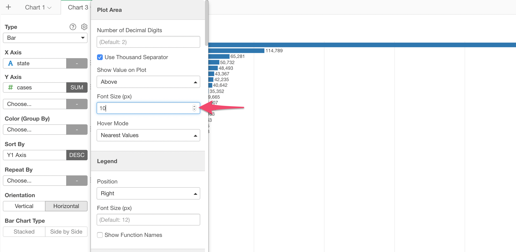
And don’t forget to adjust the font size for the State names as well, otherwise, all the state names won’t show up.
Here’s the chart we have created so far.
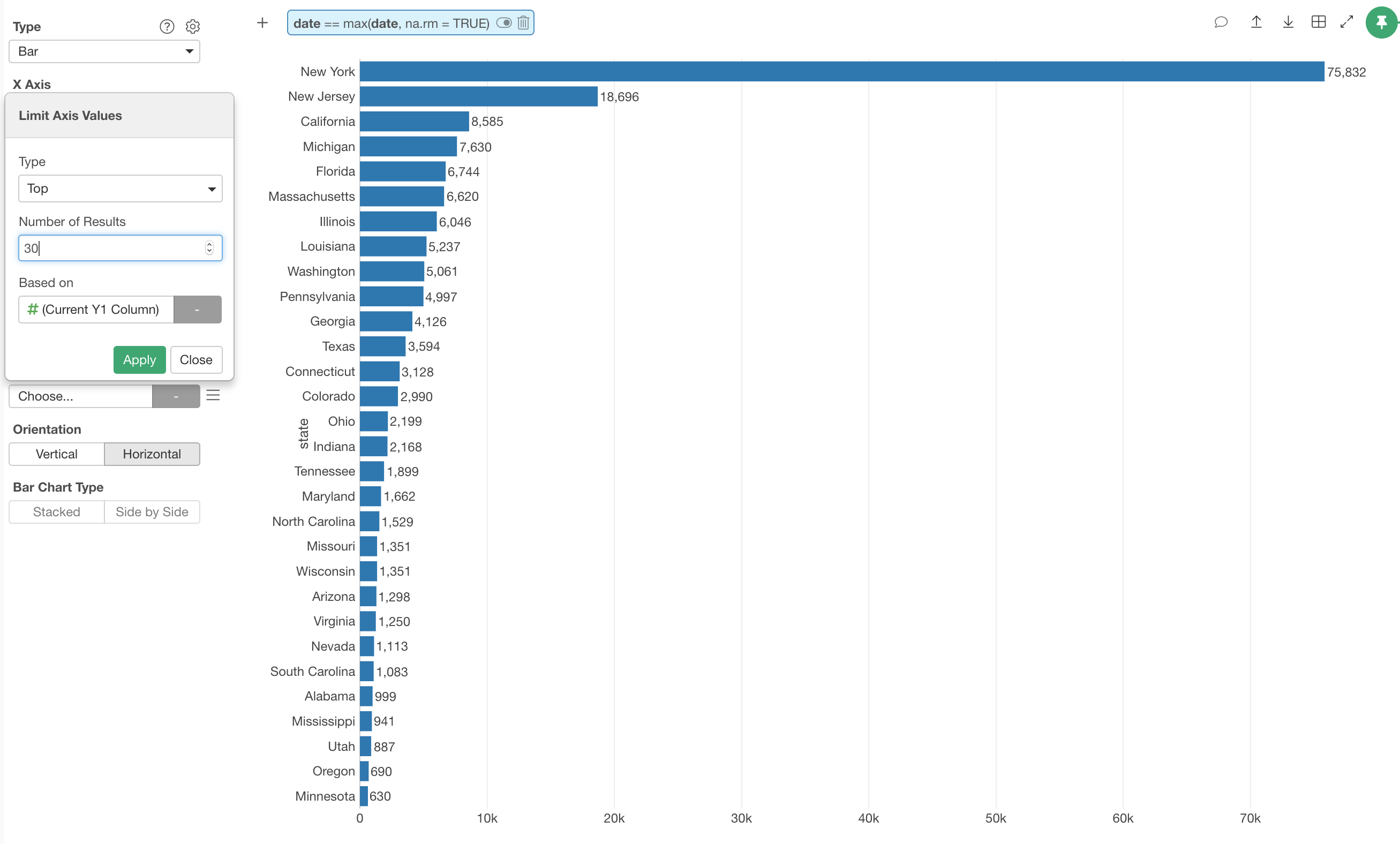
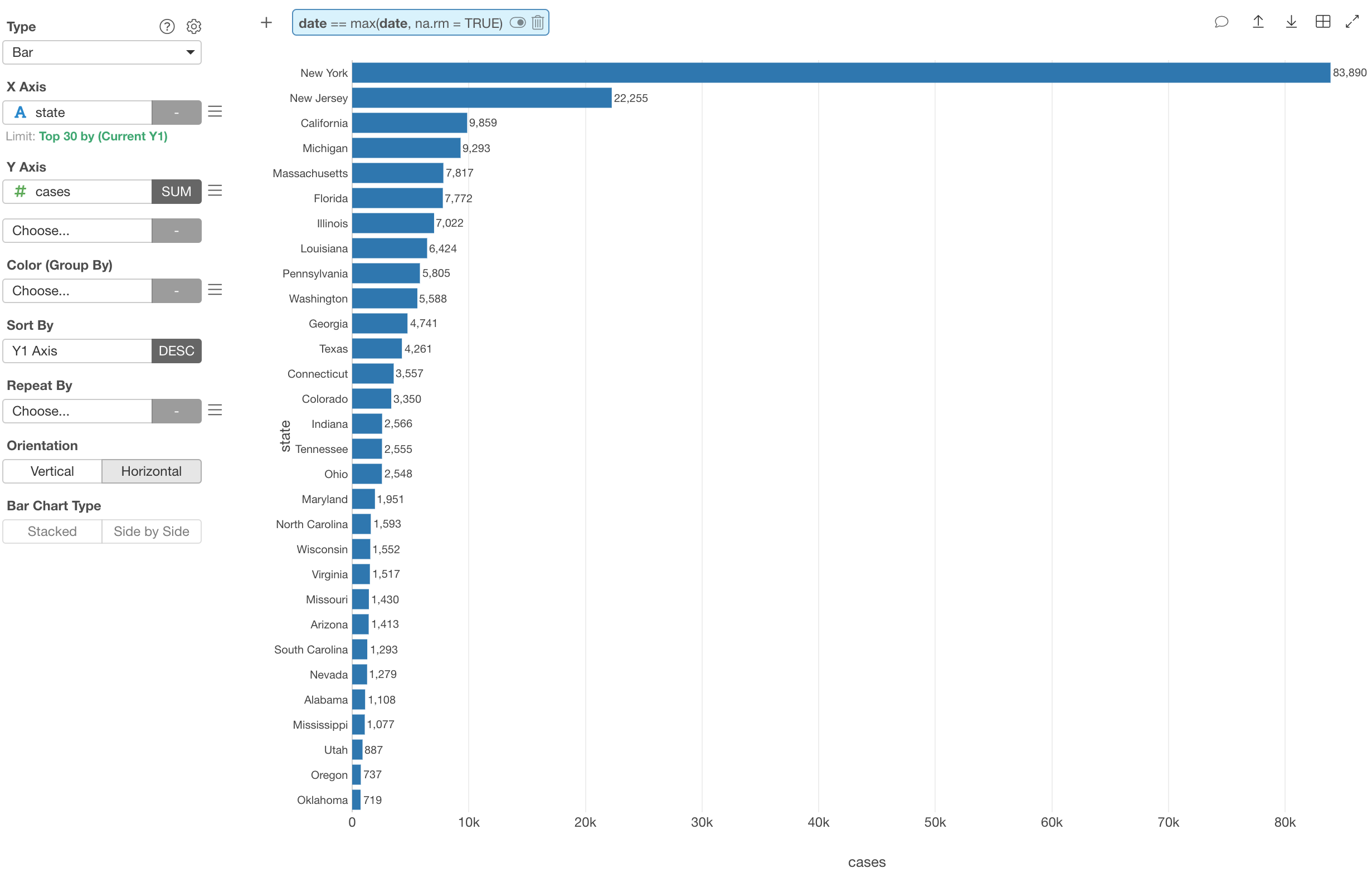
Show Only Top 30 States
Wait, but there are too many states and that makes it harder to read, isn’t it?
You can limit the number of states to show with ‘Limit’ feature.
Let’s say we want to limit to only the top 30 states based on the number of cases.
Select ‘Limit Axis Values’ from the X-Axis menu.
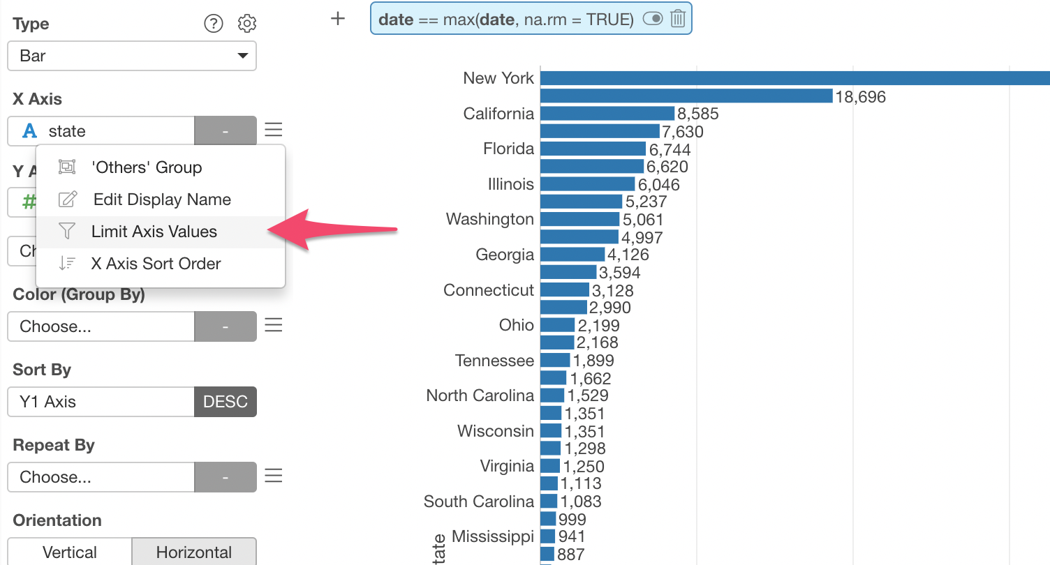
In the dialog, select ‘Top’ for the Type and type 30 for the Number of Results. We can keep ‘(Current Y1 Column)’ for the Based on as is so that the top 30 evaluation is done on the number of cases, which is the column currently assigned to Y-Axis.
Here’s how it looks with the top 30 States.
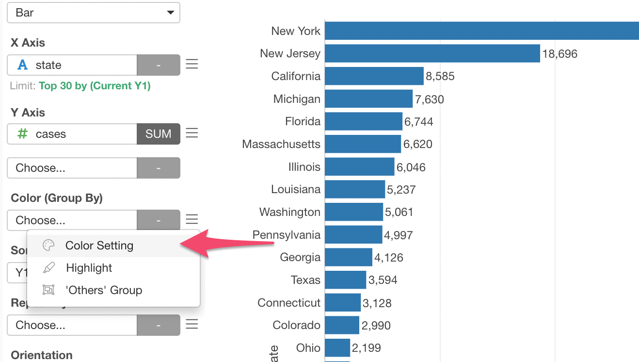
Change the Color
Now, here’s the last step.
Let’s change the color!
Select ‘Color Setting’ from the Color (Group By) menu.
You can either select one of the pre-defined color palettes or create your own by selecting ‘Custom’!
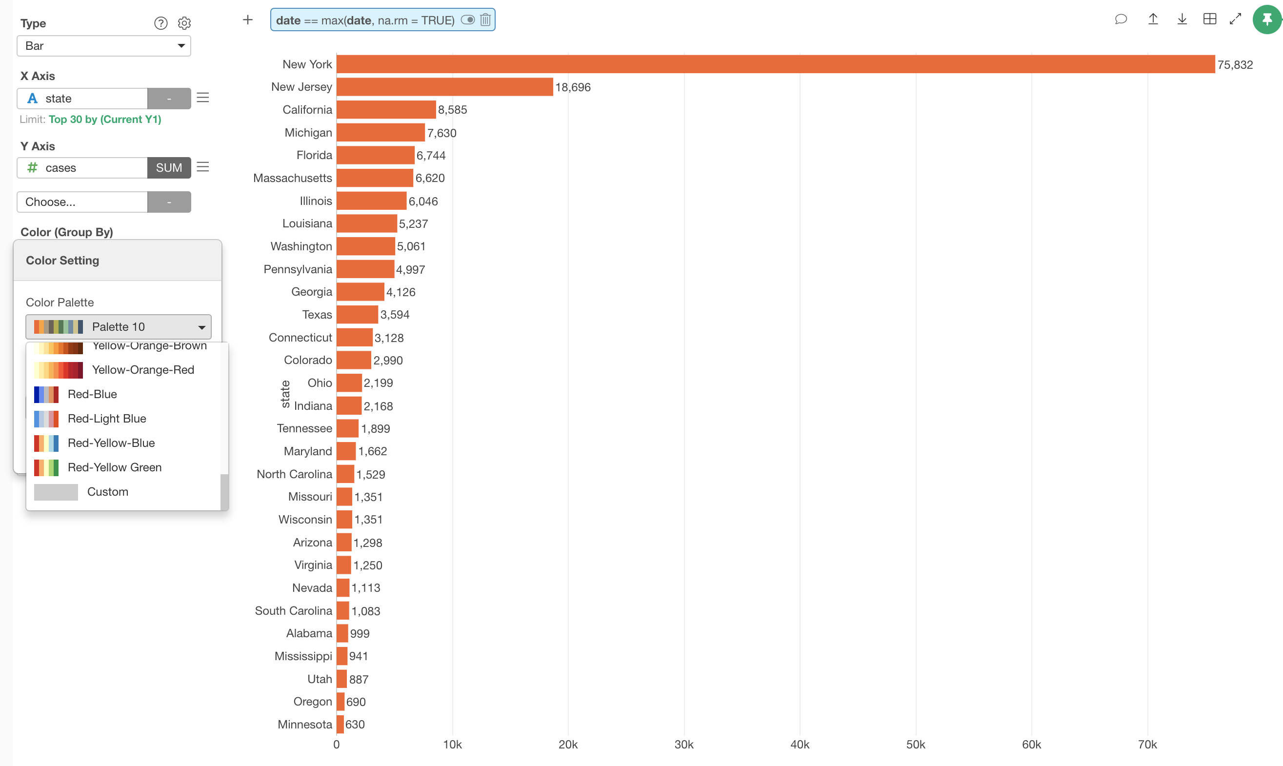
I have selected ‘Color Palette 10’ and here’s how it looks now.
That’s it for this tutorial!
You can do a lot more, and I’m planning to add more tutorials with this same data soon, so stay tuned!
- How to Visualize COVID-19 Data with Map
- How to Join with Population Data to Calculate Ratio
- How to Label Each County with IFELSE function