How to winsorize by the 5th percentile on each end of my data
This is how you can ‘winsorize’ the numeric values.
Winsorization is to set caps at the top and the bottom and set any values, typically they are outliers, that go beyond the threadsholds to be the threshold values.
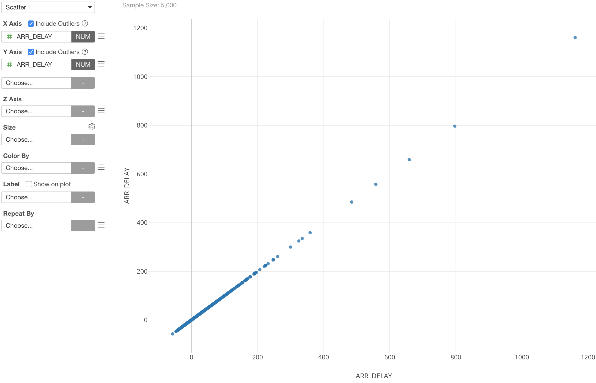
For example, here is a flight delay data and I am showing the arrival delay time at both the X-axis and Y-axis with Scatterplot chart.
Here is the same chart except now the Y-axis is showing the winsorized arrival delay time.
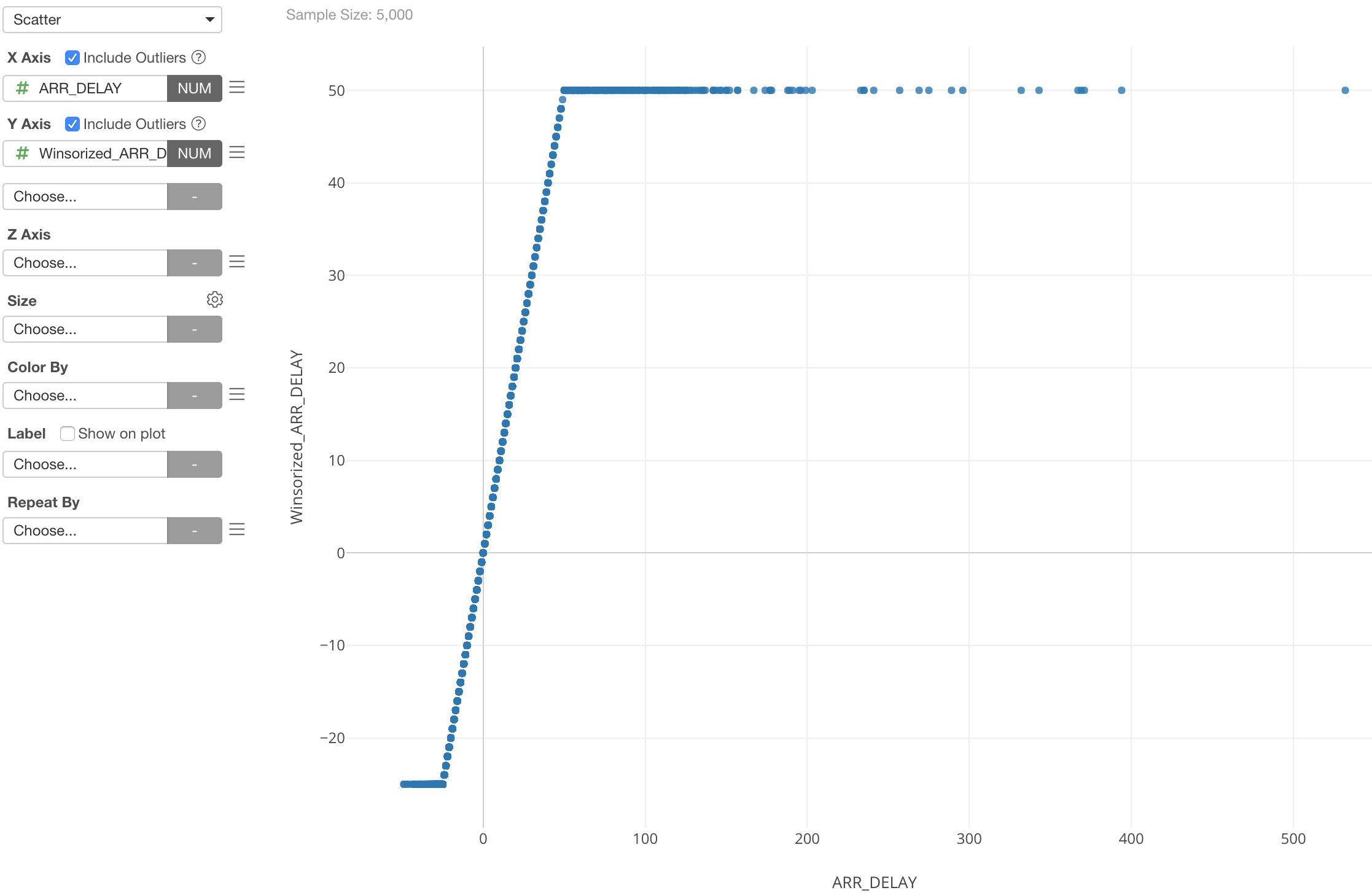
As you can see the Y-Axis has the caps at the top and the bottom. So extreme values of the original arrival delay times are now converted as the top and the bottom threshold values.
Here’s more details about the ‘winsorize’ function.
How you can do it in Exploratory
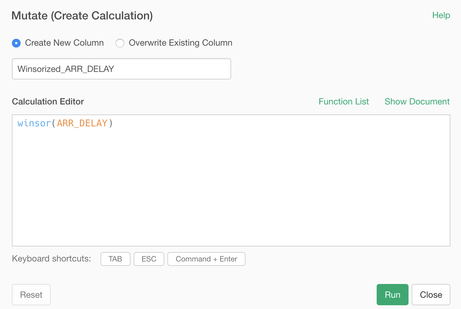
You can create a custom R function and call it from Mutate step.
Create a Custom R Function
You can create an R script and define a function like below.
winsor <- function (x, fraction=.05)
{
   if(length(fraction) != 1 || fraction < 0 ||
         fraction > 0.5) {
      stop("bad value for 'fraction'")
   }
   lim <- quantile(x, probs=c(fraction, 1-fraction))
   x[ x < lim[1] ] <- lim[1]
   x[ x > lim[2] ] <- lim[2]
   x
}
Call it from Mutate Step
Use the above function inside ‘mutate’.
This will give you a chart like below.