Introduction to Chart ‘Pin’ Feature in Exploratory
Chart ‘Pin’ is a super useful feature that is unique to Exploratory.
When you create a new chart you will notice that there is a green circle button with ‘Pin’ icon at the right hand side top of the chart.
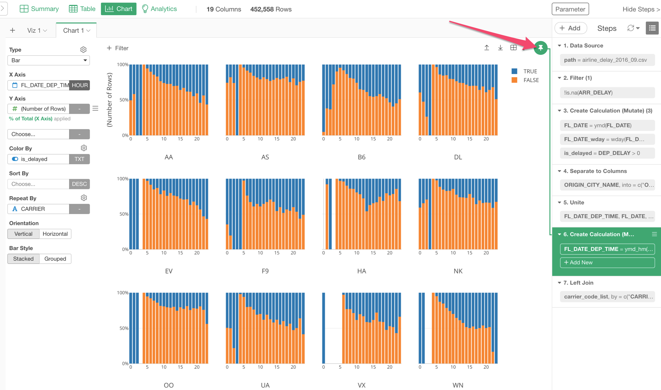
This indicates that this chart is ‘Pinned’ to a particular step, whose background color is green.
This means that the chart is always showing the data from the ‘Pinned’ step (Green background) regardless of which step you move to at the right hand side,
This turned out to be a super useful feature.
For example, take a look at the chart below, which shows the percentage of the delayed flights (Blue) by the hour (X-Axis), and by each airline company.
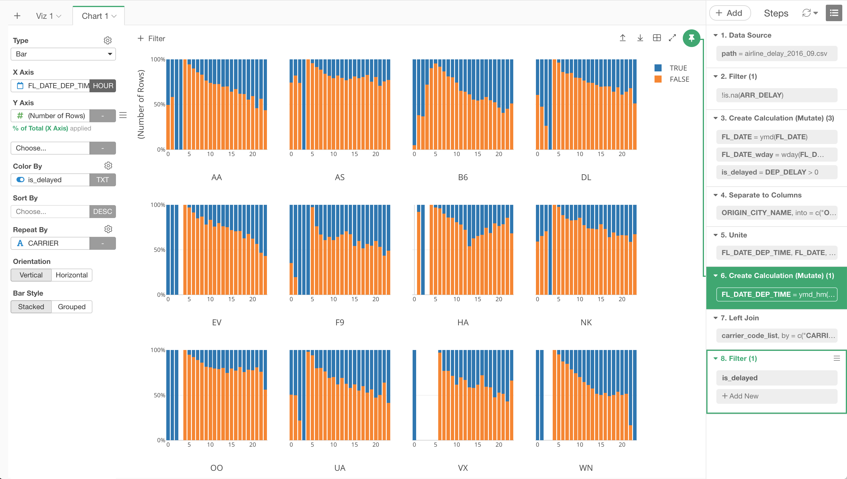
It is ‘Pinned’ to a step ‘6. Create Calculation…’ (Green background color).
Though the currently selected step is the last step ‘8. Filter’, we are still looking at the data from the step ‘6. Create Calculation…’ in the chart.
Now, if the chart was not ‘Pinned’, then the chart could have been something like the below.
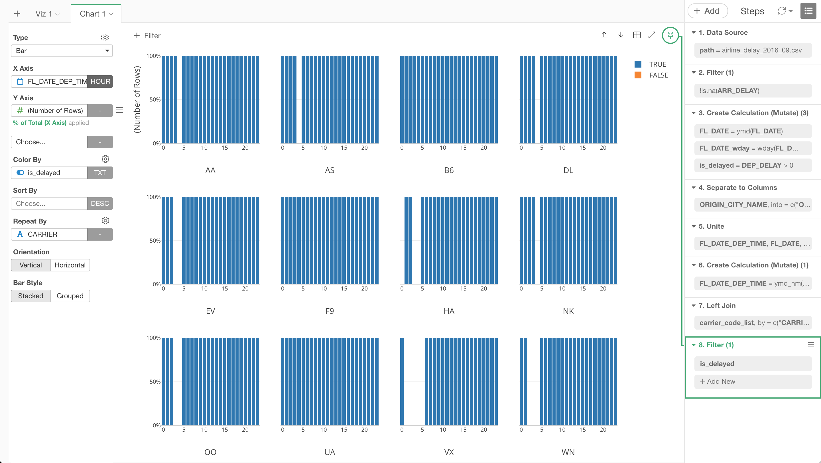
Yes, it’s all Blue!
That’s because the chart is currently ‘pinned’ to the step called ‘8. Filter’, which filters out ‘False’ values. And if you let the chart shows the data from this ‘Filter’ step then you will end up only the Blue data!
This ‘Filter’ step might be useful for other charts or analytics, but not for this particular chart that is supposed to show the percentage of delayed flights.
By ‘Pinning’ this chart to the step ‘6. Create Calculation…’ it’s guaranteed that we always see the data from the step 6 with this chart.
When ‘Pin’ could be confusing…
But, this ‘Pin’ can be confusing sometimes.
For example, take a look at this scenario.
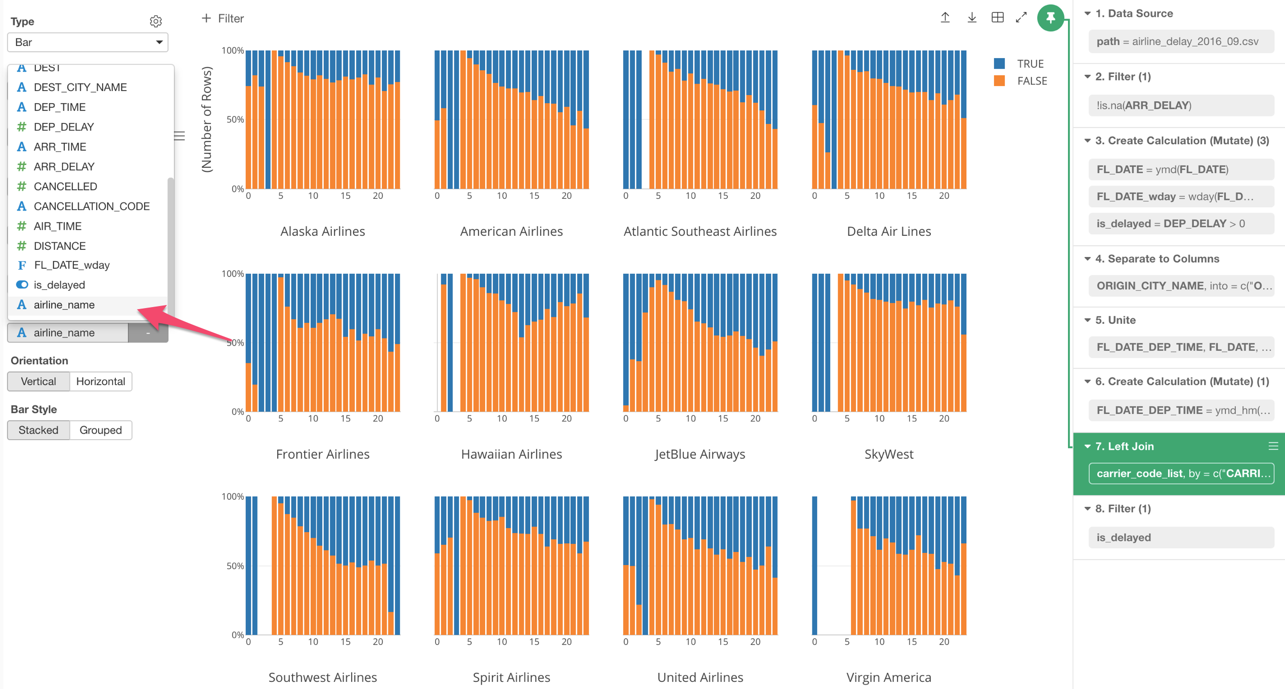
After I created a chart, then I realized that I wanted to bring additional columns from anther chart. So I used ‘Join’ command which is added as step 7.
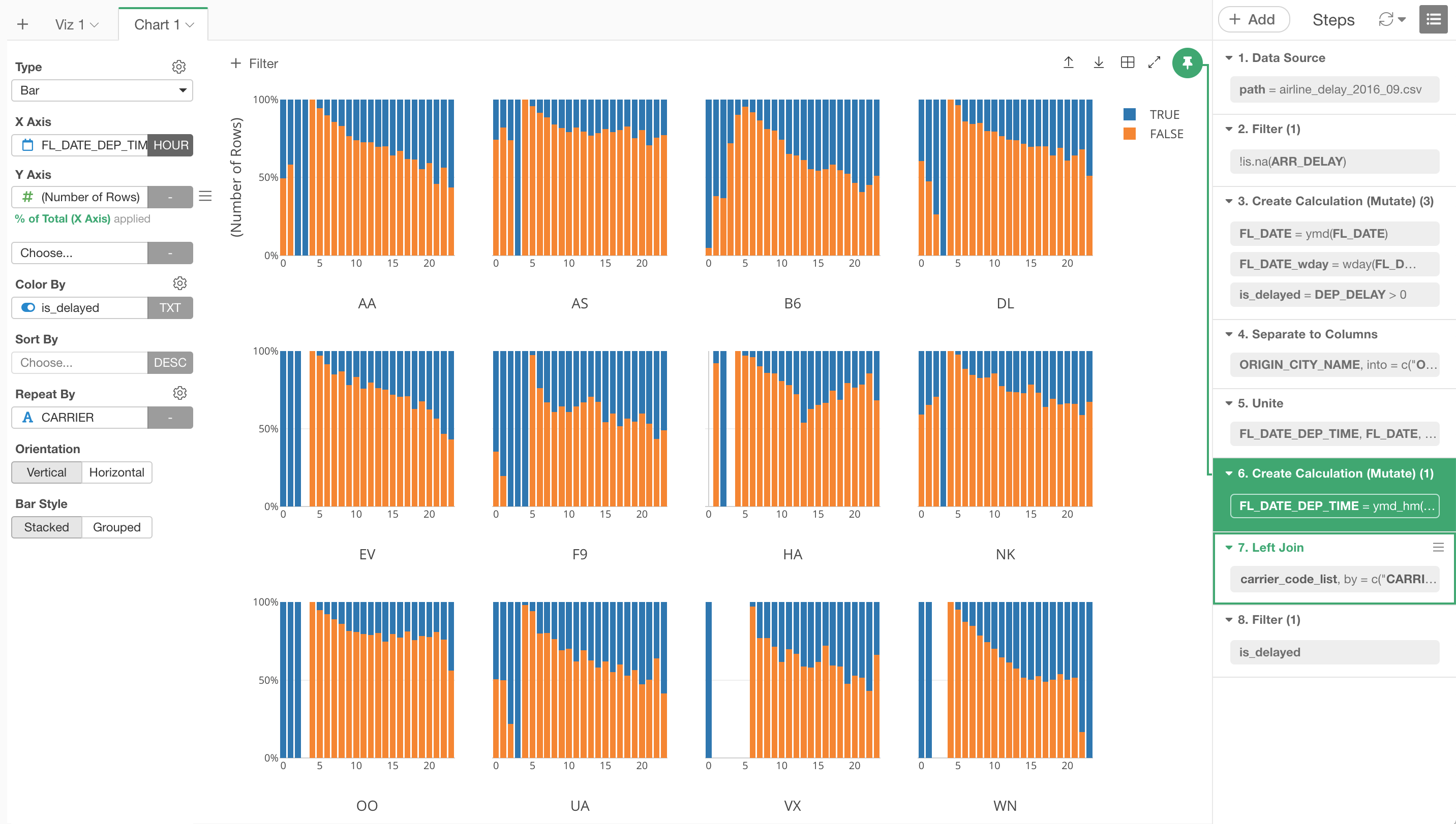
But when I try to use one of the newly added columns called ‘airline name’ (e.g. American Airline) for the X-Axis, I can’t find it in the column selection dropdown.
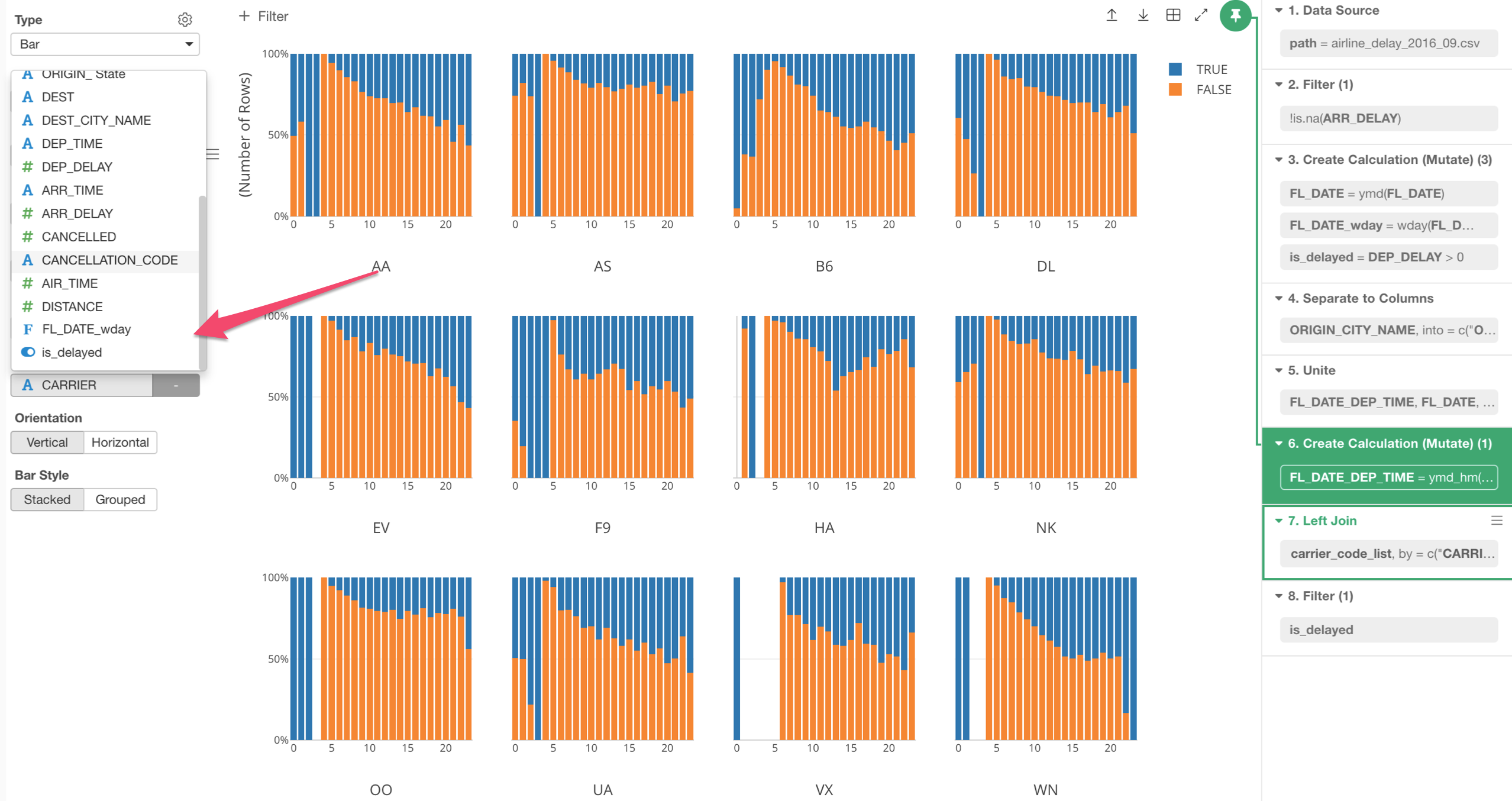
This is because the chart is ‘Pinned’ to step 6, which is before the Join step and still doesn’t have the column yet.
To get the ‘airline_name’ column, we need to move the ‘Pin’ to step 7 where the column has been added with the ‘Join’ command.
You can either click on the Pin button to ‘Un-Pin’ the step, which makes the chart automatically reference the currently selected step.
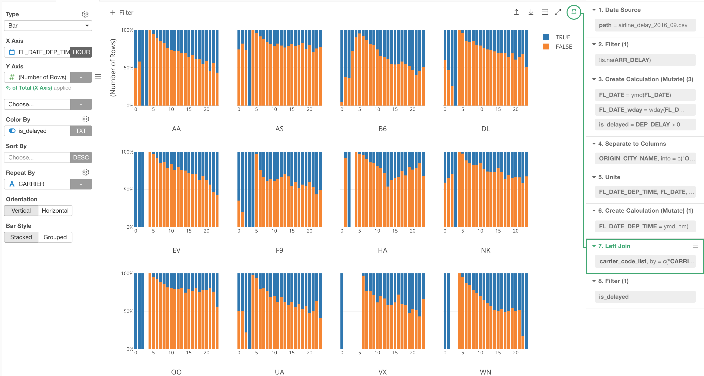
And you can click the ‘Pin’ button to pin the chart to this step if you like.
Or, simply drag the Pin button to the step 7 and drop it there.
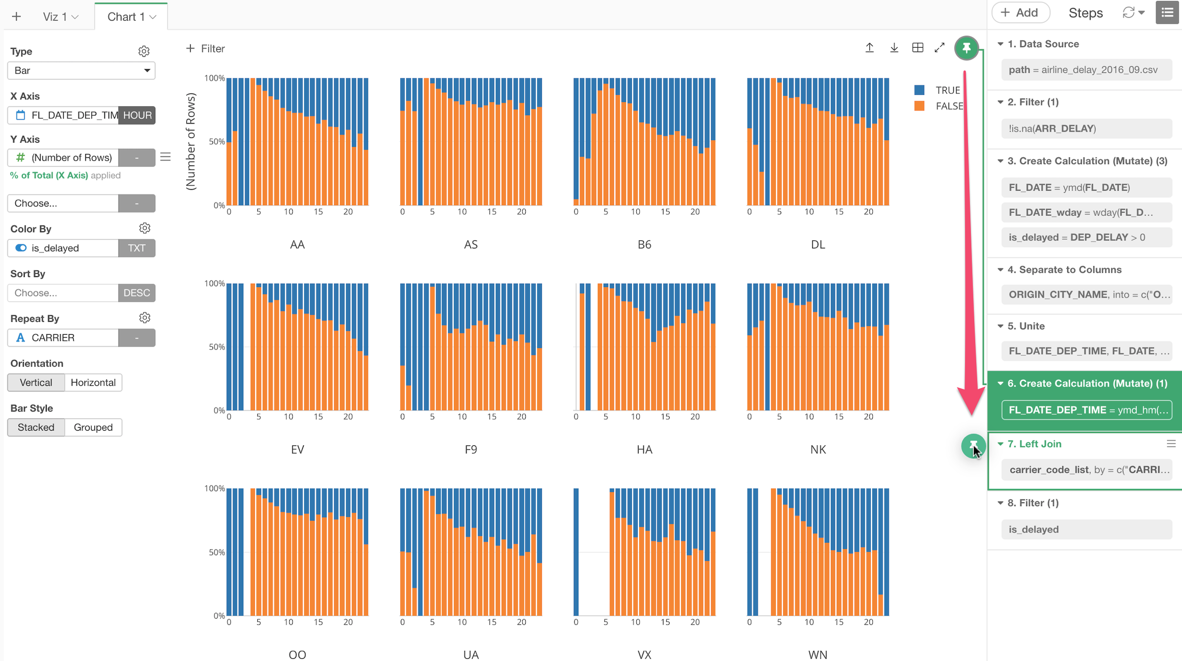
Either way, now we can see the new column ‘airline_name’ in the column selection dropdown of the chart and we can assign it to the chart.
