Density Plot
We often use Histogram to visualize the distribution of numerical variables, but sometimes it’s not helpful.
For example, in order to compare the data distribution among multiple categories, we can use Color. But this often ends up placing multiple histograms on top of each other, which makes it harder to understand the difference, like the below.
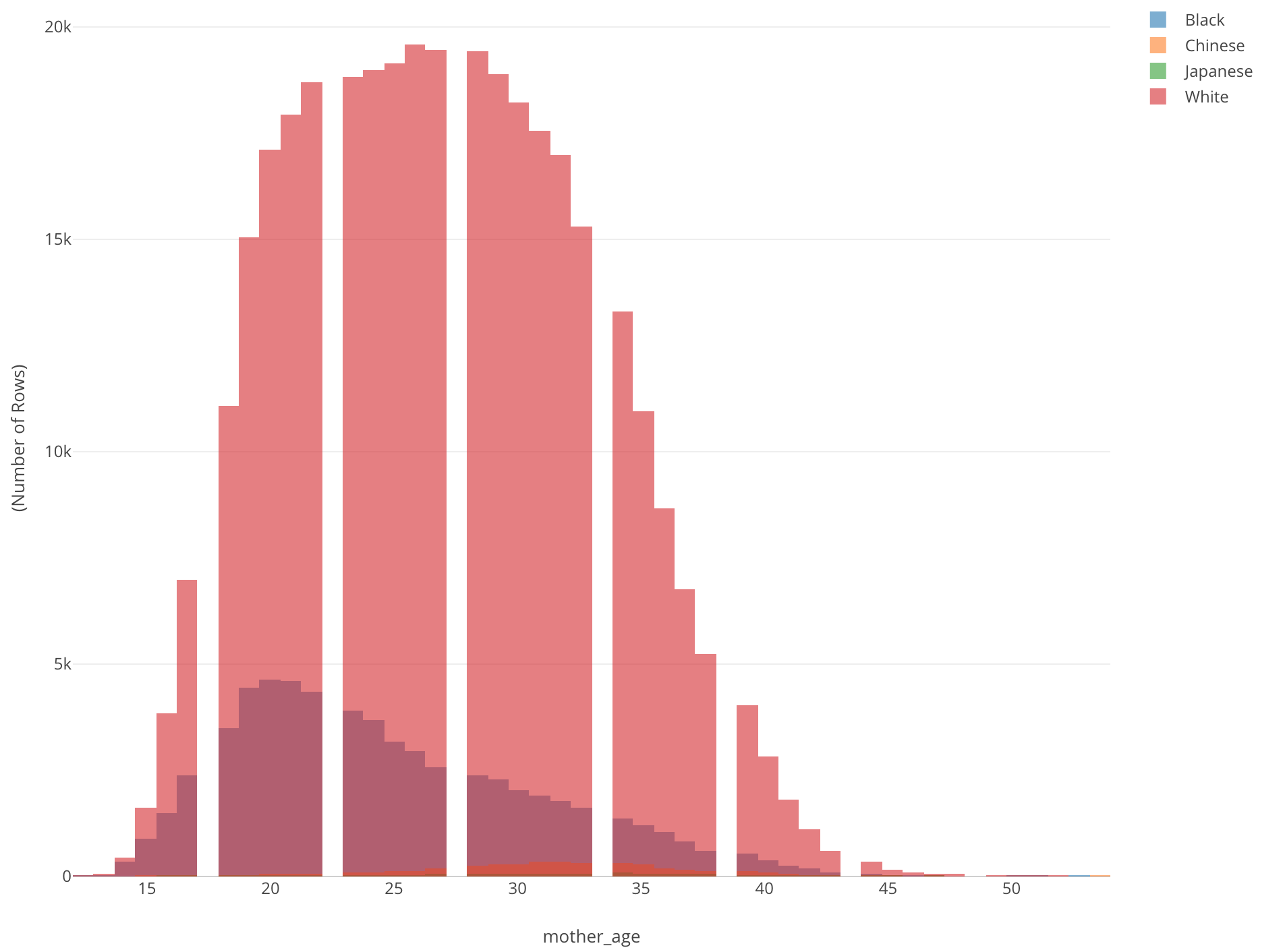
This is showing the age distribution of mothers who gave birth by mother’s race. All we can see is a histogram of White (Red). There is another histogram inside it, but we don’t know what exactly is and we can’t really see others.
There are two problems. One is that different colors are on top of each other. Another is that there are some groups (categories) that have very small values compared to others.
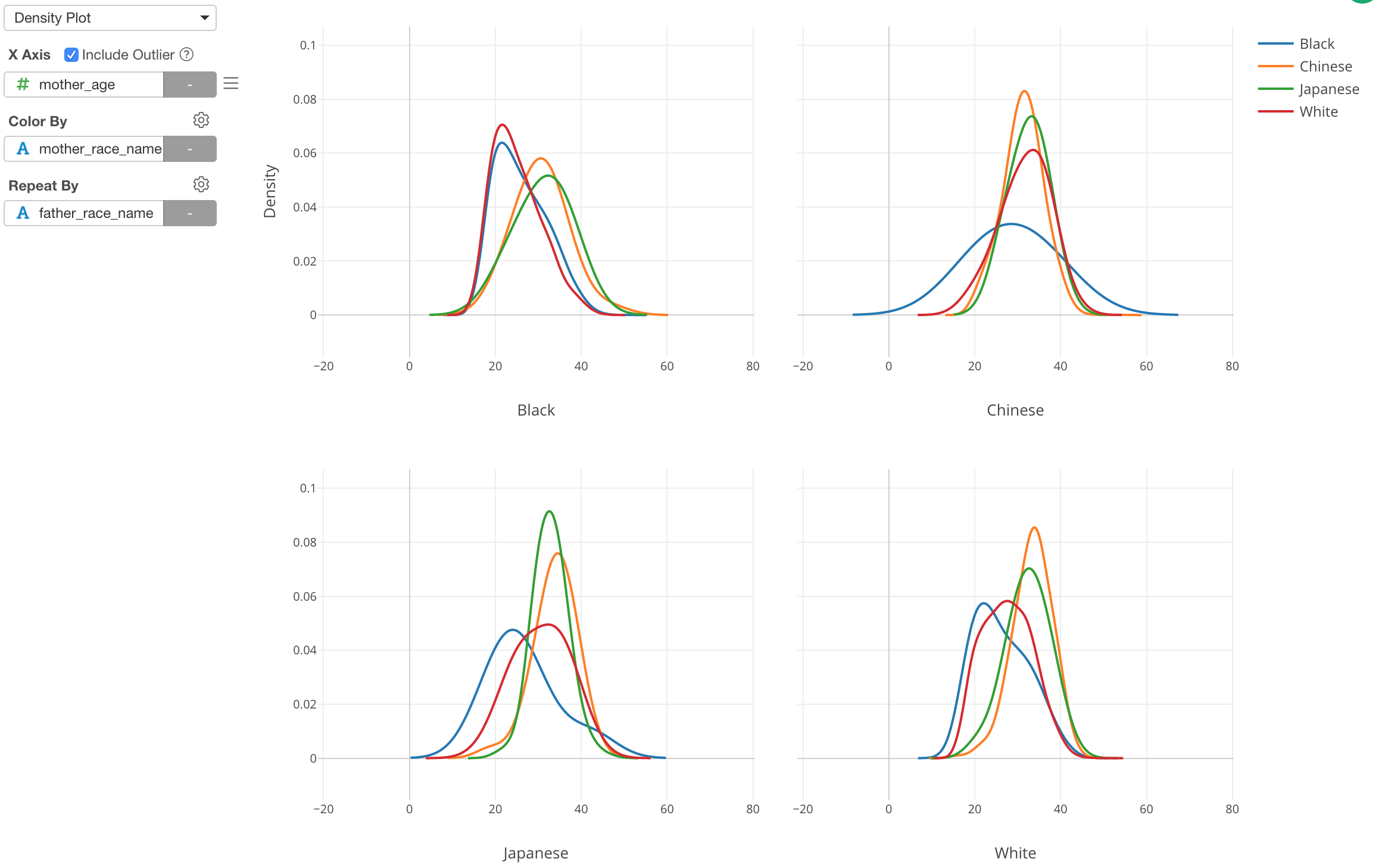
This is when Density plot comes in handy. Here, I’ve just changed it from Histogram to Density Plot. Now we can see that Chinese (Orange) and Japanese (Green) mothers tend to be older than other groups while Black (Blue) mothers tend to be younger.
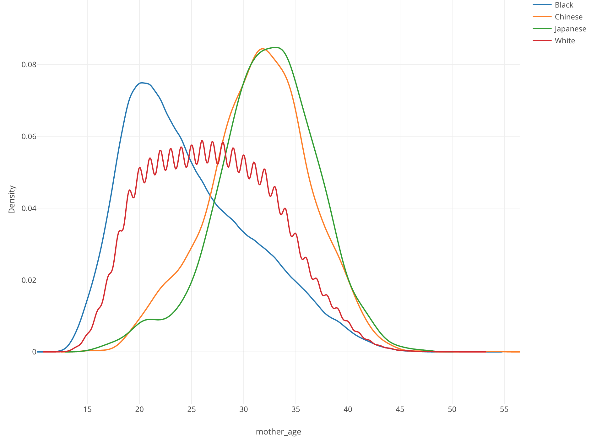
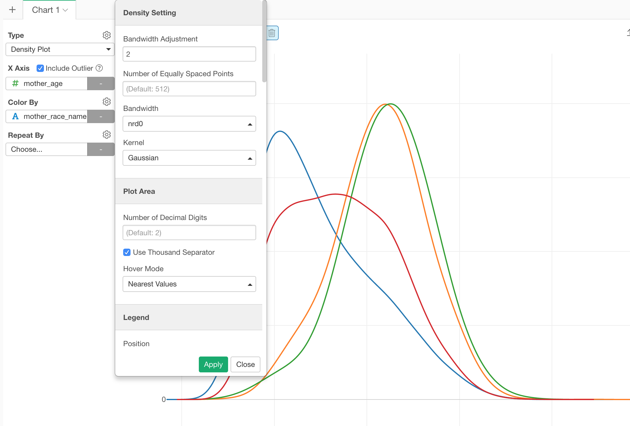
From the property, you can configure the algorithm behind the plot called ‘kernel smoothing’, which estimates the density of the data distribution.