K-Means Clustering algorithm is super useful when you want to understand similarity and relationships among the categorical data. It creates a set of groups, which we call ‘Clusters’, based on how the categories score on a set of given variables.
But, while running the algorithm is relatively easy, understanding the characteristics of each cluster is not as straightforward. At the end of the day, we want to answer questions like:
- What does it make this cluster unique from the others?
- What are the clusters that are similar to one another?
And, another challenge for using the K-Means algorithm is to pick the right number of ‘K’, the number of the clusters you are going to build. Is that 5 clusters or 10 clusters?
So we have added K-Means Clustering to Analytics view to address these type of challenges in Exploratory v5.0.
In this post, I’m going to show how you can use K-Means Clustering under Analytics view to visualize the result from various angles so that you can have a better understanding of the characteristics of the clusters.
If you are interested in finding the optimal number of the clusters you should take a look at the following post I have written about the topic.
Data
Here is a data about the 2016 election result for California ballot measures.
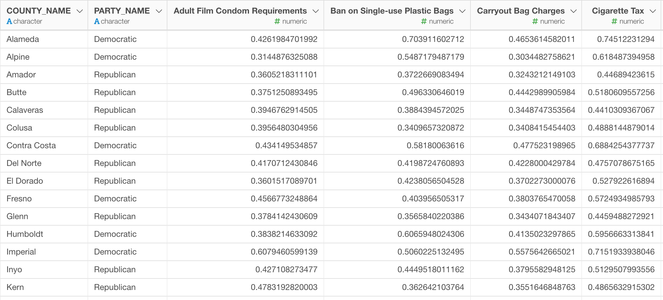
There were 17 ballots such as whether legalizing Marijuana, whether mandating adult films using condoms, whether making it harder to purchase firearms, etc. at the election. And this data is the result that is aggregated at each county level, there are 58 countries in California.
Here is a chart that shows how each county voted for each of the ballot. Y-Axis shows the percentage of the voters who supported the ballots, X-Axis shows the ballots, each circle represents each county, and the color indicates which of the party candidates of the president (Trump or Hilary) they supported more than the other.

Running K-Means Algorithm as Data Wrangling Step
Let’s say we want to cluster the counties into a set of groups based on how they voted for those 17 ballots.
You can run the K-means clustering algorithm to cluster them into 3 clusters as a data wrangling step like below.

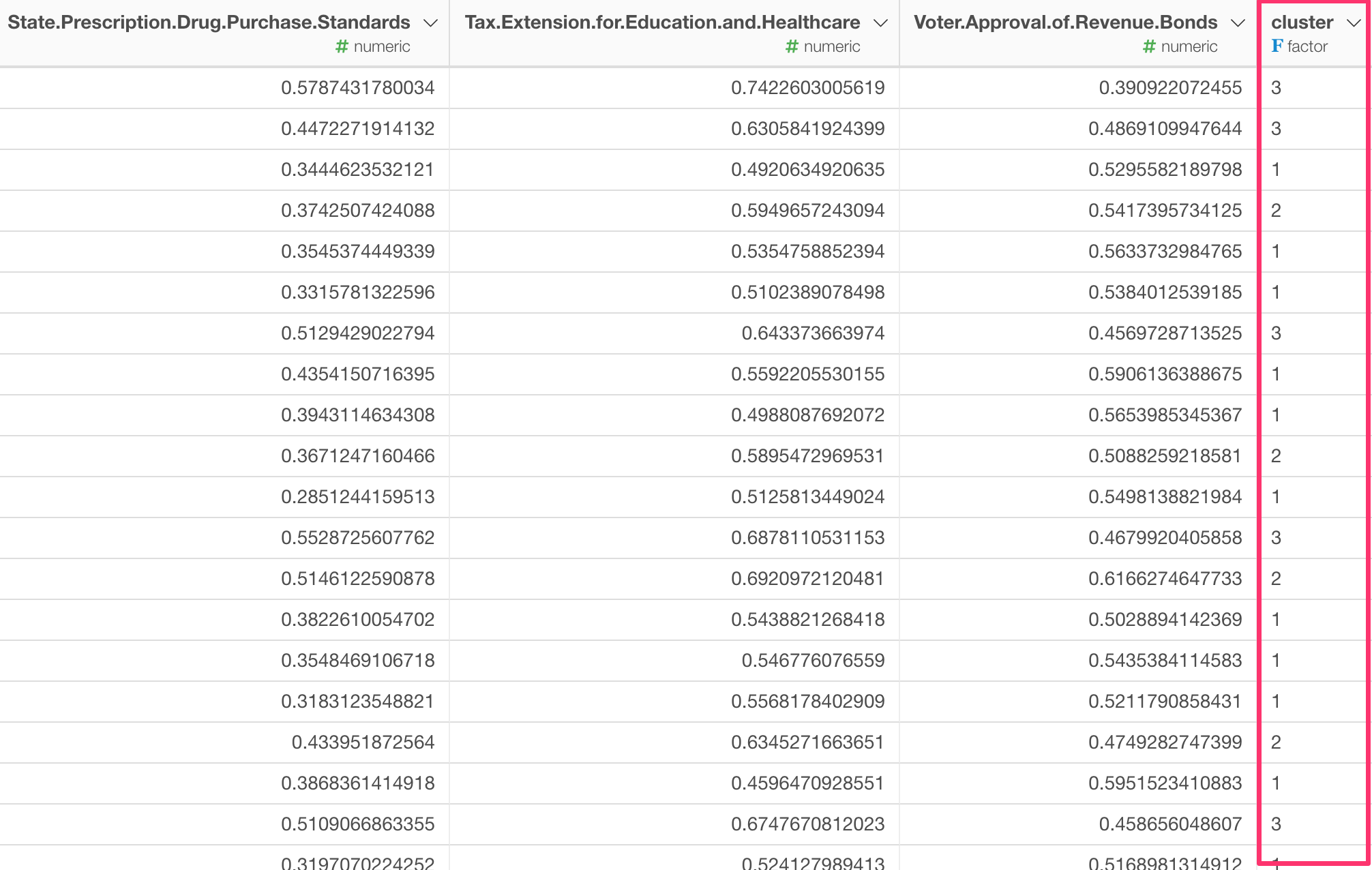
Once we get the cluster scores, then we can visualize it. Here is a California county map and each county is colored based on which cluster it is assigned to.
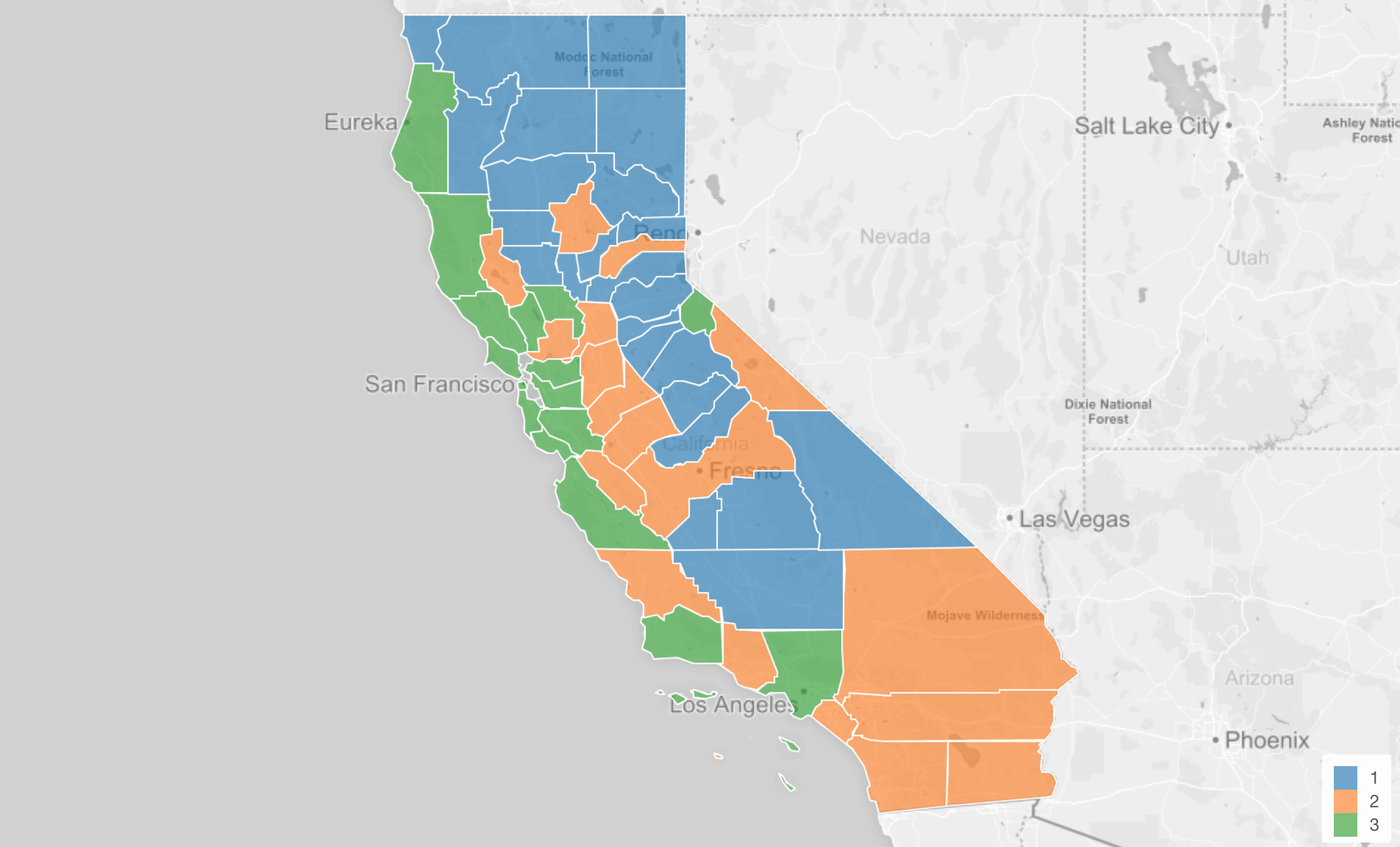
But what does that mean to be in Cluster 1 compared to Cluster 3?
This is when you want to go to Analytics view to quickly run K-Means Clustering.
Running K-Means Clustering under Analytics View
Go to Analytics view, and select ‘K-Means Clustering’ for the Analytics type.

You can select the variables that you want to used to build the clustering model.
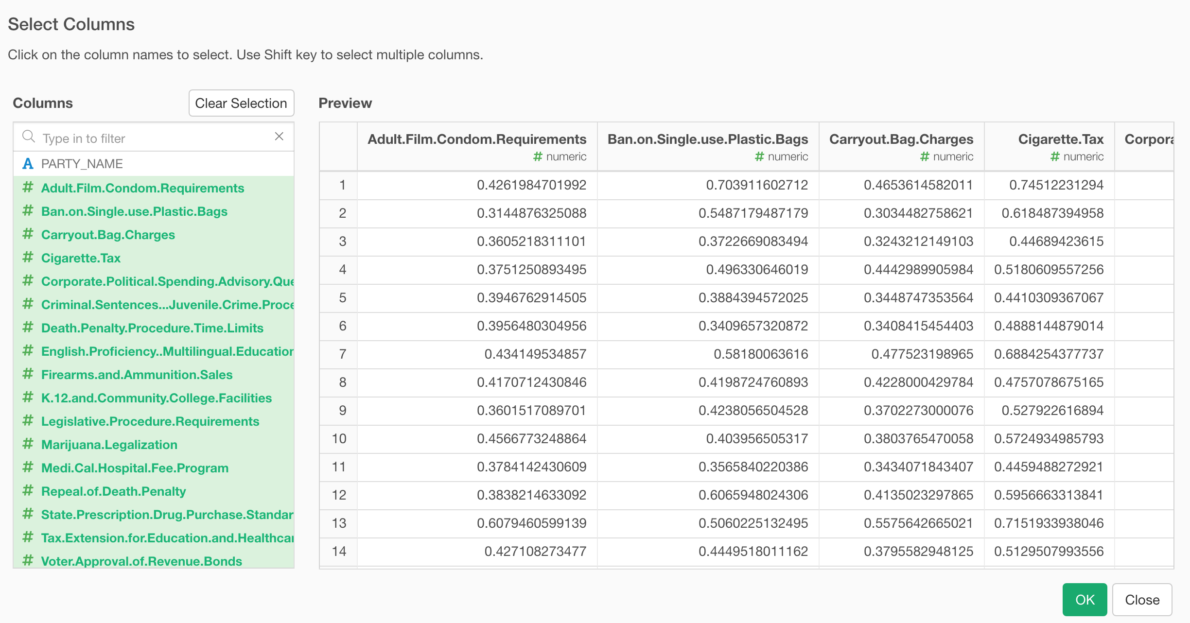
Then, click the ‘Run’ button, this will produce a set of charts we are going to take a look at one by one.
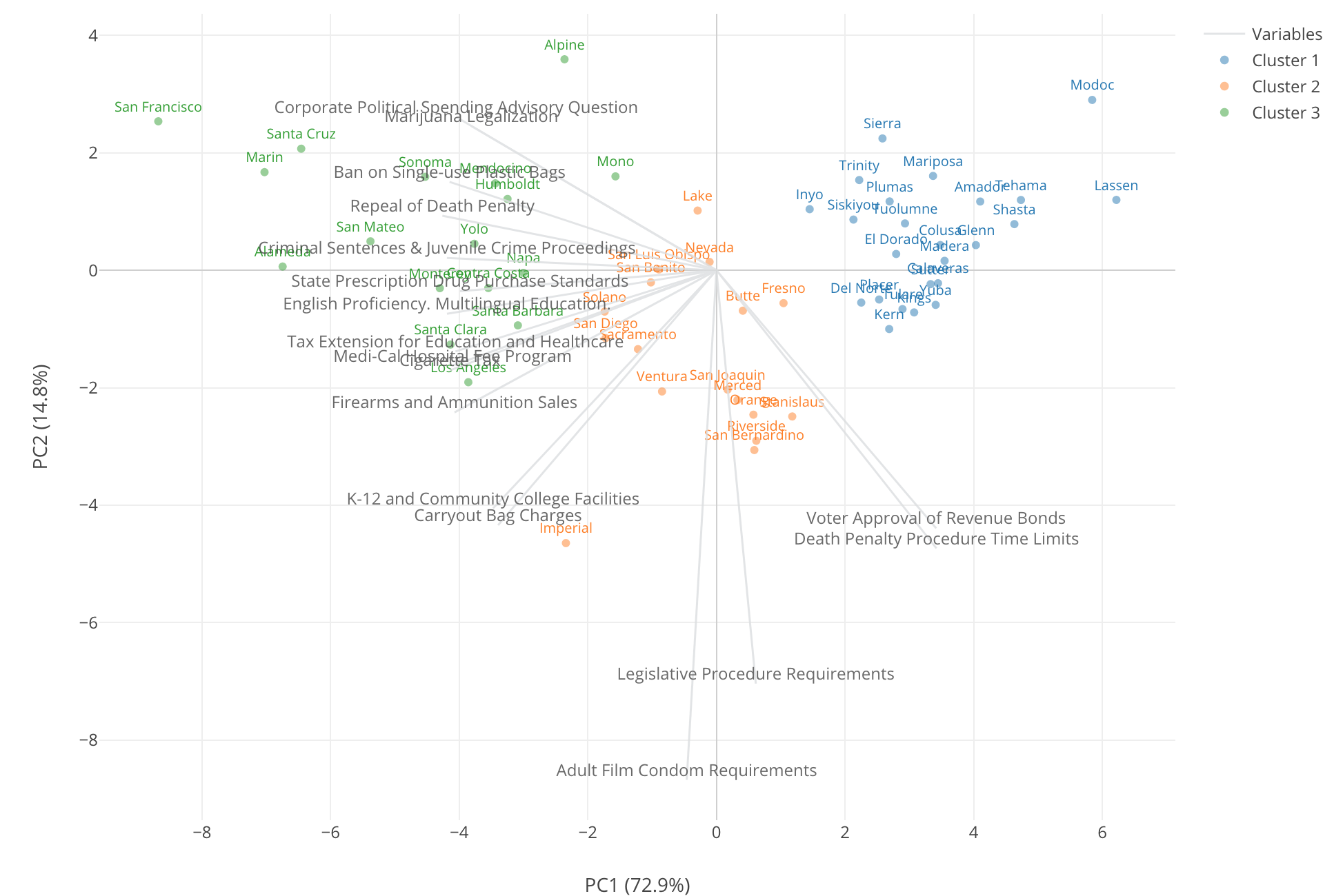
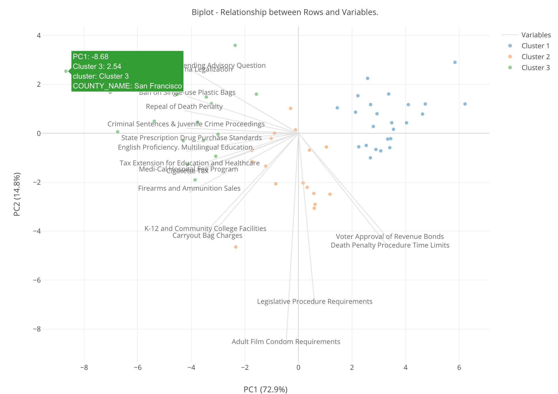
Scatter - Biplot Chart

This is something called ‘Biplot’, The theory behind this chart can be a bit complicated, but how to understand the result is pretty straightforward.
Each row, in this case, that is each county is represented by each circle on the 2 dimensional space with X Axis and Y Axis.
These X and Y are the two artificial dimensions that were created by an algorithm called PCA (Primary Component Analysis) and try to express as much of the original information that is expressed by all the 17 variables of the measures.
At X-Axis title, you can see X-Axis contains 72.9% of the original information and Y-Axis contains 14.8% of the original information. This means that combining X and Y contain 87.7% of the original information. This is called ‘Dimensionality Reduction’ by the way.
Now, you notice that there are 17 gray lines shooting off from 0 point of X and Y. These are the 17 of the ballot measures and they are expressed by the two dimensional space that is expressed by the artificially created X and Y.
Lastly, the color indicates the cluster ID and we can see three colors each of which represents each of the clusters.
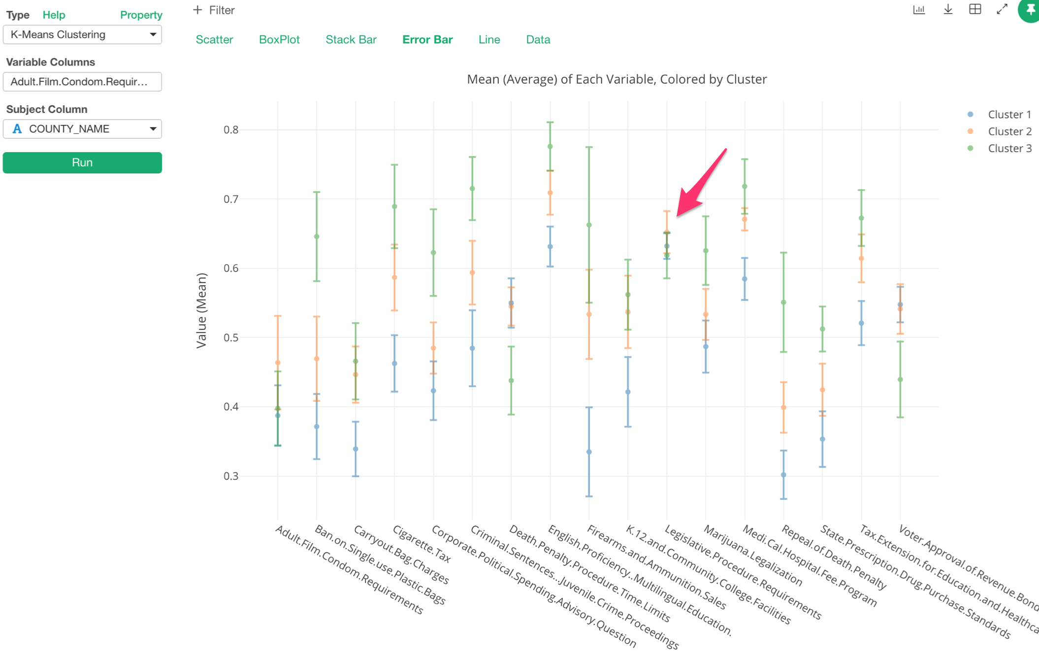
Given these information, let me explain what we can get out of this chart by using the dot that is pointed by the red arrow in the picture below.
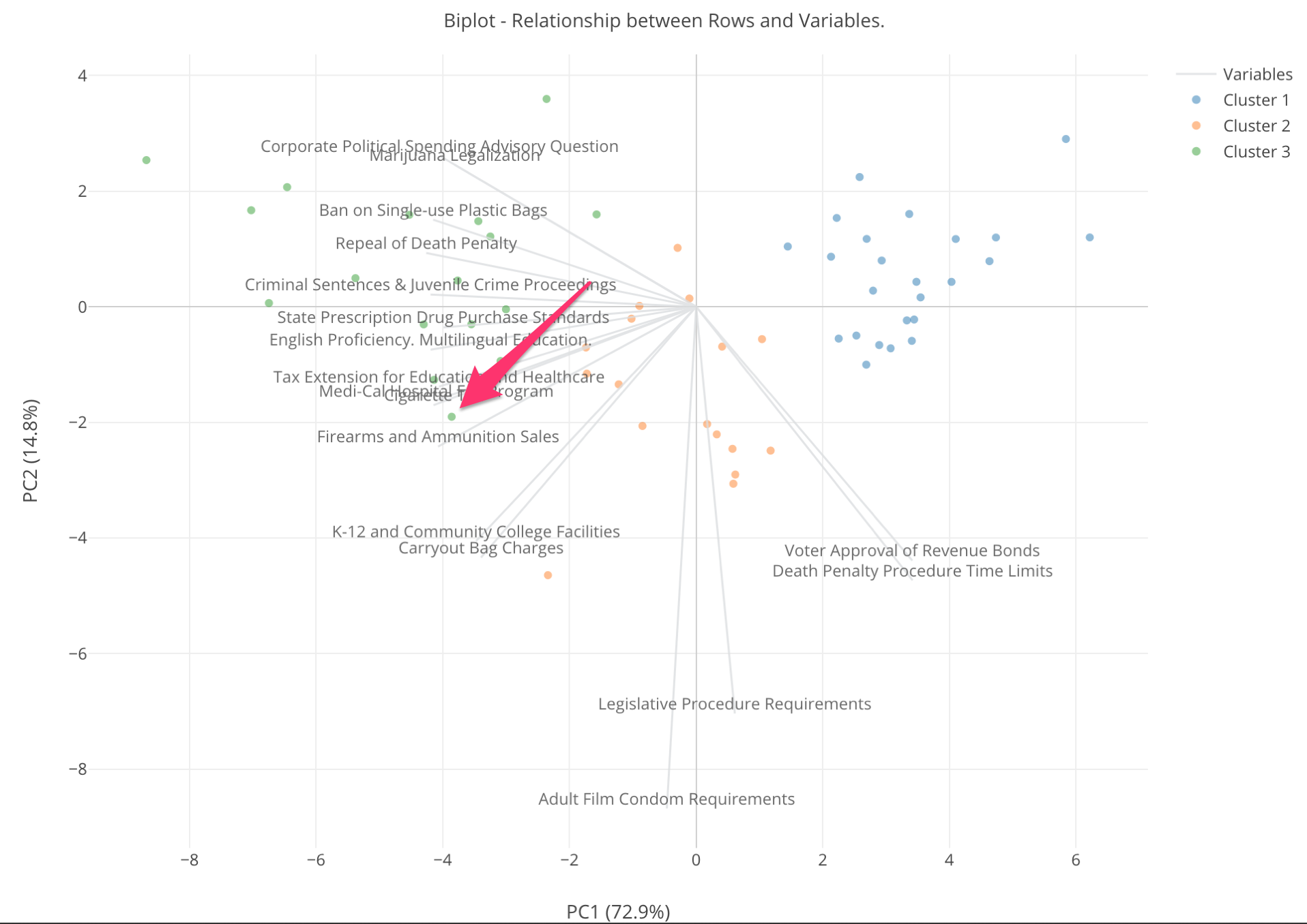
First, this dot is green so whatever the county that is it belongs to Cluster 3. Notice that there is a gray line for “Firearms and Ammunition Sales” ballot measure that is close to the dot. This means that this county has a high supporting rate for this measure.
And any counties that are close to the higher edge of this gray line can be considered that they have supported this measure with high ratio.
On the other hand, the counties that are the opposite end of the “Firearms and Ammunition Sales” ballot measure line can be considered that they have lower values of the supporting rate for this measure. In another word, the counties close to the red line have opposed to the measure.
When you look at the 3 colors, the green colored counties are spread towards the left hand side, the blue counties are towards right hand side, and the orange counties are at the middle of the two.
There are a bunch of the gray lines that are closer to the green counties. These are so called ‘liberal’ measures, which means that if you are a liberal person you would vote Yes for these measures. They are, for example, ‘Marijuana Legalization’, ‘Ban on Single Use Plastic Bags’, ‘Repeal of Death Penalty’, etc.
The green counties have high supporting rates for those ballot measures, so we can say that these green counties are ‘liberal’ counties. In contrast, the blue counties are the opposite end of those gray lines, which means they have low supporting rates or opposed to those ballots, so we can say that these are ‘conservative’ counties.
Counties That Care About Porn Actors
Now, there are these orange counties that are in the middle. They don’t have high or low supporting rates for those ‘liberal’ measures.
But, there are two measures that are shooting downward. One of them is ‘Adult Film Condom Requirements’, which is a ballot measure mandating porn actors to wear condoms. Some of the orange counties seem to have high supporting rates for these measures while the green and the blue counties don’t have high or low. Probably, they don’t care about these measures as much as the orange counties.
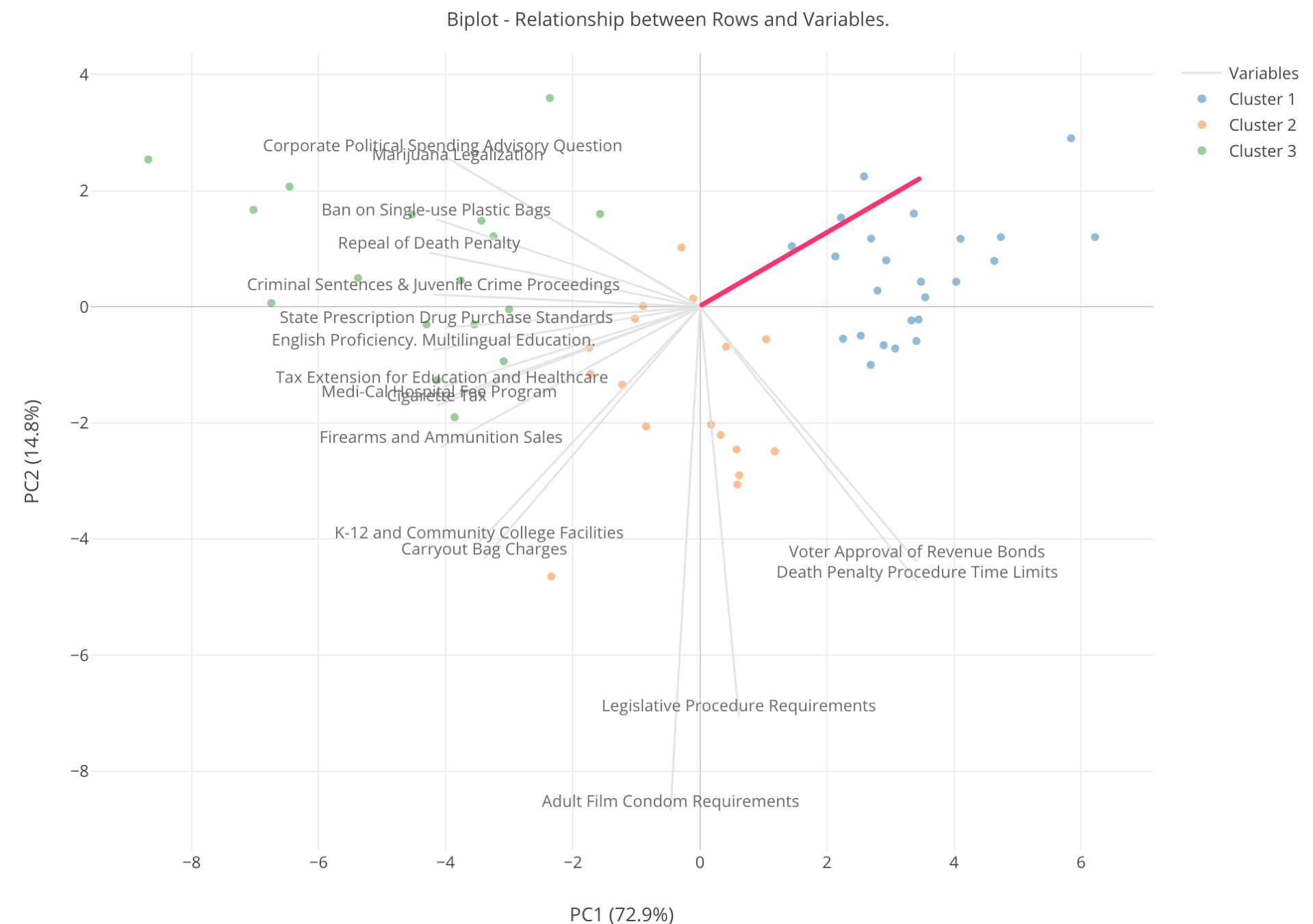
At this point, we don’t know which dot is which county, so let’s bring the information into the chart.
Assign COUNTY_NAME column to ‘Subject Column’ and click ‘Run’ button again.

Now, we can move the mouse on top of each dot to see which county it is.
For example, the county that is close to ‘Adult Film Condom Requirements’ is Imperial county. Looks whether the porn actors wear condoms or not is an important agenda for this county.
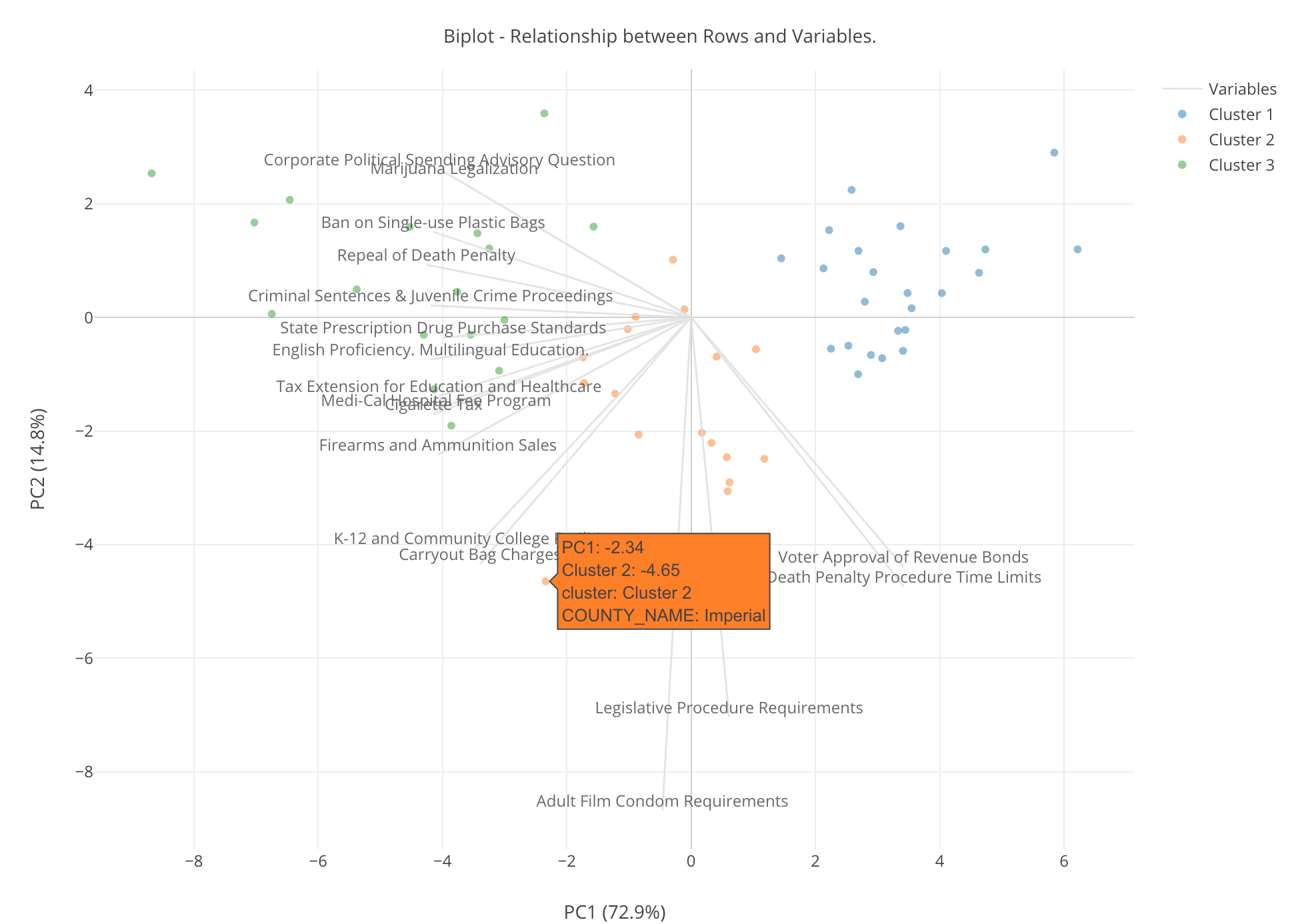
We can see the previously shown chart to see how much Imperial county supported this measure.
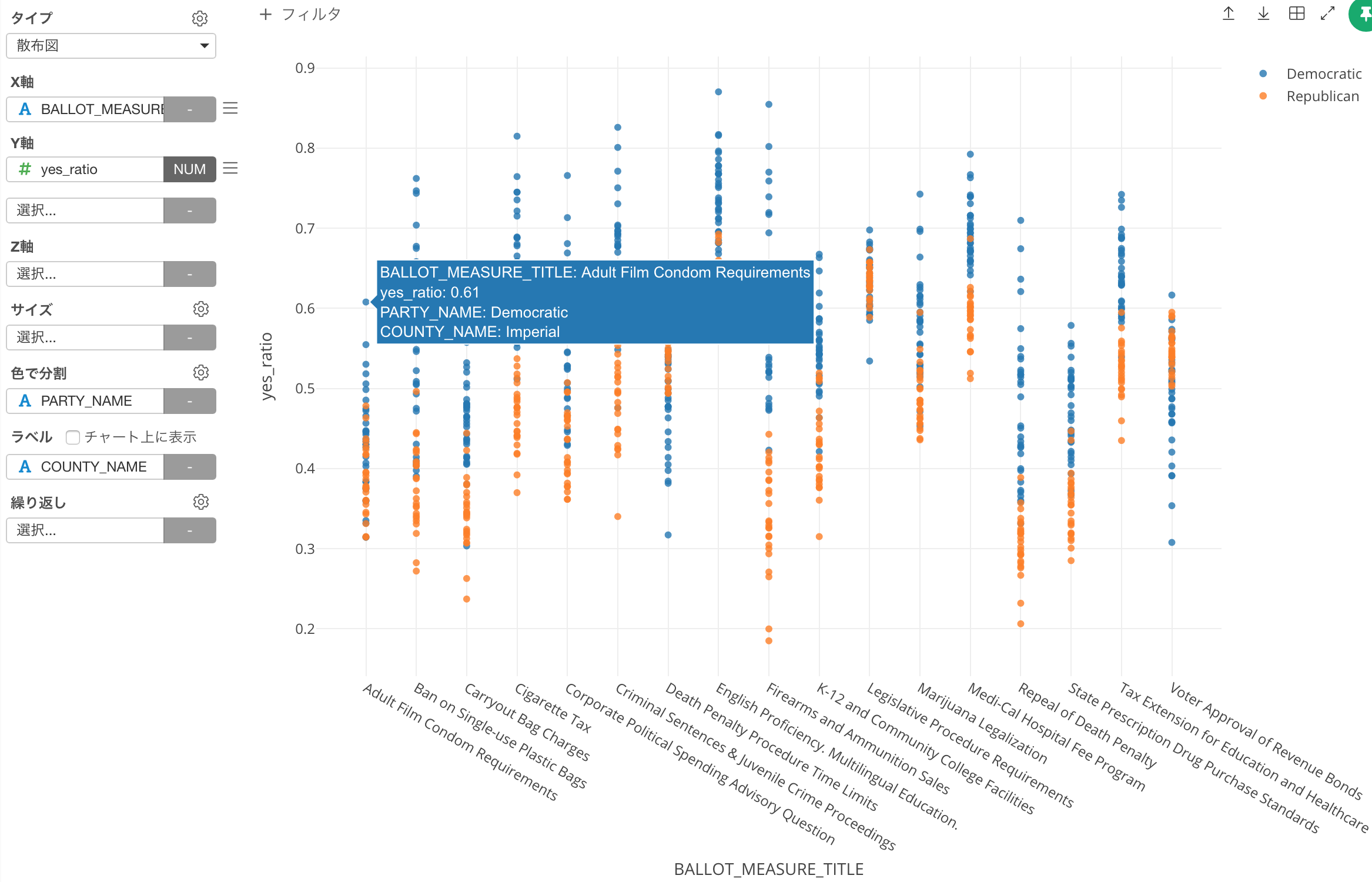
It is about 60%, the number is not that high, but it’s one county standing out.
Super Liberal County - San Francisco
Let’s go back to the biplot chart again.
The county located at the very left hand side top is San Francisco. Given all the measures that are close to this dot are ‘liberal’ measures, San Francisco’s supporting rates for these ‘liberal’ measures are super high, I mean the highest among all the ‘liberal’ counties.
If we pull the previously shown chart, we can see how super liberal San Francisco is.

For example, 74% of people in San Francisco (those who voted, of course) supported ‘Marijuana Legalization’ measure. That’s 3 out of 4, and it’s pretty high. And there are other measures that 80% to 90% of people in San Francisco supported. Very extreme! ;)
Show the Subject Value on Plot
By the way, we can show the county names on the plot rather than showing them in the mouse over pop-up.
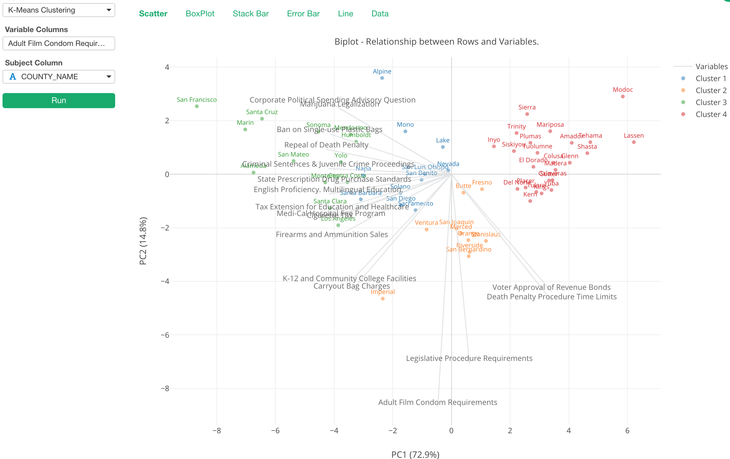
You can click on ‘Chart Property’ icon and check ‘Show Values on Plot’.

This biplot chart gives a lot of insights about the relationship between the measures and the counties and helps us understand the overall picture. But there are other ways to look at such relationships. Let’s move to the next section.
Boxplot
First, here is a boxplot to show how each of the variables is distributed in each cluster.
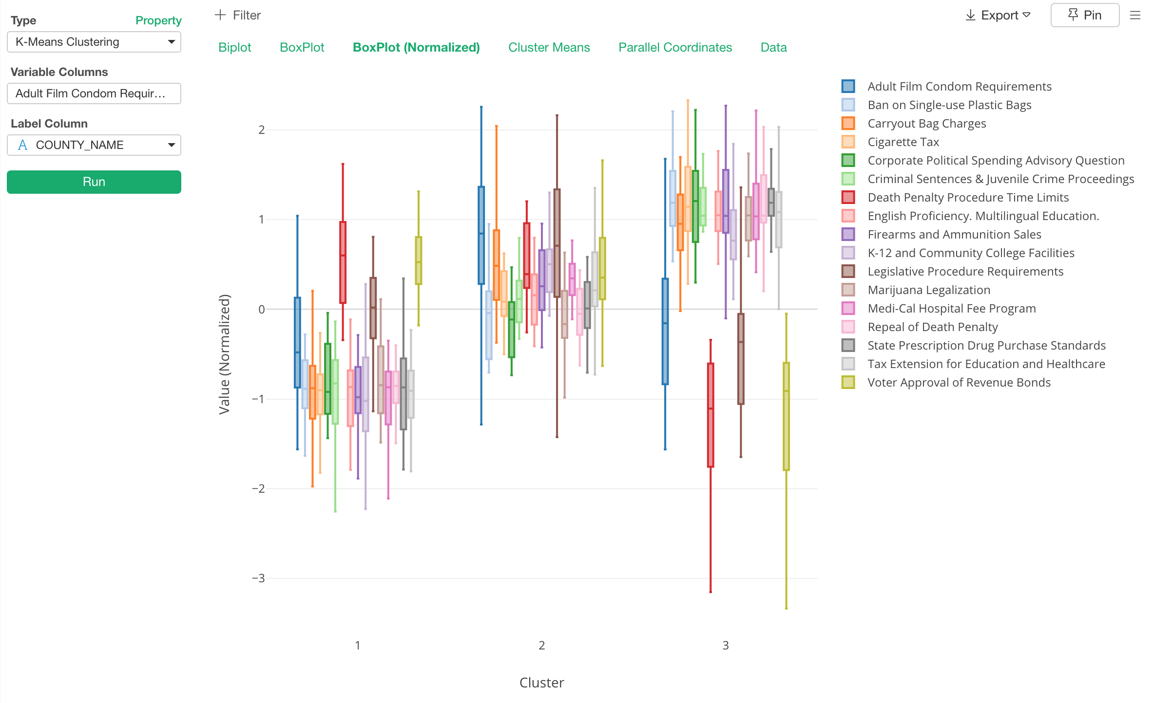
From this chart, we can find a lot of information. For example, when you look at the red color box and line, that is ‘Death Penalty Procedure Time Limit’, it is showing the negative direction in the cluster 3 while it’s relatively positive in the cluster 1 and 2.
Also, when we look at the blue box and line, Cluster 1 and 3 are pretty similar but the Cluster 2 is different from the others. This means that counties in the cluster 2 voted for ‘Adult Film Condom Requirement’. But by looking at the distribution in the cluster 1 and 3, it’s not like the counties are in those clusters are hugely against it. it’s just that they don’t really care, probably. ;)
Parallel Coordinate
And here is something called ‘Parallel Coordinate’ chart that shows how each observation scores for each variable, which can give you another way to understand the characteristics of the clusters.

Each line represents each row, so in this case that is each county. We can see that the counties in Cluster 3 (Green) have voted for most of the ballots while they voted against the ballots like Death Penalty Procedure Limits, Voter Approval Revenue Bonds, etc.
Also, we can see that these Cluster 3 counties are varied when it comes to some of the ballots like ‘Adult Film Condom Requirements’, ‘Carryout Bag Charges.’
Error Bar
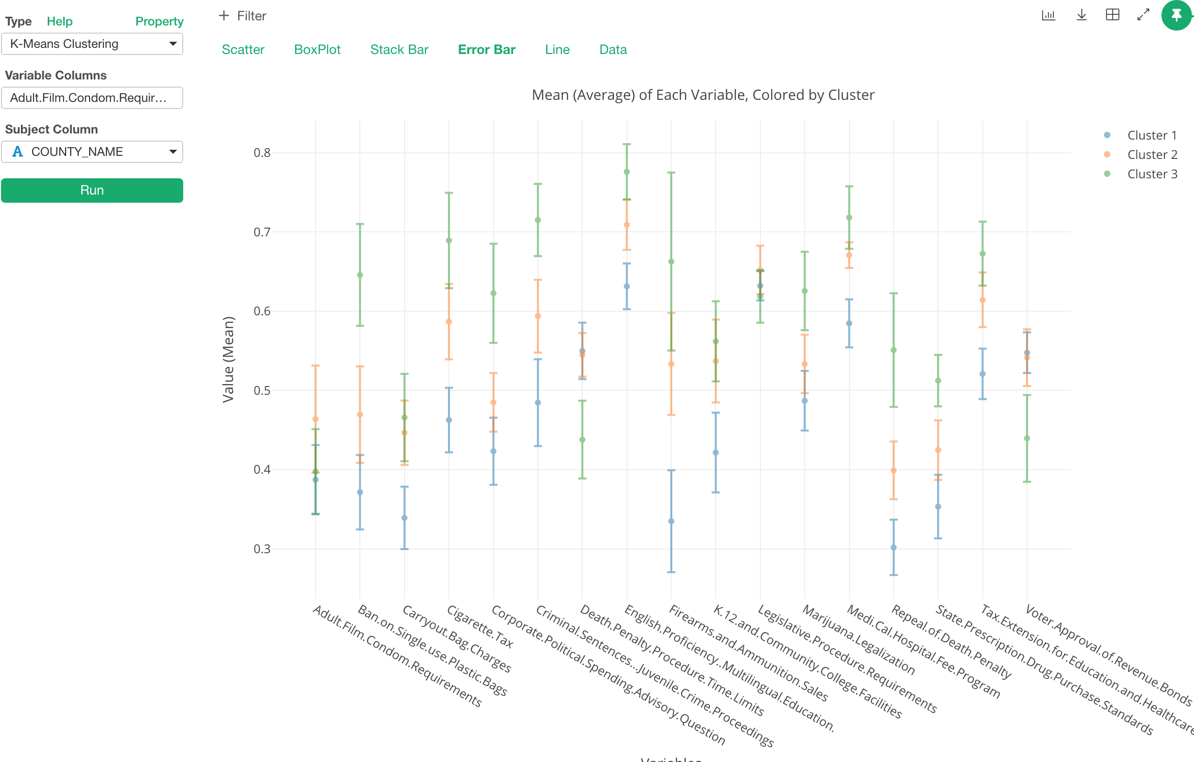
Error bar shows how the mean (average) of each variable for each cluster. The dot at the middle of the line is the mean. The line indicates the range of 1 standard deviation here, but this can be changed to other types like Confidence Interval, Standard Error, etc.

This chart is useful to see what variables separates the clusters the most or the least.
For example, let’s take a look at ‘Cigarette Tax’ variable.

From here, we can see that each cluster is very different from one another. And given the Cluster 3 is showing less than 0.5 we can say that this cluster is one that doesn’t support this measure.
Now, let’s take a look at ‘English Proficiency Multilingual Education’ measure.

It shows a clear difference among the clusters, but given all the means are greater than 0.5, all of them are favor for this measure, not against it.
Lastly, let’s take a look at ‘Legislative Procedure Requirements’ measure.
Not only the dot (the mean) of each cluster is super close to one another, but also even the ranges are overlapping. So this measure doesn’t seem to make the clusters different from one another.
Stack Bar
This chart shows what are inside the clusters. Whatever a column you assign to ‘Subject Column’ becomes the color.
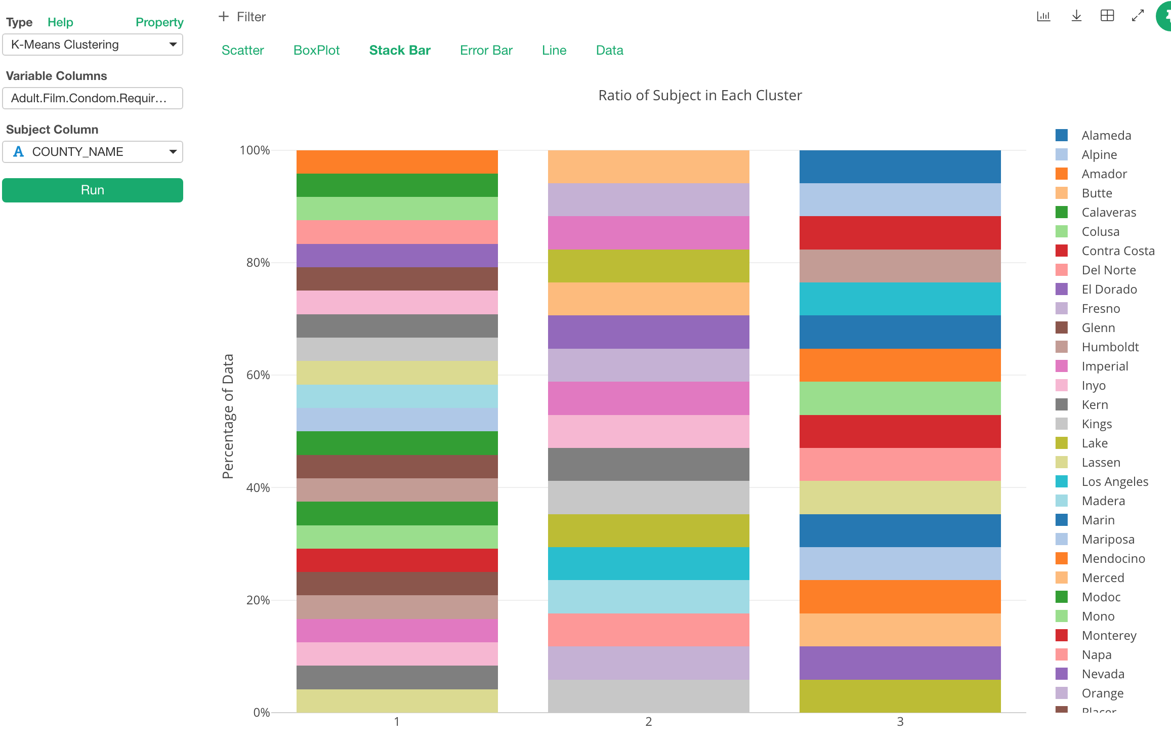
I set the county column to ‘Subject’ above so each color is representing each county here. And this means that we can see which county belongs to which cluster.
But this data is one county for one row. So by looking at the county ratio in the stack bar chart is not so useful. However, this chart actually shines when you assign different attribute columns. For example, If I assigned Party Name column (Republican party or Democratic party) to the subject I would get something like the below.

Then, we can say the cluster 1 is the Republican counties and the cluster 2 and the cluster 3 are the Democratic counties, though there are a few exceptions in the cluster 2.
That’s pretty much for interpreting the characteristics of the clusters and understanding the similarity (or dissimilarity) among the data.
By using this new K-Means Clustering feature under Analytics view, you can understand not only the characteristics of the clusters but also the relationship among the categories and among the variables with a set of pre-defined charts.
In fact, I have started this feature often as part of my exploratory data analysis especially when I receive a new data set and want to understand the overall relationship among the variables. I’d recommend you do, too!
In this post, the number of the clusters was set to 3, which is the default. If you are wondering how many clusters to create, take a look at this post I’ve written separately.