An Introduction to Principal Component Analysis (PCA) with 2018 World Soccer Players Data
PCA — Primary Component Analysis — is one of those statistical algorithms that is popular among data scientists and statisticians, but not much among people who are outside of data science or statistics.
It can be used as a dimensionality reduction method, which can help to minimize the number of the variables (or columns of a data frame) without losing much of the original information. This is useful especially when you are building machine learning models based on the data with many variables like 100s or 1000s.
But PCA can be also practically useful to visualize the relationships between the variables or even between the subjects of your interest such as customers, products, countries, etc.
And that is what I’m going to talk about in this post.
To demonstrate it, I’m going to use this Professional Soccer player’s data that was scraped from SoFIFA website and originally hosted at Kaggle, which is an online community where data scientists compete for building better machine learning models.
For your convenience, I’m hosting the data here so that you can directly download.
It contains the following information about all the professional soccer players who are recognized by FIFA this year.
- Player personal data like Nationality, Photo, Club, Age, Wage, Salary etc.
- Player skill measures such as Dribbling, Aggression, GK Skills etc.
- Playing position related data.
Now, there are 34 measures about the players’ skills.
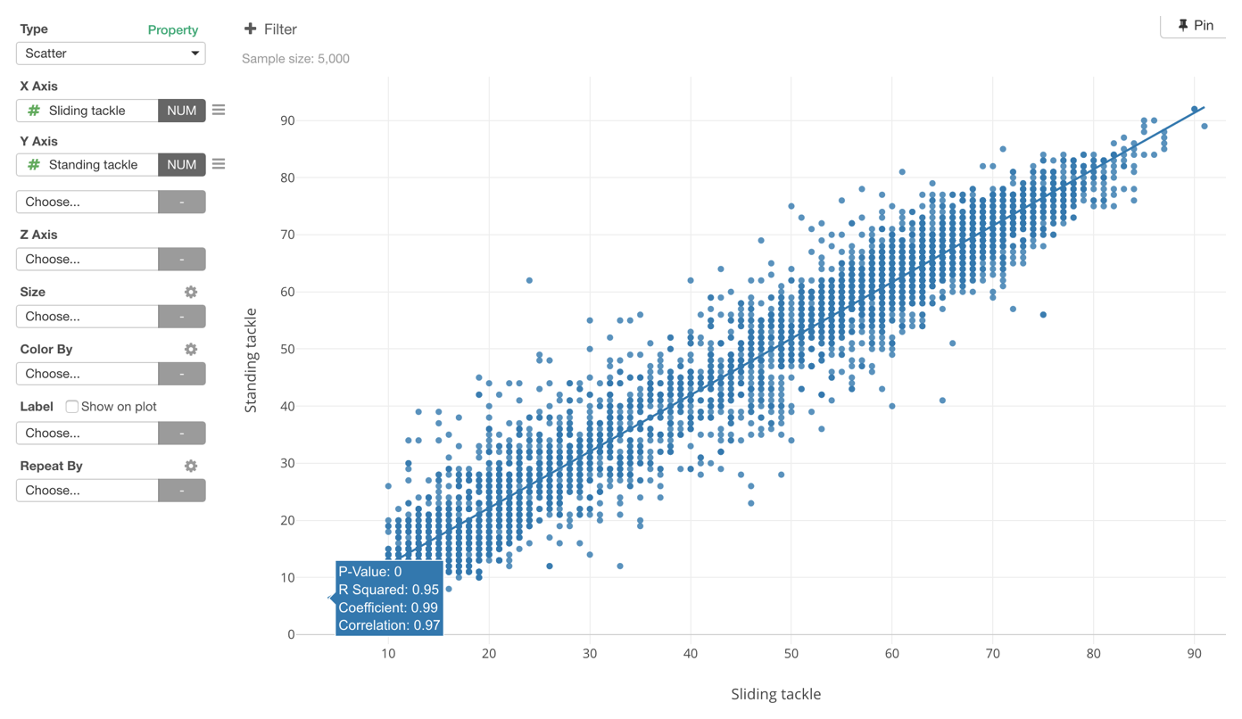
Now, I wonder if some of the measures can be very similar to one another. For example, if you are good at Sliding Tackle probably you might be also good at Standing Tackle.
So what are the variables that are highly correlated to one another?
Correlation — Pearson
One way to answer this question effectively is to run a correlation algorithm like Pearson.
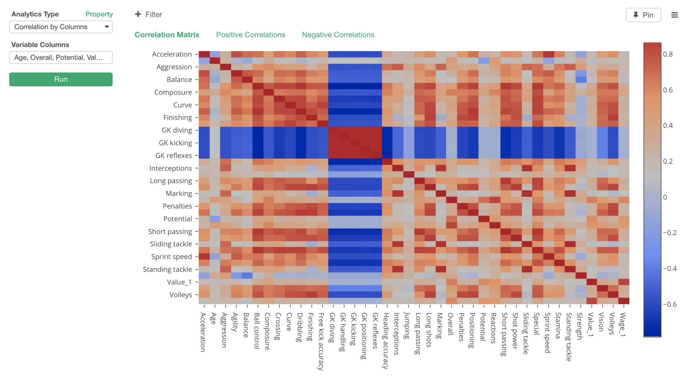
In the Heatmap chart above, X and Y Axis have a same set of the measures and each intersection shows a color that is ranging between Red and Blue. The darker the red is, the higher the positive correlation is between the two variables. The high correlation means that an increase in one variable can expect an increase in another variable in a linear fashion.
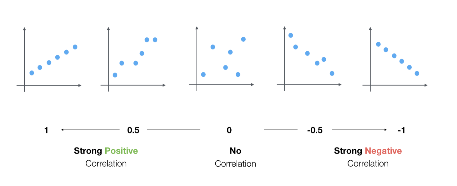
And, the darker the blue is the higher the negative correlation is. The high negative correlation means that an increase in one variable can expect a decrease in another variable.
If the color is gray (between Red and Blue) then there is no correlation between the two variables.
Now, you would notice that there are two blue color bands that are crossing. These are all Goal Keeper (GK) related measures such as:
- GK Diving
- GK Handling
- GK Kicking
- GK Positioning
- GK Reflexes
And these are negatively correlated (Blue) to all the non-GK measures. So we can say that the players who score high on these measures tend to score low on the other type of measures, vice-a-versa. Goal Keepers and other position players are very different by looking at this data.
And the area where these Goal Keeper related measures intersect to one another shows dark red color, which means that they are highly and positively correlated to one another.
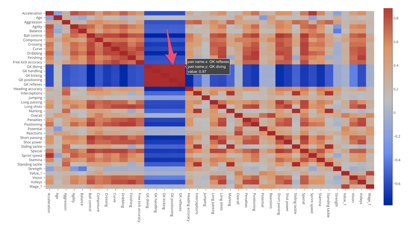
Among non-Goal Keeper related skills, there are many correlated variables that are indicated as dark red colors. For example, we can see that Standing Tackle and Sliding Tackle are highly positively correlated with 0.97 correlation score.
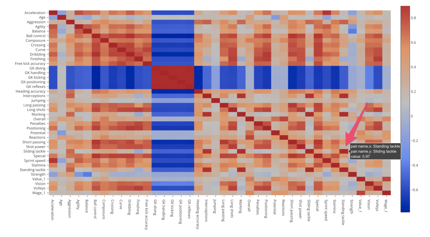
Overall, regardless whether they are Goal Keeper related or non-Goal Keeper related there are many correlated skill measures. This means that we might not need all the skill measures, or we can express the same amount of the information with fewer set of variables.
For example, probably we just need one variable to express all those Goal Keeper related variables given that they are all highly positively correlated to one another.
PCA — Principal Component Analysis
This is when we want to try PCA.
PCA is an algorithm that generates a new set of artificial dimensions (components) that are created in a way that they are not correlated to one another and that carry as much information of the original data as possible with fewer dimensions.
As we saw with the correlation example above, there are many variables that are correlated to one another so probably we don’t really need to have the original 34 variables. Instead, we might be able to express the same amount of the information with much fewer artificially created variables.
Let’s run PCA against the same data that consists of the same set of the soccer player skill measures.
First, in Exploratory, we get ‘Component Importance’ chart like below.
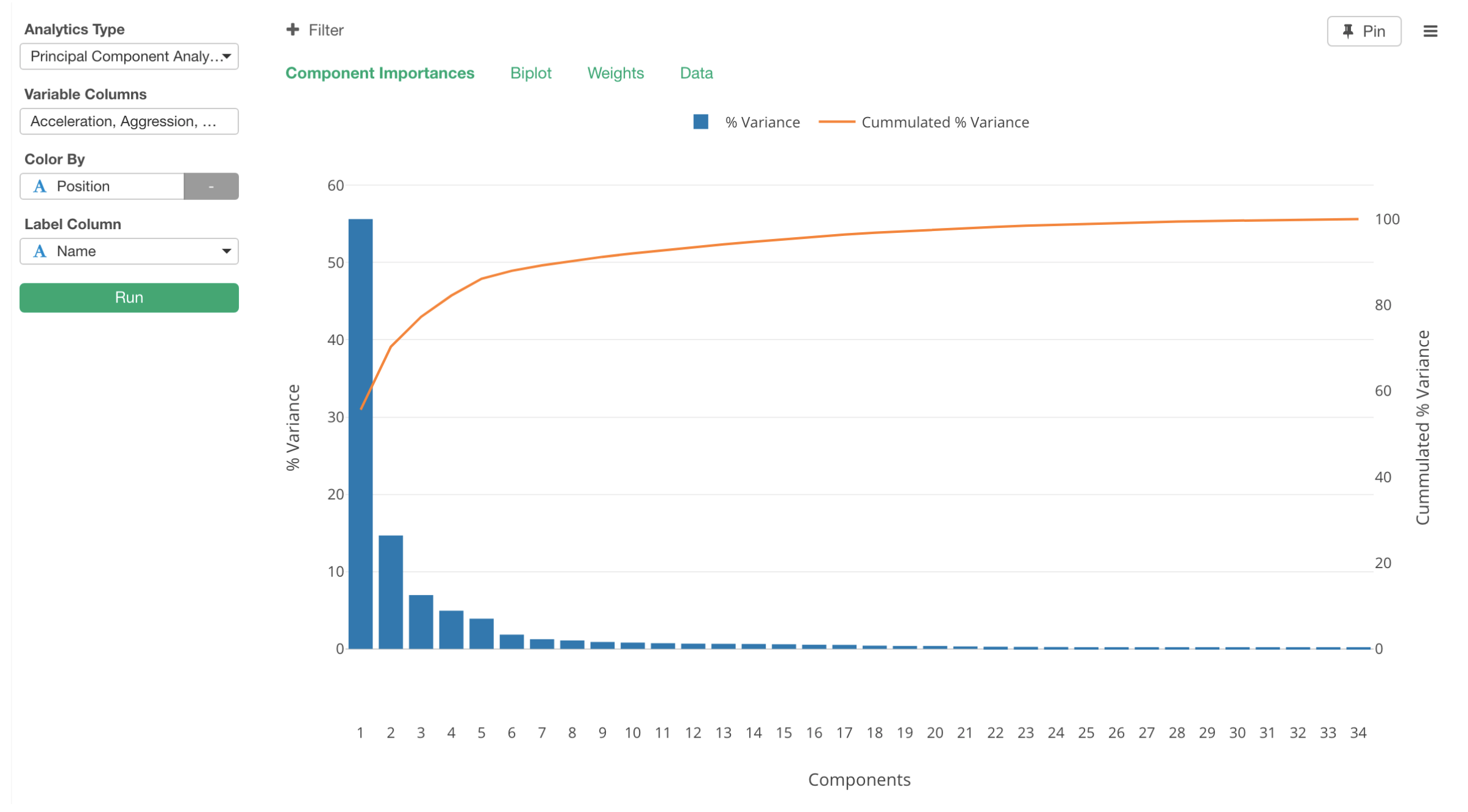
By looking at this chart, we can say that the first component (blue bar) carries more than a half of the information (or precisely, it’s variability) of the original data. The second component carries about 15% of the information. When we combine the first two components together, they carry about 70% of the information, which is what the orange line is showing as the cumulative sum of the percentage variances.
This means that we can have only a few of these new components (or dimensions) to carry most of the information that the original 34 variables carry. This is why PCA is known as ‘dimensionality reduction’ algorithm.
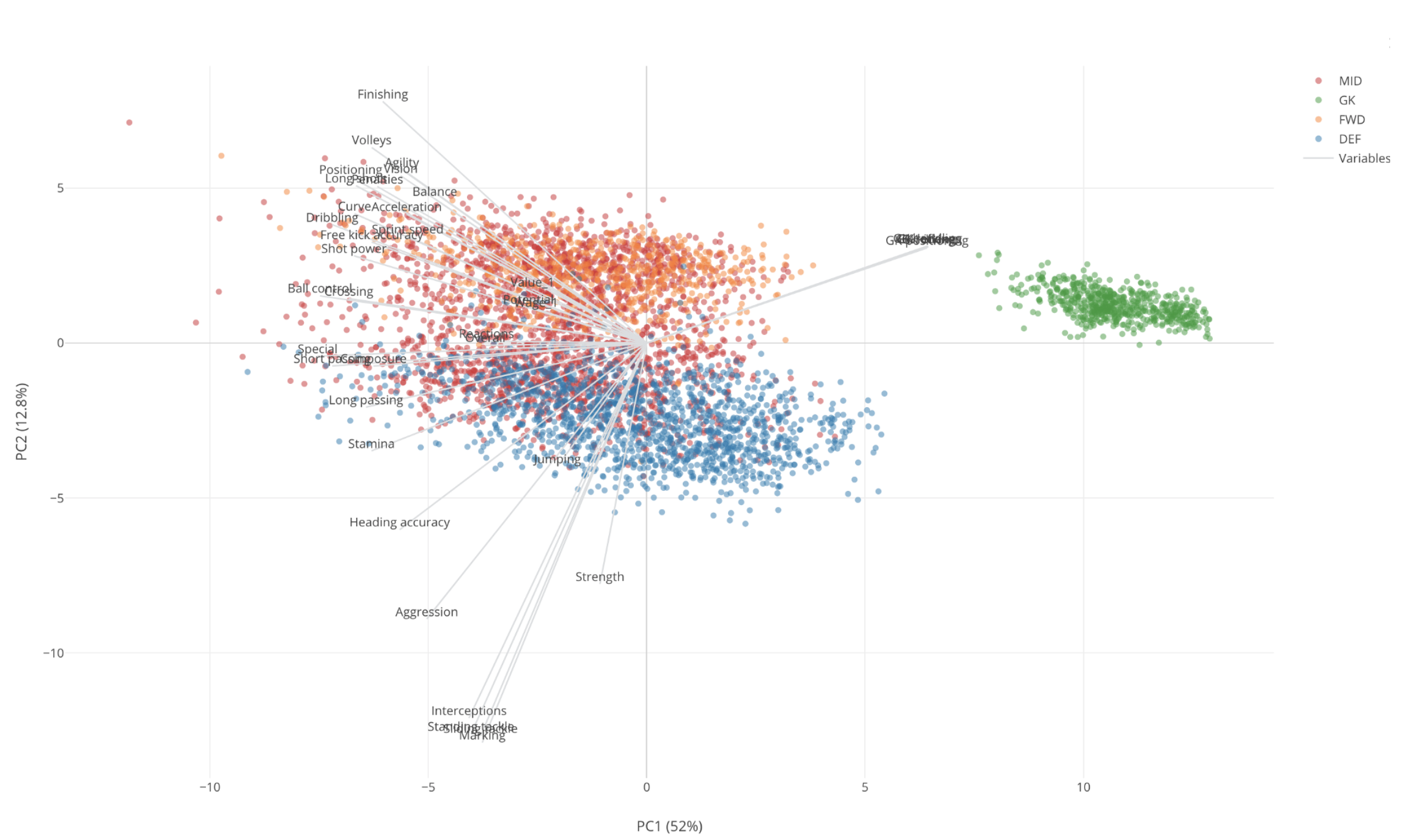
Now, we can go to Biplot tab to visualize the original data by assigning the first two components to X and Y Axis of Scatter chart like below.
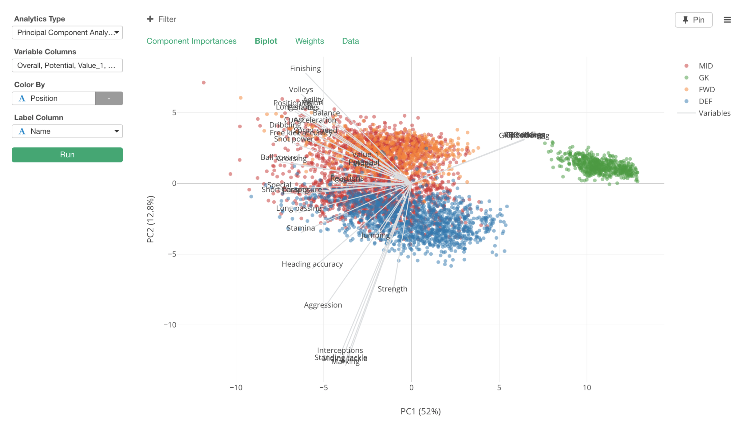
The original variables are shown as the gray straight lines starting from 0 positions of X and Y, and the original rows, each of which is essentially each Soccer player, are shown as dots.
The color represents their positions. Blue is Defense players (DEF), Red is Mid Field players (MID), Orange is Forward players (FWD), and Green is Goal Keepers (GK).
Having said that, the first thing we would notice is that there is a green island towards to the right side of the chart. These are all Goal Keepers.
They are on the higher side of PC1, which is the X-Axis of this chart. So just by looking at this much, we can say that PC1 is an indicator of how much Goal Keeper type skills the players possese.
The measures (Gray lines) that are pointing to these GK players area are the GK related ones like below.
- GK Diving
- GK Handling
- GK Kicking
- GK Positioning
- GK Reflexes
And these seem to be pretty much the same information, meaning that all the players are scoring on these measures almost exactly the same way.
Now, we can say that the players at the higher side of this dimension scores high on the Goal Keeper skills. The players at the opposite side don’t have Goal Keeper type skills at all.
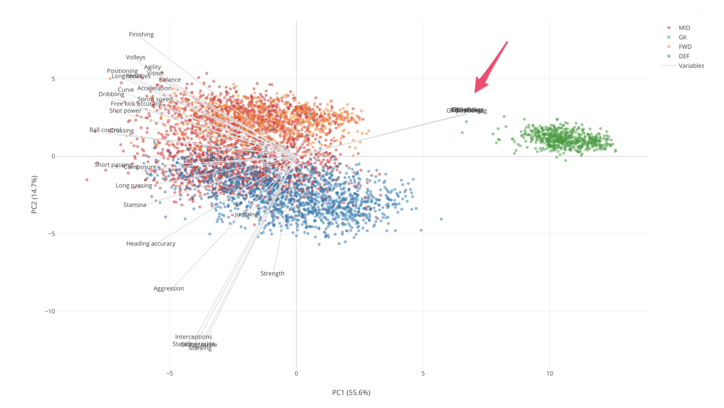
Given that these Goal Keepers seem to be very different from other players, we can remove them from the data and re-run PCA so that we can understand the relationship between remaining measures and players better.
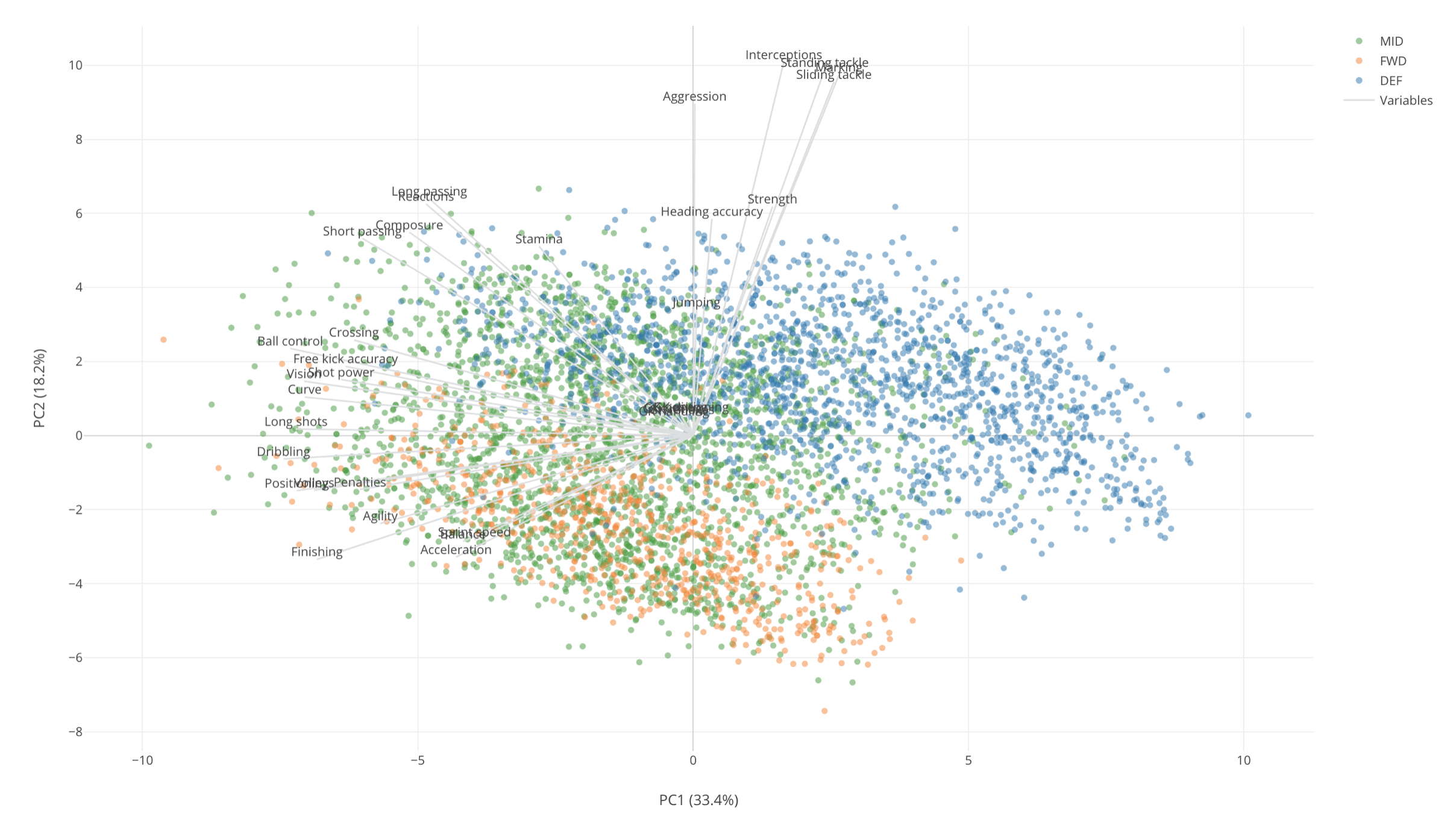
Now, we would notice that there are some measures that are pointing in the same direction. These are:
- Marking
- Sliding Tackle
- Standing Tackle
- Interception
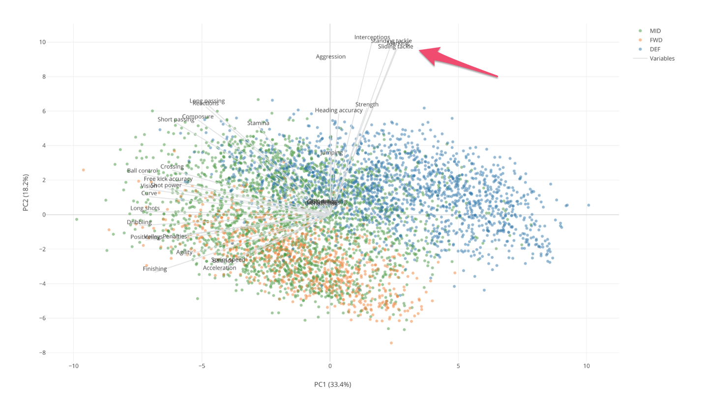
And these measures are closest to the Defense players (Blue dots) who are scoring higher on these measures than other position players. From this, we can say that these are the measures that are characteristics of the Defense players, which kind of makes sense.
And these measures along with other measures like Strength, Aggregation, etc. are relatively closer to the Y-Axis which is PC2 in this case. From this, we can say that PC2 indicates how good or bad at these Defense skills.
On the other hand, Mid Field players and Forward players seem to share the same skills. But Mid Fielders tend to score high on the following skill measures.
- Short Pass
- Stamina
- Crossing
- Free Kick Accuracy
- Vision
- Shot Power
Forward players score high on the following skill measures.
- Agility
- Acceleration
- Spring Speed
- Finishing
Also, the Forward players (Orange) tend to be at the left bottom quarter area and they are at the opposite side of the Defense skill measures. So we can say that the Forward players tend to score low on these Defense measures relative to other position players.
By the way, this particular chart type is called ‘Biplot’, which shows the original variables and the original subjects (in this case they are the soccer players) together on a Cartesian coordinate (two-dimensional space of X and Y) with the primally component dimensions. It gives us a lot of information that helps us understand the relationship between the original measures and the soccer players.
Now that we know how PCA works and how to interpret the ‘Biplot’ chart, we can use this method to compare the players from two countries that played against each other at the 2018 World Cup. But since this post has already become too long, I’ve created a separate post to compare the players from Brazil, Belgium, Croatia, France, and Japan by using the PCA algorithm. I’d recommend you take a look at this post!
Try it for yourself!
If you want to try this out quickly, you can download the data from here, import it in Exploratory Desktop, and follow the steps.
If you don’t have Exploratory Desktop yet, you can sign up from here for 30 days free trial!