Violin Plot
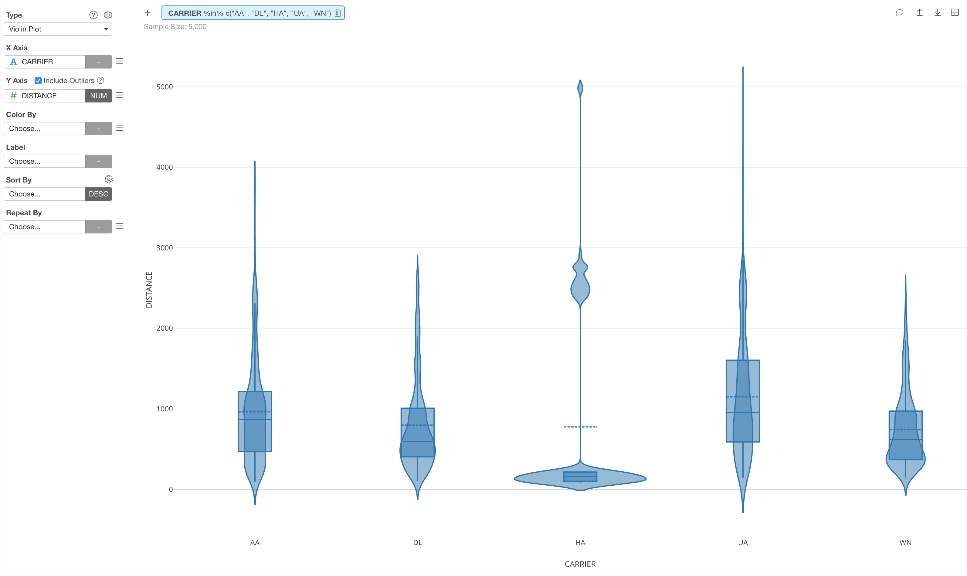
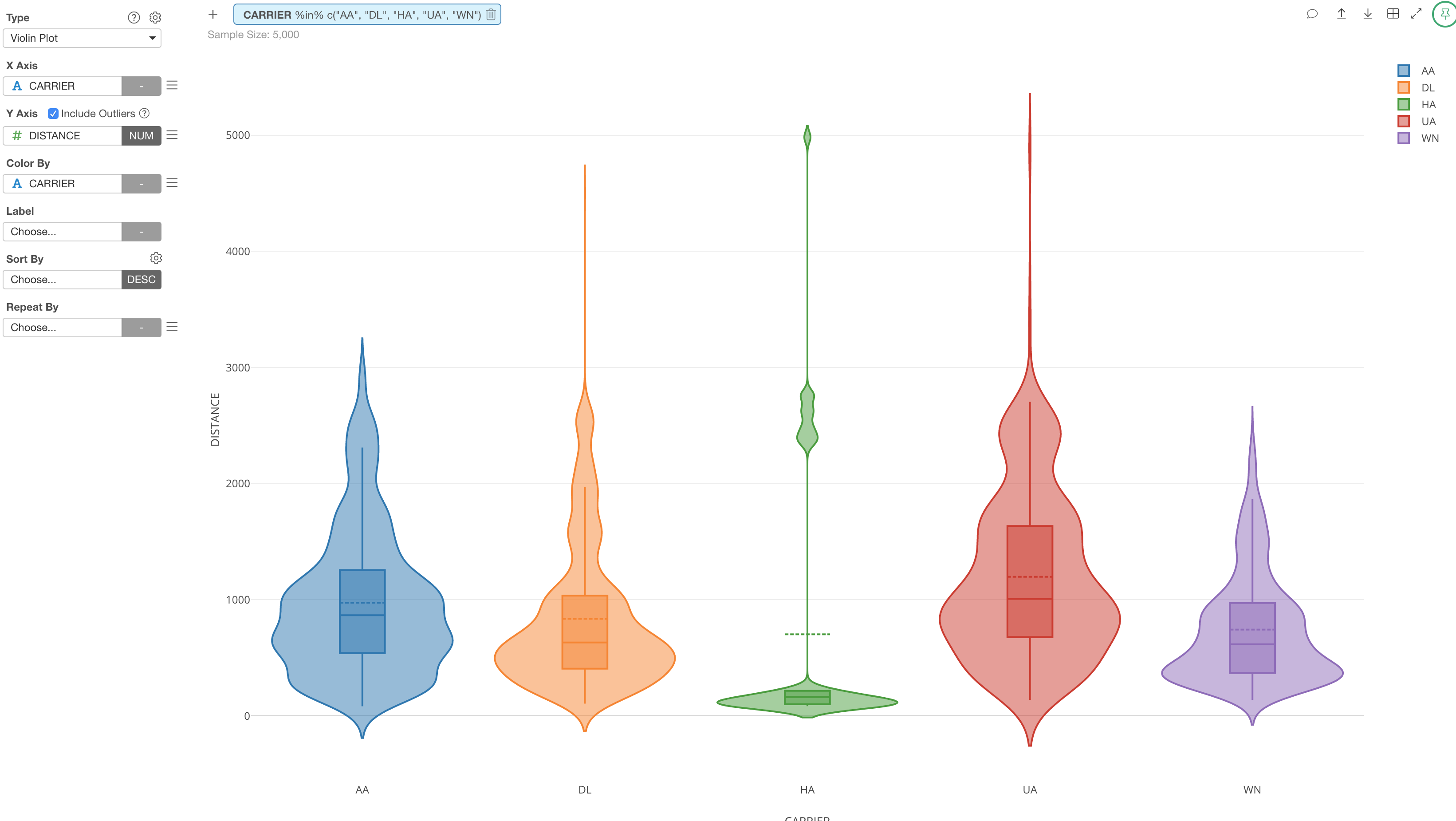
Violin Plot is basically combining Density plot and Boxplot.
It visualizes how the data is distributed and help you compare the distribution among categories better.
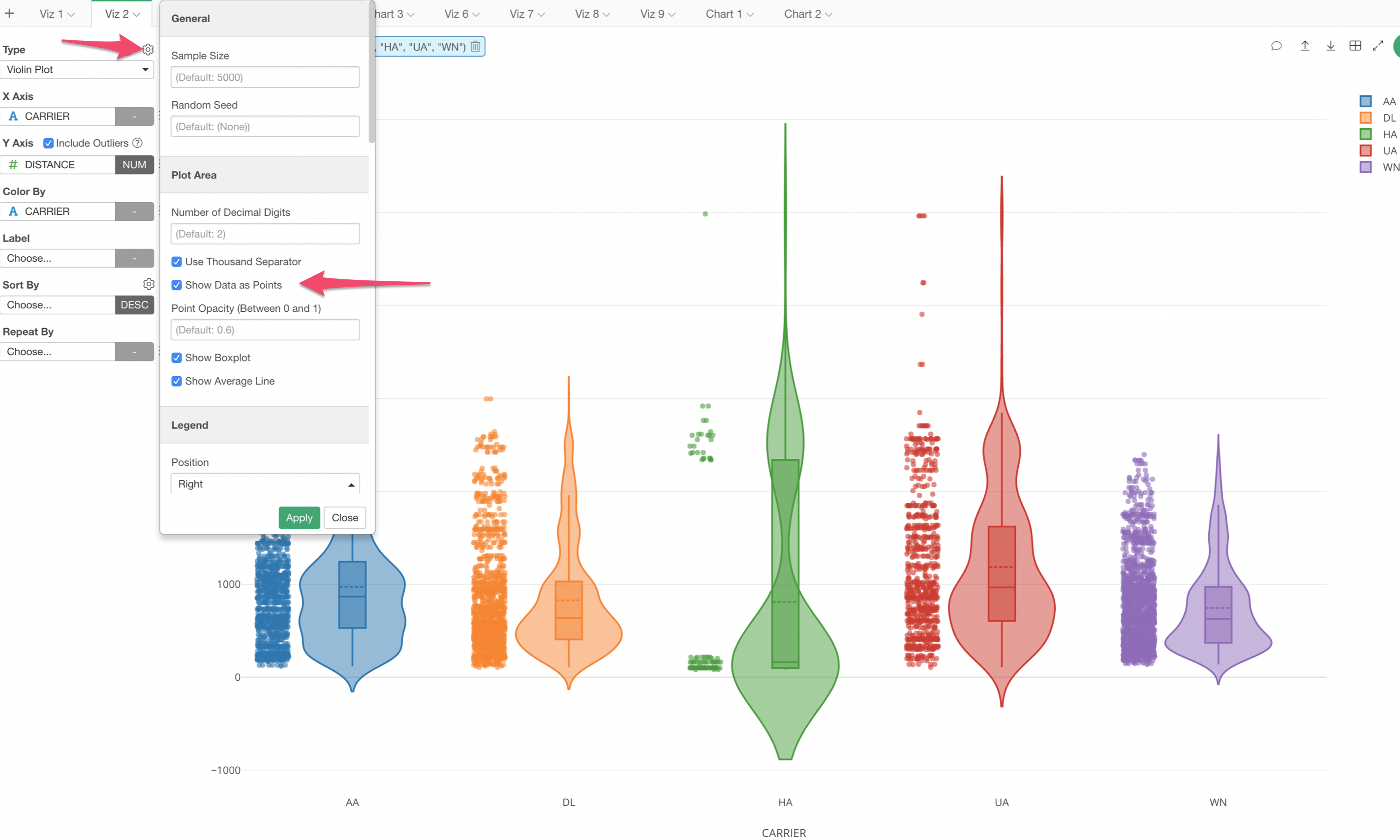
You can select ‘Vionlin Plot’ from the Chart Type dropdown.
You can change the Color by using Color By.
You have an option of showing the boxplot inside the violin shape and showing the dots (original data points) next to the Violin.