Introduction to Window Calculations in Chart
There are various window calculation methods you can use inside Bar, Line, Area, Scatter (Aggregate), and Pivot Table.
- Cumulative
- % of
- Difference From
- % Difference From
- Moving Average
For example, here is a stock price data and I’m showing each company’s adjusted stock price trend represented by a different color.
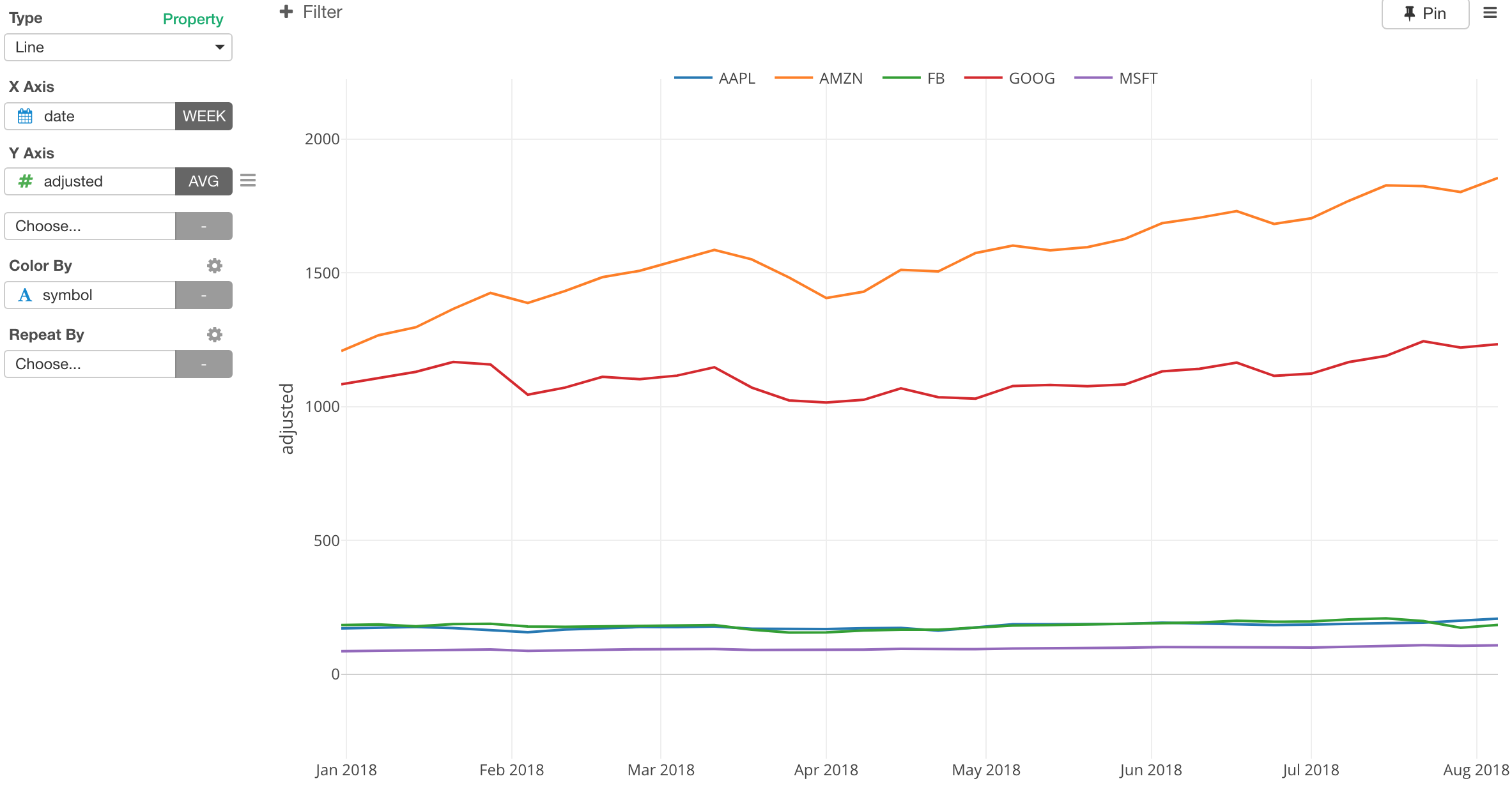
Since the price ranges between two groups - one group (AMZN/Amazon and GOOG/Google) and another group (AAPL/Apple, FB/Facebook, and MSFT/Microsoft) - are very different, it is hard to compare which stocks are performing better or worse.
Instead, we can show how much they have grown from the beginning of the period in percentage.
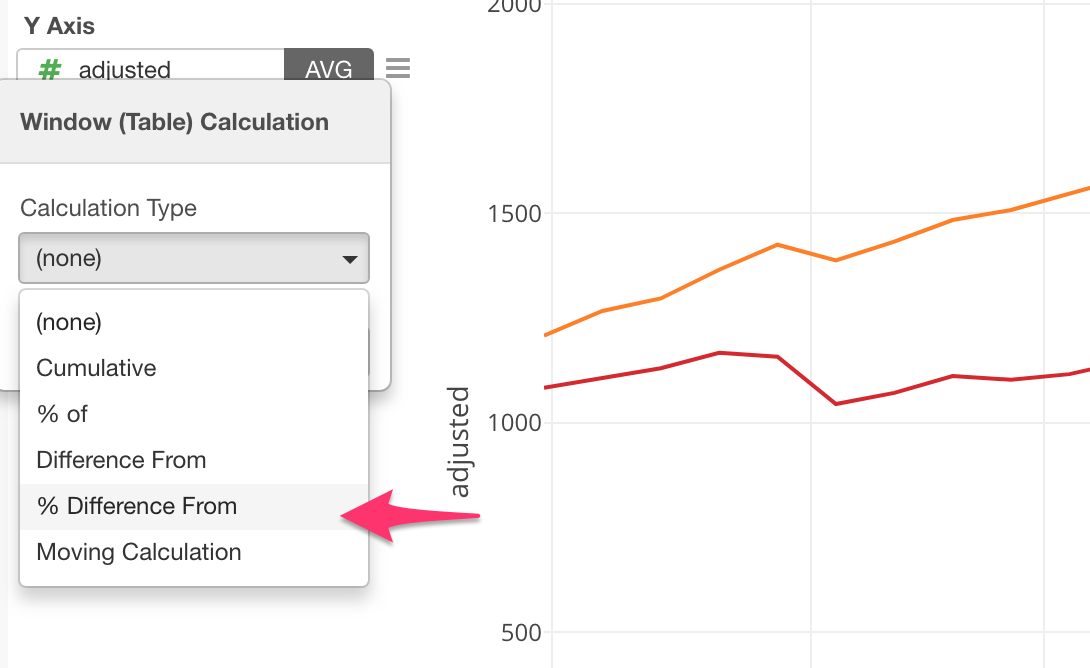
Select Window Calculation from Y Axis menu.

Select % Difference From.
By selecting ‘First Value’, which is the default by the way, we can now see how much each stock price has performed easier.
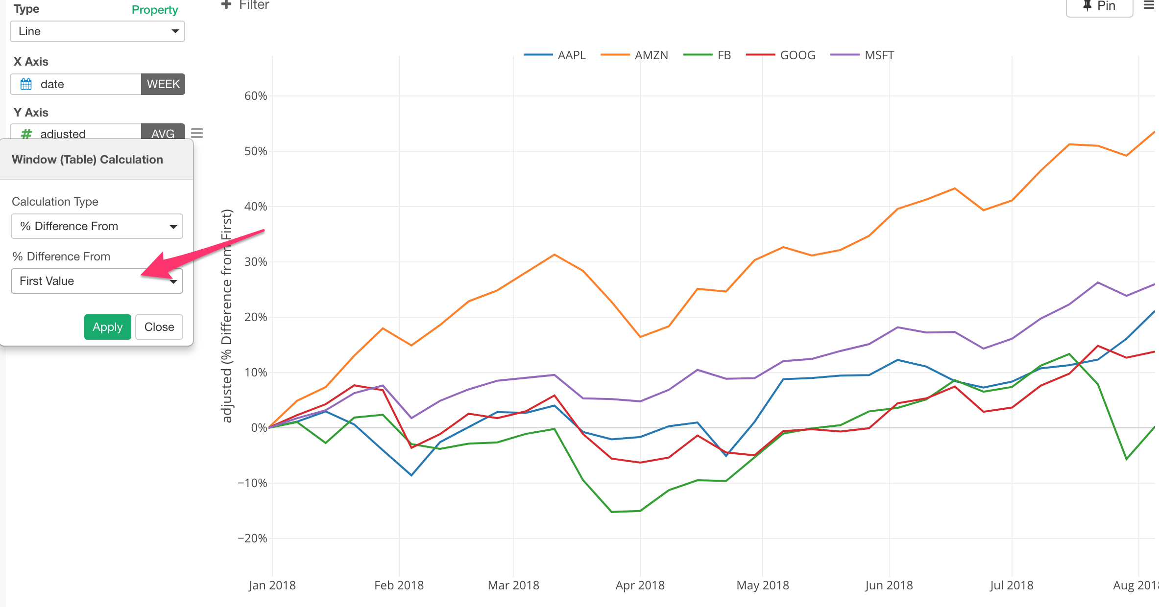
This ‘% Difference From - First Value’ method is to calculate the difference between a value at any given point and the first value for a series of the values for each color line, in this case that is the stock.
The calculation is something like the below.
(adjusted - first(adjusted)) / first(adjusted) * 100There are other methods I’d recommend you try out. Take a look at this introduction of Windows Calculation post for more details.