How should we decide how many clusters to create?
This is a follow up post for ‘Visualizing K-Means Clustering Results to Understand the Characteristics of Clusters Better’. I’d recommend you take a look at it first if you haven’t yet.
In the previous post, we have used the default setting of 3 for the number of the clusters.
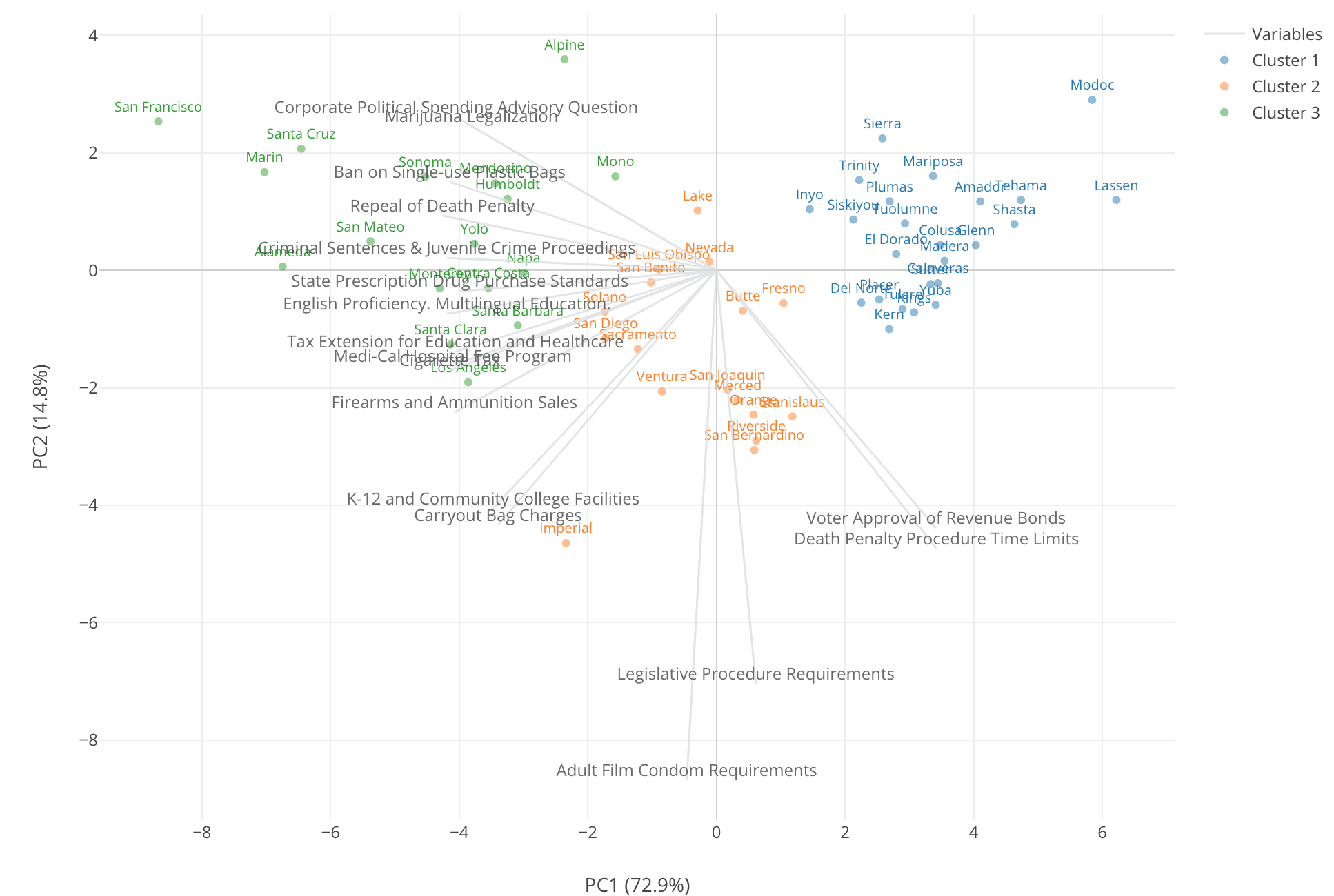
Why 3 clusters?
That’s because 3 is the default! ;)
Now, seriously, how many clusters we should create?
In this post, we will take a look at how to find the most optimal number of clusters using the same 2016 California Election data.
Finding How Many Clusters to Create with Elbow Curve
The K-means Clustering algorithm requires you to set the number (K) of the clusters when you build the model. And the obvious question here is,
“What is the magic number K?”
There are a few ways to answer the question. One of them is called ‘Elbow Curve’,
We iteratively build the K-Means Clustering models as we increase the number of the clusters starting from 1 to, let’s say, 10. Then we can calculate the distance between all the members (in our example they are the counties) that belong to each cluster and the center of each cluster every time we build a new model.
This will give us a series of models with different distance values. Finally, we draw a line that connects all the distances of the clusters like the below.
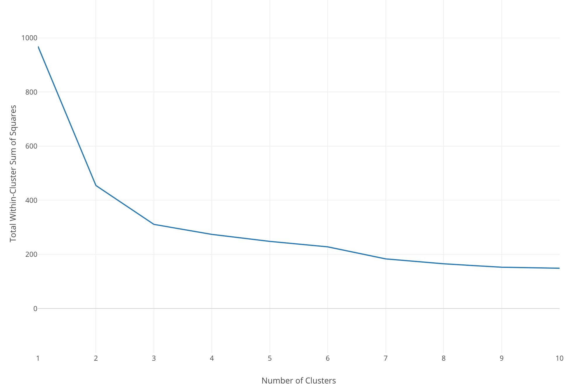
The Y-Axis is the distance and the X-Axis is the number of the clusters.
And when you see a huge drop that means increasing the number of the clusters for one at that point dramatically helps to optimize the model in terms of how good it separates the members. The distance keeps decreasing as you increase the number of the clusters, but usually, there is a point where the decline settles.
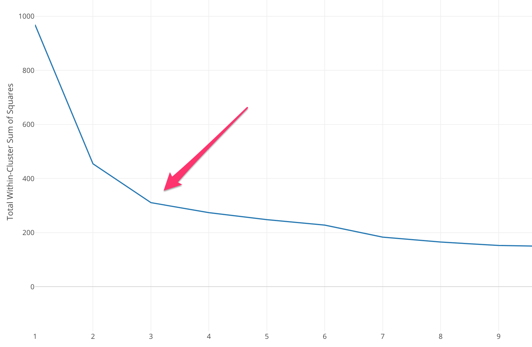
And we call this point ‘Elbow’ because it looks like the elbow of our arm.
Luckily, we don’t need to do the above task manually thanks to the new K-Means Clustering feature under Analytics view.
Let’s take a look.
Finding the Optimal Number of Clusters
We’ll use the same K-Means Clustering model we built in the previous post. We built the clustering model to cluster the California counties based on the supporting rates of the 17 ballot measures from the 2016 California Election.
Click the Property button.
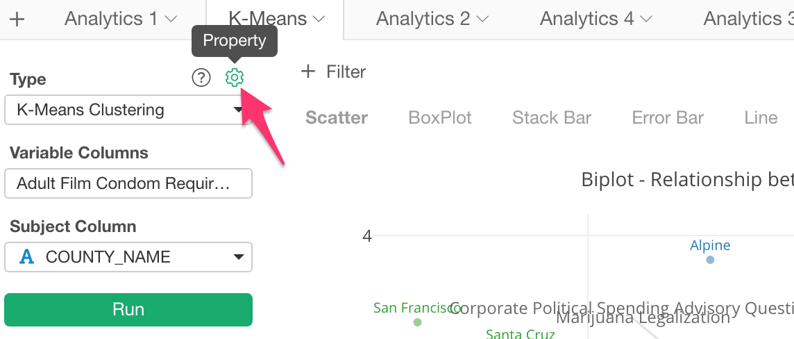
In the property dialog, set ‘Find Optimal Number of Clusters’ to TRUE and click ‘Apply’ button.
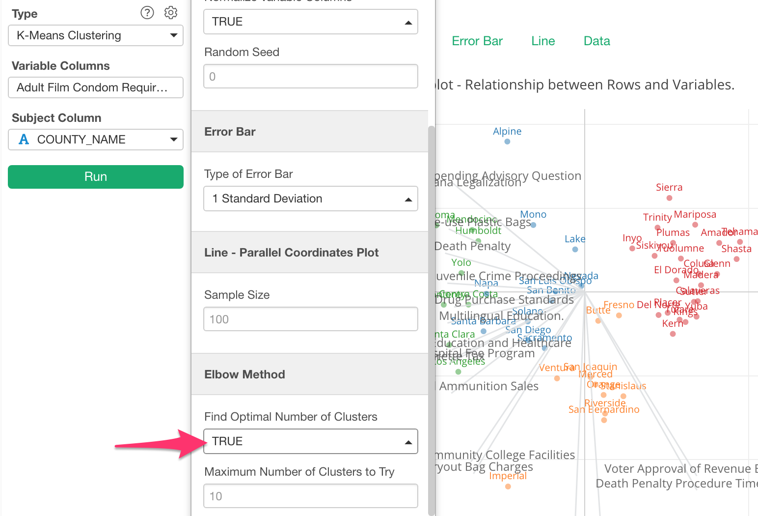
This will produce a chart like the below.
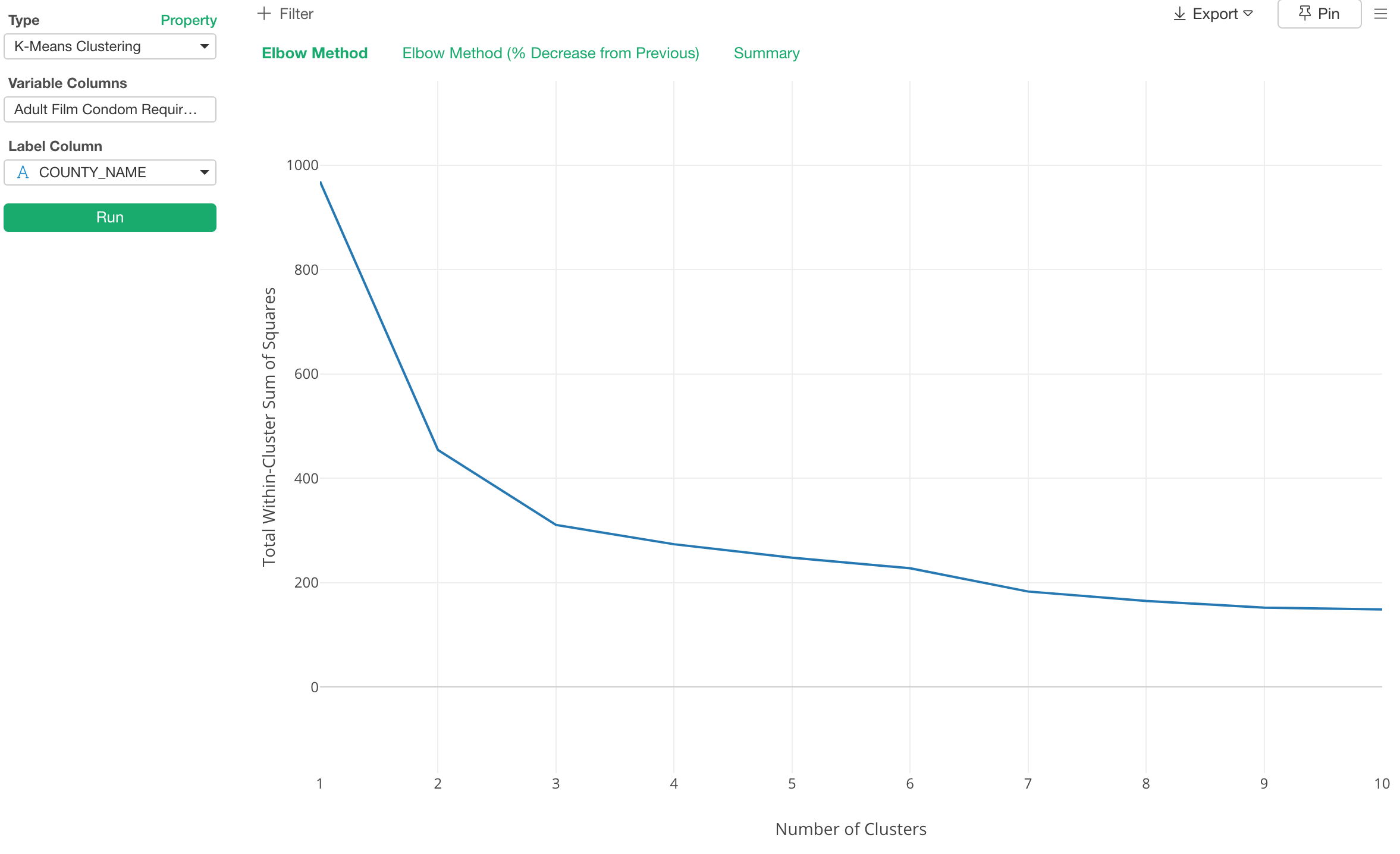
Here, the elbow of the curve is around the number 3, so most likely 3 is the optimal number of the clusters for this data.
Experiment with Different Numbers of Clusters and Compare Them
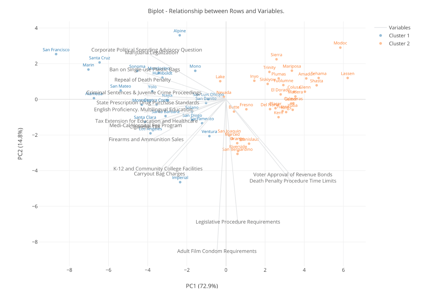
Let’s compare a few clustering models varying the number of clusters from 1 to 3.
Here’s how it looks when we have 2 clusters.
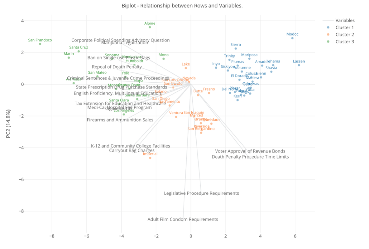
Here’s one with 3 clusters.
Finally, here’s one with 4 clusters.
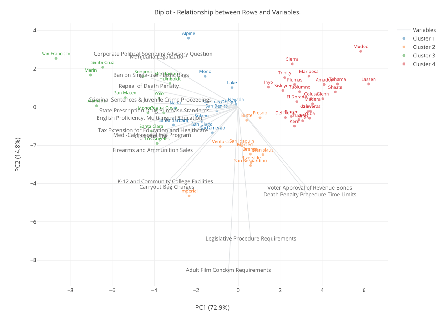
Now, when we increase the number of the clusters to 4 there is a new blue colored cluster that used to be either blue or orange when there is only 3 clusters.
This blue color cluster seems to be at supporting counties for the ‘liberal’ measures because they are at the positive side of the gray lines that represent the ‘liberal’ measures. But they are not as ‘enthusiastic’ as the green clusters. And if we think such degree of the difference then increasing the number of clusters from 3 to 4 is meaningful.
But, when we had only 3 clusters we had a liberal cluster, a conservative cluster, and a middle cluster, and if we think that’s a useful separation in terms of grouping the counties then having 3 clusters is good enough and no need to make the clusters even more separated.
The reason we want to cluster the data into a set of groups is that we want to find similarities among the categories such as the counties. Hence, the smaller number of the clusters is better in order to identify simpler similarities to interpret. The bigger number of the clusters will become harder to interpret the character of each cluster.
However, the smaller number of the clusters obviously might not be able to capture a small but important difference between the groups that could have been found by increasing the number.
This is why Elbow Curve method can be helpful. It helps how increasing the number of the clusters contribute separating the clusters in a meaningful way, not in a marginal way.
Does Elbow Curve always work?
Note that some data doesn’t produce the kind of Elbow Curve we saw in this post and you might have a hard time to find one Elbow point.
In such cases, I’d recommend you use various charts to visualize the clustered data and compare the differences that are made by changing the number of clusters, and find the most meaningful set of clusters. And the new K-Means Clustering under Analytics view can help you do such exploration quickly.