Christine Zhang has put together a data for all the places Anthony Bourdain has traveled to via his TV shows, which are I think the most influential and the most humanistic entertainment shows in our era.
- No Reservation
- Parts Unknown
- The Layover
#plotswithchristine took a bit longer this week: places Anthony Bourdain visited on his shows
— Christine Zhang (@christinezhang) June 11, 2018
“If I'm an advocate for anything, it's to move….walk in someone else's shoes or at least eat their food, it's a plus for everybody” @PartsUnknownCNN
data+code https://t.co/vS7TIWUcQa pic.twitter.com/84VmPFDFTY
This is pretty cool, I love all his shows, and always wanted to see where he traveled to in a single map.
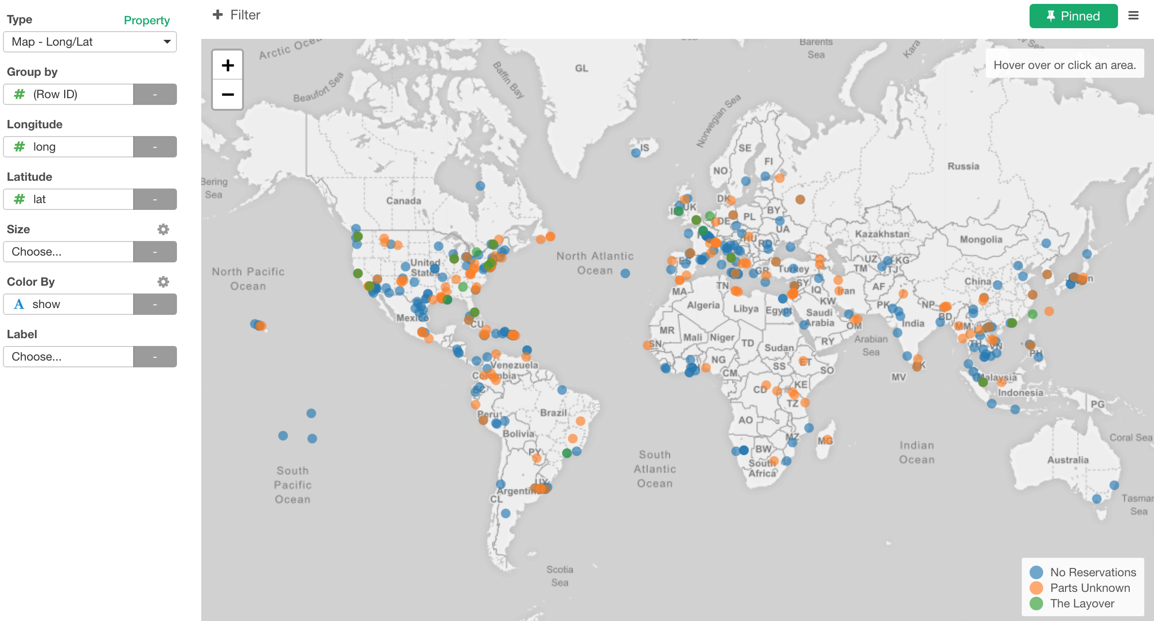
Places Anthony Bourdain Traveled To
So I have downloaded the data from the linked Github repository, and visualize it in Exploratory. Just visualizing it is not that interesting, Christine has already done that job greatly. What I wanted to do is to show his travel paths in each episode, and here it is.
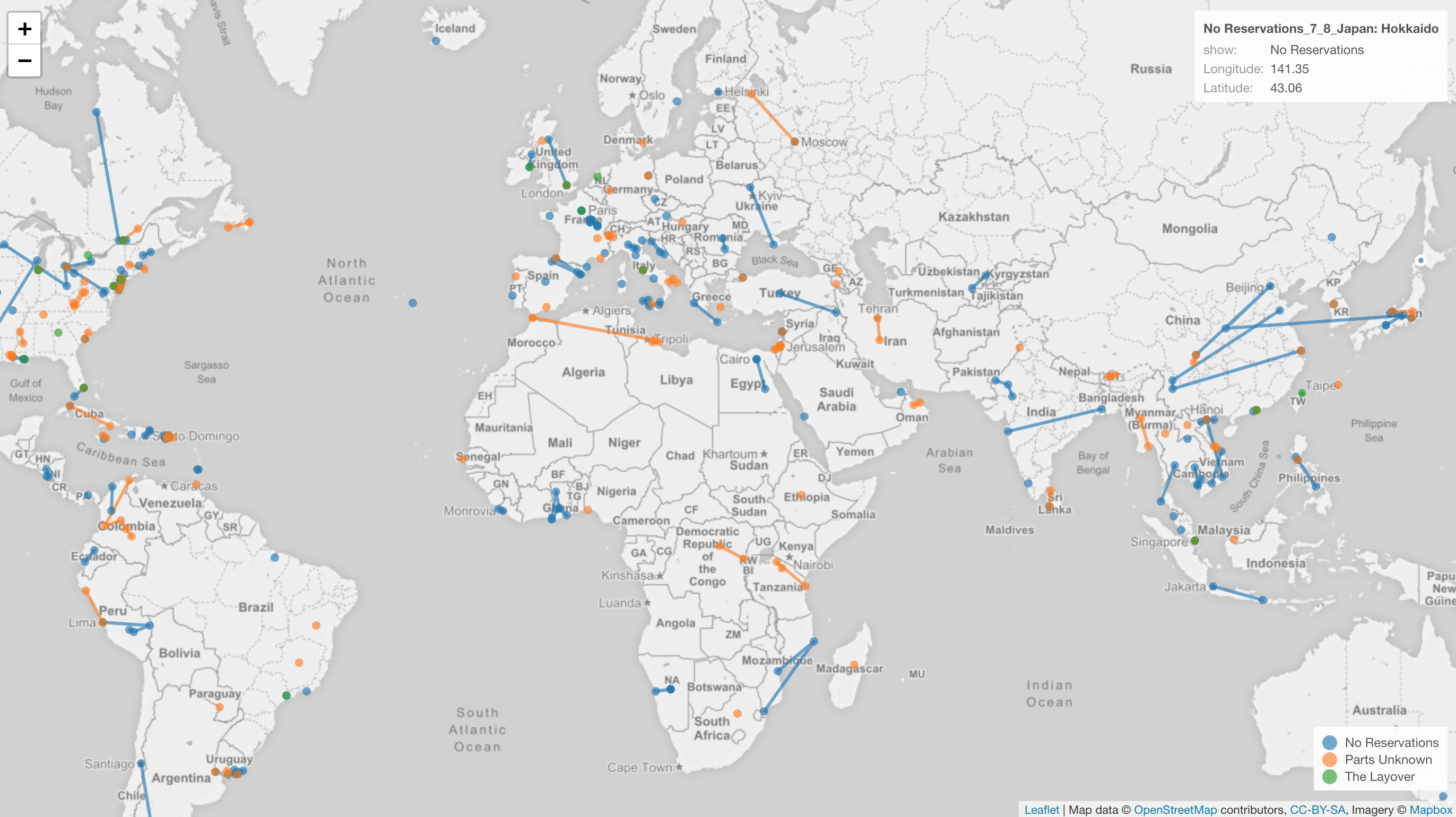
The color indicate which show of the following three.
- No Reservation
- Parts Unknown
- The Layover
And I used lines to connect between the places he visited during each of the shows.
Here is an interactive version. You can zoom in and out, and drag to pan.
He traveled to just one location for some of the episodes, but he often traveled to multiple locations, sometimes across multiple countries, for a same episode. For example, for an episode called ‘Asia Special: China & Japan’ of ‘No Reservation’, he traveled to Kisoji and Osaka in Japan, then Xi’an, Beijin, and Chengdu.

Here’s a list of the locations.
Regardless whether he traveled for a long distance in each episode or not, overall, he traveled to many many different places among different countries and continents. Just by looking at all these locations make me want to watch all his shows again.
Now, I originally thought I could visualize this data on Map in Exploratory quickly. This data has only 438 rows at the end of the day. But boy, was I wrong.
As with any data, regardless whether it is big or not, it always require some amount of data wrangling works before getting to Visualization step. Since I had to do some data wrangling operations that were common among others, I wanted to share what and how I prepared the data.
Here is a list of the data wrangling operations.
- Separate a single column with Longitude and Latitude into two different columns so that I can assign them to the Map viz.
- Fix a title name for one episode that is coded wrongly.
- Map some values in Country column to correct countries.
- Convert Country to Continent Names.
- Unite Show, Season, Episode, and Title columns together so that I can use it as an unique id for each episode to make the line connecting only the locations in the same episode, not across the episodes.
How to Prepare the Data
Separate a single column with Longitude and Latitude
In order to visualize the data on the Map viz in Exploratory, we need to have Longitude and Latitude columns separately, but the original data has them in a single column like below.
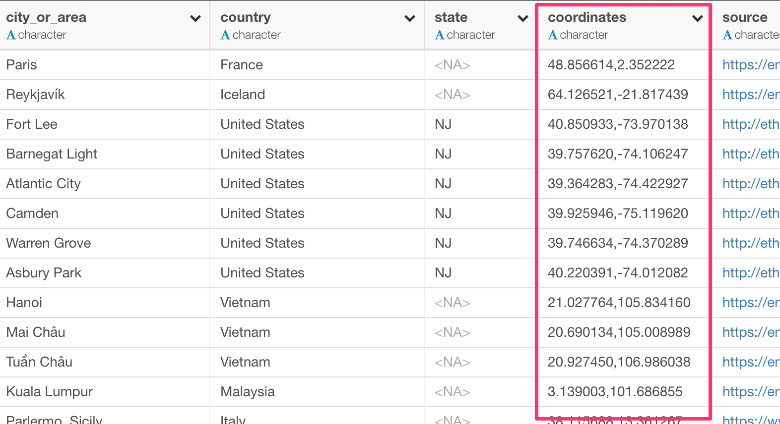
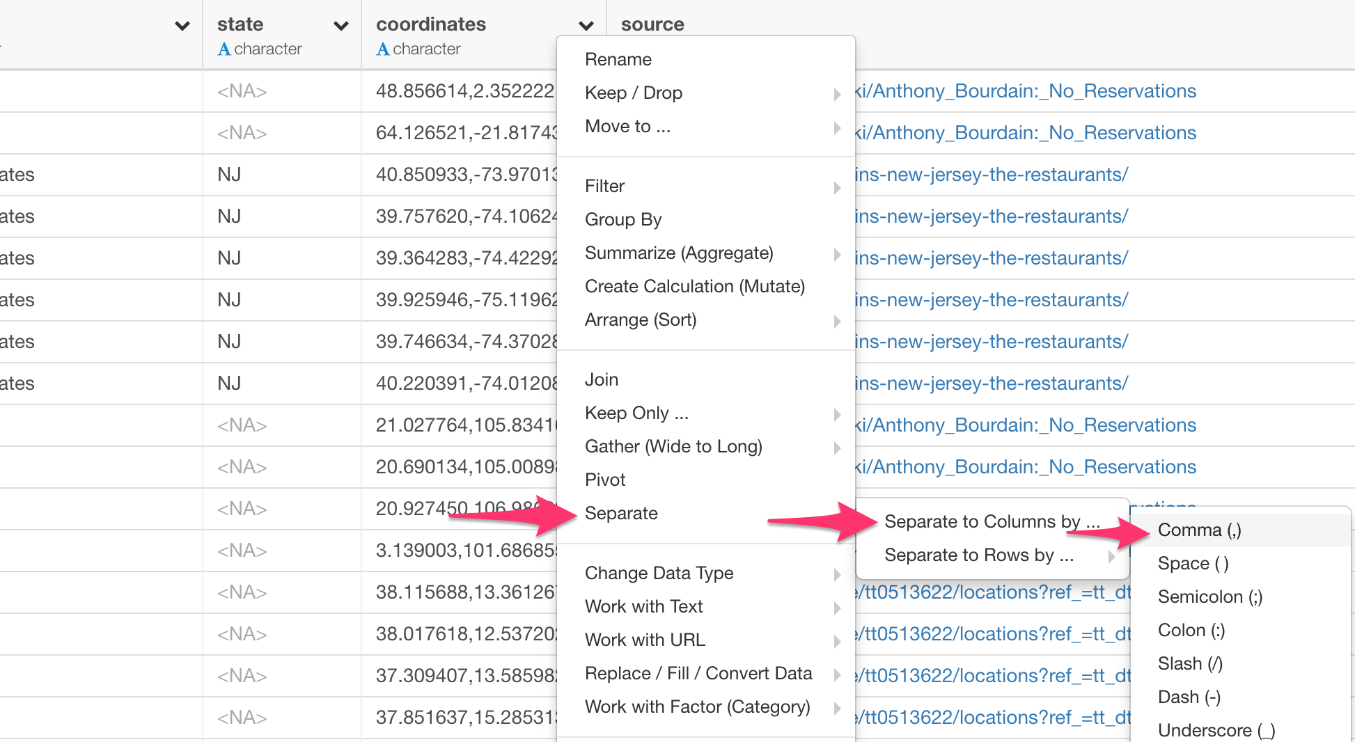
But you can separate it to two different columns easily.
You can select:
Separate -> Separate to Columns by… -> Comma (,)
from the column header menu of the ‘coordinate’ column.
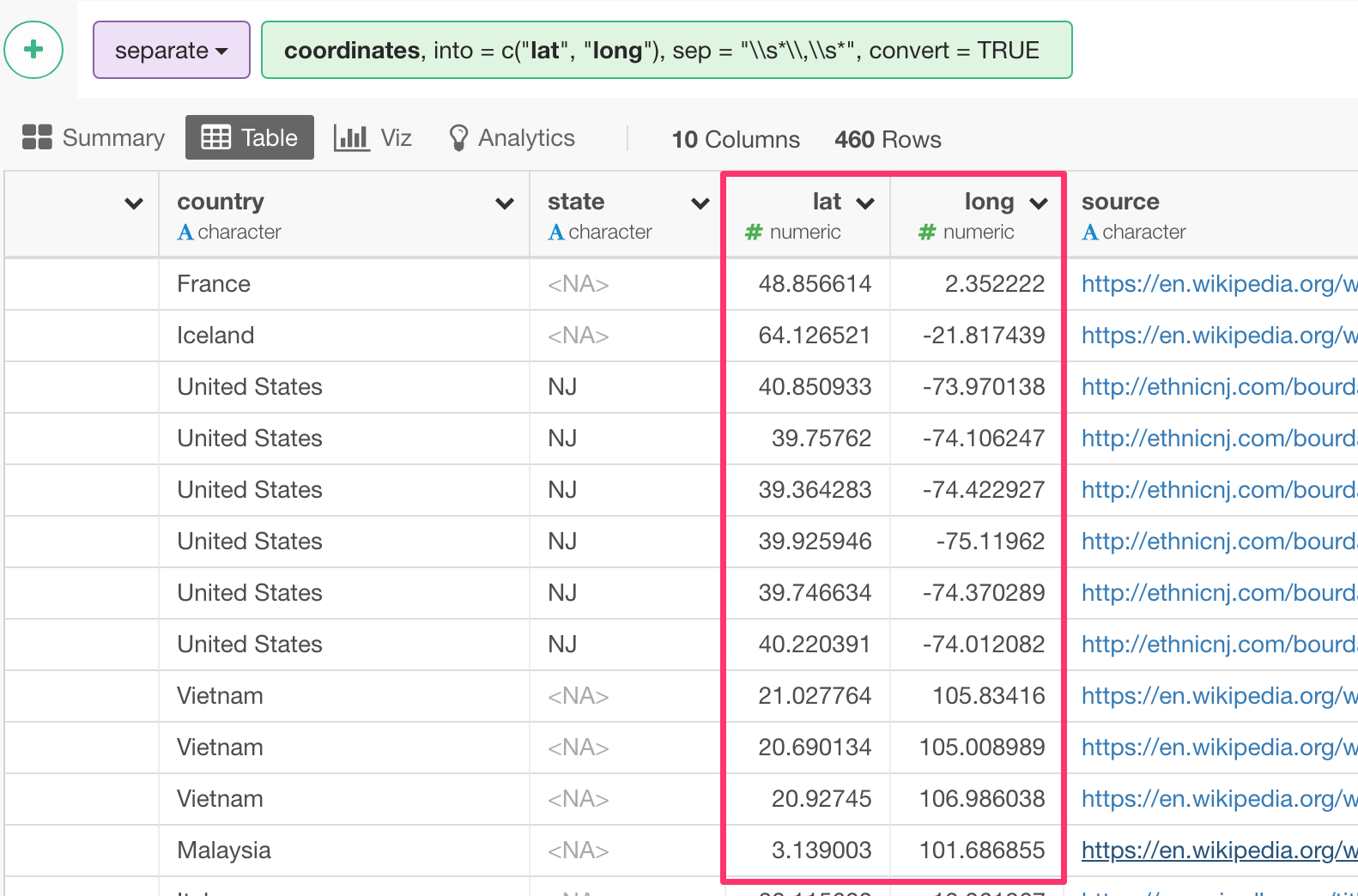
Then, we get the two columns, ‘lat’ and ‘long’.
Fix a title for one episode that is coded wrongly
There is one episode that had a wrong value. As you see below, No Reservation’s 2nd season, 4th episode should be about Montreal, Quebec, Canada, but it’s coded as Peru.
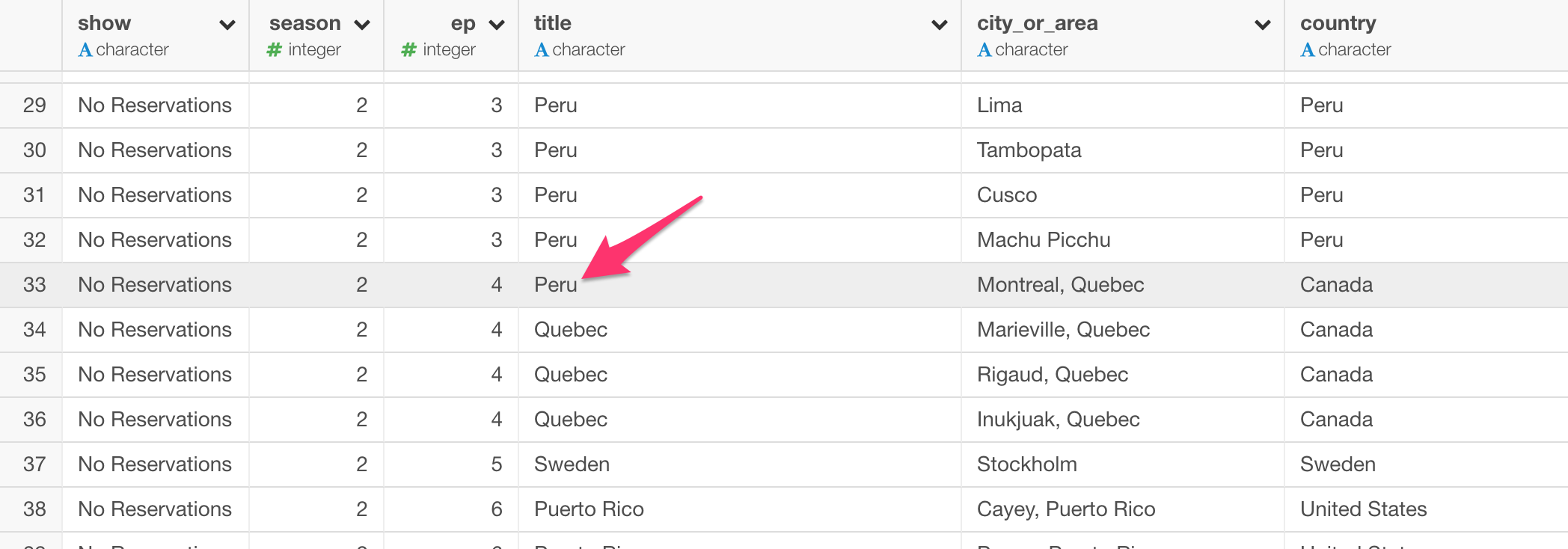
Given this is just for this one row, we can simply fix it by using ‘if_else’ function from dplyr R package like below.
if_else(show  == "No Reservations" & season  == 2 & ep  == 4,
"Quebec", title)

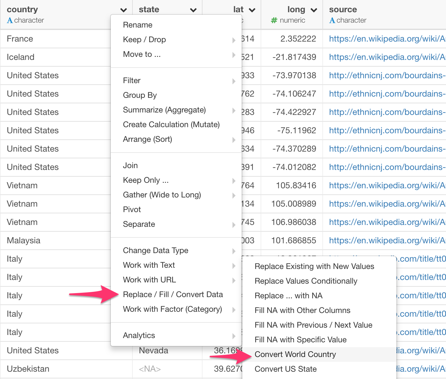
Map some values in Country column to correct countries
I wanted to see the number of times he had visited by country. This is what I got first.
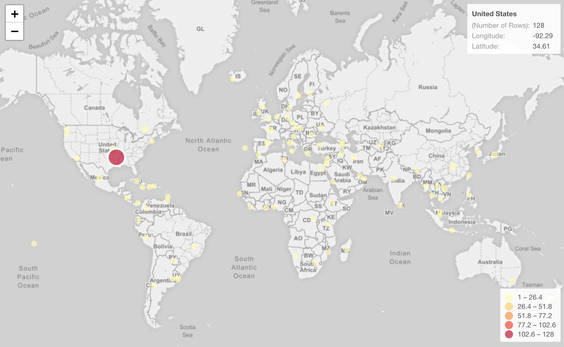
Apparently, United States is the biggest. And this makes all the other countries look like same. So I filtered United States out.

And I got this.

Huh?
There are still blue circles on United States territory even after removing United States! What’s going on?
It turned out that these are states like California, Oregon, Washington, etc. For some reasons, these episodes had the states names as the country names. So I needed to ‘recode’ them to the correct country (United States).

By the way, Sicily is another place that is coded as the country name so I needed to recode it to Italy.

Now, all the circles on United States are gone.

And here is the map that shows the number of times he visited per country.
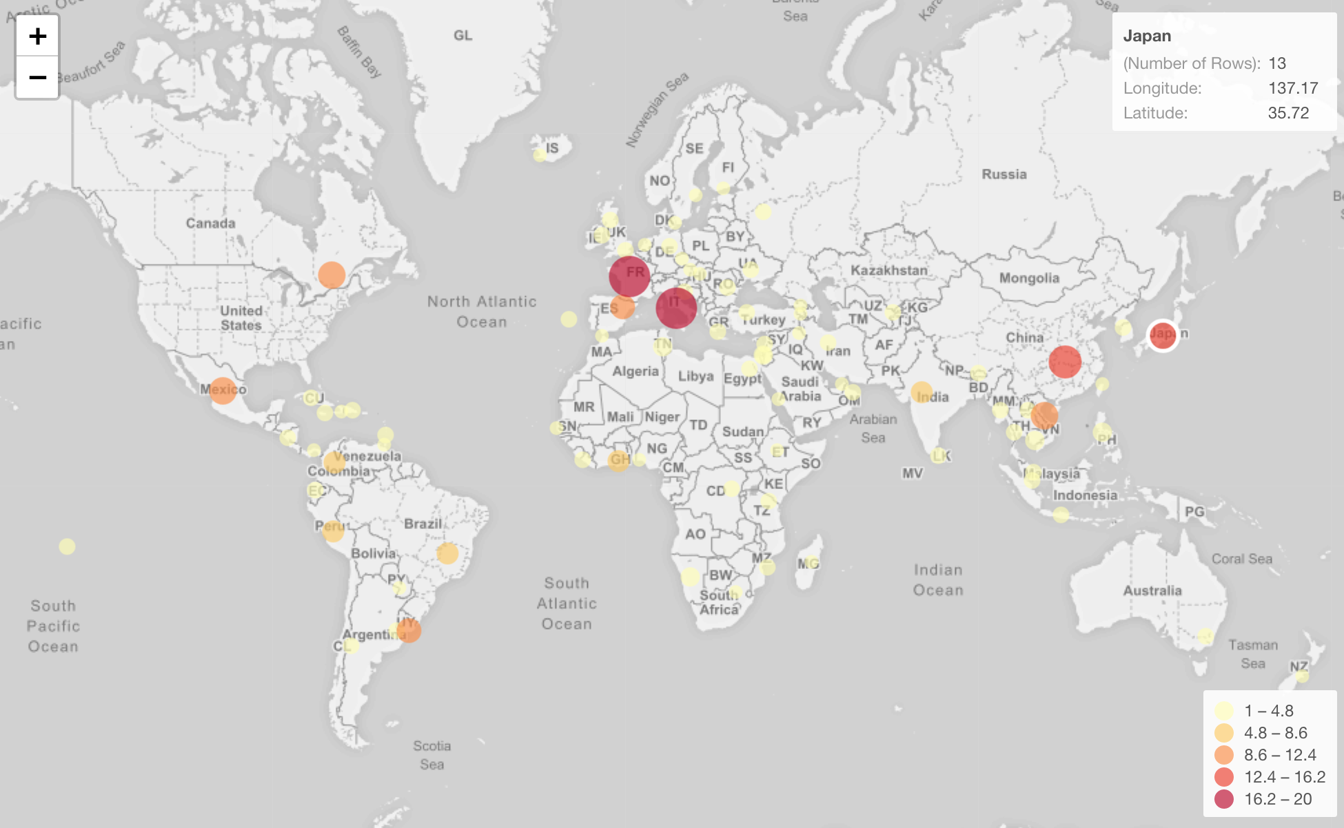
He’s visited Japan 13 times! I knew he visited there with a few episodes and I enjoyed watching all of them. But it didn’t occur to me that it was that many!
Country to Continent Mapping
By the way, this bar chart makes it easier to see which countries he visited the most.

The Y-Axis is showing the number of the unique episodes per each country.
Italy is the highest, and France, China, Japan follow.
And I can map Continent name based on each country name by using this function called ‘countrycode’, which is from ‘countrycode’ R package.
This function is pretty convenient, you just assign what the original value is, in this case that is ‘country.name’, and what do you want to convert to, in this case that is ‘continent’.
countrycode(country, origin="country.name", destination="continent")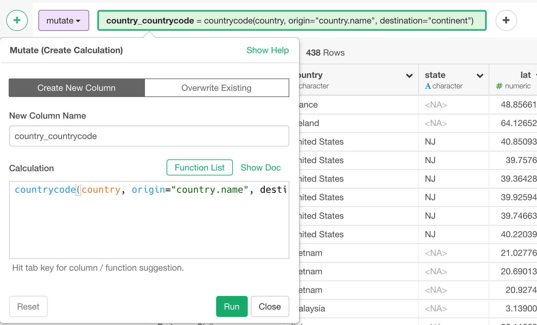
Then, use the information to Color like below.
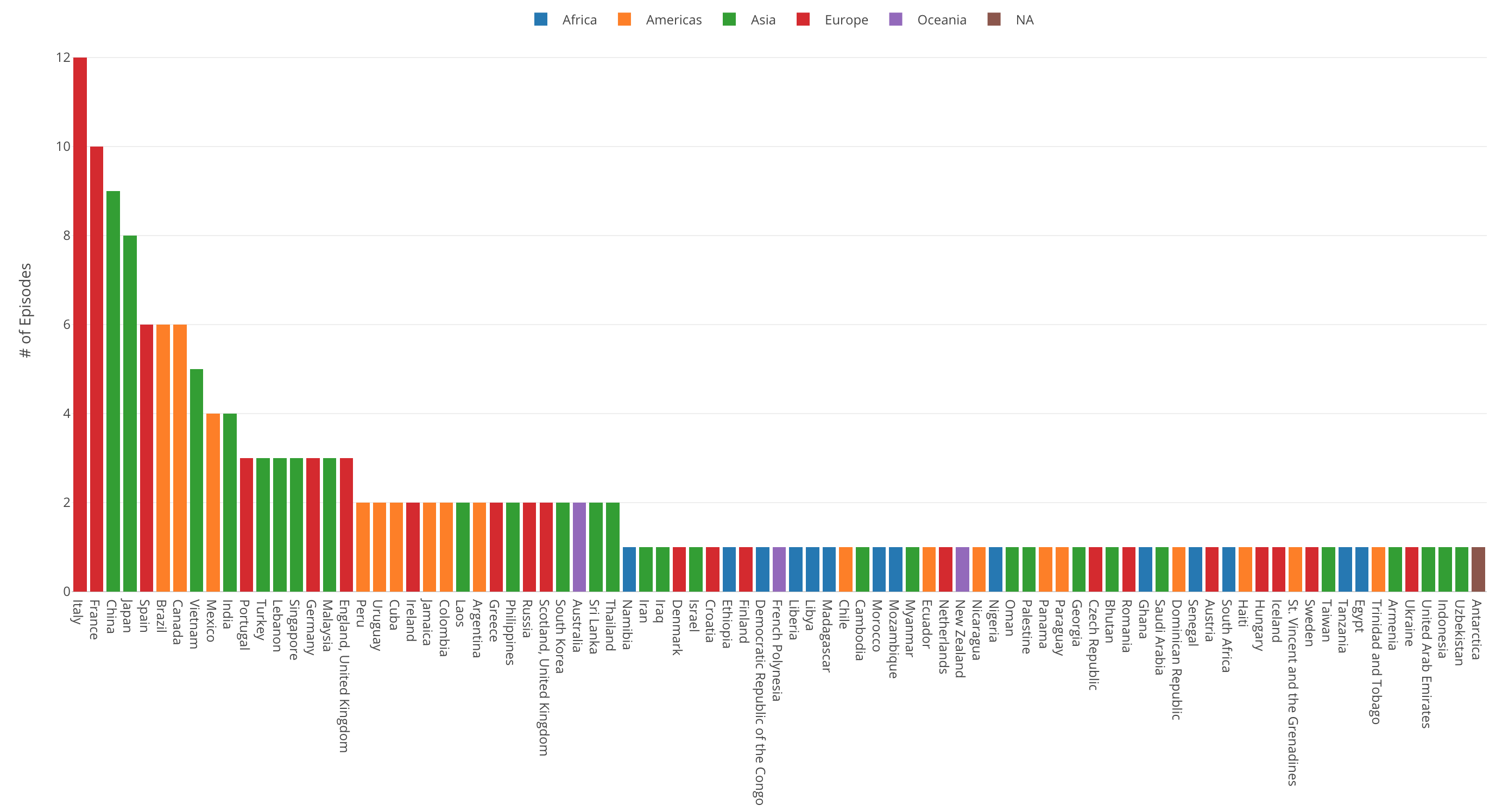
Looks he’s repeatedly visited many Asian countries.
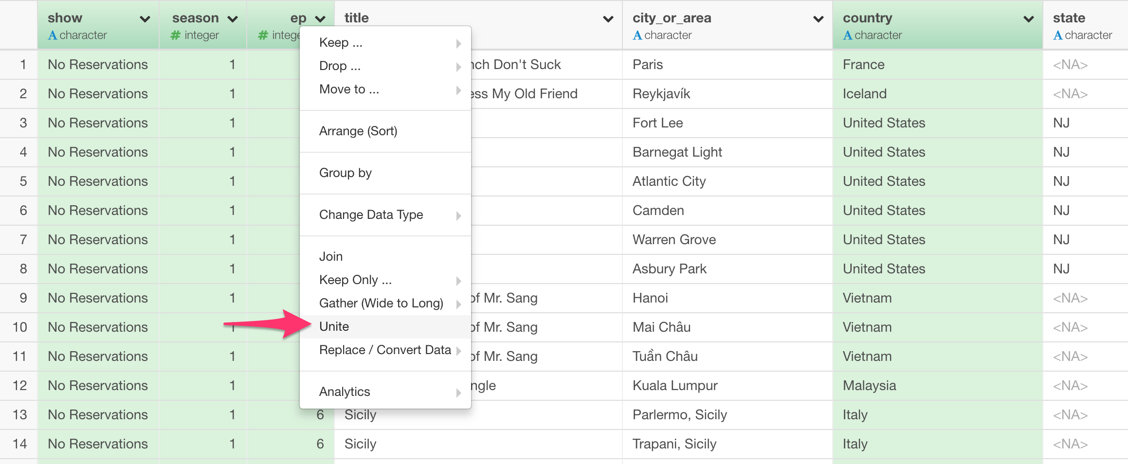
Unite Show, Season, and Episode Columns together
I wanted to create a column that can be used as an unique identifier for each episode so that I can use it to draw a line between the locations for each episode. This will show how far he traveled in each episode.
Also, I wanted to show this information when I clicked the line and wanted the information to include the title names.
So, what I needed to do is to unite Show, Season, Episode, and Title columns.
Select these four columns and select ‘Unite’ from the column header menu.
How to Visualize
Visualizing this data on Map is pretty straightforward in Exploratory. But there is one thing. How to draw those lines?
Let’s take a step by step.
Visualize on Map
Under Viz view, we can select ‘Map - Long/Lat’ chart type, which would automatically map ‘long’ and ‘lat’ columns appropriately. Assigning Show column to Color By will give us a map like below.
Now, click on Property and check ‘Connect Data Points by Lines’.

As you can see though, the lines look crazy. That’s because each line tries to connect all the locations for each values that are assigned to Color, in this case that has only three show names.
To fix this, we can assign the previously created ‘show_season_episode_title’ column to Label.
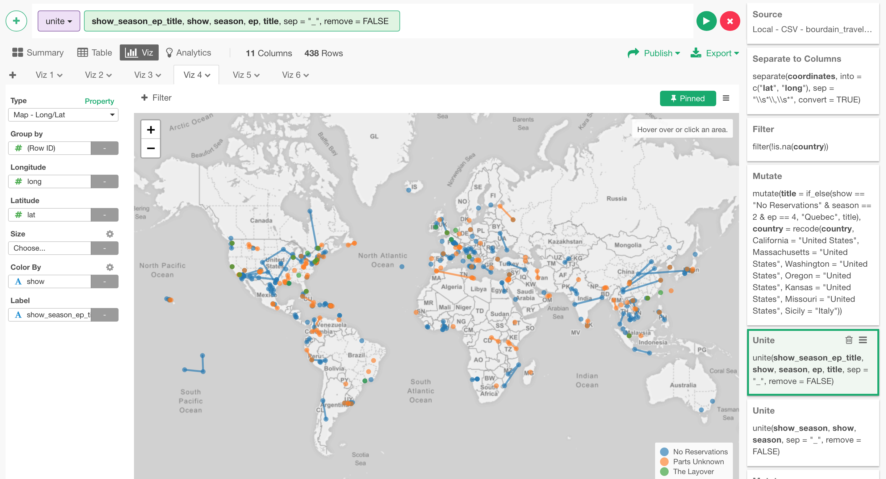
This will make the line to connect only for those that are in the same episodes.
Closing…
When I heard about his death, I was deeply shocked, disappointed, and saddened, like many millions of people who were touched by the genuine and authentic character he carried through all the shows and episodes.
There are so many episodes I can talk about for hours. The thing I find his shows so unique and authentic is his approach to the culture he introduced to the world. He accepts the things the way they are, and finds something that makes them unique, something that needs to be told and shared, some values that needs to be introduced to the world that might have not recognized yet. His straight no bull shit talk that was always wrapped by his genuine love and curiosity towards to something different, unique foods, unique culture, unique people, unique other things. By watching his shows, I felt like I’ve experienced not just the food and locations he introduced but also the various values, cultures, and the way people live in their regular days.
I’m still sad and will continue to miss him a lot. But at the same time, I’m grateful that I could experience the world that Anthony Bourdain introduced. He has definitely left a great mark on me that will be carried through as I move forward with my life.
With that, I leave one of his great quotes and close this post.
“I always entertain the notion that I’m wrong, or that I’ll have to revise my opinion. Most of the time that feels good; sometimes it really hurts and is embarrassing.”