Limit Number of Groups to Show with Top N, Bottom N, or Condition
This 'Limit Values' feature is quite convenient. It literally limits the categorical values that are shown in the charts.
Here's a quick how-to video.
How to Use Limit Values Feature
Here, I have US flight data and am using a bar chart to show the average flight delay time for each departure city.
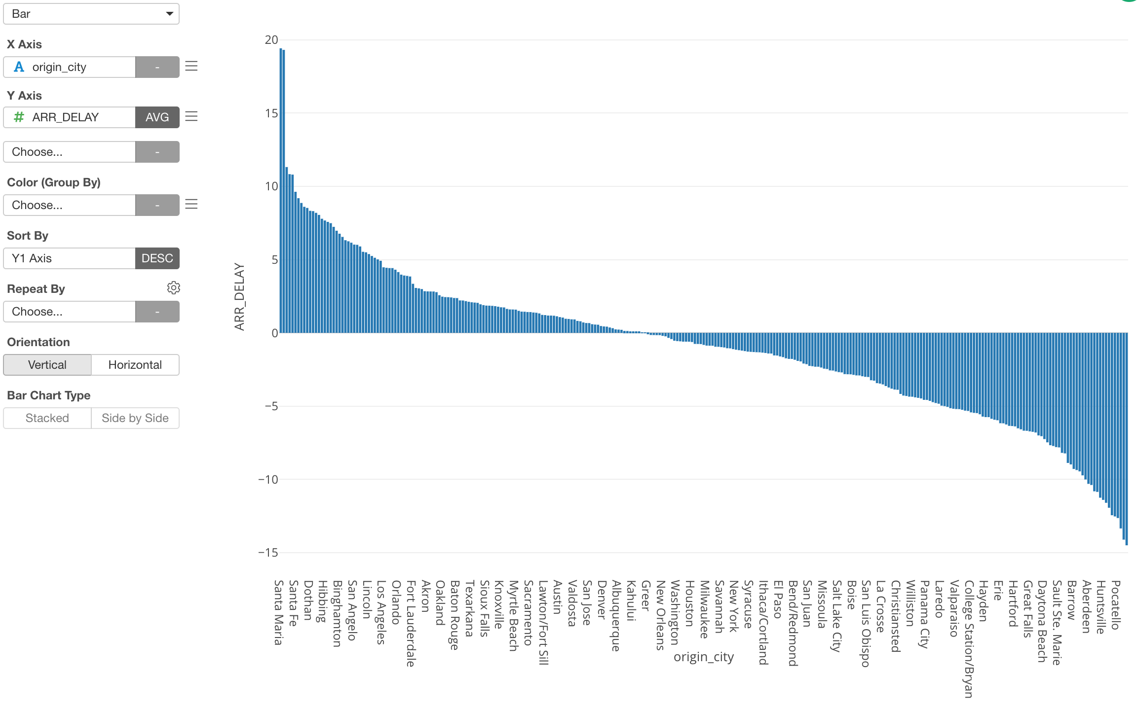
However, as you can see there are tons of cities and it's hard to see what cities are even in the chart.
This is when you want to use the 'Limit Values' feature.
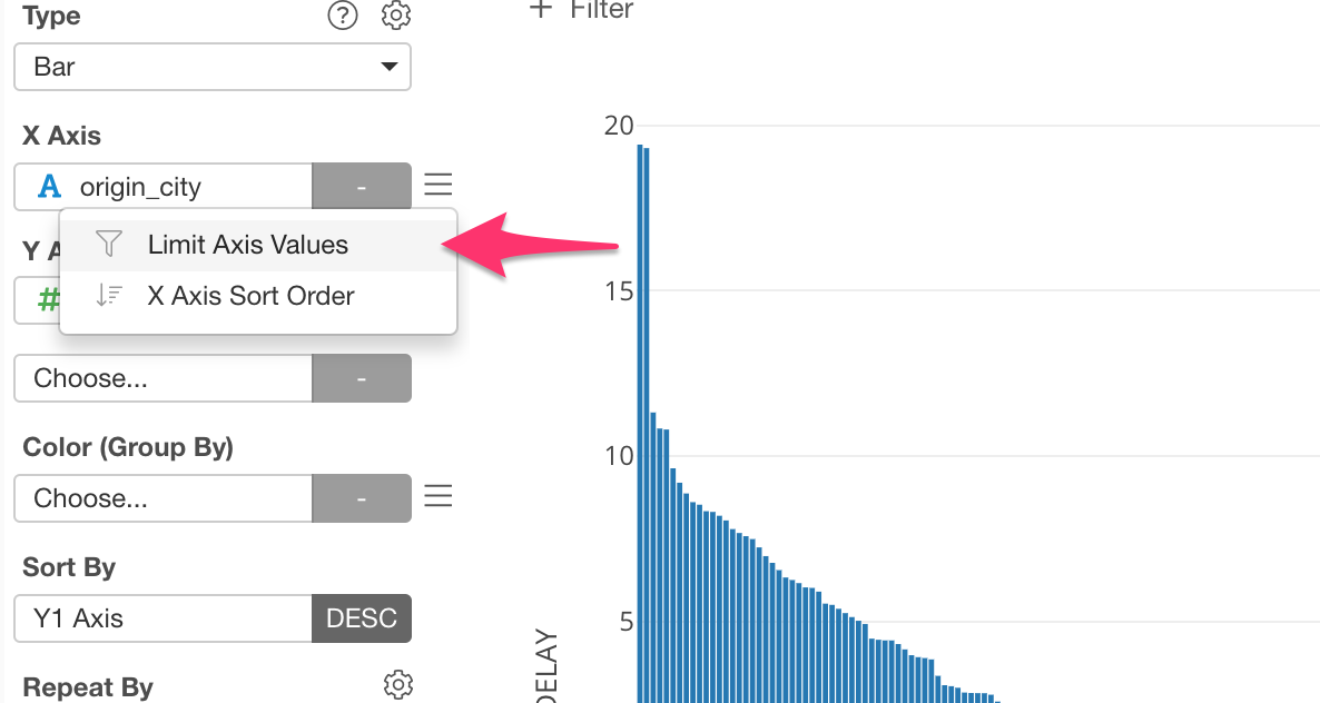
We can select 'Limit Axis Values' from the X-Axis menu.
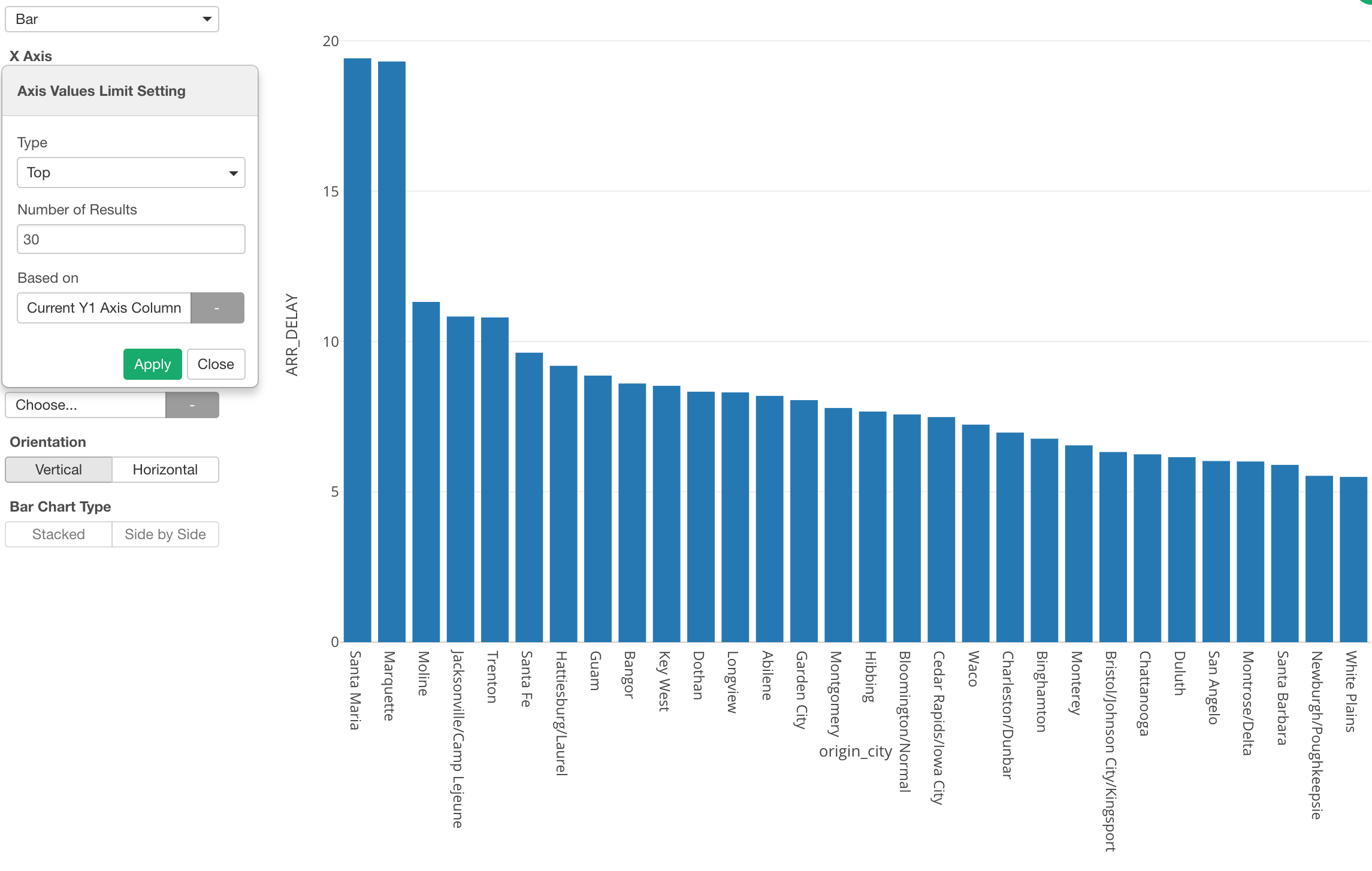
And we can select 'Top' as Type and 30 for Number of Results to show the top 30 cities based on the delay time.
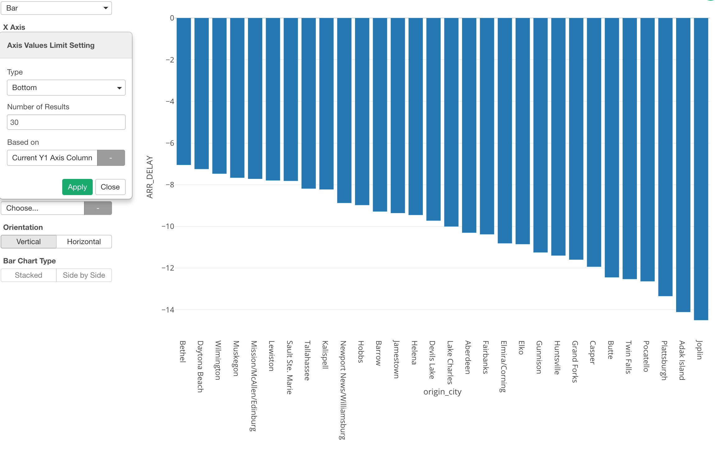
Limit Values with Bottom N
We can do the opposite, which is to show the bottom 30 cities based on the delay time.
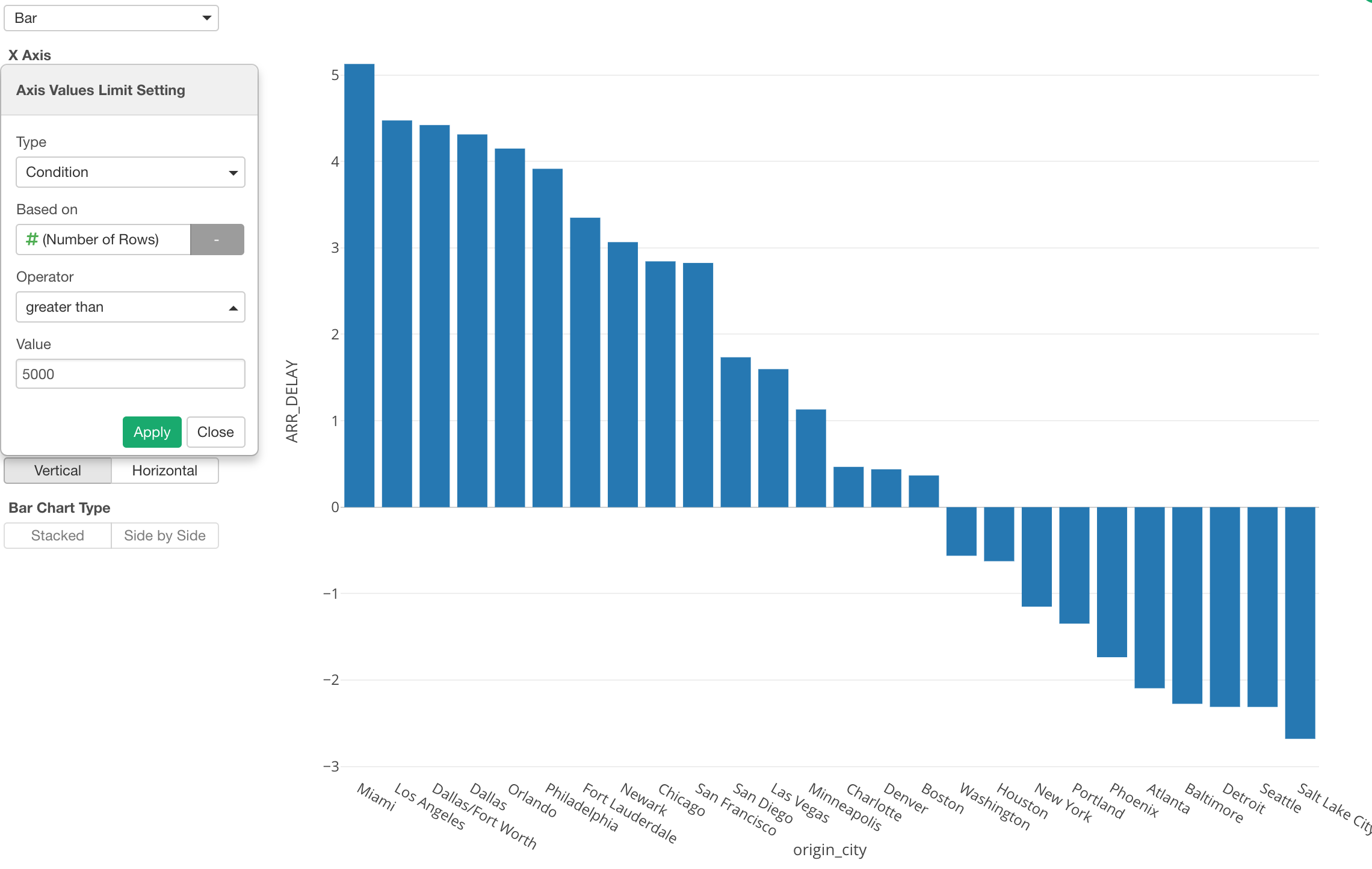
Limit Values with Condition
Also, we can use Condition as the limiting option.
Here, I'm using the 'Condition' to show the cities that have departed greater than 5000 flights.