Transforming JSON Data and Visualize in Exploratory
JSON data is unique, very differerent from ‘table’ data such as CSV, Excel, etc. It is nested, has the array structure, and has a concept called ‘Key-Value’. And these characteristics make it harder to work with JSON data.
But, with Exploratory, you can work with JSON data just like other data types and start exploring the data quickly.
I’ll demonstrate how you can work with JSON data by using Yelp’s restaurant review data.
Get Yelp JSON data
You can obtain the data from Yelp Dataset Challenge page. I’m also hosting it here for you to download directly in case you can’t find the data from the above link.
This data contains information about the businesses listed on Yelp for selected states and provinces in US and Europe.
And here is a snippet of the data.
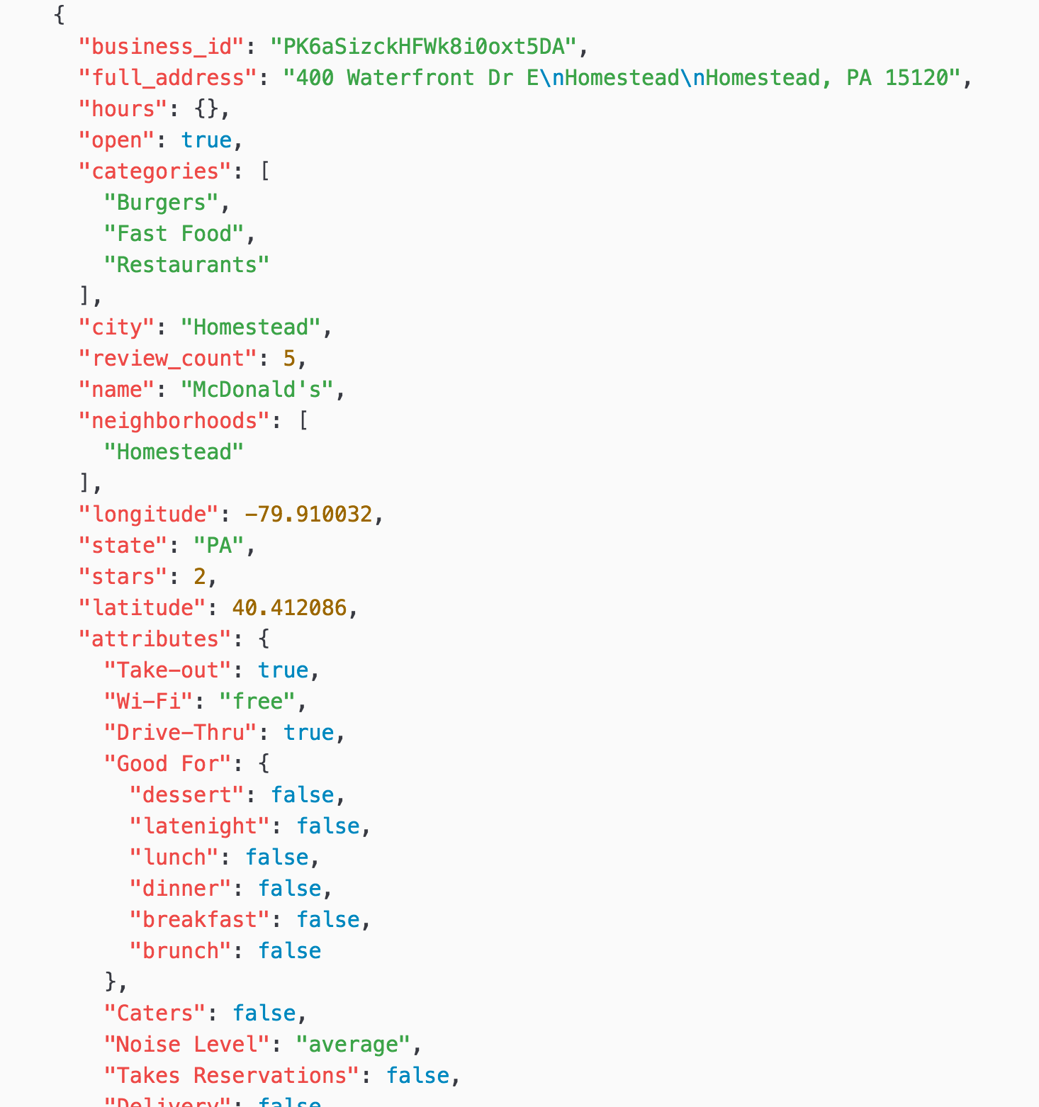
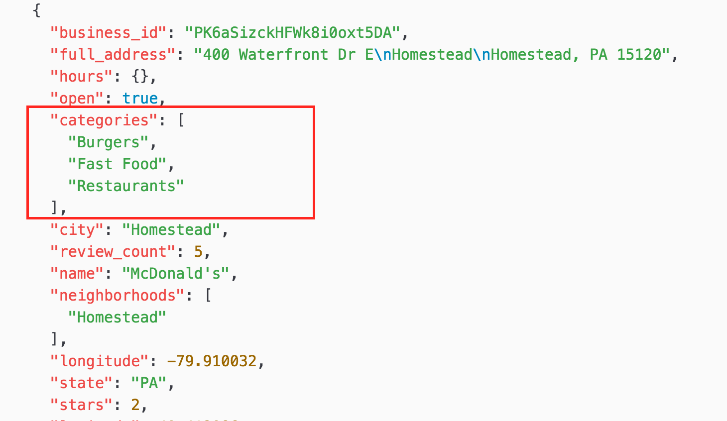
This is JSON data, so it’s nested and hierarchical.
For example, when you look at ‘categories’ there are three values of “Burgers”, “Fast Food”, and “Restaurants” at the same level. This is called ‘Array’, and it’s useful to have multiple values assigned to one entity like “business” in this case.
When you look at “attributes” it has several key-value pairs like ‘“Take-out”: true’ and has multiple child levels.
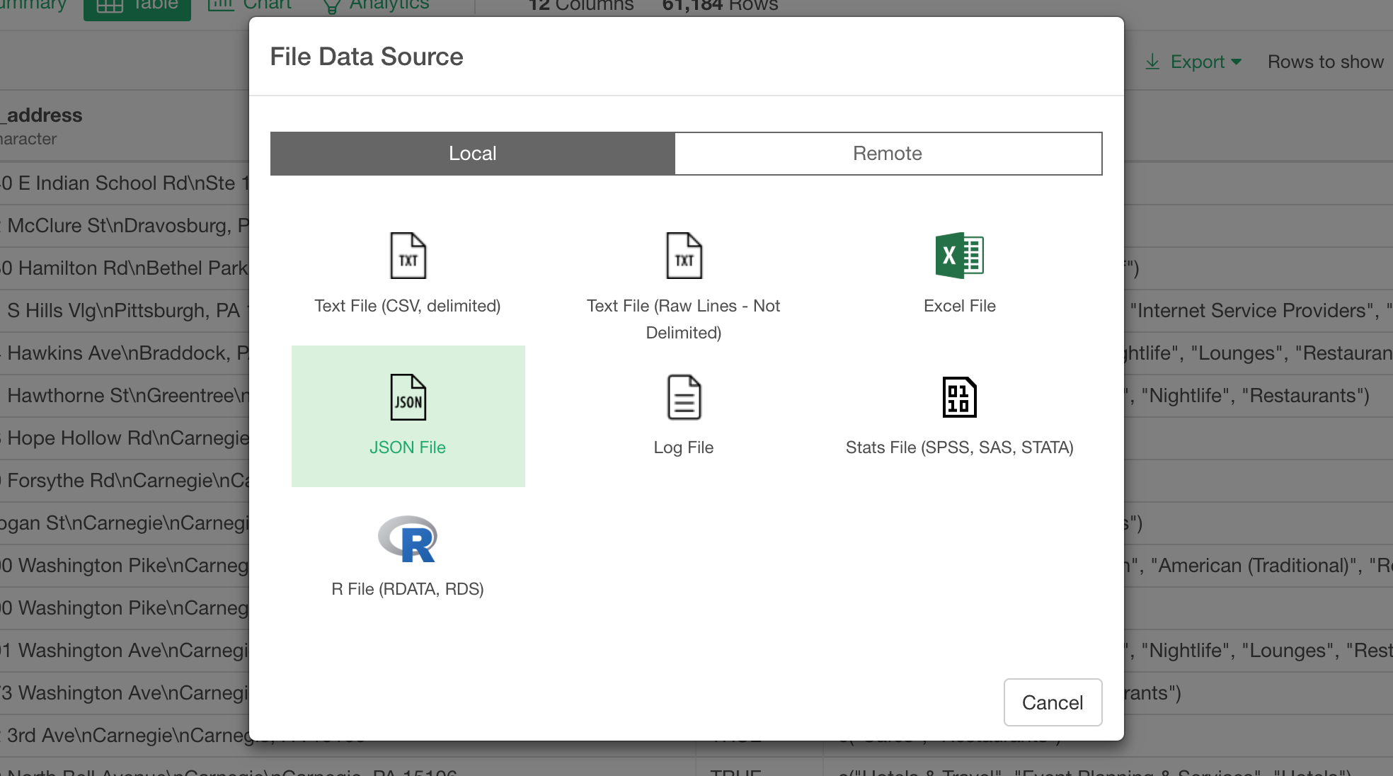
Import JSON data
You can import the data in Exploratory by selecting ‘File Data’ from the ‘+ (Plus)’ button right next to the ‘Data Frames’.
And select ‘JSON File’ in the opened dialog.
Select the Yelp JSON file in the file picker and click ‘Open’ button. It would take from 30 seconds to a few minutes depending on your machine spec for loading the JSON file.
After that, you will see it in the preview table.
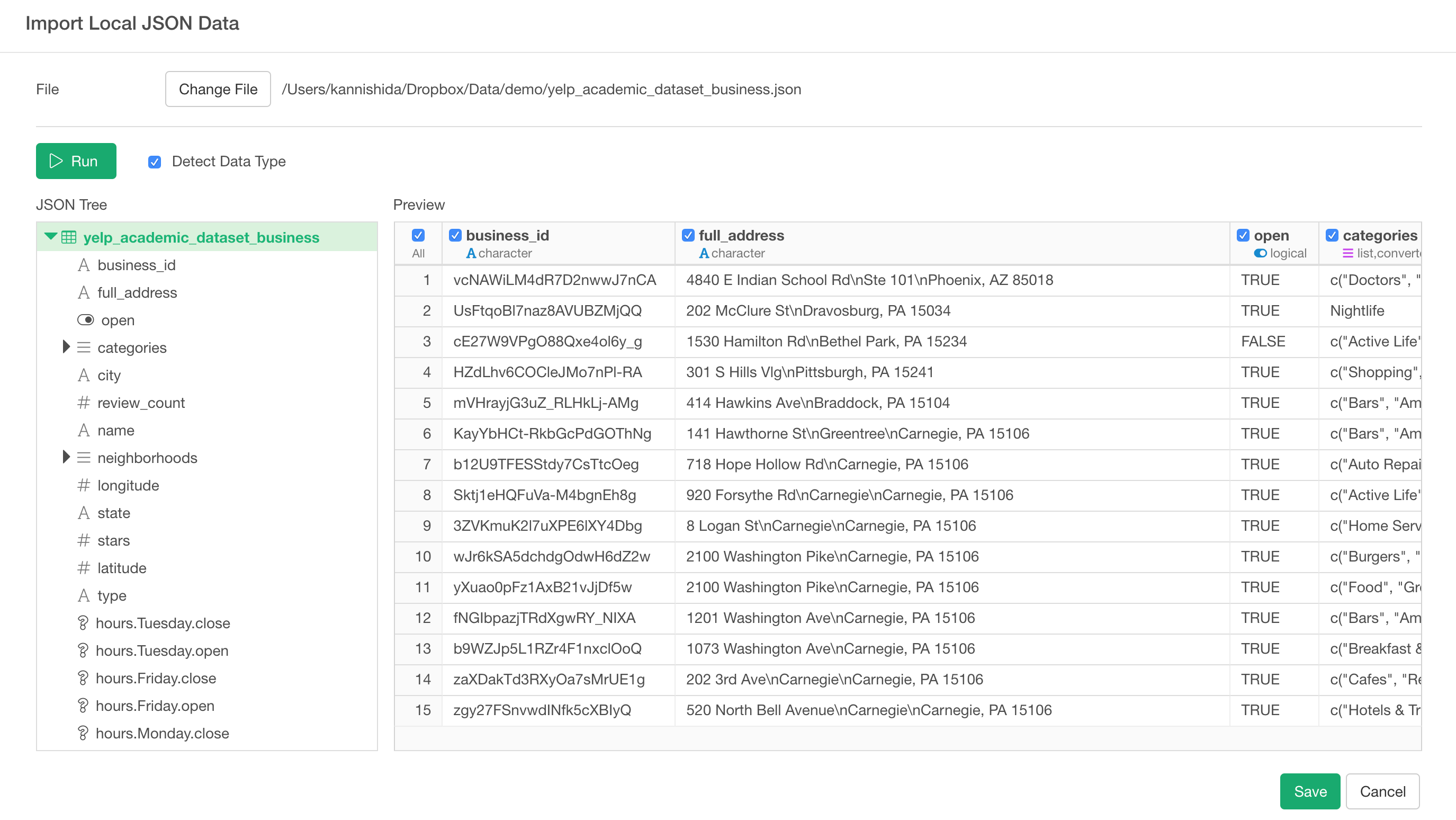
The entire data in the JSON file is now flattened out and presented in a single table view.
Some JSON files are nested in a weird way and you need to find a table-ish data somewhere in the nested data hierarchy, but this JSON file is relatively simple.
Click ‘Save’ button and give a name to this data frame. This will import the data and you will see the data in Summary view quickly.
Now, let’s begin Data Wrangling!
Remove unnecessary variables
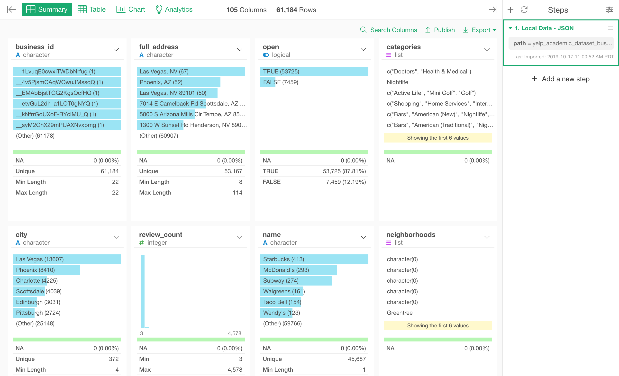
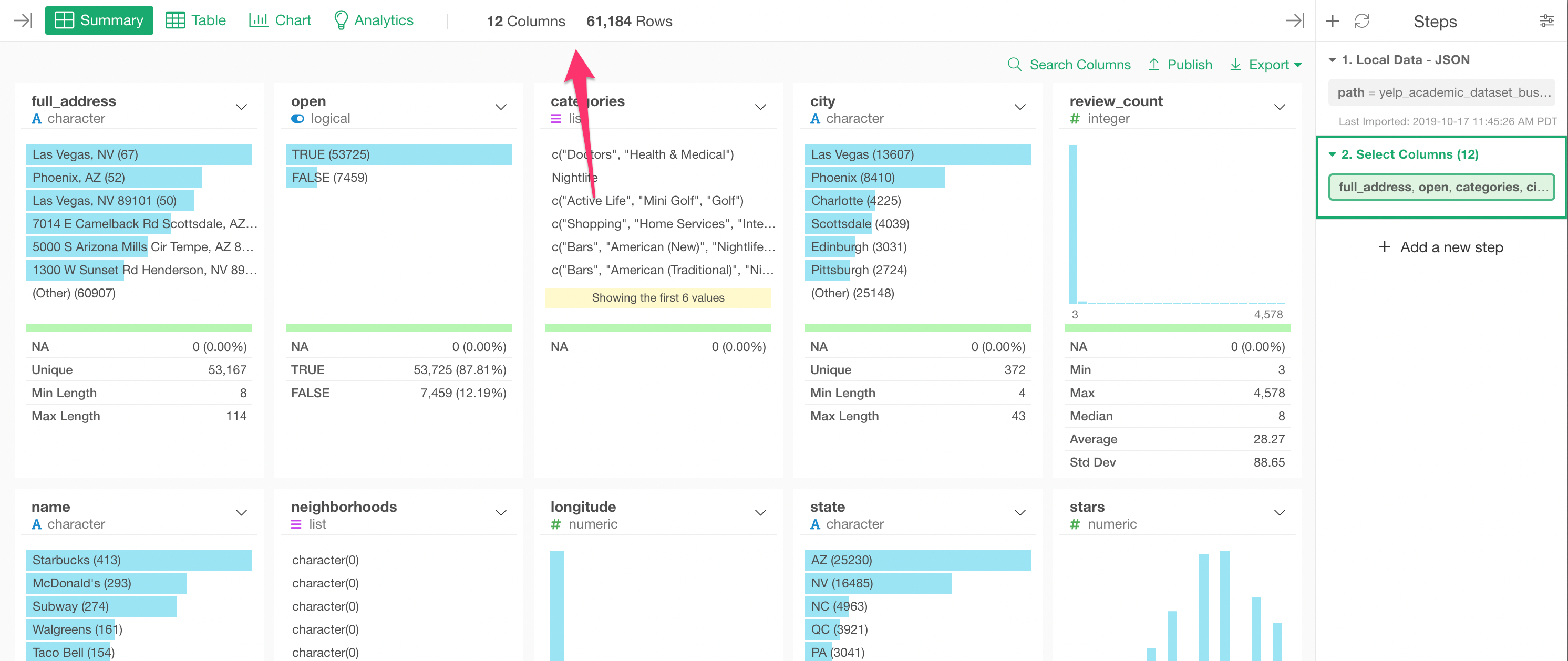
Now when you look at the data, there are 105 columns.
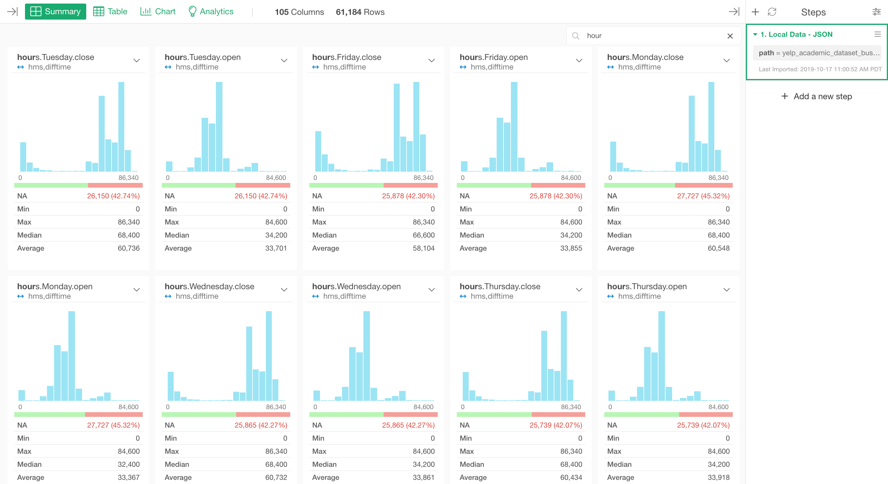
Most of the columns are actually those whose names start with either ‘hours’ or ‘attributes’. These columns were originally nested in the original JSON file, but now they are all flattened and presented as separate columns.
Here is a list of the ‘hours’ related columns.
Let’s say we are not interested in these ‘hours’ and ‘attribute’ data this time. We can quickly get rid of these columns with ‘Select’ step.
Select ‘Select’ from any of the column header menus.
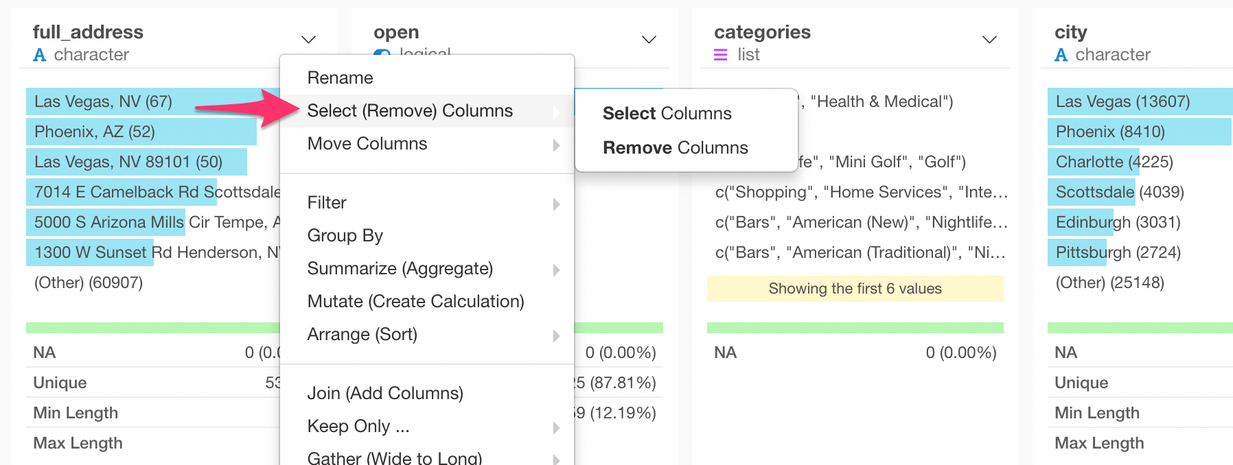
This will select only one column. But you can open ‘Select’ dialog by clicking on the token inside the Select step at the right-hand side.
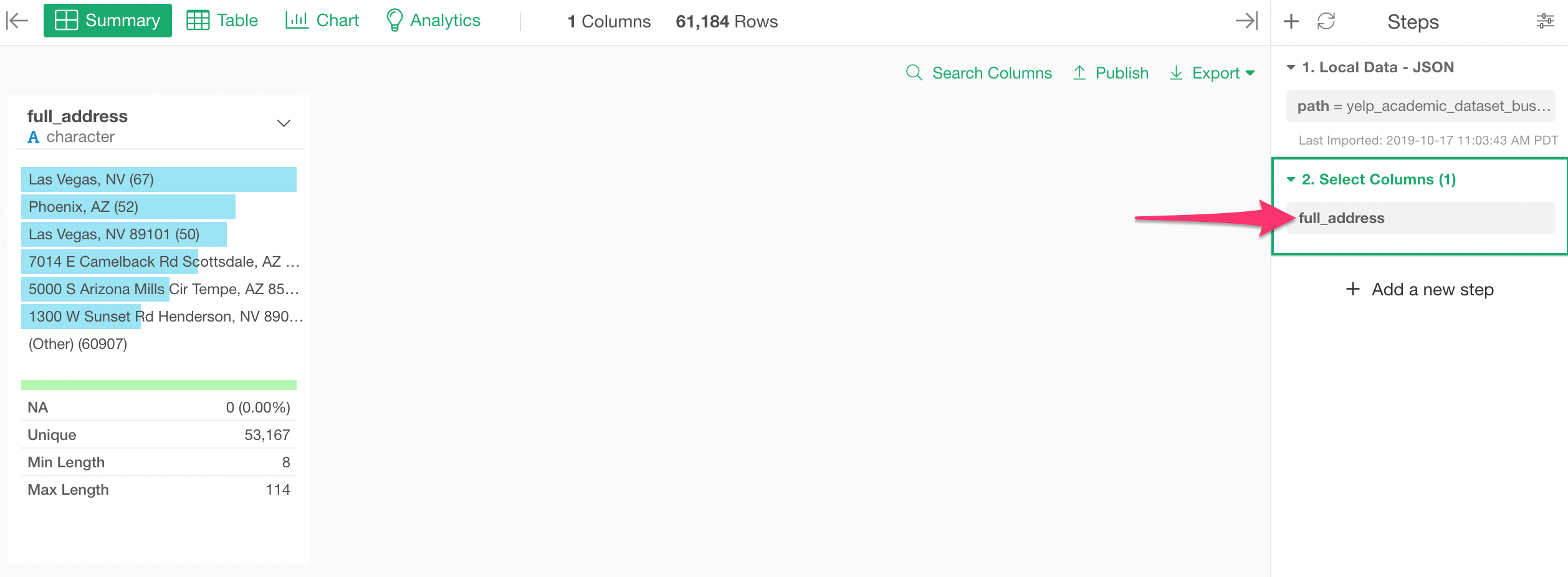
In the Select dialog, select the columns you want. I’m selecting all the columns between ‘full_address’ and ‘type’ here.
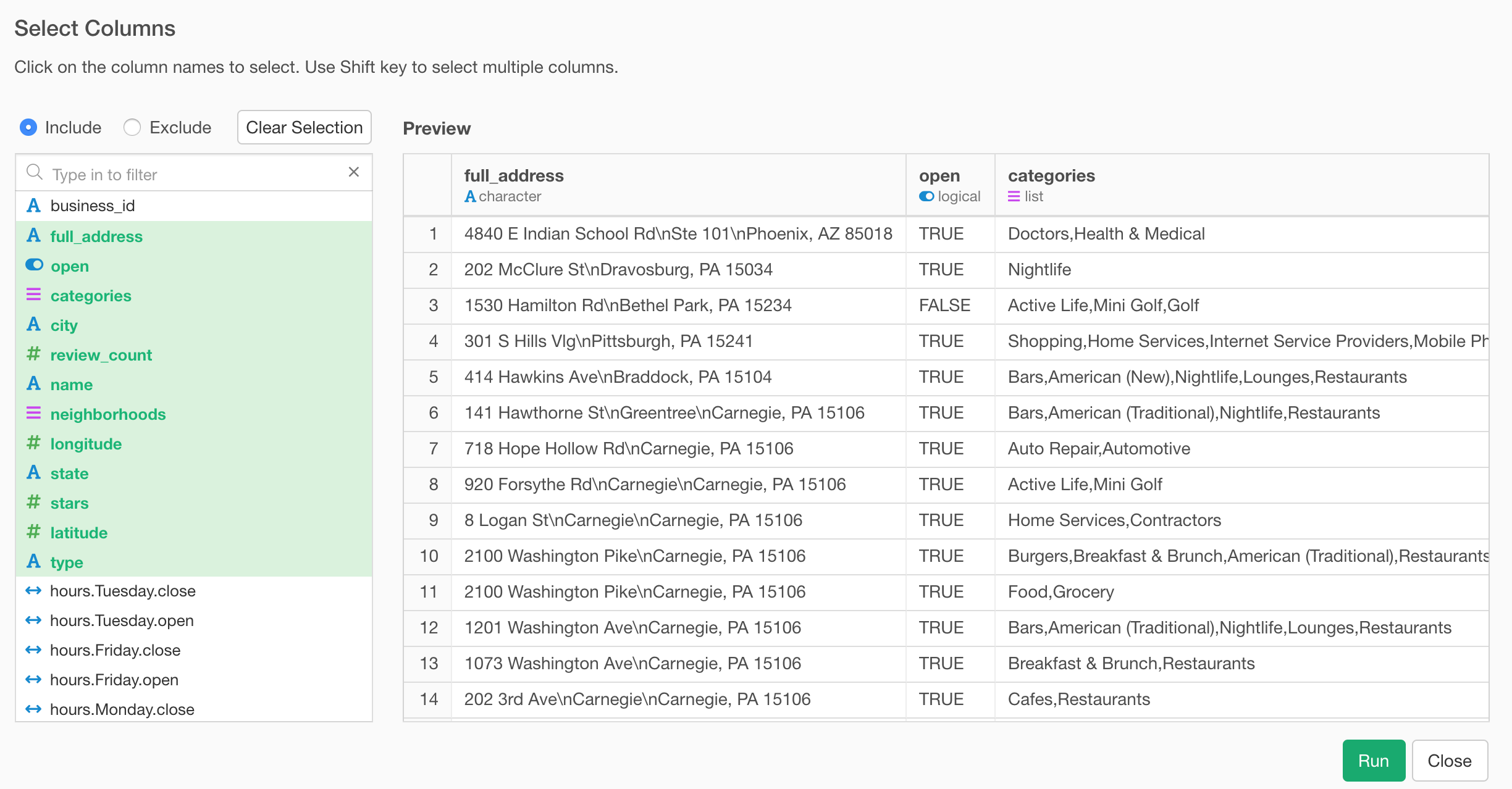
We have now only 12 columns as opposed to the original 105 columns, but we still have enough information to find out what types of businesses are in this data.
Array data becomes List data type
You would notice that the ‘categories’ column is shown as ‘list’ data type and has multiple values (or entries) for each row.
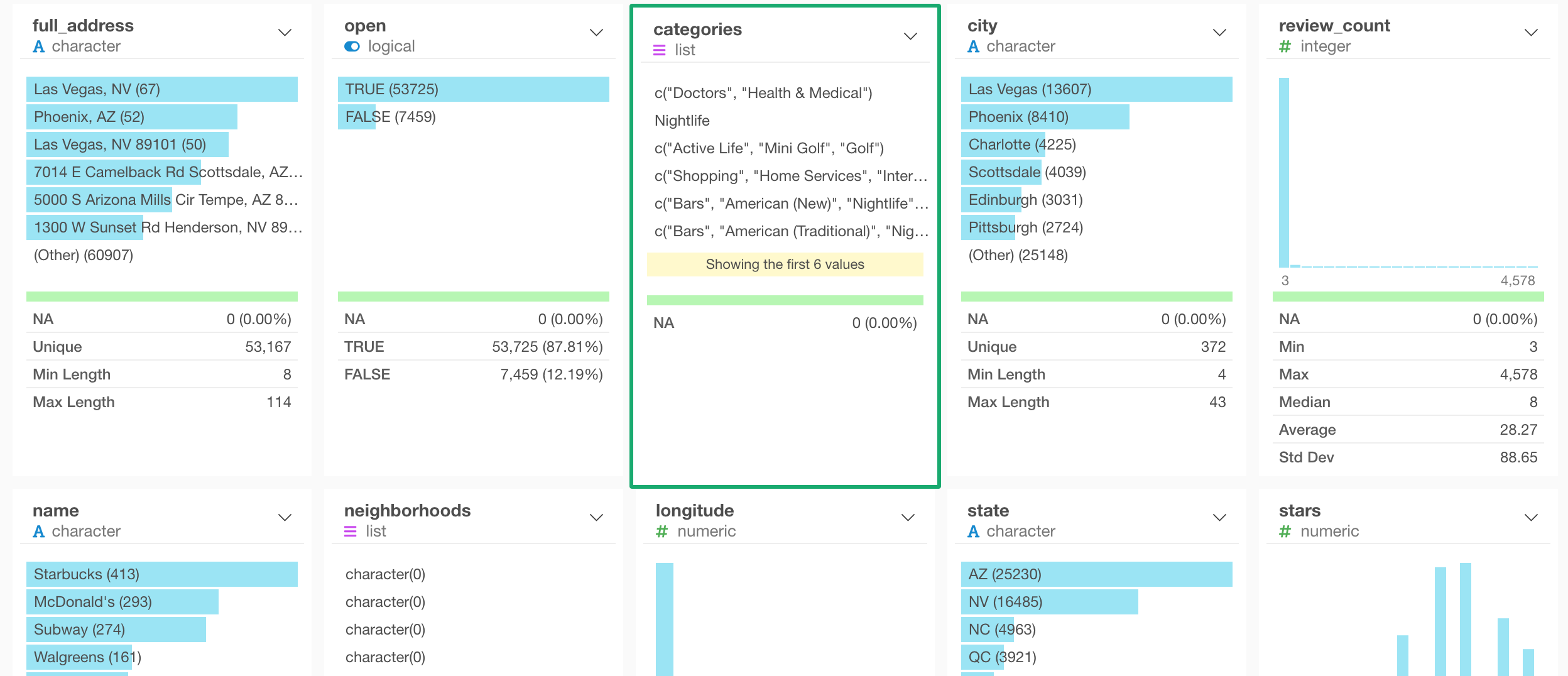
This is because the ‘categories’ column was an array data that contains multiple values in the original JSON data.
The array data becomes the ‘list’ data type, which has a list of the values per row.
Let’s take a look at how we can work with this type of data.
Detect a text pattern from List data
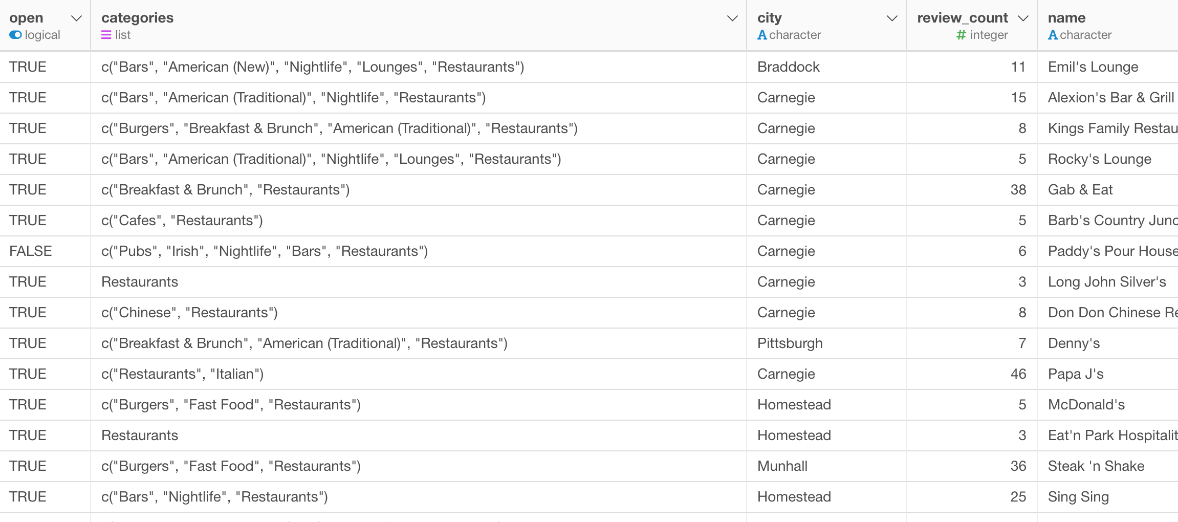
The ‘categories’ column contains values like ‘Shopping’, ‘Doctor’, ‘Restaurants’, or whatever the categories people tag for each business on Yelp.
Most of the businesses have multiple categories. For example, one French restaurant might have ‘French’, ‘Restaurant’, and ‘Cafe’ categories.
We can quickly find out how many ‘Restaurant’ businesses in the data by detecting ‘Restaurant’ as a text pattern.
Select ‘Detect if it contains…’ from the column header menu of the ‘categories’ column.
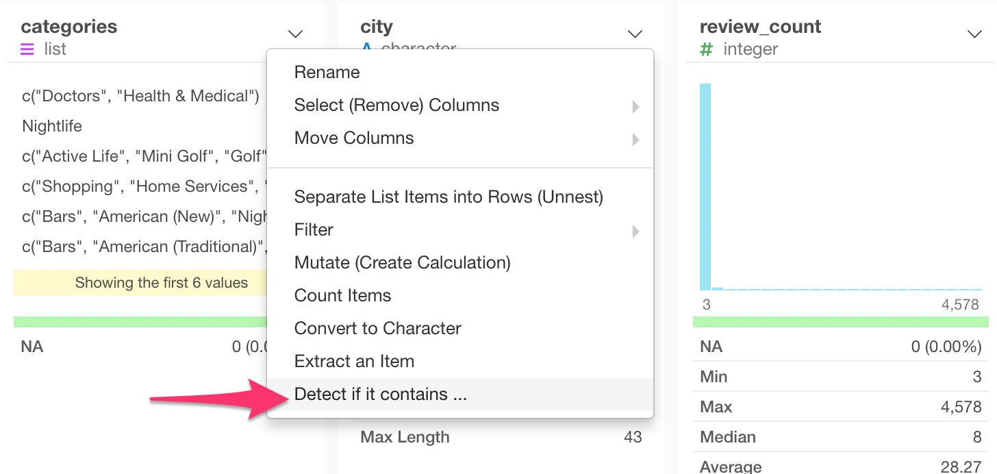
This will populate the ‘str_detect’ function, which is from ‘stringr’ package to detect a given text pattern.
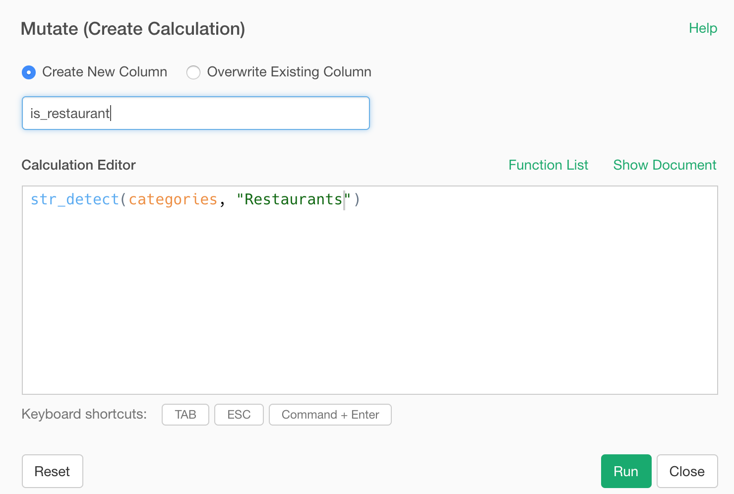
If you want to know about this function or other text data wrangling functions check out this note.
After running this function, we can see a new column called ‘is_restaurant’ added at the end.
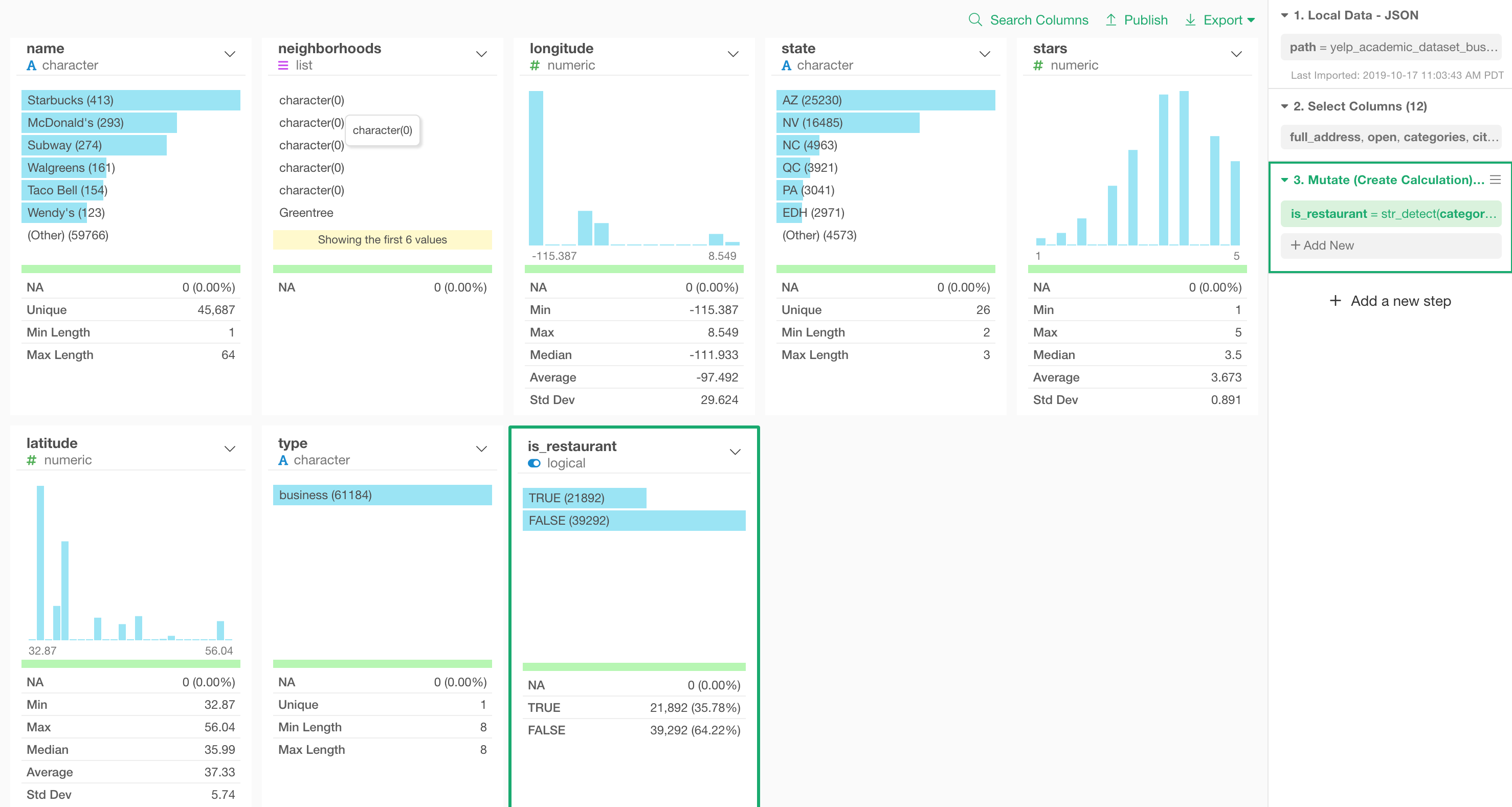
And we can quickly see that there are 21,892 restaurant businesses and they are 35.78% of all the businesses in this data set.
Filter only Restaurants
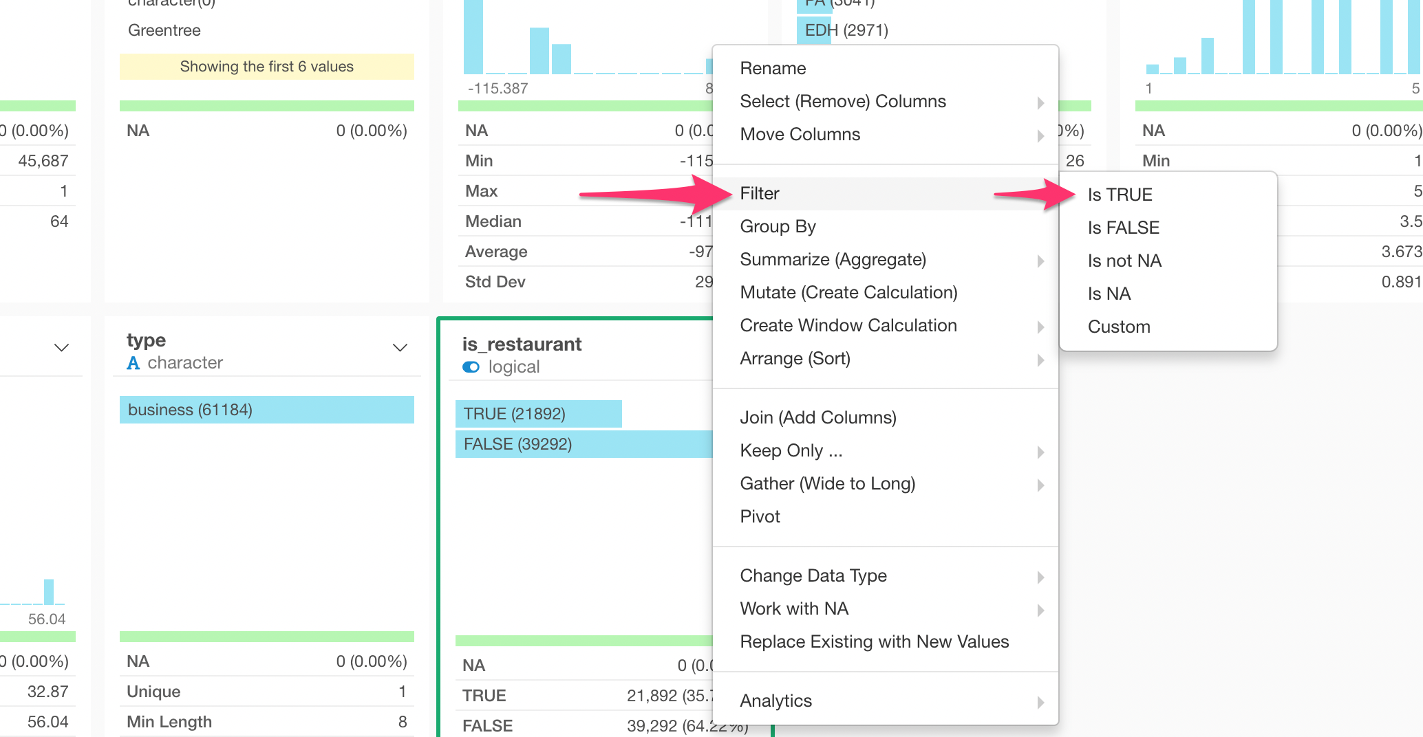
Now, if we want to keep only ‘Restaurant’ related businesses, we can simply keep ‘TRUE’ values from this ‘is_restaurant’ column by using the ‘filter’ command like below.
Select ‘Filter’ -> ‘Is TRUE’ from the column header menu.
You can see the result better in Table view where you can see that all the values for the ‘categories’ column include the ‘Restaurants’ category now.
Unnest a list column
At this point, one question I’d like to ask is,
“what are the top categories of the restaurants?”
The easiest way to answer this question is to transform the list of the categories and make each category as a separate row.
This means that most of the businesses would be repeated as many categories as they have, but that will be ok if we just want to count the categories.
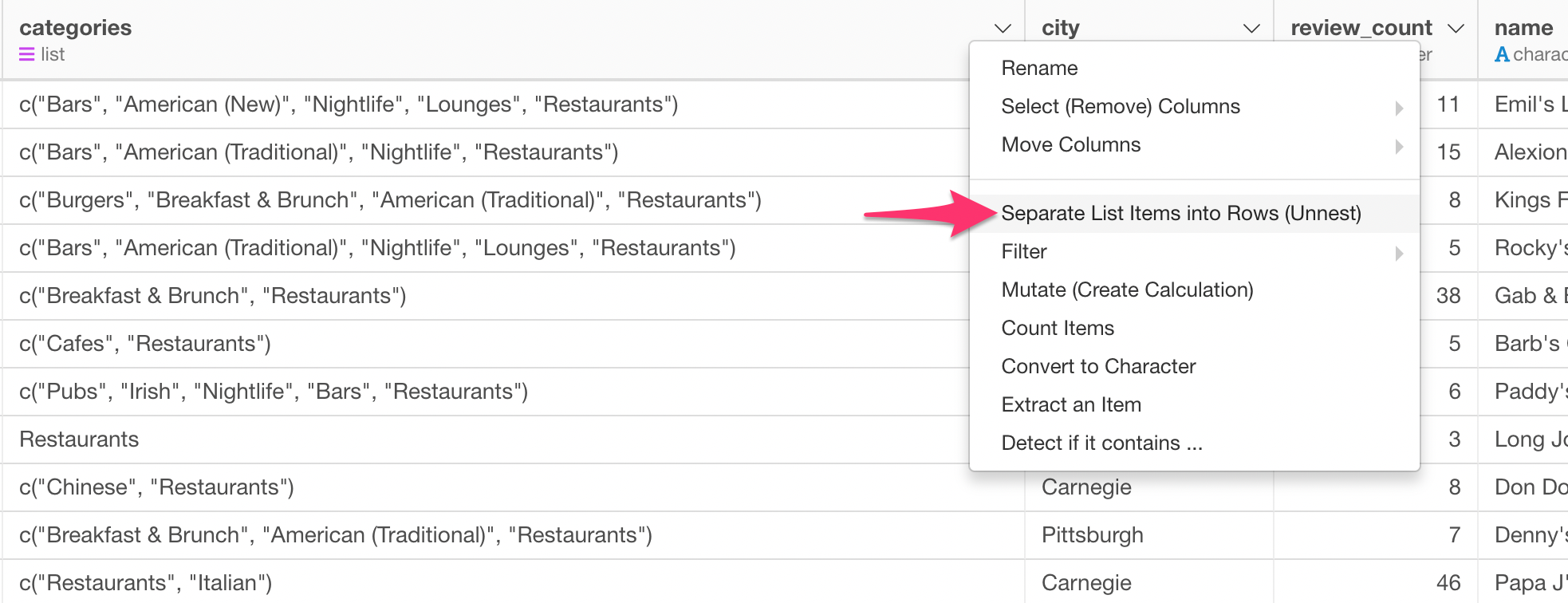
For this task, we can use the ‘Unnest’ step, which is to un-do the ‘nested’ data.
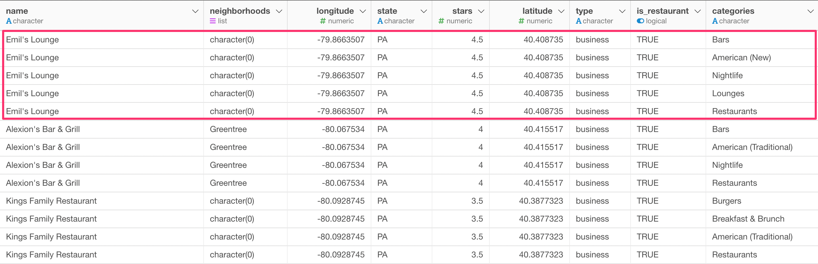
Select ‘Separate List Items into Rows (Unnest)’ from the column header menu of the ‘categories’ column.
After you run it, you will see that, for example, ‘Emil’s Lounge’ is now repeated 5 times. This is because this restaurant has 5 categories.
We can go to the Summary view and see the top categories.
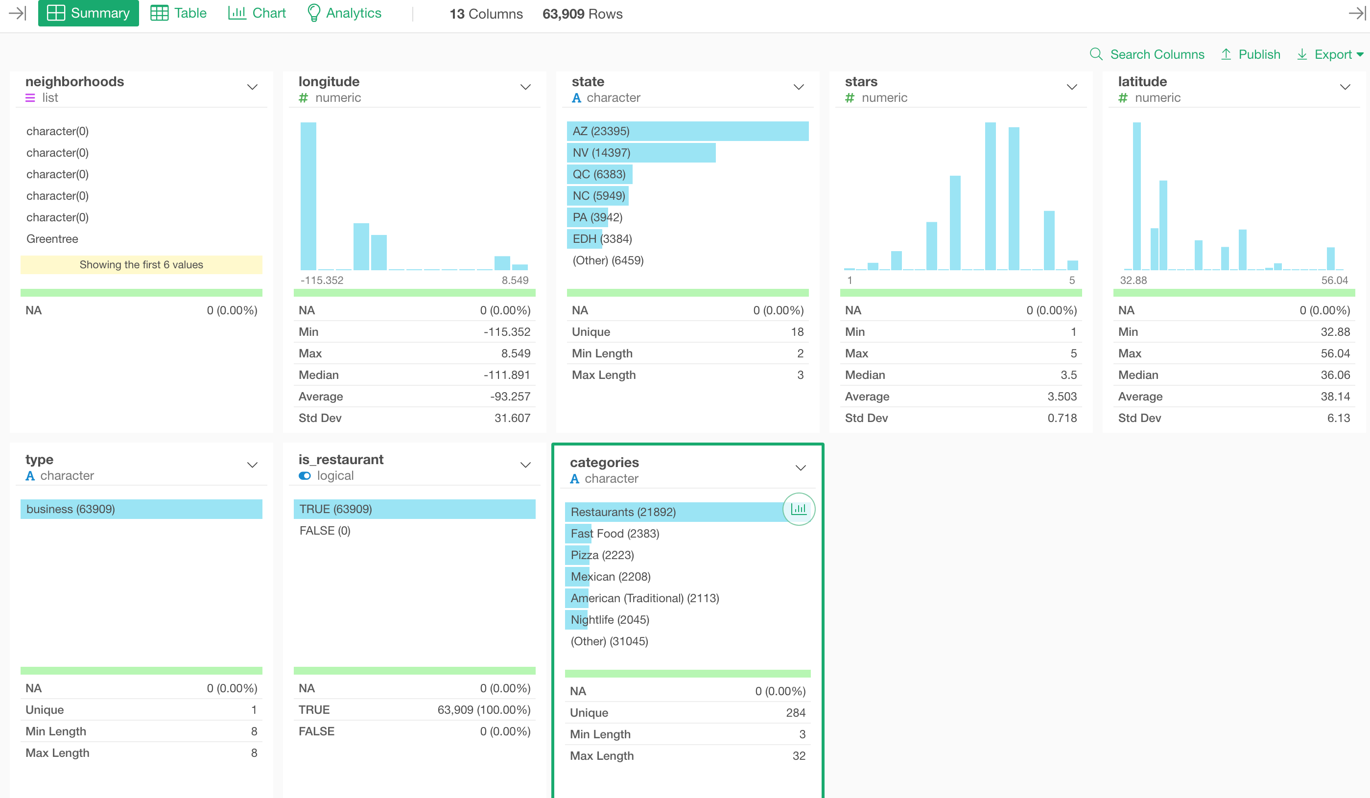
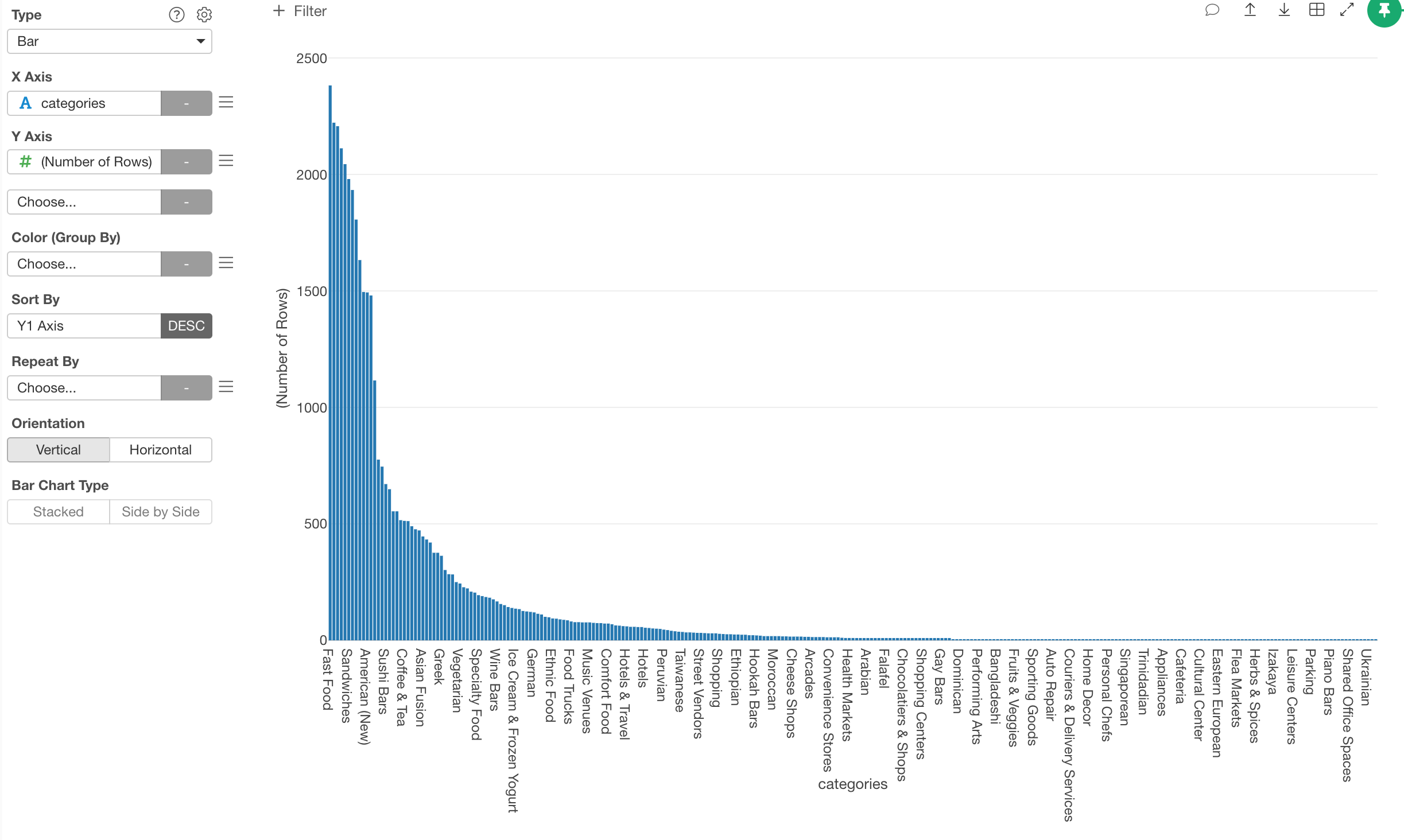
As you can imagine ‘Restaurants’ is the top category because all of them are ‘Restaurant’!
But this is useless information at this point, so we can remove this with the ‘Filter’ step.
Select ‘Filter’ -> ‘Not Equal to …’ from the column header menu.
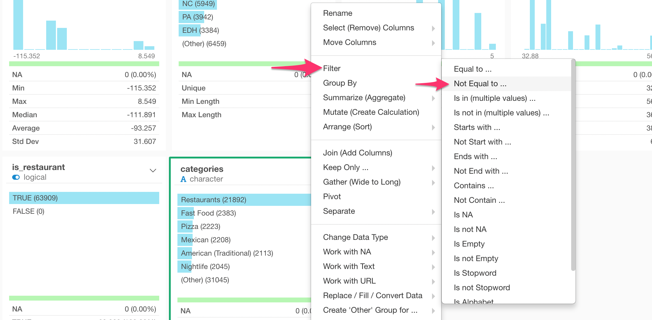
And select ‘Restaurants’ from the drop-down menu under the ‘Value’ section.
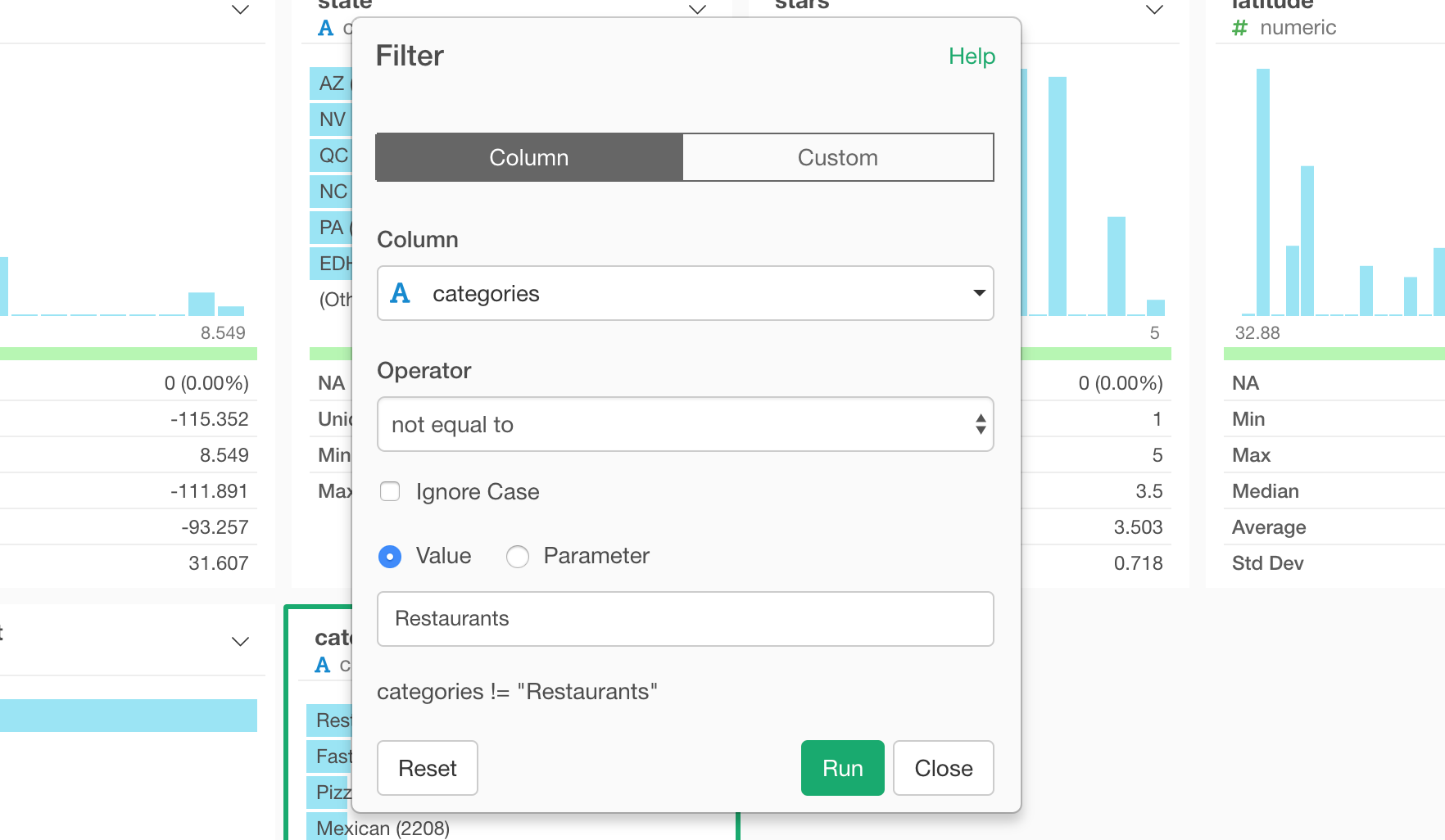
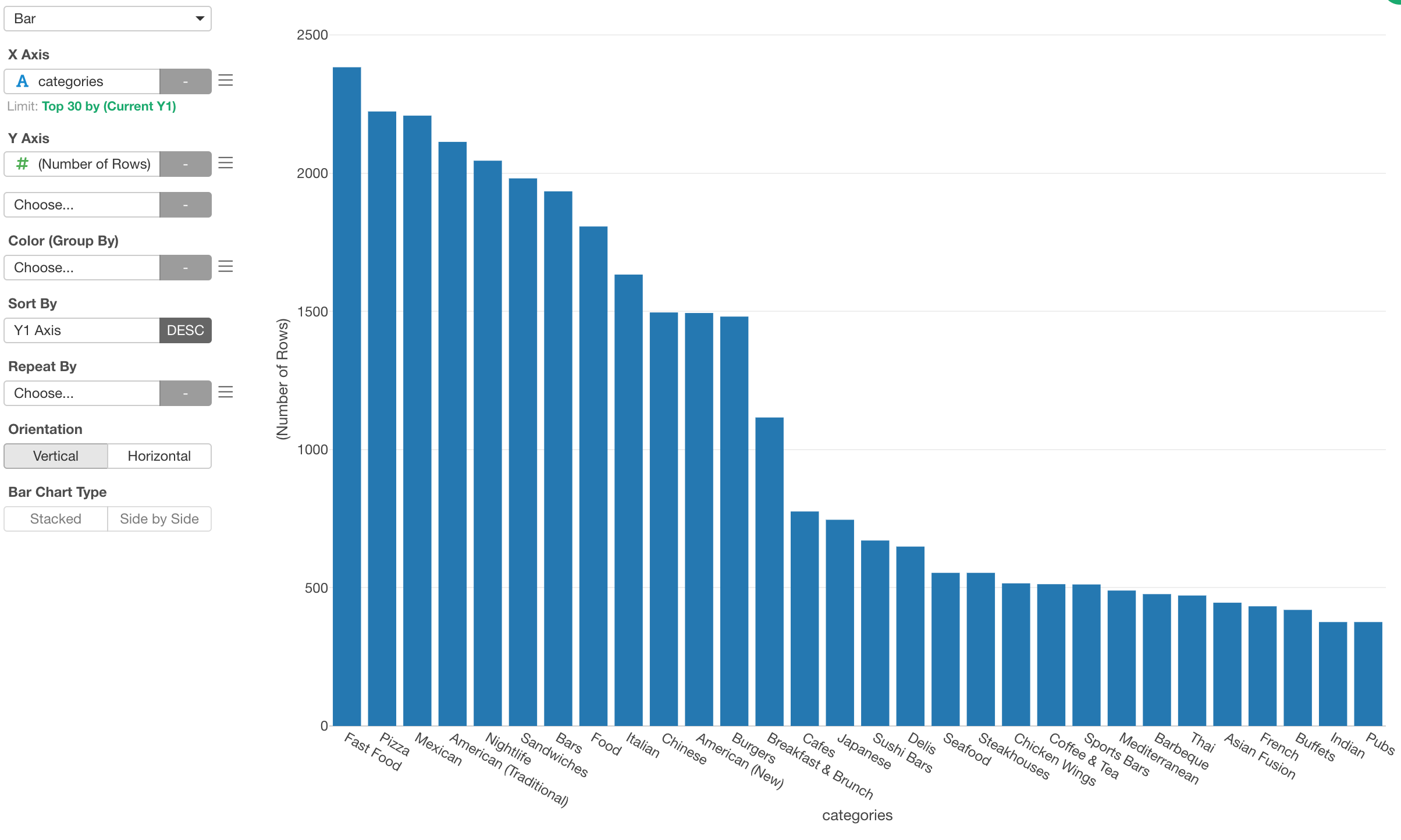
Now we can see the top categories such as ‘Fast Food’, ‘Pizza’, ‘Mexican’, etc.
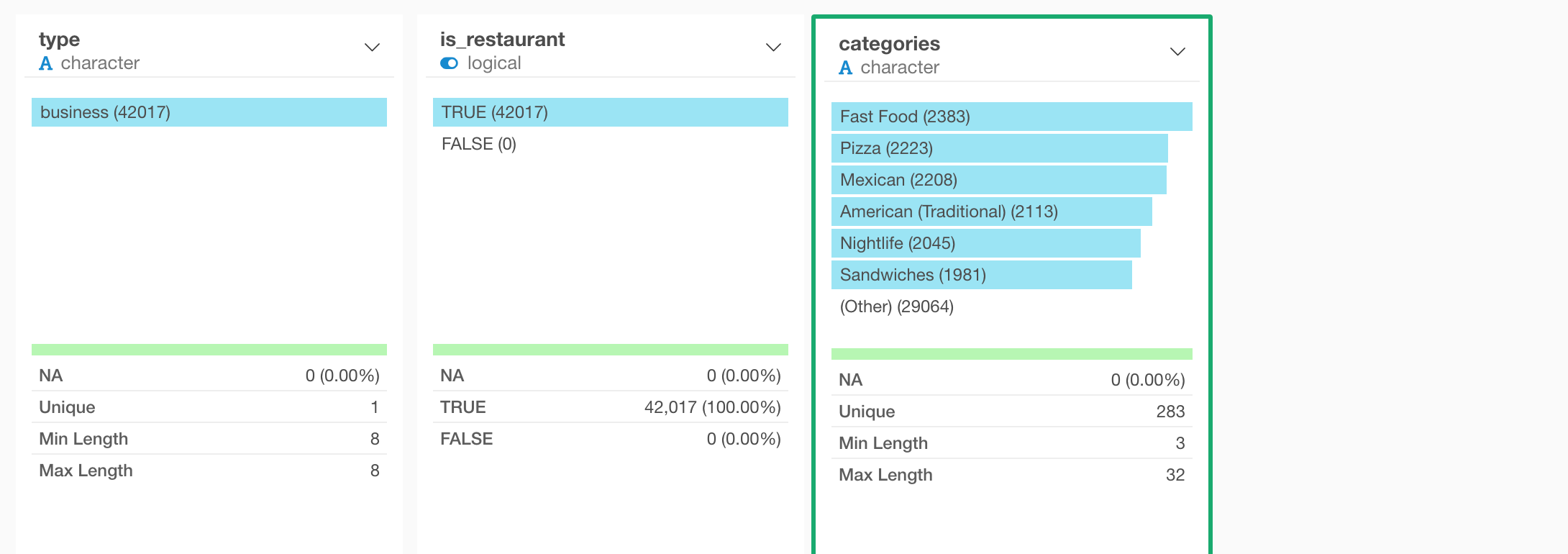
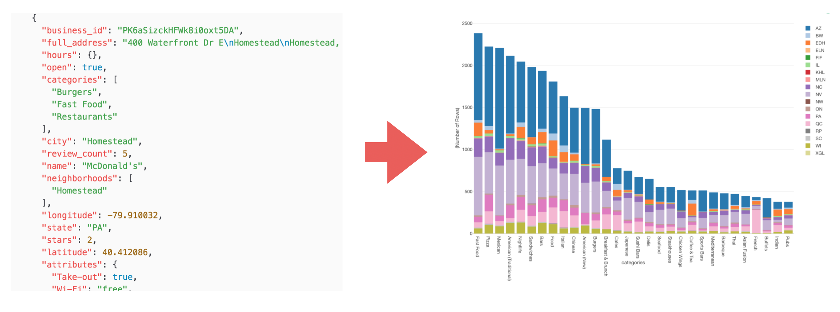
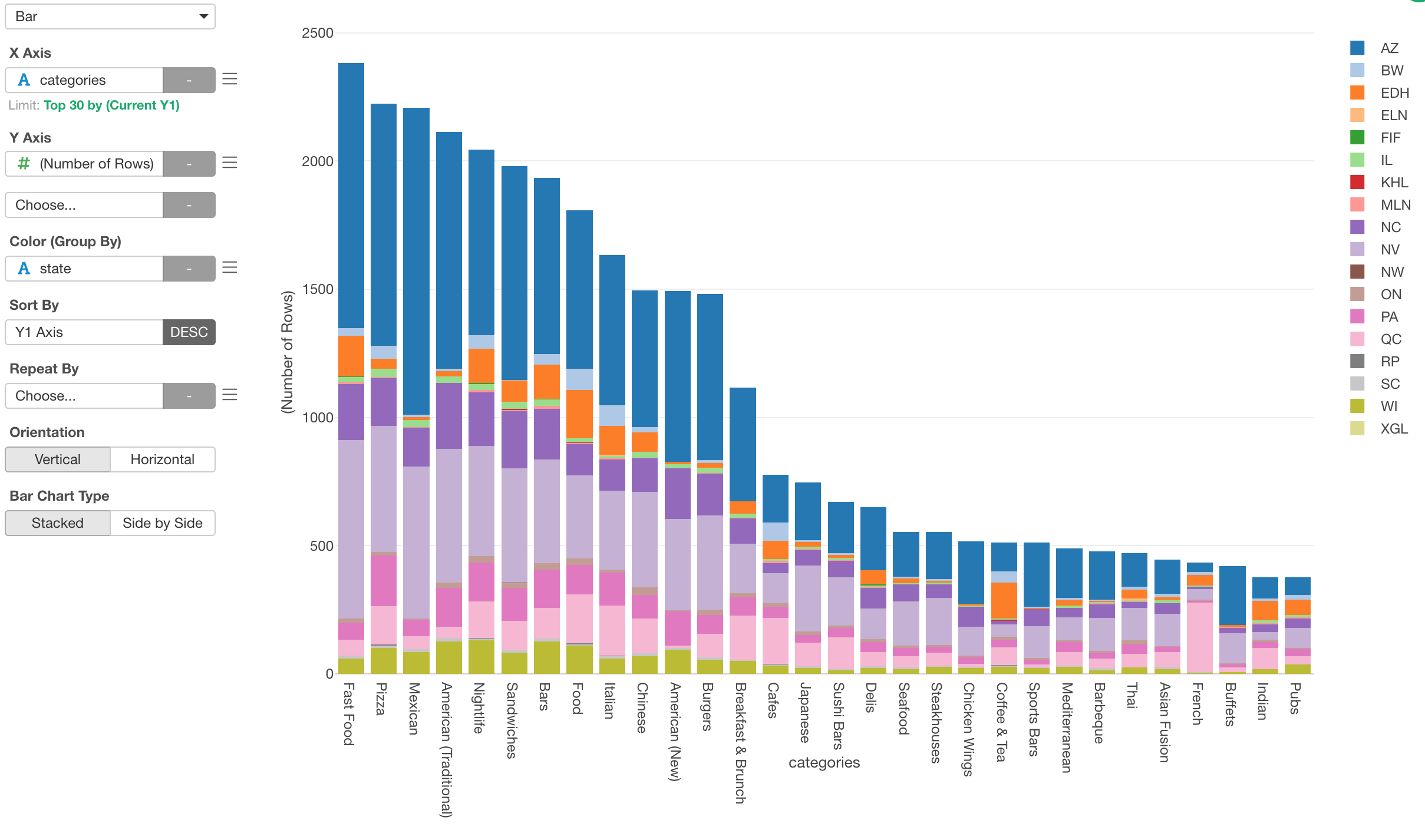
Visualize Restaurant Category Data
Lastly, let’s visualize this data under Chart view.
We can click on the Chart icon on top of the ‘categories’ column.
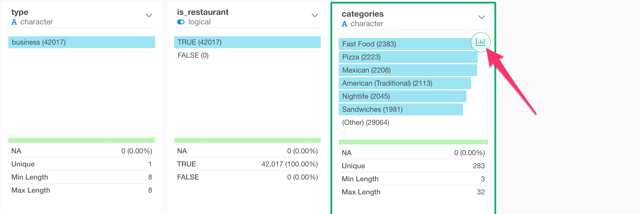
This will create a bar chart with the ‘categories’ column assigned to X-Axis showing the number of the restaurants as the height of the bars.
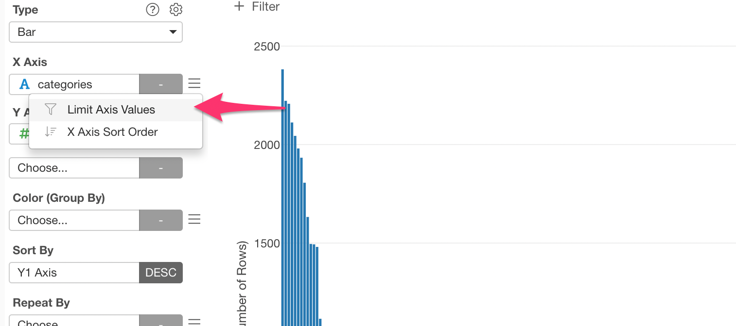
Limit X-Axis Values
There are too many categories, let’s limit to the top 30 categories.
Select ‘Limit Axis Values’ from the ‘X Axis’ menu.
In the dialog, select ‘Top’ for Type and type 30 for ‘Number of Results’.
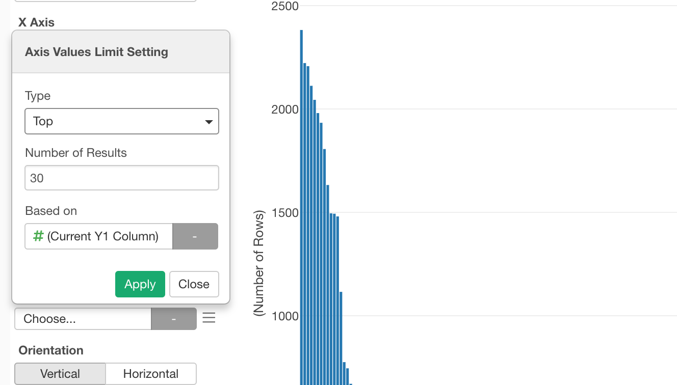
This will make the bar chart to show only the top 30 restaurants based on the number of rows (or restaurants).
Assigning Color
We can assign the ‘state’ column to color to see which categories are more popular in which states.
This is it for this tutorial!
This is a very simple and quick data wrangling exercise with the Yelp business JSON data.
As you have seen, in Exploratory not only you can work with JSON data quickly but also get more insights out of the data easily!