Using Area Map to Visualize US State Data Geographically
Visualizing geographical data using Map gives you a better and more intuitive understanding of the data rather than having the data on a table or bar chart. This article explains how to visualize geographical data using Map step by step.
Import Data
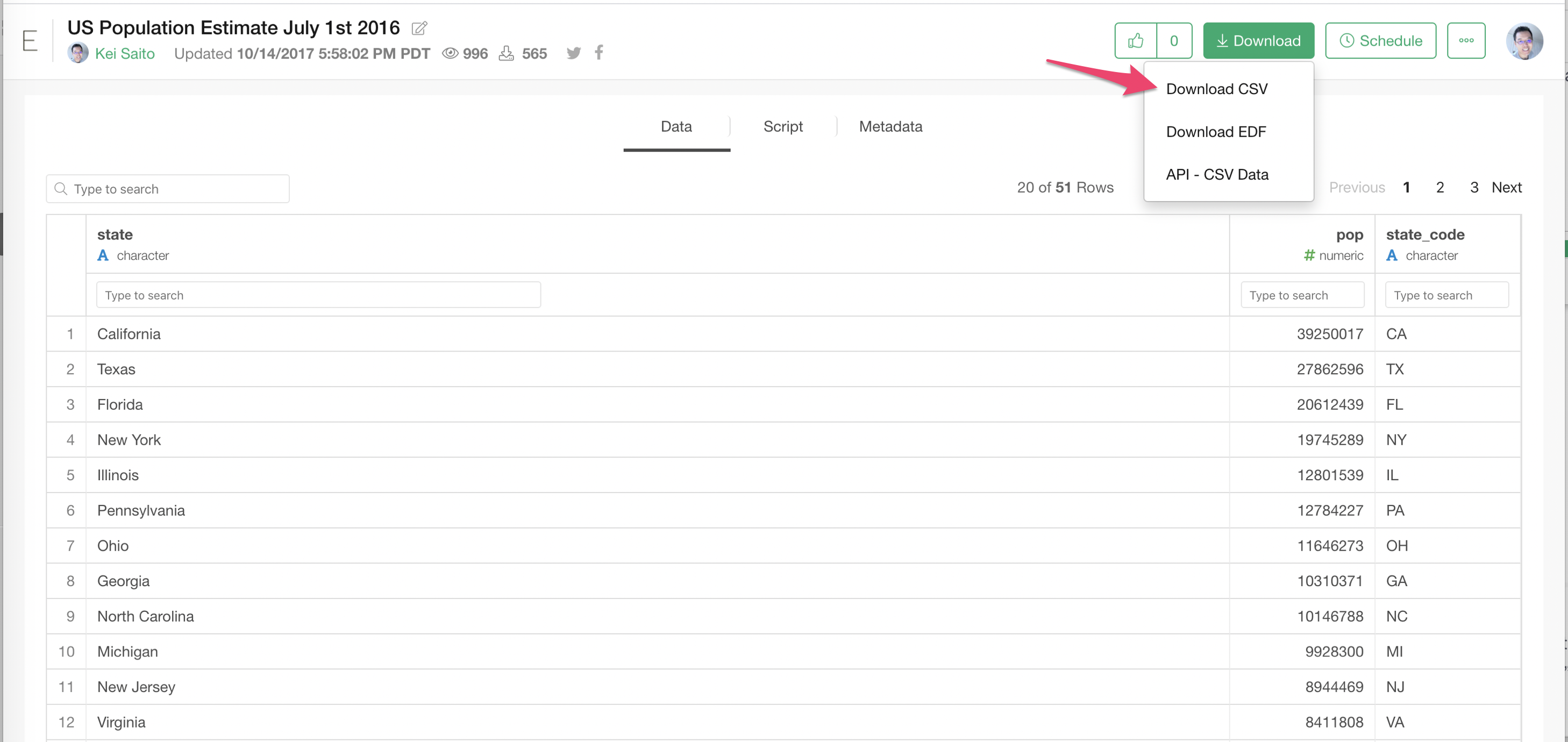
Here we use the US population data by States. The data originally comes from the List of U.S. states and territories by population on Wikipedia. I did a Web Scraping on that page with Exploratory and created simple CSV data already.
You can visit here, and choose 'Download CSV' to download the data.
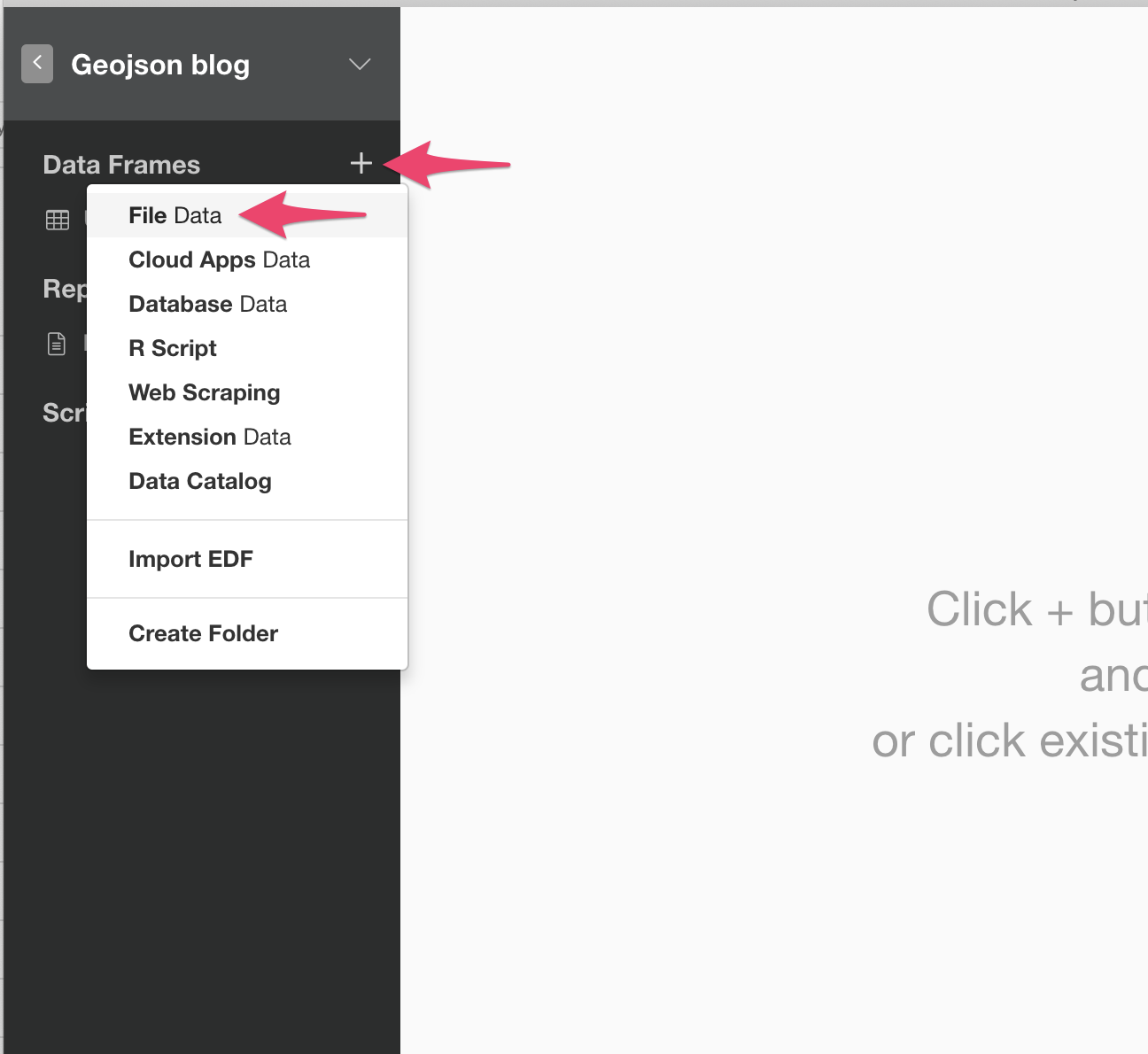
Once you download the CSV data, go to Exploratory, open a project (or create a new project), clikc the '+' icon next to the 'Data Frames' and choose 'File Data'.
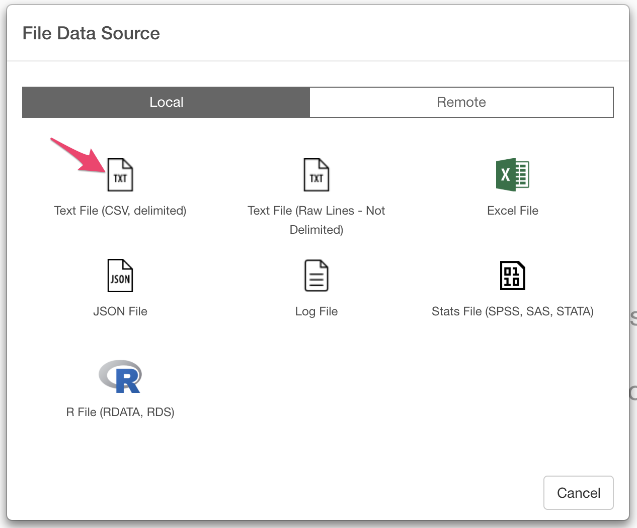
It will open up the File Data Source dialog. Choose 'Text File (CSV, delimited)'.
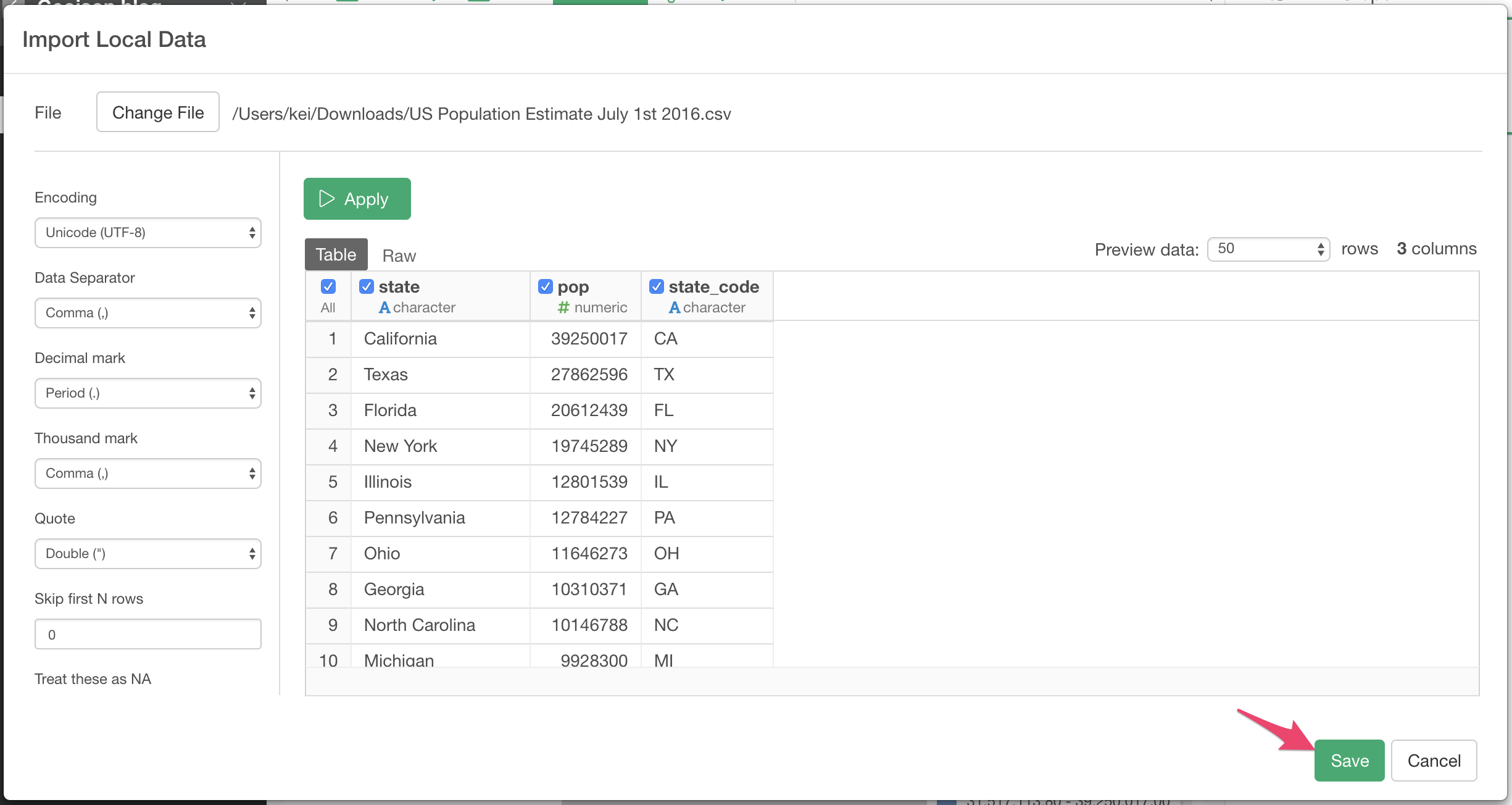
Once you choose the CSV file you downloaded, then you see 'Import Local Data' dialog. You will see the preview of the data in the Preview Table. Make sure there are 3 columns ('state', 'pop', and 'state_code'. and click the 'Save' button.
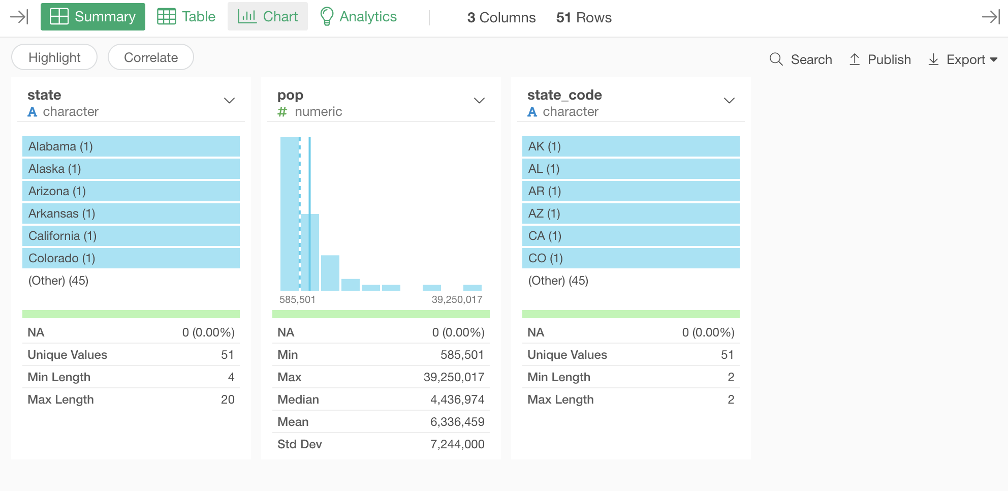
Once the import is done, you will see the summary of the data. You can see the detail of each column.
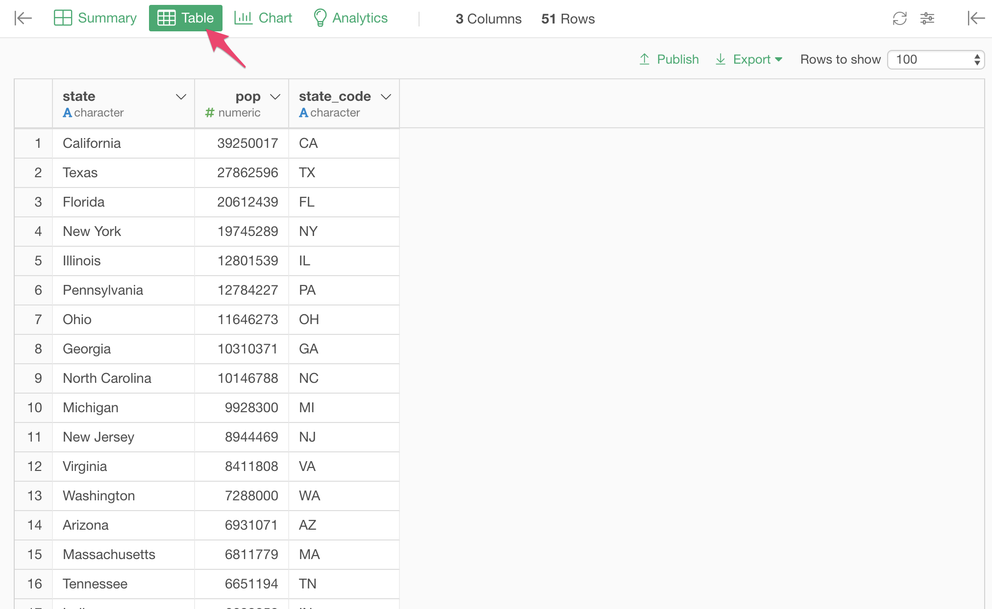
If you click 'Table' tab, you can see the actual data.
Plot the Data on Map
Now the data is ready. Let's plot the data on the Map.
- Click the "Chart" tab
- Click the "+" button to create a new chart.
- Choose "Map - Standard" for the type.
- Choose "US States" for Map.
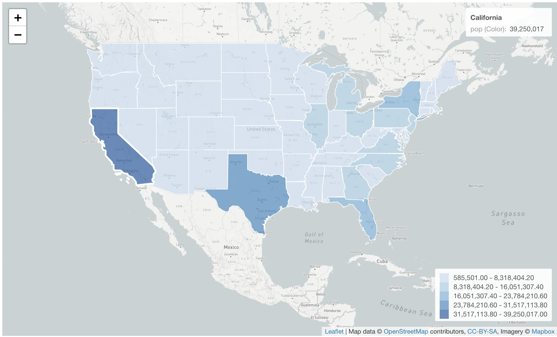
Then, you see a Map with the United States centered like the following.
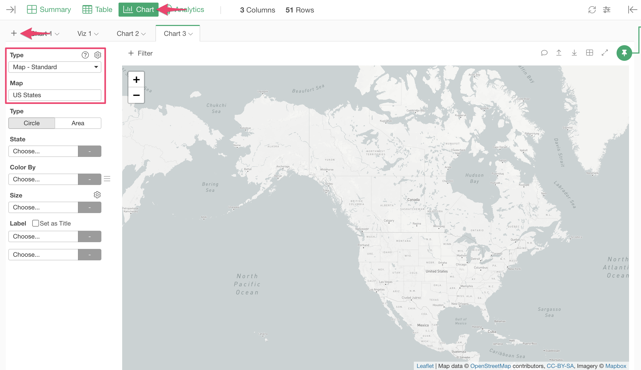
Next, let's assign the data.
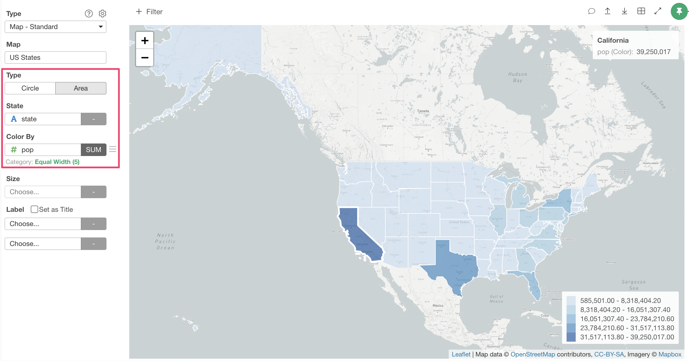
- Choose "Area" for Map Type.
- Choose "state" column for State.
- Choose "pop" for Color By.
Now, States are colored based on the number of the populations. You can hover the map to see the detail in the info area located at the top right of the map.
If you don’t have Exploratory Desktop yet, you can sign up from here for a 30 days free trial. If you are currently a student or teacher, then it’s free!