How to Change the Date Rounding Unit on the fly Using a Parameter
Suppose you have a dashboard with a bar chart showing the daily sales, and you want to change the date rounding level from daily to weekly, monthly or yearly. This note explains how to create such a dashboard on Exploratory.
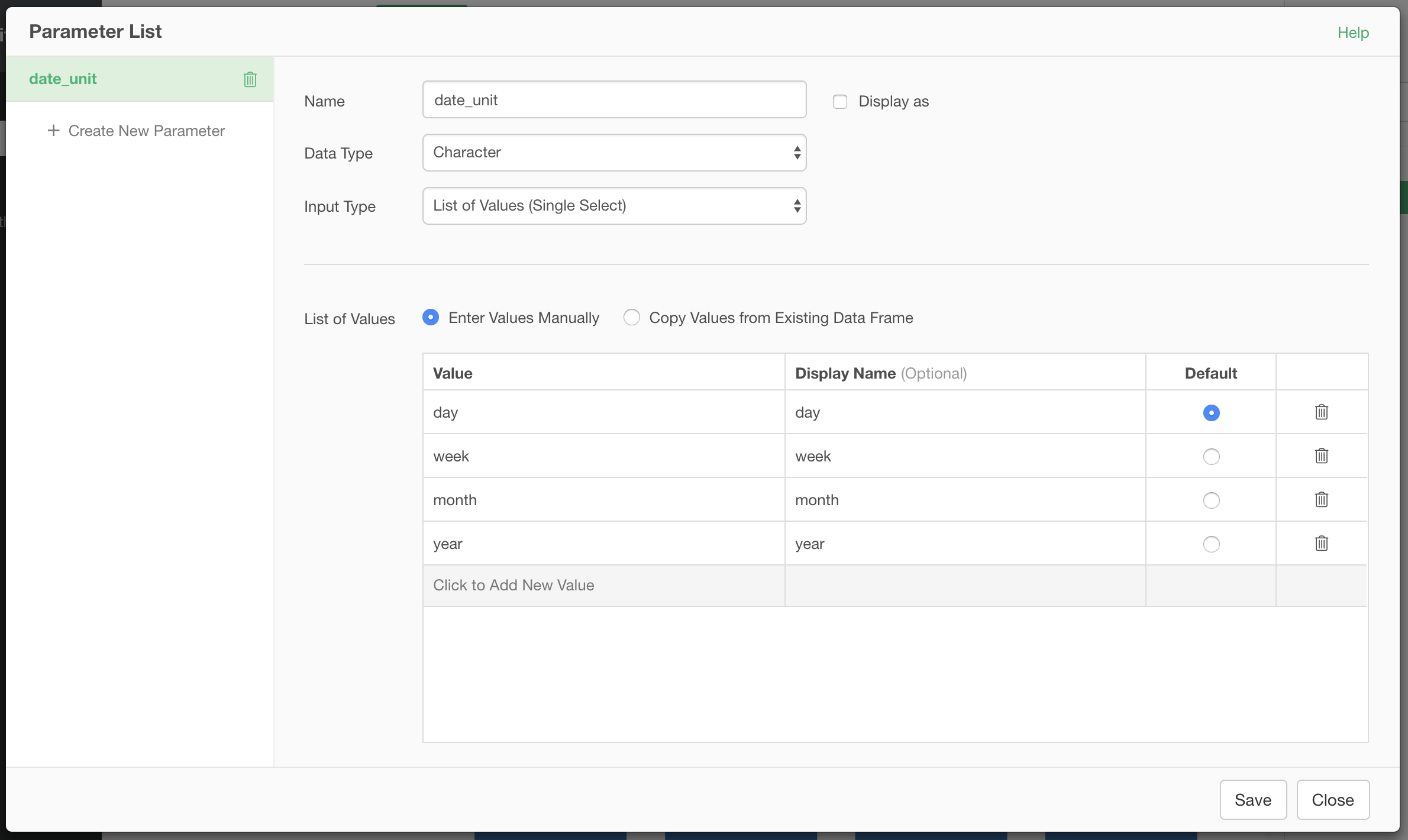
1. Create a Parameter for Date Rounding Unit
You can create a character parameter for the value of the rounding unit parameter for floor_date function. The value can be either “day”, “week”, “month” or “year”. If the date data contains the time data (POSIXct data type), you can also use “hour”, “minute” or “second”.
2. Create a Step to Round the Date Using the Parameter
The next step is to create a step to round the date data using floor_date function. Use the parameter created above at the rounding parameter of the function.
floor_date(`Order Date`, unit=@{date_unit})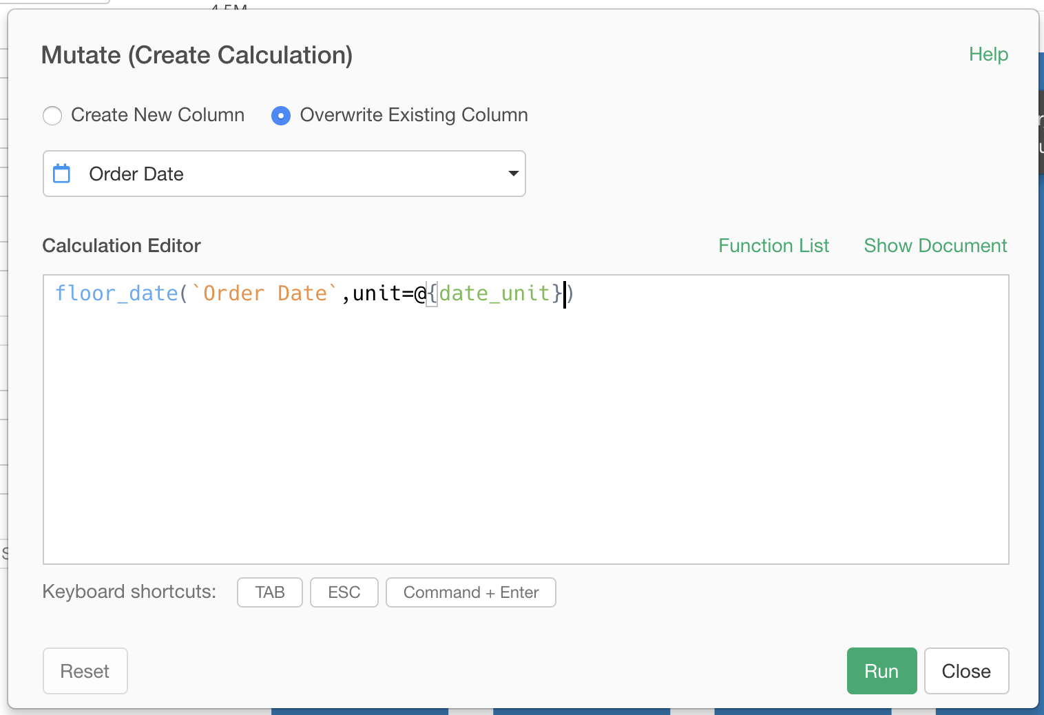
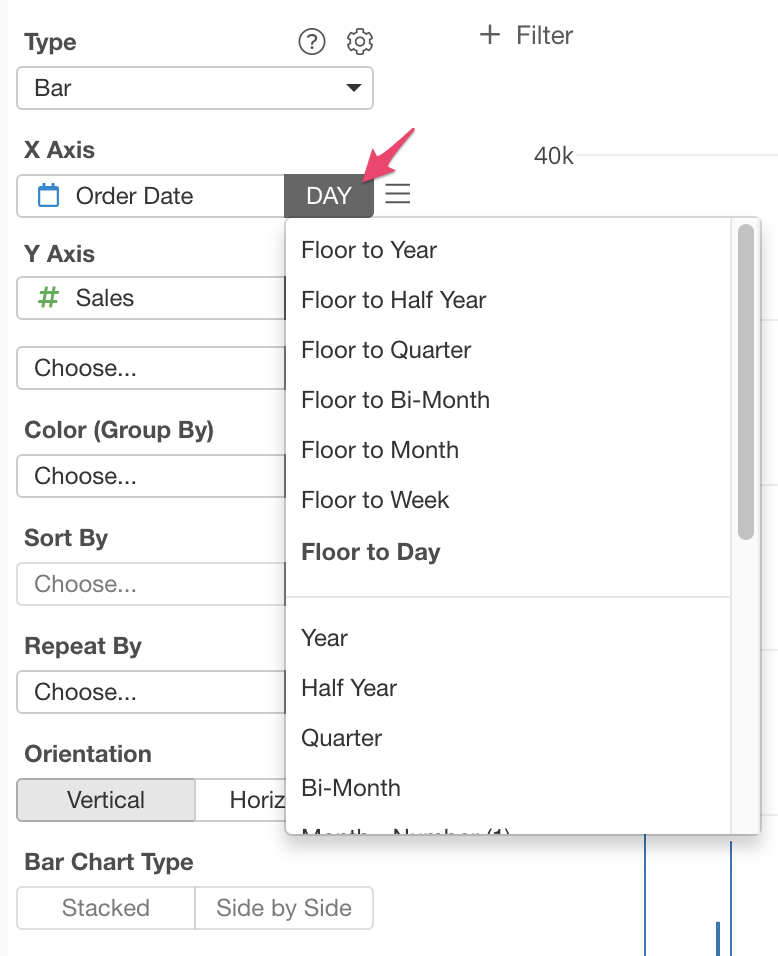
3. Create a Chart
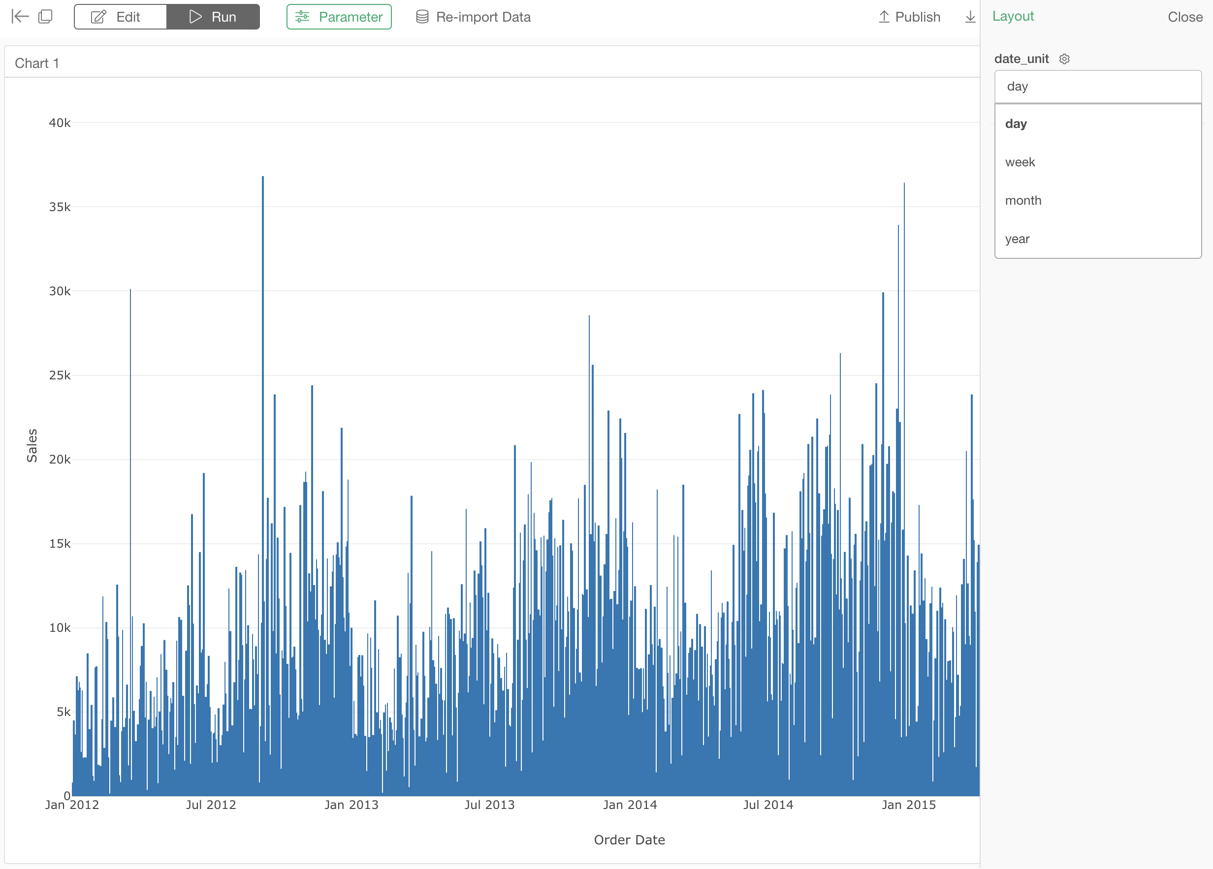
The next step is to create a chart using the date column that you created a parameter on it just before. Make sure to set the date aggregation function to the most detailed level. In this case, “Day” is the most detailed level.
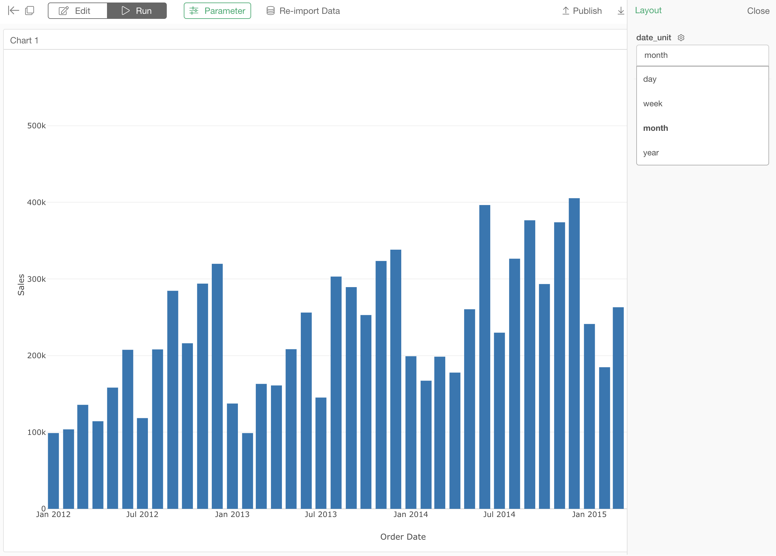
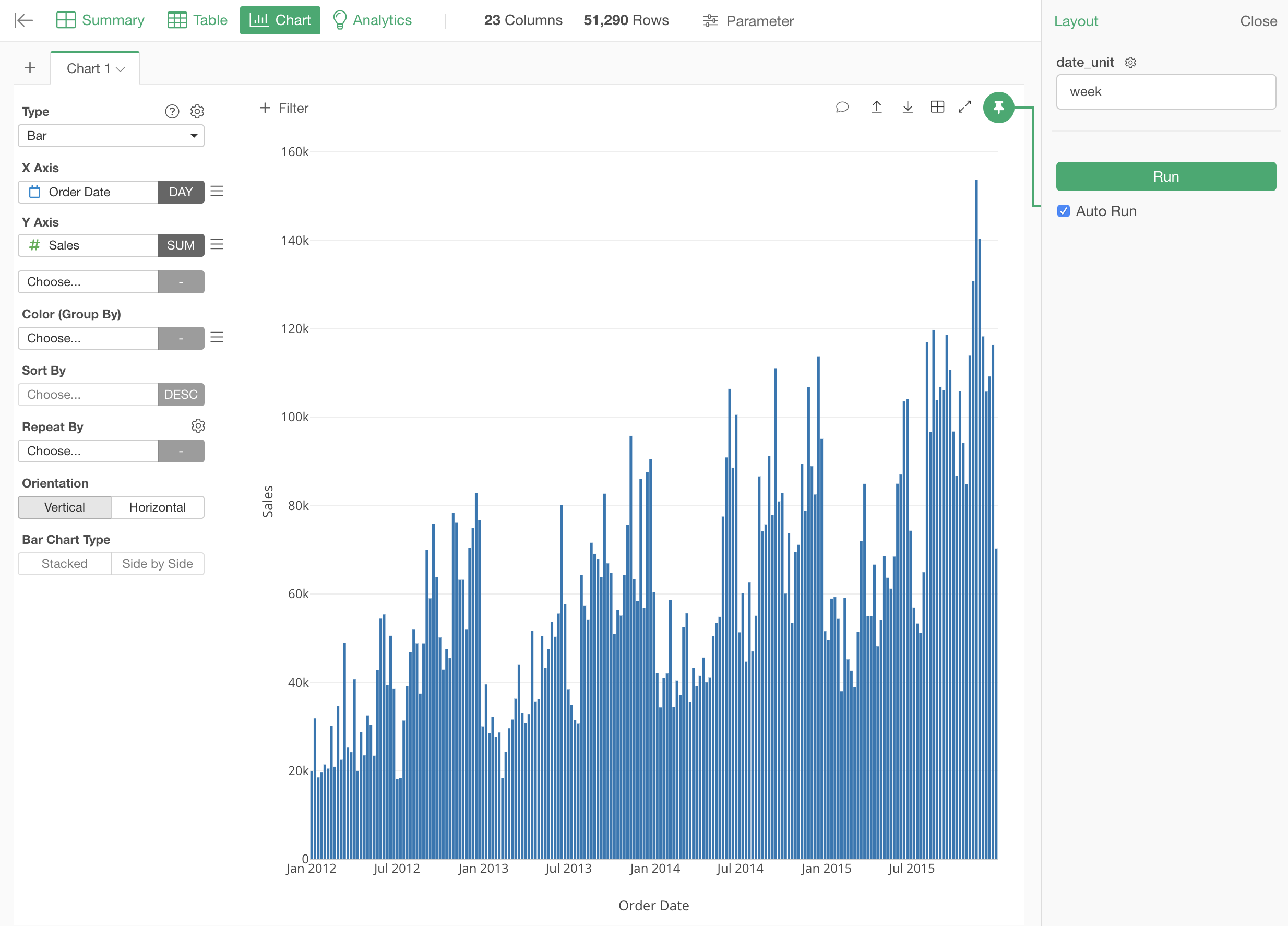
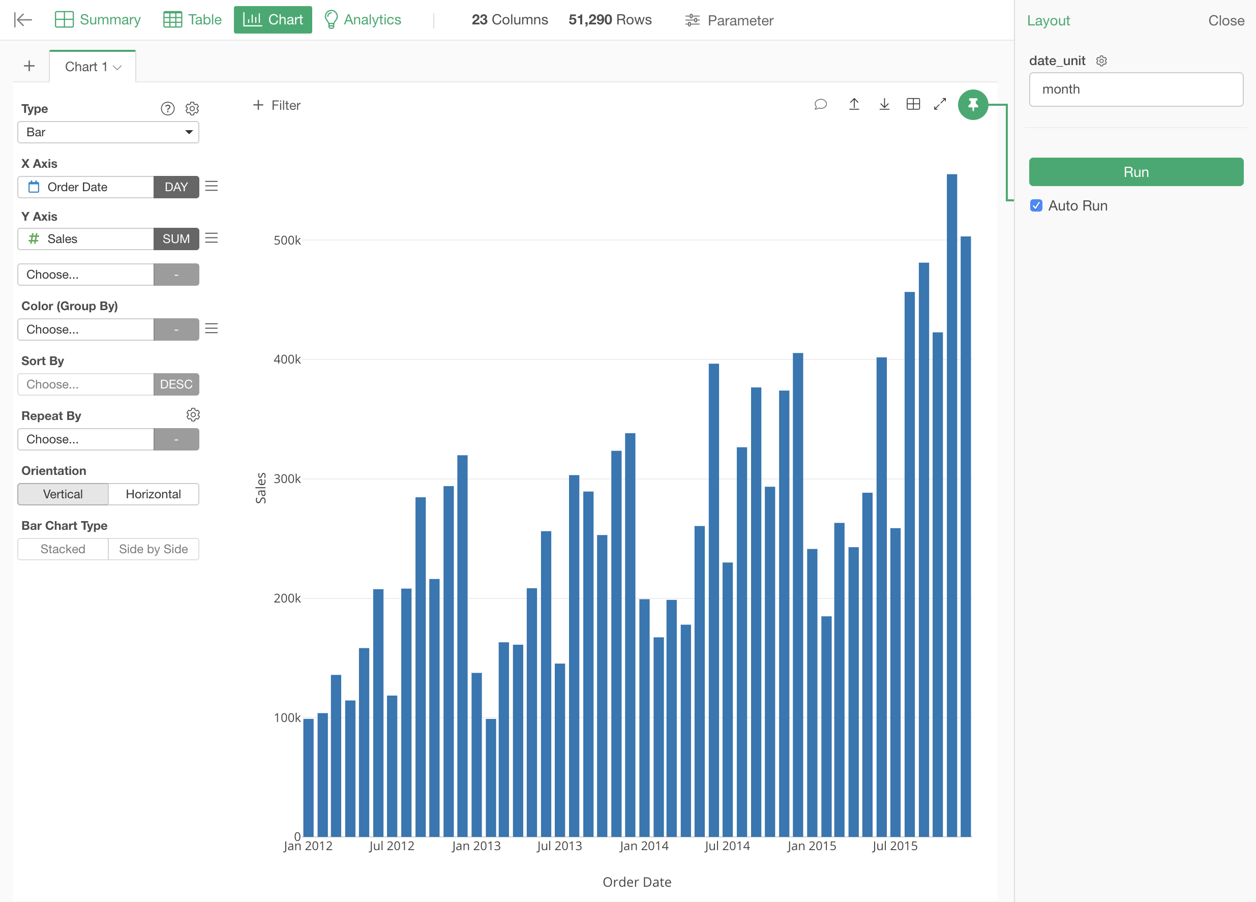
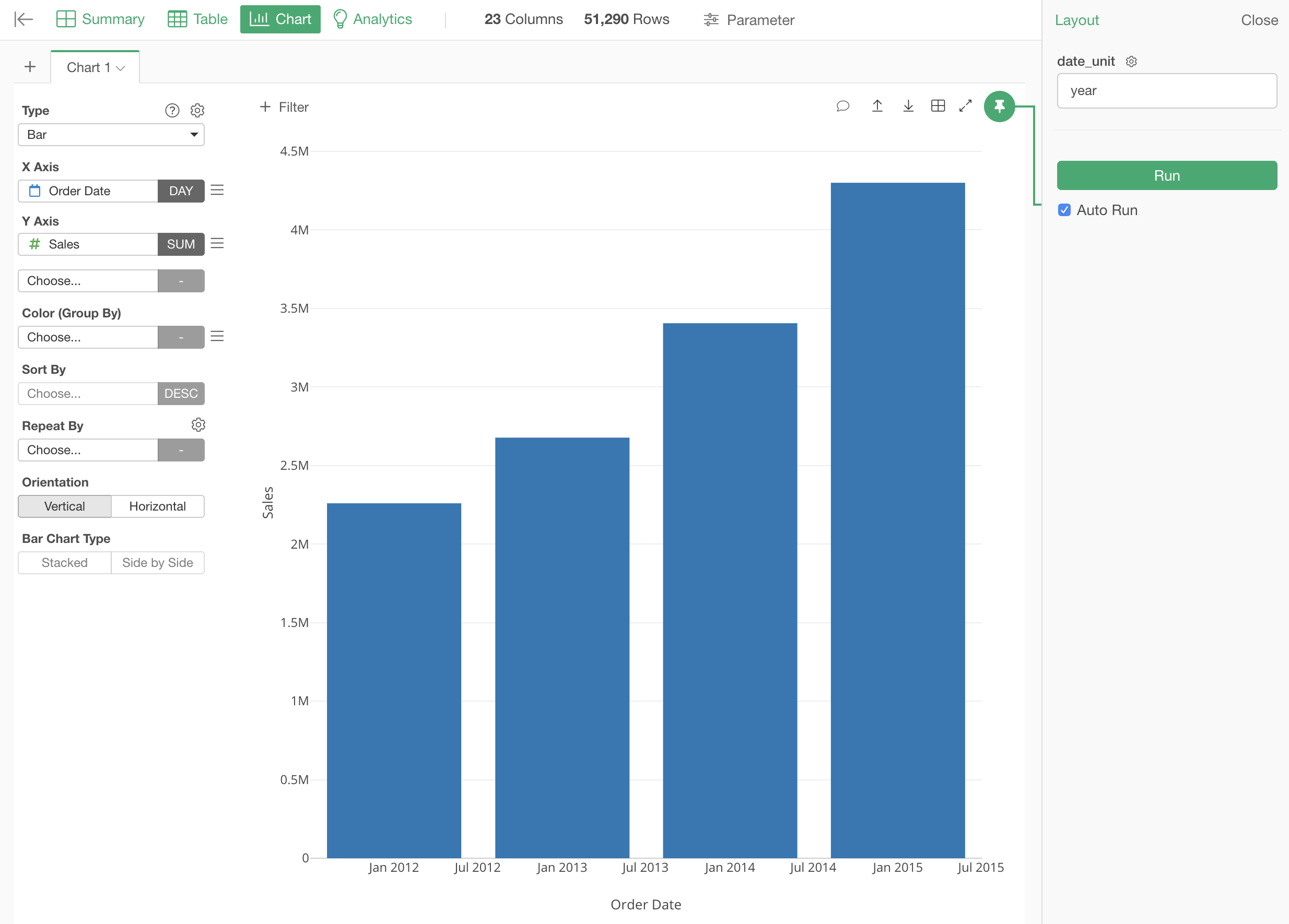
Once you create it, you will see the the parameter for the rounding unit in the parameter pane. You can change the parameter to see the Sales data in daily, weekly, monthly or yearly.
4. Create a Dashboard
You can create a dashboard with this chart. Then the dashboard will automatically show the parameter for the rounding unit, and you can change the parameter to see the Sales data in daily, weekly, monthly or yearly just as you do at the chart.