
How to Create a Venn Diagram
What is "Venn Diagram"
Venn Diagram is a type of chart that can show the relationship between categories. Especially, it is good for comparing a small number of categories. Let's see some examples.
Here I use the United Nations Voting Data for the United States, Canada, and Russia. You can download the data from here. This data is originally from United Nations General Assembly Voting Data in the Harvard Dataverse.
This data shows how those countries voted for each topic. So if those countries vote in the same way for many topics, then we can say probably those countries have similar ways of thinking. Let's look at the relationship between the United States and Canada first.
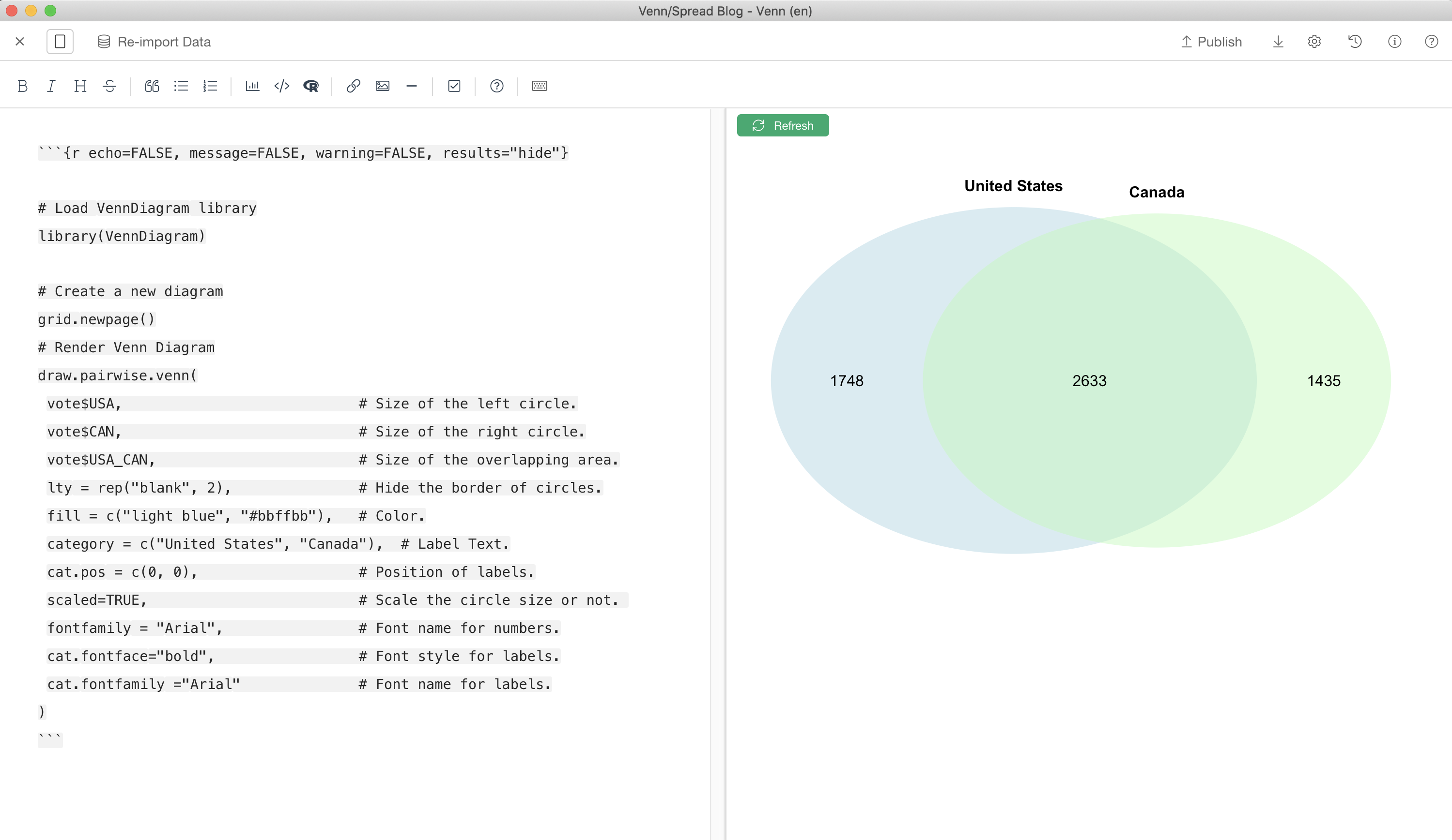
There are 4,381 valid votes from United Status, and 4,068 from Canada. The "valid votes" means they actually voted either "Yes" or "No". Numbers are different because sometimes they didn't show up for a vote, or they just didn't vote. And, they voted in the same way for 2,633 topics. In other words, both the United States and Canada voted "Yes", or both voted "No" for 2,633 topics. If I visualize it in Venn Diagram, it looks like this.

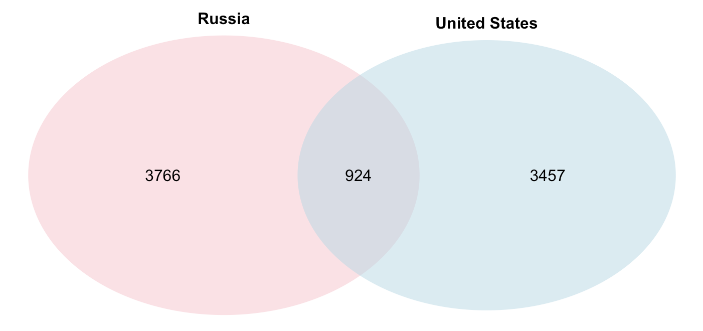
If I visualize the relationship between the United States and Russia. It looks like this. You can see the less overlapping area between those 2 countries. Meaning there are more topics that both countries voted in the opposite way.
I will explain how to create a Venn Diagram in Exploratory using the Note feature next.
Install "VennDiagram" Package (One-time setup)
In order to draw a Venn Diagram, you need to install "VennDiagram" package to Exploratory. This is a one-time setup.
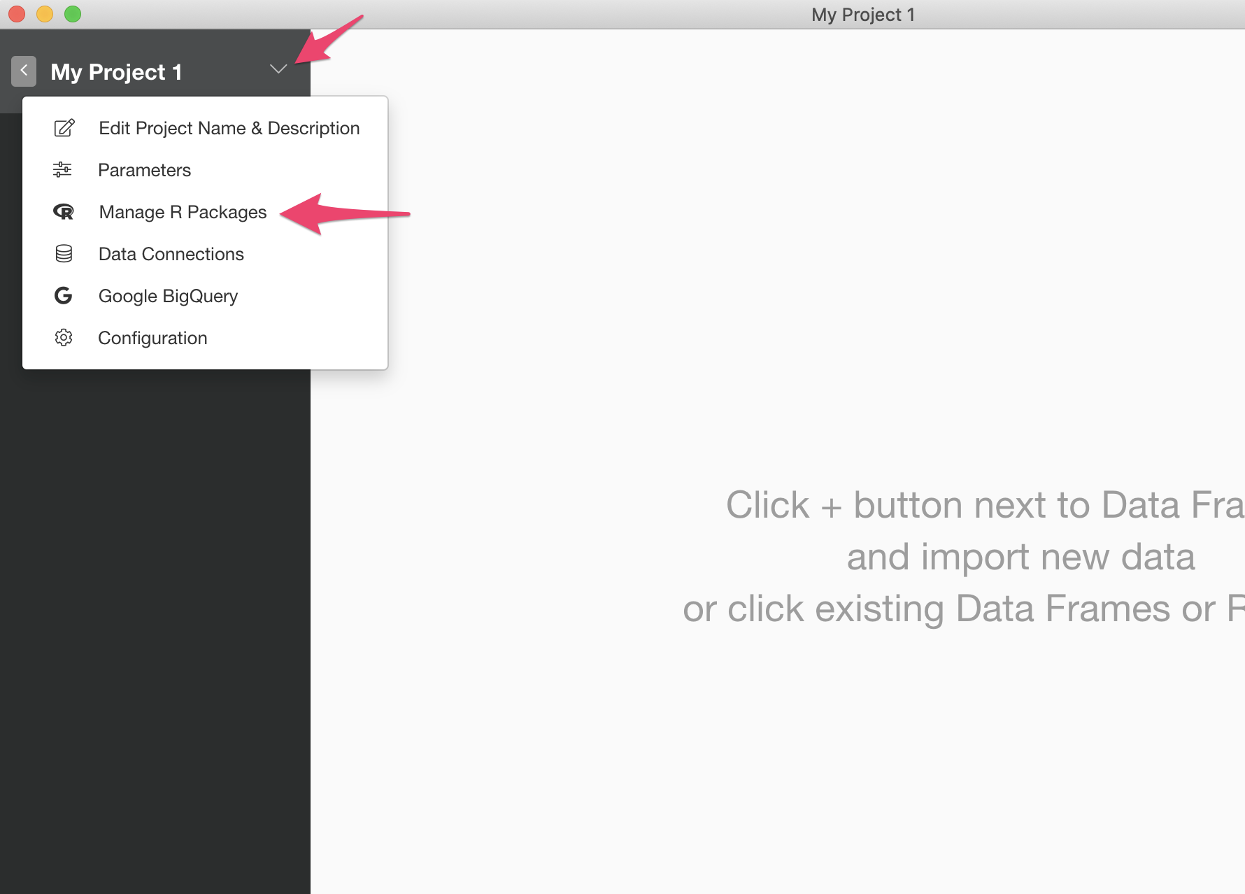
First, select "Manage R Packages" menu from the project menu.
It opens "Manage R Package" dialog. Click the "Install New Packages" tab, type in "VennDiagram" in the input field, and click "Install".

Import Data
You can download an EDF file of the summarized version of the vote data from here.
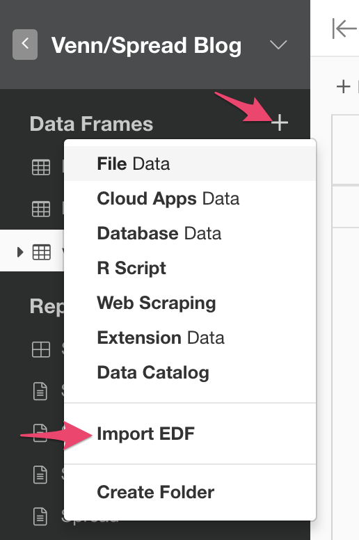
Once you download the EDF file, you can import it by clicking "+" icon next to "Data Frame" and choose "Import EDF".
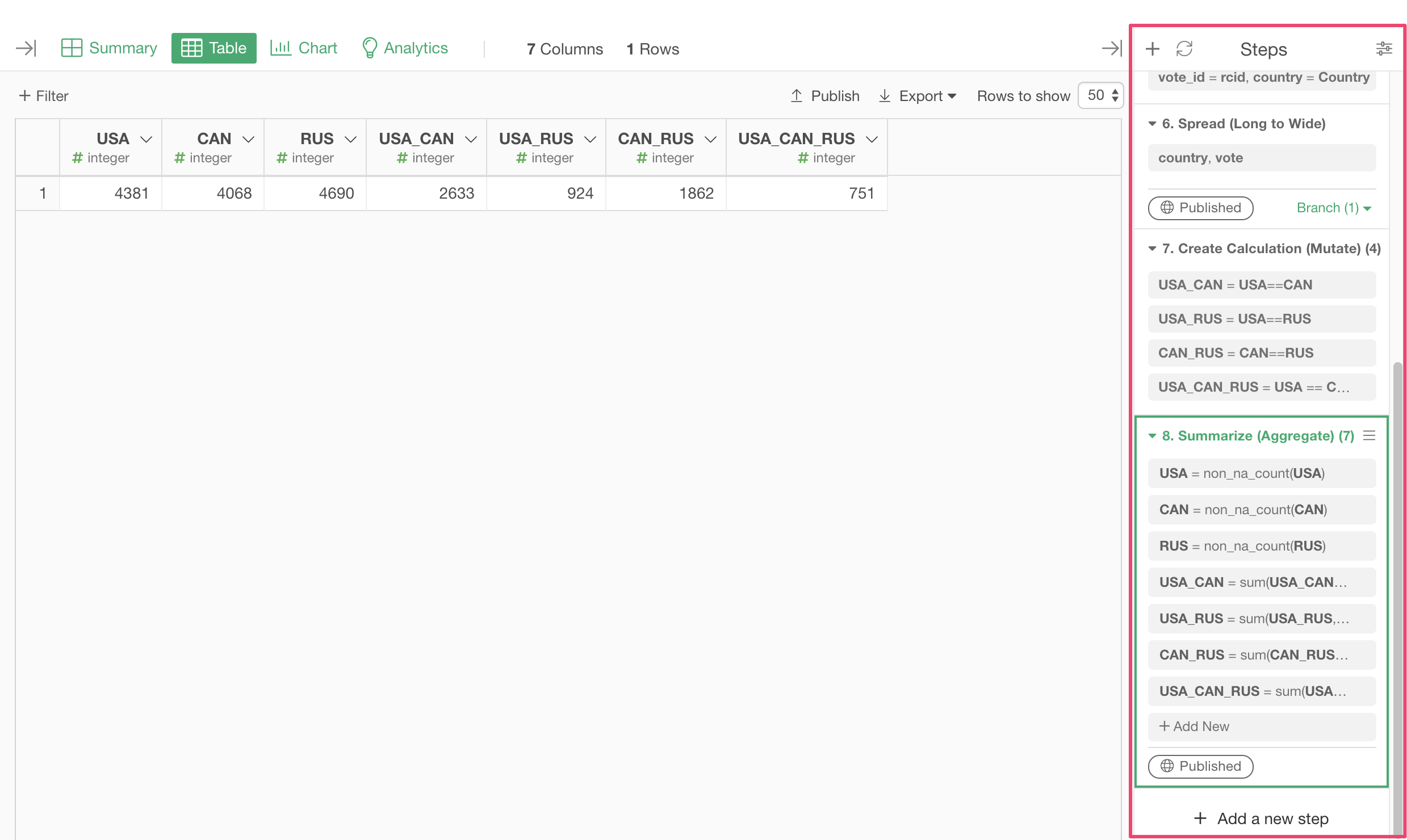
Once you finish importing the EDF, you will see a dataframe named "vote". It has only 1 row with the summarized data like the following. Numbers for USA, CAN, RUS are the total number of valid votes. "USA_CAN" means the number of topics that both United Status and Canada voted in the same way, meaning both countries voted for "Yes", or "No". Same for USA_RUS and CAN_RUS. USA_CAN_RUS means all those countries voted in the same way.

By the way, if you are interested in how I calculated this data, you can look at the steps on the left-hand side.
Create a Venn Diagram
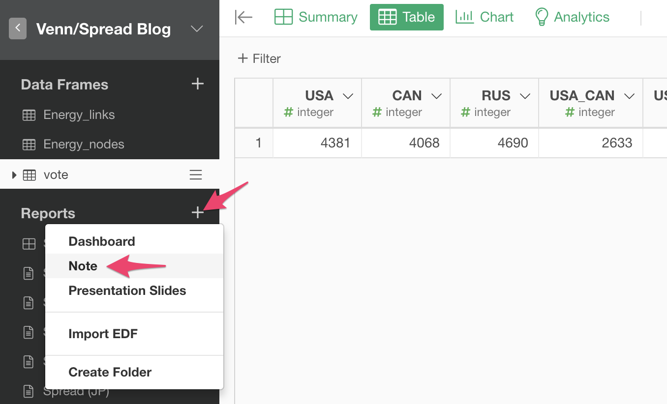
Let's create a Venn Diagram to see the relationship between the United States and Canada. First, create a new Note by clicking "+" icon next to the "Reports" and select "Note".
It will open up the Note Editor. You can cut and paste the following code into the Note Editor.
```{r echo=FALSE, message=FALSE, warning=FALSE, results="hide"}

# Load VennDiagram library
library(VennDiagram)

# Create a new canvas
grid.newpage()
# Render a Venn Diagram
draw.pairwise.venn(
  vote$USA,                            # Size of the left circle.
  vote$CAN,                            # Size of the right circle.
  vote$USA_CAN,                        # Size of the overlapping area.
  lty = rep("blank", 2),               # Hide the border of circles.
  fill = c("light blue", "#bbffbb"),   # Color.
  category = c("United States", "Canada"),  # Label text.
  cat.pos = c(0, 0),                   # Position of labels.
  scaled=TRUE,                         # Scale the circle size or not.
  fontfamily = "Arial",                # Font name for numbers.
  cat.fontface="bold",                 # Font style for labels.
  cat.fontfamily ="Arial"              # Font name for labels.
)
```
You can click "Refresh" button to see the Venn Diagram. If you don't see it, please check that the dataframe has a name "vote". If not, please rename it to "vote".
Create a Venn Diagram for more than 2 Categories
You can create a Venn Diagram to see the relationship between all those 3 countries at a time. Here is the code you can cut and paste into the Note Editor.
```{r echo=FALSE, message=FALSE, warning=FALSE, results="hide"}

# Load VennDiagram library
library(VennDiagram)

# Create a new canvas
grid.newpage()
# Render a Venn Diagram
draw.triple.venn(
  area1 = vote$USA,        # Size of the circle1.
  area2 = vote$CAN,        # Size of the circle2.
  area3 = vote$RUS,        # Size of the circle3.
  n12 = vote$USA_CAN,      # Size of the overlapping area of circle1 and 2.
  n23 = vote$CAN_RUS,      # Size of the overlapping area of circle2 and 3.
  n13 = vote$USA_RUS,      # Size of the overlapping area of circle1 and 3.
  n123 = vote$USA_CAN_RUS, # Size of the overlapping area of circle1, 2, 3.
  category = c("United States", "Canada", "Russia"), # Label text.
  lty = "blank",           # Hide the border of circles.
  fill = c("light blue", "#99ff99", "pink"),   # Color
  fontfamily = "Arial",    # Font name for numbers.
  cat.fontface="bold",     # Font style for labels.
  cat.fontfamily ="Arial"  # Font name for labels.
)

```
You can click "Refresh" button to see the Venn Diagram.
As you might notice, the Venn Diagrams that "VennDiagram" package draws cannot scale the circle size based on the number of votes if there are more than 2 categories. You can look at here for more details about the parameters and configurations about the "VennDiagram" package.
Try it for Yourself!
If you want to quickly try it out but you don’t have an Exploratory account yet, sign up from our website for 30 days free trial without a credit card!
If you happen to be a current student or teacher at schools, it’s free! Sign up for Community Plan.
And, if you don’t mind sharing what you create publicly you can sign up for Public edition of Exploratory (FREE)!