How to sort the Heatmap axis based on the color values.
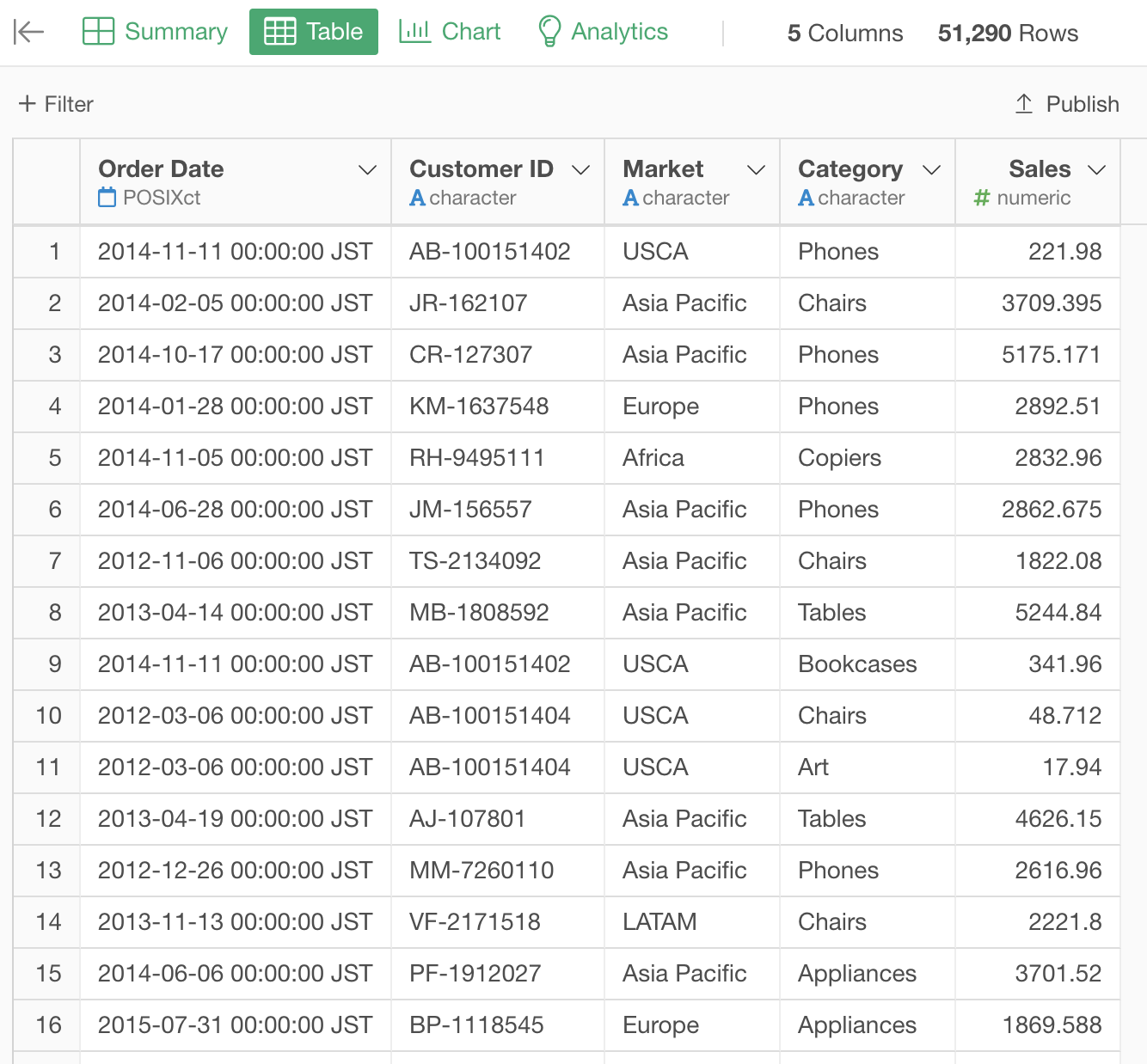
Suppose you have Sales data. Each row represents a sales order.
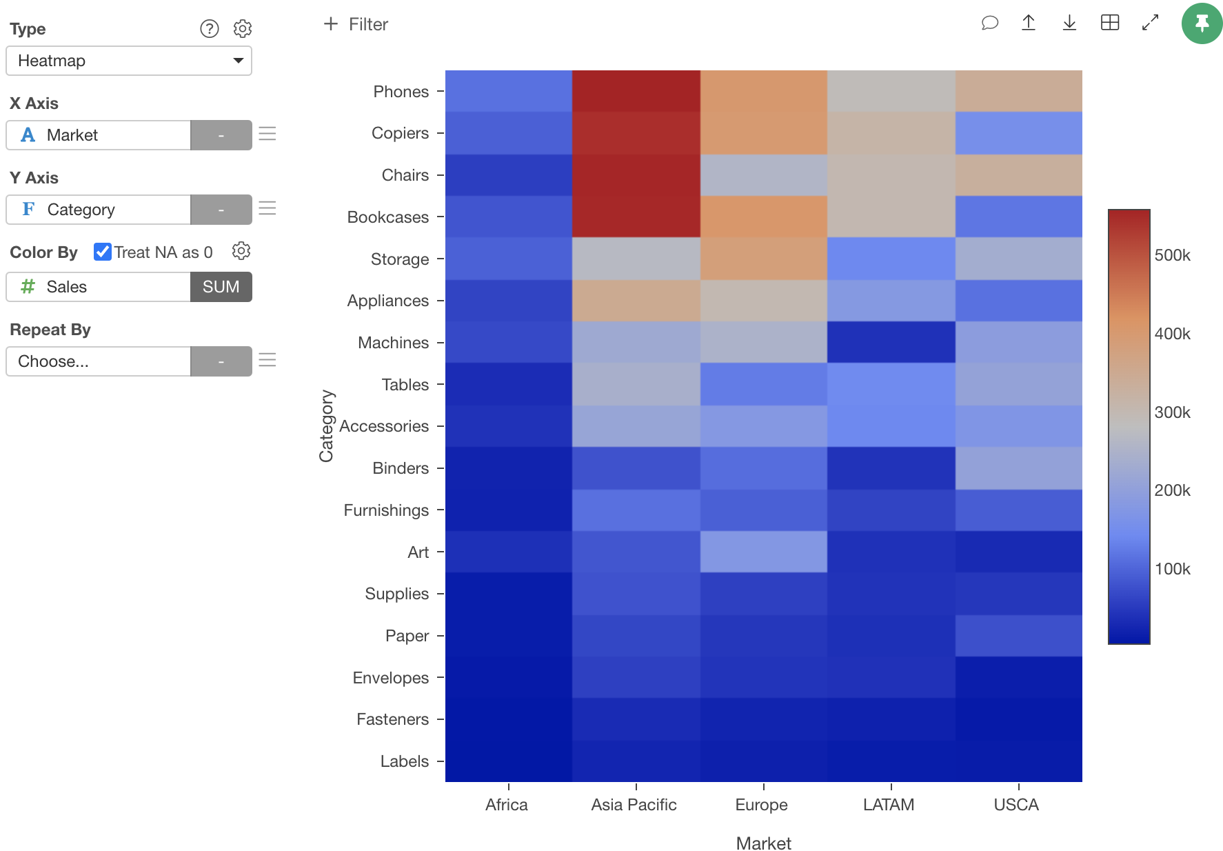
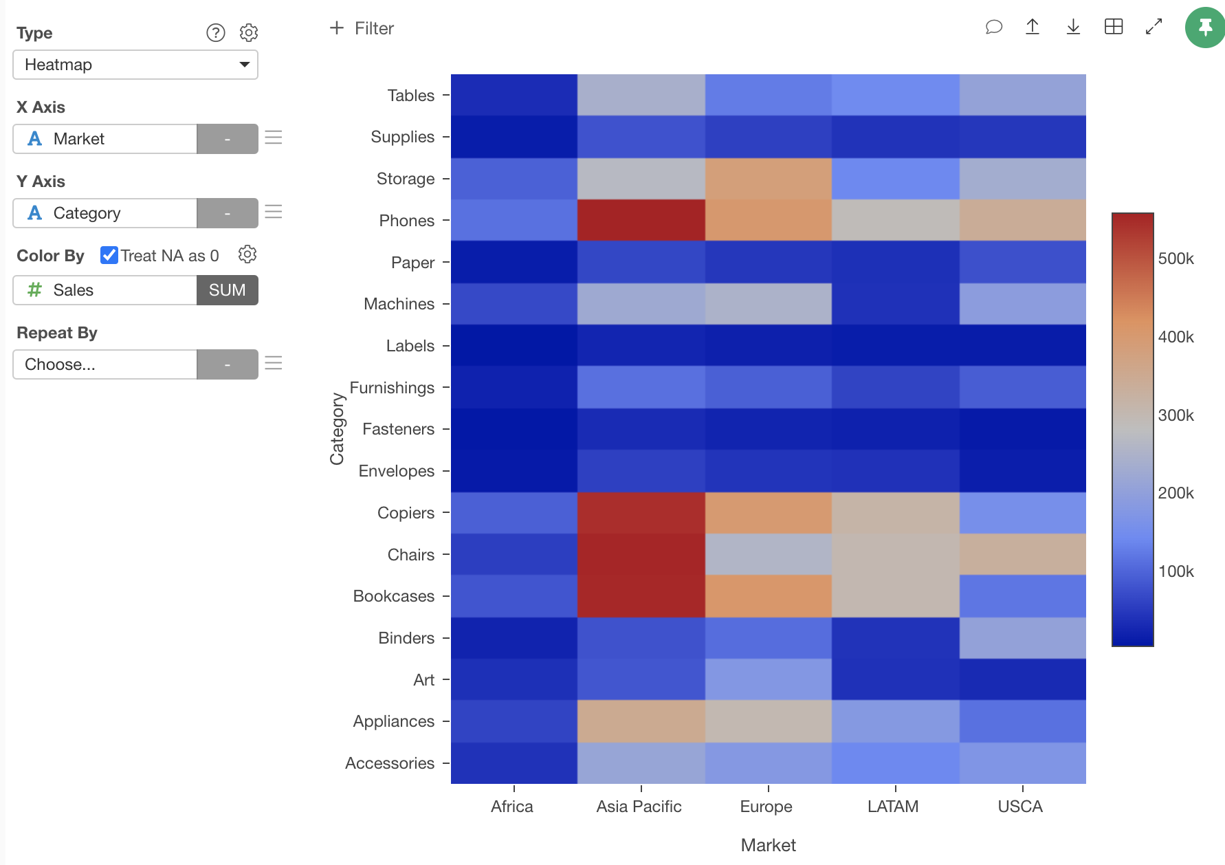
If you create a heatmap of the total sales by Category and Market, it will look like this.
But, in some cases, you want to sort the Y axis values based on the Sales values like this.
You can do this by setting an order on Category column. Here is how.
Group by Category column
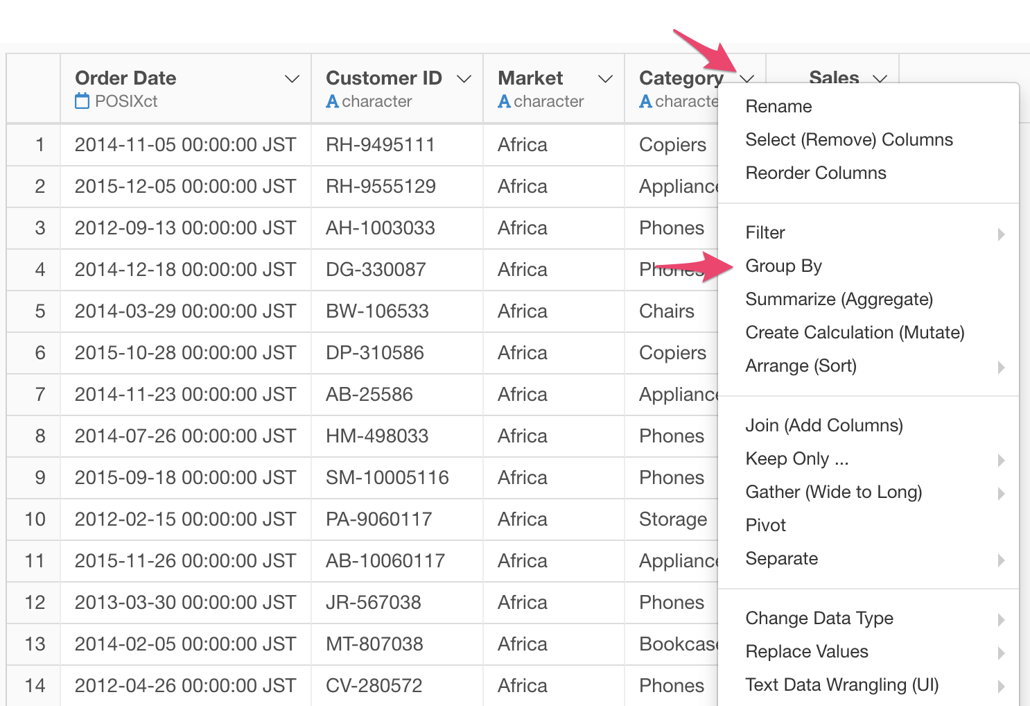
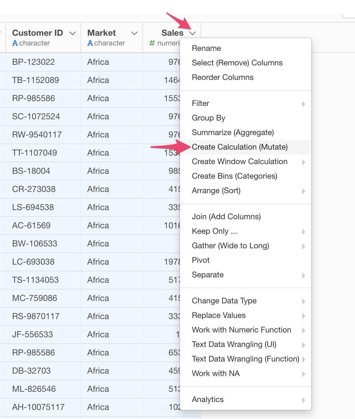
Select "Group By" from the column header menu of the Category column.
Calculate the sum of sales for each Category.
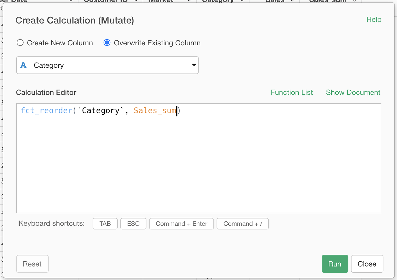
Create a new column “Sales_sum” from the “Create Calculation” menu.
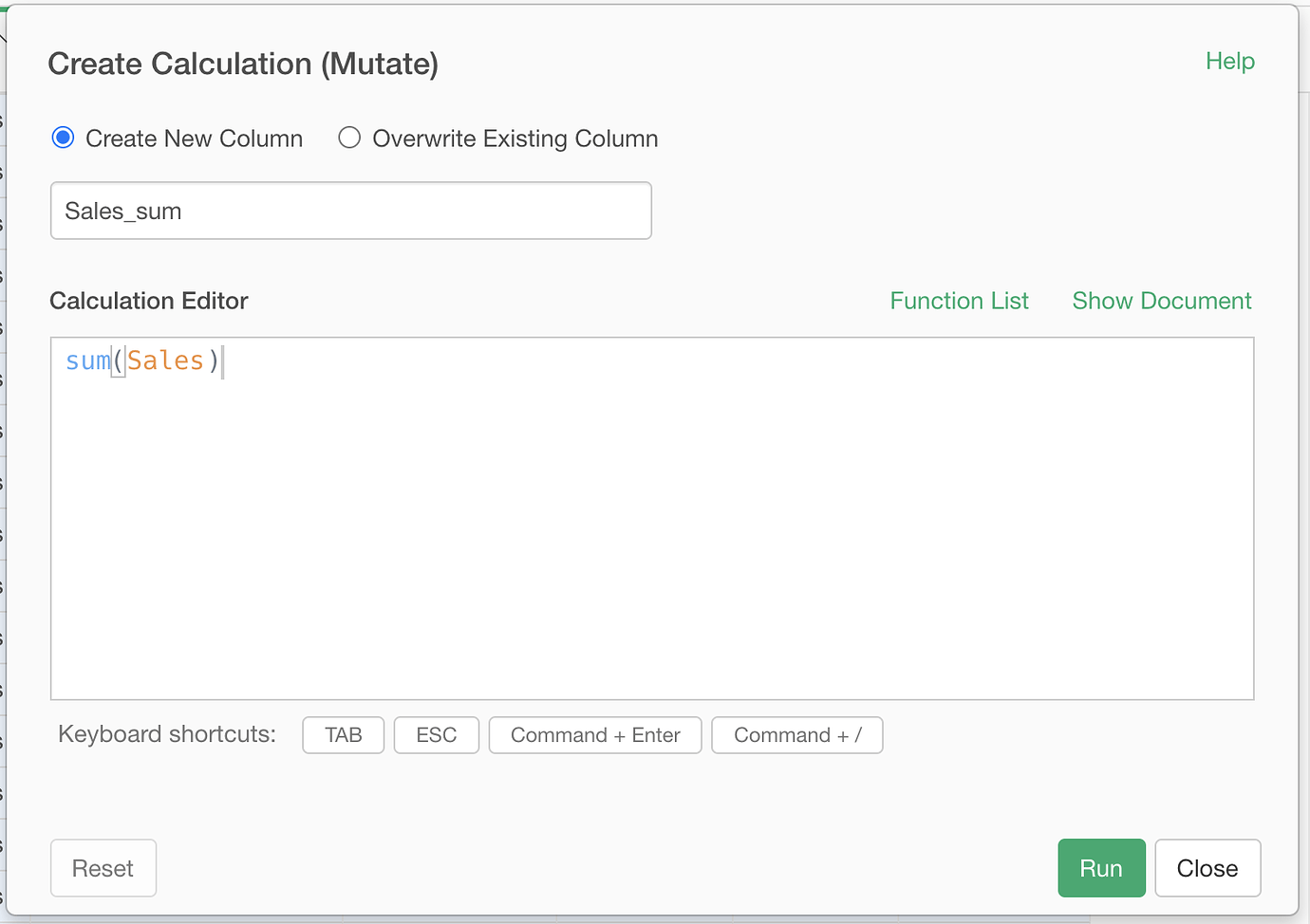
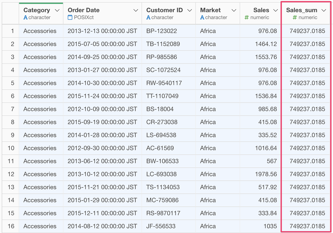
It will create a new column with the sum of sales for each Category.
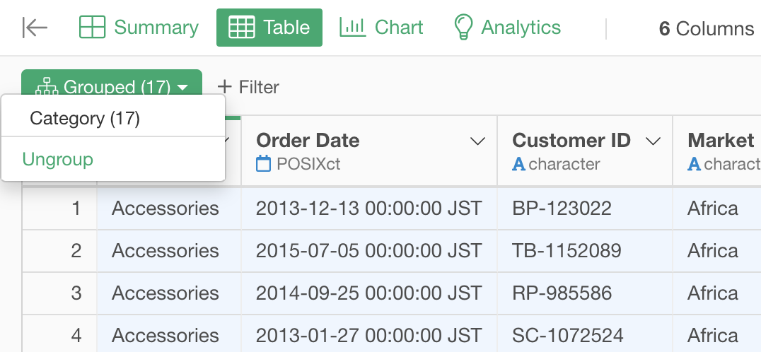
Ungroup
Reset the grouping by selecting “Ungroup”
Set the order on Category column.
Set the order on the Category column based on the sum of Sales for each column. Select “Set Order for Values” -> “By Another Column” from the column header menu of the Category column.
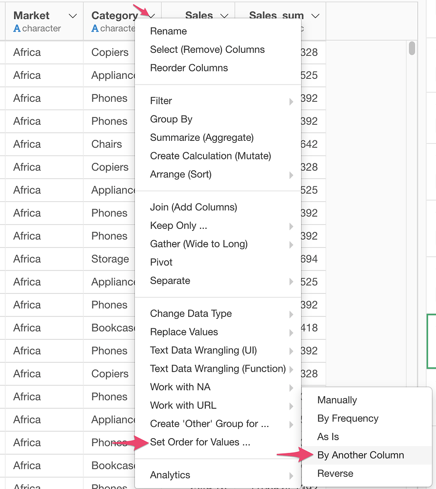
Set “Sales_sum” column for the another column.
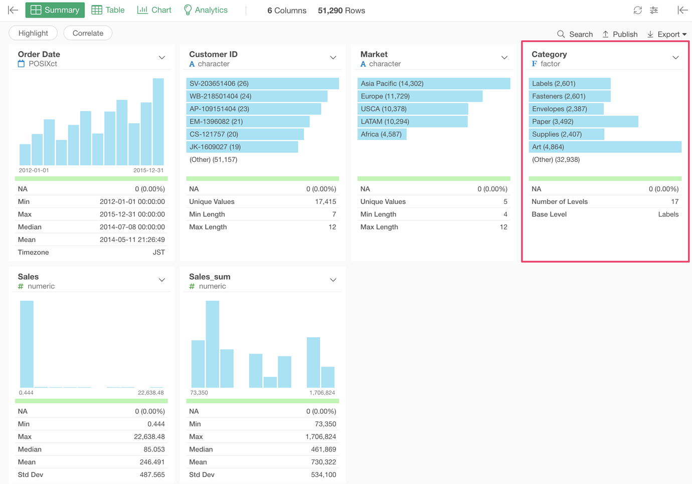
Once you are done, you will see the Category column is now in “factor” data type and the values have order in the Summary view.
Now, you can create a Heatmap. You see the categories with the larger sales show up in top.