Exploratory Analysis
- Adapted from: https://datascienceineducation.com/c09.html
Introduction
Data scientists working in education don’t always have access to student level data, so knowing how to model aggregate datasets is very valuable. This tutorial explores what aggregate data is, and how to access, clean, and explore it.
Overview
A common situation encountered when searching for education data, particularly by analysts who are not directly working with schools or districts, is the prevalence of publicly available, aggregate data. Aggregate data refers to numerical information (or non-numerical information, such as the names of districts or schools) that has the following characteristics:
- collected from multiple sources and/or on multiple measures, variables, or individuals and compiled into data summaries or summary reports, typically for the purposes of public reporting or statistical analysis
- Examples of publicly available aggregate data include school-level graduation rates, state test proficiency scores by grade and subject, or mean survey responses.
In this tutorial, we explore the role of aggregate data, with a focus on educational equity.
Aggregate data is essential both for accountability purposes and for providing useful information about schools and districts to those who are monitoring them. For example, district administrators might aggregate row-level (also known as individual-level or student-level) enrollment reports over time. This allows them to see how many students enroll in each school, in the district overall, and any grade-level variation. Depending on their state, the district administrator might submit these aggregate data to their state education agency (SEA) for reporting purposes. These datasets might be posted on the state’s department of education website for anyone to download and use.
Federal and international education datasets provide additional information. In the US, some federal datasets aim to consolidate important metrics from all states. This can be useful because each state has its own repository of data and to go through each state website to download a particular metric is a significant effort. The federal government also funds assessments and surveys which are disseminated to the public. However, federal datasets often have more stringent data requirements than the states, so the datasets may be less usable.
For data scientists in education, these reports and datasets can be analyzed to answer questions related to their field of interest. However, doing so is not always straightforward. Publicly available, aggregate datasets are large and often suppressed to protect privacy. Sometimes they are already a couple of years old by the time they’re released. Because of their coarseness, they can be difficult to interpret and use. Generally, aggregate data is used to surface broader trends and patterns in education as opposed to diagnosing underlying issues or making causal statements. It is very important that we consider the limitations of aggregate data first before analyzing it.
Analysis of aggregate data can help us identify patterns that may not have previously been known. When we have gained new insight, we can create research questions, craft hypotheses around our findings, and make recommendations on how to improve for the future.
We want to take time to explore aggregate data since it’s so common in education but can also be challenging to meaningfully used.
What is the Difference Between Aggregate and Student-Level Data?
Let’s dig a little deeper into the differences between aggregate and student-level data. Publicly available data - like the data we’ll use in this tutorial - is a summary of student-level data. That means that student-level data is totaled to protect the identities of students before making the data publicly available. For example:
student school test_score
<chr>   <chr>       <int>
  a       k              25
  b       l              56
  c       m              53
  d       n              23
  e       o              15
  f       k              57
  g       l              89
  h       m              29
  i       n              76
  j       o              84
Aggregate data totals up a variable - the variable test_score in this case - to “hide” the student-level information. The rows of the resulting dataset represent a group. The group in our example is the school variable:
school mean_score
<chr>       <dbl>
k            20.5
l            77
m            27
n            43.5
o            80
Notice here that this dataset no longer identifies individual students.
Disaggregating Aggregated Data
Aggregated data can tell us many things, but in order for us to better examine subgroups (groups that share similar characteristics), we must have data disaggregated by the subgroups we hope to analyze. This data is still aggregated from row-level data but provides information on smaller components than the grand total. Common disaggregations for students include gender, race/ethnicity, socioeconomic status, English learner designation, and whether they are served under the Individuals with Disabilities Education Act (IDEA).
Disaggregating Data and Equity
Disaggregated data is essential to monitor equity in educational resources and outcomes. If only aggregate data is provided, we are unable to distinguish how different groups of students are doing and what support they need. With disaggregated data, we can identify where solutions are needed to solve disparities in opportunity, resources, and treatment.
It is important to define what equity means to your team so you know whether you are meeting your equity goals.
Sources of Data
There are many publicly available aggregate datasets related to education. On the international level, perhaps the most well-known is PISA:
- Programme for International Student Assessment (PISA) (http://www.oecd.org/pisa/), which measures 15-year-old school pupils’ scholastic performance on mathematics, science, and reading.
On the federal level, well-known examples include:
Civil Rights Data Collection (CRDC) (https://www2.ed.gov/about/offices/list/ocr/data.html), which reports many different variables on educational program and services disaggregated by race/ethnicity, sex, limited English proficiency, and disability. These data are school-level.
Common Core of Data (CCD) (https://www2.ed.gov/about/offices/list/ocr/data.html), which is the U.S. Department of Education’s primary database on public elementary and secondary education.
EdFacts (https://www2.ed.gov/about/inits/ed/edfacts/data-files/index.html), which includes state assessments and adjusted cohort graduation rates. These data are school- and district-level.
Integrated Postsecondary Education Data System (IPEDS) (https://nces.ed.gov/ipeds/), which is the U.S. Department of Education’s primary database on postsecondary education.
National Assessment for Educational Progress (NAEP) Data (https://nces.ed.gov/nationsreportcard/researchcenter/datatools.aspx), which is an assessment of educational progress in the United States. Often called the “nation’s report card,” the NAEP reading and mathematics assessments are administered to a representative sample of fourth- and eighth-grade students in each state every two years.
At the state and district levels, two examples include:
New York State Educational data collection (https://data.nysed.gov/). You can download different datasets in the "Downloads" section
California Department of Education (https://www.cde.ca.gov/ds/), which is the state department of education website. It includes both downloadable CSV files and “Data Quest,” which lets you query the data online.
Minneapolis Public Schools (https://mpls.k12.mn.us/reports_and_data), which is a district-level website with datasets beyond those listed in the state website.
Our Data
For the purposes of this tutorial, we will be looking at a particular school district’s data.
The district we focus on here reports their student demographics in a robust, complete way. Not only do they report the percentage of students in a subgroup, but they also include the number of students in each subgroup. This allows a deep look into their individual school demographics. Their reporting of the composition of their schools provides an excellent opportunity to explore inequities in a system.
The file for this information is "schoolData.csv". You can get the data from the Brighspace tutorial page. Import this file into a new project in Exploratory.io.
Now, we will import the Free Reduced Price Lunch (FRPL) PDF’s. The file for this information is "frpl.csv". You can get the data from the Brighspace tutorial page.
FRPL stands for Free/Reduced Price Lunch and is often used as a proxy for poverty. Students from a household with an income up to 185 percent of the poverty threshold are eligible for free or reduced price lunch. (Sidenote: definitions are very important for disaggregated data. FRPL is used because it’s ubiquitous but there is debate as to whether it actually reflects the level of poverty among students.)
Cleaning the Data
We clean up the schoolData dataset by:
We are only interested in school totals, so we remove the datailed information per grade. To do this, we filter the "school_group" column and we only keep the rows that have a "NA" value. To do it, in the column we do "Filter" -> "Keep Only NA"
Removing unnecessary or blank columns. We should eliminate: "X1", "school_group", "grade", "pi_pct" and "blank_col". To do this, use the "Select Columns" step in Exploratory.
Removing all Grand Total rows (otherwise they’ll show up in our data when we just want district-level data) using "Filter". We only remove those that does not contain "Grand Total"
Then we trim white space in "school_name" with "Work with Text" -> "Remove" -> "Leading and trailing spaces"
We remove the word "Total" from certain school_names. Use "Work with Text"-> "Remove" -> "Text". In the dialog set Characters to "Total". You can previou to see if works.
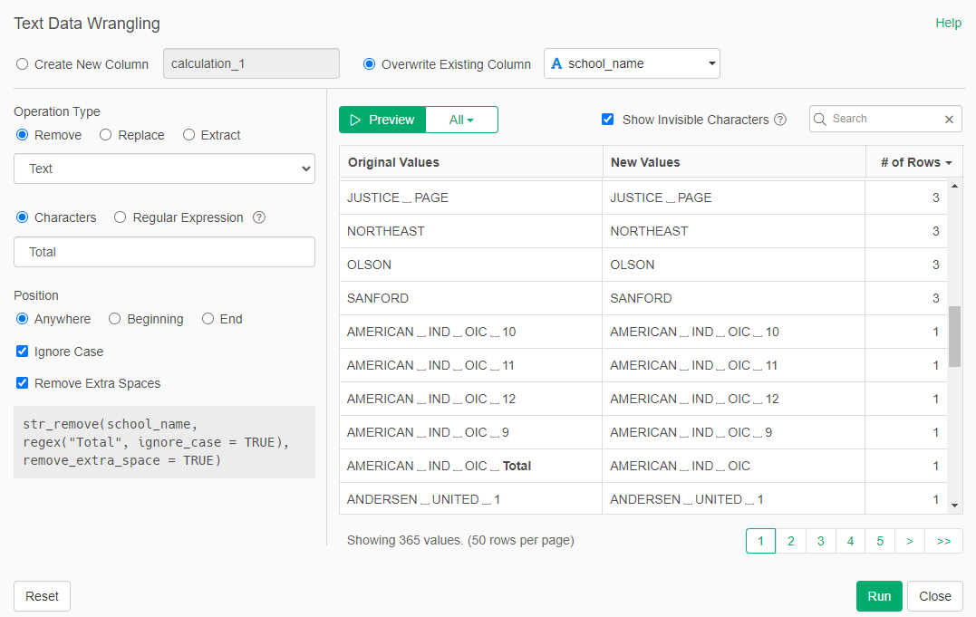
- The data in the percentage columns are provided with a percentage sign. This means percentage was read in as a character. We convert those columns to numeric to eliminate the "%" sign. We do this for all columns that ends in "pct"
To clen the frpl dataset:
We remove the X1 column with Select
We remove the rows in which the name of the school is blank. Use "Filter" in the column and then "Remove NA"
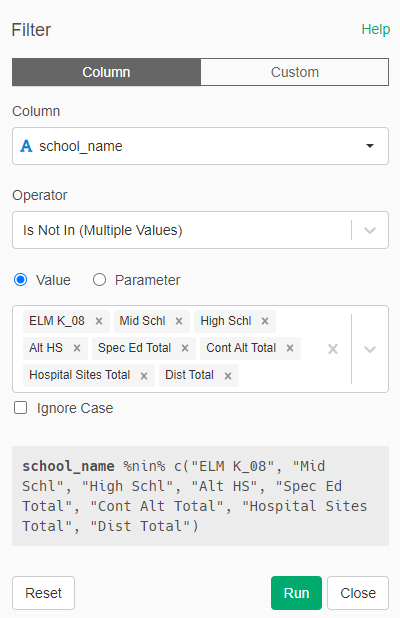
We notice that there are aggregations inserted into the table that are not district-level. For example, the report includes ELM K_08, presumably to aggregate FRPL numbers up to the K-8 level. Although this is useful data, we don’t need it for this district-level analysis. There are different ways we can remove these rows but we will just filter them. Remove any row in which the school name is: "ELM K_08", "Mid Schl", "High Schl", "Alt HS", "Spec Ed Total", "Cont Alt Total", "Hospital Sites Total", "Dist Total". We use Filter -> Is Not In(Multiple Values).
- Finally, we conver the percentage columns ("pct") to numeric.
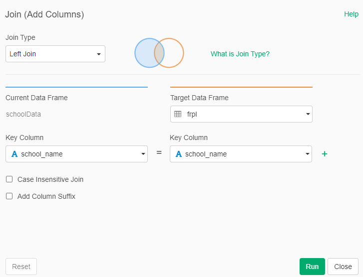
Because we want to look at race/ethnicity data in conjunction with free/reduced price lunch percentage, we join the two datasets by the name of the school.
- Go to schoolData and Left Join with frpl
Did you notice? The total number of students from the Race/Ethnicity table does not match the total number of students from the FRPL table (tot and frpl_num), even though they’re referring to the same districts in the same year. Why? Perhaps the two datasets were created by different people, who used different rules when aggregating the dataset. Perhaps the counts were taken at different times of the year, and students may have moved around in the meantime. We don’t know but it does require us to make strategic decisions about which data we consider the ‘truth’ for our analysis.
Indicate "High Poverty" Schools
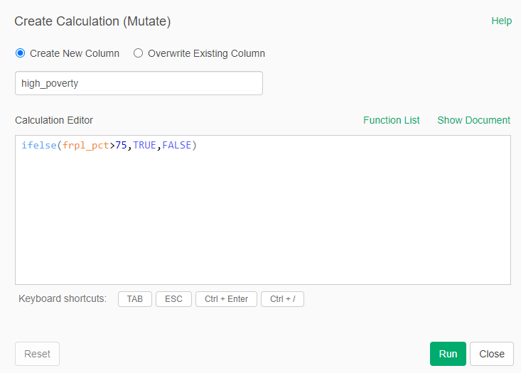
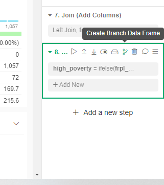
Now we create new columns based on the merged dataset. We want to flag ‘high poverty’ schools. This is defined by NCES as schools that are over 75% FRPL. When a school is over 75% FRPL.
- We Calculate Single Column (Mutate) a new column called "high_poverty". We use the formula:
ifelse(frpl_pct>75,TRUE,FALSE)- That formula will return TRUE if frpl_pct column is greater than 75 and FALSE if it is 75 or lower.
Race/Ethnicity Distribution in the District
Now is time to summarize our data into a few visualizations. First we wiil visualize the percentage of students belonging to each race in the whole district.
- We create a new branch of our dataset (after the last step executed). We call this new version "RacePerDistrict". Select that new dataset.
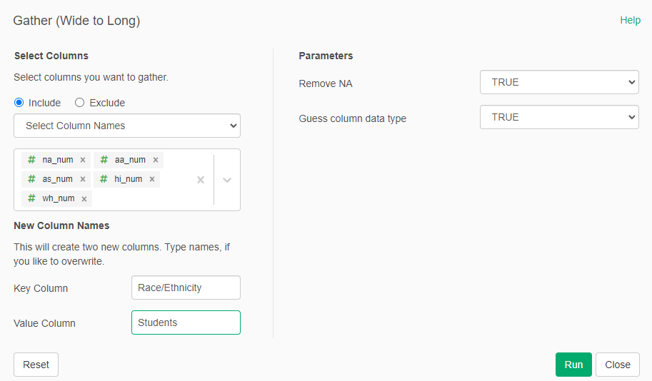
We select only the columns containing the name of the school (school_name), the total number of students per Race/Ethnicity (na_num, hi_num, wh_num, aa_num, as_num), and if the school is "high poverty" (high_poverty)
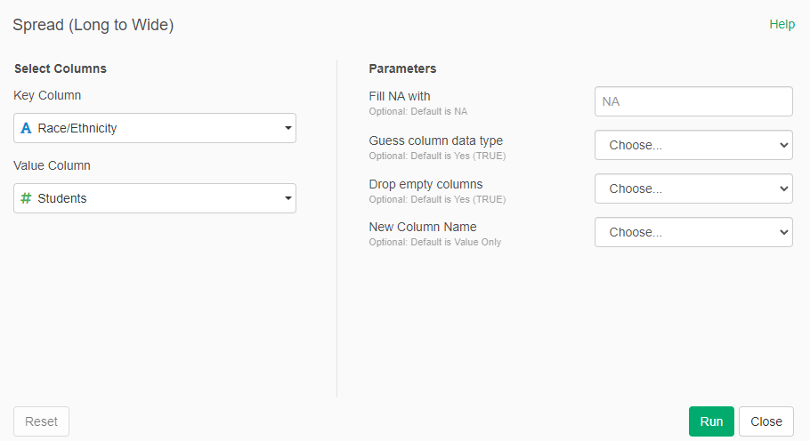
Now we gather (wide to long) the Race/Ethnicity columns into a two columns "Race/Ethnicity" and "Students"
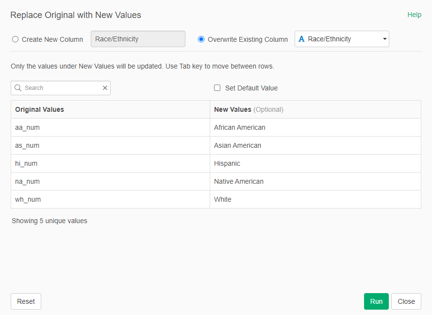
- In the new column "Race/Ethnicity" we "Replace the Values" -> "New Values" so we have a more descriptive name for each race/ethnicity:
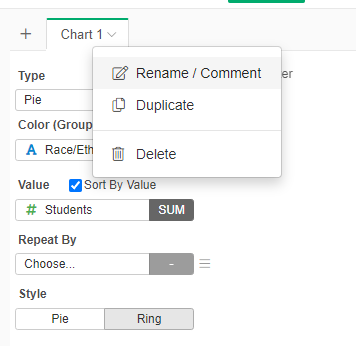
- Now we create a new Chart, of type Pie. The Color is determined by Race/Ethnicity and the Value is Students.
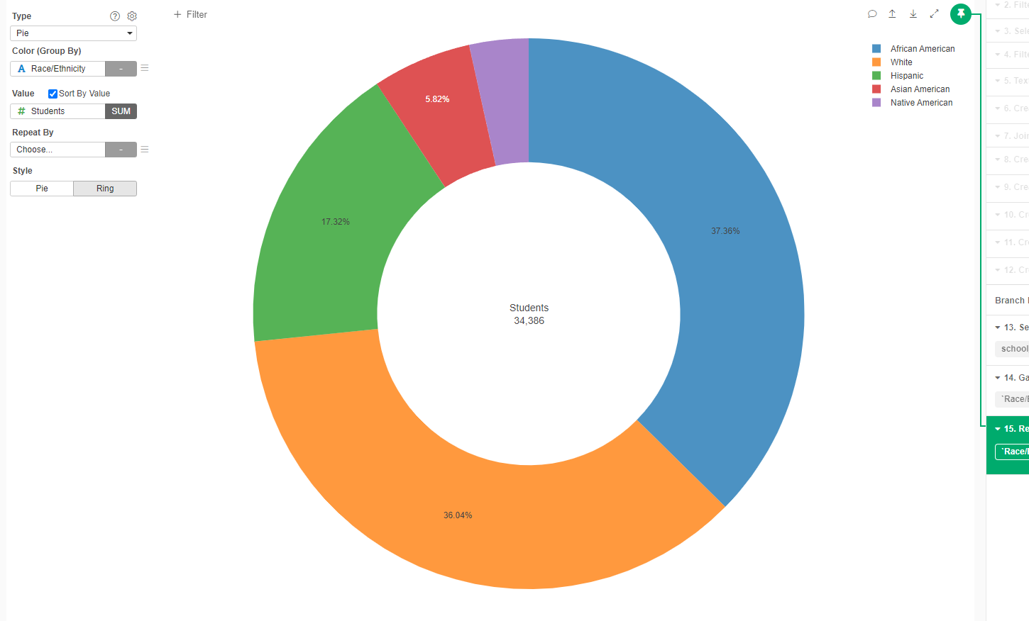
- Change the name of the Chart to "Race/Ethnicity in the District"
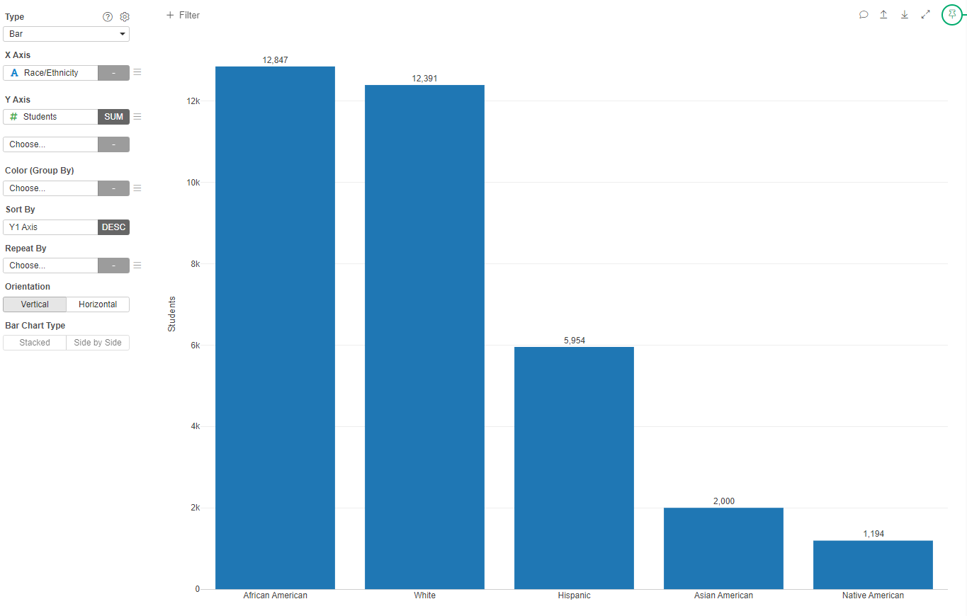
When we look at these data, the district looks very diverse. Almost 38% of students are African American and around 36% are White. There is a good representation of Hispanics and Asian Americans, and in lower, but still significant proportion, Native Americans.
We can also see the same information as a Bar Chart with the total number of students per race:
- Create a Bar Chart with XAxis Race/Ethnicity and Y axis Students. Sort by Y1 Axis and add values at the top of the bars (in the Gear beside the Type)
- Change the name of the Chart to "Total Race/Ethnicity in the District"
High Poverty Schools
Now we would want to see the percentage of schools that are high poverty.
- Create a new Pie Chart
- Set Color as high_proverty
- Set Value (Num of Rows)
- Set the name of the Chart to "High Poverty Schools in the District"
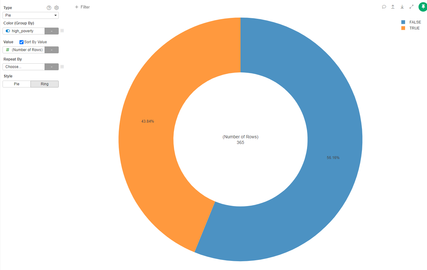
It seems that almost half of the schools in the district are high poverty schools.
Race/Ethnicity in High Poverty Schools
We now want to see how races divide between schools that are o are not "high poverty".
- Create a new Pie Chart
- Set Color as Race/Ethnicity
- Value as Students
- Repeat by select high_poverty
- Set the name of the Chart to "Race/Ethnicity in High Poverty Schools"
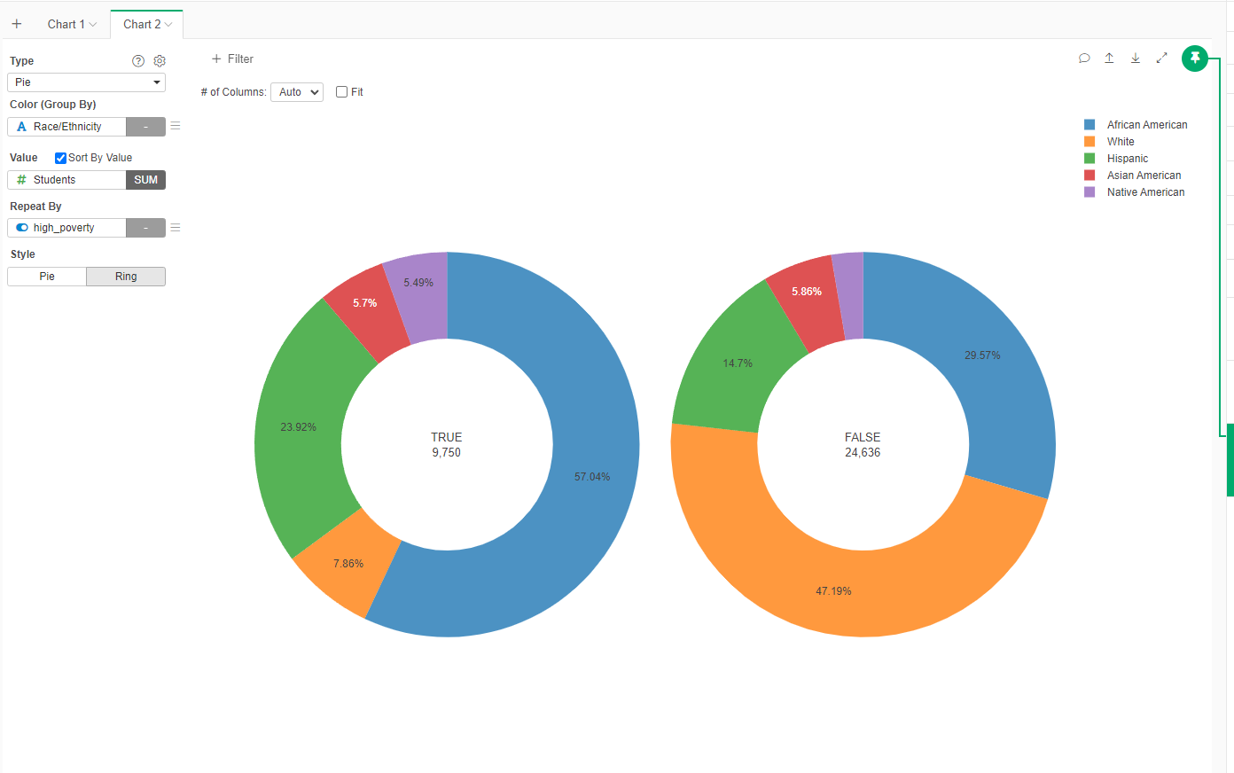
Now we see a complete different image. In, high poverty shools (TRUE), more than half of the population is African American, while in the schools outside this category (FALSE), almost 50% is White.
Another Way to See It
We will use a different visualization that will present how many students of each race/ethnicity are in average in different types of school.
- In the RacePerDistrict dataset, Spread (Wide to Long) the Race/Ethnicity column with the Students as values
- Now create a new Chart of type Radar. In the Values add the columns related to the Race/Ethnicity and Color by high_povety
- Set the name of the Chart to "Comparision of Race/Ethnicity by Poverty Level"
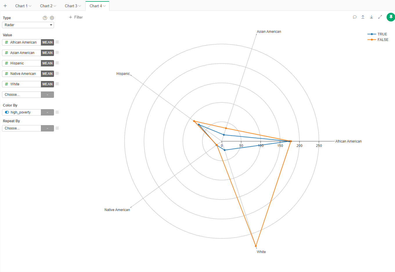
We can see that both high poverty and non-high poverty schools have, in average, a similar population of all races/ethnicities but whites. Non-high poverty schools are larger, mainly because of a disproportiante number of white students.
Is there is a relationship?
Now that we know that we discover that it is a over rerpresentation of white students in non-high poverty schools, let's see if there is a more concrete relationship between the level of poverty (measured by the percentage of students.
- Go back to the schoolData dataset
- Create a new Chart of type Histogram
- In the X Axis select the percentage of white students in the school (wh_pct)
- In the Color (Group By) select if the school is high poverty (high_poverty)
- Change the name to the graph to "White Students per Type of School"
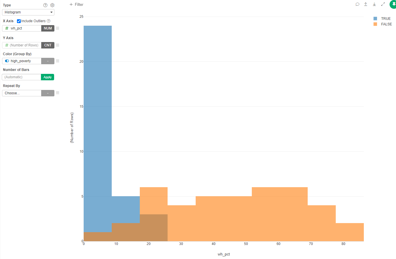
Most of high poverty schools have less than 10% of white students, while very few non-high poverty schools have less than 20% of white students. Also interesting to note is that no high poverty school has more than 25% of white students, while a good proportion of non-high poverty schools could be more than 50% white students.
Now lets create a similar chart for African American students
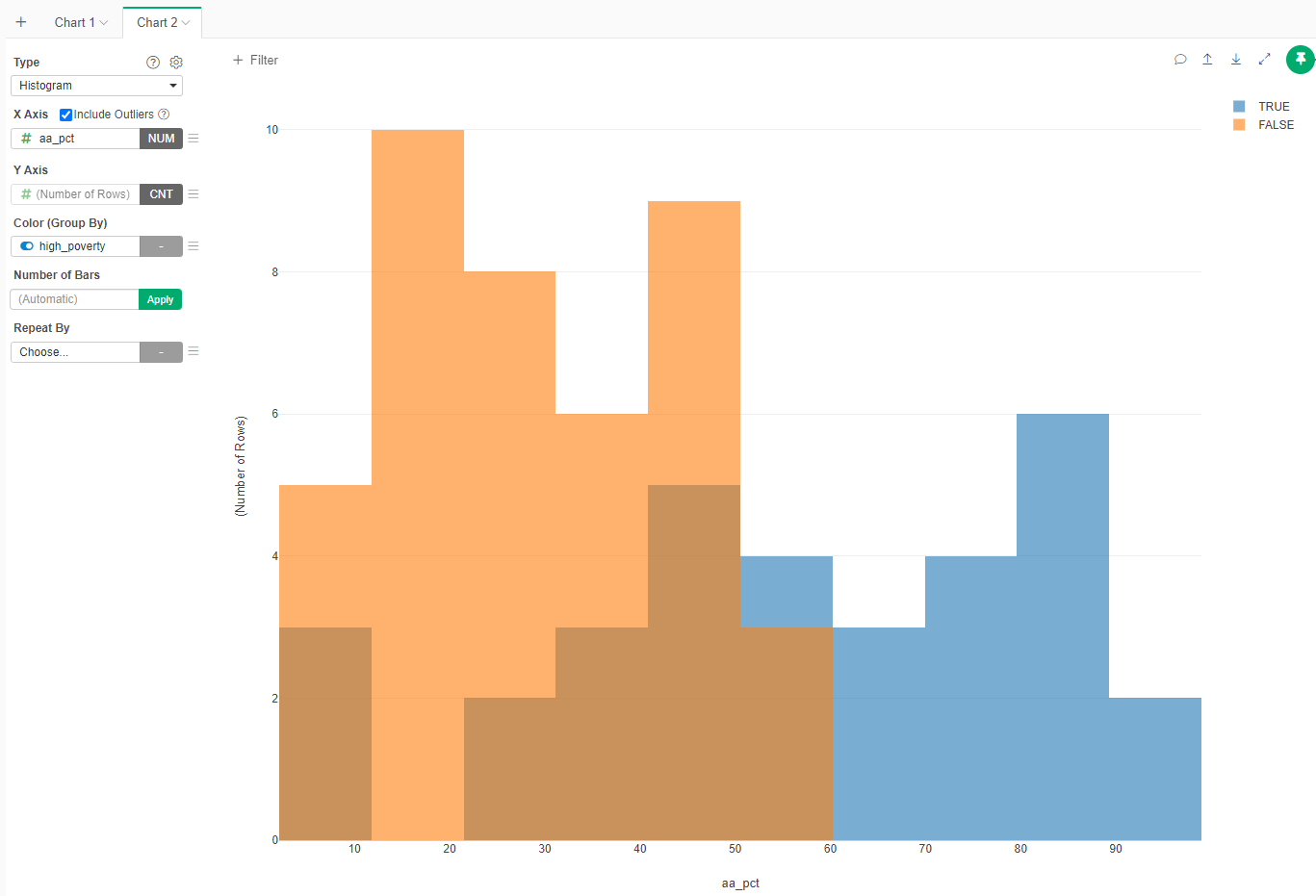
Get your own conclusions.
What kind of relationship?
To see what kind of relationship exists between percentage of white students and the level of poverty of the school, we just create a scatterplot.
- Create a new Chart of type Scatterplot (No Aggregation)
- X Axis is the percentage of white students (wh_pct) and the Y Axis is the percentage of free meals (frpl_pct).
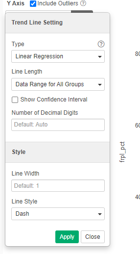
- Add a trend line (three line menu bside Y Axis). Select Linear Regression and deselect confidence interval
- Name the chart "Relation between White Population and Poverty Level"
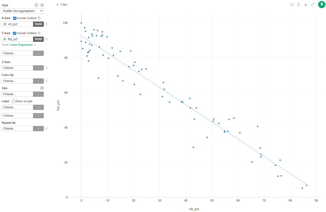
Almost a textbook linear relation!
Let's calculate the Correlation Coefficient.
- Create a new Analytics
- Select Correlation
- Select Variables wh_pct and frpl_pct
- Select the "Data" tab
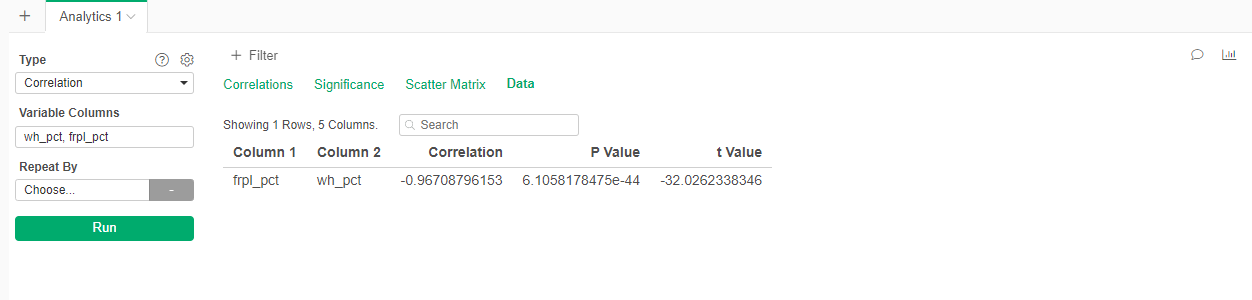
We can see that the correlation coefficent is -0.97!!!! That is almost a perfect correlation.
Your Report
To submit this tutorial you need to create a narrative report analyzing the findings that we obtained by exploring the data in this dataset about the distribution of students of different races/ethnicities among different schools with diverse poverty levels. You should support your analysis with the visualizations that we created (or new ones). Imaging that you are presenting this report to the School Board of this district.
In your report try to also answer the questions of why do you think this is happening (it is ok if it is just an hypothesis.
Submit the link to that report as response to the assignment.