Drawing reference line is now easier! Unlock more analysis without any data wrangling!
Reference lines in charts are crucial for visually indicating specific benchmarks or target values, which helps in understanding data trends more clearly.
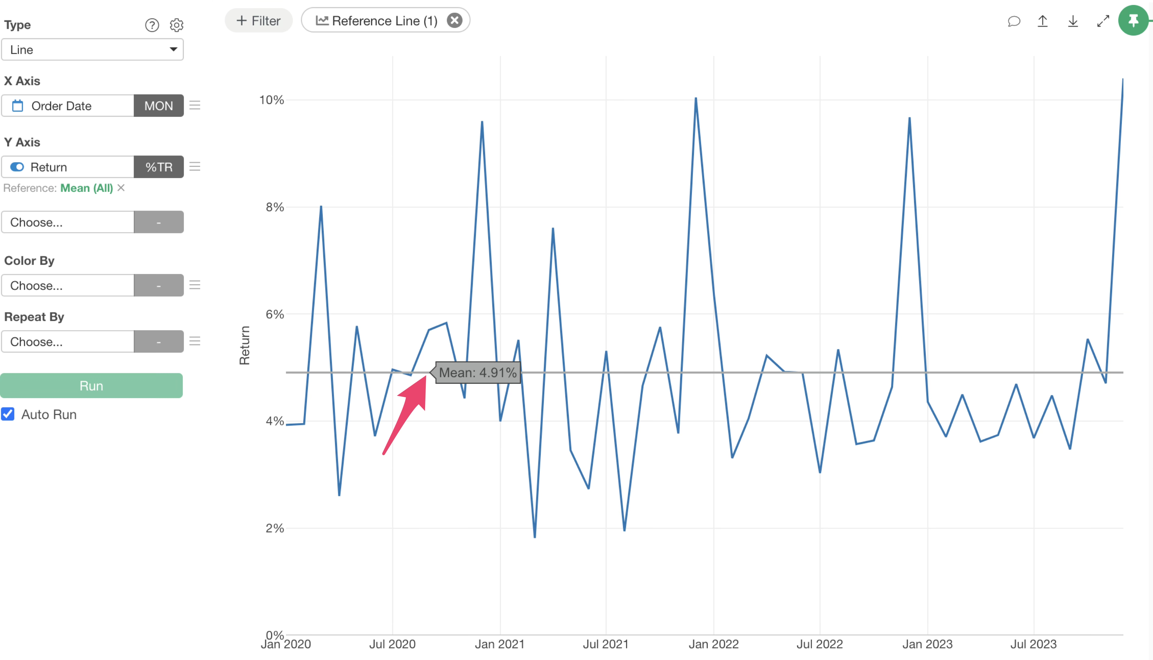
Previously, setting reference lines in Exploratory required selecting values directly from the Y-axis or X-axis menus.
This process often presented a minor hurdle, sometimes hindering the flow of analysis.
With version 14, we have significantly enhanced the reference line drawing capabilities.
Now, you can easily set reference lines, utilize table calculation functions, and draw multiple reference lines simultaneously.
This note will guide you through setting up reference lines with the new UI and highlight the key features of this update.
How to Use the New Reference Line Feature
Setting a Reference Line
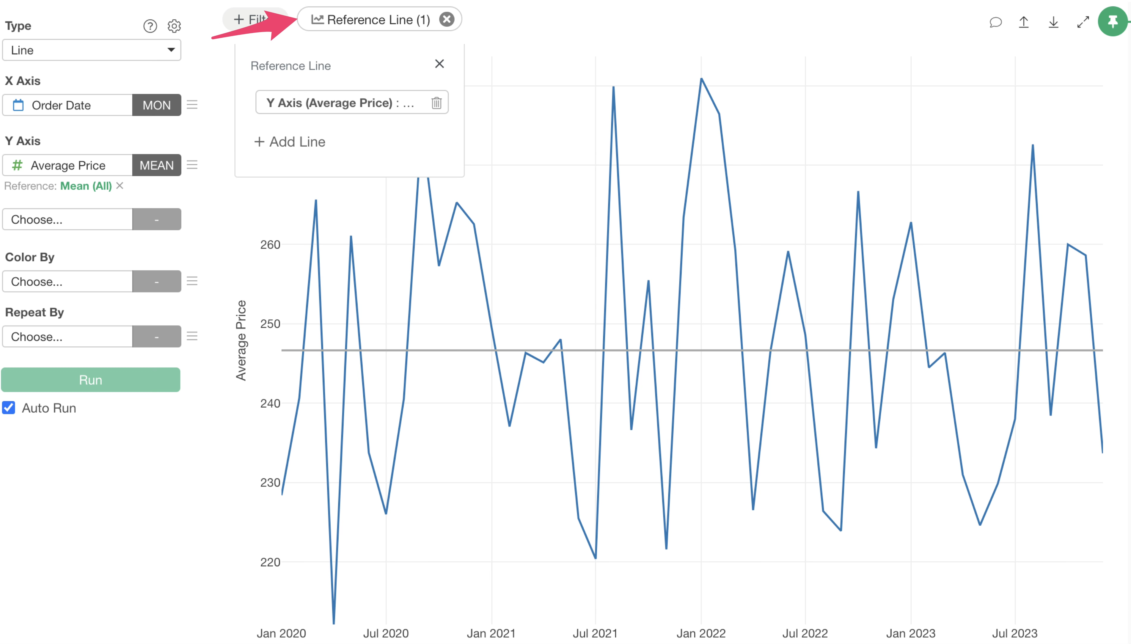
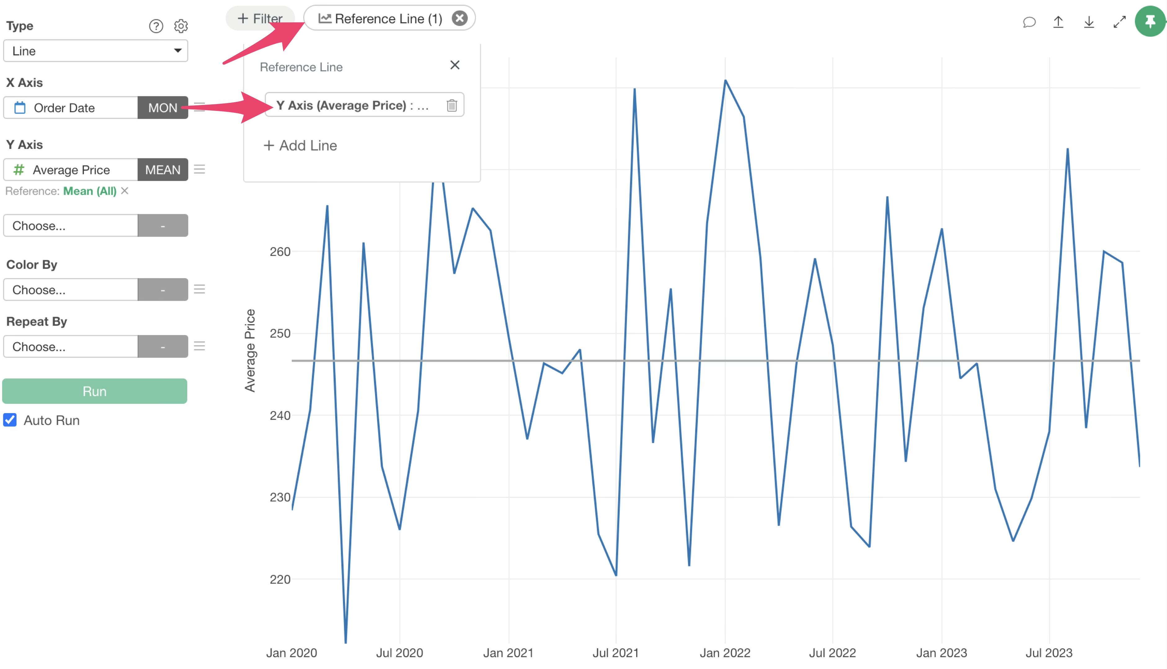
To set a reference line, click the “Line” button at the top of the chart.
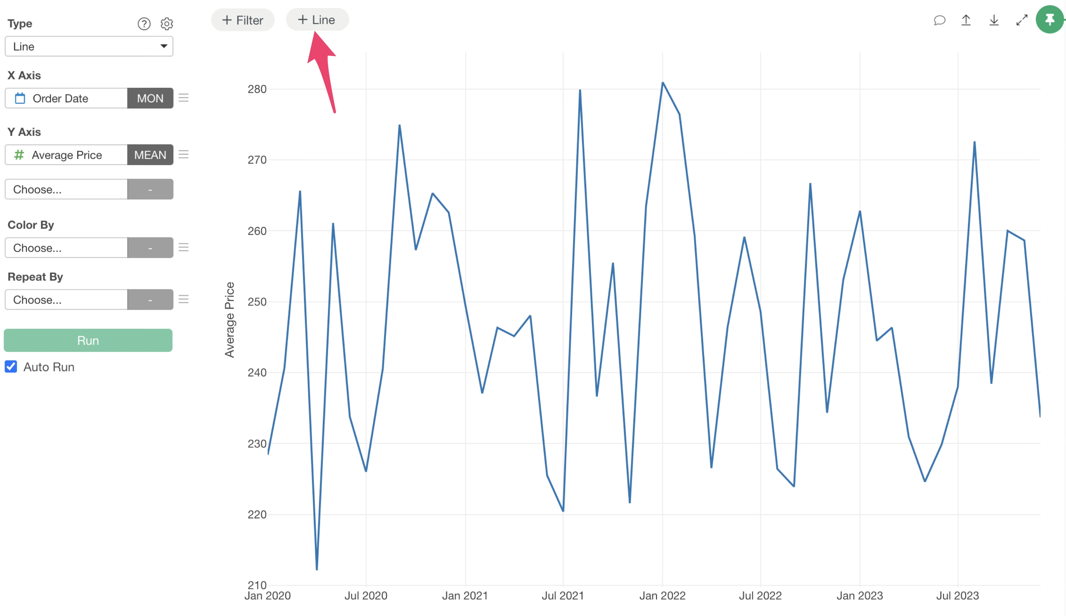
Clicking the “Line” button will display a menu, allowing you to choose whether to draw the reference line on the X-axis or the Y-axis.
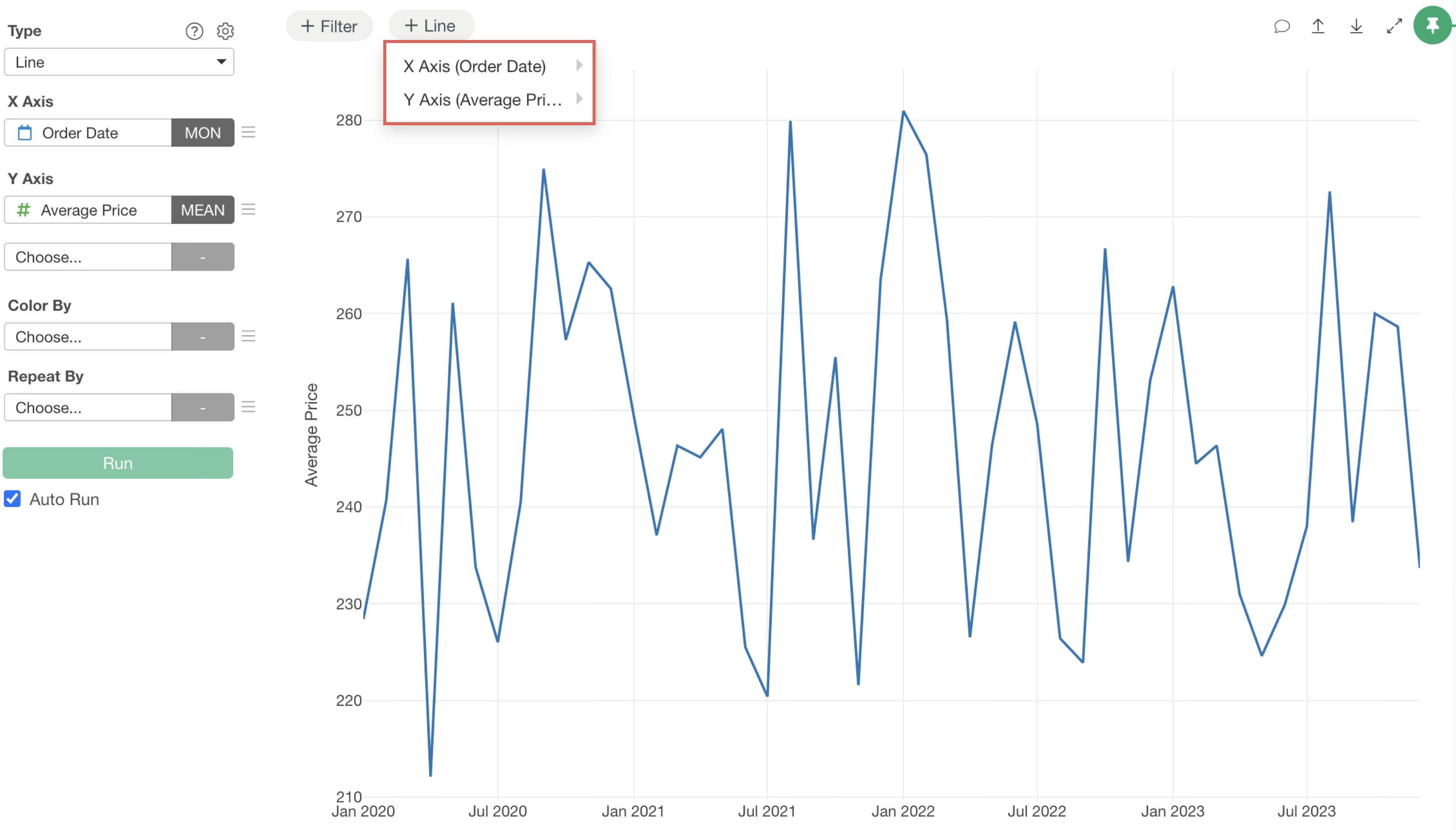
Hovering your mouse over either axis will show the available reference line types.
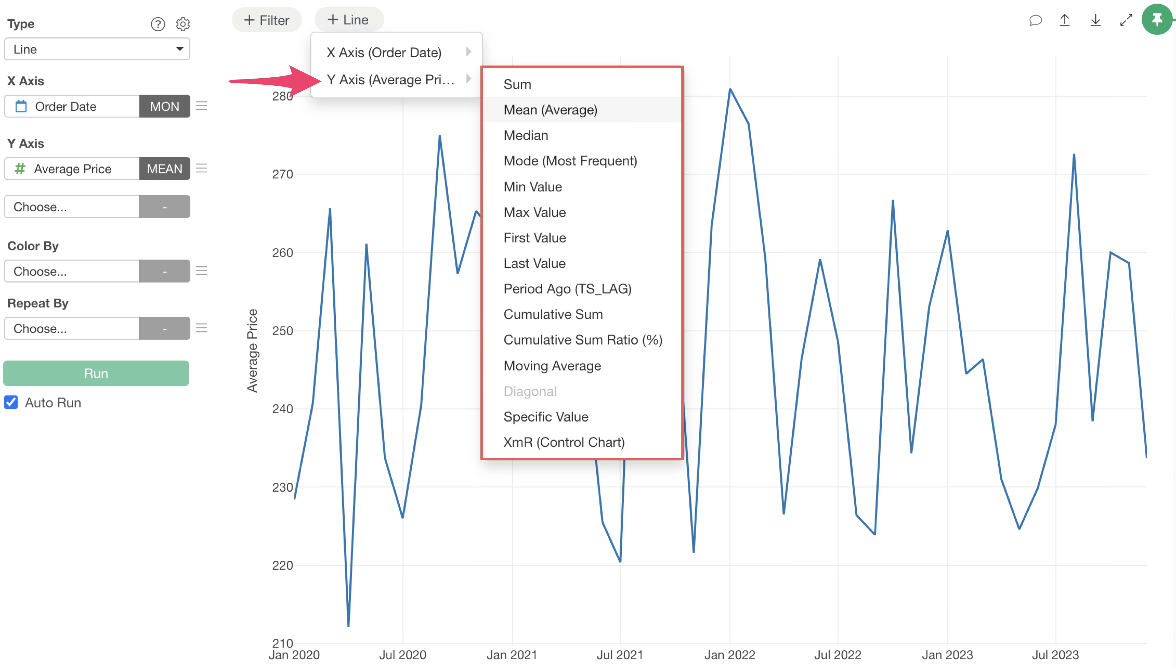
Simply select the type of reference line you wish to draw, and the setup is complete.
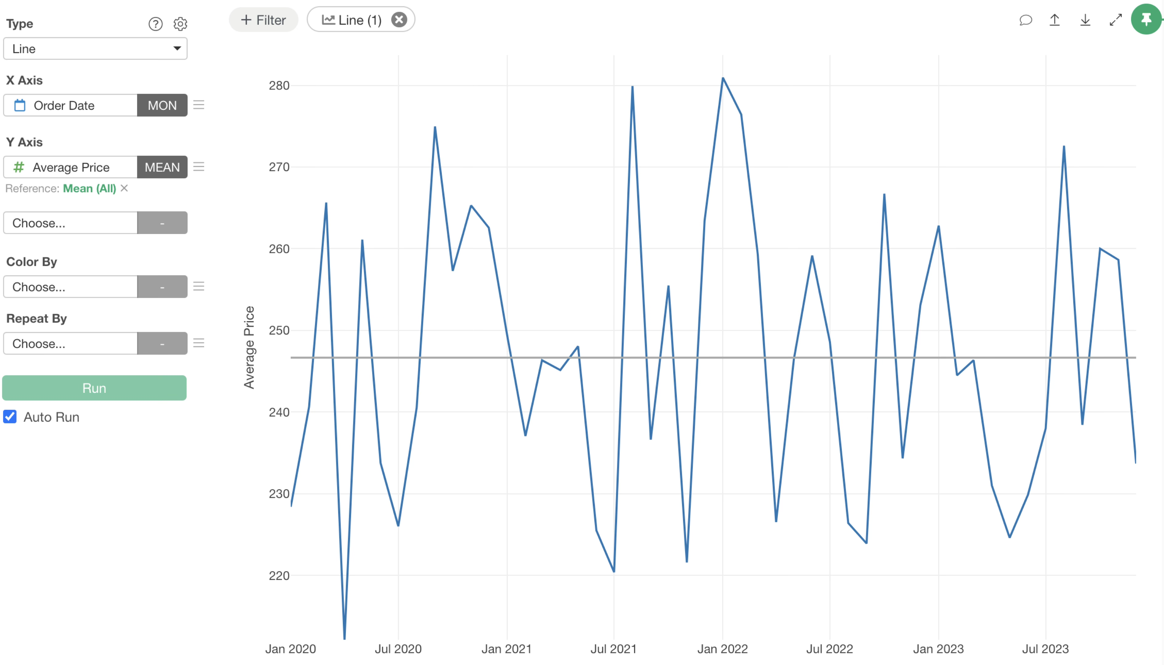
Once a reference line is set, the “Line” button will display the number of currently configured reference lines, allowing you to quickly check their status.
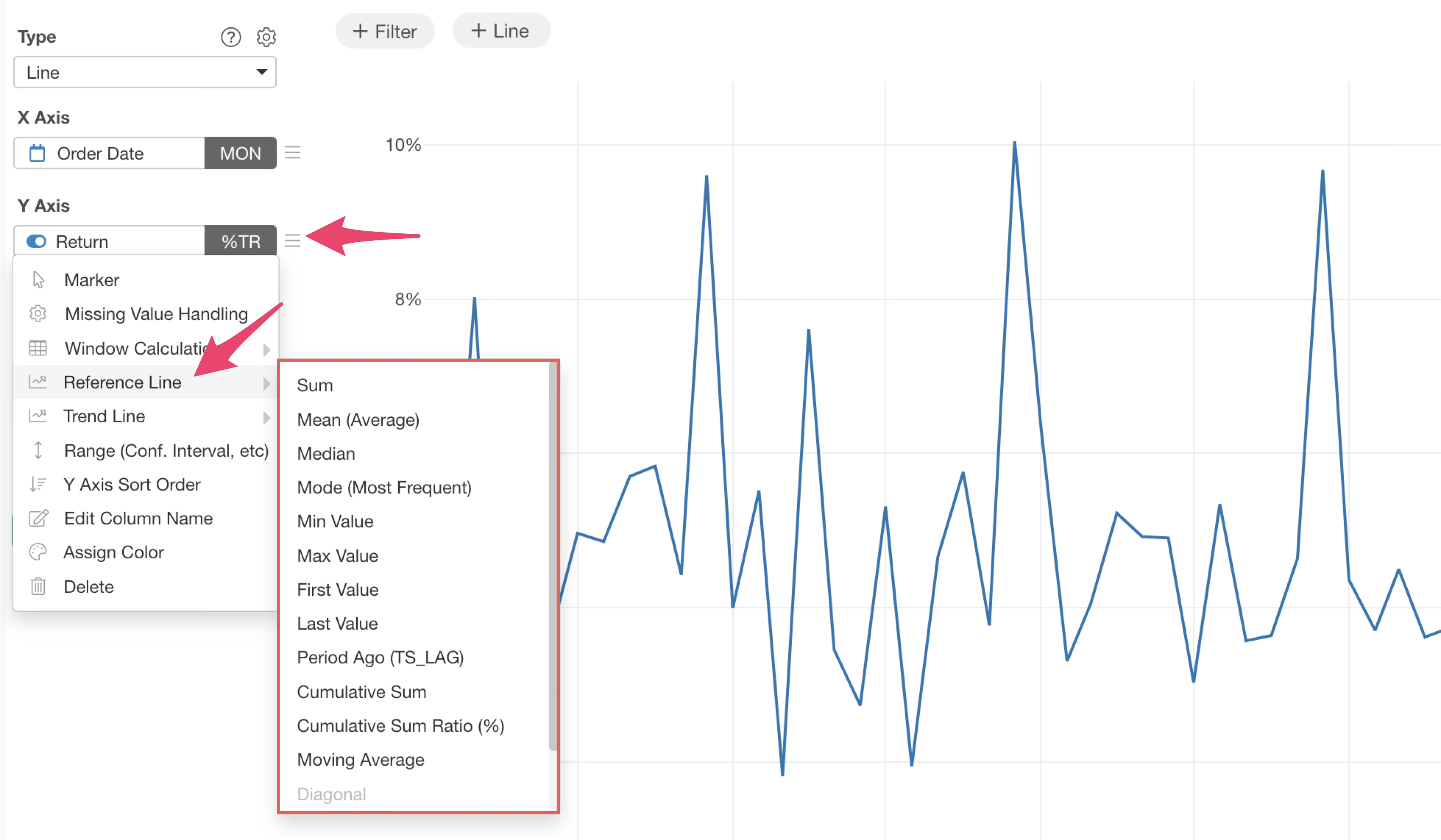
You can still access reference lines from the Y-axis value menu, just as in previous versions.
Setting Multiple Reference Lines
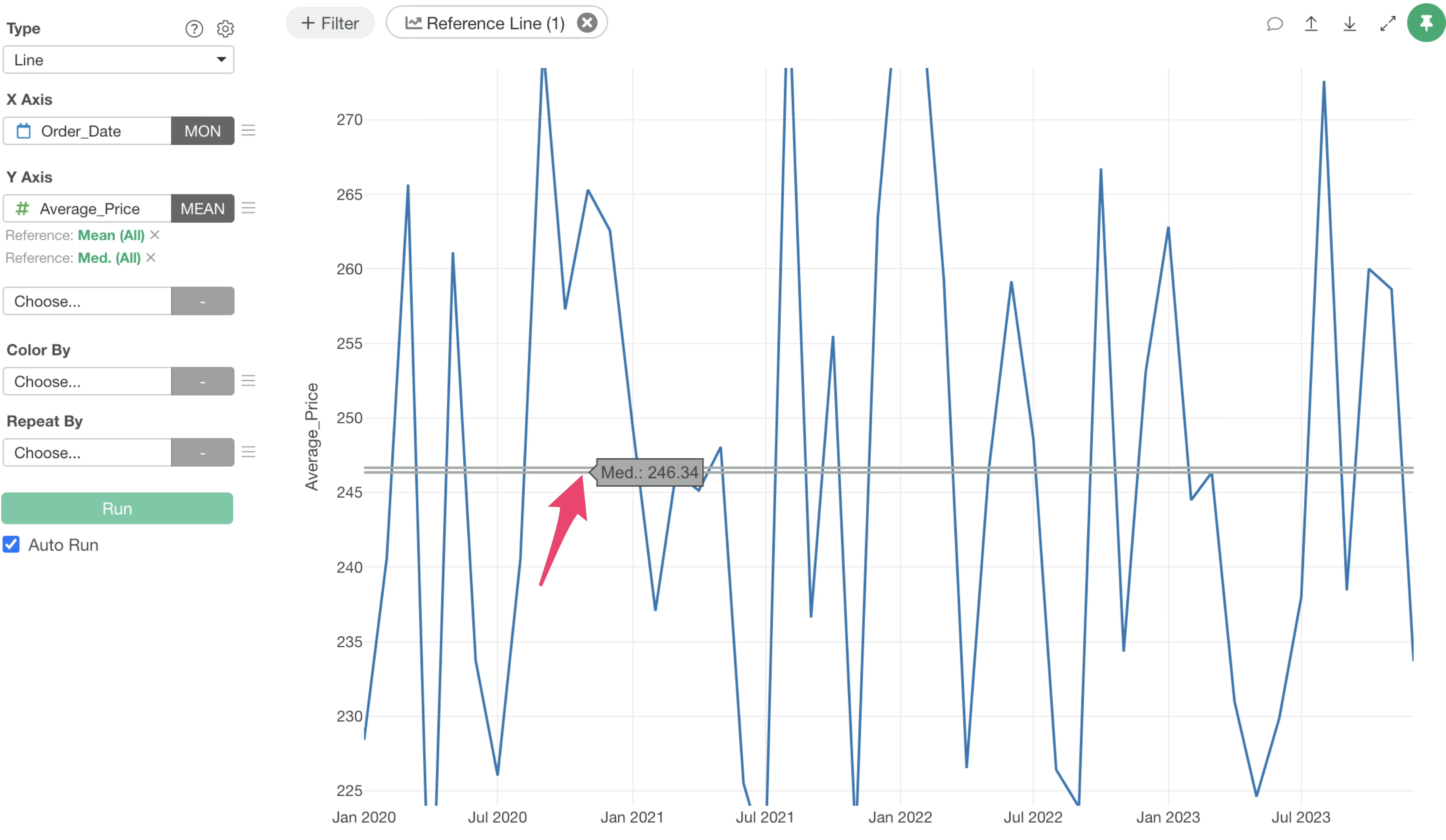
With version 14, you can now draw multiple reference lines for a single value.
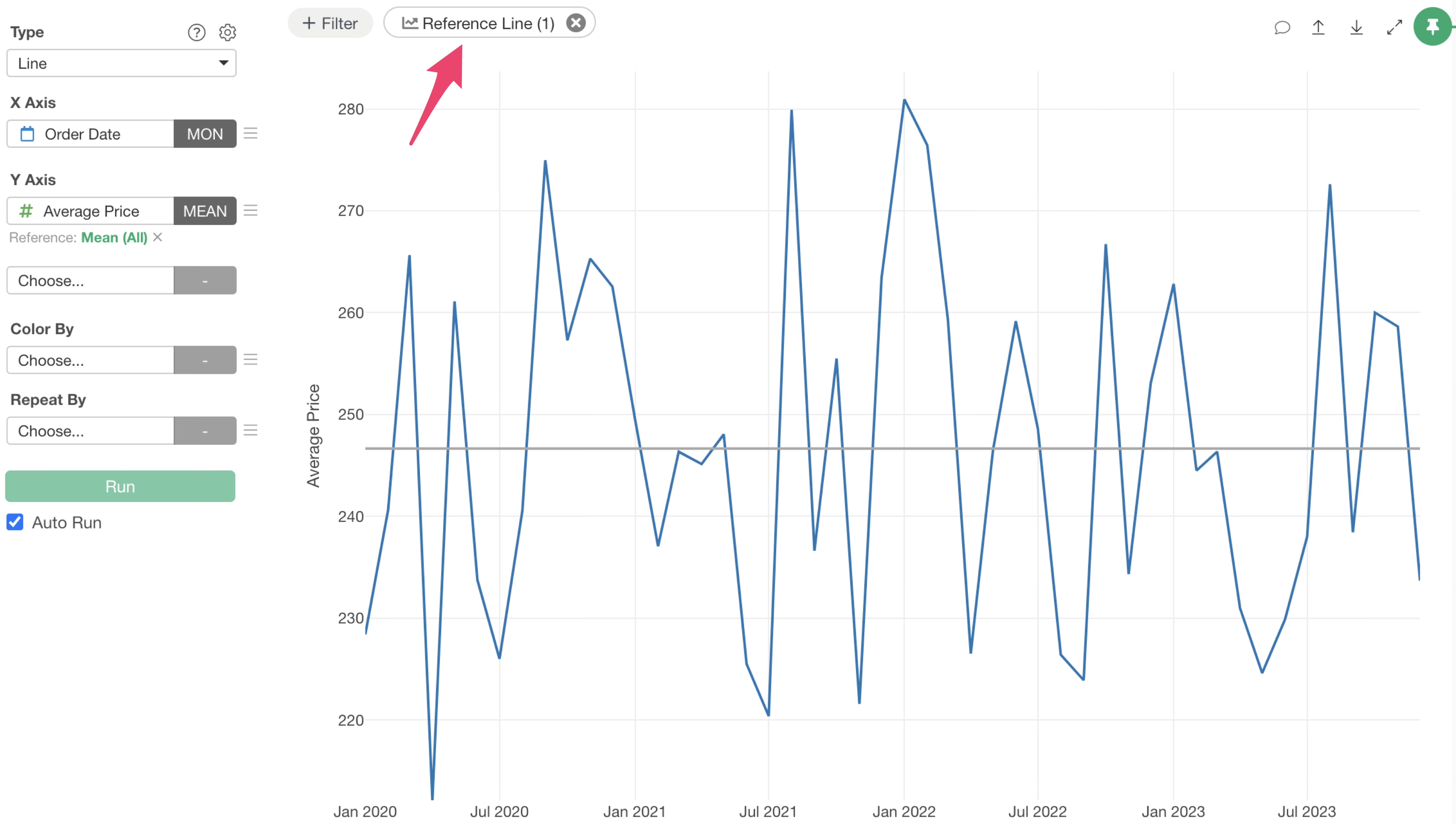
To add more reference lines, click the “Reference Line” button again.
In the displayed reference line dialog, click the “Add Line” button.
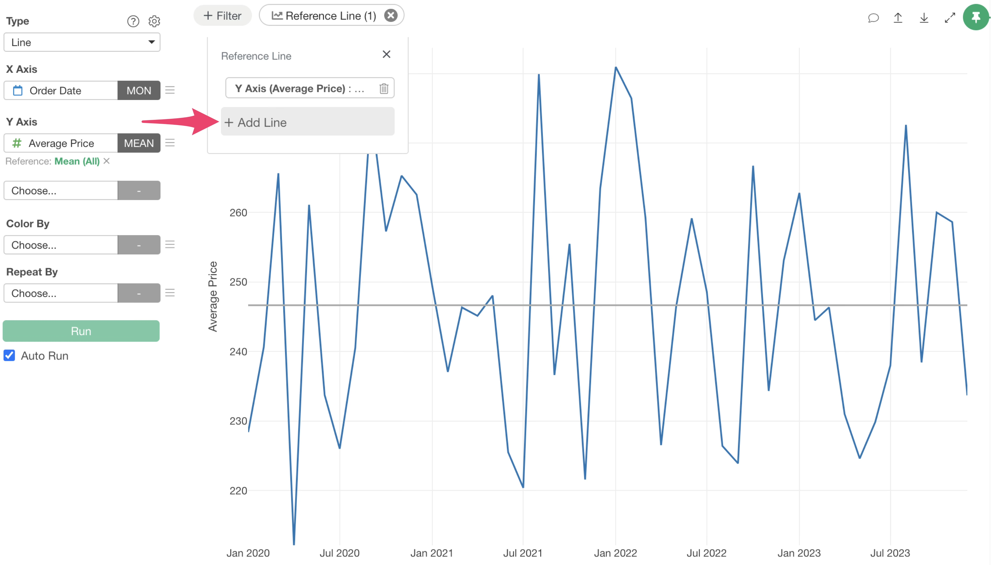
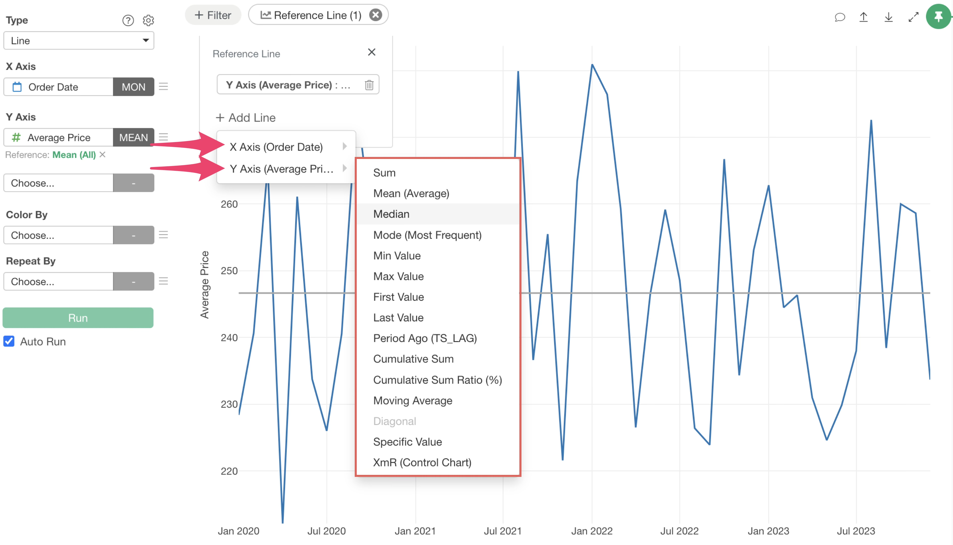
This will allow you to select whether to draw the reference line on the X-axis or Y-axis, similar to the first line, and add it using the same steps.
Adding reference lines this way will display multiple lines for a single value.
Modifying Reference Line Settings
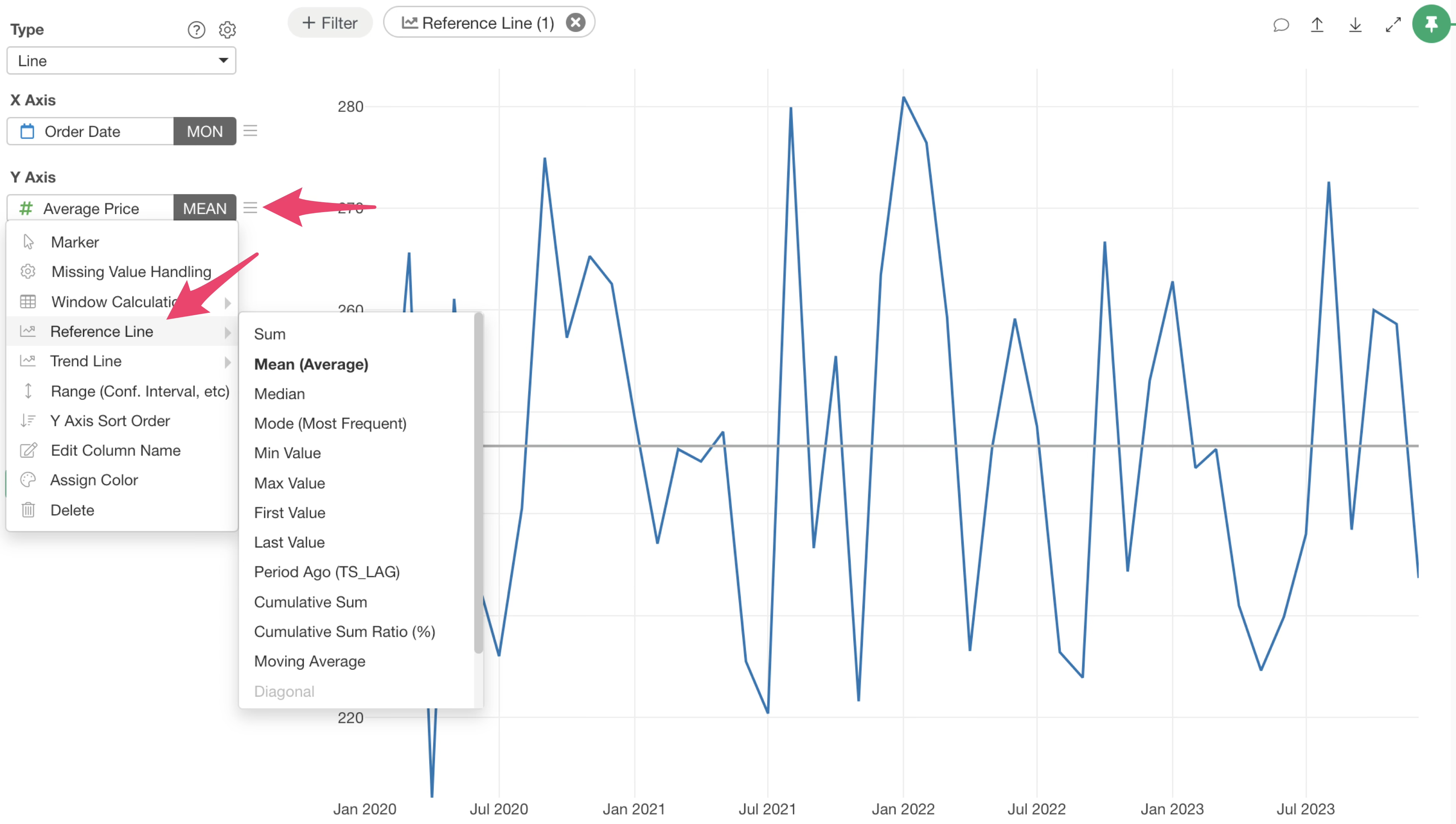
To edit an existing reference line, click the “Reference Line” button and then select the button for the specific reference line you wish to modify.
Alternatively, you can click the green text of the reference line displayed on each axis.
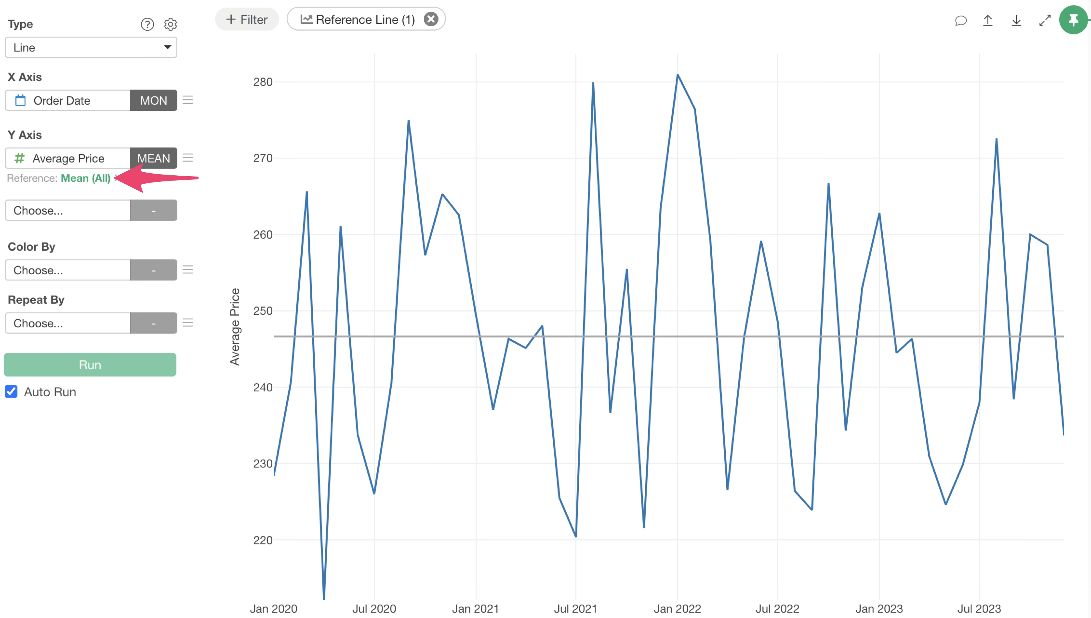
This action will open the reference line settings dialog, where you can adjust detailed settings such as the line type, color, style, and label.
Table Calculation Support
This update significantly expands the types of reference lines you can draw, now supporting reference lines based on the following table calculations:
- Previous Period Value (TS_LAG)
- Cumulative Sum
- Cumulative Sum Percentage (%)
- Moving Average
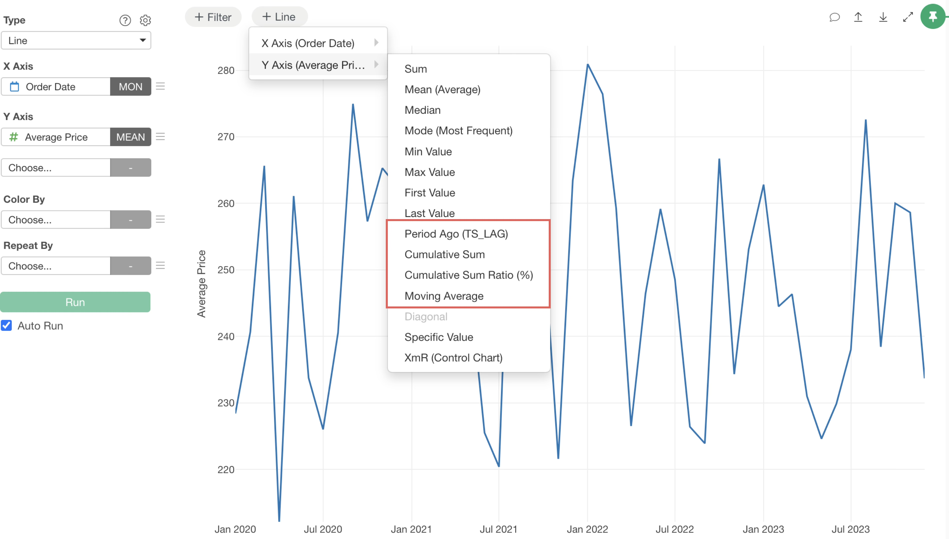
Let’s explore some examples of reference lines using table calculation functions.
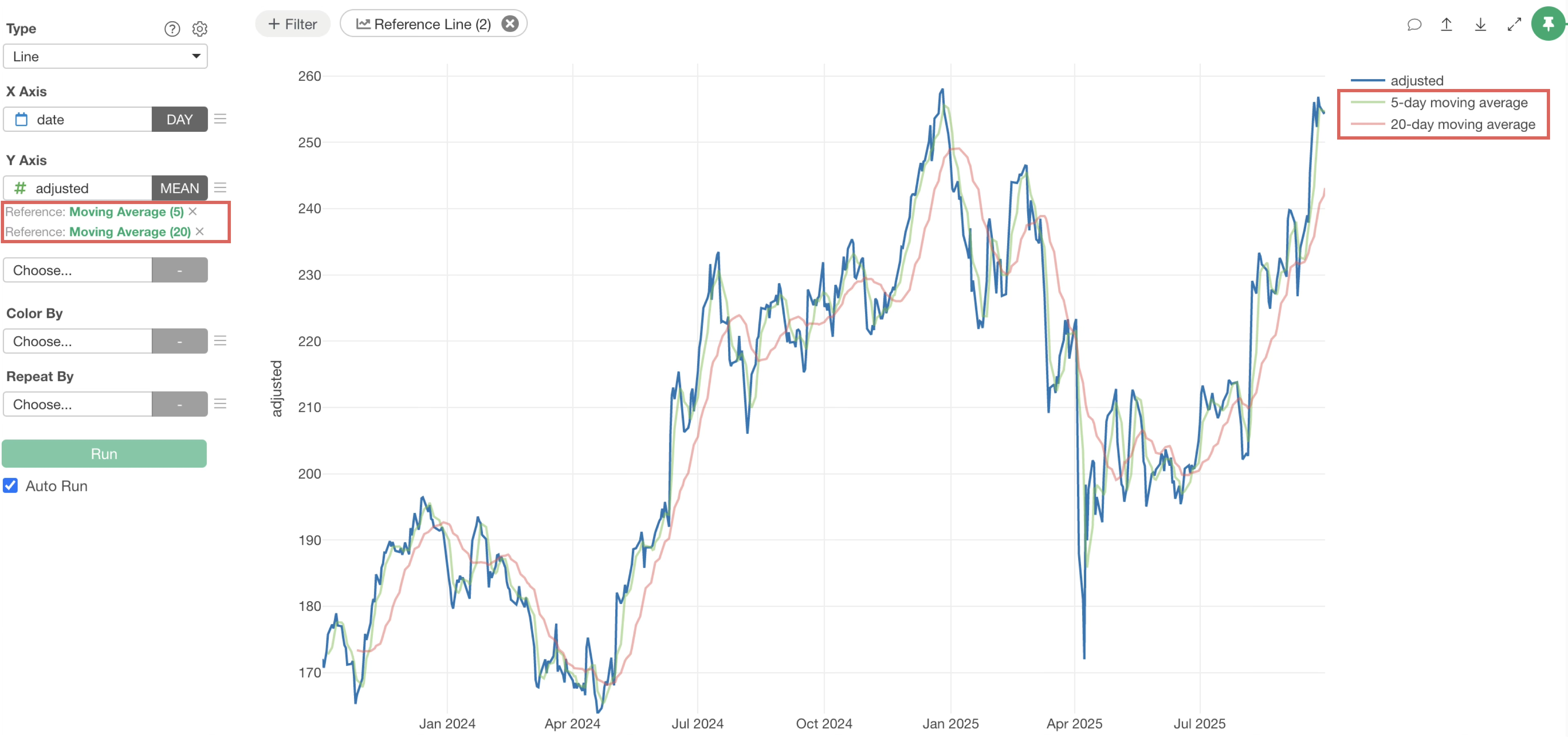
Moving Average
The availability of moving averages as reference lines makes it easier to identify trends in time-series data.
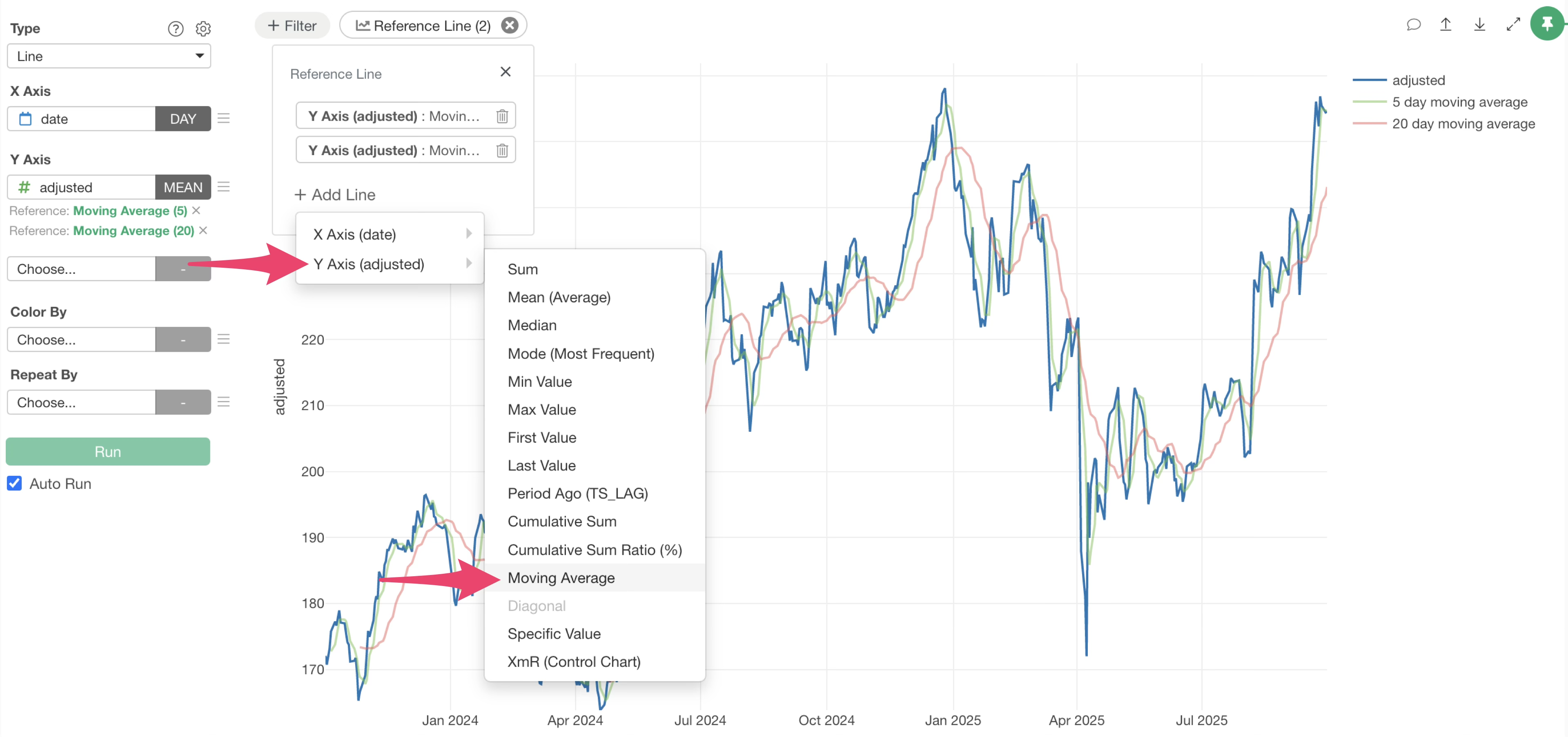
With the ability to draw multiple reference lines, you can now visualize both short-term and long-term trends simultaneously. This allows for a multi-faceted evaluation of trends, such as in stock price movements or sales data fluctuations.
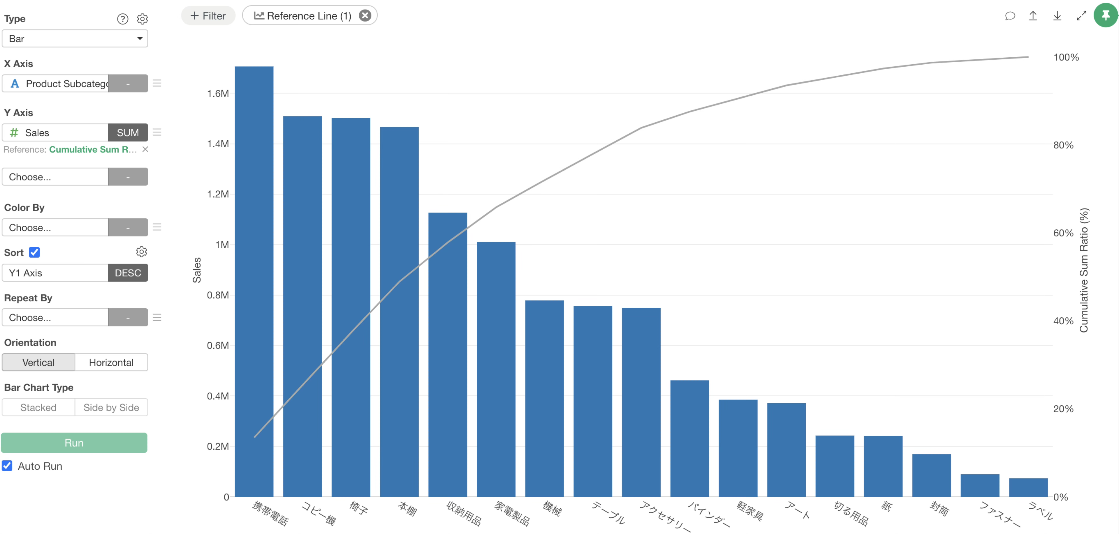
Cumulative Sum / Cumulative Sum Percentage (%)
You can now visualize cumulative sums and cumulative sum percentages as reference lines.
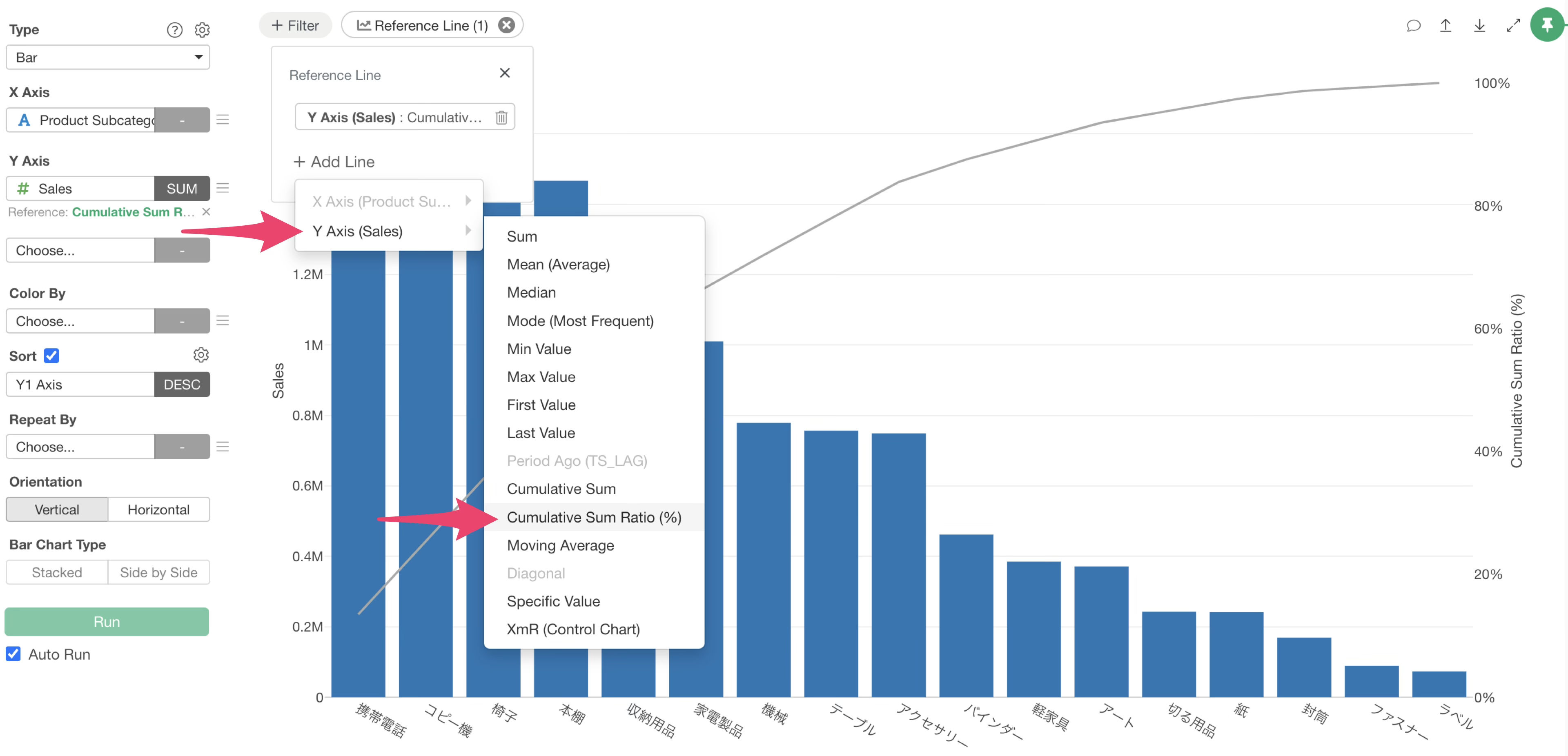
This feature simplifies analyses like Pareto analysis, which relies on cumulative ratios. It is particularly effective for identifying high-contributing customers or product groups based on sales.
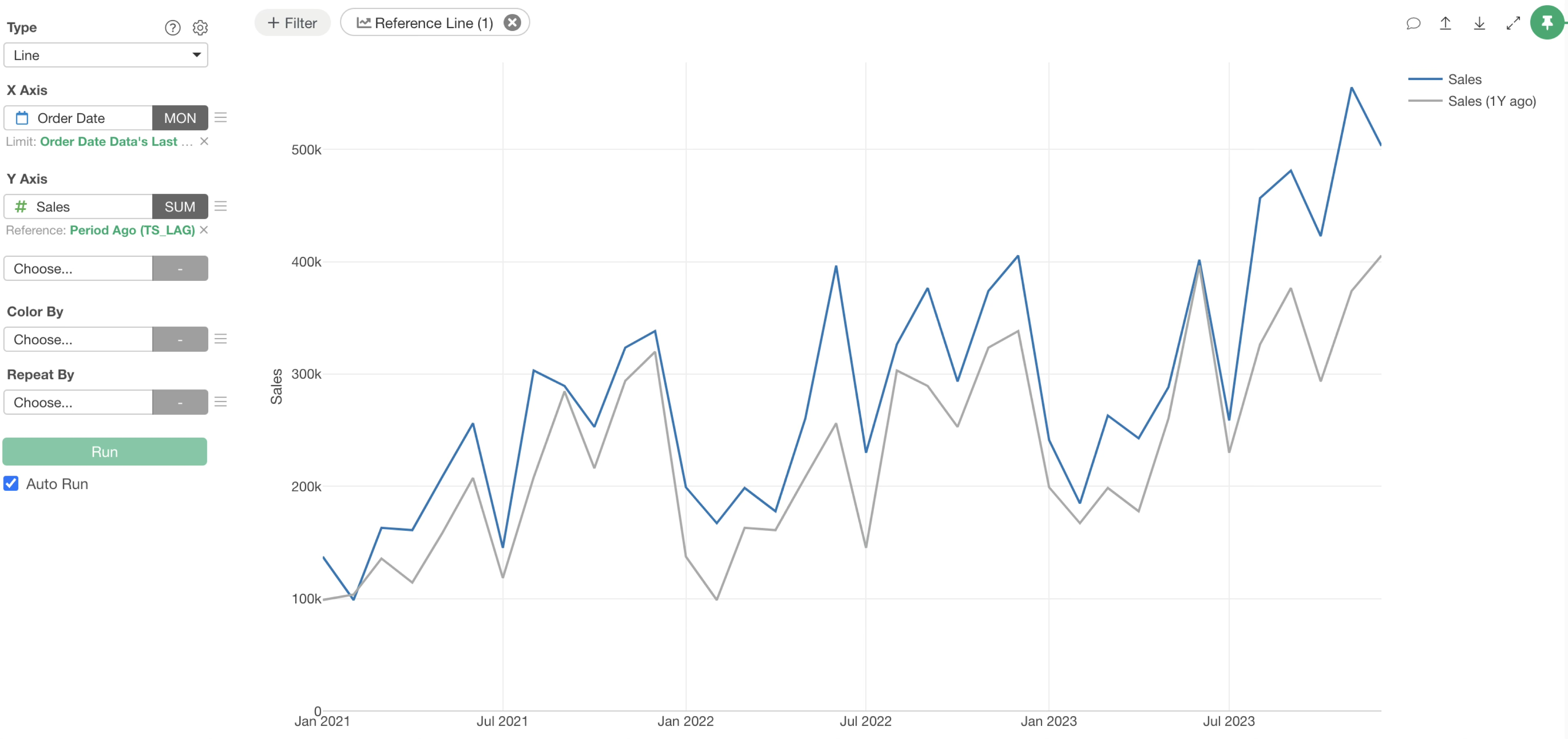
Previous Period Value
While this feature was supported in earlier versions, this update improves its accessibility, making it even easier to use.
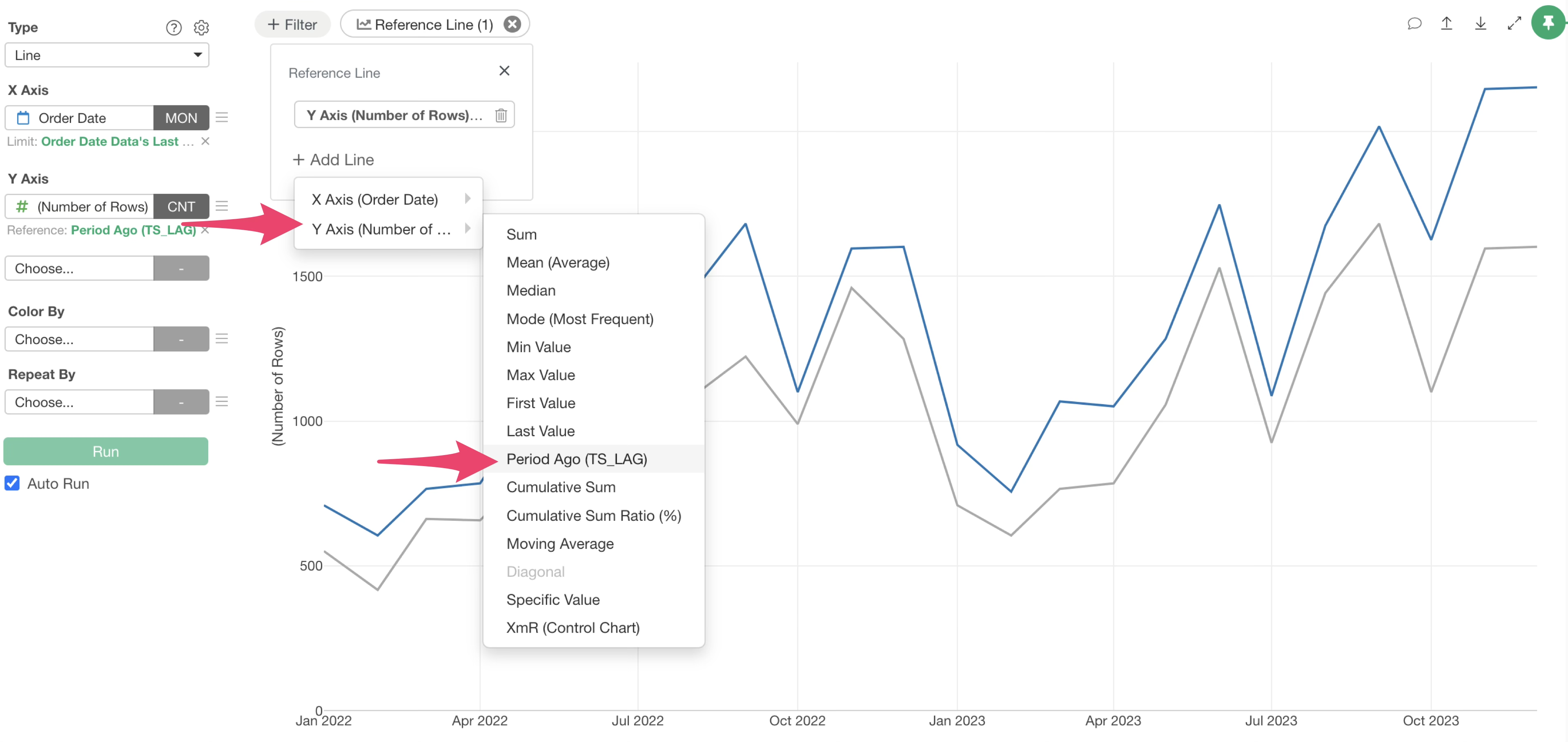
For example, by displaying previous year’s sales data as a reference line against current year’s sales, you can intuitively compare and analyze the growth of specific metrics.
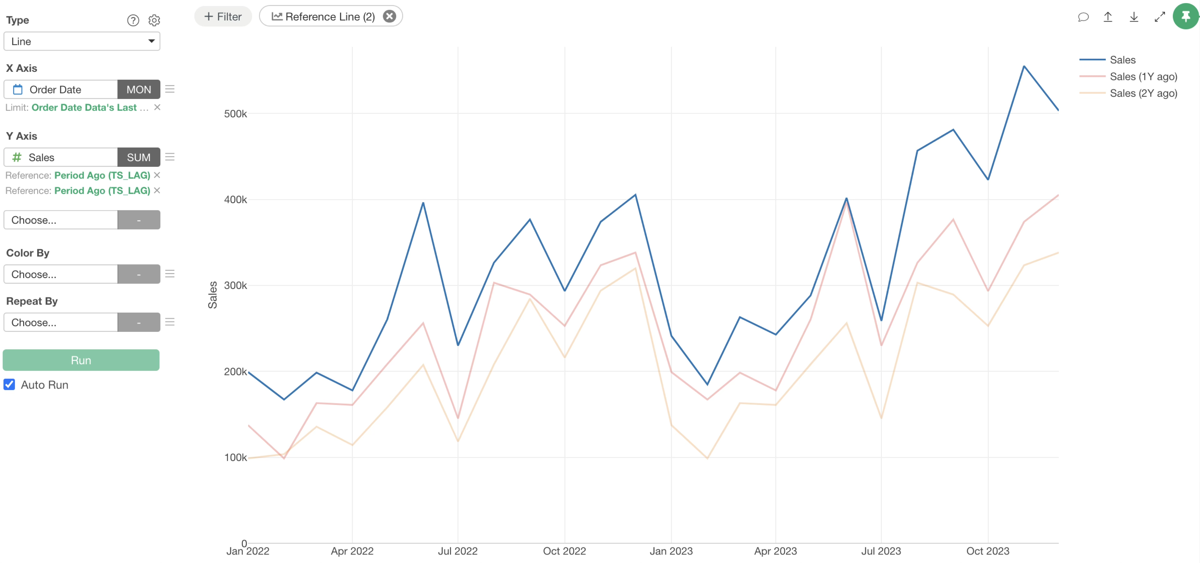
Since drawing multiple reference lines is now supported, you can also visualize sales from one and two years prior simultaneously.
Ready to Experience It?
The “Reference Line” feature in Exploratory v14 is a powerful tool that significantly expands the possibilities of data analysis. We encourage you to experience its ease of use and the depth of analysis it offers firsthand.
Start your 30-day free trial to try out Exploratory’s latest features today.