How to Create a Z-Chart with AI Prompt
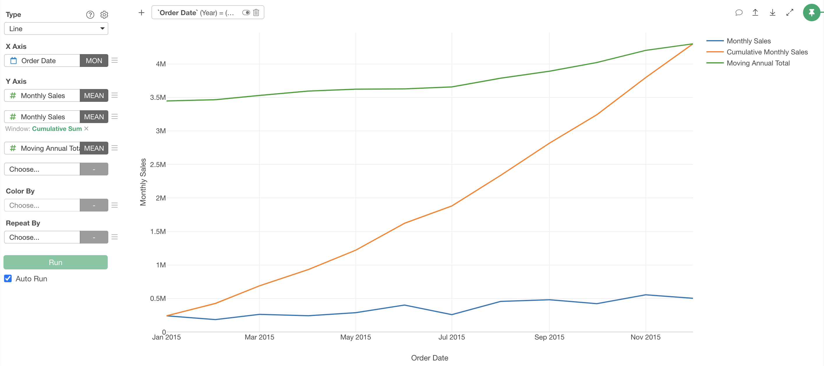
Z-Chart is a visualization technique that simultaneously displays three perspectives—“short-term,” “medium-term,” and “long-term”—in a single chart. These three lines form a shape resembling the letter “Z,” hence the name “Z-Chart.”
A Z-Chart consists of the following three elements:
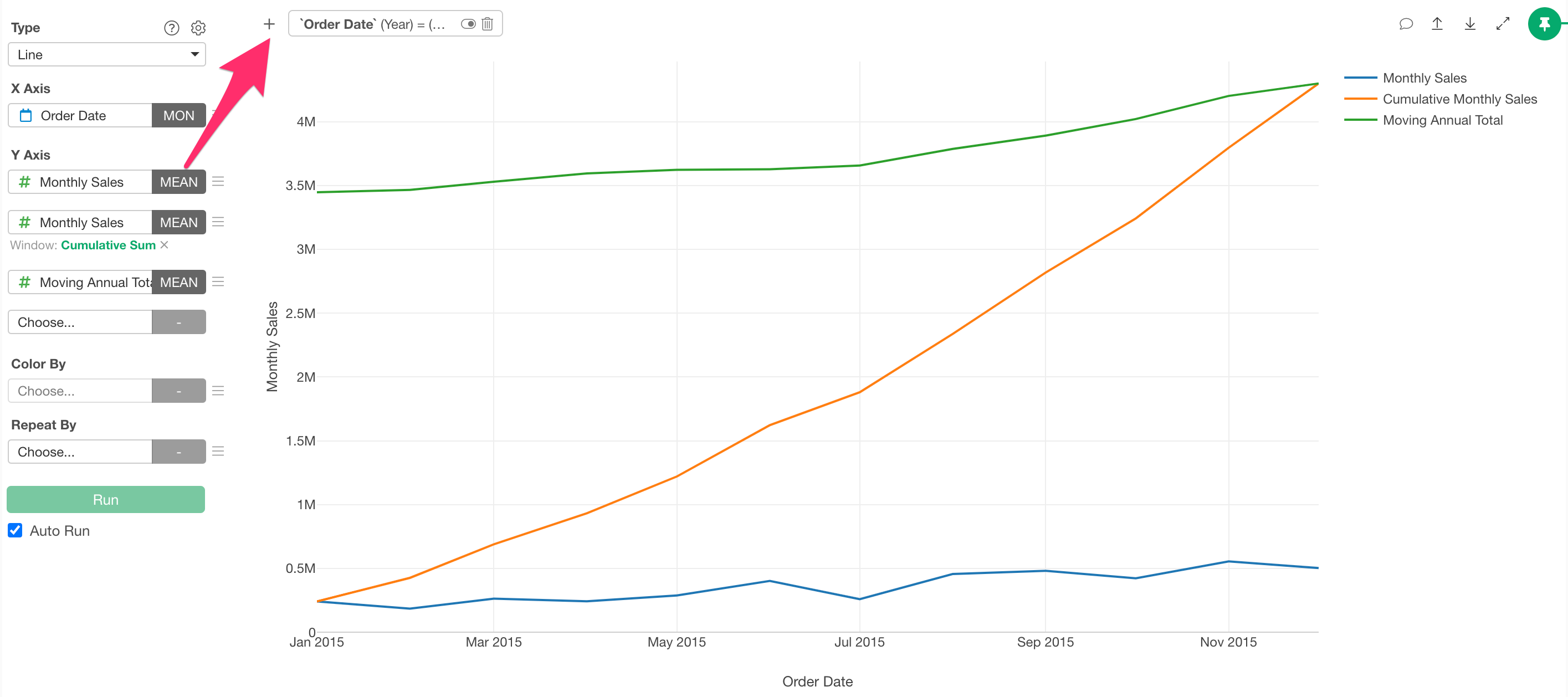
Short-term: Monthly performance (single month data): Shows individual values such as monthly sales, allowing you to check short-term fluctuations.
Medium-term: Cumulative total (accumulated from the beginning of the year): Represents the cumulative value from the beginning of the year to the current month, helping you understand progress toward annual targets.
Long-term: Moving total (sum of the past 12 months): Continuously updates to show the total value of the most recent 12 months, allowing you to confirm long-term trends.
By overlaying these three elements on a line graph, you can analyze business performance from multiple angles, making it especially suitable for continuous monitoring of time-series data.
Applications of Z-Charts
Z-Charts are versatile analytical tools that can be utilized across various industries and departments. They are particularly effective in the following areas:
Executives and Managers
Executives and managers can use Z-Charts to comprehensively understand the health of their business.
By simultaneously checking not only monthly figures but also annual progress and long-term trends, more strategic decision-making becomes possible.
For example, even if a single month’s sales are lower than the same month in the previous year, if the moving total line shows an upward trend, the business as a whole can be judged to be growing. Conversely, if monthly data is increasing but the moving total line shows a downward trend, there may be long-term issues that need to be addressed.
Sales Departments
For sales managers and representatives, Z-Charts are useful for measuring the effectiveness of sales activities.
The effects of campaigns and initiatives can be immediately confirmed through monthly data, while progress toward annual targets can be understood through the cumulative line. Even in industries susceptible to seasonal variations, the moving total line helps determine genuine changes in sales capabilities.
Product Managers
In product lifecycle management, Z-Charts help identify the current stage of a product.
For new products, monthly and cumulative figures may increase rapidly while the moving total rises more gradually. For mature products, the three lines tend to move almost in parallel, while in the decline phase, the moving total line typically begins to descend first.
Creating a Z-Chart with AI Prompt
In this example, we’ll use data where each row represents a single order line item to create a monthly sales Z-Chart using AI Prompt.
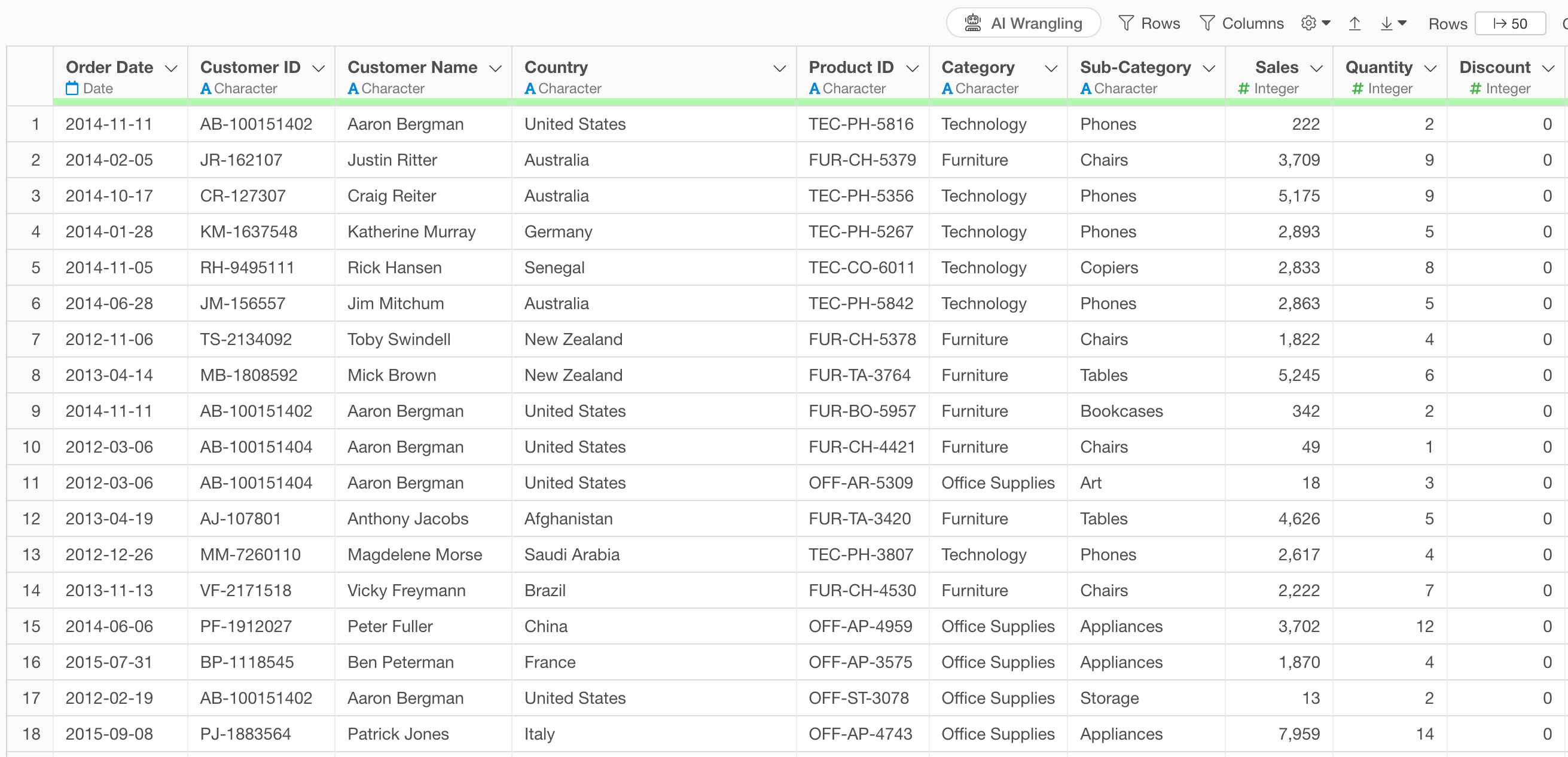
The data includes information such as order date, product category, subcategory, product name, sales, and more.
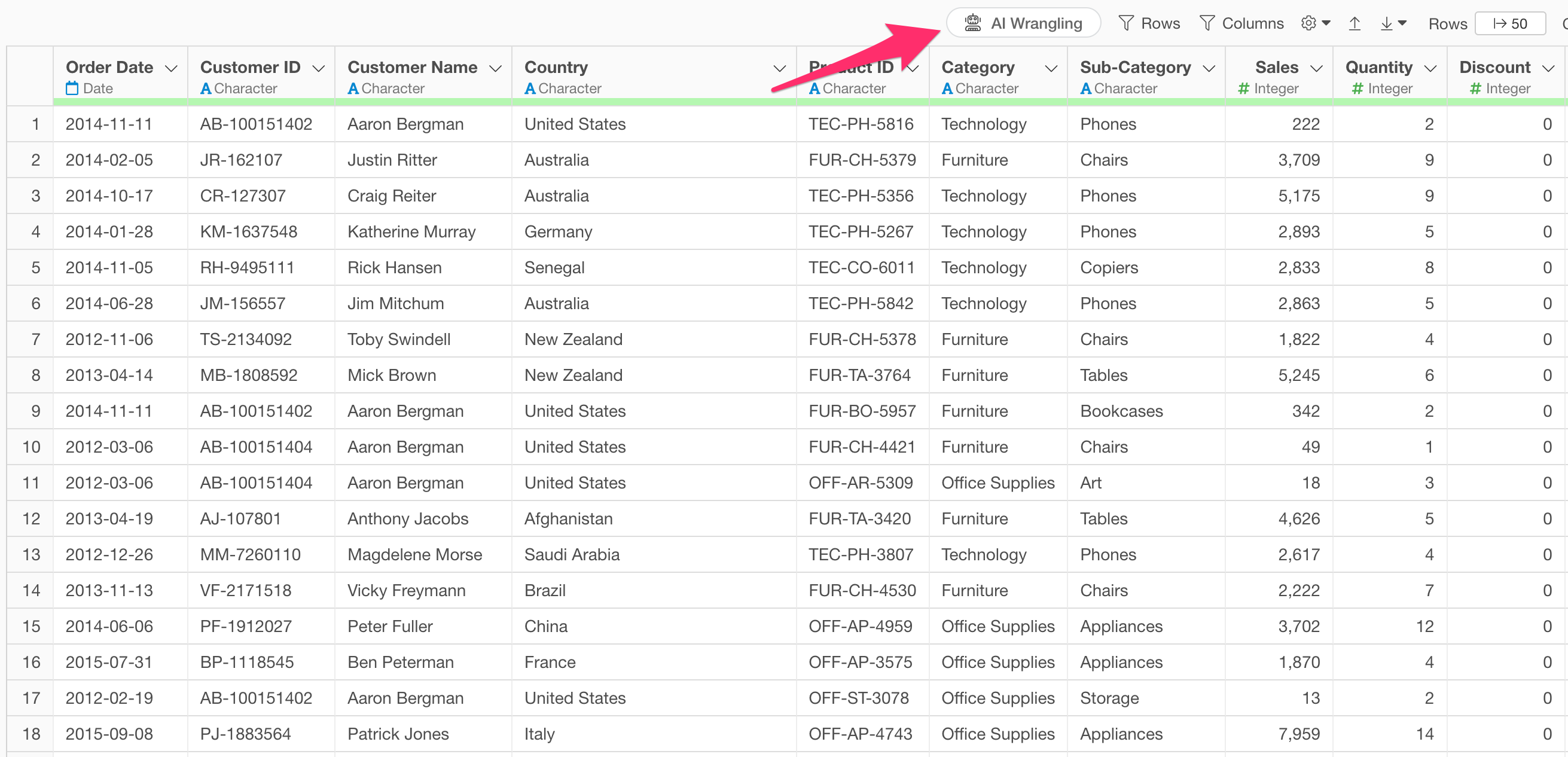
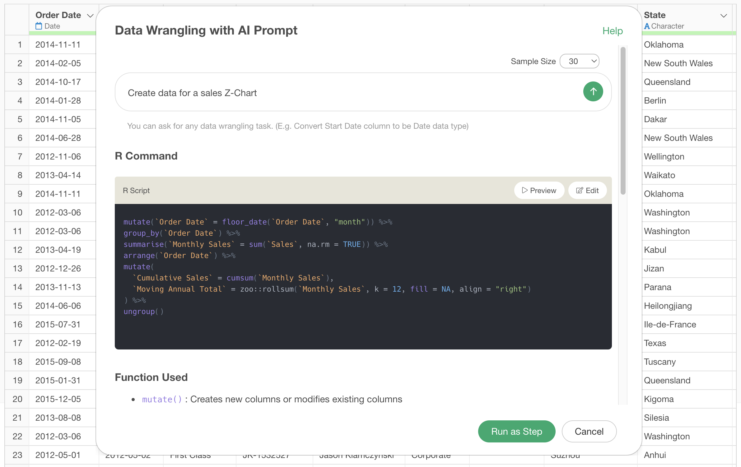
Click on the “AI Wrangling” button.
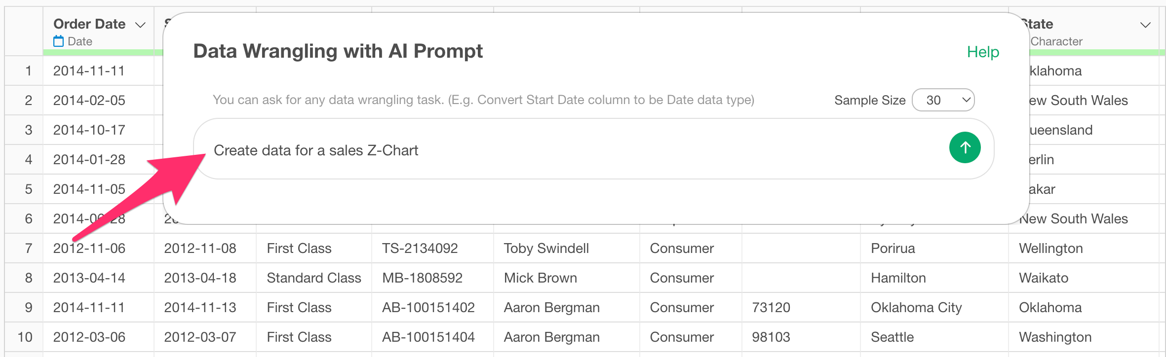
When the AI Prompt dialog opens, enter the following text and execute:
Create data for a sales Z-Chart
This will generate code to create a Z-Chart.
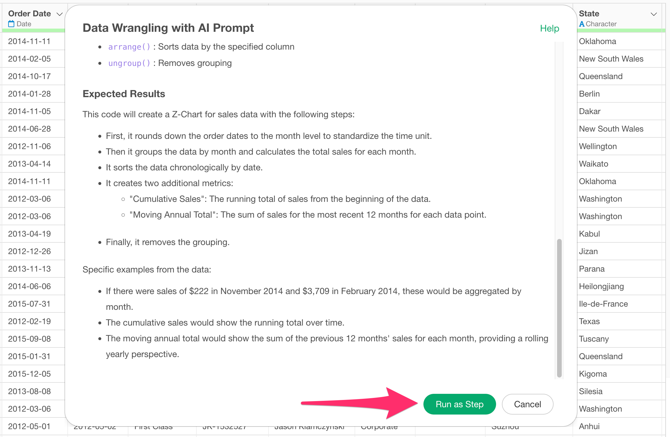
Review the explanation of the functions used and the expected results to ensure that the Z-Chart data will be generated appropriately, then click the “Run as Step” button.
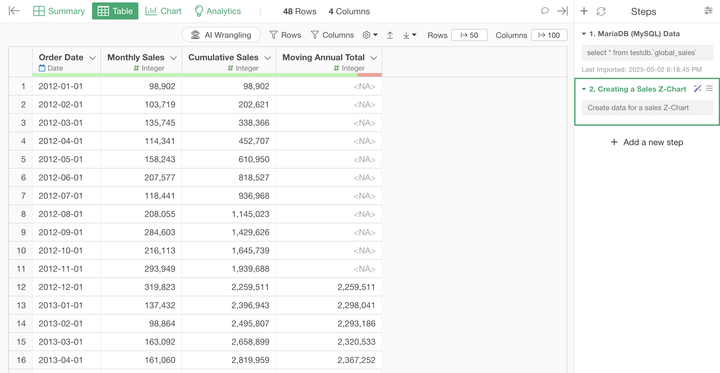
The step is added, and the Z-Chart data has been calculated.
Now you just need to create a line chart with date on the X-axis, sales (monthly performance) on the Y1-axis, cumulative sales on the Y2-axis, and moving total on the Y3-axis.
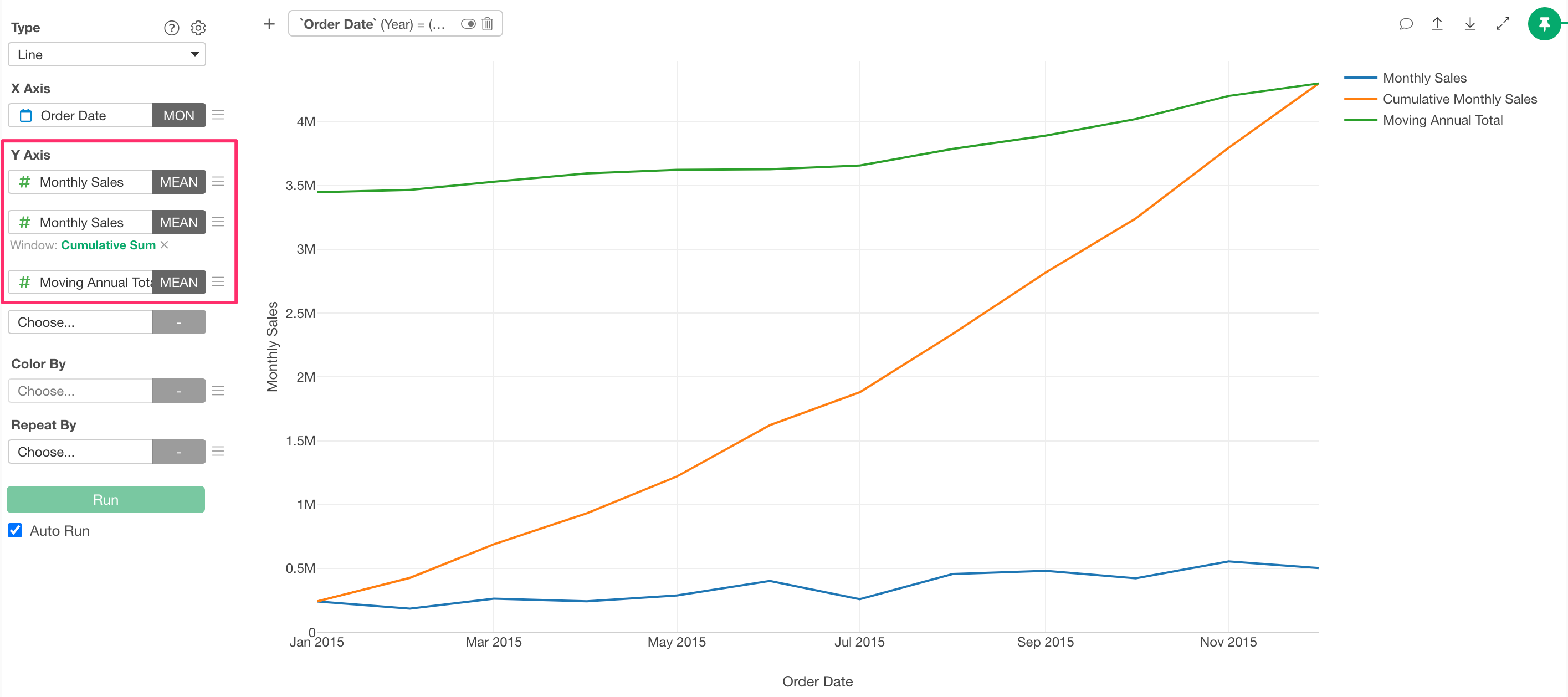
Note that since this data includes sales from multiple years, you’ll need to set a filter to focus on the most recent year’s data.
Summary
In this article, we introduced how to create a Z-Chart using Exploratory’s AI feature, “AI Prompt.”
Previously, creating a Z-Chart required knowledge of data aggregation methods, calculation techniques, and the skills to implement them. With Exploratory, you can quickly create Z-Charts using natural language!
If you haven’t used Exploratory before, please try the 30-day free trial!