Introducing “Guided Analytics” for Everyone to Understand Analysis Results
Have you ever had these experiences when performing data analysis?
- “I was able to run the analytics, but I don’t understand what this chart means…”
- “There are too many tabs to look at, and I end up getting lost about which one to focus on…”
- “When explaining analysis results to my boss, I don’t know how to explain them due to a lack of specialized knowledge…”
With conventional data analysis tools, analysis results were output, but there was a problem where users couldn’t understand “how to interpret these results” or “what they mean.” Even if analytics could be performed, they couldn’t be correctly understood and fully utilized for business.
Common points of frustration in data analysis are as follows:
- Barrier of Technical Terms: Not understanding the meaning of statistical terms such as “P-value,” “coefficient,” and “R-squared”
- Interpretation of Results: Charts are displayed, but it’s unclear what to look at or what the key points are
- Difficulty in Explanation: Not knowing how to explain results to a boss or team members due to a lack of specialized knowledge
Due to these issues, many people likely gave up, thinking “data analysis is difficult” or “it’s too early for me.”
Therefore, with the “Guided Analytics” feature added in v13, detailed explanations on how to view each chart and analysis methods are automatically displayed, making analysis results understandable even for beginners.
Below, we will introduce what kind of results are displayed for each type of analytics.
Hypothesis Testing
Exploratory supports various Statistical tests methods.
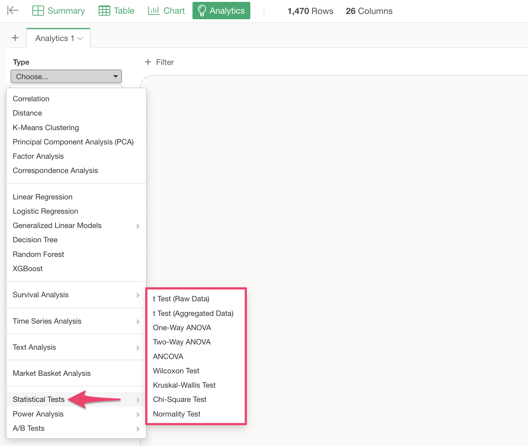
This time, we will introduce the results of Guided Analytics based on the execution results of a t Test.
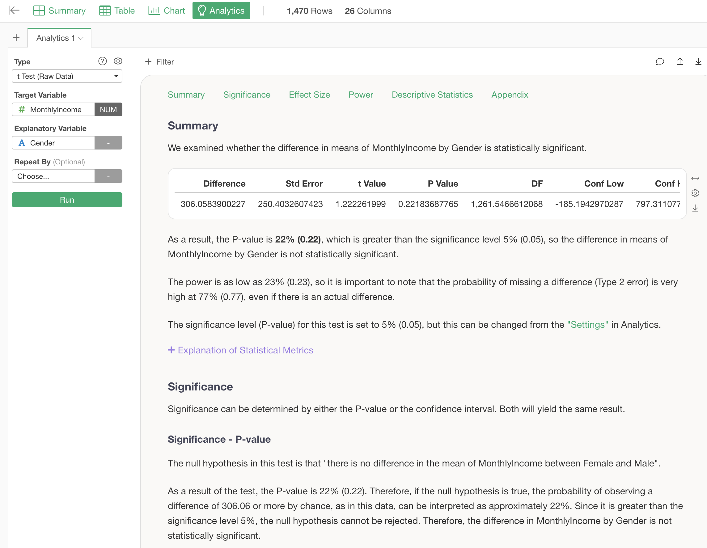
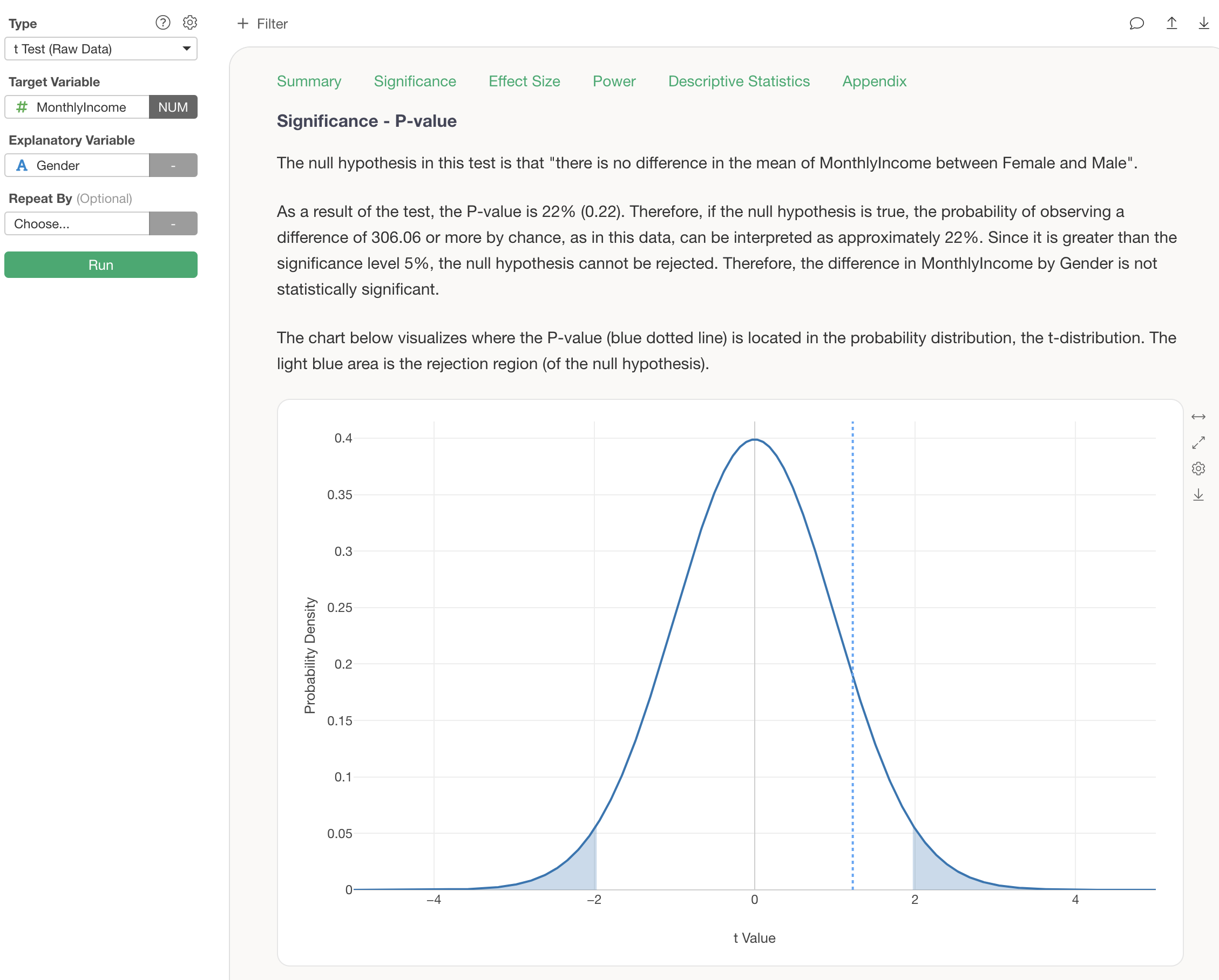
When performing tests such as the t-test, the results of the test, specifically whether they are “statistically significant” or not, are explained based on the P-value below the summary.
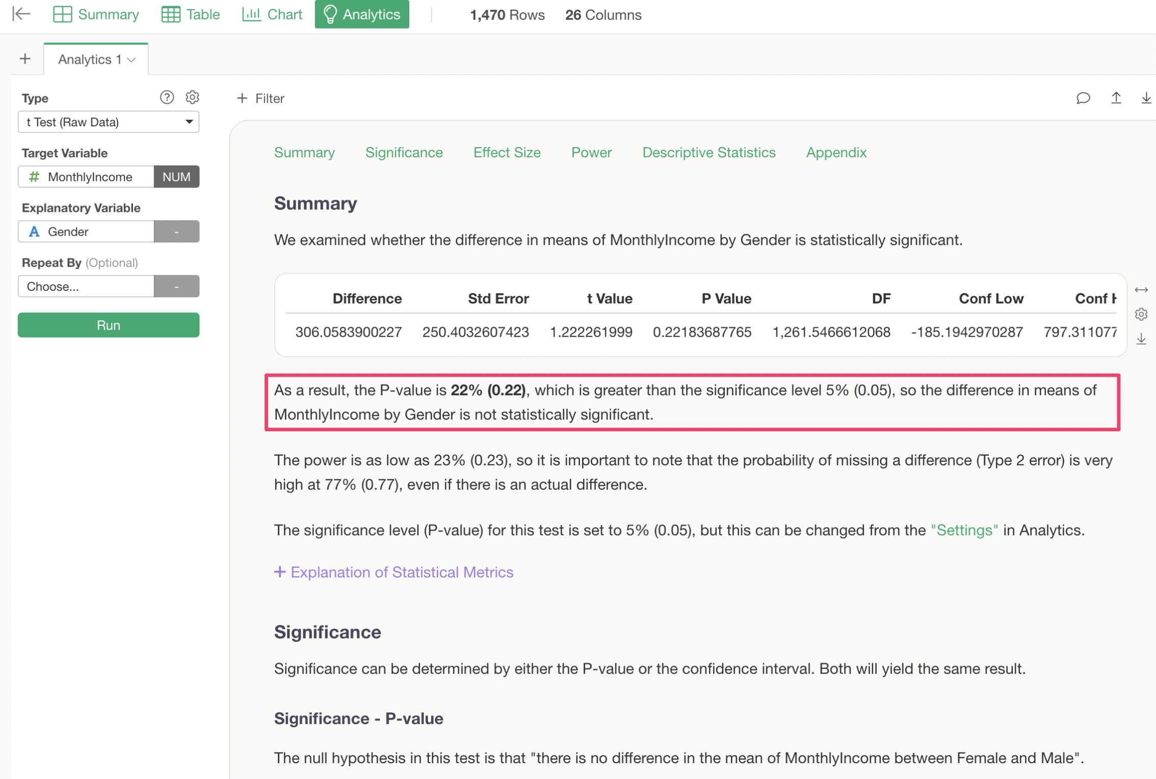
Explanations of what significance and P-value are in the first place are provided in the “Significance - P-value” section.
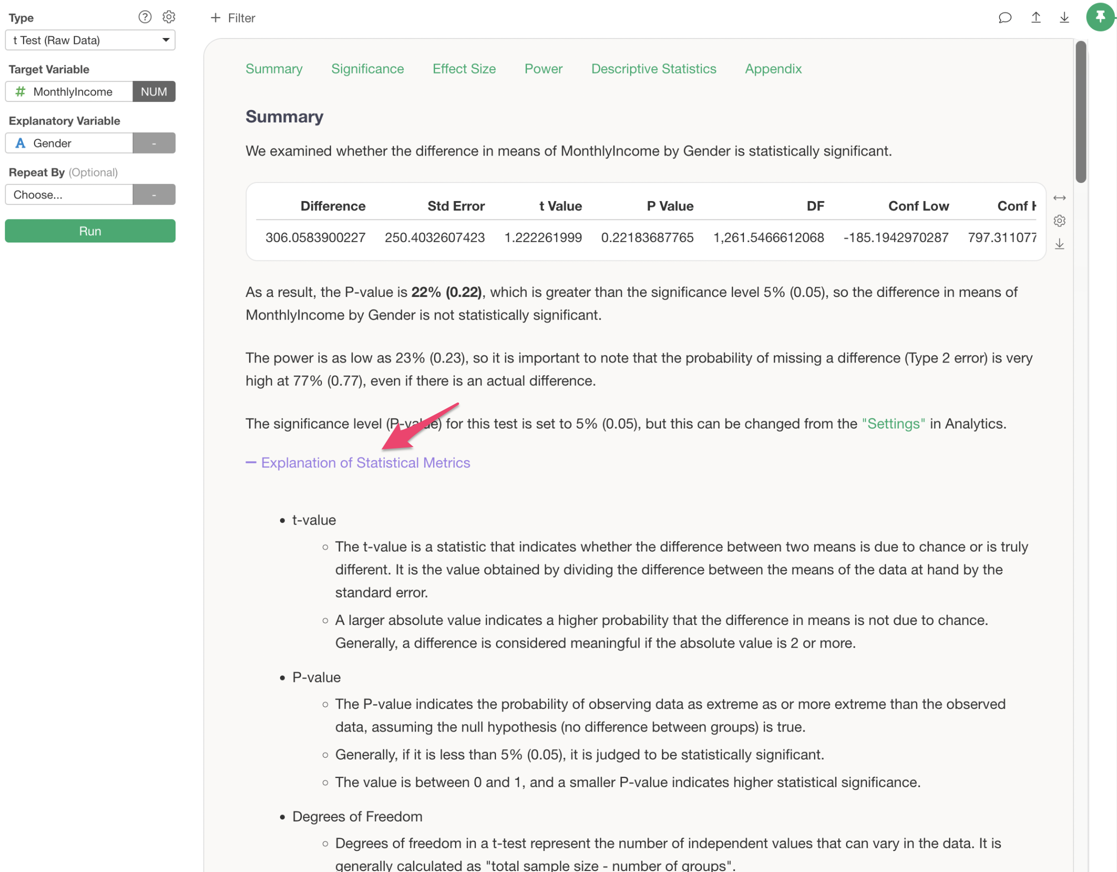
Furthermore, when a t-test is performed, the table displayed in the summary shows several statistical metrics, but for those seeing them for the first time, there is a problem of “not knowing how to interpret these metrics…”
Therefore, by clicking “Explanation of Statistical Metrics” for these metrics, the interpretation method for all metrics is explained.
Multivariate Analysis
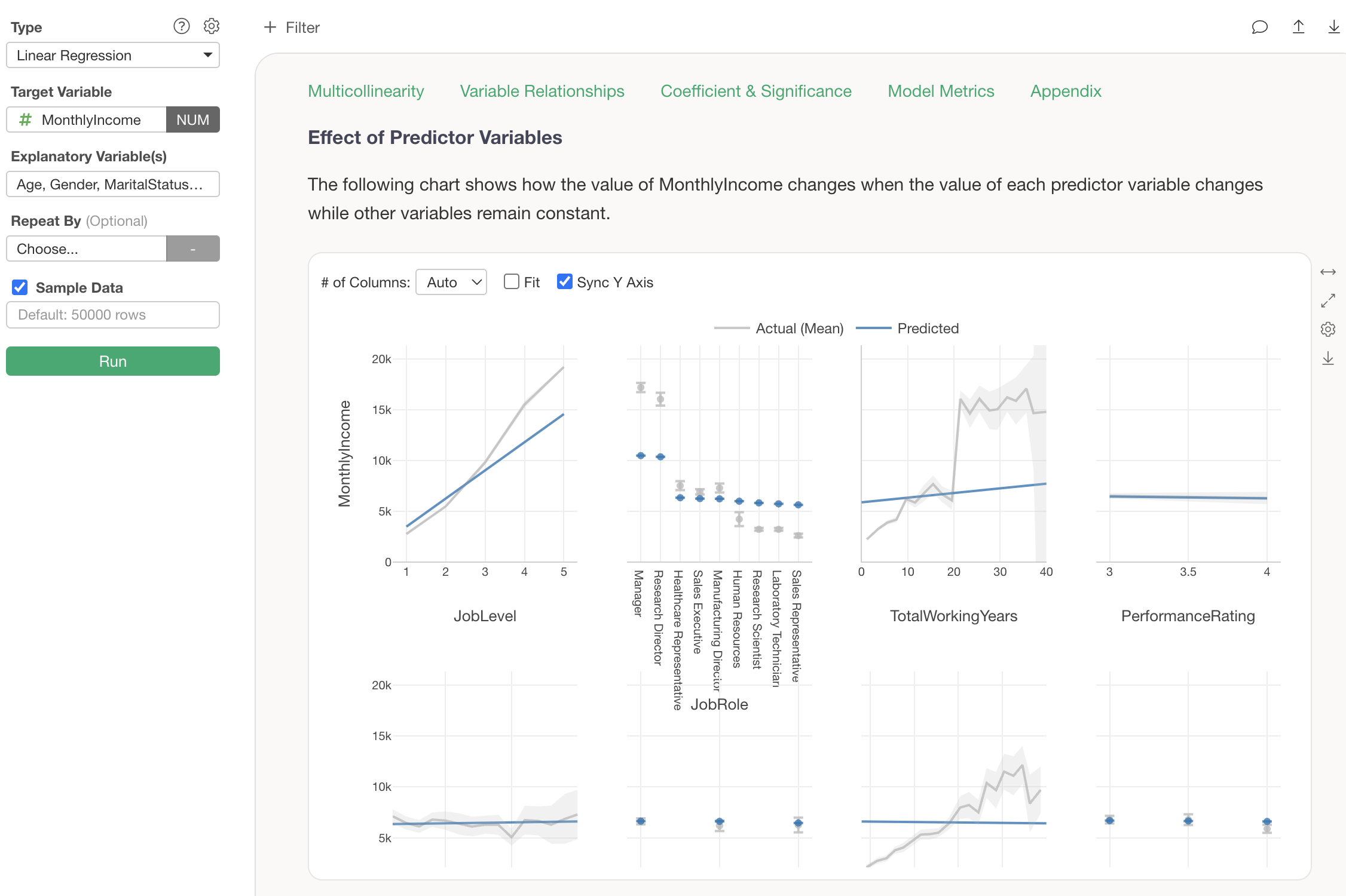
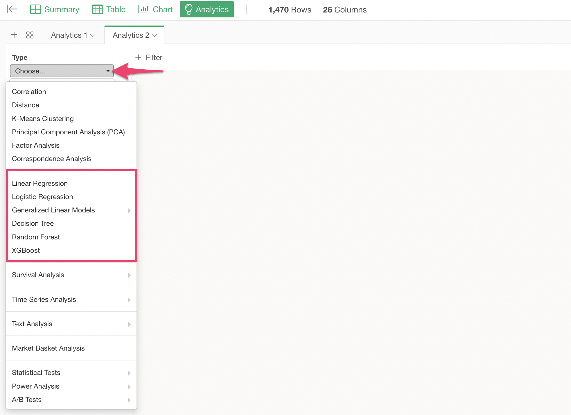
Exploratory supports statistical prediction models such as Linear Regression and Logistic Regression, as well as machine learning prediction models like Random Forest and XGBoost, enabling multivariate analysis.
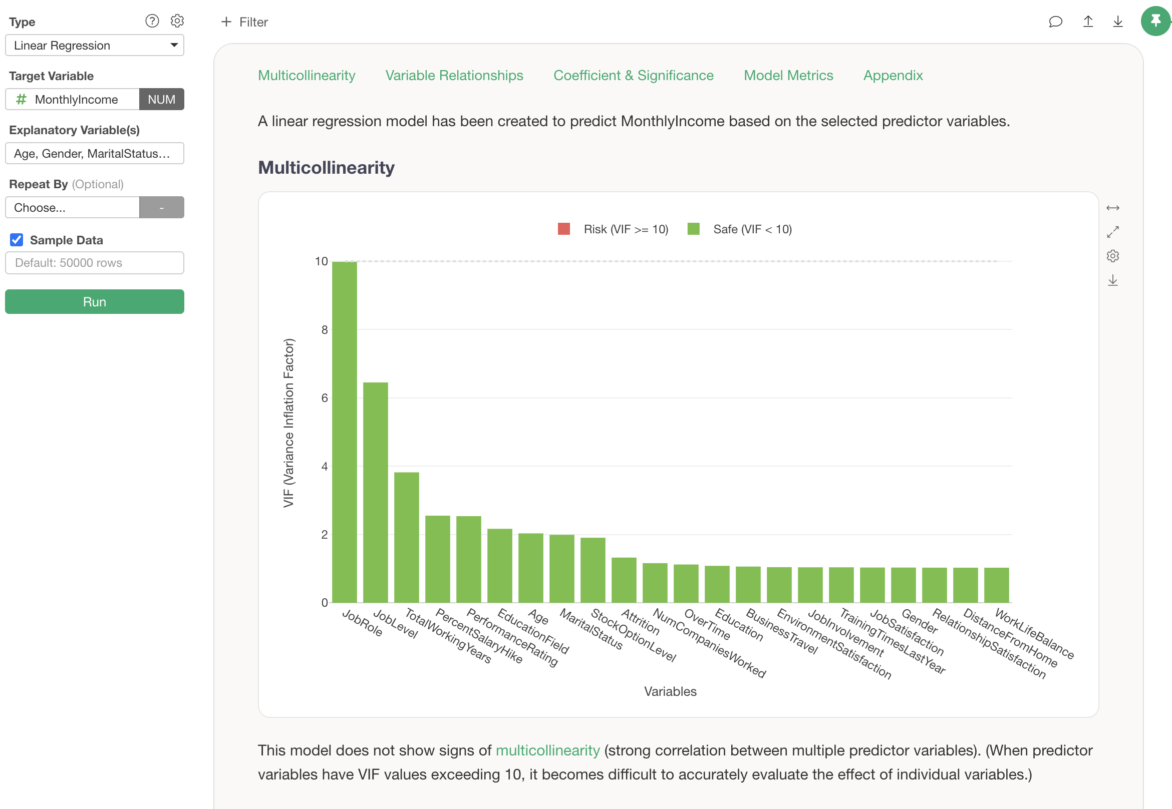
For example, when performing regression-based prediction models such as linear regression, selecting explanatory variables with too strong a correlation simultaneously can lead to a problem called “multicollinearity.” In such cases, appropriate guidance is displayed.
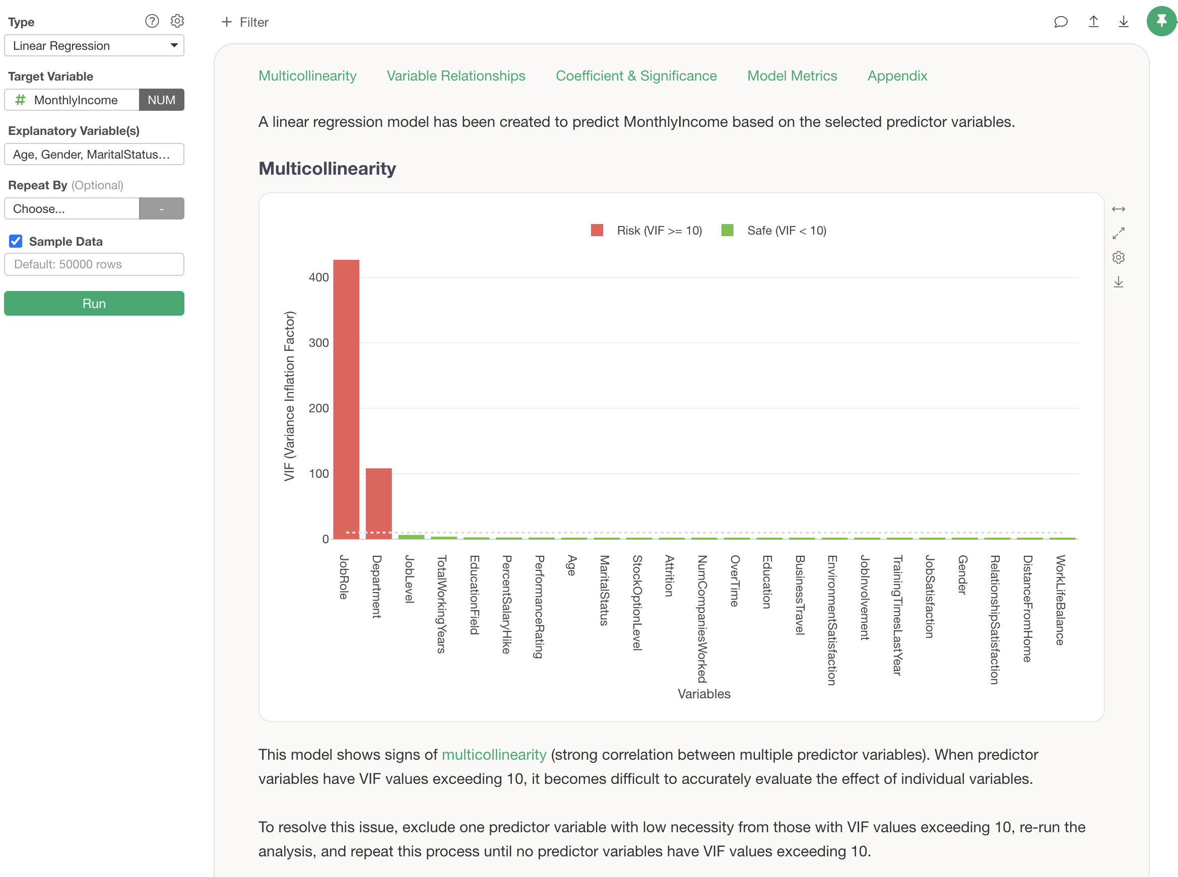
If the multicollinearity problem is resolved, it is explained that no multicollinearity problem is observed.
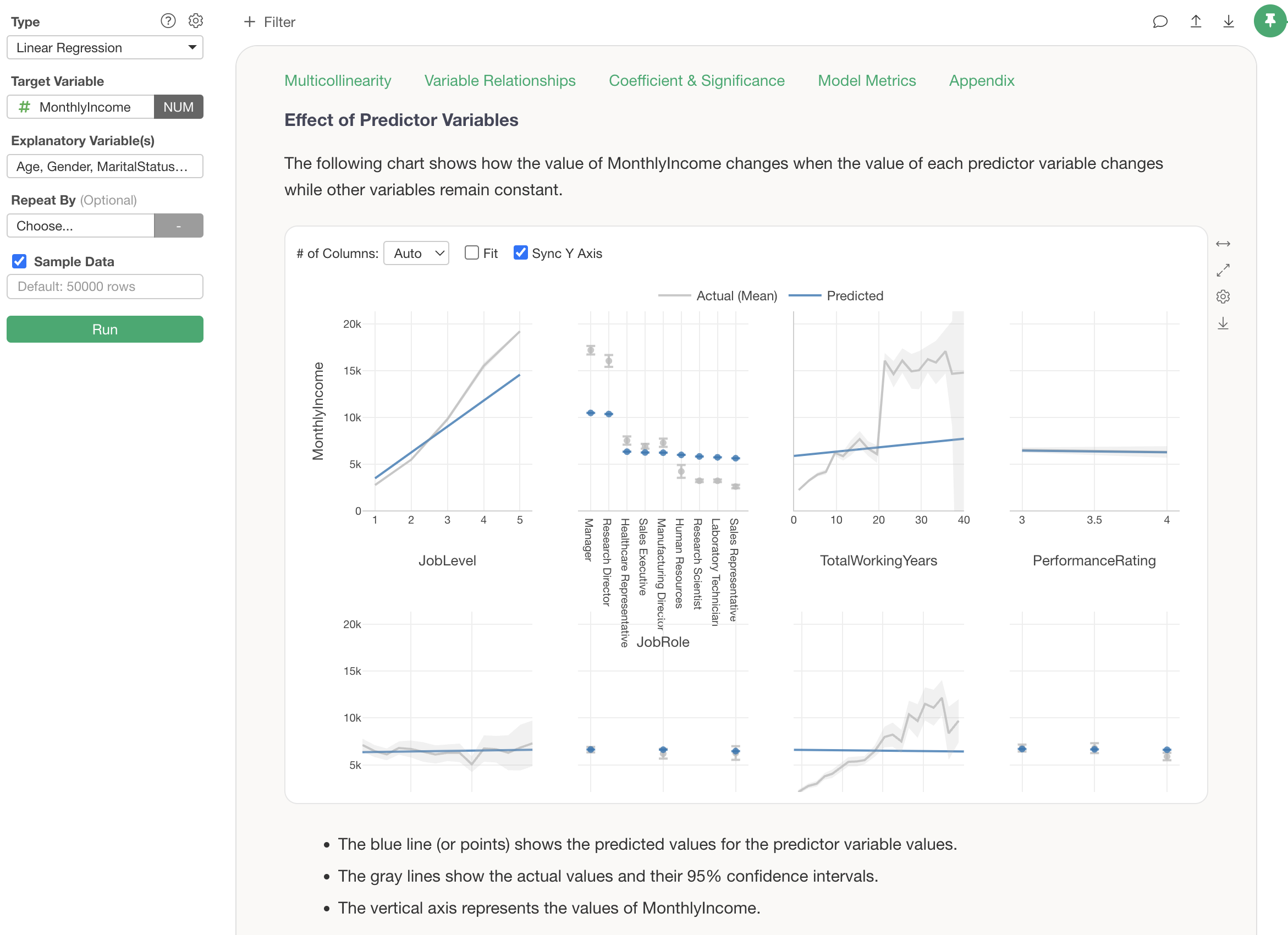
When multivariate analysis is performed, a chart showing the results of observed values and predicted values is displayed under “Influence of Explanatory Variables.” How to interpret the results of this chart is also explained in detail, including points of caution.
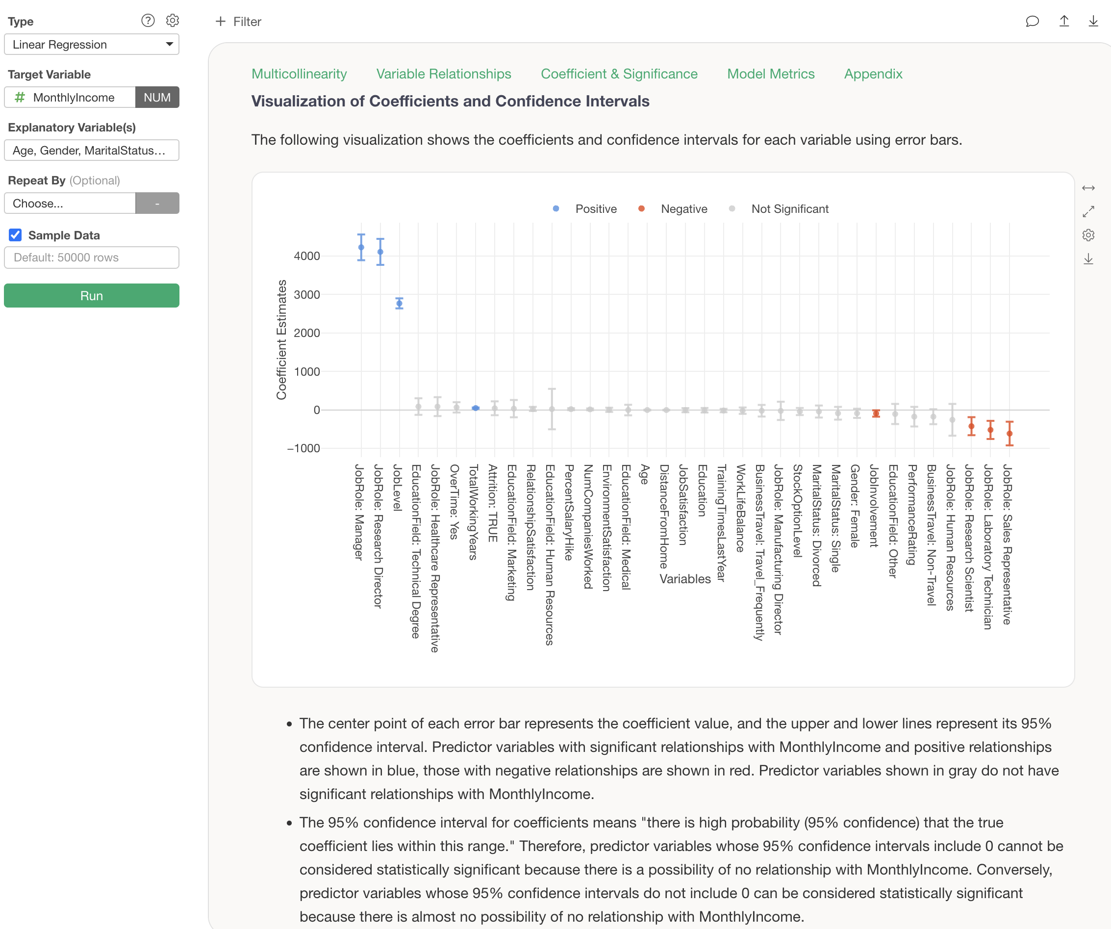
In statistical prediction models (e.g., Linear Regression, Logistic Regression), confidence intervals for coefficients are displayed. How to interpret these confidence intervals for coefficients is also explained in detail according to the type of model, allowing for proper interpretation of results even without specialized statistical knowledge.
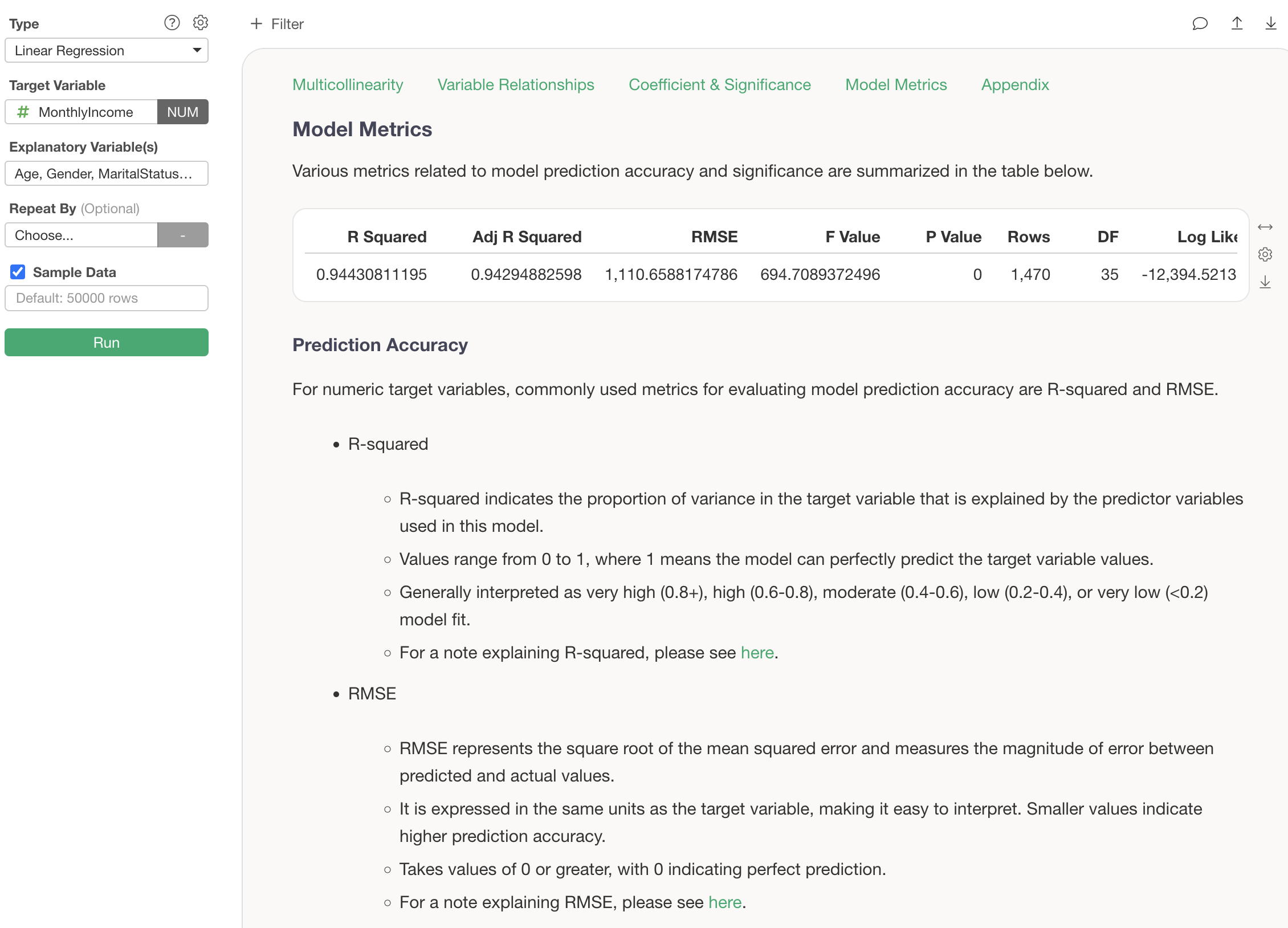
For metrics such as R-squared and RMSE, explanations of what they are and guidelines based on their values are also displayed. This makes it possible to understand how the current analysis results should be interpreted, even if one is encountering these metrics for the first time.
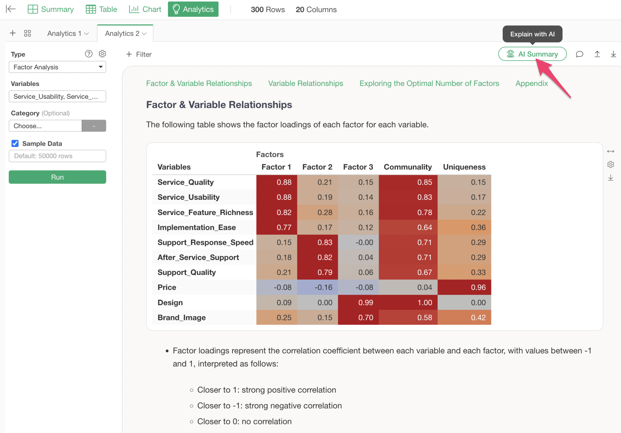
Factor Analysis
Factor analysis is an analytics method that discovers a smaller number of “latent common factors” behind many variables (question items). For example, even if there are 10 evaluation items in a customer satisfaction survey, they can often be explained by 3 to 4 essential factors. Factor analysis can be used to investigate such essential factors.
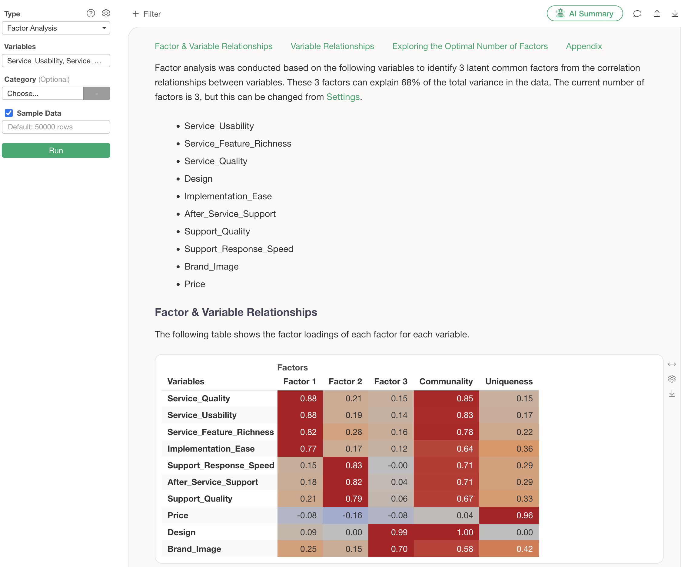
By performing factor analysis, you can confirm results such as the following:
A scree plot for determining the optimal number of factors is also automatically generated.
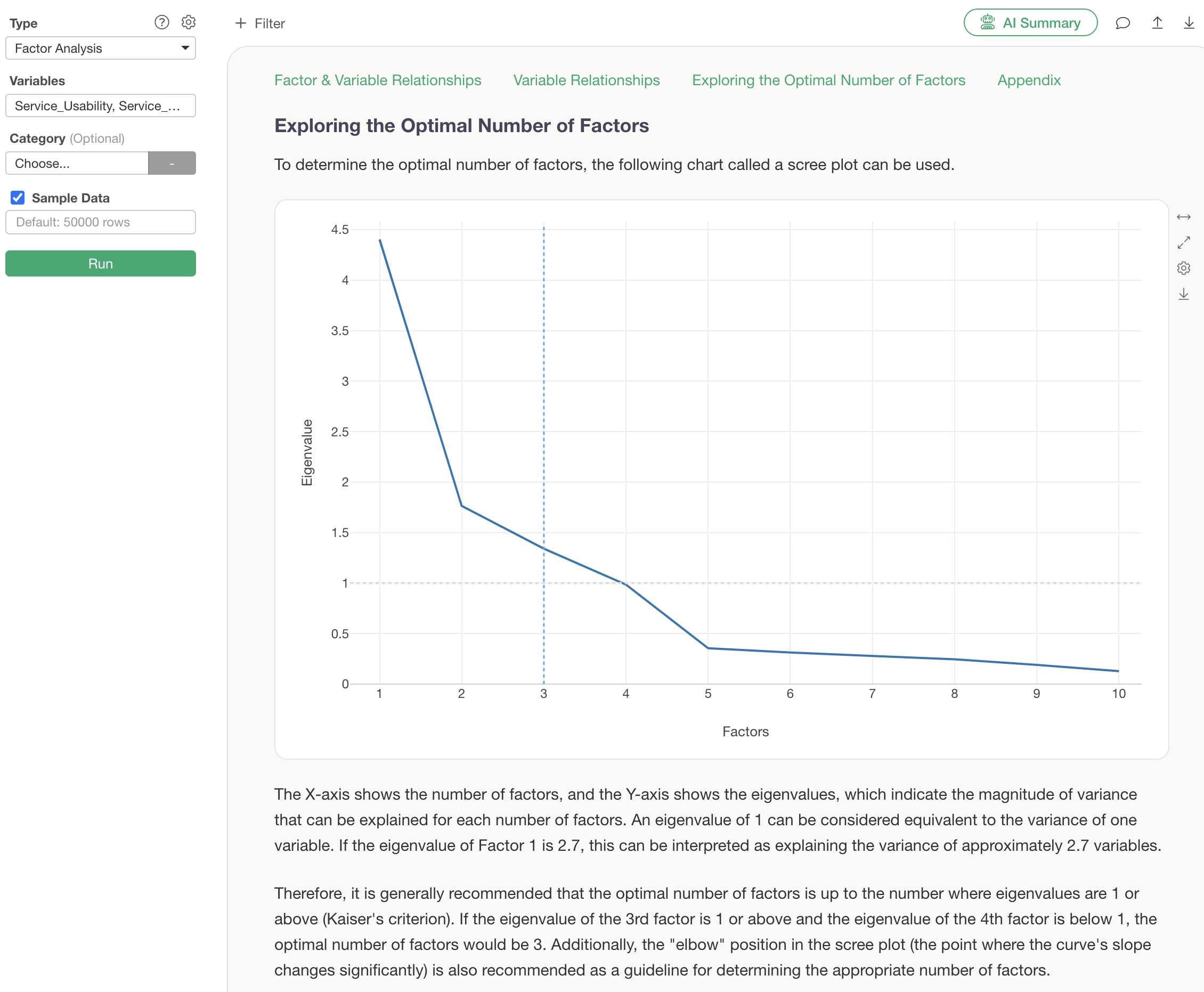
The “elbow” position and the criterion of eigenvalues greater than or equal to 1 are clearly explained in Guided Analytics, allowing for appropriate judgment even without specialized knowledge.
At the core of the analysis results is the factor loading table. This indicates how strongly each variable (evaluation item) is related to each factor, using a value from -1 to 1.
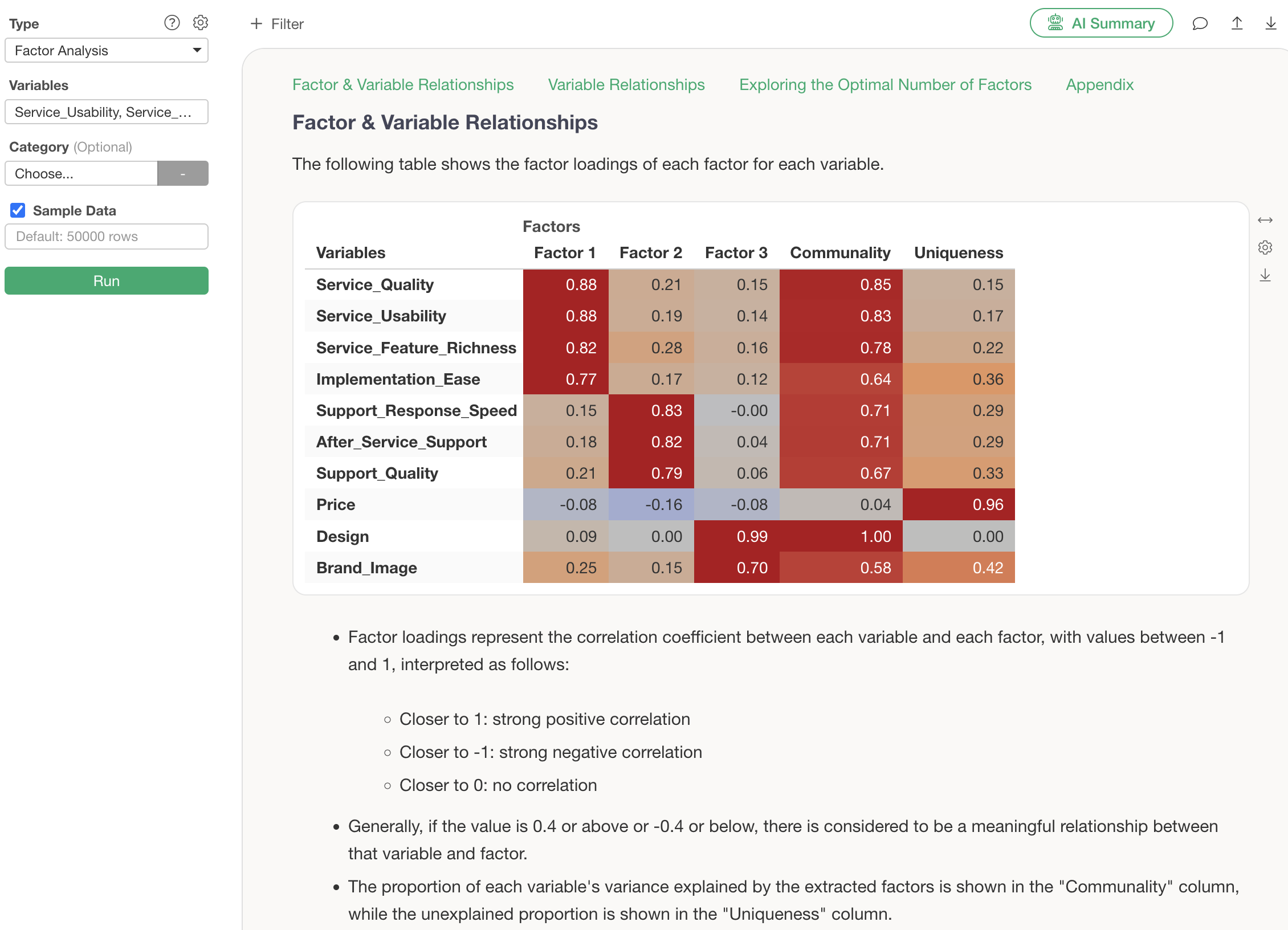
Guided Analytics explains interpretation methods such as “if the value is 0.4 or higher, or -0.4 or lower, there is a meaningful relationship between that variable and the factor.” Content that previously required reading specialized books to understand is now accessible to everyone.
Furthermore, the characteristics of each factor can be visually confirmed with a radar chart.
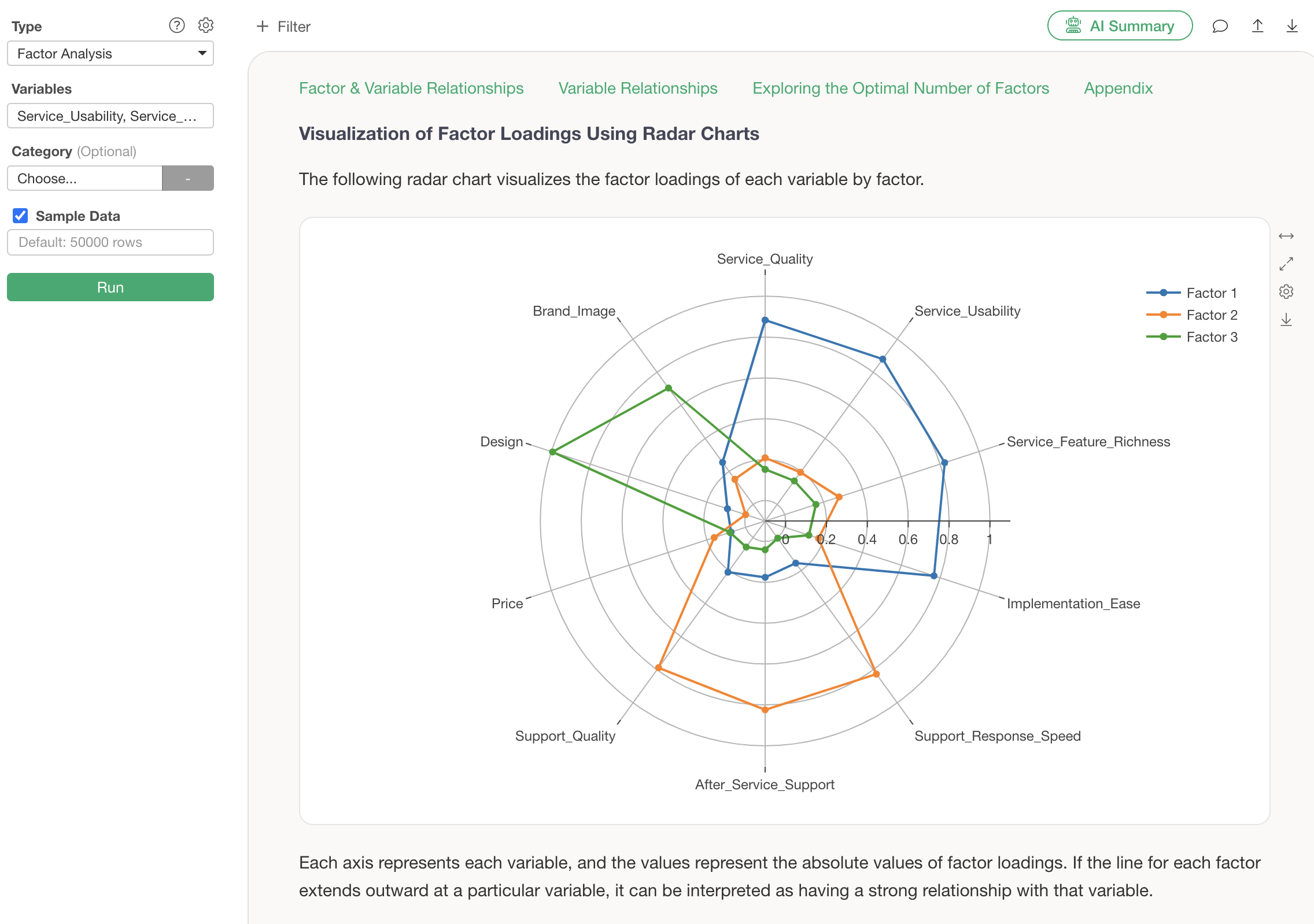
This chart clearly shows at a glance that Factor 1 extends outwards with “service quality”-related variables, and Factor 2 extends outwards with “support”-related variables. Thanks to the guide feature, how to read the chart is also explained in detail, allowing even beginners to interpret it with confidence.
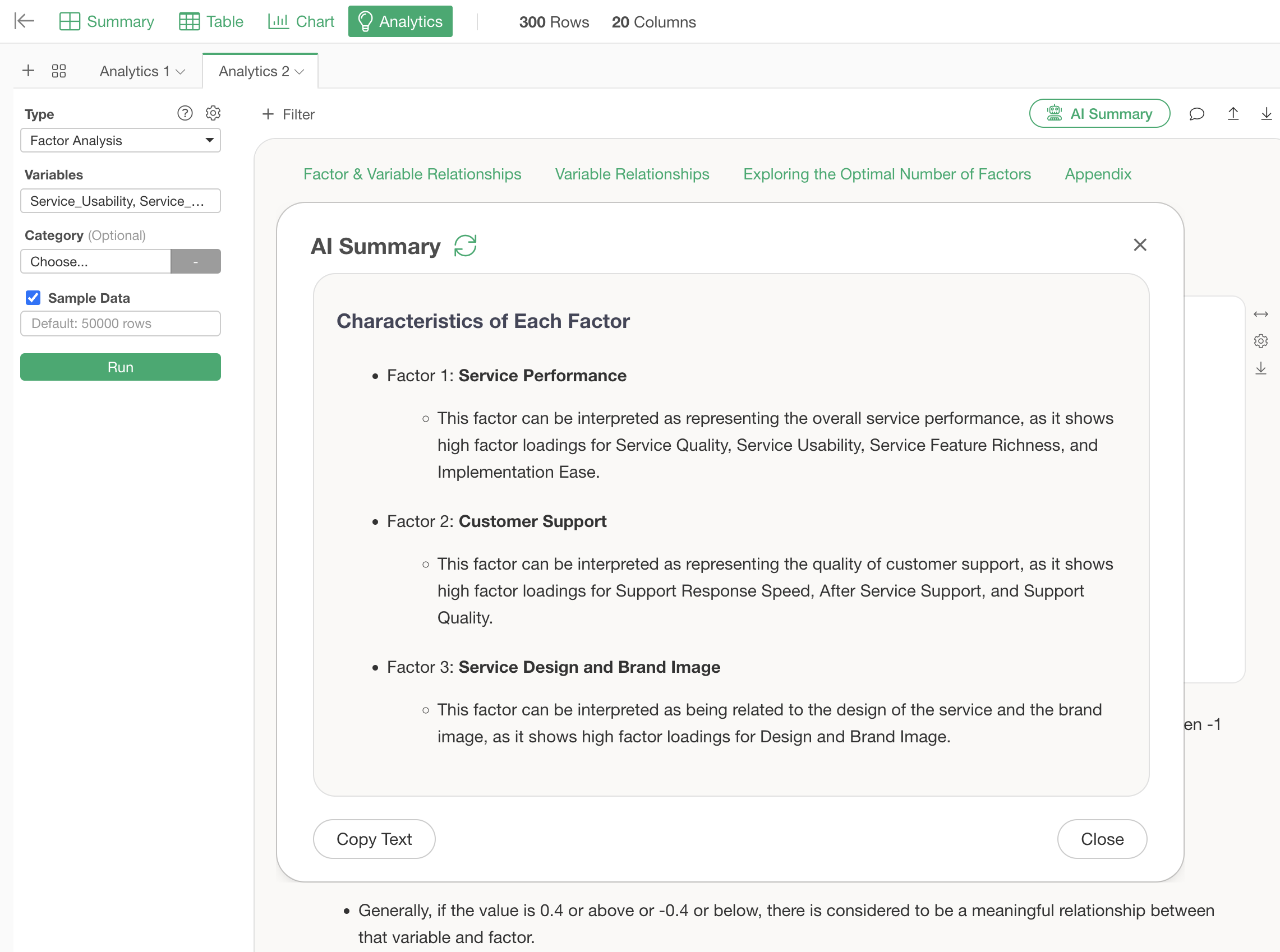
By the way, the newly added “AI Summary” feature in v13 automatically summarizes complex factor analysis results. Its usage is surprisingly simple: just press the “AI Summary” button after performing factor analysis.
By simply viewing this AI Summary, anyone can easily use factor analysis because the AI determines and informs them of the characteristics of each factor, without needing to interpret the factor loading table themselves.
Summary
“Guided Analytics” is an innovative feature that fundamentally solves the problem of “interpreting results,” which has been a major barrier in data analysis.
Analysis results that previously required reading specialized books or studying statistics to understand can now be comprehended with the help of guides. The meaning of P-values in hypothesis testing, the problem of multicollinearity in regression analysis, and how to read factor loadings in factor analysis—all of which previously required specialized knowledge—are now explained in a way that anyone can understand.
With this feature, we believe that data analysis will transform from being “only for a few experts” to “a business tool that anyone can utilize.” By correctly understanding analysis results and being able to confidently explain them to teams and superiors, data-driven decision-making will become more accessible.
Whether you have experienced frustration with data analysis or are looking to start, “Guided Analytics” allows you to confidently step into the world of data analysis.
Ready to Experience It Now?
Please experience new features like Guided Analytics for yourself!
The new Guided Analytics and AI Summary will surely support your data analysis.
If you haven’t used Exploratory yet, please try our 30-day free trial!