
Top 5 Analysis Methods Frequently Used When Analyzing Survey Data
You might have conducted a survey, only to end up simply averaging the 5-point (or 10-point) scale responses, or reading through free-text answers, feeling happy or sad, without actually using them to improve your business.
However, survey data can actually provide hints that lead to concrete actions for business and service improvement by utilizing various analysis methods.
Therefore, in this article, we will briefly introduce five essential analysis methods for analyzing survey data.
Basic Information on Survey Data
When conducting a survey, you likely design it with a clear idea of what information you want to learn from the respondents and what actions you want to take based on that information.
Examples of Objectives:
To deeply understand respondents, such as customers or employees, to enable quick and appropriate actions.
To gain insights for improving our products and services.
Examples of What You Want to Know:
What type of people are the respondents, and what are their preferences?
What kind of people want or need our products and services?
What aspects of our products and services do respondents find satisfying or dissatisfying?
Survey questions can be broadly categorized into the following types:
Respondent demographic information
Examples: Age, gender, occupation, etc.
Numerical (5/10-point scale)
Single choice
Multiple choice
Free text
Even if you want to analyze the obtained survey responses, the appropriate analytics (analysis method) will differ depending on the objective. Below are common objectives and analytics set when analyzing surveys.
In
this article, we will introduce five analytics (analysis methods)
aligned with these objectives.
1. Correlation Analysis
When analyzing survey data, it is important to investigate whether there is a “correlation” between two columns.
Correlation refers to a relationship between two variables where if the value of one variable changes, the value of the other variable also changes together according to a certain rule.
For example, if service satisfaction differs by “occupation,” it might be effective to target marketing efforts towards people in specific occupations.

If an increase in “support quality” scores leads to an increase in service satisfaction, then improving support quality is likely effective for increasing satisfaction.

If service satisfaction does not change even when “brand image” scores increase, it is assumed that an image-building strategy will not lead to an improvement in satisfaction.

In this way, the presence of “correlation” in the data can provide hints for product and service improvement.
The “correlation coefficient” is an indicator that expresses correlation.

The correlation coefficient ranges from -1 to 1. A value closer to 1 indicates a positive correlation, and a value closer to -1 indicates a negative correlation. A value closer to 0 means there is no correlation.
In Exploratory, you can use the “Correlation Mode” feature to simultaneously examine the correlation between a column of interest (question or metric) and other questions.

Additionally, you can calculate and visualize the correlation coefficients between all questions at once under the Analytics View.

2. Factor Analysis
Factor analysis is a statistical algorithm that can be used to understand respondents’ “preferences” or the “motivations” behind their answers, based on how they answer questions.
This time, we will explain using “what is important when choosing beer” as an example.

Suppose a survey was conducted on “what is important when choosing beer,” and the following results were obtained.

In this data, each row represents one respondent, and each column represents an importance score. A higher numerical value indicates higher importance for that item.
Some respondents might prioritize “color,” “aroma,” and “taste.”

Or, some people might prioritize “price,” “size,” and “alcohol.”

Furthermore, some people seem to prioritize “reputation.”

From a different perspective, it can be said that there are preferences (factors) that consider the following important when “choosing beer.”

Factor analysis extracts the underlying motivations of a survey as “factors” to enable such labeling of motivations, and calculates the strength of the correlation between each factor and each variable (question) as “factor loadings.”
Factor loadings range from -1 to 1, and the closer the value is to -1 or 1, the stronger the influence each factor has on its respective variable.

In Exploratory, you can easily perform “Factor Analysis” from the Analytics View.

Furthermore, Exploratory v13’s guided analytics provides detailed explanations in a note format, including how to interpret each chart and information about the analysis method, making factor analysis results understandable even for beginners.

However, for those unfamiliar with factor analysis, it can often be difficult for beginners to interpret, and oversights are not uncommon.
Therefore, by using “AI Summary,” you can interpret the characteristics of each factor more reliably and easily.

3. Clustering
Clustering is a method of classifying data into groups that share common characteristics within the data.
For example, as a marketing manager, you might want to send campaign emails to people who responded to a survey.
However, a question arises here: should you send the “same” campaign email to all respondents? Not all survey respondents are identical; they should have different characteristics.
For example, suppose you have survey data from a study on what people prioritize when adopting a certain service.

Based on response patterns, respondents can be categorized into three groups:
Group that prioritizes “service usability, features, and quality”

Group that prioritizes “after-sales support, support quality, and response speed”

Group that prioritizes “price”

As shown above, survey response patterns differ depending on what respondents prioritize.
Therefore, by performing “clustering,” respondents can be classified into several groups based on their response patterns.
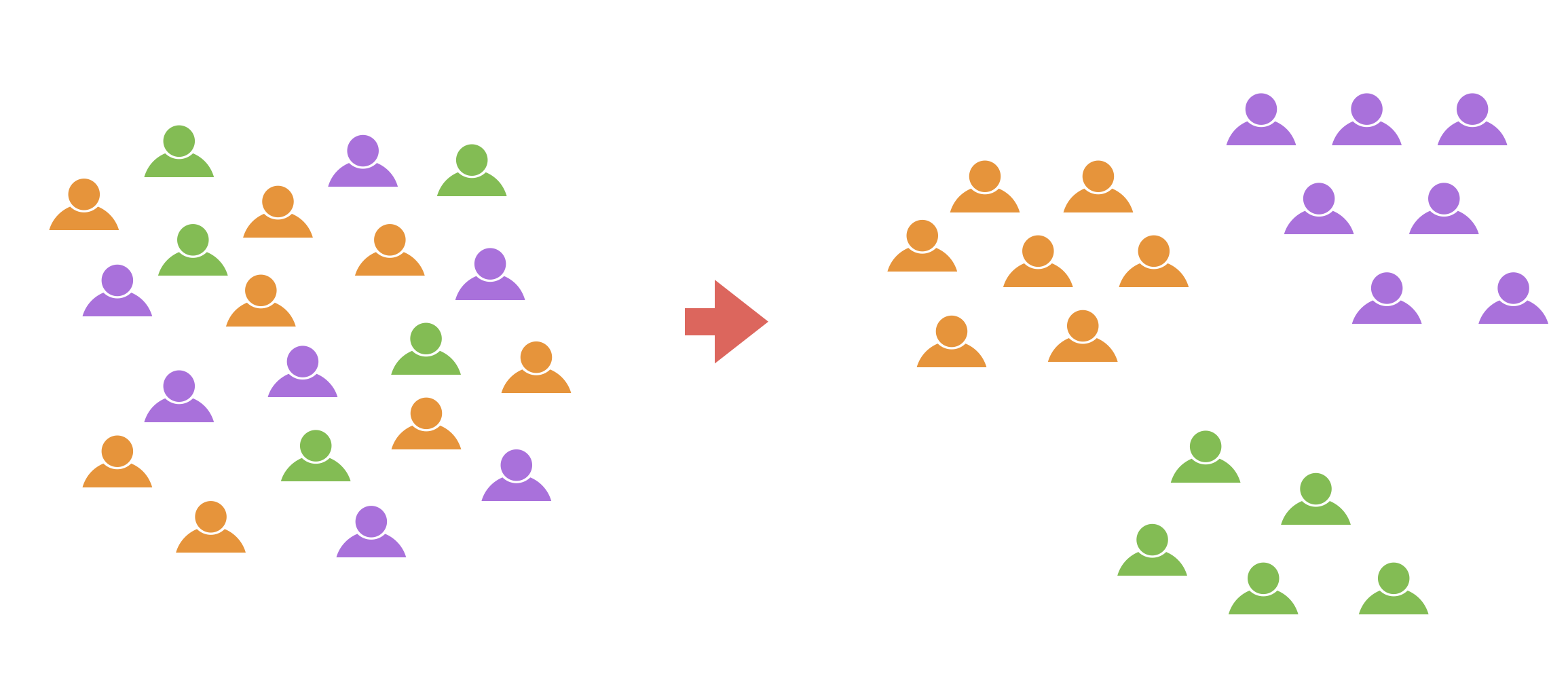
Clustering survey data allows for tailored approaches to the grouped respondents.

There are various clustering algorithms, but one of the most commonly used is the “K-Means Clustering” algorithm.
In Exploratory, you can easily perform “K-Means Clustering” under the Analytics View, and intuitively understand clustering trends through various charts.

This chart clearly shows at a glance that Cluster 3 generally has high ratings, while Cluster 1 generally has low ratings. The guide feature also provides detailed explanations on how to read the charts, allowing even beginners to interpret them with confidence.
Additionally, using the “AI Summary” feature automatically summarizes complex clustering results.

4. Text Analysis - Word Count
One common type of survey question is “free text.”

However, while free-text responses can be read one by one if the number of respondents is small, it becomes difficult to grasp the overall picture when there are many responses.

By breaking down sentences into “words,” you can count the frequency of each word (quantification) and grasp patterns and characteristics within the data.
In Exploratory, when you perform “Text Analysis” under the Analytics View, not only are sentences tokenized into words, but you can also intuitively grasp trends in word usage frequency using tools like word clouds and co-occurrence networks.
Word Cloud
A word cloud is a chart that allows you to grasp the overall trend of a text at a glance. More important words are displayed larger, making it possible to instantly convey “what was frequently mentioned in this survey” when reporting to management or sharing information within a team.

Co-occurrence Network
A co-occurrence network is a chart that groups words that are used together and visualizes their relationships. This allows you to get an overview of what groups and words are being used.

Furthermore, by using the AI Summary feature, based on the information from this co-occurrence network, “Summary” information that summarizes the overall trend of the text, and “Frequent Word Grouping” information that summarizes the characteristics of each group and actual sentences, are output.

Just by looking at this AI Summary, you can immediately determine what words were frequent and what groups exist as a result of the text analysis.
5. Text Analysis - Topic Model (LDA)
Earlier, we introduced how to group respondents using “K-Means Clustering” for numerical columns. But can we group respondents based on “free-text” responses?

For example, consider the following text.

Looking at each text, there appear to be groups related to “support,” “implementation,” and “service quality.”

Based on the trends in these texts, the topic model (LDA) solves the problem of whether respondents can be mechanically grouped.
In topic modeling, when you execute the “topic model,” you can obtain the ratio (probability) of each topic for each text.
 Some
texts may refer to both Topic 1 (support) and Topic 3 (quality), but
topic models are designed to output the probability of each topic.
Some
texts may refer to both Topic 1 (support) and Topic 3 (quality), but
topic models are designed to output the probability of each topic.
 Based
on the high topic ratios in each text, it is possible to group each
respondent accordingly.
Based
on the high topic ratios in each text, it is possible to group each
respondent accordingly.

In Exploratory, you can easily perform topic modeling by selecting “Topic Model” under the Analytics View and choosing the “free text” column.

By examining the relationship between topics and sentences, you can identify sentences with high probabilities for each topic, making it easy to interpret how the groups are formed.

Additionally, using the AI Summary feature automatically summarizes complex results, outputting information that compiles the characteristics of each topic and actual sentences.

Want to Try It Now?
Experience Exploratory v13’s innovative new features for yourself! The new Analytics Guide feature and AI Summary will surely support your data analysis.
If you haven’t used Exploratory yet, please try our 30-day free trial!