Introduction to Correlation Analysis in Exploratory
Correlation Analysis is super useful when you want to understand the relationship among variables (columns).
Consider the following chart.
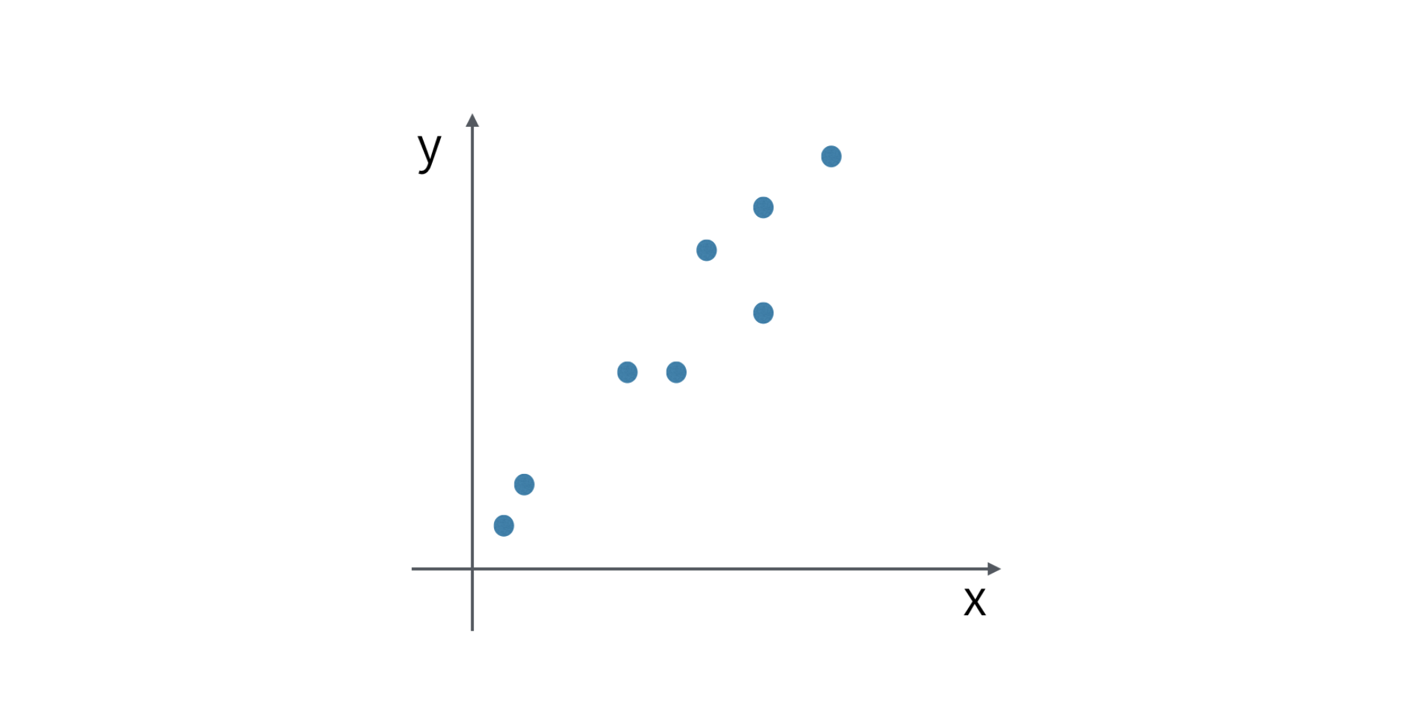
Revenue is assigned at X-Axis and Profit is assigned at Y-Axis, and we are looking at how they are correlated.
If we draw a trend line it goes straight up from the left hand side bottom to right hand side top.
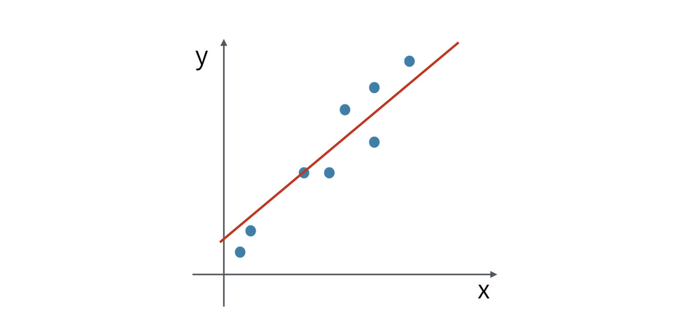
And this indicates that these two variables are highly correlated and the correlation is positive.
And now, consider the following chart.
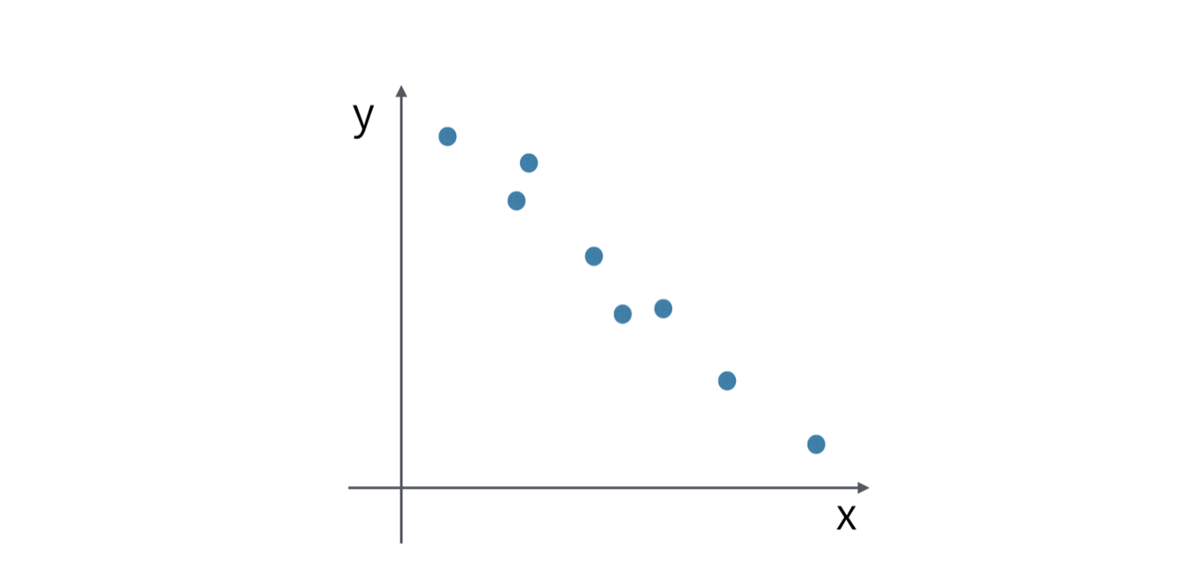
This time, the trend line is going down from the left hand side top to the right hand side bottom.
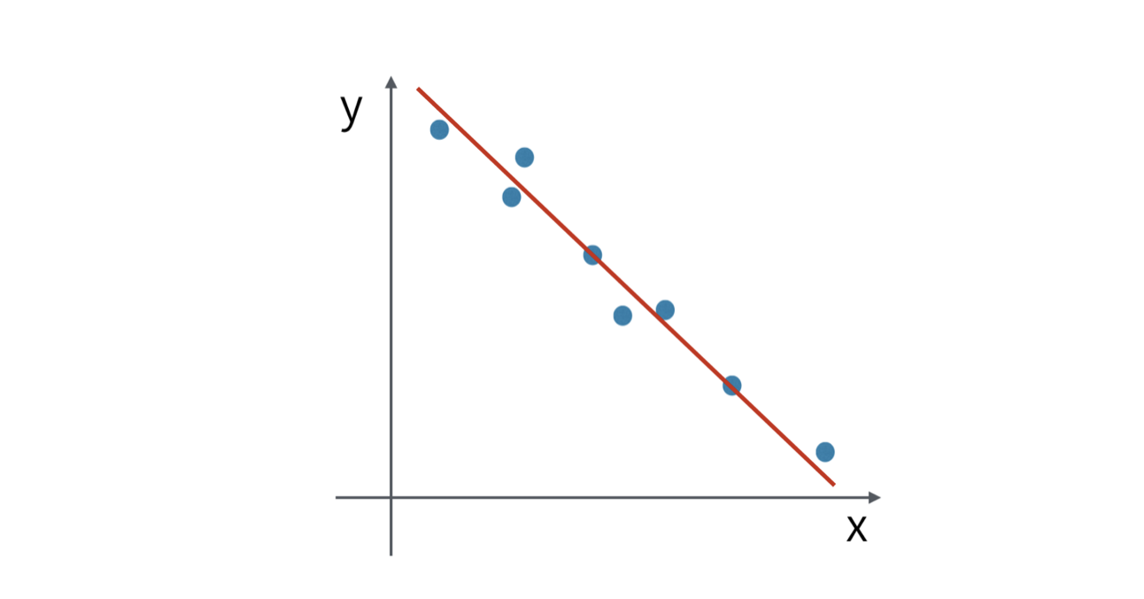
They are highly correlated, but the correlation is negative.
Lastly, consider the following chart.
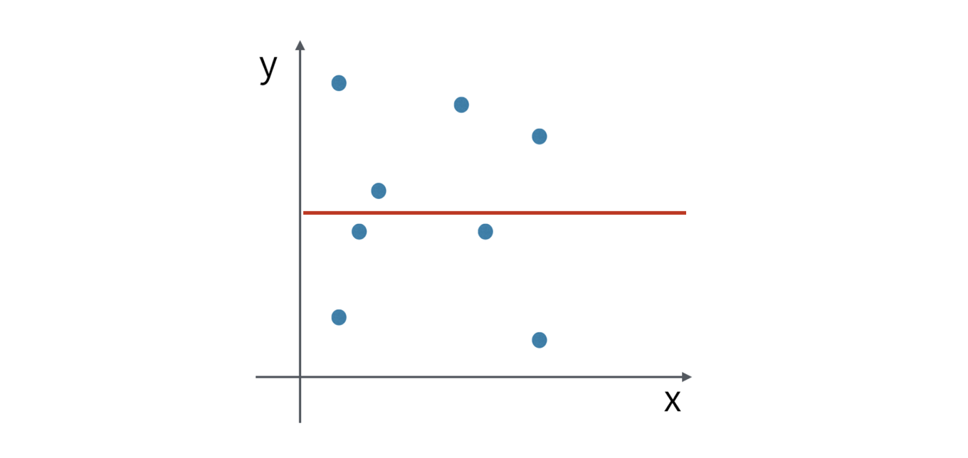
The dots are everywhere and looks there is no rule. This indicates that there is no correlation between the two variables and they are independent from one another.
Now, instead of examining the correlation one by one, typically you want to see which variables in your data set are correlated all together.
In R, there is a built-in standard function called ‘cor’, which calculates the correlations among all the given numeric variables.
In Exploratory, you can do this quickly under Analytics view. Let’s take a look. Correlation Analysis
There are two ways to perform the correlation analysis with the algorithm.
One is to find the correlation among the categorical values, such as regions.
Another is to find the correlation among the columns (or variables), such as Revenue, Profit, and Expense. Let’s take a look one by one.
Correlations among Categories
Here, we have weather data for some of the California cities like San Francisco, Los Angels, etc.
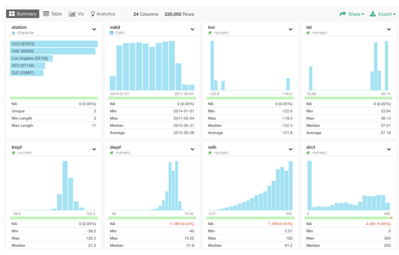
You can download this sample data from here as EDF and import into Exploratory to try for yourself.
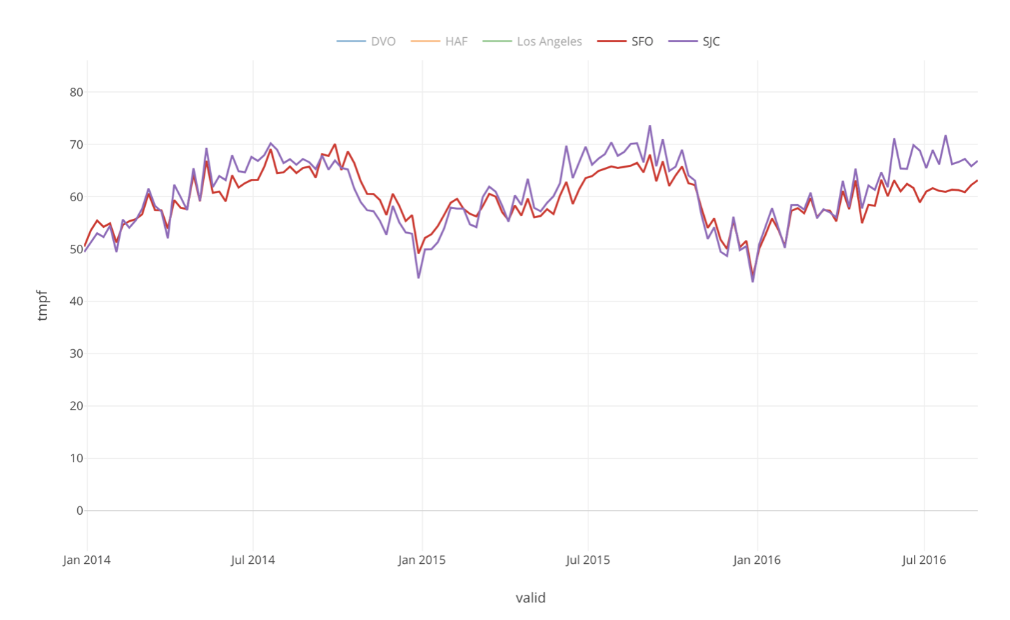
Now, if we visualize this data to see the temperatures trend over the years among the cities, we can see that some cities share more similar trends than the others meaning they are more correlated.
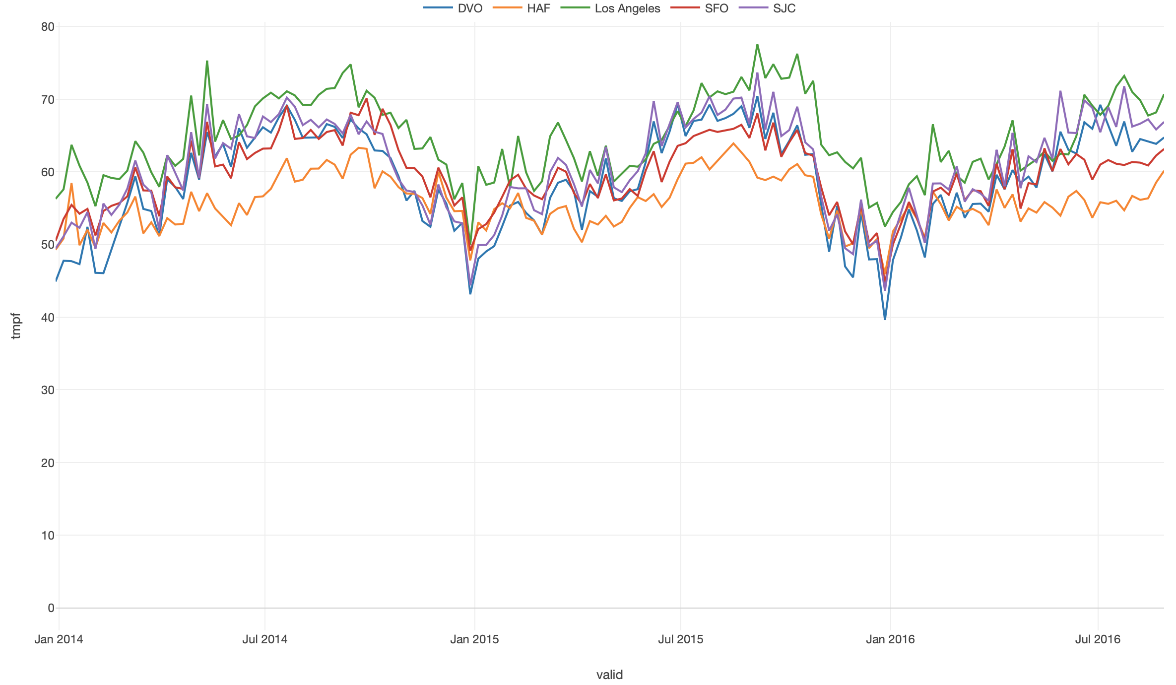
But, our eyes are not as good as we hope to recognize such patterns especially when there are many data points. Instead of relying on our eyes, we can calculate the correlations among all the variables together
Go to Analytics view and select ‘Correlation by Categories’, then assign the columns to the shelfs like the followings.
- Assign ‘station’ column, for which we want to calculate correlations, to Category.
- Assign ‘valid’ column (Date) to ‘Measured By’ and set it to ‘Day’ as the aggregate level.
- Assign ‘tmpf’ column (Temperature in Fahrenheit) to Measure and set ‘Average’ as the aggregate function.
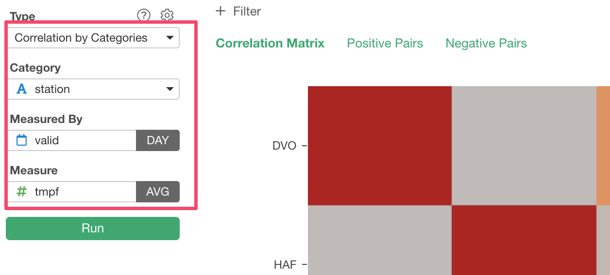
Once you click Run button, you will get a heatmap chart like below.
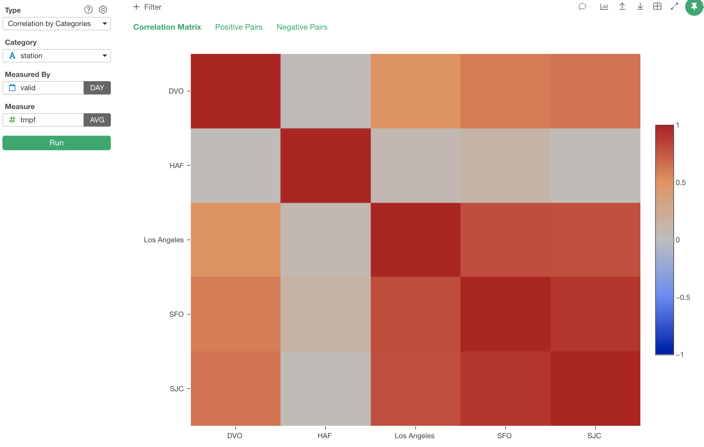
The darker the red color is, the higher the correlation is. And, we can see San Francisco and San Jose are highly and positively correlated with 0.9 point. The correlation values are between -1 and 1.
-1 indicates the complete negative correlation meaning that when one goes up another goes down the same degree.
And 1 indicates the complete positive correlation meaning that when one goes up another goes up the same degree.
We can go back to the original chart and see how San Francisco and San Jose are correlated.
Correlations among Columns (or Variables)
Now, when you look at this same weather data, there are more variables than just the temperature (tmpf).
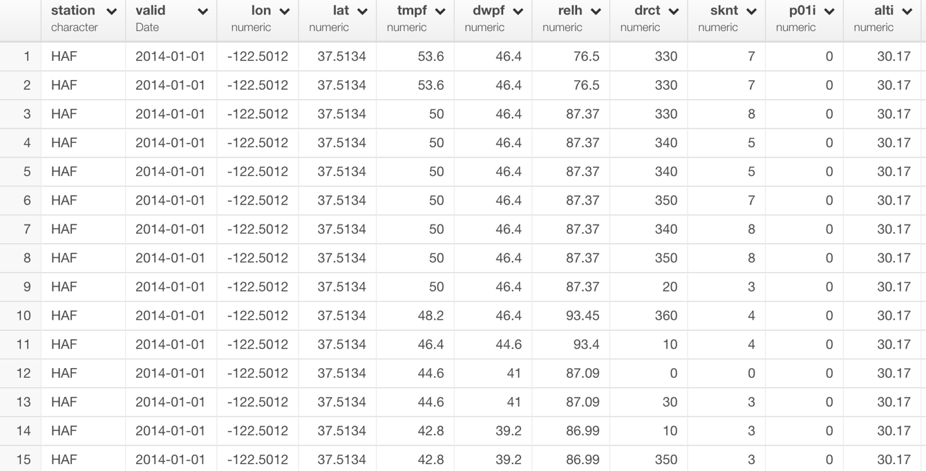
Let’s say we want to know which variables are more correlated than the others based on the trend along the timeline.
This time, we want to choose ‘Correlation by Columns’ as Analytics Type.
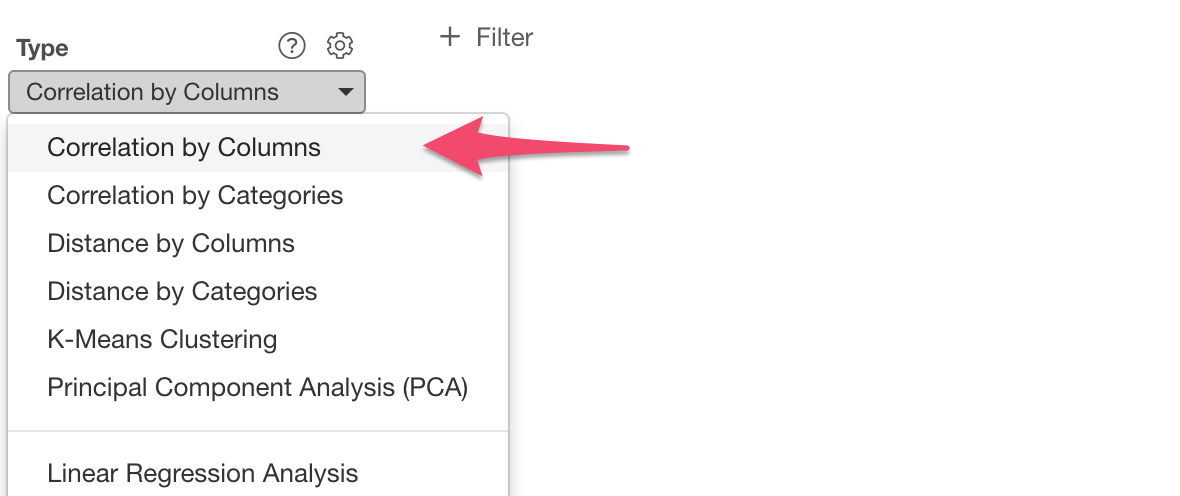
And click the ‘Variable Columns’ button to open the column selection dialog.
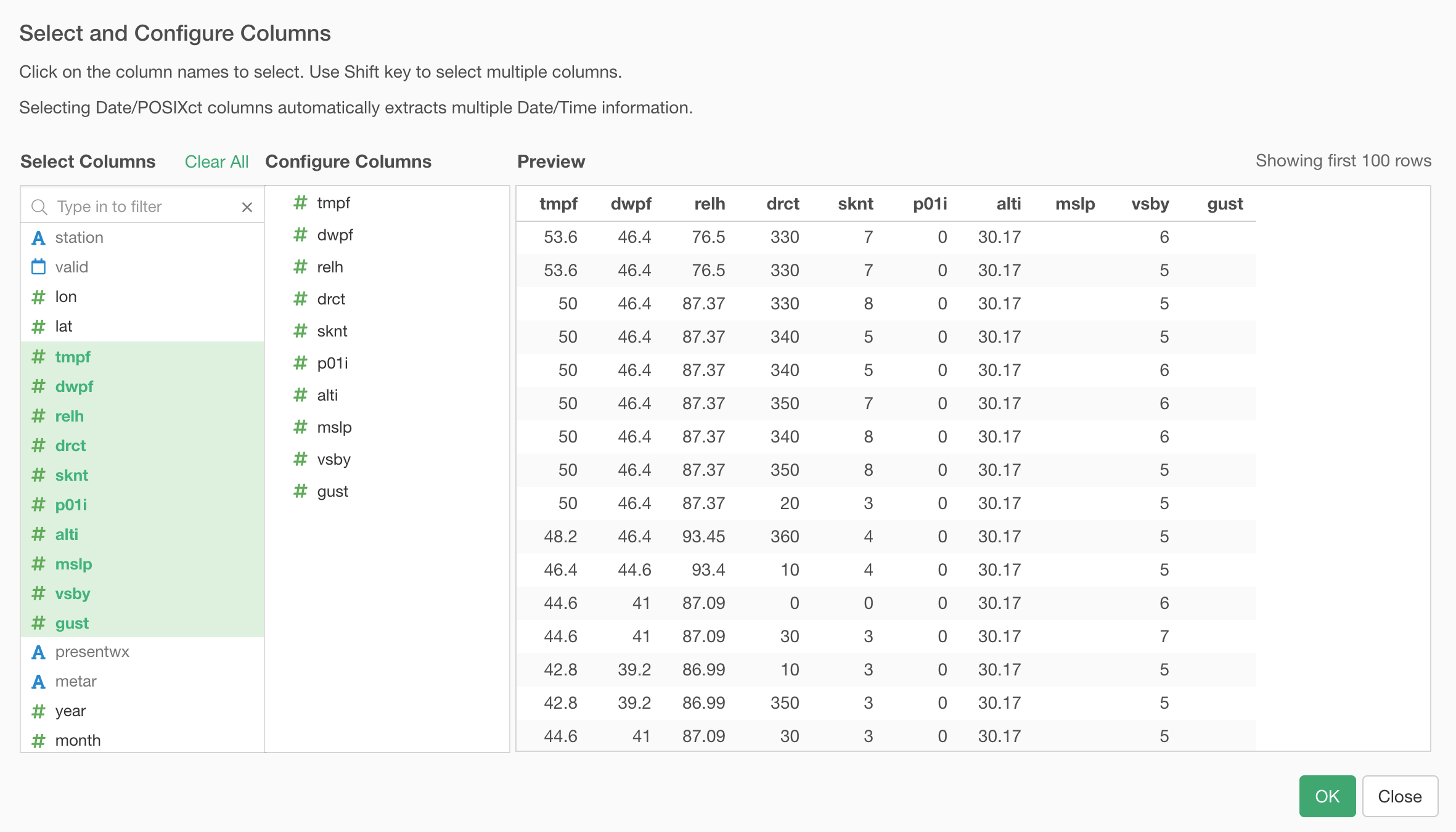
And select the columns among which you want to examine the correlation.

Once you hit ‘Run’ button you will get a heatmap chart like below.
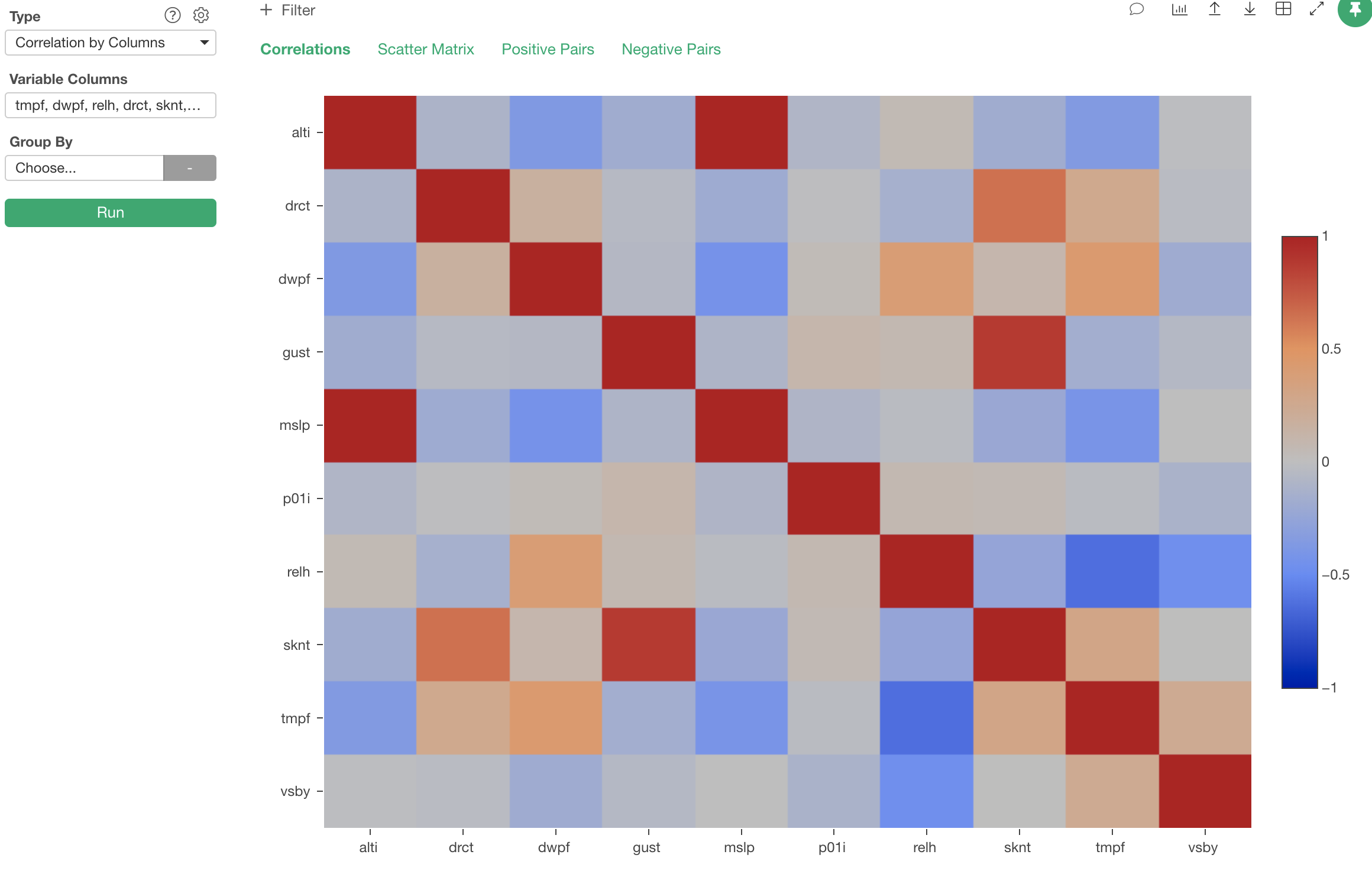
The darker the blue is the higher the two variables are negatively correlated. You can see that ‘relh’ column (Relative Humidity) and ‘tmpf’ (Temperature in Fahrenheit) are negatively correlated with -0.62 point.
We can confirm this by having these two variables on Scatterplot and enable Trend Line like below.
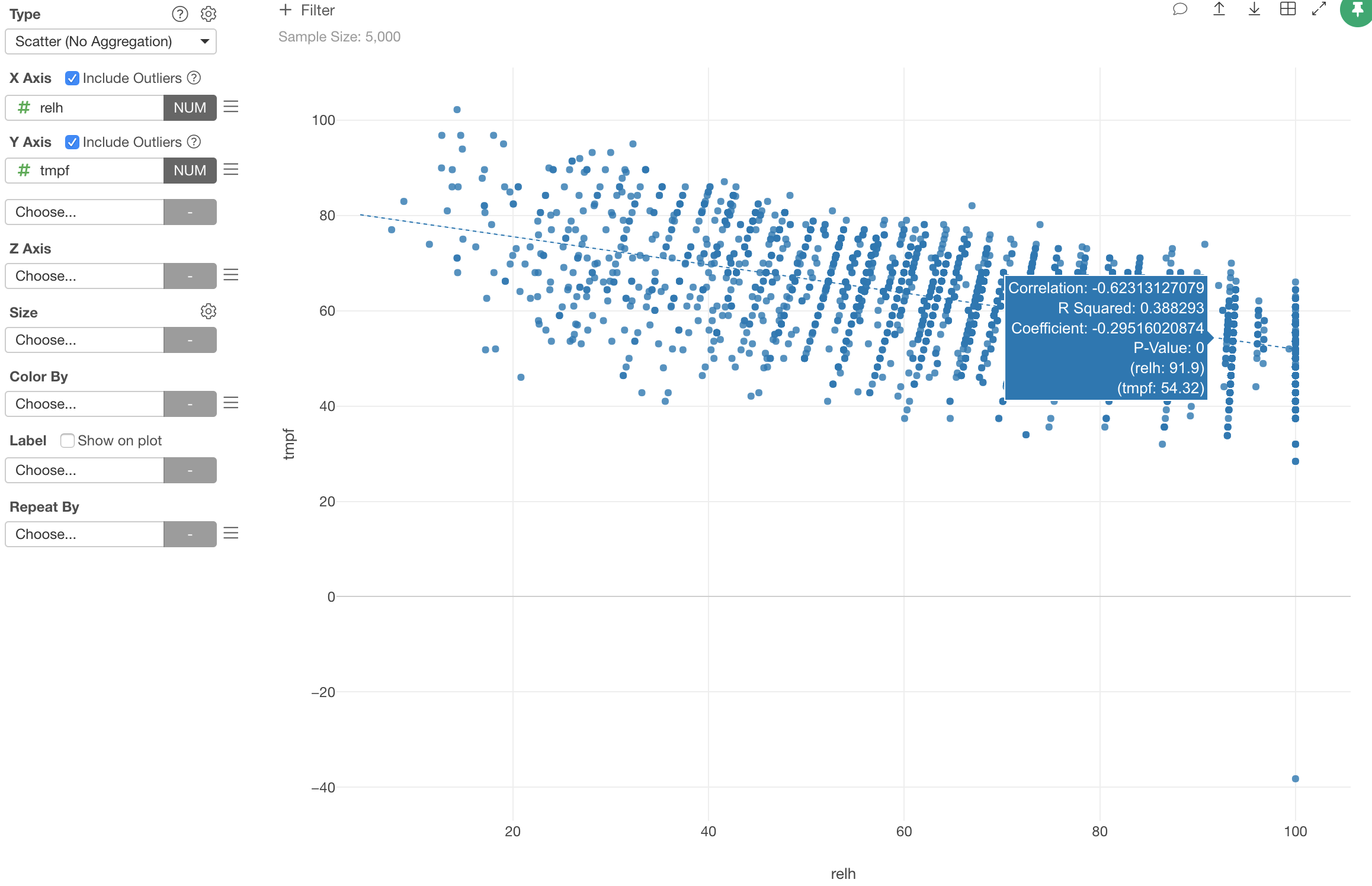
You can see the trend line is going down from the left side up to the right side down. The angle is not that steep, it’s rather mild, and that’s the slope of -0.62.
As we have seen, Correlation algorithm is a great tool especially when you want to understand the relationship among the variables (columns).