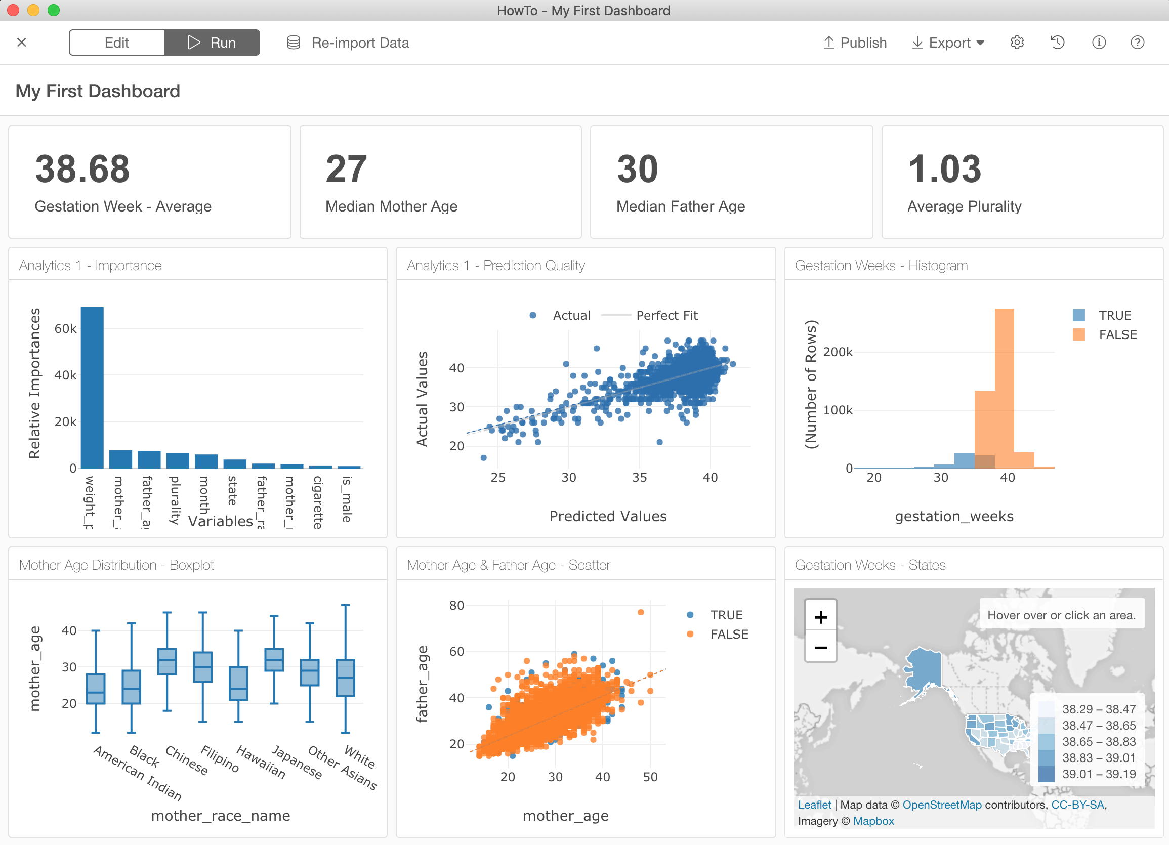
Regardless of the size, every company or organization has their own KPIs (otherwise should!) and monitor them often by using Dashboard. With the release v4.2, Exploratory now supports Dashboards to monitor your important KPIs and share useful insights with others.
And with the release v4.3, we have made it much easier to configure the Dashboard.
Today, I’m going to demonstrate how you can quickly create your own Dashboard with Exploratory.
How to Start?
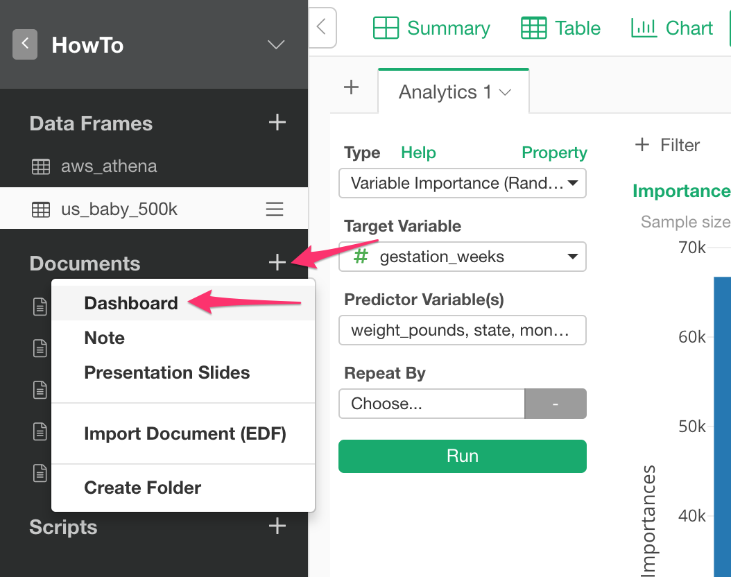
You can start by clicking ‘+’ button next to “Documents” and selecting Dashboard from the menu to create a new Dashboard.
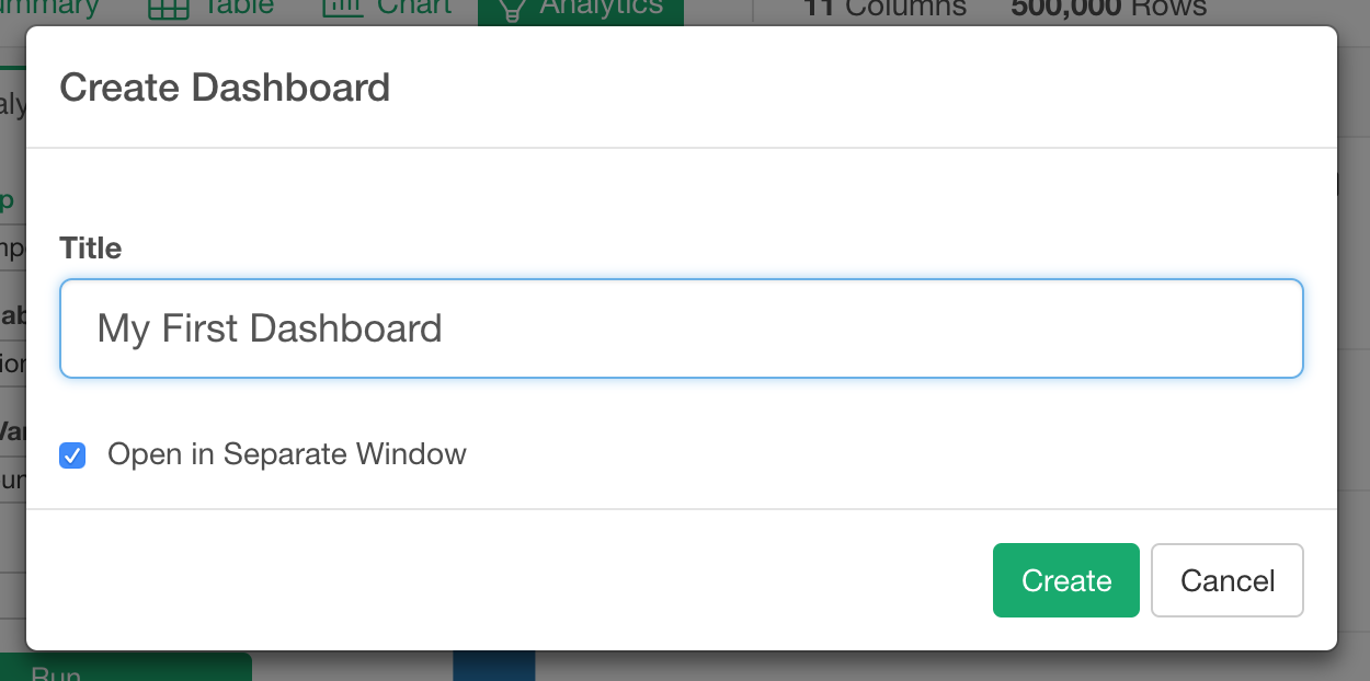
After you put name on your Dashboard, click ‘Create’ button.
You will see another window is opened with blank Dashboard edit page.
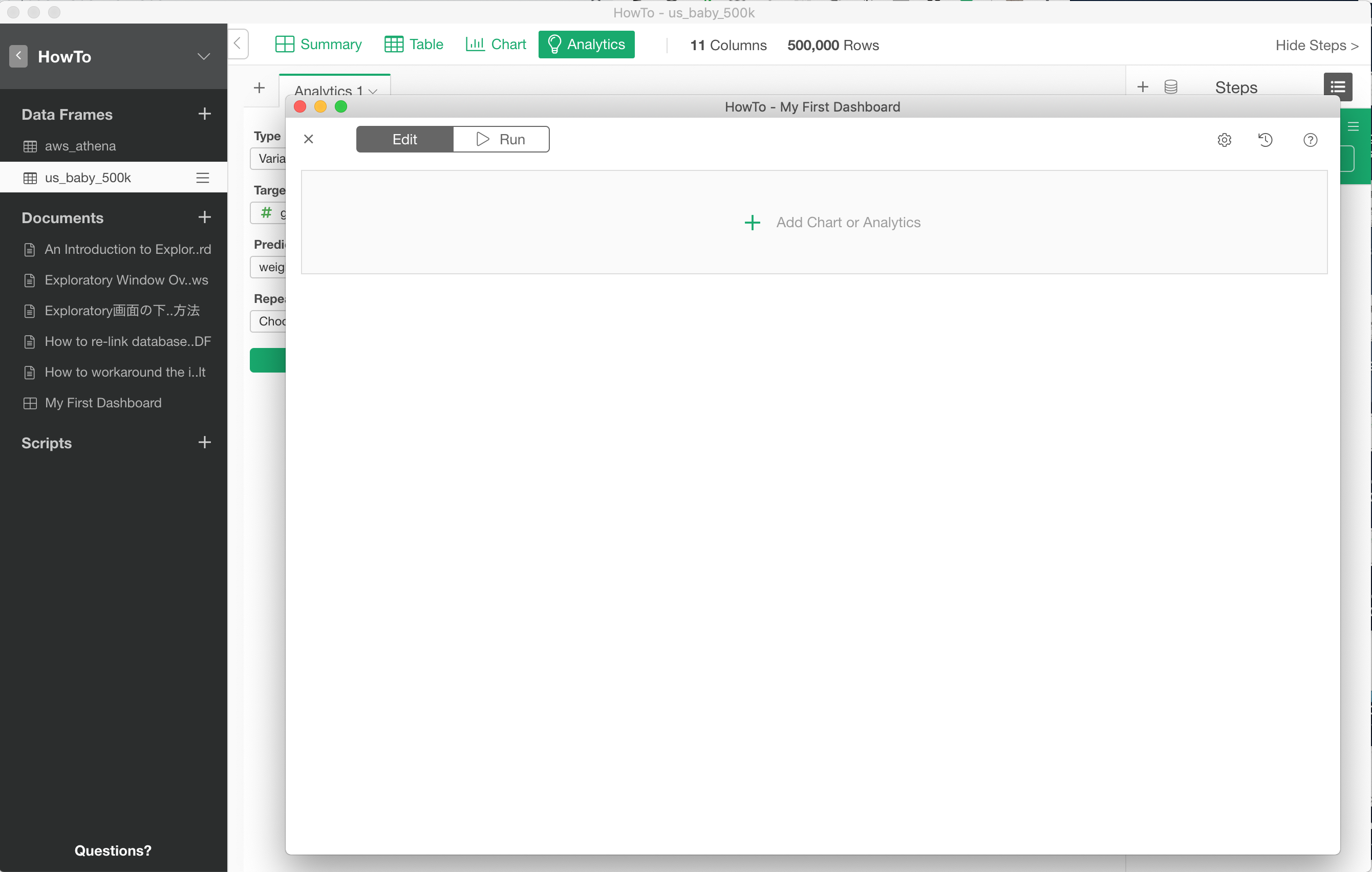
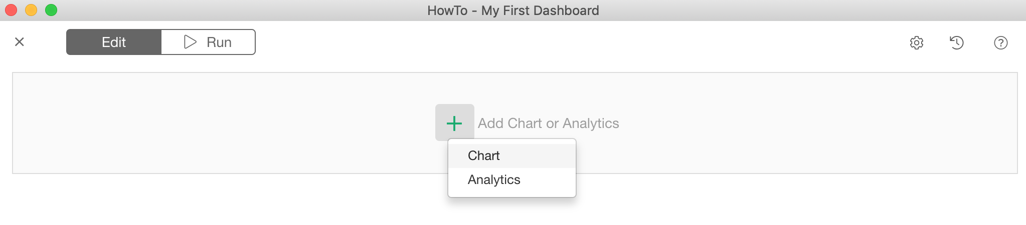
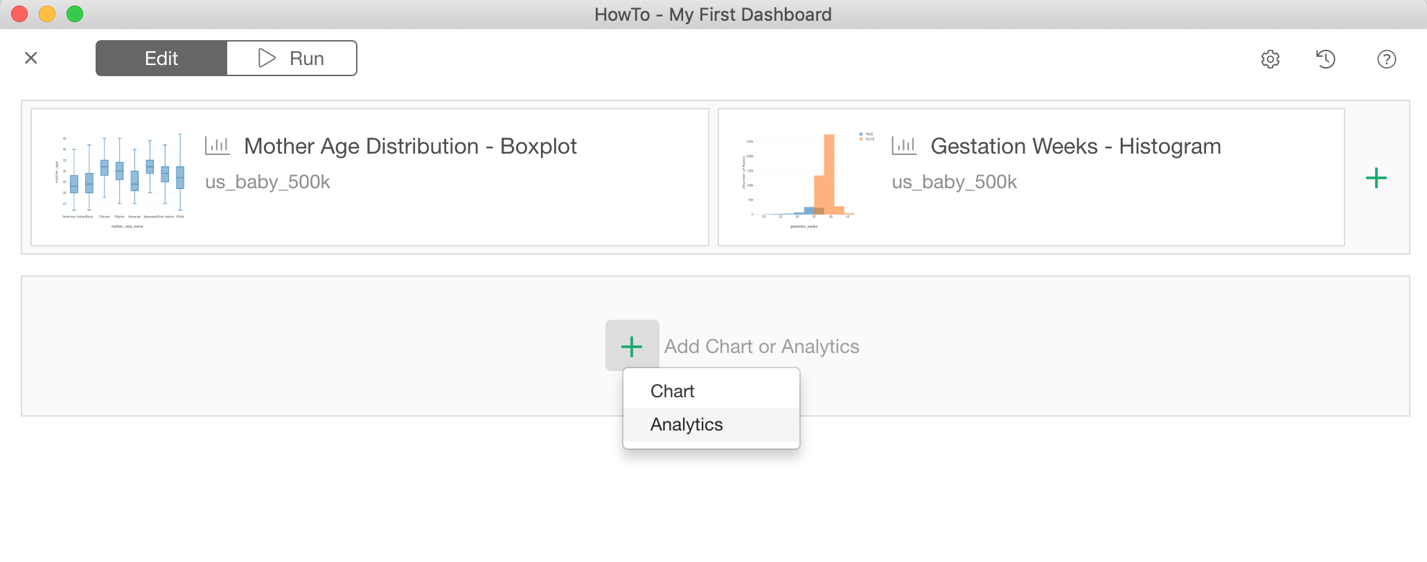
Let’s start adding charts by clicking ‘+ Add Chart or Analytics’ button.
Add Charts to Dashboard
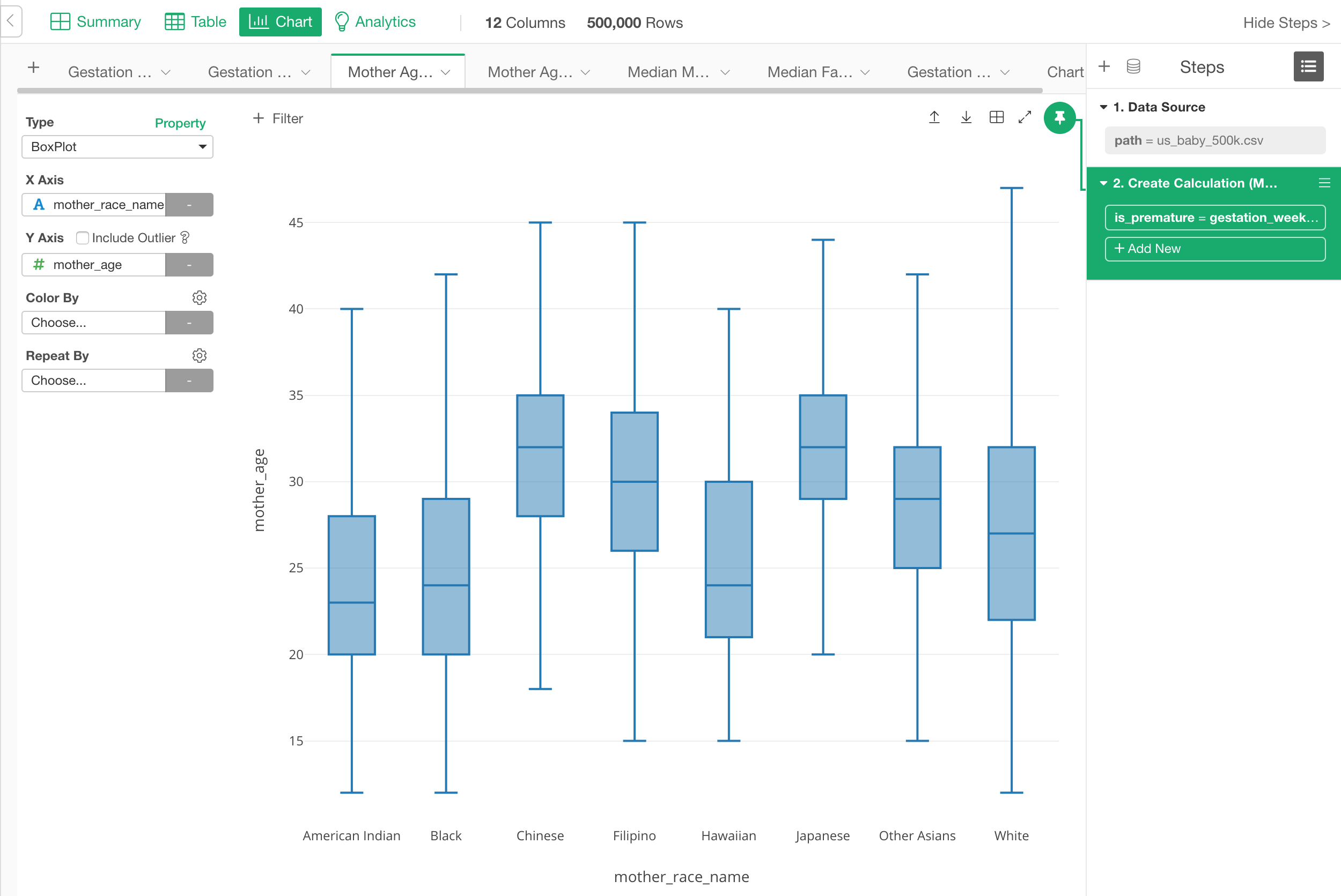
Now the “Edit” tab is selected and this is where you can configure the layout and select the charts you want to add in the Dashboard page.
Add Visualization Charts
You can add any visualizations (e.g. charts, maps, pivot table, etc.) you have created inside the same project.
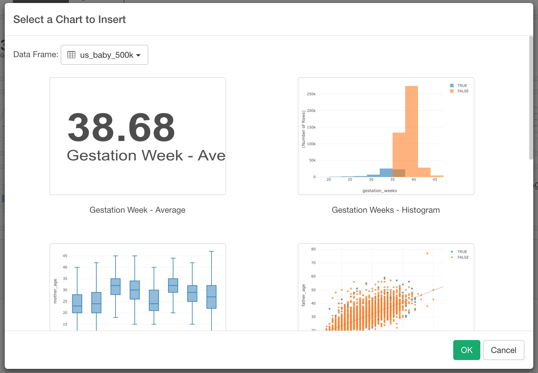
You can simply click the green plus button and select ‘Chart’ from the menu. This will open a Chart selection dialog.
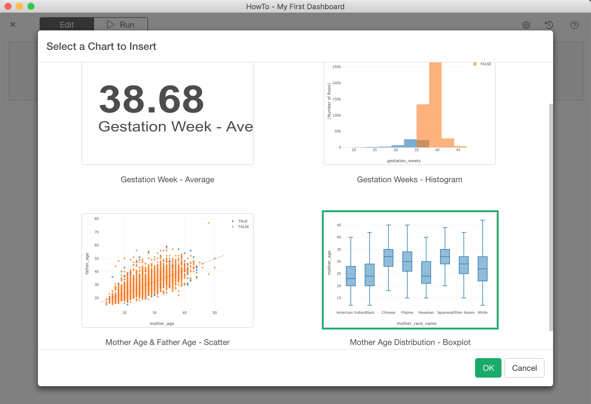
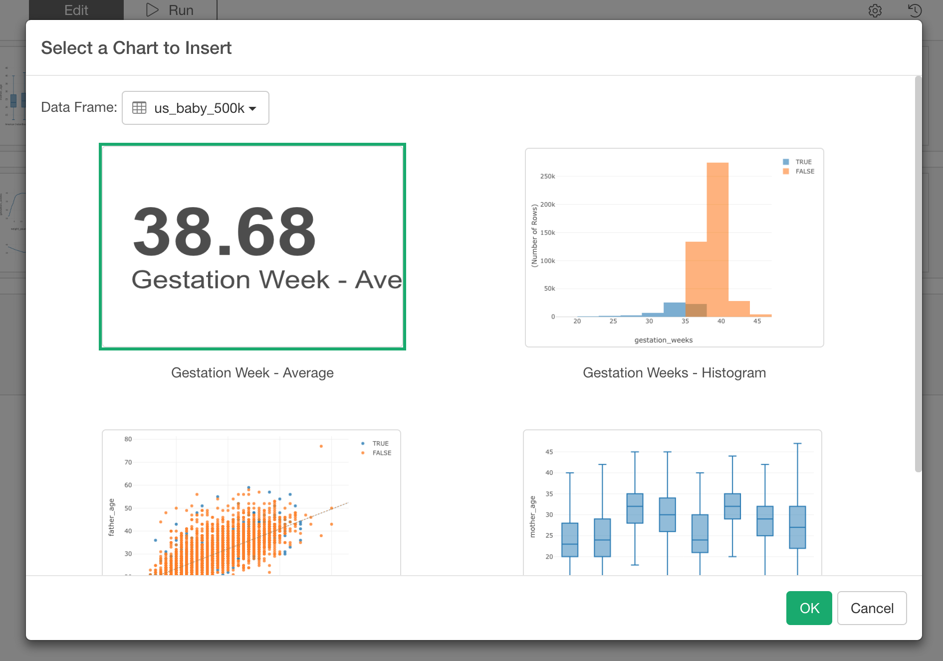
Select a chart you want to add to the Dashboard and click OK button.
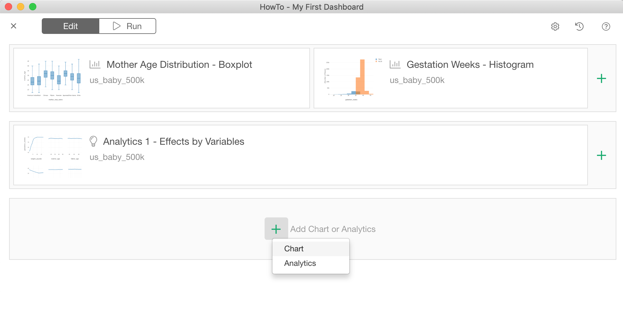
You can add more charts in the same row by clicking the green plus button at the right hand side of each row.
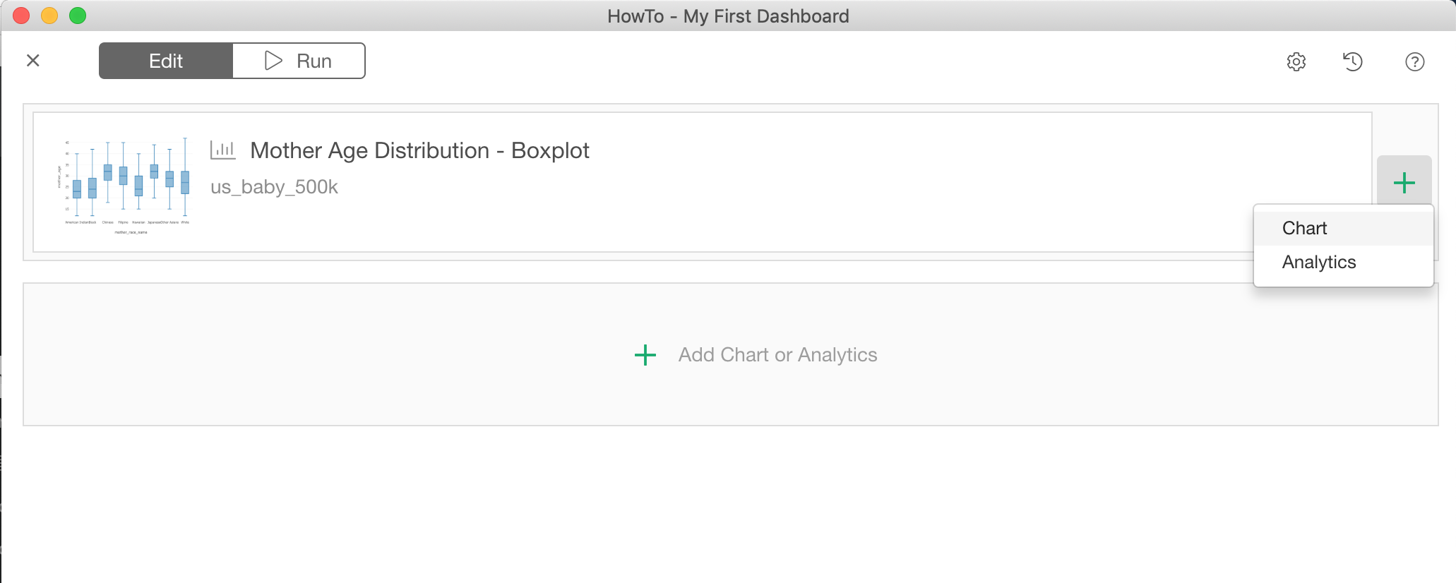
Select a Chart that you want to insert from the same Chart selection dialog.
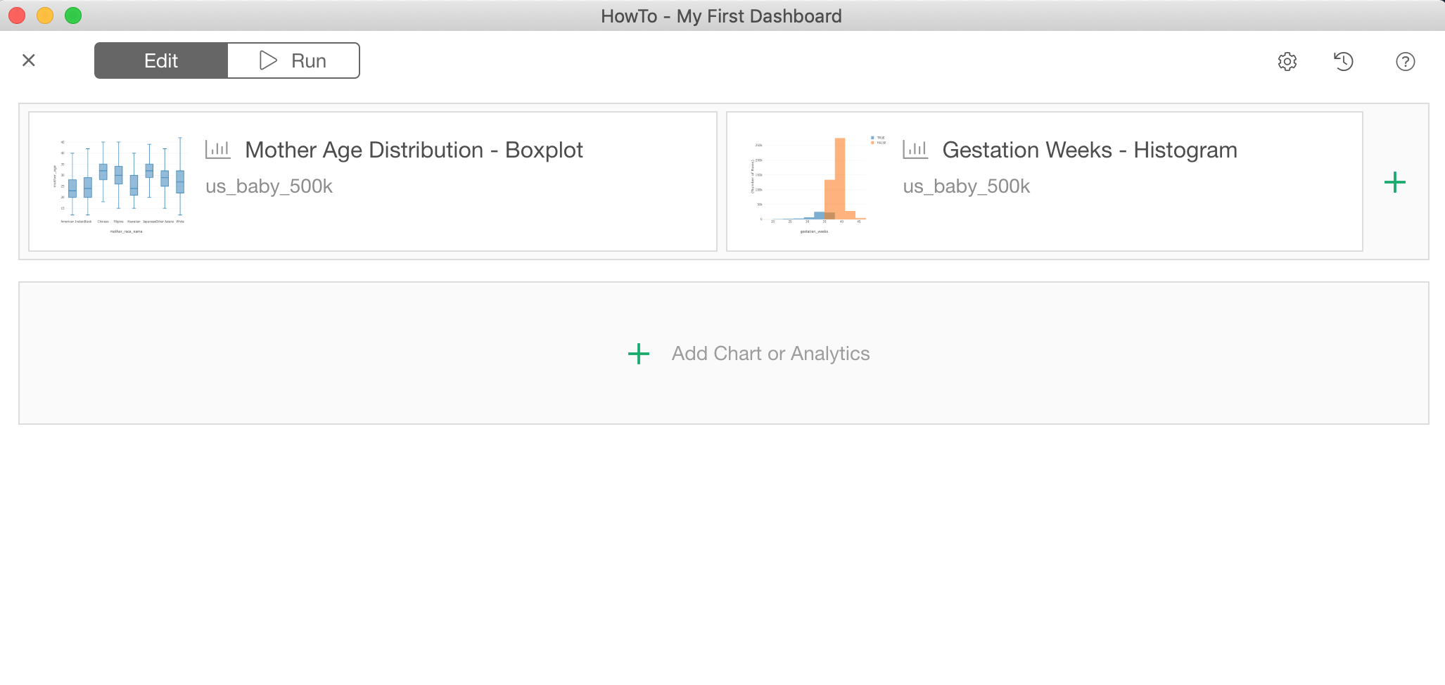
And now you have multiple visualizations in a row.
Add Analytics Charts
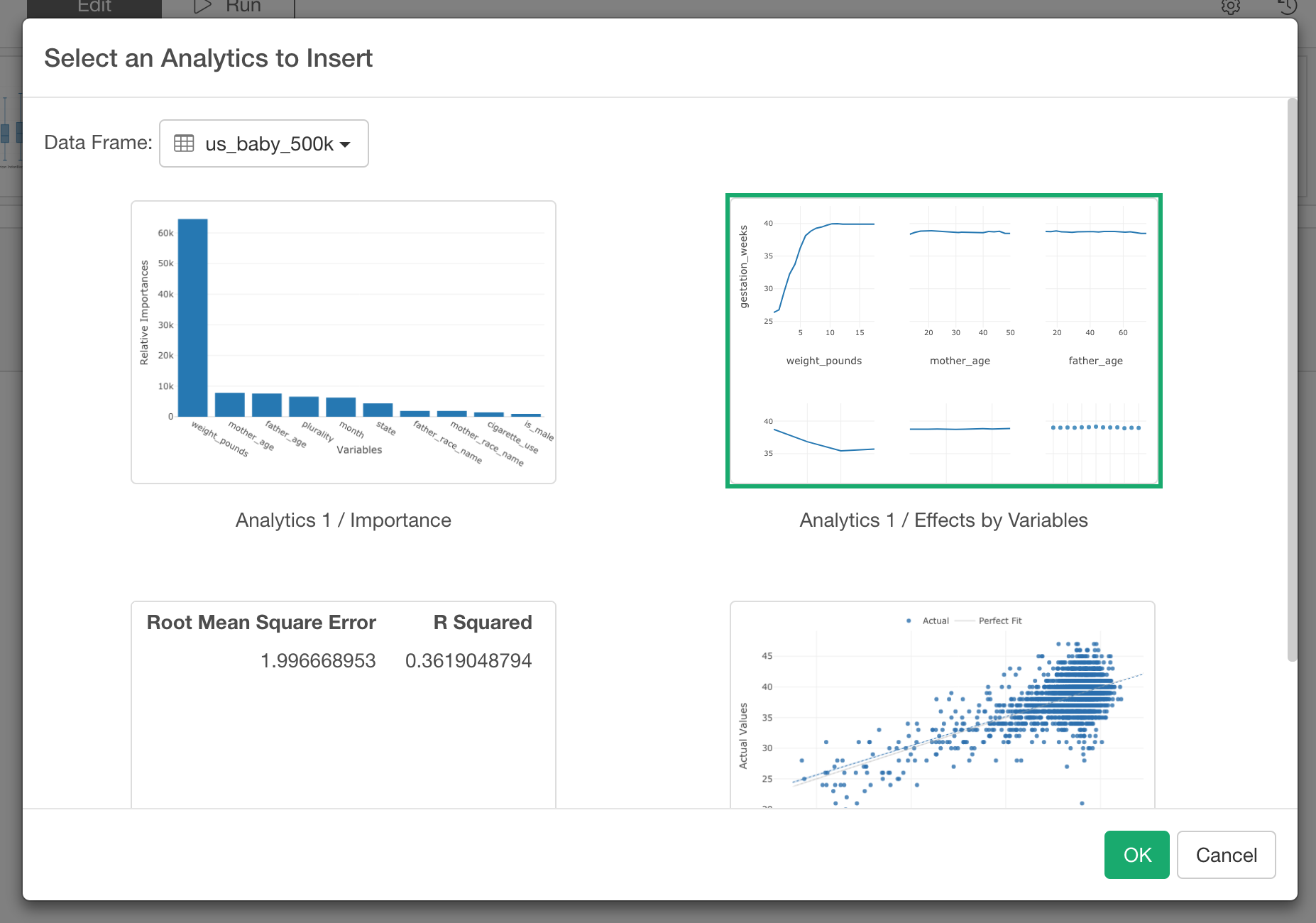
You can also add Analytics Charts that you have created under the Analytics view in the same way as demonstrated above for Visualization Charts.
Click the green plus button and select ‘Analytics’ from the menu.
In the Analytics chart dialog, select a chart you want to add and click OK button.
Add Number
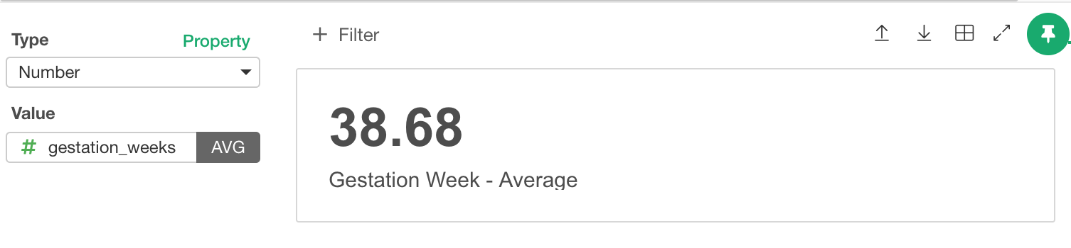
There is one ‘chart’ type called Number under Chart view. This is really for showing a summarized value in Dashboard, and it can be used to track one of your KPIs such as the number of sign ups, the conversion rate, MRR (Monthly Recurring Revenue), the head counts, etc. Given that this is one of the chart types, you can add this Number to your Dashboard by using the same Visualization Chart selection dialog.
Select a Number you want to embed inside the Dashboard.
Once you select and click ok, it inserts the Number into the Dashboard.
Update Chart Section Title
Each chart section has its own title and you can customize this.
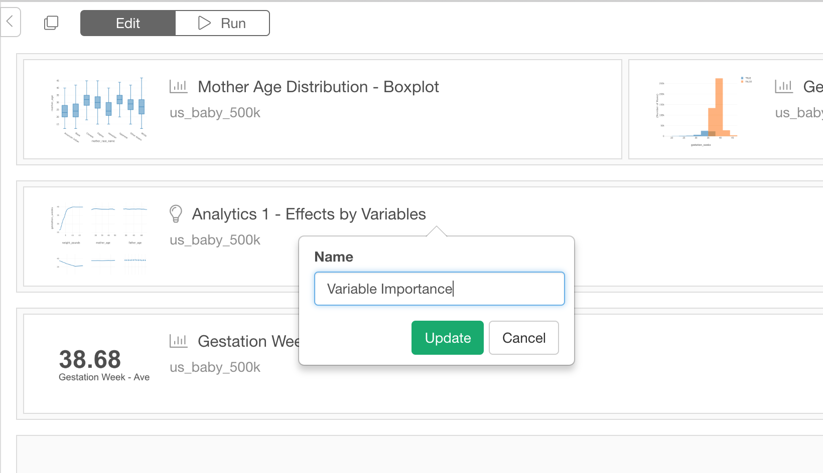
Click Edit icon (looks like a pencil on a paper) next to the chart title.
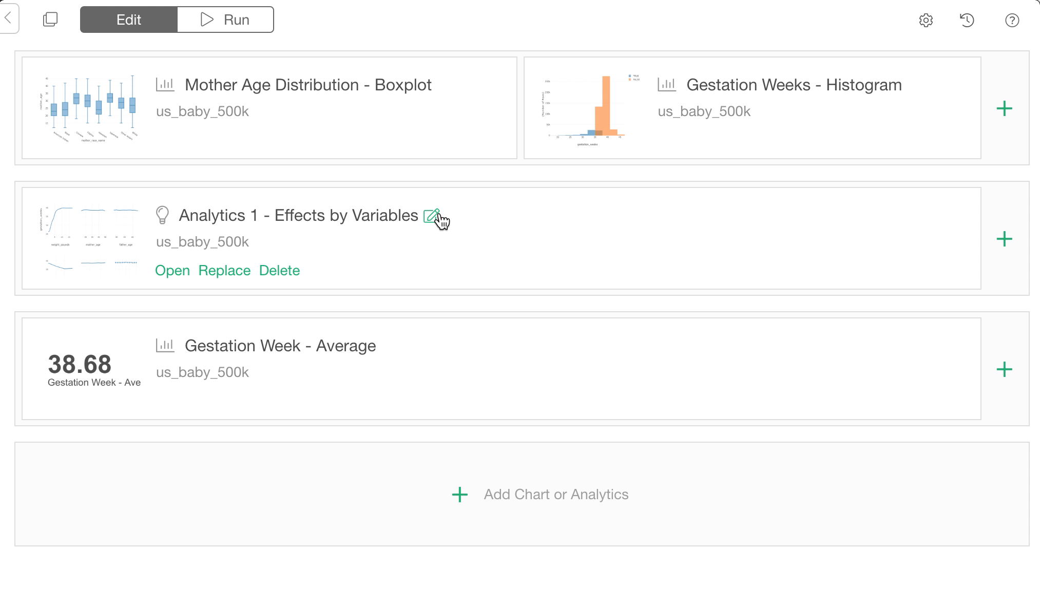
After you type in new name, click Update button.
Re-order Charts
If you want to change the chart positions, you can simply drag and drop them.
You can change the positions inside the same row or even move between the rows.
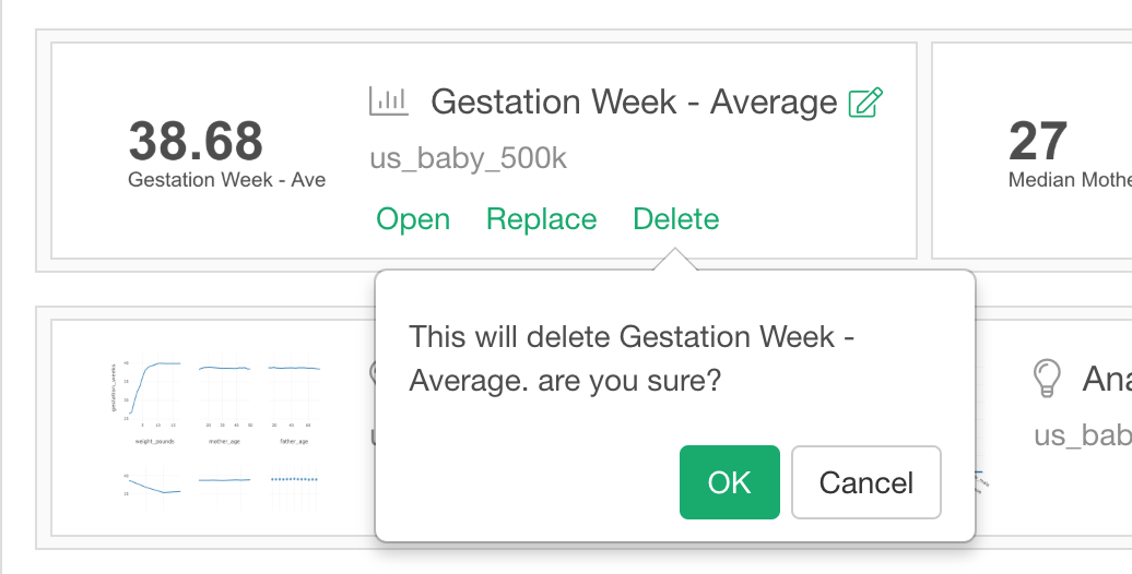
Delete Charts
To delete the viz from Dashboard, click Delete button at the bottom.
Switch to a different Chart
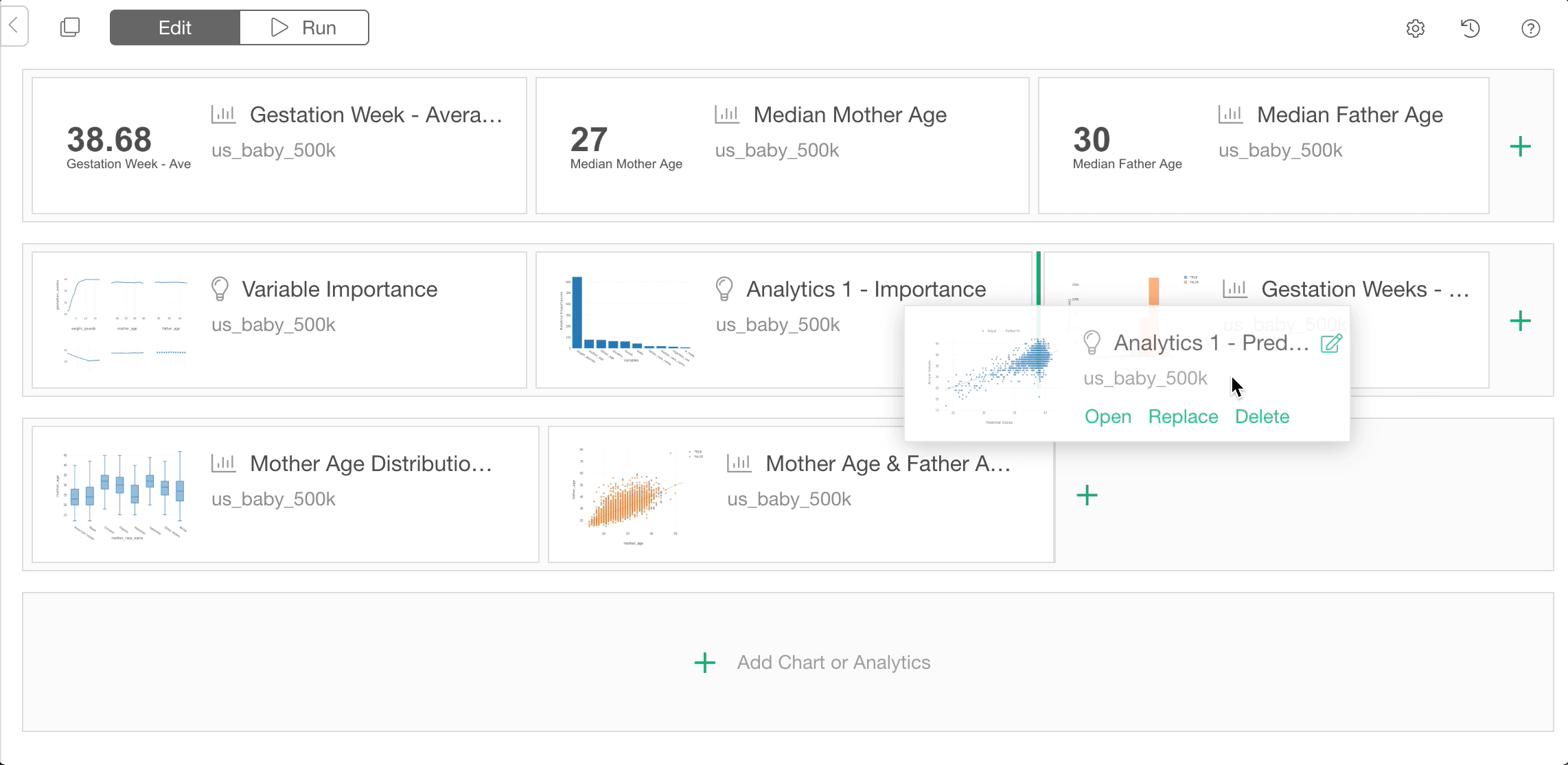
To switch to another chart, click Replace button under the chart title.
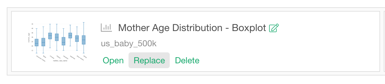
Then from Choose Chart Dialog, click a chart that you want to replace with and click OK button.
Navigate to the Chart
Sometimes you might want to edit the charts that you have in Dashboard. You can click Open button to quickly navigate to the target chart in its Viz view and change the configuration (like Color, Repeat by, etc).

Clicking the Open button will navigate you directly to the Chart View.
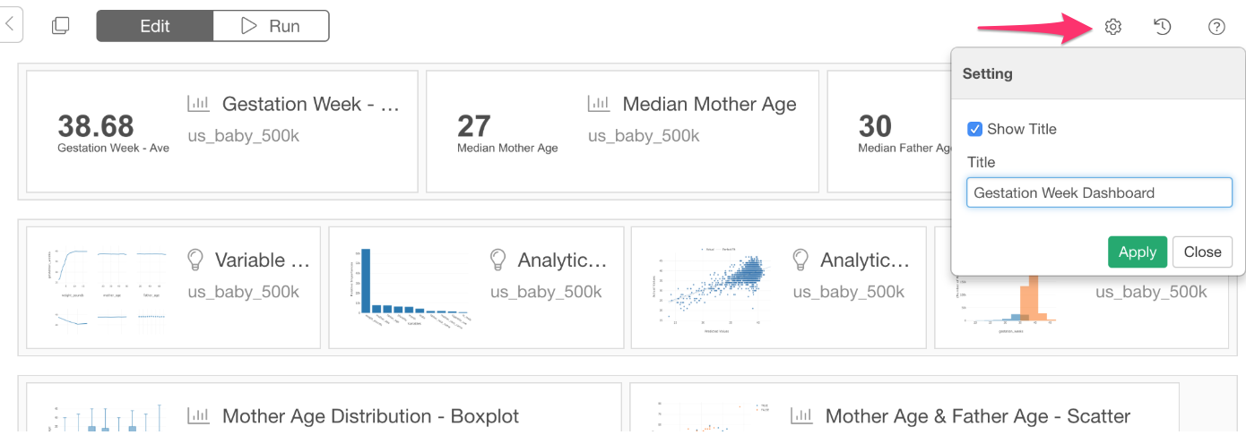
Set Dashboard Title
You can select whether you want to show Dashboard title or not. If you do want to show, then you can edit the title text.
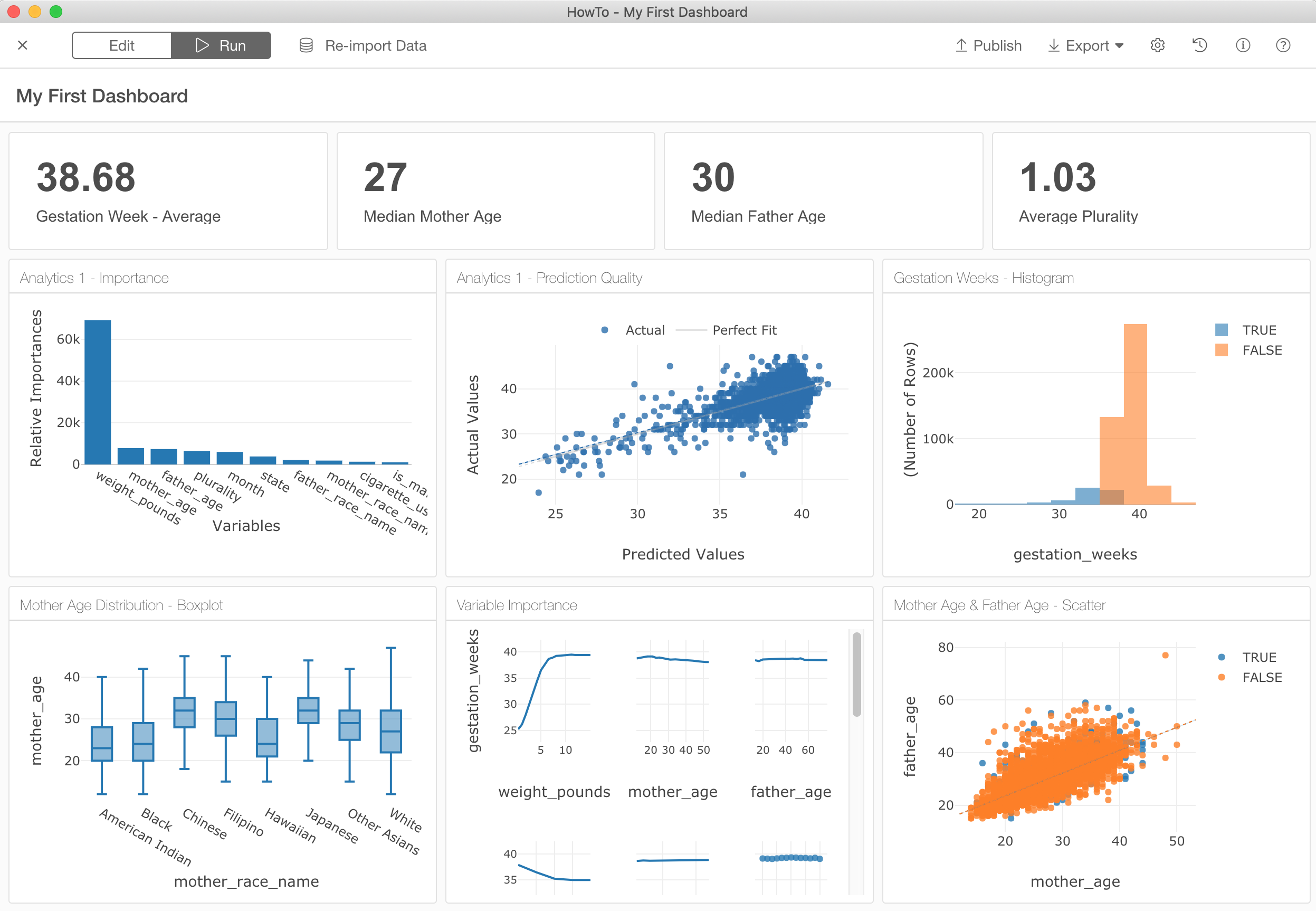
Run Dashboard
Once the setup is done, click Run button on the Header. This will render the Dashboard with the configuration.
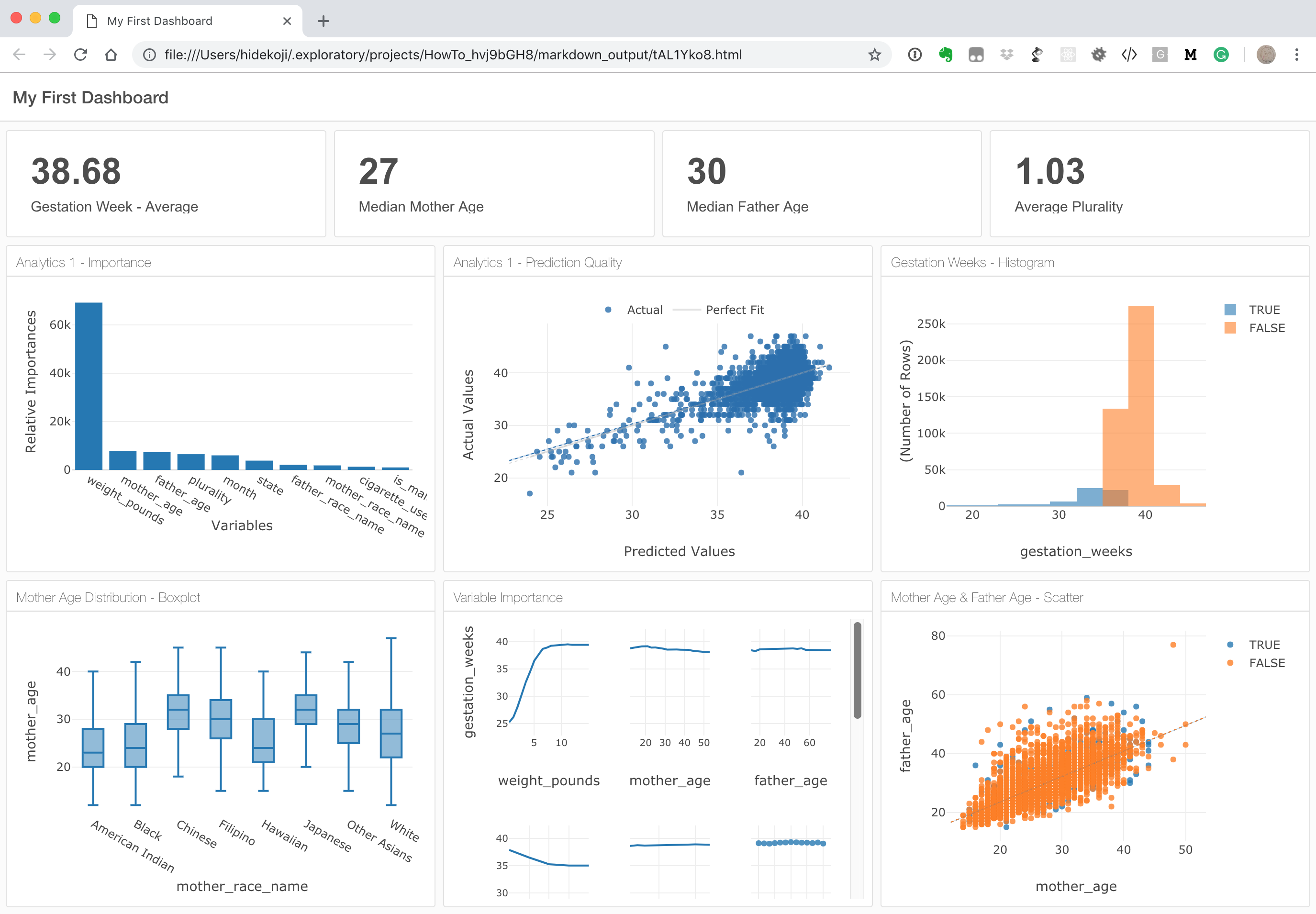
You can click on ‘Export’ button then select ‘Open in Web Browser’ to show the Dashboard in your web browser and see how it looks.
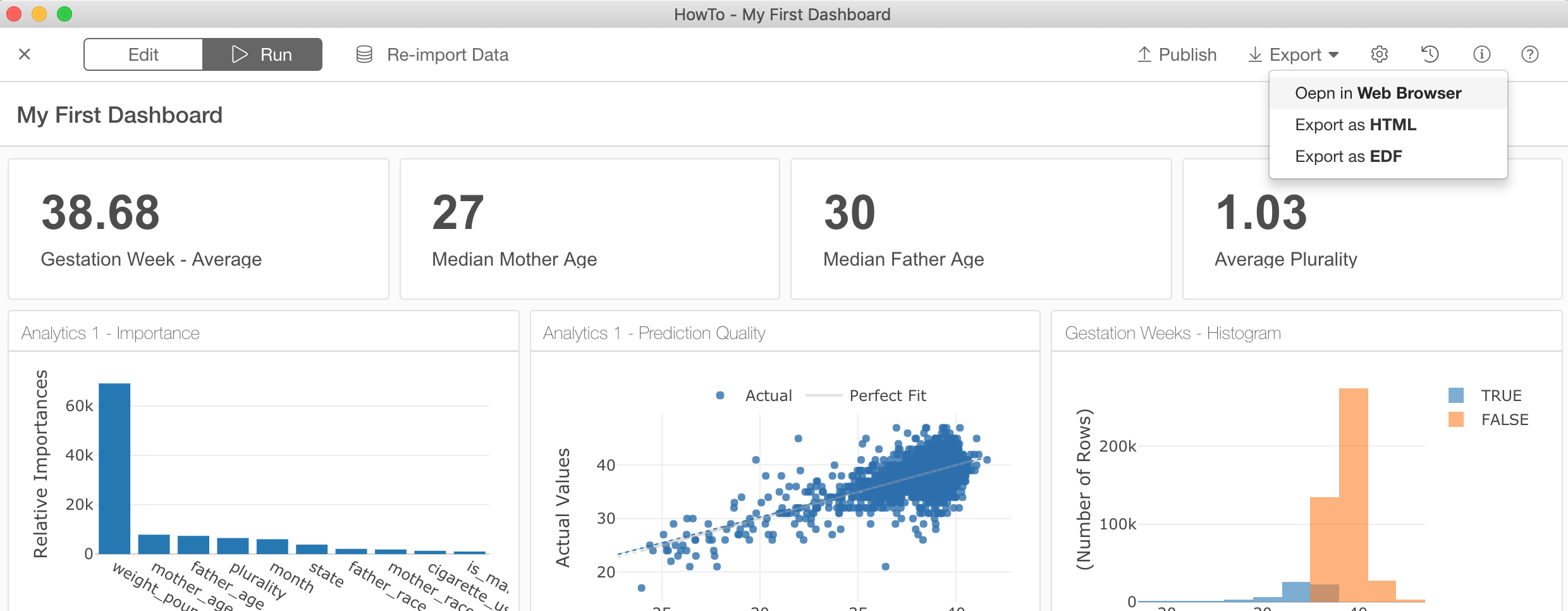
This is convenient especially when you want to confirm how your Dashboard would look like when it’s deployed to Exploratory cloud and/or on-promise Exploratory Collaboration Server.
Share and Present Dashboard
Once your Dashboard is ready, there are two ways to share it with others.
One is to publish the Dashboard to exploratory.io or your on-promise Exploratory Collaboration Server and share the URL with them.
Another is to export the Dashboard and save it to your PC or your document sharing servers.
Let’s take a look one by one.
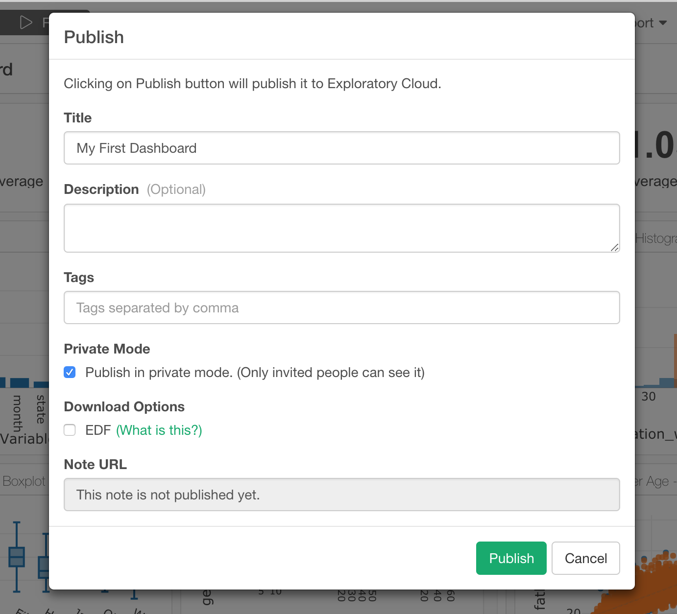
Publish to Share

By clicking ‘Publish’ button you can set the title and other information for the dashboard. You can also set whether you want to publish it as Public or Private mode. If you choose Private mode, then you can invite others by emails to see the slides.
Export to Present
You can also export the Dashboard and save it to your PC or your document sharing servers by clicking on Export button then select ‘Export as HTML’
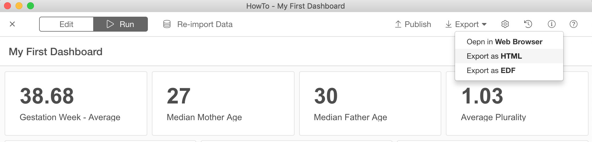
This will generate a zip file that contains all the necessary files to present the dashboard.

You can double click on ‘dashboard.html’ to see the dashboard.
Reproducibility
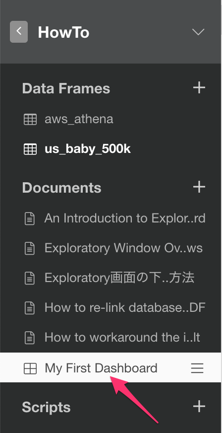
You constantly need to update the dashboard for a variety of reasons. For example, you might need to change the data wrangling steps to produce the data used in the Dashboard. Or, you might need to adjust the charts or analytics that are presented in the Dashboard. In such cases, all you need to do is to ‘re-open’ the Dashboard simply by clicking it in the left hand side pane.
Have your data sources like database, Google Sheet, etc. been updated? Then you can simply click on ‘Re-Import Data’ button at the top.
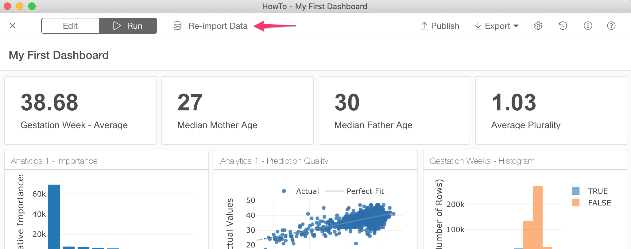
This will re-import the data from the related data sources for all the charts used in the Dashboard. Once the ‘re-import’ is done, then it will automatically refresh the Dashboard contents.
Conclusion
With this new Dashboard support in Exploratory, you can quickly build your own Dashboard to monitor KPIs and business metrics for your team and share important insights with others effectively and timely, and most importantly, in a reproducible way.
Happy Dashboarding!
R Packages Referenced in this post
We use two very cool and important R packages behind this Dashboard implementation inside Exploratory. They are RMarkdown and Flexdashboard and they both make it easier and simpler to write documents and create Dashboards by using R.
- RMarkdown:https://github.com/rstudio/rmarkdown
- flexdashboard: https://cran.r-project.org/web/packages/flexdashboard/index.html
If you happen to be an R user with RStudio, you should try them directly!
Try it for yourself!
If you don’t have Exploratory Desktop yet, you can sign up from here for free. If you are currently a student or teacher, then it’s free!
Learn Data Science without Programming
If you are interested in learning various powerful Data Science methods ranging from Machine Learning, Statistics, Data Visualization, and Data Wrangling without programming, go visit our Booster Training home page and enroll today!